Compatibility is the capacity to exist together. As a real-life example, water is not compatible with oil, but milk is. The same thing happens with software or apps that we build.
Compatibility Testing
Compatibility testing is a crucial QA task which guarantees that the software or product that is being tested is compatible, as desired over a broad set of client frameworks and configurations.
Foldable phones are here — and they'll soon be in the hands of consumers.
In fact, three of the leading Android vendors have already launched such devices — including Samsung, LG, and Huawei. And with this new generation of devices, DevOps teams will need to ensure that their apps are ready with optimized performance.
Not so long back, entrepreneurs doubted if they needed a mobile-responsive site. When desktop-based online stores were already performing quite well, wouldn’t spending on mobile optimization be a redundant investment? Gradually, stats coming from reported sources blew their minds, and consequently, their perceptions changed. Mobile-responsiveness became a necessity than a choice. In 2017, eCommerce stores […]
Many of us have heard of the 80/20 rule, also known as the ‘Pareto Principle.’ Applied to mobile application security, the idea is that guarding against threats with the greatest potential impact can mitigate 80 percent of your risk and provide the biggest bang for the buck.
A defense-in-depth strategy can best protect your organization from security, privacy, and compliance threats stemming from mobile app vulnerabilities. Once the essential layers of security are in place, some people tack on specialized solutions that address narrow edge cases. Just know that such additional initiatives usually have diminishing returns. What’s worse, enterprises distracted by the latest mobile security buzzword or hype may end up overlooking the basic blocking and tackling that can eliminate the majority of their mobile risk.
Mobile app developers often use deep links to improve the user experience and engagement by helping users navigate from the web to their app. However, our security testing has found an easily exploitable vulnerability when deep links are used incorrectly for authorization purposes. This blog will explain how this vulnerability can be exploited and how to safeguard your app by using the more secure version of deep links, App Links.
Deep Links Overview
Deep links are URLs that take users directly to specific content in an app. They can be set up by adding a data specification (URI) inside an Intent Filter. Whenever a user clicks a URL (either in a webview, in an app, or in a web browser in general) that matches the URI specified inside the intent filter, she will be taken to the activity that handles it. Below is an example that shows how to add a deep link that points to your activity in the AndroidManifest.xml file:
In this Refcard, you will learn everything you need to know about getting started with this open-source tool, from installing the Appium server to running your first tests. Download this Refcard now to see why Appium is "Mobile App Automation Made Awesome."
Creating a secure DevOps culture helps companies accelerate mobile app release cycles and securely deliver the new features and capabilities that users crave. Automating the continuous integration/continuous delivery (CD/CD) pipeline speeds time to market to meet the demands of the business.
But app store ratings and reviews aren't the only important measures of performance. As more NowSecure customers embark on the journey to DevOps, they increasingly focus on a few key performance indicators.
As a design agency professional, you must design your clients’ websites with a mobile-first approach in mind. Mobile-first user experiences make it easy for visitors to find what they’re looking for quickly and encourage them to take action. Doing so can help increase conversions and boost sales. With this in mind, in this article, we’ll […]
Image optimization SEO isn’t what it used to be. Google is no longer like a toddler you can entertain with a picture book with basic words. Oh no, we’re dealing with a sophisticated teenager, who not only wants a deeper meaning but also to experience the thrill of speed. And your photos better be, like, […]
The new Gutenberg block editor that arrived in WordPress 5.0 is now in beta testing on the mobile apps. The editor will be available in version 11.9, which is planned to be released to the public on March 11.
“For this first version, our main focus was to build a pleasant writing experience with support for the most basic types of content,” WordPress mobile engineer Jorge Bernal said.
“Our data showed that 90%+ of the posts created on the mobile apps consisted of basic text and images, so we decided to focus on supporting the Paragraph, Image, and Heading blocks on this version.”
The interface looks similar to using Gutenberg on desktop, but it has been pared back to allow for only the most commonly used blocks and access to simple block settings.
The block editor in the Android app feels noticeably slower on mobile than the previous editor. It’s not yet an improvement on the existing mobile editor but it’s still in beta. Even though it’s still rough around the edges, the posting interface is more consistent with what users experience on the desktop. During this transition time, users will retain the ability to use either editor, since the Gutenberg implementation just provides the basics for now.
After version 11.9 rolls out to the apps, users can choose if they want to use the block editor. The app detects which editor a post was created with and will automatically open it when a user attempts to edit a post. Users can manually switch back to the old editor for posts that have blocks by selecting “Switch to Classic Editor” under the ellipses menu. New posts will still use the Classic Editor by default but users can change the default to the block editor by going to Me > App Settings and enabling the “Use Block Editor” option.
After 11.9 is released the team plans to work on UX improvements and bug fixes before moving on to add support for the most common blocks and use cases.
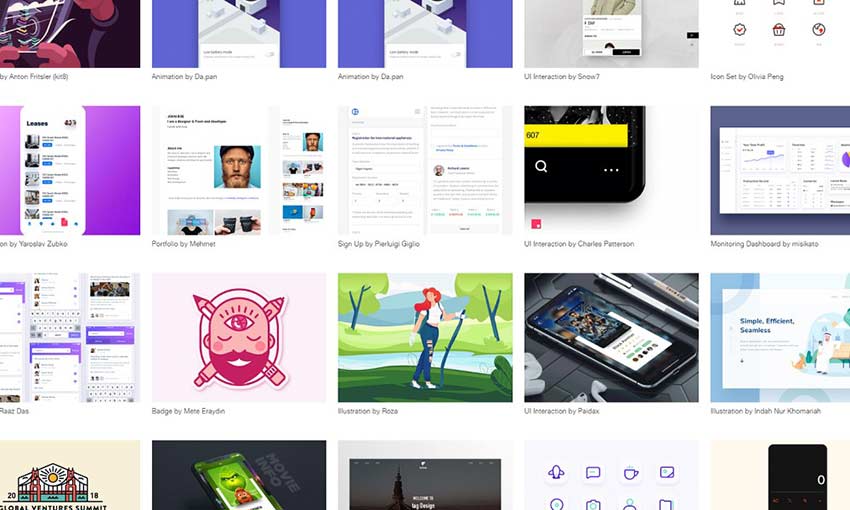
UI design isn’t easy, but you don’t need to figure this out on your own. UI inspiration and design sites exist just for this purpose, giving you access to the latest and most innovative mobile UI. Whether you’re searching for animations, page layouts, or art direction, you’ll find the inspiration you need here.
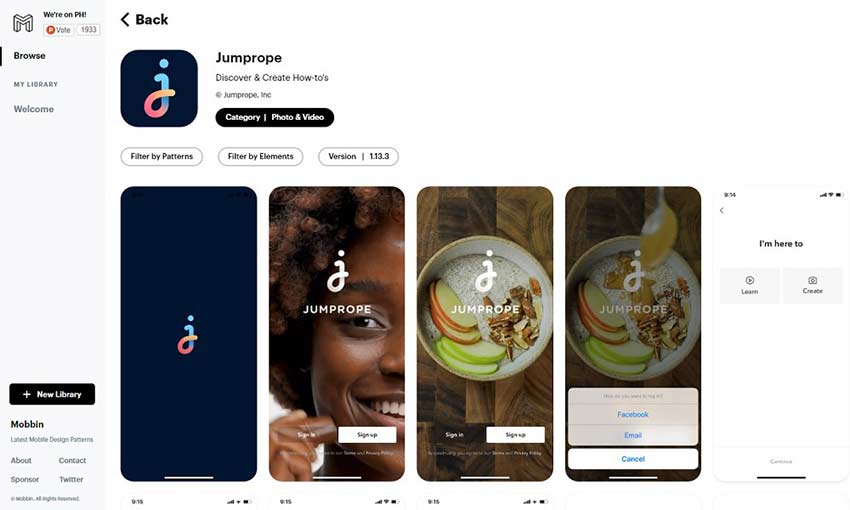
If you’re looking to stay up to date with UI trends, Mobbin has 150+ apps and 8,000+ patterns to scroll through. The best part of this site is the extensive sorting features. You can filter screenshots by category, content and design elements. Sign up to save the patterns you like best.
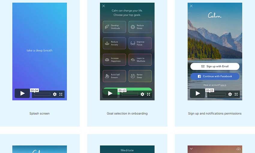
What makes this pattern site awesome is the inclusion of animated examples. Any mobile designer knows that animations are extremely important, so it’s great to have a place to find animation inspiration! You can save patterns to your board, which you can then share with others.
The most popular apps on the App Store, broken down into UI elements. This is the perfect resource for designers. There’s other cool content on this site too, like sortable UI patterns, premium UI kits and even breakdowns of Chinese apps’ unique UI design.
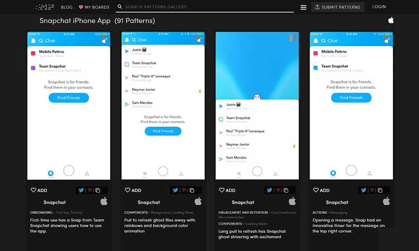
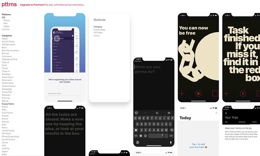
A huge list of mobile patterns, sortable by platform, category, tags and date. What more could you need? To get the most out of this site and access all the images, you’ll need to pay for a premium subscription.
Collect UI posts hand-picked UI inspiration daily, bringing you everything from mobile webpage design to animations and illustrations. With nearly two hundred categories, there’s a little something for everyone.
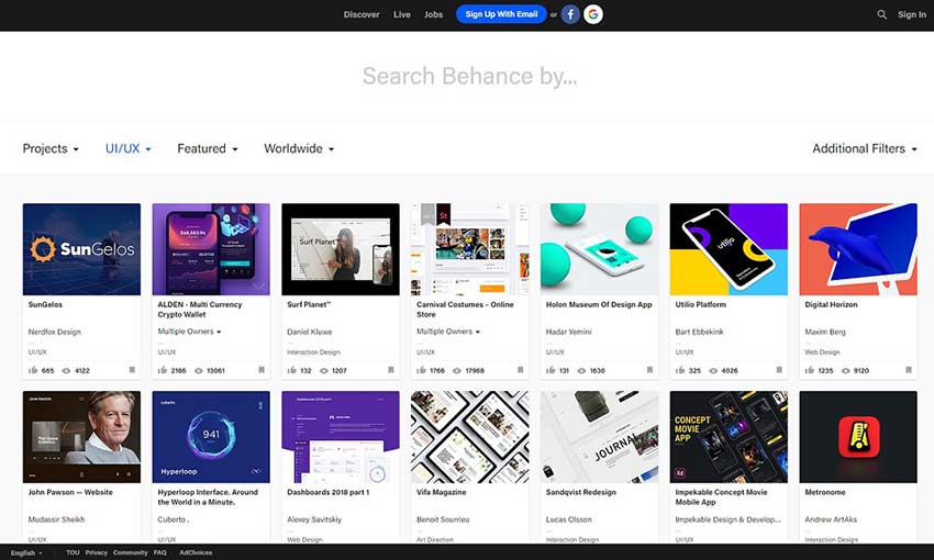
Made for creatives of all skill levels, Behance features various portfolio pieces from designers across the web. These aren’t just static images – expect to dive into details of an app’s creation and design process.
If you just want to see full screenshots of great UI in action, Inspired UI has some content for you. Rather than zoomed in, carefully cropped images, see how designs look on an actual iPhone, iPad or Android screen.
This blog is a huge collection of UI animations and screenshots. Just keep scrolling down to pull up dozens more images, or use the search bar to locate the kind of UI you’re looking for inspiration on.
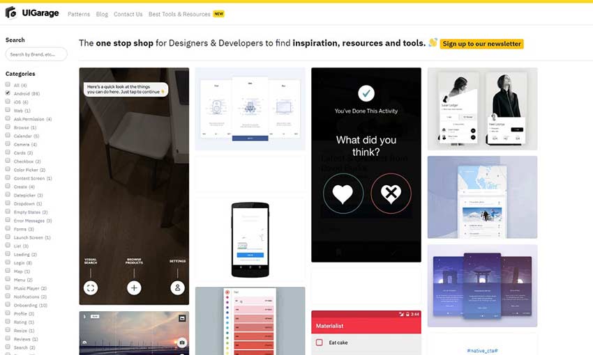
UI Garage has hundreds of user-submitted screenshots, all of which can be searched for with tags or sorted by the elements that appear in them. Simple as that! There’s also a section on the site that contains helpful tools for designers and developers.
Dribbble is so appealing because it’s straightforward and easy to use: Just search for what you want and scroll through thousands of results. It’s used by creative professionals of all kinds, which means there’s more than just UI design here. But every shot is high quality work.
There are tons of amazing, animated UI inspiration to be found here. Some of the designs are for computer- or tablet-sized screens, but there’s no scarcity of mobile UI. Sort or search, or sign up for the newsletter to get five new animations a week.
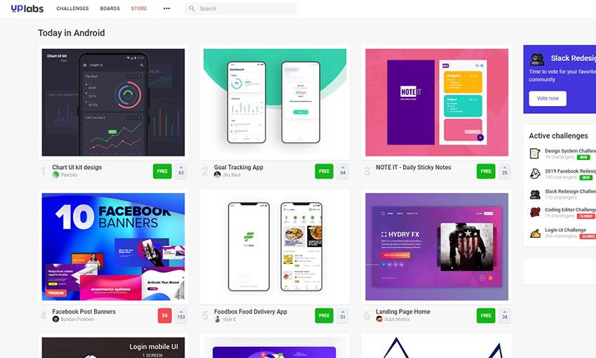
Along with inspiration and portfolio work, Uplabs also features downloadable mobile resources like UI kits. This site is popular, with dozens of submissions a day in each category, so you’ll always have tons of content at your fingertips.
Design a Better UI
It’s always a good idea to stay up to date with the latest in UI. Besides keeping up with the trends, you might find some inspiration for your own app’s design. And sites like this are a great resource if you’re struggling with getting that page or animation just right. Just be careful not to spend hours browsing all of these amazing mobile patterns!
Securing your mobile applications with cert pinning will help you ward off man-in-the-middle (MiTM) attacks, verify users using trusted certificates, and secure HTTPS network traffic. In this Refcard, you’ll learn about what MiTM attacks are, how to implement cert pinning on both iOS and Android apps, and how to test and maintain your certificate pinning.
Web Design is one of the most advanced fields ever-changing trends. The web design industry is one of the most demanded and competitive industries. There are millions of websites present on the World Wide Web now, with hi-tech advancements and innovative ideas implemented on their website. In the past years, we have seen a rise in […]
Capacitive touch sensing means that the detection of fingers or your stylus on a screen relies on capacitive adjustment, mostly through touch. Capacitive touch sensing uses spread across many electronics, unlike before when it was an exclusive technology. Tablets, smartphones, Kindles and any screen that operates by touch probably uses capacitive touch sensing. In the […]
If you use a mobile device to browse the internet, you’ll have noticed lots of sites with burger menus. These are menus that are hidden behind a ‘burger’ icon that the user can tap on, to reveal the whole menu.
The reason they’re called ‘burger menus’ is because of the icon that normally represents them – three lines. It looks like a little burger, or at least that’s the theory. I like my burgers a little less skinny!
But naming aside, being able to add a burger menu to your WordPress site is something that will enhance the user experience for people visiting on a mobile device.
You could add a plugin to create a burger menu. Or you could install a theme with one already there (like one of ours). But what if you’ve got your own theme and you’d rather add the burger menu yourself?
In this post I’m going to show you just how to do that. Taking a menu that’s been added via the standard WordPress menu screen, I’ll show you how to add some CSS and Javascript that’ll turn your existing menu into a burger menu on small screens. Continue reading, or jump ahead using these links:
A development installation of WordPress running a site that has a menu already created.
Your own theme or a child theme of a third party theme. Don’t directly edit the third party theme or your changes will be deleted when you update it. Instead, create a child theme if you need to.
I’m going to apply this code to my own website. It targets the main navigation menu, which in my case has a CSS class of .menu.main. If yours is different you’ll need to edit any CSS targeting those classes so it applies correctly to your own theme.
So, let’s get started!
The Desktop Menu Version
Right now my menu looks fine on desktop – it sits beneath my header banner above the content:
But on mobile things aren’t so pretty. On an iPhone 7 the menu is split across multiple lines and doesn’t even do that consistently, It also gets in the way of the content:
Mobile menu before adding burger icon.
I could improve that by centering the menu items, but then it would take up way too much space. Instead I’m going to add a burger menu so that on small screens the menu is hidden until the user taps on the burger icon.
Adding the Burger Icon
The first step is to add the burger icon. You do this in your theme’s header.php file.
Note: If you’re using a third party theme, create a child theme, copy the header.php file from the parent theme into that and edit the new file in your child theme.
Add a link just below the main navigation menu. Here’s mine:
This creates a link with the class togglenav – because it toggles the navigation on and off. Inside this link is the burger icon, which is created with an HTML symbol. No custom graphics required – neat, huh?
Note that the link goes nowhere – it’s just a hashtag, not a url.
That’s all you need to add to your header file, so you can save and close it now.
If you refresh your screen you’ll see the burger icon has appeared:
We don’t want that to be visible on the desktop version of the site, so we’ll fix that in the next step.
Hiding the Burger Icon on Large Screens
Now for the bit where it starts to come together – the styling. You can add all this in your theme’s stylesheet. If you’re using a child theme, you’ll already have created a stylesheet for it and can add everything there.
Note: my theme is responsive but it isn’t mobile first so I’ll be using max-width in my media queries. If your theme is mobile first you’ll need to change the way you add this code to media queries.
Let’s start with the large screen (or desktop) version of the toggle icon. Add this to your stylesheet:
That will turn the icon back on for small screens, and adds positioning and colour, as well as setting up hover and active styles to override any existing styles in the theme for links.
Now let’s style the menu itself. Add this in your media query:
It makes the menu as a whole display as an inline-block, with a solid white background and relative positioning – so we can use absolute positioning for child elements.
It sets the ul element to be invisible by default. The Javascript will slide it in when we add that, which will make it appear. It also adds position and colour styling for the list.
It removes floats for list items and displays them as a block.
Now save your stylesheet. Before your burger menu is working properly you’ll need to add the final step – a script.
Adding the Script
This step consists of two steps: enquiring the script and adding the code to it. Let’s start by enqueuing it.
In your theme add a folder called scripts and inside that, an empty file called burger-menu-script.js.
Now open your theme functions file and add this to it:
This takes the .toggle-nav element we created and creates a click call for it, which will be triggered when someone taps it. It then uses .slideToggle to toggle the navigation menu in and out when the link is clicked. It also stops the link behaving in its default way.
Finally, save your file.
So now here’s the site on a small screen:
The burger icon on a small device.
And when I tap on that icon, the menu appears:
The mobile site with the menu displayed.
And here’s a video of how it works when I visit the site on my phone (the video is a bit jerky so you may want to visit the site on mobile to see it live).
The burger menu animation in action.
All done! Now all I need to do is work on my header banner, which also looks pretty ugly on small screens!
Adding a Burger Menu Will Enhance the User Experience on Mobile
If you follow the steps above (editing the CSS to suit your theme if you need to), you’ll create a simple burger menu that improves user experience on your site when people visit it on a mobile device. And if you need to, you can amend the styling, changing the color of the icon, adjusting the width of the menu, and whatever you need to make it work for you.
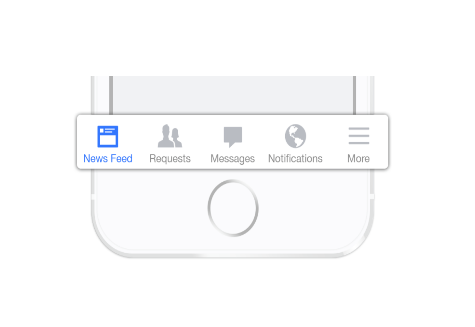
Screen space is a precious resource on mobile. To meet the challenge of small screen space while still making navigation accessible, designers often rely on hiding navigation behind the hamburger icon, a prime example of hidden navigation. In this article, we’ll see why hidden navigation creates bad UX and what alternatives are available for designers.
Why the Hamburger Menu Is Bad For UX
On mobile, visible navigation is used 1.5x more than hamburger
If you’re working on digital products, you’ve probably already read dozens of articles describing how the hamburger menu on mobile hurts UX metrics. The main downside is its low discoverability, and this is backed up by actual numbers. In qualitative studies, NNGroup found that hidden navigation is less discoverable than visible or partially visible navigation. This means that when navigation is hidden, users are less likely to use navigation. Hamburger menus drive engagement down, slow down exploration and confuse people.
So What Should We Use Instead?
While there is no hard-and-fast rule for mobile apps and websites, a general recommendation is to use either visible—the main navigation options are shown in a visible navigation bar—or combo navigation, where some of the main navigation options are visible and some are hidden under an interactive element.
1. Tab Bar
If you have a limited number of top-level destinations in your website or app, a tabbed navigation might be the solution. When a menu is visible at the top or bottom, it’s basically advertising that a navigation is there and people are able to see the navigation options right from the start.
Tabs seem to be the simplest navigation pattern. However, a few things should be considered when designing this type of navigation:
Tab bar allows 5 or fewer navigation options to display.
One of the options should always be active and should be visually highlighted by, for example, using a contrasting color.
The first tab has to be the home page and the order of the tabs should relate to their priority or logical order in the user flow.
It’s better to use icons together with labels for each navigation option. Icons without labels work only for common actions, like a magnifying glass icon for search, and for interfaces that the users use frequently (e.g. Instagram).
Tip: In order to save screen space, the navigation bar could be hidden/revealed on downward and upward scrolling.
2. Tab Bar With “More” Option
When you have more than 5 top-level destinations, a practical solution might be to show the 4 prioritized sections and have a 5th element as a list of remaining options.
The design principles for this solution are basically the same as for Tab bar. There’s just one exception: the last element is the ‘more’ item.
The ‘more’ item can work as a dropdown menu or even link to a separate navigation page with the remaining sections. From the first glance this solution isn’t much better than the hamburger menu, since it also hides content and its label doesn’t say too much about what’s hidden behind it. If you correctly prioritize navigation options, however, a majority of your users will have 4 or 5 visible top-priority navigation options on the screen all the time so the navigation experience for them will be improved.
3. Progressively Collapsing Menu
Progressively collapsing menu, also known as the “Priority+” pattern, is a menu that adapts to the screen width. It shows as much of the navigation as possible and puts everything else under a “more” button. Basically, this pattern is a sophisticated version of the ‘Tab bar + more’ navigation where the number of navigation options hidden behind the “more” menu depends on the available screen space. The flexibility of this solution provides a better user experience than a ‘static’ ‘Tab bar + more’.
Similar to the previous two patterns, this is another approach for longer lists. If you have a number of navigation options without a big distinction in priorities, for example music genres, you can list all the items in a scrollable view. By making the list scrollable you allow users to move from side-to-side.
The downside of this solution is that still only the top few items are visible without scrolling and all the remaining ones are out of the sight. This is, however, an acceptable solution when the users are expected to explore the content, for example news categories, music categories or in an online store.
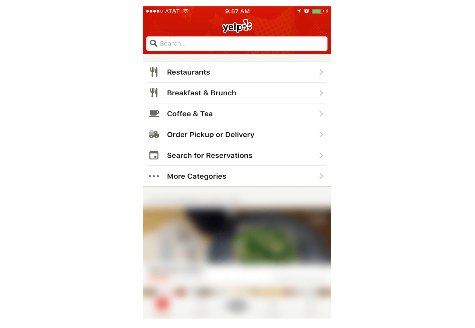
5. Full-Screen Navigation
While with other patterns mentioned in this article, the struggle is to minimize the space that the navigation systems take up, the full-screen pattern takes the exact opposite approach. This approach usually devotes the home page exclusively to navigation. Users incrementally tap or swipe to reveal additional menu options as they scroll up and down.
This pattern works well in task-based and direction-based websites and apps, especially when users tend to limit themselves to only one branch of the navigation hierarchy during a single session. Funnelling users from broad overview pages to detail pages helps them to home in on what they’re looking for and to focus on content within an individual section.
Full-screen navigation in Yelp
Using full-screen navigation, designers can organize large chunks of information in a coherent manner and reveal information without overwhelming the user. Once the user makes their decision about where to go, then you can dedicate the entire screen space to content.
Conclusion
With navigation patterns for mobile, there isn’t a one-size-fits-all solution; it always depends on your product, on your users, and on the context. However, the foundation of every well-designed navigation is information architecture: clear structure, priorities, and labels based on your users’ needs. Helping users navigate should be a top priority for every app designer. Both first-time and returning users should be able to figure out how to move through your app with ease.


 Screen space is a precious resource on mobile. To meet the challenge of small screen space while still making navigation accessible, designers often rely on hiding navigation behind the hamburger icon, a prime example of hidden navigation. In this article, we’ll see why hidden navigation creates bad UX and what alternatives are available for designers.
