Anatomy of High Converting Mobile Web Pages: Learn What Makes or Breaks a Responsive Design!

In 2020, smartphone sales were 1.57 billion units worldwide, an increase from 1.52 billion units in 2019. Such impressive figures continue when we look at the world’s tablet shipments and deliveries. In the third quarter of 2020, Apple alone shipped 13.9 million units of tablets. These figures, as surprising as they are, make us think about the impact on mobile websites and website owners. The demand for smartphones and other mobile devices have been responsible for connecting 4.66 billion people with the internet. This number has gone up by 7.3 per cent since last year. Out of this, mobile internet traffic has been more than half of all the internet traffic all around the world. As a website owner whose website is not mobile-friendly, this is a matter of great concern and something to help shape our website in the correct direction.

It is now time that website owners understand that mobile users are top priority and should be taken seriously. If you are still backing on the desktop website with a bunch of media queries and letting luck shape your revenue, I will help you decode the importance of responsive design and how to make a high converting mobile web pages.

Responsiveness and Conversion Rates

A lot of the people take the responsiveness and conversion rates as a cause and solution pair in the website world. But converting a mobile web page is a much more complex process than just making your website responsive or mobile-friendly. Sure, responsiveness is an important aspect of conversion and is the first step in the website development but it alone cannot increase your CTR. In 2015, Google started giving more preference to responsive and mobile-friendly websites. Improving for a better experience for their users, Google does not want people to keep searching for that one perfect website which is rendered proportionately on the device. This move gave the website owners a wake-up call to focus on the user experience and mobile-friendliness as much as possible.

So how can we improve our conversion rates once we have the responsive website built? To be fair, responsiveness is more concerned towards scaling your website up and down. If my images are scaled in the proper ratio on a 5.5-inch device, I have got a responsive website. But the user is never concerned about responsiveness. Instead of praising the scalable elements, the user is more concerned about how fast those elements rendered on to the device? My user is more concerned about their own preferences and benefits.

Nearly 8 out of 10 users bounce back when the content is not properly visible on the mobile device. Such anomalies on the mobile website bring down conversion rates and affect the business. In the subsequent sections, we will focus on things that are responsive in nature (no doubt!) but is not enough that can make the user click that CTA of yours or purchase a product from your website. Soon we will realise that responsiveness has much more than what meets the eye. Let’s see how we can put ourselves up to the user’s expectations.

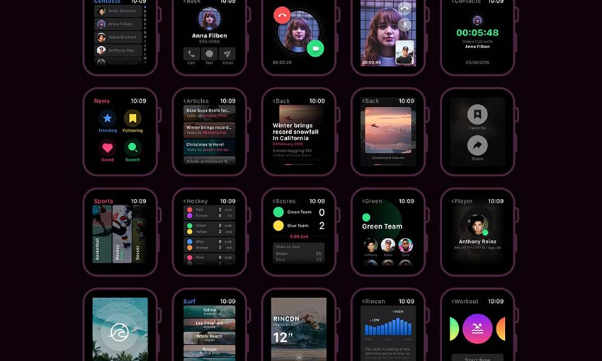
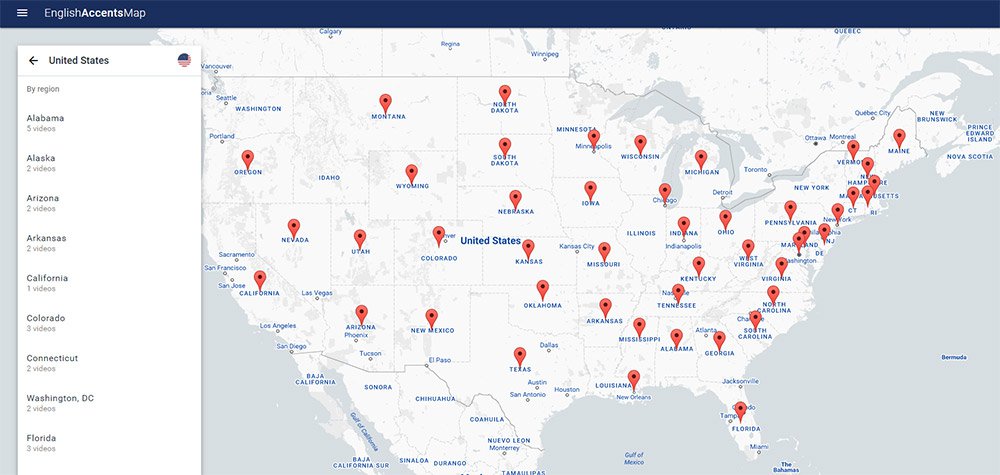
PS – We have used LambdaTest LT Browser to show website view in various device viewports. Know more here – https://www.lambdatest.com/lt-browser

Do you need all the content on the mobile?

The first thing to ask in developing a website for mobile is the content you are about to show on the device. A device’s screen is small, which means you have to show less but relevant content on the small space provided to you. The content should be able to communicate to the user without using too many words. A user is not going to read everything just to find if he gets anything pleasing for himself. That is your job to show him what he needs to see. The content analysis can be boiled down to three major categories: the headline, the font size and the content.

What’s a perfect headline?

A web page starts with a headline which is probably the first thing a user sees. This is your chance, the moment that decides whether the user will increase the session duration or will bounce back. The following two website ranks on the first page of Google for “real estate solutions”:

Anatomy of High Converting Mobile Web Pages - 1

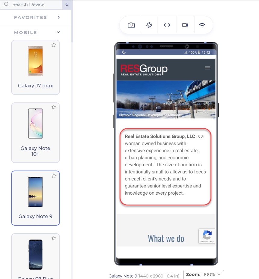
The above landing page is from RESGroup while the below screenshot is from Getrealestatesolution.

Anatomy of High Converting Mobile Web Pages - 2

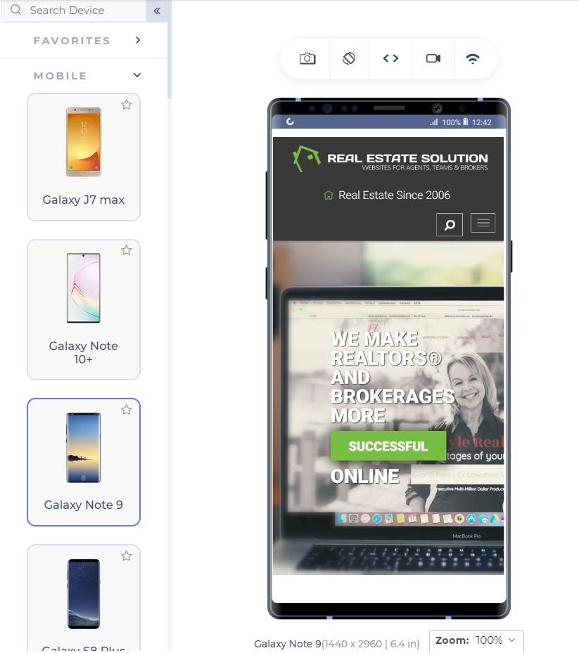
Apart from a weird header which is taking 25% of your valuable screen space, the headline is concise and easy to read. The RESGroup have focussed on a long heading (if that what it is) and forces users to scroll the entire page to find something meaningful for them. A good point to note is that although building up trust on the user is important by embellishing the web page with your achievements, a user needs to find something which they can use. They rarely care about what you have to offer but more about how they can be benefitted. Remember, a user makes up his mind about the website in just 50 milliseconds.

Scrolling from up to bottom and reading about your achievements will result in an increased bounce rate. Getrealestatesolution is building up trust and showing their achievement both cleverly into a single line: “We make realtors and brokers more successful”. This more or less would translate to “We are capable enough to make you successful” and “You will be successful if you join us”.

Font-Size: Should my user zoom in?

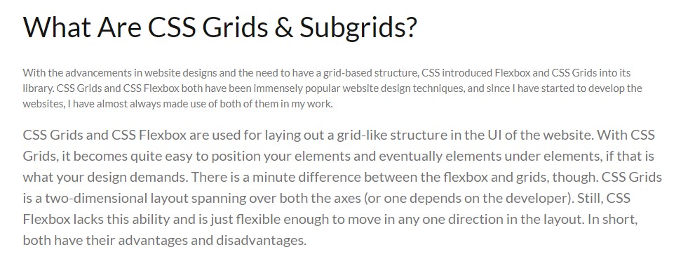
Font-size is an extremely important part of a landing page (or any other page) to determine the conversion rate of your website. A font-size of 16 px or 1 em is considered perfect for good readability of the content. Although one might argue that they can still read properly on 14 px, there are a large percentage of visually impaired people to be taken into account. The main target audience of the majority of businesses lies in the range of 15-49 years which is 28% visually impaired, as per WHO data. The following screenshot shows a blog on CSS Subgrids with 12 px font and the original font below it.

Anatomy of High Converting Mobile Web Pages - 3

Although text can be enlarged by zooming into the mobile device, it moves the content out of the screen and makes the screen scrollable which is not liked by the users.

The relevance of Keywords- Which words to choose?

The final thing to remember while presenting content to the user is to use specific keywords which are relevant to the user. Mobile screens are very small with 5.5 inches being the most popular among the users as per a 2019 study. With a little time and smaller space in our hands, we want to gain a user’s trust as soon as possible so that he sticks on the website and does not bounce back.

The specific keywords process first starts by eliminating all the redundancy and loose words. Words such as “very”, “extremely”, “best” etc are considered fillers in the content. “We are very professional and provide the best services” could be transformed to “We are professional in providing real-estate services”. The second sentence is more effective and uses 1 less word than the first.

After elimination comes the relevant keywords to pitch to help you convert through the web page. These keywords will work as something your user can trust upon. At least, the user should be well convinced that you are the best and believe me, writing “best” does no charm in conversions. So, instead of being verbose and explicitly pitching your projects, choose minimal but effective words that show your confidence, experience and professionalism. In my analysis, I found two interior design services websites that portray this point quite clearly.

This is the landing page of Woodenstreet

Anatomy of High Converting Mobile Web Pages - 4

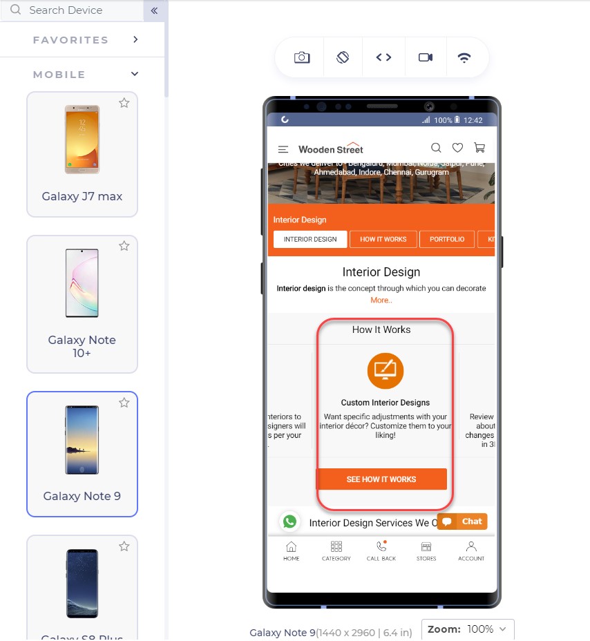
In addition to proving our point of small font-size, the only effective sentence in this segment is “Customize them to your liking!” which makes me feel the fact that I will have control over customizations but not a strong one. The words are loose to build trust over to the service company.

Another competitor of this website is Livespace. The same section on their website looks like this:

Anatomy of High Converting Mobile Web Pages - 5

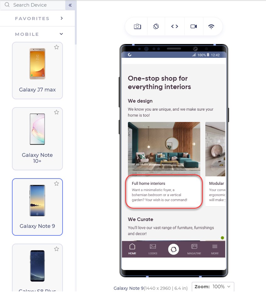
The segment focuses on keywords and experience by the lines of sophisticated keywords that will lure the user. I too want someone who knows a bohemian bedroom!! (Just Kidding!)

Also, notice the transformation of the same sentence in these two websites. Where Woodenstreet says, “Customize them to your liking!”, Livespace says, “Your wish is our command!”.

Which one do you think has more weight to convert your page?

For the enhancements of the content, you do not need to remove the white spaces and fill every gap on the web page. White spaces are good! They let the elements breath in the congested space and every element can get proper attention from the user. For larger content, you can also use bullets that can deliver more information in lesser sentences.

To ensure yourselves of the appearance of your website on mobile devices, you can use tools which can help you emulate the experience. A developer-friendly browser such as LT browser is also a great choice since it provides a complete solution with loads of features (including a debugger) and performance reports to analyze. LT browser can show you your website on any mobile device of your choice in a couple of clicks.

Test Responsiveness on LT Browser

Emulators and simulators have been long used to test the website on different devices. But today, for a specific tester’s need, we can take advantage of a mobile-specific testing browser that provides a complete environment for the tester. A developer-oriented browser such as LT browser can provide additional features highlights of which are given below:

  • A large list of in-built tools: A list of 40+ in-built screens can render the website in a couple of clicks.
  • Comparison Grid: A comparison grid shows two mobile devices side by side for the testers to compare. The tester can also use scroll-sync to mirror his actions on both the devices simultaneously.
  • Screenshot capture and Session recording: The tester can take screenshots of the device screen and mark a bug and send the video/image to the team.
  • Third-Party Integrations: The third-party integrations allow the developer to share the bugs or issues with their teammates with a single click.
  • Network Throttling: A very important feature to check user experience is how the website performs under various network bandwidth. This can be achieved with network throttling in LT browser.
  • Local Testing: Local testing allows the developer to test their website even before publishing it on a domain service. With the local tunnel, they can view the website on any device from the local system.
  • Performance Report: To analyse the final performance, developers and testers can view the performance report and share it or save it for future use.

The thumb zone and its importance in conversion

The thumb zone has been a conclusive argument for some time now and a strong foundation to many pieces of research in mobile designs and mobile web implementation. The thumb zone is the area on the mobile screen determining how hard or easy it is for our thumb to reach a certain point. A research study by Hoober concluded that 49% of people operate their mobile phones with one hand and only a 15% with two hands. Among those who do, 67% are operating through their right thumb with two major positions:

Anatomy of High Converting Mobile Web Pages - 6

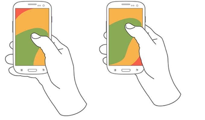
Note: The second image is placed slightly above as compared to the first image.

The color that you see in the above image: is our thumb zone. A thumb zone in general for a person using their phone with one-hand can be magnified as follows:

Anatomy of High Converting Mobile Web Pages - 7

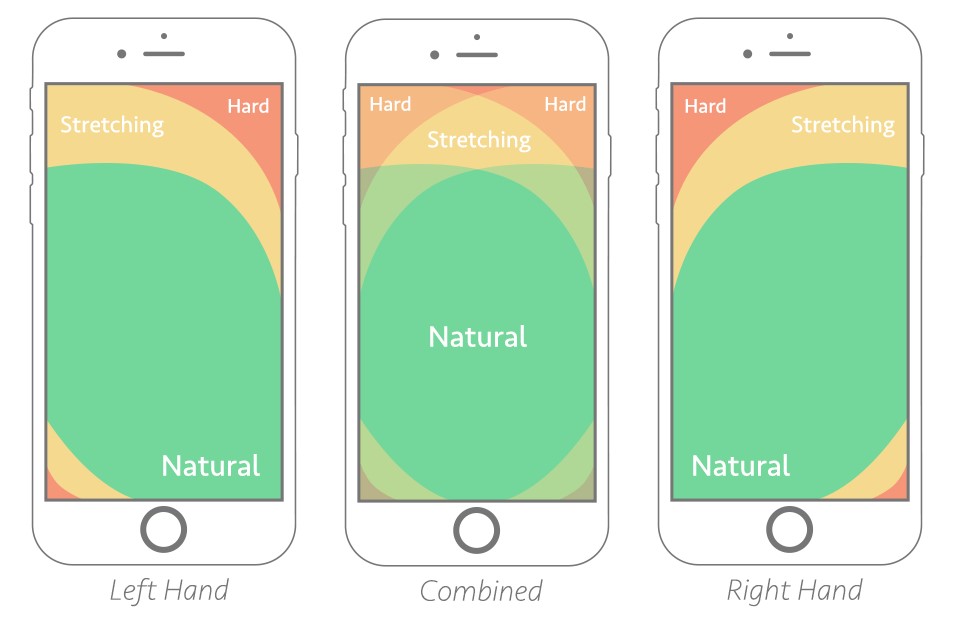
The green zone is the easiest to achieve: hence the most important for our conversion goals. The yellow zone is a bit hard to reach but manageable: something we can put less important things in such as headings and other content, things which are not clickable. Finally, the red zone is the toughest to reach and is the worst place to put our CTA.

Another worst position to put our CTA is at the bottom of the page or deep down below. No user would want to scroll down 4 5 times and search your CTA on the webpage. A lot of them probably don’t even know about CTA buttons and if it exists on that website or not.

The best way is to put CTA in the thumb zone and on above-fold in the first web page view. Amazon has put similar thought into their CTA and the following is their landing page:

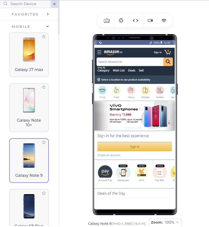
The Sign In button is exactly where our green zone lies with the width being enough that we do not touch anything accidentally.

From the above page, we observe two interesting things: first the Sign In is also available at the top right (the hardest) position too and our green zone has another CTA “Create Account”.

Having two sign-in options reminds the user about signing in two times. You would see the button anyway even if you do not click that. LiveSpace uses the same approach on its website in a little different way:

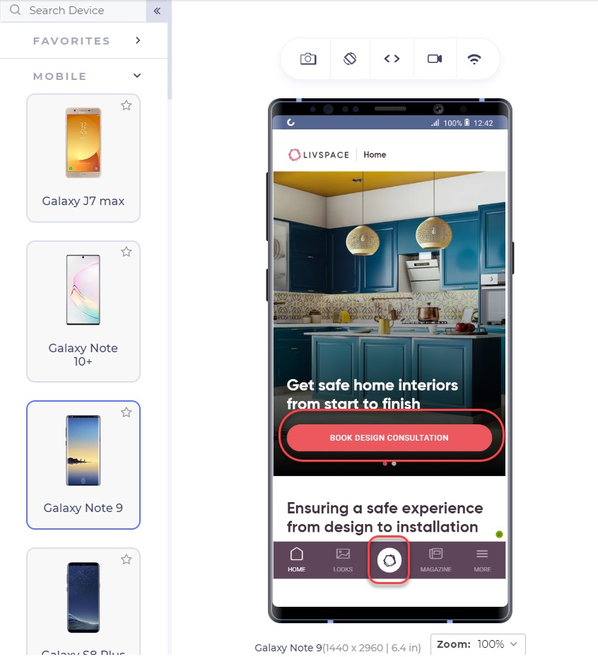
The bottom button is fixed and is a constant reminder to “book design consultation”. The second approach is interesting. There are two possibilities of an unknown user: either he signs in (given that he has already registered) or he creates a new account.

Deciding among the two is important for an owner to come to a final conclusion of primary CTA and secondary CTA. Having two CTAs is generally not considered a good approach as it confuses the user but even if you do, one of them should stand out in comparison to another, as in Amazon.

What CTA to use?

As a website owner, you might have a lot of services to provide: a consultation booking form, you want to showcase your cheap pricing too! And you want them to call you by a single click from the home page itself!! A CTA can increase your revenue with high conversions but a CTA cannot be the developer’s wish. It has to be what the audience wants. To increase your mobile conversions through CTAs, you need to analyse what your visitors are more interested in.

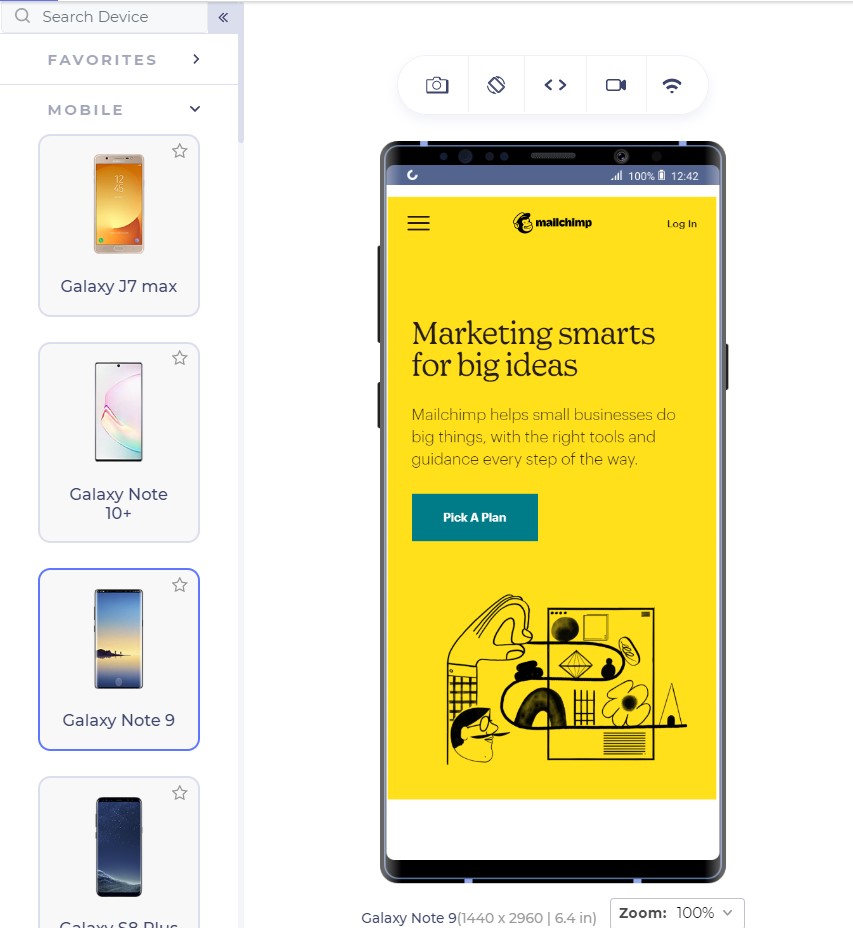
Google Analytics is a great way to start here. Google Analytics provides the keywords your visitor is most interested in. Mailchimp has a lot of good features which can be used as CTAs for example, “Start Campaign”. But their website on mobile uses the CTA linked to pricing:

CTAs are something to ponder upon and it is also a good idea to include a good input from the marketing and sales team which can suggest to you the user’s inclination quite well.

With keywords in hand, the next step is to think about the CTA text that can bring out more conversions through a responsive mobile web design. In the above screenshot, Mailchimp could have used, “See pricing” but they went with “Pick a plan” even though the page links to the pricing page.

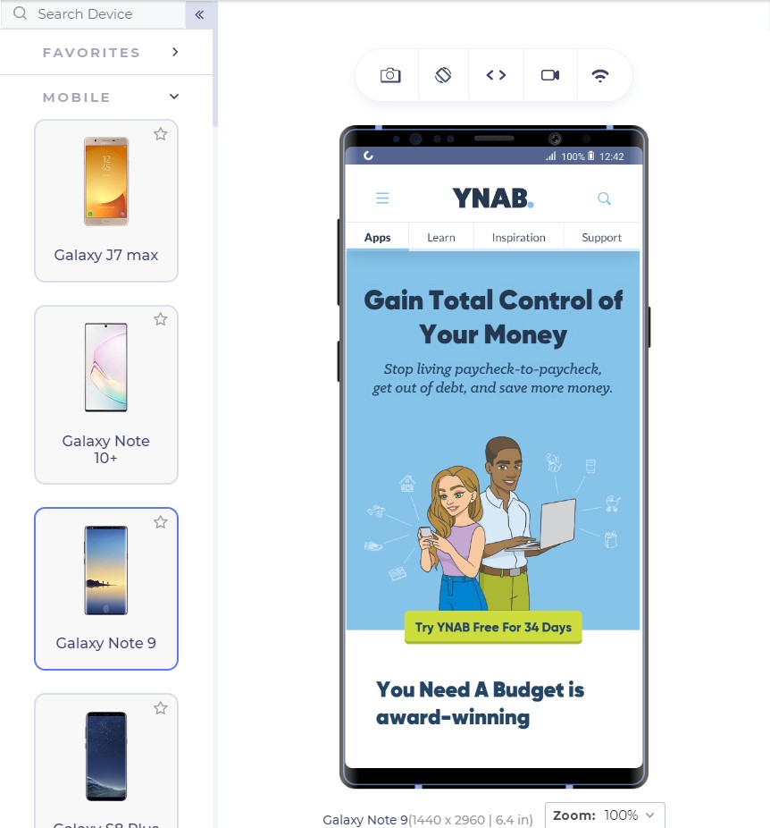
Similarly, Youneedabudget provides the user with “Try YNAB Free For 34 Days” instead of Sign Up or Try YNAB Free.

Research these words and find out why your user visits your website. Show them exactly what they are looking for through the CTAs and the conversion rates would see an increase.

The CTA should also look like a “CTA” and work like one. If the CTA gets blended into the background and looks like a ghost button, it loses its purpose. CTAs should be a contrast in colour speaking out loud and demanding attention from the user; that is what they are there for.

Mailchimp does that perfectly with a little darker shade of yellow in the background and CTA with blue; a complete contrast.

For business providers looking for direct leads, forms work as fine as a button since they cannot provide all the information in concise segments and users have a lot of other doubts. For example, interior designing. Interior designing has different requirements for different users and personal contact is necessary. A responsive form works as a great CTA here:

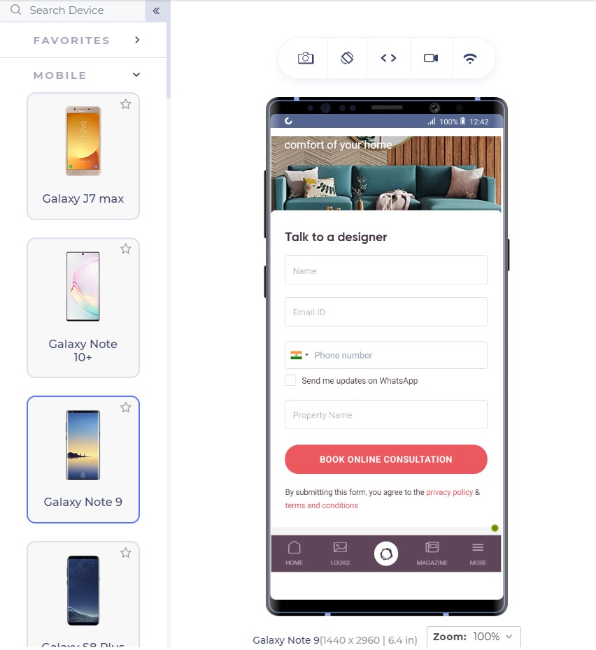
The number of fields is important to understand the conversion rates. A user is not interested in filling too many fields and will bounce back too easily. Quicksprout shows how the number of fields leads to a lower conversion rate on the mobile:

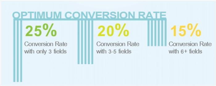
More than 5 fields in a form is intimidating for the user and the user is unlikely to complete the form. If you cannot manage to lower down the fields below 6 or 7, use the autocomplete feature of the browser in your HTML code so that the user can quickly fill out the form in one tap. Autocomplete is available in major browsers today and is helpful for the user.

If your CTA is a call button, it should be a one-click button instead of plain text. Do not expect your user to take the burden of copying the number and moving onto his dial pad, paste it and then call you.

Remember the 2-second rule!

Google aims at 0.5 second load time when it comes to loading any Google’s product. But don’t worry, we still have not touched such a high-performance statistic practically although we have come a long way in the last decade. Google states that 2 second is the user’s “acceptability” for the website load time. So how is it affecting our conversion rates?

As it turns out, the bounce rate depends heavily on the website loading time:

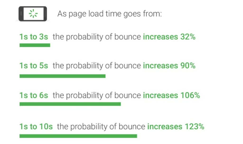
Gone are the days of 2G connection when people could wait a hundred seconds for the website to load. With the increase in elements on the website leading to a lower load time, the conversion rate drops by a whopping 95%!!

What can we do to increase loading speed?

The question drops to the mind as to what we can do as web developers to decrease the web page load time when the network plays a vital role which we have no idea about. As a developer, we can follow a series of checks on our responsive mobile design to ensure higher conversion rate and simultaneously lower bounce rates:

Content Display Improvement

A good way to start is to code the web page to display something (if not all) to the user as early as possible. For example, AJAX queries are a great way to show a partial content to the user on the first view.

Server Improvement

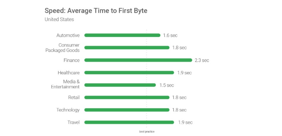
Use a good server!! Servers play an important role as they are responsible for not only communicating with requests but also sending the first byte to the user. Google recommends a time of 1.3 seconds for the mobile server to communicate with the first byte. The lower the better.

The figure shows recommended average response time of the mobile server in various categories:

Request Count Optimization

Lowering the number of requests to the server also decreases the overall page load time. The lesser number of requests would generally mean lesser elements to fetch. While Google recommends less than 50, today’s average lies somewhere between 120-170.

Weight of Elements

An extremely important factor in determining the loading speed of the website is the weight of elements present in the mobile web page. The study found out that websites use too many elements in order to lure the users which slows down the loading speed even on the 4G connection (which is the most popular). 70% of the pages took 5 seconds for any visual element to first appear on the web page. This has made the average loading time to 15 seconds as compared to the recommended 2 seconds.

The main culprit; images. Providing an extremely high-quality image will just decrease the conversion rates especially the ones which are nowhere related to the product such as background or achievement thumbnails. Applying very high-quality images without compression can load up the page to as high as 4MB which is more than the average.

The analysis is done in the study also found an image worth 16 MB of size on a web page which is a simple blunder, an invitation to decrease the conversion rates. What can we do? Compress these images and use proper image formats.

By simply compressing the images on the web page, the developers can save up to 250 KB of size on as high as 25% of the website analysed. Image format can help you in decreasing the load time too. Out of all the mobile-friendly websites, 46% use JPEG and 28% use PNG. The reason behind the success of JPEG is that it is a lossy compression losing bits in the process. JPEG is a great format to use when too much focus is not on the extreme detail of the image like nature images, landscapes or background color shades etc. PNG on the other hand is lossless and saves the bits in the process. PNG images are great when sharpness, details and observations are required in the image.

The following image is a JPEG image:

This image is of a natural scene and hence does not demand very small details for the user. Your user will not zoom into the Taj dome to check out the colour shade. This image makes about 127 KB in size.

The same image in PNG consumes 714 KB of the web page which is extremely unnecessary.

To determine your website’s performance, you can use a trusted tool PageSpeedInsights by Google.

To increase the speed of the landing page, developers can also make use of CDN or Cache that web service providers such as Amazon offer. These are very fast and help store data according to the geographic locations.

A/B Testing and you are done!

When Google launched ads on Gmail, they were not sure which blue colour to use. In their experiment, they decided to provide different shades of blue to different users and see their response. With 1% of users getting one shade and another 1% getting another, Google ended up testing among 40 shades of blue to 40 different groups. The final blue selected in this experiment earned them an additional $200 million in revenue.

This is termed as A/B testing. A/B testing is a process of comparing two different versions of a web page by giving them to different groups and recording their response. A/B testing has been used extensively today to finalize the colour, location or size of the CTA button. An experiment between green and red CTA buttons showed that the red CTA button performed 21% better on 2000 page visits. The 21% increase in the conversion rates points towards how important A/B testing is today.

This does not mean every red CTA button will outperform green ones. Performing A/B testing will provide conclusive results by which you can increase the conversions and they are different for different websites.

Not only CTAs, as a developer you can also test the headlines, buttons and other important content to decrease the bounce rate which eventually does result in increased conversions. You can use Heatmap tools for A/B testing.

Conclusion

If you ever believed that responsiveness is everything there is to increase the CTR, you are not alone. The researches and studies have brought out a lot more about the behavioural aspect of a user than we knew before. From colour to the font-size, conversion rates on a mobile device is like a house on wooden pillars. All of them together increases the CTR to its capabilities and give your revenue a boost up.

Apart from the points discussed in this post, as a developer, you can also perform certain enhancements on the website for better conversions. User experience always matters on a mobile website. Whether it is conversions, word of mouth or any other target, you will always be rewarded for a better user experience. Enhancements such as not losing the sessions when the back button is pressed, providing cart support on multiple devices or shutting up the navigation bar in a hamburger menu. These enhancements are always noticed by the user and the easier it is for him, the better are the chances of conversions. So the next time you are busy developing your website, make a checklist and boost up that conversion rate from mobile web pages.

How to Design Mobile Product Pages for Greater Sales

This post is originally published on Designmodo: How to Design Mobile Product Pages for Greater Sales

How to Design Mobile Product Pages for Greater Sales

Mobile e-commerce has experienced a meteoric rise these last few years. And according to recent data, experts predict that the vast majority of online sales will be made through smartphones by 2021. Specifically, it’s believed that 72.9% of e-commerce revenue …

For more information please contact Designmodo

Adaptive vs. Responsive Web Design

Modern websites need to look and function well on every screen. That’s not exactly a newsflash, as web designers have been told this for years. But there is more than one way to go about accomplishing it, such as adaptive design and responsive design, which we will discuss in this article.

There can be some confusion when it comes to the terminology used to describe these techniques. As with so many aspects of design and development, we are inundated with buzzwords. Sometimes they become so mixed up that we (mistakenly) use them interchangeably. True, both adaptive and responsive design share a similar end goal: to ensure a great user experience on large screens, small screens and everything in-between. But they take very different approaches to get there.

Today, we’ll dig into those differences in an effort to help you choose the right solution for your projects.

What is Responsive Design?

The more commonly-used of the two techniques, responsive design rearranges content based on browser size.

CSS media queries are used to set one or more breakpoints – viewport resolutions at which selected elements of a website adjust accordingly. Breakpoints are often set to mimic the screen sizes of popular mobile devices, including phones and tablets.

One common example of this would be responsive navigation. Think of a full-width navigation bar displaying on larger screens (laptops and desktops). As the viewport shrinks, the menu could conceivably be set to adjust any number of ways to make use of the space available. Then, on the smallest of mobile screens, that same navigation is then hidden beneath a “hamburger” menu.

Responsive multi-column layouts are also quite popular. Designers often configure them to “stack” on top of each other on smaller screens. On mid-sized screens such as tablets, columns may remain in-tact or partially stack. The feature is actually built into CSS specifications such as Flexbox, which automatically adjusts columns according to screen real estate.

Advantages of Responsive Design

Perhaps the biggest advantage of using responsive design techniques is that users get essentially the same website on every device. That continuity allows frequent visitors to more easily find what they’re looking for.

In addition, adding responsive elements to CSS is relatively straightforward. It’s a matter of taking what’s on the big screen and adjusting accordingly for various breakpoints. Even older websites designed before the smartphone revolution can be retrofitted without too much trouble.

Lastly, since the content and URL of a given page is the same throughout the full spectrum of viewports, a responsive design is better for SEO. Thanks to that consistency, search engines tend to handle these websites a bit better.

Disadvantages

Going responsive is not all good news. Some website layouts may be fine on a big screen, but are more difficult to manage on smaller viewports.

Massive amounts of scrolling might be necessary – even if that isn’t quite as taboo as it used to be. Also, some interactive or code-heavy elements may simply be too slow and cumbersome to use on a phone.

A mobile phone - Adaptive vs. Responsive Web Design

What is Adaptive Design?

Adaptive design, also referred to as “progressive enhancement”, is the process of creating several fixed layouts for various screen sizes. In essence, a designer could create completely different experiences for phones, tablets and desktops.

The idea is that you start with something very basic and then “enhance” the experience for larger screens. The more screen real estate a user has, the more bells and whistles will become available.

One way to visualize the difference between adaptive and responsive design: observe how a given website reacts as you resize your web browser on a desktop device.

A responsive website will continually adjust content as you reach specific breakpoints. Columns may stack, containers and typography may scale.

With an adaptive website, there is an absence of a constantly-shifting layout. Instead, new breakpoints may bring completely new layouts – and thus, even some potential differences in content. For example, some items deemed unnecessary on a phone may be removed altogether.

Advantages of Adaptive Design

Implementing an adaptive design means really putting users first. By crafting a separate experience for a specific screen size, designers can limit the pain points that often come with responsive sites.

Mobile users, for instance, will see only the design and content elements that are relevant to them. The website should, in theory, be easier to navigate and content easier to digest on that smaller, touch-enabled screen.

Then, as more screen size and computing power come into play, those extra features are added in. Adaptive design is understanding that the web is not one-size-fits-all.

Disadvantages

Because you’re creating separate experiences, implementing adaptive design techniques can be very time-consuming. This is especially of concern for projects that are on a tight budget, deadline or both.

Then there is also the potential for an inconsistent user experience. Attention to detail is incredibly important here, as a website will need to provide a separate-but-similar look, feel and functionality. Missing a detail or making a few poor decisions in the design process could hamper the ability to use the website on one or more devices.

Speaking of devices, new ones are being released all the time. Some have unique viewports and could conceivably be served the “wrong” layout. Therefore, it may require routine checks to ensure your site is working with the latest technology.

SEO is also a concern for sites that serve up mobile-only editions using “m.yoursite.com” and the like. That won’t come into play in every situation, but still worth considering if your project is affected.

A desk with design tools - Adaptive vs. Responsive Web Design

Choosing the Right Design Technique

How do you know which technique is the best fit for your project? In many cases, it may be a matter of time and money. To that end, responsive designs are quicker and cheaper to implement.

If you’re using third-party products like WordPress themes – which often come with responsive styles –  that decision has already been made for you.

However, adaptive design still has its place. For larger websites that have the budget and time resources, designers can craft an outstanding experience for every device using adaptive techniques.

Either way, the bottom line is ensuring that your website works well for every user. Thankfully, there are two highly-proven methods to make it a reality: adaptive or responsive design.

10+ Examples of Responsive Websites That Got It Right

When designing a new website, there’s a long list of specifications and requirements you have to fulfill. It’s just the nature of web design these days. And at the top of that list sits responsive web design.

Thankfully, high-quality WordPress themes like BeTheme make it insanely easy to check off all the technical requirements you’re expected to meet — including responsive design. But why does it matter so much?

Well, for starters, more than half of all website traffic takes place on mobile according to data from StatCounter.

While desktop has put up a good fight for a couple years, mobile has prevailed as the winner. It will continue to do so, too, considering how much more convenient it is to access the web from the palm of one’s hand.

Plus, Google has made it clear that it rewards responsive web designs and mobile-friendly websites with better search rankings, so there’s no hiding from it now.

Responsive web design is a must.

Just keep in mind that following the rules for good mobile design doesn’t mean you ignore desktop users. By prioritizing the mobile experience, you can design more beautiful and efficient websites for all users.

Let’s look at some examples that demonstrate how to do this well.

Responsive web designs that encourage leaner desktop experiences

Just because you have more space to work with when designing for desktop users doesn’t mean you need to make the most of every pixel.

In fact, as Internet-enabled devices have grown smaller in size, it’s encouraged many designers to create leaner and more efficient experiences on desktop.

Take the website for designer/developer Rob Grabowski, for example.

This is how his website appears on a mobile screen:

With minimized logo and navigation out of the way, this allows the focus to remain on his photo and welcome message. Desktop visitors encounter the same thing:

This consistency in design is great because it enables visitors to seamlessly transition from viewing a website on one device to another (which happens often).

Mobile web designs that improve the decision-making process

Consumers today struggle with an overabundance of choice. It might be easier to find that thing or service they’re looking for, but that doesn’t make choosing between similar options any easier.

One of the benefits of responsive design is that it forces web designers to create websites in a modular fashion so that, as the screen size shrinks, each section falls in line beneath the others.

In turn, this makes it easier for customers to review options one-by-one. BeRepair, one of the 500+ pre-built sites from BeTheme, demonstrates this point really well:

This is one of the services offered. Notice how the responsive layout allows the visitor to really focus on the details before them and not get distracted by too much information.

This works well for other types of websites. Take, for instance, the BeRestaurant pre-built desktop site:

It’s a great-looking restaurant website. The mobile counterpart looks just as great, but minimizes the distractions so the core elements can really shine:

Rather than try to fit the menu to the right of the food images, the responsive website maintains the integrity of the original design by tucking it into the hamburger menu icon in the top-right.

Again, this is all about giving your visitors the ability to pause and really focus on the key actions you’re asking them to take. A navigation bar in full view would only distract from that.

Responsive designs that cut out the excess

Think about the last time you went to an art gallery or museum and the kinds of paintings you encountered:

  • The landscape murals that have a central focus but beautiful details surrounding it.
  • The portraits with a singular focus that’s chock-full of intimate details.

What’s cool about responsive websites is that they allow us to display the same web page in both formats.

Desktop screens thereby display landscape murals and mobile screens display portraits. But it’s important to know where the excess is in the desktop view so you can trim it back enough to make the mobile experience worthwhile.

For instance, this is the desktop site for BeITService:

This is a great looking hero banner on the home page. It’s well-balanced, the colors are carefully chosen, and the message is crystal-clear.

This is a good example of how smart designers have become when it comes to choosing responsive images for websites.

Here’s that same image and banner from above, but now displayed on mobile:

The image may not appear in full, but there’s nothing lost in this translation from desktop to mobile. What’s more, the message remains front and center.

Culturally Connected does something similar:

On desktop, it shows an elaborate background graphic that enhances the overall design. On mobile, however, it turns into this:

Even with the image now reduced and placed at the bottom, it’s still a striking design that allows the message to really shine through.

Another great example is BeTutor. This is how the desktop version looks like:

Here we have the main title and some more info using smaller text. In order not to cramp the mobile view, the design omits the extra content and focuses on the primary message:

The mobile view stays uncluttered without loosing any of the important subject matter that reveals the type of service offered.

Responsive websites that leverage their space

While a small screen requires reducing content in most of the cases, some responsive web designs leverage the space and use the different ratio to their advantage.

Take 1987 Masters for example:

While the desktop version focuses on their main tagline, the mobile version makes use of the vertical space and shows more content, giving the mobile visitor an option to learn more about the company right away:

So a mobile design don’t necessarily have to show less content in order to work well.

The mobile screen ratio allows for making use of the vertical space, like it’s shown in this example of BeCosmetics. Check out the desktop view:

The mobile view has more vertical space so the introductory content can be shown along with the button that invites the user to explore all products:

Once again, these examples demonstrate that less space doesn’t need to mean less useful content for the mobile website user.

Responsive websites that enhance readability

When laying out text on a desktop website, you have to be careful about how much you show to a reader at once. Put too many words on a line or not include enough spacing between letters, and your visitors might skip reading it altogether.

It’s a tricky balance to maintain and usually requires visual elements to balance out the text. Take, for example, the BeDanceSchool site:

Thanks to the funky designs and eye-catching graphics around the text, it’s easy for visitors to focus on the content and read it all the way through.

This won’t work on mobile though, which is why it’s important to understand the strengths of each screen size. Here you can see how that same text from above should be handled on mobile:

The design is paired back immensely so that all the visitor can see is the content. But that’s okay because the text is still beautifully styled which helps keep attention.

That said, text presented to mobile visitors doesn’t always have to be so heavily styled. If you select the right font size and type, you can create something that’s readable and engaging just as Base Coat does:

Just be mindful of the vertical length of text on mobile. While it might be easy to see where it ends on desktop, it can seem daunting on mobile if it appears to go on and on.

Mobile sites that put a spotlight on visual content

Responsive web designs aren’t just useful for websites with lots of text. Because of the way content responds to smaller screen sizes, visual storytelling elements look great on mobile, too.

Here’s what visitors see on the BeBand website on desktop:

Mobile screens don’t have the ability to play with balance as in the example above, but they do have the ability to shine a spotlight on the images you’ve chosen:

Websites that contain eye-catching images like this one would certainly benefit from responsive web design.

It’s not just static images that this works with either. The Scott Resort, for example, invites first-time visitors to watch a video:

Regardless of what kind of device the visitor is on, the video automatically conforms to the width of the screen.

This is the video on desktop:

And this is the video on mobile:

With a mobile responsive design, you really allow your content to adapt to the device and experience your users want.

Mobile responsive sites that collect more leads

Although more website traffic comes from mobile devices, it’s still quite difficult to get mobile users to convert as much as they do on desktop. That’ll come with time, but we’re not there just yet.

In the meantime, your responsive site needs to be prepared to capture leads whenever it can to improve those conversion rates.

Let’s take a look at how this works.

This is the pre-built site for BeClub:

This “Newsletter” section stands out beautifully on the homepage. And because it’s so convenient (e.g. it’s light on text and requires only one field be filled out), it’s likely to get a ton of subscribers.

This is how that same subscriber form appears on mobile:

Again, it’s really well done — and the smaller, dedicated space on mobile might be an even more effective way to catch the attention of potential subscribers.

So, if you can design your responsive site to collect visitors’ email addresses, you’ll empower them to reconnect with your website from their preferred device. As a result, you can increase the number of conversions it gets.

Responsive web designs for the win

When WordPress users go looking for a theme to design their website with, they look for qualities like:

  • Ease of use
  • Cost efficiency
  • Features
  • Customizability
  • Overall design quality

It’s easy to take responsive web designs for granted because we see them everywhere, but, the truth is, not every WordPress theme is built with the mobile user in mind.

BeTheme is different. Each of its 500+ pre-built sites comes with mobile responsiveness baked in.

So, when you use BeTheme, you can spend less time stressing over how to make your website look like the responsive designs above and more time getting your new website online and in front of consumers.

10+ Examples of Responsive Websites That Got It Right was written by Bogdan Sandu and published on Codrops.

10 Free Mobile UI Kits For Sketch

You can find plenty of free mockups online, but most cater to Photoshop users. In recent years Sketch has grown rapidly with tons of plugins and free tutorials to help beginners move into this alternative UI design software.

This also means you’ll find tons of awesome Sketch freebies online ranging from complete mockups to detailed UI kits. And in this post, I’ve curated my top 10 picks for the best freebie UI kits for any Sketch user.

All the Mobile UI Kits You Could Ask For


iOS Design Kit

ios sketch design kit

Every new release of iOS prompts an updated GUI kit and this freebie is by far the most comprehensive one to date.

It covers all the major elements for iPhone and iPad apps with free kits for most design software. You’ll find PSDs for Photoshop too, but you can download just the Sketch files with the same iOS-styled vector elements.

These elements all come in @1x size, but since they’re vectors you can easily resize them without any quality loss.

Google Now UI

google now uikit

One of Google’s lesser-known projects is the Google Now prediction app. Designer Manu Akash created a variation of the Google Now UI as a Sketch freebie.

This kit features a lot of the main application pages but also uses styles from the material design library. It’s a great freebie to keep saved if you want to design Android apps while following Google’s design styles.

Blog Kit

blog uikit sketch

Free blogging platforms like Medium have changed the face of writing on the web. And this free blog UI kit shows what’s possible with a great mobile application UI following that same tactic.

Designer Thomas Budiman created this blog/writing kit for Sketch with a focus on mobile app design. It spans many different types of interfaces like gallery pages, article archives, and signup/login forms for new users.

Move Mobile UI Kit

move ui kit sketch

Move UI is a free mobile app mockup pack created by Czech designer Volodymyr Kurbatov. This pack doesn’t focus specifically on elements, but rather on screen designs and interfaces for different situations.

But in these interfaces you’ll find all the common mobile elements like buttons, input fields, tabs, post archives, slideshows, and pretty much everything else you might use for a custom mobile application.

This freebie is hosted on Gumroad so it works through their checkout system, but notice it’s a whopping $0, so it won’t cost you anything to download.

Coffee Shop iOS Kit

coffee shop ios kit

For a very unique eCommerce-style UI kit check out this coffee shop freebie designed in Sketch. It mimics an iOS application for a local coffee shop with over 50 screens covering the shop menu, checkout, and product pages(among many others).

The coolest thing about this freebie is the ease of use. You can take this design and customize it however you want to create any type of mobile eCommerce interface.

Each element is a scalable vector and the text is all based on free Google Webfonts.

Social Leads App

social lead gui kit

Social media is a huge part of today’s web and this freebie offers a really cool start for mobile designers.

The interface kit comes with a handful of screens showcasing a social marketing application. The screens feature user lists, login fields, profile pages, and photo upload/edit screens for interactivity.

Many of these elements can be expanded to a full website layout so don’t feel constrained to a mobile design. This UI kit also follows the material design language so it’s best suited for Android or Google-type interfaces.

Bootstrap UI Kit

bootstrap ui kit sketch

The Bootstrap library is hugely popular amongst designers and it’s the fastest way to get a new project online. You can always start by coding the layout first, but it’s usually easier to work with a mockup like this BS3 UI kit.

This is totally free to download in both AI and Sketch format. Each element perfectly matches with the Bootstrap 3 kit, and it uses Glyphicons, just like Bootstrap.

If you’re designing with Bootstrap, then you’ll absolutely want a copy of this freebie.

And if you’re eager to move into Bootstrap 4 then check out this Sketch freebie of the BS4 grid system. It’s not a complete BS4 kit since that version is still in Alpha release, but hopefully we’ll see more of those freebies in the next couple years.

Harmony UI Kit

harmony ui kit freebie

This mobile map UI kit features all the pin drops, location arrows, and search features you’d expect from a geolocation app. The Harmony UI Kit by Dawid Młynarz is one of the newer Sketch freebies on this list first being released in mid-2017.

It comes with a dozen mobile app screens of map interfaces and search features for finding directions on a phone.

The UI kit is totally free but it’s also hosted on Gumroad so the download process can feel a little weird.

Tinder iOS UI Kit

tinder gui kit sketch

Here’s another niche mobile UI kit based on the Tinder interface. This freebie was created by Gilberto De La Garza and released for free on Sketch App Sources.

It comes packed with 15 different views for profiles, user lists, dating info, and photo pages. This interface kit mimics the Tinder application, but you can pick out smaller elements from this UI kit and use them on your own.

Sketch is perfect for iOS app design because it lets you resize elements without any quality loss. That’s why kits like this Tinder freebie are so valuable for newer designers just learning the ropes of UI work.

Mobile Wireframes

sketch wireframing gui kit

Digital wireframing is a huge part of any interface project. The process of wireframing and even prototyping helps you map the interface with clarity before designing the colors, textures, and typography.

This mobile wireframe freebie is an excellent place to start. It’s built specifically for Sketch and comes with 57 different mobile interface screens you can pair together.

All of these screens include vector elements that you can also arrange to your liking. A really fantastic UI kit for pre-design work and basic prototyping.

Start Your Project Off Right with 7 Free Adobe XD UI Kits

UI/UX design is tough work. Designing all the little pieces and screens from scratch can end up being extremely time-consuming. Luckily, plenty of amazing designers out there have released UI kits, a helpful resource that can seriously cut down on time as well as providing inspiration.

Premade assets, screens and pages will allow you to get right to the site or app design. Skip all the tedious setting up and start working on the actual product. Here are seven of the best free UI kits, made just for Adobe XD users.

Social Meet Up UI Kit

Social Meet Up UI Kit

An iOS kit made for social media apps, Social Meet Up comes with an absolute ton of content. 80+ screens provide everything needed to create a social network, a perfect launching pad for your app’s UI. The strong, feminine design is just perfect for a project like this. And the kit is built to be easily customized, so keep the parts you like and mix it up with your own brand.

Non-Profit UI Kit

Non-Profit UI Kit

Designed for non-profits, this kit offers everything you need to build a website that looks beautiful and reaches further. Two colors and three fonts create a simple but memorable palette. The responsive website prototype comes with home, about, donation and various other pages relevant for a non-profit. 30+ components and 20+ screens will give you plenty to work with here.

Smartwatch UI Kit

Smartwatch UI Kit

There are plenty of resources for website and app designers, but what about for a smartwatch? With 60 screens, 20 customizable components and 30 icons, this UI kit leaves little to be desired. Whatever kind of smartwatch app you’re making, there’s something to build on here, and plenty of room to add your own unique style.

Pawtastic UI Kit

Pawtastic UI Kit

If you’re creating a website for pet services, look no further. Pawtastic comes with various super helpful components, including a well-crafted sign-up process and various customizable UI elements. The colors and typography look amazing here. And by downloading the free pack, you get 15 wireframes too! This is one that just can’t be passed up.

Fashion Influencer UI Kit

Fashion Influencer UI Kit

Fashion designer? You’ll adore this elegant UI kit. With 10+ pages to work off of and over 50 components, you won’t be running out of material any time soon. These designs are made with a careful, sophisticated style, perfect for a fashion portfolio or an online clothing store. For any project that’s trying to nail the fashionable look, the potential here is unlimited.

Dashboard UI Kit

Dashboard UI Kit

This one is just awesome! If you’re building a site with data visualization, Dashboard has exactly what you need. 15 customizable charts, 10 screens and 100+ UI components – a dizzying amount of resources for your project. The prototype is actually interactive as well, so customizing and even embedding it into a website is no problem. Show the world your designs as you work with this comprehensive UI resource.

Navigo Transportation UI Kit

Navigo Transportation UI Kit

This unique UI kit is designed for transportation and GPS apps – specifically ones made for iOS and iPhone X. With 60+ assorted screens, spread across 6 categories, you’ll find plenty of content to keep you going. There’s even statistics and profile pages to really add some personality to your app.

Easily Create Website Mockups

People who create and release UI kits for free are a godsend for web and UI/UX designers. Finding or creating assets and components eats up so much time. Using one of these kits, you can skip all of that and start drafting your new website right away. Try out one of these professionally made kits and get right to the action! No more scrambling to meet a deadline.

12 Resources for Mobile UI Inspiration

UI design isn’t easy, but you don’t need to figure this out on your own. UI inspiration and design sites exist just for this purpose, giving you access to the latest and most innovative mobile UI. Whether you’re searching for animations, page layouts, or art direction, you’ll find the inspiration you need here.

Mobbin

Mobbin

If you’re looking to stay up to date with UI trends, Mobbin has 150+ apps and 8,000+ patterns to scroll through. The best part of this site is the extensive sorting features. You can filter screenshots by category, content and design elements. Sign up to save the patterns you like best.

Mobile Patterns

Mobile Patterns

What makes this pattern site awesome is the inclusion of animated examples. Any mobile designer knows that animations are extremely important, so it’s great to have a place to find animation inspiration! You can save patterns to your board, which you can then share with others.

UI Sources

UI Sources

The most popular apps on the App Store, broken down into UI elements. This is the perfect resource for designers. There’s other cool content on this site too, like sortable UI patterns, premium UI kits and even breakdowns of Chinese apps’ unique UI design.

Pttrns

Pttrns

A huge list of mobile patterns, sortable by platform, category, tags and date. What more could you need? To get the most out of this site and access all the images, you’ll need to pay for a premium subscription.

Collect UI

Collect UI

Collect UI posts hand-picked UI inspiration daily, bringing you everything from mobile webpage design to animations and illustrations. With nearly two hundred categories, there’s a little something for everyone.

Behance

Behance

Made for creatives of all skill levels, Behance features various portfolio pieces from designers across the web. These aren’t just static images – expect to dive into details of an app’s creation and design process.

Inspired UI

Inspired UI

If you just want to see full screenshots of great UI in action, Inspired UI has some content for you. Rather than zoomed in, carefully cropped images, see how designs look on an actual iPhone, iPad or Android screen.

Mobile Design Inspiration

Mobile Design Inspiration

This blog is a huge collection of UI animations and screenshots. Just keep scrolling down to pull up dozens more images, or use the search bar to locate the kind of UI you’re looking for inspiration on.

UI Garage

UI Garage

UI Garage has hundreds of user-submitted screenshots, all of which can be searched for with tags or sorted by the elements that appear in them. Simple as that! There’s also a section on the site that contains helpful tools for designers and developers.

Dribbble

Dribbble

Dribbble is so appealing because it’s straightforward and easy to use: Just search for what you want and scroll through thousands of results. It’s used by creative professionals of all kinds, which means there’s more than just UI design here. But every shot is high quality work.

UI Movement

UI Movement

There are tons of amazing, animated UI inspiration to be found here. Some of the designs are for computer- or tablet-sized screens, but there’s no scarcity of mobile UI. Sort or search, or sign up for the newsletter to get five new animations a week.

Uplabs

Uplabs

Along with inspiration and portfolio work, Uplabs also features downloadable mobile resources like UI kits. This site is popular, with dozens of submissions a day in each category, so you’ll always have tons of content at your fingertips.

Design a Better UI

It’s always a good idea to stay up to date with the latest in UI. Besides keeping up with the trends, you might find some inspiration for your own app’s design. And sites like this are a great resource if you’re struggling with getting that page or animation just right. Just be careful not to spend hours browsing all of these amazing mobile patterns!

10 Fantastic Examples of Progressive Webapps

The concept of a progressive webapp (PWA) is simple. Developers create websites that behave like native applications for all environments. These work like hybrid site-app combos where you have “webapps” that can run natively on a mobile device and just as well on a desktop web browser.

If you’re looking for some examples of PWAs then this collection is sure to please.

Your Web Designer Toolbox
Unlimited Downloads: 500,000+ Web Templates, Icon Sets, Themes & Design Assets


English Accents Map

english accents map

The English Accents Map site is one of the strangest yet most interesting progressive webapps I’ve found. It features pin markers for different accents in regions across the UK and the US.

Each marker links to a set of videos from YouTube. These videos have been created by people with that local accent, so you can listen and study how certain areas of the world speak English.

Really cool PWA and definitely one of the coolest concepts I’ve seen for a website.

React HN

react hn webapp

The React.js craze isn’t slowing down anytime soon and it’s certainly a staple for building any progressive webapp.

One example is the React HN site that pulls data from Hacker News and loads it all into a neat React.js webapp.

This is designed just like the HN homepage but it can operate like a native app on mobile devices. It doesn’t support account logins but you can do pretty much everything else, and it’s got a real snappy interface to boot.

Currency-X

currencyx converter

Looking for a free currency exchange rate app for your iPhone? Currency-X has you covered.

This free PWA works around a handful of currencies and runs with live data from APIs. This way the currency conversion rates are accurate and you can test them against pretty much every country from Kenya to Vietnam.

I do think the UX is lacking a bit and could be improved for mobile. But on the whole, this is one of the more impressive apps considering how much data it pulls.

Pokedex.org

pokedex org webapp

All you Pokemon fans are gonna love Pokedex.org for its simplicity and ease of use.

This webapp behaves like a literal Pokedex where you can search for monsters and get all their stats quickly. Data comes from the Pokeapi along with Wiki pages to ensure total accuracy.

And while this doesn’t distinguish between the different games it’s still an impressive webapp for the amazing price of free. Perfect for Pokemon players who want quick access to quick data.

GitHub Explorer

github explorer pwa

Web developers love GitHub for its massive curation of free resources. The site has become a go-to resource for code snippets and now with GitHub Explorer you can dig into those code samples yourself.

The site is still a work in progress but it lets you browse through two methods: users and repos.

You can search by username or by repo name and pull up data fast. This includes the full readme file, all directories, and recent updates. However the search feature doesn’t include every repo so it’s more like a demo app showcasing what PWAs can offer.

Flipkart

flipkart ecommerce

Believe it or not there are entire eCommerce shops that support PWA features. Flipkart is the only one I know of but their website is absolutely massive.

This India-based eCommerce site offers complete support as a native mobile application. You can search, browse products, and use your account to purchase items all with a native feel.

I’d argue this is the most complex PWA on the web and it deserves an award as one of the best UX’s I’ve seen all year.

Expense Manager

expense manager pwa

If you want to track some quick expenses on your phone then the Expense Manager app is a nice place to start.

This thing behaves more like a simple calculator but it can save data for the long term. The demo account clears data after one hour but you can try the Vaadin framework yourself if you want a longterm solution.

The Expense Manager is mostly used to help sell this framework and bring attention to the company. And for that I’d say it gets the job done with plenty of “wow” factor to go around.

Offline Wikipedia

offline wikipedia

Here’s another cool demo app that I think should actually be built into the core of Wikipedia.

Offline Wikipedia is a PWA site created by Jake Archibald. It’s fully compliant with all the ideas of progressive webapps so it works on smartphones, tablets, laptops and desktops alike.

The interface is also pretty snappy so it’s easy searching and finding Wiki articles. Probably one of the few PWAs that I think really could add value to the main site.

Splittypie

splittypie expenses

Never worry about splitting the bill again with Splittypie.

This app is fantastic and for the price of free you can’t beat it. You just visit the site in your browser and you create new “events” for tracking prices.

Whether you’re splitting a meal or the price of a ball game this app works for any device at the click (or tap) of a button.

Also the source code is freely available on GitHub if you want to use this as a base for your own PWA.

FT App

financial times pwa

The massive publishing giant Financial Times surprisingly has their own PWA and it works really well.

Their app runs just like a news site except it’s fully responsive to touch. This means it behaves exactly like a native application where you don’t see new pages load, they just slide into view.

I’d like to think the future of publishing is full of websites like this. We’re already seeing this with Google AMP but that’s only a small step towards full PWAs.

Get Kana!

get kana training webapp

Last but certainly not least is the Get Kana app. What’s cool is this site actually has a full application in the Android and iOS app stores.

But this progressive webapp is the next best thing for anyone who wants to try it out in their browser. It’s a Japanese learning app where you can learn the syllabaries for katakana & hiragana through flash cards.

Not something that everyone will find useful but absolutely one of the cleanest PWAs I’ve used. And best of all their code is freely available on GitHub if you want to dig into that too.