Sass offers functions and mixins that accept parameters. You can use Sass default parameters, that is, parameters that have a value even if you don’t provide them when the function or mixin is called.
Let’s focus on mixins here. Here’s the syntax of a mixin:
@mixin foo($a, $b, $c) {
  // I can use $a, $b, and $c in here, but there is a risk they are null
}

.el {
  @include foo(1, 2, 3);

  // if I tried to do `@include foo;`
  // ... which is valid syntax...
  // I'd get `Error: Missing argument $a.` from Sass
}
It’s safer and more useful to set up default parameters in this Sass mixin:
@mixin foo($a: 1, $b: 2, $c: 3) {
}

.el {
  // Now this is fine
  @include foo;

  // AND I can send in params as well
  @include foo("three", "little", "pigs");
}
But what if I wanted to send in $b and $c, but leave $a as the Sass default parameter? The trick is that you send in named parameters:
@mixin foo($a: 1, $b: 2, $c: 3) {
}

.el {
  // Only sending in the second two params, $a will be the default.
  @include foo($b: 2, $c: 3);
}
A real-life example using Sass default parameters
Here’s a quick-y mixin that outputs what you need for very basic styled scrollbars (Kitty has one as well):
@mixin scrollbars(
  $size: 10px,
  $foreground-color: #eee,
  $background-color: #333
) {
  // For Google Chrome
  &::-webkit-scrollbar {
    width: $size;
    height: $size;
  }
  &::-webkit-scrollbar-thumb {
    background: $foreground-color;
  }
  &::-webkit-scrollbar-track {
    background: $background-color;
  }

  // Standard version (Firefox only for now)
  scrollbar-color: $foreground-color $background-color;
}
Now I can call it like this:
.scrollable {
  @include scrollbars;
}

.thick-but-otherwise-default-scrollable {
  // I can skip $b and $c because they are second and third
  @include scrollbars(30px);
}

.custom-colors-scrollable {
  // I can skip the first param if all the others are named.
  @include scrollbars($foreground-color: orange, $background-color: black);
}

.totally-custom-scrollable {
  @include scrollbars(20px, red, black);
}
I’m just noting this as I had to search around a bit to figure this out. I was trying stuff like sending empty strings or null as the first parameter in order to “skip” it, but that doesn’t work. Gotta do the named parameter approach.
I recently wrote a very basic Sass loop that outputs several padding and margin utility classes. Nothing fancy, really, just a Sass map with 11 spacing values, looped over to create classes for both padding and margin on each side. As we’ll see, this works, but it ends up a pretty hefty amount of CSS. We’re going to refactor it to use CSS custom properties and make the system much more trim.
This very much works. It outputs all the utility classes we need. But, it can also get bloated quickly. In my case, they were about 8.6kb uncompressed and under 1kb compressed. (Brotli was 542 bytes, and gzip came in at 925 bytes.)
Since they are extremely repetitive, they compress well, but I still couldn’t shake the feeling that all these classes were overkill. Plus, I hadn’t even done any small/medium/large breakpoints which are fairly typical for these kinds of helper classes.
Here’s a contrived example of what the responsive version might look like with small/medium/large classes added. We’ll re-use the $space-stops map defined previously and throw our repetitious code into a mixin
That clocks in at about 41.7kb uncompressed (and about 1kb with Brotli, and 3kb with gzip). It still compresses well, but it’s a bit ridiculous.
I knew it was possible to reference data-* attributes from within CSS using the [attr() function, so I wondered if it was possible to use calc() and attr() together to create dynamically-calculated spacing utility helpers via data-* attributes — like data-m="1" or data-m="1@md" — then in the CSS to do something like margin: calc(attr(data-m) * 0.25rem) (assuming I’m using a spacing scale incrementing at 0.25rem intervals). That could be very powerful.
But the end of that story is: no, you (currently) can’t use attr() with any property except the content property. Bummer. But in searching for attr() and calc() information, I found this intriguing Stack Overflow comment by Simon Rigét that suggests setting a CSS variable directly within an inline style attribute. Aha!
So it’s possible to do something like <div style="--p: 4;"> then, in CSS:
This is a lot like the first Sass loop above, but there’s no loop going 11 times — and yet it’s infinite. It’s about 1.4kb uncompressed, 226 bytes with Brotli, or 284 bytes gzipped.
If you wanted to extend this for breakpoints, the unfortunate news is that you can’t put the “@” character in CSS variable names (although emojis and other UTF-8 characters are strangely permitted). So you could probably set up variable names like p_sm or sm_p. You’d have to add some extra CSS variables and some media queries to handle all this, but it won’t blow up exponentially the way traditional CSS classnames created with a Sass for-loop do.
Here’s the equivalent responsive version. We’ll use a Sass mixin again to cut down the repetition:
That’s about 6.1kb uncompressed, 428 bytes with Brotli, and 563 with gzip.
Do I think that writing HTML like <div style="--px:2; --my:4;"> is pleasing to the eye, or good developer ergonomics… no, not particularly. But could this approach be viable in situations where you (for some reason) need extremely minimal CSS, or perhaps no external CSS file at all? Yes, I sure do.
It’s worth pointing out here that CSS variables assigned in inline styles do not leak out. They’re scoped only to the current element and don’t change the value of the variable globally. Thank goodness! The one oddity I have found so far is that DevTools (at least in Chrome, Firefox, and Safari) do not report the styles using this technique in the “Computed” styles tab.
Also worth mentioning is that I’ve used good old padding and margin properties with -top, -right, -bottom, and -left, but you could use the equivalent logical properties like padding-block and padding-inline. It’s even possible to shave off just a few more bytes by selectively mixing and matching logical properties with traditional properties. I managed to get it down to 400 bytes with Brotli and 521 with gzip this way.
Other use cases
This seems most appropriate for things that are on a (linear) incremental scale (which is why padding and margin seems like a good use case) but I could see this potentially working for widths and heights in grid systems (column numbers and/or widths). Maybe for typographic scales (but maybe not).
I’ve focused a lot on file size, but there may be some other uses here I’m not thinking of. Perhaps you wouldn’t write your code in this way, but a critical CSS tool could potentially refactor the code to use this approach.
Digging deeper
As I dug deeper, I found that Ahmad Shadeed blogged in 2019 about mixing calc() with CSS variable assignments within inline styles particularly for avatar sizes. Miriam Suzanne’s article on Smashing Magazine in 2019 didn’t use calc() but shared some amazing things you can do with variable assignments in inline styles.
I work for Supercool, a fast-moving design agency that makes custom built sites for arts clients, powered by the off-the-shelf system, Craft CMS; it's high-spec graphic design with relatively demanding typography and art direction. Over the past few months we’ve been moving to CSS grid. We’re transitioning slowly, allowing ourselves to discover new paradigms and design methods, instead of simply porting old habits to a new syntax.
So far, we've developed a number of really useful strategies for keeping track of the layout. I've written a couple of surprisingly nifty mixins, using named areas and templates, and we've hit upon some basic conventions to create highly readable code. I thought it would be valuable to walk through a fully-developed production implementation of a single major component using grid, digging in to some of the design questions it throws up and steering you away from some pitfalls we’ve encountered. CSS grid is a large spec, with lots of possible approaches and lots of right ways to do things, but at some point you have to lock down your method and get it live.
I’m expecting some basic familiarity with CSS, Sass, BEM, and some interest in the task of prototyping fully-realized, accessible, custom frameworks with 50+ components from Sketch or Photoshop-type documents on a tight timeline (say, a week).
First, let’s identify and separate out the design into distinct coding tasks and plan how we’ll approach them:
Type: The designer has already defined a type system.
Colors: First, we build a theme model and then include that in the partial.
Content: What elements are in this block? What are its variations? This is where our BEM mixin comes in.
Layout: This is how the content is placed in the block. You might want to skip directly to this.
Conventions: This is exactly how we choose to write all the above. There are many right answers in CSS, so what is important is that we all just agree to a convention, the rules of the road. This really comes first, but for the sake of this article, we’ll conclude here.
Type system
We use utility classes (e.g. h-text--h1, h-text--badge) for type styles. There may be a hundred type styles in a project. We export those styles from Sketch right into our Patternlab using Typex. That’s a whole other article on its own, so let’s just stipulate type as handled. We won’t bring type into our component partial.
Theming is a few tiny mixins dropped in, so we ideally won’t see a ton of color rules in our partial. We store them all together in a _themer.scss partial in our "Mixins and Models" library, so we can be sure to follow the design system of the site. This way, when someone comes back to the build later on, they have a key reference partial describing the design and branding rules. When building and maintaining numerous sites in broadly the same market — but each all with different brand spec — you’ve gotta make sure you don’t mix up one brand with another! So, much like type, we abstract the color rules away from the partial. In essence, we’re really only looking at layout (as much as possible) in our _header.scss file.
Given that we agree the convention to always theme using our mixin, this is how it would be included on an element:
@include var($property, $value);
Then we’ll set a theme model, of how colors work on this particular site and apply that theme to a component with:
@include theme;
Here’s the sample theme model we’re going to use with this page header. It’s super simple.
We’re pairing a color with black or white. We depend on a contrast rule and flip them for emphasis, maybe on events, like hover, or a highlighted call to action. This is all we need to do to make that happen and now we have a document of how color should really work on this site. We can go to and check against if we need to debug or expand the UI.
We also want to prep inheritance to help us, so let’s identify some helpful conventions:
Using this theme model, we might generate any number of themes, perhaps storing them as utility classes, or looping over a list of modifiers inside a component, or just allowing the user to set variables right on the block in the CMS. When IE 11 drops below 1% in our stats, we can do much more with variables, but this is enough for our current purposes.
Let’s not get side-tracked. What about grid?!
Content components
Grid lets us describe exactly what content we have in each partial in a new way. It’s really a game changer for design agencies building new UI for every project and we’re discovering new (and fun) applications for it as we explore.
To give context: we customize each interface for our clients, with custom fields made to suit their specific needs and their content model, using Craft CMS. We have internal tools that pull in events from ticketing APIs and create entries from that data, which may then be edited and expanded (or created entirely) in the CMS. The client can fill in or edit named fields in permanent page regions, and also add in whole designed, branded content blocks into the layout of each page as they build them.
There’s a lot of UI. The clients have a lot of control over content and we have a lot of control over the HTML, so we can ensure a high standard of accessible, semantic code on the page. We develop the content model together during discovery and then turn ’em loose on content creation. They add what they want and we ensure that it works and always looks right. Better than right! Super. (Sorry! :P)
Accessible, logical HTML is my jam. At minimum, I require a green accessibility score on Lighthouse score for my projects. (Who am I kidding, I want that delicious 100!) Core paths and pages are tested with a couple of screen readers, the keyboard tab, keyboard navigation), low vision simulators, dasher, voice access and binary switch. (I also work for Robots and Cake so this is a big part of my development.) I add giant clickable phone numbers and email addresses to pages over and over. I just want to get people where they are going.
I’ve been concerned about the way content can be re-ordered with grid (and flexbox, for that matter). Having gone through a few builds now, I actually think grid can help us with this problem. With CSS Grid, there’s no reason to move around HTML in service to the layout. We can go back to thinking about the whole document as a logical, linear sequence as our first concern.
Branding vs. Performance vs. Maintenance
Arts venues require high-spec graphic design, unified across print and web, and have constantly changing materials (e.g. programs, brochures, tickets, posters, microsites, etc.) they need to get out to their audiences, including contractual marketing obligations that must be met. As you can imagine, we have a lot of high quality large images we have to prioritize and typically come with strong print-led branding. That means we may be serving around fifteen custom fonts (including weight variations, display faces, etc.) and complex CSS to the page as well. We have to keep ourselves as lean as we can. We are shipping CSS that’s around 20 KB nano Gzipped at the moment but I’m working on reducing it further.
However, we do keep the grid area names full length by setting reduce identifiers to false in our PostCSS task. It’s vastly more useful to have the layout maps available in DevTools than it is to save those few bytes. For maintenance, self-documentation, and the sake of your future self who is debugging this site without repo access on a delayed train in Sowerby Bridge: keep the maps.
Code health
The way to balance all these competing needs is to articulate and agree on conventions so that there’s less to fix in testing and so that solved problems stay solved. We examine all the components we build and make sure they always start with a heading, that links go places, and buttons trigger actions, that countable objects are delivered as a list and preceded by a landmark heading, that navs are <nav> and times are <time> and div soup is eaten for breakfast— the basics.
With CSS Grid, there’s no excuse to move aroundHTMLin service to the layout. Your content can always flow logically while changes in layout happen in CSS. And, as there’s no need for margins or padding to create gutters, you can simply declare:
.o-grid .o-grid { width:100%; }
...to be sure any number of nested groups all visually occupy the same page grid. The HTML can be a clearer guide to what things really are: a closer document.
There’s a lot to manage between the heading and the action, and it’s my challenge to keep track of all these fields in all those components and make it traversable, scannable, linearizable, and easily read in some kind of logical, understandable manner, while making sure I’m faithfully executing the design spec.
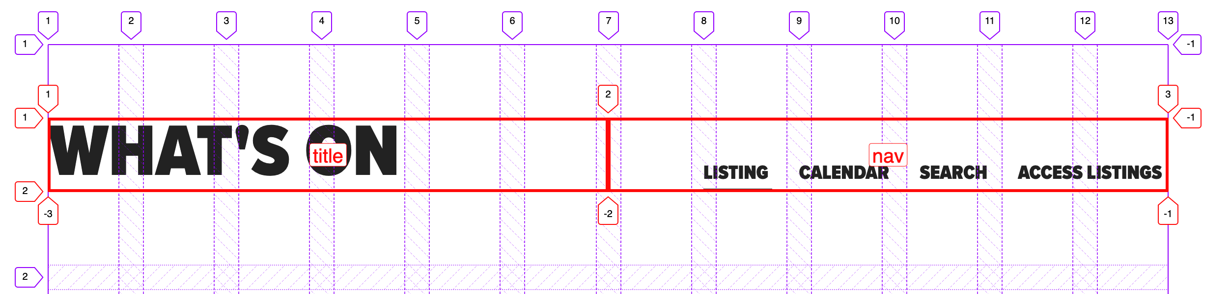
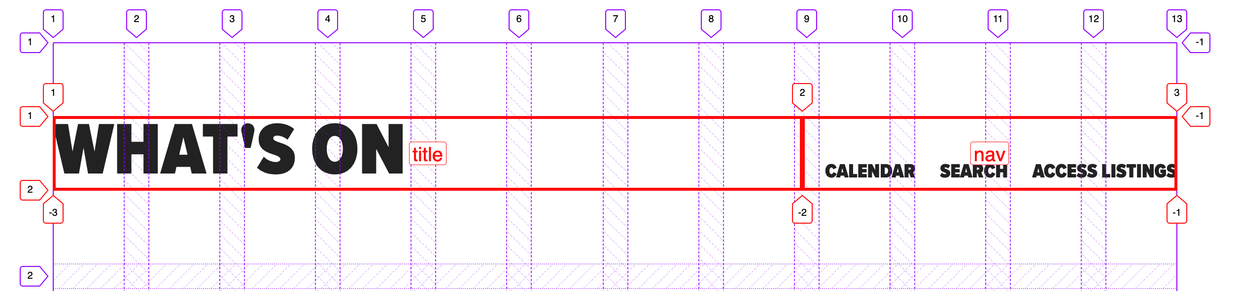
Let’s bring in my first, surprisingly useful, grid mixin.
Each component partial now starts out with a list of all its possible elements, which is a very handy piece of documentation, especially when Twigging the actual front-end component.
The mixin takes care of assigning the grid areas.
Element and component names stay consistent across Sketch, CSS, and HTML and any inconsistencies will be very obvious, as the layout will fail. I’m firm, but fair.
BEM naming is enforced automatically but isn’t muddling things up in the partial.
Now, in the partial, we will just declare grid-template-areas, using normal English words, giving us a series of maps of the layouts that also match the database fields. Super readable!
We decided to stick to named areas for internal grids because I read a great article on this very site explaining how Autoprefixer can handle grid for IE 11 if you stick to the listed supported properties — and it does for the most part. If you view this test case with Autoprefixer applied in the super useful Debug Mode in a browser test, you’ll see it working.
So far, so good.
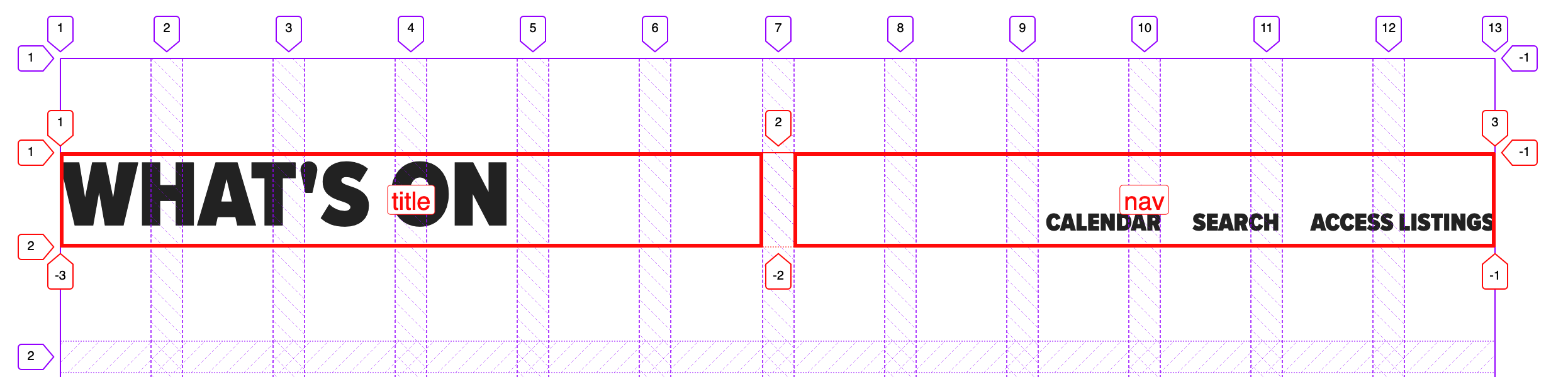
But there are pitfalls! You must set inline elements to block to make sure they always operate as grid cells in IE 11. Comment out the marked line in the example to see what happens otherwise:
Debug has caught an issue.
Ouch! Be careful with those blocks. You may find some versions of IE 11 don’t even pick up this fix, in which case you might try just using plain ol’ <p> tags... sigh.
I don’t include display:grid in this mixin because there are scenarios where the actual grid is set on an inner container, for example, but we’d still want the grid-areas to match on the correct BEM class.
Let’s identify a few more rules of the road to ensure this component slides right into a page layout without hassle. At time of writing, there’s no subgrid) available (but there will be!), so this component knows nothing of the parent grid it’s living in. This happens to match the BEM component approach well — as each component is written flat, and orphaned, to limit inheritance. I’m not advocating for BEM (or BEM-ish as we obviously use) here — I’m just saying that if you’re already using it, this is a bonus.
In this example, the designer has set a page layout of 12 column grid with 20px (1.25rem) gutters, site-wide, with no offset pieces. Our component is a page region and will occupy all 12 grid columns. In this transitional period, we’re still using this kind of set grid as we have a ton of systems still based on this idea that we have to integrate with. So, here’s our convention for this condition: for a full width region drop the grip gap and write the grid template columns as fractional units (fr) of 12.
Doing things this way means:
the sight lines of this internal grid broadly follow the grid it sits within;
it’s easy to see the underlying design rules in the code; and
it’s easy to line things up exactly, if required.
A quick note on "lining up"
Wait... what do I mean 'to have things line up exactly'? Doesn’t it already line up exactly?
Two equal columns split mid-gutter of the parent 12-column grid.
Well, no. The fractional units approach divides across the space perfectly, so you end up in the gutter. Two even columns lands you halfway across the gutter. Two columns where one is 2/3 and the other is 1/3 will split 1/3 of the way across that gutter, and so on.
Two unequal columns (set to 2fr and 1fr, respectively) split a third of the way into a gutter of the 12-column parent grid.
It’s not exactly hard to fix the alignment, as we know the width of our page grid gutter. For example, on an even split, we could include the grid gap.
However, we can’t do that with any other division. What we can do is add that gap as a margin — the margin is added inside no matter what box sizing you have set. In this example, we have three columns (two named areas and one empty space), splitting our gutter into thirds:
This is how to calculate those margins: Make sure the total fr units sum results in 12. Divide the grid gap by the number of columns in the parent grid, then multiply that like so:
The right margin multiplier of n is equal to the sum of the fr units to the right of n. The left margin of n is equal to the sum of the fr units to the left of n.
So, for grid-template-columns with a value of 2fr 3fr 2fr 4fr 1fr:
I’m sure you can think of other solutions, like switching to named lines, or adding in extra fixed-width columns or even writing all maps with 12 named areas per row. There are so many ways you can deal with this, but I think a lot of them remove the advantage of named areas. Areas give us a readable layout map that contains what our future selves need to know. It is code as documentation.
To be clear, the design problem I’m walking us through is not one of alignment. Alignment is easy with grid. The question is not of solving the immediate, trivial, layout problem, but of solving it in a way that supports our goal of being able to come back in six months and grasp:
What elements are in the component.
How they are laid out.
Why the code is written in this way.
The grid specification is huge and it’s easy to get lost in the options. Perhaps it’s a better plan to reset to a 12-column grid and use the number spec (i.e. explicitly link to our page grid, which uses the number spec) when absolute alignment is required — but I do feel there’s a smarter, simpler solution waiting to be found. For this site, we ended up writing a page grid object and added nested internal grid cells to it with classes: .o-page-grid__sidebar.
What do you all think? I definitely foresee differing perspectives on this. 🤦♀️
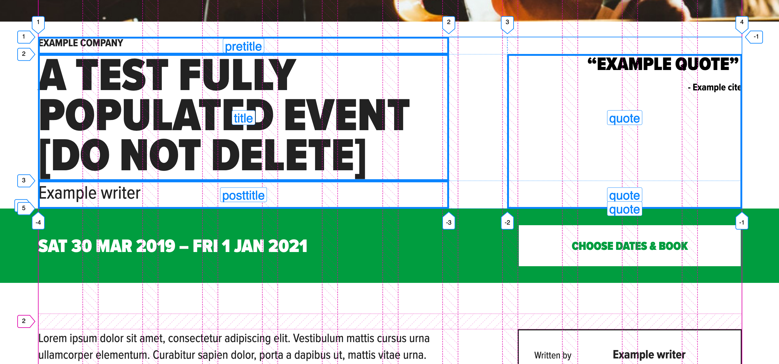
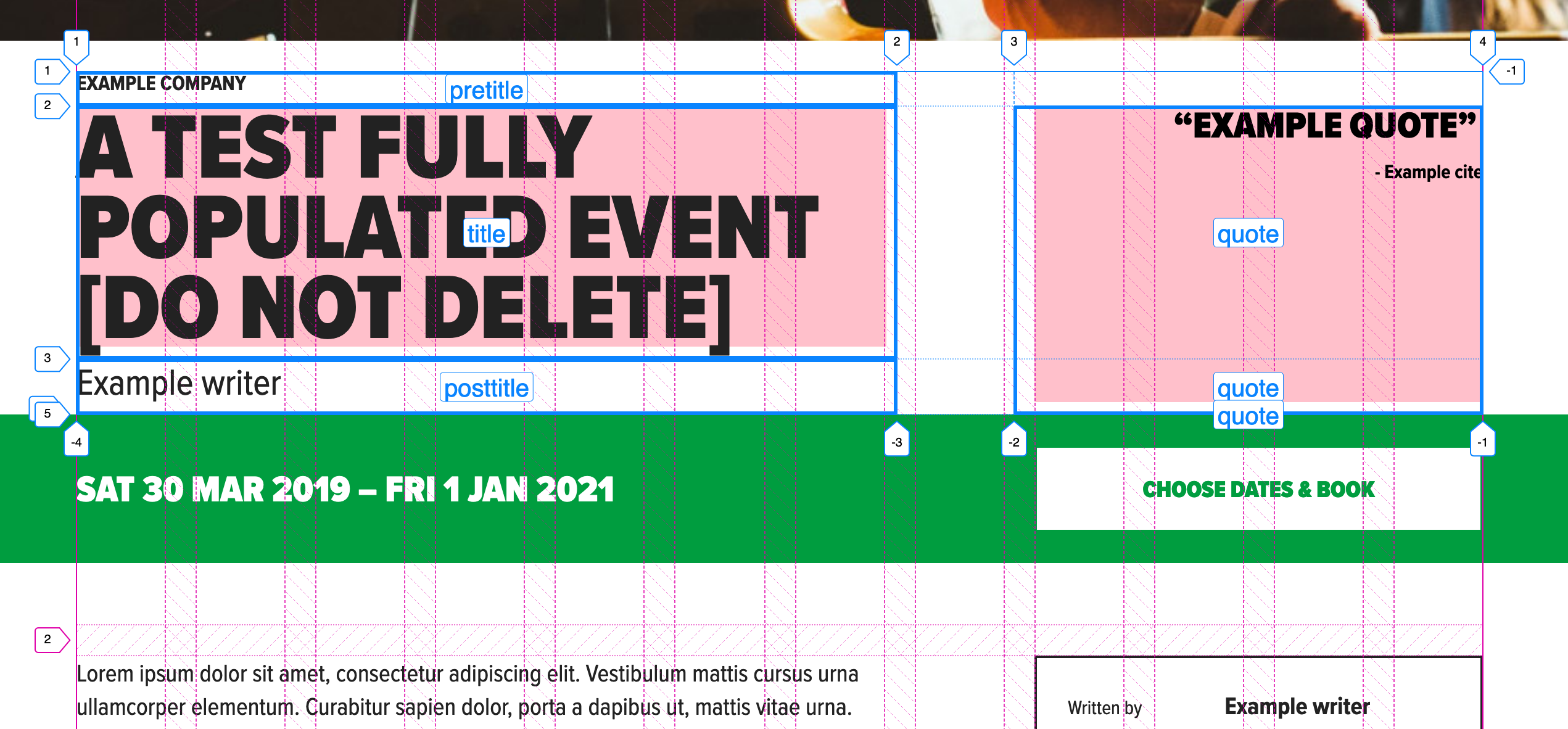
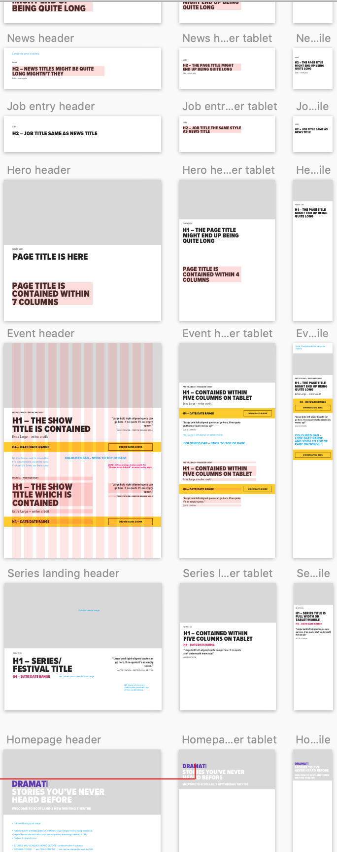
What next? A themed event header with a full width info bar that sticks and an internal button that lines up with the sidebar on the parent grid? You bet. I’ll include a parent grid so it’s easier to see:
Here’s a demo of all these variations as one partial. Yes, it’s a map! And it’s a wrap!
Conventions
Phew, we covered a lot! But you can see how flexible and self-documenting a system like this can be, right?
Type is handled with a separate type system.
Colors are handled by a theme partial that describes the underlying color rules of the design, rather than simply coloring elements ad hoc.
Elements are called what they are, in English, and included as a list at the top of the partial with the template mixin. This list can be taken into Twig or a template as a reference.
Correct HTML is always used and nesting doesn’t break grid. That means you can apply any number of nested grids to the same layout space by setting a convention.
Precise alignment is done in a number spec, and not a name spec (but note that alignment is possible with name spec).
IE 11 is supported.
I do have one more quick note and example of another component built with named areas. In this example, cards are not regions, but components placed in a grid, so there’s no reason to use the fr of 12 convention. You can expect a media object partial to look like this:
.c-card {
  &--news {
    align-content: start;
    grid-template-areas:
      "image"
      "datetime"
      "title";
  }

  &--search {
    justify-content: start;
    grid-template-columns: 1fr 3fr;
    grid-template-areas:
      "image page"
      "image title"
      "image summary";
  }

  &--merchandise {
    grid-gap: 0;
    grid-template-columns: $b 1fr 1fr $b;
    grid-template-areas:
      "image image   image   image"
      ".     title   title   ."
      ".     summary summary ."
      ".     price   action  .";
  }

  &--donations {
    // donations thanks button is too long and must take up more space than input
    grid-gap: 0;
    grid-template-columns: $b 1fr 2fr $b;
    grid-template-areas:
      "image image   image   image"
      ".     title   title   ."
      ".     summary summary ."
      ".     input   action  .";
  }
}

// ...
Responsive Font Size (RFS) is an engine that automatically calculates and updates the font-size property on elements based on the dimensions of the browser viewport.
If you’re thinking that sounds familiar, that’s because there is a slew of tools out there that offer various approaches for fluid typography. In fact, Chris compiled a bunch of those a little while back. Check that out because it’s always good to know what’s out there and what fits best for a particular task.
RFS is different in that it makes writing code for fluid type feel a lot like writing native CSS (or, more accurately, like writing with a preprocessor) directly in the stylesheets you’re already working in — only without having to wrangle and manage a bunch of media queries. It’s even compatible with Sass, Less, Stylus and PostCSS, so it plugs into just about any stack.
Curious how that works? Let’s check it out and then go into how to set it up for a project.
The magic behind automatic re-scaling
Here’s a graph to get a better understanding of how RFS re-scales font sizes:
Every color represents a font size that gets passed to the font-size() mixin provided by RFS. The y-axis of the graph represents the font size (in px) and the x-axis represents the width of the viewport (again, in px).
Let’s focus on the green line, which is generated by applying a mixin to an element:
.title {
  @include font-size(40);
}
In this case, a font size of 40px is passed into the mixin. That value serves as the maximum font size of the element and reaches that size when the viewport is 1200px or wider, at which point it stays at that size.
Conversely, the font size will bottom out at 20px, never going below that mark.
Everything else? Well, that’s where the font size value is automatically calculated, using a function behind the scenes to determine the number according to the current width of the viewport.
RFS is also a little opinionated in that it limits itself to font sizes that are 20px and above. The reasoning is that smaller text (e.g. normal body text) normally does not need to flex as much and is a lot easier to manage than larger pieces of content, like titles and such. That’s very much in line with FitText, which also prefers being used on large text (even though it will not stop you from doing it).
If you’re the type of person who likes to look under the hood, the mixin for each preprocessor is available to view in the RFS GitHub repo. For example, here’s a direct link to the SCSS version. It’s a lot of math!
Note that every font size is generated in a combination of rem and vw units, but they are mapped to px in the graph to make it easier to understand. In other words, it really takes all the mathwork out of the mix.
Everything is configurable
Seriously. Every. Single. Thing.
For example, you may have wondered why the font size capped out at viewports 1200px and wider in the previous example. That can be changed, as well as a ton of other things, including:
Base font size: The lowest font size value.
Font size unit: The type of unit to use in the output value (px or em).
Breakpoint: The maximum width of the viewport where the font size of the element reaches its maximum value.
Breakpoint unit: The unit used for the media query that the mixin generates (px, em or rem).
Factor: This serves as a sorta volume control that informs the mixin how aggressive it should be in calculating font sizes from the maximum viewport width all the way down.
Rem value: This defines the value of 1rem in pixel (px) units.
Two dimensional: A feature that sniffs out the smallest side of a viewport and uses it to calculate the font size value. This comes in handy when, say, you’d like to keep the font from getting smaller when a device is rotated from a portrait orientation to landscape.
Class: Provides class names that can be added to an element in the HTML to either enable or disable fluid sizing.
So, yeah. A lot of options and flexibility here. The important thing to know is that all of these options are variables that can be defined in your stylesheets.
All this said, the default settings are pretty safe to use, and they will prevent a lot of longer words truncating from the viewport. This is especially true for some languages — like German or Dutch — that contain a lot of compound words.
Using RFS in a project
Let’s dive straight into to the code. It would be exhaustive to look at the code for each preprocessor, so I’ll be explaining everything in the .scss syntax. But if you prefer something else, you can check out the examples in other languages in the GitHub repo in the Usage section.
First and foremost, RFS needs to be installed on the project. It’s available in npm and Yarn:
## npm
npm install rfs

## Yarn
yarn add rfs

## Bower is available, but has been deprecated
bower install rfs --save
Then, gotta make sure the mixin is imported with the rest of the styles, wherever you do your imports for other partials:
I passed values in px, but rem units are also supported. If a value without a unit is passed, px is used by default. The font sizes are always rendered in rem (in combination with vw) to make sure the font sizes also increase when the default font size is increased in the browser (this is a feature often used by visually impaired people).
Notice that the mixin is font-size(), but RFS will also let you use it in two other ways:
.title {
  @include font-size(4rem);
  // or
  @include responsive-font-size(64px);
  // or
  @include rfs(64);
}
RFS is baked right into Bootstrap
Here’s a little story for you.
One day, I had this incredibly impulsive idea to put RFS into Bootstrap. I actually did not use Bootstrap at that time, but believed it was a feature Bootstrap could definitely use. I made a pull request and waited a couple months to see what would happen.
In the meantime, I was getting more and more intrigued by Bootstrap and version 4 had just been released. Slowly but surely, I got more involved in contributing to the project and a whole new world opened for me when I discovered the community behind it. It was during hacktoberfest (oh yes, I got my t-shirt) in October 2018 that I got asked to join the Bootstrap team by mdo.
I believe contributing to open source projects is such a fun and rewarding thing. Andrés Galante has a great post on the topic if you're interested in becoming a contributor.
Since then, RFS has become a project of the Bootstrap team, and on February 11th this year, we launched Bootstrap 4.3 which includes RFS right out of the box. It’s currently disabled by default, but can easily be switched on by setting the Sass variable $enable-responsive-font-sizes: true.
But make no mistake: RFS can still be used on its own. Just cool that it's baked right into a widely used framework.
Oh yeah, let's talk browser support
Support is pretty darn good! In fact, RFS will work anywhere that supports media queries and viewport units. RFS will set a font size for Legacy browsers, like Internet Explorer 8, but the fluidity won't be there. In other words, should be safe for production!
What’s next for RFS
The next major version of Bootstrap is version 5 and we’re planning to enable RFS by default. We don’t have any plans to change the way it works for now. More than likely, the $enable-responsive-font-sizes variable will simply be set to true and that’s it.
In the future, I hope I can make use of the min() function because it would generate less CSS and make things a lot less complex. Browsers don’t seem to support this function all too well just yet, but if you’re interested in this feature, you can follow the progress in this GitHub issue.
Anything else? No, but I can leave you with a little song and dance: Na na na na, na na na na, hey hey hey goodbye!
Not to be confused with Lifecycle Hooks, Hooks were introduced in React in v16.7.0-alpha, and a proof of concept was released for Vue a few days after. Even though it was proposed by React, it’s actually an important composition mechanism that has benefits across JavaScript framework ecosystems, so we’ll spend a little time today discussing what this means.
Mainly, Hooks offer a more explicit way to think of reusable patterns — one that avoids rewrites to the components themselves and allows disparate pieces of the stateful logic to seamlessly work together.
The initial problem
In terms of React, the problem was this: classes were the most common form of components when expressing the concept of state. Stateless functional components were also quite popular, but due to the fact that they could only really render, their use was limited to presentational tasks.
Classes in and of themselves present some issues. For example, as React became more ubiquitous, stumbling blocks for newcomers did as well. In order to understand React, one had to understand classes, too. Binding made code verbose and thus less legible, and an understanding of this in JavaScript was required. There are also some optimization stumbling blocks that classes present, discussed here.
In terms of the reuse of logic, it was common to use patterns like render props and higher-order components, but we’d find ourselves in similar “pyramid of doom” — style implementation hell where nesting became so heavily over-utilized that components could be difficult to maintain. This led me to ranting drunkenly at Dan Abramov, and nobody wants that.
Hooks address these concerns by allowing us to define a component's stateful logic using only function calls. These function calls become more compose-able, reusable, and allows us to express composition in functions while still accessing and maintaining state. When hooks were announced in React, people were excited — you can see some of the benefits illustrated here, with regards to how they reduce code and repetition:
In terms of maintenance, simplicity is key, and Hooks provide a single, functional way of approaching shared logic with the potential for a smaller amount of code.
Why Hooks in Vue?
You may read through this and wonder what Hooks have to offer in Vue. It seems like a problem that doesn’t need solving. After all, Vue doesn’t predominantly use classes. Vue offers stateless functional components (should you need them), but why would we need to carry state in a functional component? We have mixins for composition where we can reuse the same logic for multiple components. Problem solved.
I thought the same thing, but after talking to Evan You, he pointed out a major use case I missed: mixins can’t consume and use state from one to another, but Hooks can. This means that if we need chain encapsulated logic, it’s now possible with Hooks.
Hooks achieve what mixins do, but avoid two main problems that come with mixins:
They allows us to pass state from one to the other.
They make it explicit where logic is coming from.
If we’re using more than one mixin, it’s not clear which property was provided by which mixin. With Hooks, the return value of the function documents the value being consumed.
So, how does that work in Vue? We mentioned before that, when working with Hooks, logic is expressed in function calls that become reusable. In Vue, this means that we can group a data call, a method call, or a computed call into another custom function, and make them freely compose-able. Data, methods, and computed now become available in functional components.
Example
Let’s go over a really simple hook so that we can understand the building blocks before we move on to an example of composition in Hooks.
useWat?
OK, here’s were we have, what you might call, a crossover event between React and Vue. The use prefix is a React convention, so if you look up Hooks in React, you’ll find things like useState, useEffect, etc. More info here.
In Evan’s live demo, you can see where he’s accessing useState and useEffect for a render function.
If you’re not familiar with render functions in Vue, it might be helpful to take a peek at that.
But when we’re working with Vue-style Hooks, we’ll have — you guessed it — things like: useData, useComputed, etc.
So, in order for us look at how we'd use Hooks in Vue, I created a sample app for us to explore.
In the src/hooks folder, I've created a hook that prevents scrolling on a useMounted hook and reenables it on useDestroyed. This helps me pause the page when we're opening a dialog to view content, and allows scrolling again when we're done viewing the dialog. This is good functionality to abstract because it would probably be useful several times throughout an application.
import { useDestroyed, useMounted } from "vue-hooks";

export function preventscroll() {
  const preventDefault = (e) => {
    e = e || window.event;
    if (e.preventDefault)
      e.preventDefault();
    e.returnValue = false;
  }

  // keycodes for left, up, right, down
  const keys = { 37: 1, 38: 1, 39: 1, 40: 1 };

  const preventDefaultForScrollKeys = (e) => {
    if (keys[e.keyCode]) {
      preventDefault(e);
      return false;
    }
  }

  useMounted(() => {
    if (window.addEventListener) // older FF
      window.addEventListener('DOMMouseScroll', preventDefault, false);
    window.onwheel = preventDefault; // modern standard
    window.onmousewheel = document.onmousewheel = preventDefault; // older browsers, IE
    window.touchmove = preventDefault; // mobile
    window.touchstart = preventDefault; // mobile
    document.onkeydown = preventDefaultForScrollKeys;
  });

  useDestroyed(() => {
    if (window.removeEventListener)
      window.removeEventListener('DOMMouseScroll', preventDefault, false);

    //firefox
    window.addEventListener('DOMMouseScroll', (e) => {
      e.stopPropagation();
    }, true);

    window.onmousewheel = document.onmousewheel = null;
    window.onwheel = null;
    window.touchmove = null;
    window.touchstart = null;
    document.onkeydown = null;
  });
}
And then we can call it in a Vue component like this, in AppDetails.vue:
We're using it in that component, but now we can use the same functionality throughout the application!
Two Hooks, understanding each other
We mentioned before that one of the primary differences between hooks and mixins is that hooks can actually pass values from one to another. Let's look at that with a simple, albeit slightly contrived, example.
Let's say in our application we need to do calculations in one hook that will be reused elsewhere, and something else that needs to use that calculation. In our example, we have a hook that takes the window width and passes it into an animation to let it know to only fire when we're on larger screens.
In the first hook:
import { useData, useMounted } from 'vue-hooks';

export function windowwidth() {
  const data = useData({
    width: 0
  })

  useMounted(() => {
    data.width = window.innerWidth
  })

  // this is something we can consume with the other hook
  return {
    data
  }
}
Then, in the second we use this to create a conditional that fires the animation logic:
// the data comes from the other hook
export function logolettering(data) {
  useMounted(function () {
    // this is the width that we stored in data from the previous hook
    if (data.data.width > 1200) {
      // we can use refs if they are called in the useMounted hook
      const logoname = this.$refs.logoname;
      Splitting({ target: logoname, by: "chars" });

      TweenMax.staggerFromTo(".char", 5,
        {
          opacity: 0,
          transformOrigin: "50% 50% -30px",
          cycle: {
            color: ["red", "purple", "teal"],
            rotationY(i) {
              return i * 50
            }
          }
        },
        ...
Then, in the component itself, we'll pass one into the other:
Now we can compose logic with Hooks throughout our application! Again, this is a contrived example for the purposes of demonstration, but you can see how useful this might be for large scale applications to keep things in smaller, reusable functions.
Future plans
Vue Hooks are already available to use today with Vue 2.x, but are still experimental. We’re planning on integrating Hooks into Vue 3, but will likely deviate from React’s API in our own implementation. We find React Hooks to be very inspiring and are thinking about how to introduce its benefits to Vue developers. We want to do it in a way that complements Vue's idiomatic usage, so there's still a lot of experimentation to do.
You can get started by checking out the repo here. Hooks will likely become a replacement for mixins, so although the feature still in its early stages, it’s probably a concept that would be beneficial to explore in the meantime.
(Sincere thanks to Evan You and Dan Abramov for proofing this article.)