How often to do you reach for the CSS background-size property? If you’re like me — and probably lots of other front-end folks — then it’s usually when you background-size: cover an image to fill the space of an entire element.
Well, I was presented with an interesting challenge that required more advanced background sizing: background stripes that transition on hover. Check this out and hover it with your cursor:
There’s a lot more going on there than the size of the background, but that was the trick I needed to get the stripes to transition. I thought I’d show you how I arrived there, not only because I think it’s a really nice visual effect, but because it required me to get creative with gradients and blend modes that I think you might enjoy.
Let’s start with a very basic setup to keep things simple. I’m talking about a single <div> in the HTML that’s styled as a green square:
<div></div>
div {
  width: 500px;
  height: 500px;
  background: palegreen;
}
Setting up the background stripes
If your mind went straight to a CSS linear gradient when you saw those stripes, then we’re already on the same page. We can’t exactly do a repeating gradient in this case since we want the stripes to occupy uneven amounts of space and transition them, but we can create five stripes by chaining five backgrounds on top of our existing background color and placing them to the top-right of the container:
div {
  width: 500px;
  height: 500px;
  background:
    linear-gradient(black, black) top right,
    linear-gradient(black, black) top 100px right,
    linear-gradient(black, black) top 200px right,
    linear-gradient(black, black) top 300px right,
    linear-gradient(black, black) top 400px right,
    palegreen;
}
I made horizontal stripes, but we could also go vertical with the approach we’re covering here. And we can simplify this quite a bit with custom properties:
div {
  --gt: linear-gradient(black, black);
  --n: 100px;

  width: 500px;
  height: 500px;
  background:
    var(--gt) top right,
    var(--gt) top var(--n) right,
    var(--gt) top calc(var(--n) * 2) right,
    var(--gt) top calc(var(--n) * 3) right,
    var(--gt) top calc(var(--n) * 4) right,
    palegreen;
}
So, the --gt value is the gradient and --n is a constant we’re using to nudge the stripes downward so they are offset vertically. And you may have noticed that I haven’t set a true gradient, but rather solid black stripes in the linear-gradient() function — that’s intentional and we’ll get to why I did that in a bit.
One more thing we ought to do before moving on is prevent our backgrounds from repeating; otherwise, they’ll tile and fill the entire space:
div {
  --gt: linear-gradient(black, black);
  --n: 100px;

  width: 500px;
  height: 500px;
  background:
    var(--gt) top right,
    var(--gt) top var(--n) right,
    var(--gt) top calc(var(--n) * 2) right,
    var(--gt) top calc(var(--n) * 3) right,
    var(--gt) top calc(var(--n) * 4) right,
    palegreen;
  background-repeat: no-repeat;
}
We could have set background-repeat in the background shorthand, but I decided to break it out here to keep things easy to read.
Offsetting the stripes
We technically have stripes, but it’s pretty tough to tell because there’s no spacing between them and they cover the entire container. It’s more like we have a solid black square.
This is where we get to use the background-size property. We want to set both the height and the width of the stripes and the property supports a two-value syntax that allows us to do exactly that. And, we can chain those sizes by comma separating them the same way we did on background.
Let’s start simple by setting the widths first. Using the single-value syntax for background-size sets the width and defaults the height to auto. I’m using totally arbitrary values here, so set the values to what works best for your design:
div {
  --gt: linear-gradient(black, black);
  --n: 100px;

  width: 500px;
  height: 500px;
  background:
    var(--gt) top right,
    var(--gt) top var(--n) right,
    var(--gt) top calc(var(--n) * 2) right,
    var(--gt) top calc(var(--n) * 3) right,
    var(--gt) top calc(var(--n) * 4) right,
    palegreen;
  background-repeat: no-repeat;
  background-size: 60%, 90%, 70%, 40%, 10%;
}
If you’re using the same values that I am, you’ll get this:
Doesn’t exactly look like we set the width for all the stripes, does it? That’s because of the auto height behavior of the single-value syntax. The second stripe is wider than the others below it, and it is covering them. We ought to set the heights so we can see our work. They should all be the same height and we can actually re-use our --n variable, again, to keep things simple:
div {
  --gt: linear-gradient(black, black);
  --n: 100px;

  width: 500px;
  height: 500px;
  background:
    var(--gt) top right,
    var(--gt) top var(--n) right,
    var(--gt) top calc(var(--n) * 2) right,
    var(--gt) top calc(var(--n) * 3) right,
    var(--gt) top calc(var(--n) * 4) right,
    palegreen;
    background-repeat: no-repeat;
    background-size: 60% var(--n), 90% var(--n), 70% var(--n), 40% var(--n), 10% var(--n); // HIGHLIGHT 15
}
Ah, much better!
Adding gaps between the stripes
This is a totally optional step if your design doesn’t require gaps between the stripes, but mine did and it’s not overly complicated. We change the height of each stripe’s background-size a smidge, decreasing the value so they fall short of filling the full vertical space.
We can continue to use our --n variable, but subtract a small amount, say 5px, using calc() to get what we want.
Now let’s swap the palegreen background color we’ve been using for visual purposes up to this point for white.
div {
  /* etc. */
  background:
    var(--gt) top right,
    var(--gt) top var(--n) right,
    var(--gt) top calc(var(--n) * 2) right,
    var(--gt) top calc(var(--n) * 3) right,
    var(--gt) top calc(var(--n) * 4) right,
    #fff;
  /* etc. */
}
A black and white pattern like this is perfect for masking and blending. To do that, we’re first going to wrap our <div> in a new parent container and introduce a second <div> under it:
<section>
  <div></div>
  <div></div>
</section>
We’re going to do a little CSS re-factoring here. Now that we have a new parent container, we can pass the fixed width and height properties we were using on our <div> over there:
section {
  width: 500px;
  height: 500px;
}
I’m also going to use CSS Grid to position the two <div> elements on top of one another. This is the same trick Temani Afif uses to create his super cool image galleries. The idea is that we place both divs over the full container using the grid-area property and align everything toward the center:
Now, check this out. The reason I used a solid gradient that goes from black to black earlier is to set us up for masking and blending the two <div> layers. This isn’t true masking in the sense that we’re calling the mask property, but the contrast between the layers controls what colors are visible. The area covered by white will remain white, and the area covered by black leaks through. MDN’s documentation on blend modes has a nice explanation of how this works.
To get that working, I’ll apply the real gradient we want to see on the first <div> while applying the style rules from our initial <div> on the new one, using the :nth-child() pseudo-selector:
If we stop here, we actually won’t see any visual difference from what we had before. That’s because we haven’t done the actual blending yet. So, let’s do that now using the screen blend mode:
div:nth-child(2)  {
  /* etc. */
  mix-blend-mode: screen;
}
I used a beige background color in the demo I showed at the beginning of this article. That slightly darker sort of off-white coloring allows a little color to bleed through the rest of the background:
The hover effect
The last piece of this puzzle is the hover effect that widens the stripes to full width. First, let’s write out our selector for it. We want this to happen when the parent container (<section> in our case) is hovered. When it’s hovered, we’ll change the background size of the stripes contained in the second <div>:
/* When <section> is hovered, change the second div's styles */
section:hover > div:nth-child(2){
  /* styles go here */
}
We’ll want to change the background-size of the stripes to the full width of the container while maintaining the same height:
I only added text in there to show what it might look like to use this in a different context. If you do the same, then it’s worth making sure there’s enough contrast between the text color and the colors used in the gradient to comply with WCAG guidelines. And while we’re touching briefly on accessibility, it’s worth considering user preferences for reduced motion when it comes to the hover effect.
That’s a wrap!
Pretty neat, right? I certainly think so. What I like about this, too, is that it’s pretty maintainable and customizable. For example, we can alter the height, colors, and direction of the stripes by changing a few values. You might even variablize a few more things in there — like the colors and widths — to make it even more configurable.
I’m really interested if you would have approached this a different way. If so, please share in the comments! It’d be neat to see how many variations we can collect.
👋 The demos in this article experiment with a non-standard bug related to CSS gradients and sub-pixel rendering. Their behavior may change at any time in the future. They’re also heavy as heck. We’re serving them async where you click to load, but still want to give you a heads-up in case your laptop fan starts spinning.
Do you remember that static noise on old TVs with no signal? Or when the signal is bad and the picture is distorted? In case the concept of a TV signal predates you, here’s a GIF that shows exactly what I mean.
View image (contains auto-playing media)
Yes, we are going to do something like this using only CSS. Here is what we’re making:
Before we start digging into the code, I want to say that there are better ways to create a static noise effect than the method I am going to show you. We can use SVG, <canvas>, the filter property, etc. In fact, Jimmy Chion wrote a good article showing how to do it with SVG.
What I will be doing here is kind of a CSS experiment to explore some tricks leveraging a bug with gradients. You can use it on your side projects for fun but using SVG is cleaner and more suitable for a real project. Plus, the effect behaves differently across browsers, so if you’re checking these out, it’s best to view them in Chrome, Edge, or Firefox.
Let’s make some noise!
To make this noise effect we are going to use… gradients! No, there is no secret ingredient or new property that makes it happen. We are going to use stuff that’s already in our CSS toolbox!
The “trick” relies on the fact that gradients are bad at anti-aliasing. You know those kind of jagged edges we get when using hard stop colors? Yes, I talk about them in most of my articles because they are a bit annoying and we always need to add or remove a few pixels to smooth things out:
As you can see, the second circle renders better than the first one because there is a tiny difference (0.5%) between the two colors in the gradient rather than using a straight-up hard color stop using whole number values like the first circle.
Here’s another look, this time using a conic-gradient where the result is more obvious:
An interesting idea struck me while I was making these demos. Instead of fixing the distortion all the time, why not trying to do the opposite? I had no idea what would happen but it was a fun surprise! I took the conic gradient values and started to decrease them to make the poor anti-aliasing results look even worse.
Do you see how bad the last one is? It’s a kind of scrambled in the middle and nothing is smooth. Let’s make it full-screen with smaller values:
I suppose you see where this is going. We get a strange distorted visual when we use very small decimal values for the hard colors stops in a gradient. Our noise is born!
We are still far from the grainy noise we want because we can still see the actual conic gradient. But we can decrease the values to very, very small ones — like 0.0001% — and suddenly there’s no more gradient but pure graininess:
Tada! We have a noise effect and all it takes is one CSS gradient. I bet if I was to show this to you before explaining it, you’d never realize you’re looking at a gradient. You have to look very carefully at center of the gradient to see it.
We can increase the randomness by making the size of the gradient very big while adjusting its position:
The gradient is applied to a fixed 3000px square and placed at the 60% 60% coordinates. We can hardly notice its center in this case. The same can be done with radial gradient as well:
And to make things even more random (and closer to a real noise effect) we can combine both gradients and use background-blend-mode to smooth things out:
Our noise effect is perfect! Even if we look closely at each example, there’s no trace of either gradient in there, but rather beautiful grainy static noise. We just turned that anti-aliasing bug into a slick feature!
Now that we have this, let’s see a few interesting examples where we might use it.
Animated no TV signal
Getting back to the demo we started with:
If you check the code, you will see that I am using a CSS animation on one of the gradients. It’s really as simple as that! All we’re doing is moving the conic gradient’s position at a lightning fast duration (.1s) and this is what we get!
I used this same technique on a one-div CSS art challenge:
Grainy image filter
Another idea is to apply the noise to an image to get an old-time-y look. Hover each image to see them without the noise.
I am using only one gradient on a pseudo-element and blending it with the image, thanks to mix-blend-mode: overlay.
We can get an even funnier effect if we use the CSS filter property
And if we add a mask to the mix, we can make even more effects!
Grainy text treatment
We can apply this same effect to text, too. Again, all we need is a couple of chained gradients on a background-image and then blend the backgrounds. The only difference is that we’re also reaching for background-clip so the effect is only applied to the bounds of each character.
Generative art
If you keep playing with the gradient values, you may get more surprising results than a simple noise effect. We can get some random shapes that look a lot like generative art!
Of course, we are far from real generative art, which requires a lot of work. But it’s still satisfying to see what can be achieved with something that is technically considered a bug!
I hope you enjoyed this little CSS experiment. We didn’t exactly learn something “new” but we took a little quirk with gradients and turned it into something fun. I’ll say it again: this isn’t something I would consider using on a real project because who knows if or when anti-aliasing will be addressed at some point in time. Instead, this was a very random, and pleasant, surprise when I stumbled into it. It’s also not that easy to control and it behaves inconsistently across browsers.
This said, I am curious to see what you can do with it! You can play with the values, combine different layers, use a filter, or mix-blend-mode, or whatever, and you will for sure get something really cool. Share your creations in the comment section — there are no prizes but we can get a nice collection going!
Under the hood there is a suite of filter(), background-blend-mode(), mix-blend-mode(), and clip-path() combinations that have been painstakingly tweaked to reach the desired effect. I ended up using a little img { visibility: hidden; } in DevTools to get a better sense of each type of holographic effect.
“Raise the curtains” is what I call an effect where the background goes from dark to light on scroll, and the content on top also goes from light to dark while in a sticky position.
First, we need a container for the curtain, which we’ll give a .curtain class. Then, inside the .curtain, we have the an .invert child element that will serve as our “sticky” box. And, finally, we have the content inside this box — a good old-fashioned <h2> element for this specific example.
Let’s set up some CSS variables
There are three values we know we’ll need upfront. Let’s make CSS variables out of them so it’s easy to write them into our styles and easily change them later if we need to.
Next, we can define our .curtain element using the following techniques:
A linear-gradient for the “split” background
min-height for the extra space at the bottom of the container
We use the ::after pseudo-element to add the extra space to the bottom. This way, our “sticky” content will actually stick to the container while scrolling past the ::after element. It’s an illusion.
.curtain {
  /** create the "split" background **/
  background-image: linear-gradient(to bottom, var(--color2) 50%, var(--color1) 50%);
}

/** add extra space to the bottom (need this for the "sticky" effect) **/
.curtain::after {
  content: "";
  display: block;
  min-height: var(--minh);
}
Making sticky content
Next up, we need to make our content “sticky” in the sense that it sits perfectly inside the container as the background and text swap color values. In fact, we already gave the .curtain‘s child element an .invert class that we can use as the sticky container.
Stay with me for a moment — here’s how this is going to play out:
position: sticky and top define the stickiness and where it sticks.
mix-blend-mode: difference blends the color of the content inside the <h2> element into the .curtain‘s background gradient.
display: flex centers the content for presentation.
min-height defines the height of the container and allows for the extra space at the bottom.
color sets the color of the h2 heading.
Now to put that into CSS code!
.invert {
  /** make the content sticky **/
  position: sticky;
  top: 20px;

  /** blend the content with the contrast effect **/
  mix-blend-mode: difference;

  /** center the content **/
  display: flex;
  align-items: center;
  justify-content: center;

  /** set the minimum height of the section **/
  min-height: var(--minh);
}

h2 {
  /** set the color of the text **/
  color: var(--color1);
}
There are many things going on here, so let’s explain each one of them.
First, we have a sticky position that is self-explanatory and flexbox to help center the content. Nothing new or particularly tricky about this.
The content’s height is set using CSS variable and the value is the same height value as the .curtain::after pseudo-element.
The mix-blend-mode: difference declaration blends our content with the background. The difference value is complicated, but you might visualize it like inverted text color against the background. Here’s a nice demo from the CSS-Tricks Almanac showing off the different mix-blend-mode values:
To make the blending work, we need to set the color of our heading. In this case, we’re assigning a light color value (wheat) to the --color1 variable.
“Raise the Curtains” Demo
Gotchas
I experienced a few problems while working out the details of the “raise the curtain” effect. If you want to add images to the “sticky” content, for example, avoid using images that don’t look good when their colors are inverted. Here’s a quick demo where I made a simple SVG and transparent PNG image, and it looks good.
Another gotcha: there’s no way to set mix-blend-mode: difference on specific child elements, like headings, while avoiding the effect on images. I discovered there are several reasons why it doesn’t work, the first of which is that position: sticky cancels the blending.
The same goes when using something like transform: skewY on the container to add a little “tilt” to things. I suspect other properties don’t play well with the blending, but I didn’t go that far to find out which ones.
Here’s the demo without scrolling that removes the troubling properties:
Curtain call!
I enjoyed building this component, and I always love it when I can accomplish something using only HTML and CSS, especially when they work smoothly on every browser.
What will make with it? Is there a different way you would approach a “raise the curtain” effect like this? Let me know in the comments!
Some days ago I encountered the beautiful website of Alef Estate made by the amazing folks of Advanced Team. The site has so many interesting details and interactions! What strikes me the most is the changing cursor that also has a blend mode. When scrolling further down, the whole page switches to a black background with a kind of slice animation. I think this is a super interesting effect! It’s the perfect excuse to code up a portfolio design and play with mix-blend-mode and some background trickery.
If you want to learn about CSS Blend Modes, check out the entry in our CSS Reference by Sara Soueidan: mix-blend-mode. It has lots of examples and demos.
I really hope you are enjoying this effect remake and experiment and find it interesting!
The wonderful company I work for, Payoneer, has a new logo, and my job was to recreate it and animate it for a loader component in our app. I’ll explain exactly how I did it, share the problems I had, and walk you through the solution I came up with. And, as a bonus, we’ll look at animating it!
But first, I guess some of you are asking yourselves… Recreate it? Why?
The branding agency that designed our logo sent us a full set of assets categorized by themes. They came in all sizes and in every available format. We had everything, including SVGs, for the logo and the loader animation. But we couldn’t use them.
Here’s why. Let’s take a look at the logo:
We call the new logo “The Halo.”
The logo is a ring with a conic gradient that consists of five colors, and… that’s it. The problem is that SVG doesn’t support angled gradients (for now, at least), so when we export a design that has a conic gradient as an SVG, we need some sort of hack to get the desired result.
Now, I’m no expert when it comes to working with vector graphic software, so there might be a different (and perhaps better) way to do this, but I know that the most common way to export conic gradients to SVG is to convert the gradient element to an image and insert that image into the SVG as a base64 string. That’s also what we got from the branding agency, and I trust them to know the best way to export an SVG.
But, since the final SVG file now contains a PNG base64 string, the file size jumped to nearly 1MB, which might not be a total disaster, but it’s much higher than the 2KB that it should be. Multiply that difference by three themes (no text, light text, and dark text variations), and we’re looking at 3MB worth of images instead of 3KB worth of code. That’s a big difference, so we’ve decided to recreate the logo with SVG.
But how?!
Even though CSS fully supports conic gradients, SVG does not. So the first question I asked myself was how to create a conic gradient in SVG. Actually, I asked Google. And what I found was a lot of cool, unique, creative ways to add a conic gradients to SVG, most of them relying on some sort of clip-path implementation. I first created a short <path> that represents the shape of the ring and used it as a clip-path on a simple <rect> element.
Next, I needed to fill the <rect> with conic gradients, but first, I had to find all the correct color stops to recreate the look. That took a while, but after a lot of fine tuning, I got a result I’m happy with:
The last step was to replace the <rect> with something else that supports conic gradients, and the simplest way I’ve found is to use an SVG <foreignObject> element with a regular <div> inside it, and a conic-gradient as a background-image. Then all I needed to do was to set the clip-path on the <foreignObject> element, and that’s it.
So, that’s how I used a conic gradient in an SVG to keep the design fully vector and scalable with less than 20 lines of code, and less than 2KB in file size.
But that was the easy part. Now let’s talk animation.
The loader
Our app shows a loading animation every time a user logs in. We had been using a GIF file for it, but I had been meaning to update it to a pure CSS/SVG animation for months. The benefits are obvious: faster render means a more seamless loading experience, and a smaller file size means even faster loading. We simply get more for less, which is especially ideal for a loading animation.
Here’s the animation I was aiming for:
This type of animation is actually fairly easy with SVG. All we really need is a trick using stroke-dasharray and stroke-dashoffset. That was my starting point. I created a new <path> in the center of the ring, removed the fill, added a stroke with the right stroke-width, and then worked on the animation.
It took me some playing around to get the movement just like the designers wanted it. I ended up using two animations, actually: one controls the stroke-dashoffset, and the second rotates the entire <path> a full turn.
But, since the clip-path property refers to the fill of the shape, animating the stroke meant I had to solve one of two problems: I could either find a different way to animate the movement, or find a different way to add the colors to the stroke.
So I went back to Google and all of the creative ideas I found before, but most of them were pretty much un-animatable, so I started looking for a good non-clip-path way to add colors to the stroke. I looked at a few “out-of-the-box” solutions, checked out masking, and ended up with the simplest perfect solution:
.logoBlend {
  mix-blend-mode: lighten;
}
A lighten blend mode looks at the RGB colors of each pixel of the rendered element, compares it to the RGB value of the background pixel that’s behind it, and keeps whichever is highest. That means that the parts of the element that are white will remain white, and the dark parts will get the values of the background pixel.
By adding a white <rect> to the black path, I essentially blocked anything that’s behind it. Meanwhile, everything that’s behind the animated black stroke is visible. That meant I could bring back the <foreignObject> with the conic-gradient, put it behind the mix-blend-mode layer, and give it a simple rotate animation to match the design.
Note that the end result of this method will have a white background, not transparent like the static logo, but I was fine with that. If you need to, you can flip it around, use black background, and hide the light parts of your element by setting the blend mode to darken.
Final touches
I was pretty much done at this point, and quite happy with the end result. But a couple of days later, I got a Lottie-based JSON file from the branding agency with the exact same animation. In retrospect, maybe I could spare my work and use their file, it would have worked just fine. Even the file size was surprisingly small, but it was still 8✕ bigger than the SVG, so we ended up using my animation anyway.
But, that meant I had one last thing to do. The Lottie animation had a “start animation” where the small orange dot grows into view, and I had to add it to my animation as well. I added a short 0.5s delay to all three animations as well as a scaling animation in the beginning.
Click on “Rerun” on the Pen to see the animation again from the initial dot.
That’s it! Now my company has a new logo and a set of lightweight, fully scalable assets to use across our web platforms.
And for those of you wondering, yes, I did end up creating a nice little Logo component in React since we’re using it. It even renders the SVG according to a theme passed to it as a prop, making the implementation easier, and keeping all future changes in a single location.
What about you?
Do you think there’s a better way to get the same result? Share your thoughts in the comments! And thank you for reading.
Up until 2020, blend modes were a feature I hadn’t used much because I rarely ever had any idea what result they could produce without giving them a try first. And taking the “try it and see what happens” approach seemed to always leave me horrified by the visual vomit I had managed to create on the screen.
The problem stemmed from not really knowing how they work in the back. Pretty much every article I’ve seen on the topic is based on examples, comparisons with Photoshop or verbose artistic descriptions. I find examples great, but when you have no clue how things work in the back, adapting a nice-looking demo into something that would implement a different idea you have in your head becomes a really time-consuming, frustrating and ultimately futile adventure. Then Photoshop comparisons are pretty much useless for someone coming from a technical background. And verbose artistic descriptions feel like penguin language to me.
So I had a lightbulb moment when I came across the spec and found it also includes mathematical formulas according to which blend modes work. This meant I could finally understand how this stuff works in the back and where it can be really useful. And now that I know better, I’ll be sharing this knowledge in a series of articles.
Today, we’ll focus on how blending generally works, then take a closer look at two somewhat similar blend modes — difference and exclusion — and, finally, get to the meat of this article where we’ll dissect some cool use cases like the ones below.
A few examples of what we can achieve with these two blend modes.
Let’s discuss the “how” of blend modes
Blending means combining two layers (that are stacked one on top of the other) and getting a single layer. These two layers could be two siblings, in which case the CSS property we use is mix-blend-mode. They could also be two background layers, in which case the CSS property we use is background-blend-mode. Note that when I talk about blending “siblings,” this includes blending an element with the pseudo-elements or with the text content or the background of its parent. And when it comes to background layers, it’s not just the background-image layers I’m talking about — the background-color is a layer as well.
When blending two layers, the layer on top is called the source, while the layer underneath is called the destination. This is something I just take as it is because these names don’t make much sense, at least to me. I’d expect the destination to be an output, but instead they’re both inputs and the resulting layer is the output.
Blending terminology
How exactly we combine the two layers depends on the particular blend mode used, but it’s always per pixel. For example, the illustration below uses the multiply blend mode to combine the two layers, represented as grids of pixels.
How blending two layers works at a pixel level
Alright, but what happens if we have more than two layers? Well, in this case, the blending process happens in stages, starting from the bottom.
In a first stage, the second layer from the bottom is our source, and the first layer from the bottom is our destination. These two layers blend together and the result becomes the destination for the second stage, where the third layer from the bottom is the source. Blending the third layer with the result of blending the first two gives us the destination for the third stage, where the fourth layer from the bottom is the source.
Blending multiple layers
Of course, we can use a different blend mode at each stage. For example, we can use difference to blend the first two layers from the bottom, then use multiply to blend the result with the third layer from the bottom. But this is something we’ll go a bit more into in future articles.
The result produced by the two blend modes we discuss here doesn’t depend on which of the two layers is on top. Note that this is not the case for all possible blend modes, but it is the case for the ones we’re looking at in this article.
They are also separable blend modes, meaning the blending operation is performed on each channel separately. Again, this is not the case for all possible blend modes, but it is the case for difference and exclusion.
More exactly, the resulting red channel only depends on the red channel of the source and the red channel of the destination; the resulting green channel only depends on the green channel of the source and the green channel of the destination; and finally, the resulting blue channel only depends on the blue channel of the source and the blue channel of the destination.
R = fB(Rs, Rd)
G = fB(Gs, Gd)
B = fB(Bs, Bd)
For a generic channel, without specifying whether it’s red, green or blue, we have that it’s a function of the two corresponding channels in the source (top) layer and in the destination (bottom) layer:
Ch = fB(Chs, Chd)
Something to keep in mind is that RGB values can be represented either in the [0, 255] interval, or as percentages in the [0%, 100%] interval, and what we actually use in our formulas is the percentage expressed as a decimal value. For example, crimson can be written as either rgb(220, 20, 60) or as rgb(86.3%, 7.8%, 23.5%) — both are valid. The channel values we use for computations if a pixel is crimson are the percentages expressed as decimal values, that is .863, .078, .235.
If a pixel is black, the channel values we use for computations are all 0, since black can be written as rgb(0, 0, 0) or as rgb(0%, 0%, 0%). If a pixel is white, the channel values we use for computations are all 1, since white can be written as rgb(255, 255, 255) or as rgb(100%, 100%, 100%).
Note that wherever we have full transparency (an alpha equal to 0), the result is identical to the other layer.
difference
The name of this blend mode might provide a clue about what the blending function fB() does. The result is the absolute value of the difference between the corresponding channel values for the two layers.
Ch = fB(Chs, Chd) = |Chs - Chd|
First off, this means that if the corresponding pixels in the two layers have identical RGB values (i.e. Chs = Chd for every one of the three channels), then the resulting layer’s pixel is black since the differences for all three channels are 0.
Chs = Chd
Ch = fB(Chs, Chd) = |Chs - Chd| = 0
Secondly, since the absolute value of the difference between any positive number and 0 leaves that number unchanged, it results in the corresponding result pixel having the same RGB value as the other layer’s pixel if a layer’s pixel is black (all channels equal 0).
If the black pixel is in the top (source) layer, replacing its channel values with 0 in our formula gives us:
Ch = fB(0, Chd) = |0 - Chd| = |-Chd| = Chd
If the black pixel is in the bottom (destination) layer, replacing its channel values with 0 in our formula gives us:
Ch = fB(Chs, 0) = |Chs - 0| = |Chs| = Chs
Finally, since the absolute value of the difference between any positive subunitary number and 1 gives us the complement of that number, it results that if a layer’s pixel is white (has all channels 1), the corresponding result pixel is the other layer’s pixel fully inverted (what filter: invert(1) would do to it).
If the white pixel is in the top (source) layer, replacing its channel values with 1 in our formula gives us:
Ch = fB(1, Chd) = |1 - Chd| = 1 - Chd
If the white pixel is in the bottom (destination) layer, replacing its channel values with 1 in our formula gives us:
Ch = fB(Chs, 1) = |Chs - 1| = 1 - Chs
This can be seen in action in the interactive Pen below, where you can toggle between viewing the layers separated and viewing them overlapping and blended. Hovering the three columns in the overlapping case also reveals what’s happening for each.
exclusion
For the second and last blend mode we’re looking at today, the result is twice the product of the two channel values, subtracted from their sum:
Ch = fB(Chs, Chd) = Chs + Chd - 2·Chs·Chd
Since both values are in the [0, 1] interval, their product is always at most equal to the smallest of them, so twice the product is always at most equal to their sum.
If we consider a black pixel in the top (source) layer, then replace Chs with 0 in the formula above, we get the following result for the corresponding result pixel’s channels:
If we consider a black pixel in the bottom (destination) layer, then replace Chd with 0 in the formula above, we get the following result for the corresponding result pixel’s channels:
So, if a layer’s pixel is black, it results that the corresponding result pixel is identical to the other layer’s pixel.
If we consider a white pixel in the top (source) layer, then replace Chs with 1 in the formula above, we get the following result for the corresponding result pixel’s channels:
If we consider a white pixel in the bottom (destination) layer, then replace Chd with 1 in the formula above, we get the following result for the corresponding result pixel’s channels:
So if a layer’s pixel is white, it results that the corresponding result pixel is identical to the other layer’s pixel inverted.
This is all shown in the following interactive demo:
Note that as long as at least one of the layers only has black and white pixels, difference and exclusion produce the exact same result.
Now, let’s turn to the “what” of blend modes
Here comes the interesting part — the examples!
Text state change effect
Let’s say we have a paragraph with a link:
<p>Hello, <a href='#'>World</a>!</div>
We start by setting a few basic styles to put our text in the middle of the screen, bump up its font-size, set a background on the body and a color on both the paragraph and the link.
The result we now have with the pseudo-element on the link (demo)
The above looks like we’ve messed things up… but have we really? What we have here is a gold rectangle on top of gold text. And if you’ve paid attention to how the two blend modes discussed above work, then you’ve probably already guessed what’s next — we blend the two sibling nodes within the link (the pseudo-element rectangle and the text content) using difference, and since they’re both gold, it results that what they have in common — the text — becomes black.
p { isolation: isolate; }

a {
  /* same as before */

  &::after {
    /* same as before */
    mix-blend-mode: difference;
  }
}
Note that we have to isolate the paragraph to prevent blending with the body background. While this is only an issue in Firefox (and given we have a very dark background on the body, it’s not too noticeable) and is fine in Chrome, keep in mind that, according to the spec, what Firefox does is actually correct. It’s Chrome that’s behaving in a buggy way here, so we should have the isolation property set in case the bug gets fixed.
Alright, but we want this to happen only if the link is focused or hovered. Otherwise, the pseudo-element isn’t visible — let’s say it’s scaled down to nothing.
a {
  /* same as before */
  text-decoration: none;

  &::after {
    /* same as before */
    transform: scale(0);
  }

  &:focus { outline: none }
  &:focus, &:hover { &::after { transform: none; } }
}
We’ve also removed the link underline and the focus outline. Below, you can now see the difference effect on :hover (the same effect occurs on :focus, which is something you can test in the live demo).
The mix-blend-mode: difference effect only on :hover (demo)
We now have our state change, but it looks rough, so let’s add a transition!
a {
  /* same as before */

  &::after {
    /* same as before */
    transition: transform .25s;
  }
}
Much better!
The mix-blend-mode: difference effect only on :hover, now smoothed by a transition (demo)
It would look even better if our pseudo grew not from nothing in the middle, but from a thin line at the bottom. This means we need to set the transform-origin on the bottom edge (at 100% vertically and whatever value horizontally) and initially scale our pseudo to something slightly more than nothing along the y axis.
a {
  /* same as before */

  &::after {
    /* same as before */
    transform-origin: 0 100%;
    transform: scaleY(.05);
  }
}
The mix-blend-mode: difference effect only on :hover, now smoothed by a transition between a thin underline and a rectangle containing the link text (demo)
Something else I’d like to do here is replace the font of the paragraph with a more aesthetically appealing one, so let’s take care of that too! But we now have a different kind of problem: the end of the ‘d’ sticks out of the rectangle on :focus/:hover.
The problem illustrated: the end of the “d” sticks out when we :focus or :hover the link (demo)
We can fix this with a horizontal padding on our link.
a {
  /* same as before */
  padding: 0 .25em;
}
In case you’re wondering why we’re setting this padding on both the right and the left side instead of just setting a padding-right, the reason is illustrated below. When our link text becomes “Alien World,” the curly start of the ‘A’ would end up outside of our rectangle if we didn’t have a padding-left.
One quick fix here would be to set display: inline-block on the link. This isn’t a perfect solution. It also breaks when the link text is longer than the viewport width, but it works in this particular case, so let’s just leave it here now and we’ll come back to this problem in a little while.
Let’s now consider the situation of a light theme. Since there’s no way to get white instead of black for the link text on :hover or :focus by blending two identical highlight layers that are both not white, we need a bit of a different approach here, one that doesn’t involve using just blend modes.
What we do in this case is first set the background, the normal paragraph text color, and the link text color to the values we want, but inverted. I was initially doing this inversion manually, but then I got the suggestion of using the Sass invert() function, which is a very cool idea that really simplifies things. Then, after we have this dark theme that’s basically the light theme we want inverted, we get our desired result by inverting everything again with the help of the CSS invert() filter function.
Tiny caveat here: we cannot set filter: invert(1) on the body or html elements because this is not going to behave the way we expect it to and we won’t be getting the desired result. But we can set both the background and the filter on a wrapper around our paragraph.
body {
  /* same as before,
     without the place-content, background and color declarations,
     which we move on the section */
}

section {
  display: grid;
  place-content: center;
  background: invert(#ddd) /* Sass invert(<color>) function */;
  color: invert(#222); /* Sass invert<color>) function */;
  filter: invert(1); /* CSS filter invert(<number|percentage>) function */
}

a {
  /* same as before */
  color: invert(purple); /* Sass invert(<color>) function */
}
Here’s an example of a navigation bar employing this effect (and a bunch of other clever tricks, but those are outside the scope of this article). Select a different option to see it in action:
Something else we need to be careful with is the following: all descendants of our section get inverted when we use this technique. And this is probably not what we want in the case of img elements — I certainly don’t expect to see the images in a blog post inverted when I switch from the dark to the light theme. Consequently, we should reverse the filter inversion on every img descendant of our section.
section {
  /* same as before */

  &, & img { filter: invert(1); }
}
Putting it all together, the demo below shows both the dark and light theme cases with images:
Now let’s get back to the wrapping link text issue and see if we don’t have better options than making the a elements inline-block ones.
Well, we do! We can blend two background layers instead of blending the text content and a pseudo. One layer gets clipped to the text, while the other one is clipped to the border-box and its vertical size animates between 5% initially and 100% in the hovered and focused cases.
a {
  /* same as before */
  -webkit-text-fill-color: transparent;
     -moz-text-fill-color: transparent;
  --full: linear-gradient(currentColor, currentColor);
  background:
    var(--full),
    var(--full) 0 100%/1% var(--sy, 5%) repeat-x;
  -webkit-background-clip: text, border-box;
          background-clip: text, border-box;
  background-blend-mode: difference;
  transition: background-size .25s;

  &:focus, &:hover { --sy: 100%; }
}
Note that we don’t even have a pseudo-element anymore, so we’ve taken some of the CSS on it, moved it on the link itself, and tweaked it to suit this new technique. We’ve switched from using mix-blend-mode to using background-blend-mode; we’re now transitioning background-size of transform and, in the :focus and :hover states; and we’re now changing not the transform, but a custom property representing the vertical component of the background-size.
Much better, though this isn’t a perfect solution either.
The first problem is one you’ve surely noticed if you checked the caption’s live demo link in Firefox: it doesn’t work at all. This is due to a Firefox bug I apparently reported back in 2018, then forgot all about until I started toying with blend modes and hit it again.
The second problem is one that’s noticeable in the recording. The links seem somewhat faded. This is because, for some reason, Chrome blends inline elements like links (note that this won’t happen with block elements like divs) with the background of their nearest ancestor (the section in this case) if these inline elements have background-blend-mode set to anything but normal.
Even more weirdly, setting isolation: isolate on the link or its parent paragraph doesn’t stop this from happening. I still had a nagging feeling it must have something to do with context, so I decided to keep throwing possible hacks at it, and hope maybe something ends up working. Well, I didn’t have to spend much time on it. Setting opacity to a subunitary (but still close enough to 1 so it’s not noticeable that it’s not fully opaque) value fixes it.
a {
  /* same as before */
  opacity: .999; /* hack to fix blending issue ¯_(ツ)_/¯ */
}
The final problem is another one that’s noticeable in the recording. If you look at the ‘r’ at the end of “Amur” you can notice its right end is cut out as it falls outside the background rectangle. This is particularly noticeable if you compare it with the ‘r’ in “leopard.”
I didn’t have high hopes for fixing this one, but threw the question to Twitter anyway. And what do you know, it can be fixed! Using box-decoration-break in combination with the padding we have already set can help us achieve the desired effect!
a {
  /* same as before */
  box-decoration-break: clone;
}
Note that box-decoration-break still needs the -webkit- prefix for all WebKit browsers, but unlike in the case of properties like background-clip where at least one value is text, auto-prefixing tools can take care of the problem just fine. That’s why I haven’t included the prefixed version in the code above.
Result after fixing the text clipping issue (demo).
Another suggestion I got was to add a negative margin to compensate for the padding. I’m going back and forth on this one — I can’t decide whether I like the result better with or without it. In any event, it’s an option worth mentioning.
$p: .25em;

a {
  /* same as before */
  margin: 0 (-$p); /* we put it within parenthesis so Sass doesn't try to perform subtraction */
  padding: 0 $p;
}
Result when we have a negative margin compensating for the padding (demo)
Still, I have to admit that animating just the background-position or the background-size of a gradient is a bit boring. But thanks to Houdini, we can now get creative and animate whatever component of a gradient we wish, even though this is only supported in Chromium at the moment. For example, the radius of a radial-gradient() like below or the progress of a conic-gradient().
Invert just an area of an element (or a background)
This is the sort of effect I often see achieved by either using element duplication — the two copies are layered one on top of the other, where one of them has an invert filter and clip-path is used on the top one in order to show both of layers. Another route is layering a second element with an alpha low enough you cannot even tell it’s there and a backdrop-filter.
Both these approaches get the job done if we want to invert a part of the entire element with all its content and descendants, but they cannot help us when we want to invert just a part of the background — both filter and backdrop-filter affect entire elements, not just their backgrounds. And while the new filter() function (already supported by Safari) does have effect solely on background layers, it affects the entire area of the background, not just a part of it.
This is where blending comes in. The technique is pretty straightforward: we have a background layer, part of which we want to invert and one or more gradient layers that give us a white area where we want inversion of the other layer and transparency (or black) otherwise. Then we blend using one of the two blend modes discussed today. For the purpose of inversion, I prefer exclusion (it’s one character shorter than difference).
Here’s a first example. We have a square element that has a two-layer background. The two layers are a picture of a cat and a gradient with a sharp transition between white and transparent.
div {
  background:
    linear-gradient(45deg, white 50%, transparent 0),
    url(cat.jpg) 50%/ cover;
}
This gives us the following result. We’ve also set dimensions, a border-radius, shadows, and prettified the text in the process, but all that stuff isn’t really important in this context:
The two backgrounds layered
Next, we just need one more CSS declaration to invert the lower left half:
div {
  /* same as before */
  background-blend-mode: exclusion; /* or difference, but it's 1 char longer */
}
Note how the text is not affected by inversion; it’s only applied to the background.
You probably know the interactive before-and-after image sliders. You may have even seen something of the kind right here on CSS-Tricks. I’ve seen it on Compressor.io, which I often use to compress images, including the ones used in these articles!
Our goal is to create something of the kind using a single HTML element, under 100 bytes of JavaScript — and not even much CSS!
Our element is going to be a range input. We don’t set its min or max attributes, so they default to 0 and 100, respectively. We don’t set the value attribute either, so it defaults to 50, which is also the value we give a custom property, --k, set in its style attribute.
<input type='range' style='--k: 50'/>
In the CSS, we start with a basic reset, then we make our input a block element that occupies the entire viewport height. We also give dimensions and dummy backgrounds to its track and thumb just so that we can start seeing stuff on the screen right away.
The next step is to add another background layer on the track, a linear-gradient one where the separation line between transparent and white depends on the current range input value, --k, and then blend the two.
@mixin track() {
  /* same as before */
  background:
    url(flowers.jpg) 50%/ cover,
    linear-gradient(90deg, transparent var(--p), white 0);
  background-blend-mode: exclusion;
}

[type='range'] {
  /* same as before */
  --p: calc(var(--k) * 1%);
}
Note that the order of the two background layers of the track doesn’t matter as both exclusion and difference are commutative.
It’s starting to look like something, but dragging the thumb does nothing to move the separation line. This is happening because the current value, --k (on which the gradient’s separation line position, --p, depends), doesn’t get automatically updated. Let’s fix that with a tiny bit of JavaScript that gets the slider value whenever it changes then sets --k to this value.
addEventListener('input', e => {
  let _t = e.target;
  _t.style.setProperty('--k', +_t.value)
})
Now all seems to be working fine!
But is it really? Let’s say we do something a bit fancier for the thumb background:
$thumb-r: .5*$thumb-w;
$thumb-l: 2px;

@mixin thumb() {
  /* same as before */
  --list: #fff 0% 60deg, transparent 0%;
  background:
    conic-gradient(from 60deg, var(--list)) 0/ 37.5% /* left arrow */,
    conic-gradient(from 240deg, var(--list)) 100%/ 37.5% /* right arrow */,
    radial-gradient(circle,
      transparent calc(#{$thumb-r} - #{$thumb-l} - 1px) /* inside circle */,
      #fff calc(#{$thumb-r} - #{$thumb-l}) calc(#{$thumb-r} - 1px) /* circle line */,
      transparent $thumb-r /* outside circle */),
    linear-gradient(
      #fff calc(50% - #{$thumb-r} + .5*#{$thumb-l}) /* top line */,
      transparent 0 calc(50% + #{$thumb-r} - .5*#{$thumb-l}) /* gap behind circle */,
      #fff 0 /* bottom line */) 50% 0/ #{$thumb-l};
  background-repeat: no-repeat;
}
The linear-gradient() creates the thin vertical separation line, the radial-gradient() creates the circle, and the two conic-gradient() layers create the arrows.
The problem is now obvious when dragging the thumb from one end to the other: the separation line doesn’t remain fixed to the thumb’s vertical midline.
When we set --p to calc(var(--k)*1%), the separation line moves from 0% to 100%. It should really be moving from a starting point that’s half a thumb width, $thumb-r, until half a thumb width before 100%. That is, within a range that’s 100% minus a thumb width, $thumb-w. We subtract a half from each end, so that’s a whole thumb width to be subtracted. Let’s fix that!
But the way range inputs work, their border-box moving within the limits of the track’s content-box (Chrome) or within the limits of the actual input’s content-box (Firefox)… this still doesn’t feel right. It would look way better if the thumb’s midline (and, consequently, the separation line) went all the way to the viewport edges.
We cannot change how range inputs work, but we can make the input extend outside the viewport by half a thumb width to the left and by another half a thumb width to the right. This makes its width equal to that of the viewport, 100vw, plus an entire thumb width, $thumb-w.
body { overflow: hidden; }

[type='range'] {
  /* same as before */
  margin-left: -$thumb-r;
  width: calc(100vw + #{$thumb-w});
}
A few more prettifying tweaks related to the cursor and that’s it!
A fancier version of this (inspired by the Compressor.io website) is to put the input within a card whose 3D rotation also changes when the mouse moves over it.
We could also use a vertical slider. This is slightly more complex as our only reliable cross-browser way of creating custom styled vertical sliders is to apply a rotation on them, but this would also rotate the background. What we do is set the --p value and these backgrounds on the (not rotated) slider container, then keep the input and its track completely transparent.
This can be seen in action in the demo below, where I’m inverting a photo of me showing off my beloved Kreator hoodie.
We may of course use a radial-gradient() for a cool effect too:
In this case, the position given by the --x and --y custom properties is computed from the mouse motion over the card.
The inverted area of the background doesn’t necessarily have to be created by a gradient. It can also be the area behind a heading’s text, as shown in this older article about contrasting text against a background image.
Gradual inversion
The blending technique for inversion is more powerful than using filters in more than one way. It also allows us to apply the effect gradually along a gradient. For example, the left side is not inverted at all, but then we progress to the right all the way to full inversion.
In order to understand how to get this effect, we must first understand how to get the invert(p) effect, where p can be any value in the [0%, 100%] interval (or in the [0, 1] interval if we use the decimal representation).
The first method, which works for both difference and exclusion is setting the alpha channel of our white to p. This can be seen in action in the demo below, where dragging the slider controls the invrsion progress:
In case you’re wondering about the hsl(0, 0%, 100% / 100%) notation, this is now a valid way of representing a white with an alpha of 1, according the spec.
Furthermore, due to the way filter: invert(p) works in the general case (that is, scaling every channel value to a squished interval [Min(p, q), Max(p, q)]), where q is the complement of p (or q = 1 - p) before inverting it (subtracting it from 1), we have the following for a generic channel Ch when partly inverting it:
What we got is exactly the formula for exclusion where the other channel is p! Therefore, we can get the same effect as filter: invert(p) for any p in the [0%, 100%] interval by using the exclusion blend mode when the other layer is rgb(p, p, p).
This means we can have gradual inversion along a linear-gradient() that goes from no inversion at all along the left edge, to full inversion along the right edge), with the following:
background:
  url(butterfly_blues.jpg) 50%/ cover,
  linear-gradient(90deg,
    #000 /* equivalent to rgb(0%, 0%, 0%) and hsl(0, 0%, 0%) */,
    #fff /* equivalent to rgb(100%, 100%, 100%) and hsl(0, 0%, 100%) */);
background-blend-mode: exclusion;
Note that using a gradient from black to white for gradual inversion only works with the exclusion blend mode and not with the difference. The result produced by difference in this case, given its formula, is a pseudo gradual inversion that doesn’t pass through the 50% grey in the middle, but through RGB values that have each of the three channels zeroed at various points along the gradient. That is why the contrast looks starker. It’s also perhaps a bit more artistic, but that’s not really something I’m qualified to have an opinion about.
Gradual left-to-right inversion vs. pseudo-inversion (demo)
Having different levels of inversion across a background doesn’t necessarily need to come from a black to white gradient. It can also come from a black and white image as the black areas of the image would preserve the background-color, the white areas would fully invert it and we’d have partial inversion for everything in between when using the exclusion blend-mode. difference would again give us a starker duotone result.
This can be seen in the following interactive demo where you can change the background-color and drag the separation line between the results produced by the two blend modes.
Hollow intersection effect
The basic idea here is we have two layers with only black and white pixels.
Ripples and rays
Let’s consider an element with two pseudos, each having a background that’s a repeating CSS gradient with sharp stops:
Then we can place them one on top of the other and set mix-blend-mode to exclusion or difference, as they both produce the same result here.
div {
  &::before, &::after {
    /* same other styles minus the now redundant display */
    position: absolute;
    mix-blend-mode: exclusion;
  }
}
Wherever the top layer is black, the result of the blending operation is identical to the other layer, whether that’s black or white. So, black over black produces black, while black over white produces white.
Wherever the top layer is white, the result of the blending operation is identical to the other layer inverted. So, white over black produces white (black inverted), while white over white produces black (white inverted).
However, depending on the browser, the actual result we see may look as desired (Chromium) or like the ::before got blended with the greyish background we’ve set on the body and then the result blended with the ::after (Firefox, Safari).
Chromium 87 (left): result looks as desired; Firefox 83 and Safari 14 (right): cloudy from being blended with the body layer (demo)
The way Chromium behaves is a bug, but that’s the result we want. And we can get it in Firefox and Safari, too, by either setting the isolation property to isolate on the parent div (demo) or by removing the mix-blend-mode declaration from the ::before (as this would ensure the blending operation between it and the body remains the default normal, which means no blending) and only setting it on the ::after (demo).
Of course, we can also simplify things and make the two blended layers be background layers on the element instead of its pseudos. This also means switching from mix-blend-mode to background-blend-mode.
This gives us the exact same visual result, but eliminates the need for pseudo-elements, eliminates the potential unwanted mix-blend-mode side effect in Firefox and Safari, and reduces the amount of CSS we need to write.
The basic idea is we have a scene that’s half black and half white, and a white item moving from one side to the other. The item layer and the scene layer get then blended using either difference or exclusion (they both produce the same result).
When the item is, for example, a ball, the simplest way to achieve this result is to use a radial-gradient for it and a linear-gradient for the scene and then animate the background-position to make the ball oscillate.
This may look like we’re over-complicating things considering that we’re getting the same visual result, but it’s actually what we need to do if the moving item isn’t just a disc, but a more complex shape, and the motion isn’t just limited to oscillation, but it also has a rotation and a scaling component.
$d: 15em;
$t: 1s;

div {
  /* same as before */

  &::after {
    /* same as before */
    /* creating the shape, not detailed here as
       it's outside the scope of this article */
    @include poly;
    /* the animations */
    animation:
      t $t ease-in-out infinite alternate,
      r 2*$t ease-in-out infinite,
      s .5*$t ease-in-out infinite alternate;
  }
}

@keyframes t { to { translate: 300% } }
@keyframes r {
  50% { rotate: .5turn; }
  100% { rotate: 1turn;; }
}
@keyframes s { to { scale: .75 1.25 } }
The Experimental Web Platform features flag enabled in Chrome.
More examples
We won’t be going into details about the “how” behind these demos as the basic idea of the blending effect using exclusion or difference is the same as before and the geometry/animation parts are outside the scope of this article. However, for each of the examples below, there is a link to a CodePen demo in the caption and a lot of these Pens also come with a recording of me coding them from scratch.
Here’s a crossing bars animation I recently made after a Bees & Bombs GIF:
We’re not necessarily limited to just black and white. Using a contrast filter with a subunitary value (filter: contrast(.65) in the example below) on a wrapper, we can turn the black into a dark grey and the white into a light grey:
Discovery: two squares/ four triangles (demo, source)
If we want to make it look like we have a XOR effect between black shapes on a white background, we can use filter: invert(1) on the wrappers of the shapes, like in the example below:
And if we want something milder like dark grey shapes on a light grey background, we don’t go for full inversion, but only for partial one. This means using a subunitary value for the invert filter like in the example below where we use filter: invert(.85):
It doesn’t necessarily have to be something like a looping or loading animation. We can also have a XOR effect between an element’s background and its offset frame. Just like in the previous examples, we use CSS filter inversion if we want the background and the frame to be black and their intersection to be white.
Another example would be having a XOR effect on hovering/ focusing and clicking a close button. The example below shows both night and light theme cases:
Bring me to life
Things can look a bit sad only in black and white, so there are few things we can do to put some life into such demos.
The first tactic would be to use filters. We can break free from the black and white constraint by using sepia()after lowering the contrast (as this function has no effect over pure black or white). Pick the hue using hue-rotate() and then fine tune the result using brightness() and saturate() or contrast().
For example, taking one of the previous black and white demos, we could have the following filter chain on the wrapper:
filter:
  contrast(.65) /* turn black and white to greys */
  sepia(1) /* retro yellow-brownish tint */
  hue-rotate(215deg) /* change hue from yellow-brownish to purple */
  blur(.5px) /* keep edges from getting rough/ jagged */
  contrast(1.5) /* increase saturation */
  brightness(5) /* really brighten background */
  contrast(.75); /* make triangles less bright (turn bright white dirty) */
Discovery: two squares/four triangles — a more lively version (demo)
For even more control over the result, there’s always the option of using SVG filters.
The second tactic would be to add another layer, one that’s not black and white. For example, in this radioactive pie demo I made for the first CodePen challenge of March, I used a purple ::before pseudo-element on the body that I blended with the pie wrapper.
body, div { display: grid; }

/* stack up everything in one grid cell */
div, ::before { grid-area: 1/ 1; }

body::before { background: #7a32ce; } /* purple layer */

/* applies to both pie slices and the wrapper */
div { mix-blend-mode: exclusion; }

.a2d { background: #000; } /* black wrapper */

.pie {
  background: /* variable size white pie slices */
    conic-gradient(from calc(var(--p)*(90deg - .5*var(--sa)) - 1deg),
      transparent,
      #fff 1deg calc(var(--sa) + var(--q)*(1turn - var(--sa))),
      transparent calc(var(--sa) + var(--q)*(1turn - var(--sa)) + 1deg));
}
This turns the black wrapper purple and the white parts green (which is purple inverted).
Another option would be blending the entire wrapper again with another layer, this time using a blend mode different from difference or exclusion. Doing so would allow us more control over the result so we’re not limited to just complementaries (like black and white, or purple and green). That, however, is something we’ll have to cover in a future article.
Finally, there’s the option of using difference (and not exclusion) so that we get black where two identical (not necessarily white) layers overlap. For example, the difference between coral and coral is always going to be 0 on all three channels, which means black. This means we can adapt a demo like the offset and XOR frame one to get the following result:
Offset and XOR frame — a more lively version (demo).
With some properly set transparent borders and background clipping, we can also make this work for gradient backgrounds:
Offset and XOR frame example — a gradient version (demo).
Similarly, we can even have an image instead of a gradient!
Note that this means we also have to invert the image background when we invert the element in the second theme scenario. But that should be no problem, because in this article we’ve also learned how to do that: by setting background-color to white and blending the image layer with it using background-blend-mode: exclusion!
Closing thoughts
Just these two blend modes can help us get some really cool results without resorting to canvas, SVG or duplicated layers. But we’ve barely scratched the surface here. In future articles, we’ll dive into how other blend modes work and what we can achieve with them alone or in combination with previous ones or with other CSS visual effects such as filters. And trust me, the more tricks you have up your sleeve, the cooler the results you’re able to achieve get!
In this post, we’re going to use CSS superpowers to create a visual effect where two elements overlap and weave together. The epiphany for this design came during a short burst of spiritual inquisitiveness where I ended up at The Bible Project’s website. They make really cool animations, and I mean, really cool animations.
My attention, however, deviated from spiritualism to web design as I kept spotting these in-and-out border illustrations.
Screenshot form The Bible Project website.
I wondered if a similar could be made from pure CSS… and hallelujah, it’s possible!
The red frame is created using border. Its box-sizing is set to include the border size in the dimensions of the box so that the frame is centered around the picture after being rotated. Otherwise, the frame will be bigger than the image and get pulled towards the bottom-right corner.
Then we pick a pair of opposite corners of the image and overlay their quadrants with their corresponding portion in a copy of the same image as before. This hides the red frame in those corners.
We basically need to make a cut portion of the image that looks like below to go on top of the red frame.
The visible two quadrants will lay on top of the .rotated-border element.
So, how do we alter the image so that only two quadrants of the image are visible? CSS Blend Modes! The multiply value is what we’re going to reach for in this instance. This adds transparency to an element by stripping white from the image to reveal what’s behind the element.
Chris has a nice demo showing how a red background shows through an image with the multiply blend mode.
OK, nice, but what about those quadrants? We cover the quadrants we want to hide with white grid cells that will cause the image to bleed all the way through in those specific areas with a copy of the bird image right on top of it in the sourcecode.
<div id="design">
    <img src="bird-photo.jpg">
    <div class="rotated-border"></div>

    <div class="blend">
      <!-- Copy of the same image -->
      <img src="bird-photo.jpg">
      <div class="grid">
        <!-- Quadrant 1: Top Left -->
        <div></div>
        <!-- Quadrant 2: Top Right -->
        <div data-white></div>
        <!-- Quadrant 3: Bottom Left -->
        <div data-white></div>
        <!-- Quadrant 4: Bottom Right -->
        <div></div>
      </div>
    </div>

</div>
.blend > * {
  position: absolute;
  height: 100%;
  width: 100%;
}

/* Establishes our grid */
.grid {
  display: grid;
  grid: repeat(2, 1fr) / repeat(2, 1fr);
}

/* Adds white to quadrants with this attribute */
[data-white]{
  background-color: white;
}
The result is a two-by-two grid with its top-right and bottom-left quadrants that are filled with white, while being grouped together with the image inside .blend.
To those of you new to CSS Grid, what we’re doing is adding a new .grid element that becomes a "grid" element when we declare display: grid;. Then we use the grid property (which is a shorthand that combinesgrid-template-columns and grid-template-rows) to create two equally spaced rows and columns. We’re basically saying, "Hey, grid, repeat two equal columns and repeat two equal rows inside of yourself to form four boxes."
A copy of the image and a grid with white cells on top of the red border.
Now we apply the multiply blend mode to .blend using the mix-blend-mode property.
.blend { mix-blend-mode: multiply; }
The result:
As you can see, the blend mode affects all four quadrants rather than just the two we want to see through. That means we can see through all four quadrants, which reveals all of the red rotated box.
We want to bring back the white we lost in top-left and bottom-right quadrants so that they hide the red rotated box behind them. Let’s add a second grid, this time on top of .blend in the sourcecode.
<div id="design">
  <img src="bird-photo.jpg">
  <div class="rotated-border"></div>

  <!-- A second grid  -->
  <!-- This time, we're adding white to the image quandrants where we want to hide the red frame  -->
  <div class="grid">
    <!-- Quadrant 1: Top Left -->
    <div data-white></div>
    <!-- Quadrant 2: Top Right -->
    <div></div>
    <!-- Quadrant 3: Bottom Left -->
    <div></div>
    <!-- Quadrant 4: Bottom Right -->
    <div data-white></div>
  </div>

  <div class="blend">
    <img src="bird-photo.jpg">
    <div class="grid">
      <!-- Quadrant 1: Top Left -->
      <div></div>
      <!-- Quadrant 2: Top Right -->
      <div data-white></div>
      <!-- Quadrant 3: Bottom Left -->
      <div data-white></div>
      <!-- Quadrant 4: Bottom Right -->
      <div></div>
    </div>
  </div>

</div>
The result!
Summing up, the browser renders the elements in our demo like this:
At bottommost is the bird image (represented by the leftmost grey shape in the diagram below)
Then a rotated red frame
On top of them is a grid with top-left and bottom-right white cells (corners where we don’t want to see the red frame in the final result)
Followed by a copy of the bird image from before and a grid with top-right and bottom-left white cells (corners where we do want to see the red frame) – both grouped together and given the blending mode, multiply.
You may have some questions about the approach I used in this post. Let me try to tackle those.
What about using CSS Masking instead of CSS Blend Modes?
For those of you familiar with CSS Masking – using either mask-image or clip-path – it can be an alternative to using blend mode.
I prefer blending because it has better browser support than masks and clipping. For instance, WebKit browsers don't support SVG <mask> reference in the CSS mask-image property and they also provide partial support for clip-path values, especially Safari.
Another reason for choosing blend mode is the convenience of being able to use grid to create a simple white structure instead of needing to create images (whether they are SVG or otherwise).
Then again, I’m fully on board the CSS blend mode train, having used it for knockout text, text fragmentation effect... and now this. I’m pretty much all in on it.
Why did you use grid for the quadrants?
The white boxes needed in the demo can be created by other means, of course, but grid makes things easier for me. For example, we could've leaned on flexbox instead. Use what works for you.
Why use a data-attribute on the grid quadrant elements to make them white?
I used it while coding the demo without thinking much about it – I guess it was quicker to type. I later thought of changing it to a class, but left it as it is because the HTML looked neater that way… at least to me. :)
Is multiply the only blend mode that works for this example?
Nope. If you already know about blend modes then you probably also know you can use either screen, darken, or lighten to get a similar effect. (Both screen and lighten will need black grid cells instead of white.)
To better explain that title right off the bat, here’s what we’re about to learn, and it’s easier than you think. Give it a go, change the shirt from yellow to blue by using the color picker in the bottom right corner:
You can see another example of this in the demo Color this sofa! where you can change the color of a sofa and its background gradient.
Imagine this for a second: You’ve finally done it, over the summer, you and a buddy are about to launch your screen printing start up out of your shared house, it’s not much, but you have a working setup and a few local bands and non-profits have already shown interest. Your supplier for t-shirts, pants, hats and $2 sunglasses is exactly what you’ve been looking for, they supply 25 colors per item and you couldn’t be happier that your website has finally been signed off. Now all you need to do is upload some photos of your merchandise! Problem is, 25 colors per item? Thats 125 different options, how do you approach this?
You’ve seen this often happen online, and the solution is almost always a picture of one color, and little dots that represent the rest of the options.
And for good reason too, nobody wants to spend the time or money photographing someone wearing over 125 items, so like the masses before you, you get your friend to model one color of each and let your potential customer use their imagination to determine what the others look like based on a dotted color.
The reason for the preamble is to be clear about why the solution you’re about to learn is so valuable. With just a small to moderate amount of setup, you can take one photo of your product and let your web page dynamically change the color of a t-shirt, hat, sunglasses and pants to any color you throw at it, in fact, if you wanted to you can change all of these items independently on the same image, on the same web page, without it reloading.
So what’s happening here? What magic is this?
It’s an SVG element with an image behind it, and a vector shape (path element) drawn over the part(s) you want the color to change. You simply change the fill color of your path element, and use the CSS property mix-blend-mode: multiply to stain that color onto the image.
Let’s Get Started
Download this photo if you’d like to follow along.
This part is important: you want to know the dimensions of your photo, and it should ideally be something customized to your website’s needs (a square photo at 1000x1000px for instance). My example is 1920x1280px and it’s a dimension we should take note of when we set this up.
Second, the part of the photo you’re changing needs to be white. Our t-shirt is white, if we were changing a sofa material or the cladding on the side of house, the material and cladding needs to be white.
Part 1: Creating the Vector Shape / SVG Markup
The easiest way to do this is via Adobe Illustrator, and it’s the program we will be using here, but if you don’t have that, you can follow along using the free online alternative Method Draw.
Create a canvas at the same dimensions as your photo (1920 x 1280px) and place your photo directly centred in the frame.
Tip: Lock this photo so that it doesn’t budge.
The image has the Lock enabled in the layer panel to the right.
Using the Pen Tool, draw a path around the t-shirt, be sure to zoom in as much as possible and really focus on getting this path as close to pixel perfect as possible. It sounds daunting, but doing this by hand will result in the most accurate final outcome and the Pen Tool is something that while takes a bit of practice, gets faster the more you use it.
Don’t know how to use the Pen Tool? here’s a great instructional video (~5min)
A couple pointers
Undo is your friend here, it’s easier to undo an anchor and try again than it is to move it into the correct place
For what we want to do, having it a pixel bigger than the t-shirt is better than having it cutting into the t-shirt a pixel
Disable both stroke color and fill color while you do this, they seem to get in the way
Remember, you can make multiple paths around different sections of the photo if you for instance wanted to change a hat color as well as the t-shirt.
Exporting Your SVG
You now have your path around the shirt, fill it with any color to see the result, you can safely delete the underlying photo leaving you with this:
When we export this SVG, it’s important that Illustrator keeps the white space around the shape, because the photo will fill this area on our web page.
If you’re using Method Draw instead, go to View > Source, this is done by default
This isn’t done by default in Illustrator though, so we need to use File > Export > Export for Screens which exports the whole artboard, keeping the relative position intact.
Export the SVG as a file to your computer, wherever makes sense to you. Open this file with your text editor and you’ll see the SVG markup inside. This is the HTML that we will use on our webpage. Copy all of it.
Paste your markup and click on Markup, your SVG is now cleaner than what Illustrator exported.
If you’ve drawing multiple paths around different items that should be color changed independently, its worth disabling the “Merge Paths” option. This can be helpful in situations like our example though, where the shirt is two paths in the original SVG markup and ideally we’d want this as a single path element.
You want to add two ID’s to your HTML, these will be up to you, but for this example let’s use product-svg for the SVG element and product-shape for the path element.
Wrap your SVG inside a parent div, we will add the ID container for this tutorial. Add the position: relative style for the container.
The two child elements in our container should now be stacked on top of each other.
It’s important that the image never shifts in size or position compared to the SVG, we want to keep them the same size aspect ratio at all times.
In your SVG, your path element will likely have a fill attribute that includes the HEX of the color you added in Illustrator. Let’s remove that attribute and add these styles to the product-shape element.
#product-shape {
  fill: #DBED64;
}
The fill property is the HEX color we will dynamically update in the next step.
Its not a stretch from here conclude that the possibilities from here are massive, all you have to do is use JavaScript to change out the fill color of your path element to any color you want, (or any color you have for offer).
If you’re comfortable with JavaScript, and you have ideas on how you would update the fill property, you’ve learned the fundamentals and can safely head off and continue on your own, if however you’d like some insight in how to do that, the rest of this tutorial covers a basic function that will let you update the fill property.
I’ve prepared some color options for us. Copy and paste the HTML below your container, and copy and paste the CSS at the bottom of your CSS.
Lets write a simple changeColor function that takes a path and a HEX
JavaScript
// Reference the color shape that was drawn over the image
const overlay = document.getElementById("product-shape");

// Click on a color

var el = document.getElementsByClassName("color");
for (var i = 0; i < el.length; i++) {
  el[i].onclick = changeColor;
}

function changeColor(e) {
  // get the hex color
  let hex = e.target.getAttribute("data-hex");
  // set the hex color
  overlay.style.fill = hex;
}
Using these principles you can imagine how useful it could be for a store to be able to show actual images of all of their color options, just from an array of HEX colors. Wild.
The Fine Print
Browser support for this feature is always growing, but you should know that as of now (mid-late 2019), IE, Edge, and unfortunately Chrome for Android (but only for Android) currently don’t support the mix-blend-mode property. More info here
Worth mentioning that Mozilla considers Safari and and Safari on iOS to not support mix-blend-mode on SVG element, however it appears to work fine in both.
Final Word
As a parting gift, here’s a more complete CodePen. I’ve used the library jscolor which sends a HEX to our changeColor function. And a very useful function that will take our SVG, and simulate the CSS property background-size: cover inside a parent div. This function is worth investigating if you’re planning on implementing this feature on a website where the photo + SVG is inside a fluid parent.
Today we’d like to share a fun mouse interaction effect with you that we found on the VLNC Studio website. The idea is to follow the mouse and show a trail of random images. It’s a kind of brutalist effect and there are various possibilities when it comes to showing and hiding the images. So we compiled a set of demos that explores different animations.
One Sunday morning, I woke up a little earlier than I would’ve liked to, thanks to the persistent buzzing of my phone. I reached out, tapped into Facebook Messenger, and joined the conversation. Pretty soon my attention went from the actual conversations to the funky gradient effect of the message bubbles containing them. Let me show you what I mean:
This is a new feature of Messenger, which allows you to choose a gradient instead of a plain color for the background of the chat messages. It’s currently available on the mobile application as well as Facebook’s site, but not yet on Messenger’s site. The gradient appears “fixed" so that chat bubbles appear to change background color as they scroll vertically.
I thought this looked like something that could be done in CSS, so… challenge accepted!
Let’s walk through my thought process as I attempted to recreate it and explain the CSS features that were used to make it work. Also, we’ll see how Facebook actually implemented it (spoiler alert: not the way I did) and how the two approaches compare.
Getting our hands dirty
First, let’s look at the example again to see what exactly it is that we’re trying to achieve here.
In general, we have a pretty standard messaging layout: messages are divided into bubbles going from top to bottom, ours on the right and the other people in the chat on the left. The ones on the left all have a gray background color, but the ones on the right look like they’re sharing the same fixed background gradient. That’s pretty much it!
Step 1: Set up the layout
This part is pretty simple: let’s arrange the messages in an ordered list and apply some basic CSS to make it look more like an actual messaging application:
<ol class="messages">
  <li class="ours">Hi, babe!</li>
  <li class="ours">I have something for you.</li>
  <li>What is it?</li>
  <li class="ours">Just a little something.</li>
  <li>Johnny, it’s beautiful. Thank you. Can I try it on now?</li>
  <li class="ours">Sure, it’s yours.</li>
  <li>Wait right here.</li>
  <li>I’ll try it on right now.</li>
</ol>
When it comes to dividing the messages to the left and the right, my knee-jerk reaction was to use floats. We could use float: left for messages on the left and float: right for messages on the right to have them stick to different edges. Then, we’d apply clear: both to on each message so they stack. But there’s a much more modern approach — flexbox!
We can use flexbox to stack the list items vertically with flex-direction: column and tell all the children to stick to the left edge (or “align the cross-start margin edges of the flex children with cross-start margin edges of the lines," if you prefer the technical terms) with align-items: flex-start. Then, we can overwrite the align-items value for individual flex items by setting align-self: flex-end on them.
What, you mean you couldn’t visualize the code based on that? Fine, here’s how that looks:
This is a nasty hack with a pseudo-element on top of the text and mix-blend-mode doesn't work in IE / Edge, but: Yes, this is possible to do with CSS! 😅https://t.co/FLKGvd1YoI
The key clue here is mix-blend-mode, which is a CSS property that allows us to control how the content of an element blends in with what’s behind it. It’s a feature that has been present in Photoshop and other similar tools for a while, but is fairly new to the web. There’s an almanac entry for the property that explains all of its many possible values.
One of the values is screen: it takes the values of the pixels of the background and foreground, inverts them, multiplies them, and inverts them once more. This results in a color that is brighter than the original background color.
The description can seem a little confusing, but what it essentially means is that if the background is monochrome, wherever the background is black, the foreground pixels are shown fully and wherever it is white, white remains.
With mix-blend-mode: screen; on the foreground, we'll see more of the foreground as the background is darker.
So, for our purposes, the background will be the chat window itself and the foreground will contain an element with the desired gradient set as the background that’s positioned over the background. Then, we apply the appropriate blend mode to the foreground element and restyle the background. We want the background to be black in places where we want the gradient to be shown and white in other places, so we’ll style the bubbles by giving them a plain black background and white text. Oh, and let’s remember to add pointer-events: none to the foreground element so the user can interact with the underlying text.
At this point, I also changed the original HTML a little. The entire chat is a wrapper in an additional container that allows the gradient to stay “fixed" over the scrollable part of the chat:
Now the gradient is being shown where the text bubbles are under it! However, we only want it to be shown over our bubbles — the ones along the right edge. A hint to how that can be achieved is hidden in MDN’s description of the mix-blend-mode property:
The mix-blend-mode CSS property sets how an element's content should blend with the content of the element's parent and the element's background.
That’s right! The background. Of course, the effect only takes into account the HTML elements that are behind the current element and have a lower stack order. Fortunately, the stacking order of elements can easily be changed with the z-index property. So all we have to do is to give the chat bubbles on the left a higher z-index than that of the foreground element and they will be raised above it, outside of the influence of mix-blend-mode! Then we can style them however we want.
The gradient applied to the chat bubbles.
Let’s talk browser support
At the time of writing, mix-blend-mode is not supported at all in Internet Explorer and Edge. In those browsers, the gradient is laid over the whole chat and others’ bubbles appear on top of it, which is not an ideal solution.
This browser support data is from Caniuse, which has more detail. A number indicates that browser supports the feature at that version and up.
Desktop
Chrome
Opera
Firefox
IE
Edge
Safari
41
29
32
No
No
TP
Mobile / Tablet
iOS Safari
Opera Mobile
Opera Mini
Android
Android Chrome
Android Firefox
12.2
46
No
67
71
64
So, this is what we get in unsupported browsers:
How browsers that don’t support mix-blend-mode render the chat.
Fortunately, all the browsers that support mix-blend-mode also support CSS Feature Queries. Using them allows us to write fallback styles for unsupported browsers first and include the fancy effects for the browsers that support them. This way, even if a user can’t see the full effect, they can still see the whole chat and interact with it:
A simplified UI for older browsers, falling back to a plain cyan background color.
Here’s the final Pen with the full effect and fallback styles:
Turns out that Facebook’s solution is almost the opposite of what we’ve covered here. Instead of laying the gradient over the chat and cutting holes in it, they apply the gradient as a fixed background image to the whole chat. The chat itself is filled with a whole bunch of empty elements with white backgrounds and borders, except where the gradient should be visible.
The final HTML rendered by the Facebook Messenger React app is pretty verbose and hard to navigate, so I recreated a minimal example to demonstrate it. A lot of the empty HTML elements can be switched for pseudo-elements instead:
As you can see, the end result looks similar to the mix-blend-mode solution, but with a little bit of extra markup. Additionally, their approach provides more flexibility for rich content, like images and emojis . The mix-blend-mode approach doesn’t really work if the background is anything but monochrome and I haven’t been able to come up with a way to “raise" inner content above the gradient or get around this limitation in another way.
Because of this limitation, it’s wiser to use Facebook’s approach in an actual chat application. Still, our solution using mix-blend-mode showcases an interesting way to use one of the most under-appreciated CSS properties in modern web design and hopefully it has given you some ideas on what you could do with it!


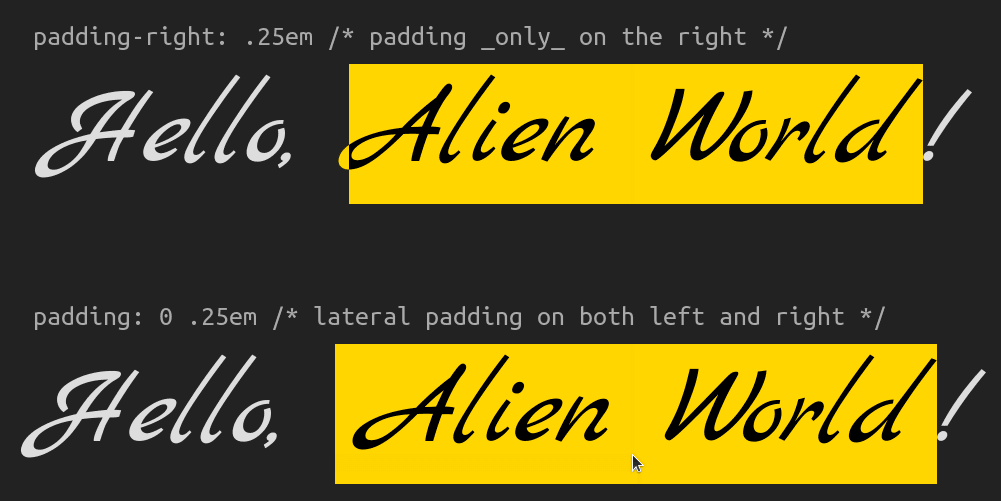


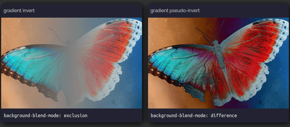

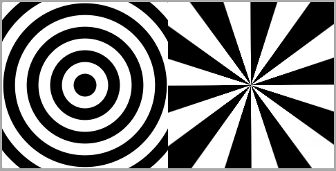


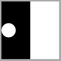


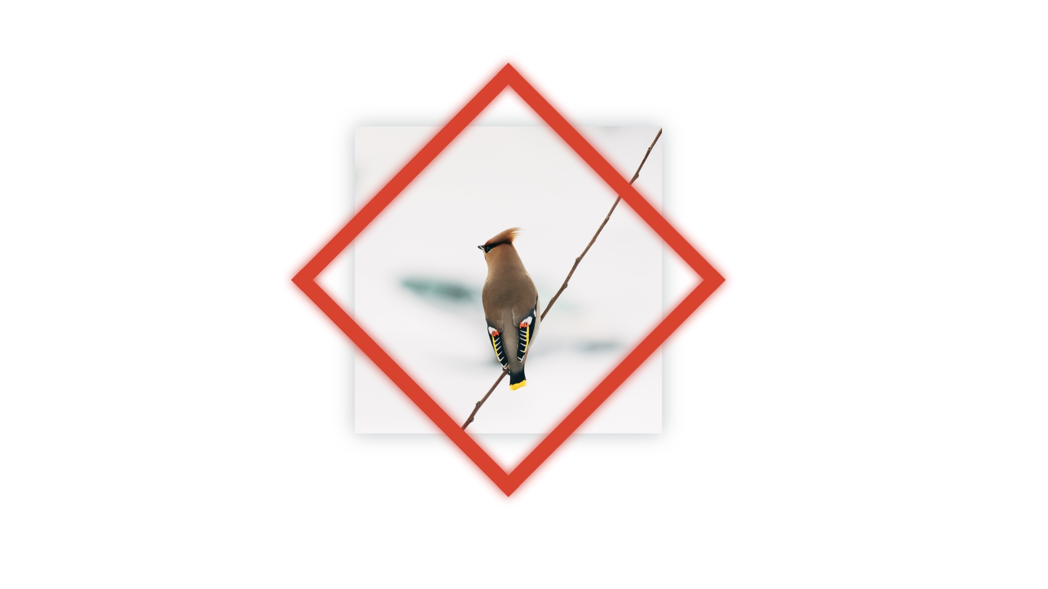
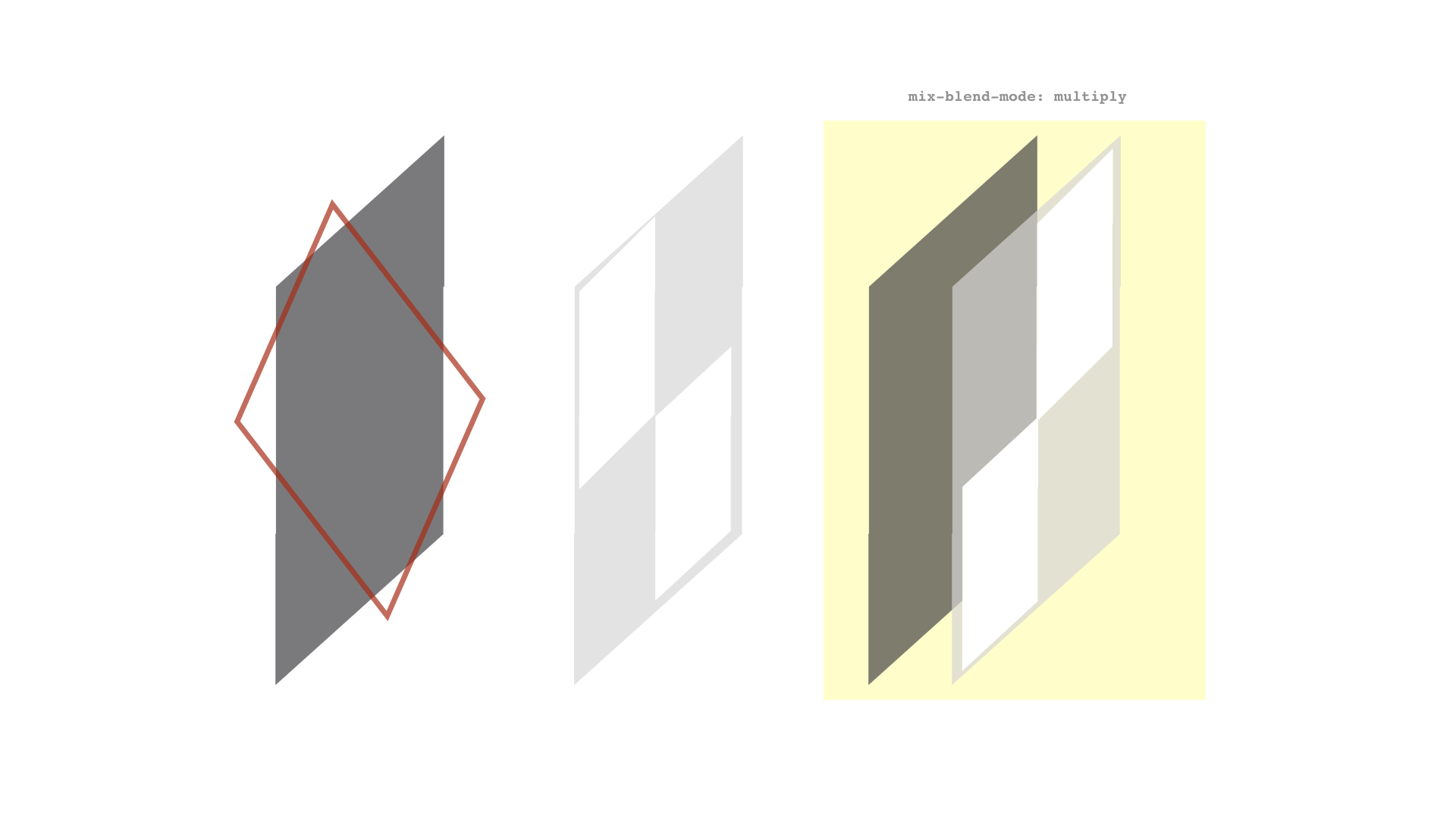


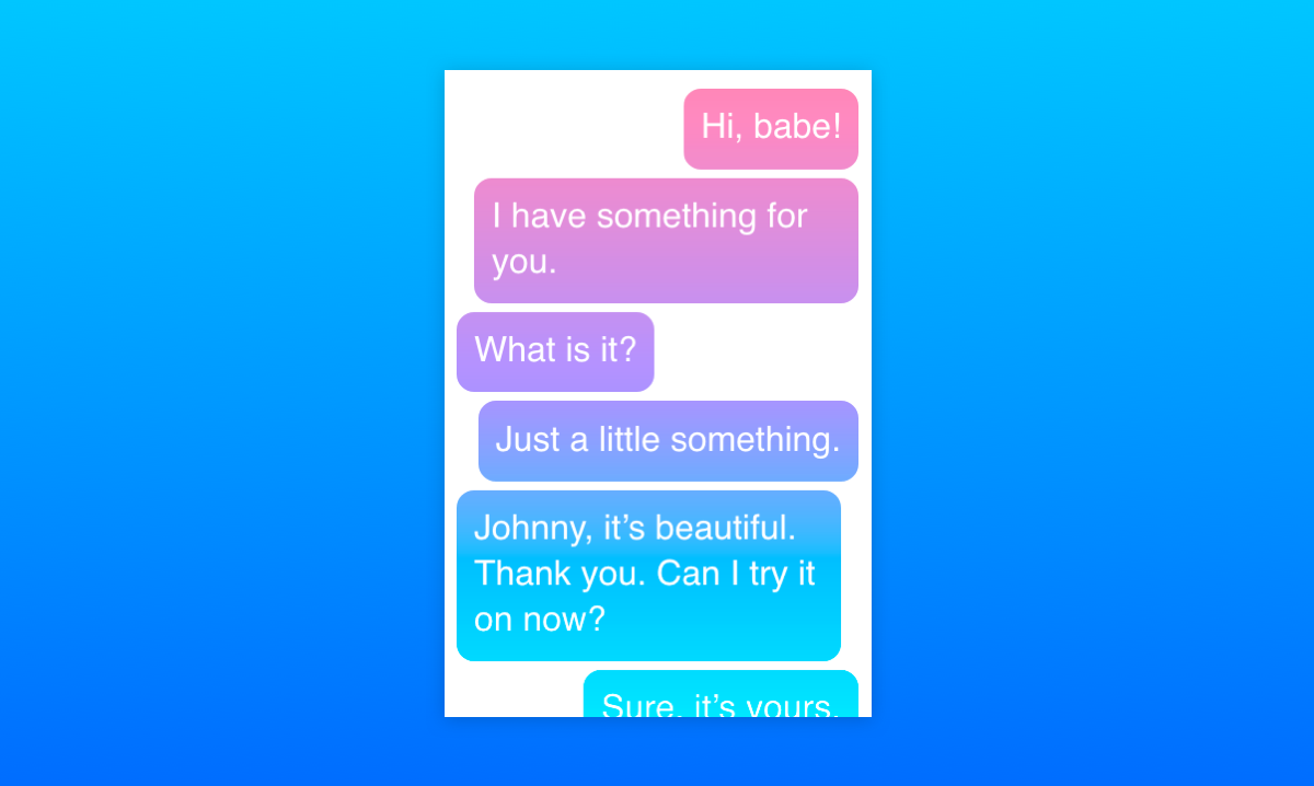
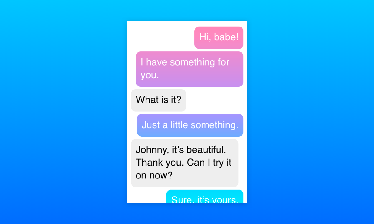
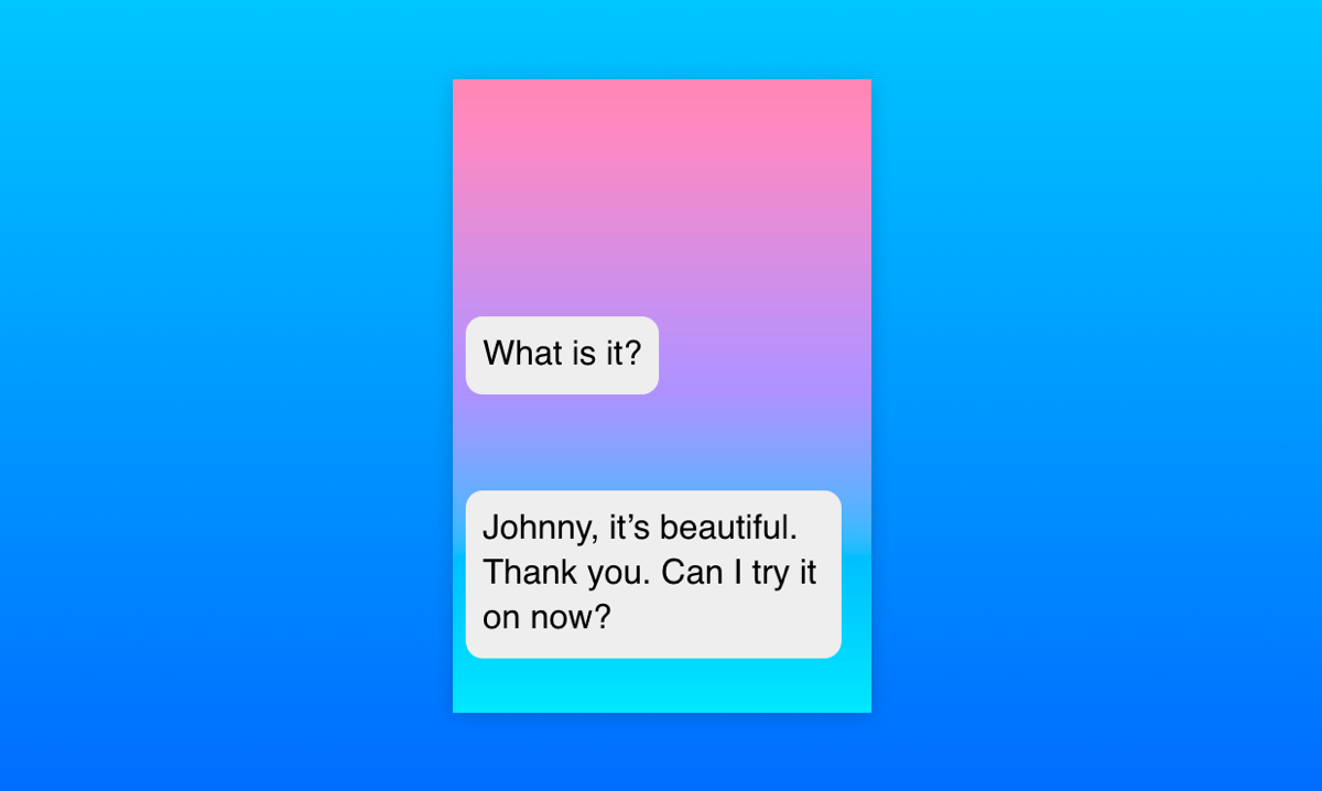