Minimalist Design: Top 10 Free Google Fonts

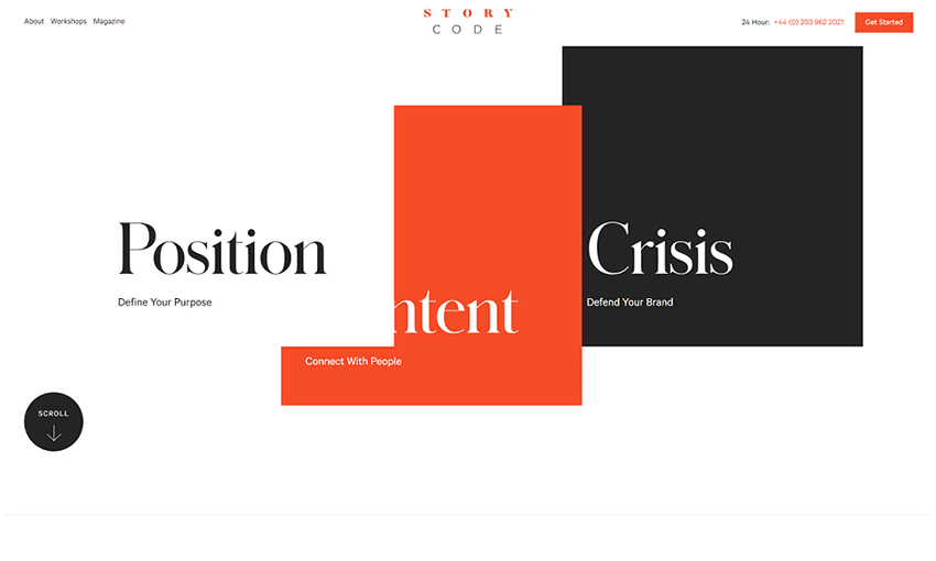
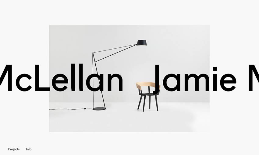
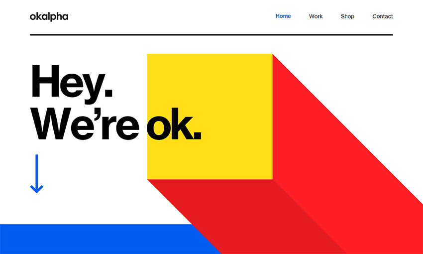
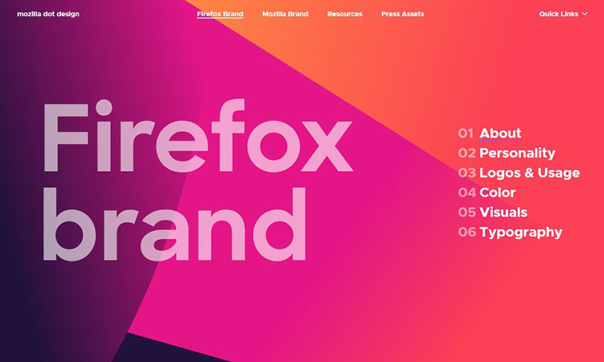
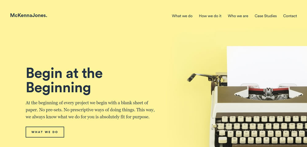
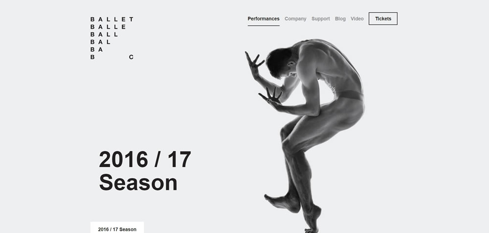
In the field of design, simplicity can often eclipse complexity. Minimalist design principles echo across varied creative fields — from architecture to product design, and notably, typography. Our overview takes you on a journey through the landscape of fonts, highlighting ten free Google Fonts that encapsulate minimalist design principles. Featuring both trusted favorites and potential new go-to’s, these fonts can enhance your designs with their clean lines, clear visuals, excellent readability, and contemporary appeal.

Your Web Designer Toolbox
Unlimited Downloads: 500,000+ Web Templates, Icon Sets, Themes & Design Assets


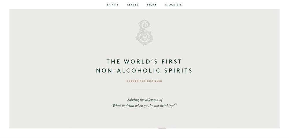
Understanding Minimalist Typography

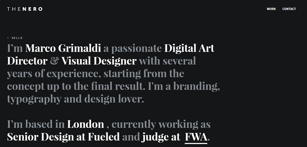
At its core, minimalist typography embraces simplicity. It drops unnecessary decorations, focusing on visual appeal and functional design that boosts readability. Sans-serif typefaces, appreciated for their clean lines and generous white space, are a frequent choice in minimalist typography. This focus on functionality and elegance ensures the design’s core message and content shines through, unhindered and dominant.

Now, let’s take a closer look at our top 10 minimalist font recommendations.

Roboto

Roboto, a font you’ve likely encountered on the web or in apps, combines mechanical and geometric forms. Its 12 distinct styles make it a versatile choice for an array of minimalist designs, from website headers to the UIs of mobile applications. Its universal appeal and wide language support make Roboto a popular choice for digital design.

Open Sans

Open Sans, another ubiquitous font, stands out with upright stress and open forms, conveying a friendly yet neutral demeanor. Its extensive character set enhances readability at small sizes, cementing its status as a reliable choice for body text in minimalist designs.

Lato

Lato, with semi-rounded details in its letters, communicates warmth without losing its professional essence. The font family’s ten styles offer designers flexibility to meet various design needs, from commanding headlines to nuanced captions.

Montserrat

Inspired by the geometric sans-serif style, Montserrat offers modern, clean character designs. With 18 styles, from thin to black, it caters to a broad spectrum of minimalist designs, be it unobtrusive body text or bold headlines.

Raleway

Raleway’s elegance and sophistication are accentuated by its distinctive ‘w’ and ‘k’ characters, adding visual interest without compromising readability. With nine weights, this font is especially well-suited for headers and large text in minimalist designs.

Arimo

Designed by Steve Matteson, Arimo is a breath of fresh air with its crisp sans-serif design. It stands out with enhanced on-screen readability characteristics, making it an excellent choice for cross-platform document portability.

Poppins

With its geometric sans-serif design, Poppins exudes a clean, modern aesthetic. Its balanced letterforms, available in nine weights, support high readability at both large and small sizes, making it a versatile addition to any minimalist design toolkit.

Oswald

By reinterpreting the classic gothic type style for the digital age, Oswald’s condensed letterforms create a versatile typeface. Offering six weights, Oswald lends itself to a variety of minimalist design applications, from dense body text to airy headers.

Fira Sans

Designed for Mozilla, Fira Sans is a humanist sans-serif typeface. It boasts excellent readability across sizes, thanks to its generous x-height and open apertures. Its broad range of weights make it adaptable for diverse design needs.

Noto Sans

Noto Sans, a part of Google’s mission to support all languages with a harmonious typeface, impresses with its clean, simple forms. Available in regular and bold weights, its unfussy design is a perfect fit for minimalist aesthetics.

While these fonts are free and ready for download on Google Fonts, making them accessible for designers on any budget, they offer significant advantages. They are open-source, web-optimized, and incredibly versatile, catering to an extensive array of design needs and platforms.

Final Thoughts

Typography underpins minimalist design, and your font selections can significantly influence the viewer’s perception.

As a designer, you should consider factors like UX, the overarching design system, font pairing, and hierarchy when selecting fonts for your minimalist design. Fonts that integrate seamlessly into your design system, adhere to UX principles, and respect font hierarchy can result in visually coherent, minimalist aesthetics.

In addition, the process of testing and finalizing fonts can be iterative, requiring you to test different font combinations, review them in various contexts (like different browsers or screen sizes), and gather user feedback. Analytical tools, usability tests, or A/B testing can provide invaluable insights into how your typography choices impact user engagement and accessibility.

Minimalist design is not about restrictions but about thoughtful reduction and focus. Your choice of typography should reflect that ethos.

Bonus💡: 11 Typography Styles to Consider for Your Next Design

Beautiful Blockquotes with CSS ::before Pseudo-Element

Today, we’ll explore how to design blockquotes using the CSS ::before pseudo-element. This straightforward yet versatile element allows designers to add styling or insert content before an element’s main text, without modifying the HTML markup. Let’s see how you can combine it with other CSS properties to create visually appealing blockquotes that can enhance your web content.

Your Web Designer Toolbox
Unlimited Downloads: 500,000+ Web Templates, Icon Sets, Themes & Design Assets


Implementing the Blockquotes

We’ll start by setting up our HTML structure. We will use the blockquote HTML element, styled with a CSS class named .custom-blockquote.

<blockquote class="custom-blockquote">
  Creativity involves breaking out of established patterns to look at things in
  a different way.
  <span>Don Norman</span>
</blockquote>

Once we have our structure set up, let’s move on to the CSS. The ::before pseudo-element will play a key role in adding a unique design element to our blockquote.

@import url('https://fonts.googleapis.com/css?family=Open+Sans:400italic,700');</pre>
.custom-blockquote {
font-size: 1.4em;
width: 60%;
margin: 50px auto;
font-family: Open Sans, sans-serif;
font-style: italic;
color: #555555;
padding: 1.2em 30px 1.2em 75px;
border-left: 8px solid #FFA07A;
line-height: 1.6;
position: relative;
background: #EDEDED;
}

.custom-blockquote::before {
content: "\201C";
color: #FFA07A;
font-size: 4em;
position: absolute;
left: 10px;
top: -10px;
font-family: Arial, sans-serif;
}

.custom-blockquote span {
display: block;
color: #333333;
font-style: normal;
font-weight: bold;
margin-top: 1em;
}

Understanding the Key Aspects

Our CSS code incorporates various elements to enhance the design of our blockquote. Here’s an explanation of the crucial aspects:

  • The ::before pseudo-element: This element adds a large, stylized opening quotation mark before the blockquote’s text. We set its font-family to Arial to create a distinct look. The content property is used to insert the quotation mark, and the color property is set to #FFA07A, matching the color of the blockquote’s left border.

.custom-blockquote::before {
content: "\201C"; /* Inserts the opening quotation mark */
color: #FFA07A; /* Matches the color of the left border */
font-size: 4em; /* Sets the size of the quotation mark */
position: absolute; /* Positions the quotation mark relative to the blockquote */
left: 10px; top: -10px; /* Adjusts the position of the quotation mark */
font-family: Arial, sans-serif; /* Sets the font for a unique look */
}

  • The .custom-blockquote class: This class includes multiple properties that design and position our blockquote. We set the font-family to Open Sans for the quote and the author’s name, using italic and bold variations for distinction.

.custom-blockquote {
font-size: 1.4em; /* Sets the font size for the quote and the author's name */
width: 60%; /* Adjusts the width of the blockquote */
margin: 50px auto; /* Centers the blockquote and adds margin on the top and bottom */
font-family: Open Sans, sans-serif; /* Sets the font for the quote and author's name */
font-style: italic; /* Applies italic style to the quote */
color: #555555; /* Sets the color for the quote */
padding: 1.2em 30px 1.2em 75px; /* Adds space around the quote and author's name */
border-left: 8px solid #FFA07A; /* Adds a left border with a unique color */
line-height: 1.6; /* Improves the readability of the quote */
position: relative; /* Sets the position relative to the parent element */
background: #EDEDED; /* Sets a light grey background color */
}

The Final Design

The image below showcases the final result of the implementation. You’ll see that the creative use of CSS ::before pseudo-element and other design properties result in an attractive, distinct blockquote that stands out from regular web content.

blockquote with quotation inside it

Remember, while this guide provides a specific styling, you can freely modify the color, font, size, positioning, and other properties to match your website’s design language. We encourage you to do so!

10 Beautifully Clean Websites with Minimalist Designs

Minimalism is always in. The universally appealing, clean web design trend has dominated the internet for many years, and will certainly continue for many years to come. While there’s plenty of bright, flashy, experimental web design emerging as well, nothing beats simplistic, clean, and beautiful.

Looking for some inspiration for your own designs? We’ve collected these elegant, minimalistic web designs for you today. Take a look at these websites and their own spins on the trend.

UNLIMITED DOWNLOADS: Email, admin, landing page & website templates


Pitch

Example of Pitch

Pitch opens with a unique full screen intro that scrolls out and transitions into the rest of the site content. It uses clean, white design as a base but builds on it with plenty of colorful and lively animations. This is a great example of what you can do with a simple white base and a little creativity.

Hello Monday

Example of Hello Monday

Great animation has the power to make a simple website vivid and memorable. The intro animation alone will capture your eye, and all the beautiful transitions and hover effects round it out perfectly. This is the perfect portfolio for a branding company: one that leaves a lasting impact.

OpenAI

Example of OpenAI

Clean doesn’t have to mean boring. OpenAI uses vivid images and a gorgeous gradient background while still being efficient and elegant. Scrolling transitions to white to give you a break from the rich colors, and blog pages blend a simple background with interactive elements and bright images to keep things fresh.

Outline

Example of Outline

Check out this website if you’re aiming for minimalism and elegance balanced against vivid imagery. It introduces itself with a simple animated header, then drops you into softly scrolling sliders and bold full screen design. Product pages are intensely colorful with crisp HD pictures, and that same elegant aesthetic.

StoryCode

Example of StoryCode

A little innovation is all it takes to make a simple, clean UI interesting. StoryCode opens with a cool scroll animation that pulls away to reveal their branding tagline. The three-color palette of orange, black, and white provides consistency and contrast in this design.

Jamie McLellan

Example of Jamie McLellan

You’ll definitely remember this designer’s name, as it hovers boldly behind his project images. Click a picture to see its project page, and again to zoom in closer. The whole site is in black and white barring images, but the unique UI does more than enough to make it appealing.

Okalpha

Example of Okalpha

Minimalism doesn’t just mean a white background or a subtle two-toned palette. Okalpha goes all out, starting out with just a pop of color before plunging right into the bright, cartoonish hues. This definitely isn’t an easy aesthetic to pull off, but this site does it by consistently using only three bright colors to balance the intensity.

Good On You

Example of Good On You

If you’re going for a more sophisticated, muted design, look here for inspiration. This fashion website uses pale browns and blues, with each carefully picked image having just the right intensity of color to accent them.

Mozilla Dot Design

Example of Mozilla Dot Design

Clean design is all about the UI, and Mozilla Dot Design does it right with a bold and image-focused appearance. Its palette is striking and multi-toned, but it uses it to great effect on every single page.

Bold

Example of Bold

Bold uses fresh and professional design to create a stunning aesthetic. The site opens to black and white tones, with a crisp video that also begins in a monochromatic palette. The middle of the page is filled with bright and beautiful colors, before transitioning back into black and white as it reaches the footer. It’s an awesome effect and great for branding.

A Fresh Take on Minimalism

Minimalism is definitely a style can be overdone, but with a unique little twist, you can breathe life into this popular trend. Take note of how each of these websites include a fresh new spin on things. A pop of color, an intriguing intro, a beautiful scrolling animation – add your own touch to it, and your site will stand out.

12 Inspirational Examples of Minimal Web Design

Considering that the current philosophy of UI design is “less is more,” the expected rise in popularity of minimalism has reached an all-time high amongst web designers, especially in the last couple of years. But, perhaps unknowingly, its appeal to users has also grown.

The principles of minimalism in web design are that a website (and other mediums as well) should be stripped down to their bare bones, while carefully making use of whitespace and improving readability with clearer typography. When implemented correctly, the result will allow users to focus on what’s truly important without being distracted by non-essential elements.

Your Web Designer Toolbox
Unlimited Downloads: 500,000+ Web Templates, Icon Sets, Themes & Design Assets


While this may sound easy, it can be difficult deciding what the truly important elements are and what’s little more than decoration. It can also be risky. Accidentally removing a seemingly innocuous element could be deemed critical by the user and could result in the wrong message (or worse, no message at all) being delivered to your target audience.

minimal web design Rotate

Source: Rotate°

If you think about the logistics, it makes sense that minimalism appeals to users: the less fluff on the site, the less you have to think about. When there are just a few links or blocks of text, and the point of interest is directly in front of you, you can let your mind rest for a bit – relax, and the website will spoon feed you just what you need.

This collection features fifteen websites that have been designed using the minimalistic principles mentioned above. Some of the sites have also been influenced by many of the popular web design trends we have seen over that past year or so, like flat design, yet still retain a look and feel that can only be described as minimal. Here are the beautifully designed sites:

minimal web design Ballet BC

Source: Ballet BC

minimal web design Cropmark

Source: Cropmark

minimal web design GSArora

Source: GSArora

minimal web design Seedlip

Source: Seedlip

minimal web design Tim Brack

Source: Tim Brack

minimal web design Hatch Inc

Source: Hatch Inc.

minimal web design Elastique

Source: Elastique

Finshed

Minimalism isn’t the miracle solution that you can slap on every single project. There’s a time and place for everything; the time is now, but you need to carefully decide the place.