We rely on CSS Media Queries for selecting and styling elements based on a targeted condition. That condition can be all kinds of things but typically fall into two camps: (1) the type of media that’s being used, and (2) a specific feature of the browser, device, or even the user’s environment.
So, say we want to apply certain CSS styling to a printed document:
@media print {
  .element {
    /* Style away! */
  }
}
The fact that we can apply styles at a certain viewport width has made CSS Media Queries a core ingredient of responsive web design since Ethan Marcotte coined the term. If the browser’s viewport width is a certain size, then apply a set of style rules, which allows us to design elements that respond to the size of the browser.
/* When the viewport width is at least 30em... */
@media screen and (min-width: 30em) {
  .element {
    /* Style away! */
  }
}
Notice the and in there? That’s an operator that allows us to combine statements. In that example, we combined a condition that the media type is a screen and that it’s min-width feature is set to 30em (or above). We can do the same thing to target a range of viewport sizes:
/* When the viewport width is between 30em - 80em */
@media screen and (min-width: 30em) and (max-width: 80em) {
  .element {
    /* Style away! */
  }
}
Now those styles apply to an explicit range of viewport widths rather than a single width!
But the Media Queries Level 4 specification has introduced a new syntax for targeting a range of viewport widths using common mathematical comparison operators — things like <, >, and = — that make more sense syntactically while writing less code.
Let’s dig into how that works.
New comparison operators
That last example is a good illustration of how we’ve sort of “faked” ranges by combining conditions using the and operator. The big change in the Media Queries Level 4 specification is that we have new operators that compare values rather than combining them:
< evaluates if a value is less than another value
> evaluates if a value is greater than another value
= evaluates if a value is equal to another value
<= evaluates if a value is less than or equal to another value
>= evaluates if a value is greater than or equal to another value
Here’s how we might’ve written a media query that applies styles if the browser is 600px wide or greater:
Often when we write CSS Media Queries, we’re creating what’s called a breakpoint — a condition where the design “breaks” and a set of styles are applied to fix it. A design can have a bunch of breakpoints! And they’re usually based on the viewport being between two widths: where the breakpoint starts and where the breakpoint ends.
Here’s how we’ve done that using the and operator to combine the two breakpoint values:
/* When the browser is between 400px - 1000px */
@media (min-width: 400px) and (max-width: 1000px) {
  /* etc. */
}
You start to get a good sense of how much shorter and easier it is to write a media query when we ditch the Boolean and operator in favor of the new range comparison syntax:
@media (400px <= width <= 1000px) {
  /* etc. */
}
Much easier, right? And it’s clear exactly what this media query is doing.
Browser support
This improved media query syntax is still in its early days at the time of this writing and not as widely supported at the moment as the approach that combines min-width and max-width. We’re getting close, though! Safari is the only major holdout at this point, but there is an open ticket for it that you can follow.
This browser support data is from Caniuse, which has more detail. A number indicates that browser supports the feature at that version and up.
Desktop
Chrome
Firefox
IE
Edge
Safari
104
63
No
104
No
Mobile / Tablet
Android Chrome
Android Firefox
Android
iOS Safari
107
106
107
No
Let’s look at an example
Here’s a layout for that’s nicely suited for larger screens, like a desktop:
This layout has base styles that are common to all breakpoints. But as the screen gets narrower, we start to apply styles that are conditionally applied at different smaller breakpoints that are ideally suited for tablets all the way down to mobile phones:
To see what’s happening, here’s a how the layout responds between the two smaller breakpoints. The hidden nav list getting displayed as well as title in the main gets increased in font-size.
That change is triggered when the viewport’s changes go from matching one media’s conditions to another:
/* Base styles (any screen size) */
header {
  display: flex;
  justify-content: center;
}

header ul {
  display: none;
}

.title p {
  font-size: 3.75rem;
}

/* When the media type is a screen with a width greater or equal to 768px */
@media screen and (width >= 768px) {
  header {
    justify-content: space-between;
  }

  header ul {
    display: flex;
    justify-content: space-between;
    gap: 3rem;
  }

  .title p {
    font-size: 5.75rem;
  }
}
We’ve combined a few of the concepts we’ve covered! We’re targeting devices with a screen media type, evaluating whether the viewport width is greater than or equal to a specific value using the new media feature range syntax, and combining the two conditions with the and operator.
OK, so that’s great for mobile devices below 768px and for other devices equal to or greater than 768px. But what about that desktop layout… how do we get there?
As far as the layout goes:
The main element becomes a 12-column grid.
A button is displayed on the image.
The size of the .title element’s font increases and overlaps the image.
Assuming we’ve done our homework and determined exactly where those changes should take place, we can apply those styles when the viewport matches the width condition for that breakpoint. We’re going to say that breakpoint is at 1000px:
/* When the media type is a screen with a width greater or equal to 1000px  */
@media screen and (width >= 1000px) {
  /* Becomes a 12-column grid */
  main {
    display: grid;
    grid-template-columns: repeat(12, 1fr);
    grid-template-rows: auto 250px;
  }

  /* Places the .title on the grid */
  .title {
    grid-row: 1;
  }

  /* Bumps up the font-size */
  .title p {
    font-size: 7.75rem;
  }

  /* Places .images on the grid */
  .images {
    grid-row: 1 / span 2;
    align-self: end;
    position: relative;
  }

  /* Displays the button */
  .images .button {
    display: block;
    position: absolute;
    inset-block-end: 5rem;
    inset-inline-end: -1rem;
  }
}
Have a play with it:
Why the new syntax is easier to understand
The bottom line: it’s easier to distinguish a comparison operator (e.g. width >= 320px) than it is to tell the difference between min-width and max-width using the and operator. By removing the nuance between min- and max-, we have one single width parameter to work with and the operators tell us the rest.
Beyond the visual differences of those syntaxes, they are also doing slightly different things. Using min- and max- is equivalent to using mathematical comparison operators:
max-width is equivalent to the <= operator (e.g. (max-width: 320px) is the same as (width <= 320px)).
min-width is equivalent to the >= operator (e.g. (min-width: 320px) is the same as (width >= 320px)).
Notice that neither is the equivalent of the > or < operators.
Let’s pull an example straight from the Media Queries Level 4 specification where we define different styles based on a breakpoint at 320px in the viewport width using min-width and max-width:
Both media queries match a condition when the viewport width is equal to 320px. That’s not exactly what we want. We want either one of those conditions rather than both at the same time. To avoid that implicit changes, we might add a pixel to the query based on min-width:
While this ensures that the two sets of styles don’t apply simultaneously when the viewport width is 320px, any viewport width that fall between 320px and 321px will result in a super small zone where none of the styles in either query are applied — a weird “flash of unstyled content” situation.
One solution is to increase the second comparison scale value (numbers after the decimal point) to 320.01px:
Phew, we covered a lot of ground on the new syntax for targeting viewport width ranges in CSS Media Queries. Now that the Media Queries Level 4 specification has introduced the syntax and it’s been adopted in Firefox and Chromium browsers, we’re getting close to being able to use the new comparison operators and combining them with other range media features besides width, like height and aspect-ratio
Una is calling it the new responsive. A nod to the era we were most certainly in, the era of responsive design. Where responsive design was fluid grids, flexible media, and media queries, the new responsive is those things too, but slotted into a wider scope: user preference queries, viewport and form factor, macro layouts, and container styles.
I like the thinking and grouping here and I kinda like the name. It eludes to an evolution and extension of responsive web design rather than a rejection and replacement.
This isn’t the first crack at identifying and naming a shift between eras. Back in 2018, Jen Simmons was doing a talked called “Everything You Know About Web Design Just Changed” where she identified that responsive design was a major shift in how we did layout on the web. And yet, it was firmly defined in an era where layout tools like flexbox and grid didn’t even exist. Now, they do exist, and with them a bevy of other new features that bring more capable graphic design to the web. She called itIntrinsic Design.
I almost like Intrinsic Design more now than I did in 2018, because now, if we attempt to lump in @container queries, the name makes more intuitive sense. We (hopefully will soon) make styling choices based on the intrinsic size of elements. We make styling choices based on the intrinsic nature of the individual users we serve. We make styling choices off the intrinsic qualities of the browser.
I wouldn’t say either of the terms have really caught on though. It’s hard to make a name stick. That little burst of ideating around CSS4 sure didn’t go anywhere.
Looks like 2021 is the time to start using CSS Logical Properties! Plus, Chrome recently shipped a few APIs that have raised eyebrows, SVG allows us to disable its aspect ratio, WordPress focuses on the accessibility of its typography, and there’s still no update (or progress) on the development of CSS custom media queries.
Let’s jump right into the news…
Logical CSS could soon become the new default
Six years after Mozilla shipped the first bits of CSS Logical Properties in Firefox, this feature is now on a path to full browser support in 2021. The categories of logical properties and values listed in the table below are already supported in Firefox, Chrome, and the latest Safari Preview.
CSS property or value
The logical equivalent
margin-top
margin-block-start
text-align: right
text-align: end
bottom
inset-block-end
border-left
border-inline-start
(n/a)
margin-inline
Logical CSS also introduces a few useful shorthands for tasks that in the past required multiple declarations. For example, margin-inline sets the margin-left and margin-right properties, while inset sets the top, right, bottom and left properties.
/* BEFORE */
main {
  margin-left: auto;
  margin-right: auto;
}

/* AFTER */
main {
  margin-inline: auto;
}
A website can add support for an RTL (right-to-left) layout by replacing all instances of left and right with their logical counterparts in the site’s CSS code. Switching to logical CSS makes sense for all websites because the user may translate the site to a language that is written right-to-left using a machine translation service. The biggest languages with RTL scripts are Arabic (310 million native speakers), Persian (70 million), and Urdu (70 million).
/* Switch to RTL when Google translates the page to an RTL language */
.translated-rtl {
  direction: rtl;
}
David Bushell’s personal website now uses logical CSS and relies on Google’s translated-rtl class to toggle the site’s inline base direction. Try translating David’s website to an RTL language in Chrome and compare the RTL layout with the site’s default LTR layout.
Chrome ships three controversial Fugu APIs
Last week Chrome shipped three web APIs for “advanced hardware interactions”: the WebHID and Web Serial APIs on desktop, and Web NFC on Android. All three APIs are part of Google’s capabilities project, also known as Project Fugu, and were developed in W3C community groups (though they’re not web standards).
The WebHID API allows web apps to connect to old and uncommon human interface devices that don’t have a compatible device driver for the operating system (e.g., Nintendo’s Wii Remote).
The Web Serial API allows web apps to communicate (“byte by byte”) with peripheral devices, such as microcontrollers (e.g., the Arduino DHT11 temperature/humidity sensor) and 3D printers, through an emulated serial connection.
Web NFC allows web apps to wirelessly read from and write to NFC tags at short distances (less than 10 cm).
Apple and Mozilla, the developers of the other two major browser engines, are currently opposed to these APIs. Apple has decided to “not yet implement due to fingerprinting, security, and other concerns.” Mozilla’s concerns are summarized on the Mozilla Specification Positions page.
By default, an SVG scales to fit the <svg> element’s content box, while maintaining the aspect ratio defined by the viewBox attribute. In some cases, the author may want to stretch the SVG so that it completely fills the content box on both axes. This can be achieved by setting the preserveAspectRatio attribute to none on the <svg> element.
Distorting SVG in this manner may seem counterintuitive, but disabling aspect ratio via the preserveAspectRatio=none value can make sense for simple, decorative SVG graphics on a responsive web page:
This value can be useful when you are using a path for a border or to add a little effect on a section (like a diagonal [line]), and you want the path to fill the space.
WordPress tones down the use of italics
An italic font can be used to highlight important words (e.g., the <em> element), titles of creative works (<cite>), technical terms, foreign phrases (<i>), and more. Italics are helpful when used discreetly in this manner, but long sections of italic text are considered an accessibility issue and should be avoided.
Italicized text can be difficult to read for some people with dyslexia or related forms of reading disorders.
Putting the entire help text in italics is not recommended
WordPress 5.7, which was released earlier this week, removed italics on descriptions, help text, labels, error details text, and other places in the WordPress admin to “improve accessibility and readability.”
In related news, WordPress 5.7 also dropped custom web fonts, opting for system fonts instead.
Still no progress on CSS custom media queries
The CSS Media Queries Level 5 module specifies a @custom-media rule for defining custom media queries. This proposed feature was originally added to the CSS spec almost seven years ago (in June 2014) and has since then not been further developed nor received any interest from browser vendors.
A media query used in multiple places can instead be assigned to a custom media query, which can be used everywhere, and editing the media query requires touching only one line of code.
Custom media queries may not ship in browsers for quite some time, but websites can start using this feature today via the official PostCSS plugin (or PostCSS Preset Env) to reduce code repetition and make media queries more readable.
On a related note, there is also the idea of author-defined environment variables, which (unlike custom properties) could be used in media queries, but this potential feature has not yet been fully fleshed out in the CSS spec.
Using media queries in CSS as part of responsive websites is bread and butter stuff to todays front-end developer. Using preprocessors to make them more comfortable to write and easier to maintain has become common practice as well.
I spent a few months experimenting with a dozen different approaches to media queries in Sass and actually used a few in production. All of them eventually failed to cater for everything I needed to do in an elegant way. So I took what I liked about each of them and created a solution that covered all scenarios I came across.
Why use a preprocessor at all?
That’s a fair question. After all, what’s the point of doing all this if one can simply write media queries using pure CSS? Tidiness and maintainability.
The most common use for media queries is the transformation of a layout based on the browser’s viewport width. You can make a layout adapt in such a way that multiple devices with different screen sizes can enjoy an optimal experience. As a consequence, the expressions used to define the media queries will make reference to the typical screen width of those devices.
So if your code contains 5 media queries that target tablet devices with a width of 768px, you will hardcode that number 5 times, which is something ugly that my OCD would never forgive. First of all, I want my code to be easy to read to the point that anyone understands instantly that a media query is targeting tablet devices just by looking at it – I reckon the word tablet would do that better than 768px.
Also, what if that reference width changes in the future? I hate the idea of replacing it in 5 instances around the code, especially when it’s scattered around multiple files.
A first step would be to store that breakpoint in a variable and use it to construct the media query.
/* Using plain CSS */
@media (min-width: 768px) {

}

/* Using SCSS variables to store breakpoints */
$breakpoint-tablet: 768px;
@media (min-width: $breakpoint-tablet) {

}
Another reason to write media queries with a preprocessor like Sass is that it can sometimes provide some precious help with the syntax, in particular when writing an expression with a logical or (represented with a comma in CSS).
For example, if you want to target retina devices, the pure CSS syntax starts getting a bit verbose:
/* Plain CSS */
@media (min-width: 768px) and
       (-webkit-min-device-pixel-ratio: 2),
       (min-width: 768px) and
       (min-resolution: 192dpi) {
}

/* Using variables? */
@media (min-width: $bp-tablet) and ($retina) { // or #{$retina}

}
It does look nicer, but unfortunately it won’t work as expected.
A problem with logic
Because of the way the CSS “or” operator works, I wouldn’t be able to mix the retina conditions with other expressions since a (b or c) would be compiled into (a or b) c and not a b or a c.
$retina: "(-webkit-min-device-pixel-ratio: 2), (min-resolution: 192dpi)";

// This will generate unwanted results!
@media (min-width: 480px) and #{$retina} {
  body {
    background-color: red;
  }
}
/* Not the logic we're looking for */
@media (min-width: 480px) and (-webkit-min-device-pixel-ratio: 2), (min-resolution: 192dpi) {
  body {
    background-color: red;
  }
}
I realized I needed something more powerful, like a mixin or a function, to address this. I tried a few solutions.
Dmitry Sheiko’s technique
One I tried was Dmitry Sheiko’s technique, which had a nice syntax and includes Chris’ retina declaration.
He has a single-responsibility retina version as well.
But another problem hit me when I was styling an element that required additional rules on intermediate breakpoints. I didn’t want to pollute my list of global breakpoints with case-specific values just so I could still use the mixin, but I definitely didn’t want to forgo the mixin and go back to using plain CSS and hardcoding things every time I had to use custom values.
/* I didn't want to sometimes have this */
@include tablet {

}

/* And other times this */
@media (min-width: 768px) and (max-width: 950px) {

}
Breakpoint technique
Breakpoint-sass was next on my list, as it supports both variables and custom values in its syntax (and, as a bonus, it’s really clever with pixel ratio media queries).
Things were looking better, but I personally think that Breakpoint-sass’ syntax feels less natural than Dmitry’s. You can give it a number and it assumes it’s a min-width value, or a number and a string and it assumes a property/value pair, to name just a few of the combinations it supports.
That’s fine and I’m sure it works great once you’re used to it, but I hadn’t given up on finding a syntax that was both simple and as close as possible to the way I orally describe what a media query must target.
Also, if you look at the example above you’ll see that a device with a width of exactly 768px will trigger both media queries, which may not be exactly what we want. So I added the ability to write inclusive and exclusive breakpoints to my list of requirements.
I’m a fan of Dmitry’s syntax, so my solution was inspired by it. However, I’d like some more flexibility in the way breakpoints are created. Instead of hardcoding the names of the breakpoints in the mixin, I used a multidimensional map to declare and label them.
The mixin comes with a set of default breakpoints, which you can override anywhere in the code by re-declaring the variable $breakpoints.
Inclusive and exclusive breakpoints
I wanted to have a finer control over the intervals in the expressions, so I included support for the less-than-or-equal-to and greater-than-or-equal-to operators. This way I can use the same breakpoint declaration in two mutually exclusive media queries.
@include media(">=phone", "<tablet") {

}

@include media(">=tablet", "<=950px") {

}

/* Compiles to */
@media (min-width: 640px) and (max-width: 767px) {

}

@media (min-width: 768px) and (max-width: 950px) {

}
Infer media types and handle logic disjunction
Similarly to the breakpoints, there’s a list for media types and other static expressions declared by default (which you can override by setting the variable $media-expressions). This adds support for optional media types, such as screen or handheld, but it’s also capable of correctly handling expressions with logical disjunctions, such as the retina media query we saw before. The disjunctions are declared as nested lists of strings.
$media-expressions: (screen: "screen",
                    handheld: "handheld",
                    retina2x:
                    ("(-webkit-min-device-pixel-ratio: 2)",
                    "(min-resolution: 192dpi)")) !default;

@include media("screen", ">=tablet") {

}

@include media(">tablet", "<=desktop", "retina2x") {

}

/* Compiles to */
@media screen and (min-width: 768px) {

}

@media (min-width: 769px) and
       (max-width: 1024px) and
       (-webkit-min-device-pixel-ratio: 2),
       (min-width: 769px) and
       (max-width: 1024px) and
       (min-resolution: 192dpi) {

}
There’s no rocket science under the hood, but the full implementation of the mixin isn’t something I could show in just a few lines of code. Instead of boring you with huge code snippets and neverending comments, I included a Pen with everything working and I’ll briefly describe the process it goes through to construct the media queries.
How it works
The mixin receives multiple arguments as strings and starts by going through each one to figure out if it represents a breakpoint, a custom width, or one of the static media expressions.
If an operator is found, it is extracted and any matching breakpoint will be returned, or else we assume it’s a custom value and cast it to a number (using SassyCast).
If it’s a static media expression, it checks for any or operators and generates all the combinations necessary to represent the disjunction.
The process is repeated for all the arguments and the results will by glued together by the and connector to form the media query expression.
If you’d like to look at the complete Sass for it, it’s here. It’s called include-media on GitHub.
Final thoughts
I’m a big fan of this technique to make Sass talk to JavaScript. Because we declare breakpoints as a multidimensional list with their names as keys, exporting them in bulk to JavaScript becomes really straightforward and can be done automatically with just a few lines of code.
I’m not trying to put down other people’s solutions and I’m definitely not saying this one is better. I mentioned them to show some of the obstacles I found along the way to my ideal solution, as well as some great things they introduced that inspired my own solution.
You might have some concerns about the length and complexity of this implementation. While I understand, the idea behind it is that you download one single file, @import it into your project and start using it without having to touch the source code. Ping me on Twitter though if you have any questions.
You can get it from GitHub and you are very welcome to contribute with issues/code/love. I’m sure there’s still a lot we can do to make it better.
Update!
Eduardo made a website for his approach: @include-media.
Spoiler alert: There is no support for it yet. But it is defined in the Media Queries Level 5 spec that includes other recent, but more familiar user preference features, like prefers-color-scheme and prefers-reduced-motion.
The Polypane blog goes into incredible depth on prefers-reduced-data, especially for something that we have yet to see in the wild. That’s actually what makes the Polypane team an ideal voice on the subject. It’s product is a browser that is able to emulate the feature behind a Chromium flag.
At the same time, it’s worth noting that the spec calls out two significant potential issues with this feature in its current state:
It may be an undesired source of fingerprinting, with a bias towards low income with limited data.
This feature is an early draft, and the CSS-WG does not consider it ready for shipping in production.
But that’s not to say we can’t start getting acquainted with it. Here’s how it works:
@media (prefers-reduced-data: reduced) {
  /* Stuff for reduced data preferences */
}

@media (prefers-reduced-data: no-preference) {
  /* Stuff for no data preferences */
}
What I appreciate from this post is the wealth of possible use cases it lists. Allow me to summarize:
Conditionally load fonts. As in, make a @font-face declaration then call the font on the body, once for users with no-preference to get the custom font, and again for users with reduced to get a lighter stack.
Background images. Have you ever used a giant splash image as the background for some full-width hero component? Maybe that can be served just to folks who have no-preference while those with reduced get either a smaller variation or no image at all.
Smaller images in HTML. This is clever because remember that we have the media attribute on the <source> element. So, we can instruct browsers to use certain images when working with <picture>, a la: <source srcset="small.jpg" media="(prefers-reduced-data: reduce)" />.
Conditionally preload and autoplay videos. Just as we can work with this feature in HTML, we can use it in JavaScript, too, by using window.matchMedia('(prefers-reduced-data: no-preference)').matches to set autoplay and preload attributes on a video based on data preferences.
Ditch infinite scrolling. I’d generally ditch this pattern in the first place, but we can certainly disable it so users who prefer reduced data aren’t force-fed more content (and thus, more data) just by reaching the end of a page.
That’s not a definitive list of ideas, of course! We talk all the time about serving the right assets to the right people at the right time and this media feature is a great tool to help us do that in certain contexts. Think also of:
Providing low-res versions of downloaded assets (e.g. PDFs)
Linking to certain sites or pages that have heavy experiences
Conditionally loading entire scripts, stylesheets, or libraries based on preference
Probably a gazillion other and more clever things…
And this advice is golden:
Like prefers-reduced-motion, it’s good to think of the prefers-reduced-data: reduce option as the default option: people get the lean, fast experience, and only when they indicate no-preference, we send them more data. That way, older browser that don’t support the media query get the lean experience by default.
Yep. The same sort of idea as “mobile-first” responsive design: start by designing for reduced data and then enhance as we scale up.
Media queries are a way to target browser by certain characteristics, features, and user preferences, then apply styles or run other code based on those things. Perhaps the most common media queries in the world are those that target particular viewport ranges and apply custom styles, which birthed the whole idea of responsive design.
/* When the browser is at least 600px and above */
@media screen and (min-width: 600px) {
  .element {
    /* Apply some styles */
  }
}
There are lots of other things we can target beside viewport width. That might be screen resolution, device orientation, operating system preference, or even more among a whole bevy of things we can query and use to style content.
Looking for a quick list of media queries based on the viewports of standard devices, like phones, tablets and laptops? Check out our collection of snippets.
Using media queries
Media queries are commonly associated with CSS, but they can be used in HTML and JavaScript as well.
HTML
There are a few ways we can use media queries directly in HTML.
There’s the <link> element that goes right in the document <head>. In this example. we’re telling the browser that we want to use different stylesheets at different viewport sizes:
<html>
  <head>
    <!-- Served to all users -->
    <link rel="stylesheet" href="all.css" media="all" />
    <!-- Served to screens that are at least 20em wide -->
    <link rel="stylesheet" href="small.css" media="(min-width: 20em)" />
    <!-- Served to screens that are at least 64em wide -->
    <link rel="stylesheet" href="medium.css" media="(min-width: 64em)" />
    <!-- Served to screens that are at least 90em wide -->
    <link rel="stylesheet" href="large.css" media="(min-width: 90em)" />
    <!-- Served to screens that are at least 120em wide -->
    <link rel="stylesheet" href="extra-large.css" media="(min-width: 120em)" />
    <!-- Served to print media, like printers -->
    <link rel="stylesheet" href="print.css" media="print" />
  </head>
  <!-- ... -->
</html>
Why would you want to do that? It can be a nice way to fine-tune the performance of your site by splitting styles up in a way that they’re downloaded and served by the devices that need them.
But just to be clear, this doesn’t always prevent the stylesheets that don’t match those media queries from downloading, it just assigns them a low loading priority level. So, if a small screen device like a phone visits the site, it will only download the stylesheets in the media queries that match its viewport size. But if a larger desktop screen comes along, it will download the entire bunch because it matches all of those queries (well, minus the print query in this specific example).
That’s just the <link> element. As our guide to responsive images explains, we can use media queries on <source> element, which informs the <picture> element what version of an image the browser should use from a set of image options.
<picture>
  <!-- Use this image if the screen is at least 800px wide -->
  <source srcset="cat-landscape.png" media="(min-width: 800px)">
  <!-- Use this image if the screen is at least 600px wide -->
  <source srcset="cat-cropped.png" media="(min-width: 600px)">

  <!-- Use this image if nothing matches -->
  <img src="cat.png" alt="A calico cat with dark aviator sunglasses.">
</picture>
Again, this can be a nice performance win because we can serve smaller images to smaller devices — which presumably (but not always) will be low powered devices that might be limited to a data plan.
And let’s not forget that we can use media queries directly on the <style> element as well:
<style>
  p {
    background-color: blue;
    color: white;
  }
</style>

<style media="all and (max-width: 500px)">
  p {
    background-color: yellow;
    color: blue;
  }
</style>
CSS
Again, CSS is the most common place to spot a media query in the wild. They go right in the stylesheet in an @media rule that wraps elements with conditions for when and where to apply a set of styles when a browser matches those conditions.
/* Viewports between 320px and 480px wide */
@media only screen and (min-device-width: 320px) and (max-device-width: 480px)
  .card {
    background: #bada55;
  }
}
It’s also possible to scope imported style sheet but as a general rule avoid using @import since it performs poorly.
/* Avoid using @import if possible! */

/* Base styles for all screens */
@import url("style.css") screen;
/* Styles for screens in a portrait (narrow) orientation */
@import url('landscape.css') screen and (orientation: portrait);
/* Print styles */
@import url("print.css") print;
JavaScript
We can use media queries in JavaScript, too! And guess, what? They’re work a lot like they do in CSS. The difference? We start by using the window.matchMedia() method to define the conditions first.
So, say we want to log a message to the console when the browser is at least 768px wide. We can create a constant that calls matchMedia() and defines that screen width:
// Create a media condition that targets viewports at least 768px wide
const mediaQuery = window.matchMedia( '( min-width: 768px )' )
Then we can fire log to the console when that condition is matched:
// Create a media condition that targets viewports at least 768px wide
const mediaQuery = window.matchMedia( '( min-width: 768px )' )


// Check if the media query is true
if ( mediaQuery ) {
  // Then log the following message to the console
  console.log('Media Query Matched!')
}
Unfortunately, this only fires once so if the alert is dismissed, it won’t fire again if we change the screen width and try again without refreshing. That’s why it’s a good idea to use a listener that checks for updates.
// Create a condition that targets viewports at least 768px wide
const mediaQuery = window.matchMedia('(min-width: 768px)')


function handleTabletChange(e) {
  // Check if the media query is true
  if (e) {
    // Then log the following message to the console
    console.log('Media Query Matched!')
  }
}


// Register event listener
mediaQuery.addListener(handleTabletChange)

// Initial check
handleTabletChange(mediaQuery)
Check out Marko Ilic’s full post on “Working with JavaScript Media Queries” for a deeper dive on this, including a comparison of using media queries with an older JavaScript approach that binds a resize event listener that checks window.innerWidth or window.innerHeight to fire changes.
Anatomy of a Media Query
Now that we’ve seen several examples of where media queries can be used, let’s pick them apart and see what they’re actually doing.
The first ingredient in a media query recipe is the @media rule itself, which is one of many CSS at-rules. Why does @media get all the attention? Because it’s geared to the type of media that a site is viewed with, what features that media type supports, and operators that can be combined to mix and match simple and complex conditions alike.
Media types
@media screen {
  /* Styles! */
}
What type of media are we trying to target? In many (if not most) cases, you’ll see a screen value used here, which makes sense since many of the media types we’re trying to match are devices with screens attached to them.
But screens aren’t the only type of media we can target, of course. We have a few, including:
all: Matches all devices
print: Matches documents that are viewed in a print preview or any media that breaks the content up into pages intended to print.
screen: Matches devices with a screen
speech: Matches devices that read the content audibly, such as a screenreader. This replaces the now deprecated aural type since Media Queries Level 4.
Once we define the type of media we’re trying to match, we can start defining what features we are trying to match it to. We’ve looked at a lot of examples that match screens to width, where screen is the type and bothmin-width and max-width are features with specific values.
But there are many, many (many!) more “features” we can match. Media Queries Level 4 groups 18 media features into 5 categories.
Viewport/Page Characteristics
Feature
Summary
Values
Added
width
Defines the widths of the viewport. This can be a specific number (e.g. 400px) or a range (using min-width and max-width).
<length>
height
Defines the height of the viewport. This can be a specific number (e.g. 400px) or a range (using min-height and max-height).
<length>
aspect-ratio
Defines the width-to-height aspect ratio of the viewport
<ratio>
orientation
The way the screen is oriented, such as tall (portrait) or wide (landscape) based on how the device is rotated.
portrait
landscape
overflow-block
Checks how the device treats content that overflows the viewport in the block direction, which can be scroll (allows scrolling), optional-paged (allows scrolling and manual page breaks), paged (broken up into pages), and none (not displayed).
scroll
optional-paged
paged
Media Queries Level 4
overflow-inline
Checks if content that overflows the viewport along the inline axis be scrolled, which is either none (no scrolling) or scroll (allows scrolling).
scroll
none
Media Queries Level 4
Display Quality
Feature
Summary
Values
Added
resolution
Defines the target pixel density of the device
<resolution>
infinite
scan
Defines the scanning process of the device, which is the way the device paints an image onto the screen (where interlace draws odd and even lines alternately, and progressive draws them all in sequence).
interlace
progressive
grid
Determines if the device uses a grid (1) or bitmap (0) screen
0 = Bitmap 1 = Grid
Media Queries Level 5
update
Checks how frequently the device can modify the appearance of content (if it can at all), with values including none, slow and fast.
slow
fast
none
Media Queries Level 4
environment-blending
A method for determining the external environment of a device, such as dim or excessively bright places.
opaque
additive
subtractive
display-mode
Tests the display mode of a device, including fullscreen(no browsers chrome), standalone (a standalone application), minimal-ui (a standalone application, but with some navigation), and browser (a more traditional browser window)
Defines the color support of a device, expressed numerically as bits. So, a value of 12 would be the equivalent of a device that supports 12-bit color, and a value of zero indicates no color support.
<integer>
color-index
Defines the number of values the device supports. This can be a specific number (e.g. 10000) or a range (e.g. min-color-index: 10000, max-color-index: 15000), just like width.
<integer>
monochrome
The number of bits per pixel that a device’s monochrome supports, where zero is no monochrome support.
<integer>
color-gamut
Defines the range of colors supported by the browser and device, which could be srgb, p3 or rec2020
srgb
p3
rec2020
Media Queries Level 4
dynamic-range
The combination of how much brightness, color depth, and contrast ratio supported by the video plane of the browser and user device.
standard
high
inverted-colors
Checks if the browser or operating system is set to invert colors (which can be useful for optimizing accessibility for sight impairments involving color)
inverted
none
Media Queries Level 5
Interaction
Feature
Summary
Values
Added
pointer
Sort of like any-pointer but checks if the primary input mechanism is a pointer and, if so, how accurate it is (where coarse is less accurate, fine is more accurate, and none is no pointer).
coarse
fine
none
Media Queries Level 4
hover
Sort of like any-hover but checks if the primary input mechanism (e.g. mouse of touch) allows the user to hover over elements
hover

none
Media Queries Level 4
any-pointer
Checks if the device uses a pointer, such as a mouse or styles, as well as how accurate it is (where coarse is less accurate and fine is more accurate)
coarse
fine
none
Media Queries Level 4
any-hover
Checks if the device is capable of hovering elements, like with a mouse or stylus. In some rare cases, touch devices are capable of hovers.
hover
none
Media Queries Level 4
Video Prefixed
The spec references user agents, including TVs, that render video and graphics in two separate planes that each have their own characteristics. The following features describe those planes.
Feature
Summary
Values
Added
video-color-gamut
Describes the approximate range of colors supported by the video plane of the browser and user device
srgb
p3
rec2020
Media Queries Level 5
video-dynamic-range
The combination of how much brightness, color depth, and contrast ratio supported by the video plane of the browser and user device.
standard
high
Media Queries Level 5
video-width¹
The width of the video plane area of the targeted display
<length>
Media Queries Level 5
video-height¹
The height of the video plane area of the targeted display
<length>
Media Queries Level 5
video-resolution¹
The resolution of the video plane area of the targeted display
Checks whether the device allows scripting (i.e. JavaScript) where enabled allows scripting, iniital-only
enabled
initial-only
Media Queries Level 5
User Preference
Feature
Summary
Values
Added
prefers-reduced-motion
Detects if the user’s system settings are set to reduce motion on the page, which is a great accessibility check.
no-preference
reduce
Media Queries Level 5
prefers-reduced-transparency
Detects if the user’s system settings prevent transparent across elements.
no-preference
reduce
Media Queries Level 5
prefers-contrast
Detects if the user’s system settings are set to either increase or decrease the amount of contrast between colors.
no-preference
high
low
forced
Media Queries Level 5
prefers-color-scheme
Detects if the user prefers a light or dark color scheme, which is a rapidly growing way to go about creating “dark mode” interfaces.
light
dark
Media Queries Level 5
forced-colors
Tests whether the browser restricts the colors available to use (which is none or active)
active
none
Media Queries Level 5
prefers-reduced-data
Detects if the user prefers to use less data for the page to be rendered.
no-preference
reduce
Media Queries Level 5
Deprecated
Name
Summary
Removed
device-aspect-ratio
The width-to-height aspect ratio of the output device
Media Queries Level 4
device-height
The height of the device’s surface that displays rendered elements
Media Queries Level 4
device-width
The width of the device’s surface that displays rendered elements
Media Queries Level 4
Operators
Media queries support logical operators like many programming languages so that we can match media types based on certain conditions. The @media rule is itself a logical operator that is basically stating that “if” the following types and features are matches, then do some stuff.
and
But we can use the and operator if we want to target screens within a range of widths:
/* Matches screen between 320px AND 768px */
@media screen (min-width: 320px) and (max-width: 768px) {
  .element {
    /* Styles! */
  }
}
or (or comma-separated)
We can also comma-separate features as a way of using an or operator to match different ones:
/*
  Matches screens where either the user prefers dark mode or the screen is at least 1200px wide */
@media screen (prefers-color-scheme: dark), (min-width 1200px) {
  .element {
    /* Styles! */
  }
}
not
Perhaps we want to target devices by what they do not support or match. This declaration removes the body’s background color when the device is a printer and can only show one color.
@media print and ( not(color) ) {
  body {
    background-color: none;
  }
}
Do you really need media queries?
Media Queries is a powerful tool in your CSS toolbox with exciting hidden gems. But if you accomodate your design to every possible situation you’ll end up with a codebase that’s too complex to maintain and, as we all know, CSS is like a bear cub: cute and inoffensive but when it grows it will eat you alive.
That’s why I recommend following Ranald Mace’s concept of Universal Design which is “the design of products to be usable by all people, to the greatest extent possible, without the need for adaptation or specialized design.”
On Accessibility for Everyone Laura Kalbag explains that the difference between accessible and universal design is subtle but important. An accessible designer would create a large door for people on a wheel chair to enter, while a universal designer would produce an entry that anyone would fit disregarding of their abilities.
I know that talking about universal design on the web is hard and almost sound utopian, but think about it, there are around 150 different browsers, around 50 different combinations of user preferences, and as we mentioned before more than 24000 different and unique Android devices alone. This means that there are at least 18 million possible cases in which your content might be displayed. In the words of the fantastic Miriam Suzanne“CSS out here trying to do graphic design of unknown content on an infinite and unknown canvas, across operating systems, interfaces, & languages. There’s no possible way for any of us to know what we’re doing.”
That’s why assuming is really dangerous, so when you design, develop and think about your products leave assumptions behind and use media queries to make sure that your content is displayed correctly in any contact and before any user.
Using min- and max- to match value ranges
Many of the media features outlined in the previous section — including width, height, color and color-index — can be prefixed with min- or max- to express minimum or maximum constraints. We’ve already seen these in use throughout many of the examples, but the point is that we can create a range of value to match instead of having to declare specific values.
In the following snippet, we’re painting the body’s background purple when the viewport width is wider than 30em and narrower than 80em. If the viewport width does not match that range of values, then it will fallback to white.
body {
  background-color: #fff;
}

@media (min-width: 30em) and (max-width: 80em) {
  body {
    background-color: purple;
  }
}
Media Queries Level 4 specifies a new and simpler syntax using less then (>), greater than (<) and equals (=) operators. Unfortunately, at the time of writing, it isn’t supported by any major browser.
Nesting and complex decision making
CSS allows you to nest at-rules or group statements using parentheses, making it possible to go as deep as we want to evaluate complex operations.
@media (min-width: 20em), not all and (min-height: 40em) {
  @media not all and (pointer: none) { ... }
  @media screen and ( (min-width: 50em) and (orientation: landscape) ), print and ( not (color) ) { ... }
}
Be careful! even thought it’s possible to create powerful and complex expressions, you might end up with a very opinionated, hard to maintain query. As Brad Frost puts it: “The more complex our interfaces are, the more we have to think to maintain them properly.”
Accessibility
Many of the features added in Media Queries Level 4 are centered around accessibility.
prefers-reduced-motion
prefers-reduced-motion detects if the user has the reduced motion preference activated to minimize the amount of movements and animations. It takes two values:
no-preference: Indicates that the user has made no preference known to the system.
reduce: Indicates that user has notified the system that they prefer an interface that minimizes the amount of movement or animation, preferably to the point where all non-essential movement is removed.
This preference is generally used by people who suffer from vestibular disorder or vertigo, where different movements result in loss of balance, migraine, nausea or hearing loss. If you ever tried to spin quickly and got dizzy, you know what it feels like.
In a fantastic article by Eric Bailey, he suggests stopping all animations with this code:
@media screen and (prefers-reduced-motion: reduce) {
  * {
    /* Very short durations means JavaScript that relies on events still works */
    animation-duration: 0.001ms !important;
    animation-iteration-count: 1 !important;
    transition-duration: 0.001ms !important;
  }
}
The prefers-contrast feature informs whether the user has chosen to increase or reduce contrast in their system preferences or the browser settings. It takes three values:
no-preference: When a user has made no preference known to the system. If you use it as a boolean it’ll evaluate false.
high: When a user has selected the option to display a higher level of contrast.
low: When a user has selected the option to display a lower level of contrast.
At the moment of writing this feature is not supported by any browser. Microsoft has done a non-standard earlier implementation with the -ms-high-contrast feature that works only on Microsoft Edge v18 or earlier (but not Chromium-based versions).
This example is increasing the contrast of a the class button from AA to AAA when the user has high contrast on.
inverted-colors
The inverted-colors feature informs whether the user has chosen to invert the colors on their system preferences or the browser settings. Sometimes this option is used as an alternative to high contrast. It takes three values:
none: When colors are displayed normally
inverted: When a user has selected the option to invert colors
The problem with invested colors is that it’ll also invert the colors of images and videos, making them look like x-ray images. By using a CSS invert filter you can select all images and videos and invert them back.
@media (inverted-colors) {
  img, video {
    filter: invert(100%);
  }
}
At the time of writing this feature is only supported by Safari.
prefers-color-scheme
Having a “dark mode” color scheme is something we’re seeing a lot more of these days, and thanks to the prefers-color-scheme feature, we can tap into a user’s system or browser preferences to determine whether we serve a “dark” or a “light” theme based on the ir preferences.
It takes two values:
light: When a user has selected that they prefer a light theme or has no active preferences
dark: When a user has selected a dark display in their settings
body {
  --bg-color: white;
  --text-color: black;

  background-color: var(--bg-color);
  color: var(--text-color);
}

@media screen and (prefers-color-scheme: light) {
  body {
    --bg-color: black;
    --text-color:white;
  }
}
As Adhuham explains in the complete guide to Dark Mode there is way more to it than just changing the color of the background. Before you jump into doing dark mode remember that if you don’t have a very smart implementation strategy you might end up with a code base that’s really hard to maintain. CSS variables can do wonders for it but that’s a subject for another article.
What lies ahead?
Media Queries Level 5 is currently in Working Draft status, which means a lot can change between now and when it becomes a recommendation. But it includes interesting features that are worth mentioning because they open up new ways to target screens and adapt designs to very specific conditions.
User preference media features
Hey, we just covered these in the last section! Oh well. These features are exciting because they’re informed by a user’s actual settings, whether they are from the user agent or even at the operating system level.
Detecting a forced color palette
This is neat. Some browsers will limit the number of available colors that can be used to render styles. This is called “forced colors mode” and, if enabled in the browser settings, the user can choose a limited set of colors to use on a page. As a result, the user is able to define color combinations and contrasts that make content more comfortable to read.
The forced-colors feature allows us to detect if a forced color palette is in use with the active value. If matched, the browser must provide the required color palette through the CSS system colors. The browser is also given the leeway to determine if the background color of the page is light or dark and, if appropriate, trigger the appropriate prefers-color-scheme value so we can adjust the page.
Detecting the maximum brightness, color depth, and contrast ratio
Some devices (and browsers) are capable of super bright displays, rendering a wide range of colors, and high contrast ratios between colors. We can detect those devices using the dynamic-range feature, where the high keyword matches these devices and standard matches everything else.
We’re likely to see changes to this because, as of right now, there’s still uncertainty about what measurements constitute “high” levels of brightness and contrast. The browser may get to make that determination.
Video prefixed features
The spec talks about some screens, like TVs, that are capable of displaying video and graphics on separate “planes” which might be a way of distinguishing the video frame from other elements on the screen. As such, Media Queries Level 5 is proposing a new set of media features aimed at detecting video characteristics, including color gamut and dynamic range.
There are also proposals to detect video height, width and resolution, but the jury’s still out on whether those are the right ways to address video.
Browser support
Browsers keep evolving and since by the time you are reading this post chances are that browser support for this feature might change, please check MDN updated browser compatibility table.
A note on container queries
Wouldn’t be cool if components could adapt themselves on their own size instead of the browser’s? That’s what the concept of container queries is all about. We currently only have the browser screen to make those changes via media queries. That’s unfortunate, as the viewport isn’t always a direct relationship to how big the element itself is. Imagine a widget that renders in many different contexts on a site: sometimes in a sidebar, sometimes in a full-width footer, sometimes in a grid with unknown columns.
This is the problem that the elusive container queries idea is trying to solve. Ideally we could adapt styles of an element according to the size of itself instead of of the size of the viewport. But container queries don’t exist yet. The WICG is looking for use cases and it’s a highly requested feature. We see occasional movement, but it’s unsure if we’ll ever get it. But when we do, you can bet that it will have an impact on how we approach media queries as well.
Let’s look at a bunch of media query examples. There are so many combinations of media types, features, and operators that the number of possibilities we could show would be exhaustive. Instead, we’ll highlight a handful based on specific media features.
Adjust layout at different viewport widths
More info
This is the probably the most widely used media feature. It informs the width of the browser’s viewport including the scrollbar. It unlocked the CSS implementation of what Ethan Marcotte famously coined responsive design: a process by which a design responds to the size of the viewport using a combination of a fluid grid, flexible images, and responsive typesetting.
Later, Luke Wroblewski evolved the concept of responsive design by introducing the term mobile-first, encouraging designers and developers to start with the small-screen experience first then progressively enhance the experience as the screen width and device capabilities expand. A mobile-first can usually be spotted by it’s use of min-width instead of max-width. If we start with min-width, we’re essentially saying, “hey, browser, start here and work up.” On the flip side, max-width is sort of like prioritizing larger screens.
One approach for defining breakpoints by width is using the dimensions of standard devices, like the exact pixel width of an iPhone. But there are many, many (many), many different phones, tables, laptops, and desktops. Looking at Android alone, there are more than 24,000 variations of viewport sizes, resolutions, operating systems, and browsers, as of August 2015. So, while targeting the precise width of a specific device might be helpful for troubleshooting or one-off fixes, it’s probably not the most robust solution for maintaining a responsive architecture. This isn’t a new idea by any stretch. Brad Frost was already preaching the virtues of letting content — not devices — determine breakpoints in his post “7 habits of highly effective media queries” published back in 2013.
And even though media queries are still a valid tool to create responsive interfaces, there are many situations where it’s possible to avoid using width at all. Modern CSS allow us to create flexible layouts with CSS grid and flex that adapts our content to the viewport size without a need to add breakpoints. For example, here is a grid layout that adapts how many columns it will have without any media queries at all.
This example is pulled straight from our Guide to Dark Mode on the Web. The idea is that we can detect whether a user’s system settings are configured to light or dark mode using the prefers-color-scheme feature and then define an alternate set of colors for the rendered UI.
Combining this technique with CSS custom properties makes things even easier because they act like variables that we only need to define once, then use throughout the code. Need to swap colors? Change the custom property value and it updates everywhere. That’s exactly what prefers-color-scheme does. We define a set of colors as custom properties, then redefine them inside a media query using the prefer-color-scheme feature to change colors based on the user’s settings.
Detecting orientation, hover and motion on a responsive card gallery
More info
This gallery is responsive without using the width feature.
It detects the orientation of the viewport. If it’s a portrait viewport, the sidebar will became a header; if it’s landscape it stays off to the side.
Using the pointer media feature, it decides if the main input device is coarse — like a finger — or fine — like a mouse cursor — to set the size of the clickable areas of the checkboxes.
Then, by using the hover media feature, the example checks if the device is capable of hovering (like a mouse cursor) and display a checkbox in each card.
The animations are removed when prefers-reduced-motion is set to reduce.
And did you notice something? We’re actually not using media queries for the actual layout and sizing of the cards! That’s handled using the minmax() function on the .container element to show how responsive design doesn’t always mean using media queries.
In short, this is a fully responsive app without ever measuring width or making assumptions.
Target an iPhone in landscape mode
/* iPhone X Landscape */
@media only screen
  and (min-device-width: 375px)
  and (max-device-width: 812px)
  and (-webkit-min-device-pixel-ratio: 3)
  and (orientation: landscape) {
  /* Styles! */
}
More info
The orientation media feature tests whether a device is rotated the wide way (landscape) or the tall way (portrait).
While media queries are unable to know exactly which device is being used, we can use the exact dimensions of a specific device. The snippet above is targets the iPhone X.
Apply a sticky header for large viewports
More info
In the example above, we’re using height to detached fixed elements and avoid taking up too much screen real estate when the screen is too short. A horizontal navigation bar is in a fixed position when the screen is tall, but detaches itself on shorter screens.
Like the width feature, height detects the height of the viewport, including the scrollbar. Many of us browse the web on small devices with narrow viewports, making designing for different heights more relevant than ever. Anthony Colangelo describes how Apple uses the height media feature in a meaningful way to deal with the size of the hero image as the viewport’s height changes.
Responsive (fluid) typography
More info
A font can look either too big or too small, depending on the size of the screen that’s showing it. If we’re working on a small screen, then chances are that we’ll want to use smaller type than what we’d use on a much larger screen.
The idea here is that we’re using the browser’s width to scale the font size. We set a default font size on the <html> that acts as the “small” font size, then set another font size using a media query that acts as the “large” font size. In the middle? We set the font size again, but inside another media query that calculates a size based on the browser width.
The beauty of this is that it allows the font size to adjust based on the browser width, but never go above or below certain sizes. However, there is a much simpler way to go about this that requires no media queries at all, thanks to newer CSS features, like min(), max(), and clamp().
Provide bigger touch targets when devices have a course pointer
More info
Have you ever visited a site that had super tiny buttons? Some of us have fat fingers making it tough to tap an object accurately without inadvertently tapping something else instead.
Sure, we can rely on the width feature to tell if we’re dealing with a small screen, but we can also detect if the device is capable of hovering over elements. If it isn’t then it’s probably a touch device, or perhaps a device that supports both, like the Microsoft Surface.
The demo above uses checkboxes as an example. Checkboxes can be a pain to tap on when viewing them on a small screen, so we’re increasing the size and not requiring a hover if the device is incapable of hover events.
Again, this approach isn’t always accurate. Check out Patrick Lauke’s thorough article that details potential issues working with hover, pointer, any-hover and any-pointer.
What’s the first thing that comes to mind when you think of media queries? Maybe something in a CSS file that looks like this:
body {
  background-color: plum;
}


@media (min-width: 768px) {
  body {
    background-color: tomato;
  }
}
CSS media queries are a core ingredient in any responsive design. They’re a great way to apply different styles to different contexts, whether it’s based on viewport size, motion preference, preferred color scheme, specific interactions and, heck, even certain devices like printers, TVs and projectors, among many others.
But did you know that we have media queries for JavaScript too? It’s true! We may not see them as often in JavaScript, but there definitely are use cases for them I have found helpful over the years for creating responsive plugins, like sliders. For example, at a certain resolution, you may need to re-draw and recalculate the slider items.
Working with media queries in JavaScript is very different than working with them in CSS, even though the concepts are similar: match some conditions and apply some stuff.
Using matchMedia()
To determine if the document matches the media query string in JavaScript, we use the matchMedia() method. Even though it’s officially part of the CSS Object Model View Module specification which is in Working Draft status, the browser support for it is great going as far back as Internet Explorer 10 with 98.6% global coverage.
This browser support data is from Caniuse, which has more detail. A number indicates that browser supports the feature at that version and up.
Desktop
Chrome
Firefox
IE
Edge
Safari
9
6
10
12
5.1
Mobile / Tablet
Android Chrome
Android Firefox
Android
iOS Safari
84
79
3
5.0-5.1
The usage is nearly identical to CSS media queries. We pass the media query string to matchMedia() and then check the .matches property.
// Define the query
const mediaQuery = window.matchMedia('(min-width: 768px)')
The defined media query will return a MediaQueryList object. It is an object that stores information about the media query and the key property we need is .matches. That is a read-only Boolean property that returns true if the document matches the media query.
// Create a media condition that targets viewports at least 768px wide
const mediaQuery = window.matchMedia('(min-width: 768px)')


// Check if the media query is true
if (mediaQuery.matches) {
  // Then trigger an alert
  alert('Media Query Matched!')
}
That’s the basic usage for matching media conditions in JavaScript. We create a match condition (matchMedia()) that returns an object (MediaQueryList), check against it (.matches), then do stuff if the condition evaluates to true. Not totally unlike CSS!
But there’s more to it. For example, if we were change the window size below our target window size, nothing updates the way it will with CSS right out of the box. That’s because .matches is perfect for one-time instantaneous checks but is unable to continuously check for changes. That means we need to…
Listen for changes
MediaQueryList has an addListener() (and the subsequent removeListener()) method that accepts a callback function (represented by the .onchange event) that’s invoked when the media query status changes. In other words, we can fire additional functions when the conditions change, allowing us to “respond” to the updated conditions.
// Create a condition that targets viewports at least 768px wide
const mediaQuery = window.matchMedia('(min-width: 768px)')


function handleTabletChange(e) {
  // Check if the media query is true
  if (e.matches) {
    // Then log the following message to the console
    console.log('Media Query Matched!')
  }
}


// Register event listener
mediaQuery.addListener(handleTabletChange)

// Initial check
handleTabletChange(mediaQuery)
The one-two punch of matchMedia() and MediaQueryList gives us the same power to not only match media conditions that CSS provides, but to actively respond to updated conditions as well.
When you register an event listener with addListener() it won’t fire initially. We need to call the event handler function manually and pass the media query as the argument.
The old way of doing things
For the sake of context — and a little nostalgia — I would like to cover the old, but still popular, way of doing “media queries” in JavaScript (and, yes, those quotes are important here). The most common approach is binding a resize event listener that checks window.innerWidth or window.innerHeight.
You’ll still see something like this in the wild:
function checkMediaQuery() {
  // If the inner width of the window is greater then 768px
  if (window.innerWidth > 768) {
    // Then log this message to the console
    console.log('Media Query Matched!')
  }
}


// Add a listener for when the window resizes
window.addEventListener('resize', checkMediaQuery);
Since the resize event is called on each browser resize, this is an expensive operation! Looking at the performance impact of an empty page we can see the difference.
That’s a 157% increase in scripting!
An even simpler way to see the difference is with the help of a console log.
That’s 208 resize events versus six matched media events.
Even if we look past the performance issues, resize is restrictive in the sense that it doesn’t let us write advanced media queries for things like print and orientation. So, while it does mimic “media query” behavior by allowing us to match viewport widths, it’s incapable of matching much of anything else — and we know that true media queries are capable of so much more.
Conclusion
That’s a look at media queries in JavaScript! We explored how matchMedia() allows us to define media conditions and examined the MediaQueryList object that lets us do one-time (.matches) and persistent (addListener()) checks against those conditions so that we can respond to changes (.onchange) by invoking functions.
We also saw the “old” way of doing things by listening for resize events on the window. While it’s still widely used and a totally legit way to respond to changes to the size of the window.innerWidth, it’s unable to perform checks on advanced media conditions.
To finish the article here is a useful example that is not achievable in the old way. Using a media query I will check if the user is in the landscape mode. This approach is common when developing HTML5 games and is best viewed on a mobile device.
One of the challenges we face when implementing class-based atomic styling is that it often depends on a specific breakpoint for context.
<div class="span-12"></div> <!-- we want this for small screens  -->
<div class="span-6"></div>  <!-- we want this for medium screens -->
<div class="span-4"></div>  <!-- we want this for large screens  -->
It’s common to use a prefix to target each breakpoint:
This works well until we start adding multiple classes. That’s when it becomes difficult to keep a track what relates to what and where to add, remove. or change stuff.
These aren’t lost of classes but a whitespace-separated list of attributes we can select using [attribute~="value"], where ~= requires the exact word to be found in the attribute value in order to match.
It may be a bit odd-looking but I think translating atomic classes to attributes is fairly straightforward (e.g. .sm-span-1 becomes [data-sm~="span-1"]). Plus, attribute selectors have the same specificity as classes, so we lose nothing there. And, unlike classes, attributes can be written without escaping special characters, like /+.:?.
That’s all! Again, this is merely an idea that aims to make switching declarations in media queries easier to write, read and manage. It’s definitely not a proposal to do away with classes or anything like that.
Favicons are the little icons you see in your browser tab. They help you understand which site is which when you’re scanning through your browser’s bookmarks and open tabs. They’re a neat part of internet history that are capable of performing some cool tricks.
One very new trick is the ability to use SVG as a favicon. It’s something that most modern browsers support, with more support on the way.
Here’s the code for how to add favicons to your site:
If a browser doesn’t support a SVG favicon, it will ignore the first link element declaration and continue on to the second. This ensures that all browsers that support favicons can enjoy the experience.
You may also notice the alternate attribute value for our rel declaration in the second line. This programmatically communicates to the browser that the favicon with a file format that uses .ico is specifically used as an alternate presentation.
Following the favicons is a line of code that loads another SVG image, one called safari-pinned-tab.svg. This is to support Safari’s pinned tab functionality, which existed before other browsers had SVG favicon support. There’s additional files you can add here to enhance your site for different apps and services, but more on that in a bit.
Here’s more detail on the current level of SVG favicon support:
This browser support data is from Caniuse, which has more detail. A number indicates that browser supports the feature at that version and up.
Desktop
Chrome
Firefox
IE
Edge
Safari
80
41
No
80
TP
Mobile / Tablet
Android Chrome
Android Firefox
Android
iOS Safari
80
No
No
13.4
Why SVG?
You may be questioning why this is needed. The .ico file format has been around forever and can support images up to 256×256 pixels in size. Here are three answers for you.
Ease of authoring
It’s a pain to make .ico files. The file is a proprietary format used by Microsoft, meaning you’ll need specialized tools to make them. SVG is an open standard, meaning you can use them without any further tooling or platform lock-in.
Future-proofing
Retina? 5k? 6k? When we use a resolution-agnostic SVG file for a favicon, we guarantee that our favicons look crisp on future devices, regardless of how large their displays get.
Performance
SVGs are usually very small files, especially when compared to their raster image counterparts — even more-so if you optimize them beforehand. By only using a 16×16 pixel favicon as a fallback for browsers that don’t support SVG, we provide a combination that enjoys a high degree of support with a smaller file size to boot.
This might seem a bit extreme, but when it comes to web performance, every byte counts!
Tricks
Another cool thing about SVG is we can embed CSS directly in it. This means we can do fun things like dynamically adjust them with JavaScript, provided the SVG is declared inline and not embedded using an img element.
Since SVG favicons are embedded using the link element, they can’t really be modified using JavaScript. We can, however, use things like emoji and media queries.
Emoji
Lea Verou had a genius idea about using emoji inside of SVG’s text element to make a quick favicon with a transparent background that holds up at small sizes.
For supporting browsers, this code means our star-shaped SVG favicon will change its fill color from black to white when dark mode is activated. Pretty neat!
Other media queries
Dark mode support got me thinking: if SVGs can support prefers-color-scheme, what other things can we do with them? While the support for Level 5 Media Queries may not be there yet, here’s some ideas to consider:
Use light-level to desaturate favicon colors in a low-light environment.
Use inverted-colors to “flip” inverted colors to preserve branding, or to ensure a photorealistic favicon looks as intended.
A mockup of how these media query-based adjustments could work.
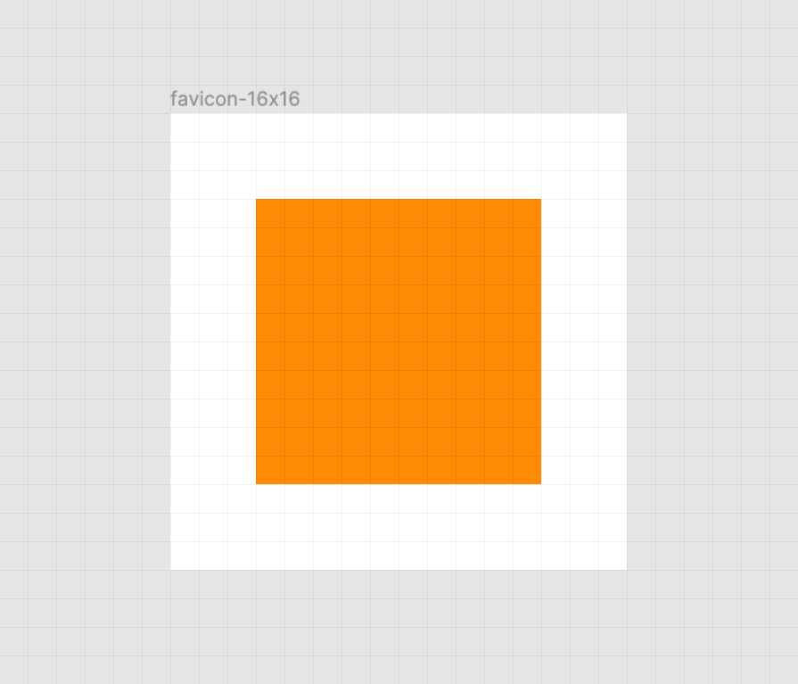
Keep it crisp
Another important aspect of good favicon design is making sure they look good in the small browser tab area. The secret to this is making the paths of the vector image line up to the pixel grid, the guide a computer uses to turn SVG math into the bitmap we see on a screen.
Here’s a simplified example using a square shape:
When the vector points of the square align to the pixel grid of the artboard, the antialiasing effect a computer uses to smooth out the shapes isn’t needed. When the vector points aren’t aligned, we get a “smearing” effect:
A vector point’s position can be adjusted on the pixel grid by using a vector editing program such as Figma, Sketch, Inkscape, or Illustrator. These programs export SVGs as well. To adjust a vector point’s location, select each node with a precision selection tool and drag it into position.
In addition to favicons, there are a bunch of different (and unfortunately proprietary) ways to use icons to enhance its experience. These include things like the aforementioned pinned tab icon for Safari¹, chat app unfurls, a pinned Windows start menu tile, social media previews, and homescreen launchers.
If you’re looking for a great place to get started with these kinds of enhancements, I really like realfavicongenerator.net.
It’s a lot, but it guarantees robust support.
A funny thing about the history of the favicon: Internet Explorer was the first browser to support them and they were snuck in at the 11th hour by a developer named Bharat Shyam:
As the story goes, late one night, Shyam was working on his new favicon feature. He called over junior project manager Ray Sun to take a look.
Shyam commented, “This is good, right? Check it in?”, requesting permission to check the code into the Internet Explorer codebase so it could be released in the next version. Sun didn’t think too much of it, the feature was cool and would clearly give IE an edge. So he told Shyam to go ahead and add it. And just like that, the favicon made its way into Internet Explorer 5, which would go on to become one of the largest browser releases the web has ever seen.
The next day, Sun was reprimanded by his manager for letting the feature get by so quickly. As it turns out, Shyam had specifically waited until later in the day, knowing that a less experienced Program Manager would give him a pass. But by then, the code had been merged in. Incidentally, you’d be surprised just how many relatively major browser features have snuck their way into releases like this.
I’m happy to see the platform throw a little love at favicons. They’ve long been one of my favorite little design details, and I’m excited that they’re becoming more reactive to user’s needs. If you have a moment, why not sneak a SVG favicon into your project the same way Bharat Shyam did way back in 1999.
¹ I haven’t been able to determine if Safari is going to implement SVG favicon support, but I hope they do. Has anyone heard anything?
Mezo Istvan does a good job of covering the problem and a solution to it in a blog post on Medium¹.
If you tap on something that has a :hover state but you don't leave the page then, on a mobile device, there is a chance that :hover state "sticks." You'll see this with stuff like jump-links used as tabs or buttons that trigger on-page functionality.
It almost feels like we have to apologize to linking to things on Medium lately. I have no idea what you're going to experience when you get there. Will you just be able to read it? Will it be a teaser where you have to log in to read more? Will it be behind a paywall? I have no idea. In this case, hopefully, this link post has enough info in it that isn't not blocking you from learning anything.
Container queries are always on the top of the list of requested improvements to CSS. The general sentiment is that if we had container queries, we wouldn't write as many global media queries based on page size. That's because we're actually trying to control a more scoped container, and the only reason we use media queries for that now is because it's the best tool we have in CSS. I absolutely believe that.
There is another sentiment that goes around once in a while that goes something like: "you developers think you need container queries but you really don't." I am not a fan of that. It seems terribly obvious that we would do good things with them if they were available, not the least of which is writing cleaner, portable, understandable code. Everyone seems to agree that building UIs from components is the way to go these days which makes the need for container queries all the more obvious.
It's wonderful that there are modern JavaScript ideas that help us do use them today — but that doesn't mean the technology needs to stay there. It makes way more sense in CSS.
Here's my late 2019 thought dump on the subject:
Philip Walton's "Responsive Components: a Solution to the Container Queries Problem" is a great look at using JavaScript's ResizeObserver as one way to solve the issue today. It performs great and works anywhere. The demo site is the best one out there because it highlights the need for responsive components (although there are other documented use cases as well). Philip even says a pure CSS solution would be more ideal.
CSS nesting got a little round of enthusiasm about a year ago. The conversation makes it seem like nesting is plausible. I'm in favor of this as a long-time fan of sensible Sass nesting. It makes me wonder if the syntax for container queries could leverage the same sort of thing. Maybe nested queries are scoped to the parent selector? Or you prefix the media statement with an ampersand as the current spec does with descendant selectors?
Other proposed syntaxes generally involve some use of the colon, like .container:media(max-width: 400px) { }. I like that, too. Single-colon selectors (pseduo selectors) are philosophically "select the element under these conditions" — like :hover, :nth-child, etc. — so a media scope makes sense.
I don't think syntax is the biggest enemy of this feature; it's the performance of how it is implemented. Last I understood, it's not even performance as much as it mucks with the entire rendering flow of how browsers work. That seems like a massive hurdle. I still don't wanna forget about it. There is lots of innovation happening on the web and, just because it's not clear how to implement it today, that doesn't mean someone won't figure out a practical path forward tomorrow.
There is probably a point where the logic of that gets out of hand, so careful. But hey, it works. Presumably, you can "infinitely" nest at-rules.
To look at nested code like that looks a little like a CSS preprocessor is in use, but that's not the case here. Regular ol' CSS handles this just fine, and in fact, CSS preprocessors don't meaningfully manipulate it at all (tested Sass, Less, and Stylus).
Andy Bell made a really cool demo that shows us how to create a responsive grid layout without any media queries at all. It happens to look like this when you change the size of the browser window:
I think this is a wonderful layout technique that’s just 6 lines (!) of CSS.
What this shows us is that we don’t have to write a million media queries to change the number of columns in a grid. Andy also proves that CSS Grid can automate so much of the tedious work of styling layouts.
I’ve seen this technique used in a couple of places (and we have a few starter grid templates to boot) but Andy’s article about how it all works finally made it all sink in just how useful grid is.
There have been problems with the
:hover pseudo-class ever since the first web browser was installed on a touchscreen device. Of course, there were solutions, but none were
the solution. With the new Level 4 Media Queries, this issue seems like it’s solved for good.
‘Uhm… What’s the Problem Again?’
So let’s say you simply added a :hover styling to an element of your webpage, so it gets some styling when the mouse hovers over it. Easy.
That's straightforward enough. But what if my element has several sub-elements and the breakpoint affects them as well? There are different approaches, and I'm never quite sure which one I should be doing.
Or I could do a combination of the two. Neither of them feels particularly great because of the duplication, but I'm not sure there is a perfect answer here. I err a little more on duplicating the media query, as it seems less error-prone than duplicating selectors.