Every respectable software project needs a README. This file provides crucial information about what the project is, how to work with it, and other relevant information for developers. README files are written in markdown, a special markup syntax. The syntax for markdown is simple enough, but it can be a pain to manually type out, and it’s easy to make simple mistakes and typos.
Wouldn’t you like to just use the Cmd+B keyboard shortcut to bold some text instead of typing ** around your text? Or what about creating a nicely formatted table in your README, especially when editing an existing table? Wouldn’t it be nice if the table formatting and column width adjustments were taken care of for us? Markdown is wonderful, but it’s not exactly as easy as working with a Google doc when applying formatting.
Mermaid diagrams and flowcharts have been gaining traction, especially with GitHub’s announcement that they are natively supported in Markdown. Let’s take a look at what they are, how to use them, and just as importantly: why.
Just like you might want to embed your CodePen demo directly in your documentation source, having your diagrams and charts live adjacent to your text helps prevent them from rotting — that is, drifting out of sync with the state of your document. Just as unhelpful, obsolete, or otherwise misleading comments in your code can be objectively worse than no comments, the same goes for diagrams.
Mermaid diagrams pair well with Jamstack and static site generators, which continue to grow in popularity. The pairing is natural. While Mermaid diagrams aren’t Markdown-exclusive, they are Markdown-inspired. Using the same markup abstractions Markdown provides to notate code, Mermaid can be represented the same to output diagrams and flowcharts. And Markdown is to Jamstack and static sites as peanut butter is to jelly.
If your site is authored in Markdown, processed into HTML, and you have enough control to add a bit of custom JavaScript, then you can use the ideas we’re covering in this article to fit your own needs and implement diagrams with Mermaid conveniently alongside the rest of your Markdown. Is “diagrams-as-code” a term yet? It should be.
For example, let’s say you’re working on a fancy new product and you want to provide a roadmap in the form of a Gantt chart (or some other type — say flowcharts, sequences, and class diagrams). With Mermaid, you can do this in a small handful of lines:
gantt
  title My Product Roadmap
  dateFormat  YYYY-MM-DD
  section Cool Feature
  A task           :a1, 2022-02-25, 30d
  Another task     :after a1, 20d
  section Rad Feature
  Task in sequence :2022-03-04, 12d
  Task, No. 2      :24d
Which will render a nice SVG diagram like so:
Nine lines of code gets us a full-fledged Gantt chart that can be used for product roadmaps and such.
Pro tip: Mermaid has a live editor which lets you try it out without the commitment over at mermaid.live.
Mermaid diagrams in Markdown
Mermaid goes well with Markdown because it presents itself as just another fenced code block, only using the mermaid language syntax set. For example, this block of code:
The Mermaid API’s default behavior expects a <div class="mermaid"> tag that directly contains the contents — so, no <code> or <span> (like from a syntax highlighter) that you might see in the conversion from Markdown-to-HTML.
Finessing with JavaScript
With a bit of JavaScript, it’s reasonable to take the Markdown-generated HTML and finesse it into the <div class="mermaid"> tag that Mermaid targets. It’s worth noting that $element.textContent is purposeful here: Markdown will HTML-encode specific characters (like > into >) that Mermaid uses. It also filters out any erroneous HTML elements that are descendants of the <pre> element.
// select <pre class="mermaid"> _and_ <pre><code class="language-mermaid">
document.querySelectorAll("pre.mermaid, pre>code.language-mermaid").forEach($el => {
  // if the second selector got a hit, reference the parent <pre>
  if ($el.tagName === "CODE")
    $el = $el.parentElement
  // put the Mermaid contents in the expected <div class="mermaid">
  // plus keep the original contents in a nice <details>
  $el.outerHTML = `
    <div class="mermaid">${$el.textContent}</div>
    <details>
      <summary>Diagram source</summary>
      <pre>${$el.textContent}</pre>
    </details>
  `
})
Now that our HTML is properly-formatted, let’s implement Mermaid to do the rendering.
Using Mermaid
Mermaid is published as an npm package, so you can grab a copy by using a package-aware CDN, like unpkg. You’ll want to use the minified code (e.g., mermaid.min.js) instead of the default export of mermaid.core.js. For example:
Mermaid is also ESM-ready, so you can use Skypack to load it up as well:
<script type="module">
  import mermaid from "https://cdn.skypack.dev/mermaid@8.14.0";
</script>
You could stop right here if you want to keep things simple. By default, Mermaid will auto-initialize itself when the document is ready. As long as you do the Markdown-to-HTML finessing with JavaScript mentioned earlier — before loading in Mermaid — you’ll be all set.
However, Mermaid has a couple settings worth configuring:
// initialize Mermaid to [1] log errors, [2] have loose security for first-party
// authored diagrams, and [3] respect a preferred dark color scheme
mermaid.initialize({
  logLevel: "error", // [1]
  securityLevel: "loose", // [2]
  theme: (window.matchMedia && window.matchMedia("(prefers-color-scheme: dark)").matches) ?
    "dark" :
    "default" // [3]
})
logLevel will give you a bit more visibility into any errors that may arise. If you want to see more information, you can choose a more verbose level (or vice versa).
securityLevel relates to the level of trust for the diagram source. If it’s content that you are authoring, then "loose" is fine. If it’s user-generated content, it’s probably best leaving the "strict" default in place.
Here are a couple of Mermaid diagrams examples in Markdown:
Deeper waters
This strategy is particularly effective because it’s progressive: if JavaScript is disabled then the original Mermaid source is displayed as-is. No foul.
There’s also a fully-fledged command line interface for Mermaid which, if you’re interesting in exploring, could potentially be leveraged to display diagrams that are completely server-side rendered. Between the Mermaid CLI and the online generator, it may even be possible to hook into whatever build process you use to generate a snapshot of a diagram and display it as an <img> fallback instead of the source code.
Hopefully, we’ll see more native Mermaid integrations like this as Mermaid continues to grow in popularity. The usefulness of having visual charts and diagrams alongside documentation is unquestionable — from product roadmaps to decision trees and everything in between. That’s the sort of information that’s just plain difficult to document with words alone.
Mermaid charts solve that, and in a way that ensures the information can be managed and maintained alongside the rest of the documentation.
No matter what stage you’re at as a developer, the tasks we complete—whether big or small—make a huge impact in our personal and professional growth. Unfortunately, those tasks aren’t always recognized because they can easily get lost in the sea of other things that need to get done.
The unnoticed tasks we do fall under what is known as “invisible work,” a concept I stumbled across from a talk titled “Getting Credit for Invisible Work” by Ryan T. Harter. This type of work seeps into the cracks because our brains are not wired to remember things. Yet come review time, we find ourselves repeatedly stuck when trying to recall what we did over the past 6 or 12 months.
To solve this long-established problem, Julia Evans wrote an article suggesting that we keep our own “brag document.” A brag document is exactly what it sounds like. It’s a document where you give yourself permission to brag about all the valuable work you did. Whether it be:
How you contributed to a project
Helping others
Improving existing processes
Giving talks or running workshops
What you learned
Extra-curricular activities (e.g. blogging, talks, personal projects)
Using their site to build one is a great idea, but what better way to brag about your work than to create your own brag document from scratch?
Today I want to show you how I re-created bragdocs.com using the static site generator Eleventy. With a little bit of JavaScript and CSS, you can get your own up and running!
What are we going to build?
Below is the end result of following this tutorial. You can find the live demo here. It imitates bragdocs.com as a starting point for you to create one from scratch and make it your own.
Requirements
Installing packages in Node.js (version 10 or higher)
General understanding of HTML and CSS
Markdown, Nunjucks templating, and JavaScript (all are optional, but helpful)
Basic programming concepts, including ifstatements, loops, and accessing variables in JSON
What is Eleventy?
Eleventy is a static site generator. This means that rather than building a full-stack website (front-end and back-end), you have flexibility to write content in any of the following templating languages accepted by Eleventy: HTML, Markdown, Liquid, Nunjucks, Mustache, etc. The content is then processed (using custom templates if you like) to generate static HTML pages, ready for hosting as a fully functioning site.
Setting up our “Hello, World!” Eleventy project
In this tutorial, the repository I’ll be referring to is eleventy-bragdoc, and the final product we’re working towards will be referred to as a “bragdoc.”
With a GitHub repository created with a README.mdand .gitignorefile for Node, I started setting up an Eleventy project.
Creating a new project
Inside eleventy-bragdoc, I began with the following files:
eleventy-bragdoc
├── README.md
└── .gitignore // .gitignore for node
With the terminal navigated inside of eleventy-bragdoc, I initialized the project by running the following command:
npm init -y
This created a package.jsonfile for my node packages.
eleventy-bragdoc
├── package.json // new file
├── README.md
└── .gitignore
Next, I installed Eleventy.
npm install @11ty/eleventy
This gave me the following list of files and folders:
eleventy-bragdoc
├── node_modules  // new folder
├── package.json
├── package-lock.json  // new file
├── README.md
└── .gitignore
Configuring the Eleventy project
With Eleventy installed, I updated the scriptsin the package.json file to include the following commands:
The startcommand serves the project during development which runs Browsersync for hot reload.
The buildcommand creates production ready HTML files so that it can be hosted onto a server.
Inside .eleventy.js, I told Eleventy that it’s going to reference what’s inside of the srcfolder to build the HTML files. The output is then stored inside a folder called public:
To make my first page, I created the srcfolder that I declared as the input directory in .eleventy.js . Inside it, I added my first page, a Markdown file called index.md
Eleventy works with many templating languages that you can mix and match: HTML, Markdown, Liquid, Nunjucks, JavaScript, Handlebars, Mustache, EJS, Haml, Pug.
In Eleventy, any key value pairs written between the dashes (---) above and below is considered front matter.
In index.md , I included a titleproperty with the value “11ty x Bragdocs” and some test content underneath the front matter.
---
title: "11ty x Bragdocs"
---

This is the home page.
Building templates
Next, I created a folder which Eleventy expects, called _includesinside of src. This is where the templates, or what Eleventy refers to as layouts, must live. Within that folder, I created a subfolder called layoutsfor my first template, base.njk
The .njkfiletype refers to the templating language Nunjucks.
In base.njk , between the <title> tags, I wanted to pull in the titleproperty defined in the front matter of index.md, so I used double curly braces, i.e. {{title}}, to access this variable. Similarly, in the body, I added <h1> tags and set it with the same titleproperty.
Next, I brought in the rest of the body content from index.md using the contentproperty. Using the provided safefilter, I told Eleventy to render instead of escape any HTML that lives inside the content of the Markdown file.
I then jumped back to index.md and added a layoutproperty to the front matter and referenced base.njk
---
title: "11ty x Bragdocs"
layout: "layouts/base.njk"
---

This is the home page.
To give you an idea of what happens when we run the build, the template specified in the layoutfront matter property is used to wrap the Markdown content. In this example, the compiled HTML will look like what is shown below:
<!DOCTYPE html>
<html lang="en">
<head>
  <meta charset="UTF-8">
  <meta name="viewport" content="width=device-width, initial-scale=1.0">
  <title>11ty x Bragdocs</title>
</head>
<body>
  <h1>11ty x Bragdocs</h1>
  <p>This is the home page.</p>
</body>
</html>
Connecting CSS and image folders in build
While this part might not be necessary for all Eleventy projects, CSS and self-hosted images are always good features to add. So, I created two folders in the srcdirectory: cssand images.
Then, in .eleventy.js, since I wanted the content inside these folders to be accessible when hosted, I referenced these folders by adding the following configurations:
addWatchTarget tells Eleventy that it should recompile when we make a change to a file in this directory (e.g. styles.cssin the cssfolder).
addPassthroughCopy tells Eleventy that once the files are compiled, to take the contents of the directory and pass it through to the publicdirectory.
You can read more about how passthrough file copy works in the documentation.
Since I was using the Nunjucks templating system, I added the markdownTemplateEngineproperty and set it to njkto make sure that it knows to go through Nunjucks first before anything else.
Since I had already defined the custom development scripts in package.json, I was able to run the following command:
npm start
This compiled index.md in the srcdirectory and generated a HTML file in the publicfolder. Additionally, it launched a hot reload server through Browsersync where I could see the result at http://localhost:8080/
The result so far
With Eleventy running in development, I could start building the rest of the bragdoc.
Building the bragdoc system
With a base Eleventy project in a folder structure similar to what’s shown below, I began building out my bragdoc.
Eleventy has the ability to create collections that group similar content together. Therefore, I created a folder called postsfor my bragdoc entries. Inside that folder, I created multiple Markdown files to represent each entry.
The filenames post-1.md, post-2.md, post-3.md don’t affect anything that is rendered on the webpage
Public / Private (a boolean value—true or false—to determine whether you want to show it on the bragdoc )
Icon (a Notion-inspired design element to visually organize entries)
I decided that the description for each entry would be the body content of the Markdown file, as this would give me freedom to add paragraphs, images, code blocks, etc. Additionally, I was not limited to Markdown elements as I could also include HTML and style it using CSS.
Below is an example of a bragdoc entry in a Markdown file:
---
title: Build my own Bragdoc using Eleventy
date: 2021-09-19
categories:
  - Learning
  - Eleventy
public: True
icon: 🎈
---

I learned how to use Eleventy to build my own bragdoc!
Some things to note:
Links written in Markdown by default do not open in a new blank window. So after some research, I stumbled upon a snippet by Mark Thomas Miller, which I added just before the closing <body> tag in base.njk. This might not be your thing (it’s definitely not Chris’ thing) but just in case you need it:
<script>
// Making all external links open in new tabs
// Snippet by Mark Thomas Miller

(function () {
  const links = document.querySelectorAll("a[href^='https://'], a[href^='http://']")
  const host = window.location.hostname

  const isInternalLink = link => new URL(link).hostname === host

  links.forEach(link => {
    if (isInternalLink(link)) return

    link.setAttribute("target", "_blank")
    link.setAttribute("rel", "noopener")
  })
})()
</script>
The datefront matter property must be written in YYYY-MM-DD format.
You can assign as many custom front matter properties as you’d like. Just make sure that if you plan on accessing the property in the template, that the property exists in all of the Markdown files using the same template; otherwise it may break the build.
Lists in front matter can be written in multiple ways (e.g. an array or single line).
Assigning front matter properties to a collection
Instead of repeatedly assigning front matter properties with the same value in each Markdown file, I created a data directory JSON file to assign the same key-value pair only once across a collection.
To create a data directory file, it must have the same name as the collection, i.e. posts.json. Additionally, the file must also be placed inside the collection folder, i.e. the postsfolder.
At this point, the posts for the bragdoc had not been defined as a collection yet. To do this, I added the tagsproperty in posts.json. Here I assigned the value “posts” to that property so that I could access the collection by calling collections.posts
And since I didn’t need each post to have its own page, i.e. http://localhost:8080/posts/post-1/, I switched off it’s auto-generated permalink.
{
  "tags": "posts",
  "permalink": false
}
Listing bragdoc entries
Simply put, the bragdoc is a page made up of the entries in the postscollection. To access the front matter properties and body content of the Markdown files, the entries are looped through via Nunjucks.
To do this, I went back to index.md and changed the filetype from Markdown to Nunjucks, i.e. index.njk
Next, I replaced the content of index.njk with a Nunjucks forloop.
A Nunjucks function (forloop, ifstatement, etc.) must include start and end tags.
Since the order of posts by default was in chronological order (oldest first), I added the reversefilter to show the most recent at the top.
To access front matter and render it in HTML (such as the dateand titleof a post), I had to go through another “data” layer. Accessing properties in front matter requires double curly braces.
---
title: "11ty x Bragdocs"
layout: "layouts/base.njk"
---

{% for post in collections.posts | reverse %}
  <p>
    {{ post.data.date }} - {{ post.data.title }}
  </p>
{% endfor %}
A little more progress
Filtering bragdoc entries
To filter certain entries, I used the front matter data to check if the publicproperty was set to True. If the property was set to False, the entry did not appear in the bragdoc.
Similarly, when accessing front matter properties, such as publicthrough a Nunjucks function, I again needed to go through another “data” layer.
---
title: "11ty x Bragdocs"
layout: "layouts/base.njk"
---

{% for post in collections.posts | reverse %}
  {% if post.data.public %}
    <p>
      {{ post.data.date }} - {{ post.data.title }}
    </p>
  {% endif %}
{% endfor %}
The posts are ordered with the title.
Adding custom data filters
By default, the dateproperty renders something that we’re generally unfamiliar with. So, after some research, I found a custom filter written by Phil Hawksworth. To use the filter, I created a file called dates.js and placed it in a new folder called _filters
In index.njk, I assigned the dateDisplayfilter to the datevariable, rendering it in a human-readable format.
---
title: "11ty x Bragdocs"
layout: "layouts/base.njk"
---

{% for post in collections.posts | reverse %}
  {% if post.data.public %}
    <p>
      {{ post.data.date | dateDisplay }} - {{ post.data.title }}
    </p>
  {% endif %}
{% endfor %}
The server needs to be restarted every time you change something in the configuration file.
The posts with updated date formatting.
To return the body content of a post, I called templateContent and added the safefilter so that it rendered any HTML in the Markdown file rather than escaping it.
---
title: "11ty x Bragdocs"
layout: "layouts/base.njk"
---

{% for post in collections.posts | reverse %}
  {% if post.data.public %}
    <p>
      {{ post.data.date | dateDisplay }} - {{ post.data.title }}
      <br/>
      {{ post.templateContent | safe }}
    </p>
    <br/>
  {% endif %}
{% endfor %}
The posts with body content.
Finally, I included another for loop to list the values in the categoriesfront matter property.
---
title: "11ty x Bragdocs"
layout: "layouts/base.njk"
---

{% for post in collections.posts | reverse %}
  {% if post.data.public %}
    <p>
      {{ post.data.date | dateDisplay }} - {{ post.data.title }}
      <br/>
      {{ post.templateContent | safe }}
      {% for category in post.data.categories %}
        <span># {{category}}</span>
      {% endfor %}
    </p>
    <br/>
  {% endif %}
{% endfor %}
Having finished extracting data from the posts collection, it was time to build out the HTML structure.
Structuring the bragdoc
Partials in Eleventy allow us to repeatably use bits of HTML or templating. This also simplifies the code from one massive template file to manageable pieces that fit together.
Inside the <body> tags of base.njk , I removed everything except the content and snippet.
Inside bragdoc-entry.njk, I brought over the content that make up the bragdoc entry, written in index.njk. Notice that it doesn’t require any front matter since it is treated as a snippet.
Partials do not extend a template, so they do not need any front matter.
Then, between the ifstatement in index.njk, I added an includetag that references the bragdoc-entry.njkpartial. By doing this, the content inside bragdoc-entry.njkis repeatably added until the forloop finishes.
---
title: "11ty x Bragdocs"
layout: "layouts/base.njk"
---

{% for post in collections.posts | reverse %}
  {% if post.data.public %}
    {% include 'partials/bragdoc-entry.njk' %}
  {% endif %}
{% endfor %}
Next, I wrapped the entire forloop with some custom HTML, including a header, profile container and footer. At this point, I also included a profile picture in the imagesfolder and referenced it in the custom HTML using Eleventy’s URL filter.
---
title: "11ty x Bragdocs"
layout: "layouts/base.njk"
---

<div class="bragdoc__section" id="bragdoc__section">
<h1 class="bragdoc__header">{{ title }}</h1>
<div class="bragdoc__container">
  <div class="bragdoc__profile">
    <img class="bragdoc__photo" src="{{ '/images/profile_picture.jpg' | url }}">
    <h1 class="bragdoc__name">Emily Y Leung</h1>
    <div class="role">Computational Designer</div>
  </div>
  {% for post in collections.posts | reverse %}
    {% if post.data.public -%}
      {% include 'partials/bragdoc-entry.njk' %}
    {% endif %}
  {% endfor %}
  </div>
  <footer>
    <div><a target="_blank" href="https://www.bragdocs.com/">Bragdocs</a> inspired theme built with <a target="_blank" href="https://www.11ty.dev/">11ty</a></div>
    <div>Made with ♥ by <a target="_blank" href="https://emilyyleung.github.io/">Emily Y Leung</a></div>
  </footer>
</div>
Then, inside bragdoc-entry.njk, I updated the HTML structure and included classes for styling:
A good way to understand global data is to imagine building a HTML template that someone could use as a base for their website. Rather than searching for specific HTML tags to replace the text, they only need to replace certain values in an external file which then updates the content. This is one of the many things a global data file can do for us.
Eleventy can access global data files written in JSON when they are placed in a folder called _data. So, I created a data.jsonfile that is accessible when I call {{data}} and then pick out whatever properties I had provided in the JSON object.
With the bragdoc structure completed, I updated the styling in styles.css
To imitate bragdocs.com, I selected some of their colors and stored them in a root variable.
Additionally, I wanted to create multiple themes, so I added a custom data-themeproperty on top of the :rootvariable. In this case, the default color theme is “light” regardless of whether data-themeis assigned to the <html> tag. But that also means that if I wanted to create a “dark” theme, I could create a new selector html[data-theme="dark"]in my CSS, and assign alternative colors to the same variables as specified in :root
To control what theme you want to use, add the data-themeproperty to the <html>tag in base.njk. From there, assign the value associated to the corresponding CSS selector, i.e. “light” or “dark.”
Using CSS media queries, I could also control the size of text as well as the positioning of HTML elements. This makes it work well when viewed on mobile.
/* Make it responsive */

@media only screen and (max-width: 1400px) {

  .bragdoc__container {
    /* Center the bragdoc*/
    margin: 0 auto;
  }

  .bragdoc__entry-title {
    font-size: 1.25em;
  }
}

@media only screen and (max-width: 870px) {

  .bragdoc__container {
    padding-left: 2em;
    padding-right: 2em;
  }

  .bragdoc__entry-title {
    font-size: 1.15em;
  }
}
The final touches to the design needed to account for the description (i.e. the Markdown body content) in each entry, which you can find in this Gist.
Given that the CSS has been structured with reference to root variables, we can continue to create more themes. Have a crack at exploring color palettes from Color Hunt or Cooolers.
Deploying the bragdoc to GitHub Pages
Building a project from scratch is fantastic, but sharing it with the world is even better!
While there are a myriad of ways to host a bragdoc, I decided to host it on GitHub Pages. This meant I could use the base URL of my GitHub account and add /eleventy-bragdoc/ to the end of it.
At this point, I had been working from the eleventy-bragdocrepository and had already created a gh-pagesbranch.
Follow this tutorial for information on how to set up GitHub Pages for your repository.
Configuring the URL path
To configure the URL path for deployment, I included a pathPrefixin .eleventy.jsto define the route relative to the base URL.
Without specifying a pathPrefix, the value by default is /, which links to the base URL, i.e. https://emilyyleung.github.io/
Since I already had content on the base URL, I wanted to host it on a sub-page, i.e. https://emilyyleung.github.io/eleventy-bragdoc/
To set the pathPrefixfor sub-pages, it must start and end with a slash:
Just like in development, I navigated my terminal to the eleventy-bragdocfolder. But this time, I ran the following command to rebuild the files into the publicfolder:
npm run-script build
Then, to deploy to GitHub Pages, I ran the following command:
npm run deploy
Granting access to deploy
At this point, the terminal may ask you to log in via the terminal or through the GitHub Desktop application. If the login fails, the terminal may ask you to generate a token of authentication to use instead of a password. Here is a guide on how to create one.
Unlike reports and books, a bragdoc must be maintained continuously as a live record of your progress and achievements. Think of your bragdoc like a garden, where tending requires regular attention and care. While you may not see the benefits straight away, time invested in tending to your document will lead to far greater returns. Instant recall and the ability to share what you’ve done are some of the upsides in forming this habit.
While you may not be able to note down everything as it happens, Julia Evans suggests setting a block of time to review your progress and update the document. Perhaps even making it a bi-weekly group activity to celebrate all wins, big and small.
For many, the less time it takes to do something, the better. With this bragdoc setup, adding new entries and rebuilding the site doesn’t take long at all! Just to give you an idea of how simple this is, I’ll walk you through the process of adding another entry to round out the tutorial.
Add a new bragdoc entry
Continuing from my last deployment, I’ll first add a new Markdown file in my postsfolder.
Inside post-4.md, I’ll add in my front matter and description content.
---
title: Working towards publishing my first article on CSS-Tricks
date: 2021-10-02
categories:
  - Writing
  - Eleventy
public: True
icon: ✍🏻
---

Since re-creating [bragdocs.com](https://www.bragdocs.com/) using Eleventy, I am now in the process of writing the steps on how I did it.
Run the build
With the entries added and saved, I’m ready to tell Eleventy to reference my Markdown files from srcto generate static HTML files in the publicfolder. So I navigate the terminal to eleventy-bragdocwhere I run the following command:
npm run-script build
Run deploy
Since I’ve already deployed once before, my GitHub credentials should grant me immediate access for deployment when running the following command:
npm run deploy
Those changes are then reflected on my website at the same configured URL.
What’s next?
Well first off, congratulations on putting together your very own bragdoc from scratch! It’s yours to keep, to tend and to share.
While this tutorial has only scratched the surface of what’s possible with Eleventy, a small step can lead you to all sorts of directions. To fuel your curiosity, check out what others are doing with Eleventy.
Feel free to reach out, I’d love to see what you come up with!
To make your repo more appealing and useful, you need to provide example code snippets in your README.md. It would be inefficient and time-consuming to manually copy and paste each code snippet in its respective place in your README.
This problem can be solved using Markdown-autodocs: a GitHub Action that automatically generates and updates markdown content (like your README.md) from external or remote files. You will need to add markers in your README.md that will tell markdown-autodocs where to insert the code snippet.
A table of contents is a list of links that allows you to quickly jump to specific sections of content on the same page. It benefits long-form content because it shows the user a handy overview of what content there is with a convenient way to get there.
This tutorial will show you how to parse long Markdown text to HTML and then generate a list of links from the headings. After that, we will make use of the Intersection Observer API to find out which section is currently active, add a scrolling animation when a link is clicked, and finally, learn how Vue’s <transition-group> allow us to create a nice animated list depending on which section is currently active.
Parsing Markdown
On the web, text content is often delivered in the form of Markdown. If you haven’t used it, there are lots of reasons why Markdown is an excellent choice for text content. We are going to use a markdown parser called marked, but any other parser is also good.
We will fetch our content from a Markdown file on GitHub. After we loaded our Markdown file, all we need to do is call the marked(<markdown>, <options>) function to parse the Markdown to HTML.
Now that we’ve generated the HTML, we need to transform our headings into a clickable list of links. To find the headings, we will use the DOM function querySelectorAll('h1, h2'), which selects all <h1> and <h2> elements within our markdown container. Then we’ll run through the headings and extract the information we need: the text inside the tags, the depth (which is 1 or 2), and the element ID we can use to link to each respective heading.
This snippet results in an array of elements that looks like this:
[
  {title: "The Red Panda", depth: "1", id: "the-red-panda"},
  {title: "About", depth: "2", id: "about"},
  // ...
]
After getting the information we need from the heading elements, we can use ES6 template literals to generate the HTML elements we need for the table of contents.
First, we loop through all the headings and create <li> elements. If we’re working with an <h2> with depth: 2, we will add an additional padding class, .pl-4, to indent them. That way, we can display <h2> elements as indented subheadings within the list of links.
Finally, we join the array of <li> snippets and wrap it inside a <ul> element.
Next, we need to find out which part of the content we’re currently reading. Intersection Observers are the perfect choice for this. MDN defines Intersection Observer as follows:
The Intersection Observer API provides a way to asynchronously observe changes in the intersection of a target element with an ancestor element or with a top-level document’s viewport.
So, basically, they allow us to observe the intersection of an element with the viewport or one of its parent’s elements. To create one, we can call a new IntersectionObserver(), which creates a new observer instance. Whenever we create a new observer, we need to pass it a callback function that is called when the observer has observed an intersection of an element. Travis Almand has a thorough explanation of the Intersection Observer you can read, but what we need for now is a callback function as the first parameter and an options object as the second parameter.
The observer is created, but nothing is being observed at the moment. We will need to observe the heading elements in our Markdown, so let’s loop over them and add them to the observer with the observe() function.
Since we want to update our list of links, we will pass it to the observer function as a $links parameter, because we don’t want to re-read the DOM on every update for performance reasons. In the handleObserver function, we find out whether a heading is intersecting with the viewport, then obtain its id and pass it to a function called updateLinks which handles updating the class of the links in our table of contents.
Let’s write the function to update the list of links. We need to loop through all links, remove the .is-active class if it exists, and add it only to the element that’s actually active.
function updateLinks(visibleId, $links) {
  $links.map(link => {
    let href = link.getAttribute('href')
    link.classList.remove('is-active')
    if(href === visibleId) link.classList.add('is-active')
  })
}
The end of our init() function creates an observer, observes all the headings, and updates the links list so the active link is highlights when the observer notices a change.
async function init() {
  // Parsing Markdown
  const $aside = document.querySelector('#aside');


  // Generating a list of heading links
  const $headings = [...$main.querySelectorAll('h1, h2')];


  // Adding an Intersection Observer
  const $links = [...$aside.querySelectorAll('a')]
  const observer = createObserver($links)
  $headings.map(heading => observer.observe(heading))
}
Scroll to section animation
The next part is to create a scrolling animation so that, when a link in the table of contents is clicked, the user is scrolled to the heading position rather abruptly jumping there. This is often called smooth scrolling.
Scrolling animations can be harmful if a user prefers reduced motion, so we should only animate this scrolling behavior if the user hasn’t specified otherwise. With window.matchMedia('(prefers-reduced-motion)'), we can read the user preference and adapt our animation accordingly. That means we need a click event listener on each link. Since we need to scroll to the headings, we will also pass our list of $headings and the motionQuery.
Let’s write our handleLinkClick function, which is called whenever a link is clicked. First, we need to prevent the default behavior of links, which would be to jump directly to the section. Then we’ll read the href attribute of the clicked link and find the heading with the corresponding id attribute. With a tabindex value of -1 and focus(), we can focus our heading to make the users aware of where they jumped to. Finally, we add the scrolling animation by calling scroll() on our window.
Here is where our motionQuery comes in. If the user prefers reduced motion, the behavior will be instant; otherwise, it will be smooth. The top option adds a bit of scroll margin to the top of the headings to prevent them from sticking to the very top of the window.
function handleLinkClick(evt, $headings, motionQuery) {
  evt.preventDefault()
  let id = evt.target.getAttribute("href").replace('#', '')
  let section = $headings.find(heading => heading.getAttribute('id') === id)
  section.setAttribute('tabindex', -1)
  section.focus()


  window.scroll({
    behavior: motionQuery.matches ? 'instant' : 'smooth',
    top: section.offsetTop - 20
  })
}
Animate the list of links
For the last part, we will make use of Vue’s <transition-group>, which is very useful for list transitions. Here is Sarah Drasner’s excellent intro to Vue transitions if you’ve never worked with them before. They are especially great because they provide us with animation lifecycle hooks with easy access to CSS animations.
Vue automatically attaches CSS classes for us when an element is added (v-enter) or removed (v-leave) from a list, and also with classes for when the animation is active (v-enter-active and v-leave-active). This is perfect for our case because we can vary the animation when subheadings are added or removed from our list. To use them, we will need wrap our <li> elements in our table of contents with an <transition-group> element. The name attribute of the <transition-group> defines how the CSS animations will be called, the tag attribute should be our parent <ul> element.
Now we need to add the actual CSS transitions. Whenever an element is entering or leaving it, should animate from not visible (opacity: 0) and moved a bit to the bottom (transform: translateY(10px)).
Then we define what CSS property we want to animate. For performance reasons, we only want to animate the transform and the opacity properties. CSS allows us to chain the transitions with different timings: the transform should take 0.8 seconds and the fading only 0.4s.
Then we want to add a bit of a delay when a new element is added, so the subheadings fade in after the parent heading moved up or down. We can make use of the v-enter-active hook to do that:
Finally, we can add absolute positioning to the elements that are leaving to avoid sudden jumps when the other elements are animating:
.list-leave-active {
  position: absolute;
}
Since the scrolling interaction is fading elements out and in, it’s advisable to debounce the scrolling interaction in case someone is scrolling very quickly. By debouncing the interaction we can avoid unfinished animations overlapping other animations. You can either write your own debouncing function or simply use the lodash debounce function. For our example the simplest way to avoid unfinished animation updates is to wrap the Intersection Observer callback function with a debounce function and pass the debounced function to the observer.
const debouncedFunction = _.debounce(this.handleObserver)
this.observer = new IntersectionObserver(debouncedFunction,options)
Here’s the final demo
Again, a table of contents is a great addition to any long-form content. It helps make clear what content is covered and provides quick access to specific content. Using the Intersection Observer and Vue’s list animations on top of it can help to make a table of contents even more interactive and even allow it to serve as an indication of reading progress. But even if you only add a list of links, it will already be a great feature for the user reading your content.
As I’ve documented here, I’m documenting my journey in creating content, mostly related to Coding, Architecture, Frameworks but also related to Leadership, Startups, and Product Management, which are topics that I really love and am learning a lot about.
MDX is a killer feature for things like blogs, slide decks and component documentation. It allows you to write Markdown without worrying about HTML elements, their formatting and placement while sprinkling in the magic of custom React components when necessary.
Let’s harness that magic and look at how we can customize MDX by replacing Markdown elements with our own MDX components. In the process, we’ll introduce the concept of “shortcodes” when using those components.
As a heads up, the code snippets here are based on GatsbyJS and React, but MDX can be written with different frameworks as well. If you need a primer on MDX, start here first. This article extends that one with more advanced concepts.
Setting up a layout
We almost always want to render our MDX-based pages in a common layout. That way, they can be arranged with other components on our website. We can specify a default Layout component with the MDX plugin we’re using. For example. we can define a a layout with the gatsby-plugin-mdx plugin like this:
This would require the src/templates/blog-post.js file to contain a component that would render the children prop it receives.
import { MDXRenderer } from 'gatsby-plugin-mdx';


function BlogPost({ children }) {
  return (
    <div>{children}</div>
  );
}


export default BlogPost;
If we are programmatically creating pages, we’d have to use a component named MDXRenderer to achieve the same thing, as specified in the Gatsby docs.
Custom Markdown elements
While MDX is a format where that lets us write custom HTML and React components, its power is rendering Markdown with custom content. But what if we wanted to customize how these Markdown elements render on screen?
We could surely write a remark plugin for it, but MDX provides us with a better, simpler solution. By default, these are some of the elements being rendered by Markdown:
A complete list of components is available in the MDX Docs.
To replace these defaults with our custom React components, MDX ships with a Provider component named MDXProvider. It relies on the React Context API to inject new custom components and merge them into the defaults provided by MDX.
import React from 'react';
import { MDXProvider } from "@mdx-js/react";
import Image from './image-component';


function Layout({ children }) {
  return (
    <MDXProvider
      components={{
        h1: (props) => <h1 {...props} className="text-xl font-light" />
        img: Image,
      }}
    >
      {children}
    </MDXProvider>
  );
}


export default Layout;
In this example, any H1 heading (#) in the MDX file will be replaced by the custom implementation specified in the Provider component’s prop while all the other elements will continue to use the defaults. In other words, MDXProvider is able to take our custom markup for a H1 element, merge it with MDX defaults, then apply the custom markup when we write Heading 1 (#) in an MDX file.
MDX and custom components
Customizing MDX elements is great, but what if we want to introduce our own components into the mix?
---
title: Importing Components
---
import Playground from './Playground';


Here is a look at the `Playground` component that I have been building:


<Playground />
We can import a component into an MDX file and use it the same way we would any React component. And, sure, while this works well for something like a component demo in a blog post, what if we want to use Playground on all blog posts? It would be a pain to import them to all the pages. Instead. MDX presents us with the option to use shortcodes. Here’s how the MDX documentation describes shortcodes:
[A shortcode] allows you to expose components to all of your documents in your app or website. This is a useful feature for common components like YouTube embeds, Twitter cards, or anything else frequently used in your documents.
To include shortcodes in an MDX application, we have to rely on the MDXProvider component again.
import React from 'react';
import { MDXProvider } from "@mdx-js/react";
import Playground from './playground-wrapper';


function Layout({ children }) {
  return (
    <MDXProvider
      components={{
        h1: (props) => <h1 {...props} className="text-xl font-light" />
        Playground,
      }}
    >
      {children}
    </MDXProvider>
  );
}


export default Layout;
Once we have included custom components into the components object, we can proceed to use them without importing in MDX files.
---
title: Demoing concepts
---


Here's the demo for the new concept:


<Playground />


> Look ma! No imports
Directly manipulating child components
In React, we get top-level APIs to manipulate children with React.Children. We can use these to pass new props to child components that change their order or determine their visibility. MDX provides us a special wrapper component to access the child components passed in by MDX.
To add a wrapper, we can use the MDXProvider as we did before:
MDX is designed with flexibility out of the box, but extending with a plugin can make it do even more. Here’s what we were just able to do in a short amount of time, thanks to gatsby-plugin-mdx:
Create default Layout components that help format the MDX output.
Replace default HTML elements rendered from Markdown with custom components
Use shortcodes to get rid of us of importing components in every file.
Manipulate children directly to change the MDX output.
Again, this is just another drop in the bucket as far as what MDX does to help make writing content for static sites easier.
In this tutorial, you’ll learn how to use Gatsby to create a blog app that integrates with the Netlify content management system (CMS) for content. Your app will allow you to author posts in Markdown and add or edit posts from your browser or Git. As a last step, you’ll secure a section of your app with Okta.
First, let’s take a step back. What is Gatsby? Gatsby is a tool for creating static websites with React. With Gatsby, you can pull data from CMSs, Markdown files, APIs, databases, and more. Gatsby uses GraphQL and webpack to combine your data and React code to generate static files for your website.
Markdown has traditionally been a favorite format for programmers to write documentation. It’s simple enough for almost everyone to learn and adapt to while making it easy to format and style content. It was so popular that commands from Markdown have been used in chat applications like Slack and Whatsapp as document applications, like Dropbox Paper and Notion. When GitHub introduced Markdown support for README documentation, they also rendered HTML content from it — so, for example, we could drop in some link and image elements and they would render just fine.
Even though Markdown isn’t broken by any stretch of the imagination, there’s always room for improvement. This is where Markdown Extended (MDX) comes in.
When would we consider MDX over Markdown? One thing about MDX is that JavaScript can be integrated into cases where normal Markdown is used. Here are few examples that illustrate how handy that is:
Frontend Armory uses MDX on its education playground, Demoboard. The playground supports MDX natively to create pages that serve both as demo and documentation, which is super ideal for demonstrating React concepts and components..
Brent Jackson has a brand new way of building websites pairing MDX and Styled System. Each page is written in MDX and Styled System styles the blocks. It’s currently in development, but you can find more details on the website.
Using mdx-deck or Spectacle could make your next presentation more interesting. You can show demos directly in your deck without switching screens!
MDX Go, ok-mdx and Docz all provide tools for documenting component libraries in MDX. You can drop components right in the documentation with Markdown and it will just work™.
MDX shines in cases where you want to maintain a React-based blog. Using it means you no longer have to create custom React component pages when you want to do something impossible in Markdown (or create a plugin). I have been using it on my blog for over a year and have been loving the experience One of my favorite projects so far is a React component I call Playground that can be used to demo small HTML/CSS/JavaScript snippets while allowing users to edit the code. Sure, I could have used some third-party service and embed demos with it, but this way I don’t have to load third party scripts at all.
Speaking of embedding, MDX makes it so easy to embed iFrames created by third-party services, say YouTube, Vimeo, Giphy, etc.
Use it alongside Markdown
You’ll know a file is written in MDX because it has an .mdx extension on the filename. But let’s check out what it looks like to actually write something in MDX.
import InteractiveChart from "../path/interactive-chart";


# Hello - I'm a Markdown heading


This is just markdown text


<InteractiveChart />
See that? It’s still possible to use Markdown and we can write it alongside React components when we want interactive visualizations or styling. Here is an example from my portfolio:
Another benefit of MDX is that, just like components, the files are composable. This means that pages can be split into multiple chunks and reused, rendering them all at once.
import Header from "./path/Header.mdx"
import Footer from "./path/Footer.mdx"

<Header />

# Here goes the actual content.

Some random content goes [here](link text)

<Footer />
Implementing MDX into apps
There are MDX plugins for most of the common React based integration platforms, like Gatsby and Next.
To integrate it in a create-react-app project, MDX provides a Babel Macro that can be imported into the app:
You can also try out MDX on the playground they created for it.
MDX contributors are very actively working on bringing support for Vue. A sample is already available on GitHub. This is though in Alpha and not ready for production.
Editor support
Syntax highlighting and autocomplete have both been increasing support for VS Code, Vim, and Sublime Text. However,in use, these do have some sharp edges and are difficult to navigate. A lot of these come from the inability to predict whether we are going for JavaScript or Markdown within the context of a page. That’s something that certainly can be improved.
MDX plugins and extensions
A key advantage of MDX is that it is part of the unified consortium for content that organizes remark content. This means that MDX can directly support the vast ecosystem of remark plugins and rehype plugins — there’s no need to reinvent the wheel. Some of these plugins, including remark-images and remark-redact, are remarkable to say the least. To use a plugin with MDX, you can add them to them to your corresponding loader or plugin. You can even write your own MDX plugins by referring to the MDX Guide for creating plugins.
MDX is only a few years old but its influence has been growing in the content space. From writing blog posts and visualizing data to creating interactive demos and decks, MDX is well suited for many uses — well beyond what we have covered here in this introduction.
One of the more powerful concepts I've stumbled across recently is the idea of abstract syntax trees, or ASTs. If you've ever studied alchemy, you may recall that the whole motivation for alchemists was to discover some way to transform not-gold into gold through scientific or arcane methods.
ASTs are kind of like that. Using ASTs, we can transform Markdown into HTML, JSX into JavaScript, and so much more.
Why are ASTs useful?
Early in my career, I tried to change files using a find-and-replace method. This ended up being fairly complicated, so I tried using regular expressions. I ended up abandoning the idea because it was so brittle; the app broke all the time because someone would enter text in a way I hadn’t anticipated and it would break my regular expressions causing the whole app to fall down.
The reason this was so hard is that HTML is flexible. That makes it extremely hard to parse using regular expressions. String-based replacement like this is prone to breaking because it might miss a match, match too much, or do something weird that results in invalid markup that leaves the page looking janky.
ASTs, on the other hand, turn HTML into something far more structured, which makes it much simpler to dive into a text node and do replacements on only that text, or to mess with elements without needing to deal with the text at all.
This makes AST transformation safer and less error-prone than a purely string-based solution.
What are ASTs used for?
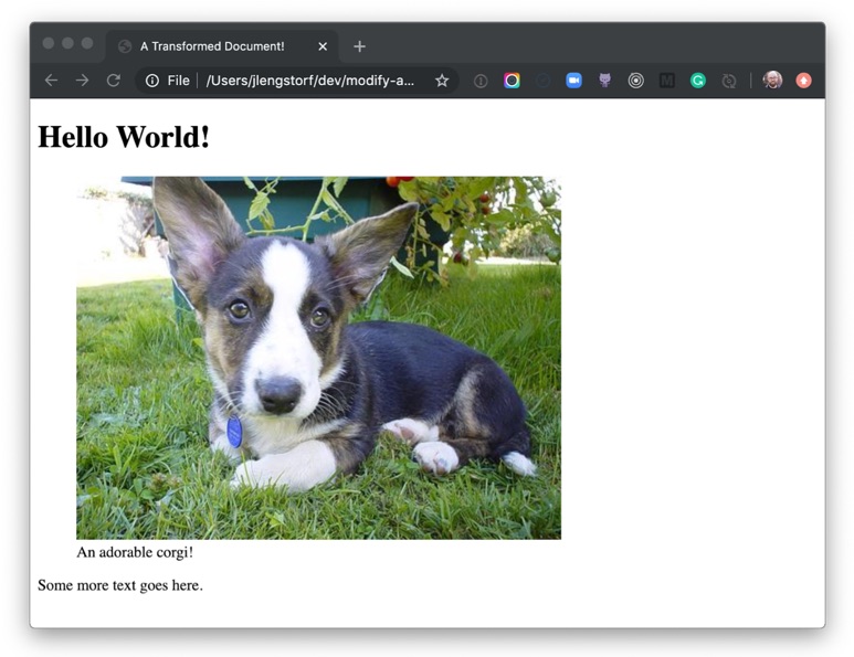
To start, let's take a look at a minimal document using a couple lines of Markdown. This will be saved as a file called home.md, which we'll save in the content folder of our website.
# Hello World!
 An adorable corgi!
Some more text goes here.
Assuming we know Markdown, we can infer that when this Markdown is parsed, it'll end up being an <h1> that says, "Hello World!" and a <p> that says, "This is some Markdown."
But how does it get transformed from Markdown to HTML?
First, we need to install the dependencies required to parse the Markdown into an AST and convert it to HTML. To do that, we need to make sure we've initialized the folder as a package. Run the following command in your terminal:
# make sure you’re in your root folder (where `content` is)
# initialize this folder as an npm package
npm init

# install the dependencies
npm install unified remark-parse remark-html
If we assume our Markdown is stored in home.md, we can get the AST with the following code:
This code takes advantage of Node’s built-in fs module, which allows us to access and manipulate the filesystem. For more information on how this works, check out the official docs.
If we save this as src/index.js and use Node to execute this script from the command line, we’ll see the following in our terminal:
$ node src/index.js
<h1>Hello World!</h1>
<p><img src="<https://images.dog.ceo/breeds/corgi-cardigan/n02113186_1030.jpg>" alt="cardigan corgi"> An adorable corgi!</p>
<p>Some more text goes here.</p>
We tell unified to use remark-parse to turn the Markdown file into an AST, then to use remark-html to turn the Markdown AST into a HTML — or, more specifically, it turns it into something called a VFile. Using the toString() method turns that AST into an actual string of HTML we can display in the browser!
Thanks to the hard work of the open-source community, remark does all the hard work of turning Markdown into HTML for us. (See the diff)
Next, let's look at how this actually works.
What does an AST look like?
To see the actual AST, let’s write a tiny plugin to log it:
Note that the position values have been truncated to save space. They contain information about where the node is in the document. For the purposes of this tutorial, we won’t be using this information. (See the diff)
This is a little overwhelming to look at, but if we zoom in we can see that each part of the Markdown becomes a type of node with a text node inside it.
The type tells us what kind of node we're dealing with.
Each node type has additional properties that describe the node. The depth property on the heading tells us what level heading it is — a depth of 1 means it’s an <h1> tag, 2 means <h2>, and so on.
The children array tells us what's inside this node. In both the heading and the paragraph, there’s only text, but we could also see inline elements here, like <strong>.
This is the power of ASTs: We've now described the Markdown document as an object that a computer can understand. If we want to print this back to Markdown, a Markdown compiler would know that a "heading" node with a depth of 1 starts with #, and a child text node with the value "Hello" means the final line should be # Hello.
How AST transformations work
Transforming an AST is usually done using the visitor pattern. It‘s not important to know the ins and outs of how this works to be productive, but if you’re curious, JavaScript Design Patterns for Humans by Soham Kamani has a great example to help explain how it works. The important thing to know is that the majority of resources on AST work will talk about "visiting nodes," which roughly translates to "find part of the AST so we can do stuff with it." The way this works practice is that we write a function that will be applied to AST nodes matching our criteria.
A few important notes about how it works:
ASTs can be huge, so for performance reasons we will mutate nodes directly. This runs counter to how I would usually approach things — as a general rule I don't like to mutate global state — but it makes sense in this context.
Visitors work recursively. That means that if we process a node and create a new node of the same type, the visitor will run on the newly created node as well unless we explicitly tell the visitor not to.
We're not going to go too deep in this tutorial, but these two ideas will help us understand what's going on as we start to mess with the code.
How do I modify the HTML output of the AST?
What if we want to change the output of our Markdown, though? Let's say our goal is to wrap image tags with a figure element and supply a caption, like this:
To accomplish this, we'll need transform the HTML AST — not the Markdown AST — because Markdown doesn't have a way of creating figure or figcaption elements. Fortunately, because unified is interoperable with multiple parsers, we can do that without writing a bunch of custom code.
Convert a Markdown AST to an HTML AST
To convert the Markdown AST to an HTML AST, add remark-rehype and switch to rehype-stringify for turning the AST back to HTML.
npm install remark-rehype rehype-stringify
Make the following changes in src/index.js to switch over to rehype:
This is the AST for the HTML representation of the image, so we can start changing it over to use the figure element. (See the diff)
Write a plugin for unified
To wrap our img element with a figure element, we need to write a plugin. In unified, plugins are added with the use() method, which accepts the plugin as a first argument and any options as a second argument:
.use(plugin, options)
The plugin code is a function (called an “attacher” in unified jargon) that receives option. These options are used to create a new function (called a “transformer”) that receives the AST and does work to, er, transform it. For more details on plugins, check out the plugin overview in the unified docs.
The function it returns will receive the entire AST as its argument, and it doesn't return anything. (Remember, ASTs are mutated globally.) Create a new file called img-to-figure.js in the same folder as index.js, then put the following inside:
module.exports = options => tree => {
  console.log(tree);
};
Next, we need to add a visitor. This will let us actually get at the code. Unified takes advantage of a number of utility packages, all prefixed with unist-util-*, that allow us to do common things with our AST without writing custom code.
We can use unist-util-visit to modify nodes. This gives us a visit helper that takes three arguments:
The entire AST we're working with
A predicate function to identify which nodes we want to visit
A function to make any changes to the AST we want to make
To install, run the following in your command line:
npm install unist-util-visit
Let's implement a visitor in our plugin by adding the following code:
const visit = require('unist-util-visit');

  module.exports = options => tree => {
    visit(
      tree,
      // only visit p tags that contain an img element
      node =>
        node.tagName === 'p' && node.children.some(n => n.tagName === 'img'),
      node => {
        console.log(node);
      }
    );
};
When we run this, we can see there's only one paragraph node logged:
Now that we have the image attributes, we can start to change the AST. Remember, because ASTs can be really large, we mutate them in place to avoid creating lots of copies and potentially slowing our script down.
We start by changing the node’s tagName to be a figure instead of a paragraph. The rest of the details can stay the same for now.
Make the following changes in src/img-to-figure.js:
const visit = require('unist-util-visit');

module.exports = options => tree => {
  visit(
    tree,
    // only visit p tags that contain an img element
    node =>
    node.tagName === 'p' && node.children.some(n => n.tagName === 'img'),
    node => {
      node.tagName = 'figure';
    }
  );
};
If we run our script again and look at the output, we can see that we’re getting closer!
<h1>Hello World!</h1>
<figure><img src="<https://images.dog.ceo/breeds/corgi-cardigan/n02113186_1030.jpg>" alt="cardigan corgi">An adorable corgi!</figure>
<p>Some more text goes here.</p>
To avoid needing to write custom syntax, we're going to use any text passed inline with an image as the image caption.
We can make an assumption that usually images don't have inline text in Markdown, but it’s worth noting that this could 100% cause unintended captions to appear for people writing Markdown. We're going to take that risk in this tutorial. If you're planning to put this into production, make sure to weigh the trade-offs and choose what's best for your situation.
To use the text, we're going to look for a text node inside our parent node. If we find one, we want to grab its value as our caption. If no caption is found, we don’t want to transform this node at all, so we can return early.
Make the following changes to src/img-to-figure.js to grab the caption:
const visit = require('unist-util-visit');

module.exports = options => tree => {
  visit(
    tree,
    // only visit p tags that contain an img element
    node =>
    node.tagName === 'p' && node.children.some(n => n.tagName === 'img'),
    node => {
      // find the text node
      const textNode = node.children.find(n => n.type === 'text');

      // if there’s no caption, we don’t need to transform the node
      if (!textNode) return;

      const caption = textNode.value.trim();

      console.log({ caption });
      node.tagName = 'figure';
    }
  );
};
Now that we have our caption text, we can add a figcaption to display it. We could do this by creating a new node and deleting the old text node, but since we’re mutating in place it’s a little less complicated to just change the text node into an element.
Elements don’t have text, though, so we need to add a new text node as a child of the figcaption element to display the caption text.
Make the following changes to src/img-to-figure.js to add the caption to the markup:
const visit = require('unist-util-visit');

module.exports = options => tree => {
  visit(
    tree,
    // only visit p tags that contain an img element
    node =>
      node.tagName === 'p' && node.children.some(n => n.tagName === 'img'),
    node => {
      // find the text node
      const textNode = node.children.find(n => n.type === 'text');

      // if there’s no caption, we don’t need to transform the node
      if (!textNode) return;

      const caption = textNode.value.trim();
      // change the text node to a figcaption element containing a text node
      textNode.type = 'element';
      textNode.tagName = 'figcaption';
      textNode.children = [
        {
          type: 'text',
          value: caption
        }
      ];

      node.tagName = 'figure';
    }
  );
};
If we run the script again with node src/index.js, we see the transformed image wrapped in a figure element and described with a figcaption!
<h1>Hello World!</h1>
<figure><img src="<https://images.dog.ceo/breeds/corgi-cardigan/n02113186_1030.jpg>" alt="cardigan corgi"><figcaption>An adorable corgi!</figcaption></figure>

<p>Some more text goes here.</p>
Now that we've made a bunch of transformations, we want to save those adjustments to an actual file so we can share them.
Since the Markdown doesn't include a full HTML document, we’re going to add one more rehype plugin called rehype-document to add the full document structure and a title tag.
Run the script again and we'll be able to see a new folder in root called public, and inside that we’ll see home.html. Inside, our transformed document is saved!
If we open public/home.html in a browser, we can see our transformed Markdown rendered as a figure with a caption.
Holy buckets! Look at that adorable corgi! And we know it’s adorable because the caption tells us so.
What to do next
Transforming files using ASTs is extremely powerful — with it, we’re able to create pretty much anything we can imagine in a safe way. No regexes or string parsing required!
From here, you can dig deeper into the ecosystem of plugins for remark and rehype to see more of what’s possible and get more ideas for what you can do with AST transformation, from building your own Markdown-powered static site generator; to automating performance improvements by modifying code in-place; to whatever you can imagine!
You can have the best open source project in the world but, if it doesn’t have good documentation, chances are it’ll never take off. In the office, good documentation could save you having to repeatedly answer the same questions. Documentation ensures that people can figure out how things work if key employees decide to leave the company or change roles. Well documented coding guidelines help bring consistency to a codebase.
If you’re writing long-form text, Markdown is clearly a great alternative to authoring HTML. Sometimes though, Markdown syntax isn’t enough. It’s always been possible to write straight HTML inside of Markdown documents. This includes custom elements so, if you’re building a design system with native web components, it’s easy to incorporate them inside your text-based documentation. If you’re working with React (or any other framework that speaks JSX, like Preact or Vue), you can do the same thing by using MDX.
This article is a broad overview of the tools available for writing documentation and for building style guides. Not all the tools listed here make use of MDX but it’s increasingly being incorporated into documentation tooling.
What is MDX?
A .mdx file has exactly the same syntax as a regular Markdown file, but lets you import interactive JSX components and embed them within your content. Support for Vue components is in alpha. It’s easy to get MDX set up with Create React App. There are MDX plugins for Next.js and Gatsby. The forthcoming version two release of Docusaurus will also come with built-in support.
Writing documentation with Docusaurus
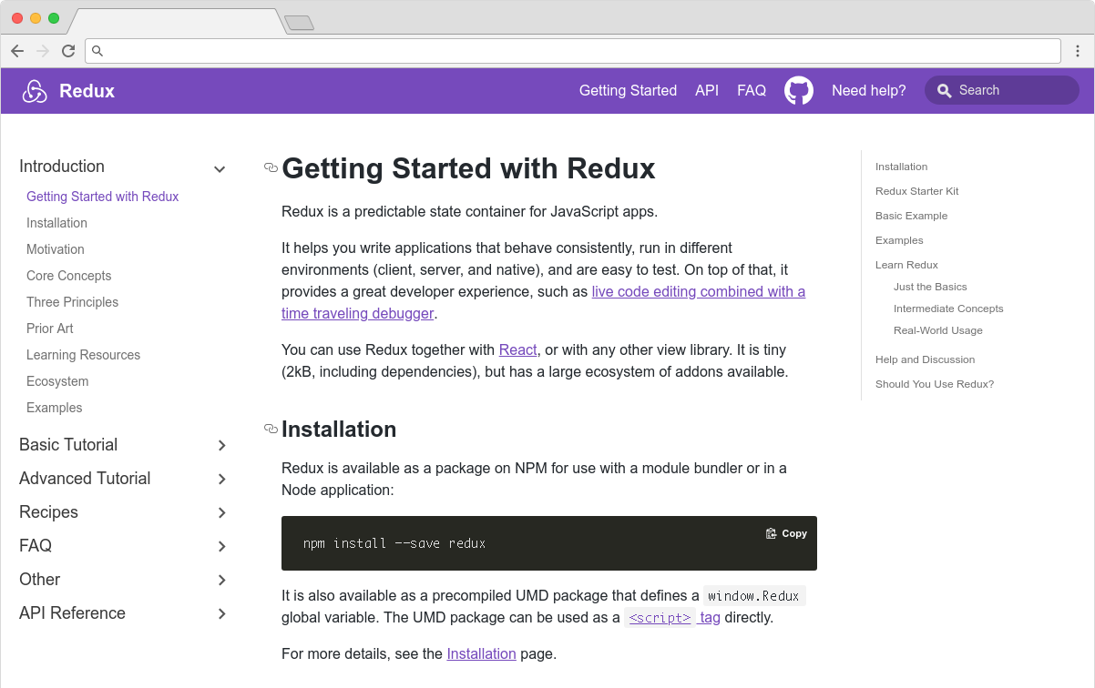
Docusaurus is made by Facebook and used by every Facebook open source project, apart from React. It’s also used by many major open source projects outside of Facebook, including Redux, Prettier, Gulp and Babel.
Projects making use of Docusaurus.
You can use Docusaurus to document anything — it isn’t front-end specific. Docusaurus uses React under the hood, but you don’t have to know that framework to make use of it. It’ll take your Markdown files and turn them into a nicely-structured, well-formatted and readable documentation site, with a nice design right out of the box.
The Redux site shows the typical Docusaurus layout
Sites created with Docusaurus can also include a Markdown-based blog. Prism.js is included by default for zero-setup syntax highlighting. While relatively new, Docusaurus has proven popular, being voted the number one new tool of 2018 on StackShare.
Other options for written content
Docusaurus specifically caters to building documentation. Of course, there are a million and one ways to make a website — so you could roll your own solution with any back-end language, CMS, or static site generator.
The documentation sites for React, IBM’s design system, Apollo and Ghost CMS use Gatsby, for example — a generic static site generator often used for blogs. If you work with the Vue framework, VuePress is becoming a popular option. MkDocs is an open source static site generator for creating documentation, written in Python and configured with a single YAML file. GitBook is a popular paid product that’s free for open-source and non-profit teams. If you're building internal documentation and want something easy, the reading experience on GitHub itself isn’t half bad, so you could just commit some Markdown files and leave it at that.
Documenting components: Docz, Storybook and Styleguidist
Style guides, design systems, pattern libraries — whatever you want to call them — have become a hugely popular area of concern in the last decade. What’s really made the difference in turning them from vanity projects into useful tools isn’t the pontificating of thought leaders but the emergence of component-driven frameworks, like React, and the tools mentioned here.
Storybook, Docz and Styleguidist all do much the same thing: display interactive UI components and document their API. A project may have dozens or even hundreds of components to keep track of — all with a variety to states and styles. If you want components to be reused, people have to know that they exist. We aid discoverability when we catalog components. A style guide gives an easily searchable and scannable overview of all your UI components. This helps to maintain visual consistency and avoid duplicating work.
These tools provide a convenient way to review different states. It can be difficult to reproduce every state of a component in the context of a real application. Rather than needing to click through an actual app, developing a component in isolation can be helpful. Hard-to-reach states (like a loading state, for example) can be mocked.
Dan Green wrote a nice synopsis of the benefits of using Storybook, but it applies equally to Docz and Styleguidist:
"Storybook has made it really easy for designers who code to collaborate with engineers. By working in storybook they don't need to get a whole environment running (docker container, etc). For Wave, we have many important components that are only visible in the middle of a process that is short lived and time consuming to reproduce (i.e. a loading screen that only shows while a user is having their payment account set up). Before Storybook, we didn't have a good way to work on these components and were forced to temporary hacks in order to make them visible. Now, with Storybook we have an isolated place to easily work on them, which has the bonus feature of being easily accessible for designers and PMs. It also makes it really easy for us to show off these states in sprint demos."
- Dan Green, Wave Financial
As well as visualizing different states side-by-side and listing props, its often helpful to have written content about a component — whether its explaining the design rationale, use-cases, or describing the results of user-testing. Markdown is easy enough for *anybody* to learn — ideally a style guide should be a joint resource for designers and developers that both disciplines contribute to. Docz, Styleguidist and Storybook all offer a way to seamlessly intermingle Markdown with the components themselves.
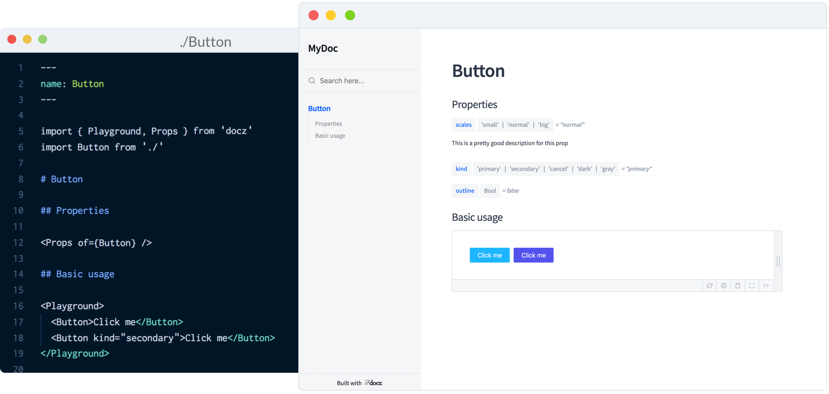
Docz
Currently, Docz is a React-only project, but is working on support for Preact, Vue and web components. Docz is the newest of the three tools, but has already amounted over 14,000+ stars on GitHub. It is, to my mind, the easiest solution to work with. Docz provides two components — <Playground> and <Props>. These are imported and used directly in .mdx files.
import { Playground, Props } from "docz";
import Button from "../src/Button";

## You can _write_ **markdown**
### You can import and use components

<Button>click</Button>
You can wrap your own React components with <Playground> to create the equivalent of an embedded CodePen or CodeSandbox — a view of your component alongside editable code.
<Playground>
  <Button>click</Button>
</Playground>
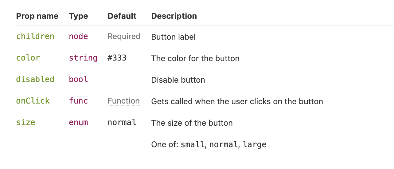
<Props> will show all the available props for a given React component, default values, and whether the prop is required.
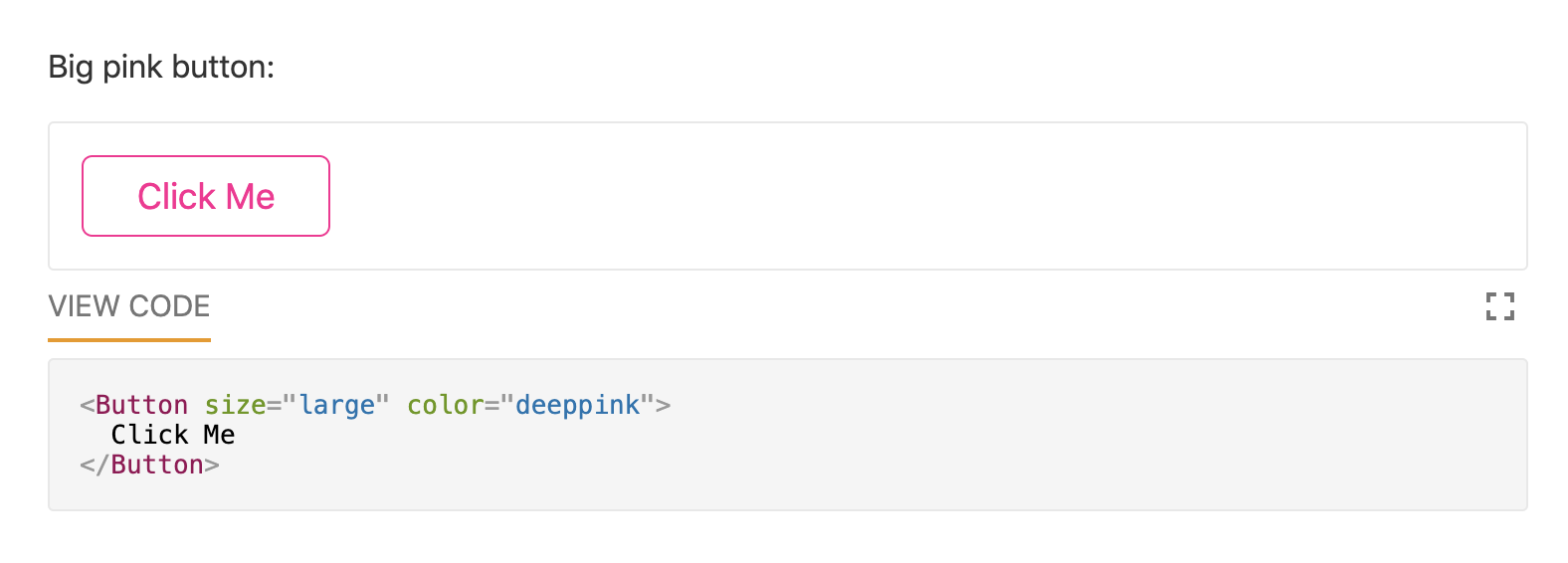
<Props of={Button} />
I personally find this MDX-based approach the simplest to understand and the easiest to work with.
Just like with Docz, examples are written using Markdown syntax. Styleguidist uses Markdown code blocks (triple backticks) in regular .md files rather than MDX:
Code blocks in Markdown usually just show the code. With Styleguidist, any code block with a language tag of js, jsx or javascript will be rendered as a React component along with the code. Just like with Docz, the code is editable — you can change props and instantly see the result.
Styleguidist will automatically create a table of props from either PropTypes, Flow or Typescript declarations.
Styleguidist currently supports React and Vue.
Storybook
Storybook markets itself as "a development environment for UI components." Rather than writing examples of components inside Markdown or MDX files, you write *stories* inside Javascript files. A *story* documents a particular state of a component. A component might have stories for a loading state and a disabled state, for example.
Storybook is less straightforward to use than Styleguidist and Docz. At over 36,000 GitHub stars though, it’s the most popular option. It’s an open source project with 657 contributors and a full-time maintainer. It is used by, among others, Airbnb, Algolia, Atlassian, Lyft, and Salesforce. Storybook supports more frameworks than any other offering — React, React Native, Vue, Angular, Mithril, Ember, Riot, Svelte and plain HTML are all supported.
Writing documentation about components currently requires addons. In a future release, Storybook is taking inspiration from Docz and adopting MDX.
# Button

Some _notes_ about your button written with **markdown syntax**.

<Story name="disabled">
  <Button disabled>lorem ipsum</Button>
</Story>
Storybook’s new Docs feature is being rolled out incrementally over the next couple of months and looks set to be a big step forward.
Do you use @storybookjs for component docs or design systems? You're gonna love DocBlocks: 📦 Drop into MDX 🏗 Modular and composable 🤝 Compatible w/ @gatsbyjs, #nextjs, etc
The benefits of pattern libraries have been extolled at nauseating length in a million Medium articles. When done well, they aid visual consistency and facilitate the creation of cohesive products. Of course, none of these tools can magic up a design system. That takes careful thought about both design and CSS. But when it comes time to communicate that system to the rest of an organization, Docz, Storybook and Styleguidist are all great options.


