This article was originally published in August 2019.
The objective of this article is to familiarize you with the C# programming basics. This article is for absolute beginners who want to learn C# fundamentals.

Tips, Expertise, Articles and Advice from the Pro's for Your Website or Blog to Succeed

This article was originally published in August 2019.
The objective of this article is to familiarize you with the C# programming basics. This article is for absolute beginners who want to learn C# fundamentals.
Let’s look at how to get the user’s mouse position and map it into CSS custom properties: --positionX and --positionY.
We could do this in JavaScript. If we did, we could do things like make make an element draggable or move a background. But actually, we can still do similar things, but not use any JavaScript!
I’ve used this method as a part of a demo I’ve made for getting a ‘Click and drag’ effect with pure CSS. I used the perspective tips from my pervious article. It’s a pretty neat effect to get this done entirely in CSS, which might have wider usefulness than my demo, so let’s take a look.
Our first demo is going to use --positionX and --positionY custom properties to set the width and height of an element.
Heads up that we’re only using SCSS here for brevity, but all of this can be done in pure CSS.
This is our initial state. We have here a ‘wrapper’ <div> with a .content class of that is spread to the width and height of the body. This <div> will host the content of our project, and the elements we want to control using the mouse position – in this case, the .square element.
We’ve also added the two custom-properties to the content. we will use the mouse position to set the value of these properties, and then use them set the .square element’s width and height accordingly.
Once we have mapped the custom properties for mouse position, we can use them to do pretty much anything we want . For example, we could use them to set the top / left properties of an absolute positioned element, control a transform property, set the background-position, manipulate colors, or even set the content of a pseudo-element. We’ll see some of these bonus demos at the end of the article.
The goal is to create an invisible grid on the screen, and use the :hover pseudo-class to map each ‘cell’ to a set of values that we will allocate to the custom properties. So, when the mouse cursor moves to the right side of the screen, the value of the --positionX will be higher; and when it moves to left, it gets lower. We’ll do the same with --positionY: the value will be lower as the cursor moves to the top, and higher when it moves to the bottom.
A few words about the grid size we’re using: We can actually make the grid whatever size we want. The larger it is, the more accurate our custom property values will be. But that also means we will have more cells, which can lead to performance issues. It’s important to maintain proper balance and adjust the grid size to the specific needs of each project.
For now, lets say that we want a 10×10 grid for a total of 100 cells in our markup. (And yes, it’s OK to use Pug for that, even though I won’t in this example.)
<div class="cell"></div>
<div class="cell"></div>
<div class="cell"></div>
<!-- 97 more cells -->

<div class="content">
  <div class="square"></div>
</div>
You’re probably wondering why the .cell elements come before the .content. That’s because of the cascade.
We want to use the .cell class to control the .square, and the way the cascade works (for now) is that an element can only control its children (or descendants) and its siblings (or their descendants) — but only as long as the sibling is after the controlling element.
That means two things:
.cell must come before the element we want to control (in this case, the .square)..cells in a container, because if we do, the .content is no longer their sibling.There are a few ways to position the .cells. we can position: absolute them and offset them with the top and left properties. Or we can translate them into position using transform. But the easiest option is likely using display: grid.
body {
  background-color: #000;
  height: 100vh;
  display: grid;
  grid-template: repeat(10, 1fr) / repeat(10, 1fr);
}

.cell {
  width: 100%;
  height: 100%;
  border: 1px solid gray;
  z-index: 2;
}border is just temporary, so we could see the cells on the screen. we’ll remove it later on.z-index is important, because we want the cells to be in front of the content.Here’s what we have so far:
We want to use .cell to set the --positionX and --positionY values.
When we hover over a .cell that is in the first (left) column, the value of --positionX should be 0. When we hover over a .cell in the second column, the value should be 1. It should be 2 in the third column, and so on.
The same goes for the y-axis. When we hover over a .cell that is in the first (top) row, --positionY should be 0, and when we hover over a cell in the second row, the value should be 1, and so on.
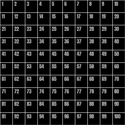
The numbers in this image represent the numbers of the cell elements in the grid. If we take just a single .cell as an example — let’s say cell 42 — we can select it using :nth-child():
.cell:nth-child(42) { }But we need to remember a couple of things:
:hover to it..content instead of the cell itself, so we’ll use the General Sibling Combinator (~) to do that.So now, to set --positionX to 1 and --positionY to 3 for .content when the 42nd cell is hovered, we need to do something like this:
.cell:nth-child(42):hover ~ .content {
  --positionX: 1;
  --positionY: 3;
}
But who wants to do that 100 times!? There are a few approaches to make things easier:
@for loop to go through all 100 cells, and do some math to set the proper --positionX and --positionY values for each iteration.:nth-child’s functional notation.@for loop and :nth-child functional notation.I thought long and hard about what would be the best and easiest approach to take, and while all of then have pros and cons, I landed on the third approach. The amount of code to write, the quality of the compiled code, and the math complexity all went into my thinking. Don’t agree? Tell my why in the comments!
@for loop@for $i from 0 to 10 {
.cell:nth-child(???):hover ~ .content {
--positionX: #{$i};
}
.cell:nth-child(???):hover ~ .content {
--positionY: #{$i};
}
}This is the basic loop. We’re going over it 10 times since we have 10 rows and 10 columns. And we’ve separated the x- and y-axes to set --positionX for each column, and the --positionY for each row. All we need to do now is to replace those ??? things with the proper notation to select each row and column.
Going back to our grid image (the one with numbers),We can see that the numbers of all the cells in the second column are multiples of 10, plus 2. The cells in the third column are multiples of 10 plus 3. And so on.
Now let’s ‘translate’ it into the :nth-child functional notation. Here’s how that looks for the second column:
:nth-child(10n + 2)10n selects every multiple of 10.2 is the column number.And for our loop, we will replace the column number with #{$i + 1} to iterate sequentially:
.cell:nth-child(10n + #{$i + 1}):hover ~ .content {
  --positionX: #{$i};
}Look again at the grid image and focus on the fourth row. The cell numbers are somewhere between 41 and 50. The cells in the fifth row are between 51 to 60, and so on. To select each row, we’ll need to define its range. For example, the range for the fourth row is:
.cell:nth-child(n + 41):nth-child(-n + 50)(n + 41) is the start of the range.(-n + 50) is the end of the range.Now we’ll replace the numbers with some math on the $i value. For the start of the range, we get (n + #{10 * $i + 1}), and for the end of the range we get (-n + #{10 * ($i + 1)}).
So the final @for loop is:
@for $i from 0 to 10 {
 .cell:nth-child(10n + #{$i + 1}):hover ~ .content {
    --positionX: #{$i};
  }
  .cell:nth-child(n + #{10 * $i + 1}):nth-child(-n + #{10 * ($i + 1)}):hover ~ .content {
    --positionY: #{$i};
  }
}
The mapping is done! When we hover over elements, --positionX and --positionY change according to the mouse position. That means we can use them to control the elements inside the .content.
OK, so now we have the mouse position mapped to two custom-properties, The next thing is to use them to control the .square element’s width and height values.
Let’s start with the width and say that we want the minimum width of the .square to be 100px (i.e. when the mouse cursor is at the left side of the screen), and we want it to grow 20px for each step the mouse cursor moves to the right.
Using calc(), we can do that:
.square {
  width: calc(100px + var(--positionX) * 20px);
}
And of course, we’ll do the same for the height, but with --positionY instead:
.square {
  width: calc(100px + var(--positionX) * 20px);
  height: calc(100px + var(--positionY) * 20px);
}
That’s it! Now we have a simple .square element, with a width and height that is controlled by the mouse position. Move your mouse cursor over the window, and see how the square changes its width and height accordingly.
I added a small transition to make the effect smoother. That’s not required, of course. And I’ve also commented out on the .cell border.
There might be a case where you want to ‘bypass’ --positionX and --positionY, and set the end value directly inside the @for loop. So, for our example it would look like this:
@for $i from 0 to 10 {
 .cell:nth-child(10n + #{$i + 1}):hover ~ .content {
    --squareWidth: #{100 + $i * 20}px;
  }
  .cell:nth-child(n + #{10 * $i + 1}):nth-child(-n + #{10 * ($i + 1)}):hover ~ .content {
    --squareHeight: #{100 + $i * 20}px;: #{$i};
  }
}
Then the .square would use the custom properties like this:
.square {
  width: var(--squareWidth);
  height: var(--squareHeight);
}
This method is a little more flexible because it allows for more advanced Sass math (and string) functions. That said, the general principle is absolutely the same as what we already covered.
Well, the rest is up to you — and the possibilities are endless! How do you think you’d use it? Can you take it further? Try using this trick in your CSS, and share your work in the comments or let me know about it on Twitter. It will be great to see a collection of these come together.
Here are a few examples to get your hamster wheel turning:
The post How to Map Mouse Position in CSS appeared first on CSS-Tricks.
You can support CSS-Tricks by being an MVP Supporter.
In this tutorial, you will learn how to use for and while loops in Python.
Specifically, you’ll learn how to:
A friend shared this youtube video on the Art of Code where FizzBuzz was demonstrated on SonicPi and also at end of the video (I won’t spoil it for you). After watching it, I was highly inspired to also implement it on Mule, because why not? I even searched the web to see if anyone had already done a FizzBuzz loop on Mule. The fact that I then did it last night kinda tells you that the answer was no.
It turns out that I also learned a thing or two implementing FizzBuzz on Mule 4. FizzBuzz is one of the ways loops are introduced when learning a programming language. Even the recent Golang course I took also introduces loops using FizzBuzz. For the uninitiated, FizzBuzz is derived from a children’s game, the problem statement for a FizzBuzz program is pretty straightforward. This is the same one you can find at HackerRank.
The history of functional programming can be traced back to Lambda-calculus. It is a mathematical language invented by Alonzo in 1930. In some ways, lambda-calculus is the first programming language. Some principles of lambda calculus can be found in modern functional languages and even in Java also. The first principle is that the main object in this kind of language is functions and functions in the mathematical sense of these words. something that takes input and returns the output.
It always returns the same output if based on the same input. Hence, this property goes by the name of being stateless. In other words, the function has no memory of previous inputs.
There are loads of ways to loop in JavaScript! How do you know which one to choose, and when? It can be a minefield for those new to the language. In this article, we are going to cover 7 of...
The post JavaScript Loops 101 appeared first on Treehouse Blog.
I reckon that a lot of our uses of Sass maps can be replaced with CSS Custom properties – but hear me out for a sec.
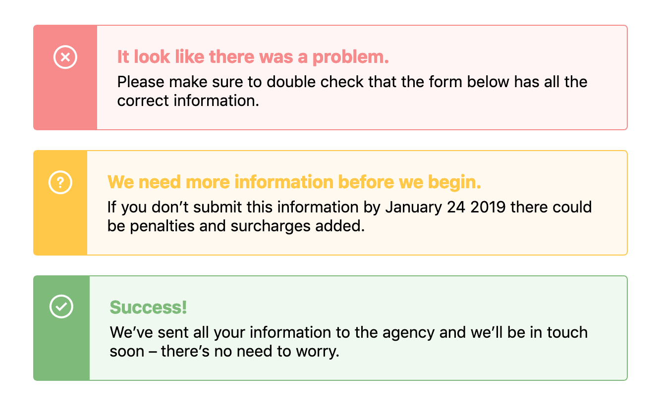
When designing components we often need to use the same structure of a component but change its background or text color based on a theme. For example, in an alert, we might need a warning style, an error style, and a success style – each of which might be slightly different, like this:
There’s a few ways we could tackle building this with CSS, and if you were asking me a couple of years ago, I would’ve tried to solve this problem with Sass maps. First, I would have started with the base alert styles but then I’d make a map that would hold all the data:
$alertStyles: (
  error: (
    theme: #fff5f5,
    icon: 'error.svg',
    darkTheme: #f78b8b
  ),
  success: (
    theme: #f0f9ef,
    icon: 'success.svg',
    darkTheme: #7ebb7a
  ),
  warning: (
    theme: #fff9f0,
    icon: 'warning.svg',
    darkTheme: #ffc848
  )
);
Then we can loop through that data to change our core alert styles, like this:
@each $state, $property in $alertStyles {
  $theme: map-get($property, theme);
  $darkTheme: map-get($property, darkTheme);
  $icon: map-get($property, icon);

  .alert-#{$state} {
    background-color: $theme;
    border-color: $darkTheme;
    &:before {
      background-color: $darkTheme;
      background-image: url($icon);
    }
    .alert-title {
      color: $darkTheme;
    }
  }
}
Pretty complicated, huh? This would output classes such as .alert-error, .alert-success and .alert-warning, each of which would have a bunch of CSS within them that overrides the default alert styles.
This would leave us with something that looks like this demo:
See the Pen
Alerts – Sass Loops by Robin Rendle (@robinrendle)
on CodePen.
However! I’ve always found that using Sass maps and looping over all this data can become unwieldy and extraordinarily difficult to read. In recent projects, I’ve stumbled into fantastically complicated uses of maps and slowly closed the file as if I’d stumbled into a crime scene.
How do we keep the code easy and legible? Well, I think that CSS Custom Properties makes these kinds of loops much easier to read and therefore easier to edit and refactor in the future.
Let’s take the example above and refactor it so that it uses CSS Custom Properties instead. First we’ll set out core styles for the .alert component like so:
See the Pen
Alerts – Custom Variables 1 by Robin Rendle (@robinrendle)
on CodePen.
As we create those base styles, we can setup variables in our .alert class like this:
.alert {
  --theme: #ccc;
  --darkTheme: #777;
  --icon: '';
  background: var(--theme);
  border: 1px solid var(--darkTheme);
  /* other styles go here */

  &:before {
    background-image: var(--icon);
  }
}
We can do a lot more with CSS Custom Properties than changing an interface to a dark mode or theme. I didn’t know until I tried that it's possible to set an image in a custom property like that – I simply assumed it was for hex values.
Anyway! From there, we can style each custom .alert class like .alert-warning by overriding these properties in .alert:
.alert-success {
  --theme: #f0f9ef;
  --darkTheme: #7ebb7a;
  --icon: url(https://s3-us-west-2.amazonaws.com/s.cdpn.io/14179/success.svg);
}

.alert-error {
  --theme: #fff5f5;
  --darkTheme: #f78b8b;
  --icon: url(https://s3-us-west-2.amazonaws.com/s.cdpn.io/14179/error.svg);
}

.alert-warning {
  --theme: #fff9f0;
  --darkTheme: #ffc848;
  --icon: url(https://s3-us-west-2.amazonaws.com/s.cdpn.io/14179/warning.svg);
}
And that’s about it! We’ll get the exact same visual interface that we had with a Sass loop:
See the Pen
Alerts – Custom Variables 2 by Robin Rendle (@robinrendle)
on CodePen.
However! I think there’s an enormous improvement here that’s been made in terms of legibility. It’s much easier to look at this code and to understand it right off the bat. With the Sass loop it almost seems like we are trying to do a lot of clever things in one place – namely, nest classes within other classes and create the class names themselves. Not to mention we then have to go back and forth between the original Sass map and our styles.
With CSS Custom Properties, all the styles are contained within the original .alert.
There you have it! I think there’s not much to mention here besides the fact that CSS Custom Properties can make code more legible and maintainable in the future. And I reckon that’s something we should all be a little excited about.
Although there is one last thing: we should probably be aware of browser support whilst working with Custom Properties although it’s pretty good across the board.
The post Do CSS Custom Properties Beat Sass Loops? appeared first on CSS-Tricks.