Where to Put Your Logo? What the Research Says

You’ve got a beautifully designed logo. Well done. Now, what do you do with it?

Once your high quality logo is designed and ready to go, it should appear on all your branded material, including your WordPress website. Typically, there are three schools of thought as to where logos can go: in the top-left, top-middle, or top-right corners of a page. So this begs the question: which position is right for your logo?

If we’re going strictly based on UX logic, then your logo belongs in the top-left corner of your website. No questions asked. There are two reasons for this:

  1. For those of us with a native language that reads from left to right, our eyes naturally look to the left first.
  2. In the earlier years of web design, logos were always on the left, and that’s where most people assume they are located now.

Despite what logic says, there are some websites that have eschewed the norm for logo placements in the center or right corner of a website. Would a unique placement of your logo fit better with your brand identity?

Let’s take a closer look at what the studies show, and see if left really is right for your site.

Experts Weigh In: Where to Place Your Logo?

According to the Nielsen Norman Group, there are three purposes that logos serve on modern websites:

  • They remind visitors where they are. In other words, whose website am I on?
  • They allow for easy navigation to the home page since most websites no longer include a “Home” button in the navigation.
  • They aid in brand recognition as the logo always remains there at the top of the site, and sometimes even follows visitors as they scroll down a page.

The NNGroup performed two studies to find the ideal logo location. Here is what they found:

Left vs. Right

In the left-versus-right study, the NNGroup tested and observed the response of 128 users. Similar to an A/B test, each user was shown only one version of a website: either the original with the logo on the left or the one the NNGroup manipulated in order to place the logo and navigation on the right.

They gave the users a minute’s time to review their version of the website. They were then asked a series of questions and shown photos of 10 hotel websites. This test aimed to establish what sort of effect logo placement had on brand recall.

These were the results:

  • Left-aligned logos lead to greater brand recall. Specifically, the average brand recall for left-aligned logos was 39% as opposed to 21% for the right-aligned version.
  • Left-aligned logos are more likely to be labeled “unique.” Despite the traditional placement of a left-aligned logo, respondents were still more likely to label a left-aligned logo as “unique” and “stylish” than one that appeared on the right.

Left vs. Center

The Nielsen Norman Group conducted an additional study to discover what happens when users were exposed to a center-aligned logo. They conducted two different tests to determine the viability of a centered logo.

Unlike the A/B test conducted between left- and right-aligned logos, this first survey provided 50 users each with one retail website to interact with. Eight of those websites had a centered logo whereas six had a left-aligned logo. They were then asked to complete different tasks that would test their ease in using the navigation and return to the home page.

This was the result:

  • Left-aligned logos are better for navigation. In the study, only 4% of users failed to navigate home in a single click when the logo appeared on the left. When the logo was centered, however, 24% of users failed to get there in one click.

In the second of these tests, the NNGroup presented 128 users with five different hotel websites. Four of the logos showed variations of a logo on either the left or in the center, while the fifth site included a right-aligned logo. Users were then asked a series of questions to determine brand recall.

This was the result:

  • Brand recall is unaffected by the difference between left or centered logos. Despite presenting users with variations of the same logo in different spots, brand recall was inconsistent in this comparison between left-aligned and centered logos.

The Winner Is…

After reviewing the results from the logo placement studies, it appears that logic does prevail:

Left is best.

Here’s why:

  • Many people don’t think about looking in the right-hand corner of a website for a logo, and so brand recall can be severely compromised as a result.
  • Many people are conditioned to look for a navigation in one of the top corners of a site, so placing a logo and/or navigation in the center confuses the process of getting around a website.

In summary, left-aligned logos are ideal as they are located exactly where the eye is naturally drawn.

Just remember that web design’s primary concern should always be with the user experience. While a centered logo may look sleek, it probably isn’t ideal if you have more than one page on your website (and you expect people to visit those other pages). The same goes for a right-aligned logo. It may seem like you’re giving your site a unique edge, but you may hurt your brand’s recall in the process.

It’s also important to keep in mind that it’s not just logo placement that matters. Logos should be exported in a high-quality file format, created using a legible font face, and positioned on top of white space so that background imagery, shadows, and colors can’t distract from it.

Wrapping Up

If you’re trying to get creative with your WordPress site’s design, there are other ways to go about doing it. You could create a killer landing page, add push notifications, or revamp your CTA buttons.

If this study has shown us anything, it’s that you shouldn’t mess around with the placement of your logo. Left is always best.
20 Logos With Hidden Messages – 2020 Update

Designing logos can be a very difficult task.

When designing a logo, you want it to stand out from the crowd, yet still be really simple.

Sometimes the designer is really clever and makes the logo very simple, yet includes a hidden message within the logo that has a deeper meaning.

In today’s article, we’re going to cover 20 logos with hidden messages.

Some logos you will have seen before, and some may be completely new to you, but hopefully, you will enjoy them all.

Amazon

Amazon logo hidden message

The Amazon logo is an extremely simple logo and while the arrow may just look like a smile it actually points from a to z.

This represents that Amazon sells everything from a to z, and the smile on the customers face when they bought a product.

Goodwill

goodwill logo hidden mesages

Goodwill. The one thrift store we all know and love.

When you look at the logo, you see it’s a person smiling, probably happy that they just donated their clothes or just copped an awesome find for a great deal!

Now look at the letter ‘g’ from ‘goodwill’.

You’ll see that same smiling person in the first letter of the logo!

LG

LG logo with hidden message

At first glance, you might think LG’s logo may just be the winking face of a happy client.

But look closer.

You’ll see that in the winky face logo, there’s actually an L in the center, and the face is a G!

Super clever on their part.

Pinterest

Pinterest logo hidden message

Pinterest is one of my favorite social media apps out there.

It’s always full of great ideas and new trends that I can get inspired from, and then I can pin those images to one of my boards.

Hence, “Pin-terest”.

Duh.

Anyway, to the untrained eye, you might just see the letter “P” in the logo.

But if you really pay close attention, you’ll see that the letter “P” is actually a pin.

Michael Deal, the co-designer of this logo said, “For most of the project, I had avoided making visual reference to the image of a pin because it seemed too literal. But the “P” started to lend itself too well to the shape of a map pin.”

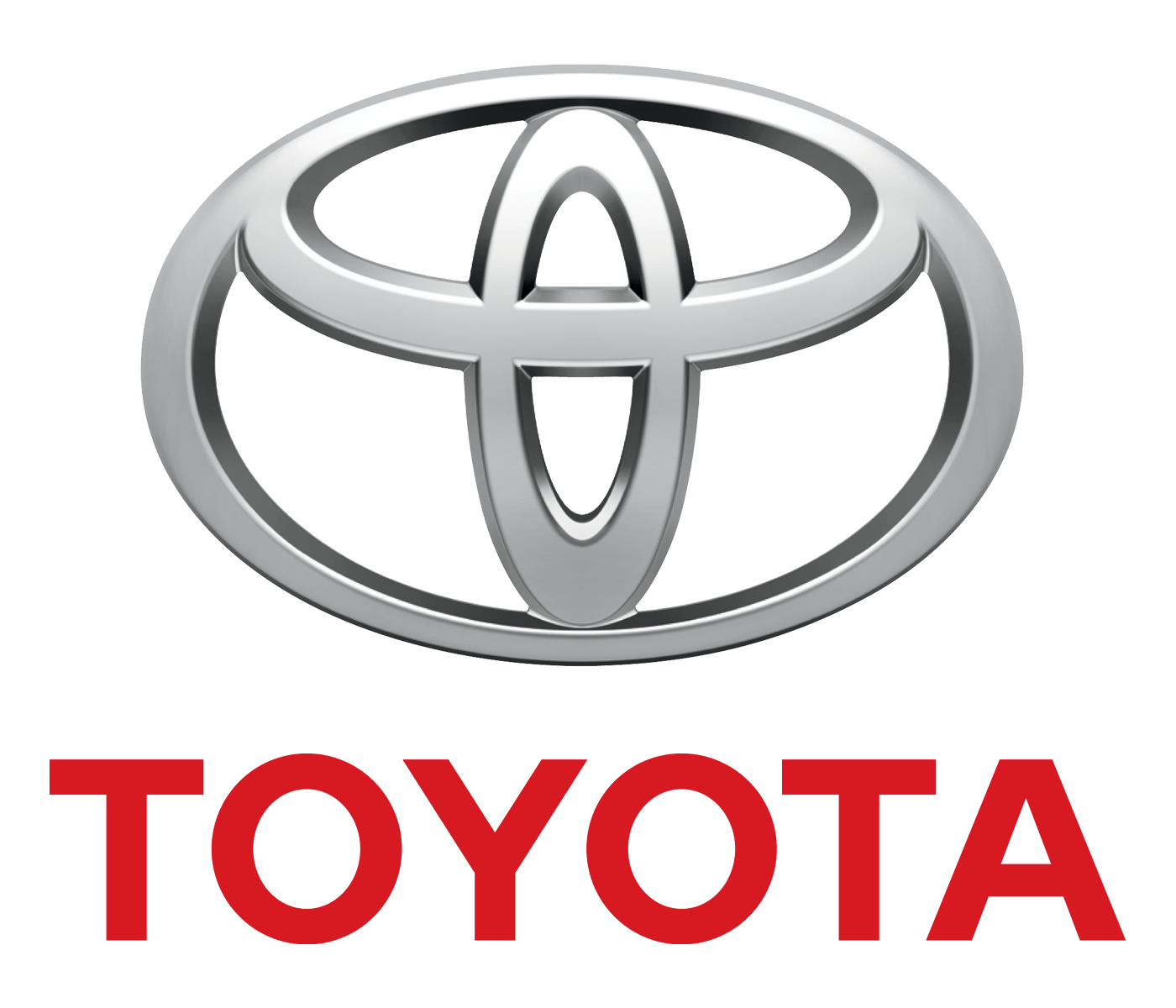
Toyota

toyota logo hidden message

Next up, we have Toyota.

This one is definitely one of the coolest of them all, and if it hasn’t received some kind of award already, well, it definitely deserves one.

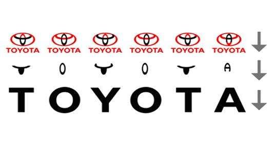
If you didn’t already know, the Toyota logo has the entire word “Toyota” written in it!

Here’s a diagram to explain it better.

toyota logo explained

Isn’t that the coolest thing you’ve ever seen?

BMW

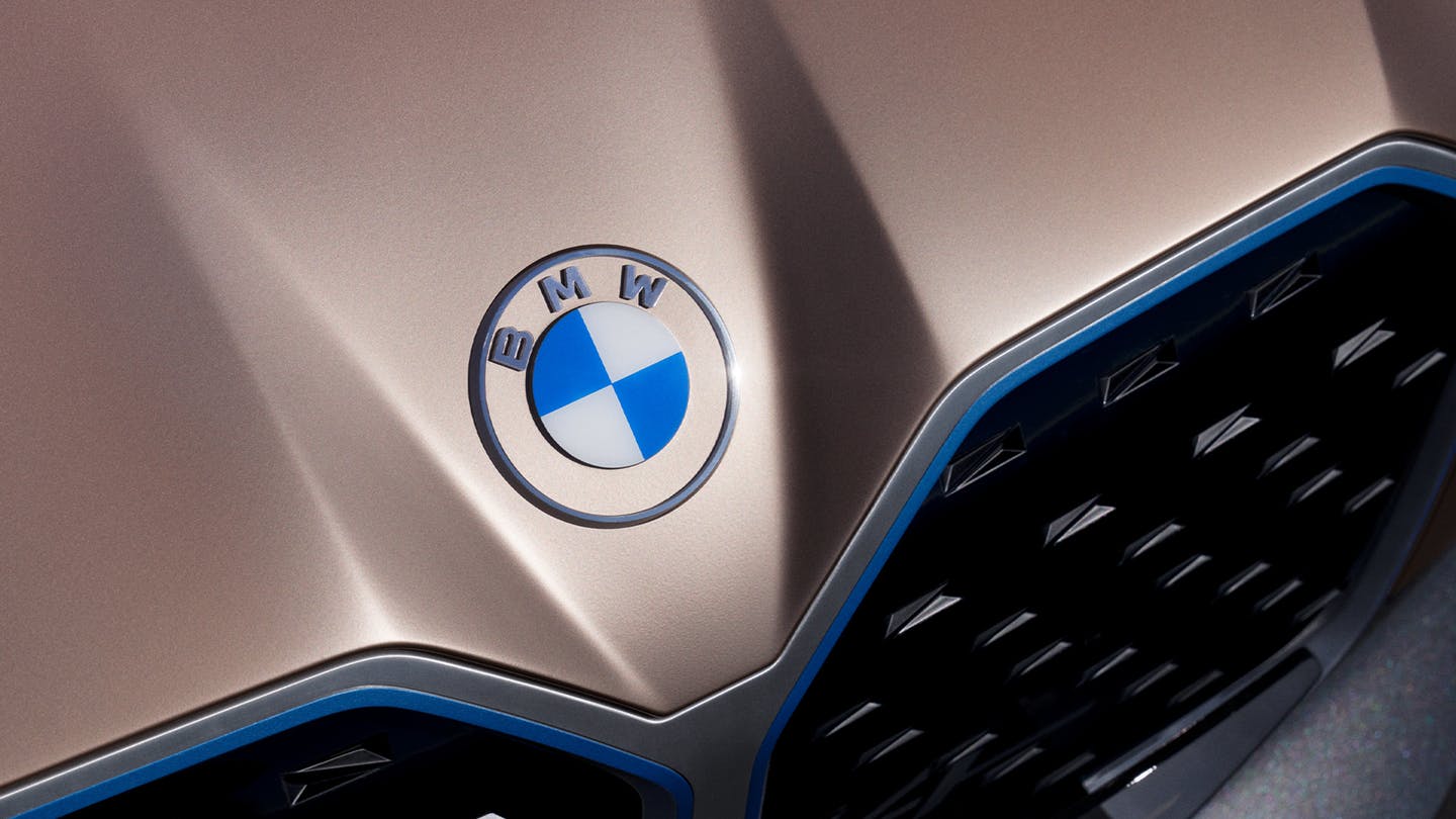
new logo bmw

BMW just recently updated its logo and it looks amazing.

I wrote an entire piece about the new BMW logo because that’s how much I loved it.

But anyway, let’s talk about the hidden message here!

This logo actually represents a propeller in motion, with the blue part representing the sky, and the white part representing the propeller.

BMW’s logo is a tribute to the company’s history in aviation.

Baskin Robbins

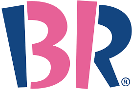
Baskin robbins hidden logo

The Baskin Robbins logo may look like it includes a simple BR above the name. bBt if you take another look, you will that it includes a pink number 31. This is a reference to their original and iconic 31 flavors.

Chick-fil-a

hidden logos chickfila

The Chick-fil-a logo incorporates a chicken into the C. Although this isn’t very hidden, it is still very clever.

Eighty20

eighty 20 logo

The eighty20 logo is a bit of a geeky one to figure out, the two lines of squares represent a binary sequence with the blue squares being 1’s and the grey squares being 0’s.

Which makes 1010000 which represents eighty and 0010100 which represents 20.

F1

formula 1 logo hidden message

The F1 logo is a fairly simple one to figure out. The negative space in the middle creates the 1.

Facebook Places

facebook places logo hidden message

If you didn’t already know Facebook Places, it is Facebook’s new geolocational product, which is in direct competition with the current leader in that area, Foursquare.

Now if you take another look at Facebook Places logo you will notice there is a 4 in a square.

Now is this a coincidence or is it a dig at Foursquare?

Fedex

fedex logo with hidden message

The FedEx logo looks like a plain, text-based logo.

But if you take a second look, between the E and the X, you will see an arrow, that represents the speed and accuracy of the company’s deliveries.

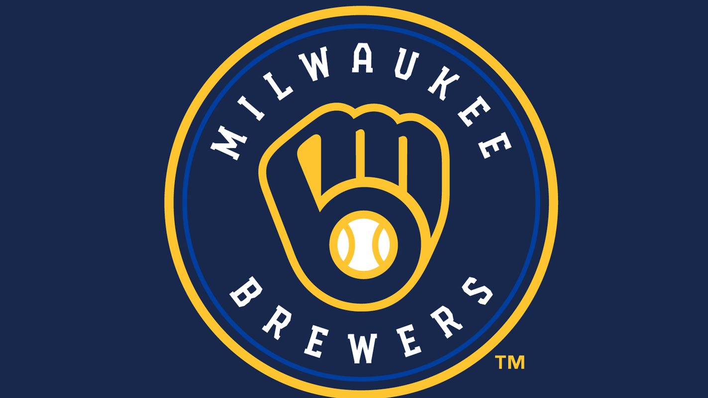
Milwaukee Brewers

Milwaukee Brewers logo hidden message

The old Milwaukee Brewers logo may look like a simple catchers mitt holding a ball, but if you take a second glance, you will see the team’s initials M and B.

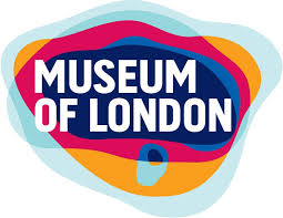
Museum of London

museum of london logo

The Museum of London logo may look like a modern logo design, but it actually represents the geographic area of London as it as grew over time.

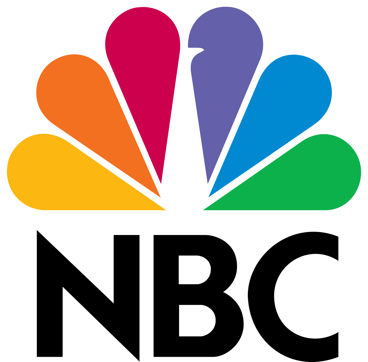
NBC

NBC logo hidden peacock

The NBC logo has a hidden peacock above the above text which is looking to the right.

This represents the companies motto to look forward and not back, and also that they are proud of the programs they broadcast.

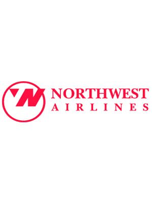
Northwest Airlines

The old Northwest Airlines logo may look like a simple logo, but if you take a closer look, the symbol on the left actually represents both N and W and because it is enclosed within the circle it also represents a compass pointing northwest.

Piano Forest

piano forest logo

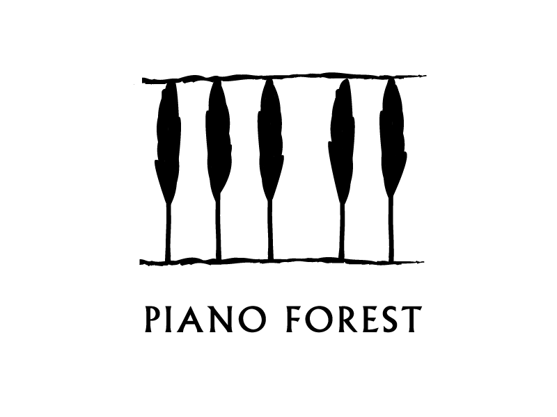
The Piano Forest logo may look like a simple text logo with trees above it, but if you take another look you will see that the trees actually represent keys on a piano.

Toblerone

Toblerone Logo

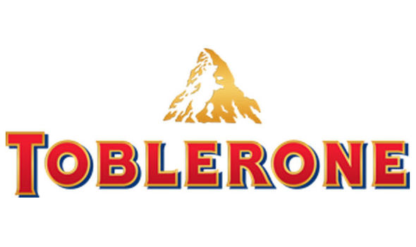
The Toblerone logo contains the image of a bear hidden in the Matterhorn mountain, which is where Toblerone originally came from.

Tostitos

tostitoss logo hidden message

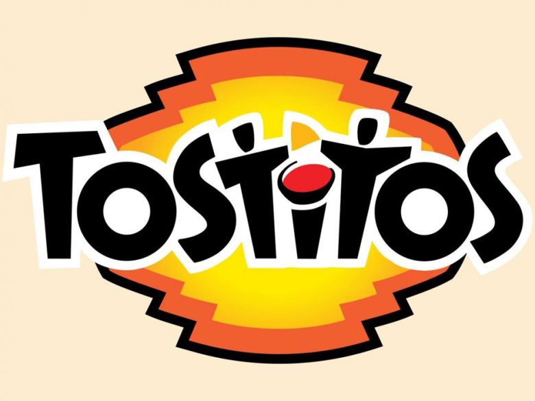
The Tostitos logo includes two people sharing a chip and a bowl of salsa, this conveys an idea of people connecting with each other over a bowl of chips.

Treacy Shoes

treacy shoes hidden logo

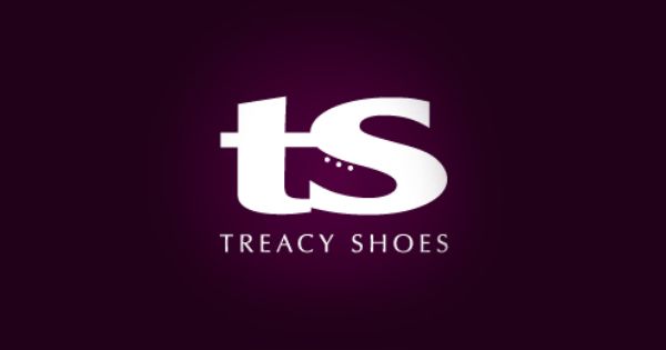
The Treacy Shoes logo is very cute logo with a shoe hidden between the t and s.

In Conclusion

Making a clever logo doesn’t always just come easily to you.

It can take weeks, months, and even years to come up with something mindblowing.

Other times, the idea comes to the forefront of your brain and you can see it clear as day.

Gather inspiration from these amazing logos with hidden messages and start making your own!

You could design the next big logo.

Did I miss any other big logos that have hidden messages within them?

Let me know in the comments!

Until next time,

Stay creative, folks!

Read More at 20 Logos With Hidden Messages – 2020 Update