You’d be doing yourself a favor to read Manuel’s breakdown of all what’s happening here, but it basically works out to the equivalent of this longer syntax:
max() acecepts a comma-separated list of CSS numeric values, where the applied value is the largest (or as MDN puts it, the “most positive”) one in the set.
0px is the first value in the set, ensuring that the smallest value is always going to be greater than zero pixels.
(100% - 64rem) is the second “value” in the set, but is expressed as a calculation (note that calc() is unnecessary) that subracts the the max-width of the element (64rem) from its full available width (100%). What’s left is the space not taken up by the element.
((100% - 64rem) / 2)) divides that remaining space equally since we’re divying it between the inline boundaries of the element.
max(0px, ((100% - 64rem) / 2)) compares 0px and (100% - 64rem) / 2). The largest value is used. That’ll be the result of the equation in most cases, but if 64rem is ever greater than the computed value of the element’s full 100% width, it’ll lock that value at zero to ensure it never results in a negative value.
margin-inline is the property that the winning value sets, which applies margin to the inline sides of the element — that’s the logical shorthand equivalent to setting the same value to the margin-left and margin-right physical properties.
It’s the same sort of idea Chris shared a while back that uses the CSS max()function to solve the “Inside Problem” — a container that supports a full-bleed background color while constraining the content inside it with padding.
Michelle Barker with my favorite sorta blog post: short, practical, and leaves you with a valuable nugget for your time. Here, she gets into logical property shorthands in CSS, particularly those that set lengths just on a single axis, say only the block (vertical) axis or just the inline (horizontal) axis.
I say “block” and ”inline” because, as far as logical properties are concerned, the x-axis could just as well behave like a vertical axis depending on the current writing-mode.
So, where we’ve always had padding, margin, and border shorthands that can support a multi-value syntax, none of them allow us to declare lengths on a specific axis without also setting a length on the other axis.
For example:
/* This gives us margin on the inline axis */
margin: 0 3rem;
…but we had to set the other axis in order to get there. With logical properties, however, we have additional shorthands for each axis meaning we can cue up the margin-inline shorthand to work specifically on the inline axis:
margin-inline: 3rem;
Michelle mentions my favorite logical property shorthand in passing. How many times do you position something to this sort of tune:
We can get those four lines into in with inset: 0. Or we could target the block and inline axis directly with inset-block and inset-inline, respectively.
Now that cross-browser support is at a tipping point, it’s a good time to take a look at logical properties and values. If you’re creating a website in multiple languages, logical properties and values are incredibly useful. Even if you’re not, there are still some convenient new shorthands it’s worth knowing about.
For example, I’ve lost count of the amount of times I’ve written this to center something:
.thing {
  margin-left: auto;
  margin-right: auto;
}
We could make it a one-liner with something like margin: 0 auto; but then the top and bottom margins get thrown into the mix. Instead, we can select just the left and right margin with the margin-inline logical property.
Start thinking of things as “inline” or “block”
That last demo is pretty neat, right? The margin-inline property sets both margin-left and margin-right. Similarly, the margin-block property sets both margin-top and margin-bottom. And we’re not only talking margins. Logical properties has similar shorthands to set border and padding. So if you have a visual design that calls for borders only on the sides, you can just use border-inline instead of fussing with each physical direction on its own.
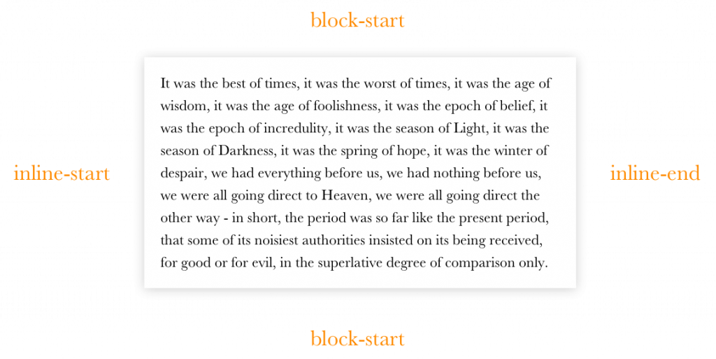
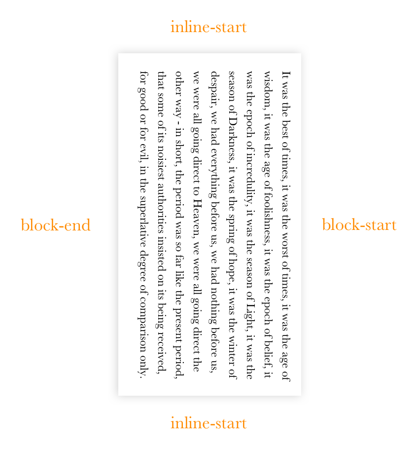
Rather than thinking in physical terms, like left and right, we can think of an “inline” direction and a “block” direction.
So, as we move ahead, we now know that we’re dealing with inline and block directions instead of physical directions. Inline handles the left and right directions, while block manages top and bottom.
That is, until things get swapped around when the writing-mode changes.
Pay attention to direction and writing mode
What we’ve seen so far are examples of CSS logical properties. These are versions of CSS properties were used to like margin and padding, but written in a new way that forgoes physical directions (i.e. left, right, top, and bottom).
CSS was developed with the English language in mind and English is written and read from left-to-right. That’s not the case for all languages though. Arabic, for example, is read from right-to-left. That’s why HTML has a dir attribute.
<html dir="rtl">
CSS has an equivalent property (although it’s recommended to use the HTML attribute just in case the CSS fails to load):
Chinese, Japanese, Korean and Mongolian can be written either horizontally from left-to-right, or vertically from top to bottom. The majority of websites in these languages are written horizontally, the same as with English.
Comparatively, vertical writing is more common on Japanese websites. Some sites use a mixture of both vertical and horizontal text.
When written vertically, Chinese, Japanese and Korean are written with the top-right as a starting point, whereas Mongolian reads from left to right. This is exactly why we have the writing-mode property in CSS, which includes the following values:
horizontal-tb: This is the default value, setting the the direction left-to-right for languages like English or French, and right-to-left languages like Arabic. The tb stands for “top-to-bottom.”
vertical-rl: This changes the direction to right-to-left in a vertical orientation for languages like Chinese, Japanese and Korean.
vertical-lr: This is used for vertical left-to-right languages, like Mongolian.
CSS logical properties offer a way to write CSS that is contextual. When using logical properties, spacing and layout are dependent on both the writing-mode and direction (whether set by either CSS or HTML). It therefore becomes possible to reuse CSS styles across different languages. BBC News, for example, rebuild their website in over a dozen languages. That’s a better experience than leaving users to rely on autotranslate. It also means they can better cater specific content to different parts of the world. The visual styling though, remains much the same across regions.
Let’s look at the example below to see the shortcomings of physical properties. Using the physical margin-left property (shown in red), everything looks good in English. If you were to reuse the CSS but change the writing mode to rtl (shown at the bottom) there’s no space between the text and the icon and there’s excess white space on the left of the text. We can avoid this by using a logical property instead.
What makes logical properties and values so useful is that they will automatically cater to the context of the language. In a left-to-right language like English, margin-inline-start will set the left-side margin. For a right-to-left language like Arabic, Urdu, or Hebrew, it will set the right-hand margin — which solves the layout problem in the above example. That’s right-to-left taken care of. If you have vertical text, margin-inline-start will cater to that context to, adding the margin at the top, which is where you would start reading from in any vertical language (that’s why it’s called margin-inline-start — just think about which direction you start reading from). The direction of inline changes based on the element’s writing-mode. When a vertical writing-mode is set, it handles the vertical direction top and bottom. See how things can get switched around?
An example of the writing direction in Mongolian. (Credit: W3C)
A complete list of logical properties and values
There are dozens of CSS properties that have a logical alternative syntax. Adrian Roselli has a handy visualization where you can toggle between the physical CSS properties that we’re all used to and their logical property equivalents. It’s a nice way to visualize logical properties and the physical properties they map to when the direction is ltr and the writing-mode is horizontal-tb.
Let’s break all of those down even further and map each and every physical CSS property to its logical companion, side-by-side. The tables shown throughout this article show traditional physical CSS in the left column and their logical equivalents (using a left-to-right horizontal mapping) in the right column. Remember though, the whole point of logical properties is that they change based on context!
Sizing
In a horizontal writing mode, inline-size sets the width of an element, while block-size sets the height. In a vertical writing mode, the opposite is true: inline-size sets the height and block-size sets the width.
Here’s an example of using border-inline-start shown with English, Arabic, and Chinese.
Here’s an example that sets border-block-start dotted and border-block-end dashed:
There are also logical properties for setting the border color, width, and style individually:
Physical property
Logical property
border-top-color
border-block-start-color
border-top-width
border-block-start-width
border-top-style
border-block-start-style
So, again, it’s about thinking in terms of “inline” and “block” instead of physical directions, like left and top. We also have shorthand logical properties for borders:
Physical property
Logical property
border-top and border-bottom
border-block
border-left and border-right
border-inline
Margin
Here are all the individual logical margin properties:
Physical property
Logical property
margin-top
margin-block-start
margin-bottom
margin-block-end
margin-left
margin-inline-start
margin-right
margin-inline-end
These logical properties has comprehensive modern cross-browser support, including Samsung Internet, and has been supported in Safari since 12.2.
And, remember, we have the shorthands as well:
Physical property
Logical property
margin-top and margin-bottom
margin-block
margin-left and margin-right
margin-inline
Padding
Padding is super similar to margin. Replace margin with padding and we’ve got the same list of properties.
Need to offset an element’s position in a certain direction? We can declare those logically, too.
Physical property
Logical property
top
inset-block-start
bottom
inset-block-end
left
inset-inline-start
right
inset-inline-end
top and bottom
inset-block
left and right
inset-inline
In a horizontal writing mode (either left-to-right, or right-to-left) inset-block-start is equivalent to setting top, and inset-block-end is equivalent to setting bottom. In a horizontal writing mode, with a left-to-right direction, inset-inline-start is equivalent to left, while inset-inline-end is equivalent to right, and vice-versa for right-to-left languages.
Conversely, for a vertical writing mode, inset-inline-start is equivalent to top while inset-inline-end is equivalent to bottom. If writing-mode is set to vertical-rl, inset-block-start is equivalent to right and inset-block-end is equivalent to left. If the writing-mode is set to vertical-lr, the opposite is the case and so inset-block-start is equivalent to left.
Logical property
Writing mode
Equivalent to:
inset-block-start`
Horizontal LTR
top
inset-block-start
Horizontal RTL
top
inset-block-start
Vertical LTR
left
inset-block-start
Vertical RTL
right
Here’s an example of how the same CSS code for absolute positioning looks in each of the four different writing directions:
There’s also a new shorthand for setting all four offsets in one line of code. Here’s an example using inset as a shorthand for setting top, bottom, left, and right in one fell swoop to create a full-page overlay:
I’ve heard inset incorrectly referred to as a logical property. But, a quick look in DevTools shows that it is actually a shorthand for physical values, not logical properties:
What it’s actually doing is defining physical offsets (i.e. left, right, top and bottom) rather than logical ones (i.e. inline, block, start and end). Obviously if you want to set the same value for all four sides, as in the example above, it doesn’t matter.
inset: 10px 20px 5px 8px; /* shorthand for physical properties not logical properties */
Text alignment
Logical values for text alignment enjoy great browser support and have for many years. When working in English, text-align: start is the same as text-align: left, while text-align: end is the same as text-align-right. If you set the dir attribute to rtl, they switch and text-align: start aligns text to the right.
Physical value
Writing mode
Equivalent to:
start
LTR
left
start
RTL
right
end
LTR
right
end
RTL
left
Border radius
So far everything we’ve looked at has decent browser support. However, there are some other logical properties where support is still a work in progress, and border radius is one of them. In other words, we can set a different border-radius value for different corners of an element using logical properties, but browser support isn’t great.
Physical property
Logical property
border-top-left-radius
border-start-start-radius
border-top-right-radius
border-start-end-radius
border-bottom-left-radius
border-end-start-radius
border-bottom-right-radius
border-end-end-radius
It’s worth noting that the spec doesn’t include shorthand properties, like border-start-radius and border-end-radius. But, like I said, we’re still in early days here, so that might be a space to watch.
Floats
Flow-relative values for logical floats have terrible browser support at the time I’m writing this. Only Firefox supports inline-start and inline-end as float values.
Physical value
Logical value
float: left
float: inline-start
float: right
float: inline-end
clear: left
clear: inline-start
clear: right
clear: inline-end
Other logical properties
There are proposed logical properties for overflow and resize, but they currently have horrendous browser support.
Physical
Logical
resize: vertical
resize: block
resize: horizontal
resize: inline
overflow-y
overflow-block
overflow-x
overflow-inline
Digging deeper
We explored what it means for a property to be considered “logical” and then mapped out all of the new logical properties and values to their physical counterparts. That’s great! But if you want to go even deeper into CSS Logical Properties and Values, there are a number of resources worth checking out.
“RTL Styling 101” (Ahmad Shadeed): A great resource if you’re dealing with Arabic or other right-to-left languages. Ahmad covers everything, from logical properties to considerations when working with specific layout techniques, like flexbox and grid.
text-combine-upright (CSS-Tricks): If you’re dealing with vertical text, did you know that this property can rotate text and squeeze multiple characters into the space of a single character? It’s a nice touch of refinement in specific situations where some characters need to go together but still flow with a vertical writing mode.
If you want to view some nice real-world examples of vertical typography from across the web, take a look at the Web Awards for Horizontal and Vertical Writings. There’s a lot of great stuff in there.
Wrapping up
Do you need to rush and swap all of the physical properties out of your codebase? Nope. But it also doesn’t hurt to start using logical properties and values in your work. As we’ve seen, browser support is pretty much there. And even if you’re working on a site that’s just in English, there’s no reason to not use them.
I’m dropping “left“ and “right“ from my lexicon. The new CSS normal is all about Logical Properties and Values […] It can be as easy as replacing left/right with inline start/end. Top/bottom with block start/end. Normal inline flow, Flexbox, and Grid layouts reverse themselves automatically.
Looks like 2021 is the time to start using CSS Logical Properties! Plus, Chrome recently shipped a few APIs that have raised eyebrows, SVG allows us to disable its aspect ratio, WordPress focuses on the accessibility of its typography, and there’s still no update (or progress) on the development of CSS custom media queries.
Let’s jump right into the news…
Logical CSS could soon become the new default
Six years after Mozilla shipped the first bits of CSS Logical Properties in Firefox, this feature is now on a path to full browser support in 2021. The categories of logical properties and values listed in the table below are already supported in Firefox, Chrome, and the latest Safari Preview.
CSS property or value
The logical equivalent
margin-top
margin-block-start
text-align: right
text-align: end
bottom
inset-block-end
border-left
border-inline-start
(n/a)
margin-inline
Logical CSS also introduces a few useful shorthands for tasks that in the past required multiple declarations. For example, margin-inline sets the margin-left and margin-right properties, while inset sets the top, right, bottom and left properties.
/* BEFORE */
main {
  margin-left: auto;
  margin-right: auto;
}

/* AFTER */
main {
  margin-inline: auto;
}
A website can add support for an RTL (right-to-left) layout by replacing all instances of left and right with their logical counterparts in the site’s CSS code. Switching to logical CSS makes sense for all websites because the user may translate the site to a language that is written right-to-left using a machine translation service. The biggest languages with RTL scripts are Arabic (310 million native speakers), Persian (70 million), and Urdu (70 million).
/* Switch to RTL when Google translates the page to an RTL language */
.translated-rtl {
  direction: rtl;
}
David Bushell’s personal website now uses logical CSS and relies on Google’s translated-rtl class to toggle the site’s inline base direction. Try translating David’s website to an RTL language in Chrome and compare the RTL layout with the site’s default LTR layout.
Chrome ships three controversial Fugu APIs
Last week Chrome shipped three web APIs for “advanced hardware interactions”: the WebHID and Web Serial APIs on desktop, and Web NFC on Android. All three APIs are part of Google’s capabilities project, also known as Project Fugu, and were developed in W3C community groups (though they’re not web standards).
The WebHID API allows web apps to connect to old and uncommon human interface devices that don’t have a compatible device driver for the operating system (e.g., Nintendo’s Wii Remote).
The Web Serial API allows web apps to communicate (“byte by byte”) with peripheral devices, such as microcontrollers (e.g., the Arduino DHT11 temperature/humidity sensor) and 3D printers, through an emulated serial connection.
Web NFC allows web apps to wirelessly read from and write to NFC tags at short distances (less than 10 cm).
Apple and Mozilla, the developers of the other two major browser engines, are currently opposed to these APIs. Apple has decided to “not yet implement due to fingerprinting, security, and other concerns.” Mozilla’s concerns are summarized on the Mozilla Specification Positions page.
By default, an SVG scales to fit the <svg> element’s content box, while maintaining the aspect ratio defined by the viewBox attribute. In some cases, the author may want to stretch the SVG so that it completely fills the content box on both axes. This can be achieved by setting the preserveAspectRatio attribute to none on the <svg> element.
Distorting SVG in this manner may seem counterintuitive, but disabling aspect ratio via the preserveAspectRatio=none value can make sense for simple, decorative SVG graphics on a responsive web page:
This value can be useful when you are using a path for a border or to add a little effect on a section (like a diagonal [line]), and you want the path to fill the space.
WordPress tones down the use of italics
An italic font can be used to highlight important words (e.g., the <em> element), titles of creative works (<cite>), technical terms, foreign phrases (<i>), and more. Italics are helpful when used discreetly in this manner, but long sections of italic text are considered an accessibility issue and should be avoided.
Italicized text can be difficult to read for some people with dyslexia or related forms of reading disorders.
Putting the entire help text in italics is not recommended
WordPress 5.7, which was released earlier this week, removed italics on descriptions, help text, labels, error details text, and other places in the WordPress admin to “improve accessibility and readability.”
In related news, WordPress 5.7 also dropped custom web fonts, opting for system fonts instead.
Still no progress on CSS custom media queries
The CSS Media Queries Level 5 module specifies a @custom-media rule for defining custom media queries. This proposed feature was originally added to the CSS spec almost seven years ago (in June 2014) and has since then not been further developed nor received any interest from browser vendors.
A media query used in multiple places can instead be assigned to a custom media query, which can be used everywhere, and editing the media query requires touching only one line of code.
Custom media queries may not ship in browsers for quite some time, but websites can start using this feature today via the official PostCSS plugin (or PostCSS Preset Env) to reduce code repetition and make media queries more readable.
On a related note, there is also the idea of author-defined environment variables, which (unlike custom properties) could be used in media queries, but this potential feature has not yet been fully fleshed out in the CSS spec.
On a default left-to-right web page, “hanging” an element off the right side of the page (e.g. position: absolute; right: -100px;) triggers a horizontal scrollbar that scrolls as far as needed to make that whole element visible. But if you hang an element of the left side of the page, it’s just hidden (no scrollbar is triggered). That’s called “data loss” in CSS terms, if you’re fancy. The same is true for the top edge of the page (hidden) and bottom of the page (scrolling happens).
Ahmad puts a point on this. It’s just one of those CSS things that you just need to know. I love how Ahmad uses logical directions like inline-start direction (and block-start direction) to describe the issue because those directions change when the direction or writing mode of the page changes. If the page is right-to-left (RTL) like <html dir="rtl">, then horizontal edges where the data loss occurs are flipped (except in Firefox 🤷♀️).
Here’s something I find myself needing to do again and again in CSS: completely covering one element with another. It’s the same CSS every time: the first element (the one that needs to be covered) has position: relative applied to it. The second has position: absolute and is positioned so that all four sides align to the edges of the first element.
I have it stuck in my head somehow that it’s “not as reliable” to use bottom and right and that it’s safer to set the top and left then do width: 100% and height: 100%. But I can’t remember why anymore—maybe it was an older browser thing?
But speaking of modernizing things, my favorite bit from Michelle’s article is this:
.overlay {
  position: absolute;
  inset: 0;
}
The inset property is a Logical Property and clearly very handy here! Read the article for another trick involving CSS grid.
2020 brought another wave of logical property features to major browsers and I’ve thoroughly enjoyed my investment into logical, rather than physical, web styling. I feel like I’ve learned a new way to speak about the box model that results in less written code with more global coverage.
Like I described in the web.dev article I linked to above, a logical property is one that references a side, corner, or axis of the box model in context of the applicable language direction. It’s akin to referencing someone’s strong arm, rather than assuming it’s their right arm. “Right” is a physical arm reference, “strong” is a logical arm reference, contextual to the individual.
Latin, Hebrew and Japanese are shown rendering placeholder text within a device frame. Arrows and colors follow the text to help associate the 2 directions of block and inline.
Once I got the hang of the updated syntax, I realized other places in the world had already solved their problems similarly! The web was just late to logical jargon. Here are a couple of other places that have already gone logical.
Nautical Orientation
Port and starboard are logical sides of the ship that are contextual to the vessel. I love how Wikipedia says confidently:
… nautical terms of orientation deal unambiguously with the structure of vessels, referring respectively to the left and right sides of the vessel, seen by an observer aboard the vessel looking forward.”
Vessel centric logical properties. While working with ships, use a ship language.
Skiers & Stages
Skier’s left is logical direction that’s based on a skier facing down the mountain. Without the logical language, skiers were confusing left and right, since it depended on where they stood when they declared the direction. If you’re on a chair lift facing up the mountain, left is right and right is left once you’ve gotten off the lift and started skiing back down the mountain. So that community came up with a logical way to talk about the direction. Their terminology, “Skier’s Right” and “Skier’s Left”, are essentially contextual logical properties. While working with skiers, use skier language.
Similarly, film studios use terms like “Stage One” and “Camera Two”. It helps logically orient everyone based on a common understand, not a relative direction.
Logical Conclusion
As an industry or community, we have had issues with physical focused styles. Adding padding to the left and right of a button is only fitting in some languages. It’s like you wrote the padding while facing the wrong way on the ship. Logical properties, via inline-start and inline-end, will fit all languages. It won’t matter which way you’re facing in the ship, it’s not about you anymore.
Give logical properties a play in the Pen below. Notice the browser is doing tons of work to keep your content readable across the globe. So rad.
To emulate the confidence that Wikipedia had in nautical logical directions: We, the web, can now unambiguously deal with the structure of our boxes by referring respectively to their sides, contextual to language direction. Describe the side once, in a way that is still relevant to you, but now relevant to everyone else too. Think less, deliver more.
p {
  max-inline-size: 50ch;
  margin-block: 1rem;
}
It’s critical to me that logical properties are centered around people. Its user-centric because its language direction respective. By using logical properties we invite the individual to bring their diversity, complexity and unpredictability to the table; we can embrace it and rely on the browser engines to properly lay it out.
Drop “top” and “left”-style thinking, and starting thinking logically with “block” and “start”-style properties. While working with web boxes, use a web box language.
The web’s “magic paper” is now even more magical as it can stay as natural to the user as possible. I love it.
P.S. You’ve been getting logical property trained since flexbox.
There are some new features in CSS that can assist us with building layouts for different directions and languages with ease. This article is about CSS logical properties and values (e.g. margin-inline-start). These are a W3C working draft that still going under heavy editing, but have shipped in many browsers. I want to talk about this because I’ve been using these properties for a little while and have seen a significant boost to my workflow after switching to them.
I’ll talk about the specifications and how can you use it today in your work. I live in Egypt where we use Arabic as a primary language. Arabic is written from right to left, which means Arabic websites look like a mirror image of an English version. Most of the websites we create are bilingual, which means we provide a stylesheet specific for each direction. We do that by flipping values and properties of almost everything! I will not talk in details about this part but you can talk a quick look about a past article I wrote on the topic.
It starts with declaring the dir attribute on the HTML tag.
<html dir="rtl">
This attribute accepts one of two values: ltr (which is the default value if none is specified) and rtl. According to its value, the browser starts to paint the elements following a specific algorithm. Text will be written with respect to the direction and punctuations will be placed in their correct location. Some elements, like tables, will have their direction switched (for example, a <td> starting from the right in rtl). Thankfully, some new specifications, like CSS Grid, and flexbox follow a similar approach to the table. That means we don't have to change the order of anything because the browser will take care of it!
HTML5 introduced a new auto value for the dir attribute. It will check for the first character within the element and, if it belongs to a language that is written from left-to-right (like Latin characters), the element will have an ltr direction and vice versa. The W3C urges authors to avoid relying on this value to determine text direction and use a server-side solution instead.
An interesting use case for the auto value is when you're unsure about the direction of the content, such user-generated content, like a comment thread. I see a lot of people contributing to discussions in Arabic websites in English. The support for auto is pretty good except, for Internet Explorer and Edge.
Introducing the :dir() pseudo-class
The :dir() pseudo-class is a new selector modifier that selects an element based on its direction value. It works like this:
/* Select all paragraphs that have their direction value set to rtl */
p:dir(rtl) {
  font-size: 16px; /* Sometimes Arabic glyphs need a size boost to feel right. */
}


/* Select all paragraphs that have their direction value set to ltr */
p:dir(ltr) {
  font-size: 14px;
}
This selector will select the element if it has a direction set directly or evaluates the automatically set value using auto, it will still correctly the element based on its content!
<style>
  p:dir(ltr) {
    background: green;
  }
  p:dir(rtl) {
    background: red;
  }
</style>


<!-- The following paragraph will have a green background -->
<p dir="auto">This is a paragraph that starts with a latin character</p>
<!-- The following paragraph will have a red background -->
<p dir="auto">هذا النص يستخدم حروف عربية</p>
Sadly, the support for :dir() isn't great and limited only to Firefox.
This browser support data is from Caniuse, which has more detail. A number indicates that browser supports the feature at that version and up.
Desktop
Chrome
Opera
Firefox
IE
Edge
Safari
No
No
17*
No
No
No
Mobile / Tablet
iOS Safari
Opera Mobile
Opera Mini
Android
Android Chrome
Android Firefox
No
No
No
No
No
68
Even if the browser support was great, the selector only allows you to target elements and manually apply certain styles to them. That means that we still should flip the values for everything (like margins, paddings, floats, positions, etc.) which doesn't really enhance our workflow or reduce the effort to produce multi-directional layouts.
Introducing CSS logical properties and values
As defined by the W3C, logical properties and values provide us with the ability to control layout through logical, rather than physical, direction and dimension mappings. Let's skip the technical jargon and jump directly to the details. These provide us with new properties and values that will evaluate differently according to certain conditions.
Logical values
Let's say we have a paragraph that we want to align in a direction that’s opposite to the natural direction of the language. Let's say this is in English that follows the ltr direction. We would do something like this:
<article>
  <p class="opposite">
    Lorem ipsum dolor sit amis ..
  </p>
</article>
And the CSS file would be like this:
.opposite {
  text-align: right;
}
To provide the opposite for the rtl version, we would override the selector by targeting the <html> tag with the dir attribute, or simply provide a different file for the rtl version, like this:
html[dir="rtl"] .opposite {
  text-align : left;
}
Logical properties and values were created to solve this problem. Why don't we use values that evaluates to the correct context instead of using left and right? In an ltr element, the value left means the beginning or the start of the element while on the rtl element, the value right means the start! It's simple, right?
So instead of what we wrote before, we can use:
.opposite {
  text-align: end;
}
And that's it! If the element’s computed direction is ltr, the text would be aligned right; and the computed direction would be opposite for the rtl elements. So, instead of using left and right values for text-align, we can simply replace it with start and end. This is a lot easier and more convenient than our previous options.
Logical properties
What we just looked at were logical values, so let's turn now to logical properties. Logical properties are new properties that have the same idea; they evaluate differently according to the direction of the element. Take a look at margin as an example. Previously, we wanted to add some space toward the start of the paragraph. We can do so in the ltr document by using:
article img {
  margin-left: 15px;
}
Now, in the case of the rtl version, we will need to add the margin to the opposite direction in addition to resetting the left value:
We can do better with logical properties. Consider the following:
article img {
  margin-inline-start: 15px;
}
The -inline-start part evaluates to the beginning of the horizontal axis of the image. In the case of ltr, that means left, and in the case of rtl, that means right.
The start and end are probably obvious by now, but what is with the word inline and why do we need it? To understand it, we need to talk about something called CSS writing modes. Jen Simmons wrote an excellent article on that topic. I won’t regurgitate everything explained there, but the bottom line is that we can use writing modes to define the writing direction. Some languages, like the Chinese, Korean, and Japanese, can be written vertically from top to bottom. CSS writing modes allow us to control that flow. Take a look at the following paragraph:
You can clearly identify the top, bottom, left and right edges of the block. What will happen if we change the direction of the paragraph using CSS writing modes to flow vertically?
When we talk about the “top” of this rotated paragraph, do we mean the where the content begins or what was the right edge when it wasn’t rotated? Identifying the four directions becomes confusing. Let's look at them from a different perspective. In “normal” writing conditions, the vertical axis will have the suffix -block and the horizontal axis will have the suffix -inline, both followed by start or end:
And if we rotate it, it should be like this:
Since we are talking about normal horizontal layout, we will be using -inline-start and -inline-end, but it is good to know about the other properties as well. We can also write logical shorthand values by using the logical keyword. Consider the following:
article img {
  margin: logical 10px 20px 30px 40px;
}
The computed value of the image's margin will be the following:
The logical keyword is an experimental feature at this point in time, which means it may change or it may be replaced by the time the spec becomes official. There’s an open discussion on the topic that you can follow in the meantime.
Logical properties also allow us to apply values to a certain axis, meaning we have margin-inline and margin-block for the horizontal and vertical axises, respectively.
Property
Logical Property
margin-top
margin-block-start
margin-left
margin-inline-start
margin-right
margin-inline-end
margin-bottom
margin-block-end
Just like with the logical margin properties, we also have logical padding properties which follow the same rules as the margin.
Property
Logical Property
padding-top
padding-block-start
padding-left
padding-inline-start
padding-right
padding-inline-end
padding-bottom
padding-block-end
Logical positioning properties
In the previous examples we were able to modify the meaning of the property by appending suffixes, but what about the positions? The properties names changed completely from what we know now as top, right, bottom, and left.
.element {
  position: absolute;
  inset-block-start: 0;  /* evaluates to top */
  inset-block-end: 0;    /* evaluates to bottom */
  inset-inline-start: 0; /* evaluates to left in ltr and right in rtl */
  inset-inline-end: 0;   /* evaluates to right in ltr and left in rtl */
}
Learning new properties and values can be hard but, hey, we get a shorthand property called inset to make it a little easier:
/* Shorthand FTW! */
.element {
  position: absolute;
  inset: logical 10px 20px 30px 40px;
}


/* It evaluates to this */
.element {
  position: absolute;
  inset-block-start: 10px;
  inset-inline-start: 20px;
  inset-block-end: 30px;
  inset-inline-end: 40px;
}
inset supports both inset-block and inset-inline just like margin and padding.
Property
Logical Property
top
inset-block-start
left
inset-inline-start
right
inset-inline-end
bottom
inset-block-end
Logical border properties
Border properties can also become logical by appending the -inline-start and -block-start.
Property
Logical Property
border-top{-size|style|color}
border-block-start{-size|style|color}
border-left{-size|style|color}
border-inline-start{-size|style|color}
border-right{-size|style|color}
border-inline-end{-size|style|color}
border-bottom{-size|style|color}
border-block-end{-size|style|color}
In her deep dive on logical properties and values, Rachel Andrew includes an excellent demo that demonstrates logical border properties and how they respond to different writing modes.
How can we start using all this today?
We can start using all the magic of logical properties and value today, thanks to the power of PostCSS! Jonathan Neal wrote this lovely PostCSS plugin that enables us to write logically and compile the code to something today’s browsers will understand. The plugin works in three stages:
It translates the new syntax to existing standards that unsupported browsers will recognize, using the :dir pseudo-class to create output to ltr and rtl.
It uses another one of Neal’s plugins to translate :dir to an attribute selector, like this:
It uses the postcss-nested plugin to transform nested selectors to one-line selectors, the same way other CSS preprocessors do.
PostCSS works with any workflow. You can try it with Grunt, Gulp, and webpack.
I will close by saying I have seen a lot of benefits since making the shift to logical properties and values. Sure, building multi-directional layouts takes time. There’s the learning curve, the addition of more properties to write, and of course, testing. Our previous methods for creating multi-directional layouts were either taking care of both directions in development or working on one direction at a time — neither of which is all that suitable for big projects. With logical properties and values you write your code once and it works for both directions without any consideration.
In the past few years, we’ve seen a lot of change and diversion in regard to web technologies. In 2020, I foresee us as a web community heading toward two major trends/goals: extensibility and interoperability. Let’s break those down.
Extensibility
Extensibility describes how much someone can take a particular technology and extend it to their own needs. We’ve built a component-based web over the last few years in terms of both development (React components! Vue components! Svelte components! Web components!) and design (Design systems!). Interesting how form follows function, isn’t it?
Now we’re trying to make that component system look and feel more unique. Extensibility on the web allows us to tailor the platform to our own needs, and experiment with outcomes.
CSS itself is becoming much more extensible…
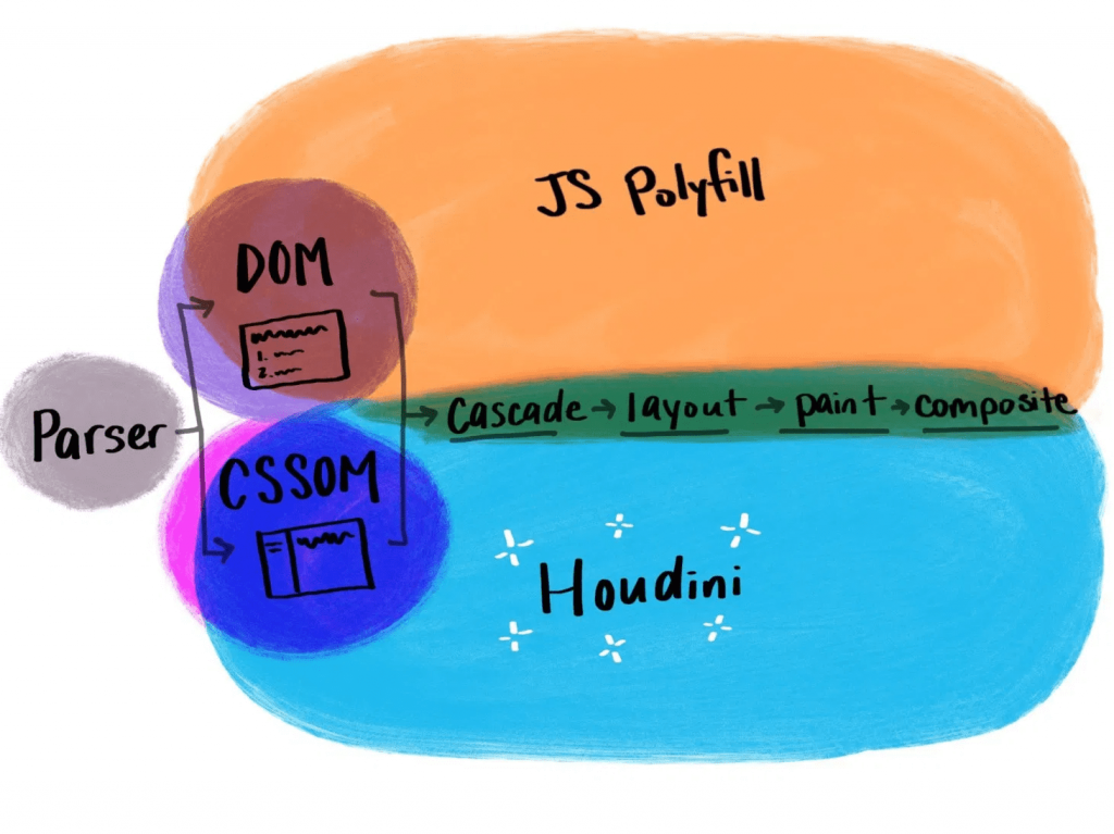
CSS Houdini
With CSS Houdini, developers will be able to extend what’s currently possible in the CSS Object Model and teach the browser how they want it to read and render their CSS.
That means that things that weren’t previously possible on the web, like angled corners or round layout, now become possible.
If you’re not yet familiar with Houdini, it’s an umbrella term that describes a few different browser APIs, intended to improve browser performance. It makes styling more extensible and lets users dictate their own CSS features. Houdini’s current APIs include:
With these APIs, users can tap into meaningful semantic CSS (thanks to the Typed Object Model), and even apply semantics to their CSS variables (Properties and Values). With the Paint API, you can draw a canvas and have it applied as a border image (hello, gradient borders), or create animated sparkles (link) that accept dynamic arguments and are implemented with a single line of CSS.
.sparkles {
  background: paint(sparkles)
}
You can build round menus without placing the items manually through margins (via the Layout API), and you can integrate your own interactions that live off of the main thread (using the Animation Worklet).
Houdini is definitely one to watch in the new year, and now is a great time to start experimenting with it if you haven’t yet.
Variable fonts
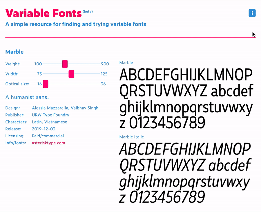
Another technology that falls in line with the goal of making websites more performant while offering more user extensibility is variable fonts. With so many new variable fonts popping up — and Google Fonts’ recent beta launch — variable fonts are now more available and easy to use than ever.
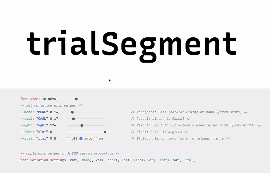
Variable fonts are vector-based and allow for a broad range of values to be set for various font axes, like weight and slant. The interpolation of these axes allows fonts to transition smoothly between points.
Here’s an example:
Variable fonts also allow for new axes to help designers and developers be even more creative with their work. Here’s an example of some of those from an excellent resource called v-fonts:
Variable fonts are relatively well supported, with 87% of modern browsers supporting the required font format.
Custom Properties
Custom properties, like variable fonts, are also well supported. While they’re not new, we’re still discovering all of the things we can do with custom properties.
Custom properties allow for truly dynamic CSS variables, meaning we can adjust them in JavaScript, separating logic and style. A great example of this comes from David Khourshid, who shows us how to create reactive animations and sync up the styling without sweating it.
We’re also starting to experiment with more logic in our stylesheets. I recently published a blog post that explains how to create dynamic color themes using the native CSS calc() function, along with custom properties.
This eliminates the need for additional tools to process our CSS, and ensures that this technique for theming works across any technology stack — which brings me to my next 2020 vision: interoperability.
Interoperability
Interoperability, by my definition in this post, means the ability to work between technologies and human needs. From a technical perspective, with the fragmented web, a lot of companies have migrated stacks in the recent past, or have multiple internal stacks, and are now likely interested in safeguarding their technology stack against future changes to maintain some semblance of uniformity.
Web components
Web components try to solve this problem by attacking the problem of component-based architecture from a web-standards perspective. The vision is to introduce a standard format that can be used with or without a library, benefiting the developer experience and establishing uniformity between components.
Each web component is encapsulated and works in modern browsers without dependencies. This technology is still evolving and I think we’ll see a lot of growth in 2020.
Logical properties
Logical properties challenge us to adjust our mental model of how we apply layout sizing on a page in order for us to make our pages more friendly across languages and reading modes. They allow for our layouts to be interoperable with user experiences.
In English, and other left-to-right languages, we think of the layout world in terms of height and width, and use a compass-type expression for margins, border, and padding (top, left, bottom, right). However if we style this way and then adjust the language to a right-to-left language, like Arabic, the padding-left of our paragraphs no longer means padding from the beginning of where we would read. This breaks the layout.
If you were to write padding-inline-start instead of padding-left, the padding would correctly swap to the other side of the page (the start of where one would be reading) when switching to the right-to-left language, maintaining layout integrity.
Preference media queries
Preference media queries are also on the rise, with more capability coming in 2020. They allow us to tailor our sites to work with people who prefer high contrast or dark mode, as well as people who prefer a less animation-heavy experience.
In this video, I go over how to create a preference media query for dark mode, using custom properties for styling:
Runner up: Speed
Speed is also a topic I see as a big focus of the web world in 2020. Several of the technologies I mentioned above have the benefit of improving web performance, even if it isn’t the main focus (e.g. how variable fonts may reduce the total weight of fonts downloaded). Performance becomes increasingly important when we think about the next billion users coming online in areas where network speeds may be lacking.
In addition, Web Assembly, which is a wrapper that lets users write closer to the browser metal, is gaining popularity. I also foresee a lot more work with WebGL in the coming year, which uses similar techniques for advanced and speedy graphics rendering. Writing lower-level code allows for speedier experiences, and in some cases of WebGL, may be required to prevent advanced visualization from crashing our browsers. I think we’ll see these two technologies grow and see more WebGL demos in 2020.
The web is constantly evolving and that's what makes it so exciting to be a part of. What do you see as a goal or technology to watch in 2020? Tell us in the comments!
Say you have a <blockquote> and the design calls for a thick border along the left side. Well, you might not necessarily mean left side, but actually mean on the side of the start of the text.
That's exactly what CSS logical properties are meant to address, and Hussein Al Hammad has a nice article laying out some use cases, including the blockquote thing I mentioned above.
By using logical properties, you don't have to mess around with manually writing selectors including [dir="rtl"] or needing to be aware of writing modes and such. The box model stuff (borders, padding, margin...) will adjust where it needs to be.
Hussein's blockquote is a good baby step example for understanding of all this:
This browser support data is from Caniuse, which has more detail. A number indicates that browser supports the feature at that version and up.
Desktop
Chrome
Opera
Firefox
IE
Edge
Safari
69
62*
41
No
76
12.1
Mobile / Tablet
iOS Safari
Opera Mobile
Opera Mini
Android
Android Chrome
Android Firefox
12.2-12.4
46*
No
76
76
68
One thing that threw me off in the article is the term "Horizontal Rules." First I imagined the <hr> element. Then I imagined wanting to reverse the direction of the design with logical properties. Usually an <hr> is just a line so horizontal direction doesn't matter, but let's say it's like a shorter line along the edge where new lines start after wrapping.
We could draw the shorter line with backgrounds that cover different parts of the box model, then use logical properties where the padding applies. This is a pretty unique edge case, but it's fun to fiddle with: