We’ve covered techniques before for when you want a full-width element within a constrained-width column, like an edge-to-edge image within a narrower column of text. There are loads of techniques.
That works as long as the column is centered and you don’t mind having to hide overflow-x on the column (or the body) as this can trigger horizontal overflow otherwise.
There was a little back and forth on some other ideas lately…
Josh Comeau blogged that you could set up a three-column grid, and mostly place content in the middle column, but then have the opportunity to bust out of it:
I think this is clever. I’d probably use it. But I admit there are bits that feel weird to me. For instance…
Now everything within the container is a grid element. Not a huge deal, but the elements will behave slightly differently. No margin collapsing, for one.
You have to apply the default behavior you want to every single element. Rather than elements naturally stacking on top of each other, you have to select them and tell them where to go and let them stack themselves. Feels a little less like just going with the web’s grain. Then you still need a utility class to do the full bleed behavior.
What I really like about the idea is that it gives you this literal grid to work with. For example, your left spacer could be half the width of the right and that’s totally fine. It’s setting up that space to be potentially used, like Ethan talked about in his article on constrained grids.
Kilian Valkhof responded to the article with this idea:
Also very clever. This constrains the width of everything (in whatever container, and it wouldn’t have to be the body) except the elements you want to bust out (which could be a utility class there too, and not necessarily images and videos).
Again, to me, this feeling that I have to select every single element and provide it this fundamental information about layout feels slightly weird. Not like “don’t use it” weird, just not something I’m used to doing. Historically, I’m more comfortable sizing and positioning a container and letting the content in that container lay itself out without much further instruction.
You know what I like the most? That we have so many powerful layout tools in CSS and we have conversations about the pros and cons of pulling off exactly what we’re going for.
Today I have a little layout for you. The idea is to show a menu with a nice background grid of images and when choosing to explore a project, an animation happens where the images of the background grid fly away and an inner page shows.
This kind of layout is interesting for a photography portfolio or some other project presentation.
I hope you like this little layout and find it useful!
I also wanted to add some smooth scrolling and on-scroll animations, so I’ve used Locomotive Scroll. The beautiful images are by DeMorris Byrd.
This is highly experimental and it turned out to be a complex process. But I hope it gives you some of sort idea and entry point of how to pull off these kind of animations without touching the width and height of an element.
The main idea behind this technique is to scale an element and then counter-scale the child. Paul Lewis and Stephen McGruer show how to do that on a menu using expand and collapse animations. Avoiding animating the width and height of an element helps keep performance in check.
So what we do is to initially set the scale of the content__intro wrapper to a value that will make it shrink to an exact size. Then we set a counter scale to the image. This will make the image maintain the same size as before. Then, we add another scale to the image, shrinking it also the to the target size.
Having the initial width and height of an element and also the target dimensions, we can calculate the scale values of the outer wrapper based on this:
1/introTransform.scaleX is the counter scale of the outer wrapper. The second value that we multiply makes sure that we scale the image down to our desired size, just like we did with the outer wrapper before.
And that’s the main idea behind the scaling magic.
I hope this gives you a starting point for these kind of tricky animations! Thank you for checking it out
Una doing an amazing job of showing just how (dare I say it?) easy CSS layout has gotten. There is plenty to learn, but what you learn makes sense, and once you have, it’s quite empowering.
Previously, Zhenya Rynzhuk also designed this wonderful layout with a similar interaction:
It’s not too complicated to implement this. I wanted to try it and in the following I’ll walk you through the relevant markup and code.
The markup and style for the grid
The markup is simply a grid of items that have background images. I like to use this structure because it allows me to control the sizes of the images by setting their position in the grid.
Note that I use the double division structure for the possibility of moving the inner element with the background image to create the motion effect seen in demo 3. For that case, I define some extra styles:
/* If we want to move the inner image */

.grid--img .grid__item {
	overflow: hidden;
	display: flex;
	align-items: center;
	justify-content: center;
	will-change: transform;
}

.grid--img .grid__item-img {
	flex: none;
	width: calc(100% + 100px);
	height: calc(100% + 100px);
	will-change: transform;
}
The JavaScript
Now, let’s have a look at the JavaScript part. I’m using GSAP by GreenSock. We start by creating a Grid class to represent the grid of pictures:
There should be an initial animation where the grid items scale up and fade in. We can add a method to the class for that. We also want the items to start at different times and for that we use the GSAP stagger option. The items will start animating from the center of the grid:
The position of each item in both axes should be mapped with the mouse position. So, the mouse can move from position 0 to the width or height of the window. As for the item, it’ll move in a range of [start, end] that we need to specify. We’ll be assigning random values for the start/end value so that each item moves differently from each other.
Let’s add the move method to the GridItem class:
move() {
    // amount to move in each axis
    let translationVals = {tx: 0, ty: 0};
    // get random start and end movement boundaries
    const xstart = getRandomNumber(15,60);
    const ystart = getRandomNumber(15,60);

    // infinite loop
    const render = () => {
        // Calculate the amount to move.
        // Using linear interpolation to smooth things out.
        // Translation values will be in the range of [-start, start] for a cursor movement from 0 to the window's width/height
        translationVals.tx = lerp(translationVals.tx, map(mousepos.x, 0, winsize.width, -xstart, xstart), 0.07);
        translationVals.ty = lerp(translationVals.ty, map(mousepos.y, 0, winsize.height, -ystart, ystart), 0.07);

        gsap.set(this.DOM.el, {x: translationVals.tx, y: translationVals.ty});
        requestAnimationFrame(render);
    }
    requestAnimationFrame(render);
}
And that’s it!
I hope you find this helpful and please let me know your feedback via @codrops. Thank you for reading!
Snook shows off a classic design with an oversized header up top, and a content area that is “pulled up” into that header area. My mind goes to the same place:
Historically, I’ve done this with negative margins. The header has a height that adds a bunch of padding to the bottom and then the body gets a margin-top: -50px or whatever the design calls for.
If you match the margin and padding with a situation like this, it’s not exactly magic numbers, but it still doesn’t feel great to me beaus they’re still numbers you need to keep in sync across totally different elements.
Robin recently lamented the common complaint that CSS is frustrating. There are misconceptions about what it is and what it does. There are debates about what kind of language it is. There are even different views on where it should be written.
Rachel Andrew has a new talk from An Event Apart DC 2019 available that walks us back; back to the roots of the issues we used to have with CSS and the "hacks" we used to overcome them. CSS has changed a lot over the past few years and, while those changes have felt complex and confusing at times, they are designed to solve what we have always wanted CSS to do.
The full hour it takes to watch the talk is well worth the time. Here are a few nuggets that stood out. First off, some de-bunking of common CSS complaints:
You never know how tall anything is on the web. Floats never solved this because they only bring things next to each other instead of knowing about the items around them. New layout methods, including CSS Grid and Flexbox, actually look at our elements and help them behave consistently.
Flexbox is weird and unintuitive. It's not the layout method you might think it is. If we view it as a way to line things up next to each other, it's going to feel weird and behavior weirdly as well. But if we see it for what it is - a method that looks at differently sized elements and returns the most logical layout - it starts to make sense. It assigns space, rather than squishing things into a box.
Rachel continues by giving us a peek into the future of what CSS wants to do for us:
CSS wants to avoid data loss. New alignment keywords like safe and unsafe will give us extra control to define whether we want CSS to aggressively avoid content that's unintentionally hidden or allow it to happen.
.container {
  display: flex;
  flex-direction: column;
  /* Please center as long as it doesn't result in overflow */
  align-items: safe center;
}
CSS wants to help us get real with overflow. Themin-content and max-content keywords make it possible to create boxes that are wide enough for the content but not wider, and boxes that are as big as the content can be.
CSS wants to lay things out logically. The web is not left-to-right. Grid and Flexbox quietly introduced a way of thinking start-to-end that is direction agnostic. That has brought about a new specification for Logical Properties and Values.
CSS wants to make content more portable.CSS Regions let us flow content from one element into another. While it's probably a flawed comparison, it's sorta like the pipes in old school Mario Bros. games where jumping in one pipe at one location will plop your character out of another pipe in another location... but we get to define those sources ourselves and without angry plants trying to eat us along the way.
Anyway, these are merely scratching the surface of what Rachel covers in her talk. It's a good reminder that An Event Apart has an entire library of valuable talks from amazing speakers and that attending an AEA event is an invaluable experience worth checking out. Rachel's talk was from last year's Washington D.C. event and, as it turns out, the very next event is taking place there this April 13-15. If you can't make that one, there are several others throughout the year across the United States.
Oh, and of course we have a discount code for you! Use AEACP for $100 off any show.
Disclaimer: This event is fake, it’s made up. I got the name from a generator, I recommend not going. But if you do, don’t you dare @ me!
In this article, I’ll show you how to create an accessible and responsive layout using semantic HTML and modern CSS. As a bonus, we’ll add some spice with a little bit of JavaScript to make the design feel more alive. We’ll be covering the following:
Accessible and semantic HTML
Responsive design
Flexbox
CSS Grid
Clip-path
As a bonus, we’ll look at how to bring the layout to live by adding a subtle parallax scroll effect.
You can skip to the sections that most interest you, or follow along on our journey of building the entire layout. This article is for developers of all experience levels. So, if I’m covering something you already know, you can simply skip ahead, no hard feelings.
Getting Started
For following along visually, have a look at the Figma file here, that lays out the desktop, tablet, and mobile designs.
Note that I’ll be using rems for units instead of pixels. In case a user zooms in, it’ll keep the design and fonts scalable. Our root pixel size is 16px, so the formula for wanting to know how many rems a pixel value would be is to divide the pixel size by 16. So, if we wanted to convert 20px into rems, we’d calculate 20 / 16 = 1.25rem.
First, let’s build out the basic layout that involves a <header> that contains a <nav> element and adjacent to the header, we have a <main> element which houses the heading and main component (the magazine cutout).
Let’s cover the body element’s styles which have a background radial gradient:
.site {
  background: radial-gradient(50% 50% at 50% 50%, rgba(123, 131, 126, 0.9) 0%, rgba(54, 75, 73, 0.9) 100%), #364b49;
  color: #FFF;
  height: 100%;
  min-height: 120vh; // we’re adding an extra 20vh here for scrolling purposes we'll use later
}
This line is the gradient: background: radial-gradient(50% 50% at 50% 50%, rgba(123, 131, 126, 0.9) 0%, rgba(54, 75, 73, 0.9) 100%), #898989;. If you’re unfamiliar with background gradients, the first argument 50% 50% indicates the width and height of the inner shape and at 50% 50% refers to the x and y position of the container. Next, the rgba value is the color with a .1 value of transparency and the color starts from the middle of the circle (0%). The next rgba value indicates the last color which starts at the very end (100%). Finally, the last value of #364b49is the background color that shows beneath the gradient since we’re using a little bit of the transparency in the alpha channel for the two gradient values. And just like that, we have an ambient radial-gradient! Neat!
Next, we place a min-height on the body to span at least 120% of the viewport. This allows the gradient to cover the entire screen, but don’t stare too closely at it… it can read your thoughts.
We’re using the <header> element here since it contains a group of information about the site which makes up important conference details and the navigation to all of the links. In the case that a screen reader is reading it, it’s concise and accessible to the user.
Ok, let’s talk about the styles now. What’s required of this component is the following:
Spread elements across the height of the viewport
Align items at their top
Fix it to the window
Display the text on its side
CSS that requires equal spacing and can align at the top or center is a perfect use case for Flexbox. We don’t have to do too much in order to get that.
For the parent element .site__header and the .site__nav-list, we’ll add this flex style:
.site__header,
.site__nav-list {
  display: flex;
}
What this does is lay out the direct children of the elements to situate beside each other and align at the top of the elements.
For the direct children of .site__header, we want them to grow to fill the available space by adding the following:
.site__header > * {
  flex: 1 1 auto;
}
The flex property is a shorthand property for flex children. The three values stand for flex-grow, flex-shrink, and flex-basis. These values indicate to grow to the available space and be able to shrink/get smaller if need be, and auto is the default value which tells the browser to look at the element’s width or height property rather than specifying a particular width value like a percentage.
Finally for the .site__nav-list, we’ll add justify-content: space-between so the elements spread out equally among the available space.
In order for the text to turn 90 degrees, we give the writing-mode property the value of vertical-rl. The writing-mode property determines if lines of text are horizontal, vertical, and what direction the blocks should be laid out.
Next, we fix the position of the header which means the element stays at a specific point relative to the window as one scrolls, so the user always sees it and never scrolls away from it. It’s best practice to put at least one Y or X value for fixed and absolute positioned elements. We have our Y value of top: 0, and the X value of right: 1.25rem to move it to the top and right of the window. Then we want to have some padding on both ends so the text doesn’t hit the sides of the window by adding `1.25rem` which is equal to 20px.
Note: since we’re dealing with a different writing mode, we have a padding-top and bottom instead of padding-left/right as the element now behaves as a vertical element. And to get the header to span the entire height of the body, we add 100% to the height property.
What we have so far is a responsive foundation of a fixed navigation and background. Great job for making it all this way, dear reader. Now let’s cover the <h1> and the grid cutout section.
For the <main> element we have the following styles:
.main {
  padding: 5rem 0;
  display: flex;
  justify-content: center; // centers content horizontally
  align-items: center; // centers content vertically
  min-height: 100vh; // make content at least as tall as the viewport
  width: 100%;
}

.container {
  position: relative;
}
Heading
If we look at the desktop, tablet, and mobile designs we notice that the heading is on top of the cutout component for desktop and tablet indicating it’s out of the document flow, and on mobile, it’s back in the normal document flow. We’ll implement this via the position property and a media query. Since we’re going to absolutely position the heading, we need to add position: relative to its parent element so the heading position value is relative to the .container vs the window.
To implement this layout we’ll leave it a static positioned element (which means it’s in the normal document flow), and then absolutely position it on screens larger than 40rem (640px) and above. We position it 6rem (92px) from the top of the <main> element and to be exactly on the left edge as we’ll need that for tablet and mobile screens.
.heading {
  font-size: 1.5rem;
  text-transform: uppercase;
  margin-bottom: 2rem;

  @media screen and (min-width: 40rem) {
    font-size: 2rem;
    left: 0;
    position: absolute;
    top: 6rem;
    z-index: 10; // to be on top of grid
  }
}
We also slightly change font sizes to be 1.5rem on mobile and 2rem on larger screens:
For the heading, we’re using the <mark> HTML element for the highlight styles instead of a <span> since it’s a little more semantic. It’s how we get the background color to show beneath the text.
Now it’s time for the magazine cutout. Since there’s a lot of images overlapping each other, we’re going to use CSS Grid. Wahoo, let’s get started!
Alright, let’s take a look at how we can best implement this via a grid.
This image shows us the grid and clip-path outlines of the images so we can easily see what’s happening here with the different layers. The design allows us to divide the grid into 12 equal columns. Perfect! This image will be our rough guide for where to put each item in the grid.
We have a parent div that’ll contain the grid and its styles with an aria-hidden=“true" attribute which tells screenreaders to not add this element and its children to the Accessibility Tree or in other words, skip over this element because it’s purely for decoration. If you’d like to learn more about when to use aria-hidden=“true” or role=“presentation”, I encourage reading this wonderful article explaining the differences and when to use what.
For the grid styles we’ll add:
.grid-container {
  margin: 0 auto; // centers itself horizontally
  padding: 0 10%;
  max-width: 65rem; // restricts the grid from getting too big
}

.grid {
  display: grid;
  grid-template-columns: repeat(12, 1fr);
  grid-template-rows: repeat(12, 1fr);
  position: relative;
}
In order for the grid to act like a grid, we define the display property as, well, grid. Next, we want to be explicit about how many columns and rows we want for this grid since we’ll be laying out the images at a particular column and row value.
This line: grid-template-columns: repeat(12, 1fr) means to make 12 equal columns with the available space of 1fr. fr is a flexible unit that indicates the fraction of the available space in the grid. To learn more, I’d recommend reading this article and this article to see different fr unit use cases.
The same goes for grid-template-rows; we’ll want 12 equally spaced rows. This allows the images to scale beautifully and keep their positions in the grid once the browser is resized. Lastly, we add position: relative for the ability to overlap images which we’ll be covering soon.
Let’s look at the assets needed for this:
Since we’re dealing with images, we’ll want them to act as a block-level element and take up the entire space of the container. So we’ll add this to all of our images:
img {
  display: block;
  width: 100%;
}
Next, we add the .grid__item children elements with their specific classes and placements. I will write about a couple of them so you can see the thinking behind them.
For each .grid__item element, we have 3 very important properties that we’ll use to place the element where we want in the grid and where in the z-stack we want it to reside.
The grid-column property is a shorthand that takes the grid-column-start and grid-column-end property values separated by a “/“. Let’s take grid-column: 2 / span 9. This rule says to start at the second grid-line and span 9 columns. I recommend using Firefox’s dev tools when you’re working with grid so you can easily see the grid lines. The grid-row property acts very similarly to grid-column; it’s a shorthand property that combines grid-row-start and grid-row-end. This line grid-row: 1 / -1 says start at grid-row 1, and stretch all the way to the end which is -1. It’s the same as saying grid-row: 1 / span 12. Last we have the z-index property to be at the very bottom or background of the grid which is what we get with the value of 0.
We start at grid-line 6 and span 6 columns, make it stretch the entire height of the grid with the grid-row property, and with a higher z-index than the background, so it sits right on top of the background.
Since there are a total of 10 grid elements I won’t list them all out here but here’s a demo so you can see what I did for each and every one of them:
Now we want to add the clip-paths to make the cutout shapes appear on the images. Cool cool, but what’s a clip-path?
I’m glad you asked! A clip-path is a clipping area that determines what part of an element can be seen. What’s inside of the area is shown, while what’s outside of the area is hidden. Clip-paths can take several values, but we’re going to use the polygon shape for the most part.
The anatomy of a clip-path property value is this:
clip-path: polygon(x1 y1, x2 y2, x3 y3);
You can add more than 3 x/y values, which we’ll be doing for our images. Since it can be complicated to write out clip-path values by hand, I find it necessary to use clip-path tools that make clip-path shapes. I like to use Clippy and Firefox’s dev tools to create the clip-paths because they both make it incredibly easy to get the exact shapes you want and give you the values for it. So nice!
In order to make this shape:
It consists of these values: the first point value (the white dots in the above photo) indicates 5% from the left and 10% from the top, then the second point is 27% from the left and 3% from the top, and so on and so forth for all of the points.
I apply different clip-paths to each element to make each image look cutout and unique. I highly recommend experimenting with the different points, it’s loads of fun!
And there you have it, a responsive, accessible layout that employs modern CSS and semantic HTML. You’re probably thinking, cool, but how can we spice this up a bit? In the next section, we’ll make the image’s layers come alive!
Bonus: Interactivity and Animation
To get this spice party started there are a two things we could do:
1. Add some fun little parallax
2. Animate the clip-path on hover with the transition property
I recommend doing one instead of both. As much as I love animation, there’s a fine line between a little spice and completely over the top psychopathic.
We’re going to cover the first option, a little bit of parallax, since the overlapping images call for it, in my opinion! If you wanted to see an example of an animated clip-path, check out the demo in the reference section at the bottom of this article.
Adding animation comes with great responsibility. We need to be mindful of users that have vestibular disorders who might get dizzy when seeing parallax. After we implement the parallax we’ll cover how to remove it if the user has their “Prefers Reduced Motion” Preference turned on via their operating system.
This section will cover a basic implementation of the very small parallax library called rellax.js. We only need one line of JavaScript to make it happen, which is great!
Depending on your project, you can import the library via npm/yarn or add the minified file itself in your project. We’re going to go with the latter by way of their CDN. So, before the end of the closing body tag we’ll add:
In our JavaScript file, all we need to do to instantiate the Rellax object in the following line:
const rellax = new Rellax(‘.js-rellax');
There are many options you can also pass in via JavaScript but for our purposes, we only need this line. We’ll handle the different scrolling speeds in the HTML.
In order for Rellax to know what elements should be used for parallax we need to add the class js-rellax to them. I like to prepend js to classes that are only used in JavaScript so it’s easy to tell if it’s tied to JavaScript, i.e. if you remove that class from the HTML, something will likely break!
We’ll add the class to the all of the elements in the .grid so it’s easy to control what we want. Next, Rellax has a handy data attribute called data-rellax-speed which handles the scrolling speed of the element. If you don’t specify the speed, it’ll fall back to its default speed of -2. It’s recommended to use the values of -10 through 10. -10 is the slowest while 10 is the fastest. In order to add a speed, we add this line to each element with a different value, for example: data-rellax-speed="3". I encourage you to play around with different speeds, I find it a ton of fun!
For users who have vestibular (or inner ear) disorders, where they can get dizzy by seeing animations they can tell their operating systems to reduce motion in their system preferences. Wonderfully, there’s a media query that captures that information and is called prefers-reduced-motion and takes the values of no-preference and reduce. Read more about where the browsers look for various operating systems here: prefers-reduced-motion on MDN
Since we’re not animating anything via CSS and only JS, we’ll detect the media query via JavaScript and kill the parallax animations if the media query is set to reduce.
To turn off the animations for users who prefer reduced motion we’ll add these two lines of code:
// grabs the media query
const motionMediaQuery = window.matchMedia('(prefers-reduced-motion: reduce)');

// if there is a prefers-reduced-motion media query set to reduce, destroy animations
if (motionMediaQuery.matches) rellax.destroy();
If you made it this far, you get 5 gold stars! This was a full tutorial that builds from a Figma file, is responsive, uses modern CSS, semantic HTML, and accessible animations. I hope you enjoyed it!
Today we’re going to take a look at a cool, small technique to bend and fold HTML elements. This technique is not new by any means, it was explored in some previous works and one great example is Romain’s portfolio. It can be used to create interesting and diverse layouts, but please keep in mind that this is very experimental.
To start the article I’m going to come clean: this effect is all smoke and mirrors. HTML elements can’t actually bend, sorry if that breaks your heart.
This illusion is created by lining up multiple elements together to give the impression that it is a single piece. Then, rotating the elements on the edges making it look like the single piece is bending. Let’s see how that looks in code.
Creating the great fold illusion!
To begin, we’ll add a container with perspective so that we see the rotations happening in 3D. We’ll also create children “folds” with fixed dimensions and overflow hidden. The top and bottom folds are going to be placed absolutely on their respective sides of the middle fold.
Giving the folds fixed dimensions is not necessary; you can even give each fold different sizes if you are up to the challenge! But having fixed dimensions simplifies a lot of the alignment math.
The overflow:hidden is necessary, and it’s what makes the effect work. Because that’s what makes it seem like it’s a single unit even when the folds have different rotations.
.wrapper-3d {
  position: relative;
    /* Based on screen with so the perspective doesn't break on small sizes*/
  perspective: 20vw;
  transform-style: preserve-3d;
}

.fold {
  overflow: hidden;
  width: 100vw;
  height: 80vh;
}

.fold-after {
  background: #dadada;
  position: absolute;
  transform-origin: top center;
  right: 0;
  left: 0;
  top: 100%;
}

.fold-before {
  background: #dadada;
  position: absolute;
  transform-origin: bottom center;
  left: 0;
  right: 0;
  bottom: 100%;
}
Note: In this case, were using the bottom and top attributes to position our extra folds. If you wanted to add more than two you would need to stack transforms. You could for example use a SCSS function that generates the code for all the folds to be in place.
Now let’s add a little bit of content inside the folds and see how that looks like. We’ll insert them inside a new .fold-content division. Each fold needs to have the same copy of the content for it to be seamless.
For now, the content is going to be a bunch of squares and headers. But you can add any HTML elements.
<div class="wrapper-3d">
	<div class="fold fold-top">
		<div class="fold-content">
			<div class="square green"></div>
			<h1>This is my content</h1>
			<div class="square blue"></div>
			<h1>This is my content</h1>
			<div class="square red"></div>
		</div>
	</div>
	<div class="fold fold-center" id="center-fold">
		<div class="fold-content" id="center-content">
			<div class="square green"></div>
			<h1>This is my content</h1>
			<div class="square blue"></div>
			<h1>This is my content</h1>
			<div class="square red"></div>
		</div>
	</div>
	<div class="fold fold-bottom">
		<div class="fold-content">
			<div class="square green"></div>
			<h1>This is my content</h1>
			<div class="square blue"></div>
			<h1>This is my content</h1>
			<div class="square red"></div>
		</div>
	</div>
</div>
Right now the content is out of place because each fold has its content at the top. Well, that’s how HTML works. We want it to be a single unit and be all aligned. So we’ll add an extra .fold-align between the content and the fold.
Each fold is going to have its unique alignment. We’ll position their content to start at the top of the middle fold.
Because our folds have overflow: hidden there isn’t a default way to scroll through them. Not to mention that they also need to scroll in sync. So, we need to manage that ourselves!
To make our scroll simple to manage, we’ll take advantage of the regular scroll wheel.
First, we’ll set the body’s height to how big we want the scroll to be. And then we’ll sync our elements to the scroll created by the browser. The height of the body is going to be the screen’s height plus the content overflowing the center fold. This will guarantee that we are only able to scroll if the content overflows its fold height.
let centerContent = document.getElementById('center-content');
let centerFold = document.getElementById('center-fold');

let overflowHeight =  centerContent.clientHeight - centerFold.clientHeight

document.body.style.height = overflowHeight + window.innerHeight + "px";
After we create the scroll, we’ll update the position of the folds’ content to make them scroll with the page.
let foldsContent = Array.from(document.getElementsByClassName('fold-content'))
let tick = () => {
    let scroll = -(
        document.documentElement.scrollTop || document.body.scrollTop
    );
    foldsContent.forEach((content) => {
        content.style.transform = `translateY(${scroll}px)`;
    })
    requestAnimationFrame(tick);
}
tick();
And that’s it! To make it more enjoyable, we’ll remove the background color of the folds. And add a some lerp to make the scrolling experience smoother!
Conclusion
Over this short tutorial, we went over the basic illusion of folding HTML elements. But there’s so much more we can do with this! Each of the demos uses different variations (and styles) of the basic technique we just learned!
With one variation you can use non-fixed size elements. With another variation, you can animate them while sticking some folds to the sides of the screen.
Each demo variation has its benefits and caveats. I encourage you to dig into the code and see how the small changes between demos allow for different results!
Also, it’s good to note that in some browsers this technique has some tiny line gaps between folds. We minimized this by scaling up the parent and down-scaling the child elements. It’s not a perfect solution but it reduced it slightly and did the trick for most cases! If you know how to remove them for good let us know!
If you have any questions or want to share something lets us know in the comments or reach out to me on Twitter @anemolito!
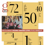
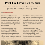
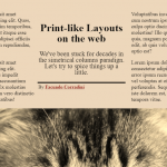
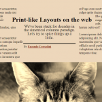
I always love seeing people get inspired by print design and trying to port it over to the web. There is a much deeper history of interesting print work to draw from, and still a ton of modern work happening that eclipses most digital design work today. The web is fully capable of bold, interesting designs, yet we see it all-too-rarely.
Just lately, we've seen a little surge of interest...
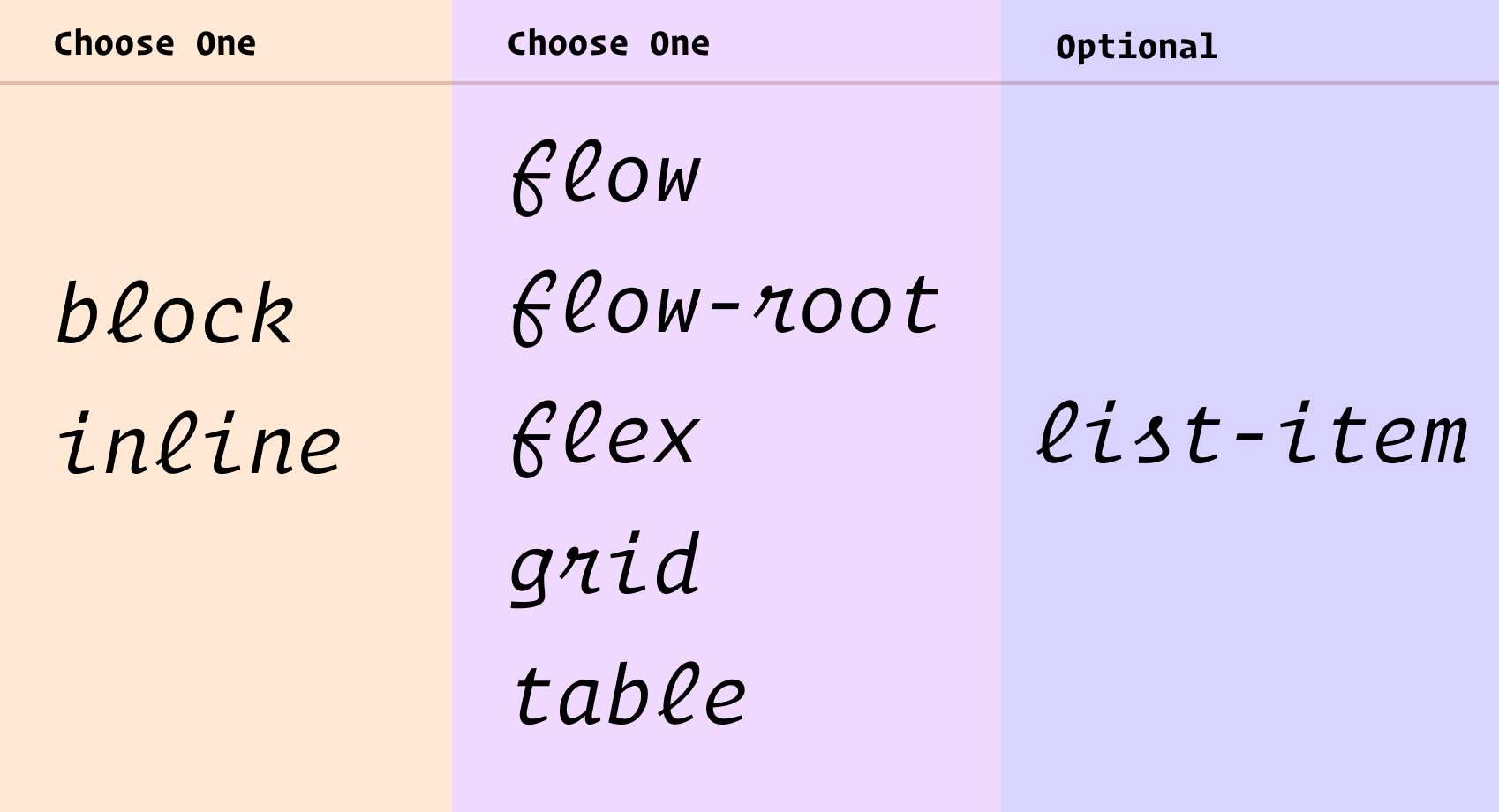
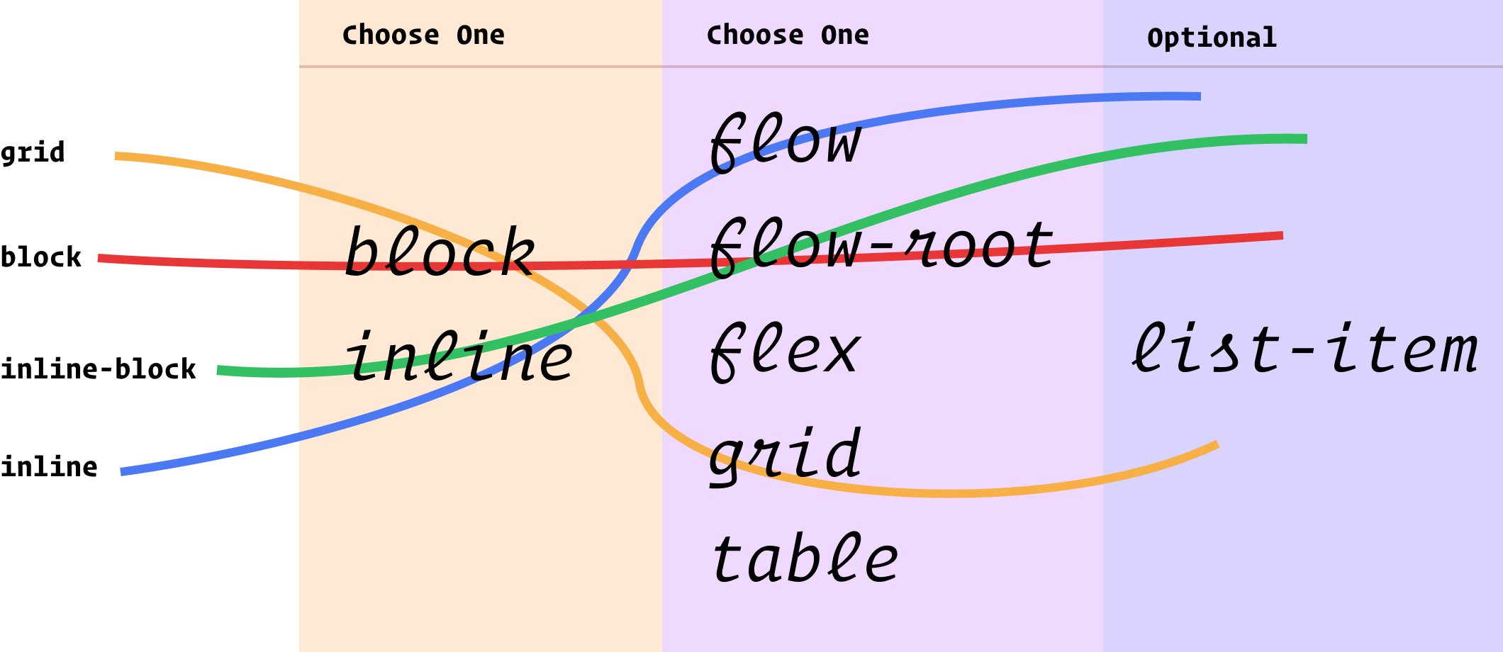
You know the single-value syntax: .thing { display: block; }. The value "block" being a single value. There are lots of single values for display. For example, inline-flex, which is like flex in that it becomse a flex container, but behaves like an inline-level element rather than a block-level element. Somewhat intuitive, but much better served by a two-value system that can apply that same concept more broadly and just as intuitively.
Choose block or inline, then choose flow, flow-root, flex, grid, or table. If it's a list-item that's a third thing.
You essentially pick one from each column to describe the layout you want. So the existing values we use all the time map out something like this:
Another way to think about those two columns I have there is "outside" and "inside" display values. Outside, as in, how it flows with other elements around it. Inside, as in, how layout happens inside those elements.
Can you actually use it?
Not really. Firefox 70 is first out of the gate with it, and there are no other signals for support from Chrome-land or Safari-land that I know about. It's a great evolution of CSS, but as far as day-to-day usage, it'll be years out. Something as vital as layout isn't something you wanna let fail just for this somewhat minor descriptive benefit. Nor is it probably worth the trouble to progressively enhance with @supports and such.
Weirdnesses
You can't block flow because that doesn't really make sense. It'll be reset to block flow-root.
There is implied shorthand. Like if you inline list-item, that's really inline flow list-item whereas list-item is block flow list-item. Looks all fairly intuitive.
You still use stuff like table-row and table-header-group. Those are single-value deals, as is contents and none.
Column one technically includes run-in too, but as far as I know, no browser has ever supported run-in display.
Column two technically includes ruby, but I have never understood what that even is.
How we talk about CSS
I like how Rachel ties this change to a more rational mental and teaching model:
... They properly explain the interaction of boxes with other boxes, in terms of whether they are block or inline, plus the behavior of the children. For understanding what display is and does, I think they make for a very useful clarification. As a result, I’ve started to teach display using these two values to help explain what is going on when you change formatting contexts.
It is always exciting to see new features being implemented, I hope that other browsers will also implement these two-value versions soon. And then, in the not too distant future we’ll be able to write CSS in the same way as we now explain it, clearly demonstrating the relationship between boxes and the behavior of their children.
Picking up on our last tutorial on how to add smooth scrolling plus image animations to a page, we’d like to explore some more ideas for animations. We’ve made a small set of effects that show how you can apply some interesting transforms to elements like images and text while scrolling the page smoothly.
Attention: Note that the demos are experimental and that we use modern CSS properties that might not be supported in older browsers.
For the demos, we’ve created different (grid) layouts with images that have decorative elements and captions.
We’ve used background images that are wrapped in a division with its overflow set to hidden, so that we can animate the scale or translate of the inner images in some examples. There are many possibilities to explore, for example, rotating the images:
…or adding a blend mode to one of the moving elements:
As you can also see in Jesper Landberg’s smooth scroll with skew effect demo, you can use the acceleration to control the transform amount. So when you scroll faster, the elements distort more.
Here’s a little GIF to show a detail of one of the animations:
Note that when using the scale transform, the animations in Firefox don’t perform so smoothly.
We hope you enjoy this little set and find it inspirational.
After our little draggable image strip experiment, we wanted to explore using the dragging functionality on a menu. The idea is to show a large inline menu with some scattered thumbnails. The menu can be dragged and while doing so, the thumbnails get moved with an animation. Each menu item also changes the letters to show an outlined version. When clicking on the “explore” link under a menu item, the thumbnails move and enlarge to form a grid.
The animations are powered by TweenMax and we use Dave DeSandro’s Draggabilly.
Attention: Note that the demo is experimental and that we use modern CSS properties that might not be supported in older browsers.
The initial view looks as follows:
When clicking on the explore link, we animate all thumbnails to their place in a custom grid.
Every Layout is a new work-in-progress website and book by Heydon Pickering and Andy Bell that explains how to make common layout patterns with CSS. They describe a lot of the issues when it comes to the design of these layouts, such as responsive problems and making sure we all write maintainable code, and then they’ve provided a handy generator at the end of each article to create our own little frameworks for dealing with these things.
They also have a complementary blog and one of the posts called "Algorithmic Design" caught my eye:
We make many of our biggest mistakes as visual designers for the web by insisting on hard coding designs. We break browsers’ layout algorithms by applying fixed positions and dimensions to our content.
Instead, we should be deferential to the underlying algorithms that power CSS, and we should think in terms of algorithms as we extrapolate layouts based on these foundations. We need to be leveraging selector logic, harnessing flow and wrapping behavior, and using calculations to adapt layout to context.
The tools for flexible, robust, and efficient web layout are there. We are just too busy churning out CSS to use them.
I’m looking forward to seeing where this project goes and how many more layouts these two end up documenting.
Today we’d like to share a little draggable experiment with you. The idea is to show a strip of differently sized images that can be dragged. When clicking and holding to drag, a title element appears and the images get scaled. This separates the images and gives the whole thing an interesting look. When a number gets clicked, the same separation happens and then the images fly up. Another larger version of the images slides in from the bottom.
The animations are powered by TweenMax and we use Dave DeSandro’s Draggabilly.
Attention: Note that the demo is experimental and that we use modern CSS properties that might not be supported in older browsers.
The initial view looks as follows:
When we click to drag the image strip, we show the title:
When clicking on a number, we slide the images up and show a larger view with some content:
Here’s a preview of the whole thing in motion:
We hope you enjoy this experiment and find it useful!
Today we’d like to share a little layout with you. The idea is based on the current trend of a grid layout where the columns are animated. You can see this kind of animation in Aristide Benoist’s amazing design for Everest or Hrvoje Grubisic’s GETZ — Photography Portfolio Website concept. In our demo, we animate a decorative image grid and make the columns move away in an alternating way, revealing some content underneath. We use a playful hover effect for the menu items and mimic the animating when they fly away. We also added some slight mouse move interaction for the columns.
Attention: Note that the demo is experimental and that we use modern CSS properties that might not be supported in older browsers.
The initial view of the demo is the navigation with the decorative grid in the background.
When clicking on one of the menu items, we animate the grid out by moving the columns in an alternating fashion, rotating them slightly. We mimic this behavior on the letters of the menu item.
When the grid moves away, the content area underneath is revealed:
We hope you enjoy this experiment and find it useful!
If you recently browsed Awwwards or FWA you might have stumbled upon Ultranoir’s website. An all-round beautifully crafted website, with some amazing WebGL effects. One of which is a sticky effect for images in their project showcase. This tutorial is going to show how to recreate this special effect.
The same kind of effect can be seen on the amazing website of MakeReign.
Understanding the effect
When playing with the effect a couple of times we can make a very simple observation about the “stick”.
In either direction of the effect, the center always reaches its destination first, and the corners last. They go at the same speed, but start at different times.
With this simple observation we can extrapolate some of the things we need to do:
Differentiate between the unsticky part of the image which is going to move normally and the sticky part of the image which is going to start with an offset. In this case, the corners are sticky and the center is unsticky.
Sync the movements
Move the unsticky part to the destination while not moving the sticky part.
When the unsticky part reaches its destination, start moving the sticky part
Getting started
For this recreation we’ll be using three.js, and Popmotion’s Springs. But you can implement the same concepts using other libraries.
We’ll define a plane geometry with its height as the view height, and its width as 1.5 of the view width.
const camera = new THREE.PerspectiveCamera(45, 1, 0.1, 10000);
const fovInRadians = (camera.fov * Math.PI) / 180;
// Camera aspect ratio is 1. The view width and height are equal.
const viewSize = Math.abs(camera.position.z * Math.tan(fovInRadians / 2) * 2);
const geometry = new THREE.PlaneBufferGeometry(viewSize *1.5,viewSize,60,60)
Then we’ll define a shader material with a few uniforms we are going to use later on:
u_progress Elapsed progress of the complete effect.
u_direction Direction to which u_progress is moving.
u_offset Largest z displacement
const material = new THREE.ShaderMaterial({
	uniforms: {
		// Progress of the effect
		u_progress: { type: "f", value: 0 },
		// In which direction is the effect going
		u_direction: { type: "f", value: 1 },
		u_waveIntensity: { type: "f", value: 0 }
	},
	vertexShader: vertex,
	fragmentShader: fragment,
	side: THREE.DoubleSide
});
We are going to focus on the vertex shader since the effect mostly happens in there. If you have an interest in learning about the things that happen in the fragment shader, check out the GitHub repo.
Into the stick
To find which parts are going to be sticky we are going to use a normalized distance from the center. Lower values mean less stickiness, and higher values mean more sticky. Since the corners are the farthest away from the center, they end up being most sticky.
Since our effect is happening in both directions, we are going to have it stick both ways. We have two separate variables:
One that will stick to the front. Used when the effect is moving away from the screen.
And a second one that will stick to the back. Used when the effect is moving towards the viewer.
Depending on the direction, we are going to determine which parts are not going to move as much. Until we want them to stop being sticky and move normally.
The Animation
For the animation we have a few options to choose from:
Tween and timelines: Definitely the easiest option. But we would have to reverse the animation if it ever gets interrupted which would look awkward.
Springs and vertex-magic: A little bit more convoluted. But springs are made so they feel more fluid when interrupted or have their direction changed.
In our demo we are going to use Popmotion’s Springs. But tweens are also a valid option and ultranoir’s website actually uses them.
Note: When the progress is either 0 or 1, the direction will be instant since it doesn’t need to transform.
And we are going to sequence the movements by moving through a wave using u_progress.
This wave is going to start at 0, reach 1 in the middle, and come back down to 0 in the end. Making it so the stick grows in the beginning and decreases in the end.
Now, the last step is to move the plane back or forward as the stick is growing.
Since the stick grow starts in different values depending on the direction, we’ll also move and start the plane offset depending on the direction.
void main(){
	...
	float offsetIn = clamp(waveIn,0.,1.);
	// Invert waveOut to get the slope moving upwards to the right and move 1 the left
	float offsetOut = clamp(1.-waveOut,0.,1.);
	float offsetProgress = mix(offsetIn,offsetOut,u_direction);
	pos.z += stickEffect * u_offset * stickProgress - u_offset * offsetProgress;
	gl_Position =
	projectionMatrix *
	modelViewMatrix *
	vec4(pos, 1.0);
}
And here is the final result:
Conclusion
Simple effects like this one can make our experience look and feel great. But they only become amazing when complemented with other amazing details and effects. In this tutorial we’ve covered the core of the effect seen on ultranoir’s website, and we hope that it gave you some insight on the workings of such an animation. If you’d like to dive deeper into the complete demo, please feel free to explore the code.
We hope you enjoyed this tutorial, feel free to share your thoughts and questions in the comments!