As we continue through this eventful 2019, there are many newsletter design trends that have already come and gone. But, there are also quite a few that have stuck around, and even more that are just beginning to show up.
So what are they? Great question. Newsletters are one of the most simple and effective marketing strategies out there, so it’s worth knowing what’s trending and what you should avoid. With that said, here are some of the best 2019 newsletter design trends that you’ve gotta know.
Interactive newsletters
Interactivity has been a trend in the design world for a while now. The reason is as cut and dry as it gets: people love to be entertained. There’s just something about being able to navigate, click, and watch the screen evolve in front of you that just can’t be beaten.
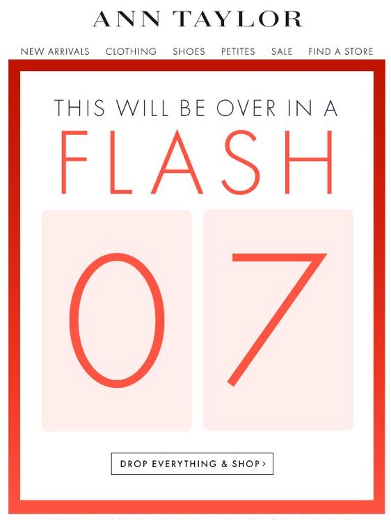
Take this newsletter from Ann Taylor, for example. It has a simple design that allows users to interact with it, see all the new products, and even go straight to the online store. Things like sidebars, drop-down tabs, and shopping links are actually taking off as a trend. This is an interactive email newsletter if I’ve ever seen one. As long as you don’t go overboard with it, this is a great trend to follow.
Simple and clean design
Minimalism is a huge trend in design right now. It’s no big surprise that it’s snuck its way into newsletter design trends, too.
There’s nothing more annoying than getting a newsletter, opening it, and finding an explosion of information that you can’t seem to click away from fast enough. The whole point of a newsletter is to grab someone’s attention quickly and direct them to the announcement.
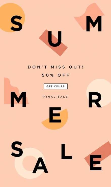
Something like this simple newsletter design clearly shows the reader that there’s a summer sale, it’s 50% off, and then gives them a link to go shopping. There’s nothing overwhelming or misleading about it. By definition, this is a perfectly simply newsletter, and it does the trick.
Catchy newsletter names
You may think that a name really isn’t part of the design, but I think that the name is the first thing that really grabs the reader’s attention. Amidst the absolute ocean of emails that some of us get daily, the subject lines can easily blend in with the background.
It helps to have a name that people not only recognize as your own but by having a name that stands out. There’s really no guideline for this other than be creative. Overall, you should just try to avoid names like (insert company name)’s newsletter.
Infographics in newsletters
If you absolutely need to give a lot of information, a nice infographic can really help maintain your clean design. One particular style of infographics that a lot of businesses are using is video infographics.
Video marketing, in general, has really rocketed forward in recent years. For many businesses, it’s their main focus. A simple video infographic is an easy way to pump out a lot of your information and still keep the target audience engaged.
Personalization
Creating a newsletter design that is easy to adapt to any reader can be hard to do, but it drives opening rates and engagement like crazy.
A good example of this would be Pinterest. For years now, they have sent you Pins via email based on the things that you like.
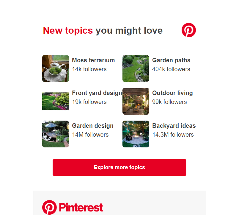
On top of that, they will often use your name in the subject line. It makes it feel less like a corporate cash-grab, and more like a friendly email from a close friend. I don’t know about you, but when scrolling through my inbox, my name in a subject line stands out drastically. Many times, it’s all I look for.
Videos in newsletters
The reason videos work well in newsletters is simple: people love to be entertained. On top of that, listening to a video requires much less effort than reading.
That being said, adding a video to a newsletter can be tricky. If someone has rendering issues, or they can’t watch the video the moment they open it, then they may leave and never come back. There has to be a balance between making the video catchy enough to grab their attention and keep it and being short enough to not waste their time. Basically, keep it short and sweet.
Bright and contrasting colors
A little splash of color never hurt anyone. This statement rings true for a lot of things, but with design, it’s a little more complicated. It’s true that the right colors can really help any design. But, notice I said the RIGHT colors.
Just because you toss in some bright and contrasting colors doesn’t mean that people are going to love it. In fact, if you don’t get the colors almost exactly right, most people are going to hate it.
The colors you choose have to make sense. They have to match your brand’s tone, but they don’t necessarily have to be the brand’s colors. Take this newsletter for example:
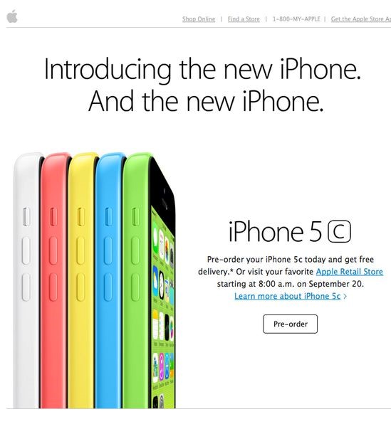
We’re all familiar with the trillion-dollar company, Apple. They’re infamous for their simplicity in design. Most of the time, their devices are simple gold, black, grey, or white. It was quite a shock when they released the 5c, simply because they were like nothing Apple fans had ever seen.
Granted, this email newsletter design is a few years old at this point, but you can see the strategy in using these colors. They absolutely pop off the screen at you. They used the phone’s colors to highlight the phones themselves on the screen.
Or, how about this one:
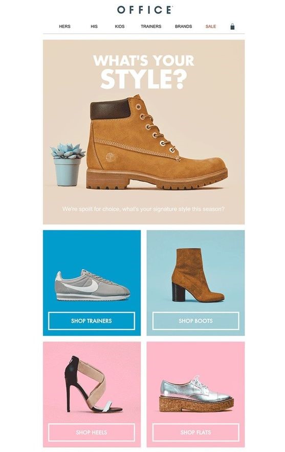
Again, what we have here is an ingeniously implemented design with contrasting colors. They’re not wildly different from each other, but they certainly do a great job of highlighting the products. These colors make sense, and they look good.
Full-width images
Just like the colors, images have become the main focal point of the newsletter in 2019. And, just like the example above with Apple, the images have quickly started to take up the majority of the newsletter.
It makes sense if you think about it. Let your product do the talking for you. Even if you’re newsletter is a software or a simple announcement, you should be confident enough with what you’re proposing in the newsletter.
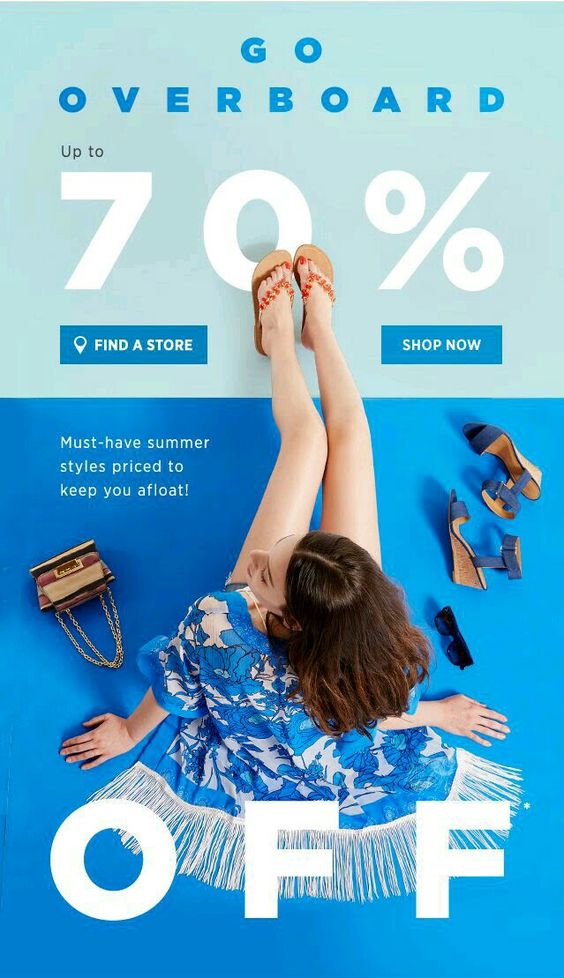
This newsletter advertisement is a perfect example of this. The image of the woman in the middle takes up nearly the entire thing, from end to end.
In fact, this particular design hits on a few of the points we talked about, so we’ll end it here. You have a nice big image, contrasting and bold colors, a simple image, and interactivity.
Get creative
As I hinted at several times throughout this article, creativity is key. Most people will scan their emails, look for only the most important emails, and forget about the rest, newsletters included.
A combination of many or all the design elements above will definitely give you a competitive edge, but don’t forget to play around a little. Just because someone doesn’t open a newsletter email of yours once, doesn’t mean they’ll never do it again. This process will have a lot of trial and error, but you will get the hang of it eventually. Especially is you use these 2019 newsletter design trends.
Read More at 2019 Newsletter Design Trends You Have to Know About