Mastering SVG’s stroke-miterlimit Attribute

So, SVG has this stroke-miterlimit presentation attribute. You’ve probably seen it when exporting an SVG from a graphic editor program, or perhaps you find out you could remove it without noticing any change to the visual appearance.

After a good amount of research, one of the first things I discovered is that the attribute works alongside stroke-linejoin, and I’ll show you how as well as a bunch of other things I learned about this interesting (and possibly overlooked) SVG attribute.

TLDR;

stroke-miterlimit depends on stroke-linejoin: if we use round or bevel for joins, then there’s no need to declare stroke-miterlimit. But if we use miter instead, we can still delete it and maybe the default value will be enough. Beware that many graphic software editors will add this attribute even when is not necessary.

What is stroke-linejoin?

I know, we’re actually here to talk about stroke-miterlimit, but I want to start with stroke-linejoin because of how tightly they work together. This is the definition for stroke-linejoin pulled straight from the SVG Working Group (SVGWG):

stroke-linejoin specifies the shape to be used at the corners of paths or basic shapes when they are stroked.

This means we can define how the corner looks when two lines meet at a point. And this attribute accepts five possible values, though two of them have no browser implementation and are identified by the spec as at risk of being dropped. So, I’ll briefly present the three supported values the attribute accepts.

miter is the default value and it just so happens to be the most important one of the three we’re looking at. If we don’t explicitly declare stroke-linejoin in the SVG code, then miter is used to shape the corner of a path. We know a join is set to miter when both edges meet at a sharp angle.

But we can also choose round which softens the edges with — you guessed it — rounded corners.

The bevel value, meanwhile, produces a flat edge that sort of looks like a cropped corner.

What is stroke-miterlimit?

OK, now that we know what stroke-linejoin is, let’s get back to the topic at hand and pick apart the definition of stroke-miterlimit from the book Using SVG with CSS3 and HTML5:

[…] on really tight corners, you have to extend the stroke for quite a distance, before the two edges meet. For that reason, there is a secondary property: stroke-miterlimit. It defines how far you can extend the point when creating a miter corner.

In other words, stroke-miterlimit sets how far the stroke of the edges goes before they can meet at a point. And only when the stroke-linejoin is miter.

Miter join with miter limit in grey.

So, the stroke-miterlimit value can be any positive integer, where 4 is the default value. The higher the value, the further the corner shape is allowed to go.

How they work together

You probably have a good conceptual understanding now of how stroke-linejoin and stroke-miterlimit work together. But depending on the stroke-miterlimit value, you might get some seemingly quirky results.

Case in point: if stroke-linejoin is set to miter, it can actually wind up looking like the bevel value instead when the miter limit is too low. Here’s the spec again to help us understand why:

If the miter length divided by the stroke width exceeds the stroke-miterlimit then [the miter value] is converted to a bevel.

So, mathematically we could say that this:

[miter length] / [stroke width] > [stroke-miterlimit] = miter
[miter length] / [stroke width] < [stroke-miterlimit] = bevel

That makes sense, right? If the miter is unable to exceed the width of the stroke, then it ought to be a flat edge. Otherwise, the miter can grow and form a point.

Sometimes seeing is believing, so here’s Ana Tudor with a wonderful demo showing how the stroke-miterlimit value affects an SVG’s stroke-linejoin:

Setting miter limits in design apps

Did you know that miter joins and limits are available in many of the design apps we use in our everyday work? Here’s where to find them in Illustrator, Figma, and Inkscape.

Setting miter limits in Adobe Illustrator

Illustrator has a way to modify the miter value when configuring a path’s stroke. You can find it in the “Stroke” settings on a path. Notice how — true to the spec — we are only able to set a value for the “Limit” when the path’s “Corner” is set to “Miter Join”.

Applying stroke-miterlimit in Adobe Illustrator.

One nuance is that Illustrator has a default miter limit of 10 rather than the default 4. I’ve noticed this every time I export the SVG file or copy and paste the resulting SVG code. That could be confusing when you open up the code because even if you do not change the miter limit value, Illustrator adds stroke-miterlimit="10" where you might expect 4 or perhaps no stroke-miterlimit at all.

And that’s true even if we choose a different stroke-linejoin value other than “Miter Join”. Here is the code I got when exporting an SVG with stroke-linejoin="round".

<svg viewBox="0 0 16 10"><path stroke-width="2" stroke-linejoin="round" stroke-miterlimit="10" d="M0 1h15.8S4.8 5.5 2 9.5" fill="none" stroke="#000"/></svg>

The stroke-miterlimit shouldn’t be there as it only works with stroke-linejoin="miter". Here are a couple of workarounds for that:

  • Set the “Limit” value to 4, as it is the default in SVG and is the only value that doesn’t appear in the code.
  • Use the “Export As” or “Export for Screen” options instead of “Save As” or copy-pasting the vectors directly.

If you’d like to see that fixed, join me and upvote the request to make it happen.

Setting miter limits in Figma

Miter joins and limits are slightly different in Figma. When we click the node of an angle on a shape, under the three dots of the Stroke section, we can find a place to set the join of a corner. The option “Miter angle” appears by default, but only when the join is set to miter:

Applying stroke-miterlimit in Figma.

This part works is similar to Illustrator except for how Figma allows us to set the miter angle in degree units instead of decimal values. There are some other specific nuances to point out:

  • The angle is 7.17° by default and there is no way to set a lower value. When exporting the SVG, that value is becomes stroke-miterlimit='16‘ in the markup, which is different from both the SVG spec and the Illustrator default.
  • The max value is 180°, and when drawing with this option, the join is automatically switched to bevel.
  • When exporting with bevel join, the stroke-miterlimit is there in the code, but it keeps the value that was set when the miter angle was last active (Illustrator does the same thing).
  • When exporting the SVG with a round join, the path is expanded and we no longer have a stroke, but a path with a fill color.

I was unable to find a way to avoid the extra code that ends up in the exported SVG when stroke-miterlimit is unneeded.

Setting miter limits in Inkscape

Inkscape works exactly the way I’d expect a design app to manage miter joins and limits. When selecting a a miter join, the default value is 4, exactly what it is in the spec. Better yet, stroke-miterlimit is excluded from the exported SVG code when it is the default value!

Applying stroke-miterlimit in Inkscape.

Still, if we export any path with bevel or round after the limit was modified, the stroke-miterlimit will be back in the code, unless we keep the 4 units of the default in the Limit box. Same trick as Illustrator.

These examples will work nicely if we choose the Save AsOptimized SVG option. Inkscape is free and open source and, at the end of the day, has the neatest code as far as stroke-miterlimit goes and the many options to optimize the code for exporting.

But if you are more familiar with Illustrator (like I am), there is a workaround to keep in mind. Figma, because of the degree units and the expansion of the strokes, feels like the more distant from the specs and expected behavior.

Wrapping up

And that’s what I learned about SVG’s stroke-miterlimit attribute. It’s another one of those easy-to-overlook things we might find ourselves blindly cutting out, particularly when optimizing an SVG file. So, now when you find yourself setting stroke-miterlimit you’ll know what it does, how it works alongside stroke-linejoin, and why the heck you might get a beveled join when setting a miter limit value.


Mastering SVG’s stroke-miterlimit Attribute originally published on CSS-Tricks. You should get the newsletter.
Free Vector Tech Illustrations You Can Download, Edit, & Use

Today we are sharing five free vector tech illustrations that you can download and use in your commercial or personal projects without any limitations. Included in the download is an Adobe Illustrator file that you can use to customize colors, add your own elements, or edit in any other way you desire. High resolution exported JPG files are also included.

These vector tech illustrations were created specifically for 1stWebDesigner readers and cannot be found anywhere else, so you can use them knowing that you will be among a select number of designers who have access to them. We always enjoy giving something back to all of our loyal followers and readers, so we created these free vector tech illustrations just for you!

All The Best Procreate Brushes
Unlimited Downloads: Hundreds of Procreate Brushes For Your Designs

Envato Elements - Procreate Brushes

Smartwatch

Free Vector Tech Illustrations - Smartwatch

First in our collection of free vector tech illustrations is a pair of hands using a messaging app on a smartwatch. You’ll notice the recurring theme throughout, with the background reflecting what is on the screen in the foreground.

Cell Phone

Free Vector Tech Illustrations - Cell Phone

Next is a familiar scene – “liking” something on an app on a mobile phone. Has anyone ever not done this?

Tablet

Free Vector Tech Illustrations - Tablet

Who hasn’t used a tablet to submit a thumbs up? Here’s a colorful representation of this oft-used action.


Laptop

Free Vector Tech Illustrations - Laptop

In this illustration, the user is checking statistics of some type on a laptop. You could use this to represent almost any type of stat-checking setting.


Desktop Computer

Free Vector Tech Illustrations - Desktop Computer

Our fifth and final illustration depicts a pie chart being viewed on a desktop computer.

Ready To Download & Use These 5 Free Vector Tech Illustrations?

Go for it! We hope you have fun with and enjoy utilizing these illustrations in your projects. Keep following 1stWebDesigner so you don’t miss out on future freebies, along with everything else we have to offer.

Download Illustrations


Free Vector Illustrations For You To Download, Edit & Use

We have some cool, 100% absolutely FREE vector illustrations to offer you that you can download, edit, and use any way you’d like in your personal or commercial projects without any limitations! These Adobe Illustrator files were created specifically for 1stWebDesigner readers and cannot be found anywhere else, so you can use them confident in the knowledge that you will be among a select number of designers who have access to them. We wanted to give something back to all of our loyal followers and readers, so we created these free vector illustrations just for you!

If you have skills in Adobe Illustrator, you can change the colors, remove elements, or add to the image any way you’d like. Or, if not, you can just use them as is. A high-resolution PNG and SVG of each file is included in the download. You can also grab your own copy of Adobe Illustrator here, if you don’t already own it.

Your Web Designer Toolbox

Unlimited Downloads: 500,000+ Web Templates, Icon Sets, Themes & Design Assets


Woman In Airport On Cellphone

woman in airport on cellphone - free vector illustrations

First up in our collection of free vector illustrations is a woman sitting in an airport talking on her cellphone. This could be used in a multitude of ways. For instance, you could easily change the airport setting by removing the airplane and suitcase.

Cat and Character With Plant On The Stairs

cat and person on stairs - free vector illustrations

Next up is a side-smiling character with a cat wandering down the stairs. Again, you could do any number of things to modify this illustration, such as moving the person the top of the stairs so that it looks like the cat is running away from them.

Windowsill Woman With A Tablet In Winter

winter windowsill woman - free vector illustrations

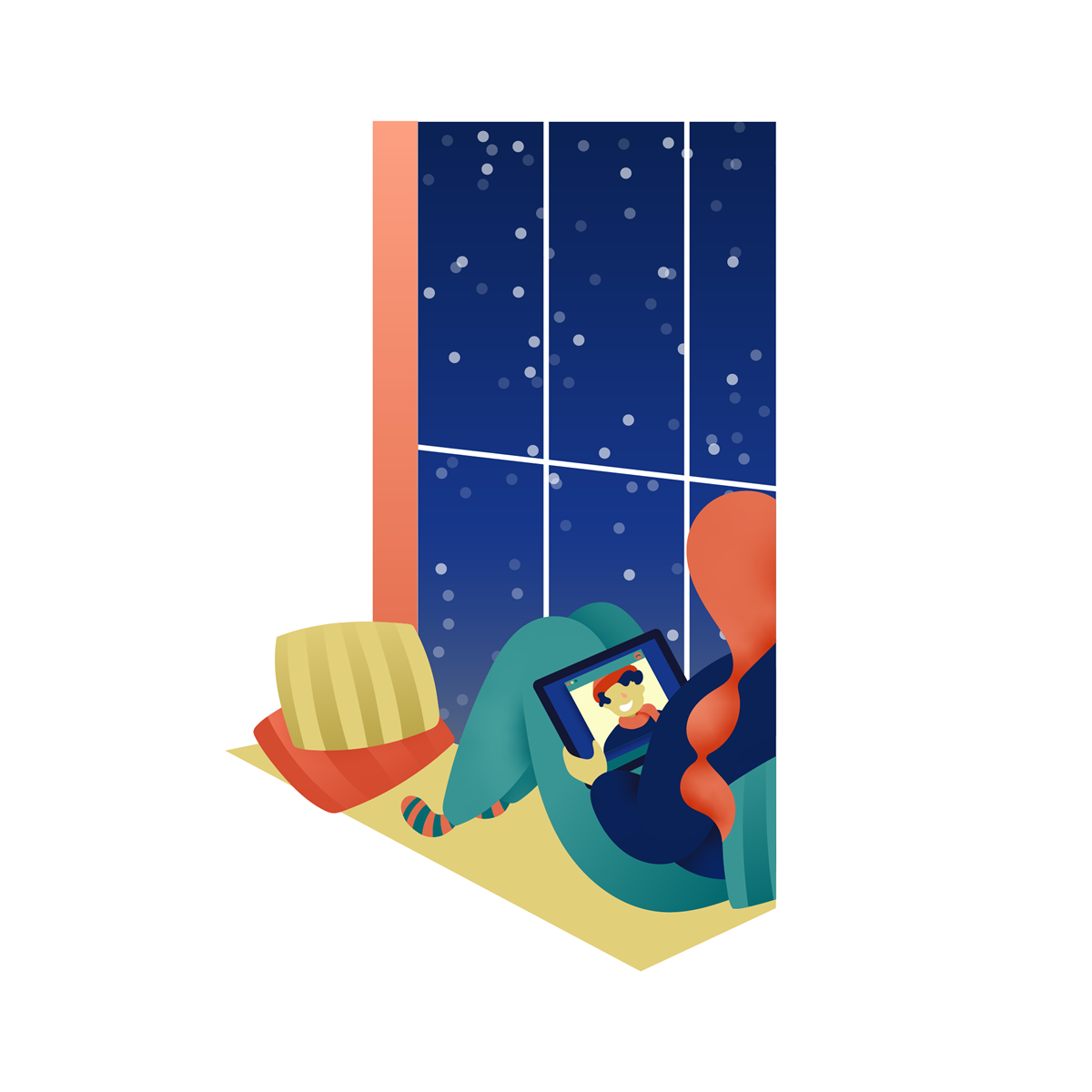
Our final offering is a woman sitting on a window seat with a tablet while snowflakes fall outside. Take this serene setting and adjust it to fit your needs in books, flyers, web sites – however you see fit!

Download Your Free Vector Illustrations Now!

We hope you have fun with and enjoy utilizing these illustrations in your projects. Keep following 1stWebDesigner so you don’t miss out on future freebies, along with everything else we have to offer.

DOWNLOAD ILLUSTRATIONS


The Best Packaging Design Ideas for 2019 You Need to See

sofias tea packaging design ideas

Your product could be the most amazing and useful product in the world, but if your packaging is not on point, then your entire business could be in some major trouble.

Imagine this scenario: You’ve designed the best product in your field, invested all of your funds into creating the product, and put packaging design on the back burner. You get on a free mock-up website, make something in an hour, call it day, and show it to your investors. 

Terrible idea. 

juice summery packaging ideas

In my personal opinion, you should put just as much effort into the packaging design of your product as you put into the product itself.

According to science, it only takes a person 1/10th of a second to create or form an opinion about someone or something. That gives you literally not even one second to give someone a great first impression. 

The first thing your potential customer is going to see is your packaging. And you better hope to goodness that you’ve aced your first impression and wowed your target audience with your packaging design.

Best Packaging Design Ideas for 2019

I’ve rounded up 20 of my favorite packaging designs for you to be inspired by for your next design project.

Let’s check em out!

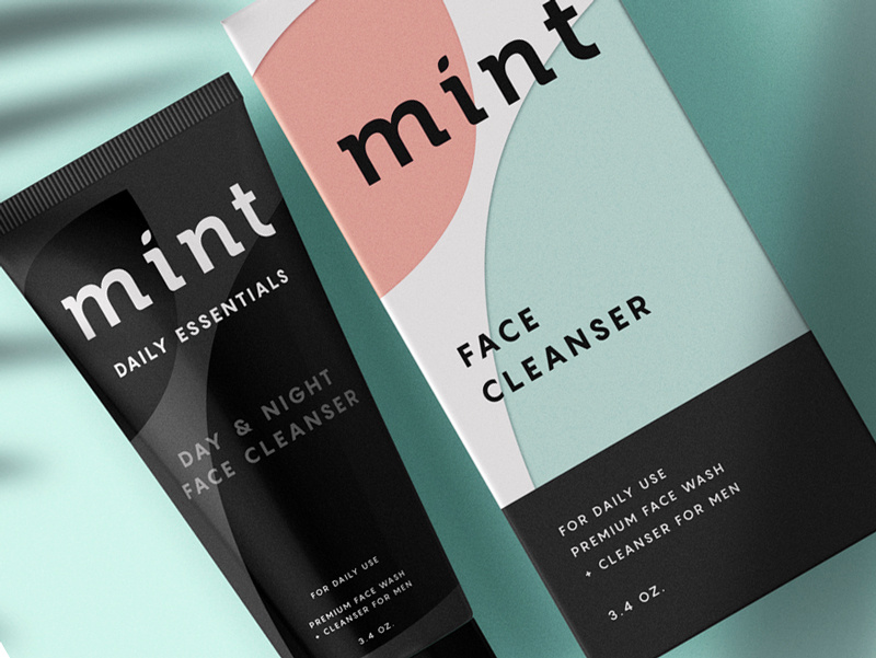
1. Mint

mint pastel color packaging design

[source]

This face wash for men is so simplistic in its design that it’s easy and enjoyable for the eye to look at. The black color of the face wash gives off tones of luxury and the pastel colors on the box, combined with flat design, simply works for this packaging. 


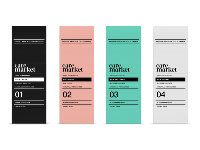
2. Care Market

care-market-pt2_5_2x packaging design pastels

Continuing on with the pastel trend, we have Care Market packaging design. The palette they chose here is lovely, as pastels have been all over the place this year. The consistency in font usage is just perfect, using only two different fonts and using dividing lines between each new phrase. 


This packaging design shows us that you don’t need elaborate graphic designs to exude elegance and professionalism. All you need is a great color palette, and nice, coinciding fonts. 

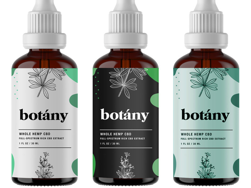
3. Botany

botany-hemp-packaging-design

[source]

Less is more, as the saying goes, and botany nailed it. Minimalist, flat design is the key here and with three different color schemes that all complement each other, I can wholeheartedly say, I believe this design will catch the eye of anyone who is looking for a high-quality serum. 

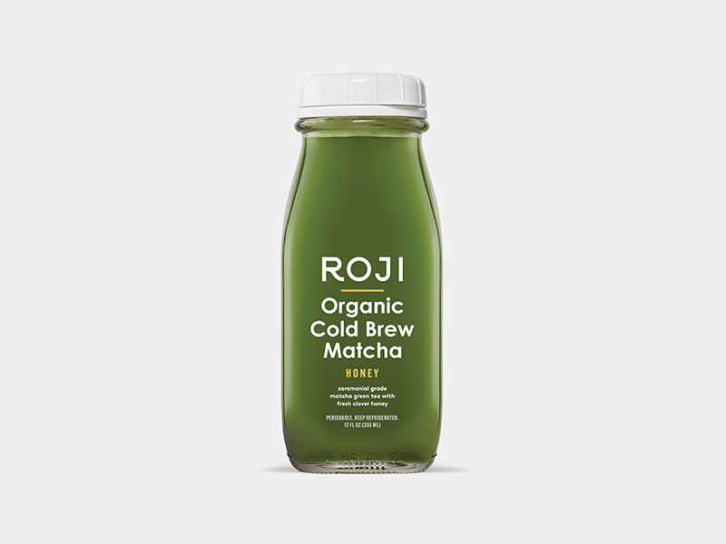
4. Roji

roji juice packaging design

When someone is looking for a healthy drink, they’re going to be looking for sleek, professional fonts that look organic. My favorite part of this packaging design is that the designer thought through the choice of font colors. 


Since the bottle is made of glass, you’ll be able to see its contents and the yellow font matches the beverage inside the bottle. The yellow-colored font perfectly complements the contents of the bottle. A simple, well-thought-out packaging design overall.


5. Sophia’s Tea

sofias tea packaging design ideas

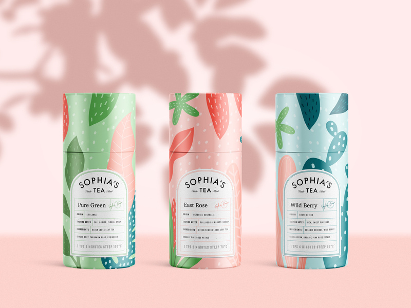
Stepping out a little bit from the pastel color palettes and into something a little bolder, we have Sophia’s Tea packaging design. Flat design really has taken the lead in 2019. We see it all over the place. And luckily for us designers, it makes our job a little easier. 


What I appreciate about this design is that the name of each drink matches the design of each recipient. The color scheme on each bottle matches each other, making a buyer recognize the brand, if they were to see each bottle on a shelf in a store. 

6. Juice.

juice summery packaging ideas

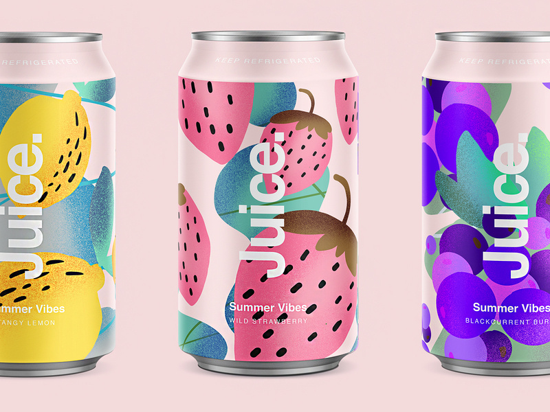
Since we’re on a drink roll, check out this summery packaging design for juice. Again, we’re hit with flat design and beautiful colors. The font sticks out perfectly on the foreground of the design. Juice. Simple, clean, clear, and to the point. 

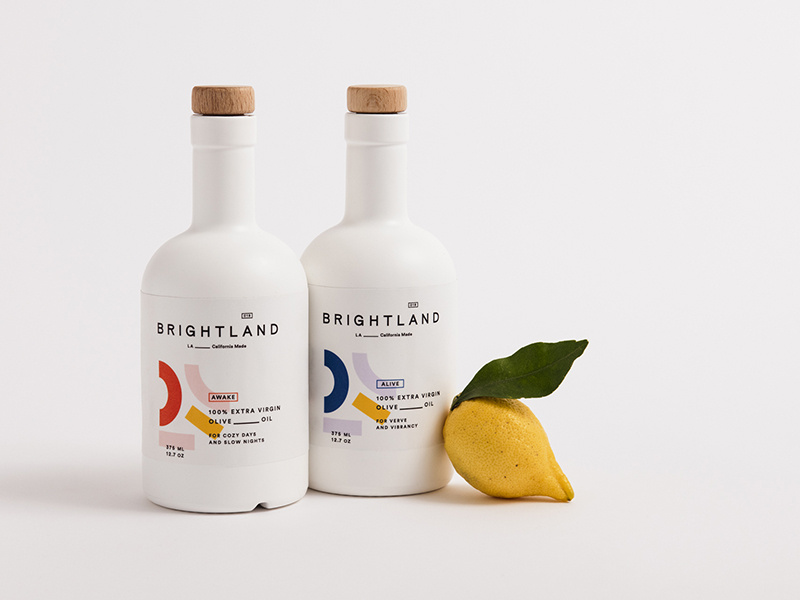
7. Brightland

brightland_packaging ideas

I’ve never seen an olive oil packaged quite like this. At first glance, you would wonder what this beautiful bottle is doing in the oil section. 


You’re inclined to pick it up, you read that it’s olive oil, you’re shook, you compare prices between this and another oil, you realize it’s the same price, and naturally you buy the more beautiful packaging design of the two products. Hit people with original, innovative designs and you’re sales will skyrocket. 


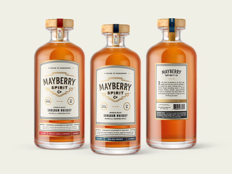
8. Mayberry Spirit Co.

mayberrylables_2x packaging whiskey ideas

[source

This bottle makes me want to have a nice, classy night at home with all my friends. The vintage font works beautifully with the design of the bottle, and I love that the color schemes match the rich color of the whiskey itself. 

9. Gatorade

gatorade_iconoptions_packaging_design

Here are some rebranding sketches for Gatorade. Simple design that gets across, yet still embraces the originality of the Gatorade logo. You won’t lose any brand recognizability, and it looks more modern.


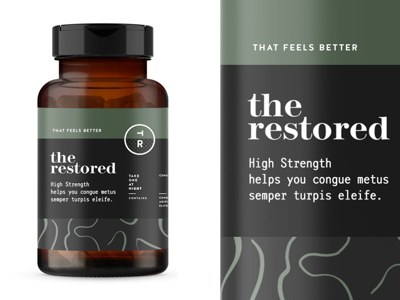
10. The Restored 

the-restored-packaging design for vitamins

The packaging design for these vitamins is everything. The manly, muted earth tones will remind a person of organic produce, making them trust your brand even more. Color association is very important when it comes to designing your packaging and establishing your brand, so choose wisely! 


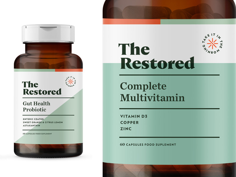
11. The Restored

the restored womens vitamins packaging design ideas

Here’s a second version to Restored vitamins. This packaging design is a touch more feminine, using a more pastel green, and creating more dimension in the background by using two different colors. The pop of orange in the corner brings the eyes to the directions.


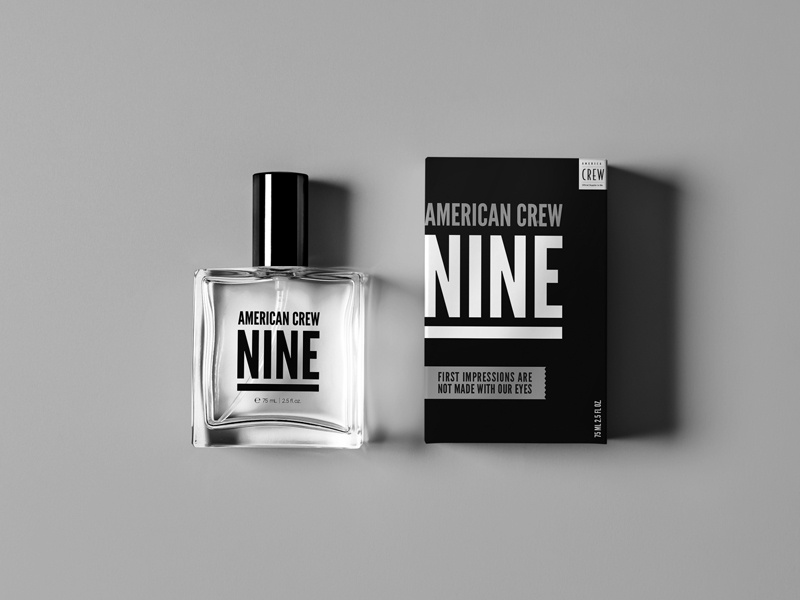
12. American Crew Fragrance

american_crew_fragrance packaging ideas

This simplistic design is one way on the box and reversed on the bottle. By using one font, they really had to play with the scaling and spacing of letters and words to make it interesting and captivating. Again, packaging design can be simple and just as engaging as a super complicated design.  


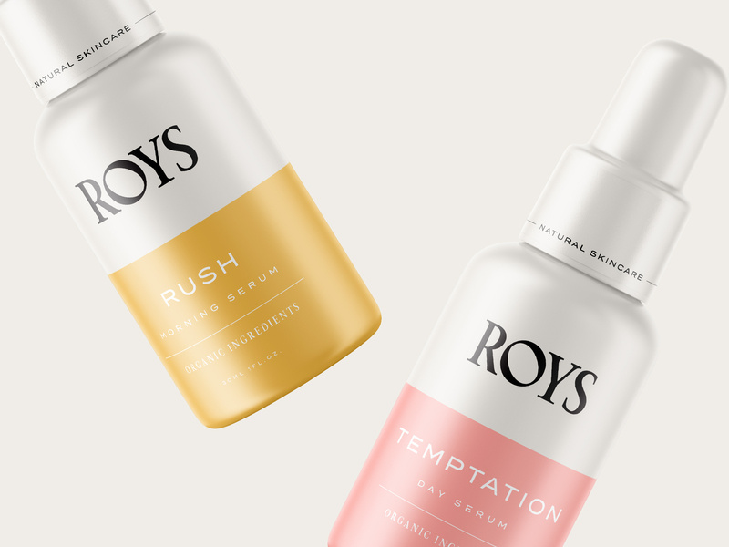
13. Roys Morning Serum


roys morning serum packaging ideas and design

Roys morning serum has two beautiful colors: a muted pink and a relaxing gold. Color association is everything. If you can convince your customers that your product is what they need and you really sell your product by having a luxurious packaging, you’ll have clients talking about you for days. 


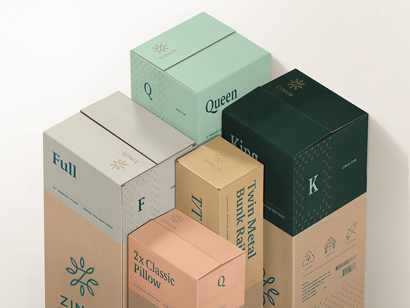
14. Zinus

zinus-packaging-design box


You can recognize an eco-friendly package design from a mile away, and most people are becoming very concerned and aware of their consumerism and trash contribution to the world. Using a bio-degradable packaging or using recycled material will help you loads when it comes to sales. And you’ll be helping the world. It’s a win-win.

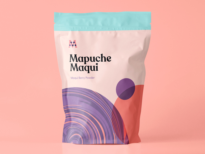
15. Mapuche Maqui

Sometimes, making healthy choices isn’t the easiest or most fun, so presenting a fun looking health product can be key in your sales. This berry powder packaging design looks fun and friendly, used flat design, a beautiful color palette, and bold font. With all these elements combined, surely it’ll catch the eye of a customer. 


16. Botanical Coffee Co

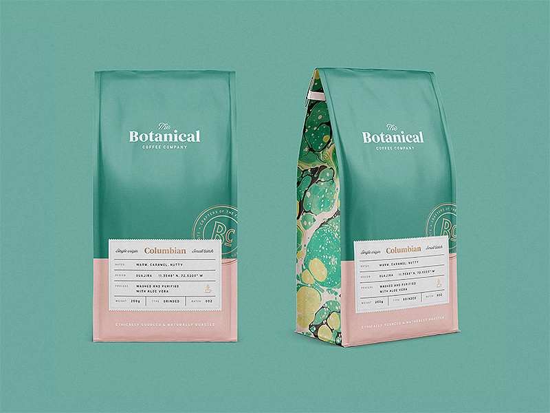
This coffee design is so relaxing to look at. The intricate design on the sides, the simplicity on the front, and the choice of font combinations are just lovely. Again, going with flat design and pastels. See the pattern? 


17. Publix Cereal Line

magic star snack packaging for kids

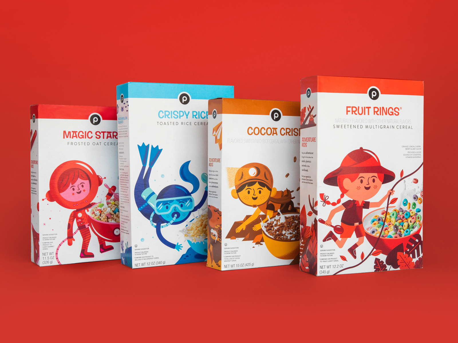
Did you know that the color red increases your appetite significantly? The designer here for kids cereal certainly knew what they were doing. By combining real-life elements and flat design, kids will surely be intrigued by this design and be inclined to beg their parents for the cereal. 


18. Coffee

easy_on_the_eyes_coffee packaging desing

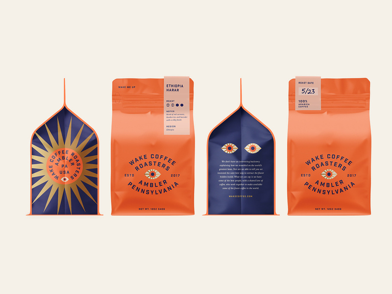
This coffee packaging is so bright and captivating, yet still has colors that are easy on the eyes. When choosing your color palette, you need to be sure that you’re choosing colors that soothe and colors that people want to look at. And of course, brand colors that represent you and that your audience will enjoy. 


19. Tesco Fish

fish packaging branding design

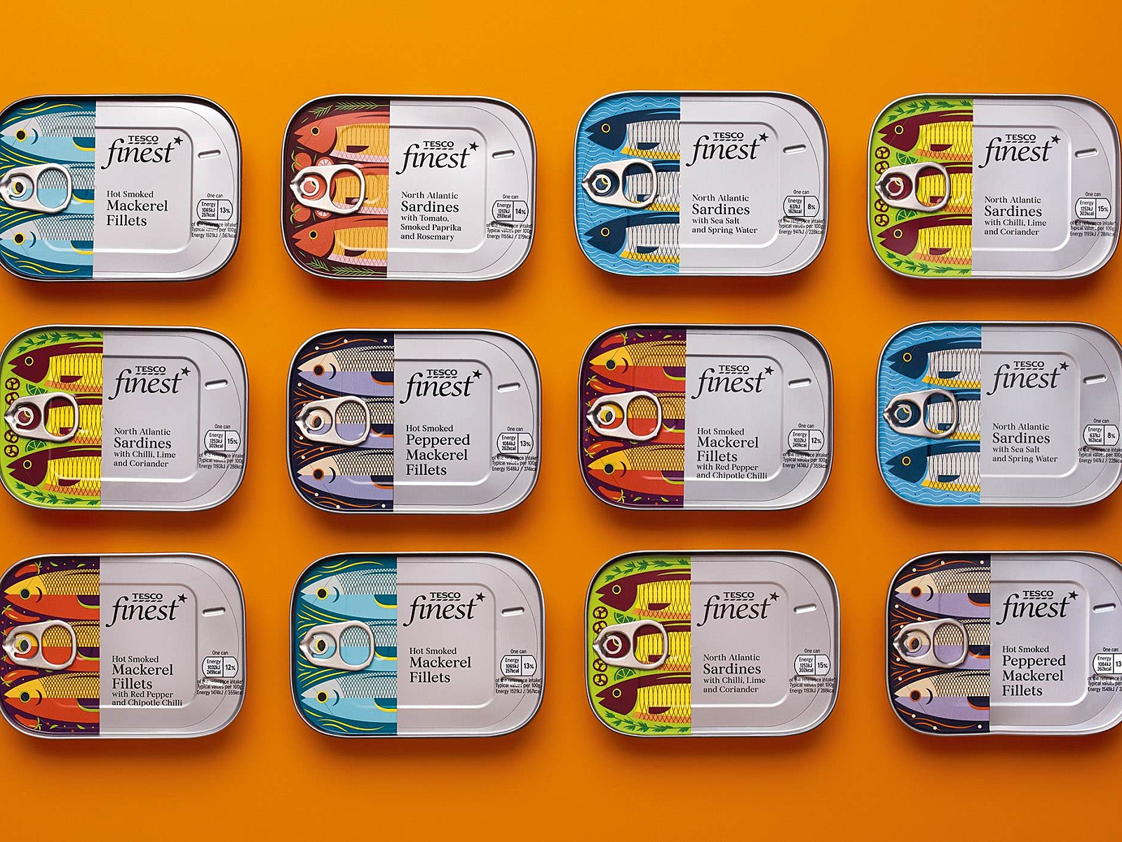
Check out these “fishy” illustrations! What I really enjoyed about this packaging design was the fish. I love the very finely defined, cut-off design of the fish, and then the can and text. Each fish is design to represent its kind, and I find this design very creative, colorful, and appetizing. 


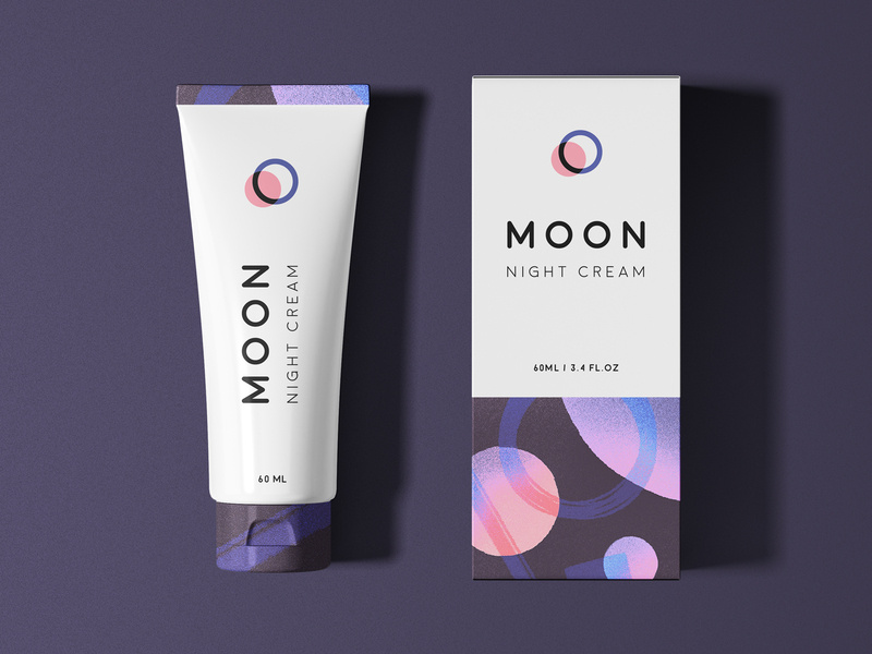
20. Moon 

And finally, we have Moon Night Cream. Notice how to colors and graphic designs represent the night. So simple, clean, and fresh-looking that you actually can’t wait to use this cream tonight before bed.


Wrapping things up 

As we all know, packaging is everything when it comes down to actually selling your product. Make sure your design represents you, your brand, and your product, and is creative and makes people feel like they need what you have to offer, in their lives. 

I hope you found this article inspiring and you’re more than ready to jump into your next design project.

Until next time,

Stay creative! 

Read More at The Best Packaging Design Ideas for 2019 You Need to See

The Ultimate Collection of Free Design Rersources

the mock up club website free mockups

I believe I speak for everyone when I say that I love to find amazing, high-quality design resources for free.

 Sometimes, when you’re in the middle of a design process, you find that you’re about to have to invest more money than you originally intended. You should save money when you can and you should spend money on things that require investment. 

That’s why I came up with the ultimate collection of free design resources for you to check out. 

Whether it’s free vectors or mockups, or free images and presets you’re looking for, I have it all right here in one incredibly comprehensive list for you, so you don’t have to search all around for your answers. Everything is right here, in one place.

Now, let’s get into it.

Free Stock Images

Photography has been and will always be a key piece of design. Stock photos are no longer what they used to be, luckily. No longer will you be seeing just those awkward group photos of people laughing or two businessmen shaking hands. 

No, there are so many stock photo sites for you to choose from with quality work from real photographers. Check out these 10 awesome free stock images websites!

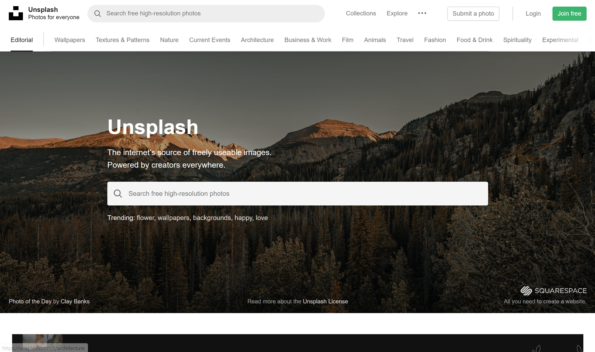
Unsplash

unsplash free stock images

I want to start this list off with a bang. Unsplash is my personal favorite free stock image website. I use it for everything from article writing to making designs. Unsplash has a huge collection of images, consisting of over 110,000 high-quality free stock images. Just type in a keyword and see hundreds of images that can suit your needs. All images are released under Unsplash’s copyright policy.

Stocksnap

stocksnap website free stock images

Stocksnap has hundreds of new high-quality free stock images added to their library every week. They have stock images to fit just about any occasion you can think of. From website building to brochure making, they having everything you need. You can find any image you need by typing in tag words, and you’ll be presented with hundreds of images that will be perfect for you. All images are free for you to use! 

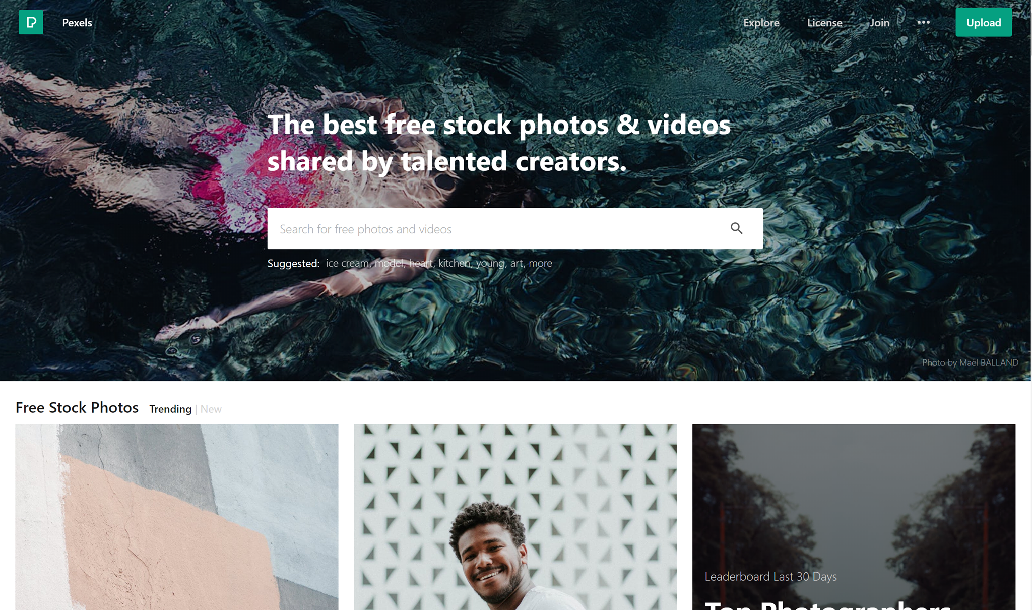
Pexels

pexels user interface free stock images

Pexels has one of the most beautiful stock images website interfaces I’ve ever seen. Pexels provides tons of high-quality stock images that are free for you to use under their license. With hundreds of thousands of beautiful free images of you to choose from, surely you’ll find what you need here. 

Reshot

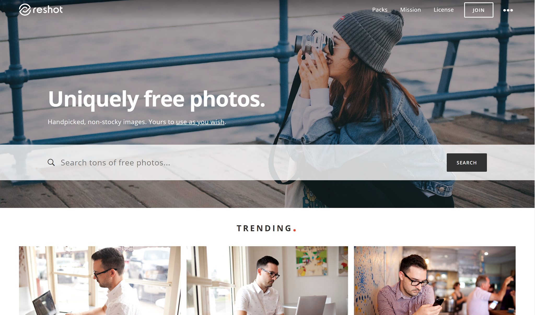
reshot free stock images website

Reshot. Uniquely free photos. Handpicked, non-stocky images. Yours to use as you wish”. That’s a pretty self-explanatory and sweet tagline. They work hand-in-hand with amazing professional photographers and give them a great place to display their work and be discovered. Find amazing free stock images on Reshot!

Pixabay

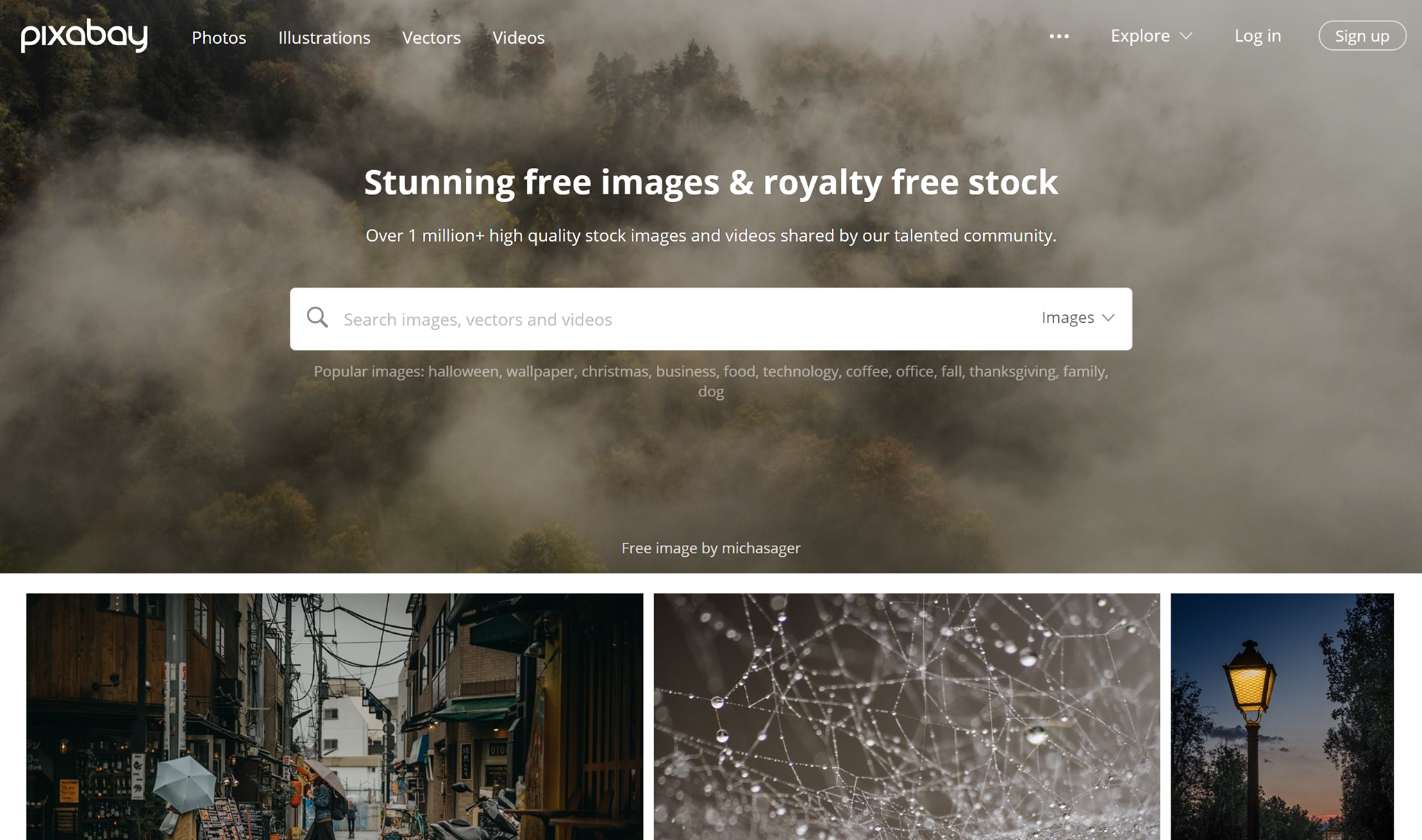
pixa website free stock photos and images

Pixabay has loads of free photos, but not only. They also have art illustrations and vectors. All images, art illustrations vectors, etc are released under Creative Commons CC0.

Life of Pix

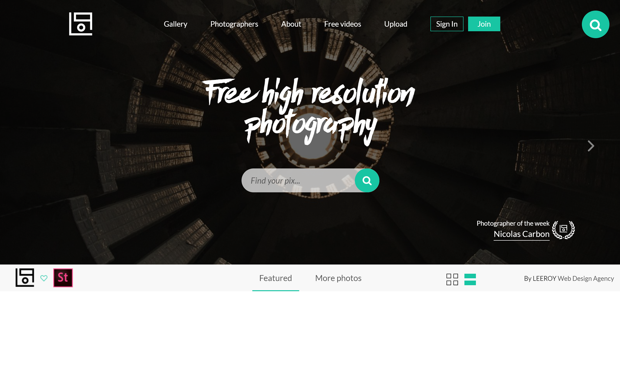
life of pix free high quality images stock

Next up, we have Life of Pix. Free high-resolution photography for everyone. Besides having loads of amazing photos to choose from, they also feature a new photographer of the week. Find new photographers whose work you love every week and in turn, have tons of stock photos to choose from! 

Foodiesfeed

food photography free stock images foodies websiteFoodiesfeed is for the foodie at heart. Which gorgeous, appetizing stock images that look so delicious that you can almost smell them just by looking at them. If you have a food blog or just need some inspiration, check out this awesome stock image site. 

Gratisography

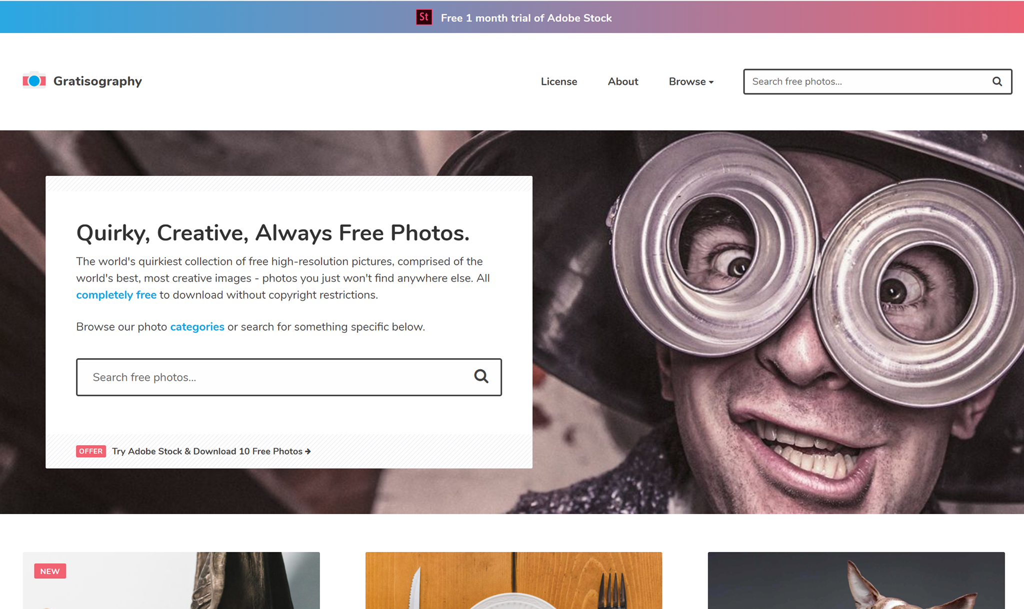
gratisography website free unique images

Gratisography is for the non-mainstream person. If you’re looking for the complete opposite of the classic boring stock photo, this website is for you. You truly won’t find photos like these anywhere else.

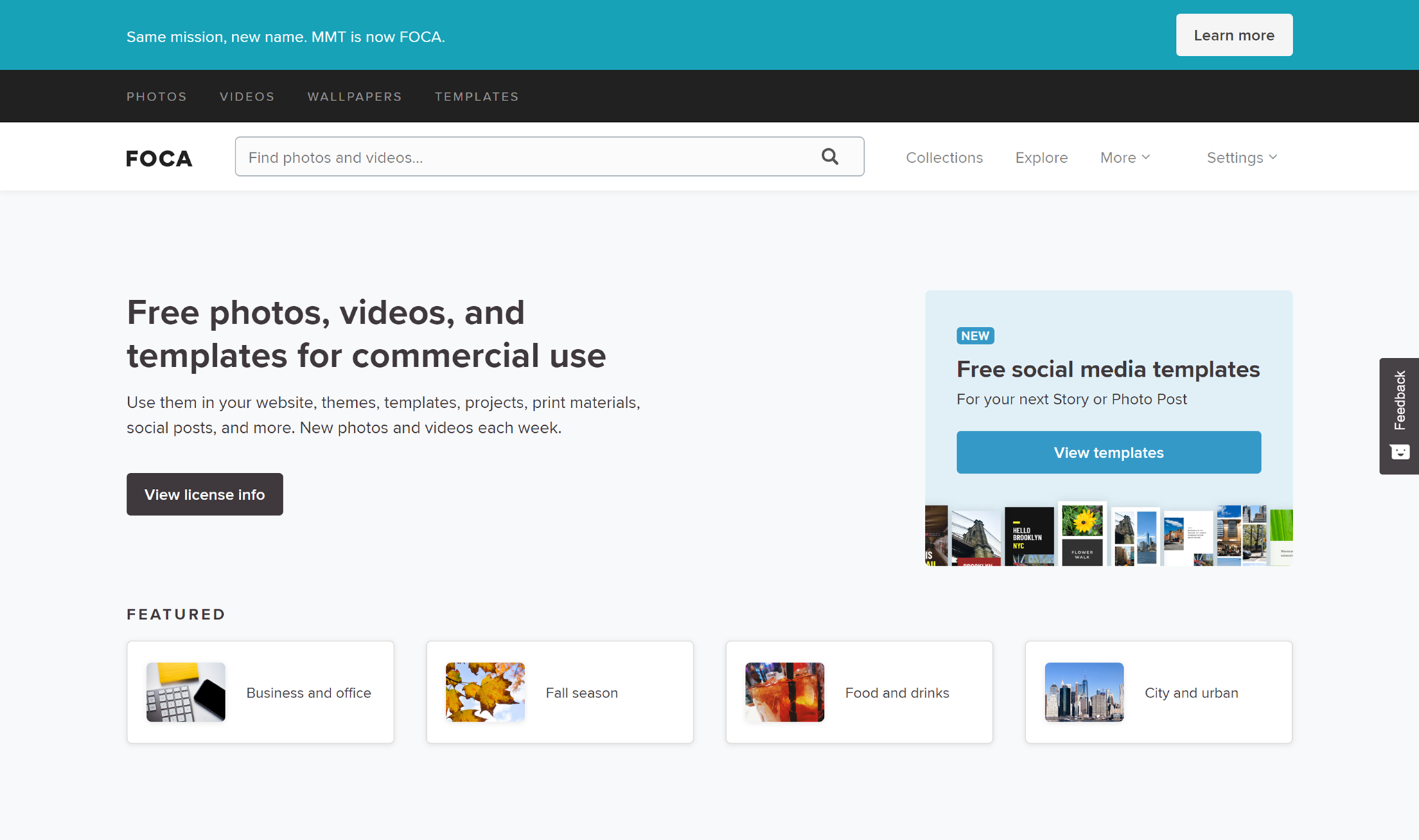
Foca

free stock images foca website

FOCA is a great stock website if you’re looking for a little more than just some stock images. They have everything from free photos to videos and templates! 

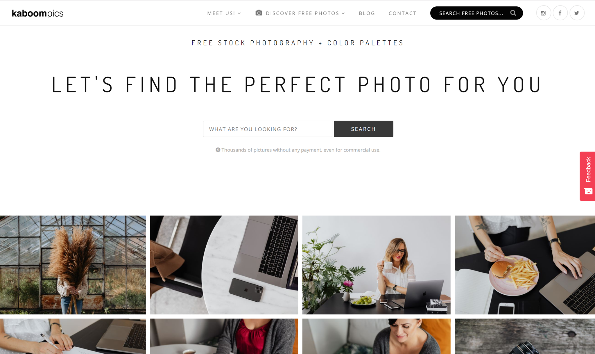
Kaboompics

kaboompics website free stock images for blogs

Kaboompics is so aesthetically pleasing, it hurts. The amazing blog pictures are everything. According to their about page, Kaboompics is one of the most popular sources of free images for lifestyle, interior design and specialized bloggers in the world. 

Free Vectors 

Creating your own vectors can take up so much of your precious time, and that’s why finding perfect vector art or vector icons can be a major time-saver, but finding them for free is like finding treasure. That’s why I picked out my 10 favorite free vector websites. Check ‘em out.

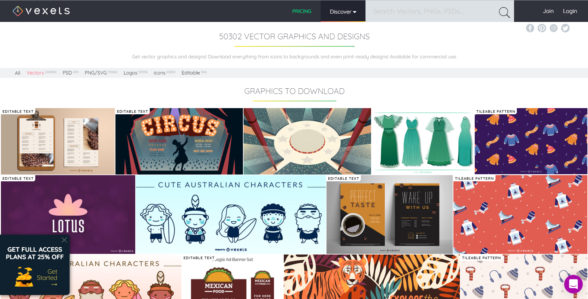
Vexels

vexels website vectors free

Vexels has great free vectors for you to use for personal and commercial use. What I really like about their vectors is that many of them are editable. You can get everything from icons to backgrounds and designs that are ready for print. Give them a try!

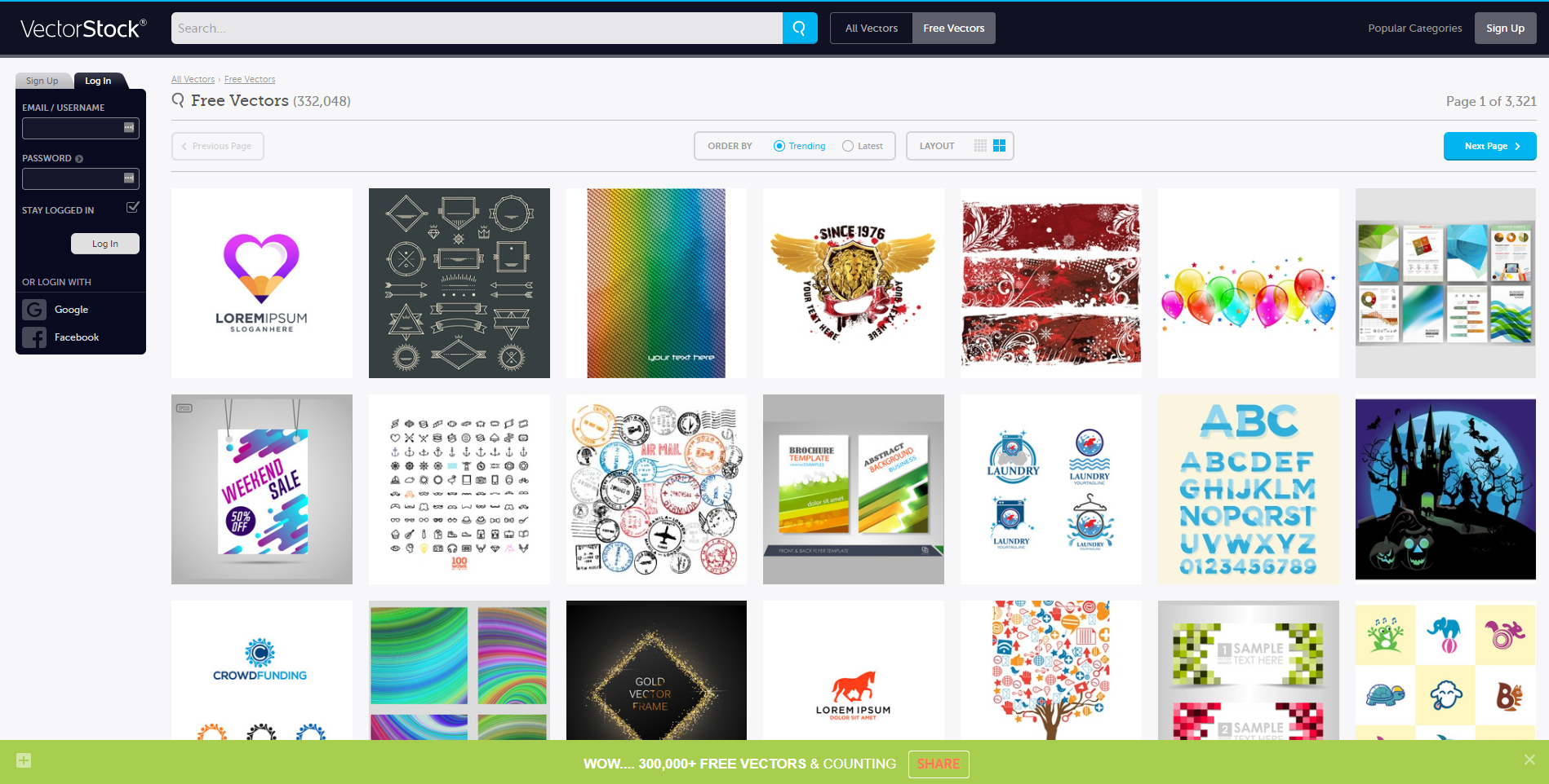
Vector Stock

free vector stock website

Vector stock has over 300,000 vectors for you to choose from. With such a wide variety of vectors, surely you’ll find something that’ll suit your project and save you loads of time. 

The Noun Project

the noun project website free vectors

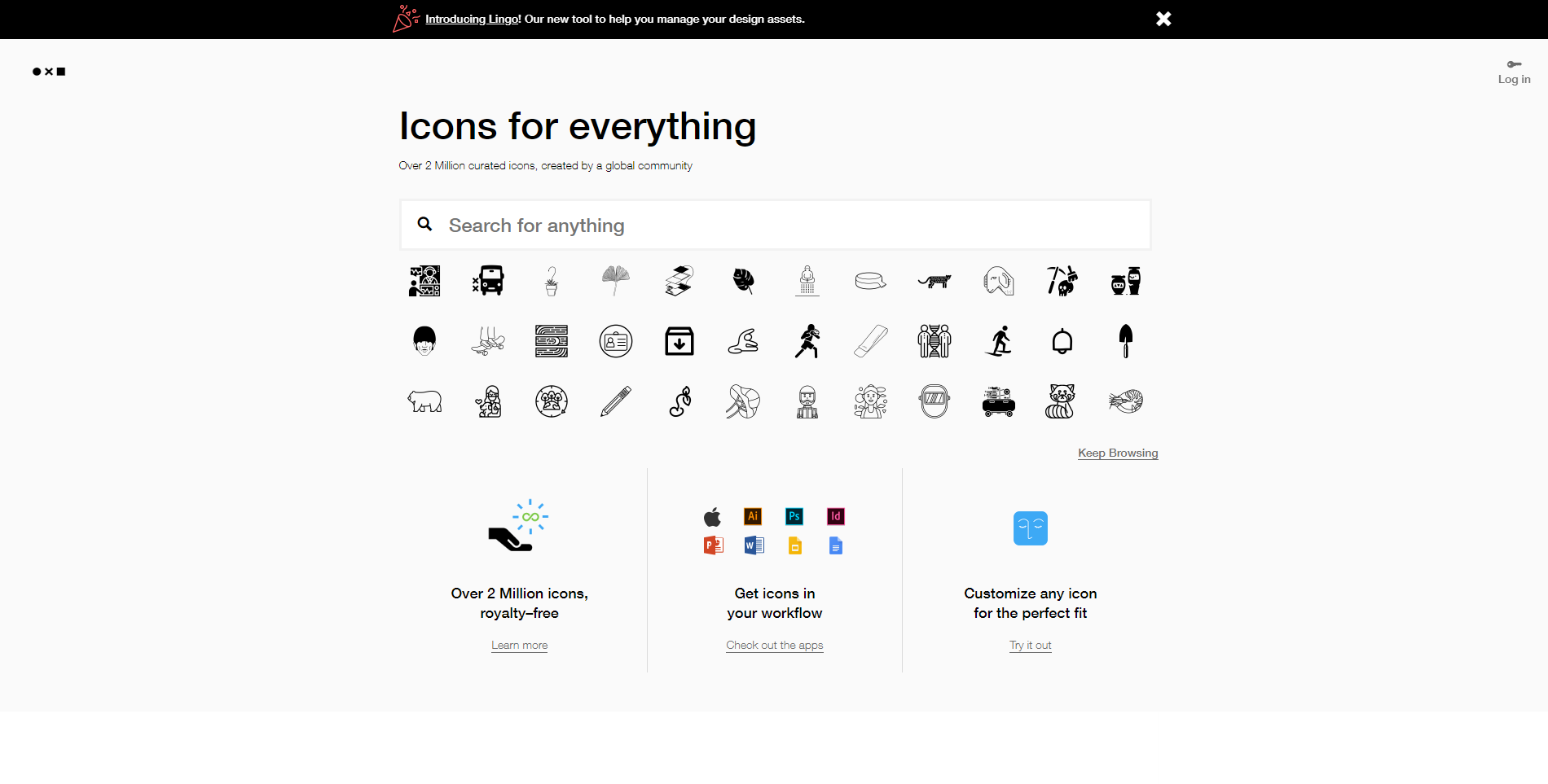
The Noun Project can be summed up in icons, icons, icons! They have over 2 million royalty-free vector icons for you to use. And what’s better? You can edit them. That is insane, people. Don’t sleep on the noun-project. They have all those quality things you’re looking for.

Vector 4 Free

vectors 4 free website free vectors

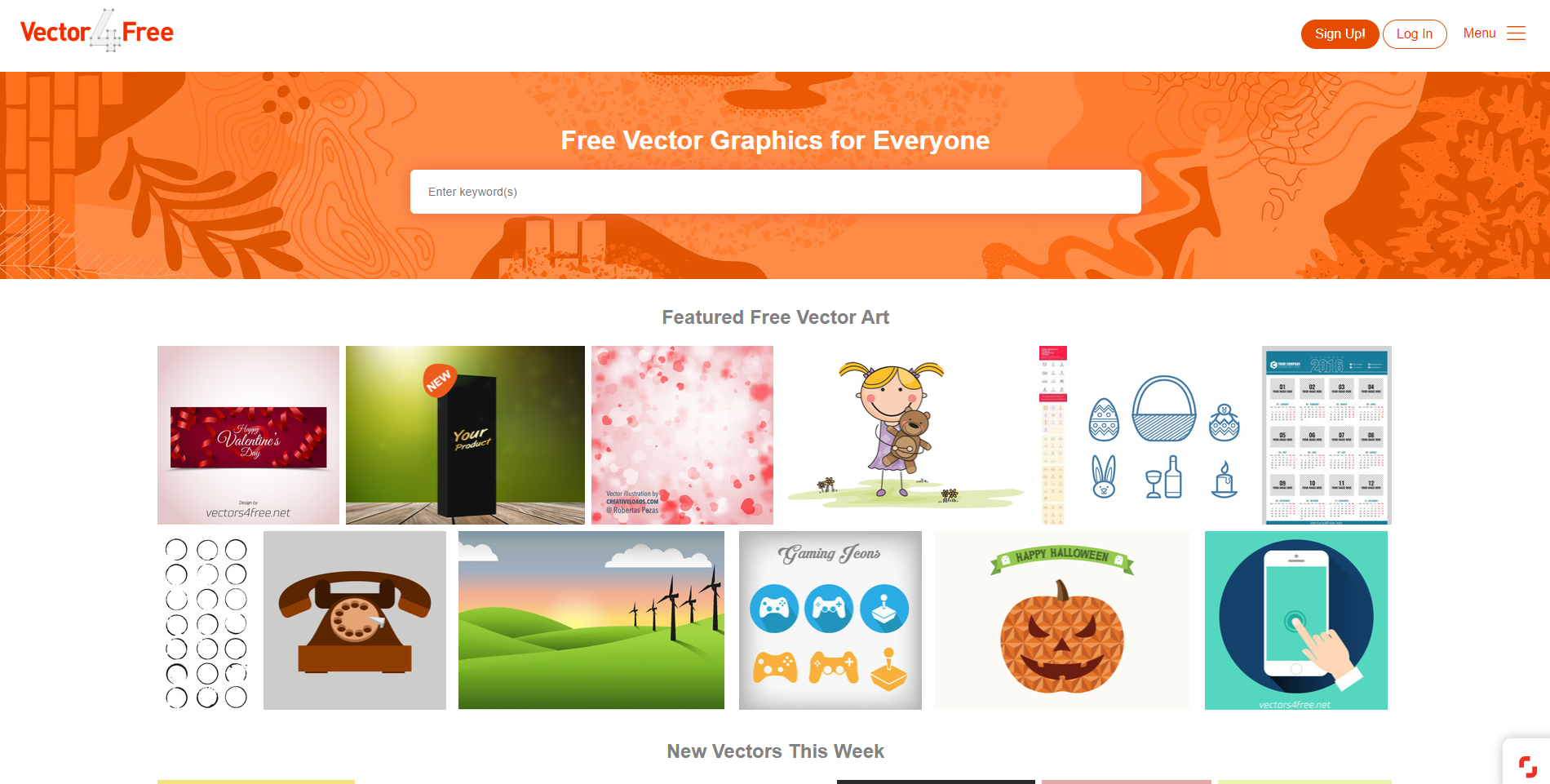
Vector 4 Free has vector art for everyone. Their goal is to share vector art created by professional designers with everyone. They have all sorts of formats, such as .ai format, but also .eps, .pdf, .svg, and even .cdr. All of their vectors are free for personal use, but for commercial use, you have to check each artist’s terms of use, as they all differ. 


Freepik 

Freepik free vector interface

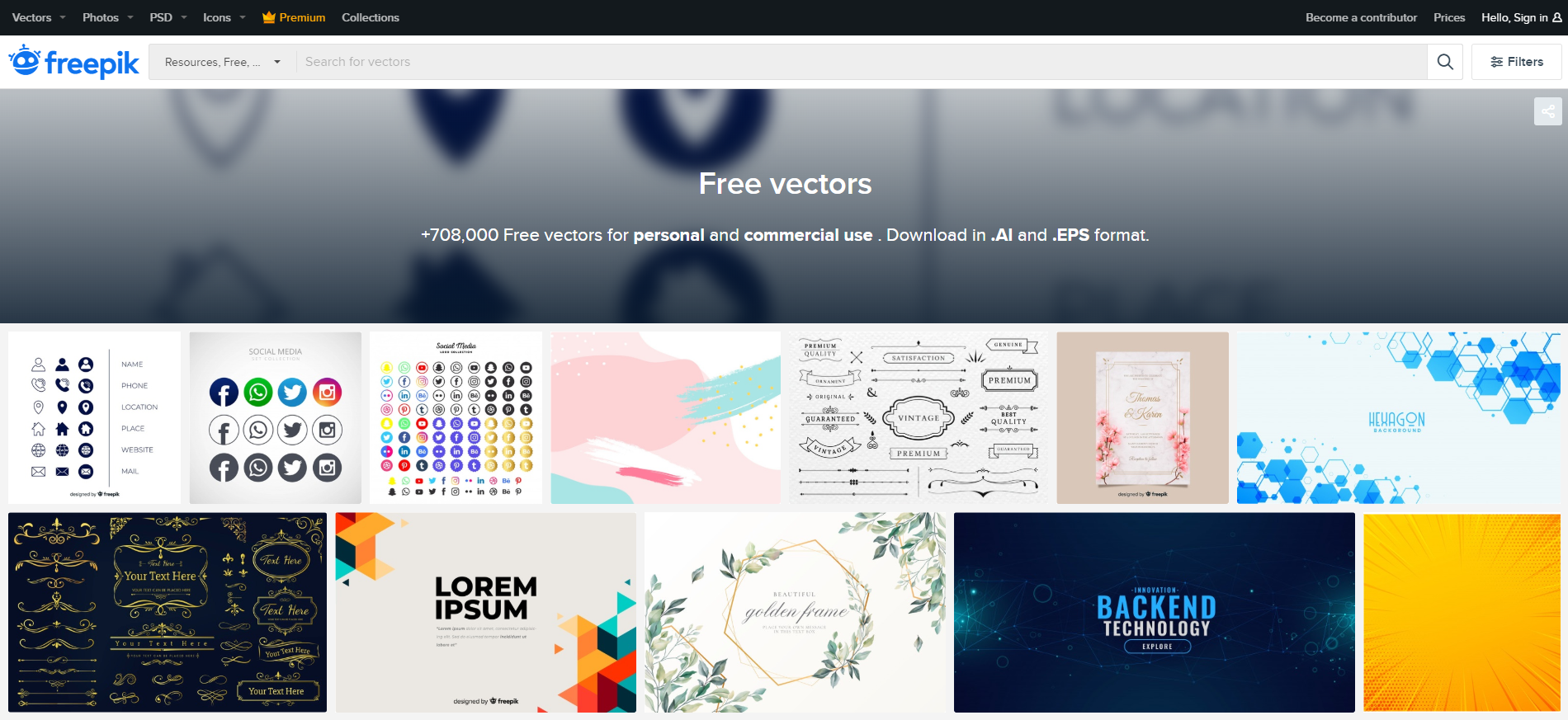
Freepik has over 708,000 free vectors for you to use for personal use and also for commercial use. The styles vary as far as feminine and elegant-looking invitations to vectors that are perfect for backend technology promotion. You’ll find every style you could need here, and you can download everything in .Ai and .EPS formats.

Free Vector

free_vector interface

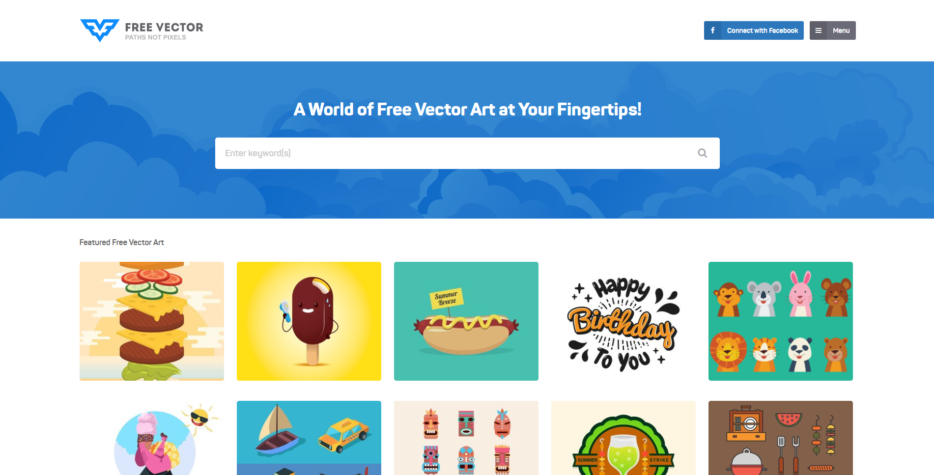
Free Vector is full of fun and colorful cartoonish vectors. They are basically a world full of free vector art that is simply at your fingertips. Type in your keywords in the search bar to find vectors that suit your style, or scroll to the end of the page and find tons of categories to browse through.

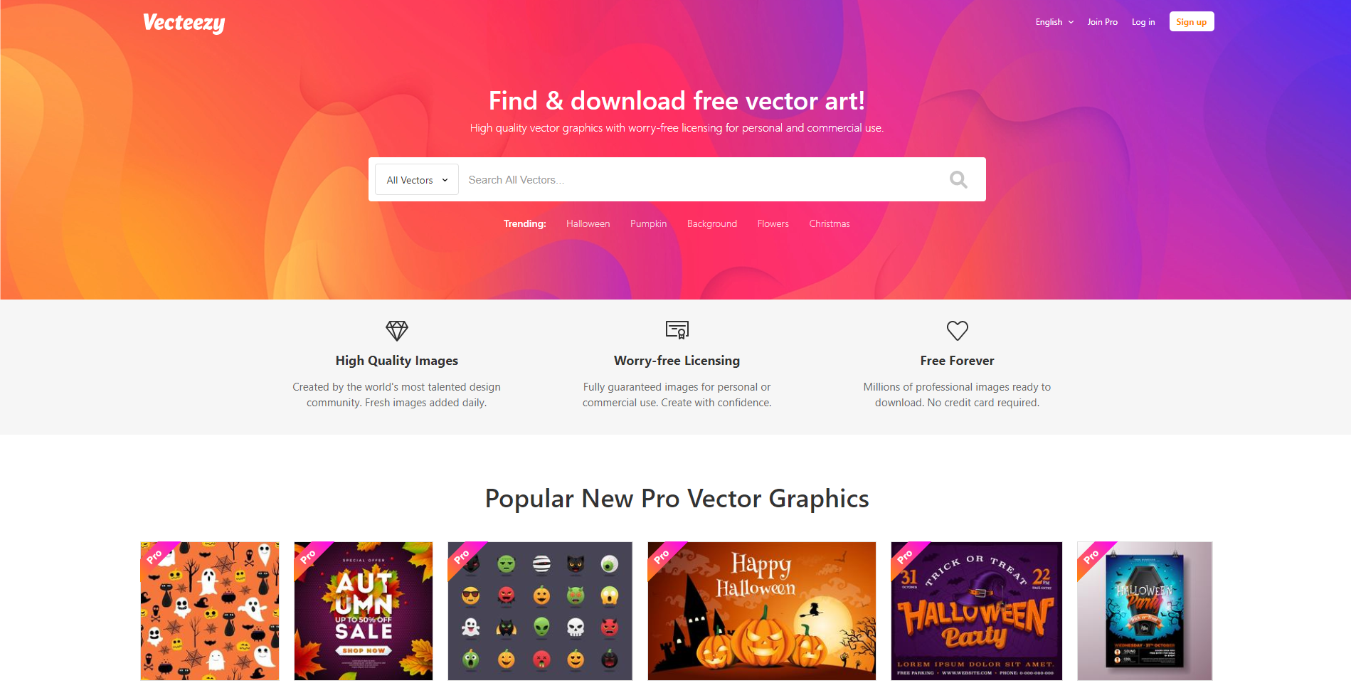
Vecteezy

vecteezy free vectors graphic design

Vecteezy has thousands of gorgeous vector art for you to use. Everything is copyright free, so you never have to worry about that. There are tons of free vectors for you to use, or you can upgrade your account to a pro account and have access to everything at your fingertips. 

Flat Icon

free vector website

Flat Icon is the largest database of free icons that are available in PNG, SVG, EPS, PSD, and BASE 64 formats to date! With a free account, you can access thousands of free icons, or you can upgrade your account and get millions of icons for free. 

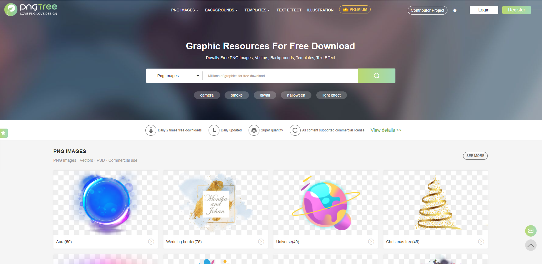
Pngtree

png tree website free vectors

Pngtree has wonderful vectors for you to choose from, and with a free account, you have access to 2 daily downloads. Get royalty-free PNG images, vectors, backgrounds, templates, and text effects from Pngtree. 

Free Mockups 

Showing real-life visuals of your work to your client is a vital selling point, and that’s one of the huge reasons that mockups are so crucially important. Here are 10 free amazing mockup websites for you to use for your next project.

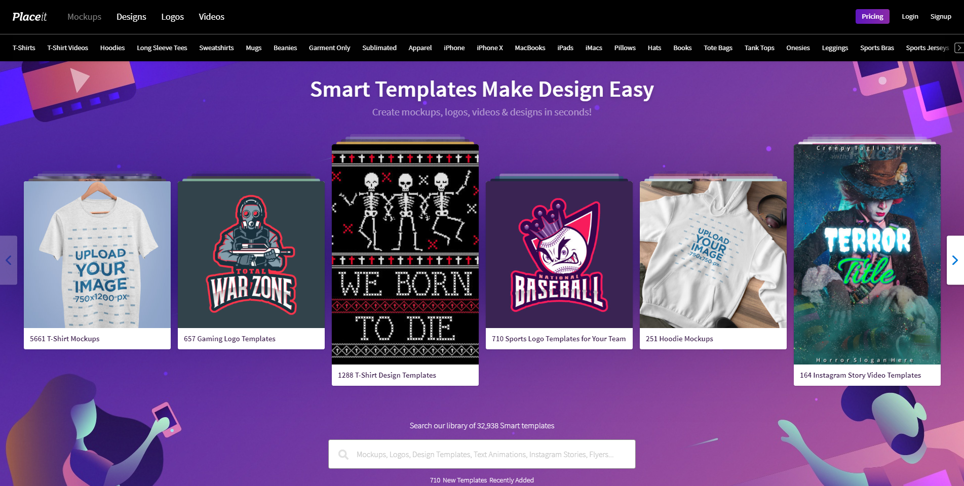
Placeit

placeit free mock up platform

Placeit is a site where you can visualize all of your designs on products within seconds. Not only can you just upload your images, but you can also make designs on the platform, and create videos. Create your own design, or try out one of their 32,938 smart templates! 

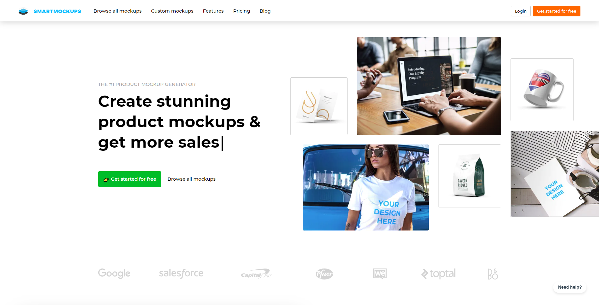
Smart Mockups

free mockups website

Smart Mockups is the fastest web-based mockup tool out there right now. It’s user-friendly in the manner that advanced designers and beginners alike can use and understand their product. You can use a free account and create 200 mockups and use basic features, or you can upgrade your account and have access to all mockups and features. 

Mockuuups

mockuuups website free mockups

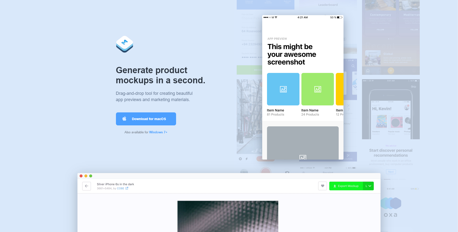
Mockuuups will generate tour product mockups in literally a second. The tool is easy to use, as it is drag-and-drop based. Download the app to your computer to start using. You can use a free account and still have access to lots of features and mockups, or you can upgrade your account to have access to everything! 

Mckups

mckups mockups website free app

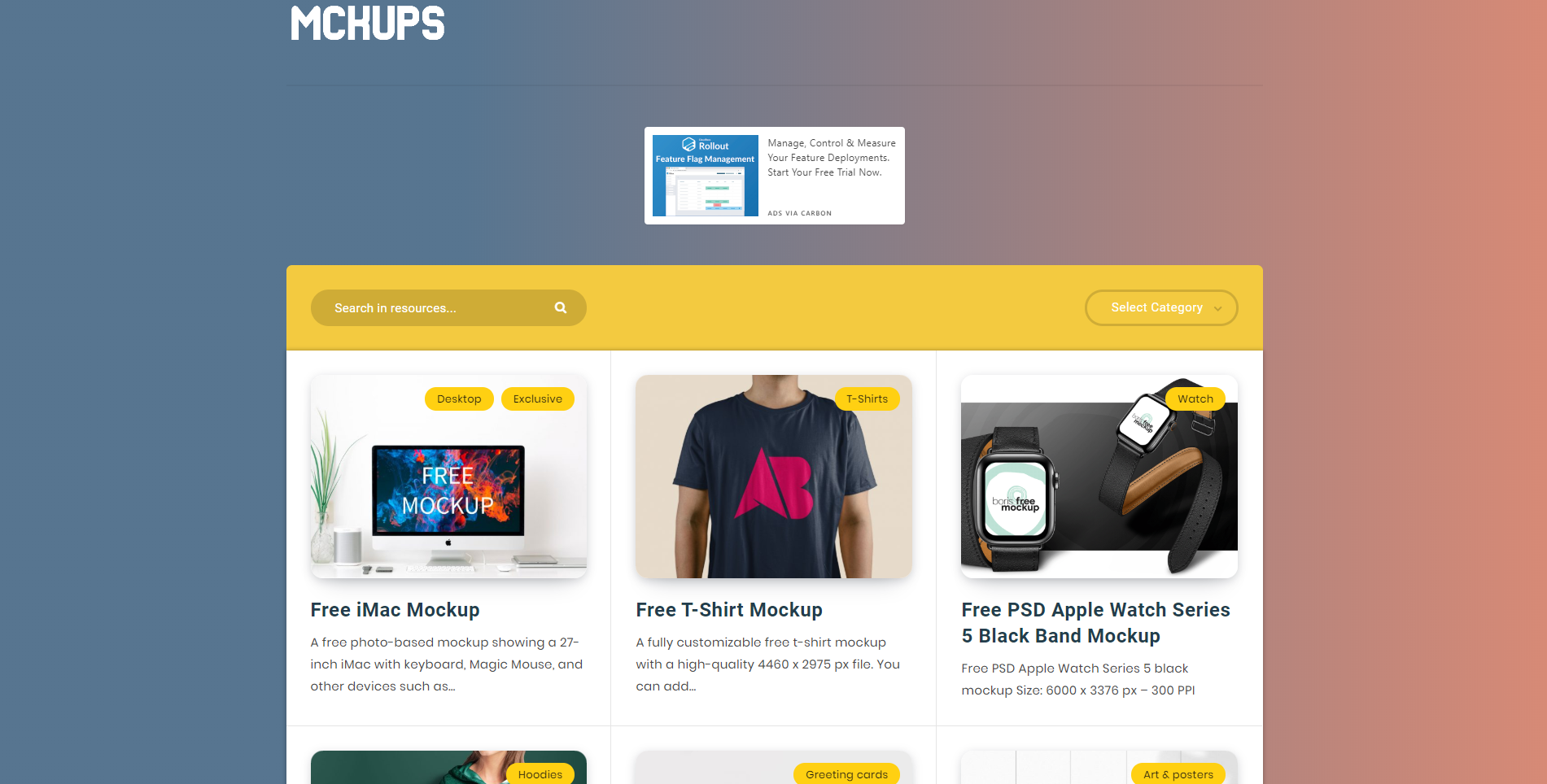
Mckups has a beautiful, minimalist interface and beautiful, free mockups for you to use. The mockups are hand-crafted by professional designers and are just waiting for you to use them. 

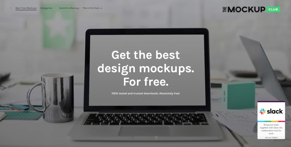
The Mockup Club

the mock up club website free mockups

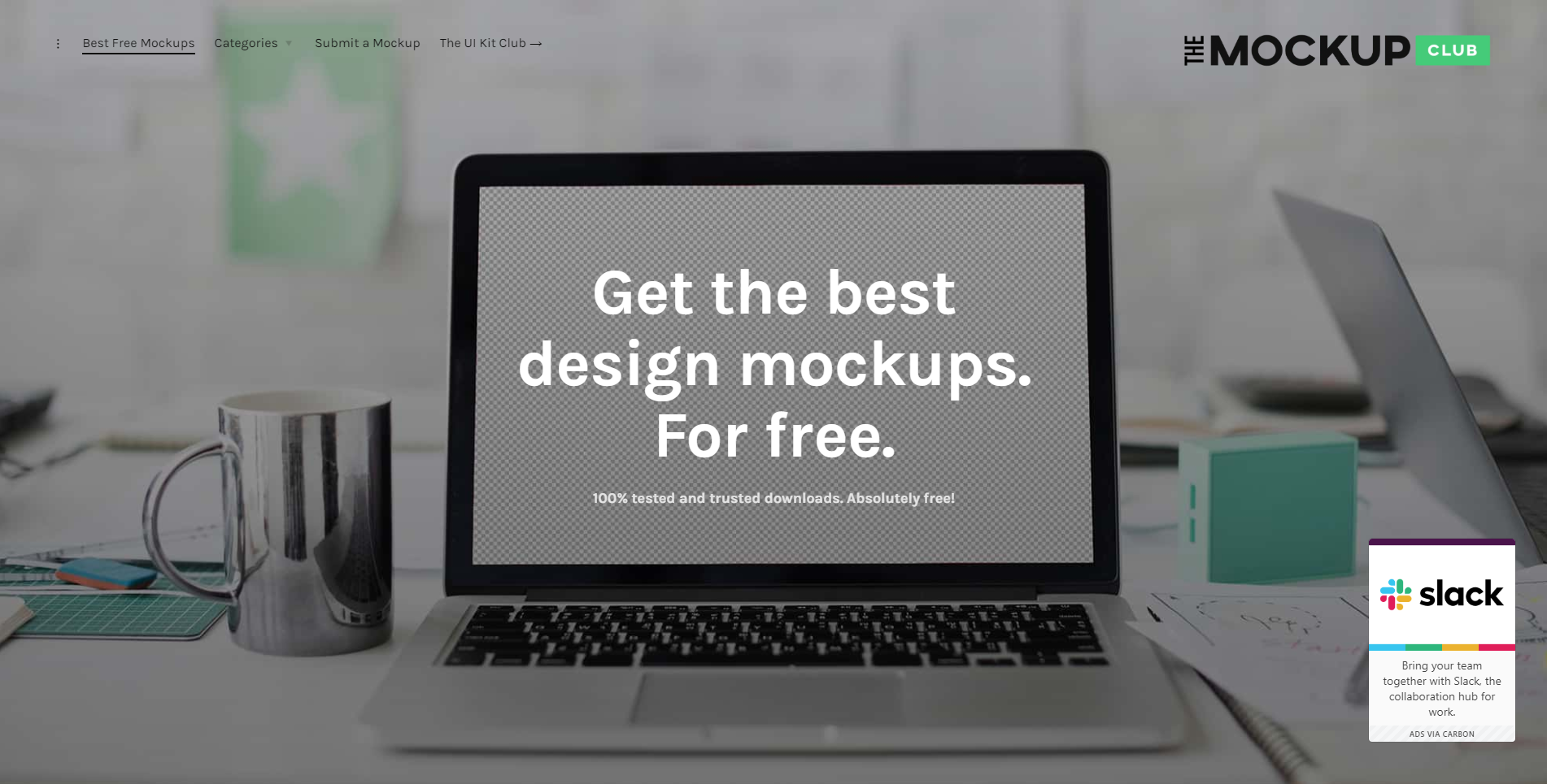
The Mockup Club is absolutely free and that might just be my favorite part. It’s a one-stop shop with loads of free mockups for you to use to showcase your lovely designs. 

Psd Repo

free psd mock up website

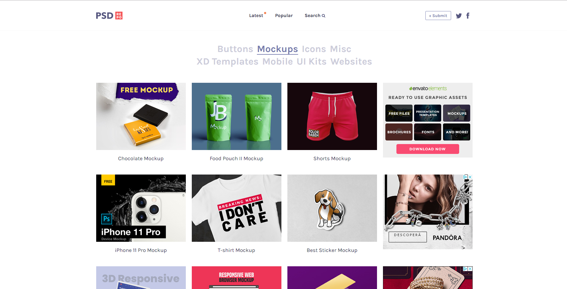
Psd Repo has every mockup imaginable. From key-chains to shorts, to t-shirts, to protein powder packaging, I think I can safely say they have it all. The mockups are made by talented designers who want to share their work with you for free. Download your favorite mockup as a PSD file and get to designing! 

Mockups Design

mockups design interface free mockup

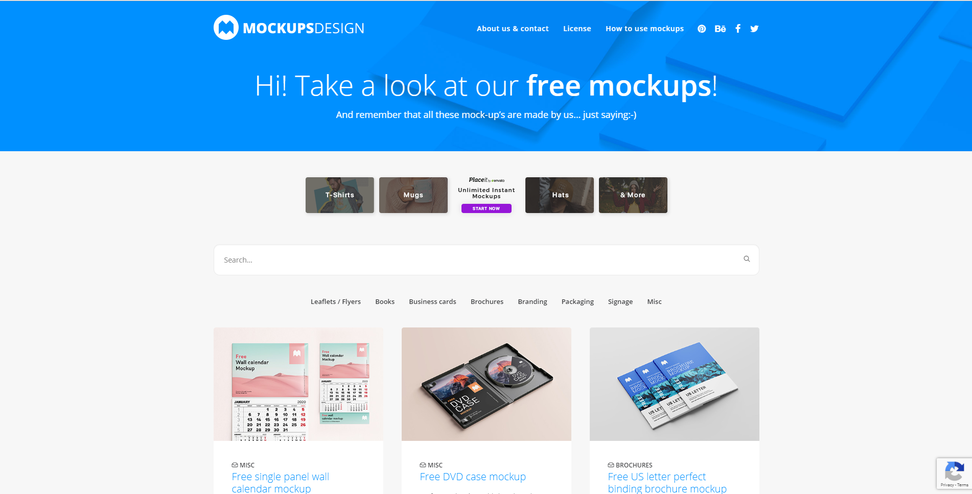
Mockups Design is an easy-to-use website where designers can find professional mockups for free to use in their next design project. From DVDs and CD to letterheads and brochures. They have lots to choose from.  

Good Mockups

good mock ups website free mock ups

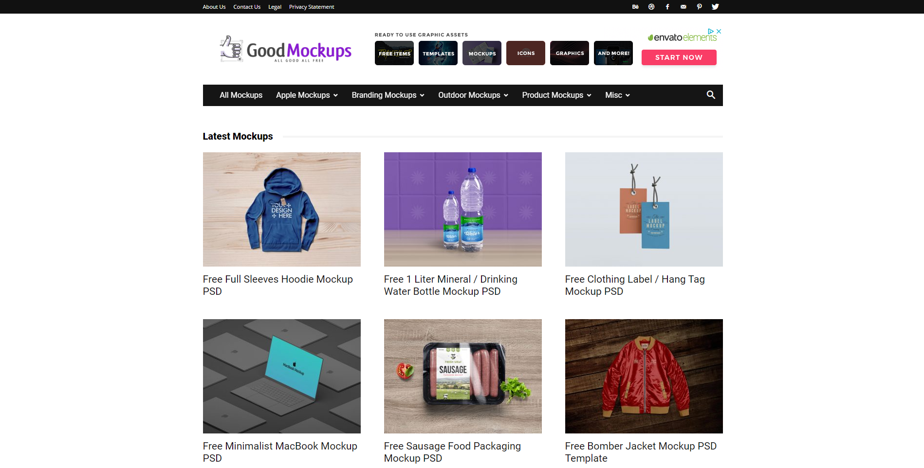
Good Mockups can be summed up about something like this: High-quality, hand-picked, premium mockups for all to use. They strive to have mockups to fit everyone and every design. With an entire list for you to go through, I believe that they are truly well worth your time. 

Mr. Mockup

mr mockups website free mockups

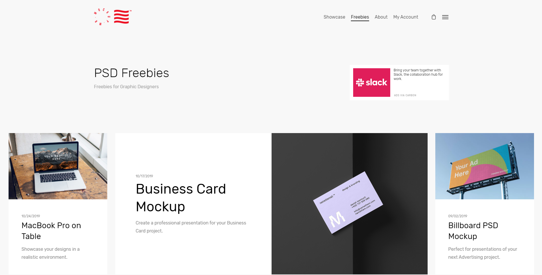
Last but not least, we have Mr. Mockup. They have a team of professional and creative designers working to mockups for everyone. With a vast experience in designing just about anything, you can count on them to find beautiful mockups for your next design project.

Wrapping up 

I hope you guys found this ultimate collection of free design resources helpful! Let us know in the comment section below what sites you’ll be using in the near future, or tell us about a website you know that you think is worth mentioning.

Until next time, 

Stay creative! 

Read More at The Ultimate Collection of Free Design Rersources

The Right Pairs of Fonts

Elegant_Hire

The Right Pairs of Fonts Are Like Peas in a Pod

pairing fonts

When fonts are matched together correctly, they really make the perfect pair. Pairs are everywhere around us – our socks, best friend, partner, peanut butter and jelly, and the list could go on. 

Thinking about fonts without thinking about font pairs is half the concept. After all, we’re all better in pairs, and there’s no exception with fonts. When a font is paired with a good partner, the original font is enhanced, and your ultimate design goal is accomplished. Let’s not get ahead of ourselves though.

The key to picking font pairs is to start with the correct font. Sounds simple, enough. When you think about choosing a font, what comes to mind? 

The style and overall design of the project, or rather, the appearance of the words? You aren’t incorrect, yet you’re also not completely correct. Choosing a font has so many layers and complexities to the process, but we’ll map it out for you. First, let’s define the goal of a font.

Change Your Mindset

Fonts are constantly advertised and viewed as just a last minute design. When changing the font for a school paper, or a company proposal, you may not put much thought into the font you change your text to. 

Elegant_Hire

Yet, fonts can add credibility to your content, make content more readable, present content for better conversions, and market your information to evoke feelings within your readers, which ultimately increases sales. 

Sometimes it’s the little changes that matter the most! The beauty and challenge with fonts are that they’re always displayed. 

Meaning, if your font is hard to read, then readers will just click away onto another website with much more readable fonts. The competition is higher than ever to get website visitors on your page and staying – don’t make your font the reason they click away. 

The Goal of the Font: Convey the Message

Although fonts do project a style and design, their main goal is to translate the marketing message. Think about it, without a font, your message wouldn’t be conveyed at all! They are the vehicle that translates the words you want your target audience to read. It doesn’t end there. A font translates much more than the physical message. 

You’re also communicating a feeling. Think about why we dress up for an interview or an important business meeting. We’re communicating an image without saying anything. That image is backed behind emotions. 

If the stakes are high like a proposal meeting, then perhaps you’d dress in business professional in order to seem credible. Think about selling a home. Why did you trust one realtor over the other to work with? 

Sometimes overdressing can separate yourself from your audience rather than associate yourself with them or seem trustworthy to your audience. If you’re aware your price range is on the lower side, you may feel intimidated and unsettled if your realtor is overdressed because they may not understand your situation.

Choosing the correct message to portray to your audience is a challenge within itself, but most likely if you have a marketing campaign, you already know this! If you’re a bank, you want to come across as trustworthy. 

If you’re a rolling skating arena, you want to appear fun. Finding it hard to see which feeling your business is trying to embody? Think of what emotions your business wouldn’t want customers to associate you with.

Serifs and Sans Serifs

pairing san serif and serif fonts

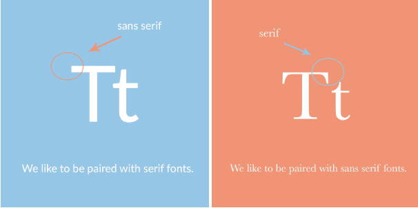
Once you’ve come up with this message, you’re halfway there. Choosing a font is merely finding a style that represents this. Be aware of the different styles of fonts like serifs and sans serif fonts. This could be an easy deciding factor that could narrow down your search! Generally, serif fonts have a traditional style. 

These are the fonts that have the little feet at the end of each character. Sans serif fonts were invented after, and are usually considered a much more modern font. These fonts, not containing the feet at the end of each character, display well on digital screens. Upon picking a serif or sans serif font, experiment with the font against your design and how the font is described online. 

pairing the right fonts

Serifs and sans serif fonts pair extremely well together because they have what the partner doesn’t! 

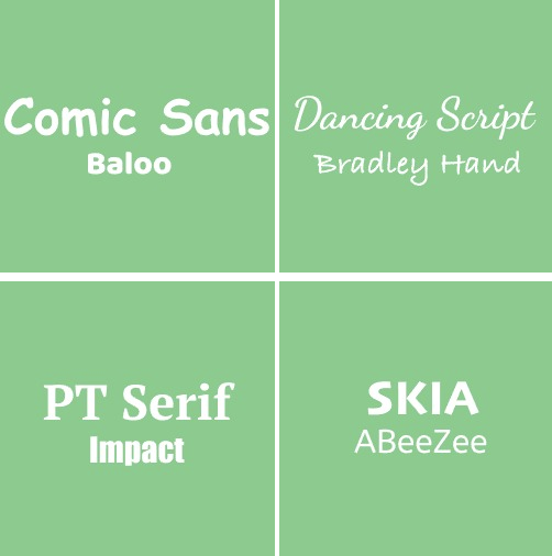
A great example of this is April Fatface and Roboto. Abril Fatface takes the spotlight, while Roboto takes a backseat, with its simple lines and versatile design. 

pairing the right fonts

Another great example is Dancing Script and Josefin Sans. Both fonts have a similar delicate design that looks handwritten. Yet, Dancing Script could only be displayed on headlines or else it would overwhelm the readers, and Josefin Sans effortlessly simple. 

Finding Your Font’s Perfect Pair

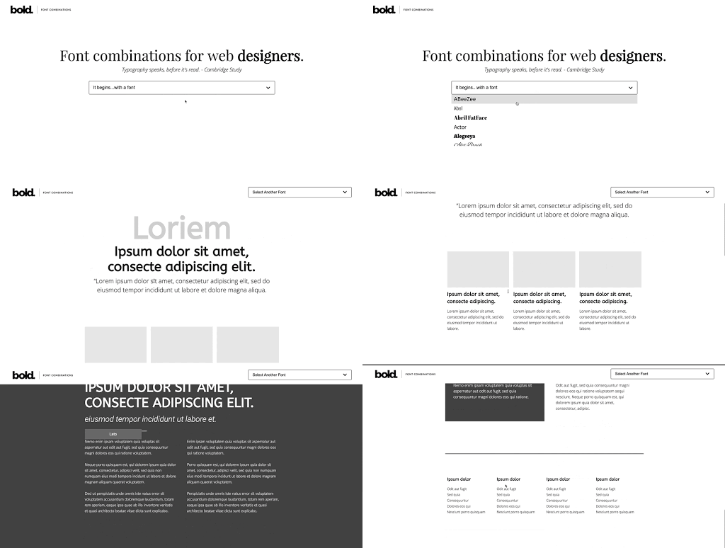
Once you’ve got a font or an idea of a font you’re looking for, it might be time to use a font combination tool. These are great because they make the pairing process much smoother. If you have no idea where to start or aren’t into design, a font combination tool, like this one by Bold Web Design Adelaide, is a great place to find inspiration or start to realize what you like and don’t like in a font. 

pairing the right fonts

Think of pairing fonts like music. There’s a melody and a harmony. One takes precedent: the melody. Without both, the music would feel incredibly empty. It may seem like the melody is more important, and it may relay the main message, but both are needed to make a song. They define each other, as without the melody the support music wouldn’t be called harmony and vice versa.

Pairing fonts is exactly like the melody and harmony in a song. One is the focal point that shines through, which I like to call the focal font. This is the font that usually has more personality, and is used for headlines or larger text. With two focal fonts, your reader would be incredibly overwhelmed when reading through your information. 

Pairing fonts is a balancing act, requiring both fonts to work together and not to take up too much attention from your readers. Secondly, both fonts have to be compatible. This relays back to your marketing messaging. You wouldn’t release a marketing campaign with one ad that’s creative and fun, and another that’s scary and serious. Ensure both fonts align with the message and emotion, and compliment each other. 

Pairing fonts is a great way to differentiate information from each other. Just as we section content within an article with headers and subheaders, different fonts can be used for the headers and paragraphs to further associate a transition within the content. 

Text that you want to stand out can be placed in a standout font, and support with a much simpler font. Even the weights of fonts within a pair can be changed, making a font bold, thin, italicized, and other variations to increase its versatility. The possibilities are truly endless. 

Play around and get familiar with the options out there. Once you’ve accomplished this, pairing fonts is a piece of cake. Your fonts will work together like a seamless song.


What Not to Do 


Don’t choose a font blindly. Picking the correct font for your business takes awareness and understanding. A font that works for another company, may not work for yours. Rather than looking at fonts as a design decision, think of it as a sales decision. 

how to pair fonts

If you’re just picking a random font from a list without much consideration, you could be throwing away potential leads to your products and services without even knowing. Within the age of digital content galore, you want to set yourself apart from the rest. 

A font is the puzzle piece to a unique brand identity and a competitive edge! Don’t put two loud fonts together. A font that definitely has a “personality” should not be paired with another font like it. 

Find a versatile font to pair with loud fonts or pair two versatile fonts together. Versatile fonts are simple and readable like Arial or Roboto. 

Conclusion 

At the end of the day, a font can always be changed if not now, later. Test different fonts and see which ones work well for your company’s design. If you’re working with print materials, print a couple of tests and get your team’s vote. 

A design is just an extension of the company, design, and culture. What better way to decide if it’s a great fit than to ask the ones that work there. When you see a good font pairing, it will seem effortless and you won’t be looking at the fonts, you’ll be reading the content. 

The fonts will balance each other out – working together to differentiate between text and information. After all, the right font pairs are like two peas in a pod. 


Read More at The Right Pairs of Fonts

5 Inspirational Designs Trends to Follow for 2019

Graphic Design trends for 2019

5 Inspirational Designs Trends to Follow for 2019


Design is all about expressing yourself through your art and showing people the beauty in simple or incredibly intricate designs. While you should always stay true to yourself and be authentically you through your designs, it is also good to stay on top of the trend game. 

Today we’re going to go over 10 design trends that we stan this year. And hopefully, always. 

We’ve got 6 months left in 2019 so we better make our designs count. 

So let’s just get right into it, shall we? 


   1. GO BOLD

 You know the saying, go bold or go home. And it rings absolutely true in design. We have two different types of “bold” that we’re going to go over in this section: bold colors and bold text.

Design trends for 2019

Source: https://www.behance.net/erikmusin

Design trends for 2019

Source: https://www.behance.net/erikmusin

Design trends for 2019

Source: https://www.behance.net/erikmusin

Design trends for 2019

Source: https://www.behance.net/erikmusin


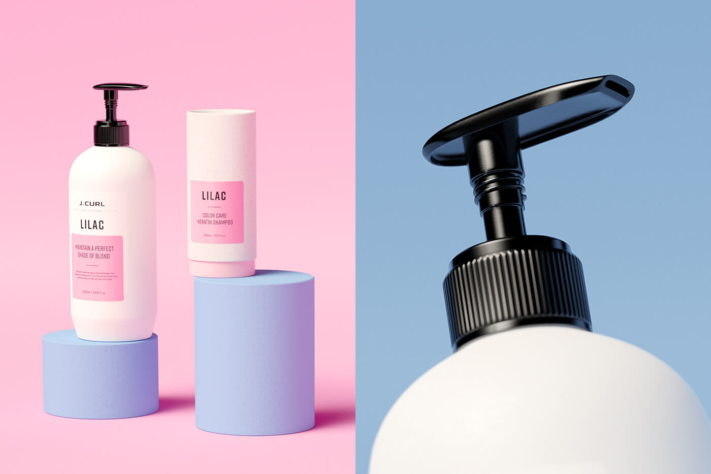
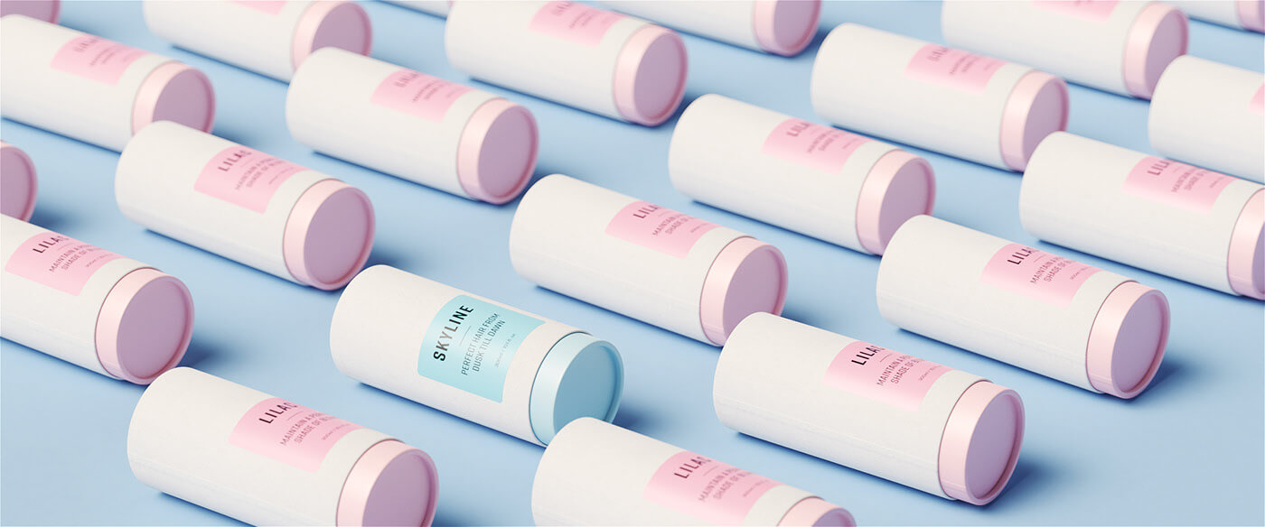
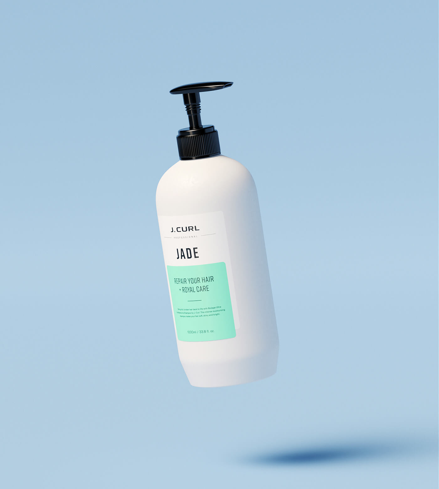
Here are some examples where minimalist background color meets bold product color. When photographing and editing a product, enhance its color by using a light, neutral color as the background. When you do this, the eye of your client will be drawn directly to your product. Make sure that the color you choose complements the product’s color and really enhances what you have to offer. This is definitely my favorite trend right now. Hats off to Erik Musen for hitting us with some sweet designs. 


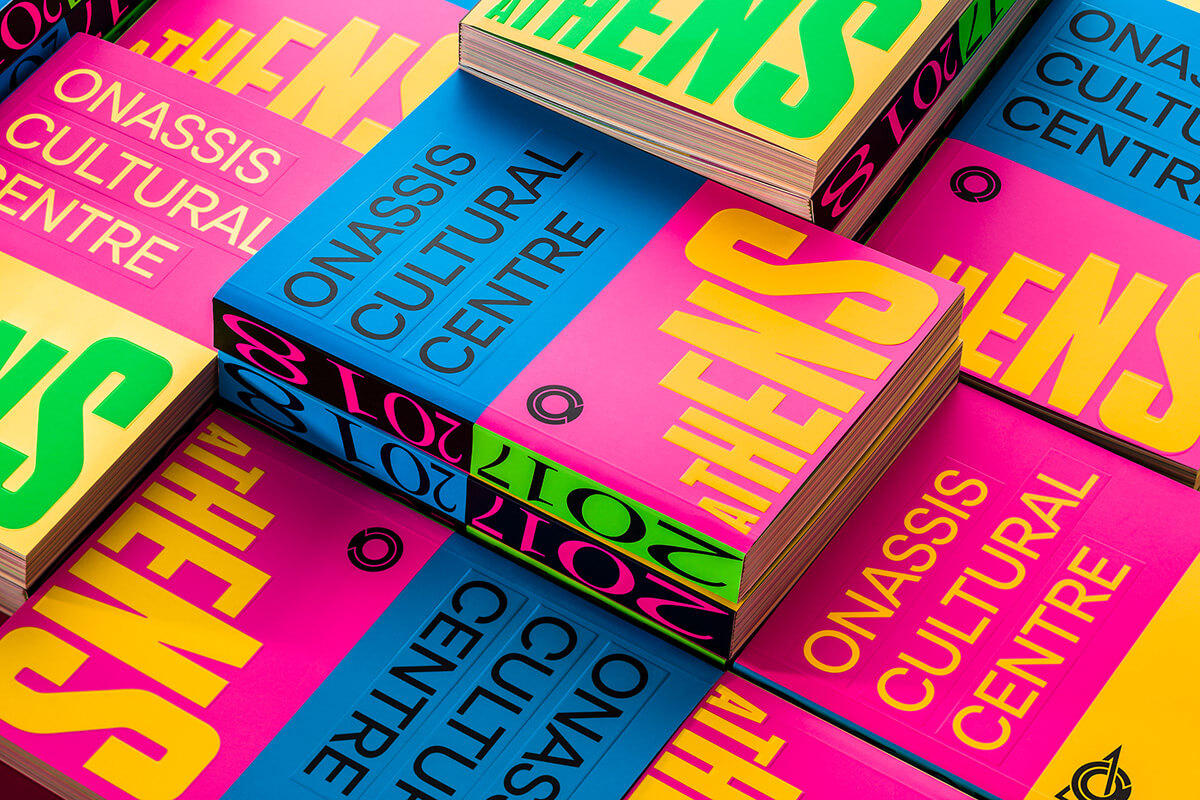
The next bold section is all about text. You have a message to share and you need to grab the attention of your readers. Do this with the same concept as with the products. Beetroot did an awesome job of using big and bold fonts to grab your attention. There’s no missing what you have to say when you use this bold technique. 

Graphic Design trends for 2019

Source: https://www.behance.net/beetrootdesign


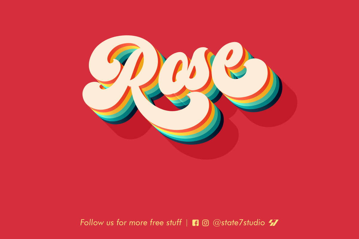
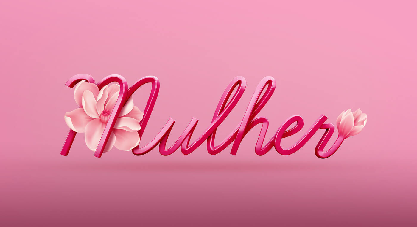
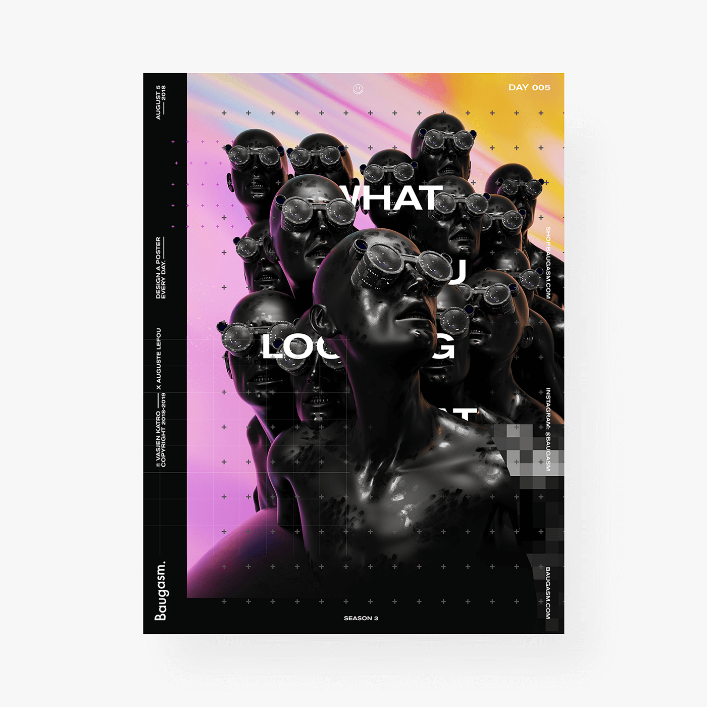
    2. 3D Design

Really stand out, literally, with a 3D design. Incorporate real-looking elements into your graphic design to make your design truly unique and eye-catching. Take these designs for example. 

Graphic Design trends for 2019

Source: https://www.behance.net/STATE7

Graphic Design trends for 2019

Source: https://www.behance.net/gallery/71276031/Mulher-3D-Type


3D design is just about everywhere right now, and as you could see above, there’s no specific font that is the set-in-stone font to use. Try out any font you’d like! A font that is skinny, bold, a sans-serif, script, or any other type of font can be rendered in 3D. Use this technique in your next project and drop the link to your portfolio in the comments below so we can check it out! 


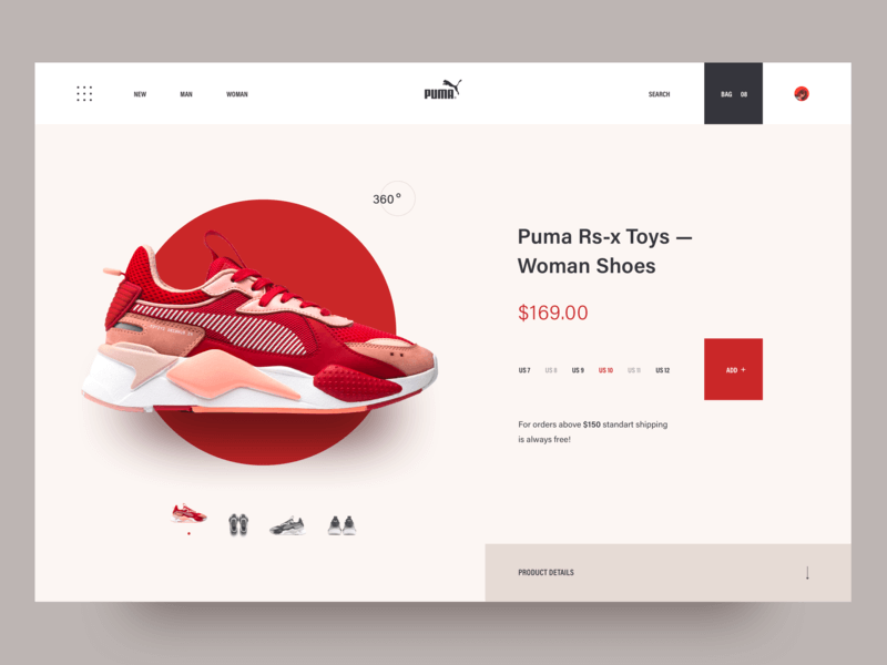
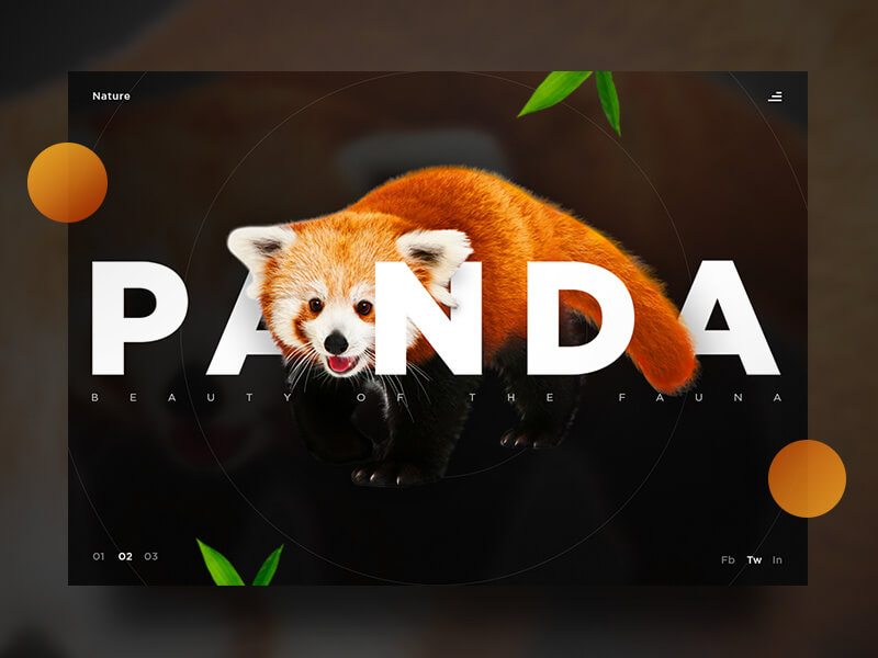
  3. Flat Design meets Realism

Another huge design trend right now is flat design combined with realism. Here are some prime examples of what I’m talking about. 

Graphic Design trends for 2019

source:https://dribbble.com/shots/5591883-Puma-sneaker-shop

Graphic Design trends for 2019

Source: https://dribbble.com/shots/4854300-Panda-UI

Graphic Design trends for 2019

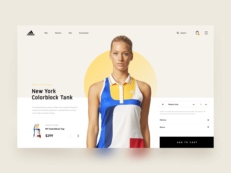
Source: https://dribbble.com/shots/3951710-Adidas-Online-Store

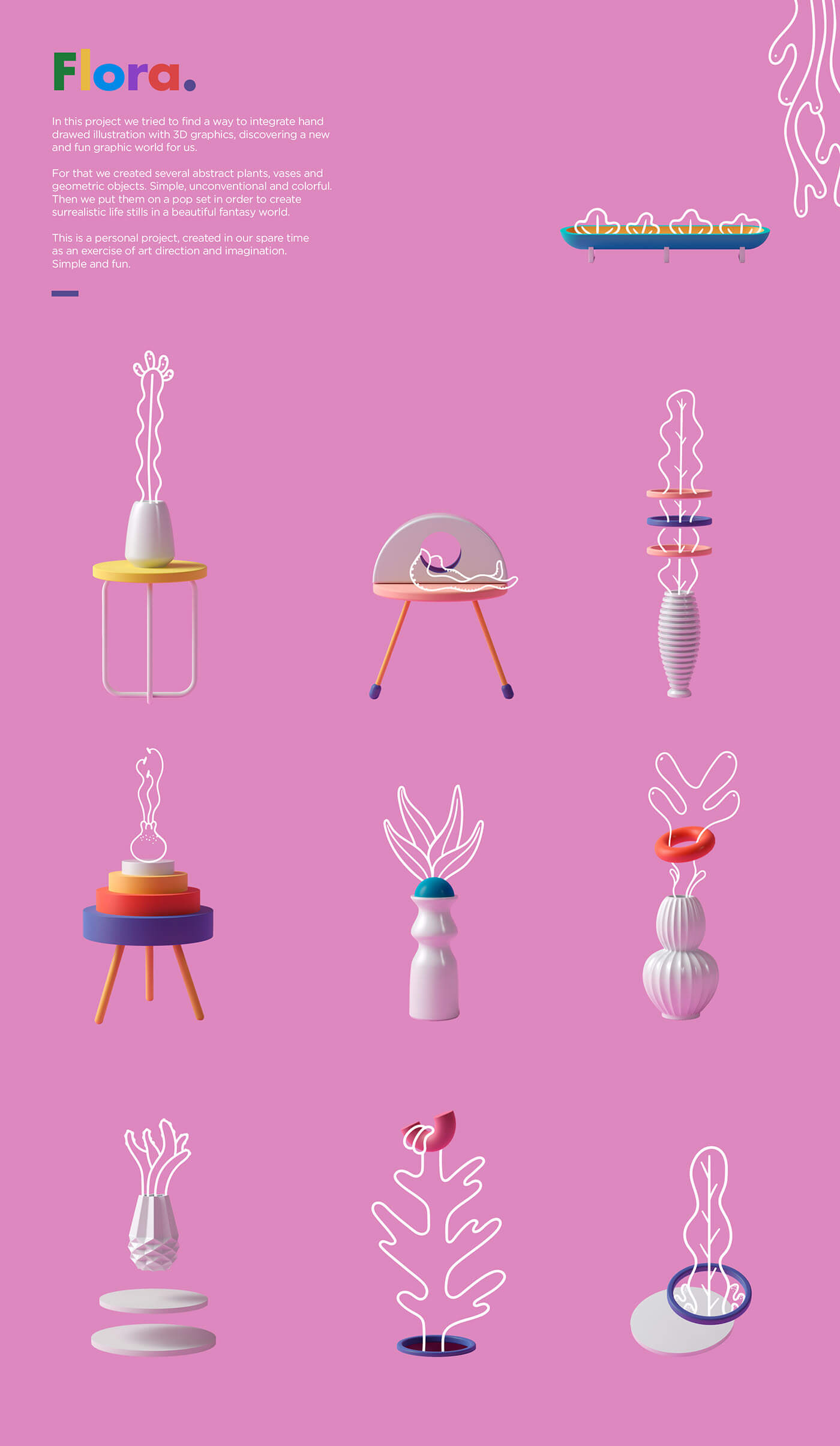
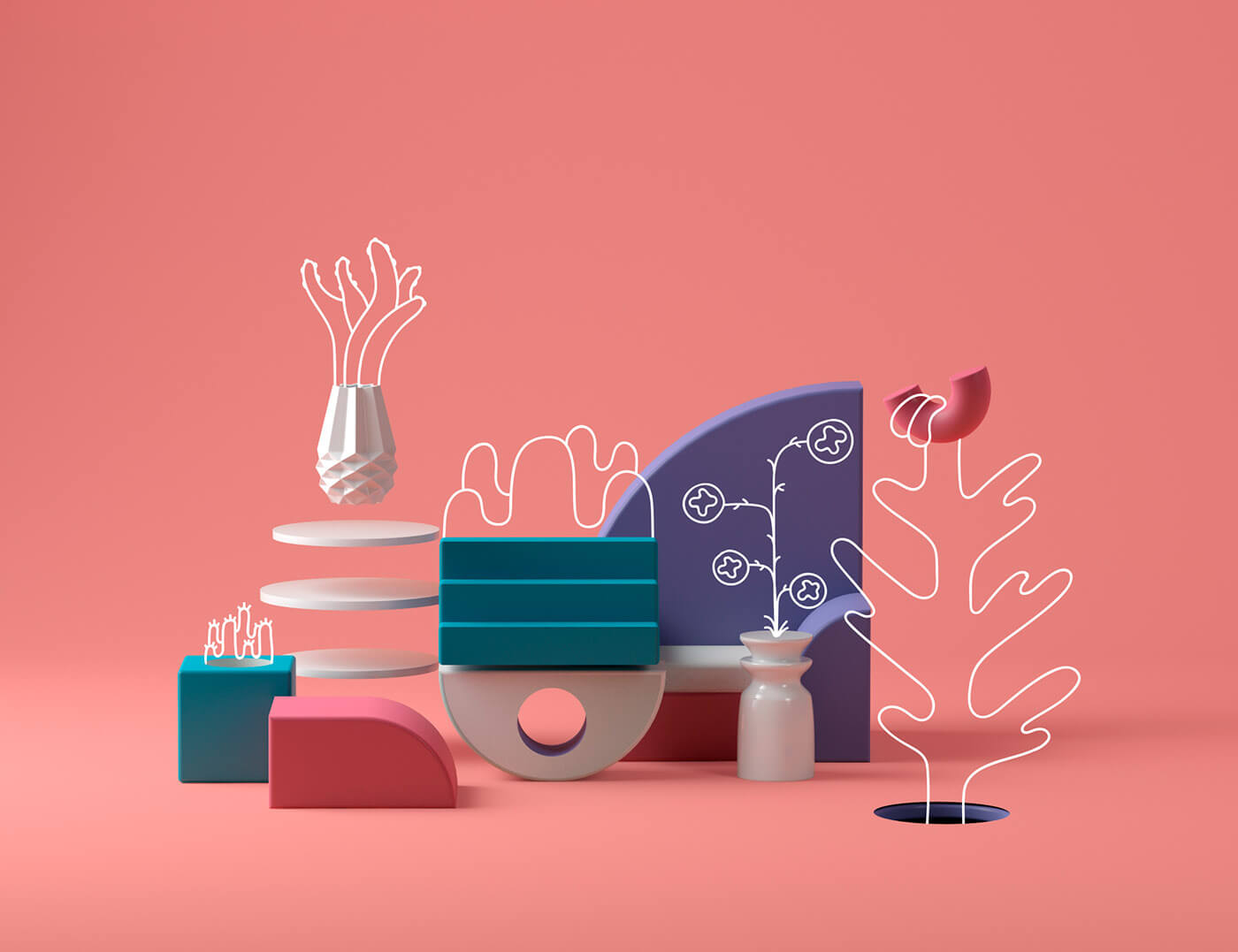
Feeding off of the 3D trend, flat design + realism is truly impressive. Two complete opposites, yet the perfect combination that gives a vibe of futuristic design. You can expect to see this trend in the E-commerce world, but not only. Add elements that look like they are floating or fly to add an aesthetic that is overall abstract. Combine 3D objects with a flat design to achieve this amazing look. 


  4. Open composition

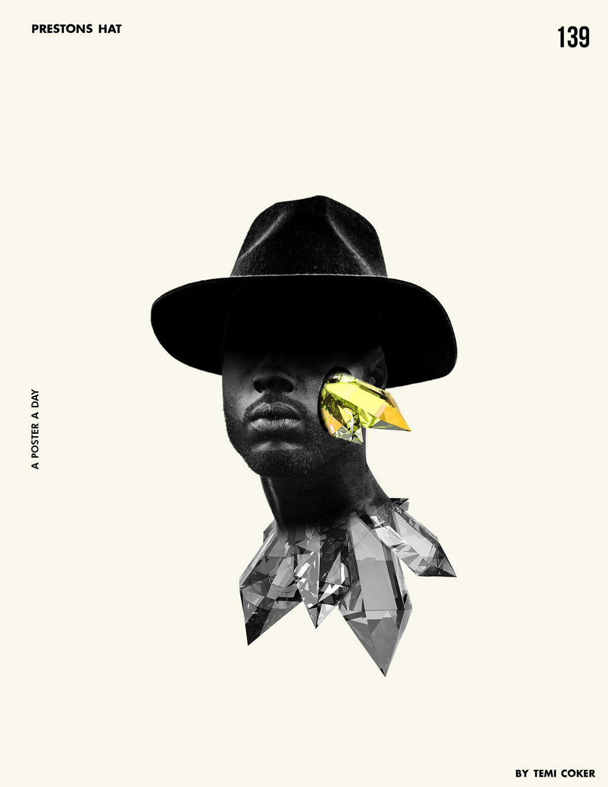
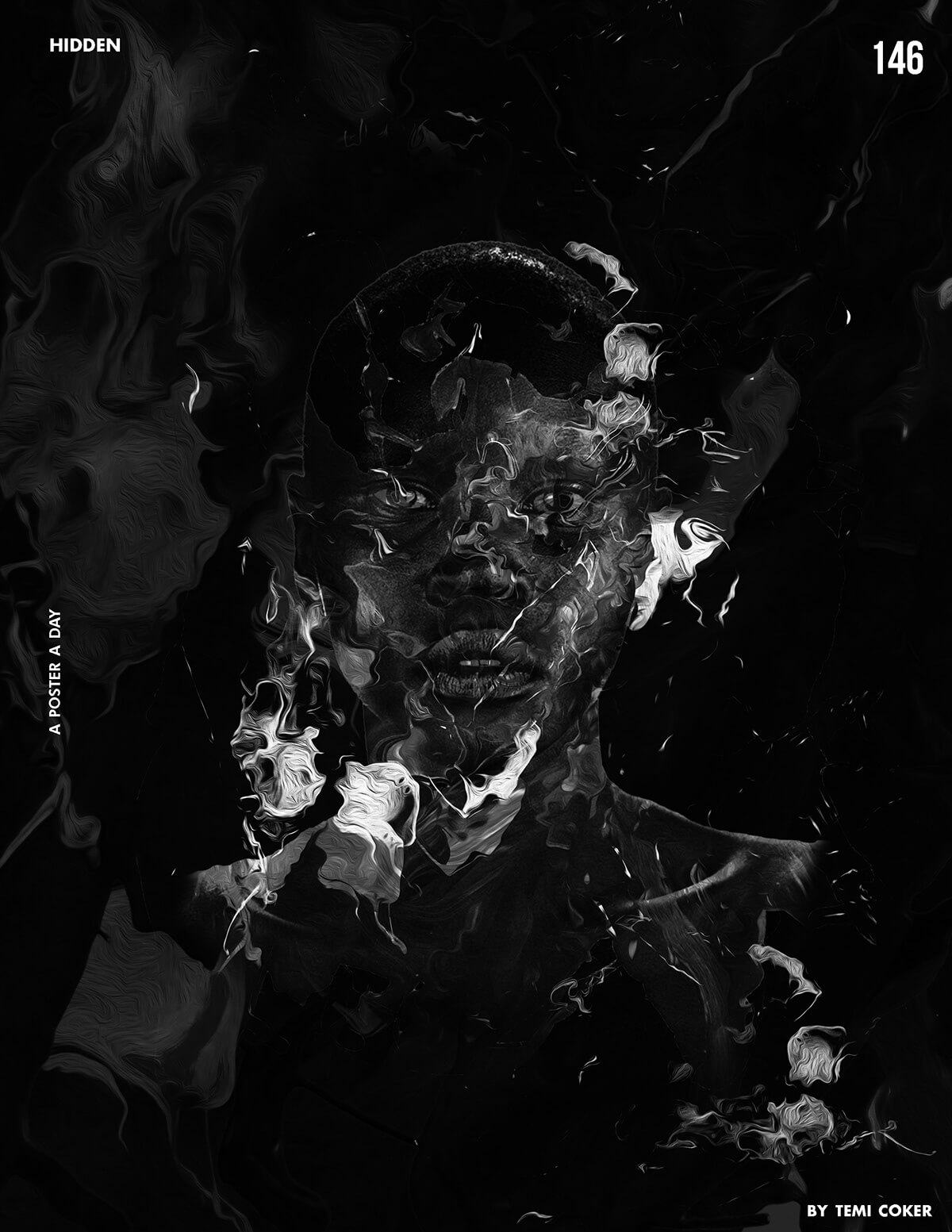
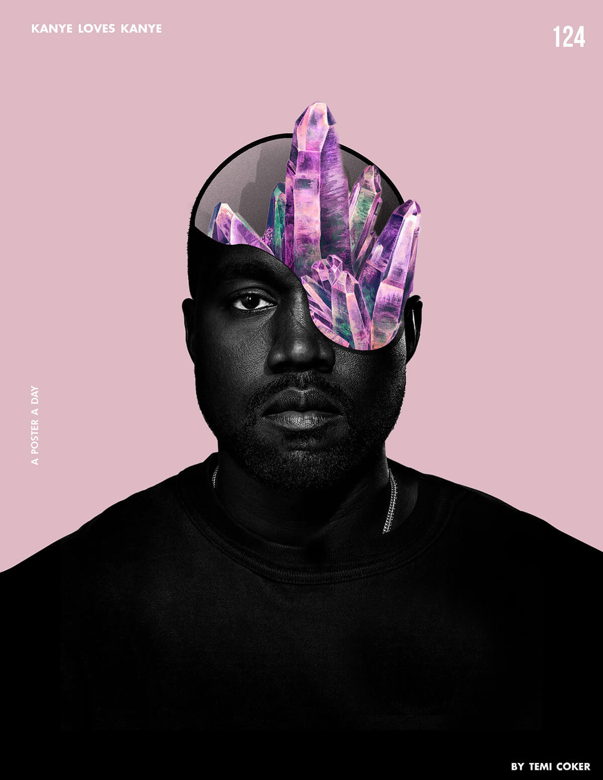
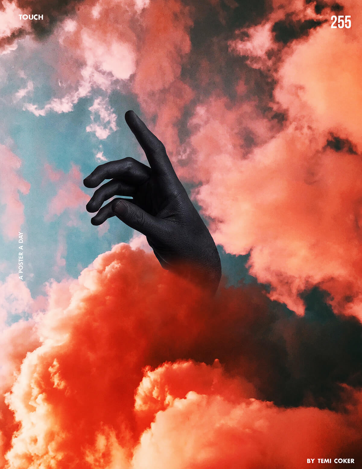
We’re taking a step back from mainstream, and a step forward in creativity. This trend exudes art. It’s chaotic, yet beautiful. For this look, the goal is to achieve a free-flowing final product. So say goodbye to a “perfect” framed finish. This trend is a combination of things: combine images with ideas. This is magic in real life. It gives people a sense that they’re just seeing a small piece of a bigger picture. The real magic of open-composition is that gives people the freedom to explore their creative side and see the deeper meaning of what the combined elements could mean. 

Graphic Design trends for 2019

Source: https://www.behance.net/temicoker

Graphic Design trends for 2019

Source: https://www.behance.net/temicoker

Graphic Design trends for 2019

Source: https://www.behance.net/temicoker

Graphic Design trends for 2019

Source: https://www.behance.net/temicoker

Graphic Design trends for 2019

Source: https://www.behance.net/temicoker

And my all-time favorite designer for this technique is Temiloluwa Coker.  Check out his work on Behance. All the images above are all his.


  5. Electrified

I’m about to end this article with a bang. Maybe this trend is actually my favorite. 

Graphic Design trends for 2019

Source: https://www.behance.net/cristianmg

Graphic Design trends for 2019

Source: https://www.behance.net/cristianmg

Graphic Design trends for 2019

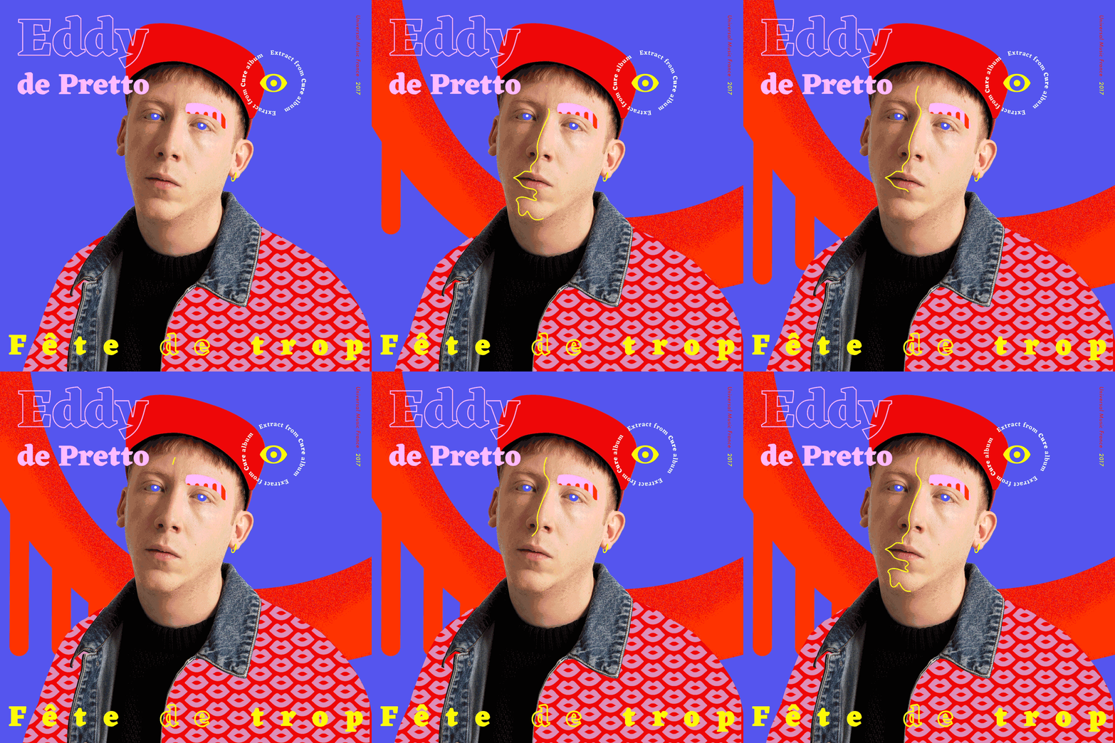
Source: https://www.behance.net/gallery/66723565/FETE-DE-TROP-__-Eddy-de-Pretto

Graphic Design trends for 2019

Source: https://www.inspirationde.com/image/85051/


One of my favorite things about social media today is that we’re all pushing for authenticity and being real. There’s no excuse for designers. In this technique, designers are encouraged to let their inner-creator out by drawing, writing, doodling, splashing, and using unique brush strokes and color stains. Imperfections and mistakes are embraced in this trend because there’s absolutely no right or wrong in this style. And I think that’s why I love it so much.


Sadly, our time has come to an end…


But no worries, we’ll be back soon! 

Let us know in the comments below what your favorite design trend was in this article, and if you have any other favorite design trends we didn’t cover, mention those down below as well. 

Drop your portfolio down in the comments for us designers to support each other. 

Until next time, 

Be kind and stay positive.

Read More at 5 Inspirational Designs Trends to Follow for 2019

When to use Photoshop, Illustrator, InDesign? And what are they for?

Photoshop, Illustrator, InDesign

Pretty often people post questions online asking “What is your favorite program: Photoshop, Illustrator, or InDesign?”

The truth is that, for a graphic designer, all three of them are equally essential and necessary to know and work with.

In fact, each of these 3 tools plays a specific role. Each one is built with well-defined functions that make it more suitable for a certain job than the others. Let’s be honest, too many designers out there believe that they can do everything and anything in Photoshop. There are too many designers who rely on a single tool, rather than exploring their options.

So why is this industry filled to the brim with designers that believe they can do anything and everything in Photoshop? Let’s dig a little deeper.

Why are there people who “create” logos on InDesign?

Quick answer: Because mainly there is a problem of education and knowledge of this software. Precisely for this reason, I decided to write this article. Which, for some, may be trivial and full of obviousness while, for others, it may be what they have been looking for for some time.

So get ready, leave … go!

Photoshop, and Illustrator, and InDesign

As mentioned before, each of these 3 softwares are used to work in different fields and to achieve different goals.

To sum it up broadly:

Photoshop is a digital image editing and editing program;

Illustrator serves instead to work with vector graphics;

Finally, InDesign is a layout program.

You have to learn to consider these softwares (as well as all software in general) as a potential tool that you may need to use.

Think of it like a hairdresser with the razor, the scissors, and the comb. There are 3 different things, which are used according to the different needs of the job and which are often used together.

Just like a hairdresser would never use a razor to cut split ends, so a designer doesn’t use Illustrator to edit photos.

And so you can use scissors and comb together to cut hair more efficiently, so you can use, for example, Illustrator and InDesign together to work on the layout of a catalog.

Let’s see, then, in more detail, what they are for and what can be done with Photoshop, Illustrator, and InDesign.

What is Photoshop and what is it for?

Photoshop, Illustrator, InDesign

Photoshop, created in 1990 and often abbreviated as ” Ps “, is probably one of the most famous programs in the world. Not only among those in graphic design, but pretty much the entire planet.

What is Photoshop for? Well, as the name implies (photo), it serves to work with photographs. It is, in fact, the most widely used photo editing program in the world.

Photoshop serves to modify, create and retouch “raster” images, ie those images based on pixels. In this article, I explain well the difference between raster and vector.

Over the years, update after update, it has also become one of the most advanced graphics programs, as well as photography. A program that designers and artists use to draw, sketch and even make digital paintings.

The key aspect of Photoshop (and which guaranteed its initial success) is its layered structure, which allows you to add changes to the overall image without affecting the original image.

When to use Photoshop (photo editing, drawing, mockup, etc.)

Today Photoshop is one of the most widely used software in the world to do anything. In reality, it is good to use it mainly in these situations:

  • When you want to retouch photos.
  • Correct colors, combine multiple images together, remove pimples or red eyes from a photographed person but also many, many extremely advanced techniques. Photoshop is the photo editing program of any kind. Use Photoshop for any type of work that requires editing or manipulating a raster image.
  • To modify and/or create illustrations and digital paintings.
  • Some of the greatest contemporary artists are digital artists and Photoshop is certainly one of the most suitable software for “painting on screen”. Maybe using a graphics tablet.
  • To create images for the web (banners, social media images, etc.).

The mockups are basically those simulations of existing products. They are used, for example, to try to apply a logo to different real elements. The process of creating or customizing a photographic mockup is based precisely on the use of software such as Photoshop.

Here, we say that this is a limit case in which you can use both Photoshop and Illustrator. However, if you need to work with photographs or raster images to create these images, then surely Ps can help you.

When NOT to use Photoshop

DO NOT use Photoshop to create a logo. Use Illustrator. A logo needs to be scalable and used in any size. It must be printed on posters and t-shirts, used on a website and engraved in wood, as needed. Thus, it needs to be vector and to be built into a vector graphics program, like Illustrator.

DO NOT even use it to create things that will need to be printed. That is, obviously raster images and photographs are fine. But don’t use Photoshop to create, for example, a flyer. For those cases use InDesign or, at least, Illustrator.

Finally, DO NOT use Photoshop when you use a lot of text within a file. In those cases, use InDesign again or, at most, Illustrator. This is because Photoshop does not handle long texts well, such as paragraphs or columns of text. While the other two software has advanced text management functions.

What is Adobe Illustrator and what is it for?

Photoshop, Illustrator, InDesign

The Illustrator software, often abbreviated as Ai, was initially created in 1986 by PostScript, one of the pioneering companies in the field of digital graphics.

It was born as vector drawing software and today it is by far the vector graphics software, that is the graphic that works with vector images, most used.

The vector images are those images based, precisely, on the carriers (rather than on the pixels) and can, therefore, be scaled indefinitely without suffering any loss of quality or definition.

Being a vector graphics software, Illustrator should be used in all those situations where you are working with vector graphics. Illustrator is then used by designers, artists, illustrators, and graphic designers.

Having a logo in vector format is absolutely necessary, given the many supports on which it must be able to be printed, from letterhead to business card, from posters to advertising on TV.

To create a vector illustration. And that is, in practice, an illustration made entirely on the computer and composed only of vector elements.

When NOT to use Illustrator

DO NOT use Illustrator when you need to edit images (we’ve seen it, that’s what Photoshop is for.) DO NOT use Ai when creating multi-page documents.

Of course, on Illustrator there is the multi-page function but it should not be used to design complex things like books, magazines or catalogs. For that, in fact, there is InDesign.

What is Adobe InDesign and what is it for?

Photoshop, Illustrator, InDesign

Adobe InDesign, often abbreviated Id, was created from 1999 by Adobe as a competitor to QuarkXPress. It is the software designed for editorial graphics and, therefore, for the design of magazines, books, newspapers, posters, and brochures.

In practice, any graphics project that requires the use of long texts should be processed and designed with InDesign.

As for the texts, for example, it allows you to create text and paragraph styles, manage margins and columns in an advanced way and work precisely on every single aspect of the text.

In addition, InDesign allows you to create master pages, ie page templates to be applied to each page of the projector to some pages. You can number the pages, customize every single aspect of your document, manage the pages in an advanced and professional way.

A graphic designer who does not know how to use InDesign simply does not have a complete education.

When to use InDesign

In any situation where you deal with multi-page documents and editorial graphics. Catalogs, books, brochures, magazines, newspapers, etc – all these are those types of work that are mainly carried out with InDesign. Of course, maybe the images or graphic elements to be included in these documents can be created with Photoshop or Illustrator, but they must then be “put together” in a single document with InDesign.

When NOT to use InDesign

DO NOT use InDesign when you need to work on smaller files, such as flyers with one or two sides or business cards. Illustrator is very good for that kind of work. Of course, you can also do it with ID, there’s nothing wrong with it, but you will complicate your life.

Conclusion

In most of the Graphic Design jobs that you will face during your career, you will need to use these 3 softwares together, depending on the stages of your work. For example, to create a magazine, you can create the magazine’s logo in Illustrator, edit the photos you want to insert into the document with Photoshop and then lay out everything with InDesign.

The important thing to remember, when dealing with software and learning it, is that the software is just a tool to help you design better. Then learn to use the right tool depending on the type of lens you want to achieve.
Read More at When to use Photoshop, Illustrator, InDesign? And what are they for?