Data visualization is becoming more important as metrics are needed for everything from customer conversions to the current bounce rate. Data visualization allows for data to be organized in an easier to understand format. The wide variety of graphs and charting styles allows for any problem to be solved and any kind of data to be charted. […]
If you’re like me, you love your tees. It’s all about the comfort and casual style when it comes to the hip t-shirt designs that are out there today. Everyone wants to walk down the street and have peoples’ heads turn and envy their newest tee. In this post, you will see some amazingly designed...
Qi Theme is a free WordPress theme created by Qode Interactive – an award-winning studio. This theme perfectly combines top speed and performance with a beautiful design.
It comes with 100 demos, allowing you to easily set up any type of website, whether it’s an online store, an artist’s portfolio, or a simple blog. If you can think it up, this theme will help you build it – it will even grant you free access to premium stock photos.
Qi Theme is fully supported by video tutorials as well as an extensive knowledge base, so you’ll always have a place to look for help.
When building a new website, one of the very first decisions you’ll need to make is:
What kind of visual style do you want to use?
Does the practical and realistic nature of photographs fit well with your brand? Or does it make more sense to turn to a more abstract and creative approach and use illustrations instead?
If you decide that you want to take the illustrative approach, keep in mind that it comes in many different forms. As a result, a very different style and story can be depicted from illustrated website to illustrated website.
This is something we’ve accounted for when creating our pre-built sites for BeTheme. We wanted to reflect a wide array of illustration styles so our customers not only get to see how diverse this visual style is, but also have a robust source of inspiration for their own designs.
We’re not alone. There are many great websites out there that creatively use illustrations. And, today, we’re going to take a look at a number of them as we explore the seven reasons why you may want to use illustrations to style a website:
1. When a photograph can’t fully capture a complicated subject
If you’ve ever tried to find a photo for a brand and struggled to pick out something that accurately reflected who they were or what they did, it’s probably because the subject was too difficult to capture.
That can mean any number of things.
It could mean that the subject itself is too difficult to photograph. Copywriters are a good example of this. While they could get someone to photograph them while typing away on their computer, there’s nothing very exciting about that. A photograph would simply capture the mundane task of writing, which is what the client would be trying to avoid.
If you take a look at the BeCopywriter 2 pre-built site, you’ll see that an illustrative style is a much better way to approach this:
The design is striking. The words are powerful. And the illustrative touches add a unique touch to the overall look.
There are other kinds of websites that would be better off with illustrations if their subjects are too complicated to capture. Take, for instance, a recycling services company like WeRecycle:
While it’s possible to pick out images or take real-life photos of recycling, that doesn’t fully capture what this company does. Rather than focus on individual scraps of trash, illustrations enable companies like these to give website visitors the full scope of what they do.
It’s a much more powerful image, to say the least.
2. When a brand has a unique look that requires a unique approach
Every brand has its own style and personality. Without a unique edge, it would be hard for consumers to differentiate between similar solutions.
That said, some companies have styles that are way out there, which means that some of the traditional rules of web design can get thrown out the window.
One way we see this happening is when photographs and illustrations blend. This allows a brand with a surreal, edgy, imaginative, or whimsical look to leverage the traditional elements of design while shaking things up.
For example, this is how the BeFoodTruck pre-built site handles it:
The illustrations are a unique choice for a business in the food industry, which would instantly make this site a standout. That said, without real photos of food, it would be difficult to convince customers to dine in or out.
That’s why the balance between the two styles works so well.
Handwrytten is a website that uses a similar balance between real photos and eye-catching illustrations:
In this case, the illustrations are animated, which gives the homepage yet another unique twist. This concept alone is already quite innovative and now they have a site to match it.
3. When a company wants to stand out from photo-strewn sites
When it comes to certain industries, the expectation is that their websites will have a similar look to them.
Take the travel and hospitality industries, for instance. Because they’re in the business of selling in-person experiences — or telling stories about them — you’d figure that photos are the only option for those websites.
But if your website is trying to compete amongst an endless supply of lookalike companies, using illustrations may be the thing that sets them apart.
Although the site isn’t complete devoid of photos, the majority of it is designed with illustrations or illustrative touches.
Bateau Mon Paris is a boat rental company in France that takes a similar approach:
You can see the peekaboo photo poking out there, but, for the most part, this website’s main visual style is illustration.
4. When a new company wants to leverage the style of a brand that consumers already trust
You see this quite often when brand new companies enter high-risk spaces. They design their branding and website to be reminiscent of a well-established company that customers already trust.
That way, there’s an unconscious association in prospects’ minds between the two companies and it eases the concerns and doubts that often arise when working with a new company.
One such company’s website that became the standard for other software companies entering the space is Stripe:
Stripe’s illustrative style (as well as its choice to use gradients) has been copied for years. And it’s been a good look to emulate.
Our BePay 2 site takes the trust-building elements that we see in Stripe and puts a unique spin on them:
The site is designed using illustrations, including the mobile application images. The color blue is also prevalent, which is a color that’s symbolic of stability and trust.
5. When a creator has an interesting story and work to share
Although you’ll find some design agencies and web developers who use photos of themselves and their teams on their websites, many times creative types use illustrations instead.
One reason why they go this route is because it’s another way to flex their creative muscles and to show prospective clients what they can do.
Another reason takes us back to point #1 in this post. Unless they have a large team and an interesting-looking studio they work from, photos aren’t going to be the most exciting way to capture what it is they do.
The BeBand 5 pre-built site, for example, uses illustrations and animations to give its site an 80s-style look.
Unless band members are in the habit of dressing up like rockers from the 80s, photos wouldn’t accurately capture the style of music the band plays. But this unique illustrative style certainly does and also proves useful in drawing attention over to their music.
Artist Polly Kole has taken a unique approach to building an illustrative website:
In addition to the dramatic and intriguing look of the site, it’s interactive too. It’s almost as though the site emulates the experience of going to look at art (maybe not the interacting part, but being able to walk around it).
6. When a company is selling a smart app or resource
Companies that sell “smart” tools to users commonly design their websites with illustrations instead of photographs. And it makes a lot of sense.
For one, these companies aren’t really selling the product itself. While the experience inside an app or using a device matters, what they’re selling on a website is a solution to the users’ problems which often involves managing a lot of data. That’s not an easy thing to depict with photos.
Another reason they use illustrations — or, more specifically, vector graphics — is because geometric styling is a good way to give a website a stable and logical feel.
BeApp 6 uses data visualizations to really hammer home the strengths of the app:
While designers could use screenshots from within their apps to do something similar, this approach enables them to highlight important elements within the product in an attractive way.
Swiggy Labs builds products that solve big problems for consumers:
While the designer of the site could’ve chosen to display the actual products they’ve built, this is a much more interesting approach. When you drag the “Swiggy It” toggle to the right, the hero image comes to life with animations and messages that allude to what the company does.
7. When a brand’s target audience is children (or their parents)
This is another no-brainer use case for illustrations on the web. Considering how comfortable children are with cartoons, games, and apps, an illustrative style is much more relatable when trying to reach this audience — or even their parents.
You might also argue that illustrations are presented in a manner that’s easier for kids to understand because of how much better illustrations are able to simplify a complex subject.
BeLanguage 3 is an interesting case because it’s a language learning website:
You might argue that illustrations are a universal language. You don’t need to understand English or Japanese or Italian in order to understand what is going on with a website or the company it represents when illustrations tell the story.
Other kinds of organizations that serve children or their families can use illustrations to simplify language and strengthen their sales pitch as See Make Play does:
The illustrations on this site give it a fun and youthful quality. In this particular part of the homepage, the illustrations are static images. However, elsewhere on the page, parents and their kids will encounter animated graphics that bring a lighthearted touch to this site.
Will you use illustrations to style your website?
If you’re finding it difficult to use photography to tell your brand’s visual story or are thinking about pursuing something a little less conventional, illustration might be the solution.
As you can see in the websites from BeTheme and others around the web, illustrated websites are in no short supply. And, yet, whenever you encounter one, they tend to have a unique look you can’t help but look away from.
If you want to make your website really stand out, an illustrated website would be a fantastic style to experiment with.
IconPress is an innovative tool for managing icons in WordPress, redefining the standard of icon use, as the best alternative for font icons.
Access over 100.000 icons through an interface that’s capable of inserting icons into your website’s pages, through most of all major popular page builders and native WordPress super-powers.
If you own a website, you already know how difficult it is to make people spend time on it once they have accessed it. The overall user experience (UX) is the one that counts, and the elements that make up a good UX are so diverse that it might be difficult to keep up with […]
One of the many challenges that a website design company needs to solve is selecting the correct color scheme for their design projects. Get the color combo wrong and your website will not attract as much traffic. The visual aspect of a website is one of the strongest components to successful webpage design. And in […]
Today we’re happy to share an exclusive set of 50 icons from the Emojious icon pack. This hand picked selection spans various categories from the more than 1200 quirky, happy icons for your next joyful project.
About the free Emojious icon set
This colorful icon set contains 50 adorable illustrations with a unique, eye-catching look. Each icon has lots of personality and fits to the modern tech and app world with its stylish color theme and symbolism.
The icons are free for personal and commercial use. Please don’t resell or redistribute them.
About Emojious PRO
Emojious PRO is an innovative icon set that collects 3700 icons, each with a smile, making it the first, quirky and eye-catching five-star product. It currently has 26 categories and it’s a growing set.
With PRO version you get 3 styles for each icon and free updates for life. Head over to emojious.com to check out all the icons.
We offer a special discount for all Codrops readers! Use coupon “CODROP30” for 30% off!
We hope you enjoy this freebie and find it useful!
If you’d like to contribute and publish your exclusive freebie on Codrops just drop us a line.
Data visualization is becoming more important as metrics are needed for everything from customer conversions to the current bounce rate. Data visualization allows for data to be organized in an easier to understand format. The wide variety of graphs and charting styles allows for any problem to be solved and any kind of data to […]
In these mixed galleries we’ll be bringing you guys inspiration from a wide variety of creative fields. Ranging from graphic and web design to more rarely updated categories like photography, illustration & product design.
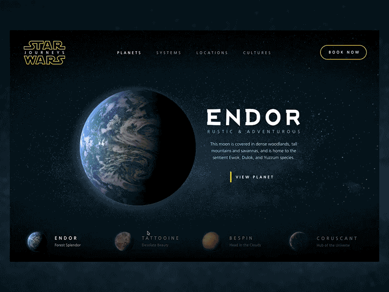
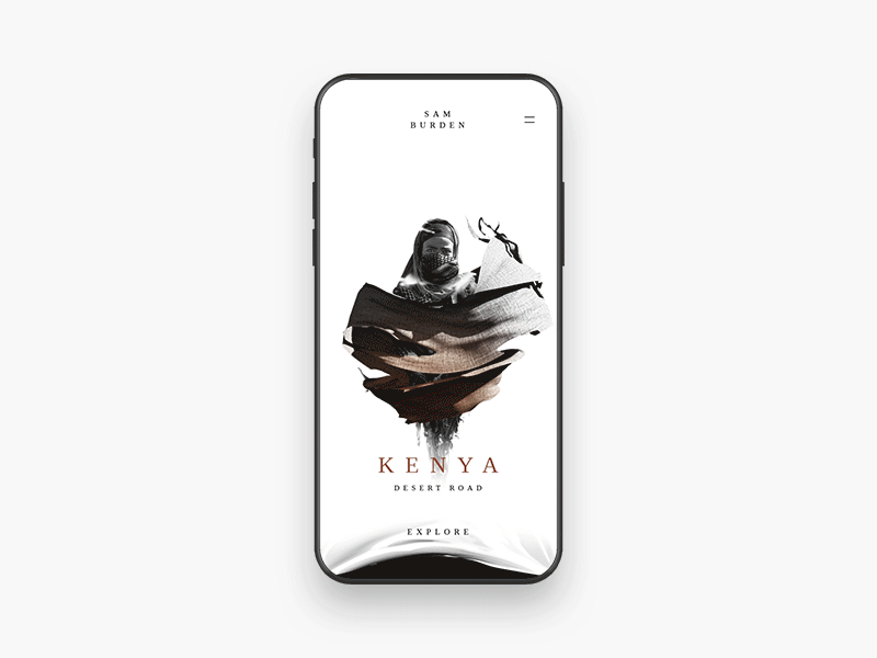
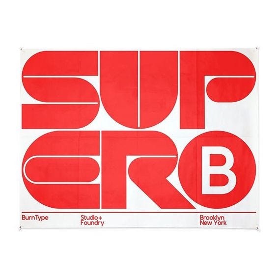
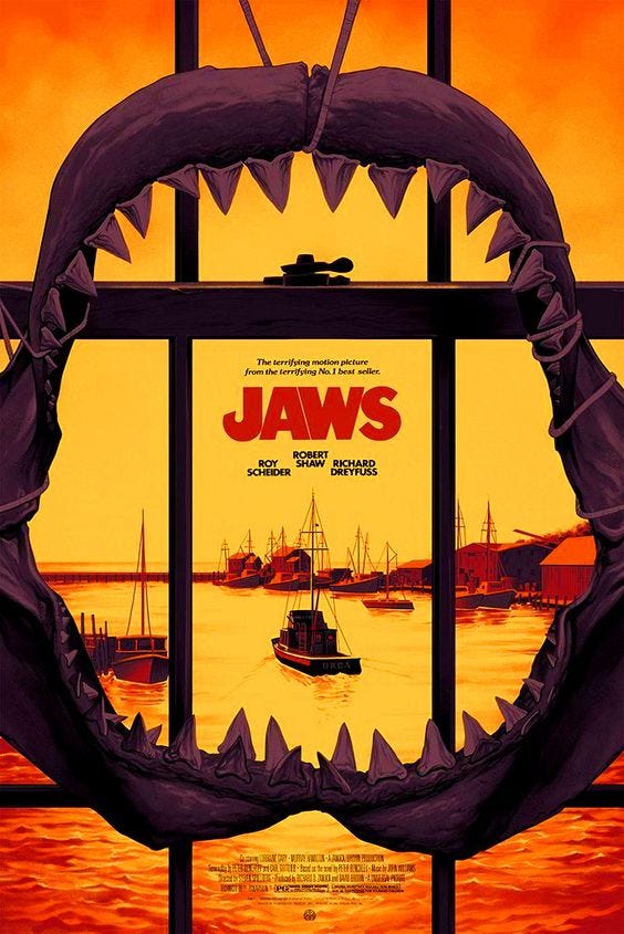
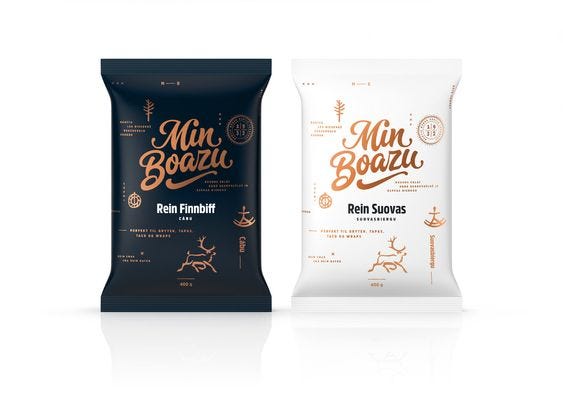
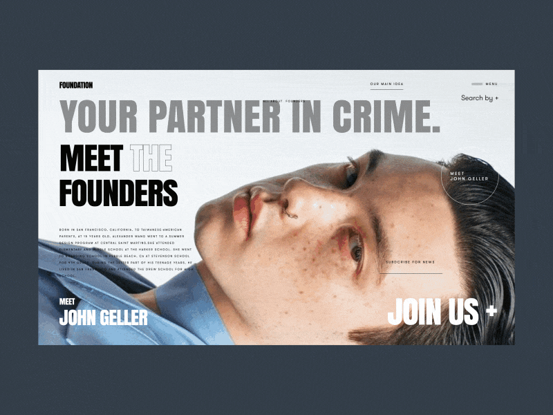
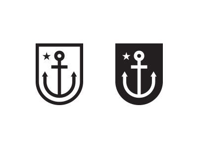
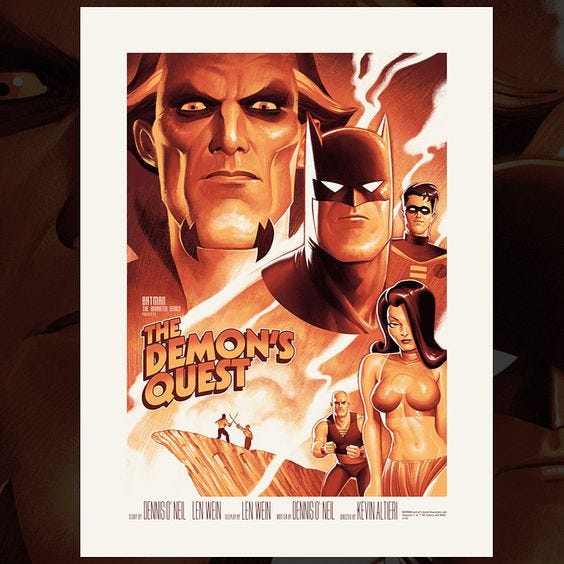
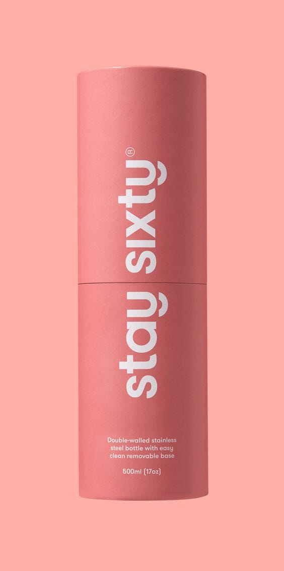
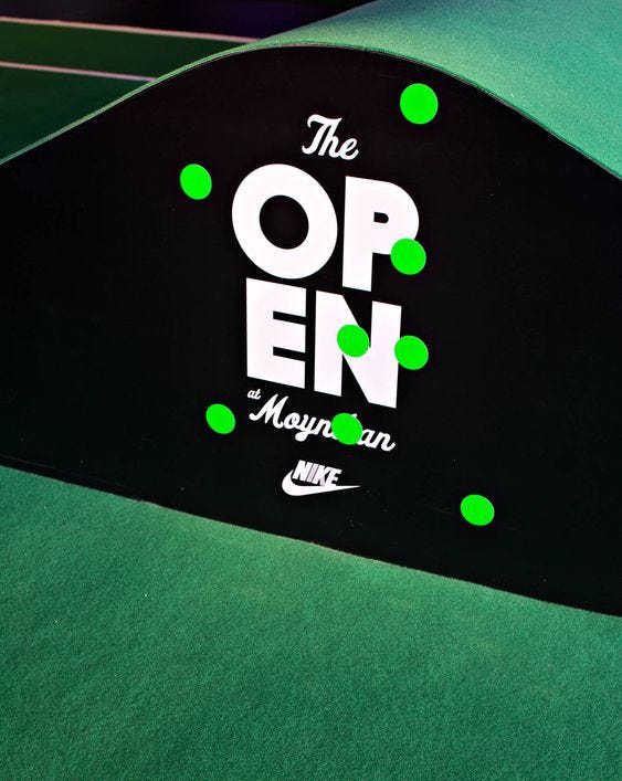
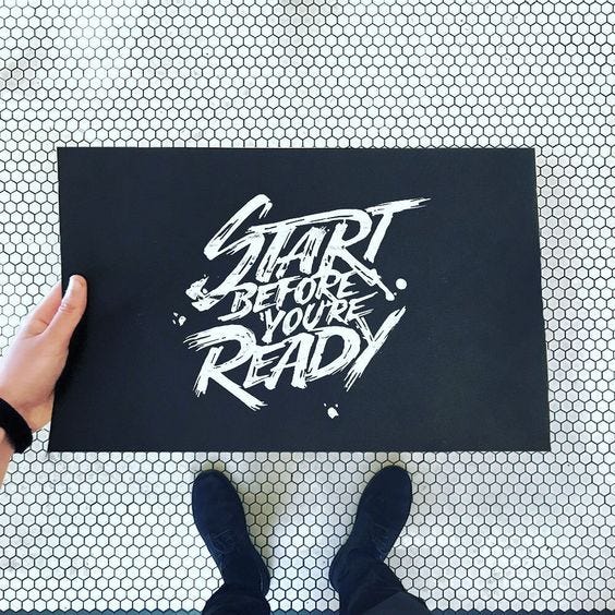
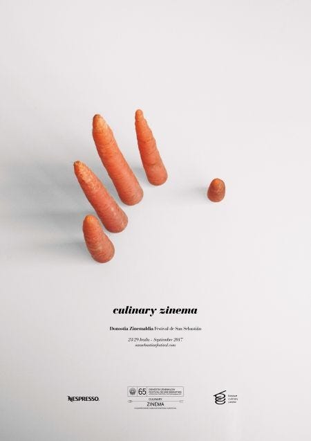
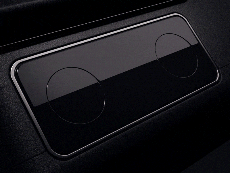
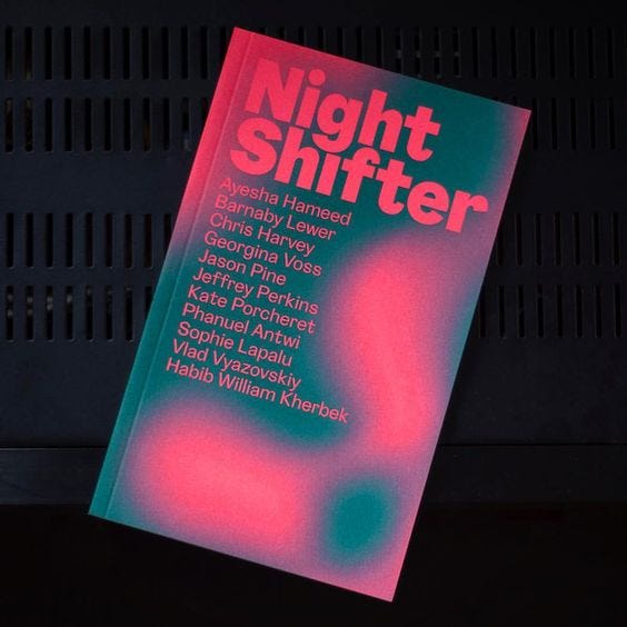
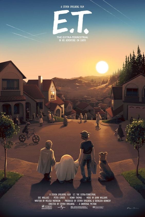
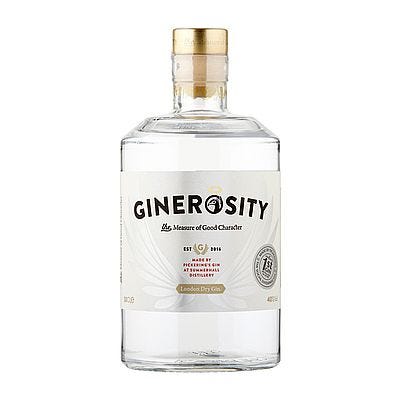
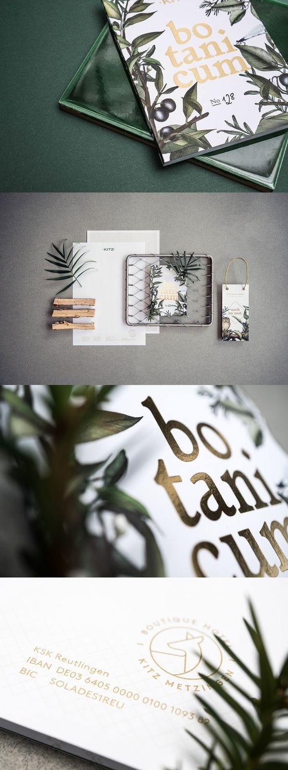
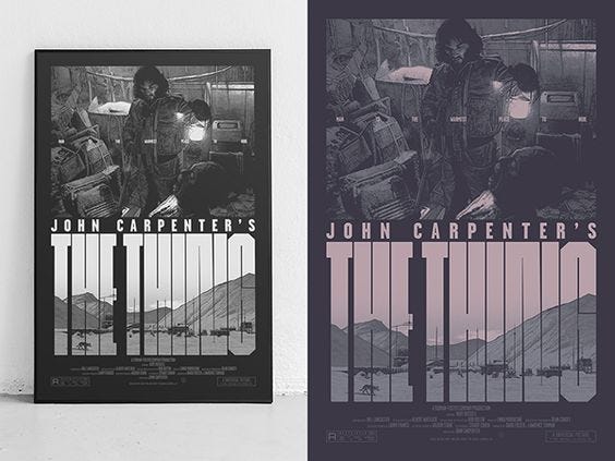
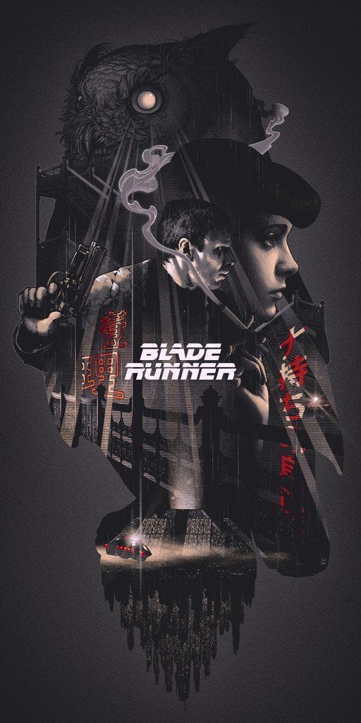
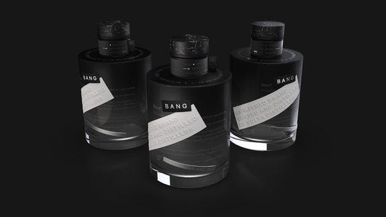
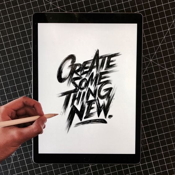
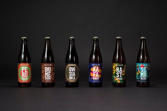
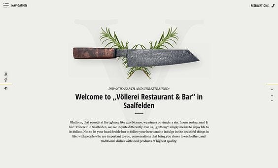
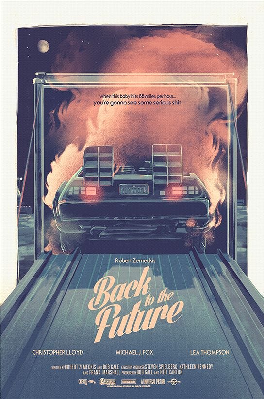
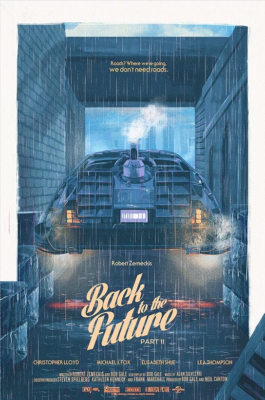
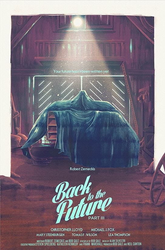
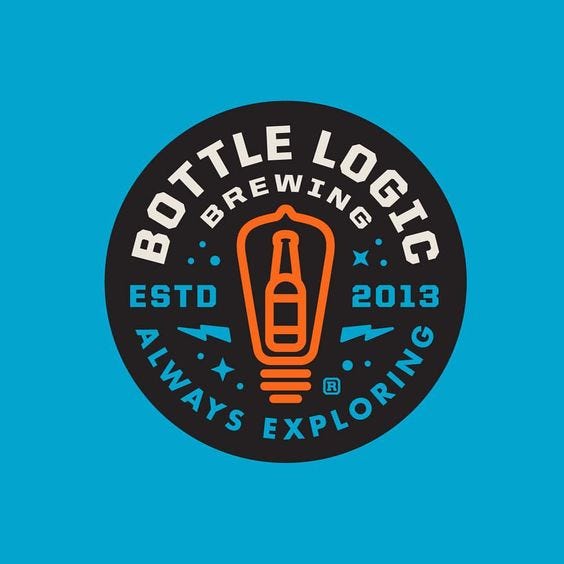
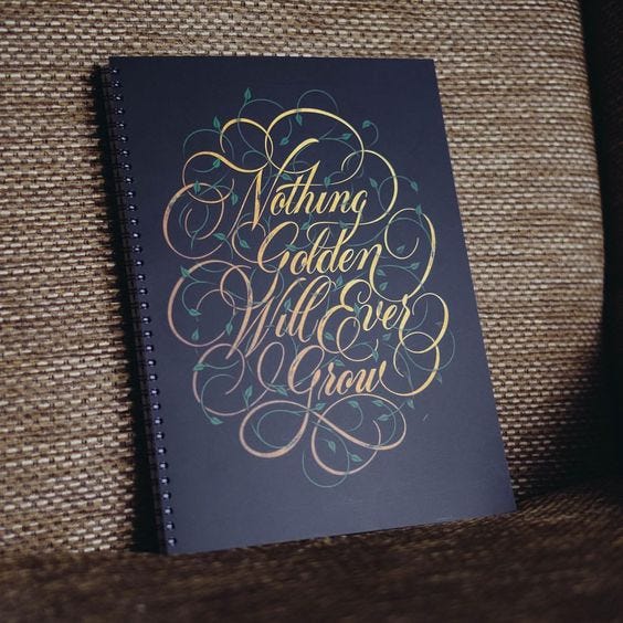
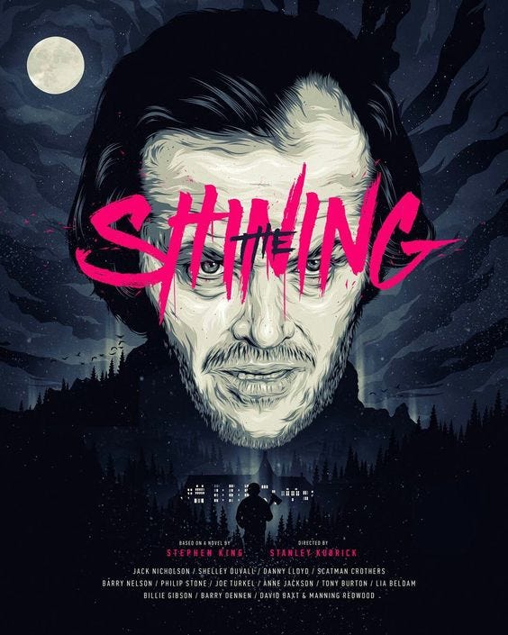
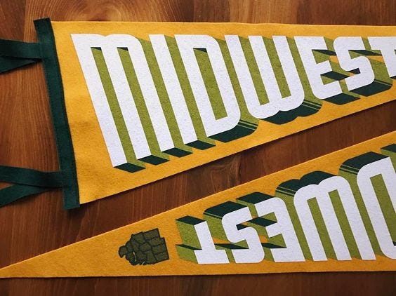
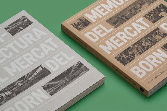
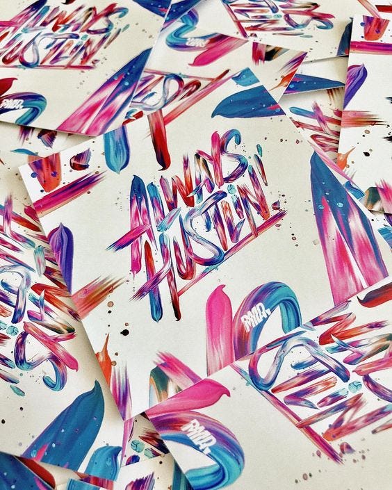
Star Wars Journeys by Scott PreavyDesert road scroll animation by Anton Skvortsov for NordeBurnTypeJaws by Phantom City CreativeMin Boazu by Strømme Throndsen DesignFoundation Marketplace Founders Page Animation by Zhenya RynzhukAnchor, Star & Shield by Jake DugardBatman by Phantom City CreativeSTAY SIXTY by Two CreateNike — The OpenStart Before You’re Ready by Emanuele RicciCulinary Cinema PosterCar climate: physical + digital by Alex SolNight ShifterE.T. by Phillipe PoirierIllustration by GregThingsGinerosity by GinerosityKitz Branding by Hochburg DesignThe Thing by StudioKxxBlade Runner PosterBang, VOLTA“Create something new” by Emanuele RicciJonas Søndergaard NielsenVÖLLEREI — Restaurant & Bar by dreist.Back to the Future by Nicolas Alejandro BarberaBack to the Future Part II by Nicolas Alejandro BarberaBack to the Future Part III by Nicolas Alejandro BarberaBottle Logic Brewing by Josh Emrich“Nothing Golden Will Ever Grow” by Ryan HamrickThe Shining PosterKrzysztof IwanskiMidwest Pennant by Sean TulgetskeEl Mercat del Born — El Born CCM by Forma & CoAlways Hustlin’ by David Milan
In these mixed galleries we’ll be bringing you guys inspiration from a wide variety of creative fields. Ranging from graphic and web design to more rarely updated categories like photography, illustration & product design.
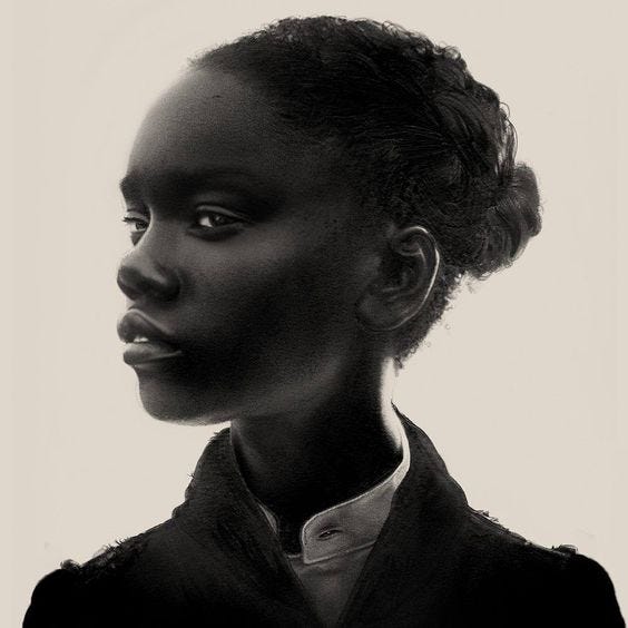
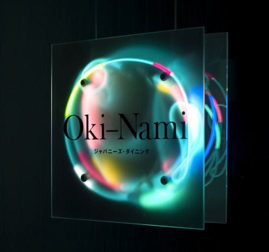
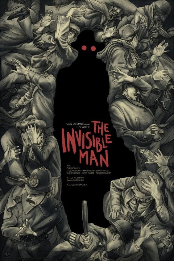
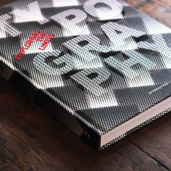
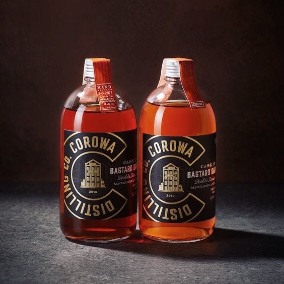
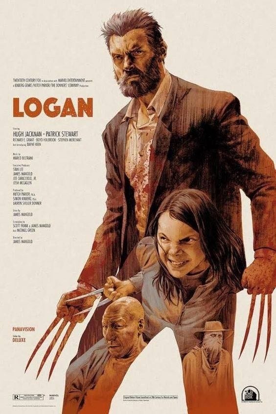
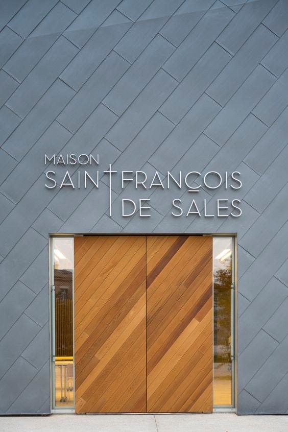
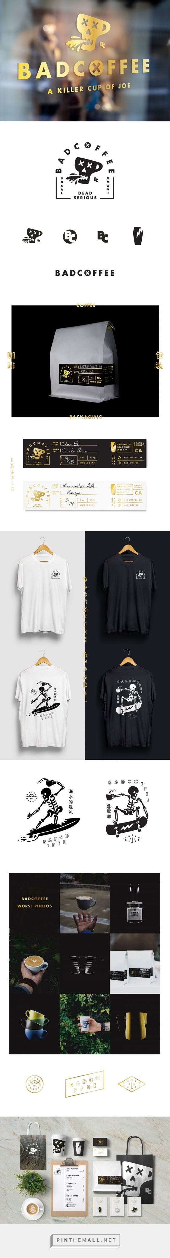
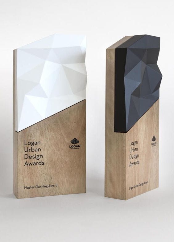
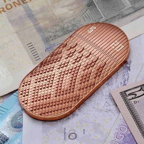
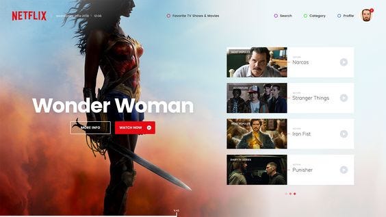
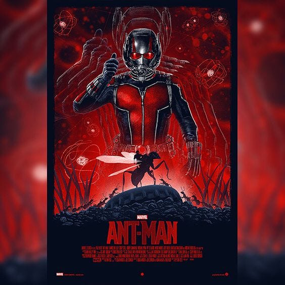
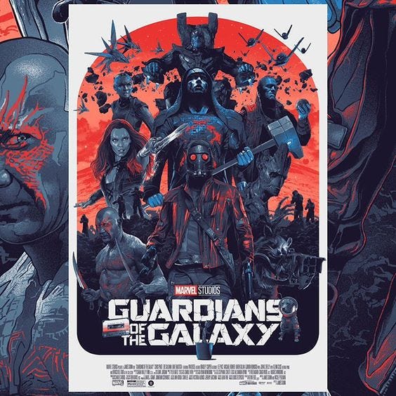
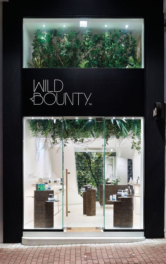
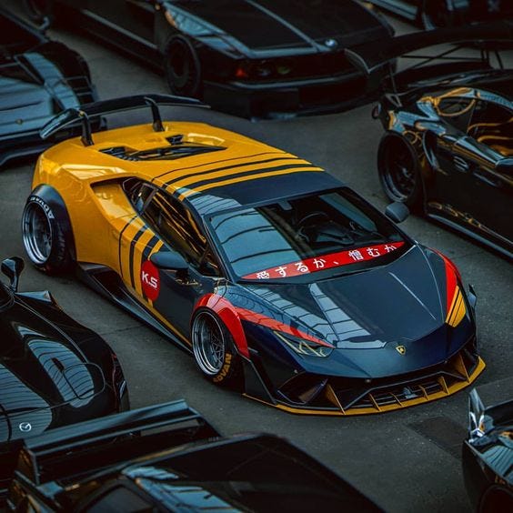
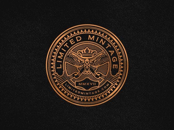
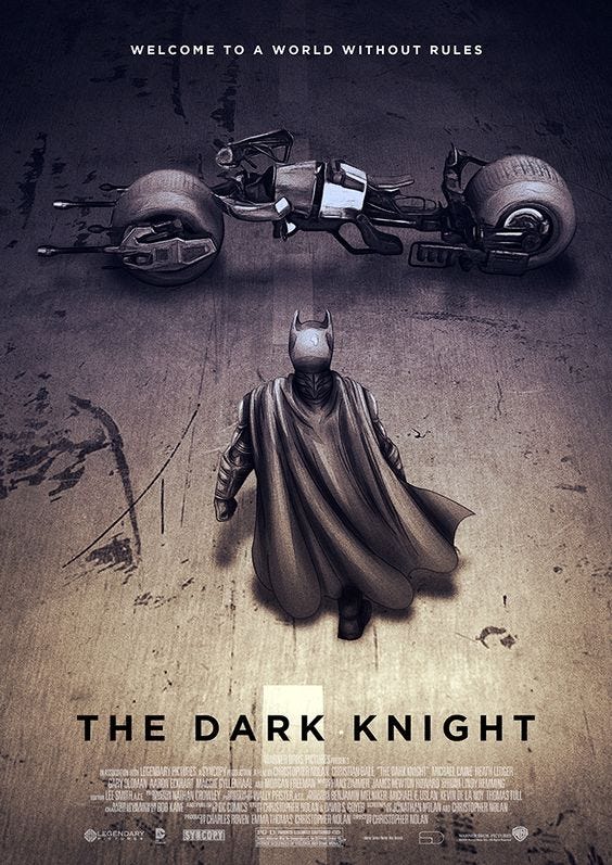
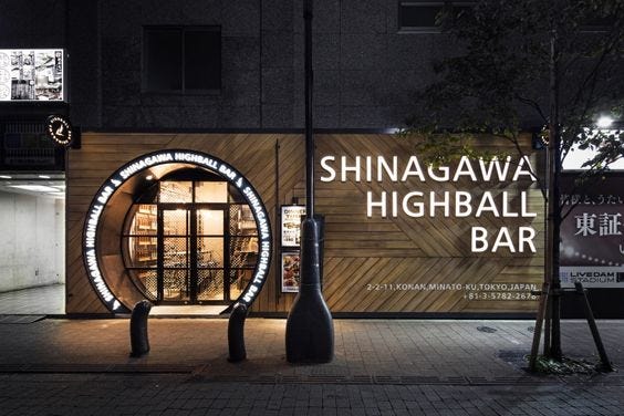
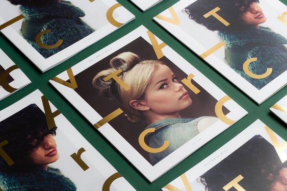
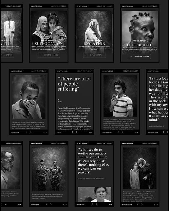
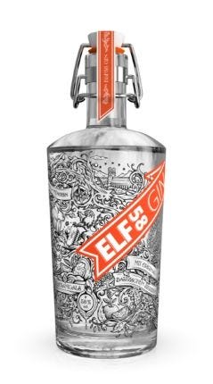
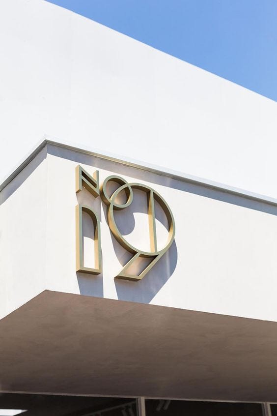
Oki-NamiThe Invisible Man by Jonathan BurtonTypography: Exploring The Limits by craftedbygcJanis Ancens in Gravity for Schön! MagazineCorowa WhiskyLogan by Robert SammelinMaison Saint Francois De SalesBadcoffee BrandingLogan Urban Design AwardsCash for a Changing World: Scrip by New Deal DesignNetflix — Apple TV by Cenk YılmazAnt Man by Marko ManevGuardians of the Galaxy by Grzegorz DomaradzkiWild Bounty SignageLambo by Khyzyl SaleemLimited Mintage by Srdjan VidakovicThe Dark Knight by Sahin DüzgünShinagawa Highball Bar by DESIGN STUDIO CROW, Tokyo — JapanAbbots & KinneyOrbit by James BulloughVictoria Will by Kati FornerIn my world by Hello MondayELF58 GinNo 19, Melbourne
To get a wider variety of designs published we’ve decided to bring back an old classic ranging back to the very start of this site some eight years ago. I’m of course talking about the mixed galleries that can include work from all our categories. So as of now we’ll be bringing you guys more inspiration from more rarely published categories like photography, product designs & illustrations.
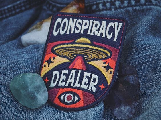
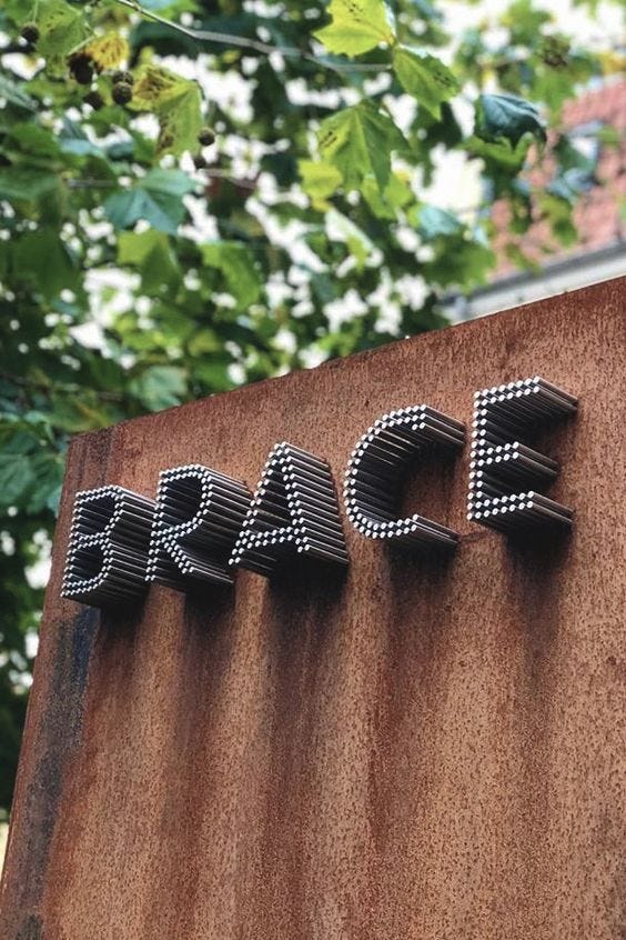
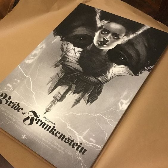
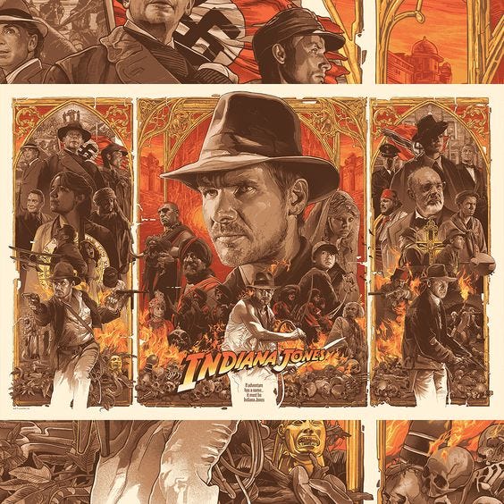
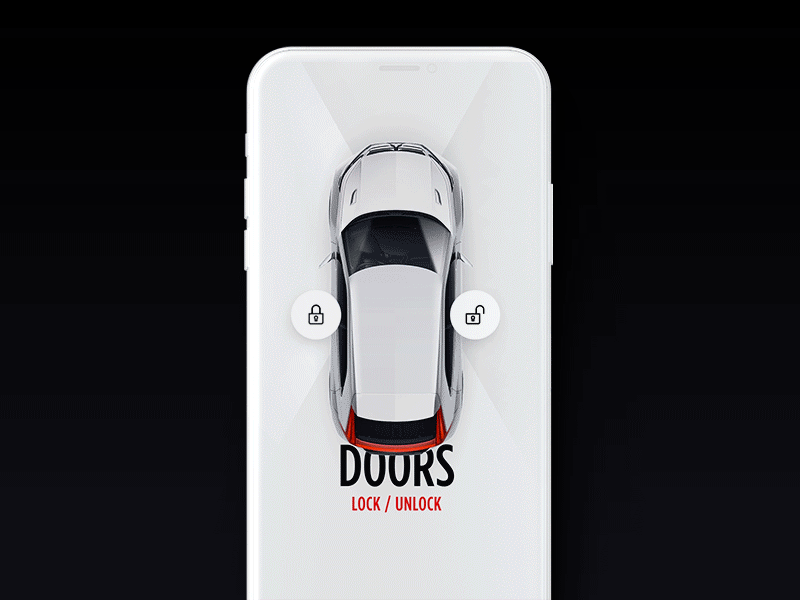
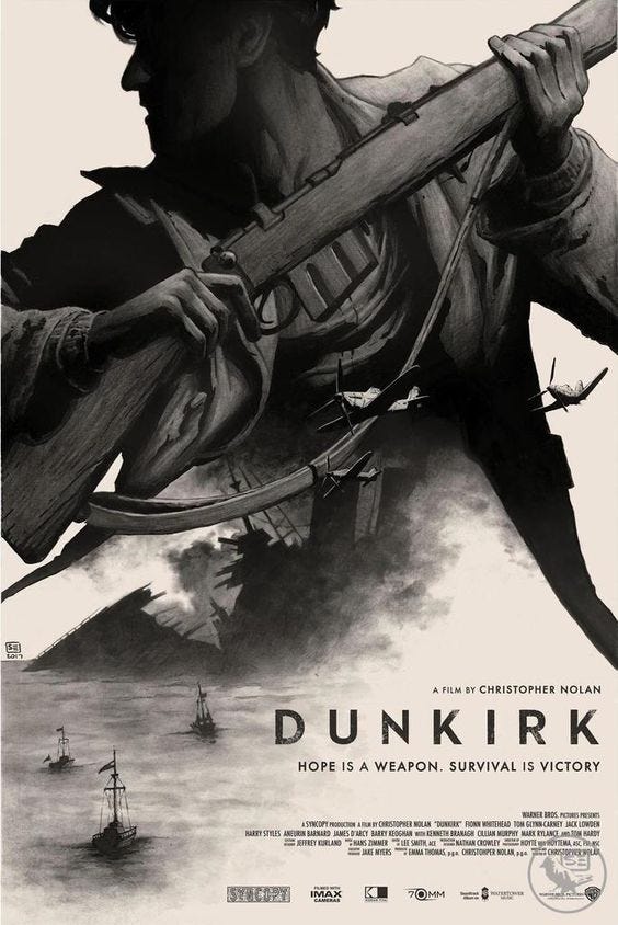
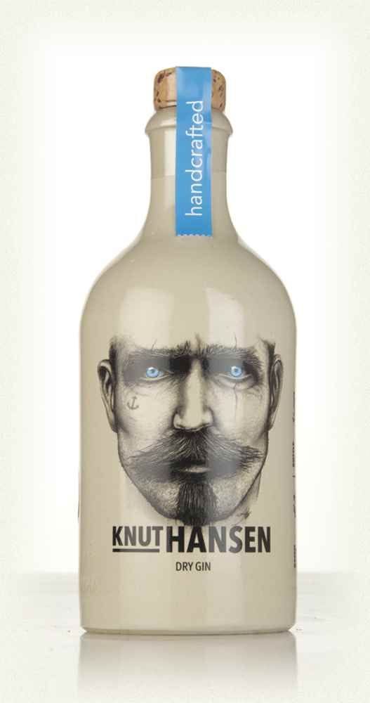
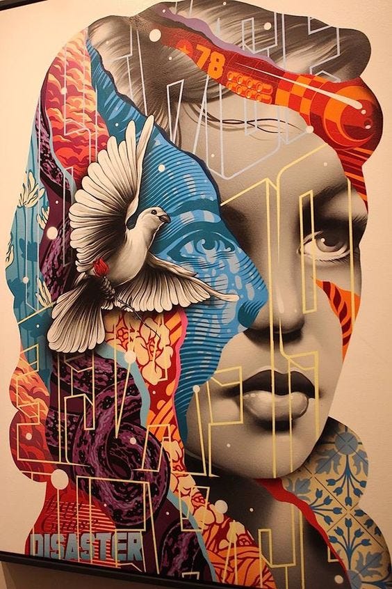
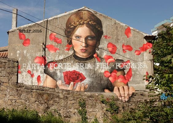
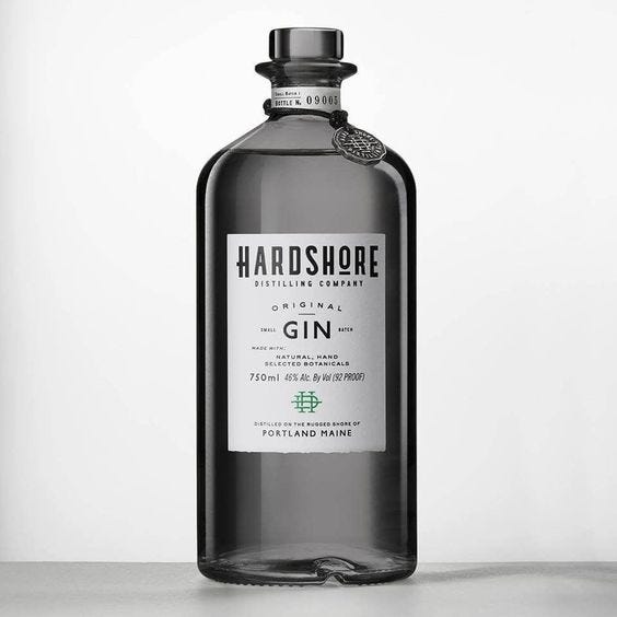
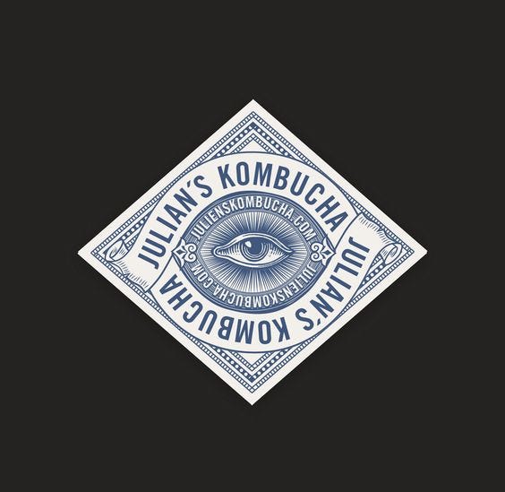
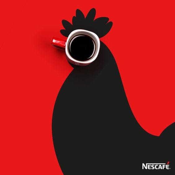
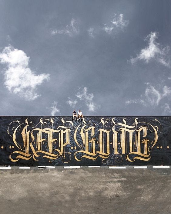
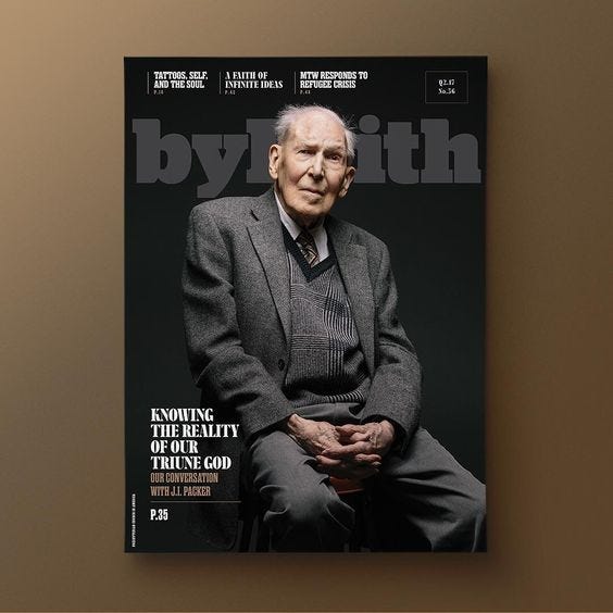
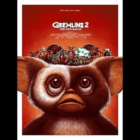
Conspiracy Dealer Patch by Jeff FinleyBrace RestaurantBride of Frankenstein by gregthingsIndiana Jones Trilogy by GabzConnected car experience UI by Gleb KuznetsovTesla WebProtea GinPerpetually Momentary by Sean O’ConnorThe Gist of ReadingDavid Bowie by gregthingsThe Sunday Co.Dunkirk PosterKnut Hansen Dry GinLa Grand — Serif by Paul Von ExciteConceptual Portrait Photography by Rony HernandesTristan EatonSFHIR, “FARTA·FORTE·FRIA·FIEL·FORMOSA” in Guarda, Portugal, 2016Handshore Ginanatoli_oskin_photographerJulian’s KombuchaGo Braves! by Jacob BoylesNESCAFÉ Coffee AdKeep Going by Ben JohnstonBy Faith Magazine by MetaleapGremlins 2 by Adam RabalaisTrident markHunkyDory Signage
Web Design is one of the most advanced fields ever-changing trends. The web design industry is one of the most demanded and competitive industries. There are millions of websites present on the World Wide Web now, with hi-tech advancements and innovative ideas implemented on their website. In the past years, we have seen a rise in […]
As a graphic designer, your portfolio is everything: it should be constantly evolving with every new job, accomplishment and skill you learn, and the design itself – whether in print or digital form – should demonstrate all your creative abilities. A portfolio should showcase your entire creative process from idea conception to design comps and […]
When sending final designs to clients, using mockups makes things look much more professional. Check out this business card mockup bundle by Freepik and Flaticon to showcase your designs in a whole new light. Clients will appreciate your work more if they can see it in real situations and not have to imagine it. […]
Current technology has replaced some of the traditional ways of sharing and storing information. Most businesses now rely on online solutions to run their operations and communicate with their partners. However, some conventional solutions like presentation folders are still relevant in the current digital world. Your employees will not always have access to a fast […]
Valentine’s Day is approaching so fast, and all beloved are impatiently waiting for a chance to show how much they love their best halves. It’s a great day to hang out at some party with your beloved or with friends and have the best V-Day. Whether you are an owner of a nightclub and are […]