Making Gooey Image Hover Effects with Three.js

Flash’s grandson, WebGL has become more and more popular over the last few years with libraries like Three.js, PIXI.js or the recent OGL.js. Those are very useful for easily creating a blank board where the only boundaries are your imagination. We see more and more, often subtle integration of WebGL in an interface for hover, scroll or reveal effects. Examples are the gallery of articles on Hello Monday or the effects seen on cobosrl.co.

In this tutorial, we’ll use Three.js to create a special gooey texture that we’ll use to reveal another image when hovering one. Head over to the demo to see the effect in action. For the demo itself, I’ve created a more practical example that shows a vertical scrollable layout with images, where each one has a variation of the effect. You can click on an image and it will expand to a larger version while some other content shows up (just a mock-up). We’ll go over the most interesting parts of the effect, so that you get an understanding of how it works and how to create your own.

I’ll assume that you are comfortable with JavaScript and have some knowledge of Three.js and shader logic. If you’re not, have a look at the Three.js documentation or The Book of Shaders, Three.js Fundamentals or Discover Three.js.

Attention: This tutorial covers many parts; if you prefer, you can skip the HTML/CSS/JavaScript part and go directly go to the shaders section.

Now that we are clear, let’s do this!

Create the scene in the DOM

Before we start making some magic, we are first going to mark up the images in the HTML. It will be easier to handle resizing our scene after we’ve set up the initial position and dimension in HTML/CSS rather than positioning everything in JavaScript. Moreover, the styling part should be only made with CSS, not JavaScript. For example, if our image has a ratio of 16:9 on desktop but a 4:3 ratio on mobile, we just want to handle this using CSS. JavaScript will only get the new values and do its stuff.

// index.html

<section class="container">
	<article class="tile">
		<figure class="tile__figure">
			<img data-src="path/to/my/image.jpg" data-hover="path/to/my/hover-image.jpg" class="tile__image" alt="My image" width="400" height="300" />
		</figure>
	</article>
</section>

<canvas id="stage"></canvas>
// style.css

.container {
	display: flex;
	align-items: center;
	justify-content: center;
	width: 100%;
	height: 100vh;
	z-index: 10;
}

.tile {
	width: 35vw;
	flex: 0 0 auto;
}

.tile__image {
	width: 100%;
	height: 100%;
	object-fit: cover;
	object-position: center;
}

canvas {
	position: fixed;
	left: 0;
	top: 0;
	width: 100%;
	height: 100vh;
	z-index: 9;
}

As you can see above, we have create a single image that is centered in the middle of our screen. Did you notice the data-src and data-hover attributes on the image? These will be our reference images and we’ll load both of these later in our script with lazy loading.

Don’t forget the canvas. We’ll stack it below our main section to draw the images in the exact same place as we have placed them before.

Create the scene in JavaScript

Let’s get started with the less-easy-but-ok part! First, we’ll create the scene, the lights, and the renderer.

// Scene.js

import * as THREE from 'three'

export default class Scene {
	constructor() {
		this.container = document.getElementById('stage')

		this.scene = new THREE.Scene()
		this.renderer = new THREE.WebGLRenderer({
			canvas: this.container,
			alpha: true,
	  })

		this.renderer.setSize(window.innerWidth, window.innerHeight)
		this.renderer.setPixelRatio(window.devicePixelRatio)

		this.initLights()
	}

	initLights() {
		const ambientlight = new THREE.AmbientLight(0xffffff, 2)
		this.scene.add(ambientlight)
	}
}

This is a very basic scene. But we need one more essential thing in our scene: the camera. We have a choice between two types of cameras: orthographic or perspective. If we keep our image flat, we can use the first one. But for our rotation effect, we want some perspective as we move the mouse around.

In Three.js (and other libraries for WebGL) with a perspective camera, 10 unit values on our screen are not 10px. So the trick here is to use some math to transform 1 unit to 1 pixel and change the perspective to increase or decrease the distortion effect.

// Scene.js

const perspective = 800

constructor() {
	// ...
	this.initCamera()
}

initCamera() {
	const fov = (180 * (2 * Math.atan(window.innerHeight / 2 / perspective))) / Math.PI

	this.camera = new THREE.PerspectiveCamera(fov, window.innerWidth / window.innerHeight, 1, 1000)
	this.camera.position.set(0, 0, perspective)
}

We’ll set the perspective to 800 to have a not-so-strong distortion as we rotate the plane. The more we increase the perspective, the less we’ll perceive the distortion, and vice versa.

The last thing we need to do is to render our scene in each frame.

// Scene.js

constructor() {
	// ...
	this.update()
}

update() {
	requestAnimationFrame(this.update.bind(this))
	
	this.renderer.render(this.scene, this.camera)
}

If your screen is not black, you are on the right way!

Build the plane with the correct sizes

As we mentioned above, we have to retrieve some additional information from the image in the DOM like its dimension and position on the page.

// Scene.js

import Figure from './Figure'

constructor() {
	// ...
	this.figure = new Figure(this.scene)
}
// Figure.js

export default class Figure {
	constructor(scene) {
		this.$image = document.querySelector('.tile__image')
		this.scene = scene

		this.loader = new THREE.TextureLoader()

		this.image = this.loader.load(this.$image.dataset.src)
		this.hoverImage = this.loader.load(this.$image.dataset.hover)
		this.sizes = new THREE.Vector2(0, 0)
		this.offset = new THREE.Vector2(0, 0)

		this.getSizes()

		this.createMesh()
	}
}

First, we create another class where we pass the scene as a property. We set two new vectors, dimension and offset, in which we’ll store the dimension and position of our DOM image.

Furthermore, we’ll use a TextureLoader to “load” our images and convert them into a texture. We need to do that as we want to use these pictures in our shaders.

We need to create a method in our class to handle the loading of our images and wait for a callback. We could achieve that with an async function but for this tutorial, let’s keep it simple. Just keep in mind that you’ll probably need to refactor this a bit for your own purposes.

// Figure.js

// ...
	getSizes() {
		const { width, height, top, left } = this.$image.getBoundingClientRect()

		this.sizes.set(width, height)
		this.offset.set(left - window.innerWidth / 2 + width / 2, -top + window.innerHeight / 2 - height / 2)
	}
// ...

We get our image information in the getBoundingClientRect object. After that, we’ll pass these to our two variables. The offset is here to calculate the distance between the center of the screen and the object on the page.

// Figure.js

// ...
	createMesh() {
		this.geometry = new THREE.PlaneBufferGeometry(1, 1, 1, 1)
		this.material = new THREE.MeshBasicMaterial({
			map: this.image
		})

		this.mesh = new THREE.Mesh(this.geometry, this.material)

		this.mesh.position.set(this.offset.x, this.offset.y, 0)
		this.mesh.scale.set(this.sizes.x, this.sizes.y, 1)

		this.scene.add(this.mesh)
	}
// ...

After that, we’ll set our values on the plane we’re building. As you can notice, we have created a plane of 1 on 1px with 1 row and 1 column. As we don’t want to distort the plane, we don’t need a lot of faces or vertices. So let’s keep it simple.

But why scale it while we can set the size directly? Glad you asked.

Because of the resizing part. If we want to change the size of our mesh afterwards, there is no other proper way than this one. While it’s easier to change the scale of the mesh, it’s not for the dimension.

For the moment, we set a MeshBasicMaterial, just to see if everything is fine.

Get mouse coordinates

Now that we have built our scene with our mesh, we want to get our mouse coordinates and, to keep things easy, we’ll normalize them. Why normalize? Because of the coordinate system in shaders.

coordinate-system

As you can see in the figure above, we have normalized the values for both of our shaders. So to keep things simple, we’ll prepare our mouse coordinate to match the vertex shader coordinate.

If you’re lost at this point, I recommend you to read the Book of Shaders and the respective part of Three.js Fundamentals. Both have good advice and a lot of examples to help understand what’s going on.

// Figure.js

// ...

this.mouse = new THREE.Vector2(0, 0)
window.addEventListener('mousemove', (ev) => { this.onMouseMove(ev) })

// ...

onMouseMove(event) {
	TweenMax.to(this.mouse, 0.5, {
		x: (event.clientX / window.innerWidth) * 2 - 1,
		y: -(event.clientY / window.innerHeight) * 2 + 1,
	})

	TweenMax.to(this.mesh.rotation, 0.5, {
		x: -this.mouse.y * 0.3,
		y: this.mouse.x * (Math.PI / 6)
	})
}

For the tween parts, I’m going to use TweenMax from GreenSock. This is the best library ever. EVER. And it’s perfect for our purpose. We don’t need to handle the transition between two states, TweenMax will do it for us. Each time we move our mouse, TweenMax will update the position and the rotation smoothly.

One last thing before we continue: we’ll update our material from MeshBasicMaterial to ShaderMaterial and pass some values (uniforms) and shaders.

// Figure.js

// ...

this.uniforms = {
	u_image: { type: 't', value: this.image },
	u_imagehover: { type: 't', value: this.hover },
	u_mouse: { value: this.mouse },
	u_time: { value: 0 },
	u_res: { value: new THREE.Vector2(window.innerWidth, window.innerHeight) }
}

this.material = new THREE.ShaderMaterial({
	uniforms: this.uniforms,
	vertexShader: vertexShader,
	fragmentShader: fragmentShader
})

update() {
	this.uniforms.u_time.value += 0.01
}

We passed our two textures, the mouse position, the size of our screen and a variable called u_time which we will increment each frame.

But keep in mind that it’s not the best way to do that. For example, we only need to increment when we are hovering the figure, not every frame. I’m not going into details, but performance-wise, it’s better to just update our shader only when we need it.

The logic behind the trick & how to use noise

Still here? Nice! Time for some magic tricks.

I will not explain what noise is and where it comes from. If you’re interested, be sure to read this page from The Book of Shaders. It’s well explained.

Long story short, Noise is a function that gives us a value between -1 and 1 based on values we pass through. It will output a random pattern but more organic.

Thanks to noise, we can generate a lot of different shapes, like maps, random patterns, etc.

noise-example1

noise-example2

Let’s start with a 2D noise result. Just by passing the coordinate of our texture, we’ll have something like a cloud texture.

noise-result1

But there are several kinds of noise functions. Let’s use a 3D noise by giving one more parameter like … the time? The noise pattern will evolve and change over time. By changing the frequency and the amplitude, we can give some movement and increase the contrast.

It will be our first base.

noise-result2

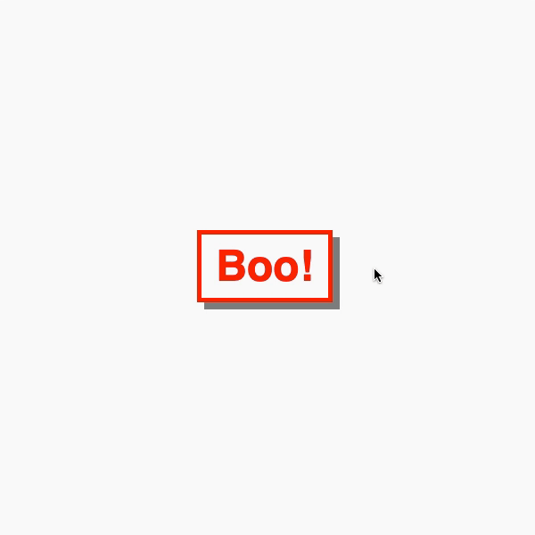
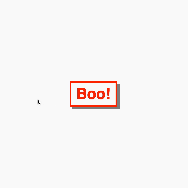
Second, we’ll create a circle. It’s quite easy to build a simple shape like a circle in the fragment shader. We just take the function from The Book of Shaders: Shapes to create a blurred circle, increase the contrast and voilà!

noise-result3

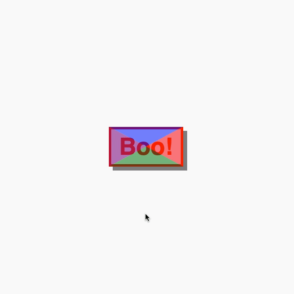
Last, we add these two together, play with some variables, cut a “slice” of this and tadaaa:

noise-result4

We finally mix our textures together based on this result and here we are, easy peasy lemon squeezy!

Let’s dive into the code.

Shaders

We won’t really need the vertex shader here so this is our code:

 // vertexShader.glsl
varying vec2 v_uv;

void main() {
	v_uv = uv;

	gl_Position = projectionMatrix * modelViewMatrix * vec4(position, 1.0);
}

ShaderMaterial from Three.js provides some useful default variables when you’re a beginner:

  • position (vec3): the coordinates of each vertex of our mesh
  • uv (vec2): the coordinates of our texture
  • normals (vec3): normal of each vertex our mesh have.

Here we’re just passing the UV coordinates from the vertex shader to fragment shader.

Create the circle

Let’s use the function from The Book of Shaders to build our circle and add a variable to handle the blurriness of our edges.

Moreover, we’ll add the mouse position to the origin of our circle. This way, the circle will be moving as long as we move our mouse over our image.

// fragmentShader.glsl
uniform vec2 u_mouse;
uniform vec2 u_res;

float circle(in vec2 _st, in float _radius, in float blurriness){
	vec2 dist = _st;
	return 1.-smoothstep(_radius-(_radius*blurriness), _radius+(_radius*blurriness), dot(dist,dist)*4.0);
}

void main() {
	vec2 st = gl_FragCoord.xy / u_res.xy - vec2(1.);
	// tip: use the following formula to keep the good ratio of your coordinates
	st.y *= u_res.y / u_res.x;

	vec2 mouse = u_mouse;
	// tip2: do the same for your mouse
	mouse.y *= u_res.y / u_res.x;
	mouse *= -1.;
	
	vec2 circlePos = st + mouse;
	float c = circle(circlePos, .03, 2.);

	gl_FragColor = vec4(vec3(c), 1.);
}

Make some noooooise

As we saw above, the noise function has several parameters and gives us a smooth cloudy pattern. How could we have that? Glad you asked.

For this part, I’m using glslify and glsl-noise, and two npm packages to include other functions. It keeps our shader a little bit more readable and avoids having a lot of displayed functions that we will not use after all.

// fragmentShader.glsl
#pragma glslify: snoise2 = require('glsl-noise/simplex/2d')

//...

varying vec2 v_uv;

uniform float u_time;

void main() {
	// ...

	float n = snoise2(vec2(v_uv.x, v_uv.y));

	gl_FragColor = vec4(vec3(n), 1.);
}

noise-result5

By changing the amplitude and the frequency of our noise (exactly like the sin/cos functions), we can change the render.

// fragmentShader.glsl

float offx = v_uv.x + sin(v_uv.y + u_time * .1);
float offy = v_uv.y - u_time * 0.1 - cos(u_time * .001) * .01;

float n = snoise2(vec2(offx, offy) * 5.) * 1.;

noise-result6

But it isn’t evolving through time! It is distorted but that’s it. We want more. So we will use noise3d instead and pass a 3rd parameter: the time.

float n = snoise3(vec3(offx, offy, u_time * .1) * 4.) * .5;

As you can see, I changed the amplitude and the frequency to have the render I desire.

Alright, let’s add them together!

Merging both textures

By just adding these together, we’ll already see an interesting shape changing through time.

noise-result7

To explain what’s happening, let’s imagine our noise is like a sea floating between -1 and 1. But our screen can’t display negative color or pixels more than 1 (pure white) so we are just seeing the values between 0 and 1.

explanation-noise1

And our circle is like a flan.

explanation-noise2

By adding these two shapes together it will give this very approximative result:

explanation-noise3

Our very white pixels are only pixels outside the visible spectrum.

If we scale down our noise and subtract a small number, it will be completely moving down your waves until it disappears above the surface of the ocean of visible colors.

noise-result8

float n = snoise(vec3(offx, offy, u_time * .1) * 4.) - 1.;

Our circle is still there but not enough visible to be displayed. If we multiply its value, it will be more contrasted.

float c = circle(circlePos, 0.3, 0.3) * 2.5;

noise-result9

We are almost there! But as you can see, there are still some details missing. And our edges aren’t sharp at all.

To avoid that, we’ll use the built-in smoothstep function.

float finalMask = smoothstep(0.4, 0.5, n + c);

gl_FragColor = vec4(vec3(finalMask), 1.);

Thanks to this function, we’ll cut a slice of our pattern between 0.4 et 0.5, for example. The shorter the space is between these values, the sharper the edges are.

Finally, we can mix our two textures to use them as a mask.

uniform sampler2D u_image;
uniform sampler2D u_imagehover;

// ...

vec4 image = texture2D(u_image, uv);
vec4 hover = texture2D(u_imagehover, uv);

vec4 finalImage = mix(image, hover, finalMask);

gl_FragColor = finalImage;

We can change a few variables to have a more gooey effect:

// ...

float c = circle(circlePos, 0.3, 2.) * 2.5;

float n = snoise3(vec3(offx, offy, u_time * .1) * 8.) - 1.;

float finalMask = smoothstep(0.4, 0.5, n + pow(c, 2.));

// ...

And voilà!

Check out the full source here or take a look at the live demo.

Mic drop

Congratulations to those who came this far. I haven’t planned to explain this much. This isn’t perfect and I might have missed some details but I hope you’ve enjoyed this tutorial anyway. Don’t hesitate to play with variables, try other noise functions and try to implement other effects using the mouse direction or play with the scroll!

If you have any questions, let me know in the comments section! I also encourage you to download the demo, it’s a little bit more complex and shows the effects in action with hover and click effects ¯\_(?)_/¯

References and Credits

Making Gooey Image Hover Effects with Three.js was written by Arno Di Nunzio and published on Codrops.

How to Create Motion Hover Effects with Image Distortions using Three.js

The reveal hover effect on images has become a very popular pattern in modern websites. It plays an important role in taking the user experience to a higher level. But usually these kind of animations remain too “flat”. Natural movements with a realistic feel are much more enjoyable for the user. In this tutorial we’re going to build some special interactive reveal effects for images when a link is hovered. The aim is to add fluid and interesting motion to the effects. We will be exploring three different types of animations. This dynamic experience consists of two parts:

  1. Distortion Image Effect (main effect)
  2. RGB Displacement, Image Trail Effect, Image Stretch (additional effects)

We assume that you are confident with JavaScript and have some basic understanding of Three.js and WebGL.

Getting started

The markup for this effect will include a link element that contains an image (and some other elements that are not of importance for our effect):

<a class="link" href="#">
	<!-- ... -->
	<img src="img/demo1/img1.jpg" alt="Some image" />
</a>

The EffectShell class will group common methods and properties of the three distinct effects we’ll be creating. As a result, each effect will extend EffectShell.

Three.js setup

First of all, we need to create the Three.js scene.

class EffectShell {
 constructor(container = document.body, itemsWrapper = null) {
   this.container = container
   this.itemsWrapper = itemsWrapper
   if (!this.container || !this.itemsWrapper) return
   this.setup()
 }
 
 setup() {
   window.addEventListener('resize', this.onWindowResize.bind(this), false)
 
   // renderer
   this.renderer = new THREE.WebGLRenderer({ antialias: true, alpha: true })
   this.renderer.setSize(this.viewport.width, this.viewport.height)
   this.renderer.setPixelRatio = window.devicePixelRatio
   this.container.appendChild(this.renderer.domElement)
 
   // scene
   this.scene = new THREE.Scene()
 
   // camera
   this.camera = new THREE.PerspectiveCamera(
     40,
     this.viewport.aspectRatio,
     0.1,
     100
   )
   this.camera.position.set(0, 0, 3)
 
   // animation loop
   this.renderer.setAnimationLoop(this.render.bind(this))
 }
 
 render() {
   // called every frame
   this.renderer.render(this.scene, this.camera)
 }
 
 get viewport() {
   let width = this.container.clientWidth
   let height = this.container.clientHeight
   let aspectRatio = width / height
   return {
     width,
     height,
     aspectRatio
   }
 }
 
 onWindowResize() {
   this.camera.aspect = this.viewport.aspectRatio
   this.camera.updateProjectionMatrix()
   this.renderer.setSize(this.viewport.width, this.viewport.height)
 }
}

Get items and load textures

In our markup we have links with images inside. The next step is to get each link from the DOM and put them in an array.

class EffectShell {
 ...
 get itemsElements() {
   // convert NodeList to Array
   const items = [...this.itemsWrapper.querySelectorAll('.link')]
 
   //create Array of items including element, image and index
   return items.map((item, index) => ({
     element: item,
     img: item.querySelector('img') || null,
     index: index
   }))
 }
}

Because we will use the images as a texture, we have to load the textures through Three.js’ TextureLoader. It’s an asynchronous operation so we shouldn’t initialize the effect without all textures being loaded. Otherwise our texture will be fully black. That’s why we use Promises here:

class EffectShell {
 ...
 initEffectShell() {
   let promises = []
 
   this.items = this.itemsElements
 
   const THREEtextureLoader = new THREE.TextureLoader()
   this.items.forEach((item, index) => {
     // create textures
     promises.push(
       this.loadTexture(
         THREEtextureLoader,
         item.img ? item.img.src : null,
         index
       )
     )
   })
 
   return new Promise((resolve, reject) => {
     // resolve textures promises
     Promise.all(promises).then(promises => {
       // all textures are loaded
       promises.forEach((promise, index) => {
         // assign texture to item
         this.items[index].texture = promise.texture
       })
       resolve()
     })
   })
 }
 
 loadTexture(loader, url, index) {
   // https://threejs.org/docs/#api/en/loaders/TextureLoader
   return new Promise((resolve, reject) => {
     if (!url) {
       resolve({ texture: null, index })
       return
     }
     // load a resource
     loader.load(
       // resource URL
       url,
 
       // onLoad callback
       texture => {
         resolve({ texture, index })
       },
 
       // onProgress callback currently not supported
       undefined,
 
       // onError callback
       error => {
         console.error('An error happened.', error)
         reject(error)
       }
     )
   })
 }
}

At this point we get an array of items. Each item contains an Element, Image, Index and Texture. Then, when all textures are loaded we can initialize the effect.

class EffectShell {
 constructor(container = document.body, itemsWrapper = null) {
   this.container = container
   this.itemsWrapper = itemsWrapper
   if (!this.container || !this.itemsWrapper) return
   this.setup()
   this.initEffectShell().then(() => {
     console.log('load finished')
     this.isLoaded = true
   })
 }
 ...
}

Create the plane

Once we have created the scene and loaded the textures, we can create the main effect. We start by creating a plane mesh using PlaneBufferGeometry and ShaderMaterial with three uniforms:

  1. uTexture contains the texture data to display the image on the plane
  2. uOffset provides plane deformation values
  3. uAlpha manages plane opacity
class Effect extends EffectShell {
 constructor(container = document.body, itemsWrapper = null, options = {}) {
   super(container, itemsWrapper)
   if (!this.container || !this.itemsWrapper) return
 
   options.strength = options.strength || 0.25
   this.options = options
 
   this.init()
 }
 
 init() {
   this.position = new THREE.Vector3(0, 0, 0)
   this.scale = new THREE.Vector3(1, 1, 1)
   this.geometry = new THREE.PlaneBufferGeometry(1, 1, 32, 32)
   this.uniforms = {
     uTexture: {
       //texture data
       value: null
     },
     uOffset: {
       //distortion strength
       value: new THREE.Vector2(0.0, 0.0)
     },
     uAlpha: {
       //opacity
       value: 0
     }
 
   }
   this.material = new THREE.ShaderMaterial({
     uniforms: this.uniforms,
     vertexShader: `
       uniform vec2 uOffset;
       varying vec2 vUv;
 
       void main() {
         vUv = uv;
         vec3 newPosition = position;
         gl_Position = projectionMatrix * modelViewMatrix * vec4( newPosition, 1.0 );
       }
     `,
     fragmentShader: `
       uniform sampler2D uTexture;
       uniform float uAlpha;
       varying vec2 vUv;
 
       void main() {
         vec3 color = texture2D(uTexture,vUv).rgb;
         gl_FragColor = vec4(color,1.0);
       }
     `,
     transparent: true
   })
   this.plane = new THREE.Mesh(this.geometry, this.material)
   this.scene.add(this.plane)
 }
}

At this point, we have a black squared plane in the center of our screen. Not very impressive.

Adding interactions

Creating events

So, let's outline all our possible events and what needs to be done:

  1. when we hover over an item, the plane’s texture takes the item’s texture
  2. when the mouse moves on the container, the plane’s position follows the mouse and its vertices are deformed
  3. when the mouse leaves the container, the plane’s opacity fades to 0
  4. when the mouse hovers a link, if the plane was invisible, its opacity animates to 1
class EffectShell {
 constructor(container = document.body, itemsWrapper = null) {
   this.container = container
   this.itemsWrapper = itemsWrapper
   if (!this.container || !this.itemsWrapper) return
 
   this.setup()
   this.initEffectShell().then(() => {
     console.log('load finished')
     this.isLoaded = true
   })
   this.createEventsListeners()
 }
 ...
 createEventsListeners() {
   this.items.forEach((item, index) => {
     item.element.addEventListener(
       'mouseover',
       this._onMouseOver.bind(this, index),
       false
     )
   })
 
   this.container.addEventListener(
     'mousemove',
     this._onMouseMove.bind(this),
     false
   )
   this.itemsWrapper.addEventListener(
     'mouseleave',
     this._onMouseLeave.bind(this),
     false
   )
 }
 
 _onMouseLeave(event) {
   this.isMouseOver = false
   this.onMouseLeave(event)
 }
 
 _onMouseMove(event) {
   // get normalized mouse position on viewport
   this.mouse.x = (event.clientX / this.viewport.width) * 2 - 1
   this.mouse.y = -(event.clientY / this.viewport.height) * 2 + 1
 
   this.onMouseMove(event)
 }
 
 _onMouseOver(index, event) {
   this.onMouseOver(index, event)
 }
}

Updating the texture

When we created the plane geometry we gave it 1 as height and width, that’s why our plane is always squared. But we need to scale the plane in order to fit the image dimensions otherwise the texture will be stretched.

class Effect extends EffectShell {
 ...
 onMouseEnter() {}
 
 onMouseOver(index, e) {
   if (!this.isLoaded) return
   this.onMouseEnter()
   if (this.currentItem && this.currentItem.index === index) return
   this.onTargetChange(index)
 }
 
 onTargetChange(index) {
   // item target changed
   this.currentItem = this.items[index]
   if (!this.currentItem.texture) return
 
   //update texture
   this.uniforms.uTexture.value = this.currentItem.texture
 
   // compute image ratio
   let imageRatio =
     this.currentItem.img.naturalWidth / this.currentItem.img.naturalHeight
 
   // scale plane to fit image dimensions
   this.scale = new THREE.Vector3(imageRatio, 1, 1)
   this.plane.scale.copy(this.scale)
 }
}

Updating the plane position

Here comes the first mathematical part of this tutorial. As we move the mouse over the viewport, the browser gives us the mouse's 2D coordinates from the viewport, but what we need is the 3D coordinates in order to move our plane in the scene. So, we need to remap the mouse coordinate to the view size of our scene.

First, we need to get the view size of our scene. For this, we can compute the plane's fit-to-screen dimensions by resolving AAS triangles using the camera position and camera FOV. This solution is provided by ayamflow.

class EffectShell {
 ...
 get viewSize() {
   // https://gist.github.com/ayamflow/96a1f554c3f88eef2f9d0024fc42940f
 
   let distance = this.camera.position.z
   let vFov = (this.camera.fov * Math.PI) / 180
   let height = 2 * Math.tan(vFov / 2) * distance
   let width = height * this.viewport.aspectRatio
   return { width, height, vFov }
 }
}

We are going to remap the normalized mouse position with the scene view dimensions using a value mapping function.

Number.prototype.map = function(in_min, in_max, out_min, out_max) {
 return ((this - in_min) * (out_max - out_min)) / (in_max - in_min) + out_min
}

Finally, we will add a GSAP-powered animation in order to smooth out our movements.

class Effect extends EffectShell {
 ...
 onMouseMove(event) {
   // project mouse position to world coordinates
   let x = this.mouse.x.map(
     -1,
     1,
     -this.viewSize.width / 2,
     this.viewSize.width / 2
   )
   let y = this.mouse.y.map(
     -1,
     1,
     -this.viewSize.height / 2,
     this.viewSize.height / 2
   )
 
   // update plane position
   this.position = new THREE.Vector3(x, y, 0)
   TweenLite.to(this.plane.position, 1, {
     x: x,
     y: y,
     ease: Power4.easeOut,
     onUpdate: this.onPositionUpdate.bind(this)
   })
 }
}

Fading the opacity

class Effect extends EffectShell {
 ...
 onMouseEnter() {
   if (!this.currentItem || !this.isMouseOver) {
     this.isMouseOver = true
     // show plane
     TweenLite.to(this.uniforms.uAlpha, 0.5, {
       value: 1,
       ease: Power4.easeOut
     })
   }
 }
 
 onMouseLeave(event) {
   TweenLite.to(this.uniforms.uAlpha, 0.5, {
     value: 0,
     ease: Power4.easeOut
   })
 }
}

Once correctly animated, we have to put uAlpha as alpha channel inside fragment shader of the plane material.


fragmentShader: `
 uniform sampler2D uTexture;
 uniform float uAlpha;
 varying vec2 vUv;

 void main() {
   vec3 color = texture2D(uTexture,vUv).rgb;
   gl_FragColor = vec4(color,uAlpha);
 }
`,

Adding the curved, velocity-sensitive distortion effect

During the movement animation, we compute the plane’s velocity and use it as uOffset for our distortion effect.

vector

class Effect extends EffectShell {
 ...
 onPositionUpdate() {
   // compute offset
   let offset = this.plane.position
     .clone()
     .sub(this.position) // velocity
     .multiplyScalar(-this.options.strength)
   this.uniforms.uOffset.value = offset
 }
}

Now, in order to make the "curved" distortion we will use the sine function. As you can see, the sine function is wave-shaped (sinusoidal) between x = 0 and x = PI. Moreover, the plane's UVs are mapped between 0 and 1 so by multiplying uv by we can remap between 0 and PI. Then we multiply it by the uOffset value that we calculated beforehand and we get the curve distortion thanks to the velocity.

sine

vertexShader: `
 uniform vec2 uOffset;
 varying vec2 vUv;

 #define M_PI 3.1415926535897932384626433832795

 vec3 deformationCurve(vec3 position, vec2 uv, vec2 offset) {
   position.x = position.x + (sin(uv.y * M_PI) * offset.x);
   position.y = position.y + (sin(uv.x * M_PI) * offset.y);
   return position;
 }

 void main() {
   vUv = uv;
   vec3 newPosition = deformationCurve(position, uv, uOffset);
   gl_Position = projectionMatrix * modelViewMatrix * vec4( newPosition, 1.0 );
 }
`,

Additional effects

RGBShift

demo1

To do an RGB shift we have to separate the red channel from other channels and apply its offset:

fragmentShader: `
 uniform sampler2D uTexture;
 uniform float uAlpha;
 uniform vec2 uOffset;

 varying vec2 vUv;

 vec3 rgbShift(sampler2D texture, vec2 uv, vec2 offset) {
   float r = texture2D(uTexture,vUv + uOffset).r;
   vec2 gb = texture2D(uTexture,vUv).gb;
   return vec3(r,gb);
 }

 void main() {
   vec3 color = rgbShift(uTexture,vUv,uOffset);
   gl_FragColor = vec4(color,uAlpha);
 }
`,

Stretch

demo3

By offsetting UV with the uOffset values we can achieve a “stretch effect”, but in order to avoid that the texture border gets totally stretched we need to scale the UVs.


vertexShader: `
 uniform vec2 uOffset;

 varying vec2 vUv;

 vec3 deformationCurve(vec3 position, vec2 uv, vec2 offset) {
   float M_PI = 3.1415926535897932384626433832795;
   position.x = position.x + (sin(uv.y * M_PI) * offset.x);
   position.y = position.y + (sin(uv.x * M_PI) * offset.y);
   return position;
 }

 void main() {
   vUv =  uv + (uOffset * 2.);
   vec3 newPosition = position;
   newPosition = deformationCurve(position,uv,uOffset);
   gl_Position = projectionMatrix * modelViewMatrix * vec4( newPosition, 1.0 );
 }
`,
fragmentShader: `
 uniform sampler2D uTexture;
 uniform float uAlpha;

 varying vec2 vUv;

 // zoom on texture 
 vec2 scaleUV(vec2 uv,float scale) {
   float center = 0.5;
   return ((uv - center) * scale) + center;
 }

 void main() {
   vec3 color = texture2D(uTexture,scaleUV(vUv,0.8)).rgb;
   gl_FragColor = vec4(color,uAlpha);
 }
`,

Trails

demo2

To make a trail-like effect, we have to use several planes with the same texture but with a different position animation duration.

class TrailsEffect extends EffectShell {
 ...
 init() {
   this.position = new THREE.Vector3(0, 0, 0)
   this.scale = new THREE.Vector3(1, 1, 1)
   this.geometry = new THREE.PlaneBufferGeometry(1, 1, 16, 16)
   //shared uniforms
   this.uniforms = {
     uTime: {
       value: 0
     },
     uTexture: {
       value: null
     },
     uOffset: {
       value: new THREE.Vector2(0.0, 0.0)
     },
     uAlpha: {
       value: 0
     }
   }
   this.material = new THREE.ShaderMaterial({
     uniforms: this.uniforms,
     vertexShader: `
       uniform vec2 uOffset;
 
       varying vec2 vUv;
 
       vec3 deformationCurve(vec3 position, vec2 uv, vec2 offset) {
         float M_PI = 3.1415926535897932384626433832795;
         position.x = position.x + (sin(uv.y * M_PI) * offset.x);
         position.y = position.y + (sin(uv.x * M_PI) * offset.y);
         return position;
       }
 
       void main() {
         vUv = uv;
         vec3 newPosition = position;
         newPosition = deformationCurve(position,uv,uOffset);
         gl_Position = projectionMatrix * modelViewMatrix * vec4( newPosition, 1.0 );
       }
     `,
     fragmentShader: `
       uniform sampler2D uTexture;
       uniform float uAlpha;
       uniform vec2 uOffset;
 
       varying vec2 vUv;
 
       void main() {
         vec3 color = texture2D(uTexture,vUv).rgb;
         gl_FragColor = vec4(color,uAlpha);
       }
     `,
     transparent: true
   })
   this.plane = new THREE.Mesh(this.geometry, this.material)
 
   this.trails = []
   for (let i = 0; i < this.options.amount; i++) {
     let plane = this.plane.clone()
     this.trails.push(plane)
     this.scene.add(plane)
   }
 }
 
 onMouseMove(event) {
   // project mouse position to world coodinates
   let x = this.mouse.x.map(
     -1,
     1,
     -this.viewSize.width / 2,
     this.viewSize.width / 2
   )
   let y = this.mouse.y.map(
     -1,
     1,
     -this.viewSize.height / 2,
     this.viewSize.height / 2
   )
 
   TweenLite.to(this.position, 1, {
     x: x,
     y: y,
     ease: Power4.easeOut,
     onUpdate: () => {
       // compute offset
       let offset = this.position
         .clone()
         .sub(new THREE.Vector3(x, y, 0))
         .multiplyScalar(-this.options.strength)
       this.uniforms.uOffset.value = offset
     }
   })
 
   this.trails.forEach((trail, index) => {
     let duration =
       this.options.duration * this.options.amount -
       this.options.duration * index
     TweenLite.to(trail.position, duration, {
       x: x,
       y: y,
       ease: Power4.easeOut
     })
   })
 }
}

Conclusion

We have tried to make this tutorial as easy as possible to follow, so that it's understandable to those who are not as advanced in Three.js. If there's anything you have not understood, please feel free to comment below.

The main purpose of this tutorial was to show how to create motion-distortion effects on images, but you can play around with the base effect and add something else or try something different. Feel free to make pull requests or open an issue in our GitHub repo.
These effects can also fit very well with texture transitions; it's something you can explore with GL Transitions.

We hope you enjoyed this article and play around with this to explore new stuff.

References

  • Three.js
  • GSAP
  • Fit Plane to screen
  • Credits

    Art Direction, Photography, Dev (HTML,CSS) – Niccolò Miranda
    Dev (JS, WebGL) – Clément Roche

    How to Create Motion Hover Effects with Image Distortions using Three.js was written by Niccolò Miranda and published on Codrops.

    Mouse Flowmap Deformation with OGL

    Following Nathan’s article on how to create mouse trails using his minimal WebGL framework OGL, we’d now like to show some demos based on his mouse flowmap example. The concept of this effect is to deform an image based on the mouse position and velocity.

    In this article, we’re not going to explain how to initialise and use OGL. Nathan’s article, Crafting Stylised Mouse Trails With OGL, is covering all of this, so we’ll rather focus on the creation of this effect and assume you already have your OGL setup ready with a renderer and a plane with its texture.

    Getting started

    In order to deform our image we need to use one of the many extras provided by OGL:

    Flowmap: import { Flowmap } from "./src/Extras.js";

    Once everything is setup according to this example you should be seeing this:

    In your shader you can alternate between the two textures to understand the concept behind this effect.

    // R and G values are velocity in the x and y direction
    // B value is the velocity length
    vec3 flow = texture2D(tFlow, vUv).rgb;
    // Use flow to adjust the uv lookup of a texture
    vec2 uv = gl_FragCoord.xy / 600.0;
    uv += flow.xy * 0.05;
    vec3 tex = texture2D(tWater, uv).rgb;
    gl_FragColor = vec4(tex.rgb, 1.0);

    If your replace tex by flow in the last line here’s the ouput:

    gl_FragColor = vec4(flow.rgb, 1.0);

    Here’s a mix of the two textures to visualize the concept:

    Now that you know how to create and use this effect you can play with the different parameters of the flowmap while instantiating it.

    Example:

    const flowmap = new ogl.Flowmap(gl, { falloff: 0.2, dissipation: 0.9 });

    Parameters available:

    Name Default value Description
    size 128 default size of the render targets
    falloff 0.3 size of the stamp, percentage of the size
    alpha 1 opacity of the stamp
    dissipation 0.98 affects the speed that the stamp fades. Closer to 1 is slower

    Mouse Flowmap Deformation with OGL was written by Robin Delaporte and published on Codrops.

    Ghost Buttons with Directional Awareness in CSS

    It would surprise me if you'd never come across a ghost button 👻. You know the ones: they have a transparent background that fills with a solid color on hover. Smashing Magazine has a whole article going into the idea. In this article, we’re going to build a ghost button, but that will be the easy part. The fun and tricky part will be animating the fill of that ghost button such that the background fills up in the direction from which a cursor hovers over it.

    Here’s a basic starter for a ghost button:

    See the Pen
    Basic Ghost Button 👻
    by Jhey (@jh3y)
    on CodePen.

    In most cases, the background-color has a transition to a solid color. There are designs out there where the button might fill from left to right, top to bottom, etc., for some visual flair. For example, here’s left-to-right:

    See the Pen
    Directional filling Ghost Button 👻
    by Jhey (@jh3y)
    on CodePen.

    There's a UX nitpick here. It feels off if you hover against the fill. Consider this example. The button fills from the left while you hover from the right.

    Hover feels off 👎

    It is better if the button fills from our initial hover point.

    Hover feels good 👍

    So, how can we give the button directional awareness? Your initial instinct might be to reach for a JavaScript solution, but we can create something with CSS and a little extra markup instead.

    For those in camp TL;DR, here are some pure CSS ghost buttons with directional awareness!

    See the Pen
    Pure CSS Ghost Buttons w/ Directional Awareness ✨👻😎
    by Jhey (@jh3y)
    on CodePen.

    Let’s build this thing step by step. All the code is available in this CodePen collection.

    Creating a foundation

    Let’s start by creating the foundations of our ghost button. The markup is straightforward.

    <button>Boo!</button>

    Our CSS implementation will leverage CSS custom properties. These make maintenance easier. They also make for simple customization via inline properties.

    button {
      --borderWidth: 5;
      --boxShadowDepth: 8;
      --buttonColor: #f00;
      --fontSize: 3;
      --horizontalPadding: 16;
      --verticalPadding: 8;
    
      background: transparent;
      border: calc(var(--borderWidth) * 1px) solid var(--buttonColor);
      box-shadow: calc(var(--boxShadowDepth) * 1px) calc(var(--boxShadowDepth) * 1px) 0 #888;
      color: var(--buttonColor);
      cursor: pointer;
      font-size: calc(var(--fontSize) * 1rem);
      font-weight: bold;
      outline: transparent;
      padding: calc(var(--verticalPadding) * 1px) calc(var(--horizontalPadding) * 1px);
      transition: box-shadow 0.15s ease;
    }
    
    button:hover {
      box-shadow: calc(var(--boxShadowDepth) / 2 * 1px) calc(var(--boxShadowDepth) / 2 * 1px) 0 #888;
    }
    
    button:active {
      box-shadow: 0 0 0 #888;
    }

    Putting it all together gives us this:

    See the Pen
    Ghost Button Foundation 👻
    by Jhey (@jh3y)
    on CodePen.

    Great! We have a button and a hover effect, but no fill to go with it. Let’s do that next.

    Adding a fill

    To do this, we create elements that show the filled state of our ghost button. The trick is to clip those elements with clip-path and hide them. We can reveal them when we hover over the button by transitioning the clip-path.

    Child element with a 50% clip

    They must line up with the parent button. Our CSS variables will help a lot here.

    At first thought, we could have reached for pseudo-elements. There won't be enough pseudo-elements for every direction though. They will also interfere with accessibility... but more on this later.

    Let's start by adding a basic fill from left to right on hover. First, let's add a div. That div will need the same text content as the button.

    <button>Boo!
      <div>Boo!</div>
    </button>

    Now we need to line our div up with the button. Our CSS variables will do the heavy lifting here.

    button div {
      background: var(--buttonColor);
      border: calc(var(--borderWidth) * 1px) solid var(--buttonColor);
      bottom: calc(var(--borderWidth) * -1px);
      color: var(--bg, #fafafa);
      left: calc(var(--borderWidth) * -1px);
      padding: calc(var(--verticalPadding) * 1px) calc(var(--horizontalPadding) * 1px);
      position: absolute;
      right: calc(var(--borderWidth) * -1px);
      top: calc(var(--borderWidth) * -1px);
    }

    Finally, we clip the div out of view and add a rule that will reveal it on hover by updating the clip. Defining a transition will give it that cherry on top.

    button div {
      --clip: inset(0 100% 0 0);
      -webkit-clip-path: var(--clip);
      clip-path: var(--clip);
      transition: clip-path 0.25s ease, -webkit-clip-path 0.25s ease;
      // ...Remaining div styles
    }
    
    button:hover div {
      --clip: inset(0 0 0 0);
    }

    See the Pen
    Ghost Button w/ LTR fill 👻
    by Jhey (@jh3y)
    on CodePen.

    Adding directional awareness

    So, how might we add directional awareness? We need four elements. Each element will be responsible for detecting a hover entry point. With clip-path, we can split the button area into four segments.

    Four :hover segments

    Let's add four spans to a button and position them to fill the button.

    <button>
      Boo!
      <span></span>
      <span></span>
      <span></span>
      <span></span>
    </button>
    button span {
      background: var(--bg);
      bottom: calc(var(--borderWidth) * -1px);
      -webkit-clip-path: var(--clip);
      clip-path: var(--clip);
      left: calc(var(--borderWidth) * -1px);
      opacity: 0.5;
      position: absolute;
      right: calc(var(--borderWidth) * -1px);
      top: calc(var(--borderWidth) * -1px);
      z-index: 1;
    }

    We can target each element and assign a clip and color with CSS variables.

    button span:nth-of-type(1) {
      --bg: #00f;
      --clip: polygon(0 0, 100% 0, 50% 50%, 50% 50%);
    }
    button span:nth-of-type(2) {
      --bg: #f00;
      --clip: polygon(100% 0, 100% 100%, 50% 50%);
    }
    button span:nth-of-type(3) {
      --bg: #008000;
      --clip: polygon(0 100%, 100% 100%, 50% 50%);
    }
    button span:nth-of-type(4) {
      --bg: #800080;
      --clip: polygon(0 0, 0 100%, 50% 50%);
    }

    Cool. To test this, let's change the opacity on hover.

    button span:nth-of-type(1):hover,
    button span:nth-of-type(2):hover,
    button span:nth-of-type(3):hover,
    button span:nth-of-type(4):hover {
      opacity: 1;
    }
    So close

    Uh-oh. There's an issue here. If we enter and hover one segment but then hover over another, the fill direction would change. That's going to look off. To fix this, we can set a z-index and clip-path on hover so that a segment fills the space.

    button span:nth-of-type(1):hover,
    button span:nth-of-type(2):hover,
    button span:nth-of-type(3):hover,
    button span:nth-of-type(4):hover {
      --clip: polygon(0 0, 100% 0, 100% 100%, 0 100%);
      opacity: 1;
      z-index: 2;
    }

    See the Pen
    Pure CSS Directional Awareness w/ clip-path 👻
    by Jhey (@jh3y)
    on CodePen.

    Putting it all together

    We know how to create the fill animation, and we know how to detect direction. How can we put the two together? Use the sibling combinator!

    Doing so means when we hover a directional segment, we can reveal a particular fill element.

    First, let's update the markup.

    <button>
      Boo!
      <span></span>
      <span></span>
      <span></span>
      <span></span>
      <div>Boo!</div>
      <div>Boo!</div>
      <div>Boo!</div>
      <div>Boo!</div>
    </button>

    Now, we can update the CSS. Referring to our left-to-right fill, we can reuse the div styling. We only need to set a specific clip-path for each div. I've approached the ordering the same as some property values. The first child is top, the second is right, and so on.

    button div:nth-of-type(1) {
      --clip: inset(0 0 100% 0);
    }
    button div:nth-of-type(2) {
      --clip: inset(0 0 0 100%);
    }
    button div:nth-of-type(3) {
      --clip: inset(100% 0 0 0);
    }
    button div:nth-of-type(4) {
      --clip: inset(0 100% 0 0);
    }

    The last piece is to update the clip-path for the relevant div when hovering the paired segment.

    button span:nth-of-type(1):hover ~ div:nth-of-type(1),
    button span:nth-of-type(2):hover ~ div:nth-of-type(2),
    button span:nth-of-type(3):hover ~ div:nth-of-type(3),
    button span:nth-of-type(4):hover ~ div:nth-of-type(4) {
      --clip: inset(0 0 0 0);
    }

    Tada! We have a pure CSS ghost button with directional awareness.

    See the Pen
    Pure CSS Ghost Button w/ Directional Awareness 👻
    by Jhey (@jh3y)
    on CodePen.

    Accessibility

    In its current state, the button isn't accessible.

    The extra markup is read by VoiceOver.

    Those extra elements aren't helping much as a screen reader will repeat the content four times. We need to hide those elements from a screen reader.

    <button>
      Boo!
      <span></span>
      <span></span>
      <span></span>
      <span></span>
      <div aria-hidden="true">Boo!</div>
      <div aria-hidden="true">Boo!</div>
      <div aria-hidden="true">Boo!</div>
      <div aria-hidden="true">Boo!</div>
    </button>

    No more repeated content.

    See the Pen
    Accessible Pure CSS Ghost Button w/ Directional Awareness 👻
    by Jhey (@jh3y)
    on CodePen.

    That’s it!

    With a little extra markup and some CSS trickery, we can create ghost buttons with directional awareness. Use a preprocessor or put together a component in your app and you won't need to write out all the HTML, too.

    Here's a demo making use of inline CSS variables to control the button color.

    See the Pen
    Pure CSS Ghost Buttons w/ Directional Awareness ✨👻😎
    by Jhey (@jh3y)
    on CodePen.

    The post Ghost Buttons with Directional Awareness in CSS appeared first on CSS-Tricks.

    React Slider with Parallax Hover Effects

    Recently I experimented with building a content slider (or carousel, if that’s your fancy) using React. I wanted to create some unique position-based cursor effects when the user hovers over the active slide. This eventually led to the parallax effect you’ll see in the final demo.

    This post will dive into the details of the slider’s components, the dynamic CSS variables used for the parallax hover effect, and some of the other properties that brought this project to life.

    See the Pen React Slider w/ Hover Effect by Ryan Mulligan (@hexagoncircle) on CodePen.light

    Component Setup

    This React slider consists of three components: SliderSlide, and SliderControl. The SliderControl houses the button template used for the previous and next arrow controls. The Slider is the parent component that contains the methods for transitioning slides. Inside the Slider render template, an array of slide objects is iterated over and each slide’s data set is returned within a Slide child component using the map() method:

    {slides.map(slide => {
      return (
        <Slide
          key={slide.index}
          slide={slide}
          current={current}
          handleSlideClick={this.handleSlideClick}
        />
      )
    })}
    

    Each of these rendered slides has the following properties:

    • A unique key (learn more about keys in React here). This key grabs index from the slide’s data.
    • A slide property equal to the slide object so the component can access that set of data.
    • The current property grabs the Slider’s current state value and controls the previous, current, and next classes being set on each slide.
    • handleSlideClick points to the Slider method of the same name to update the current value to the clicked slide’s index. This will animate the clicked slide into view.

    Updating slide classes

    The Slide element has additional classes set based on the current slide.

    if (current === index) classNames += ' slide--current'
    else if (current - 1 === index) classNames += ' slide--previous'
    else if (current + 1 === index) classNames += ' slide--next'
    

    In the code above, when current equals a slide’s index, that slide becomes active and is given a current class name. Adjacent sibling slides get previous and next class names. By adding these classes to their respective slides, unique hover styles can be applied.

    Animation of previous and next slides with cursor changing as elements are hovered

    On hover, the cursor changes based on the direction of the slide and that hovered element is pulled towards the current slide along the x-axis. As a result, the user receives some additional visual cues when they are interacting with those neighboring slides.

    Slide Parallax Hover Effect

    Now for the fun part! The Slide component contains methods that cast parallax magic. The onMouseMove event attribute is using the handleMouseMove method to update the x and y values as the user hovers over the slide. When the cursor is moved off of the slide, onMouseLeave calls handleMouseLeave to reset the x and y values and transition the slide elements back into place.

    The x and y coordinates are calculated by finding the user’s cursor in the viewport and where it’s hovering in relation to the center of the slide element. Those coordinate values are assigned to CSS variables (--x and --y) that are then used in transforms to move the child elements around in the slide. In the following pen, click on the “display coordinates” checkbox and hover over the slide to see how the x and y values update to reflect your cursor’s position and movement.

    See the Pen Cursor Movement Hover Effect by Ryan Mulligan (@hexagoncircle) on CodePen.light

    The Parallax CSS

    Let’s take a look at the CSS (Sass) being applied to some of these slide elements:

    .slide:hover .slide__image-wrapper {
      --x: 0;
      --y: 0;
      --d: 50
    		
      transform: 
        scale(1.025)
        translate(
          calc(var(--x) / var(--d) * 1px),
          calc(var(--y) / var(--d) * 1px)
      );
    }
    

    The slide__image-wrapper has overflow: hidden set so that the image can move beyond its wrapper container and hide some of itself beyond the wrapper boundaries. The wrapper container also has a faster transition-duration than the image. Now these elements animate at different speeds. I combined this with some fancy transform calculations and it developed some fluid, independent transitions.

    Calculate those transforms

    The translate(x, y) values are computed using the CSS calc() function. On the slide__image-wrapper, the --d property (the divisor) is set to 50, which yields a lower coordinate value and less of a push from the slide’s center. Now check out the slide__image transform:

    .slide__image.slide--current {
      --d: 20;
    	
      transform:
        translate(
          calc(var(--x) / var(--d) * 1px),
          calc(var(--y) / var(--d) * 1px)
        ); 
    }

    The divisor is changed to 20 on the slide__image so that the x and y values in the transform are higher and will push the image further away from the center of slide. Finally, the formula is multiplied by one pixel so that a unit gets applied to the value. Parallax achieved!

    Try playing around with the --d values in the CSS and watch how the transitions change! Edit on Codepen.

    Does it seem like the slide headline and button seem to move ever so slightly in the opposite direction of the image? Indeed they do! To achieve this, I multiplied the translate(x, y) calculations by negative pixel values instead:

    .slide__content {
      --d: 60;
    	
      transform: 
        translate(
          calc(var(--x) / var(--d) * -1px),
          calc(var(--y) / var(--d) * -1px)
        );
    }
    

    Moving the slides

    Check out the Slider component render code in the final demo:

    See the Pen React Slider w/ Hover Effect by Ryan Mulligan (@hexagoncircle) on CodePen.light

    You’ll notice the slider__wrapper element surrounding the slides. This wrapper transitions back and forth along the x-axis as the user interacts with the slider. The values for this transform are set after the current slide’s index is multiplied by the amount of slides divided into 100.  I’ve added this in a variable on line 163 to keep the template a little cleaner:

    'transform': `translateX(-${current * (100 / slides.length)}%)
    

    In this example, there are 4 slides. Click the next arrow button or on the second slide (which has an index of 1) and it will pull the wrapper 25% to the left. Click on the third slide (index of 2), do the math (2 x 25), and watch it move the wrapper 50% to the left.

    Some other tidbits

    These are a few other features I’d like to quickly call out:

    • If a slide isn’t active, the pointer-events property is set to none. I chose to do this to avoid keyboard tab focusing on buttons inside inactive slides.
    • The parallax effect is only being applied to the current slide by declaring transforms when the slide--current class is present. Inactive slides have their own animations and shouldn’t have all that fun hover magic that the active slide has.
    • Images fade in when they are loaded using the imageLoaded method in the Slide component. This helps the initial load of a slide feel smoother instead of its image just popping in. A future iteration of this project will apply lazy loading as well (which is starting to roll out as a native browser feature; very exciting!)

    How would you extend or refactor this idea? I’d love to read your thoughts and comments. Leave them below or reach out to me on Twitter.

    React Slider with Parallax Hover Effects was written by Ryan Mulligan and published on Codrops.

    Staggered CSS Transitions

    Let's say you wanted to move an element on :hover for a fun visual effect.

    @media (hover: hover) {
      .list--item {
        transition: 0.1s;
        transform: translateY(10px);
      }
      .list--item:hover,
      .list--item:focus {
        transform: translateY(0);
      }
    }

    Cool cool. But what if you had several list items, and you wanted them all to move on hover, but each one offset with staggered timing?

    The trick lies within transition-delay and applying a slightly different delay to each item. Let's select each list item individually and apply different delays. In this case, we'll select an internal span just for fun.

    @media (hover: hover) {
      .list li a span {
        transform: translateY(100px);
        transition: 0.2s;
      }
      .list:hover span {
        transform: translateY(0);
      }
      .list li:nth-child(1) span {
        transition-delay: 0.0s;
      }
      .list li:nth-child(2) span {
        transition-delay: 0.05s;
      }
      .list li:nth-child(3) span {
        transition-delay: 0.1s;
      }
      .list li:nth-child(4) span {
        transition-delay: 0.15s;
      }
      .list li:nth-child(5) span {
        transition-delay: 0.2s;
      }
      .list li:nth-child(6) span {
        transition-delay: 0.25s;
      }
    }

    See the Pen
    Staggered Animations
    by Chris Coyier (@chriscoyier)
    on CodePen.

    If you wanted to give yourself a little more programmatic control, you could set the delay as a CSS custom property:

    @media (hover: hover) {
      .list {
        --delay: 0.05s;
      }
      .list li a span {
        transform: translateY(100px);
        transition: 0.2s;
      }
      .list:hover span {
        transform: translateY(0);
      }
      .list li:nth-child(1) span {
        transition-delay: calc(var(--delay) * 0);
      }
      .list li:nth-child(2) span {
        transition-delay: calc(var(--delay) * 1);
      }
      .list li:nth-child(3) span {
        transition-delay: calc(var(--delay) * 2);
      }
      .list li:nth-child(4) span {
        transition-delay: calc(var(--delay) * 3);
      }
      .list li:nth-child(5) span {
        transition-delay: calc(var(--delay) * 4);
      }
      .list li:nth-child(6) span {
        transition-delay: calc(var(--delay) * 5);
      }
    }

    This might be a little finicky for your taste. Say your lists starts to grow, perhaps to seven or more items. The staggering suddenly isn't working on the new ones because this doesn't account for that many list items.

    You could pass in the delay from the HTML if you wanted:

    <ul class="list">
      <li><a href="#0" style="--delay: 0.00s;">① <span>This</span></a></li>
      <li><a href="#0" style="--delay: 0.05s;">② <span>Little</span></a></li>
      <li><a href="#0" style="--delay: 0.10s;">③ <span>Piggy</span></a></li>
      <li><a href="#0" style="--delay: 0.15s;">④ <span>Went</span></a></li>
      <li><a href="#0" style="--delay: 0.20s;">⑤ <span>To</span></a></li>
      <li><a href="#0" style="--delay: 0.25s;">⑥ <span>Market</span></a></li>
    </ul>
    @media (hover: hover) {
      .list li a span {
        transform: translateY(100px);
        transition: 0.2s;
      }
      .list:hover span {
        transform: translateY(0);
        transition-delay: var(--delay); /* comes from HTML */
      }
    }

    Or if you're Sass-inclined, you could create a loop with more items than you need at the moment (knowing the extra code will gzip away pretty efficiently):

    @media (hover: hover) {
     
     /* base hover styles from above */
    
      @for $i from 0 through 20 {
        .list li:nth-child(#{$i + 1}) span {
          transition-delay: 0.05s * $i;
        }
      }
    }

    That might be useful whether or not you choose to loop for more than you need.

    The post Staggered CSS Transitions appeared first on CSS-Tricks.

    Image Distortion Effects with SVG Filters

    In our recent articles series on SVG Filter Effects, Sara has shown how powerful and versatile SVG filters can be. They allow for a plethora of unique effects. Today we would like to share three animated distortion effects that we apply to an image when hovering a text link. We use feTurbulence and feDisplacementMap to create different kinds of fragment and wave-like distortions. These kind of effects have become quite popular and there are many variations. Menu hover animations showing an image in the background have also been around for a while and you can see an example that we’re based upon on Sara Marandi’s website.

    Attention: Note that this is highly experimental and that we use modern CSS properties that might not be supported in older browsers.

    If you’d like to understand how SVG filters work and learn how to create your own effects, we highly recommend you read Sara’s series:

    Have a look at the effects we’ve created for the demos:

    SVGFilterHover01.2019-03-12 17_25_08

    SVGFilterHover02

    SVGFilterHover03

    We hope you like these effects and find them useful!

    References and Credits

    Image Distortion Effects with SVG Filters was written by Mary Lou and published on Codrops.

    Custom Cursor Effects


    Custom cursors certainly were a big trend in web development in 2018. In the following tutorial we’ll take a look at how to create a magnetic noisy circle cursor for navigation elements as shown in Demo 4. We’ll be using Paper.js with Simplex Noise.

    The custom cursor effect we’re going to build in this tutorial
    The custom cursor effect we’re going to build in this tutorial

    The Cursor Markup

    The markup for the cursor will be split up into two elements. A simple <div> for the small white dot and a <Canvas> element to draw the red noisy circle using Paper.js.

    
    <body class="tutorial">
      <main class="page">
        <div class="page__inner">
          
          <!-- The cursor elements --> 
          <div class="cursor cursor--small"></div>
          <canvas class="cursor cursor--canvas" resize></canvas>
          
        </div>
      </main>
    </body>
    

    Basic Colors and Layout

    To give our demo some color and layout we’re defining some basic styles.

    body.tutorial {
      --color-text: #fff;
      --color-bg: #171717;
      --color-link: #ff0000;
      background-color: var(--color-bg);
    }
    .page {
      position: absolute;
      width: 100%;
      height: 100%;
      display: flex;
      justify-content: center;
      align-items: center;
    }
    .page__inner {
      display: flex;
      justify-content: center;
      width: 100%;
    }
    

    The Basic Cursor Styles

    Basically both cursor elements have a fixed position. To be exactly at the tip of the mouse pointer, we adjust left and top of the small cursor. The canvas will simply fill the whole viewport.

    .cursor {
      position: fixed;
      left: 0;
      top: 0;
      pointer-events: none;
    }
    .cursor--small {
      width: 5px;
      height: 5px;
      left: -2.5px;
      top: -2.5px;
      border-radius: 50%;
      z-index: 11000;
      background: var(--color-text);
    }
    .cursor--canvas {
      width: 100vw;
      height: 100vh;
      z-index: 12000;
    }
    

    The Link Element(s)

    For the sake of simplicity we will just take one link element which contains an SVG icon that we can then animate on hover.

    <nav class="nav">
     <a href="#" class="link">
      <svg class="settings-icon" xmlns="http://www.w3.org/2000/svg" viewBox="0 0 100 100">
       <g class="settings-icon__group settings-icon__group--1">
         <line class="settings-icon__line" x1="79.69" y1="16.2" x2="79.69" y2="83.8"/>
         <rect class="settings-icon__rect" x="73.59" y="31.88" width="12.19" height="12.19"/>
        </g>
       <g class="settings-icon__group settings-icon__group--2">
         <line class="settings-icon__line" x1="50.41" y1="16.2" x2="50.41" y2="83.8"/>
         <rect class="settings-icon__rect" x="44.31" y="54.33" width="12.19" height="12.19"/>
       </g>
       <g class="settings-icon__group settings-icon__group--3">
         <line class="settings-icon__line" x1="20.31" y1="16.2" x2="20.31" y2="83.8"/>
         <rect class="settings-icon__rect" x="14.22" y="26.97" width="12.19" height="12.19"/>
       </g>
      </svg>
     </a>
     <!-- you can add more links here -->
    </nav>
    

    The Navigation and Link Styles

    Here we’re defining some styles for the navigation, its items and hover transitions.

    .nav {
      display: flex;
      position: absolute;
      left: 50%;
      top: 50%;
      transform: translate(-50%, -50%);  
    }
    .link {
      display: flex;
      width: 75px;
      height: 75px;
      margin: 0 5px;
      justify-content: center;
      align-items: center;
    }
    .settings-icon {
      display: block;
      width: 40px;
      height: 40px;
    }
    .settings-icon__line {
      stroke: var(--color-text);
      stroke-width: 5px;
      transition: all 0.2s ease 0.05s;
    }
    .settings-icon__rect {
      stroke: var(--color-text);
      fill: var(--color-bg);
      stroke-width: 5px;
      transition: all 0.2s ease 0.05s;
    }
    .link:hover .settings-icon__line,
    .link:hover .settings-icon__rect {
      stroke: var(--color-link);
      transition: all 0.2s ease 0.05s;
    }
    .link:hover .settings-icon__group--1 .settings-icon__rect {
      transform: translateY(20px);
    }
    .link:hover .settings-icon__group--2 .settings-icon__rect {
      transform: translateY(-20px);
    }
    .link:hover .settings-icon__group--3 .settings-icon__rect {
      transform: translateY(25px);
    } 
    
    This is what the result should look like by now.
    This is what the result should look like by now.

    Including Paper and SimplexNoise

    As mentioned before, we need to include Paper.js. To animate the noisy circle we need Simplex Noise in addition to that.

    <script src="https://cdnjs.cloudflare.com/ajax/libs/paper.js/0.12.0/paper-core.min.js"></script>
    <script src="https://cdnjs.cloudflare.com/ajax/libs/simplex-noise/2.4.0/simplex-noise.min.js"></script>
    

    Hiding the System Cursor

    Because we’re building our own cursor, we need to make sure to not show the system’s cursor in its normal state and when hovering links.

    .page, .page a {
     cursor: none;
    }
    

    Animating the Small Dot Cursor

    In order to have smooth performance we use a requestAnimationFrame()-loop.

    // set the starting position of the cursor outside of the screen
    let clientX = -100;
    let clientY = -100;
    const innerCursor = document.querySelector(".cursor--small");
    
    const initCursor = () => {
      // add listener to track the current mouse position
      document.addEventListener("mousemove", e => {
        clientX = e.clientX;
        clientY = e.clientY;
      });
      
      // transform the innerCursor to the current mouse position
      // use requestAnimationFrame() for smooth performance
      const render = () => {
        innerCursor.style.transform = `translate(${clientX}px, ${clientY}px)`;
        // if you are already using TweenMax in your project, you might as well
        // use TweenMax.set() instead
        // TweenMax.set(innerCursor, {
        //   x: clientX,
        //   y: clientY
        // });
        
        requestAnimationFrame(render);
      };
      requestAnimationFrame(render);
    };
    
    initCursor();
    

    Setting up the Circle on Canvas

    The following is the basis for the red circle part of the cursor. In order to move the red circle around we’ll use a technique called linear interpolation.

    let lastX = 0;
    let lastY = 0;
    let isStuck = false;
    let showCursor = false;
    let group, stuckX, stuckY, fillOuterCursor;
    
    const initCanvas = () => {
      const canvas = document.querySelector(".cursor--canvas");
      const shapeBounds = {
        width: 75,
        height: 75
      };
      paper.setup(canvas);
      const strokeColor = "rgba(255, 0, 0, 0.5)";
      const strokeWidth = 1;
      const segments = 8;
      const radius = 15;
      
      // we'll need these later for the noisy circle
      const noiseScale = 150; // speed
      const noiseRange = 4; // range of distortion
      let isNoisy = false; // state
      
      // the base shape for the noisy circle
      const polygon = new paper.Path.RegularPolygon(
        new paper.Point(0, 0),
        segments,
        radius
      );
      polygon.strokeColor = strokeColor;
      polygon.strokeWidth = strokeWidth;
      polygon.smooth();
      group = new paper.Group([polygon]);
      group.applyMatrix = false;
      
      const noiseObjects = polygon.segments.map(() => new SimplexNoise());
      let bigCoordinates = [];
      
      // function for linear interpolation of values
      const lerp = (a, b, n) => {
        return (1 - n) * a + n * b;
      };
      
      // function to map a value from one range to another range
      const map = (value, in_min, in_max, out_min, out_max) => {
        return (
          ((value - in_min) * (out_max - out_min)) / (in_max - in_min) + out_min
        );
      };
      
      // the draw loop of Paper.js 
      // (60fps with requestAnimationFrame under the hood)
      paper.view.onFrame = event => {
        // using linear interpolation, the circle will move 0.2 (20%)
        // of the distance between its current position and the mouse
        // coordinates per Frame
        lastX = lerp(lastX, clientX, 0.2);
        lastY = lerp(lastY, clientY, 0.2);
        group.position = new paper.Point(lastX, lastY);
      }
    }
    
    initCanvas();
    
    cursor-move
    The custom cursor already flying around on the screen.

    Handling the Hover State

    const initHovers = () => {
    
      // find the center of the link element and set stuckX and stuckY
      // these are needed to set the position of the noisy circle
      const handleMouseEnter = e => {
        const navItem = e.currentTarget;
        const navItemBox = navItem.getBoundingClientRect();
        stuckX = Math.round(navItemBox.left + navItemBox.width / 2);
        stuckY = Math.round(navItemBox.top + navItemBox.height / 2);
        isStuck = true;
      };
      
      // reset isStuck on mouseLeave
      const handleMouseLeave = () => {
        isStuck = false;
      };
      
      // add event listeners to all items
      const linkItems = document.querySelectorAll(".link");
      linkItems.forEach(item => {
        item.addEventListener("mouseenter", handleMouseEnter);
        item.addEventListener("mouseleave", handleMouseLeave);
      });
    };
    
    initHovers();
    

    Making the Circle “Magnetic” and “Noisy”

    The following snipped is the extended version of the above-mentioned paper.view.onFrame method.

    // the draw loop of Paper.js
    // (60fps with requestAnimationFrame under the hood)
    paper.view.onFrame = event => {
      // using linear interpolation, the circle will move 0.2 (20%)
      // of the distance between its current position and the mouse
      // coordinates per Frame
      if (!isStuck) {
        // move circle around normally
        lastX = lerp(lastX, clientX, 0.2);
        lastY = lerp(lastY, clientY, 0.2);
        group.position = new paper.Point(lastX, lastY);
      } else if (isStuck) {
        // fixed position on a nav item
        lastX = lerp(lastX, stuckX, 0.2);
        lastY = lerp(lastY, stuckY, 0.2);
        group.position = new paper.Point(lastX, lastY);
      }
      
      if (isStuck && polygon.bounds.width < shapeBounds.width) { 
        // scale up the shape 
        polygon.scale(1.08);
      } else if (!isStuck && polygon.bounds.width > 30) {
        // remove noise
        if (isNoisy) {
          polygon.segments.forEach((segment, i) => {
            segment.point.set(bigCoordinates[i][0], bigCoordinates[i][1]);
          });
          isNoisy = false;
          bigCoordinates = [];
        }
        // scale down the shape
        const scaleDown = 0.92;
        polygon.scale(scaleDown);
      }
      
      // while stuck and big, apply simplex noise
      if (isStuck && polygon.bounds.width >= shapeBounds.width) {
        isNoisy = true;
        // first get coordinates of large circle
        if (bigCoordinates.length === 0) {
          polygon.segments.forEach((segment, i) => {
            bigCoordinates[i] = [segment.point.x, segment.point.y];
          });
        }
        
        // loop over all points of the polygon
        polygon.segments.forEach((segment, i) => {
          
          // get new noise value
          // we divide event.count by noiseScale to get a very smooth value
          const noiseX = noiseObjects[i].noise2D(event.count / noiseScale, 0);
          const noiseY = noiseObjects[i].noise2D(event.count / noiseScale, 1);
          
          // map the noise value to our defined range
          const distortionX = map(noiseX, -1, 1, -noiseRange, noiseRange);
          const distortionY = map(noiseY, -1, 1, -noiseRange, noiseRange);
          
          // apply distortion to coordinates
          const newX = bigCoordinates[i][0] + distortionX;
          const newY = bigCoordinates[i][1] + distortionY;
          
          // set new (noisy) coodrindate of point
          segment.point.set(newX, newY);
        });
        
      }
      polygon.smooth();
    };
    
    hover-perlin
    And et voilà, there we have our smooth and noisy circle effect.

    General Remarks

    I hope you enjoyed this tutorial and have fun playing around with it in your own projects. Of course this is just a starting point and you can go crazier with animations, shapes, colors etc. If you have any questions, please feel free to reach out or shoot me a tweet!

    References and Credits

    Custom Cursor Effects was written by Stefan Kaltenegger and published on Codrops.

    Inspiration for Menu Hover Effects

    Today we’d like to share some menu hover effects with you. We hope this set inspires you and gives you some ideas for your next project. The effects are either powered by CSS only or with the help of anime.js. Some also use Charming, for individual letter effects.

    The first style is a recreation of the link hover effect seen on The Feebles with a slight adaption. The effect “Dustu” got inspired by the link hover effect seen on Flambette.

    Attention: We are using some modern CSS techniques and properties for the demos (grid, flexbox) so please view them in a modern browser.

    This demo is kindly sponsored by FullStory.

    Example Menu Hover Effect

    The structure for the menus depends on the effect but let’s have a look at the one that was inspired by the beautiful The Feebles website. We call it “Adsila”:

    <nav class="menu menu--adsila">
    	<a class="menu__item" href="#">
    		<span class="menu__item-name">Artists</span>
    		<span class="menu__item-label">Explore all artists' portfolios</span>
    	</a>
    	<a class="menu__item" href="#">
    		<span class="menu__item-name">Exhibitions</span>
    		<span class="menu__item-label">Discover their stories</span>
    	</a>
    	<a class="menu__item" href="#">
    		<span class="menu__item-name">Schedule</span>
    		<span class="menu__item-label">View our event calendar</span>
    	</a>
    	<a class="menu__item" href="#">
    		<span class="menu__item-name">Mission</span>
    		<span class="menu__item-label">Read our mission statement</span>
    	</a>
    	<a class="menu__item" href="#">
    		<span class="menu__item-name">The Gardens</span>
    		<span class="menu__item-label">Get to know our eco village</span>
    	</a>
    	<a class="menu__item" href="#">
    		<span class="menu__item-name">Buy Tickets</span>
    		<span class="menu__item-label">Purchase event tickets online</span>
    	</a>
    	<a class="menu__item" href="#">
    		<span class="menu__item-name">Contact</span>
    		<span class="menu__item-label">Get in touch and find us</span>
    	</a>
    </nav>

    We have the following common styles for all the menus:

    .menu {
    	position: relative;
    	z-index: 10;
    }
    
    .menu__item {
    	position: relative;
    	display: block;
    	outline: none;
    	margin: 0 0 1.5em;
    	line-height: 1;
    }
    
    .menu__item-name,
    .menu__item-label {
    	position: relative;
    	display: inline-block;
    }
    
    .menu__item-name {
    	font-size: 1.25em;
    }
    
    .menu__item-label {
    	margin: 0 0 0 0.5em;
    }

    “Adsila” has these specific styles:

    .menu--adsila {
    	font-size: 1.15em;
    	font-family: 'Nunito', sans-serif;
    }
    
    .menu--adsila a {
    	color: #272727;
    }
    
    .menu--adsila .menu__item {
    	margin: 0 0 1em;
    }
    
    .menu--adsila .menu__item-name {
    	padding: 0 0.35em;
    	font-weight: bold;
    	line-height: 1.4;
    	transition: color 0.5s;
    	transition-timing-function: cubic-bezier(0.2,1,0.3,1);
    }
    
    .menu--adsila .menu__item-name::before {
    	content: '';
    	position: absolute;
    	z-index: -1;
    	width: 100%;
    	height: 50%;
    	left: 0;
    	bottom: 0;
    	opacity: 0.3;
    	transform: scale3d(0,1,1);
    	transform-origin: 0% 50%;
    	transition: transform 0.5s;
    	transition-timing-function: cubic-bezier(0.2,1,0.3,1);
    }
    
    .menu--adsila .menu__item-label {
    	font-size: 1em;
    	letter-spacing: 0.05em;
    	transform: translate3d(-0.5em,0,0);
    	transition: transform 0.5s, color 0.5s;
    	transition-timing-function: cubic-bezier(0.2,1,0.3,1);
    }
    
    .menu--adsila .menu__item-label::before {
    	content: '';
    	position: absolute;
    	z-index: -1;
    	width: 25%;
    	height: 1px;
    	left: 0.05em;
    	top: 1.25em;
    	opacity: 0.3;
    	transform: scale3d(0,1,1);
    	transform-origin: 100% 50%;
    	transition: transform 0.5s;
    	transition-timing-function: cubic-bezier(0.2,1,0.3,1);
    }
    
    .menu--adsila .menu__item:nth-child(odd) .menu__item-name::before,
    .menu--adsila .menu__item:nth-child(odd) .menu__item-label::before {
    	background: #fe628e;
    }
    
    .menu--adsila .menu__item:nth-child(even) .menu__item-name::before,
    .menu--adsila .menu__item:nth-child(even) .menu__item-label::before  {
    	background: #6265fe;
    }
    
    /* Hover */
    
    .menu--adsila .menu__item:nth-child(odd):hover,
    .menu--adsila .menu__item:nth-child(odd):focus {
    	color: #fe628e;
    }
    
    .menu--adsila .menu__item:nth-child(even):hover,
    .menu--adsila .menu__item:nth-child(even):focus {
    	color: #6265fe;
    }
    
    .menu--adsila .menu__item:hover .menu__item-name::before,
    .menu--adsila .menu__item:focus .menu__item-name::before,
    .menu--adsila .menu__item:hover .menu__item-label::before,
    .menu--adsila .menu__item:focus .menu__item-label::before {
    	transform: scale3d(1,1,1);
    }
    
    .menu--adsila .menu__item:hover .menu__item-label,
    .menu--adsila .menu__item:focus .menu__item-label {
    	transform: translate3d(0,0,0);
    }
    
    .menu--adsila .menu__item:hover .menu__item-label::before,
    .menu--adsila .menu__item:focus .menu__item-label::before {
    	transition-timing-function: ease;
    	transform-origin: 0% 50%;
    }

    We have added a slight variation to the effect by moving the label a bit and showing a line left to the label. As you can see, we don’t use different colors for each item but rather, we distinguish the even and the odd ones.

    We hope you enjoy these styles and find them inspirational.

    References and Credits

    Inspiration for Menu Hover Effects was written by Mary Lou and published on Codrops.