What is a Font? The Complete Guide for Typography Designers

what is a font

What is a font? And how are fonts used? How can you create quality typographic projects, using the best characters? This article aims to be the answer to these and many other questions that many young designers ask themselves every day.

Today, with this guide, I want to try to create a complete introductory resource for all the main topics of the font world. In short, it is a super guide for designers to use fonts!

OK, let’s go!

What is a font? And what is a typeface? And a glyph?

Before figuring out how to use fonts, it’s good to know what a font is, the difference between a typeface, a glyph, and so on. Because yes, typeface and fonts don’t mean exactly the same thing. The characters are, in graphics, typography, and publishing, like bricks in architecture, atoms in physics or numbers in mathematics. In short, they are the basis of graphics matter.

what is a font

A set of characters studied coherently and according to the same formal principles, forms a typeface, whose file is called a font. But let’s clarify these aspects better.

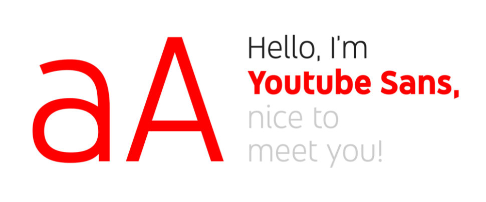
Fonts, typefaces, and glyphs

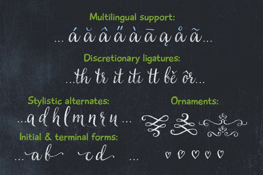
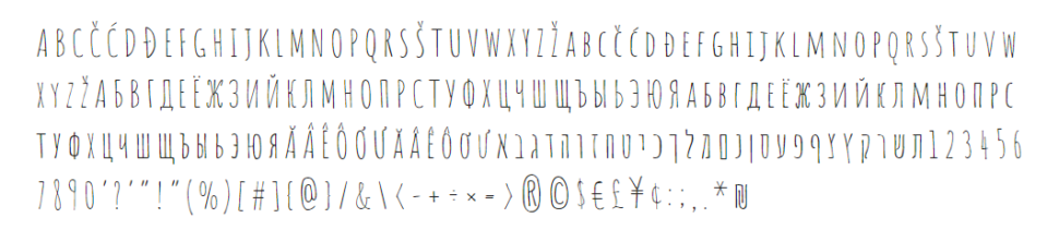
These characters are letters, punctuation marks or symbols. So, for example, the letter “A” is a character. This character can be composed of several glyphs, such as A, ä, ă or â, which will, therefore, be glyphs of the same character and of the same typeface. The set of all the characters and glyphs of the Latin alphabet designed according to the same visual coherence and meaning, takes the name, again, of a typeface.

And it is here that misunderstandings arise in many different languages. English is clearer: the character (understood as a letter) is a character, the glyph is a glyph and the coherent set of all this, the typeface, is a typeface.

what is a font

The font, however, is the file

Font is another thing: font is the medium that allows you to apply a font. That is: while Garamond is a character (typeface), the garamond_semibold.otf file is a font (better: one of the fonts that make up the Garamond font family). To explain it we can make the comparison with music: if a typeface (character) is a song, the font is the .mp3 file that allows us to listen to it. It is, therefore, wrong to say “Listen to this chorus via this mp3!”, While it is much more correct to say “Listen to this song!”

We often use the word “font” instead of character, it is a common mistake of the digital age: to confuse the software (medium) with its purpose (end). It’s a bit like saying “but this is Photoshop” looking at a montage.

And it is a mistake that I myself made for years and in which I still make from time to time. So learn from my mistakes!   

Why do you say “font”?

Many think that font is a term of English origin but in reality, its origin is French. It is, in fact, the English transposition of the term “source”, of medieval French. This word, which pronounced itself “font” (in French the end is truncated and not pronounced) originally meant “fused”. The Latin root of the word is the same as the Italian verb “folder”. The word font was then imported into England where it spread to all English-speaking countries and from there to the whole world over the last century.

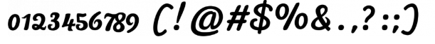
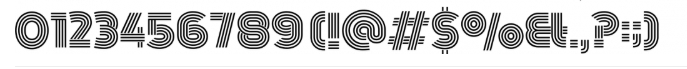
What are the font variants and types of typefaces?

Let’s look at the terms that serve to identify the various files that make up a family of fonts and the types of main typefaces:

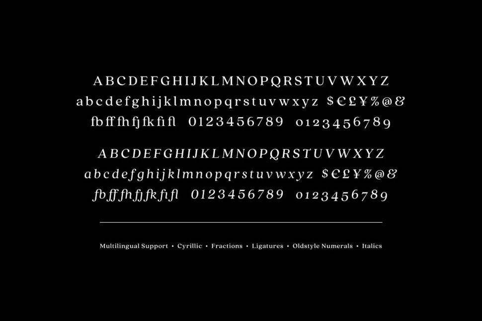
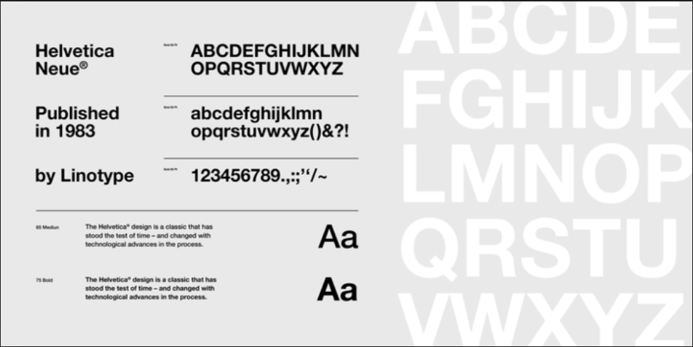
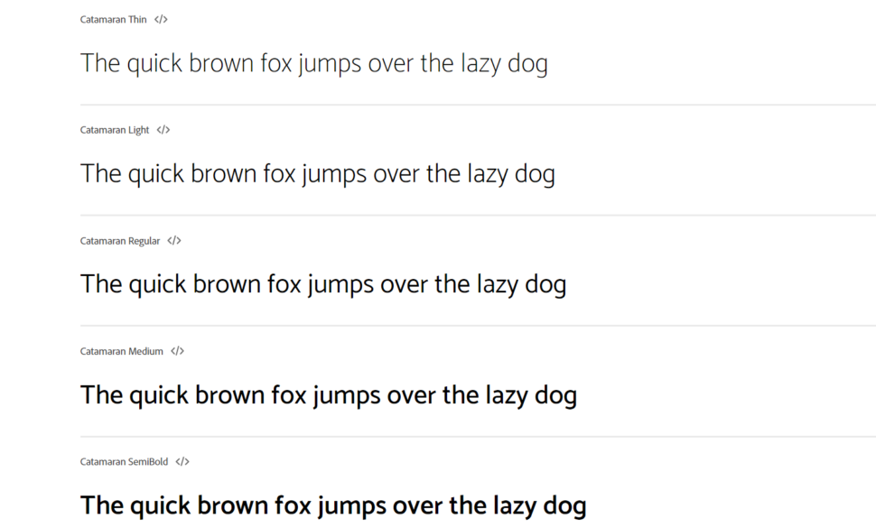
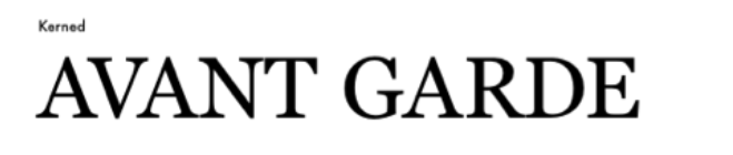
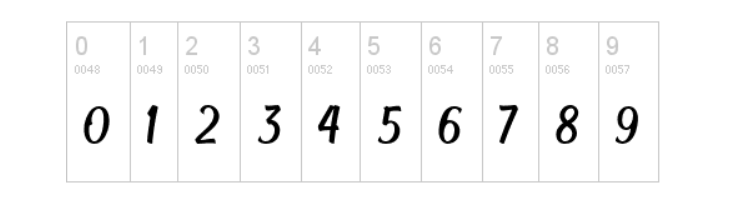
The variants of a font (weights, italics, etc.)

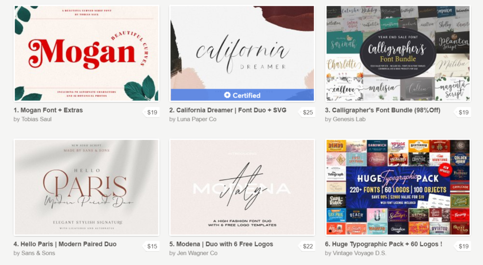
As mentioned, a font is a file and each file corresponds to a typeface in which all the glyphs that have been designed so that it works together, as a single body, and inserted. Generally, font files are grouped into font families, where there are variations of the original typeface.

what is a font

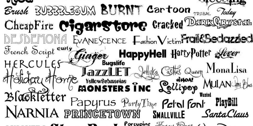
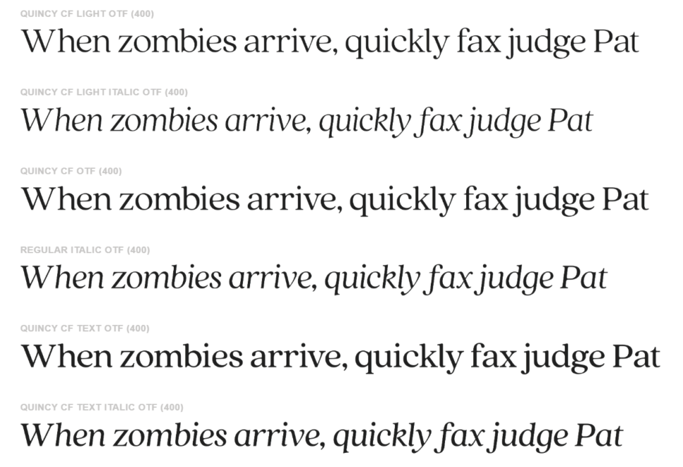
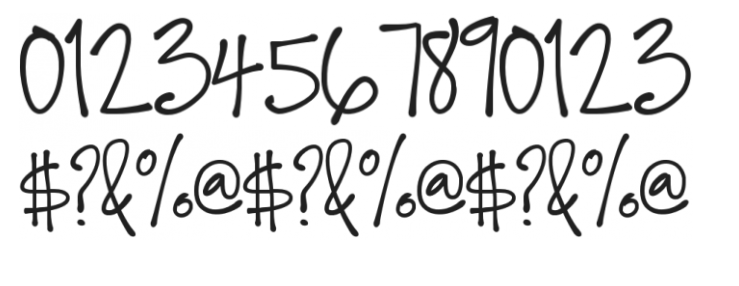
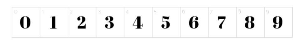
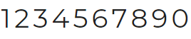
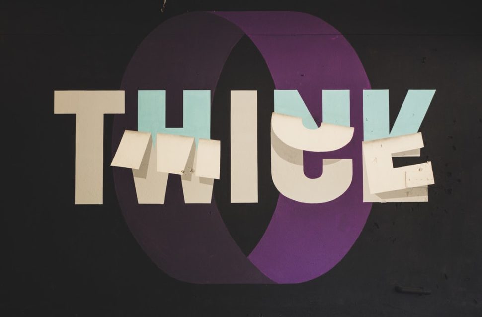
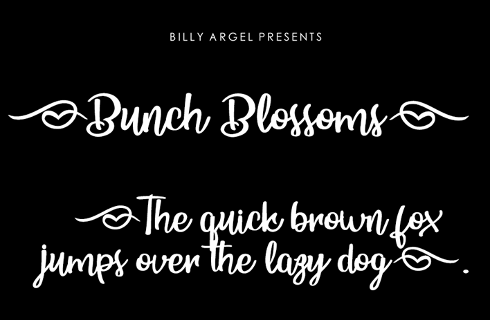
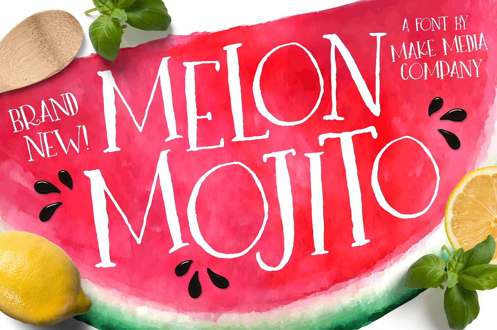
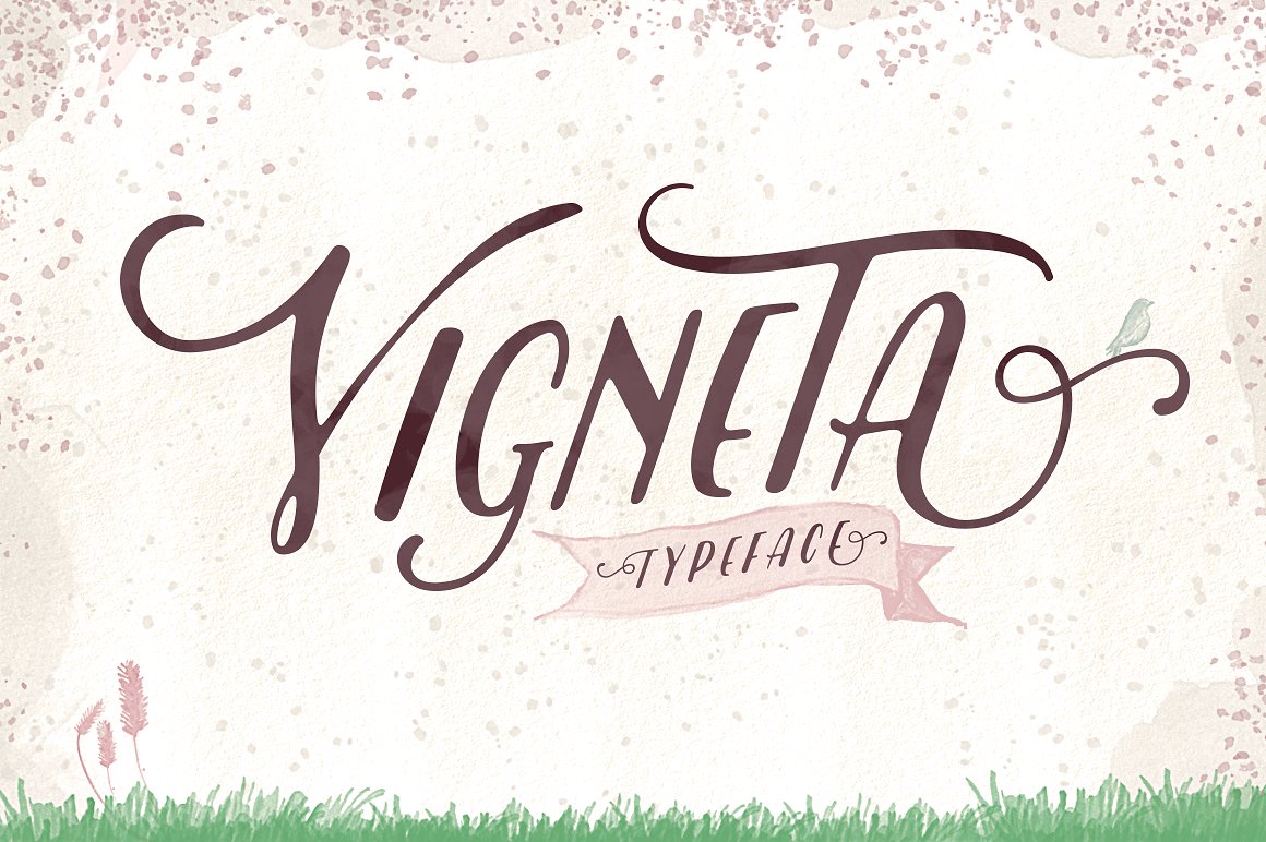
Types of typographic characters

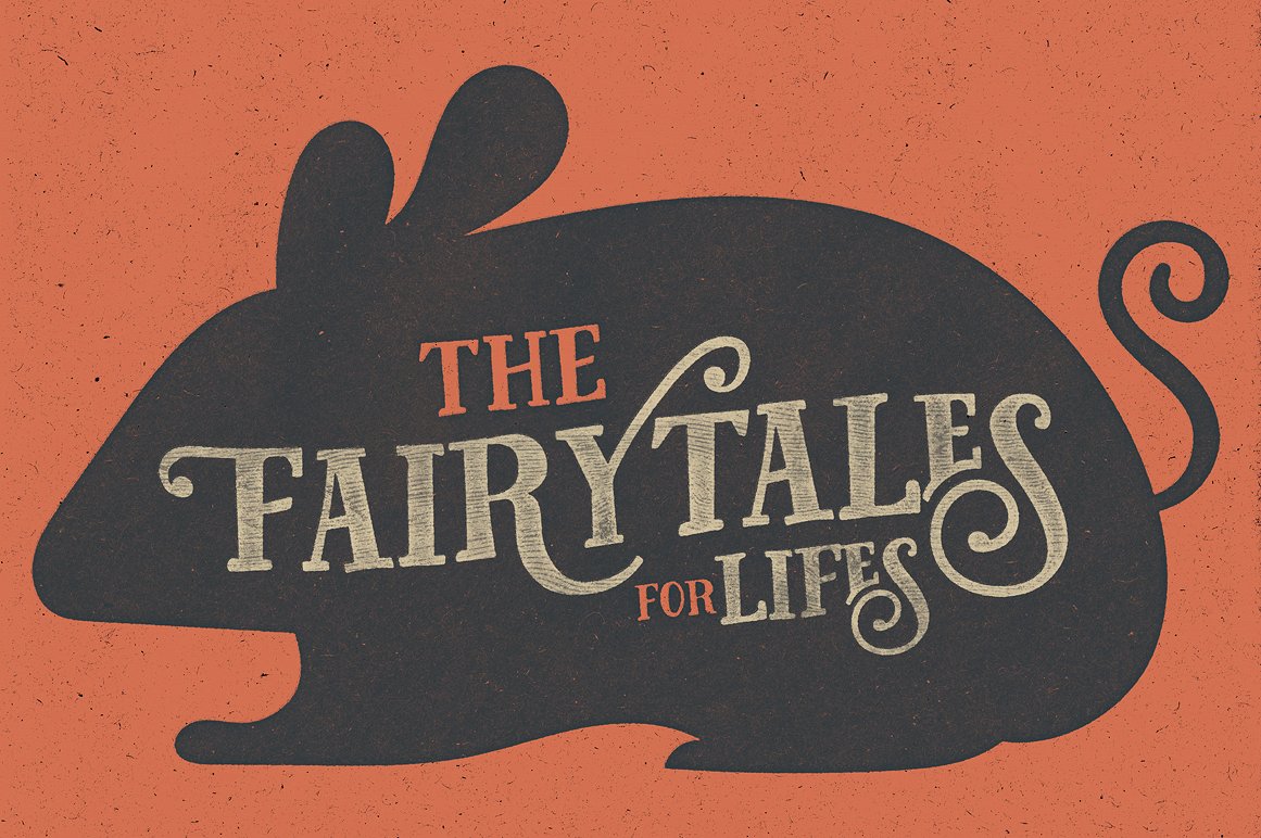
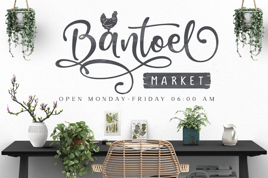
The typefaces are not all the same, indeed, they are very different! In graphic schools or universities, fonts are often said to be divided into two categories, the serif and the sans serif. These are two French terms that mean “with thanks” and “without thanks”. In reality there are several others, even within these two macro-categories.

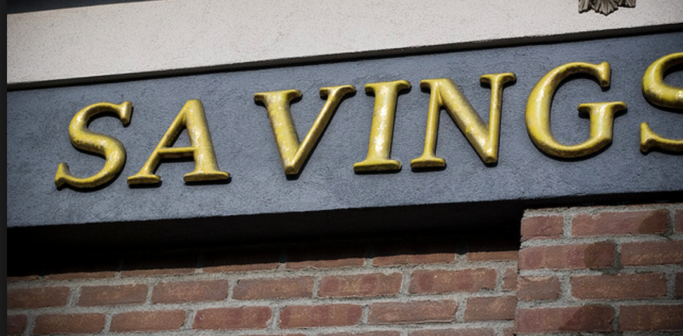
Serif and Sans Serif

what is a font

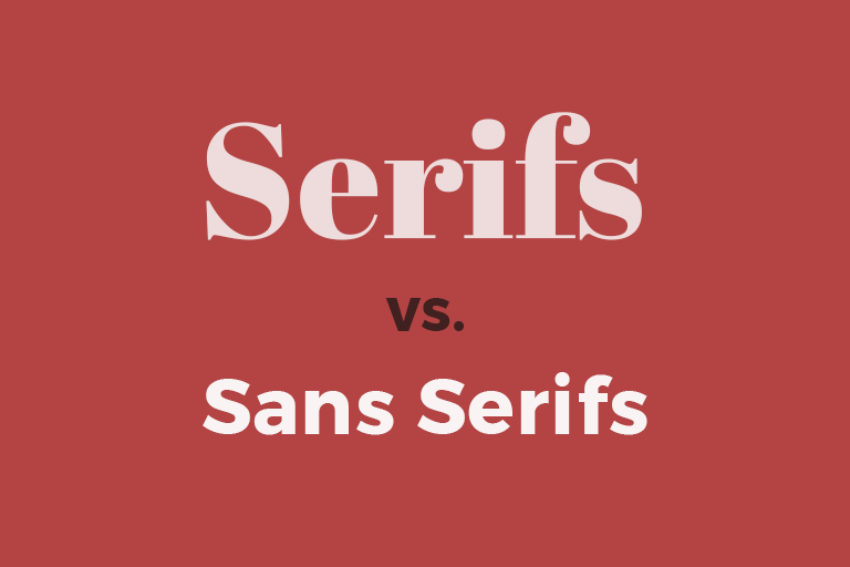
The substantial difference between these two categories of fonts is the use of the “graces”, or those small extensions at the ends of the rods, which derive from manual calligraphic writing.

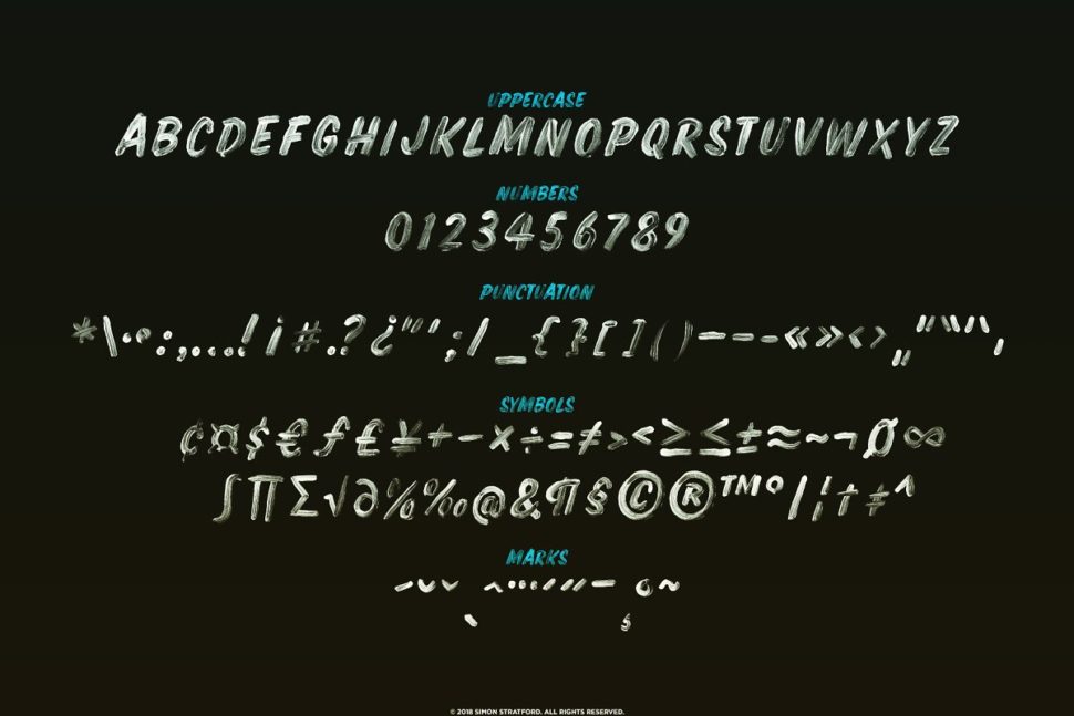
How does a font work?

As I said before, a character, or a single letter in all its variants, is composed of various different glyphs. Glyphs, in turn, are composed of many different structural elements, which take different names:
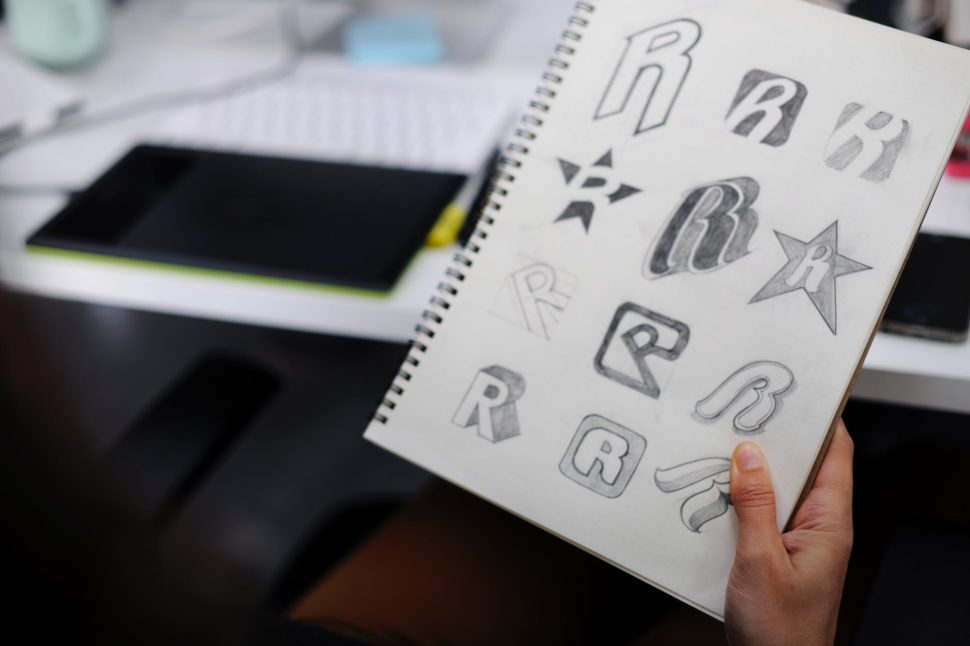
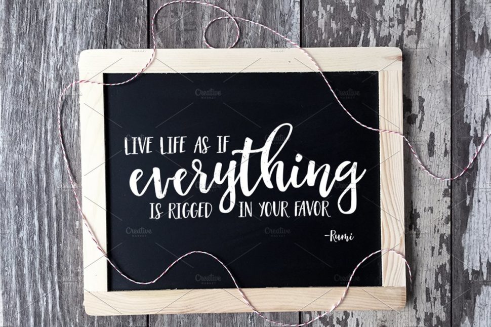
How to use fonts

In a complete guide on typography in graphics, one cannot talk about how to use these fonts. How many times have you started searching for the font best suited to your project by scrolling the font drop-down for hours, searching through the hundreds of characters you downloaded or purchased?

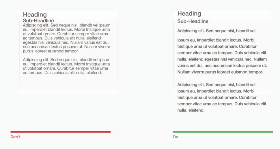
To put it simply, the font should always compliment the context. Of course, there are many ways it can do that, so it’s not exactly a science. What it is, however, is a skill that can be adapted and fine-tuned with some practice.

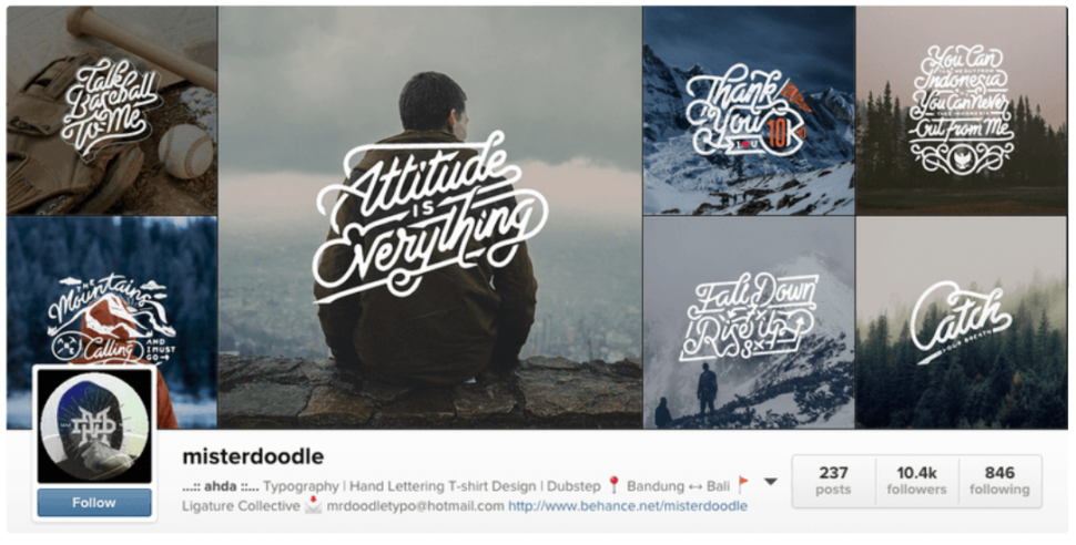
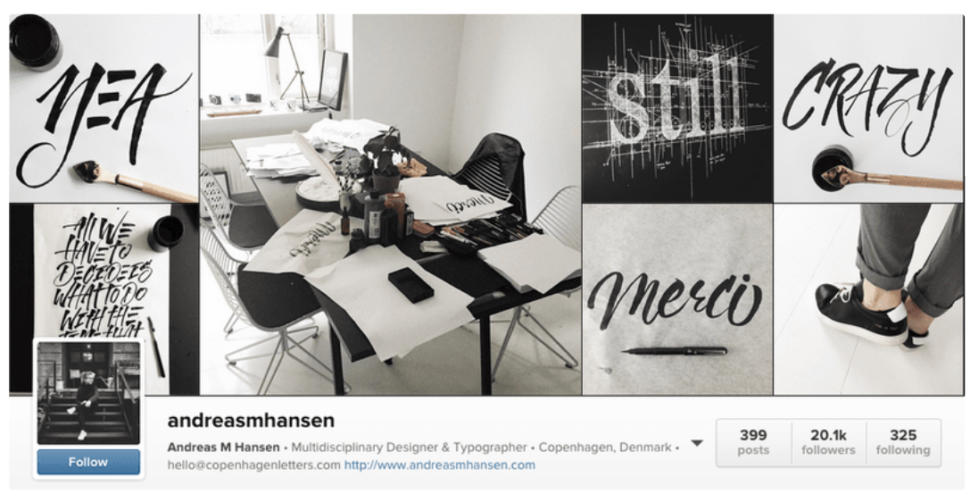
How to use fonts: combine multiple fonts with each other

Choosing a font is a complicated process and requires careful analysis of your project. But knowing how to match fonts can be even more difficult. In reality, there are so many things to talk about in this wonderful and fascinating world. Because the type is really one of the most mysterious and profound aspects of graphic design.

what is a font

There are lots of courses you can take in order to get this right. My advice would be to at least research and study as much as you can. Again, this is one of those things that can only be perfected through practice.
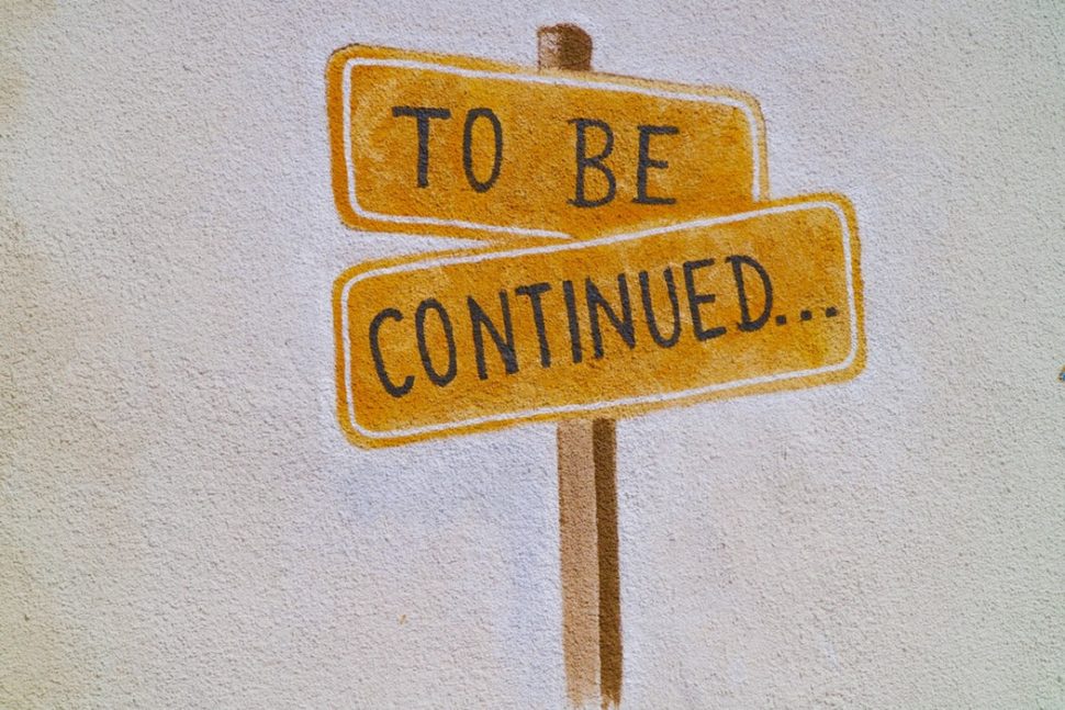
The conclusion

I hope you’ve learned something new today. Although this article aimed to cover a lot, there is still a lot to know.


Fonts have been around for quite a while, and won’t be going away ever. They are an essential part of graphic design, and design as a whole. My advice would be to get as comfortable with them as possible and to practice using a wide variety of them, combine them, and maybe even experimenting with your own.

Read More at What is a Font? The Complete Guide for Typography Designers

How to Recognize a Quality Font

quality font

To understand when a typeface is of good quality and well designed, we must first understand that within type design, or font design, there are innumerable technical aspects to consider, which contribute to the final result of that font. We talk about things like the quantity of styles, typographical variations like bold, italic, black, thin, small caps. But also things like space management and therefore kerning, tracking and leading.

All the proportions between the various glyphs, between the vertical and horizontal rods. Or even the management of open type features of a font. These are all functional, technical and aesthetic aspects that help us understand how the quality font is… or isn’t. The knowledge necessary to build a complete and well-made font are many and are not limited to aesthetic or stylistic choices only.

Technical aspects to be analyzed

The best way to understand if a font is of quality or not is to verify if, within it, there are these technical and design features. A typeface, to be considered quality, obviously also needs to respond to certain aesthetic characteristics.

And here everything becomes a little more complex. Because if, on the one hand, the technical aspects are easily analyzed and identifiable, the aesthetic canons are more subjective, right? No. I will explain this to you shortly.

Now, let’s focus on some technical aspects that I personally use to check the quality of a font:

Glyphs must be well designed

quality font

The first thing to do is to observe and analyze the individual glyphs. There are some features that make a quality typeface, and there are some that make them quite the opposite. The thing to look at is how the various glyphs are consistent with each other in terms of style and design. Individual letters must communicate in the same way within each typeface.

To do this kind of analysis, there are some tricks that type designers have used for hundreds of years. For example, there are some groups of letters that are designed using the same compositional elements, such as h / n / m / r / u. As well as the b / d / p / q or uppercase letters like O / Q / C / G, which have similar structures and curves.

It is this set of elements that make up the supporting structure of a typeface. When you go to analyze the quality of a font, you need to look for that repetition of those shapes, of those curves, of that thickness of the rods. In this way, reading a text with a quality font, one perceives a sense of rhythm. There is nothing out of place.

Furthermore, one way to analyze the design coherence of the glyphs is to compare certain details and their components.

Graces must be visually consistent

In a quality serif font, for example, the graces must be visual all the same or at least coherent with each other. And the same goes for the punctuation, the eyelets, the thickness of the temples, the ends of the temples and, in short, all the details.

Diacritical marks must be well balanced between them

Other things I always look at are the accents and diacritics, especially those of glyphs not commonly used in English as circumflex accents. Even if these elements are well designed and balanced, following the same aesthetic principles and with attention to detail, it is often an excellent sign of quality.

The number of glyphs

Furthermore, the quantity of glyphs contained within a given typeface is also attentive. Having many glyphs is not a collector’s habit, but it is simply a tool that makes the font you use flexible since it makes it adaptable to all the various languages ​​that use those specific glyphs or diacritics. For example, German uses the double S (or scharfes S ) ß, the Polish, the ogonek ę, again the French, the cedilla ç.

quality font

So, if you plan to write a long text, I suggest you choose a font that also contains these diacritical marks, because every now and then you will have to enter foreign words.

How to understand if a font is of quality

Now let’s take an example of everything we’ve said so far. Take the Helvetica Neue, Minion Pro and Melisande Sharp fonts. There is no doubt about the perfection of the first two, both designed with undoubted coherence. Writing a text in one of these two fonts, everything will appear in its place, coherent and linear.

Melisande Pro (downloaded for free), on the other hand, is not horrifying but appears to be of poor quality. Analyzing the first group of letters of the image, we can see that the h / n / m / u have the same basic forms. However, the r does not recall the form of n, as happens in the other two fonts.

quality font

Furthermore, m / n / r do not have optical corrections, which is very important when working with typography.

Another mistake can be seen in the accents, which are inconsistent with one another. This denotes a lack of attention to detail, which makes this font altogether of low quality.

1. Does it have different weights?

The fact that a character has many different weights does not mean that it is by force of quality, but it is a sign of design care, which is often a sign of care in other areas. Furthermore, having fonts with many weights is quite useful for one’s own projects, because it allows us to create contrast and visual hierarchy.

Generally, it goes from a minimum of 4 style and weight variations, namely roman and bold, and roman italic and bold italic. But it’s always better when there is more.

quality font

When you have to use the font only for a logo, or for a single title, it’s not essential, but to have more flexibility, I suggest you consider how many weight variations a font has.

2. Do you have any real text variations?

In particular, I refer to italic, oblique and small caps. Generally, a quality font, especially if it is to be used for a long text, needs true italics that is a variant of the font that has different glyphs, especially if it is a serif or pardoned. For example, in this case, the Minion Pro has true italics. If it does not have an italic type, it must have an oblique, as in the case of geometric or neo-grotesque sans-serif fonts such as Futura, Helvetica or Univers. They do not have a true italics but they still remain quality fonts if used in the right ways. The important thing is that they don’t have an oblique version which is simply a stretched version of the font in the regular version.

quality font

Another variation that I think is very important is the small caps. To understand if a font you already have has a TRUE small-case, just open a program like Illustrator or InDesign, set a few small caps and check the thickness of the rods compared to that of lower case. If they are the same, then it is a real small cap, if they aren’t, then it is not a real small caps.

3. Does it have good space management?

Managing spaces within a typeface is an art. Really. The real type designers keep their tricks to manage the various kerning pairs as something extremely precious. A quality font is one in which, when used, almost no changes are to be made in kerning and spacing (apart from cases where there are design needs to do so).

4. Do you use Open Type features?

The last aspect is that the font has open type functionality. Open Type is a font file format, developed in the late 1990s by Microsoft, which has become the main format when it comes to font files. This is because an open type font allows for many glyphs, many features, such as the use of ligatures, the use of different numbers (such as apex, as a subscript), which are all consistent with the rest of the font.

Conclusion

I really hope this article has been useful to you and that it has provided you with the necessary tools to be able to recognize a quality font for your next projects. Obviously yes, it is important to assess whether a font is of quality or not, but at some point the final question to ask before the fateful choice is: is this font suitable for the project in which it will be used?

Until later,

WDL

Read More at How to Recognize a Quality Font

All You Need to Know About Kerning in Typography

kerning


In order for messages to be clearly transmitted, many factors play an important role. Depending on the type of communication, factors such as stuttering, poor grammar, bad alignment of letters, incorrect use of punctuation marks, mumbling, and others set apart unclear from clear messages. In oral speech, diction, proper intonation, a calm tempo of spoken words, the intensity of the voice are all skills that anyone who wants to be a good communicator has to achieve. In written speech, readable caligraphy, correct alignment of letters, words, sentences, and paragraphs, will make any text accessible to the reader.

Why are all these important? Designers have a major responsibility to make the latter type of communication possible without any obstacle. There are a few notions any designer should be familiar and able to work with: Kerning, Leading, and Tracking.

What is Kerning?

Kerning: Definition

Kerning is the stylistic process that makes you read the first word of this sentence “KERNING” and not “KEMING”. You’ve probably already guessed it. Kerning is the act of adjusting the space between two letters in order to avoid the irregular flow of the words and to improve legibility.

Kerning: Meaning

Back in the good old days, before the current form of typing had been invented, people would use pieces of metal, each having imprinted one letter on them. Now, remember that each piece of metal was the same size. Are the letters the same size? No way, Jose. Imagine that the letter “V” used to have a metal cast as big as the letter “A”. If we wanted to write Avant Garde without kerning the letters, meaning shaping each metal cast so that they fit better, our words would look like this:

kerning

Obviously, there is too much space between the letters of AVANT. But after shaping the metal cast, a side of A and V would hang out the metal cast so that they could be brought closer together. The result would be the following.

Kerning Typography

In the past few years, designers have been creating new fonts. Classic fonts have the process of kerning already incorporated, while new ones either have automatic kerning, or designers can play with the spacing between letters as much as they’d desire. Manual font kerning isn’t the best option for many graphic designers, as it takes a good eye to understand how spacing works. This leads us to the next important chapter of this topic:

kerning

Bad kerning examples

As the saying goes, we always get what we pay for. While there are amazing graphic designs and typographers who are great at their job but are not always given credit for it, the bad kerning examples always put on a show. We do believe that learning from other people’s mistakes is much wiser than learning from our own failures, that’s why we are bringing into your attention how kerning can go wrong. Judge these examples yourself.

  1. SA VINGSkerning
  1. KIDS EXCHANGE

kerning

I don’t know what they exchange at this place nor do I want to find out. It sounds just as bad even if I try to guess the correct kerning.

  1. Travel

kerning

That moment when Tra decides to travel without Vel. Bad designers ruin relationships.

  1. Flikering Lights

kerning

  1. Stop

kerning

I believe the painter of this stop sign took a break between ST and OP. Or he’s just really bad at kerning.

The examples can continue, but we hope that now that you understand better what kerning is all about, you won’t skip it in your projects.

Kerning vs. Leading

We talked at the beginning of this article about the three notions every designer should be familiar with. We briefly explained what kerning does to our words, now it’s time to go to the next important term: Leading.

kerning

Simply put, leading is the process that makes your text more airy or more compact. Leading refers to the spacing between each individual line of your text. When writing in a notebook, your lines are already spaced and your text is kind of forced to follow a certain leading process. But when writing on a plain sheet of paper, you have the freedom to have the lines of text as close or as far apart as you like. Take this concept to a virtual canvas, and you can separate each line to your liking.

Kerning vs. Tracking

kerning

Tracking is the third notion we are shedding a light on today. Tracking is the process that allows you to stretch a word as far out as you want. If kerning deals with the spacing between two letters of a word, tracking deals with the spacing between all the letters of a word. While it does have to be pleasing to the eye, tracking requires a less intense concentration to get it right.


The Summary

Kerning – the process that deals with the spacing between two letters in order to make the word look good.

Leading – the process that deals with the spacing between the lines of a text in order to make it breathable.

Tracking – the process that deals with the spacing between all the letters of a word in order to make it look as you please.


We hope that this article explained well enough the difference and the roles of each of the three essential design aspects. We would happilly answer any questions posted in the comment section below on this topic. For more trendy topics of discussion, ideas, and inspiration, we invite you to visit us daily.

Until later,

WDL


Read More at All You Need to Know About Kerning in Typography

Free Illustrations: Trendy and Artistic Graphics that Tell Stories

This post is originally published on Designmodo: Free Illustrations: Trendy and Artistic Graphics that Tell Stories

Free Illustrations: Trendy and Artistic Graphics that Tell Stories

The new trend in graphic design and illustration for web, finally, is art meets illustrations. People love illustrations. Whether it is a designer, developer or regular user, hand-drawn pictures always please the eye. They bring authenticity and personality to digital …

For more information please contact Designmodo

Famous Fonts Used by Powerful Companies

famous fonts

Have you ever wondered what the most used fonts in the most famous logos are? Those logos that happen to be seen hundreds of times, repeated on all the screens, shirts and sheets of paper that surround you.

Well, then this article is made just for you!

In fact, in this article, I want to talk to you about which fonts are used in some of the most famous logos ever.

We’re going to try and understand why these specific fonts were chosen. Because choosing a font is not a simple thing, and behind the choice of a font, there is a very precise message that any brand wants to convey.

In this article, I wanted to analyze 6 fonts in depth.

Ready? Then let’s get started!

A little clarification before starting: many famous brands use private fonts

Almost every major brand opts for a custom font. Of course, these fonts aren’t generally available to the public.

Very often, however, these proprietary fonts are based on already existing and already famous characters. And in a lot of cases, custom fonts that you can purchase or even download for free follow suit shortly after.

Now, let’s really get into it!

What font does YouTube use in its logo?

Bold and tight, the Alternate Gothic was designed by Morris Fuller Benton in 1903 for the American Type Founders Company.

It is a font with a long history, designed at the beginning of the 20th century so that it could be perfect to insert titles in narrow columns.

It was the font used in the YouTube logotype until a few years ago (August 2017, to be precise) when YouTube rebranded. Since then, they’ve used a custom font called YouTube Sans.

Famous Fonts

This font was designed from scratch, by the Saffron branding agency, starting right from the shapes and aesthetics of the Alternate Gothic used previously.

Why was this font chosen?

This current one, according to what the Saffron designers write, was chosen to “communicate its brand with only a glance”, that is, to be able to immediately communicate that it is YouTube.

With this, being a reference to the Alternate Gothic that they used previously, the recognition of the brand is strengthened.

But why had the Alternate Gothic been chosen?

Nobody can really say for sure. Most people speculate that it was chosen because of its super easy readability. Being a massive international company, readability in the logo font is a must.

It was designed for editorial use in the minuscule dimensions of column headings but also in the enormous dimensions of the main titles. And so it was readable in every dimension.

What font does Adidas use in its logo?

L’Avant Garde, which in French means cutting-edge, is one of the most influential of the 900 fonts. Created in 1970 by Herb Lubalin (along with Tom Carnase), it was introduced into the font family. Its original intention was to be in the logo of their magazine, which was called “Avant Garde”.

The forms of the Avant-Garde recall very much the natural elegance of the Art Deco of the 1920s and 30s. While transmitting a vintage effect, it is nevertheless able to tell it always in a contemporary way, thanks to its flexibility and naturalness.

In reality, however, the font used in the Adidas logo is not the Avant-Garde.

Here too, it is a proprietary font, AdiHaus. A font inspired, of course, by the Avant-Garde but also by the FF Din (one of my absolute favorites).

Why was the Avant-Garde / AdiHaus chosen?

The Avant Garde was chosen in 1971 by the designers who worked on the first restyling of the Adidas logo.

Famous Fonts

It was chosen both because it was a font very similar to the one originally designed in ’49, and, I believe, because of its qualities: elegance, naturalness, cleanliness.

What font does Nike use in its logo?

The Futura is one of the most important and influential typefaces in the history of graphics.

Designed in 1928 by Paul Renner, it is now considered the geometric font par excellence.

And it is also used, among the multitude of applications, for the Nike logo.

In particular,  in the Bold Condensend Oblique version.

Even more specifically, in the Bold Condensend Oblique version, but with some substantial changes regarding the inclination and kerning (the space between the glyphs).

Why the Futura?

Famous Fonts

Because, like the “whisker” of the logo, the chosen font also transmits a message: strength (the bold version), dynamism (inclination), stability (the geometry of the Futura).

And it tells, along with with the rest of the image, a very clear message: Nike is a strong brand, buy Nike and you will be strong too.

What font does Instagram use in its logo?

Instagram, in its new logo of May 2016, does not use a real font.

Before now, the Instagram logo was made using the Billabong font. This is a 2006 script font, which has nothing special, other than the fact that it is the font of the Instagram logo.

In 2016, however, there was the famous Instagram rebrand (extremely criticized at the beginning, but now most people think it’s amazing) in which the logo has also changed.

The new logo was created without using any files, no fonts. It is simply designed to be the word “Instagram”.

It was designed by Mackey Saturday starting from the Billabong font, so that it was more functional and harmonious than the previous one while maintaining some characteristic elements.

Why this font?

Famous Fonts

Here the answer is simple: because Instagram was born as an application that presented itself as something dynamic, fun, and energetic. That font exactly reflected the kind of message they wanted to convey.

What fonts does Linkedin use in its logo?

Very little is known about the Linkedin brand choices, in reality. There are no real studies of designers or agencies that have worked with them, nor is there any mention in the brand manuals.

What is known is that the font used in the logo is certainly the Avenir (at least from 2012 onwards, before it was the Myriad Pro).

The Avenir is one of the many wonderful fonts designed by the extraordinary Adrian Frutiger, in 1988.

It is undoubtedly one of the typefaces I like most. He is able to combine the geometric shapes of the sans serif of the 1920s (such as the Futura), with the more natural and flexible forms of the grotesk characters of the late 1800s (such as the Akzidenz Grotesk) and the post-World War II period (like the Univers, always by Adrian Frutiger).

Why this font?

Because it inspires respect and professionalism. Exactly what a working network like Linkedin wants to convey.

Famous Fonts

Few other typographical choices would be so suitable.

What font does McDonald’s use in its logo?

McDonald’s has been using for years what is among the most important and today undervalued fonts in the history of graphics: the Akzidenz Grotesk.

It is extremely readable, simple, flexible and of great impact.

It was produced by the German foundry H. Berthold AG in 1896 by an unknown author. The current version available is the one reworked by Günter Gerhard Lange in the 1950s.

Why is it so difficult to recognize it? Well, because it is the base on which some of the most used and known fonts have been built today. Like Helvetica, Univers, Arial, Frutiger, all inspired by the ancestor Akzidenz.

Famous Fonts

Why exactly this font?

First of all, in my opinion, because it is very beautiful.

But then, I believe, also because it represents tradition, history. Which at McDonald’s, at the beginning, was very interesting to tell.

Conclusion

In this article, I wanted to talk about the font choices of some of the most famous brands in order to give you creative ideas for choosing a font for your project.

Analyzing what other designers have done before you is crucial.

But even more fundamental is trying to understand the reason for certain choices. What did they want to communicate? Why that font instead of another?

The choice of a font is, in fact, a crucial aspect in the process of creating a logo but also in any other aspect of graphic design.

Read More at Famous Fonts Used by Powerful Companies

10 of the best number fonts out there

number font

Although typography is nothing new, it changes all the time, and we love it. It’s always fun to see what kind of cool and unique combination you can come up with to make your brand, logo, and content stand out. But today, while continuing to talk about fonts, let’s focus on some of the characters that are included with them: numbers.

We know that there are several factors to take into account when it comes to the choice of our typography. For example, if you want to write in uppercase and lowercase, if you have a specific style in kind, and so on. It is also very important to know if you have the numbers and the character of the chosen font.

You might think that this need is pretty specific – number fonts. But the truth is, you use numbers more often than you think, so it’s better to have a specific style and have it all uniform throughout all your content. If these are the point of focus, it is very important that the aesthetics of the numbers correspond to the surrounding content correctly.

With all of that said, number fonts are overlooked quite often. It’s very common to see fancy typography and designs paired with simple numbers. Perhaps it’s because they didn’t want a number font, or perhaps they didn’t even know they existed.

For that reason, we’re going to go over 10 of the best number fonts out there today. Fasten your seatbelts everyone, it’s about to get mathematical.

1. Deadhead Scrip

number fonts

Deadhead Scrip is a handwritten style of font that pairs nicely with other handwritten typography. The thickness of the lines varies as the curves go on, giving it the perfect handwritten look.

You can find these numbers in the link for about $20, so go check it out!

2. Dear Prudence

number fonts

Dear Prudence is another good example of a handwritten font. But, just as handwriting styles vary, so should the fonts. This particular font is a much different and unique take on the traditional handwritten font. I like its irregularity but at the same time harmony. It would go great on a calendar or a homegoods shop.

For the versatility that this font provides, it’s a steal at around $4.

3. Have a Great Day

number fonts

Have a Great Day font is yet another handwritten font that you really don’t see every day. The style is like that of a thick marker. The irregularity shines through and gives each and every line a personal touch that simply can’t be duplicated by a standard font.

4. Story

number fonts

Story is perhaps the simplest typeface of this group. The strokes are perfect and remind us of when we first started to learn to write as kids. Its price is quite admirable as well (about $6), and you can do a lot with it.

5. Amatic SC

number fonts

The Amatic SC font is a Google Font that was quite popular a few years ago. It’s not as popular now, but it still looks great. This is definitely the kind of typography that would go well with a variety of different brands. It could even be paired with other fonts to make a unique combination.

As of right now, Amatic SC is free to download and use, so get downloading!

6. Abril Fatface

number fonts

We could talk about an infinite number of serifs with original numbers, but since I decided to shone a light on more “creative” fonts, we chose this one to fill in for serifs. You can find this particular font in a lot of places, but its thickness and style make it absolutely perfect to be the main focus of any project that include numbers.

To top it all off, this one is a freebie.

7. Montserrat

number fonts

As with most cases, I could probably add an infinite amount of serifs to this list, but we won’t. Instead, I’ll chose this one and the one above to highlight their variety. In this case the Montserrat is well known to all. Just like it’s perfect for a lot of titles, it’s also perfect for its numbers.

Since this is another Google Font, you can get your hands on it completely free of charge.

8. Catamaran

number fonts

As with most typographies, the thickness of Catamaran gives us a lot of font to play with. We can combine these giving more hierarchy to a certain element, or just use them to draw attention to a specific number.

Like the previous few, this one is free since it’s a Google Font.

9. Pacifico

number fonts

Pacifico is a very popular Google Font that has made its name through its use. But, the numbers are often overlooked, and it’s such a shame. The curves and swirly-like design of this number font are quite unique, and give lots of flare to any project that they find themselves in.

10. Monoton

number fonts

Last but most certainly not the least, we find Monton. As you can see, this font has quite the unique design, and comes off very retro. As specific as the niche might seem, this font actually goes well with a variety of projects. It draws attention and leaves people curious.

This one is also a Google Font, so you know what that means. That’s right, it’s free!

The conclusion

Hopefully you find at least one of the number fonts above useful, and you use it in the near future. If you didn’t find one that you like, remember to always check in package deals for the number fonts next time you purchase a font. If not, seek out a number font by itself, and combine it with your own typography to make a truly one-of-a-kind project.

Read More at 10 of the best number fonts out there

This is how you earn as a designer on Instagram

designers on Instagram

This article is the first guide dedicated to designers on how to make money with Instagram. On the web, you can find all sorts of marketing strategies, tricks, tricks and fanfare about how to have followers, but not much quite like this.

In this article, I will talk about practical and concrete facts. In fact, I want to talk about how a designer can use Instagram in their work. To promote yourself, to make yourself known and therefore to make more money.

Until a few months ago I was also skeptical about using Instagram and then, after following an online course, I changed my mind. In that course, I was told how there are dozens, hundreds, thousands of people around the world who, directly or indirectly, can earn tens or hundreds of dollars a day on Instagram!

From that moment I consider Instagram as one of the most important tools for a designer to make themselves known. A tool that, as you will see, can be perfectly integrated with your online portfolio.

Why Instagram?

Because Instagram is increasingly used

Instagram is probably one of the fastest and most dizzying social networks ever. Every day thousands of new users sign up and millions of photos and videos are posted. The number of active users is constantly growing (over 350 million) and companies use it as a communication channel with great visual impact.

The peculiarity of Instagram is that you can only share photos or short videos. Where on the other social networks, generally, we write, on Instagram we post photos and images.

Because Instagram is mobile and simple to use

designer on Instagram

Another of the features that made (and still makes) Instagram different is that it can be used mainly by mobile phones.

This initially allowed it to become a huge success among the digital natives, young people like me, who first populated the social network.

The fact that it can be used mainly by mobile phone also makes it extremely simple and intuitive to use.

Because Instagram is focused on the visuals

Only images and videos can be posted on Instagram.

designer on Instagram

What do designers work on if not images and videos? This alone should make you realize how much potential this social network has for those who, like us, work on images.

If you are able to create quality visual content, your potential on a visual social media platform like Instagram is basically endless.

So maybe you want to know the ways in which you can use Instagram to earn as a designer, right? Let’s talk about it.

How does a designer exploit Instagram?

On Instagram, there are a lot of people. All of these people gather there for one reason, and one reason alone: images. And, seeing as you work primarily with images, it’s the perfect platform for you.

But, how can you take advantage of Instagram if you are a graphic designer?

designer on Instagram

First, you need to plan what kind of profile you want to use. If you want to use your personal profile to promote your work or if you want to create a new one and then use two different ones (or even more), each with different goals and uses.

On Instagram, you can register a different profile with each different email address you have (I have several Instagram profiles, for example) and you can manage up to 5 at the same time while remaining connected to all of them.

Deciding what kind of profile you will take advantage of and the building is essential to plan your goals and the way you make money with Instagram.

So, what are the various uses of an Instagram profile and therefore the goals that can be achieved through it?

You can promote your personal brand

The first way you use Instagram to make money is basically to advertise yourself. And here you can use both a personal and main profile as well as a separate and more “professional” second profile.

designer on Instagram

What does promoting your personal brand mean?

It means promoting your person, promoting yourself from all angles. So with photos of your life, of you while you work, while you plan or draw, while you travel while doing interesting things that can interest many people and increase your followers.

There are so many people who earn huge sums simply because the brands contact them to advertise on Instagram.

In practice, profiles with many followers and a lot of engagement (ie many interactions – likes and comments – with the photos and videos they publish), in the eyes of a company, are very attractive as a means of getting publicity!

I am sure that if you have already filmed a bit on Instagram you will often have seen very popular profiles posting pictures with brands and products in plain sight.

It’s called marketing and there are people who really make big money out of it. In these three examples, there are those who promote a sponsored product or their travel blog via the link in the video description.

Blogger example profiles

Of course, not everyone wants to promote themselves and their sparkling life. And you aren’t a blogger, right? Maybe you’re interested in promoting your projects, your portfolio, your graphic design or your drawings, right?

You can promote your work and your projects. Instagram can really be a bombshell for your freelancer business or your creative agency or your career in general.

designer on Instagram

There are hundreds of artists and designers on Instagram who receive daily collaboration proposals from companies and individuals after seeing their projects.

At the same time, introducing yourself to a client or a company with a strong profile in which you promote your work with thousands and thousands of followers and interactions is certainly an added value, don’t you think?

Instagram can, therefore, be an exceptional way to send back hundreds of users to your online portfolio every day, perhaps on a page where they can contact you and ask for a quote.

Example of freelancer profiles

Freelancers rely on one person only to promote themselves in a public space: themselves. Even if Instagram was originally created as a means to connect friends, it has quickly turned into a way for anyone and everyone to connect with others around the world.

You can create business profiles with the aim of selling something. A third way is to create business profiles, or profiles of some company or agency, with the aim of promoting their products.

designer on Instagram

There are many freelancers, designers or illustrators who sell products, such as mockups, fonts, books or stickers.

You can create an Instagram profile where you post photos and images of the prints you want to sell. In the description of your profile, you send the visitor back to the site on which he can make the purchase or contact you.

Example of store profiles

You can enrich your profile with quotes, photos of you while you design, exclusive content for Instagram and much more.

If you reach good numbers of people “on target”, ie in line with what you want to sell and promote, then you can surely increase your earnings and start seeing the money coming from Instagram.

So now the objectives are clear. There is, however, a big question mark: how do you reach big numbers on Instagram?

How to grow on Instagram

Is it possible to reach thousands of followers, hundreds of likes, comments and potential customers through Instagram, starting from scratch?

The answer is yes.

designer on Instagram

But if you are wondering if there are tricks and little shortcuts you can forget it. For example, there are many people who pretend to be very popular on Instagram but what they do is simply buy followers.

All this does not make sense.

The followers you buy are always fake profiles that will never interact with your posts or create value for your page.

What you need to do is get people really interested in what you publish, people, who can actually potentially contact you and interact with you and your products.

How do you do that?

Here are some basic tips to get started

1. Use English

In the description of the profile and in the description of the photos, if you use the English language you can reach all the millions and millions of users in the world. If you only use Italian, you will limit your audience greatly.

Of course, it can also be a strategy if, intentionally, you offer services or products only for Italians. In any other case, however, English leads to extremely better and faster results.

2. Use the most popular hashtags

If there’s a social network where hashtags are really used by users, that’s Instagram. Hashtags are used to find photos related to certain topics that you may like.

designer on Instagram

Make the most of the hashtags and enter all those needed to describe your image.

Don’t forget to use some of the most popular hashtags to reach more people!

There are tons of popular hashtags out there, and they change all the time. I advise you to create a note on your phone with these hashtags or with those that you will choose to reuse from time to time through a copy/paste.

3. Leave more comments and likes

Use hashtags to find images of other users to leave feedback. Write comments and put like as many images as you can.

The more you comment or likes, the more you will get feedback. Granted, this doesn’t always result in new followers, but if it were easy, everyone would do it, right?

designer on Instagram

Make yourself extremely active on the profiles of others. It’ll get your profile noticed and receive notoriety in return.


To make money with Instagram, you must first have followers!

4. Use quality images

To make things easier for you, an Instagram profile full of cool images will be something that users won’t forget.

If you have a profile full of boring, trivial and repetitive images, without quality, those who reach your profile won’t find it easy to follow you. People want to see something new and unique, not blurry and unrecognizable.

If instead, you have a profile that breaks the norm, full of interesting and beautiful things to see, then you will see that the number of those who choose to follow you will increase dramatically.

How to make money with Instagram

You can waste time for months as I did try to increase my followers and make money. This strategy only works for those who are already rich and famous. For the average user like us, you need a strategy before you even begin.

designer on Instagram

Study up online. There are lots of articles and even courses you can take to help increase your follower count. If you’re seriously interested in growing your account, collaborating with other brands, and making some extra cash, then it’s probably well worth it.

The conclusion

It seems pretty hard nowadays to find someone that isn’t using Instagram. For that reason alone, it’s well worth it to have a presence there. All it really takes is a few minutes per day to get your name out there.

A few minutes per day can result in some serious cash return a lot faster than you think. Stay consistent and follow the tips above, and you might just be the next Instagram celebrity.

Read More at This is how you earn as a designer on Instagram

The Power of Storytelling in Branding

Storytelling

The best writers, speakers, trainers, leaders, teachers tell stories.

A brand that is engaging is easier to remember and easier to process than others in the same category. Over time, it manages to establish a connection with potential customers, which directly contributes to a relevance in the market.

An emerging brand can evolve into a strong brand.

The most accessible tools for brands to become strong are words. Words create a story, and the story is what manages to capture the attention of any user. Stories portray emotion, and emotion attaches us to everything.

Story

To build your brand’s story, you have to answer two questions:

1.What is the purpose of your brands existence?

An excellent example of storytelling that can easily answer this question is represented by non-profit organizations (non-governmental organizations). In NGOs, we choose to invest our money and time without receiving a specific product or service in return.

They promote a cause, we become attached to that cause through emotion, and we choose to give them money.

If brands would address the communication process from an NGO perspective, helping the consumer first and selling second, they would all be more successful.

Storytelling

2. How does your brand differ from others?

The importance of a brand’s offer, whether it be a product or service, has diminished over time. On a constantly growing market, competition is unavoidable, and what makes the biggest difference is how a brand promotes the offer. Why does the brand choose to do what it does? What drives us to do what we do regarding the brand?

How to turn your story into a tool

To turn a story into an effective tool for your brand, it must be narrated in a transparent and authentic way. It must have a core belief (the moral of the story) and help the target audience reach the happy ending they hoped for.

The stronger the moral of the story is, the more significant of an impact it makes, the stronger the relationship between brand and consumer. However, the moral of the story can not be the same for all audiences. Brands need to understand this and create different approaches if they want to identify themselves with a larger audience of individuals.

Advertising. Storytelling. Engagement.

Storytelling

Every brand tries to create a connection with the audience to which it addresses, but this goal is not always met as expected. Most brands create user personas to help them better understand the kinds of people that usually buy from them. By doing this, you can also understand who isn’t buying from you, and develop strategies to reach those people.

Over 75% of emails received from companies are not open and over 99% of banners end up being ignored. The main objective of advertising is to attract long term attention. Another objective is to engage customers on a personal level. Make them feel at home with your brand, and develop a relationship that fortifies their decision in choosing you.

In advertising, the story is not just an entertainment tool, but the basis for changing a decision, attitude, or behavior. That’s why brands need to invest time building relationships to help them integrate the target audience into the brand story.

The conclusion

Storytelling is a key element in advertising. It’s not enough anymore to simply sell a product. You have to sell your story. You have to make these potential customers believe in what you believe. They have to understand why you do what you do, and the journey you took to get there. A story is more than a tool for a brand, but the brand itself.

The evolution of a brand involves all these elements, based on two fundamental concepts: creating a story and transmitting the narrative. They aim to establish a long-term connection with the target audience in order to build relationships, and generate not just customers, but loyal and happy customers.

Read More at The Power of Storytelling in Branding

The Good, the Bad, and the Ugly? 10 Features of a Good Logo

What is a logo? Basically, it is a symbol, a text, or a combination of the two that helps us identify a brand. The latter is not just a logo, it is the general way in which customers perceive you. This includes the way of communication, promotional materials, images, products or services, physical stores or online stores, and more.

Why is it important to have a logo? Representing the “face” of your business, it is necessary for the purpose of identifying, differentiating competition, constant communication and loyalty.

With that in mind, let’s talk about 10 of the biggest features that should go into a logo:

Represents the niche and the target audience

The features of a logo must depend on the niche and the target audience accordingly. That’s why a marketing brief is the basis for creating a good logo.

For a specific example, let’s use a heavy metal band’s logo. The band’s logo might look ugly and grotesque to some, but it’s exactly what it should be for their target audience.

It is adaptable

Good Logo

A good logo can be easily used in the online environment, embroidery, huge banners, small labels, business cards, bottles, you name it. Keep in mind that you need a logo in vector format, not just .png or .jpg, because this format offers scalability. Do not forget to always ask the graphic designer.

In this regard, you really should consider working with a graphic designer. Remember, your logo is the face of your company. It’s the thing that almost every customer sees before they even know what you do as a company. Spend the extra time and money to get it right the first time, and avoid having to spend more time and money in the future.

It differentiates you from the competition

Good Logo

First, to differentiate yourself, you have to know your competition. Considering the multitude of existing business and logos, it is extremely important to assume your own identity and not to copy it from others. Of course, in this case, differentiation must target the niche and the target audience. To continue with the previous example, heavy metal logos do not fit a law firm.

It is timeless

Good Logo

Trends come and go, but your logo does not have to be based on time preferences, but it has to pass the test of time. Of course, many businesses change their logos through rebranding campaigns, because they have changed their values ​​or just because they originally made a trendy logo.

A good example of a timeless logo is the Coca-Cola logo. Since its creation in 1887, it’s kept roughly the same design. It’s easily recognized, and it stays up-to-date.

It’s memorable

The memorable character of a logo can be provided by simplicity, uniqueness, color, hidden elements or many other features. The customer will choose a brand they know and trust, and ultimately become faithful to your brand.

Leave a lasting impression, and gain a lasting customer.

It’s read easily

Good Logo

Handwriting fonts can be beautiful for a particular audience, but they are often hard to read and therefore hard to remember and perceive. If a font is not readable at a comfortable size, how does it look on a business card or a mobile site?

Again, keep it simple and clean, and you’ll avoid this mistake.

It doesn’t describe the business

Good Logo

Just because you deal with car production does not mean that your car needs a car illustration. Of all existing car brands, none of them include the main subject of their business (except those that make toy cars).

Many graphic designers (or business owners) tend to make the logo descriptive. This might not be considered a mistake, but, more often than not, it comes off as a generic looking logo. It usually limits you to certain services, which can prevent the expansion of your business.

It’s smart

A visible concept is not a must, but it’s a plus . A logo that contains a surprise item or something that needs to be discovered generates interest (have you ever noticed the arrow in the FedEx logo?). But one element is more than enough. Many times, designers take this idea too far, and overcomplicate the logo.

Good Logo

Contains the appropriate fonts and colors

Fonts and colors are excellent forms of communication. For example, a handwritten font is more feminine and personal, usually unmatched in a corporate logo. Every color has its psychology, which is dependent on culture. In this sense, have you ever wondered why most corporations have the blue logo? The answer is simple: because blue inspires confidence and is a favorite color of both genders.

Good Logo

It’s not complicated

Too many fonts, colors, elements, symbols, or slogans can complicate the design. This leads to a hard-to-remember and unidentifiable logo.

The summary

Now you know what a logo is, why it is important to have one, and what  the characteristics that can fit it into the category of good ones are.

There are lots of examples of great logos out there. I’m sure you can think of a few right off the top of your head right now. But, for every good example of a logo, there’s at least one bad example. Avoid being one of those bad examples, and stick to these 10 features.

Read More at The Good, the Bad, and the Ugly? 10 Features of a Good Logo

10 Alternative Typefaces to the Ubiquitous Gotham

Gotham Alternatives

Gotham has become one of the most ubiquitous typographies of the 21st century. Its versatility and, undoubtedly, its good design makes it useable in many spaces. Even more, since it became the official typography of the campaign that led Obama to become president. However, in the typographic universe, there are hundreds and hundreds of typefaces to choose from. Since we live in a world that loves variety, here are 10 alternative typefaces to the Gotham.

1. Proxima Nova

Gotham Alternatives

Designed by Mark Simonson, Proxima Nova is perhaps one of the fonts that best presents itself as an alternative to the Gotham family. According to the author, this source “closes the gap between fonts such as Futura and Akzidenz Grotesk.” The result is a hybrid that combines modern proportions with a geometric appearance. It is a balanced and versatile source – the complete family includes 48 sources, eight pesos in three widths with their italics – the result of extensive work dating back to 1994. In recent years, Proxima Nova has become of the most popular web sources.

2. Montserrat

Gotham Alternatives

Montserrat was created by the designer Julieta Ulanovsky. He took inspiration from the architecture, the old posters, the luminous signs and the canopies of the neighborhood named after him in Buenos Aires. Ulanovsky’s intention was to rescue the beauty of urban typography from the first half of the 20th century. This inspiration taken from the local signs and architectural ques bring it closer to Gotham. Even so, the Montserrat forms are a little broader, giving a less solemn and more relaxed feeling that Gotham doesn’t provide. Montserrat was chosen to be among the 10 best fonts of Google Fonts in 2017.

3. Nexa

Gotham Alternatives

Directly from FontFabric comes Nexa, a sans serif font available in Light & Bold. This alternative to Gotham is possibly more expressive typography than some of the fonts that appear in this list. For example, the lowercase letter ‘g’ and the capital letters ‘J’ and ‘Q’ are far more expressive. In terms of its uses and applications, Nexa is perfect for branding and packaging projects. Nexa Light & Bold is freely available for download.

4. Sans Museo

Gotham Alternatives

Sans Museo coems directly from Exljbris foundry. This type of sans serif is robust, geometric, low contrast and highly readable; very suitable for use on any screen or for any text. This family of OpenType fonts is in all the languages ​​of the European Union and even in Esperanto. The Sans Museo package contains 10 fonts, 5 pesos, and their respective italics.

5. Pier Sans

Gotham Alternatives

According to Mathieu Desjardins, the designer of Pier Sans, it is a modern and geometric typeface, specially designed to be able to adapt to any size of text without losing legibility. This font, besides being a good alternative to Gotham typography, is quite useful for projects of all kinds, since it is able to cover the needs of any text.

6. Vision

Gotham Alternatives

Vision is a complete typographic package. It is elegant and offers very good readability, both on screen and in the text. It consists of 12 free sources available for commercial and non-commercial work. As an alternative to Gotham, it presents a more humanistic invoice, especially in its lowercase. It was born to be versatile, a clear and modern font with great readability in large and short texts. In addition, it has ligatures, alternative glyphs and OpenType features that provide flexibility and uniqueness wherever they are placed.

7. Avenir

Gotham Alternatives

Designed by Adrian Frutiger in 1988 and published by Linotype, Avenir is one of the best-known sans serif typefaces from the Swiss typographer. The word ‘Avenir’ comes from the French and means ‘future’. Frutiger wanted Avenir to convey a more organic interpretation of the geometric style. He wanted it to be more uniform for extensive texts, with details reminiscent of more traditional typefaces, such as ‘a’ and ‘t’ – two letters with a curl at the bottom, and letters like the ‘o’ that are not exact or perfect circles, but with optical correction. Avenir is not purely geometric. The vertical strokes are thicker than their horizontal ones, the ascending ones are shortened and the ‘o’ is not perfectly round, adjustments that help readability and give the typeface a more harmonious appearance.

8. Lato

Gotham Alternatives

Lato is the most popular font from Łukasz Dziedzic, a designer based in Warsaw. Designed in 2010, this free font contains more than 3,000 glyphs in 18 styles. It offers solutions to virtually everything a designer may need. Lato, which means ‘summer’ in Polish, is a semi-rounded sans serif that, like Gotham, achieves a convincing balance between what can be a serious and friendly conversation.

9. Foundry Sterling

Gotham Alternatives

Foundry Sterling is a functional and eloquent typographic family. It was born from the desire to create a modern sans serif with an essentially English flavor. It has been designed by paying special attention to the classical proportion and the purity of the forms, which has resulted in the creation of functional, beautiful and elegant typography. Like Gotham, Foundry Sterling has a wide range of weights that make it very versatile in its applications, whether for identity, editorial, signage or other uses.

10. Gothvetica

Gotham Alternatives

Its name says it all. Gothvetica is a hybrid between Gotham and Helvetica. This MarkStudio typographic exercise began as a question: How similar are Gotham and Helvetica? What would happen if they both merged? The result is this typographic mix, a kind of Frankenstein font, and we must admit that it works as alternative typography to Gotham and can give a solution to certain projects. Oh! and, by the way, it’s free.

Conclusion

Although Gotham is one of the most popular fonts on the market today, it doesn’t mean we all have to follow its trends. There are plenty of alternatives out there, and we shouldn’t limit ourselves. Try out one or all of the fonts above and let your creative spirit fly.

Read More at 10 Alternative Typefaces to the Ubiquitous Gotham

Starbucks Will Redesign its Packaging to Fight Against Pollution

Starbucks

The international coffee chain Starbucks will make the change to an eco-friendly packaging design that allows its customers to recycle the packaging of the products.

Starbucks makes a change

Starbucks sells about 4 billion glasses per year. Each and every one of the drinks offered by the company are distributed through these disposable containers that significantly damage the environment. Only 10% of the material that composes them is recycled, so the margin of improvement that the company seeks can be very remarkable.

CHENGDU, SICHUAN PROVINCE, CHINA – 2015/09/13: Coffee cup on table in a Starbucks cafe. Starbucks is streamlining the ordering process so customers are able to get that cup of coffee faster than usual. (Photo by Zhang Peng/LightRocket via Getty Images)

Each year, an estimated 600 billion paper and plastic cups are distributed globally*, and though Starbucks cups only account for an estimated 1 percent of that total, we are invested in finding a more sustainable solution. We have made substantial progress to reduce the impact of waste generated in our stores through cup innovation and improved packaging design, advocacy for local recycling infrastructure, and offering reusable cups.

– Starbucks Headquarters

The international coffee chain, like food giants such as McDonald’s , Coca-Cola or Nestlé , has joined the investment platform for sustainable consumer goods NextGen Consortium. Through the enactment of the NextGen Cup Challenge last autumn , more than 500 participants from 50 different countries have presented innovative design proposals. After months of rigorous evaluation, the number has been reduced to 12 projects, which, in addition to being able to be selected to change the appearance of Starbucks packaging, opt for a prize of one million euros.

Starbuck packaging

New packaging

These finalist projects are divided into three large groups. The first one is related to the initiatives to create a new design for the lining of the cups. One of the selected ones was from the company Footprint US, which has created new containers based on 100% recyclable fiber. The second one is the group that studies the work with new materials, a category in which only Solublue has been selected, which has created a biodegradable plant-based cup. The third and last group is the one that has created reusable containers, among which we can highlight CupClub, which aims to create cups that are returned to Starbucks after use.

Our goal: Double the recycled content, recyclability and compostability, and reusability of our cups and packaging by 2022.

Despite all the proposals and the great commitment to eco-friendly packaging , we still have to wait a few years for the change to be real and our coffees to be respectful with the environment.

Starbucks – providing global solutions since 1997

Although this is a massive leap in the production process, one that could literally change the way products are made for years to come, it’s not their first run-in with eco-friendly products.

Back in 1997, Starbucks introduced the now widely used cup sleeve. Yep, the little cardboard sleeve that goes around your cup and pretty much any coffee shop was invented first by the people at Starbucks. It may seem a little counterintuitive, but it was actually a very green solution to the impractical practice of double cupping. Back in the day, people used to just use two cups in order to absorb the heat.

And, the push to change the impact of plastic cups and lids didn’t stop there.

In 2006, Starbucks developed paper cups manufactured with 10 percent post-consumer recycled fiber, the first cup of its kind in the food packaging industry to be approved by the U.S. Food and Drug Administration in 2006. We also introduced a more recyclable cup lid in 2016 which allowed the cup to be more widely accepted.

– Starbucks HQ

What’s next?

It’s very clear that Starbucks both as one of the most well known coffee brands in the world, and a food industry powerhouse is concerned for the environment. As time goes on, I imagine that we will see lots of changes come out of Starbucks HQ, more particularly, ones that positively affect our planet.

Only time will tell if these changes will actually make a change. Starbucks and the other companies mentioned are a great start to this ever growing problem, but it will take all of us being a little more cautious with our choices to reverse the damage that we’ve already done.

Read More at Starbucks Will Redesign its Packaging to Fight Against Pollution

White space and action buttons – 3 UX rules to perfect design

White space

Studies have shown that the first impression a user gets when visiting a site is strictly influenced by the design of the page they are reaching. Design is a very subjective element, just like user preferences. Using these elements, some UX rules have been created. If we abide by these rules, we can pretty much expect a massive change in the way users view and use our sites.

Each site has a well-defined purpose. It usually involves sales. In order to sell, a site must guide the user, and urge them to act. This is done by action buttons. The more convincing they are, the easier it will be to attract the user and get them to act. But the attractiveness of the buttons is not the only factor at play here.

Here are some UX rules that we can apply to make sure our site is successful.

How do we design attractive web buttons?

The most important thing in designing an action button is the color of the button. The negative space (the space around the button) is also important. There must be a strong contrast between the two so that the action button stands out.

White space

Thus, the Contrast Rule is paramount in this case.

The most contrasting color schemes are:

  • yellow on black/black on yellow
  • blue on white
  • red on white

Using these color schemes between the button and the negative space can ensure the success of that button. Thus, it can help the user interact with the button.

Negative space is extremely important. Another rule that applies in this step is the Rule of the Laws of Gestalt. If a form is extremely close to another form, they will be perceived as a unity. Thus, if the action button is not effectively isolated in the negative space, it can be perceived as a unit of another section. In this case, the button will lose its relevance and will certainly affect the conversion in a negative way.

White space of web design is extremely important. White space items should include:

  • margins, padding, gutters
  • white spaces between sections
  • line spacing and background – negative space

UX Rules: Why should the negative space always be white?

White space

White is a non-color. So every color placed above the white will contrast. It’s twice as easy to identify an action button placed on white than any other color. The white spaces of the sites should not be seen as simply background but as a negative element. They should be used strategically to isolate CTA buttons and clearly delimit sections of the site.

White will help the site look tidier but, most importantly, will help the visitor understand the purpose of each section.

According to specialists, pages with a lot of white space helped up to 20% more users to read content and interact with the site. Why do you think most online stores have a white background? Because administrators want to highlight products, purchase sections, and action buttons. And it really works.

White space

How important is content for action buttons?

The content is EVERYTHING in this case. You have 2 to 3 words to push the user to click on the button. Here’s what you need to consider: Less is More. This also applies to design. Less color more clarity. But as far as content is concerned, it is the first rule that we should take into account.

The fewer words the stronger and more convincing the button will be. It always starts with a verb and keeps an imperative tone. These are the buttons that convert, according to the specialists.

There you have it

Just to recap, the 3 very important rules for creating and designing the perfect CTA button are:

  • Use contrast
  • Optimize your white space
  • Less is more

The idea is to get people to see the button, distinguish it from everything else on the page, and convince them to click it. In most cases, you only have a few seconds to show them why it’s worth it, so make it count.


Read More at White space and action buttons – 3 UX rules to perfect design

The unofficial Pantone color of the year 2020

Pantone


Every year in December, Pantone, a color categorizing company, nominates their color of the year. Typically speaking, these colors are meant to represent something significant going on in the world. But the Pantone color of the year 2019 has stirred up quite a controversy.

Let’s start by mentioning last year’s color: ultraviolet. This wild shade of purple was chosen because it stands for originality, ingenuity, and visionary thinking.

Now, fast forward to Pantone color of the year 2019, they’ve decided on a lush red called living coral.

What’s wrong with Pantone color of the year 2019?

As I mentioned before, these colors are chosen to represent something significant. According to Melbourne based design agency Jack and Huei, this “living coral” glosses over the fact that corals are dying at an alarming rate all over the world.

Being from Australia, Jack Railton-Woodstock and Huei Yin Wong, owners of Jank and Huei are greatly concerned. You see, Australia’s waters are home to some of the most beautiful and endangered coral species on the Earth.

The unofficial Pantone color of the year

In protest to the official choice from Pantone, Jack and Huei have taken it upon themselves to create a new color of the year.

During their search for a more appropriate color, the duo came across Pantone sample #F0F6F7. This is a very pale, washed out blue that perfectly matches the dead stems of the coral being affected.

The process of coral dying is called bleaching. As the coral begins to die, it’s exposed skeleton loses all color, and becomes nothing more than a glorified stone.

In light of this color, and the name of the process, Jack and Huei decided to call the unofficial Pantone color of the year “Bleached coral” instead.

This is an issue we care about deeply and we think the creative industry has an opportunity to bring this global issue from the depths of the ocean to the surface of our screens. – Jack and Huei

Pantone’s reaction

As of right now, Pantone has yet to have any sort of reaction to this sort of protest. Most likely, they won’t have much to say.

But, the good news is that artists and designers just like Jack and Huei are using their talents and skills to bring more awareness to issues just like this one.

It’s the responsibility of all of us, creative or otherwise, to find creative solutions to big problems, and right now there aren’t many problems facing humanity that are bigger than climate change. – Jack and Huei

What’s next?

Jack and Huei’s plans are to continue their efforts well into 2020. They’ve begun to brand their newly proposed color using Pantone’s style in order to help bring in more awareness.

“Somber, yet uncomplicated, PANTONE P 115-1 U Bleached Coral harkens back to a simpler time. The subtly inoffensive hue offers a harsh reminder for how quickly things change, with a comforting, greyscale undertone that reinforces the inevitability of time.

Representing the fusion of modern life with the natural world, while straddling the fine line between hope and despair, PANTONE Bleached Coral asks the age-old question – where did it all go wrong?”

These are powerful words that bring a powerful message with them. Hopefully, the efforts of Jack and Huei, as well as others around the world will begin a new age for our planet. One where we value the natural beauty and wonders that we’re surrounded by each and every day. One where all life is valued and fought to be protected, instead of ignored. One where we can look at the issues we face, and overcome them together. We only have one Earth, it’s about time we started to treat it with respect.

Read More at The unofficial Pantone color of the year 2020

15 Stunning Examples of What You Need to See in a One-Page Website Design

5 Critical Elements that Can Make or Break Your Design

At first glance, designing a one-page website would seem to be intuitively easy. Especially, when compared to building a multi-pager. Designing one page takes one-third the effort of designing three pages – right?

In reality, designing a single-pager is generally much more difficult. The challenge you face is having to get all the necessary information on a single page. At the same time, you need to make sure the page is both visually appealing and user-friendly.

This guide for designing one-page websites is centered around 5 critical elements. Depending on how well you take them into account they can make or break your design.

As we outline each of these critical elements, we’ll provide examples. They will illustrate their importance – 15 examples in all.

#1 The GOAL: Identify & Understand the Goal of Your Website & Work Toward It

You might not understand perfectly what you expect your website to accomplish. Then, there’s little sense in proceeding with its design. It needs to have a single goal. Your design needs to take the user on a journey that reaches that goal and responds accordingly.

Is the goal to promote or sell something?

Is it to invite a visitor to view your portfolio?

Do you intend to announce an event or a series of events?

Once you’ve identified the goal, you’re almost halfway there. You still need to take into account what you need to do. You need to avoid chasing visitors away from the page before they hit the CTA button.

Some users are sensitive to page load speed (more than a few are oversensitive!). So, you might choose to avoid special effects (like parallax) that tend to reduce page load speeds.

Bistro Agency

This website’s interactive effects are above the fold and they don’t hinder its load speed.

Be Moving 3

Dynamic images can impact load speeds. This BeTheme pre-built one-pager features a static image that gives the appearance of being dynamic.

Think Pixel Lab

The tiny animated items that liven up this page’s illustration don’t slow anything down.

Be Product 2

Sometimes, it’s a page’s fresh look that makes the sale.

Sheerlink

Here’s an example of where large images and sliding panels will engage users.

Be App 4

You don’t need a detailed technical dissertation to promote an app when a cool visual presentation will do the trick.

#2 TEXT: Keep It to the Minimum & Make It Easy to Read

A one-pager featuring clunky blocks of text or reads like a book is going to engage visitors for a second. Sometimes, even less before they head elsewhere. Keep text brief and in nicely-spaced sections. Strip the information down to its bare essence.

Rely on bold headlines, brief paragraphs, and bullet lists to make your point.

Here are several examples worth bookmarking for future reference:

Dangerous Robot

This example illustrates how super-entertaining a one-page website can be.

Be Tea 3

A great example of careful organization.

Hello Alfred

The essential information is above the fold, where the use of bullet lists helps to keep the message as straightforward and concise as possible.

Be Cakes

This pre-built website illustrates how large attractive images help do the selling when accompanied by judiciously-placed paragraphs of text.

Mercedes-Benz

When a vehicle has the stature of a Mercedes, high quality images accompanied by a minimal amount of text is often sufficient.

#3 VISUALS: Identify the Right Patterns & Use Negative Space Wisely

Knowing how most people will scan a page is helpful. People tend to read text in an F pattern and scan an image in a Z pattern. Keep this in mind when you mix elements. You want the natural flow of the information to be directed toward your goal. Wise use of white space can be helpful.

Chris Connolly

In this example the use of white space is calming and provides a sense of order.

WeShootBottles.com

Here a wildly creative design has been splashed on a canvas of white space.

Be Dietician 2

The white space in this pre-built one-pager makes the different sections appear to pop out at you and demand your attention.

Dribble’s Year in Review

Effectively using several different design principles to the max is a challenge, but it can be done.

Nasal Drops

Not a particularly exciting subject for a one pager is it? This ingenious use of slides, white space, and animations actually succeeds in making a nasal drops one-pager exciting.

#4 NAVIGATION: Make It Easy to Navigate & Entertaining to Scroll

 When you have a long-form one-page website you have to pay close attention to how you manage navigation. Depending on your approach, you can keep visitors locked in or chase them off the page.

Alternative navigation is the key here. Horizontal sticky menu or a sidebar menu are examples. Your goal should be to enable users to jump to where they want to go with a single click, as opposed to scrolling. Auto-scroll links enable visitors to watch the page do the scrolling. This is yet another approach.

Sergio Pedercini

This designer’s website features 3 different auto-scrolling links.

Be Game

Be Game’s navigation experience is somewhat out of the ordinary, and even slightly entertaining.

Be Landing 2

The color scheme, the layout structure, and how you can scan the page with 3 mouse scrolls stand out in this example.

Brainflop

These folks really want to help you navigate their site quickly by provided a menu on the top and one on the left.

#5 CALL TO ACTION: Identify the Correct CTA & Don’t Hesitate to Use It

What’s nice about a one-pager is its aim is to get people to take a single action. This normally would involve using a single CTA button. You also might be selling several products or services, however. Then, you may want to place a CTA button at the end of every major section.

Be Hairdresser

In the Be Hairdresser pre-built website, one CTA button is above the fold and one is located in the menu.

The Art of Texture

Two CTA buttons placed above the fold give users a choice as to what they want to see.

Pyrismic

The Pyrismic site uses a simple opt-in form with a bold CTA button.

Reneza

This site doesn’t fool around with its use of CTA buttons. They’re used judiciously however; and with a proper choice of colors and text sizes.

Wrapping It Up

Now you know the 5 critical one-page website elements. It’s simply a matter of practicing with them until their use becomes habitual.

They may seem simple at first. Once you start mixing them in a one-pager and attempt to do so with consistency you’ll find it can be quite a challenge.

The good news is there’s a shortcut. Try using pre-built websites that have already incorporated these critical elements.

A good pre-built website resource is Be Theme It has an impressive library of more than 60 one-pagers, and 400+ pre-built websites of all kinds. Simply choose a pre-built website and customize it to fit your needs.

Read More at 15 Stunning Examples of What You Need to See in a One-Page Website Design

Spring fonts that will make you as fresh as a daisy

Spring fonts

Soon, the daisies will be in full bloom, and we can finally hang up that winter coat. As we enter these final phases of winter, it’s time that we start thinking about our Spring projects. Of course, no Spring project is complete without Spring fonts, but where do you even begin? Right here, of course! We’ve put together a quick list of some of our favorite spring fonts for you to use in your upcoming projects.

Lazy spring day

Spring fonts

Since winter is over, and we can feel the tips of our toes again, it’s time to relax. Not too much, of course, there’s work to be done. In order to get in that relaxed spirit, try adding Lazy Spring Day to your list of spring fonts.

This handwritten font puts off the perfect vibes for a nice Spring day. The rounded curves give it a welcoming feel that pretty much anyone can relate to. Give it a try.

Ofaly

Spring fonts

It’s pretty easy to see how Ofaly fits into the Spring fonts category. It’s handwritten, beautifully curved, and you practically smell the flowers through the screen. If you’re a fan of the Spring season, consider adding Ofaly to your collection.

Sunny Spring day

Spring fonts

The name of this font perfectly sums up the feel it gives off. Sunny Spring Day is bright, warm, and perfect for a variety of Spring projects. The color theme matches perfectly to that of a daisy, and it couldn’t be more perfect for a Spring project.

Lemon Jelly

Spring fonts

Whether you’re a fan of lemons or not, there’s no arguing the authenticity of this font. Lemon Jelly brings the beauty of Spring right to our computer screens. The bold, rounded letters are perfect for a variety of projects. It’s unique, but still perfectly legible.

Blackberry Jam

Spring fonts

Let’s continue the fruit flavored dessert trend, shall we? Blackberry Jam is another excellent font that displays both rounded curves, and a few sharp edges. It’s almost as if it was handwritten by a fountain pen. Regardless of how it was made, Blackberry Jam would be a great choice for any Spring themed project.

Bunch Blossoms

Spring fonts

Continuing with the handwritten theme, Bunch Blossoms is a great addition to anyone’s collection of Spring fonts. The messy, somewhat cursive style of the letters give a very personal and homemade feel. Just like that apple pie that sits on the windowsill on the perfect Spring day.

Melon Mojito

Spring fonts

Spring brings a freshness like no other season. With that freshness comes fresh fruits and veggies that we all like to enjoy. The Melon Mojito font perfectly captures the fresh feeling Spring brings with it. It’s fun, playful, and one of the best Spring fonts out there.

Vigenta

Spring fonts

Let’s not forget about Easter! Vigenta is a great font to help capture the spirit of Easter. It features tall, but narrow letters that look good on any Spring themed project. It’s classy, simple, and a great addition to your Spring fonts.

Fairy Tales

Spring fonts

Based on old-fashioned ads, the Fairy Tales font makes your next Spring project come to life. It’s not everyday that you get to live in a fairy tale, but this font makes it a little more achievable. This font package also comes with 10 animal vectors to add to your collection. All hand-drawn, of course.

The Fontaholics Colourbox

Spring fonts

Let’s finish off this list of Spring fonts with a bang, shall we? There’s no better way to celebrate Spring than with some color. The Fontaholics Colourbox comes with your own personal Spring care package. It features 10 fonts, 40 watercolors, 100 vectors, and 14 different patterns. Regardless of the project you’re working on, I’m sure this package will have something for you.

Spring, here we come

And there you have it, our favorite Spring fonts for this season. If you like any of them, and want to spice up your Spring projects, follow the links below each font, and enjoy!

Read More at Spring fonts that will make you as fresh as a daisy

Firefox Has a Rebrand in the Works

Firefox

Even though most of us use Google Chrome nowadays, and maybe even Explorer for those of us that are little more patient, Firefox is still a common and recognizable name. That’s right, Firefox.

In recent news, Firefox has a complete rebranding in the works. We’re not just talking about a new logo and a catchy phrase or two, we’re talking a complete overhaul of the name and what it represents as a whole. As they put it on their blog:

“With the rapid evolution of the internet, people need new tools to make the most of it. So Firefox is creating new types of browsers and a range of new apps and services with the internet as the platform.”

The new logo

A lot at Mozilla is changing, including the Firefox logo. In fact, all of their icons are changing in attempt to be more uniform. According to the team at Firefox, the old Fast Fox doesn’t offer enough design tools to represent what they’re about anymore.

In order to design the perfect logo and corresponding icons, a specialized team of designers over at Mozilla has been put together. So far, they’ve put together 2 new systems:

“Working across traditional silos, we’re designing a system that can guide people smoothly from our marketing to our in-product experiences.”

“Today, we’re sharing our two design system approaches to ask for your feedback.”

Firefox

As you can see, there are a few design ques that they’re keeping from the original logo. After all, Firefox just wouldn’t be the same without their iconic fast fox logo.

Involving the community

In the past, there have been quite a few rebranding attempts that didn’t really sit well with the community. Perhaps to avoid this sort of backlash, Mozilla has allowed the community to weigh their opinions on the blog post that announced this change.

Of course, Mozilla is taking caution during this transition, and rightfully so. We’re not just talking about a logo change, we’re talking about a structural change that can easily decide the future of the company. And, even though they want to know your opinion, they make it very clear that there will be no voting or crowdsourcing. The final decision will be up to them.

The masterbrand icon

One of the most noticeable changes will be the master icon. Yes, that little flying fox that circles the ominous blue circle will be leaving us, but not completely. As we said before, taking away the fox completely would mean abandoning their name, too. The design team is very aware of that, and came up with two new master icons:

Firefox

The spirit of the Firefox is still very much alive in these new icons, taking the most iconic characteristics from the original image, and evolving them. One being the face, and the other the tail, it’s still very easy to pick these icons out as Firefox icons. Although they seem to be shifting towards a more universal look, the colors and overall recognizability is still there.

Firefox Quantum desktop icon

Surprisingly, the desktop icon isn’t changing that drastically. Albeit, it’s not exactly the same, but it’s still the fox that we’ve all grown to know and love:

Firefox
Firefox

Above are the two proposed system designs that may be coming to a desktop icon near you. As you can already tell, it’s still a fox. The first system seems to relate more to the original icon, just with a different color theme and fox position. The second goes a little bit farther off the beaten path and ditches the blue circle, and gives the fox arms, as well as a more rounded look.

Which set will they choose?

Arguably, both sets of icons look pretty good. They’re still probably going to pump out a few more ideas and listen to the feedback, but ultimately, I would think that these two systems are very close to the finished product that we can expect.

What do you think? Is Mozilla going through a much needed change, or are they making the biggest mistake of their careers? There are quite a few icon possibilities in the images above, so take a look and decide for yourself.

Read More at Firefox Has a Rebrand in the Works

Worst design fails, and how to avoid them

design fails

Within the world of the internet, there are many great things. You can order food, shop in your underwear, and connect with people from all over the world right from your living room. Unfortunately, with these amazing things comes some pretty terrible things, too. Today, we’re going to be focusing on some of the worst design fails ever, and how you can avoid them.

Some of these fails are generic, and will have specific examples. Regardless of which category each one falls into, the point of this list is to avoid each and every one of the following fails completely. After all, that’s why they call it a fail.

Overdesign

Over designed websites are the worst thing to happen to any website. Fortunately, these websites are being weeded out slowly, but they definitely still exist, and they’re still pretty terrible.

The reasons to avoid such a terrible decision are pretty obvious. For one, too much on one page can greatly slow down your loading speeds, and it sends the reader away almost immediately. Secondly, it confuses everyone. Looking at the image above, if you manage not to get a headache and pass out, you’ll have a hard time finding what you’re looking for.

Granted, web design isn’t always easy. After all, if it were easy, we wouldn’t have a need for web designers at all. The moral of this story is to make it simple, make it clean, and for the love of God, make it easy to navigate.

Auto-playing audio and video

We’ve all been there. It’s late, you’re tired, you’re just ready to go to bed, and out of nowhere, amongst your dozens of tabs you have opened, a video starts playing. Now, you get to play the always fun and engaging game of “guess the tab” and try your best to shut down the video. It feels like you’re trying to defuse a bomb. Only in this case, you don’t know where the bomb is and you feel like crying.

If ever you find yourself wondering if an auto-playing video or audio file anywhere within your web design, stop yourself. Unless you want to slow your loading times down, and make literally everyone on the internet upset, avoid this design fail.

Websites that aren’t mobile friendly

We live in a time where everyone uses their phone for just about everything. Even if they aren’t dependant on their phones, they use them at least a few times a day. The way the web is evolving means that more and more people will be using their phones for tasks that used to be impossible using mobile web browsers. It should be a crime to not at least think about mobile users when designing a website.

Each year, the amount of mobile users goes up by a healthy amount. In fact, as of the start of 2019, over 63% of internet users are on mobile devices. Pretty soon, mobile users might make up most, if not all of your visitors. With that in mind, it’s absolutely worth spending some time to avoid this design fail, and making your website mobile friendly.

Sidebars

As helpful as sidebars used to be, and arguably still are, they’re just not good looking. Most of the time, the sidebar takes up a good portion of your main interface, and it gets quite distracting. Call it a trend if you want, but major websites like Amazon and Ebay have ditched the sidebar for a more streamlined look.

The idea is to have your visitors interact with your website. As easy as it would be to just throw up a sidebar and have all the navigation options users might need right in front of them, it takes away from the experience.

Passive-aggressive CTAs

Listen, I love conversions as much as the next guy, but being passive-aggressive about a CTA is a very quick way to turn a potential customer away completely. It might seem like a good idea, but using a CTA like, “No thanks, I don’t want to grow my traffic” actually comes off as desperate on your part, not the potential customer.

I think the overall theme of this article, aside from design fails, is to stop and think before you act. Think about how you would react in your visitors’ shoes. If you can honestly say that you wouldn’t like it, then odds are that your visitors won’t, either. A passive-aggressive CTA is a great example of this analogy, but being passive-aggressive in general works here, too. Stop, and try a different approach.

Trying to keep up with all the trends

Trends are important in any type of design. In fact, keeping up with trends should be the main objective of any designer, whether it’s web, interior, clothing, or anything else. So why, you may ask, is it such a bad thing to keep up with many trends at once? The short answer is that it takes the focus off of the content of the website.

Yes, using a color gradient is cool, and encouraged. Maybe even a few custom doodles to bring your website to life and give it a unique look. What’s not encouraged is pumping your website full of so many trends that it looks like the front cover of The Cosmopolitan. You’ll end up misdirecting your visitors. Keep it simple, and focus on the content. If the content of your website is quality, then the rest of your site will follow suit with little to no effort from you.

The conclusion

When you really take a look, design fails are everywhere, and they always will be. To be fair, there is a place for design fails on the internet. They give us opportunities to learn, and in a way, they make good design stand out more.

Of course, this is just a small list of design fails to avoid. There are many more out there that you should try your best to avoid. And, as important as it is to stay up-to-date with web design trends, perhaps the worst mistake any of us could make is using too many. Web design is all about balance. You find that balance, and you, my friend, have found the keys to success.

Read More at Worst design fails, and how to avoid them

Free Essentials for Designers: Textures, Patterns, Shapes and Backgrounds

You're reading Free Essentials for Designers: Textures, Patterns, Shapes and Backgrounds, originally posted on Designmodo. If you've enjoyed this post, be sure to follow on Twitter, Facebook, Google+!

Free Essentials for Designers: Textures, Patterns, Shapes and Backgrounds

We are living in an era where everything is digital and artificial. However, there’s still room for old-time crafting tools. CSS-based illustrations, SVG icons and images, WebGL-powered pieces and dynamic effects of all types and kinds are the most popular …