What The Heck is Conversational Design and Why You Should Know About It

person drawing graphic designs

In the golden era of technology, we as humans find ourselves less fascinated by the machine-like design most websites boast, and more attracted to conversational design. But, that does leave us with one overwhelming question: What the heck is conversational design?

What the heck is conversational design?

Conversational design isn’t as foreign as it sounds. In fact, you’re probably very familiar with the concept.


For websites, conversational design is considered user-centric design. Basically, that means that instead of conversing through a computer screen, the content is designed to sound more like a face-to-face conversation. 


Why is this a good idea? Well, that’s a concept you’re probably pretty familiar with, too. People don’t want to talk to read content that sounds like it’s computer-generated. They want to have a conversation, not be lectured.

two designers having coffee

Overall, this design tone is very polite. And, as you can imagine, this can change UI and UX completely. Right now, one of the most conversational design elements is that of a chatbot.


Can you ever remember a time when you had a question, sent it into customer service via live chat, and you got the generic reply:


“One of our agents will be with you shortly. Average wait time: 5-10 minutes.”


It’s awful. For me, I don’t seem like a priority in the slightest. In fact, I feel like they don’t even want to talk to me. Maybe I’m overreacting a little, but think about how much better you would feel if instead, the automated chatbot replied with a:


“Good afternoon, and welcome to [insert company’s name]! Please bear with us as we connect you to someone who can help.”


There are two very different tones here. In the first, you have a very unenthusiastic voice, putting you in a line, and simply hoping that you hang up.


The second, although it’s not much longer, not only implies that they’re happy you’re here, but it sounds like there’s actually a person that typed that out.

Tips to pulling off conversational design

Remember, conversational design is not just text on a screen. It’s anything that can alter the UI/UX. So we’re talking about any interactions as a user might have. Of course, this does mostly come off in your tone of voice, but you can still apply the following tips to things like machine learning with chatbots, or even video content. It’s all about making them feel like they’re part of a friendly conversation.

two guys having a podcast

Be human

This is the biggest tip than anyone can give you, and it’s actually pretty easy. Just remember that conversational design is not always the most convenient for you. Instead of just typing out a ton of information, you have to consider how the reader will actually read it. Remember, it’s a conversation!

Avoid ending the conversation

This can be a little bit more tricky. You always want to give the user the option to end the conversation. So we’ll use the example of a chatbot again. 


Chatbots have the ability to decipher what most people are saying, but sometimes there just isn’t an answer that they can give. Instead of not replying, or replying with an “I don’t have an answer for that,” you could give them common queries by other users. This way, they always have an option.

people holding shapes

Use loads of rich content

We live in a day and age where people want to be constantly entertained. But with that said, it does go too far sometimes. Videos, images, and playful designs are a great way to engage your users in a conversational way without actually having a conversation.


Of course, there are lots more ways to strike up a conversation, but these are just a few of the basics. The key is to have a rhythm and stick to it.

How to design a conversation

person drawing graphic designs

When I say design a conversation, I imagine that a lot of you are picturing an image like the one above. Fortunately, it’s not all that hard. In fact, there are a few very basic steps you can take to get started:


  • Create an outline

Like an essay or article, there needs to be an outline first. This will act as your structure for any conversation that could take place. This might be questions people may ask, keywords within the questions, or both.


  • Create a conversation flow

You have to connect the dots in the conversation. Basically, your bot has to know what to say and the order in which to say it, all based on the answer from the user. This includes the main flows, which consists of a few conversation routes the user can take.


  • The bot script

Now, you have to create a friendly and conversation script. Again, remember that the golden rule is to be human. Make it sound like a real human being is answering them, not a robot.


  • Greetings and goodbyes

You definitely need to have a friendly greeting and goodbye for your bot once the conversation is over. 


  • Safety net

Let’s be blunt for a second and just say that there’s a 100% chance that your bot will break. Technology is nice, but it’s not perfect. You’ll need a sort of safety net response to help you in these situations. A message like, “Um, I got super confused. Can we start again please?” Goes a long way, and it lets people know that there really isn’t a response made for that particular question yet.

Why you need conversational design

The short answer to the header above: most people like conversations. The long answer: People like to feel important. Nothing can make you feel less important than short and very vague answers.


A great example of conversational design is Apple’s Siri. Now, I know what you’re thinking. 


“I can think of so many times when Siri didn’t do what I asked.”

siri saying hello on iphone

But, let’s think about how much Siri has evolved since release. Let’s think about Siri directs us when she doesn’t understand. And since she’s connected to the internet, she can look it up there if she doesn’t have an answer. She can even tell jokes.


I think as far as conversational design in AI goes, Siri has nailed it. At least on a basic consumer’s level.

Start your conversation

Don’t get me wrong, there’s a lot all of us could learn about conversational design. The fact is that it’s not an exact science at all. There will always be times where you fail, but there will also be plenty of times where you succeed.


The key is to follow the main points I gave up above, use the steps we listed for designing a conversation, and remember to think about your design not as text on a screen, but words with a real person.

two designers having coffee

Read More at What The Heck is Conversational Design and Why You Should Know About It

What Most People Don’t Tell You About Designing Your Own Logo

For a lot of people, the first thing they think of when they hear the names of big companies is their logo. In truth, the logo is probably the biggest marketing decision you can make. It might sound simple, but there are quite a few things you need to keep in mind when designing a logo of your own. So without further ado, let’s talk about the basics behind designing your own logo.

Why do you need a logo?

Ideally, you’ll want to hire a professional to create your logo, but that doesn’t mean you shouldn’t bring some ideas of your own to the table. In fact, it’s best that you have a pretty good idea of what you want before the big design meeting. 

man looking at logos on wall

But let’s say that you want to go through most, if not all of this process by yourself. Where do you even begin? You need to start this journey off by understanding why you need the logo.


Your logo is an extension of your brand. It’s important that it represents you. That can be hard to do in a single picture, but that’s why this takes time. 

Pick something that scales as a favicon

A favicon is that little image that sits in the address bar when a tab is opened. It’s a small detail, but it’s very crucial.


The reason it’s so crucial is because those big, fancy, and incredibly detailed images will look absolutely terrible as a favicon. This is something that a lot of people don’t think about because they generally regard a big and fancy logo as perfect. 


One of my favorite examples of a favicon is that of Mailchimp.

chimp on yellow background logo mail chimp

This logo is simple, yes, but it still manages to capture the brand perfectly. Now, if you pay attention, you’ll notice that the main focus of the logo (the chimp) is its own entity. That makes it very easy to scale as a favicon. Just like this:

chimp on yellow background logo mail chimp

This is the Mailchimp favicon. They definitely couldn’t have put the entire logo in the address tab, and they knew that. So, they went into the logo design process with that in mind, and came out with this.

Test multiple colors

Speaking of being scalable, you want to make sure the logo looks good on multiple backgrounds in multiple colors. If you don’t you could end up having to redo this entire process when something as simple as a WordPress theme change comes up.


A good example of this would be Slack

slack logo purple and white

As unusual and controversial as the Slack logo has been here lately, we all have to admit that  it works well with multiple colors. Of course, the logo itself has a variety of colors in it, but that really only helps it.


The Slack logo can be seen around the world with all sorts of background and font colors. It’s an iconic logo, so it was important that they got all the design elements right.

Be consistent with the brand

A logo means nothing if it doesn’t embody the brand. This is especially important for startups that are looking to get their name out there. 


I don’t think I need to go into this too much, but we definitely need to mention it here. Every tiny little detail is crucial. They have to match the brand’s story, their tone of voice, and their mission.


So, for example, the choice of font is a big one. If you run a SaaS company, you probably don’t want to use a script font. Something like that makes much for sense for a small town candle shop.

lemon logo lemonade stand

Something like this classy lemonade stand logo is perfect. It’s simple, it will scale well as a favicon, and it’s on brand. The colors work well and the font stands out, but it’s not over the top.

Make your logo easy to incorporate into your brand

This point sort of goes along to the one above, but it deserves its own mention. That being said, even if your logo is on brand, it doesn’t mean that it will be easy to incorporate into the rest of your brand.


What do I mean by that? Well, looks aren’t always everything. Even if you logo looks great and embodies your brand, it might not be easy to use. Yes, there is such a thing as a logo that is too detailed to use.


A logo should not be so complicated that it takes more than a few seconds for someone to recognize what it is. If it’s simple and straightforward, it will be easy to incorporate into your brand anywhere.

Other tips to follow

There are tons of tips to take into consideration here. But, whether you’re designing it yourself or paying someone else to do it, there are some that are pretty fundamental. So, in addition to the ones above, here are some quick tips that you should consider:


  • Pick a style and stick to it

Just like a good party, a logo has a theme. This is a combination of all the elements. From the typography to the colors, everything should be perfectly thought out and implemented with a purpose. Each element needs to pay respect to the others.


  • Keep constant communication with the designer

If you choose to hire someone, you have to keep constant communication with them. In the design world, you build off of your own ideas. So if the designer gets one tiny detail wrong, then the entire logo can be off in the end.


  • Stay inspired

You are designing the face of your company. If you lack inspiration in the project, you should stop and brainstorm a bit. Or, if you really can’t handle it anymore, step away for a bit. Nothing is worse than rushed work in design, so don’t make your logo suffer.


  • Get a lot of opinions

You’re not designing this logo for your own personal use. This logo will be seen by a lot of people, so get a lot of opinions. Show it off to colleagues, friends, family, or even random strangers. The more input you can get, the better your logo will come out.

Be yourself

This is probably the most important rule in design, so we’ll end here. Being yourself is what got you to the place where you can design your own logo in the first place. Don’t fall into the norms of the industry that you’re in. Be unique!


Read More at What Most People Don’t Tell You About Designing Your Own Logo

Free iPhone 13, 13 Pro Max, Mini and XR Mockups (PSD, Figma, AI, Adobe XD)

This post is originally published on Designmodo: Free iPhone 13, 13 Pro Max, Mini and XR Mockups (PSD, Figma, AI, Adobe XD)

The time has come to raise your game and replace your already old iPhone 12 with a newer and younger yet more sophisticated version, iPhone 13. Although it is not a game-changer, it was still engineered to push the boundaries …

For more information please contact Designmodo

10 Best Free Insta Story Apps That Will Help You Slay the Instagram Game

unfold best free insta story app

Seeing all the time, effort, emojis, drawings, and true works of art put into an Insta story, we know for sure stories are not what they once were. They’re no longer just pictures and videos shot in real-time. Stories have become a true marketing platform, with intensely strategic moves behind each piece of content published. Every Insta story most likely has a cool (maybe expensive) story app that was used to produce the content.  


With Insta stories looking more polished and aesthetically pleasing than ever, as a designer, you have to be on top of your game. But to what end and to what cost? 


I’m here to help you save a good buck. I’ve got the 10 best free Insta story apps for you to use to improve your Insta stories game without breaking the bank. Without further ado, let’s jump right in.


10 Best Free Insta Story Apps


1. Unfold

unfold best free insta story app

Unfold is an amazing Insta story app that is free, but also has in-app purchases if you fancy a certain look and template theme. With many texts and elements to choose from, and themes spanning from elegant or retro, there’s something for everyone.

Try it out today for free: https://unfoldstori.es/


2. Jane

best free insta story app jane

A very underappreciated and not talked about enough app, in my opinion, is Jane. The app is free and has very many free beautiful templates for you to use to spice up your stories. They are quite girly and are perfect for maintaining an elegant or playful story vibe. Create amazing videos with royalty-free music and amazing visuals. Again, this app is free but has in-app purchases. 

Try it out free today: https://apps.apple.com/us/app/%E7%AE%80%E6%8B%BC-jane/id891640660


3. Canva

canva free insta story app


Canva is hands-down one of the best online CMP’s out there. It’s great for beginner and advanced designers alike. With tons of templates to choose from and customize, you’ll surely find the one that suits your style best. The mobile app is free and has in-app purchases, although you can totally rock with all the free elements and templates and just tune them to your liking.

Try out this app out for free today:https://www.canva.com/app/


4. Hype Type

hype type free insta story app

With a vast and wide collection of fonts, you can do some serious designing with this app. Hype type is absolutely killing the font game. If you’re focused on spreading a message, then this is absolutely the app for you. The app is free with some paid features, but it’s up to you to decide if they’re a necessary buy. 

Check out their app now: https://apps.apple.com/us/app/hype-type-moving-text-photo-s/id1152687277


5. Cut Story

Cut story free insta story app

Another great app for managing your stories is Cut Story. Cut Story’s is an amazing video editing app where you can create engaging videos and add music, texts, elements, your logo and more to your video. There are special features that you can buy to enhance your UX, but only if you deem necessary.

Try out their free Insta story app now:https://apps.apple.com/us/app/cutstory-for-instagram-stories/id917630934


6. Mojo Story Maker

free insta story app mojo story

Mojo is the way to go for Insta stories because they have 100 templates for you to choose from! Customize your stories with text to create relevance, engage with your followers and make them feel what you feel, and share the message you want to portray with them. A huge plus to this app is that you can share your new and improved story directly to your Instagram and also your Snapchat!

Try this Insta story app now: https://apps.apple.com/us/app/mojo-stories-editor/id1434861974


7. InShot

in shot free insta story app

For all my influencers out here, Inshot is the app for you. We don’t always have time to film, import, and edit our footage on our laptops or computers, so having this app will be a valuable asset for you. Edit all your video content in a single app on your phone and import it directly to your Instagram. This app is truly a gift to all of us creators out there.

Give it a try if you haven’t already: https://play.google.com/store/apps/details?id=com.camerasideas.instashot&hl=en 


8. Adobe Spark Post

free insta story app adobe spark

Adobe, king of all things editing programs, in my own personal opinion. Adobe has great editing programs, from video-editing to photoshopping images, and when they saw an opportunity to create an app to help you create amazing stories to tell your followers, well, we all know they wouldn’t pass that up. With this app you can do more than edit stories photos, you can also edit video and image posts. The app is initially free and then they offer you the chance to upgrade if you end up falling in love with the app.

Go ahead and give this Insta story maker a go: https://spark.adobe.com/features 


10. Over

over best free insta story app best free insta story app Over


And last, but not least, we have the app called Over. I love that when you visit their webpage, it’s just absolutely inspiring. It inspires you to be different, to stand out, the influence others. A great app for you to use to for free to make your Insta stories more engaging for your followers and for you to really create a brand name and grow your recognizability.

Stand out of the crowd and try this amazing app free today: https://www.madewithover.com/


Now that you have 10 new and fresh apps for you to choose from to start stepping up your Insta story game, it’s time for you to hop on it. Download any one of these apps and tag us in any of your Instagram stories for a chance to be featured on our stories. Our Instagram handle is @webdesignledger.


Don’t sleep on these amazing free Insta story apps! Try them out today. 


Until next time, 

Stay creative.


Read More at 10 Best Free Insta Story Apps That Will Help You Slay the Instagram Game

Grey Goose Redesign: 50ml of Minimalism and 1tsp of Flat Graphics

Grey Goose has revamped their visual identity and we love it. The redesign was done by London, UK-based Ragged Edge.

“We needed a bold statement. So we started by redrawing the logotype from scratch – the biggest change to the brand’s identity since its launch in 1997. [The] bespoke type is more contemporary, with just a hint of swagger. The perfect complement to the iconic lone goose symbol.”

When it comes to the goose logo, I have some reservations regarding just how distinctive the goose will actually be.
Although I love the movement towards a more minimalistic icon, the 3D texturing that the logo previously had gave it character and a more luxurious identity.
Ragged Edge has successfully made the brand feel more accessible in their attempt to, as they said it, “build a flexible identity full of optimism”


From a marketing perspective, the shorter tagline that spells just “Vodka” now instead of “World’s best tasting Vodka” makes a lot of sense. Most people shop for alcohol based on the label. In recent years, more and more consumers will go for a more minimal tag. This is a trend we’ve seen in wine bottles as well.


However, having a splash of color on your label does help a lot as this study proves. This is why the new Grey Goose packaging will definitely draw your attention in a duty free store. The new subtle patters and their dynamic with the other visuals are definitely my favorite part of the redesign. 
Now back to you. What do you think about the Grey Goose Vodka redesign? What do you like and what do you dislike about it?
Let us know in the comments bellow.

Read More at Grey Goose Redesign: 50ml of Minimalism and 1tsp of Flat Graphics

Design Trends That Have Been Taking Over This Year

So you thought you could make a functional website and leave it at that.

Don’t worry, it’s a mistake that happens often, mostly because consumers frequently emphasize the importance of functionality when it comes to (web) design. However, they forget to mention that there’s nothing that catches their eye more than an interesting design.

To put it simply, functionality is the bare-boned proposal, but a fancy design is what’s going to seal the deal.

Since 2018 was a whirlwind in many fields (especially in AR/AI development), web design found itself at a crossroads. We’ve never had as many features that can be included to enhance customer satisfaction, nor have we ever had so many opposing thoughts when it comes to web design.

We have been seeing and expecting great things from web design this year, and these web design trends we’re witnessing may just change the way we drive conversion.


#1 – The Rise of Interactive Visuals in Web Design


While simple design works okay, you wanna channel your inner kangaroo when it comes to web design.

How?

By jumping through hoops to keep your customers entertained.

2018 saw a rise of web designers customizing their approach to customers who want to be entertained. After all, you don’t have to be an entertainment company to keep your website visitors engaged.

The rise of interactive visuals in web design and different types of content (more than the traditional text & image formula) will become even more prominent in 2019. The old Romans said panem et circenses (food and games), so let’s do as Romans do. If you’ve got a great offer, give the people fun, as well.

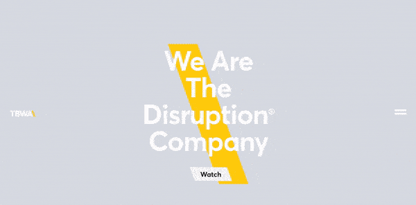
A good example of fully using interactive visuals is The Disruption Company.


[GIF source]

The Disruption Company use animations and videos to keep their customers engaged. Then they absolutely raise the bar for the rest of us commoners by switching up the content visitors see every time they visit their site.

This provides the website visitors with a unique and interesting experience and raises their conversion rate automatically.

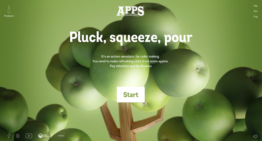
Another great example of interactive content that website visitors enjoy is APPS’ site. APPS is a company for apple cider production, and they show how much effort they put into their main product by having a cider-making action simulator on their front page.

[image source]

You can go through their entire cider-making process as though you were a part of it and even though most of us couldn’t make a cider to save our lives, APPS makes it fun and interesting from the very start.

2019 is going to be the year of consumer journey, so it’s important to integrate features that enrich the end consumer’s journey. If APPS gets anything, they get the need for a vivid experience.

Consumers today want interaction, not just plain text and images. They’ll lose their appeal in 2019, especially since many companies are already catching on to the interactive trend.

And speaking of interaction, another big trend to expect in 2019 is…


#2- Gamification in Web Design


Gamification has been a big deal in design and marketing this past year, but only as a keyword. If you Google gamification, you’ll see a lot of articles but very little substance – especially on how you can use it to boost your marketing efforts.

The trick to gamification is helping customers fully immerse themselves into the process of consuming the product. Good marketers and designers know that this immersion starts with the website.

Gamification can be used in different ways, such as:

  • Visitors and consumers competing with each other (with the goal of winning a prize)
  • Comparing results
  • Interactivity
  • Actual games

Obviously, everything about gamification is pretty fun and serves to engage visitors, but there’s nothing like real mini-games.

Now, you can integrate them into the site as a separate product, but you can also create entire websites with gamification in mind.

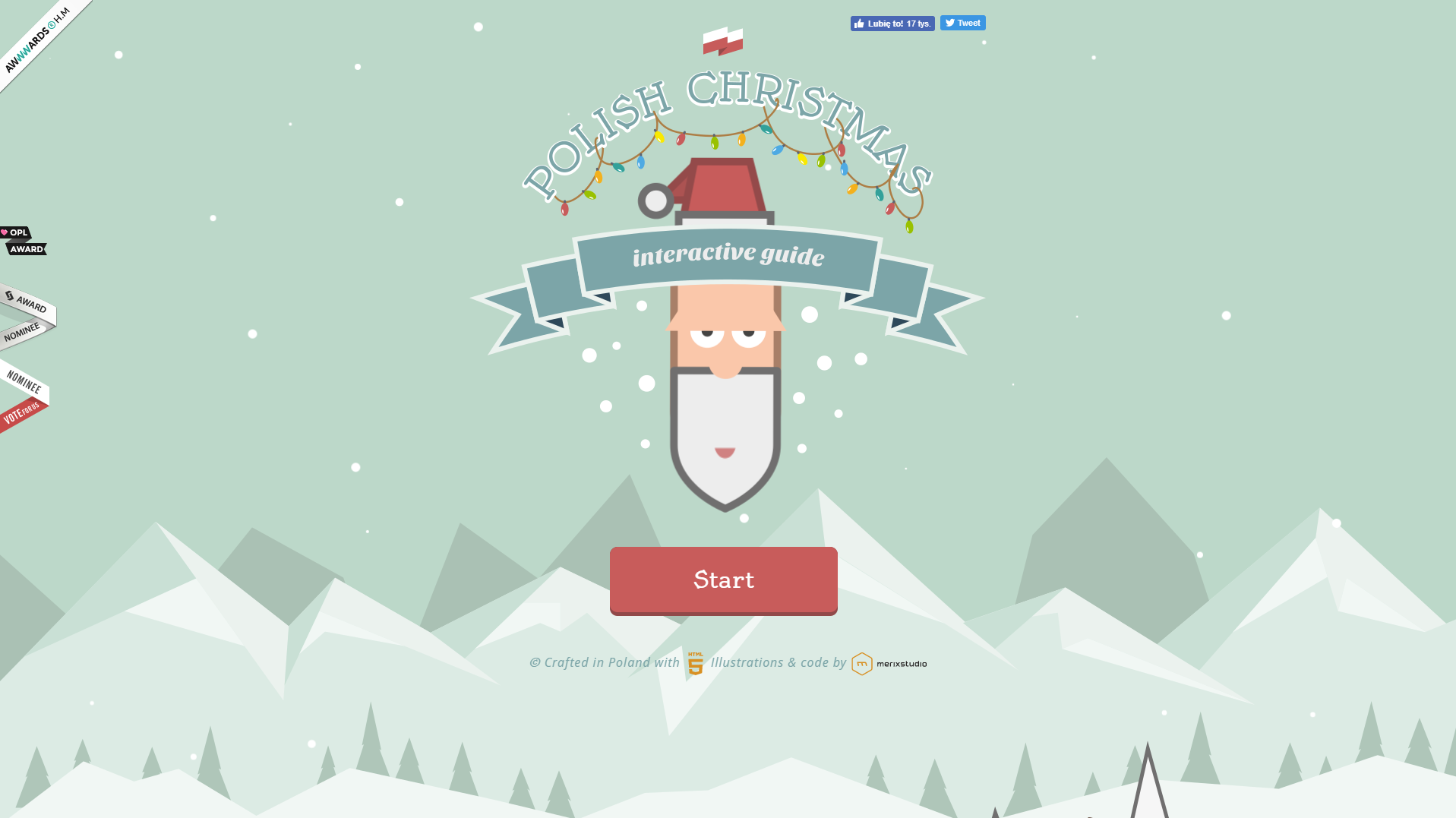
A great example of gamification is Polish Christmas Guide.

[image source]

Polish Christmas Guide is a website that helps visitors learn more about Christmas traditions in Poland, and even though it’s not a typical example of a for-profit website design, there’s a lot to learn from it.

Polish Christmas Guide uses animated SVG graphics and scroll-triggered CSS animations with custom SFX effects. The main mission behind the project is to motivate visitors to donate to Nobody’s Children Foundation, which helps abused children.

This design is driven by visuals, and visitors play a game where they ride around in Santa’s sleigh and collect presents while also learning about Polish traditions.

It’s great content, as far as content marketing goes, as it ultimately serves its main two purposes: consumer education, and emotional conversion.

Again, gamification really strives to create unique consumer experiences that can be considered separate products, but in coexistence with the actual product create an entire story.

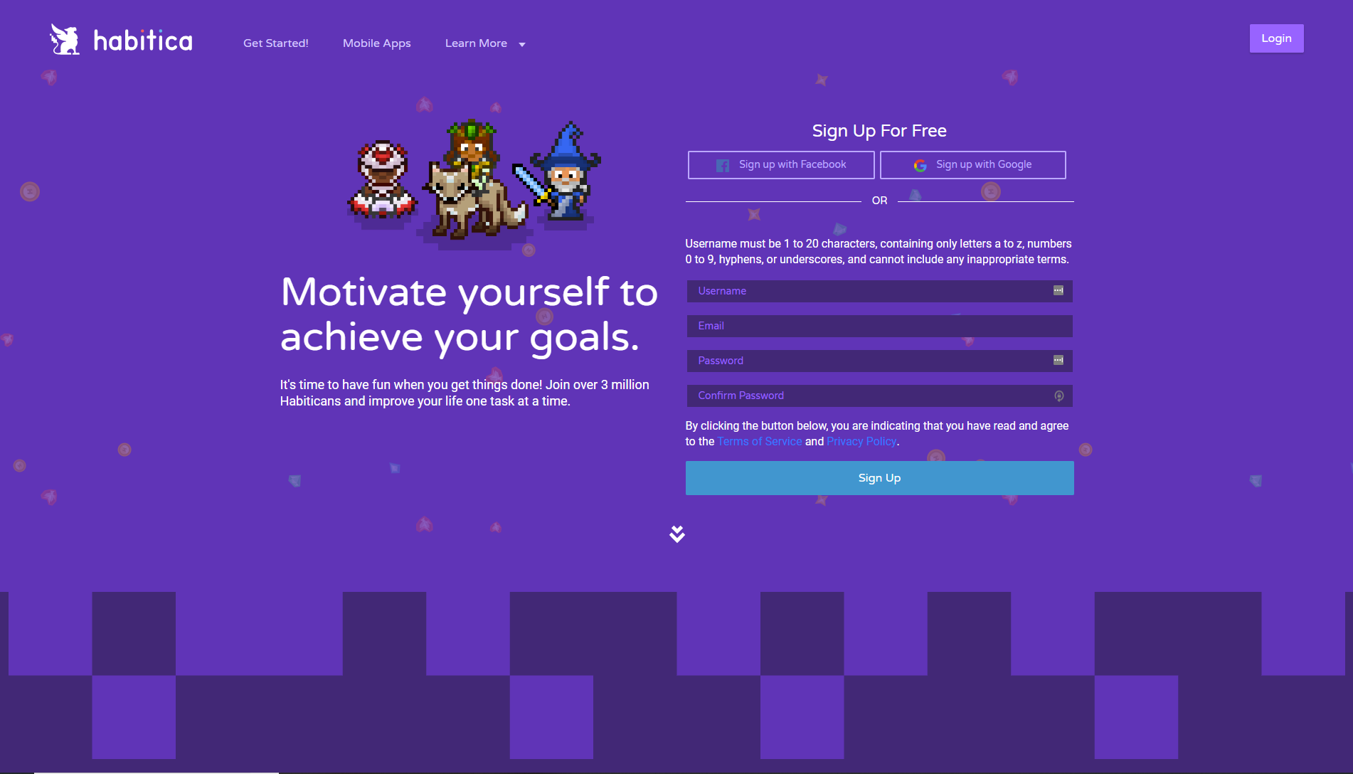
For example, Habitica allows you to gamify your life and motivate yourself to achieve your goals.

[IMAGE SOURCE]

It’s essentially a habit-tracker that uses the mechanics of role-playing games such as achieving points, earning rewards (snazzier armor, weapons, pets, etc.), and battling monsters with other friends.

While the web design itself isn’t as interactive, gamification starts from the get-go. The website is designed with the end experience in mind, allowing consumers to immerse themselves into the experience even before they’ve downloaded the apps.

Gamification is incredibly effective, especially because 70% of business transformation efforts fail due to lack of engagement. Gamification successfully combats that and increases both engagement and conversion.

Plus, it’s really darn fun. And we all need a bit more fun in 2019.


#3 – Mobile Design Giving as Much as Web


In 2015, we saw that mobile searches increased in comparison to web searches, and that trend kept rising in the last few years.

People use their phones more than they use desktop, and Google is the alpha and omega of resources, so it doesn’t surprise anyone to find that Google’s algorithms are also prioritizing mobile over web.

When it comes to web design and marketing, we’ve had to adjust our efforts to accommodate the rise of mobile. A lot of constraints come with that new direction of design, but we shouldn’t compromise on quality.

Consumers still want what consumers want, and an important trend in 2019 is going to be adjusting mobile to provide as much as web design does. This means that mobile shouldn’t only be an addition to standard design of your website, but a design in its own right.

A great example of mobile design that will gain even more significance in 2019 is the website of Adrian Zumbrunnen, a UX designer and writer.

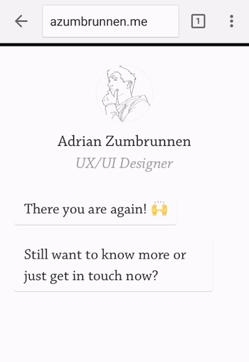
[GIF source: https://blog.hubspot.com/hs-fs/hubfs/adrian-zumbrunnen.gif?width=350&name=adrian-zumbrunnen.gif ]

Zumbrunnen’s mobile website experience is conversation-driven, and the customers can “have a conversation” with him, telling him more about their needs.

Again, interactivity is going to be huge in 2019 so if you don’t want to miss out, you can learn from Zumbrunnen.

Mobile isn’t the perfect platform for a lot of animations and videos, but great designers and marketers know that they don’t have to make compromises when it comes to unique user experience. It’s the main way of converting prospects to customers, so when thinking about mobile design, think interesting.

Then adapt to platform.

Lean Labs does the same, as they understand that mobile design is different from website design – but equally as important. They’re a marketing agency, and have a “10x formula.”

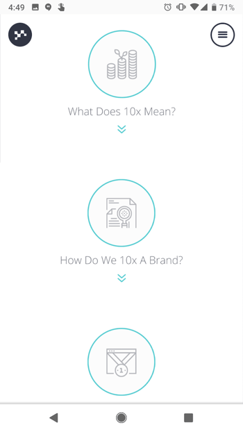
[IMAGE source: https://blog.hubspot.com/hs-fs/hubfs/lean-labs-mobile-website-2.png?width=350&name=lean-labs-mobile-website-2.png ]

Customers can understand their 10x formula by scrolling through the site, and everything is adapted to the sleekness and simplicity of the mobile experience.

Lean Labs also show their expertise in the field of design and marketing by using appropriate typefaces, color schemes and visuals.

When we take a look at Zumbrunnen and Lean Labs’ websites and compare them to other mobile sites which weren’t created with mobile-first in mind, a few things become immediately clear:

  • Mobile isn’t the second-place prize.
  • Interactivity is just as important with mobile (and it’s achievable).
  • Content matters, but so do the visuals.

We’re going to see a lot more mobile-first websites in 2019 so forget about scaling your usual website CTA buttons, and focus on creating a different, unique, but on-brand experience.


#4 – A Different Kind of Design Minimalism

Back in the day (by which we mean 2016, as that seems like it was twenty centuries ago), minimalism meant black & white color schemes, and not much to see.

Fortunately, we’ve grown up and realized that minimalism in the traditional sense won’t give the consumers what they need. So today, we’re seeing a paradigm shift towards content-first meaningful experiences that are focused on one goal (e.g. everything driving the consumer to sign up, as opposed to stuffing them with information and providing very little direction).

In order for the design to function properly, this design minimalism should be empowered by visual choices. With minimalism, colors are used to stimulate the purchasing decisions depending on the industries, and each design choice may be small, but it says a lot about the designers and marketers’ decisions.

Evoulve starts off mesmerizingly and cosmically. They’re a digital innovation company, and it becomes clear that they’re seamlessly passing through previously untouched frontiers from their website design.

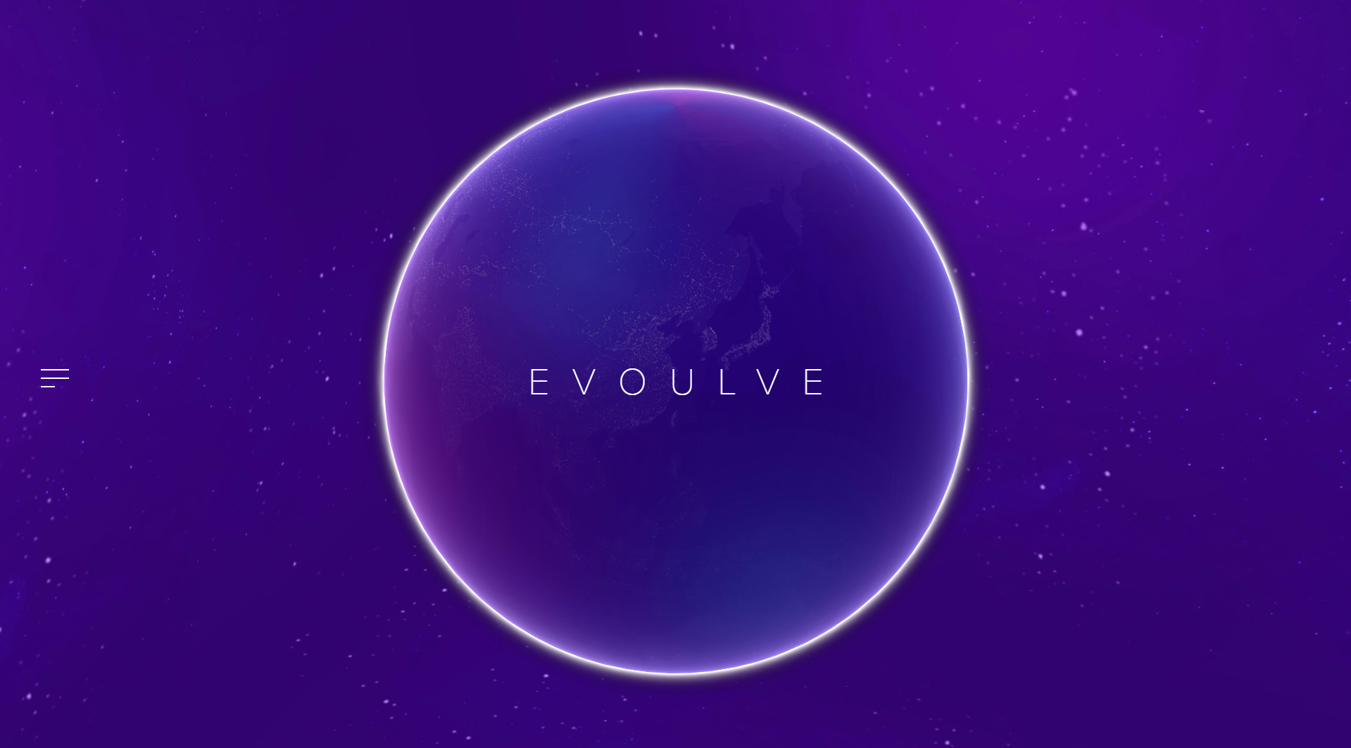
[IMAGE SOURCE: http://evoulve.com/]

Their brand message is conveyed with their website’s minimalist design. From the very start, visitors are motivated towards bigger and better things with the color scheme and the planet animation.

Evoulve only has a simple left side bar where visitors can navigate to find more information on the company. When pressed, there’s a translucent layover over the main animation, and a navigator with information on the company and technologies, and getting in touch with them.

This example is a great example to show how design and field of work can go hand in hand, especially when the principles of minimalism are utilized for that purpose.

With minimalism, each design choice goes on to say a lot about the purpose of the company. A great example of that is a product designer’s, Mikiya Kobayashi’s site.

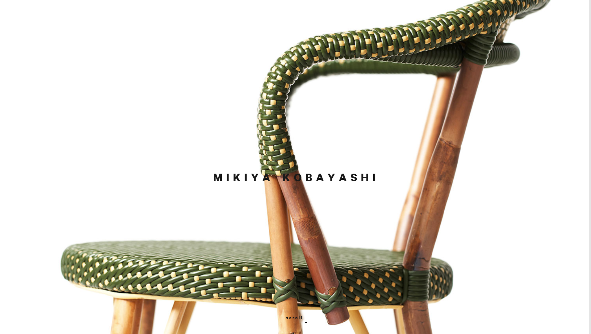
[IMAGE SOURCE: http://www.mikiyakobayashi.com/ ]

Kobayashi’s site’s main focus is on the products that he creates. He only briefly mentions his name and invites website visitors to scroll and focus on how he creates the products.

Some designers may even say that the placement of images in regard to his brand name is unfortunate. However, it’s a very bold and minimalist design choice that conveys the “product first” message from the very start.

In 2019, minimalism is going to take on a different meaning – one that will be more meaningful for the end consumers.

And designers who understand that minimalism is essentially a focus towards the central purchasing decision will be the ones making the most out of web design in 2019.


#5 – Chatbots and Machine Learning Integrated with Web Design

Bots and machine learning have changed the way we communicate, especially in sales.

Instead of manually fielding emails and customer questions, companies are increasingly using chatbots and machine learning to reduce the workload – and provide customers with much faster responses.

It’s only natural that changed design, as well. Currently, we’re seeing a lot of website integrations (usually in the form of ZenDesk pop-up on the right side) that are only a passing solutions.

Marketers and designers who want to fully utilize the possibilities of chatbots and machine learning will have to adapt their design to new technology in 2019, and make it a crucial part of website user experience.

Chatbots and machine learning are another feature of the push towards a more all-encompassing user experience. Hipmunk, a platform that helps people search for flights, hotels and rental cars, understand that, and they’ve created Slack, Facebook and Skype integrations to help users communicate with them when they need them.

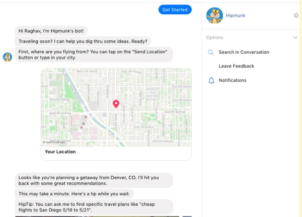
[IMAGE SOURCE: https://www.impactbnd.com/hs-fs/hubfs/Hipmunk-Messenger-Chatbot-example.jpg?width=600&name=Hipmunk-Messenger-Chatbot-example.jpg ]

Again, the convenience of web design is again exemplified by features that a company offers their customers. The goal is providing a complete service.

Landbot.io, even though they’re a chatbot provider, has a great website that shows exactly how their chatbots work.

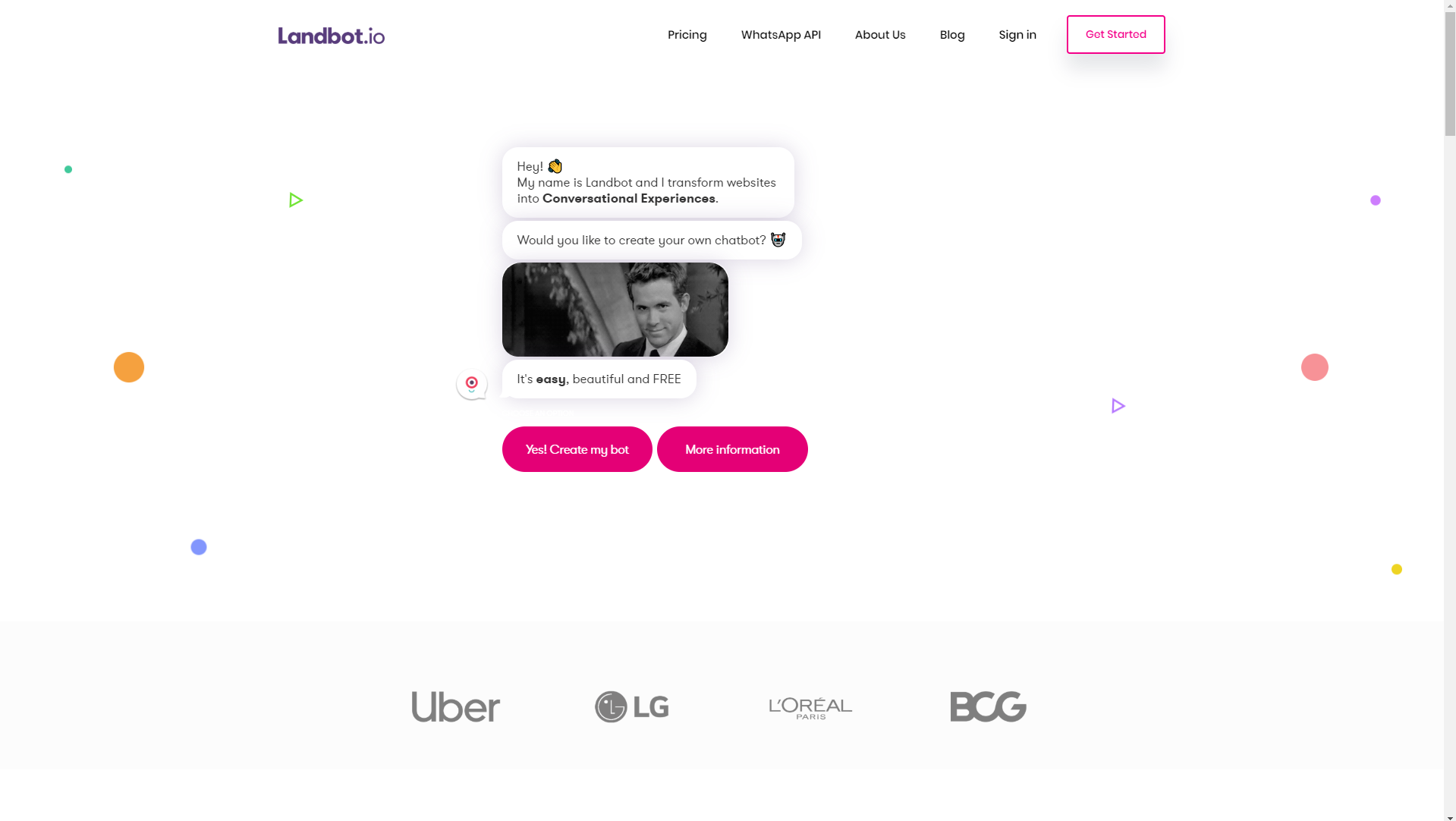
[IMAGE SOURCE: https://landbot.io/ ]

If you remember the conversational website that was a great example of interactivity, then you’ll see how much Landbot.io helps with that. Customers can have full-blown conversations (that range from product offers to customer service) with websites.

This not only helps provide excellent customer service but also cuts overhead costs for many companies, so chatbot integration is going to become a major design player in 2019.

Let’s just hope Skynet doesn’t take over the world.


#6 – Visually Intriguing Design Choices

Websites are no longer just resources – they’re becoming a major conversation and conversion drivers. Engagement matters, and it starts with them.

That’s why visually intriguing design choices will become a big trend in the way we design websites in 2019. It’s important to capture attention and provoke engagement, and what better way to do it than by making bold choices that stand out from the majority?

When we talk about visual design choices, we can talk about animations, cinemagraphs, and we can also talk about design lines and points of focus.

Traditionally, we’ve used straight and horizontal lines to separate different content. However, using diagonal line design has been proven as more effective.

An example of using diagonal line web design is Startup Giraffe. It’s immediately clear that this is a company that’s trying to present itself as fun and comfortable, but that brand image is further empowered by their design choices.

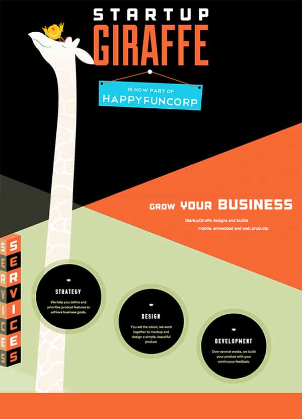
[IMAGE SOURCE: https://www.bluecompass.com/filesimages/News%20and%20Blog/Design/startup-giraffe-pin.jpg ]

These angled lines not only come off as interesting to website visitors, but also motivate visitors to keep scrolling and find out more.

Startup Giraffe’s website is a great example of a website that uses visually intriguing design to motivate conversions and education, but they can also be used to create a more dynamic user experience.

Dunlop Tires use angled lines for the purpose of creating a dynamic feeling, which is on par with their industry (automotive).

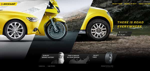
[IMAGE SOURCE: https://www.bluecompass.com/filesimages/News%20and%20Blog/Design/dunlop-tires.jpg ]

Generally, there are a lot of ways that diagonal lines can be used, but the main appeal of them (for companies and customers alike) is that they’re visually interesting and stand out from the crowd.

A lot of designers have already started using these principles in the way they shape user experience for their clients, and as a marketing tool, they’re incredibly powerful. That’s why we’ll be seeing a lot more of them in 2019.

Another way to choose something more interesting for your web design in 2019 is to use bright colors.

Gradients and grayscale have been very popular in the last few years, but we’re seeing a push towards bright colors, which will only become more prominent in 2019.

For example, MamboMambo’s website is very striking. From the collage elements to bright colors which immediately stand out, they’re presenting their brand identity from the very start.

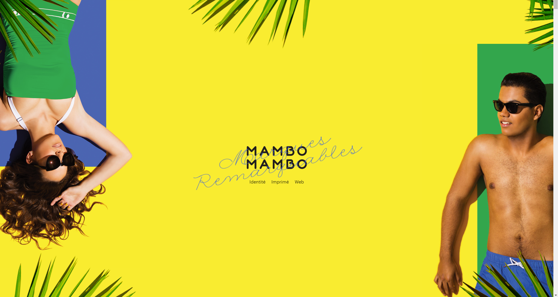
[IMAGE SOURCE: http://mambomambo.ca/ ]

Again, their website is very minimalist, but their color palette shows everything a visitor should know in order to become a customer as soon as possible.

Mambomambo also utilize scroll features and micro-animations to add to the visual appeal and show how dynamic their creative work is.

There are a lot of ways to design with curiosity in mind, and the best thing is that in 2019, that’s exactly what customers will need.


#7 – Different Scrolling in Web Design

When we think about traditional scrolling, we think from top to bottom. However, that’s become the standard, and if we’ve learned anything that we want to take into 2019, it’s that the best way to approach web design is with diversity in mind.

An increasing number of web designers are now experimenting with different scrolling. This is great from the customer’s standpoint, as it automatically creates an experience (which increases engagement and conversion rates).

There’s always competition, and creating a unique experience for the customer comes off as a promise that the purchasing experience will be more unique, as well.

A great example of different scrolling in web design which will get more popular in 2019 is Aces, a baseball recruiting agency.

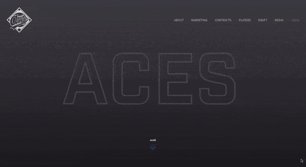
[ANIMATION SOURCE: https://www.bluecompass.com/filesimages/News%20and%20Blog/Design/aces-v2.gif ]

The first thing Aces do right is starting the page loading by showing how many baseball careers they’ve secured. And when customers reach the loaded page, they’re invited to scroll.

Scrolling is diagonal, and each movement opens up a new player whose career Aces managed. Additionally, Aces also provide statistical information about the work they do, successfully showing customers from the very start what their mission is.

They negotiate deals by showing results, not by talking, and it’s something that’s positioned them very highly in the world of baseball. However, it’s important that their web design follows suit, as well.

Long scrolling is also another type of different scrolling that can help brands tell their story more seamlessly, as opposed to stuffing website visitors with content that they can’t process.

Le Mugs is a restaurant that successfully uses long scrolling and different visual perspectives to create a unique user experience.

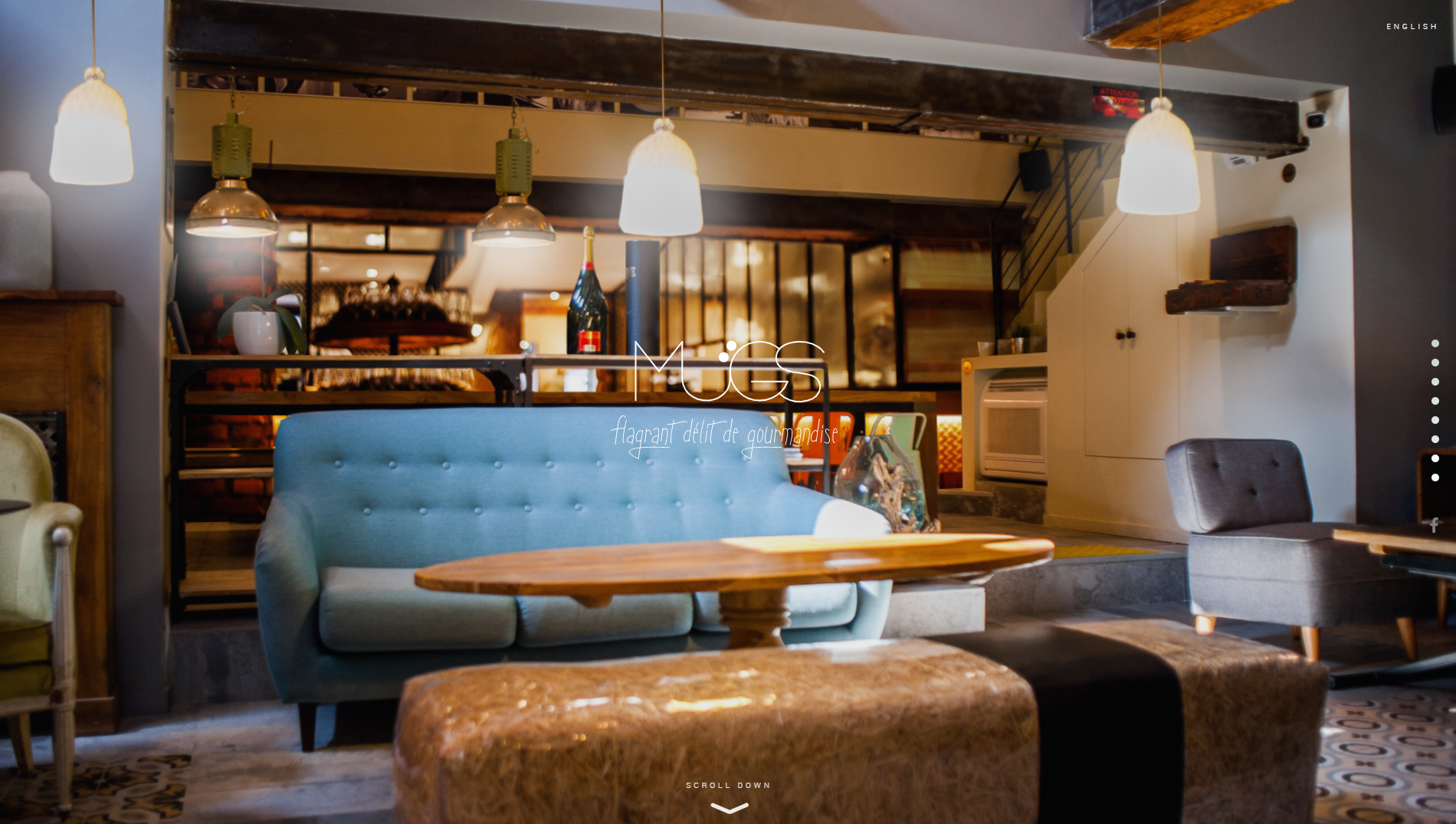
[IMAGE SOURCE: http://le-mugs.com/ ]

Website visitors are immediately invited (and pulled in) to explore their hedonistic offer, and immerse themselves into the gourmet experience.

They use bold and striking visuals and unique scrolling mechanisms to keep the attention on their site and their offer.

Long scrolling is also great for websites where it’s important for visitors to explore, and reach the purchasing decision through that.

Parallax scrolling is typical for the entertainment industry, but it can also be used to great success in different professional areas if done right. When we talk about parallax scrolling, we presume that there are two images which move at different paces.

This makes it a perfect option for storytelling and creating more dynamic in a website.

A great example of parallax scrolling is the website for The Walking Dead. A TV show about zombies, their website sticks to comic format.

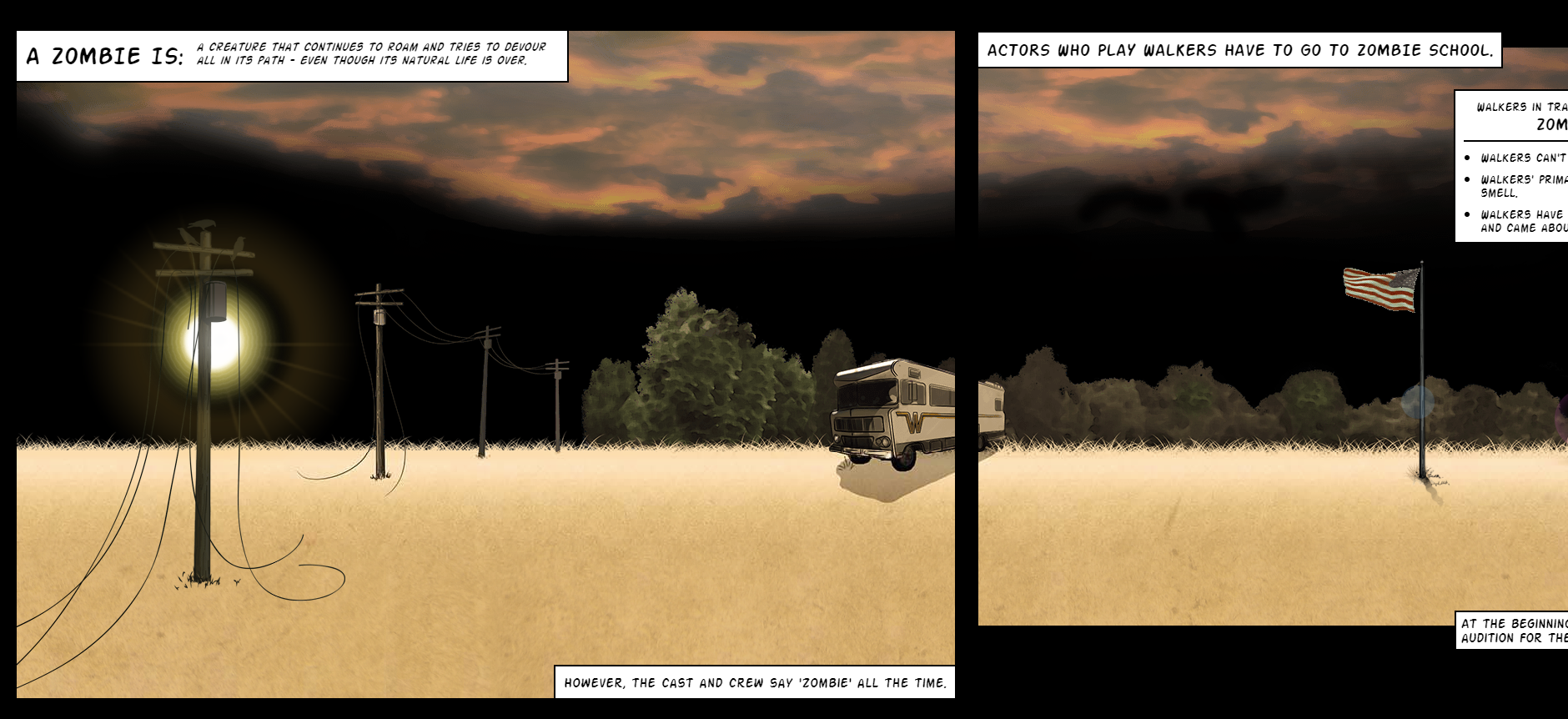
[IMAGE SOURCE: https://www.cabletv.com/the-walking-dead ]

When scrolling, we follow the character in the yellow shirt through different scenes. Some of them contain additional animations but even if they didn’t, it would still be an interesting way to scroll. Who’d say no to the show after that?

Additionally, keep scroll-triggered animations in mind. When visitors scroll, this triggers different engagement-provoking animations and interactions. Again, the focus in 2019 is definitely going to be on creating an all-encompassing user experience, and scroll-triggered animations are a very interesting way to keep the visitors on your site and convert them to customers.

[ANIMATION SOURCE: https://www.bluecompass.com/filesimages/News%20and%20Blog/Design/igor.gif ]

A great example of this is Igor, a website for an IoT company. Visitors are invited to scroll through to see the entire offer, and can see a variety of resources which they may find useful.

When it comes to different scrolling types which are a big trend for 2019, keep in mind that loading times are incredibly important.

If you don’t want to compromise on the experience just so your website is faster, try to create an interesting loading page that will stop the visitors from navigating away.


#8 – Big and Bold

If you’ve got it, flaunt it. That’s going to be website design in a nutshell in the upcoming year, so make sure you’re not falling behind.

Many web designers use a combination of big statements (literally, the font size is going to be huge) and simplified details to create a dynamic user experience. Think of billboards, only on the screens of laptops or mobile phones.

This is another play on interesting visuals and bold statements which can create a very powerful effect for customers.

A great example of big and bold as a mission of web design in 2019 is Austin Eastciders. A cider-production company, they use their slogan “Cider Y’All” as an inspiration for their design.

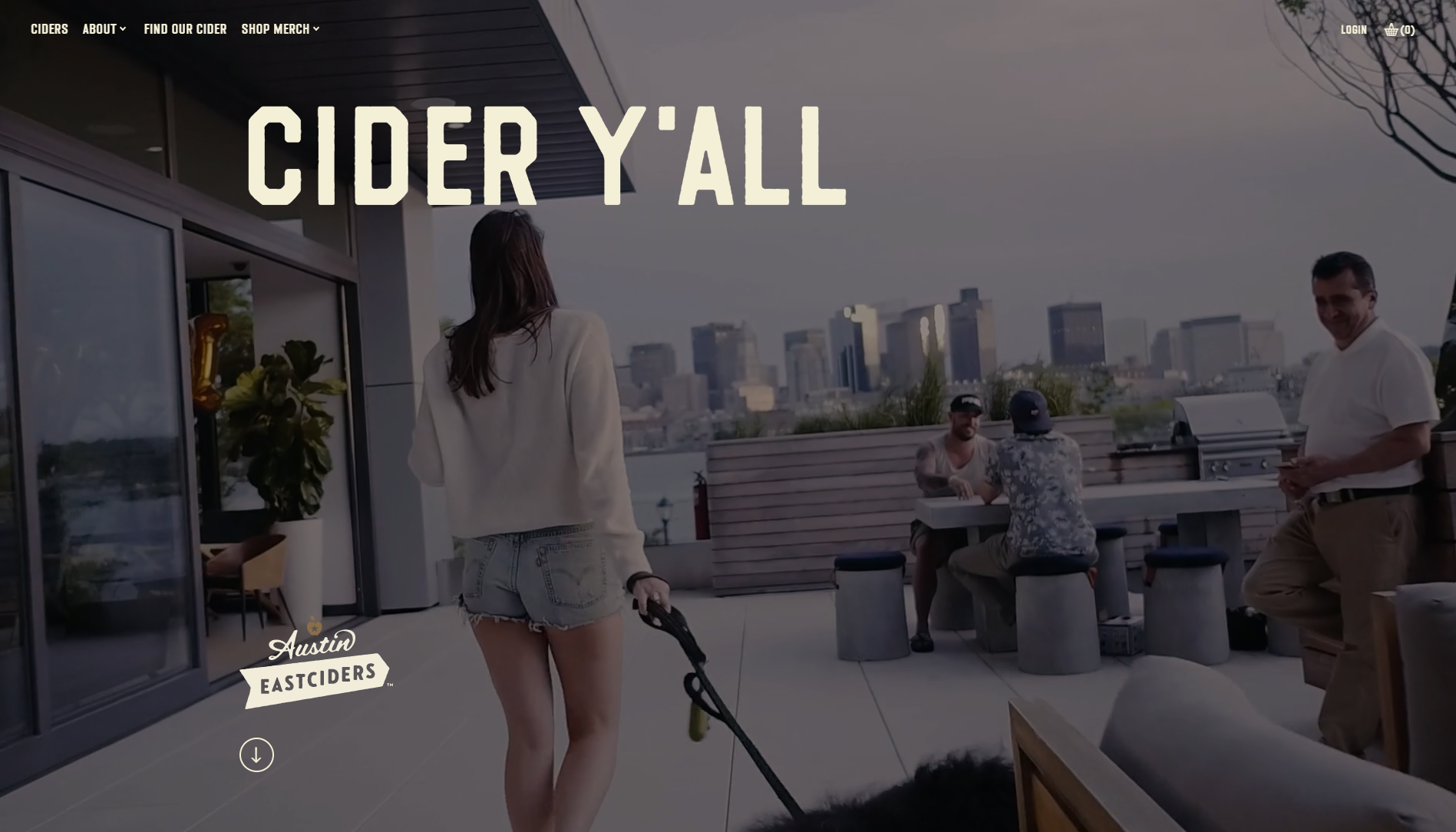
Austin Eastciders use big and bold titles with smaller copy, and let the animations and video direct the customers towards purchases.

The videos show different occasions where people can enjoy their ciders, and that’s another example of storytelling done right. People don’t buy because products are great – they buy because they want the lifestyle.

Austin Eastciders win in this category because they know that the appeal of the lifestyle in 2019 starts with web design.


#9 – Making Footers Interesting

The trend of interactivity and experience improvement in 2019 also means that each part of the website should be fully used to create a great experience for the end user and consumer.

This means that we can no longer be content with WordPress themes and a footer that contains basic information, and call it a day.

Instead, 2019 is going to make us go all kangaroo again and start jumping around in an effort to provide more to customers, instead of breaking the 4th wall with an uninspiring footer.

After all, details matter. And they’ll matter even more in 2019.

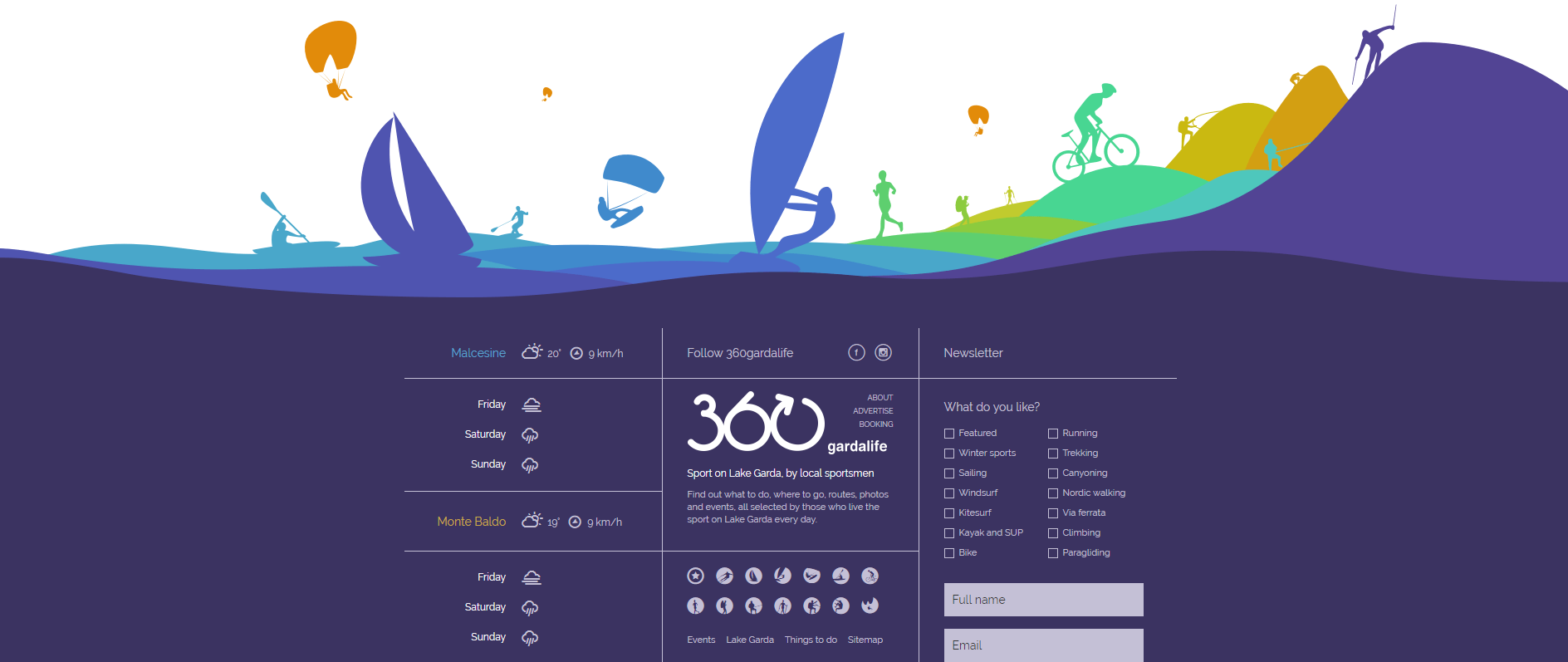
Consider 360gardalife’s website. A website for sports activities on Lake Garda in Italy, every design choice on the site caters towards the customer experience. They show details about diverse offers, offers instructions on how to book, and everything else athletic people visiting Lake Garda may enjoy.

However, the real magic starts when you reach their footer and realize that it’s not just basic information.

[IMAGE SOURCE: https://360gardalife.com/en ]

Instead of just providing visitors with basic contact information, Lake Garda designers also use the footer to display: weather reports, webcams, and icons reminding people of their diverse offer.

Additionally, visitors can also select sports they’re interested in, add their email address, and receive a personalized offer with activities that suit their preferences.

Naturally, this creates a more inclusive feeling to the entire web design (which will be an absolute necessity in 2019), and if visitors weren’t convinced, they will be upon seeing the footer.

#10 – 3D Web design

People want to be entertained, and using the principles of three-dimensionality can be a great way to provide more flavor.

There are typically two ways of using 3D web design, and that’s either through 3D elements (creating depth in the visuals) or by using animations.

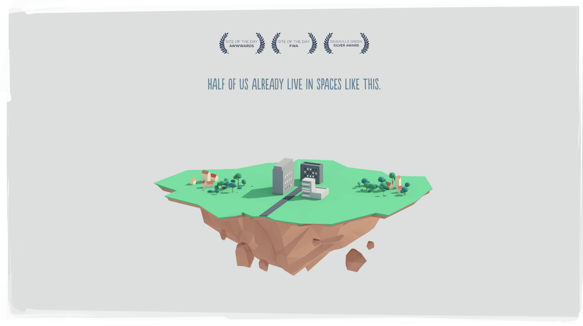
A great example of 3D web design which uses animations is Future Living. Designers behind the site were inspired by the topic and created a variety of animations and micro-interactions to improve user experience.

[IMAGE SOURCE: http://future-living.tv/en/home]

They reimagine the way we live, creating a future with shell cities that are capable of protecting themselves and to drive the point home, they’ve created incredible animations that’ll make the most of us go full-blown eco.

Again, web design in 2019 will be centered on storytelling and immersing the visitors into a unique experience. Future Living realize that, and they’ve created a beautiful website with illustrations (which evoke positive feelings) and simple explanations.

When it comes to using the principles of three-dimensionality, Future Living also create depth with shadows and different colors, not only animations.

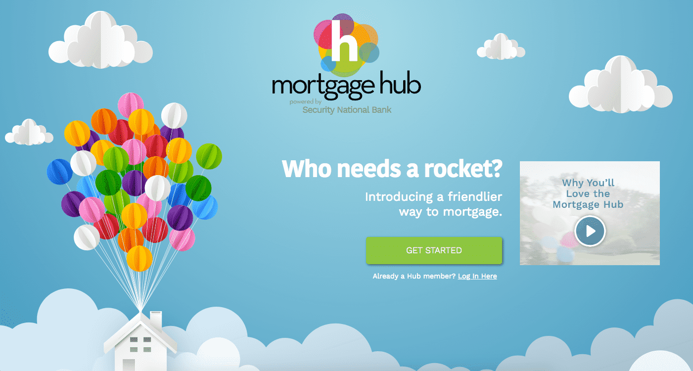
However, the best example of using colors to create the 3D effect is Mortgage Hub. While not heavy on animations, the mortgage providers create depth by mixing different color tones and visuals.

[IMAGE SOURCE: https://www.bluecompass.com/filesimages/News%20and%20Blog/Design/mortgage-hub.png ]

Since they also consider themselves to be a friendlier way to mortgage, they’ve selected designs that help the visitors feel as though they’re friends with them.

However, the principles of three-dimensionality also go a long way towards creating a dynamic (as opposed to flat) feeling of design, and add to the user experience.

2019 Is Going to Change the Way We Design for Web

But it won’t be bad.

In fact, the trends we’re currently seeing, and the ones we’ll see in 2019, will help all of us become more creative.

Of course, innovative design raises the bar, but companies which understand their consumers’ journeys (and are willing to step forward and approach them in the right way) will see an increase in revenue.

Why?

Because of creativity.

After all, we have a lot of technology at our disposal, and customers know it. It’s time our design started showing just how far we’ve come.

Read More at Design Trends That Have Been Taking Over This Year

The Right Pairs of Fonts

Elegant_Hire

The Right Pairs of Fonts Are Like Peas in a Pod

pairing fonts

When fonts are matched together correctly, they really make the perfect pair. Pairs are everywhere around us – our socks, best friend, partner, peanut butter and jelly, and the list could go on. 

Thinking about fonts without thinking about font pairs is half the concept. After all, we’re all better in pairs, and there’s no exception with fonts. When a font is paired with a good partner, the original font is enhanced, and your ultimate design goal is accomplished. Let’s not get ahead of ourselves though.

The key to picking font pairs is to start with the correct font. Sounds simple, enough. When you think about choosing a font, what comes to mind? 

The style and overall design of the project, or rather, the appearance of the words? You aren’t incorrect, yet you’re also not completely correct. Choosing a font has so many layers and complexities to the process, but we’ll map it out for you. First, let’s define the goal of a font.

Change Your Mindset

Fonts are constantly advertised and viewed as just a last minute design. When changing the font for a school paper, or a company proposal, you may not put much thought into the font you change your text to. 

Elegant_Hire

Yet, fonts can add credibility to your content, make content more readable, present content for better conversions, and market your information to evoke feelings within your readers, which ultimately increases sales. 

Sometimes it’s the little changes that matter the most! The beauty and challenge with fonts are that they’re always displayed. 

Meaning, if your font is hard to read, then readers will just click away onto another website with much more readable fonts. The competition is higher than ever to get website visitors on your page and staying – don’t make your font the reason they click away. 

The Goal of the Font: Convey the Message

Although fonts do project a style and design, their main goal is to translate the marketing message. Think about it, without a font, your message wouldn’t be conveyed at all! They are the vehicle that translates the words you want your target audience to read. It doesn’t end there. A font translates much more than the physical message. 

You’re also communicating a feeling. Think about why we dress up for an interview or an important business meeting. We’re communicating an image without saying anything. That image is backed behind emotions. 

If the stakes are high like a proposal meeting, then perhaps you’d dress in business professional in order to seem credible. Think about selling a home. Why did you trust one realtor over the other to work with? 

Sometimes overdressing can separate yourself from your audience rather than associate yourself with them or seem trustworthy to your audience. If you’re aware your price range is on the lower side, you may feel intimidated and unsettled if your realtor is overdressed because they may not understand your situation.

Choosing the correct message to portray to your audience is a challenge within itself, but most likely if you have a marketing campaign, you already know this! If you’re a bank, you want to come across as trustworthy. 

If you’re a rolling skating arena, you want to appear fun. Finding it hard to see which feeling your business is trying to embody? Think of what emotions your business wouldn’t want customers to associate you with.

Serifs and Sans Serifs

pairing san serif and serif fonts

Once you’ve come up with this message, you’re halfway there. Choosing a font is merely finding a style that represents this. Be aware of the different styles of fonts like serifs and sans serif fonts. This could be an easy deciding factor that could narrow down your search! Generally, serif fonts have a traditional style. 

These are the fonts that have the little feet at the end of each character. Sans serif fonts were invented after, and are usually considered a much more modern font. These fonts, not containing the feet at the end of each character, display well on digital screens. Upon picking a serif or sans serif font, experiment with the font against your design and how the font is described online. 

pairing the right fonts

Serifs and sans serif fonts pair extremely well together because they have what the partner doesn’t! 

A great example of this is April Fatface and Roboto. Abril Fatface takes the spotlight, while Roboto takes a backseat, with its simple lines and versatile design. 

pairing the right fonts

Another great example is Dancing Script and Josefin Sans. Both fonts have a similar delicate design that looks handwritten. Yet, Dancing Script could only be displayed on headlines or else it would overwhelm the readers, and Josefin Sans effortlessly simple. 

Finding Your Font’s Perfect Pair

Once you’ve got a font or an idea of a font you’re looking for, it might be time to use a font combination tool. These are great because they make the pairing process much smoother. If you have no idea where to start or aren’t into design, a font combination tool, like this one by Bold Web Design Adelaide, is a great place to find inspiration or start to realize what you like and don’t like in a font. 

pairing the right fonts

Think of pairing fonts like music. There’s a melody and a harmony. One takes precedent: the melody. Without both, the music would feel incredibly empty. It may seem like the melody is more important, and it may relay the main message, but both are needed to make a song. They define each other, as without the melody the support music wouldn’t be called harmony and vice versa.

Pairing fonts is exactly like the melody and harmony in a song. One is the focal point that shines through, which I like to call the focal font. This is the font that usually has more personality, and is used for headlines or larger text. With two focal fonts, your reader would be incredibly overwhelmed when reading through your information. 

Pairing fonts is a balancing act, requiring both fonts to work together and not to take up too much attention from your readers. Secondly, both fonts have to be compatible. This relays back to your marketing messaging. You wouldn’t release a marketing campaign with one ad that’s creative and fun, and another that’s scary and serious. Ensure both fonts align with the message and emotion, and compliment each other. 

Pairing fonts is a great way to differentiate information from each other. Just as we section content within an article with headers and subheaders, different fonts can be used for the headers and paragraphs to further associate a transition within the content. 

Text that you want to stand out can be placed in a standout font, and support with a much simpler font. Even the weights of fonts within a pair can be changed, making a font bold, thin, italicized, and other variations to increase its versatility. The possibilities are truly endless. 

Play around and get familiar with the options out there. Once you’ve accomplished this, pairing fonts is a piece of cake. Your fonts will work together like a seamless song.


What Not to Do 


Don’t choose a font blindly. Picking the correct font for your business takes awareness and understanding. A font that works for another company, may not work for yours. Rather than looking at fonts as a design decision, think of it as a sales decision. 

how to pair fonts

If you’re just picking a random font from a list without much consideration, you could be throwing away potential leads to your products and services without even knowing. Within the age of digital content galore, you want to set yourself apart from the rest. 

A font is the puzzle piece to a unique brand identity and a competitive edge! Don’t put two loud fonts together. A font that definitely has a “personality” should not be paired with another font like it. 

Find a versatile font to pair with loud fonts or pair two versatile fonts together. Versatile fonts are simple and readable like Arial or Roboto. 

Conclusion 

At the end of the day, a font can always be changed if not now, later. Test different fonts and see which ones work well for your company’s design. If you’re working with print materials, print a couple of tests and get your team’s vote. 

A design is just an extension of the company, design, and culture. What better way to decide if it’s a great fit than to ask the ones that work there. When you see a good font pairing, it will seem effortless and you won’t be looking at the fonts, you’ll be reading the content. 

The fonts will balance each other out – working together to differentiate between text and information. After all, the right font pairs are like two peas in a pod. 


Read More at The Right Pairs of Fonts

5 Inspirational Designs Trends to Follow for 2019

Graphic Design trends for 2019

5 Inspirational Designs Trends to Follow for 2019


Design is all about expressing yourself through your art and showing people the beauty in simple or incredibly intricate designs. While you should always stay true to yourself and be authentically you through your designs, it is also good to stay on top of the trend game. 

Today we’re going to go over 10 design trends that we stan this year. And hopefully, always. 

We’ve got 6 months left in 2019 so we better make our designs count. 

So let’s just get right into it, shall we? 


   1. GO BOLD

 You know the saying, go bold or go home. And it rings absolutely true in design. We have two different types of “bold” that we’re going to go over in this section: bold colors and bold text.

Design trends for 2019

Source: https://www.behance.net/erikmusin

Design trends for 2019

Source: https://www.behance.net/erikmusin

Design trends for 2019

Source: https://www.behance.net/erikmusin

Design trends for 2019

Source: https://www.behance.net/erikmusin


Here are some examples where minimalist background color meets bold product color. When photographing and editing a product, enhance its color by using a light, neutral color as the background. When you do this, the eye of your client will be drawn directly to your product. Make sure that the color you choose complements the product’s color and really enhances what you have to offer. This is definitely my favorite trend right now. Hats off to Erik Musen for hitting us with some sweet designs. 


The next bold section is all about text. You have a message to share and you need to grab the attention of your readers. Do this with the same concept as with the products. Beetroot did an awesome job of using big and bold fonts to grab your attention. There’s no missing what you have to say when you use this bold technique. 

Graphic Design trends for 2019

Source: https://www.behance.net/beetrootdesign


    2. 3D Design

Really stand out, literally, with a 3D design. Incorporate real-looking elements into your graphic design to make your design truly unique and eye-catching. Take these designs for example. 

Graphic Design trends for 2019

Source: https://www.behance.net/STATE7

Graphic Design trends for 2019

Source: https://www.behance.net/gallery/71276031/Mulher-3D-Type


3D design is just about everywhere right now, and as you could see above, there’s no specific font that is the set-in-stone font to use. Try out any font you’d like! A font that is skinny, bold, a sans-serif, script, or any other type of font can be rendered in 3D. Use this technique in your next project and drop the link to your portfolio in the comments below so we can check it out! 


  3. Flat Design meets Realism

Another huge design trend right now is flat design combined with realism. Here are some prime examples of what I’m talking about. 

Graphic Design trends for 2019

source:https://dribbble.com/shots/5591883-Puma-sneaker-shop

Graphic Design trends for 2019

Source: https://dribbble.com/shots/4854300-Panda-UI

Graphic Design trends for 2019

Source: https://dribbble.com/shots/3951710-Adidas-Online-Store

Feeding off of the 3D trend, flat design + realism is truly impressive. Two complete opposites, yet the perfect combination that gives a vibe of futuristic design. You can expect to see this trend in the E-commerce world, but not only. Add elements that look like they are floating or fly to add an aesthetic that is overall abstract. Combine 3D objects with a flat design to achieve this amazing look. 


  4. Open composition

We’re taking a step back from mainstream, and a step forward in creativity. This trend exudes art. It’s chaotic, yet beautiful. For this look, the goal is to achieve a free-flowing final product. So say goodbye to a “perfect” framed finish. This trend is a combination of things: combine images with ideas. This is magic in real life. It gives people a sense that they’re just seeing a small piece of a bigger picture. The real magic of open-composition is that gives people the freedom to explore their creative side and see the deeper meaning of what the combined elements could mean. 

Graphic Design trends for 2019

Source: https://www.behance.net/temicoker

Graphic Design trends for 2019

Source: https://www.behance.net/temicoker

Graphic Design trends for 2019

Source: https://www.behance.net/temicoker

Graphic Design trends for 2019

Source: https://www.behance.net/temicoker

Graphic Design trends for 2019

Source: https://www.behance.net/temicoker

And my all-time favorite designer for this technique is Temiloluwa Coker.  Check out his work on Behance. All the images above are all his.


  5. Electrified

I’m about to end this article with a bang. Maybe this trend is actually my favorite. 

Graphic Design trends for 2019

Source: https://www.behance.net/cristianmg

Graphic Design trends for 2019

Source: https://www.behance.net/cristianmg

Graphic Design trends for 2019

Source: https://www.behance.net/gallery/66723565/FETE-DE-TROP-__-Eddy-de-Pretto

Graphic Design trends for 2019

Source: https://www.inspirationde.com/image/85051/


One of my favorite things about social media today is that we’re all pushing for authenticity and being real. There’s no excuse for designers. In this technique, designers are encouraged to let their inner-creator out by drawing, writing, doodling, splashing, and using unique brush strokes and color stains. Imperfections and mistakes are embraced in this trend because there’s absolutely no right or wrong in this style. And I think that’s why I love it so much.


Sadly, our time has come to an end…


But no worries, we’ll be back soon! 

Let us know in the comments below what your favorite design trend was in this article, and if you have any other favorite design trends we didn’t cover, mention those down below as well. 

Drop your portfolio down in the comments for us designers to support each other. 

Until next time, 

Be kind and stay positive.

Read More at 5 Inspirational Designs Trends to Follow for 2019

40 of the Best Free Typography Fonts Choosen by Designers

typography fonts

The past few articles covered four of the most important categories of fonts: modern fonts, classic fonts, retro fonts, and vintage fonts. For today’s article, we won’t focus on a single category, but we will list the best typography fonts out there. What does this mean? Our professional designers have put up a list of the fonts they use the most and like the most. This list will include all kinds of fonts, from script, serif, sans serif, calligraphic, geometric fonts, to rounded, slab serif, and handwritten.

If the word FREE is music to your ears, then you better expect to see the best of the best free typography fonts cataloged below. Most of these amazing typography examples come from awwwards.com, so show your appreciation for their hard work by sharing, liking, and commenting in the comment section below. Let’s get started!

1. Wolf in the City

typography fonts

Wolf in the City is a classic, elegant handwritten font with amazing details, and 3 weights available.


2. WILD YOUTH

typography fonts

Wild Youth is a gorgeous brush script that will give your designs a natural look.

3. Linux Libertine

typography fonts

Linux is for fonts what Zeus is for Greek mythology. This typography font can easily be introduced to many projects, and will always be an important font found in books, dictionaries, and magazines.

4. Bebas Neue

typography fonts

Bebas Neue Sans Serif font inspires a versatility without limits.

5. Somatic Rounded

typography fonts

Risking to be a little bit predictable, this font looks like the best font for any mobile app.

6. Nautilus Pompilius

typography fonts

Nautilus Pompilius is a perfect script font that excels in symmetry and precision.

7. PILSNER & GUTENBERG

typography fonts

Yes, Gutenberg does have the smell of an old newspaper and will give your projects the needed old-school look.

8. Tracks Type

typography fonts

And if I said that Gutenberg smells like old newspapers, Tracks Type screams urban, modern font.

9. Campton Typefamily

typography fonts

This geometric sans that features perfect circles has a futuristic touch, one that will not go outdated any time soon.

10. Gandhi Sans

typography fonts

We need creative typography fonts like Gandi Sans when the meaning of the text is more important than the looks of a text. Use this font for meaningful projects.

11. Blenda Script

typography fonts

Blenda is a classic font that will always look perfect on packaging designs.

12. Bitter Ht

typography fonts

Serif fonts add wight to a font, making it stand out in the crowd. The same thing applied regarding this bold font.

13. Hello Stockholm

typography fonts

Hello Stockholm makes me nostalgic. This is the perfect example of how fonts carry a certain message and a certain feeling with them. You can enhance the meaning of a text by using an expressive font,

14. Poetesen One

typography fonts

Poesten One makes a great font for company logos and branding.

15. Free Font – New Day

typography fonts

New Day talks about a project that needs a futuristic touch.

16. Ginebra free font

typography fonts

Ginebra, as shown in the presentation image, is an amazing font suited for magazines.

17. Big John – Free Font

typography fonts

Both BIG JOHN and SLIM JOE want to be displayed on the billboards. Want to fulfill their wishes?

18. Fibre Free Vintage Font

typography fonts

This free vintage font features a great chuck texture, great for posters, book titles, and packaging.

19. Westfalia Free Font

typography fonts

You’ve probably seen this brush sans before because designers fell in love with it from the first sight. Did you?

20. Islander free font

typography fonts

Islander, just like Somatic Rounded, looks like the perfect font for a mobile app.

21. Simplifica – Free Font

typography fonts

Simplifica is not as simple as its name suggests. It actually comes with many alternatives to the font which will make it very difficult to choose the right one for your project.

22. Bohem Free Font

typography fonts

Bohem vintage font is the perfect font for all vintage product packaging and branding.

23. Playlist Free Font

typography fonts

Playlist has a natural feel to it, the right amount of naturalness for a cursive font.

24. Cast Iron

typography fonts

Cast Iron features elements of a unique 3D typeface which will make your text pop.

25. Noway Free Font

typography fonts

“Functionality is the smart way,” says the motto of this strong, bold font. No further description needed.

26. Elisabeth Font

typography fonts

Elisabeth is simple but modern, easy to incorporate into various projects.

27. Wavehaus Sans Typeface

typography fonts

Details make the difference. Did you not see the details of this font? Look again!

28. Wesley Gothic

typography fonts

If Wesley Gothic is indeed a gothic font, then it must be a modernized one. Use this unique font with care, as it might not do the magic to all your projects due to its complex particularities.

29. Youth Culture

typography fonts

Youth Culture reminds me of tattoo fonts. This says a lot about the personality of this amazing font.

30. Kitchen Sink

typography fonts

This wall texture marks an innovation in the history of textured fonts. Hard to miss in this sea of fonts online.

31. HK NOVA

typography fonts

HK NOVA’s bold font deserves to be placed on the cover of magazines and books of science.

32. Black Animal

typography fonts

This bold brush looks rather like a bold marker that highlights an important message.

33. Belda Regular

typography fonts

Belda is such an elegant and delicate font, exactly the looks this font will offer your designs.

34. Bunday Slab Bold , Light & Italic

typography fonts

Bunday comes with a package of contemporary moods and styles in almost 100 languages/

35. Aloja handwriting font

typography fonts

Aloja is such a joyful font, perfect for party posters, wedding invitations with a twist, and any other project you think it would work with.

36. Space Grotesk

typography fonts

At first glance, Space Grotesk looks like any classic font, but when studied a little bit more, you notice those little details that will intrigue any reader.

37. Fat Font

typography fonts

Fat fonts have one purpose only: to be the center of attention. And oh, do they do it with ease.

38. Labour Union

typography fonts

The Labor Union calls out for all the farmers to gather at the market.

39. Circus Display Font

typography fonts
The Circous explains itself and it does it right. It’s a font so full of personality!

40. Escucha (+ Consuela font duo)

typography fonts

Last, but not least, Escucha is the modern font that every designer needs in their tool kit yesterday.


Did I mention that all these fonts are free? Hurry to download them as soon as possible. Until later,


WDL


Read More at 40 of the Best Free Typography Fonts Choosen by Designers

40 Of the best Free vintage Fonts picked by professional designers

Vintage Fonts

In the past few articles on Web Design Ledger, we tried to bring into your attention some of the most important categories of fonts:

modern, classic, and retro. Today we will continue with another important category: Vintage Fonts. Designers say that, in order for a fashion product, be it clothing, font, or a decorative piece, to become “vintage” they need at least 40-years-period from the time they were released. Based on that definition, we could consider anything older than 40 as being vintage, or new products that have the vintage vibe, well, not vintage. So in order to make peace with everybody, the fonts our professional designers have chosen for this article, are exclusively based on their looks, not on the time they were created.

What particularities do vintage fonts have? you might be wondering. Well, as dictionaries tell us, vintage means “something from the past of high quality, especially something representing the best of its kind.” My question then is: are vintage fonts the best? They may very well be for some. Usually, vintage fonts stand out because of their complex details, exquisite calligraphy, and versatile looks.

Keeping these details in mind, we’ve put together a list of some of our favorite vintage fonts, both free and premium, so you can stay stocked up.

1. Vintage Party – Bold Retro Script

Vintage Fonts

Vintage Party font screams fun. Use this font in any project that is meant to bring people joy.

2. Berringer – Vintage Type Family

Vintage Fonts

Berringer is a beautiful vintage font for when a sans serif is a must.

3. Stamp & Co – Vintage Stamp Font

Vintage Fonts

Nothing gives a project the vintage look better than a stamp vintage font.

4. Bignord – Vintage Typeface

Vintage Fonts

Bignord is a classic vintage featuring amazing and detailed serifs.

5. Vintage Modern Typeface

vintage fonts

If you’ve ever wondered what a vintage font with modern features would look like, here you have it.

6. Hemera II – Vintage Decorative Font

Vintage Fonts

This elegant vintage typeface will make any packaging shine.

7. Sarcastic Typeface + Extras

Vintage Fonts

Can fonts inspire attitudes? Sarcastic can answer that question the best.

8. Rust & Nails Vintage Farmhouse Slab

Vintage Fonts

Rust & Nailsis a rustic and charming font inspired by vintage farmers markets and mid-century modern farmhouse signage.

Vintage Fonts

Caliber is inspired by the Whiskey Labels, and for other lables that need the vintage look.

Vintage Fonts

Hasthon features polished letters, very suitable for label and logo designs.

11. Arber Vintage font

Vintage Fonts

Arber gives your projects a wintery and cinematic look.

12. Chivels – Chiseled Vintage 3D Type

Vintage Fonts

This 3D font would make a great ornament on any packaging designs.

13. Prequel – The vintage Sequel

Vintage Fonts

Prequel’s stony texture will help your poster catch the attention of all pass-byers.

14. Cache – Vintage Font Family

Vintage Fonts

Its authentic vintage look and feel will give you that exact look you’ve been aiming for.

15. Ranch vintage font & illustrations

Vintage Fonts

This layered font reminds me of quality bakery products, quality being the words you should be looking for when designing.

16. Royaland Vintage Font

Vintage Fonts

The Royaland Font is a monoline font which has two styles, Clean and Rough (stamped). Featureing these styles, The Royaland Font will give your projects a more vintage look.

17. OldBarrel Vintage Typeface

Vintage Fonts

Old Barrel is made in a strong and dynamic label style. The font is perfect for any labels designed for whiskey, rum or brandy.

18.  Etherion – Vintage Display

Vintage Fonts

“Etherion” is a font display made by hand and inspired by classic posters.

19. Gold Queen Vintage Font

Vintage Fonts

Remember the saying “Oldie, but Goldie?” Gold Queen is this saying’s illustration.

20. Cairlinn | Vintage Font

Vintage Fonts

Clairlinn was inspired by the old letters that are used in classic advertisements.

21. Grand Baron – A Vintage Typeface

Vintage Fonts

GRANDBARON takes my imagination to Transylvania, in Dracula’s Castle.

22. The Crow – Vintage Style Font

Vintage Fonts

The Crow is an elegant, cinematic, and detailed font, perfect for fantasy-book covers.

23. Aesthetic – vintage typeface

Vintage Fonts

At first glance, Aesthetic has a pixeled look. Use that to your advantage in an original design.

24. Service Station Vintage Market Font

Vintage Fonts

The Farmers Market font is inspired by the classic styles of vintage signage, retro gas stations, and old repair shops.

25. Fisherman – Vintage Ocean Font

Vintage Fonts

Fisherman Fonts is perfect for branding projects, logos, wedding designs, social media posts, product packaging, product designs, labels, photography, watermarks, invitations, stationery and any project that needs an ocean and beach feel.

26. Old Pines Vintage Type

Vintage Fonts

Go Explore is an invitation to adventure. Go Explore, Go Design.

27. Blacktail – Vintage Font

Vintage Fonts

This font presents a vintage and layered style that contains four detailed layers.

28. Striped King Vintage Script

vintage fonts

Striped Kind is the script typeface you need in your tool kit, due to its versatile looks.

29. Wolf Gang – Vintage Typeface

Vintage Fonts

WOLF GANG was created with the concept of the wild in the designer’s mind, by adding pictorial elements such as wolves and other wildlife.

30. Vallely | Vintage Font

Vintage Fonts

Vallely is a classic art-deco-ish serif inspired by the old typography/letterings used in packaging labels and advertisements

31. Java Heritages + Extras (UPDATE)

Vintage Fonts

Java Heritages Typeface is a multi-layered typeface family with OpenType features, inspired by the vintage signage that has unique decorative shapes.

32. Vintage Font – Harvels

Vintage Fonts

This amazing font comes in different weights so that you can customize it to your preferences.

33. Dallas | A Vintage Sans

Vintage Fonts

This beautiful all caps vintage sans serif is so versatile and looks great in just about any context.

34. Greatest – A Vintage Font

Vintage Fonts

Greatest will remind the readers of gardens and forests instantly. It looks like the perfect look for a fantasy book cover.

35. Vintage Wood Type Classics

Vintage Fonts

The Vintage Wood Type Classics set contains the Applewood, Bootstrap and Buckboard families, all worth including to your projects.

36. Hesland – Vintage Font Duo

vintage fonts

Hesland Vintage Font Duo was inspired by the vintage old American labels and has two styles: Clean and Stamped.

37. Fright Night! A vintage horror font

vintage fonts

The Horror! The Horror! will be the first thing that comes to your clients’ minds when they’ll see this font. But that’s a good thing.

38. Forester Vintage Sans Serif

vintahge fonts

Forester Vintage makes a perfect font for branding, logos, magazines, films, websites, headlines, titles, captions, games, apps, posters, t-shirts and more.

39. Vintage Whiskey Typeface

vintage fonts

Whiskey can give your project an eye-turning effect. And it’s suited for more than just Whiskey labels.

40. RR Antique / Vintage branding font

vintage fonts
Designed for branding, stamps, tags or logos, it comes in a regular, denim textured version with rough edges.
All the fonts mentioned above belong to designers who have chosen to market their work on Creative Market. Let’s help the world’s community of designers by purchasing their amazing fonts and sharing this article. Until later,
WDL


Read More at 40 Of the best Free vintage Fonts picked by professional designers

40 Of the Best Free Retro Fonts Picked by Professional Designers

retro fonts

The variety of fonts available online at the moment includes Retro Fonts. From vintage to modern, from fancy to minimalist, we try to include all styles in our blog posts here at Web Design Ledger. But for today’s article, we have the pleasure of mentioning some of the coolest retro fonts you can find online, both free and paid. Why did we choose the retro font as the star of our article today? Because they have the ability to take us back in time, in an era we have never lived, but now we are able to, through design.

Of course, some of the fonts we are about to mention below have been designed in the past two decades. Inspired by the depth that this trend can give to a graphics project, font artists haven’t stopped giving retro fonts the attention they deserve. Retro fonts are characterized by colorful details, bold letters, unique shapes, and other cool details we are about to discover throughout this article.

What does retro mean?

The word “RETRO” comes from Latin and it means backward. We need to look back in history into the font’s evolution to find these amazing creations. We will start off with the best retro fonts of the ’50s, ’60s, ’70s, ending with the ’80s.

So fasten your seatbelts, we are about to dive into this amazing trend that keeps being fashionable even 50, 60, 70 years later.


retro fonts ’50s

The retro fonts of 1950 have a cinematic look. When I take a look at any of the fonts below, images of old movies come to my mind. Many of the movies created in this period used this style of fonts for their posters. The fonts of the ’50s tend to be more dramatic due to their bold characteristics. Today, we can use the ’50s fonts in packaging that requires a vintage look, restaurant branding, business cards for different companies, and in any project you think it would do the magic.

1. Palm Canyon Drive

2. Stiff Staff Font

retro fonts

3. Windpeak Script Font

retro fonts

4. The Lunch Box Font Set

retro fonts

5. Lucy Script

retro fonts

6. Hamburger Heaven

retro fonts

7. TV Dinner Font Set

retro fonts

8. American Captain Font 

retro fonts

9. Hardman Font

retro fonts

10. Cinqcent Font

retro fonts


retro fonts ’60s

The ’60s fonts will get your attention from the first sight. They might not be love at first sight, but it will be interest at first sight for sure. These retro fonts are often used on billboards even today. The retro fonts of the ’60s feature colorful details, another characteristic that makes it steal the show. These can be used in retro games, movie posters set in the ’60s, obviously, catchy packaging, book covers, and many others.

11. Haike

retro fonts

12. Swung Note

retro fonts

13. Sundowners

retro fonts

14. Ziclets

retro fonts

15. Bright Script

retro fonts

15. LHF Retro Ricky Doohickies

retro fonts

16. Roadside | Vintage Slab Serif

retro fonts

17. DRIVER • Retro action typeface

retro fonts

18. Hitchcut Display font

retro fonts

19. Superb 

retro fonts

20. Sunbeat Family

retro fonts

retro fonts ’70s

The fonts of the ’70s are fresh, yet nostalgic, many created for throwback posters or with the sole purpose of helping achieve the look and feel of the era. Many of the ’70s fonts feature retro hand-lettering from the ’70s, added with a touch of pop style, giving them a unique and elegant look. The fonts listed below are best suited for apparel graphics, logos, posters, and fun times, as well as  invitations, flyers, greeting cards, product packaging, book cover, printed quotes, cover album, movie, etc

21. Summer 0f 76 – Multi-Line Font

retro fonts

22. Boardley Script – Layered Font

retro fonts

23. Hornet – Retro Style Font

retro fontsretro fonts

24. “No Worries”

retro fonts

25. Saturday Night Font Family

retro fonts

26. Donatello II new retro script

retro fonts

27. Retro Fonts – Bon Voyage!

retro fonts

29. Ride Slow – Motorcycle Font Bundle

retro fonts

30. Back to the 70s

retro fonts

retro fonts ’80s

The retro fonts of the ’80s begin to evolve into more detailed fonts. We can now observe shadows, neon shades, and tracing elements. The letters are bold, with a strong personality and new features. They are super dynamic, many featuring 3D effects. These amazing fonts are great for any summer projects, due to their bright and joyful looks.

31. Vintage Party – Bold Retro Script

retro fonts

32. Bondie Extrude Font Family

retro fonts

33. Berg layered font (7 Font)

retro fonts

34. NWB UltraViolent – Designer’s Cut

retro fonts

35. Boardson Type

retro fonts

36. Bayshore + New! Neon Glow Styles

retro fonts

37. Thunderstorm + Extras

retro fonts

38. 1980

retro fonts

39. Hermes

retro fonts

40. Default Typeface + 80s Style

retro fonts
We hope you enjoyed these fonts and that you will start adding them to your projects. They will give them a unique look that every designer looks for. We would appreciate if you let us know in the comment section below which is your favorite retro font, be it part of this list or not. Also, make sure you check out our articles about the best modern fonts and the best classic fonts. Until later,
WLD

Read More at 40 Of the Best Free Retro Fonts Picked by Professional Designers

40 Of the Best Classic Fonts Picked by Professional Designers

classic fonts

The professional designers that have chosen these next classic fonts have different opinions on what makes a font stay up to date, even decades after it was created. While some might not look classic to you, they all feature elements that are a trend today and will always be a trend. The font is the frame of any text, you see it and read it, but the font can distract you from the main idea if not chosen with care. This is where classic fonts come into play. Their purpose is to keep the reader’s focus where it should be: on the meaning of the text.

Classic Fonts, due to their simple aspect, are used more than any other categories of fonts. They are versatile and easy to incorporate into any project that is oriented towards offering information. This should not stop you from using them in other types of projects. They have the power to offer a logo, a business card, a packaging, a. o., an unforgettable look. Simple doesn’t mean mediocre, therefore, a simple font can and will always stand out in the crowd.

Our designers at Web Design Ledger have carefully gathered 40 of the Best Classic Fonts so that you can use this resource your own benefit. We have to mention that some of the fonts below are free classic fonts, and some are paid. Let’s get started.

CLASSIC SERIF FONTS

Each classic serif font features sleek lines, delicate serifs, and elegant details. Therefore, they are perfect if used as headers as they create a great visual effect. Such fonts are imposing, yet elegant, authoritative but not strident. Moreover, they have a gentle personality, not as strong as the script classic fonts, for instance. Here are some great ways you can use classic serif fonts: on magazine covers, newspaper headlines, disc packaging, urban companies logo, billboard texts, and others.


1. Manhattan | A High Class Serif

classic fonts

2. Butler

classic fonts

3. Lara – Sophisticated Serif Typeface

classic fonts

4. Forum

classic fonts

5. Giveny – Classy Serif Font

classic fonts

6. Brela 

classic fonts

7. Antique – Luxury Serif Typeface

classic fonts

8. AC Big Serif

classic fonts

9. Joliet 

classic fonts

10. Zorus Serif

classic fonts

CLASSIC SANS SERIF FONTS

The classic sans serif fonts look a little bit more technical than the romantic serif fonts, but still very versatile and unique. However, Sans Serif fonts do have a more modern aspect that will always be a trend.  A sans serif font will never steal the attention from the text, but will remain neutral. Therefore, the reader will be given the opportunity to form a personal opinion. Here are some great ways you can use classic sans serif fonts: in books, instruction brochures, minimalist designs, packaging, official letters and documents, movie titles.

11. Rome | A Stunning Sans Serif

classic fonts

12. Helvetica

classic fonts

13. Denver | A Romantic Sans Serif

classic fonts

14. Avenir

classic fonts

15. Quick – An Elegant Sans Serif

classic fonts

16. Gill Sans

classic fonts

17. Chilead Font — Classic Sans Serif

classic fonts

18. AVANT GARDE

classic fonts

19. Sinclaire | A Classic Sans Serif

classic fonts

20. Univers

classic fonts

CLASSIC VINTAGE FONTS

Classic Vintage Fonts are a trend now more than ever. They give any project a natural touch, an old-school vibe, while still keeping the text stylish. Classic Vintage Fonts are associated with photography and many photographers seem to use them for their logos. Moreover, these fonts have a warm, homey voice, giving any graphics project a charming aspect. Here are some of the best ways you can use them: amazing in packing of any kind, logos and business cards for businesses that deal with people directly, fiction book covers, wedding invitations, and others.

21. Brooks – Classic font + Bonus

classic fonts

22. NATURE SPIRIT – FREE VINTAGE SANS SERIF FONT

23. Quincy CF: vintage serif font family

classic fonts

24. Bauru

classic fonts

25. Grit & Caliber – Vintage Bundle

classic fonts

26. Parker

classic fonts

27. Old Scotch Typeface – 7 Styles

classic fonts

28. ANSLEY DISPLAY

classic fonts

29. HURSTON TYPE

classic fonts

30. CAST IRON FONT

classic fonts

CLASSIC CURSIVE FONTS

Because most Classic Cursive Fonts are handwritten, they have the most humane looks. The cursive font will always be your ally when you want to transmit emotions, feelings, attitudes, states of being through text. Classic Cursive Fonts have the ability to empower words, therefore they feature a strong personality. While the range of projects you can use script font is rather narrow, there are plenty of options to choose from. You can use classic cursive fonts in the packaging of personal, even intimate products, intimate invitations, love letters, history-related projects, posters, stamps, tags for elegant clothing, and others.

31. The Stay Classy Font Duo

classic fonts

32. Bombshell Pro

classic fonts

33. Chairine a classic signature

classic fonts

34. Hipster Script Pro

classic fonts

35. Bodega Script

classic fonts

36. Jacques & Gilles

classic fonts

37. Sweet Little Things Script Font TRIO

38. Dom Loves Mary

classic fonts

39. The Huntsman Script & Sans Typeface

classic fonts

40. Thirsty Rough

classic fonts

All four categories of classic fonts that we mentioned above should feature in every designer’s tool kit. Consider then a one-time investment because they will stay classic forever.

We hope that you enjoyed the list above and that you found what you were looking for. We know that there are hundreds and thousands of cool classic fonts that we could’ve added to this list. But for now, we leave you with these hoping that you will visit our blog again soon.


Read More at 40 Of the Best Classic Fonts Picked by Professional Designers

40 Best Modern Fonts Picked by Professional Designers

sans serif modern fonts

Finding a modern font is not always an easy job. Simply googling “modern fonts” doesn’t mean you will be given a font that meets your expectations. Why? Because fonts, like fashion, go through a rotating process. That means that many times vintage fonts are seen as modern fonts, and recently created fonts will eventually lose their flair. There are some fonts, though, that seem to never die. Professional designers use them on a daily basis and that says a lot. Some of the modern fonts listed below are edgy, sleek, minimalist, and some are classy and versatile. They all have a strong personality, so pay close attention when choosing any of the following fonts for your projects.

We divided the fonts into two big categories: Serif Fonts and Sans Serif Fonts. Within these two categories, you will find two subcategories which are: clean fonts and script fonts. All fonts have been chosen by WDL’s professional designers. We hope that you will enjoy the list below just as much as we do.

40 Best Free Modern Fonts Picked by Professional Designers

Modern Serif Fonts

Clean Modern Fonts


1. Farewell Pro Space Editione

serif modern font

Although it’s not a totally clean font, we loved the originality every letter brings to the table. Perfect for any science-oriented company.

2. Stoked

serif modern font

Stoked is for enthusiast designers only. Such a versatile font can be used in many projects.

3. Decurion

serif modern font

Decurion has a sporty vibe. I think that I’ve seen the word “VIBE” written on a T-shirt using this font. Do you know what I mean?

4. Brassie

serif modern font

Brassie is an urban font, very versatile and with a great effect.

5. Vogue Font

serif modern font

One of the most notorious serif font out there, Vogue will always be a modern, fashionable font.

6. Classy Luxury

serif modern font

The font’s name says it all. Perfect on luxury jewelry packaging, but not only.

7. Ultimus

serif modern font

Ultimus is a complex and closely studied font that guarantees a great impact if used in the right project.

8. Calgary

serif modern font

Calgary is indeed an essential serif. The clean, thin font by Jen Wagner can be easily included in various projects.

9.Coldiac

serif modern font

Luxury can be expressed through simplicity the best. Coldiac may seem like a simple font, but the serif details give it a grandeur aspect.

10. Typewriter

serif modern font

Any typewriter font, be it thin or bold, is an essential part of any designer’s toolkit. Give your work an old-school touch with this amazing font.

Script Modern Fonts

11. Kaylar

Script Modern Font

Kaylar is a new font that is a little bit too precise to be a script font and a little bit too fancy to not be a script font. But we gotta admit, it can be a pretty sweet addition to any packaging.

12. Money Penny

Script Modern Font

This amazing font stands out in the crowd for two reasons: amazing calligraphy and such modern colors.


13. Rustic Gold

Script Modern Font

Many times, quality fonts feature amazing textures. Rustic Gold expresses a rich personality for this very reason.


14. Elise Dafisa

Script Modern Font

Elise Dafisa’s typography was always my goal when trying cursive handwriting. I have to admit, I still have a long way to come.

15. Hellen

Script Modern Font

Hellen sounds and looks like a goddess. It looks pretentious but used in the right project it will always be a head-turner.

16. The Herchey

Script Modern Font

Do you have an important and stylish announcement to make? Use The Herchey as your bold font.

17. Roseroot Cottage

Script Modern Font

Roseroot Cottage is the perfect darling cursive script that mimics imperfect hand-lettering.


18. Halosenseserif modern font

This new modern calligraphy with a more natural feel was handmade created with a small touch of digital design to make the letters flow like a river.

19. farmhouse

serif modern font

Farmhouse is a style itself that you can enrich using this amazing font.

Sans Serif Modern Fonts

Clean Modern Fonts

20. Cornerstone

Sans Serif Modern Fonts

Cornerstone features 90-degree corners that give the font a futuristic aspect.

21. Space Age

Sans Serif Modern Fonts

Another font in the futuristic area, full of personality and originality.

22. Parlour

Sans Serif Modern Fonts

Parlour is the vintage font that will always be a trend.

23. Komoda

Sans Serif Modern Fonts

Komoda can kill or bring to life a message. This pretentious font might be quite hard to read for some, so pay close attention to the projects you want to choose it for.

24. Pier

Sans Serif Modern Fonts

Pier is clean and bold, for clean and bold messages.


25. Nordic

script modern fonts

The parallel lines of Nordic places the font in the top most modern fonts out there.

26. Coco Gothic

Sans Serif Modern Fonts

Can Gothic be simple? This font is more extremely complex for the very simpleness of it.

27. Modeka

Sans Serif Modern Fonts

Modeka can give any company an unforgettable look.

28. Coves

Sans Serif Modern Fonts

Coves Sans is a flexible modern font that stands out due to its minimalist looks.

29. Polya

Sans Serif Modern Fonts

Polya doesn’t need any description. It’s pretty self-explanatory that the font makes itself remarkable due to its original looks.

30. One Day

Sans Serif Modern Fonts

A free font for when uppercases only is demanded.

31. Munich

Sans Serif Modern Fonts

Munich has a strong urban look, yet it’s still very versatile.

32. Ailerons

Sans Serif Modern Fonts

For a second I was tempted to think “hmm, nice details”, but then I realized that the lack of details makes this font unique.

33. Azonix

Sans Serif Modern Fonts

Azonix is another minimalist font that stands out through its cleanliness.

Script Sans Serif Modern Fonts


34. Georgia

script modern fonts

Georgia Script is a modern and feminine font, with every single letter being carefully crafted to make your text look gorgeous.

35. Portrait

script modern fonts


‘Portrait’ is a handwritten signature script with a natural & stylish flow.

36. Mindline

script modern fonts

Mindline Script is a unique blend of a modern calligraphy font with contemporary, classy, and sophisticated accents.

37. anter

script modern fonts

Anter surprizes us in every way possible with its letters that vary in size even within a word.

38. Handwritten love notes

script modern fonts

A classicall handwritten font all in caps that can give any project a very personal and intimate touch.

39. Sonneta

script modern fonts

Sonneta Script is a modern, free-flowing hand-drawn font that gives the text a signature look.


40. Landslide

script modern fonts

With this cute handwritten modern font, we close up our list of Best Modern Fonts Picked by Professional Designers. We’d love to hear which font draws your attention best and if we managed to help you choose a font for your project. We wish you tons of productive creativity,


WLD

Read More at 40 Best Modern Fonts Picked by Professional Designers

How do you evaluate the quality of a project in graphics?

quality of a project

How do you understand when a graphics project is effective? When it’s nice or ugly? Should it be “cute”? Should it be “fashionable”? In short: how do you assess the quality of a project? In this article I really want to talk about this topic, and try to explain how you to really evaluate the quality of a project. In an objective way. Let’s jump right into it!

How do you evaluate the quality of a project in graphic design?

When evaluating the quality of a design project, the subjective aspects and personal tastes certainly play an important role. But it is important to ensure that the evaluation of a project does not depend solely on those two things. In fact, in graphic design, a project is created to communicate a message and get specific results. And those are objective aspects: they do not depend on your personal tastes.

The aesthetic aspect is an important factor, but by itself, it will not tell you if the design is effective or not. To know if your project is a winner, you need to consider the elements of good visual communication and judge the project with respect to them. Well, keeping these things in mind, here are some questions you should ask yourself when evaluating the quality of design.

How to assess the quality of a project: the 4 questions to be asked

1. Does your project achieve its goals?

quality of a project

Let’s start with the basics: what are the goals of the project you are working on? Understanding the objectives of a project is a fundamental step in any graphic design project. This should always be your first step. A good way to understand them is to do a good design brief. We can talk specifics on a design brief another time. For now, let’s keep this train rolling. But what does understanding goals mean?

If it is a logo, for example, that logo aims to represent and communicate a corporate identity. If it’s the landing page of a website, instead, maybe the goal is to convince users to click on the “Buy” button or sign up for a newsletter. And so on. Each graphic project has a specific objective. And if it doesn’t have one, it means it’s not graphic design, but art or decoration. Always check if the target has been achieved! The first step to verify the achievement of the objectives is to make sure that all the relevant information is present to communicate the message you want to communicate.

2. Is the message easy to understand?

quality of a project

Every designer project must help to communicate a certain message correctly. Does your project do it easily? How about immediately? Here are some practical tips for building an effective graphic layout, in which the message is transmitted immediately:

Use a focal point on the page. Such as a large text or a title. Something that catches the viewer’s attention. The important thing is that attention goes to an important and useful element to convey the message. Then choose the focal point carefully!

3. Is it aesthetically pleasing?

quality of a project

Design is made to solve problems through visual solutions. But if those solutions are pleasing to look at, as well as functional, you double the strength of what you communicate, right? Is your project pleasant? Looking good? This is probably the most subjective part of evaluating graphic design. What is appealing to one person might be horrible for another. Different minds, different opinions.

However, generally, already applying the principles of graphic design, one can obtain excellent results in terms of aesthetics. Doing something beautifully does not necessarily mean doing something extremely different from what it already is. Because the result of something deliberately “different” could be too extravagant in the end.

Paul Rand, one of the most important twentieth-century logo designers, said: “Don’t try to be different, try to be good.” Wiser words have perhaps never been spoken. So try to do something that works, even if maybe it’s not something radically different from everything you’ve seen before (which is practically impossible, actually).

Are the aesthetic style and the graphic elements used suitable for the target audience? Most of the time you’re not just planning for yourself, but you’re trying to create a design that appeals to a particular audience. A rainbow color palette is not suitable for a finance website because most customers are looking for a consultant who is reassuring, loyal and trustworthy. Therefore, a more moderate and sober tone may be more appropriate. On the contrary, research shows that children prefer bright colors, so it makes more sense to turn to bright and over the top colors when it comes to children.

4. Is your project original?

quality of a project

Not different in the sense that we have never seen anything like it before, but different in the sense of creativity. The meaning of “originality” depends on the type of design you are dealing with. If it is a logo, it is better to make sure it is as unique as possible, because it is necessary to be able to register the trademark and the trademark application will be rejected if you use a copy of a design. An example of difficulties that can arise from logos that are too similar: the ongoing cause between 3M and Formula 1. It is difficult to create a logo with a simple and distinctive design that does not resemble any other existing design because so many ideas have already been taken and registered as trademarks. If a designer creates a logo that looks similar to an existing design, it’s not necessarily because he copied it, but because there are some logo concepts that are really common and that can be achieved regardless of seeing those designs.

This is why it is necessary to research other designs in your market and avoid designs that are too generic. However, in reality, beyond the logo, the true differentiation of a company over another is in the management of the brand and the complete coordinated image. When instead we talk about simpler elements, like the business card, differentiating oneself is something not very sensible and useless.

Good design is useless if it communicates something wrong

Good design can do great things for a business, but it will not work miracles. It doesn’t matter how good your job as a designer is if the company communicates to the wrong audience. A good design will not be effective if the product is poor or the communication is inadequate, and in the same way, a bad sales performance is not always a consequence of the quality of the design.

There are many ways to measure the performance of a project in the real world, such as A / B tests for web pages, product focus groups, results in social media interactions or sales. However, not everyone can test a project before putting it on the market. In most cases, the customer will trust your judgment. So it is essential that you develop a critical sense of analysis of your work and your projects. Let’s not reinvent the wheel here, maybe just try another way to use it.

Read More at How do you evaluate the quality of a project in graphics?

How to use grids in graphic design

grids in graphic design

Do you want to know the best way to set up any graphic design? How about one of the most useful concepts of all graphic design? In short, do you want to understand how to use graphic grids?

In this article, I want to discuss the topic of graphic grids in detail, through rules, useful examples and design resources that you can download and save on your computer. I will tell you how much of the grids are necessary for the construction of any graphic design, the aesthetic-usability effect and how to build a grid in a harmonious way.

Come on, let’s start that there is so much to talk about!

What are the graphic grids?

A grid, or cage, is essentially a subdivision of the workspace through vertical and horizontal lines aimed at organizing the spaces and defining the elements that will make up a project. Let’s think more specifically, and try to understand why the division and organization of a workspace in graphic design are so fundamental.

The composition of the grids is the basis of graphic design

Whether you work with the press or with the web, on the design of a logo or on the construction of a font, on packaging design or layout, understanding how to compose grids is something you need to consider essential among your skills as a designer. A grid is like an invisible glue that holds the project together and gives it coherence. For many designers, though, grids are an almost unknown thing, especially among the many self-teachers who, of course, were not taught about the theoretical aspect of design and therefore about grid theories.

grids in graphic design

The fact that a good organization of the project is so often overlooked is one of the reasons why around the streets and on the web we often see projects with bad balances or alignments. This article was born just to try to fill this “hole” in the training of many creatives. Without a starting grid, a project is born already messy.

Always start with a grid

Whatever your project, once thought and sketched (because making sketches is very important), you have to start realizing the final project starting from a grid.

grids in graphic design

Why? Well, try considering each of your projects as if it were a building. A building without its supporting structure collapses or at least is very unstable when that structure is poorly designed. In addition to being fundamental to creating a supporting structure for your layout, the cages are also extremely important for creating harmony between shapes and relationships. For example, the balance between the white spaces and the text or imagery in the middle of a web page. In fact, a good composition can lead to much more usable projects, as stated in the Aesthetic-Usability Effect theory.

The aesthetic-usability effect

There is a theory about design called the Aesthetic-Usability Effect. Essentially this theory states that when something is designed to be beautiful, consequently and naturally, then it will be something that will also be easily usable. It is a very important concept in all design: from graphics to interface design. A well-designed grid makes your design not only more beautiful but also more usable!

grids in graphic design

So how do you design something beautiful and easily useable? Ok, you have to start from a grid, but what kind of grid? Based on which principles and which theories? We’ll discuss this a little further below.

How to build a functional grid

I told you how a harmonious composition plays a crucial role in determining the success of a project. To construct a harmonious design project it is therefore necessary to construct a graphic grid that is also harmonic. Yes, but how do you construct a harmonious graphic grid?

One of the most effective ways to do this is to use mathematics (nothing complicated) and specific mathematical relationships to construct the structure of the grid itself. Here’s how it’s done:

Follow the paper format

grids in graphic design

The first method is to exploit the dimensional relationships of the support on which you are working. For example, if you are working on an international sheet of paper, such as the A4, it will have a ratio between the two sides of 1: 1.414 and you can then use this mathematical relationship to create the divisions given within the sheet itself.

Creating divisions in a stable relationship with each other inside the sheet will create an important visual harmony.

How to create a grid on A4 paper

Once you have built a grid, you absolutely must not limit your creativity. A grid serves to channel creativity towards your goal. Alas, grid construction is not a science with a set of rules to learn by heart. Many of the most effective grids in graphic design were born from experiments with mathematical relationships, with texts, photographs, and elements of the page or website. Sometimes even from random experiments!

grids in graphic design

You, as a graphic designer, do not have to invent new grids or new methods to build graphic elements, you can simply rely on mathematical conventions, such as those I mentioned in this article. You can even take visual inspiration from highly published magazines and from other websites. The important thing is this: the grids are a great help if they become the most difficult and expensive part of your job, maybe you are doing something wrong. Grids should decrease and not increase the time spent on your project.

Resources

Before concluding, I think it may be useful to have some useful resources for building grids. Let’s start with books, or rather with a book in particular because knowledge is power, isn’t it?   

One of the most useful resources in graphic design is the book (in English and German) of one of the masters of Swiss design in the mid-1900s, Josef Muller-Brockmann entitled “Grid Systems in Graphic Design”. This really is a MUST for every graphic designer professional. A historical and precious piece for your library. The price is directly proportional to the quality, really.

Even if you get the smallest chance to read it, it’s very worth it. You could even try getting it at a library. Here are some easy online tools that will also help in your grid creating adventures:

Gridulator – create simple grids that can be quickly saved in .png

Grid Designer – very useful for web designers to design columns and export with .css files

Searching on Google for keywords such as “grid building tool” or “grid builder” can find an infinite number of free tools that do more or less the same simple things.

Conclusion

That’s it for today. I hope I have convinced you of the importance of building a good and balanced grid in all your graphics and design projects. I also hope that this has helped you find a few new resources for designing and creating the perfect grid.

This is just an introductory article on the grids in graphic design. In short, this is just the tip of the iceberg. There are many design theories and strategies out there that will help you perfect your grid related design technique, so always be on the lookout!


Read More at How to use grids in graphic design