4 Tips on How to Simplify Your Website Design And Win Over New Customers

We’ve all seen a website so busy and unorganized that it literally makes every fiber in your being cringe.

I’m talking 0 effort in maintaining a color scheme, fonts galore, tons of pictures everywhere, no organization, and just terrible design overall.

That’s why today we’re going to go over 4 tips that explain how you can simplify your website and win over new customers!

4 Changes You Can Implement Today to Simplify Your Website Design and Make It Better 

You will lose clients faster than the speed of light with a terribly cluttered website design.

I mean, just take a look at the next two examples I’m gonna show you.

So here we have a busy website, with no specific focal point, and you don’t really know where to look, and it immediately stresses you out. You lose the client because he clicks off your site.

But then, we compare it to this…

[source]

When I look at this minimalist website design, especially compared to the other, my eyes are immediately set to ease. It’s literally like the inner designer in me just had the most amazing glass of wine and I’m just enjoying myself, admiring the design.

Alright, enough comparisons. Let’s just get things rolling over here.

Into the 4 tips we dive!

1. Simplify the Text

[source]

The most important page of all your website will be your homepage.

It’s the page that will set the tone for the rest of your site.

So it’s important that you get across what you’re trying to say quickly, efficiently, and simply.

There’s no need to clutter your website by writing so much text.

Most people just skim your website anyway! So, write your main text in bold headlines, add some details below, but not too much.

Only a small percentage of people will read the entire thing, so use your headlines to your advantage wisely!

2. Stick To A Color Scheme

[source]

A good color scheme always warms my heart, like grandma’s homemade apple pie on a summer’s day.

Maintaining a color scheme amongst your text, background elements, and images will automatically make you look more organized.

By using a color scheme, you can also bring focus to certain elements and manipulate the eye to go where you want it to.

By no means do you ever want a green font on a bright red background with orange and silver elements floating around the background. Unless you want you website to look like Christmas got a little wild at the Christmas staff party and vomited all over your website.

Go online or on any design inspiration website and type in popular color schemes on 2020, or color palettes, and save time and effort by finding beautiful palettes!

3. Limit Your Homepage To The Essentials

[source]

This kinda goes hand in hand with our first tip about limiting text.

Limit everything on the homepage and only keep what is essential.

Ask yourself, “What am I trying to achieve with this website and the homepage? What am I trying to show the customer?”

When you find the answer to that question, design your homepage accordingly.

Don’t add secondary/tertiary elements to the first bit of the homepage.

That’s what your menu tab and other secondary pages are for!

And speaking of menu tabs…

4. Scale Down Your Menu Tabs

[source]

For the love of simple design, keep your menu bar clean.

You don’t need a menu tab for 👏every 👏single 👏 element 👏of your website.

We’ve seen this way too many times than we’d personally like to admit, but some people give you the option of clicking on 20 different tabs.

As an alternative, create drop-down menu tabs where you have subcategories.

This will keep things squeaky-clean and peaceful for the eyes to look at.

No one will be frantically looking around for what they’re trying to find.

When things on your site and aesthetically pleasing and well-organized, your sales will go up.

And That’s It! 

I hope you found these 4 simple tips helpful and inspiring for your next minimalist website design.

Until next time,

Keep it simple and stay creative, folks!


Read More at 4 Tips on How to Simplify Your Website Design And Win Over New Customers

GoDaddy Goes All-In With New Logo Design And Identity

Ah, GoDaddy.

The father of loads of website domains and the place of website hosting.

GoDaddy has been around for a long, long time. For 23 years to be exact.

And it was about time they got a little facelift.

GoDaddy Goes All-In With New Logo Design And Identity

go-daddy-logo-before-and-after

GoDaddy was established back in 1997 and is a website registrar and web hosting company.

The company hosts over 19 million users, and if that’s not impressive enough, let me hit you with this statistic.

78 Million website domains have been registered through them.

So, if that doesn’t prove credibility, then I don’t know what will.

I personally use GoDaddy and have been using it for many years now.

Just a few months back when I was using GoDaddy, I remember thinking, “Man, this website and logo needs some help.”

old go daddy logo and website

(before)

And I’m happy to announce that I checked back in recently and was shocked but what I saw!

I did a double-take and thought I might be on the wrong website.

So I double-checked the domain and to my delight, it was the right website domain that I had typed in. (All those years of typing classes in 2nd grade paid off)

Their site looks so good, so modern, and so sleek now. I love it.

(after)

Here’s what GoDaddy had to say about it all.

“We thoughtfully considered every detail of our brand design system and centered it around our Design Ethos.

Our design originates from a tasteful, considered aesthetic, with every creative piece distilled down to its essential form.

The GO is a clear statement of advocacy for entrepreneurs everywhere – a symbol of empowerment that encourages them to stand on their own two feet.

godaddy new logo

Always bright and dynamic, our brand colors speak to the creativity of our customers.

Our wide palette connects with people across the globe and promotes inclusivity for all cultures. We use color to bring joy to our brand.

new go daddy website design

Our bold, serif headline font is elegant and expressive projecting a fresh, modern voice.

It presents a hint of flair for professionalism, giving the brand a distinguished feel.

We use it to establish strong moments of brand for customers.”

I personally love all of the changes that GoDaddy underwent.

The colors, the new and understandable typeface they’re using, the new logo that’s got the word “Go” in it and it’s shaped like a heart.

I really think they took a huge step in the right direction when it comes to approachability.

When you change everything about your website and logo and design, well… that can be truly nerve-wracking.

Kudos to them for taking that huge leap of faith, because I really think it worked out in their favor.

No more weird animation dude sticking out of the side of the logo. Just a really cool, well-thought-out modern logo and great colors.

I personally like all of the changes made, although I know that’s an unpopular opinion.

What do you guys think?


Let us know in the comment section below what you think of GoDaddy’s new identity and design!

Until next time,

Stay creative, folks!


Read More at GoDaddy Goes All-In With New Logo Design And Identity

Top 8 Fonts We Expect To See Designers Use in 2020

Helvetica Now 2020 fonts

Fonts are used to embody the style, direction, feeling, and overall vibe you want your current design project to have.

Since the year has begun, we’re seeing quite a few font trends.

While many people are using brand-new modern fonts, lots of people are digging up old literature and bringing old retro fonts back to life.

8 Fonts We Expect To See Designers Using in 2020

Today we want to go over the most popular fonts in 2020 that we expect to see.

So without further ado, let’s do this.

1. Ambit

Top fonts 2020 Ambit

Who doesn’t love an amazing grotesque font? I know I sure do.

Ambit is a unique sans serif font that was inspired by early grotesques but has been adapted and modified to suit the 21st century.

One of the most unique parts of this font is definitely the curly letters, “r” and “f”.

But if you’re not a huge fan of the curly letters, then that’s no problem. The second set of Ambit will be the one for you!

Because Ambit is so sleek and unique, it’s perfect for packaging and branding.

Check it out here: https://cotypefoundry.com/our-fonts/ambit/

2. Helvetica Now

Helvetica Now 2020 fonts

We all know about Helvetica.

You either love it or you hate it, and I’m on the side of the fence that loves it.

I’m a major fan of Helvetica, and Helvetica Now this is the new chapter of this era.

It comes in three different sizes, Micro, Text, and Display. Every character of Helvetica now has been refit and redrawn and they are looking mighty fine in my opinion.

Check it out here: https://www.monotype.com/fonts/helvetica-now

3. Sweet Sans

Sweet Sans font 2020

[source]

Sans, Sweet Sans.

Sans serifs always look so sleek and modern, in my opinion.

Sweet Sans is a sans serif typeface that was designed by Mark van Bronkhorst.

Sweet Sans came about after Mark was inspired by engraver’s lettering templates from the early 20th century.

Check it out here: Sweet Sans

4. Knile

Knile was designed by Atipo Foundry and is a beautiful typeface that you can integrate into your projects today!

Check it out here: http://atipofoundry.com/fonts/knile

5. Mantra

Mantra Font 2020

Mantra is a gorgeous Sans Serif created by Cynthia Torrez. Being the unique sans serif that it is, it’s perfect for branding, using it as a logotype, and more.

You’ll definitely stand out of the crowd with this font and have some amazing brand recognizability.

Check it out here: https://www.behance.net/gallery/81001925/Mantra-Typeface-Type-Editorial-Specimen

6. Supria Sans

2020 popular fonts Supria Sans

Supria Sans is a unique sans serif that was designed by Hannes von Döhren.

Check it out here: https://fonts.adobe.com/fonts/supria-sans

7. Plantin

2020 popular fonts plantin

Alright guys, check out this typeface.

Plantin is an old-style serif typeface that was created in 1913. A true antique font that you can incorporate in your elegant design projects.

Check it out here: https://www.myfonts.com/fonts/mti/plantin/

8. Brandon Grotesque

BRandon Grotesque 2020 popular fonts

Brandon Grotesque is another sans-serif typeface that we’ll be talking about that was also designed by Hannes von Döhren.

The kerning and spacing of this font were done by Igino Marini of iKern.

Brandon Grotesque is a font that I personally use weekly.

The typefaces of Brandon Grotesque include Thin, Light, Regular, Medium, Bold and Black weights.

There are also italic version for each weight.

Check it out here: https://fonts.adobe.com/fonts/brandon-grotesque

Finally…

We’ve made it to the end of our popular font list of 2020. We hope you enjoyed these fonts that we expect to see in 2020.

Let us know what fonts you’ll be using this year in the comment section below.

Until next time,

Stay creative, folks!

Read More at Top 8 Fonts We Expect To See Designers Use in 2020

See what 15 of the Best WordPress Themes in 2020 Have to Offer

There’s no need to continue to stress yourself out plowing through a host of themes in hopes of finding something that just might suit your immediate needs.

“Just might” is not a very good description to hang your hat on.

If you narrow your search down to 15 or so of the top WordPress themes going into 2020 you should easily find what you need. Better yet, we’ve already narrowed the search for you. Add the fact that WordPress will take care of the administrative features for you, and you should be good to go.

If you won’t settle for anything less than a pixel perfect, 100% responsive, SEO friendly, modern, flexible and WooCommerce ready theme, you’ll still be good to go.

We can prove it; read on to see for yourself.

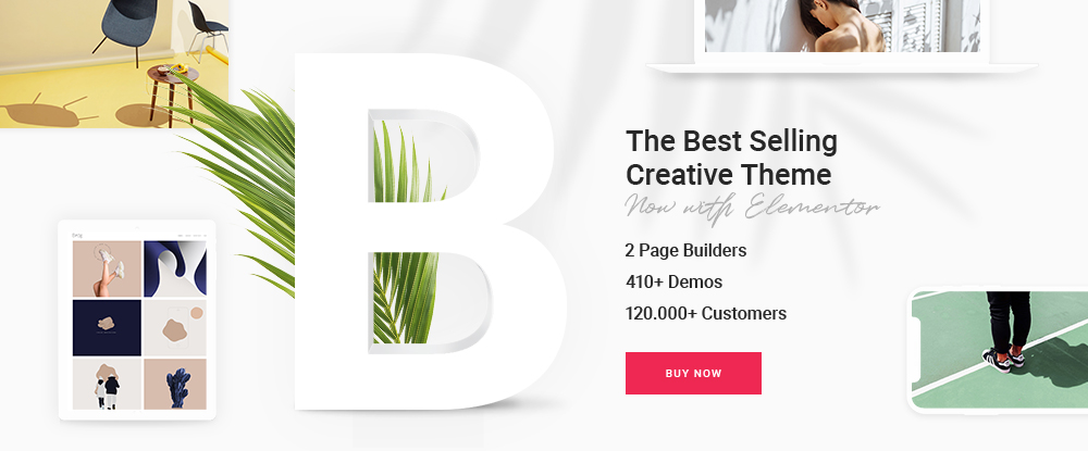
  1. BeTheme – Responsive Multi-Purpose WordPress Theme

            This premium multipurpose WordPress theme, the biggest of them all, is hard to beat in terms of its huge array of tools, features and options, performance, flexibility, and its level of support. Visit BeTheme’s website and you’ll be well into your second cup of coffee by the time you begin to have a good understanding of what this theme can help you accomplish.

  • The highlight is the selection of 500+ customizable, responsive pre-built websites. These professionally crafted design aids cover 30 industry sectors, all the major website types like portfolio, one-pager, etc., and a wide variety of business niches.

They also have functionality and UX features embedded right into them, plus they are customizable and responsive.

  • The popular Muffin Builder 3 page builder, with the WPBakery page builder as an option
  • A Layouts Configurator if you decide to build a page from scratch.
  • A Shortcode Generator and a large selection of shortcodes that, together with BeTheme’s other features, eliminates any need for coding.
  • A powerful Admin Panel that serves to give you all the flexibility you want.

“This theme is the best for WordPress, the layout and flexibility are perfect to develop a site.” – Joso970

Learn more about Be’s 40+ core features by clicking on the banner.

  1. Total Theme

This WordPress theme has been around a while. It has helped more than 41,000 users build premium websites, and it comes with more useful features than you’ll find in most themes of its type and purpose.

Total is and has

  • Drag and drop and extremely easy to use
  • Developer-friendly hooks, filters, and 450+ snippets
  • A Theme Customizer that allows you to quickly change site colors, widths, font characteristics, etc.
  • 100+ page builder elements and extra design modules, along with 500+advanced customizing and styling options

Total’s package includes the popular WPBakery page builder, 40+ pre-built demos, and a quick start demo importer, Revolution Slider and Layer Slider; and Total is WooCommerce ready.

Total is also compatible with most of the popular WordPress plugins. So, you won’t have to be burdened down with an excessive number of third-party plugins.

“I’ve been a loyal customer of Total theme for years. Support is impressively quick, useful and accurate. The theme will allow one to build virtually anything you want. AJ and his team are terrific, and there is no reason to buy any other theme.” – donnieweaver

  1. Avada

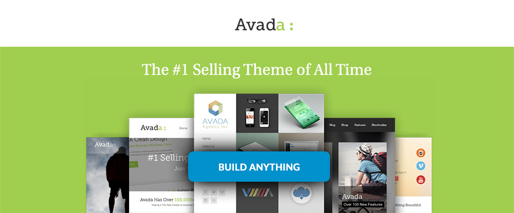
Avada has been the #1 selling theme over the past 6 years. There must be a reason – or several. It could be

  • a Dynamic Content System that gives users tremendous flexibility
  • Flawless WooCommerce integration including the capability to drag and drop product designs
  • 55+ pre-built websites to help you build and launch quickly – without coding

You can also import full or partial demos with Avada or use sections from several demos.

“There’s really NOTHING you can’t do with the Avada theme AND they have the best support team of any Theme out there – really!” – MamaSara

Click on the banner to learn more about this best-selling theme.

  1. Houzez – Highly Customizable Real Estate WordPress Theme

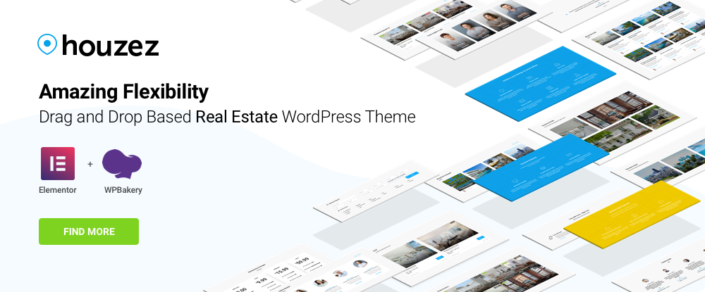
Asking a multipurpose theme to provide a solution when a specialty theme is really what is needed is asking too much. Houzez has all the features and functionality a real estate agent or agency is ever likely to need, including

  • property listings formatting options
  • advanced property search capabilities
  • a property management system

Plus, the Houzez theme can be customized to fit an agency’s business model.

“Awesome and very flexible theme and customer support is excellent.” – mardenvato

In need of a specialized theme for realtors? Look no further.

  1. TheGem – Creative Multi-Purpose High-Performance WordPress Theme

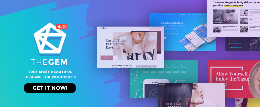
Some describe TheGem as having the most beautiful designs for WordPress. Others refer to it as being the ultimate WordPress toolbox for designers. In truth, both descriptions are true.

The package includes

  • 100+ pre-built, one-click installable websites plus 400+ trendy design templates
  • the powerful WPBakery page builder

a ready-to-launch fashion store

I love TheGem Creative Multi-Purpose High Performance Theme. I plan to utilize it for all of my clients. I’m getting some of them to change over as I update their websites.” – acreator7

The ultimate design toolbox is but a click away.

  1. Uncode – Creative Multiuse WordPress Theme

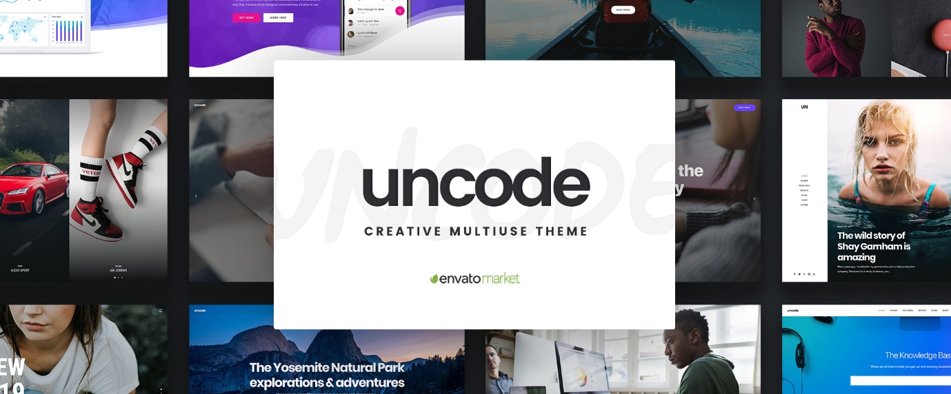
Agencies, bloggers, freelancers, and creatives can all benefit from choosing Uncode, as can businesses or anyone wanting to create a portfolio website, a magazine website, or any type of landing page.

Features include

  • a front-end editor on steroids
  • Adaptive image and grid systems
  • WooCommerce single product features

and more, but the star of the show has to be ThemeForest’s best-sellers showcase of user-created websites which tells a story of what this theme could do for you, why it claims 60K+ sales, and why it is a source of inspiration.

“Easy to use theme and customizable to ones need. I give 5 stars for theme support. Really happy!!” – rchakaipa

Click on the banner to visit the Uncode and its remarkable showcase of websites.

  1. Bridge

Rather than trying to list Bridge’s most likely benefactors, saying that this theme is perfect for just about anyone is more than sufficient. This best-selling creative theme’s features include

  • 420+ premade websites
  • open-ended customizability
  • huge collections of modules, design elements, sliders, and plugins including WooCommerce, as well as both the WPBakery and Elementor page builders
  • 5-star rated support

It should also be noted that Bridge serves a community of 120,000+ happy users.

“Very flexible, the demos are beautiful!” – rebecajobs

Click on the banner for a closer look.

  1. Brook – Multipurpose Creative WordPress Theme

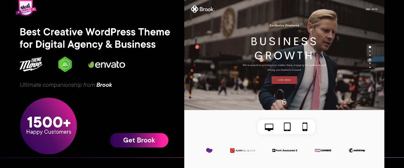
The testimonial is typical and says it all. An abundance of cool features makes Brook a web designer’s dream. In the package, you’ll find a huge collection of premade templates, premium site-building plugins, shortcodes, and design elements. Also, Brook is

  • superfast loading
  • SEO optimized
  • easily customizable

As a bonus, there’s a library of support tutorials you can also view to find out more about Brook.

“COSTUMER SUPPORT 5++++++++++

Feature request 5+++++++++

Everything on highest level

This is first time I get this kind of experience.” – souldisco

Visit the site and check out a video tutorial or two.

  1. XStore | Responsive Multi-Purpose WooCommerce WordPress Theme

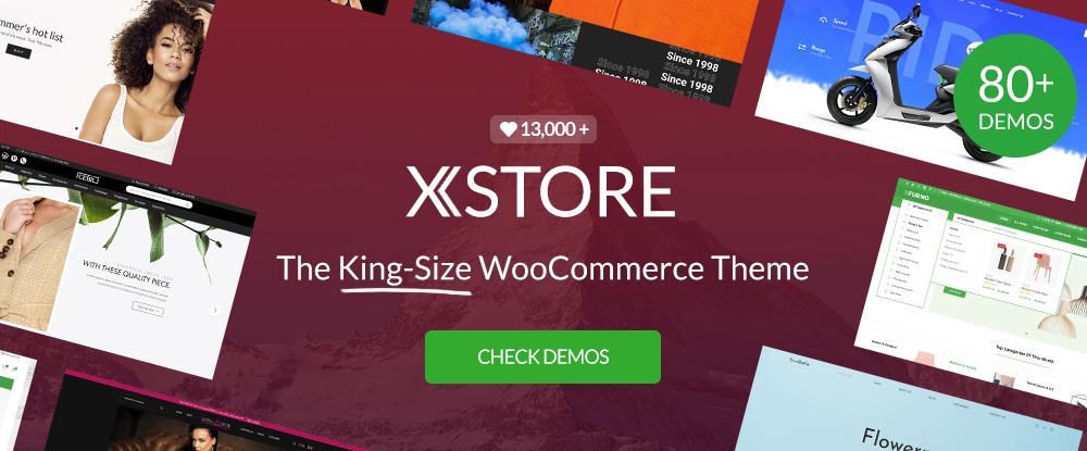
Could you use a ready-to-go shop to get an online business started? How about 80 of them? That’s what XStore brings to the table; and there’s more:

  • $300+ worth of premium plugins
  • a single product page builder
  • a powerful header builder
  • demos for a wide variety of products and retail items

In other words, everything you could wish for to get your show on the road.

“As a Graphic Designer, not a web designer, I base my purchases on quality and customer service. I’ve purchased XStore twice and they always have the best customer service if I have a question or problem. Also, the plugins they include for this theme are fantastic value.” – Chelsdevauld

Click on the banner to check out one or more of 80 stores.

  1. Typer – Amazing Theme with Multi Author Publishing Features

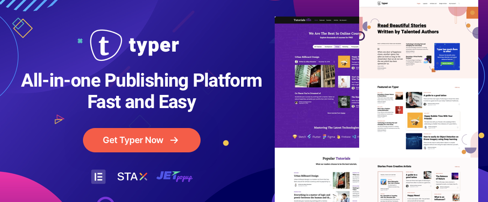
Typer may just be the ultimate WordPress theme for publishers in general and bloggers in particular. The 100% Gutenburg optimization provides powerful support for creating blog posts while the Elementor visual page builder enables Typer users to create attractive, professionally-design landing pages.

  • No coding knowledge is needed
  • Typer is optimized for speed + real lazy load images
  • unlimited Header style and unique page and post options

You can also expect to receive premium support should you require it.

“Theme is awesome! Exactly what I needed for my site!  Definitely recommend this purchase.” – chriscurran

Click on the banner if a premier publishing theme is on your wish list.

  1. Pofo – Creative Portfolio, Blog and eCommerce WordPress Theme

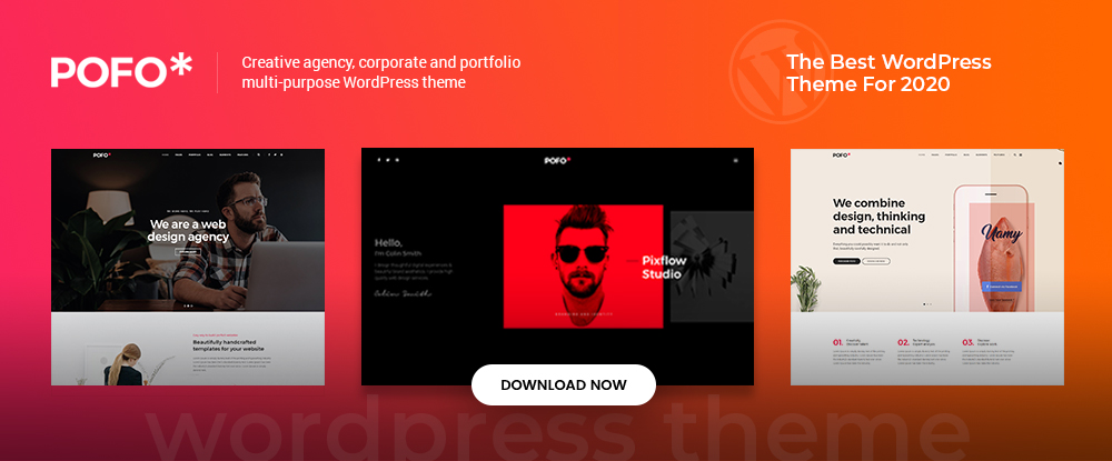
As its name suggests, Pofo is an excellent choice for anyone in need of building an attention-getting and engaging online portfolio. After all, a good portfolio design is often a key factor contributing to a business’s success.

  • Pofo is blazing fast, fully responsive and Gutenberg compatible
  • This theme offers a wide selection of home and demo pages, design elements, and valuable and useful plugins

Features include the WPBakery page builder, Revolution Slider, and detailed online documentation.

“Pofo is beautiful in design, layout, UX/UI, and color scheme. It’s truly 5 stars. However, with such a great product without a great customer support, it can mean nothing because it won’t allow you to achieve what your needs are. My 5 stars go to customer service!” – KARCIS

Click on the banner to discover more about this multi-purpose theme.

  1. Schema

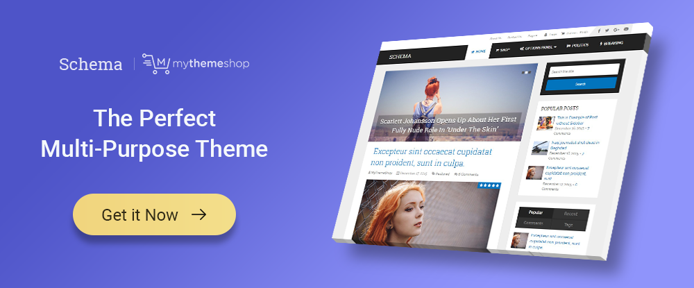
Schema is not your run-of-the-mill premium multipurpose theme. It has many if not most of the features of other premium themes along with one very significant difference: SEO functionality

  • Schema knows what search engines seek
  • Schema guides search engines through your site – content element by content element
  • Schema checks for clean code and other factors that can affect website rankings

Schema is also fully responsive, ultra-fast, and is compatible with multiple page builders.

“Gorgeous design, super-fast response to my question too. thank you for a wonderful theme :)” simonehow

If SEO is a pain in the neck for you, click on the banner for a solution.

  1. Leadinjection – WordPress Landing Page Theme

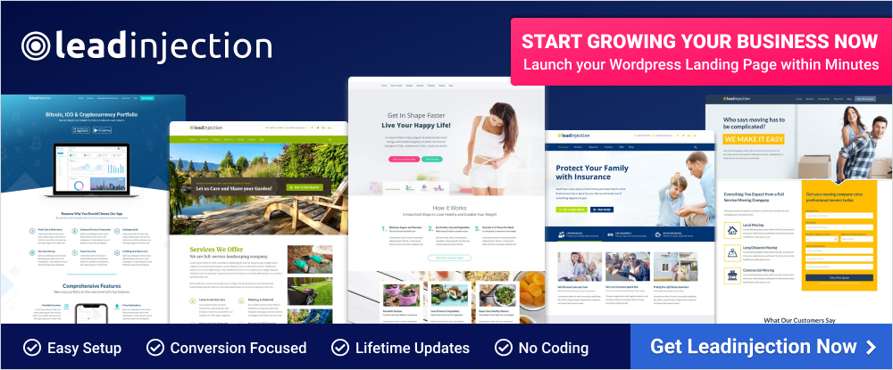
With Leadinjection, you can do something well that can be very tricky or even impossible with most WordPress themes. Leadinjection is a landing page theme that is uniquely capable of adding a landing page to an already up-and-running website.

Leadinjection is

  • WordPress Multisite Compatible
  • Conversion Focused
  • WPML and Translation Ready

This is a good tool to have if you have one or more websites to maintain.

This theme has some very cool features, and most importantly it is pretty well-documented and very well supported. The developers have been very helpful every time I’ve had a question. -frankdl98

Add Leadinjection to your web design toolkit.

  1. TheFox | Responsive Multi-Purpose WordPress Theme

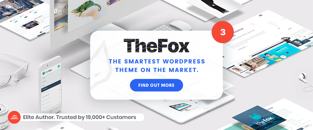
It may or may not be a stretch to call TheFox the smartest of ThemeForest’s WordPress themes. But, it certainly has the essential features and elements to back up such a claim.

Maybe it’s because TheFox’s design takes into account the tiniest of details. Whatever the reason, this multi-purpose theme has a solid track record and is a good investment.

“I have been very impressed with TheFox theme. The design and customizability are great and very straight forward. The Customer support is top notch.” – bc hughes

  1. Hongo – Modern & Multipurpose WooCommerce WordPress Theme

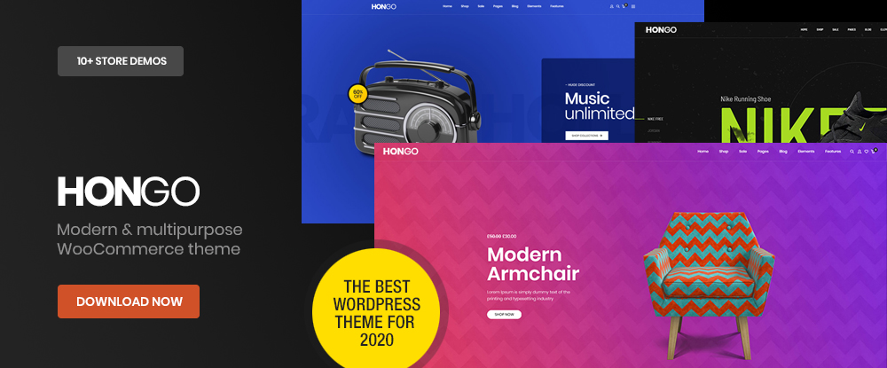
Hongo’s new look makes it especially noteworthy, plus the package features plenty of demos, templates, and other creative design elements, WPBakery, one-click demo import, and custom shortcodes.

  • Out of the box premium eCommerce features included
  • Conversion optimised and modern looking product listing and product detail page styles
  • Hongo designs are awarded at many well known awards like awwwards.com, cssdesignawards.com and many others

“Simply the great designs and best theme for WooCommerce, loading fast, customisable and easy to use with the detailed documentation. Their support team is technically sound and very kind to guide wherever needed. We have bought some other themes from ThemeZaa now and they have never lets us down, thanks!” – diyaatps

So don’t wait and start selling your products with Hongo!

*****

            The emphasis in this article is on multipurpose themes.  It is what many designers, and especially beginners, tend to look for. We’ve included several more specialized themes, one of which serves a particular niche, and others that can be used for a variety of website types.

All 15 themes have many things in common such as excellent flexibility and performance, speed, ease of use, and a large and varied selection of design aids. What this means to you is that you really can’t make a poor choice and should have little difficulty in making the best one.

Please feel free to share this article with a friend or on social media. We’d love to hear about your shopping experience.

Read More at See what 15 of the Best WordPress Themes in 2020 Have to Offer

Graphic Design Trends in 2020 You Need To Look Out For

vibrant colors graphic designs 2020

2020 is literally just hours away and we want to talk about 5 graphic design trends in 2020 that you’ll need to be looking out for.

We all know that there are some design trends that are bomb and some that should just hide under a rock and go away forever.

Today, we only want to go over the best of the best of graphic design trends in 2020.

So let’s do this.

Graphic Design Trends in 2020 You Need To Look Out For

So let’s do this. May the new year bring loads of good times and good graphic design trends!

Realism

Realism and 3D designs are a trend that reigned all of 2019, and we expect it to become even more popular during 2020.

design trends 2020

Technology is constantly evolving and improving and we’re always impressed and excited to see what designers will do with this. We’re convinced that we will continue to see 3D designs all throughout 2020.

realism design trend

[source]

Lots of people always like to combine real objects and images into their designs, but if this is something you choose to do, make sure you avoid the uncanny effect!

realism design trends 2020

[source]

lemonade ad design trends 2020 realism

[source]

Minimalism

Another trend we don’t expect to take a back seat this upcoming year is minimalism.

Minimalism has been slowly creeping in on us for a while, and almost everyone seems to embrace it with open arms.

And the best part about minimalism you may ask? Less work.

I’m just kidding. Designing something minimally can be just as much work and take just as much brainpower as making a 3D intricate design.

It has to be aesthetically pleasing to the eye and make sense within a single glance.

Let’s take a look at some examples.

minimalism design trends 2020

[source]

[source]

minimalism design trends 2020

[source]

Vibrant Color Palletes 

I’ve been reading a lot about color associations recently and I’ve learned that people will ignore neutral colors or worse, won’t even notice them, whereas when someone sees a vibrant color after seeing lots of neutrals, it’ll break the boredom and they will feel notions of excitement and fun.

This year in 2020, break all of the rules and embrace the vibrant colors that this world has to offer.

Life is short, use all the colors!

Stand out of the crowd by using bright and vibrant colors.

design trends 2020

[source]

[source]

vibrant colors graphic designs 2020

[source]

Metallics 

Following more color schemes, we present to you, the shiny metals trend.

This is definitely something that I like to see and you’ll see it a lot on packaging.

design trends 2020

[source]

Line Art

And finally, we come to our last graphic design trend of 2020 for this article which is line art.

Line art is a branch of minimalism and is a simplified illustration style that takes a lot of creativity.

It is clean and elegant and very intriguing to look at. See for yourself!

[source]

[source]

Saying Goodbye to 2019

Thanks for sticking by our side another year and we are more than thrilled to see what design trends this next year holds for each of us.

We wish you a happy New Year’s and all our best wishes.

We hope you enjoyed the 2020 design trends that you can expect to see. What trends do you expect to see in 2020? Let us know in the comment sections below.

Happy New Year’s, everyone!


Read More at Graphic Design Trends in 2020 You Need To Look Out For

The New Facebook Logo and Reasons Behind This Change

new facebook logo

new facebook logo 2019

[source]

Facebook has been around for 15 years and we all know that it needs little to no introduction.

With a boasting 1.63 billion daily active users, Facebook is easily the most popular app to date.

Since 2004, Facebook has been connecting friends and family from all over the globe.

We probably all use it, and we probably use more Facebook apps than we think.

Facebook is the parent company of 74 companies total, which include some of the most popular apps out there, such as Instagram, Whatsapp, Oculus VR and more.

So what started as a single app, grew into something bigger. Connecting families and loved ones from across the world, helping businesses grow, and find other communities.

[source]

But Facebook is more than just a social app. They have an astounding 43,000+ employees that work in over 60 offices around the world.

And although they do have great apps that we all probably enjoy using or enjoyed using at one time, we can’t forget about the major scandal of selling private information that went down last year.

But we’re not here to talk about that today.

Today we are talking about Facebook’s new logo design that was created in-house by Dalton Maag and Saffron.

To quote the reason why they’re updating their logo…

“The new company branding is designed to help us better represent the diversity of products we build, establish a distinction from the Facebook app and communicate our purpose in the world.

Through the process [of redesigning], three foundational design behaviors that informed our brand system emerged:

  • Clarity: a brand that simplifies and builds understanding
  • Empathy: a system that is respectful of context and environment
  • Creating Space: design that supports people and their stories”

[source]

Think of the new logo redesign as a design for the parent company. This way the logo can be distinguished from the app to the parent company.

“Today, when people hear “Facebook” they think of the Facebook app. This posed a unique design challenge. We needed the wordmark to establish distinction from the Facebook app and allow for a clearer connection to the full family of technologies. The new brand system uses custom typography, rounded corners, open tracking and capitalization to create visual distinction between the company and the app.”


facebook corporation new logo

[source]

As opposed to the Facebook app logo, the corporate logo is written in all caps, in a unique font that was designed in-house. It was designed with an openness of mind and clarity. With a horizontal structure and consistent stroke width, I can’t deny that the new corporate Facebook logo is as beautiful as it is simple.

You may be wondering what color the Facebook corporate logo will be. There is a more complicated answer to that.

The new logo will be fluid when it comes to color. It will adjust according to its environment and present a matching color or gradient. This is great because it could match the green of Whatsapp, the beautiful Instagram color gradient, or the recognizable blue of Facebook.

new facebook logo

I personally like the simplicitiy of the new Facebook logo.

But I want to know what you guys have to say. What do you think? Are you here for it, or will you have to go with a hard pass?

Let us know in the comment section down below.


Until next time,

Stay creative, folks!

Read More at The New Facebook Logo and Reasons Behind This Change

The Best of Logo Redesigns in 2019 – Our Top 8 Picks

You know the saying, out with the old and in with the new! 


And 2019 was definitely a big year of change.


With each new year, comes new changes, and we’re greatly anticipating next year’s big design changes. 


But until then, we want to reminisce and talk about the best 8 logo redesigns in 2019.


There were some pretty big and iconic changes that happened this year, and we’re going to go over all of them.

Logo redesign is a common practice because no matter how good your logo looked when you created it, in most cases, it’ll become dated.


With new trends coming around every season, and with new things being implemented into a business, it’s hard for a logo to stay relevant and fresh.


So today, we’ll be going over the top 8 logo redesigns of 2019. 


Let’s get into it. 


Warner Bro’s


Warner Bro’s logo redesign was a shocker for all of us. After a century of having the same iconic logo, they decided it was time to make the logo a little more versatile. 


With a new shade of blue, a little reshaping of the shield, and a new flat design, I can say that Warner Bro’s was definitely my favorite logo redesign of 2019. 


What do you all think of the new design? Let us know in the comment section below what your first impressions were.


Volkwagen


[source]


Another recent and iconic logo redesign was from Volkswagen.


Volkswagen, being internationally renowned for its cars, definitely doesn’t need much of an introduction from us.


Volkswagen stated the following in their press release regarding the new logo.


 “The new brand design marks the start of the new era for Volkswagen,” says Jürgen Stackmann, Member of the Brand Board of Management responsible for Sales, Marketing and After-Sales. “By formulating new content and with new products, the brand is undergoing a fundamental transformation towards a future with a neutral emission balance for everyone. Now is the right time to make the new attitude of our brand visible to the outside world.”

[source]


We’re happy with the steps that VW is taking to help the environment. And we also like the new flat and versatile design of the logo. 


A new era, a new logo.


Firefox


When we heard that Firefox’s new logo was accidentally leaked via Twitter over the summer, we were actually thrilled.


With every new redesign Firefox goes through, it continues to get sleeker and sleeker. 


The fox obviously had some grooming over the summer, as its coat is much smoother now. The gradient is very very similar to the old one, and now we can actually see the sly fox’s face.


Overall, we’re very pleased with the facelift that Mozilla underwent, and we’re looking forward to what they’ll put out next. 


Grey Goose 


Oh Grey Goose, you beautiful bottle of fun and joy. 


Grey Goose also went through quite a surprising redesign this summer. 


They left all their former, intricate designs behind and embraced minimalism in their design.


But not only did they embrace minimalism in their graphic design, but also in their wording.


And as we said in a previous article all about their redesign, this still rings true. 


“From a marketing perspective, the shorter tagline that spells just ‘Vodka’ now instead of ‘World’s best tasting Vodka’ makes a lot of sense. Most people shop for alcohol based on the label. In recent years, more and more consumers will go for a more minimal tag.”


Minimalism is definitely a trend we’ve been seeing all throughout 2019. 


Let’s see what we have up next. 


Discovery Channel


[source]

Next up, it’s time to “discover” another logo redesign. See what I did there? 


I need to stop. 


Anywho, Discovery came up with a new logo design. They ditched the 3D world model and went for a flat design. They also shortened it by removing the stand alone D and just including the logo in the actual written word.


If I’m completely honest, I think I like the previous logo design better. What do you guys think?


Slack


Alright, let’s cut them some “slack” with the new logo design. 


I’m kidding you guys, I really like the new look of their logo. I really need to quit on these puns. 


We all know and love Slack and loved the liveliness of their logo. I genuinely can say that I vouch for both logos! But let’s hear what Slack themselves have to say about it.


“Our first logo was created before the company launched. It was distinctive, and playful, and the octothorpe (or pound sign, or hash, or whatever name by which you know it) resembled the same character that you see in front of channels in our product.


It was also extremely easy to get wrong. It was 11 different colors—and if placed on any color other than white, or at the wrong angle (instead of the precisely prescribed 18º rotation), or with the colors tweaked wrong, it looked terrible. It pained us. 


So here we are. Our in-house design and brand team, together with Michael Bierut and the team from Pentagram, worked to create a new and more cohesive visual identity. And we’re starting, today, with the logo. It uses a simpler color palette and, we believe, is more refined, but still contains the spirit of the original. It’s an evolution, and one that can scale easily, and work better, in many more places. “

[souce]

So there you have it! 


Reebok


Whether you’re in dance, track, crossfit, or yoga, Reebok has the shoes for you. 


They also went through quite a big design change this year. 


The iconic Delta sign in their old logo has taken a back seat to the new design. 


The new design is actually just a return of their design from 1990, with some nice tweaks. 


Fox Entertainment


[source]


And finally, we come to our final logo redesign. 


Some logo redesigns require an entire make-over, and others just need a little, teeny-tiny tweak.


Fox Entertainment went for a tiny little tweak. 


The Entertainment text is the main change. 


They changed the font and they also made it quite bold. 


It definitely is more eye-catching now and looks a lot better.


Sometimes all you need is the smallest adjustment to make a huge difference!


And Finally…


We hope you guys enjoyed our collection of logo redesigns. We are looking forward to a brand new year and a new start in 2020. 


Let us know what your favorite logo redesign of the year was! 


Happy holidays!


Read More at The Best of Logo Redesigns in 2019 – Our Top 8 Picks

Inspirational Designer of The Week – Meet Aurélien Salomon

Welcome back to this week’s edition of Inspirational Designer of The Week!

Today, I’m honored to welcome Aurélien Salomon to the scene.

[source]

Aurélien Salomon is an exceptionally talented French UI/UX designer who plays by his own rules.

And by doing so, he’s been able to work with famous enterprises that favored him, such as Apple, Google, Tinder, and Uber, just to name a few.


[source]

So what’s his design philosophy?

Well, he says, “I believe in simplicity, I love solving problems and crafting amazing experiences.”

And this shows clearly in his work.

[source]

He has worked on loads of different design projects, extending from web design to creating IOS apps from scratch.

If you’re on Dribbble as much as I am, then you will surely recognize his work for its simplicity and originality.

[source]

Aurélien Salomon is from Martinique (a small French island in the Caribbean), and studied engineering in Paris and Montreal.

How did he get into design?

Salomon has loved designing ever since he can remember.

[source]

He says it all started when he was a kid, and his love for design showed through the way he played with legos.

He had always had a passion for designing and engineering, so he specialized in cognitive ergonomics, which proves to be a very useful field for a designer.

[source]

What was his growth experience like?

In the beginning, he worked for a start-up and then moved on to a design agency.

But we all know that being your own boss can be the best thing ever, in my opinion, so he moved onto bigger and better things: freelancing.

[source]

And in his words, once he began to freelance, he “[I] was lucky enough to work with big companies like Apple, Google, Tinder, Uber and more.

One of the projects he is most proud of and that he can share with us is this MacOS redesign concept.

[source]

And speaking of Apple, here are some other Apple design projects and concepts that he’s worked on that we’re obsessed with.

[source]

When Aurélien starts a new design project with a new client, he says that he always that it is vital to understand their business, what the business is trying to achieve and how you as a designer can impact their project in the best way possible.

[source]

When he begins working with new clients, he starts by communicating clearly with the client what their goals are and what the want to achieve.

Once they get a solid foundation to work from, he then takes a look at the competition.

[source]

After all of this, he starts to gain inspiration from various platforms, such as Dribbble, Behance, or even real-life things, such as books and movies.

When asked what is the most important element of UX design, he said… 

“The most important part of UX is to come up with a holistic approach.”

[source]

There are many steps a designer should follow and never neglect, such as user research, understanding, brainstorming, prototyping, and testing.

A typical day in Aurélien Salomon’s life looks like this…

He starts every morning like this:

He wakes up at 8 am, brews his white tea, and then meditates.

That sounds like my morning goals, to be completely honest here.

[source]

He then works very hard until around 7 or 8 pm.

Between the working hours, he tries to take breaks to stretch or go on runs, in order to be sure he gets sufficient exercise.

Wrapping things up

Aurélien is an inspiration to us all.

You can be anything you want to be.

To find more of Aurélien’s work, you can follow him on Dribbble and Behance.

Until next time, folks.

Stay creative!


Read More at Inspirational Designer of The Week – Meet Aurélien Salomon

32 Jolly Christmas Card Design Ideas – The Best of Christmas Card Graphic Design

Creativity is sparking and so is the fire in the fireplace. Christmas time is almost here!

With Christmas being only a few weeks away, it’s the perfect time to start getting your Christmas cards ready.

Nothing shows your friends and family that you care more than a homemade gift and a Christmas card.

Design your own Christmas cards to give away to your loved ones, or make designs to sell online!

No matter the reason behind why you’re creating Christmas card designs, you’re ultimately spreading Christmas cheer through your passion: designing.

32 Jolly Christmas Card Design Ideas

Without further ado, let’s get into 32 Incredible Christmas Card Design ideas.

[source]

[source]

[source]

[source]

[source]

[source]

[source]

[source]

[source]

[source]

[source]

[source]

[source]

[source]

[source]


We hope you enjoyed these 32 Christmas Card Design Ideas…

We wish you all the happiness in the world and happy holidays with those you love.

We hope these Christmas card design ideas inspired you to create your own!

Read More at 32 Jolly Christmas Card Design Ideas – The Best of Christmas Card Graphic Design

Inspirational Designer of The Week – Meet Gal Shir

Welcome to this edition of Web Design Ledger’s Inspirational Designer of the Week!

And now, I’d like to welcome Gal Shir to the scene, our pick for the most inspirational designer of the week.


Gal Shir is a graphic designer, illustrator and motion designer who has been designing from age 13.

The aspiring, self-taught designer at just age 13 got his first version of photoshop and started designing away.

[source]

He says that in school, his teachers liked him because he didn’t cause many problems, but he was always drawing during class or designing on his laptop.

What started out as a passion and doing small projects for friends, families, and small businesses,  led to his long-term passion and career.

He had a special talent when it came to designing, and when he realized someone would actually pay for what he’s passionate about doing, he was ecstatic.

He once used to design wedding invitations for friends, but now he’s working alongside start-up businesses to help them better embody the aesthetic they’re looking for and the message they want to spread through UX.

When asked where he gets his inspiration from, he says, “I think inspiration is all around, sometimes even a bit too much.

For a designer, almost every daily-use objects are something to learn from.

Each one of those was designed, good or bad.

I love to get to know new tech products, gadgets, applications, and websites.

[source]

My favorite website for inspiration is the one and only Dribbble, which has the most variety [in] design fields, up-to-date trends and hourly-updated feed of design works made by talented people.”

And speaking of Dribbble, he posts lots of inspirational and quality content for his 100,000+ followers.

And if you thought that was impressive, take a look at his Instagram numbers: 699k followers!

After a long day of work, he says he likes to clear his mind by being on social media.

You can see all the amazing videos of him drawing on his Instagram page.

So how does the creative process start?

Gal says that his creative process all starts from a concept in his mind.

He tries to think of a scenario that he would like to freeze in time and try to create an image out of it.

When he works together with a client, he tries to portray and represent the company’s goal and product through his art.

How can an aspiring designer enhance their design skills?

Gal shir says, “I believe that any skill is achievable, and that persistence is a key to enhancement. I found out that having a daily routine of a small drawing a day can be very effective.”

He advises all aspiring designers to surround themselves with content and other designers that inspire them.

Find people on social media that inspire you to do better and start from there.

So what does a typical day look like for Gal Shir?

He says he wakes up around 9 am and then starts his morning off with a brisk 20-minute walk to the office where he is currently working.

His workdays consist of meetings, brainstorming, designing, illustrating, working with product developers.

And after work, Gal Shir says that creating these flawless drawing videos that we all love so much, is meditative for him.

Besides drawing and creating being his job, it’s also how he escapes from the real world for a bit to recharge.

And I know I speak for all of us when I say, we’re glad this is the way you relax because as meditative as it is for him, it is as well for all of us.

Gal Shir is truly an inspiration for and to all and we were honored to represent him on this week’s edition of inspirational designers.

Let us know who your favorite designer is in the comment below for a chance to have them featured on next week’s piece about inspirational designers!

Until next time,

Stay creative!


Read More at Inspirational Designer of The Week – Meet Gal Shir

12 Free Christmas Fonts for You to Use to Spread Christmas Cheer

beyond-wonderland-font-5-big

Thanksgiving has come and gone, and now it’s time to start preparing for Christmas designs if you haven’t already!

We provided you with what we believe to be the ultimate list of free Christmas design resources a few weeks ago, but I saved the best for last.

Free Christmas fonts!

I found an abundance of free Christmas fonts to help you spread cheer this year through your designs, but I picked my absolute favorites for this list.

12 Free Christmas Fonts for You to Use

Prepare to be “sleighed” by this amazing list of free Christmas fonts!

1. Grinched

grinched-font-2-big grinched-font-3-big

Did somebody call my childhood and ask them to show up in this picture?

Everyone will recognize this font as the one from The Grinch book and movie. It’s perfect for you to use this Christmas and it’s free to use for personal use, and for commercial use, you’ll need to get in touch with the owner.

I think this font will forever be my favorite Christmas font.

Download here: https://www.1001fonts.com/grinched-font.html

2. Beyond Wonderland

beyond-wonderland-font-5-big

beyond-wonderland-font-3-big

This font screams wintertime. Within the font itself, it looks like it’s snowing!

This handwritten font is free for personal use, and you can contact the owner for commercial use.

Download here: https://www.1001fonts.com/beyond-wonderland-font.html

3. The Gingerbread House

the-gingerbread-house-font-5-big the-gingerbread-house-font-4-big

Next up, we have this curly, handwritten Christmas font called The Gingerbread House.

Handwritten fonts for Christmas are a must. It brings back some sort of nostalgia and everyone, even people with absolutely no design skills, can recognize that this font is Christmassy.

This font is free for personal use.

Download here: https://www.1001fonts.com/the-gingerbread-house-font.html

4. Candy Time

candytime-font-1-big candytime-font-2-big

Candy Time looks absolutely delicious.

This Christmas candy cane font would go perfect with any type of cooking project or a project for a game for children, or really anything you put your creativity and mind to.

This font is very versatile and perfect for the season.

Download here: https://www.1001fonts.com/candytime-font.html

5. Frosty

frosty-font-4-big frosty-font-3-big

Frosty the snowman! I mean… frost the font.

This font is so magical and is the perfect embodiment of winter.

The font is full of character and literally has little snowflakes floating around amongst the letters.

This font is perfect for the Christmas season.

This font is also free for personal and commercial use.

Download here: https://www.1001fonts.com/frosty-font.html

6. Cane Letters

kr-cane-letters-font-1-big

Another scrumptious free Christ font for you to use.

This font gives off a 3D effect due to the canes shadowing the letters.

Very festive, cute, and Christmassy.

Download here: https://www.1001fonts.com/kr-cane-letters-font.html

7. Oh Christmas Tree

kr-oh-christmas-tree-font-2-big

Oh Christmas Treeeeeee, oh Christmas Tree!

This font makes me hear my crazy aunt singing in the living room at the top of her lungs.

This decorative font is perfect for spreading Christmas cheer.

Download here: https://www.1001fonts.com/kr-oh-christmas-tree-font.html

8. Cartoon Blocks

cartoon-blocks-christmas-font-5-big

This playful Christmas font is free for you to use on any of your upcoming personal Christmas projects.

Contact the owner for a commercial license to use it.

This 3D Christmas font is jolly and perfect for the season!

Download here: https://www.1001fonts.com/cartoon-blocks-christmas-font.html

9. Christbaumkugeln

christbaumkugeln-font-2-big

Just have a look at this festive font.

The font inside of the ornaments is so festive, it hurts.

This font is calling your name. Use the link below to download it!

Download here: https://www.1001fonts.com/christbaumkugeln-font.html

10. Christmas Cookies

christmas-cookies-font-1-big

Check out this 3D Christmas font.

Can you just smell the Christmas cookies by looking at it?

Because I know I can.

Download here: https://www.1001fonts.com/christmas-cookies-font.html

11. Christmas Time

christmas-time-personal-use-font-3-big

Our second-to-last Christmas font looks like a classic.

It could be on the cover of any classic Christmas book.

This beautiful, cursive, handwritten font is free and available for personal use.

Download here: https://www.1001fonts.com/christmas-time-personal-use-font.html

12. Mountains of Christmas

mountains-of-christmas-font-1-big

And finally, we’ve come to our final Christmas font.

This gorgeous handwritten font is just waiting for you to use on your next design project!

So what are you waiting for?

Download it here: https://www.1001fonts.com/mountains-of-christmas-font.html

“Wrapping” up

We hope you enjoyed our list of free Christmas fonts for you to use this jolly season.

We wish you all the most magical holidays!


Read More at 12 Free Christmas Fonts for You to Use to Spread Christmas Cheer

Warner Bros New Logo Design and Identity – Honest Thoughts?

Warner Bros.


Don’t those two words just spark loads of childhood memories for you? 


Anyone else?


Harry Potter, Lord of the Rings, Friends, and basically all good movies/shows ever!


I gotta be honest, I really didn’t know how to feel when I heard about the brand new logo and identity that WB was going for.


And after looking at it and letting it sink in, I think I can properly voice my opinion. 


But first, let’s get into a brief history of WB Studios. 


A Brief History of the Warner Bros Studio


Warner Bros has been around since 1923 and is surely one of the most well-known entertainment companies ever.


 With great, recognizable shows and movies like The Big Bang Theory, The DC Universe, Harry Potter, The Lego movie and loads and loads more, the library has more than 100,000, let me say that again, 100,000 hours of programming.


Not only do they have movies and tv shows, but they also have, as you probably know, comics books, video games that we all know and love. 


And now that they’re coming up on their centenary, they are celebrating with a brand new logo. 

Out with the old and in with the new. 


We can thank Pentagram for this new design that will suit all branches of the studio. 


Keeping many of the same, iconic elements of the original logo, we can look at this rebranding as kind of a great make-over, rather than a brand new reinvention of the logo.


Vice president of public affairs and worldwide corporate communications, DeeDee Myers, said that the “visual identity looked a little dated.


And that’s where Emily and her team came in. 


Emily Oberman, who headed up the redesign team, said she wanted to keep the original and iconic shield, but make it “more sleek and clean”. 


Here you can see the process of the redesign.


Instead of looking at the old logo as dated and needing an entirely new look, they kept the original elements and just kind of gave it a pick-me-up. 


By just making some simple changes and tweaking things here and there, a whole new design came out of the process. 


Even though the changes may have been small, they were able to maintain the original identity of the logo and brand, while giving it a whole new look.


The team said that they wanted the new logo to give people a sense of WB Studios moving into the future with us. 


While the shield has suffered a few changes, it was vital to the team and WB Studio that it was still easily recognizable to all fans and viewers. 


And I truly believe they were able to do just that.


It is more sleek and clean, just like they wanted. 


The shield was put into a golden ratio and thinned out a bit, and the letters were redrawn to give it a better sense of balance.


The iconic blue color of the WB Studios Logo was made more modern by brightening it just enough.


With this new logo came room for variation. 


This new logo needed to fit across all platforms and needed to look natural. 


The new logo can be modified to fit any occasion, or as DeeDee Myers liked to call it, logo soup. 


This logo comes in two different variations. A flat version, and a more dimensional version. 

This logo needs to fit any movie, show, comic book, etc, and that’s why it is so important that it can be easily modified to fit any occasion, while simultaneously keeping that originality and recognizability. 


Myers told us that “There is a tremendous ability to play with it and bring it to life.”. 


And that’s what Emily Oberman and the team were going for when they said, they wanted the logo to be “contemporary, while also being able to be used as a sponge for any story they wanted to tell,”. 


Amongst the two new design variations of this logo is also a new font. 

Warner Bros Sans is an original font that came from the original shield of the logo and was inspired by the 1920s Art Deco. 


By doing this, Oberman said that the brand would still be present through the custom font, even if the shield was not there. 


“We’re excited about refreshing the brand,” says Myers, “connecting it to the past, but with eyes firmly ahead.”


This project that took 3 years to complete is finally here, and it’s here to stay. 


The new logo is on the iconic water tower located on the WB Studio lot, and will soon be everywhere, from literature to social media, to big screens and on the sides of trucks.

We’re curious what you think about the new logo redesign that Warner Brothers Studio went through.


Are you a fan? Will you be missing the old logo? 


Let us know all of your opinions in the comment section below.


Until next time,


Stay creative, folks!  


Read More at Warner Bros New Logo Design and Identity – Honest Thoughts?

The Ultimate Collection of Free Christmas Design Resources

gift boxes free design resources for Christmas

With Christmas coming up very soon, you might be swamped with Christmas-themed designs.


Everyone wants to get their job done as efficiently and quickly as possible. 


That’s why I collected loads of free Christmas design resources for you.

Everything from free Christmas icons to free Christmas PNGs, vectors and images, I’ve got you covered. 


You’ll be “sleigh-in’” it this winter season with all these free Christmas design resources, let’s get right into it.


Free Christmas Icons


Last week I wrote The Ultimate Collection of Design Resources that you should definitely check out for your day to day use. 


But today, we’re talking all about free Christmas design resources.


Having some free Christmas icons will surely save you lots of time, so you don’t have to start from scratch. 


3Here is my pick of free Christmas icons that you can use. 


Flaticon

free christmas icons

Flaticon has lots of free Christmas icons for you to use for any of your Christmas projects that are coming up.


 It’ll save you lots of time, and the fact that hundreds of these icons are free will help you save a buck as well! 


Upgrade to premium in order to get thousands of icons! 


Freepik

free christmas icon design

Freepik will help you spread tons of Christmas cheer with their hundreds of free Christmas elements. 


They have flat designs and 3D designs alike in their Christmas icons. You don’t want to miss out! 


Vecteezy

free vectors for christmas holidays

Vecteezy has lots of color and happy icons for you to use for free. 


Just choose the ones you like, download, and use to your liking! 


Free Christmas PNGs


Make your clients happy with the best Christmas PNGs out there. 


Here are my top favorite free PNG websites that will certainly help you out this season. 


Pngtree

free pngs for christmas

Pngtree is great for everyday use but especially has some great Christmas PNGs. 


Their quality has never once disappointed me.


The only downside to their site, in my opinion, is that you only get 2 free PNGs a day.


So choose wisely, or consider upgrading to a premium account! 


Pngfly

free christmas png icons and images

Pngfly has over 20,000 free resources for you to use this Christmas. That’s definitely not an offer you want to miss out on.


Pngmart

free pngs for christmas desgin

Pngmart has tens of pages for you to browse through when looking for the perfect free Christmas PNGs. 


Check em out!


Free Christmas Vectors


Vectors are a huge part of graphic design, so it’s only right that we go over the best websites with the best free Christmas vectors that the internet has to offer.


Let’s do it.


Vexels

free vectors for holidays and christmas

Vexels has some of the best vectors I’ve laid my eyes on. Colorful, cheerful, perfect for Christmas. 


If you’re looking for great free Christmas vectors, then you definitely need to check them out!


Vectorstock

free christmas vectors design

But wait—there’s “myrrh”. Vectorstock has over 13,000 free Christmas vectors for you to use!


Vector4free

free vectors reindeer christmas holidays santa

Vector4free is a great choice for using in your everyday designs, but not only.


They have lots of Christmas vectors for you to choose from, so I recommend you get to it! 


Free Christmas Images


Christmas images will give a warm, homey feel to any project. 


If you don’t have a camera or time to take any Christmas pictures, definitely give these free Christmas stock images websites for your work! 


Pexels

free christmas stock images

Pexels is definitely one of my personal favorite stock images websites. 


They have lots of high-quality images from great individual photographers.


 And if you want to, you can support the artist, by donating to them! 


Pixabay

christmas stock images for free

Pixabay has loads of photo choices for you to choose from.


With over 20,00 free images solely dedicated to Christmas time, you’re bound to find the photo you’re looking for.


Unsplash

free images for christmas holidays

And finally, we have Unsplash


Unsplash has tons of Christmas photos for you to choose from, that are extremely festive.


Check out their site and find all your Christmas photo needs there! 


“Wrapping” up


Well, you guys snow the drill. This is the end of our time together.


I hope you found these design resources helpful! 


Until next time,


Stay creative, folks!


Read More at The Ultimate Collection of Free Christmas Design Resources

The 10 Elements of Every Great Logo + 10 Logo Examples

When establishing a brand, you should never put your logo on the back burner. 


If your logo doesn’t represent you well or it looks unprofessional, then your customers are going to bounce, leaving your business to plummet. 


We’re going to go over the 10 elements of every great logo, that you can implement into your logo design. 


Let’s get straight into it. 


1. Memorable


The first, most important element of every great logo is that it’s memorable. If your logo isn’t memorable, then you’ve got a huge problem. Because people won’t remember who you are, what you offer, and you won’t come to mind in the future when they need the product you have to offer. 


Being memorable is key. Make an original first impression on people so that they’ll always remember you when they need to. 


2. Simple


A good logo is simple. If you have a great design, then it doesn’t need to be super intricate. Yes, get all the little details and hidden images in there. That’s amazing, but it should still, in its essence, be simple and easy to grasp.


3. Easy to understand


This goes hand-in-hand with simplicity. If your logo is so complicated that no one understands it, then you’ve done something wrong. Your logo shouldn’t need a huge in-depth explanation of what it represents and means. Of course, your logo can have some subliminal messages and hidden images, but it shouldn’t be so hidden that people awkwardly say “oh… okay”.


So make sure your logo comes across well, is creative and original, but also is easy to understand.


4. Recognizable


You want to be easily recognized. On the street, in the store, online- people should see your logo and go “Hey! I know that brand.” This is just as important as memorability. If people don’t remember who you are and don’t recognize you, then your company is going to die. That’s that. 


So make sure you’re recognizable, make a statement, and are memorable.


5. Timeless


How terrible if you work months and months on your logo and company, and you fall into some crazy fads, and next year your company logo looks a little bit crazy. You definitely want to follow some great trends, but make sure that your company logo will look just as good this year as it will the next five. 


6. Scalable


Your work should look good, big or small. Whether you’re being displayed on a tiny little RDA or a giant billboard in your town. This also means that you need to have a high-quality logo design, so when you blow it up or scale it down, it looks just as good, quality-wise. 


7. Relevant


Ask yourself when designing your logo, “Why this logo design? What does it represent for me?” If your logo doesn’t describe what you’re doing and isn’t relevant to your brand… then you may be doing something wrong. You want to make sure people understand why your logo is the way it is, and you want to make sure that your target audience will vibe with it. 


8. Attention-grabbing


You’ll want your logo to turn heads. When some3one is walking by and sees your logo, you’ll want them to stop for a minute and dedicate their full attention to you. For this, you can have a cool geometrical design or some bright colors. As long as your intricate design is memorable, relevant and attention-grabbing. 


9. Be Different Than Your Competition


The worst thing you can be classified as, if you want to be a reputable company, is a knock-off. If you’re trying to have your own company, then for the love of all things good, don’t copy your competition. Yes, be inspired by them, but don’t try to be exactly like them. Look at them, take some notes, and move forward and do better. You’ve got this! 


10. Don’t be afraid of change


Everything evolves, and that means your company logo will evolve as well. Maybe not this year or the next, but somewhere down the road, you’ll need to make adjustments to make your customers happy. So don’t be set in stone, afraid to change. Change is good and should be embraced. 


And Finally


Be yourself and have some fun when designing your company brand and logo. 


Let us know in the comments what some of your personal tips are when it comes to designing a logo.


Until next time,


Stay creative, folks! 

Read More at The 10 Elements of Every Great Logo + 10 Logo Examples

The Best Packaging Design Ideas for 2019 You Need to See

sofias tea packaging design ideas

Your product could be the most amazing and useful product in the world, but if your packaging is not on point, then your entire business could be in some major trouble.

Imagine this scenario: You’ve designed the best product in your field, invested all of your funds into creating the product, and put packaging design on the back burner. You get on a free mock-up website, make something in an hour, call it day, and show it to your investors. 

Terrible idea. 

juice summery packaging ideas

In my personal opinion, you should put just as much effort into the packaging design of your product as you put into the product itself.

According to science, it only takes a person 1/10th of a second to create or form an opinion about someone or something. That gives you literally not even one second to give someone a great first impression. 

The first thing your potential customer is going to see is your packaging. And you better hope to goodness that you’ve aced your first impression and wowed your target audience with your packaging design.

Best Packaging Design Ideas for 2019

I’ve rounded up 20 of my favorite packaging designs for you to be inspired by for your next design project.

Let’s check em out!

1. Mint

mint pastel color packaging design

[source]

This face wash for men is so simplistic in its design that it’s easy and enjoyable for the eye to look at. The black color of the face wash gives off tones of luxury and the pastel colors on the box, combined with flat design, simply works for this packaging. 


2. Care Market

care-market-pt2_5_2x packaging design pastels

Continuing on with the pastel trend, we have Care Market packaging design. The palette they chose here is lovely, as pastels have been all over the place this year. The consistency in font usage is just perfect, using only two different fonts and using dividing lines between each new phrase. 


This packaging design shows us that you don’t need elaborate graphic designs to exude elegance and professionalism. All you need is a great color palette, and nice, coinciding fonts. 

3. Botany

botany-hemp-packaging-design

[source]

Less is more, as the saying goes, and botany nailed it. Minimalist, flat design is the key here and with three different color schemes that all complement each other, I can wholeheartedly say, I believe this design will catch the eye of anyone who is looking for a high-quality serum. 

4. Roji

roji juice packaging design

When someone is looking for a healthy drink, they’re going to be looking for sleek, professional fonts that look organic. My favorite part of this packaging design is that the designer thought through the choice of font colors. 


Since the bottle is made of glass, you’ll be able to see its contents and the yellow font matches the beverage inside the bottle. The yellow-colored font perfectly complements the contents of the bottle. A simple, well-thought-out packaging design overall.


5. Sophia’s Tea

sofias tea packaging design ideas

Stepping out a little bit from the pastel color palettes and into something a little bolder, we have Sophia’s Tea packaging design. Flat design really has taken the lead in 2019. We see it all over the place. And luckily for us designers, it makes our job a little easier. 


What I appreciate about this design is that the name of each drink matches the design of each recipient. The color scheme on each bottle matches each other, making a buyer recognize the brand, if they were to see each bottle on a shelf in a store. 

6. Juice.

juice summery packaging ideas

Since we’re on a drink roll, check out this summery packaging design for juice. Again, we’re hit with flat design and beautiful colors. The font sticks out perfectly on the foreground of the design. Juice. Simple, clean, clear, and to the point. 

7. Brightland

brightland_packaging ideas

I’ve never seen an olive oil packaged quite like this. At first glance, you would wonder what this beautiful bottle is doing in the oil section. 


You’re inclined to pick it up, you read that it’s olive oil, you’re shook, you compare prices between this and another oil, you realize it’s the same price, and naturally you buy the more beautiful packaging design of the two products. Hit people with original, innovative designs and you’re sales will skyrocket. 


8. Mayberry Spirit Co.

mayberrylables_2x packaging whiskey ideas

[source

This bottle makes me want to have a nice, classy night at home with all my friends. The vintage font works beautifully with the design of the bottle, and I love that the color schemes match the rich color of the whiskey itself. 

9. Gatorade

gatorade_iconoptions_packaging_design

Here are some rebranding sketches for Gatorade. Simple design that gets across, yet still embraces the originality of the Gatorade logo. You won’t lose any brand recognizability, and it looks more modern.


10. The Restored 

the-restored-packaging design for vitamins

The packaging design for these vitamins is everything. The manly, muted earth tones will remind a person of organic produce, making them trust your brand even more. Color association is very important when it comes to designing your packaging and establishing your brand, so choose wisely! 


11. The Restored

the restored womens vitamins packaging design ideas

Here’s a second version to Restored vitamins. This packaging design is a touch more feminine, using a more pastel green, and creating more dimension in the background by using two different colors. The pop of orange in the corner brings the eyes to the directions.


12. American Crew Fragrance

american_crew_fragrance packaging ideas

This simplistic design is one way on the box and reversed on the bottle. By using one font, they really had to play with the scaling and spacing of letters and words to make it interesting and captivating. Again, packaging design can be simple and just as engaging as a super complicated design.  


13. Roys Morning Serum


roys morning serum packaging ideas and design

Roys morning serum has two beautiful colors: a muted pink and a relaxing gold. Color association is everything. If you can convince your customers that your product is what they need and you really sell your product by having a luxurious packaging, you’ll have clients talking about you for days. 


14. Zinus

zinus-packaging-design box


You can recognize an eco-friendly package design from a mile away, and most people are becoming very concerned and aware of their consumerism and trash contribution to the world. Using a bio-degradable packaging or using recycled material will help you loads when it comes to sales. And you’ll be helping the world. It’s a win-win.

15. Mapuche Maqui

Sometimes, making healthy choices isn’t the easiest or most fun, so presenting a fun looking health product can be key in your sales. This berry powder packaging design looks fun and friendly, used flat design, a beautiful color palette, and bold font. With all these elements combined, surely it’ll catch the eye of a customer. 


16. Botanical Coffee Co

This coffee design is so relaxing to look at. The intricate design on the sides, the simplicity on the front, and the choice of font combinations are just lovely. Again, going with flat design and pastels. See the pattern? 


17. Publix Cereal Line

magic star snack packaging for kids

Did you know that the color red increases your appetite significantly? The designer here for kids cereal certainly knew what they were doing. By combining real-life elements and flat design, kids will surely be intrigued by this design and be inclined to beg their parents for the cereal. 


18. Coffee

easy_on_the_eyes_coffee packaging desing

This coffee packaging is so bright and captivating, yet still has colors that are easy on the eyes. When choosing your color palette, you need to be sure that you’re choosing colors that soothe and colors that people want to look at. And of course, brand colors that represent you and that your audience will enjoy. 


19. Tesco Fish

fish packaging branding design

Check out these “fishy” illustrations! What I really enjoyed about this packaging design was the fish. I love the very finely defined, cut-off design of the fish, and then the can and text. Each fish is design to represent its kind, and I find this design very creative, colorful, and appetizing. 


20. Moon 

And finally, we have Moon Night Cream. Notice how to colors and graphic designs represent the night. So simple, clean, and fresh-looking that you actually can’t wait to use this cream tonight before bed.


Wrapping things up 

As we all know, packaging is everything when it comes down to actually selling your product. Make sure your design represents you, your brand, and your product, and is creative and makes people feel like they need what you have to offer, in their lives. 

I hope you found this article inspiring and you’re more than ready to jump into your next design project.

Until next time,

Stay creative! 

Read More at The Best Packaging Design Ideas for 2019 You Need to See

The Ultimate Collection of Free Design Rersources

the mock up club website free mockups

I believe I speak for everyone when I say that I love to find amazing, high-quality design resources for free.

 Sometimes, when you’re in the middle of a design process, you find that you’re about to have to invest more money than you originally intended. You should save money when you can and you should spend money on things that require investment. 

That’s why I came up with the ultimate collection of free design resources for you to check out. 

Whether it’s free vectors or mockups, or free images and presets you’re looking for, I have it all right here in one incredibly comprehensive list for you, so you don’t have to search all around for your answers. Everything is right here, in one place.

Now, let’s get into it.

Free Stock Images

Photography has been and will always be a key piece of design. Stock photos are no longer what they used to be, luckily. No longer will you be seeing just those awkward group photos of people laughing or two businessmen shaking hands. 

No, there are so many stock photo sites for you to choose from with quality work from real photographers. Check out these 10 awesome free stock images websites!

Unsplash

unsplash free stock images

I want to start this list off with a bang. Unsplash is my personal favorite free stock image website. I use it for everything from article writing to making designs. Unsplash has a huge collection of images, consisting of over 110,000 high-quality free stock images. Just type in a keyword and see hundreds of images that can suit your needs. All images are released under Unsplash’s copyright policy.

Stocksnap

stocksnap website free stock images

Stocksnap has hundreds of new high-quality free stock images added to their library every week. They have stock images to fit just about any occasion you can think of. From website building to brochure making, they having everything you need. You can find any image you need by typing in tag words, and you’ll be presented with hundreds of images that will be perfect for you. All images are free for you to use! 

Pexels

pexels user interface free stock images

Pexels has one of the most beautiful stock images website interfaces I’ve ever seen. Pexels provides tons of high-quality stock images that are free for you to use under their license. With hundreds of thousands of beautiful free images of you to choose from, surely you’ll find what you need here. 

Reshot

reshot free stock images website

Reshot. Uniquely free photos. Handpicked, non-stocky images. Yours to use as you wish”. That’s a pretty self-explanatory and sweet tagline. They work hand-in-hand with amazing professional photographers and give them a great place to display their work and be discovered. Find amazing free stock images on Reshot!

Pixabay

pixa website free stock photos and images

Pixabay has loads of free photos, but not only. They also have art illustrations and vectors. All images, art illustrations vectors, etc are released under Creative Commons CC0.

Life of Pix

life of pix free high quality images stock

Next up, we have Life of Pix. Free high-resolution photography for everyone. Besides having loads of amazing photos to choose from, they also feature a new photographer of the week. Find new photographers whose work you love every week and in turn, have tons of stock photos to choose from! 

Foodiesfeed

food photography free stock images foodies websiteFoodiesfeed is for the foodie at heart. Which gorgeous, appetizing stock images that look so delicious that you can almost smell them just by looking at them. If you have a food blog or just need some inspiration, check out this awesome stock image site. 

Gratisography

gratisography website free unique images

Gratisography is for the non-mainstream person. If you’re looking for the complete opposite of the classic boring stock photo, this website is for you. You truly won’t find photos like these anywhere else.

Foca

free stock images foca website

FOCA is a great stock website if you’re looking for a little more than just some stock images. They have everything from free photos to videos and templates! 

Kaboompics

kaboompics website free stock images for blogs

Kaboompics is so aesthetically pleasing, it hurts. The amazing blog pictures are everything. According to their about page, Kaboompics is one of the most popular sources of free images for lifestyle, interior design and specialized bloggers in the world. 

Free Vectors 

Creating your own vectors can take up so much of your precious time, and that’s why finding perfect vector art or vector icons can be a major time-saver, but finding them for free is like finding treasure. That’s why I picked out my 10 favorite free vector websites. Check ‘em out.

Vexels

vexels website vectors free

Vexels has great free vectors for you to use for personal and commercial use. What I really like about their vectors is that many of them are editable. You can get everything from icons to backgrounds and designs that are ready for print. Give them a try!

Vector Stock

free vector stock website

Vector stock has over 300,000 vectors for you to choose from. With such a wide variety of vectors, surely you’ll find something that’ll suit your project and save you loads of time. 

The Noun Project

the noun project website free vectors

The Noun Project can be summed up in icons, icons, icons! They have over 2 million royalty-free vector icons for you to use. And what’s better? You can edit them. That is insane, people. Don’t sleep on the noun-project. They have all those quality things you’re looking for.

Vector 4 Free

vectors 4 free website free vectors

Vector 4 Free has vector art for everyone. Their goal is to share vector art created by professional designers with everyone. They have all sorts of formats, such as .ai format, but also .eps, .pdf, .svg, and even .cdr. All of their vectors are free for personal use, but for commercial use, you have to check each artist’s terms of use, as they all differ. 


Freepik 

Freepik free vector interface

Freepik has over 708,000 free vectors for you to use for personal use and also for commercial use. The styles vary as far as feminine and elegant-looking invitations to vectors that are perfect for backend technology promotion. You’ll find every style you could need here, and you can download everything in .Ai and .EPS formats.

Free Vector

free_vector interface

Free Vector is full of fun and colorful cartoonish vectors. They are basically a world full of free vector art that is simply at your fingertips. Type in your keywords in the search bar to find vectors that suit your style, or scroll to the end of the page and find tons of categories to browse through.

Vecteezy

vecteezy free vectors graphic design

Vecteezy has thousands of gorgeous vector art for you to use. Everything is copyright free, so you never have to worry about that. There are tons of free vectors for you to use, or you can upgrade your account to a pro account and have access to everything at your fingertips. 

Flat Icon

free vector website

Flat Icon is the largest database of free icons that are available in PNG, SVG, EPS, PSD, and BASE 64 formats to date! With a free account, you can access thousands of free icons, or you can upgrade your account and get millions of icons for free. 

Pngtree

png tree website free vectors

Pngtree has wonderful vectors for you to choose from, and with a free account, you have access to 2 daily downloads. Get royalty-free PNG images, vectors, backgrounds, templates, and text effects from Pngtree. 

Free Mockups 

Showing real-life visuals of your work to your client is a vital selling point, and that’s one of the huge reasons that mockups are so crucially important. Here are 10 free amazing mockup websites for you to use for your next project.

Placeit

placeit free mock up platform

Placeit is a site where you can visualize all of your designs on products within seconds. Not only can you just upload your images, but you can also make designs on the platform, and create videos. Create your own design, or try out one of their 32,938 smart templates! 

Smart Mockups

free mockups website

Smart Mockups is the fastest web-based mockup tool out there right now. It’s user-friendly in the manner that advanced designers and beginners alike can use and understand their product. You can use a free account and create 200 mockups and use basic features, or you can upgrade your account and have access to all mockups and features. 

Mockuuups

mockuuups website free mockups

Mockuuups will generate tour product mockups in literally a second. The tool is easy to use, as it is drag-and-drop based. Download the app to your computer to start using. You can use a free account and still have access to lots of features and mockups, or you can upgrade your account to have access to everything! 

Mckups

mckups mockups website free app

Mckups has a beautiful, minimalist interface and beautiful, free mockups for you to use. The mockups are hand-crafted by professional designers and are just waiting for you to use them. 

The Mockup Club

the mock up club website free mockups

The Mockup Club is absolutely free and that might just be my favorite part. It’s a one-stop shop with loads of free mockups for you to use to showcase your lovely designs. 

Psd Repo

free psd mock up website

Psd Repo has every mockup imaginable. From key-chains to shorts, to t-shirts, to protein powder packaging, I think I can safely say they have it all. The mockups are made by talented designers who want to share their work with you for free. Download your favorite mockup as a PSD file and get to designing! 

Mockups Design

mockups design interface free mockup

Mockups Design is an easy-to-use website where designers can find professional mockups for free to use in their next design project. From DVDs and CD to letterheads and brochures. They have lots to choose from.  

Good Mockups

good mock ups website free mock ups

Good Mockups can be summed up about something like this: High-quality, hand-picked, premium mockups for all to use. They strive to have mockups to fit everyone and every design. With an entire list for you to go through, I believe that they are truly well worth your time. 

Mr. Mockup

mr mockups website free mockups

Last but not least, we have Mr. Mockup. They have a team of professional and creative designers working to mockups for everyone. With a vast experience in designing just about anything, you can count on them to find beautiful mockups for your next design project.

Wrapping up 

I hope you guys found this ultimate collection of free design resources helpful! Let us know in the comment section below what sites you’ll be using in the near future, or tell us about a website you know that you think is worth mentioning.

Until next time, 

Stay creative! 

Read More at The Ultimate Collection of Free Design Rersources

2019 Newsletter Design Trends You Have to Know About

summer sale campaign newsletter pink

As we continue through this eventful 2019, there are many newsletter design trends that have already come and gone. But, there are also quite a few that have stuck around, and even more that are just beginning to show up. 

So what are they? Great question. Newsletters are one of the most simple and effective marketing strategies out there, so it’s worth knowing what’s trending and what you should avoid. With that said, here are some of the best 2019 newsletter design trends that you’ve gotta know.

Interactive newsletters

Interactivity has been a trend in the design world for a while now. The reason is as cut and dry as it gets: people love to be entertained. There’s just something about being able to navigate, click, and watch the screen evolve in front of you that just can’t be beaten.

Take this newsletter from Ann Taylor, for example. It has a simple design that allows users to interact with it, see all the new products, and even go straight to the online store. Things like sidebars, drop-down tabs, and shopping links are actually taking off as a trend. This is an interactive email newsletter if I’ve ever seen one. As long as you don’t go overboard with it, this is a great trend to follow.

Simple and clean design

Minimalism is a huge trend in design right now. It’s no big surprise that it’s snuck its way into newsletter design trends, too.

There’s nothing more annoying than getting a newsletter, opening it, and finding an explosion of information that you can’t seem to click away from fast enough. The whole point of a newsletter is to grab someone’s attention quickly and direct them to the announcement.

summer sale campaign newsletter pink

Something like this simple newsletter design clearly shows the reader that there’s a summer sale, it’s 50% off, and then gives them a link to go shopping. There’s nothing overwhelming or misleading about it. By definition, this is a perfectly simply newsletter, and it does the trick.

Catchy newsletter names

You may think that a name really isn’t part of the design, but I think that the name is the first thing that really grabs the reader’s attention. Amidst the absolute ocean of emails that some of us get daily, the subject lines can easily blend in with the background.

It helps to have a name that people not only recognize as your own but by having a name that stands out. There’s really no guideline for this other than be creative. Overall, you should just try to avoid names like (insert company name)’s newsletter.

Infographics in newsletters

If you absolutely need to give a lot of information, a nice infographic can really help maintain your clean design. One particular style of infographics that a lot of businesses are using is video infographics.

Video marketing, in general, has really rocketed forward in recent years. For many businesses, it’s their main focus. A simple video infographic is an easy way to pump out a lot of your information and still keep the target audience engaged.

Personalization

Creating a newsletter design that is easy to adapt to any reader can be hard to do, but it drives opening rates and engagement like crazy.

A good example of this would be Pinterest. For years now, they have sent you Pins via email based on the things that you like. 

pinterest based on what you like

On top of that, they will often use your name in the subject line. It makes it feel less like a corporate cash-grab, and more like a friendly email from a close friend. I don’t know about you, but when scrolling through my inbox, my name in a subject line stands out drastically. Many times, it’s all I look for.

Videos in newsletters

The reason videos work well in newsletters is simple: people love to be entertained. On top of that, listening to a video requires much less effort than reading.


That being said, adding a video to a newsletter can be tricky. If someone has rendering issues, or they can’t watch the video the moment they open it, then they may leave and never come back. There has to be a balance between making the video catchy enough to grab their attention and keep it and being short enough to not waste their time. Basically, keep it short and sweet.

Bright and contrasting colors

A little splash of color never hurt anyone. This statement rings true for a lot of things, but with design, it’s a little more complicated. It’s true that the right colors can really help any design. But, notice I said the RIGHT colors.

Just because you toss in some bright and contrasting colors doesn’t mean that people are going to love it. In fact, if you don’t get the colors almost exactly right, most people are going to hate it.

The colors you choose have to make sense. They have to match your brand’s tone, but they don’t necessarily have to be the brand’s colors. Take this newsletter for example:

iphone 5c different colors white red yellow blue green campaign

We’re all familiar with the trillion-dollar company, Apple. They’re infamous for their simplicity in design. Most of the time, their devices are simple gold, black, grey, or white. It was quite a shock when they released the 5c, simply because they were like nothing Apple fans had ever seen.

Granted, this email newsletter design is a few years old at this point, but you can see the strategy in using these colors. They absolutely pop off the screen at you. They used the phone’s colors to highlight the phones themselves on the screen.

Or, how about this one:

boots and high heel shoe sale

Again, what we have here is an ingeniously implemented design with contrasting colors. They’re not wildly different from each other, but they certainly do a great job of highlighting the products. These colors make sense, and they look good.

Full-width images

Just like the colors, images have become the main focal point of the newsletter in 2019. And, just like the example above with Apple, the images have quickly started to take up the majority of the newsletter.

It makes sense if you think about it. Let your product do the talking for you. Even if you’re newsletter is a software or a simple announcement, you should be confident enough with what you’re proposing in the newsletter. 

shoe sale for summer blue campaign trend

This newsletter advertisement is a perfect example of this. The image of the woman in the middle takes up nearly the entire thing, from end to end. 


In fact, this particular design hits on a few of the points we talked about, so we’ll end it here. You have a nice big image, contrasting and bold colors, a simple image, and interactivity.

Get creative

As I hinted at several times throughout this article, creativity is key. Most people will scan their emails, look for only the most important emails, and forget about the rest, newsletters included.

A combination of many or all the design elements above will definitely give you a competitive edge, but don’t forget to play around a little. Just because someone doesn’t open a newsletter email of yours once, doesn’t mean they’ll never do it again. This process will have a lot of trial and error, but you will get the hang of it eventually. Especially is you use these 2019 newsletter design trends.


Read More at 2019 Newsletter Design Trends You Have to Know About

Dark UI: The Good, Bad, and Ugly

sony dark user interface

Dark design is and always will be a trend. The level of darkness will always vary, but basically, it’s really hard to screw up a simple, dark design. This is especially true for dark UI design.


Not everyone gets it right all the time. There are a few things you have to keep in mind when working with a Dark UI. But, don’t pull your hair out yet. We’re going to go over the elements that you need to keep in mind, and a few you’ll probably want to avoid. This is the basics to dark UI: the good, bad, and of course, the ugly.

Why use dark UI?

To be completely honest here, I don’t think every site can pull of dark UI. It is an interesting design tactic, but it sometimes just doesn’t fit the overall style or brand.


But, putting that aside, it is a very visually striking change. For starters, you don’t see lots of dark UI in the digital world. It’s way easier to put dark text on a light background. Most blogs, for example, choose to go with the light UI simply because they pump out a lot of content.


But, what about the other types of sites? I mean, even a blog can pull it off if they try hard enough. You just have to make sure the dark theme will work. And with that in mind, remember that “dark” doesn’t always mean “black”.

darkness with light strobes

A dark background can be a variety of colors. As long as it’s not completely light, or at least has more than half its elements in a dark color, you could consider it to be a dark UI theme.


To be fair to those who don’t choose dark UI, you have a little more maintenance with a dark background. You have to choose everything (fonts, font size, icons, images, colors, etc.) perfectly. If you have a font that’s too small, it will be engulfed by the dark background. If you have a color that contrasts just a little too much, it can make the entire design theme look cheap.


So, why use dark UI? It’s bold and awesome.

Good examples of dark UI

I’m always a fan of examples, so this is where that portion is going to start. Don’t get me wrong, there are plenty of horrible dark UI examples, but let’s save those for the finale. For now, let’s talk about good examples of dark UI and discuss what they’re doing right.

Spotify

spotify main menu dark user interface

Welcome to the Spotify app. This is the application window that you get when you download Spotify to your device. Spotify is notorious for their dark UI, and it’s for good reason.


For starters, “dark” doesn’t always mean black. There is a slight color gradient that breaks up the normal “black” scheme. It’s very smart because they only integrated the gradient into the middle and right side. If you notice on the left, the sidebar is still solid black, outlining it subtly, but just enough.

Netflix

dark user interface of netflix

Here’s another name we’re all fairly familiar with: Netflix. Netflix has a beautifully dark UI throughout. Most of us already know the dark UI they have when selecting a show to watch, but few of us probably remember the signup screen.


The reason I selected this screenshot is to highlight another element of dark UI that you need to remember: consistency. You simply cannot have a dark UI in one area, and then switch to a light. Visually, this is kind of an eye sore.

Sony

sony dark user interface

Here we have Sony’s main site. The dark background draws your eyes instantly to the center where all the content is gathered. It’s very, very simple, but it does the job. Plus, Sony’s logo is notoriously white, so a light background would’ve been a poor choice.


So what is Sony getting right? The lack of elements. The dark UI is contrast enough, and they know that. They don’t need to load up their main page with gradients and contrasting colors. They went with black, plain and simple. 

The bad and ugly dark UI

In order for there to be good examples of dark UI, there also has to be at least a few bad ones, too. Honestly, we can probably learn the most from bad examples. They teach us what not to do instead of giving us examples that we just copy. 

dark user interface

I don’t really like calling anyone out, so we’ll avoid names here and just jump straight to what’s wrong with the UI. To do that, let’s play a little game involving the image above. I like to call this game: Spot the tablet. Believe it or not, there are 2 tablets in that image. Can you spot number 2?


The point of this is to show you that not all images work well with dark UI. Sure, they could of had limited options. But this all points back to one of our original points when using dark UI – pick your images wisely. The fact is that the tablet blends in almost perfectly into the background. It doesn’t work.

dark user interface apple watch

This one I want you to really look at. From a glance, it looks pretty okay. There’s nothing special about it, but it’s certainly not the worst thing I’ve ever seen.


What they did wrong here is the overuse of contrasting colors. Bright redish-pink, lime green, and neon blue all come clashing together to make this app look like the inside of a cheap nightclub. It simply doesn’t work. 


Now, if they had gone with fewer colors, or maybe turned the intensity of the colors down a little bit, this could work very well. But, as it sits now, there are better designs out there.

Additional things to avoid with dark UI

We hit the basics on things to avoid with dark UI (too much color, poor image choices, etc.) but there are a few guidelines that I want to leave you with here:


  • Avoid a lot of text

We briefly mentioned how choosing the right size font makes a big difference. Well, the amount of text does, too. If you have too much light colored text on screen, it can be hard to focus.


  • Avoid a lot of content

In general, you’ll probably want to avoid too much content on screen at one time. Again, it can be very hard to focus.


  • Don’t use too many colors

Even if the design has nothing but dark colors, using too many can cause a lot of headache. With a dark UI, your brain will automatically be attracted to anything that stands out. Including varying colors. The quick change for your eyes can and will be straining.


There you have it everyone: dark UI. Overall, it can be quite a challenge to pull off dark UI design. But, if it’s done right, it will definitely make you stand out. But of course remember, dark UI is absolutely not for everyone.

Read More at Dark UI: The Good, Bad, and Ugly