Official Windows 7 Wallpapers

Official Windows 7 Wallpapers are images that Microsoft has designed and released for use as desktop backgrounds in the Windows 7 operating system. These images vary in style and subject matter and often feature landscapes, animals, plants, and other natural features. Microsoft has released this official Windows 7 wallpapers pack. If you don’t use Windows […]

How I Improved My Legacy C++ Project With PVS-Studio

Since a few months, I've been refactoring my old C++/OpenGL project. Thus far, I used compilers (MSVC and Clang), my knowledge or free tools. At some point, I also got a chance to leverage a solid static analysis tool - PVS-Studio. The tool helped me with identifying 8 critical issues not to mention good code style and performance enhancements (in total 137 warnings)

Read on to see my report.

10 Open Source Fonts That Are Actually Amazing | Free Fonts 2020

free fonts 2020 manrope

There’s nothing like creating an amazing design that your client loves, while also saving some money in the process.

You don’t have to compromise on the quality of the fonts you choose, just because you’re not paying the big bucks for them.

Better yet, why pay for fonts at all when there are some really great ones out there that are ready for you to use for free?

10 Free Fonts That’ll Change Your Life

I’m going to introduce you to your new best friends, aka 10 open source fonts that’ll spice up all your designs in 2020.

You ready to do this? Cause I am.

Let’s jump right into it.

1. Manrope

We’re going to start today’s list of 10 free fonts with Manrope.

I’ve mentions this font before, but that’s only because it’s my all time favorite.

It’s modern, it’s sleek, it’s everything you want in a free font.

It’s versatility is what really hits home for me and that’s why I recommend that you start incorporating it into all your new designs.

2. Inter

You might’ve seen Inter take a step into the scene as of recent, and I truly believe it’s here to stay.

Inter has become a staple font for many, so don’t be the exception! Add this font to your collection and start adding it to your design projects right away.

3. Public Sans

I can’t lie, I love a good sans serif font.

But what’s special about this font is that it was developed for the US government and is all over their websites and is a huge part of their design.

It looks very similar to another open-source font that you may know of, Libre Franklin.

4. Alice

It’s time to step away from the sans serif, and into the serifs.

When I saw the type-face Alice, I knew it was going to have a new and special spot in my font collection.

Alice is a very unique serif font, which seems kinda old-fashioned, but at the same time, pretty modern.

You can find this font on Google-fonts!

5. Urbanist

Another one of my all time favorite free fonts is Urbanist.

This geometric sans serif is most definitely a modern font that can be used in a variety of different projects.

From logos, to headlines, this font is perfect to add to your colelction of fonts.

What are you waiting for? Go and download it now!

6. Evolventa

Were you surprised when you saw another modern sans serif?

Me either.

Evolventa is a Cyrillic extension of the open-source URW Gothic L font family.

7. Object Sans

If this font isn’t eye-catching, I don’t know what is.

If you’re looking for the perfect combination of Swiss neo-grotesks and geometric fonts, then Object Sans is the one for you.

This font is perfect to replace any of those pricey fonts, because it looks just as good as the rest of them.

8. Lunchtype

I love a good back-story to any font that I use, and Lunchtype has one of the best.

The designer who created this font created it during a lunch break on 100-day project.

We love a good lunch-break, and I can’t deny that that’s when some of my best ideas come to me.

Food is life, and so is an amazing font.

9. Work Sans

What’s cuter than a good font and a hedgehog?

I’ll answer that for you.

nothing.

Absolutely nothing.

10. Monoid

And finally, we’ve come to our last free font, which is Monoid.

Monoid is another great font that we know you’ll love and be using on the daily, if you code.

“The clever thing about Monoid is that it has font-awesome built into it, which they call Monoisome. This means when writing code, you can pop a few icons in there easily. Monoid looks just as great when you’re after highly readable website body text.”

Let us know in the comments which font was your favorite of this list and which ones you’ll be incoporating into your daily design life.

Until next time,

Stay creative folks!

Read More at 10 Open Source Fonts That Are Actually Amazing | Free Fonts 2020

Rolls-Royce Rebranded & Came Rollin’ in With a New Logo and Identity

New Rolls Royce logo 2020

Fasten your seat belts, ladies and gentlemen, because Rolls-Royce just went full-rebrand on us and I’m about to present to you their new and improved brand identity.

Ah, Rolls-Royce. The British luxury car brand that we all know and adore.

They have done a complete 180 and changed literally everything about their brand to please and draw in a younger generation.

Between a new typeface, color palette, new icon, and everything in between, we’re going to be covering it all today.

A Short History of Rolls-Royce

“Rolls-Royce is a pioneer in cutting-edge technologies that deliver the cleanest, safest, and most competitive solutions to meet the planet’s vital power needs.

The company was formed by Charles Rolls and Henry Royce in 1906, following a successful partnership in which the pair developed and sold cars.

rolls-royce before and after rebranding

While the motor car business subsequently separated in 1973, Rolls-Royce remains one of the world’s leading names in engineering, innovating in civil and defence aerospace, power systems and nuclear technology.”

[source]

When Rolls-Royce decided that it was time to rebrand, they reached out to none other than Pentagram.

rolls royce rebranding 2020 on airplane

Although lots of things have changed regarding the Rolls-Royce rebranding, it is still immediately recognizable, which was important to leadership at RR.

The goal of this rebrand was “to bring coherence, clarity and flexibility to Rolls-Royce and its full suite of products and services”.

rolls royce new icon on book

Not only does Rolls-Royce create stunning automobiles, but they create a number of things, such as amazing, high-end car accessories, luggage and bags.

So this new logo needed to be flexible and work for multiple platforms.

The New Rolls-Royce Symbol

new rolls royce symbol icon 2020

As you can see, the new Rolls-Royce symbol has been flipped so that it is now facing the right, and has been incredibly simplified, which as we have seen with many other brands, this has been the theme of 2020.

New Rolls-Royce Identity

New rolls-royce identity

Now for the big-kicker.

From 1911 until now, the symbol of Rolls-Royce was on the bonnet of every Rolls-Royce.

But 2020 is the year of change, am I right?

From now on, things have been simplified at Rolls-Royce and the identity of RR will now be symbolized as showed in the picture above.

A bold move, but I think it’s great that they are going for more of a minimalist approach.

Rolls-Royce New Color Pallette

new color palette for rolls royce on shopping bag 2020

New new color pallete for Rolls-Royce consists of purple as the dominant color, with hints of pink and fluoro orange.

According to Willer, purple has always been associated with luxury, and it looks “softer, less masculine and harsh” than black. “It still has authority and elegance, but yet it’s broader not just to gender but culture”.

Rolls-Royce New Typeface

Final Thoughts

I really like this new look that Rolls-Royce adopted and I think it’s great in all aspects, but I do want to know what you guys think of it.

In your personal, professional opinion, what do you think of this rebrand?

Let us know in the comments below and of course…

Until next time,

Stay creative!

Read More at Rolls-Royce Rebranded & Came Rollin’ in With a New Logo and Identity

This Broken Typeface Symbolizes The Struggle of Illiteracy for 18% of New Yorkers

iliteract in new york broken type face

You just read the title of this article and you didn’t even think twice about it.

When we read, we don’t even realize that we’re reading and doing something incredible.

Something so simple, so insignificant to us, is an entirely vital part of life.

Something we do all day long and don’t pay any attention to it.

Did you know that 18% percent of New Yorkers face the daily struggle of illiteracy?

Think about what life would be like if you couldn’t read.

How difficult day to day life would be.

Sans 18% is a broken typeface created specifically to show us what it’s like to not be able to read.

This new typeface was intentionally created to be unintelligible.

To show us the struggle of what it is like to not be able to read, and to put ourselves in the shoes of others.

Sans 18% was created by Literacy Partners with the intent to show us what life is like for roughly 18% of New Yorkers who can not read, and to give a solution to people who face this problem.

When you can’t read, you face problems you would never imagine.

Reading and understanding important documents is impossible.

Being independent becomes a million times harder.

This font shows you what it’s like to look a billboard, document, or even doctor’s prescription and not be able to understand what’s going on.

The video from up above, which is narrated by a person who learned how to read from the Literacy Partners association, shows just how important it is to be able to read.

I personally am all for Literacy Partners.

Literacy Partners provides free classes, books, workshops, and education to immigrants and caregivers in New York who want to learn how to read.

The PSA video was shared on Times Square for one day, and is running digitally with pro bono support from media agency m/SIX.

CEO of Literacy Partners, Anthony Tassi said, “We can’t afford for some members of our community not to be able to read basic public health information. Their inability to do so has potentially fatal consequences for not only their families but for everyone around them.”

They have also ensured that the literacy programs have been made available online for those who cannot attend in person, and they have made sure that the families who participate in these workshops and classes have all the technology they need in order to participate.

If you want to help teach New Yorkers how to read and come together as a community to support Literacy Partners, you can donate directly on their website.

Any donation helps.

You can also download the font by creating an account on their website.

What do you guys think about this broken font?

I found it very eye opening.

Let us know in the comments what you think!

And of course, until next time,

Stay creative, folks!

Read More at This Broken Typeface Symbolizes The Struggle of Illiteracy for 18% of New Yorkers

20 Logos With Hidden Messages – 2020 Update

Designing logos can be a very difficult task.

When designing a logo, you want it to stand out from the crowd, yet still be really simple.

Sometimes the designer is really clever and makes the logo very simple, yet includes a hidden message within the logo that has a deeper meaning.

In today’s article, we’re going to cover 20 logos with hidden messages.

Some logos you will have seen before, and some may be completely new to you, but hopefully, you will enjoy them all.

Amazon

Amazon logo hidden message

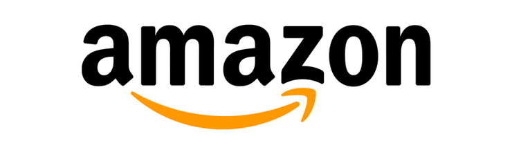
The Amazon logo is an extremely simple logo and while the arrow may just look like a smile it actually points from a to z.

This represents that Amazon sells everything from a to z, and the smile on the customers face when they bought a product.

Goodwill

goodwill logo hidden mesages

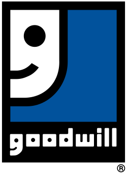
Goodwill. The one thrift store we all know and love.

When you look at the logo, you see it’s a person smiling, probably happy that they just donated their clothes or just copped an awesome find for a great deal!

Now look at the letter ‘g’ from ‘goodwill’.

You’ll see that same smiling person in the first letter of the logo!

LG

LG logo with hidden message

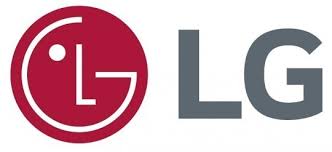
At first glance, you might think LG’s logo may just be the winking face of a happy client.

But look closer.

You’ll see that in the winky face logo, there’s actually an L in the center, and the face is a G!

Super clever on their part.

Pinterest

Pinterest logo hidden message

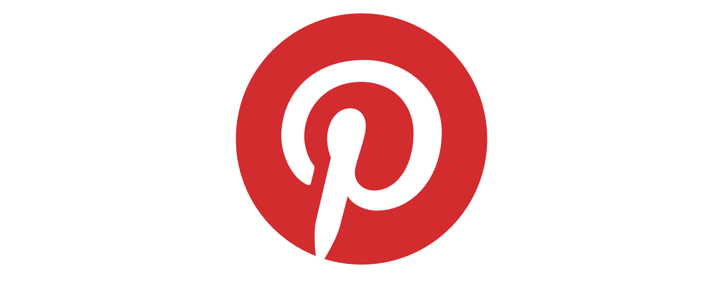
Pinterest is one of my favorite social media apps out there.

It’s always full of great ideas and new trends that I can get inspired from, and then I can pin those images to one of my boards.

Hence, “Pin-terest”.

Duh.

Anyway, to the untrained eye, you might just see the letter “P” in the logo.

But if you really pay close attention, you’ll see that the letter “P” is actually a pin.

Michael Deal, the co-designer of this logo said, “For most of the project, I had avoided making visual reference to the image of a pin because it seemed too literal. But the “P” started to lend itself too well to the shape of a map pin.”

Toyota

toyota logo hidden message

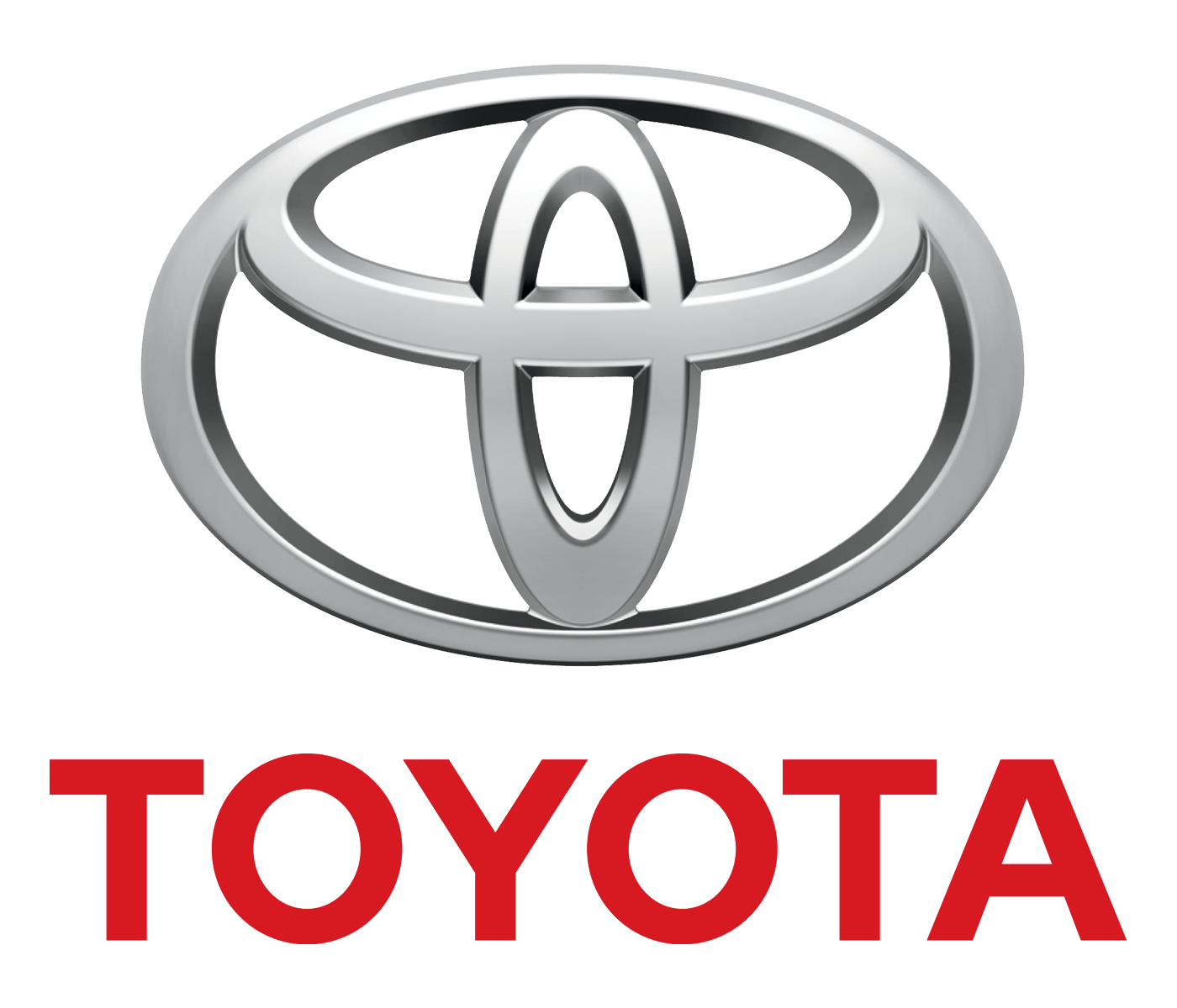
Next up, we have Toyota.

This one is definitely one of the coolest of them all, and if it hasn’t received some kind of award already, well, it definitely deserves one.

If you didn’t already know, the Toyota logo has the entire word “Toyota” written in it!

Here’s a diagram to explain it better.

toyota logo explained

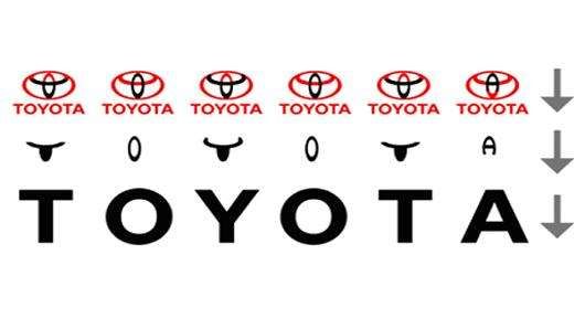
Isn’t that the coolest thing you’ve ever seen?

BMW

new logo bmw

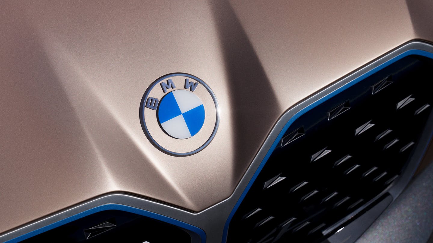
BMW just recently updated its logo and it looks amazing.

I wrote an entire piece about the new BMW logo because that’s how much I loved it.

But anyway, let’s talk about the hidden message here!

This logo actually represents a propeller in motion, with the blue part representing the sky, and the white part representing the propeller.

BMW’s logo is a tribute to the company’s history in aviation.

Baskin Robbins

Baskin robbins hidden logo

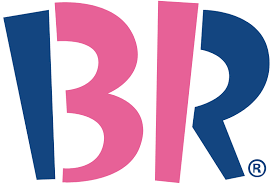
The Baskin Robbins logo may look like it includes a simple BR above the name. bBt if you take another look, you will that it includes a pink number 31. This is a reference to their original and iconic 31 flavors.

Chick-fil-a

hidden logos chickfila

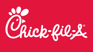
The Chick-fil-a logo incorporates a chicken into the C. Although this isn’t very hidden, it is still very clever.

Eighty20

eighty 20 logo

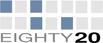
The eighty20 logo is a bit of a geeky one to figure out, the two lines of squares represent a binary sequence with the blue squares being 1’s and the grey squares being 0’s.

Which makes 1010000 which represents eighty and 0010100 which represents 20.

F1

formula 1 logo hidden message

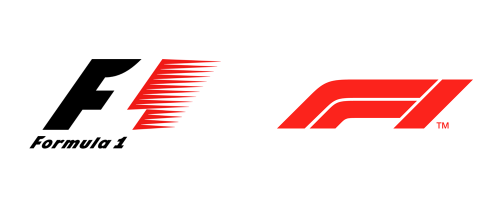
The F1 logo is a fairly simple one to figure out. The negative space in the middle creates the 1.

Facebook Places

facebook places logo hidden message

If you didn’t already know Facebook Places, it is Facebook’s new geolocational product, which is in direct competition with the current leader in that area, Foursquare.

Now if you take another look at Facebook Places logo you will notice there is a 4 in a square.

Now is this a coincidence or is it a dig at Foursquare?

Fedex

fedex logo with hidden message

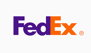
The FedEx logo looks like a plain, text-based logo.

But if you take a second look, between the E and the X, you will see an arrow, that represents the speed and accuracy of the company’s deliveries.

Milwaukee Brewers

Milwaukee Brewers logo hidden message

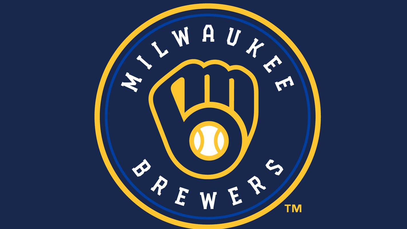
The old Milwaukee Brewers logo may look like a simple catchers mitt holding a ball, but if you take a second glance, you will see the team’s initials M and B.
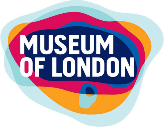
Museum of London

museum of london logo

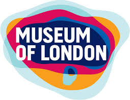
The Museum of London logo may look like a modern logo design, but it actually represents the geographic area of London as it as grew over time.

NBC

NBC logo hidden peacock

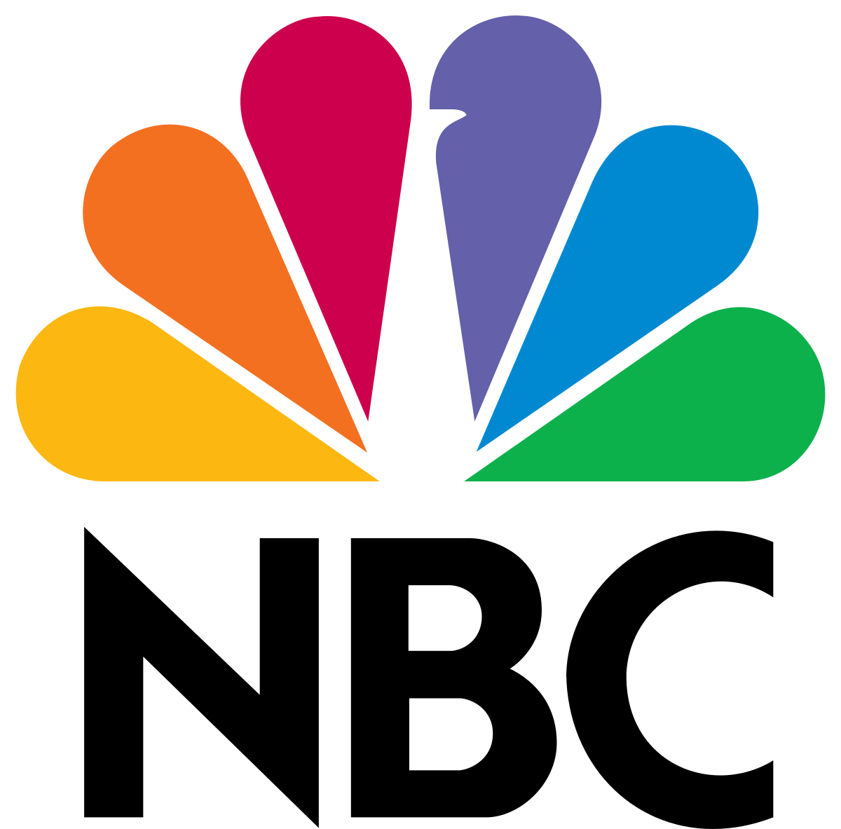
The NBC logo has a hidden peacock above the above text which is looking to the right.

This represents the companies motto to look forward and not back, and also that they are proud of the programs they broadcast.

Northwest Airlines

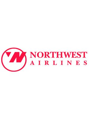
The old Northwest Airlines logo may look like a simple logo, but if you take a closer look, the symbol on the left actually represents both N and W and because it is enclosed within the circle it also represents a compass pointing northwest.

Piano Forest

piano forest logo

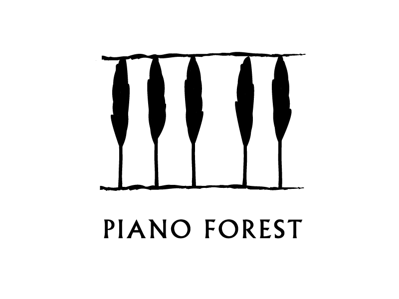
The Piano Forest logo may look like a simple text logo with trees above it, but if you take another look you will see that the trees actually represent keys on a piano.

Toblerone

Toblerone Logo

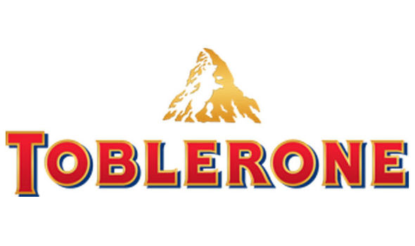
The Toblerone logo contains the image of a bear hidden in the Matterhorn mountain, which is where Toblerone originally came from.

Tostitos

tostitoss logo hidden message

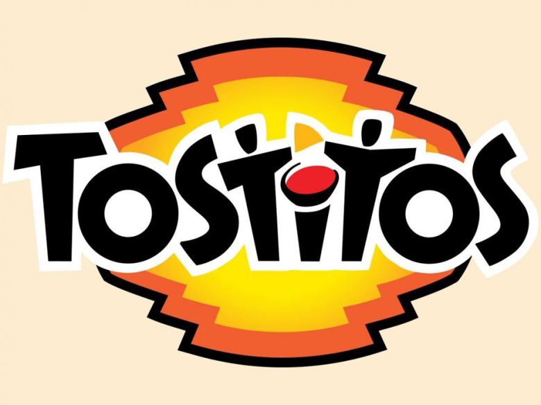
The Tostitos logo includes two people sharing a chip and a bowl of salsa, this conveys an idea of people connecting with each other over a bowl of chips.

Treacy Shoes

treacy shoes hidden logo

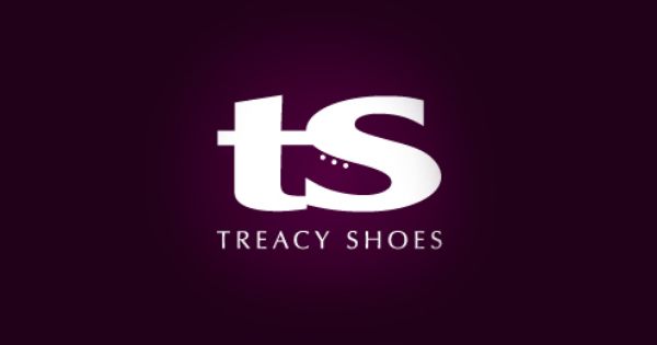
The Treacy Shoes logo is very cute logo with a shoe hidden between the t and s.

In Conclusion

Making a clever logo doesn’t always just come easily to you.

It can take weeks, months, and even years to come up with something mindblowing.

Other times, the idea comes to the forefront of your brain and you can see it clear as day.

Gather inspiration from these amazing logos with hidden messages and start making your own!

You could design the next big logo.

Did I miss any other big logos that have hidden messages within them?

Let me know in the comments!

Until next time,

Stay creative, folks!

Read More at 20 Logos With Hidden Messages – 2020 Update

6 Logo Design Principles That We Swear By

Making a logo is typically one of your first tasks as a new, up-and-coming designer.

I know I had my fair share of making logos for far too cheap, and mostly for my close friends and their small businesses, but it’s something I’ll never forget.

Although there are a few things that I wish I had known when I was at the beginning of my career, so I’m here to shed some light on a few basic design principles that I swear by.

6 Basic Logo Design Principles For Beginners 

There are a few things, in my opinion, that every novice designer should know about logo design. Of course, you’ll end up doing whatever feels right for you, but just hear me out.

Alright guys, let’s do this.

1. Keep it simple

By now you’ve already heard of the K.I.S.S. principle. Keep it stupid simple. 

This is going to be key in making any logo.

I’ve learned that the hard way.

[source]

When someone looks at your logo, it should be easy for any viewer to understand, interpret, and digest.

simple logo design

[source]

No one should have to stare at your logo, cock their head to the side like a confused, adorable puppy, and wonder just what the heck you have created there.

simple logo design

[source]

[source]

Take Apple, for example. One of the biggest dogs in the game.

apple logo design evolution

[source]

Back in the 60’s… Well, only they knew what they created for a logo.

But as the years went by, they kept simplifying and simplifying it.

And that was the key!

By simplifying their logo, it was easy to understand, it was easy on the eyes, and of course, it was memorable as heck.

Which brings me to my next point.

2. Make It Memorable

I know you immediately recognized my first simple logo example, which was obviously the Nike swoosh.

But why did you recognize it so quickly?

Because it was simple and memorable.

What’s the point in having an amazing design, if it’s not memorable?

You’ll lose brand recognizability. If your logo design is no good, well, you’ll have people talking about the business you’re designing for like this, “You know… that one place! With the thing… You know what I’m talking about!”

Nobody wants that. You need something simple, and memorable.

Let me show you some memorable logos that I know you’ll recognize.

[source]

[source]

[source]

[source]

3. Use A Cohesive Color Scheme

A good color choice is going to make or break your design.

If you’re going to be using multiple colors, then I suggest that you choose a great color palette or use some sort of cohesive color scheme.

[source]

Using a bunch of colors that don’t match won’t be a good choice.

You can always do a quick google search and see what colors are predicted to be most popular this year, or you can use color psychology and pick a color scheme that will match your service best.

4. Make It Scalable And Versatile

Keep in mind that the company, business, or client that you’re designing for will be using their logo on a multitude of services.

From big signs to coffee mugs, you need to make sure your logo won’t lose its quality and that it’s recognizable no matter where it’s displayed.

One way to make sure that your design looks good across all platforms is by creating mockups. We know lots of free mock-up sites that you might be interested in using.

[source]

[source]

[source]

5. Always Keep Your Audience in Mind

You always, always, always have to remember who you’re designing for, and adapt.

If you’re designing for kids, you don’t want to go with neutral colors and a minimalist, flat design. You’re going to want to use bright colors that catch their eye and look fun.

On the other hand, if you’re designing for a winery, you’re going to want something sleek, minimal, and elegant.

So whoever the audience is, you have to take your unique style and just adapt it to your situation.

6. Go With Your Gut

And finally, go with your gut and make the designs you love.

Not everyone will understand your designs, and you won’t always understand everyone’s request.

But you’re going to live and learn from those experiences and in the end, it’ll make you a better and more experienced designer.

Try to make a new logo design every day. It doesn’t need to be spectacular, but just something that will keep your creative wheels turning.

If you ever need some inspiration, we have lots of tips on how you can find design inspiration in everyday things.

Until next time,

Stay creative and stay safe, folks!

Read More at 6 Logo Design Principles That We Swear By

27 Social Distancing Designs That Are Just Too Good Not To Share

COVID-19 is no joke and we’re all practicing some social distancing right now.

If you’re not, and you have the choice to stay home, then you really should do it.

While social distancing can be boring or lonely, just remember that by staying home, you are saving lives, and literally changing the fate of our world.

The little things we choose to do right now are important.

And luckily for us designers, a lot of us can do our work from home.

[source]

That is a privilege I will always be grateful for and my gratitude, thoughts, and prayers are with everyone who has to go to work every day to make the world go round.

One of the many wonderful things I have noticed during this time, is that a lot designers have taken no break during this pandemic to create some beautiful designs regarding social distancing and self-quarantining.

Have a look for yourself to take your mind off of the crazy things going around us, and enjoy these 27 social distancing designs that some creative people of our beautiful world have created.

27 Social Distancing Designs To Scroll Through While We All Stay Home

social distancing design

[source]

social distancing design

[source]

social distancing design

[source]

social distancing design

[source]

social distancing club

[source]

[source]

social distancing

[source]

[source]

[source]

[source]

[source]

[source]

[source]

[source]

[source]

[source]

[source]

[source]

[source]

[source]

[source]

[source]

[source]

[source]

[source]

[source]

We’re In This Together

You guys… we’re in this together.

We can make a difference by staying home and doing our work from home.

Do the thing that you haven’t had time to do. Learn a new skill, cook a meal, play with your dog, talk to your loved ones.

We have all the time in the world right now to stay at home and focus on ourselves and the things that matter to us.

Take this time and create something beautiful with it.

Stay safe, everyone.

Until next time,

Stay creative, folks!


Read More at 27 Social Distancing Designs That Are Just Too Good Not To Share

Top 10 Logo Fonts in 2020 That All Designers Want To Get Their Hands On

Picking the right logo font can be an excruciatingly hard and tedious task.

The font you choose and the colors that go with it will make or break your design.

As font trends are always changing, we’ve got you covered and are here to share our most recent top picks with you.

The Best 10 Logo Fonts You’ll Want To Use in 2020

There are loads of lists of fonts out there, but we’ve picked the best of the best.

From our professional designers to you, here’s our personally curated list of the best logo fonts of 2020.

1. Ambit

logo fonts of 2020

Starting off the list with a bang, I present to you, Ambit.

Ambit is a classic font that I’ve loved for a long time now and have used it in a fair amount of logos that I designed.

This classic and timeless sans serif was designed by CoType Foundry, with their inspiration coming from early grotesque, but has now been adapted for modern design use in the 21st century.

From Thin to Black, Ambit features 7 different weights, so that there is something for everyone.

Ambit is the perfect font for a modern and sleek logo.

2. Bodoni

bodoni logo font

Didot


Bodoni is next up on the list.

Bodoni is the perfect font to use for any type of elegant fashion logo.

Giambattista Bodoni created this font in a time when loads of designers were experimenting with a dramatic contrast between thick and thin lines.

This font looks like it came straight out of a Vogue or Calvin Klein magazine.

Give it a whirl on your next design. You’ve got nothing to lose because it’s free!

3. Didot

Didot is another gorgeous, yet dramatic serif font that would go great not only with fashion logos, but anything modern, sleek, luxurious, and elegant.

There are many different versions of Didot, but perhaps the most well-known version is the one that Giorgio Armani used in their logo.

With the right tracking and kerning, this logo could be the perfect font for your next elegant logo project.

4. Helvetica Now

After being named one of the most widely appreciated fonts of 2019, we see no slowing in its widespread use and continual growth.

Helvetica Now is available in 3 optical sizes, Micro, Text, and Display.

Helvetica Now is essentially everything you’ve ever loved about Helvetica, with all sorts of little tweaks and improvements, all wrapped up into one new font.

And that font, may just be your new favorite.

It might be mine.

5. Untitled Sans

Meet Untitled Sans.

Untitled Sans is the product of the Super Normal project, created by Jasper Morrison and Naoto Fukasawa.

Untitled sans comes in 10 different styles, so you can find the one that works best for you.

6. TT Norms Pro

Another great typeface we want to highlight today is TT Norms Pro.

TT Norms Pro was the #1 best selling geometric sans on Myfont in 2017 and continues to trend in 2020.

The font comes in an astounding 22 different styles. 11 uprights and 11 italics.

7. Big Caslon

This font is actually pretty historical. Back in the 1600s, there was a group of serif typefaces created by by William Caslon I.

Big Caslon is a revival of the said font group that dates all the way back to the 1600s, and is now making a marvelous appearance in the digital age of the 21st century.

8. Abril Fatface

You may recognize Abril Fatface from the Abril family of fonts.

Abril Fatface has 18 different styles and variations of the serif for you to use.

9. Aileron

Aileron was inspired by aircrafts of the ’40s and is a Neo-Grotesque sans serif typeface.

This sleek sans serif comes in 16 different weights and the best part about it all?

It’s free-99.

10. Brandon Grotesque

Brandon Grotesque is a staple font for me.

One of my go-to’s.

Brandon Grotesque gets its origin inspiration from old gothic fonts from the 1920s/1930s and is aesthetically pleasing as heck.

We predict that we’ll be seeing this font all over in 2020, so you might want to hop on this train soon!

Stay Safe, Everyone

We hope you enjoyed this list and that it took your mind off of the current events going on around us.

If you’re working from home now due to COVID-19 and are looking for tips on how to stay focused and productive, we’ve got you covered.

Stay safe and stay home if you can, everyone.

And as always,

Stay creative, folks!


Read More at Top 10 Logo Fonts in 2020 That All Designers Want To Get Their Hands On

Here’s A Major International Women’s Day Appreciation Post – Happy Women’s Day

Today is a glorious day to be celebrated by all.

Happy International Women’s Day!

Here’s to all the strong, loving, independent, wonderful, creative, and special women out there.

Every day, I truly believe, women deserve to be celebrated.

[source]

Every day, but today especially, we want to honor women the way that they deserve.

Women contribute a billion and one things to society 👏every 👏single 👏day, whether you realize it or not, and deserve to be celebrated and treated as such.

Without women, our world would be bland.

Without women, we wouldn’t know our world as we know it today.

Women make our world a better place.

By women, for women. 

That’s why, today, I want to shine the spotlight on the talented and amazing women who created art to share on this International Women’s Day.

Here are 19 designs to celebrate Women’s Day and to appreciate the women in our lives and the ones that change the world each day for the better.

[source]

[source]

[source]

[source]

[source]

[source]

[source]

[source]

[source]

[source]

[source]

[source]


[source]

[source]


[source]

[source]


Happy International Women’s Day

From the bottom of our hearts, Happy Women’s Day.

We see you killing the game, hustling, climbing to the top, running a business, being a mom, taking care of others, fighting for freedom, protecting others… basically, being a woman.

You are strong.

You are a woman.

And we thank you for that.


Read More at Here’s A Major International Women’s Day Appreciation Post – Happy Women’s Day

Are You Ready to Play Uno Minimalista? We Know We Are.

uno minimalista

Oh, the golden days of Uno, when everyone would carry their pack of fun and good memories in their pocket.

I remember playing Uno all throughout my childhood and even to this day when we get a good old group of friends together, we’ll play our version of Uno extreme.

And there are no promises that someone won’t get hurt, so you play at your own risk.

Uno brings so many good memories to my mind when I think about it, and I was absolutely stoked when I heard the news that they going to make a minimalist version of it.

And we all know I’m a sucker for some minimalist design.

So let’s get into the story behind it all.

Meet Uno Minimalista

uno minimalista

[Image credit: Warleson Oliveira]

Just like we talked about last week, everyone is loving a dark mode of anything nowadays, and many people are calling Uno Minimalista the dark mode of the original Uno.

What started as a petition, is just about to become a reality.

[Image credit: Warleson Oliveira]

Last month, the new concept of Uno Minimalista drove people crazy, in the best way.

There was just an uproar of how people needed this version of Uno in their life. And I was 100% apart of this crowd.

[Image credit: Warleson Oliveira]

Warleson Oliveira was the mastermind behind this gorgeous minimalist concept of Uno that made the internet go wild.

A petition started on change.org to see this concept become a reality and Mattel heard us.

Mattel tweeted out the thing we were all dying to hear. “You asked for it, you got it.”


As soon as I saw this, you know I was just dying to get my hands on it, and if you’re anything like me, you probably had your credit card in your hand, ready to go and order a few packs.

Well, unfortunately, we don’t have an exact date yet, but we sure are looking forward to getting our hands on this new Uno Minimalista.

[Image credit: Warleson Oliveira]

They tweeted that we should “stay tuned for the summer”, so within a few short months, we will all be reliving our childhood all over again.

So call your friends and set up a camping trip, get your Uno Minimalista cards ready, and have a great time together creating new memories.

[Image credit: Warleson Oliveira]

We can’t wait to get this new and improved Uno and play all night.

Let us know what you think aboutthis new Uno design in the comments!

What do you love about it or what would you have done differently?

And of course…

Until next time,

Stay creative, folks!


Read More at Are You Ready to Play Uno Minimalista? We Know We Are.

10 Free Modern Fonts That Will Spice Up Your Futuristic Projects

Some designs just absolutely call for an edgier look than usual.

You can’t just be happy with a simple, everyday font.

You need something more, and more specifically, something that won’t break the bank.

This is why I scoured the internet and found my top 10 picks of free modern fonts.

And yes, you’re welcome.

So without further ado, let’s just jump right into our list of 10 free modern fonts, shall we?


1. Manrope

I thought that I would start this list out with my absolute favorite font and visual.

Manrope.

Pixel Surplus created this gorgeous and functional sans-serif that has amazing readability whether it’s upper or lowercased. This font is so sleek and elegant, and what really had me hooked was this visual.

I mean, just look at all that creativity wrapped up in one image.

Here’s what the creator of Manrope had to say about their font.

“Sometimes, creativity comes from simplicity, elegance, and readability. This font is an extra mile towards, guided by optical balance, and packed with modern features.”

Get it for free by clicking on the link below!

Download here: https://www.behance.net/gallery/70262447/MANROPE-FREE-MODERN-GEOMETRIC-SANS-SERIF-FONT-FAMILY

2. Oneday

Moving on to my next favorite font of this list, here I present to you Oneday.

This font is like a modern-day font that is presented in stencil style. As you can see, almost all of the letters have disconnections in them, which make them stand out and look quite futuristic, in my opinion.

Check it out through the link below and get it for free!

Download here: https://www.dafontfree.io/one-day-font-free/

3. Coco Gothic

Coco Gothic. I’m definitely vibing with this font.

This san font is so modern, sleek, and elegant that it makes you kind of want to use it on all of your upcoming product and packaging designs.

This font comes in 6 different weights and also has different variants for the letter’s “g” and “a” which I find to be very considerate.

Check out the link below to get this modern font for free.

Download here: https://www.behance.net/gallery/25341907/Coco-Gothic-NEW-2-FREE-WEIGHTS

4. Cornerstone

Cornerstone screams professional, modern, and no-nonsense. This modular font is a bit elongated and is great for things like banners, logos, and headers.

It’s definitely got that modern feel that many people are looking for nowadays, and the best part is that it is “free-ninety-nine”! Aka, 100% free.

Check it out via the download link below!

Download here: https://www.behance.net/gallery/29835665/Cornerstone-Free-Font

5. Tenre

Tenre, designed by Jacopo Severitano, is a beautiful, geometric font that comes in 4 different styles.

It’s sleek and unique, perfect for any upcoming projects that you have going on that need a bit of modern feel to them.

Download it by using the link below!

Download here: https://www.behance.net/gallery/8313635/TENRE-Font-Free-Modern

6. Vanity

This classic modern serif called Vanity is absolutely stunning.

With the perfect combination of thick and thin lines, this classic yet modern font is ready for you to use for any beauty product packaging or magazines.

This font that was created by Hendrick Rolandez is ready for you to download for free via the link below.

Download here: https://dribbble.com/shots/1559859-Vanity-Free-Modern-Type-Family

7. Kontanter

Kontanter is so interesting to look at.

Kontanter is loosely based on Gotham bold, but has an amazingly unique look about it.

This font is perfect for those designs that just need a little extra spice about them that really makes them stand out and pop.

Download it for free by using the link below!

Download here:  https://www.behance.net/gallery/17725611/Kontanter-FREE-FONT

8. Arkhip

Next up, we have Arkhip.

What’s amazing about this font is that you can use it in both Russian and English, and it’s still free!

We know how hard it can be to find a free font that supports both languages, so when we found Arkhip, we knew we hit the jackpot.

Check it out below if you want to use this font for free!

Download here: https://dribbble.com/shots/1953924-Arkhip-Free-Font

9. Headache

Second to last, we present to you Headache.

This incredibly unique and geometric font is perfect for projects that you’re working on that need a touch of futuristic and modern vibes.

This font is available in 2 different styles, and when you combine the two, the outcomes are endless.

This font will truly stand out amongst the others, and we highly recommend you try it out.

Download here:

10. Bondi

And finally, we come to our last font called Bondi.

This fun and bubbly font will give your projects an undeniably happy feel to them.

This font is modern with a touch of futuristic and has all its thick lines on the left, which give it lots of dimension and balance.

If you want to use this font, click on the link below to download it.

Download here: https://dribbble.com/shots/3611615-Headache-Free-Font

And Finally…

We hope that you enjoyed this article of our top 10 picks of free modern fonts in 2020.

Use them to your advantage, and of course…

Until next time,

Stay creative, folks!

Read More at 10 Free Modern Fonts That Will Spice Up Your Futuristic Projects

Kroger Gets A New Logo And Slogan – Fresh For Everyone

Kroger is hands-down one of my favorite grocery stores ever.

And I’m not the only one, apparently.

With 2,800 stores nationwide and in 35 states, Kroger is easily the largest grocery store retailer in the United States of America.

Kroger has been around for a long, long time.

I’m talking over 100 year’s time! Kroger was established in 1883 in Cinncinatti, where the Kroger headquarters still is.

Not only does Kroger have over 500,000 (yes, folks, you heard correctly. That’s five-hundred-thousand employees), but they also donate hundreds of millions of dollars to help feed the hungry all over the country.

Now that’s the kind of grocery store I want to be a part of.

And I have been!

For years my family and I shopped at Kroger and to this day, we still do.

That’s why I wanted to talk a little bit about the new logo and slogan that they came out with at the end of last year.

As I said, Kroger has been around for a long, long time. And because they’ve been around for so long, you can imagine that their logo can quickly become dated.

One thing that completely distinguishes Kroger from other brands the curvy letters.

The “K” and “G” have a very distinct, curvy look to them that you don’t just see around.

And with this unique design, you either love it or hate it.

I’ve read loads of comments and talked to other designers who absolutely hate the curves.

But are the curvy letters what really brings the brand to life?

If they were to drop the curves, which, visually speaking would probably be the best thing to do, they would lose brand recognizability.

Since the brand has been repping the unique font for so long, it’d just feel wrong to change it so drastically at this point.

The logo went from a 3D realistic style to minimal, flat design, which is a trend we’ve been seeing from huge brands all through-out 2019.

Beyond changing the font to be a little simpler and with better tracking, the also dropped the 3D border that they had before.

Which to me seemed to be the smart choice.

They also threw in a slogan now.

“Fresh is for everyone.”

Which is just what we need to see and hear in 2020.

Their commercial just about sums it up.

And “What are all those little animated people called?”, you may ask.

Well, those adorable little animations are called Krojis.

Only the cutest grocery store representatives I’ve ever seen.

The versatility you can get with these characters is amazing. The commercial was very relatable and inclusive, which I personally loved.

Having them on every sign in the store though does seem a bit overwhelming and excessive, but hey. They’re just trying to make us remember them, I suppose.

I think Kroger is on just the right path to becoming more relevant and modern, design-wise.

What do you guys think of all these new changes and the little Krojis?

I know many of us are in an uproar about the combination of fonts that they chose to go with.

A rounded sans serif with ITC Avant Garde Gothic… Maybe not the best choice to go with.

Be we want to know your thoughts on everything.

Let us know in the comments what you think about Kroger’s new logo and slogan.

Until next time,

Stay creative, folks!


Read More at Kroger Gets A New Logo And Slogan – Fresh For Everyone

6 Amazing Packaging Design Ideas for 2020 That Are on Point

You’re here because you’re looking for amazing packaging ideas for 2020.

Well, you’re in luck, because I’m showing you 6 ideas for you to implement this year into your packaging designs.

Well, what are we waiting for?

Let’s just jump right in!

Sustainable Packaging

Sustainability. It’s at the forefront of all of our minds nowadays.

As it should be!

It’s so important that we take care of our world because it’s the only one we’ve got.

And what better way for you as a designer to contribute to this world, than to create your own sustainable packaging ideas for yourself and for your clients?

So here are various sustainable packaging design ideas for you to draw inspiration from!

[source]

[source]

[source]

[source]

Minimalism

Next up, we have minimalism.

Minimalism was all over the globe last year and we don’t expect anything less this year.

On the contrary, we expect to see minimalism rise up even more and overtake many packaging designs.

Imagine the combo of minimalism and sustainability.

That just warms my designer soul.

[source]

[source]

https://dribbble.com/shots/6937829-uBear-Package

[source]

[source]

Bold Typography

Boldness.

You need packaging that is as bold as the product.

Sometimes the best way to display the boldness of your packaging is by simplicity.

By using bold text, you can have an intricate yet simple design that speaks louder than loads of 3D design factors could.

Here are some examples of what I mean.

[source]

[source]

[source]

[source]

[source]

Flat Design

Flat design was another trend that took over all of 2019 but that we only expect it to continue growing in 2020.

Flat design is also a type of minimal design, which is the undertone of the ultimate trend of 2019, which in my opinion was minimal design.

Check some of these designs out!

[source]

[source]

[source]

[source]

Metallic & Holographic Material

Alright you guys, it’s time to get to the 2 packaging designs that I’m most excited about this year.

And that is metallic and holographic material.

There’s just something so luxurious and eye-catching about this flashy material that will draw the eye of anyone onto your product.

I love the way it looks and the way each designer used it differently.

Here are some examples of what I mean.

[source]

[source]

[source]

[source]

[source]

[source]

Summing Things Up

I hope you found these packaging ideas inspiring!

Soon we’ll have an entire guide dedicated to sustainable packaging, so keep your eyes peeled for that.

Til next time,

Stay creative, folks!

Read More at 6 Amazing Packaging Design Ideas for 2020 That Are on Point