Building an Interactive Sparkline Graph with D3

D3 is a great JavaScript library for building data visualizations using SVG elements. Today we’re going to walk through how to use it to build a simple line graph with an interactive element, taking inspiration from the NPM website.

What we’re building

Visit any individual package page on the NPM website and you’ll notice a small line graph on the right, showing the total weekly downloads trend over a period, with the total figure to the left.

Screenshot of the D3 NPM page with sparkline graph shown on the right

This type of chart is known as a sparkline. If you hover over the graph on the NPM site, you can scrub through the trend and see the weekly downloads figure for the preceding week, marked by a vertical line and circle. We’re going to build something similar, with a few of our own adaptations. If you’d rather jump straight into the code yourself, you can find the complete demo here.

It’ll come in handy if you have some familiarity with SVG elements. SVGs use their own internal co-ordinate system. For a primer I recommend this timeless article by Sara Soueidan on SVG Coordinate Systems and Transformations.

Data

The first thing we’ll need is some data to work with. I’ve created an API endpoint we can use to fetch some data here. We could use the Fetch API to retrieve it, but instead we’re going to use D3, which conveniently parses the data for us.

HTML

Now let’s add some HTML. We should make sure that our markup makes sense without JS in the first instance. (Let’s assume that our weekly downloads total is a known value, perhaps coming from a CMS.)

We’re adding some data attributes that we’ll need to reference in our JS.

<div class="chart-wrapper" data-wrapper>
	<div>
		<h3 data-heading>Weekly downloads</h3>
		<p data-total>800</p>
	</div>
	<figure data-chart></figure>
</div>

If we choose to, we could append a static image to the figure element, to display while our data is loading.

CSS

We’re going to use D3 to draw an SVG chart, so we’ll include some base CSS styles to set a maximum width on the SVG and center the component within the viewport:

* {
	box-sizing: border-box;
}

body {
	min-height: 100vh;
	display: grid;
	place-items: center;
}

figure {
	margin: 0;
}

svg {
	width: 100%;
	height: auto;
}

.chart-wrapper {
	max-width: 600px;
}

D3

To use the D3 library we’ll first need to add it to our project. If you’re using a bundler you can install the NPM package and import it as follows:

import * as d3 from 'd3'

Otherwise, you can download it direct from the D3 website. D3 is quite a large library, and we’re only going to use parts of it for our line graph. Later on we’ll look at how to reduce the size of our bundle by only importing the modules we need.

Now we can fetch the data using D3’s json method:

d3.json('https://api.npoint.io/6142010a473d754de4e6')
	.then(data => {
		console.log(data)
	})
	.catch(error => console.log(error))

We should see the data array logged to the console in our developer tools.

Preparing the data

First let’s create a function for drawing our chart, which we’ll call once we’ve successfully fetched the data:

const draw = (data) => {
	console.log(data)
}

d3.json('https://api.npoint.io/6142010a473d754de4e6')
	.then(data => {
		draw(sortedData)
	})
	.catch(error => console.log(error))

We should still see our data logged to the console. But before we can draw our chart, we’ll need to sort the data array by date. Currently our data array looks something like this, with the dates as strings:

[
	{ 
		date: "2021-12-23T04:32:20Z",
		downloads: 445
	},
	{ 
		date: "2021-07-20T13:41:01Z",
		downloads: 210
	}
	// etc.
]

We’ll need to convert the date strings into JavaScript date objects. Let’s write a function that first of all converts the string to a date object, then sorts the values by date in ascending order, using D3’s ascending method:

const sortData = (data) => {
	/* Convert to date object */
	return data.map((d) => {
		return {
			...d,
			date: new Date(d.date)
		}
	})
	/* Sort in ascending order */
	.sort((a, b) => d3.ascending(a.date, b.date))
}

We’ll pass the sorted data into our draw function:

fetch('https://api.npoint.io/897b3f7b5f6a24dcd0cf')
	.then(response => response.json())
	.then(data => {
		const sortedData = sortData(data)
		draw(sortedData)
	})
	.catch(error => console.log(error))

Drawing the chart

Now we’re ready to start creating our data visualization. Let’s first of all define the dimensions of our chart, which we’ll use to draw the SVG at the required size:

const dimensions = {
	width: 600,
	height: 200
}

In our draw function, we’re going to use D3’s select method to select the wrapper element containing our figure, heading and downloads count:

/* In `draw()` function */
const wrapper = d3.select('[data-wrapper]')

D3 selections are more powerful than using querySelector, as they allow us to bind data to DOM elements, as well as easily append elements and add or modify attributes. We can then select the figure element and append a new SVG, using our pre-defined dimensions to set the viewbox:

/* In `draw()` function */
const svg = wrapper
	/* Select the `figure` */
	.select('[data-chart]')
	/* Append the SVG */
	.append('svg')
	.attr('viewBox', `0 0 ${dimensions.width} ${dimensions.height}`)

If we inspect our page, we should now see an SVG element is present inside the figure, but it’s not yet visible as we haven’t given it any color. It might be a good idea to add an outline in our CSS, so that we can easily see that the SVG has been created!

svg {
	width: 100%;
	height: auto;
	outline: 1px solid;
}

You might notice a jump in the layout once the SVG is created. We can fix that by adding an aspect ratio to the figure element. That way it’ll be rendered at the correct height straight away (in browsers that support the aspect-ratio property).

figure {
	margin: 0;
	aspect-ratio: 6 / 2;
}

Drawing the line

So far so good, but here’s where things get a little more complex. Don‘t worry, we’ll walk through it step-by-step!

We’re going to draw the trend line on our chart by appending a path element. But before we can do that, we need to create the scales that will enable us to plot the data within the SVG co-ordinate system. (For more on this, read the tutorial Introduction to D3’s scales by Observable.)

Accessor functions

In Amelia Wattenberger’s book, Fullstack D3 and Data Vizualisation, she recommends creating accessor functions to return the x and y values for any given data point. We’re going to need to refer to those values quite a bit, so let’s do that now.

const xAccessor = (d) => d.date
const yAccessor = (d) => d.downloads

It may seem unnecessary given their simplicity, but if we ever need to make any changes (say, a dataset with a different set of keys) we’ll be grateful to have just one place to update those values!

Scales

Our chart’s x-axis will be time-based — using the date values from our data, while the y-axis will use a linear scale to plot the number of downloads. We’ll need D3’s scaleTime and scaleLinear methods respectively.

When creating our scales we need to set both the domain and the range properties. The domain contains the smallest and largest data values that need to be plotted. The range contains the dimensions onto which we’ll plot the data. D3 does the work behind the scenes to scale the domain to the range and plot the position of each data point accordingly. The concept is illustrated in this demo. Hover over the range area and you’ll see the pointer’s position scaled within the domain area.

See the Pen
D3 domain/range
by Michelle Barker (@michellebarker)
on CodePen.0

As our data is already sorted in the correct order, the domain value for the x-axis will be an array containing the date values of our first and last data items:

/* In `draw()` function */
const xDomain = [data[0].date, data[data.length - 1].date]

This is where our accessor functions come in. We could instead use the xAccessor() function to get the desired values for the x-axis:

/* In `draw()` function */
const xDomain = [xAccessor(data[0]), xAccessor(data[data.length - 1])]

However, there is a simpler way, using D3’s extent method. We pass in our data array and the accessor function, and it returns the highest and lowest values as an array. It works even if the data is unsorted.

/* In `draw()` function */
const xDomain = d3.extent(data, xAccessor)

The range is simpler still: As our line will need to go all the way across our SVG, from left to right, our range will go from 0 to the SVG viewbox width.

/* In `draw()` function */
const xDomain = d3.extent(data, xAccessor)

const xScale = d3.scaleTime()
	.domain(xDomain)
	.range([0, dimensions.width])

Our y-axis will be similar, but with a small difference: If we use only the smallest and largest values for the domain, our trend line may appear to fluctuate wildly with even a small difference in the number of downloads. For example, if the number of downloads stayed fairly steady at between 1000 and 1100 per day, our chart would nonetheless display a line that zig-zags right from the bottom to the top of the chart, because a narrow domain is mapped to a (comparatively) wide range. It would be better if we mapped our domain with the lowest value as zero (as it’s impossible to have a negative number of downloads!).

So for the y-axis we’ll set the domain in a slightly different way, using D3’s max function to return only the highest value. We’ll also use the height instead of width from our dimensions object for the range, and D3’s scaleLinear method (which creates a continuous scale) rather than scaleTime.

You might notice that we’ve flipped the range values in this case. That’s because the SVG co-ordinate system begins with 0 at the top, and higher values move an SVG element downwards. We need the low values in our domain to be displayed further down the SVG view box than high values — which in fact means mapping them to higher viewbox co-ordinates!

/* In `draw()` function */
const yDomain = [0, d3.max(data, yAccessor)]

const yScale = d3.scaleLinear()
	.domain(yDomain)
	.range([dimensions.height, 0])
Illustration showing the chart’s axis increasing from bottom to top, whereas the viewbox y co-ordinates increase from top to bottom

Line generator

Once we have our scales set up, we can use D3’s line() function to plot the path scaled to fit our SVG viewbox. We’ll create a line generator:

const lineGenerator = d3.line()
	.x((d) => xScale(xAccessor(d)))
	.y((d) => yScale(yAccessor(d)))

Then we’ll append a path element to our SVG, and use the line generator for the d attribute (the attribute that actually defines the shape of the path). We’ll use the datum() method to bind the data to the path element. (Read more about data binding in this article.)

/* In `draw()` function */
const line = svg
	/* Append `path` */
	.append('path')
	/* Bind the data */
	.datum(data)
	/* Pass the generated line to the `d` attribute */
	.attr('d', lineGenerator)
	/* Set some styles */
	.attr('stroke', 'darkviolet')
	.attr('stroke-width', 2)
	.attr('stroke-linejoin', 'round')
	.attr('fill', 'none')

We’re also setting some styles for the fill and stroke of the path. You should now see the plotted path.

Creating the filled area

Now that we have our line, our next step is to create the filled area below the path. We could try setting a fill color on our line:

/* In `draw()` function */
line.attr('fill', 'lavender')

Unfortunately that won’t produce the desired effect!

Purple line with light purple fill

Luckily, D3 has an area() function that works similarly to line(), and is designed exactly for this use case. Instead of a single y parameter, it requires two y values: y0 and y1. This is because it needs to know where to start and end the filled area. In our case, the second y value (y1) will be the height value from our dimensions object, as the area needs to be filled from the bottom of the chart.

/* In `draw()` function */
const areaGenerator = d3.area()
	.x((d) => xScale(xAccessor(d)))
	.y1((d) => yScale(yAccessor(d)))
	.y0(dimensions.height)

Just like the line before, we’ll append a path element to the SVG and pass in the area generator for the d attribute.

/* In `draw()` function */
const area = svg
	.append('path')
	.datum(data)
	.attr('d', areaGenerator)
	.attr('fill', 'lavender')

At this point our filled area is partially obscuring the stroke of the primary line (you might notice the stroke appears thinner). We can fix this by changing the order so that we draw the filled area before the line within the draw() function. (We could also fix it with z-index in our CSS, but I prefer this way as it doesn’t require any additional code!)

Curved lines

Our line currently looks quite jagged, which is not especially pleasing to the eye. D3 provides us with a number of curve functions to choose from. Let’s add a curve to our line and area generators:

/* In `draw()` function */

/* Area */
const areaGenerator = d3.area()
	.x((d) => xScale(xAccessor(d)))
	.y1((d) => yScale(yAccessor(d)))
	.y0(dimensions.height)
	.curve(d3.curveBumpX)

/* Line */
const lineGenerator = d3.line()
	.x((d) => xScale(xAccessor(d)))
	.y((d) => yScale(yAccessor(d)))
	.curve(d3.curveBumpX)

Interaction

The next step is to add an interactive marker, which will move as the user hovers over the chart. We’ll need to add a vertical line, which will move horizontally, and a circle, which will move both horizontally and vertically.

Let’s append those SVG elements. We’ll give them each an opacity of 0, and position them on the far left. We only want them to appear when the user interacts with the chart.

/* In `draw()` function */
const markerLine = svg
	.append('line')
	.attr('x1', 0)
	.attr('x2', 0)
	.attr('y1', 0)
	.attr('y2', dimensions.height)
	.attr('stroke-width', 3)
	.attr('stroke', 'darkviolet')
	.attr('opacity', 0)
	
const markerDot = svg
	.append('circle')
	.attr('cx', 0)
	.attr('cy', 0)
	.attr('r', 5)
	.attr('fill', 'darkviolet')
	.attr('opacity', 0)

Now let’s use D3’s on method to move our markers when the user hovers. We can use the pointer method which, unlike clientX/clientY, will return the SVG co-ordinates of the pointer’s position (when the event target is an SVG), rather than the viewport co-ordinates. We can update the position of the markers with those co-ordinates, and switch the opacity to 1.

/* In `draw()` function */
svg.on('mousemove', (e) => {
	const pointerCoords = d3.pointer(e)
	const [posX, posY] = pointerCoords
	
	markerLine
		.attr('x1', posX)
		.attr('x2', posX)
		.attr('opacity', 1)
	
	markerDot
		.attr('cx', posX)
		.attr('cy', posY)
		.attr('opacity', 1)
})

Now we should see the line and circle moving with our cursor when we hover on the chart. But something’s clearly wrong: The circle is positioned wherever our cursor happens to be positioned, whereas it should follow the path of the trend line. What we need to do is get the x and y position of the closest data point as the user hovers, and use that to position the marker. That way we also avoid the marker being positioned in between dates on the x-axis.

Bisecting

To get the nearest value to the user’s cursor position, we can use D3’s bisector method, which finds the position of a given value in an array.

First we need to find the corresponding value for the position of the cursor. Remember the scales we created earlier? We used these to map the position of the data values within the SVG viewbox. But we can also invert them to find the data values from the position. Using the invert method, we can find the date from the pointer position:

/* In `draw()` function */
svg.on('mousemove', (e) => {
	const pointerCoords = d3.pointer(e)
	const [posX, posY] = pointerCoords
	
	/* Find date from position */
	const date = xScale.invert(posX)
})

Now that we know the exact date at any point when we’re hovering, we can use a bisector to find the nearest data point. Let’s define our custom bisector above:

/* In `draw()` function */
const bisect = d3.bisector(xAccessor)

Remember, this is equivalent to:

const bisect = d3.bisector(d => d.date)

We can use our bisector to find the closest index to the left or right of our position in the data array, or it can return whichever is closest. Let’s go for that third option.

/* In `draw()` function */
const bisect = d3.bisector(xAccessor)

svg.on('mousemove', (e) => {
	const pointerCoords = d3.pointer(e)
	const [posX, posY] = pointerCoords
	
	/* Find date from position */
	const date = xScale.invert(posX)
	
	/* Find the closest data point */
	const index = bisect.center(data, date)
	const d = data[index]
}

If we console log d at this point we should see the corresponding data object.

To get the marker position, all that remains is to use our scale functions once again, mapping the data value to the SVG co-ordinates. We can then update our marker positions with those values:

/* In the `mousemove` callback */
const x = xScale(xAccessor(d))
const y = yScale(yAccessor(d))

markerLine
	.attr('x1', x)
	.attr('x2', x)
	.attr('opacity', 1)

markerDot
	.attr('cx', x)
	.attr('cy', y)
	.attr('opacity', 1)

(Read more on D3 bisectors here.)

Updating the text

We also want to update the text showing the date range and the number of weekly downloads as the pointer moves. In our data we only have the current date, so at the top of the file let’s write a function that will find the date one week previously, and format the output. We’ll use D3’s timeFormat method for the formatting.

To find the date one week previously, we can use D3’s timeDay helper. This returns a date a given number of days before or after the specified date:

const formatDate = d3.timeFormat('%Y-%m-%d')

const getText = (data, d) => {
	/* Current date */
	const to = xAccessor(d)
	
	/* Date one week previously */
	const from = d3.timeDay.offset(to, -7)
	
	return `${formatDate(from)} to ${formatDate(to)}`
}

Then we’ll call this function to update the text on mouse move:

/* In the `mousemove` callback */
d3.select('[data-heading]').text(getText(data, d))

Updating the total downloads text is a simple one-liner: We select the element, and update the inner text with the corresponding value using our accessor function:

d3.select('[data-total]').text(yAccessor(d))

Resetting

Finally, when the user’s pointer leaves the chart area we should hide the marker and set the text to display the last known value. We’ll add a mouseleave callback:

/* In `draw()` function */
svg.on('mouseleave', () => {
	const lastDatum = data[data.length - 1]
	
	/* Hide the markers */
	markerLine.attr('opacity', 0)
	markerDot.attr('opacity', 0)
	
	/* Reset the text to show latest value */
	d3.select('[data-heading]').text('Weekly downloads')
	d3.select('[data-total]').text(yAccessor(lastDatum))
})

Prevent the marker being clipped

If you hover on one of the highest peaks in the line graph, you might notice that the circular marker is being clipped at the top. That’s because we’ve mapped the domain to the full height of our SVG. At the highest point, the center of the circle will be positioned at a y co-ordinate of 0. To fix that, we can add a margin to the top of our chart equivalent to the radius of the marker. Let’s modify our dimensions object:

const dimensions = {
	width: 600,
	height: 200,
	marginTop: 8
}

Then, in our yScale function, we’ll use a the marginTop value for our range instead of 0:

const yScale = d3.scaleLinear()
	.domain(yDomain)
	.range([dimensions.height, dimensions.marginTop]

Now our marker should no longer be clipped.

Color

Now that we have all the functionality in place, let’s turn our attention to customising our chart a little more. I’ve added some styles in the demo to replicate the layout of the NPM chart (although feel free to adapt the layout as you wish!). We’re going to add some bespoke color scheme options, which can be toggled with radio buttons. First we’ll add the radio buttons in our HTML:

<ul class="controls-list">
	<li>
		<input type="radio" name="color scheme" value="purple" id="c-purple">
		<label for="c-purple">Purple</label>
	</li>
	<li>
		<input type="radio" name="color scheme" value="red" id="c-red">
		<label for="c-red">Red</label>
	</li>
	<li>
		<input type="radio" name="color scheme" value="blue" id="c-blue">
		<label for="c-blue">Blue</label>
	</li>
</ul>

We’re going to use CSS custom properties to easily switch between color schemes. First we’ll define some initial colors in our CSS, using custom properties for the fill and stroke colors of our chart, and for the heading color (the “Weekly downloads” title):

:root {
	--textHeadingColor: rgb(117, 117, 117);
	--fill: hsl(258.1, 100%, 92%);
	--stroke: hsl(258.1, 100%, 66.9%);
}

Now, where we’re using named colors in our JS, we’ll swap these out for custom properties. For the marker line and circle, we can additionally include a default value. In some of our color schemes we might want to give these a different color. But if the --marker custom property isn’t defined it’ll fall back to the stroke color.

const area = svg
	.append('path')
	.datum(data)
	/* ...other attributes */
	.attr('fill', 'var(--fill)')
		
const line = svg
	.append('path')
	.datum(data)
	/* ...other attributes */
	.attr('stroke', 'var(--stroke)')
	
const markerLine = svg
	.append('line')
	/* ...other attributes */
	.attr('stroke', 'var(--marker, var(--stroke))')
	
const markerDot = svg
	.append('circle')
	/* ...other attributes */
	.attr('fill', 'var(--marker, var(--stroke))')

Now we’ll add a function to toggle the colors when the user clicks a radio button by appending a class to the body. We could do this with regular JS, but as we’re learning D3 let’s do it the D3 way!

First we’ll select our radio buttons using D3’s selectAll method:

const inputs = d3.selectAll('input[type="radio"]')

When the user selects an option, we’ll first want to remove any color scheme classes that are already appended, so let’s create an array of color classes to check for. selectAll returns a D3 selection object rather than the actual DOM nodes. But we can use nodes() in D3 to select the elements, then map over them to return the input values (which will be the classes to append):

const colors = inputs.nodes().map((input) => {
	return input.value
})

Now we can add an event listener to our input wrapper, using D3’s on() method (using select to select the element). This will remove any pre-existing color scheme classes, and append the class related to the selected input:

d3.select('.controls-list')
	.on('click', (e) => {
		const { value, checked } = e.target
		
		if (!value || !checked) return
	
		document.body.classList.remove(...colors)
		document.body.classList.add(value)
	})

All that remains is to add some CSS for the red and blue color schemes (purple will be the default):

.red {
	--stroke: hsl(338 100% 50%);
	--fill: hsl(338 100% 83%);
	--marker: hsl(277 100% 50%);
	--textHeadingColor: hsl(277 5% 9%);
	
	background-color: hsl(338 100% 93%);
	color: hsl(277 5% 9%);
}

.blue {
	--stroke: hsl(173 82% 46%);
	--fill: hsl(173 82% 56% / 0.2);
	--marker: hsl(183 100% 99%);
	--textHeadingColor: var(--stroke);
	
	background-color: hsl(211 16% 12%);
	color: white;
	color-scheme: dark;
}

As a nice little extra touch, we can use the new CSS accent-color property to ensure that our radio buttons adopt the stroke color from the color scheme in supporting browsers too:

.controls-list {
	accent-color: var(--stroke);
}

As our blue color scheme has a dark background we can use colour-scheme: dark to give the checkboxes a matching dark background.

Performance

I mentioned earlier that the D3 library is quite extensive, and we’re only using parts of it. To keep our bundle size as small as possible, we can elect to only import the modules we need. We can modify the import statements at the top of our file, for example:

import { line, area, curveBumpX } from 'd3-shape'
import { select, selectAll } from 'd3-selection'
import { timeFormat } from 'd3-time-format'
import { extent } from 'd3-array'

The we just need to modify any d3 references in our code:

/* Previously: */
const xDomain = d3.extent(data, xAccessor)

/* Modified: */
const xDomain = extent(data, xAccessor)

See the Pen
D3 sparkline chart
by Michelle Barker (@michellebarker)
on CodePen.0

Resources

The post Building an Interactive Sparkline Graph with D3 appeared first on Codrops.

Thinking of Models as Graphs

The first step in any big data visualization and analysis process is to ingest your data. In the past, most developers thought of models as rows with attributes and references to other row identifiers. In keeping with that mentality, Perspectives pulled data from a relational database into its session-scoped model.

Relational social network data file.
Relational social network data are shown in rows of elements and attributes.

Modern graph visualization developers tend to conceptualize data differently. While many users still pull data from an RDBMS, an increasing number use graph-based data storage and think about their data in graph-like ways.

Integrating With Microsoft Graph API

Microsoft offers a RESTful web service named Microsoft Graph API. The scope of the Microsoft Graph API is pretty large and allows all your entities on Office365 to connect to one another.

The following sections are available on MS Graph:

Ultimate Tutorial about Microsoft Graph APIs

What is Microsoft Graph?

In this article, we’ll talk about Microsoft Graph APIs and will show you a quick preview of the essential features. This technology is growing too fast so some existing features may not be longer available at the time of reading and surely new features will be added to it after the time of writing.

Microsoft Graph API – formerly known as Office 365 unified API - is the new service-oriented architecture owned by Microsoft to allow developers to access a vast amount of data from the Microsoft cloud platforms. Microsoft web API is essentially designed to collaborate with Office 365 and some other services hosted on the MS Azure cloud platform.

How to Make a Line Chart With CSS

Line,  bar, and pie charts are the bread and butter of dashboards and are the basic components of any data visualization toolkit. Sure, you can use SVG or a JavaScript chart library like Chart.js or a complex tool like D3 to create those charts, but what if you don't want to load yet another library into your already performance-challenged website?

There are plenty of articles out there for creating CSS-only bar charts, column charts, and pie charts, but if you just want a basic line chart, you're out of luck. While CSS can “draw lines” with borders and the like, there is no clear method for drawing a line from one point to another on an X and Y coordinate plane. 

Well, there is a way! If all you need is a simple line chart, there's no need to load in a huge JavaScript library or even reach for SVG. You can make everything you need with just CSS and a couple of custom properties in your HTML. Word of warning, though. It does involve a bit of trigonometry. If that didn't scare you off, then roll up your shirt sleeves, and let's get started!

Here’s a peek at where we’re headed:

Let’s start with the baseline

If you are creating a line chart by hand (as in, literally drawing lines on a piece of graph paper), you would start by creating the points, then connecting those points to make the lines. If you break the process down like that, you can recreate any basic line chart in CSS. 

Let’s say we have an array of data to display points on an X and Y coordinate system, where days of the week fall along the X-axis and the numeric values represent points on the Y-axis.

[
  { value: 25, dimension: "Monday" },
  { value: 60, dimension: "Tuesday" },
  { value: 45, dimension: "Wednesday" },
  { value: 50, dimension: "Thursday" },
  { value: 40, dimension: "Friday" }
]

Let’s create an unordered list to hold our data points and apply some styles to it. Here’s our HTML:

<figure class="css-chart" style="--widget-size: 200px;">
  <ul class="line-chart">
    <li>
      <div class="data-point" data-value="25"></div>
    </li>
    <li>
      <div class="data-point" data-value="60"></div>
    </li>
    <li>
      <div class="data-point" data-value="45"></div>
    </li>
    <li>
      <div class="data-point" data-value="50"></div>
    </li>
    <li>
      <div class="data-point" data-value="40"></div>
    </li>
  </ul>
</figure>

A couple notes to glean here. First is that we’re wrapping everything in a <figure> element, which is a nice semantic HTML way of saying this is self-contained content, which also provides us the optional benefit of using a <figcaption>, should we need it. Secondly, notice that we’re storing the values in a data attribute we’re calling data-value that’s contained in its own div inside a list item in the unordered list. Why are we using a separate div instead of putting the class and attribute on the list items themselves? It’ll help us later when we get to drawing lines.

Lastly, note that we have an inlined custom property on the parent <figure>  element that we’re calling --widget-size. We’ll use that in the CSS, which is going to look like this:

/* The parent element */
.css-chart {
  /* The chart borders */
  border-bottom: 1px solid;
  border-left: 1px solid;
  /* The height, which is initially defined in the HTML */
  height: var(--widget-size);
  /* A little breathing room should there be others items around the chart */
  margin: 1em;
  /* Remove any padding so we have as much space to work with inside the element */
  padding: 0;
  position: relative;
  /* The chart width, as defined in the HTML */
  width: var(--widget-size);
}


/* The unordered list holding the data points, no list styling and no spacing */
.line-chart {
  list-style: none;
  margin: 0;
  padding: 0;
}


/* Each point on the chart, each a 12px circle with a light border */
.data-point {
  background-color: white;
  border: 2px solid lightblue;
  border-radius: 50%;
  height: 12px;
  position: absolute;
  width: 12px;
}

The above HTML and CSS will give us this not-so-exciting starting point:

Well, it sort of looks like a chart.

Rendering data points

That doesn’t look like much yet. We need a way to draw each data point at its respective X and Y coordinate on our soon-to-be chart. In our CSS, we’ve set the .data-point class to use absolute positioning and we set a fixed width and height on its parent .css-chart container with a custom property. We can use that to calculate our X and Y positions.

Our custom property sets the chart height at 200px and, in our values array, the largest value is 60. If we set that data point as the highest point on the chart’s Y axis at 200px, then we can use the ratio of any value in our data set to 60 and multiply that by 200 to get the Y coordinate of all of our points. So our largest value of 60 will have a Y value that can be calculated like this:

(60 / 60) * 200 = 200px 

And our smallest value of 25 will end up with a Y value calculated the same way:

(25 / 60) * 200 = 83.33333333333334px

Getting the Y coordinate for each data point is easier. If we are spacing the points equally across the graph, then we can divide the width of the chart (200px) by the number of values in our data array (5) to get 40px. That means the first value will have an X coordinate of 40px (to leave a margin for a left axis if we want one), and the last value will have an X coordinate of 200px.

You just got mathed! 🤓

For now, let’s add inline styles to each of the divs in the list items. Our new HTML becomes this, where the inline styles contain the calculated positioning for each point.

<figure class="css-chart">
  <ul class="line-chart">
    <li>
      <div class="data-point" data-value="25" style="bottom: 83.33333333333334px; left: 40px;"></div>
    </li>
    <li>
      <div class="data-point" data-value="60" style="bottom: 200px; left: 80px;"></div>
    </li>
    <li>
      <div class="data-point" data-value="45" style="bottom: 150px; left: 120px;"></div>
    </li>
    <li>
      <div class="data-point" data-value="50" style="bottom: 166.66666666666669pxpx; left: 160px;"></div>
    </li>
    <li>
      <div class="data-point" data-value="40" style="bottom: 133.33333333333331px; left: 200px;"></div>
    </li>
  </ul>
</figure>
We have a chart!

Hey, that looks a lot better! But even though you can see where this is going, you still can’t really call this a line graph. No problem. We only need to use a little more math to finish our game of connect-the-dots. Take a look at the picture of our rendered data points again. Can you see the triangles that connect them? If not, maybe this next picture will help:

Why is that important? Shhh, the answer’s coming up next.

Rendering line segments

See the triangles now? And they’re not just any old triangles. They’re the best kind of triangles (for our purposes anyway) because they are right triangles! When we calculated the Y coordinates of our data points earlier, we were also calculating the length of one leg of our right triangle (i.e. the “run” if you think of it as a stair step). If we calculate the difference in the X coordinate from one point to the next, that will tell us the length of another side of our right triangle (i.e. the “rise” of a stair step). And with those two pieces of information, we can calculate the length of the magical hypotenuse which, as it turns out, is exactly what we need to draw to the screen in order to connect our dots and make a real line chart.

For example, let’s take the second and third points on the chart.

<!-- ... --> 


<li>
  <div class="data-point" data-value="60" style="bottom: 200px; left: 80px;"></div>
</li>
<li>
  <div class="data-point" data-value="45" style="bottom: 150px; left: 120px;"></div>
</li>


<!-- ... -->

The second data point has a Y value of 200 and the third data point has a Y value of 150, so the opposite side of the triangle connecting them has a length of 200 minus 150, or 50. It has an adjacent side that is 40 pixels long (the amount of spacing we put between each of our points).

That means the length of the hypotenuse is the square root of 50 squared plus 40 squared, or 64.03124237432849.

The hypotenuse is what we need to draw our line graph

Let’s create another div inside of each list item in the chart that will serve as the hypotenuse of a triangle drawn from that point. Then we'll set an inline custom property on our new div that contains the length of that hypotenuse.

<!-- ... -->


<li>
  <div class="data-point" data-value="60"></div>
  <div class="line-segment" style="--hypotenuse: 64.03124237432849;"></div>
</li>


<!-- ... -->

While we’re at it, our line segments are going to need to know their proper X and Y coordinates, so let’s remove the inline styles from our .data-point elements and add CSS custom properties to their parent (the <li> element) instead. Let’s call these properties, creatively, --x and --y. Our data points don’t need to know about the hypotenuse (the length of our line segment), so we can add a CSS custom property for the length of the hypotenuse directly to our .line-segment. So now our HTML will look like this:

<!-- ... -->


<li style="--y: 200px; --x: 80px">
  <div class="data-point" data-value="60"></div>
  <div class="line-segment" style="--hypotenuse: 64.03124237432849;"></div>
</li>


<!-- ... -->

We’ll need to update our CSS to position the data points with those new custom properties and style up the new .line-segment div we added to the markup:

.data-point {
  /* Same as before */


  bottom: var(--y);
  left: var(--x);
}


.line-segment {
  background-color: blue;
  bottom: var(--y);
  height: 3px;
  left: var(--x);
  position: absolute;
  width: calc(var(--hypotenuse) * 1px);
}
We have all of the parts now. They just don’t fit together correctly yet.

Well, we have line segments now but this isn’t at all what we want. To get a functional line chart, we need to apply a transformation. But first, let’s fix a couple of things.

First off, our line segments line up with the bottom of our data points, but we want the origin of the line segments to be the center of the data point circles. We can fix that with a quick CSS change to our .data-point styles. We need to adjust their X and Y position to account for both the size of the data point and its border as well as the width of the line segment.

.data-point {
  /* ... */


  /* The data points have a radius of 8px and the line segment has a width of 3px, 
    so we split the difference to center the data points on the line segment origins */
  bottom: calc(var(--y) - 6.5px);
  left: calc(var(--x) - 9.5px);
}

Secondly, our line segments are being rendered on top of the data points instead of behind them. We can address that by putting the line segment first in our HTML:

<!-- ... -->


<li style="--y: 200px; --x: 80px">
    <div class="line-segment" style="--hypotenuse: 64.03124237432849;"></div>
    <div class="data-point" data-value="60"></div>
</li>


<!-- ... -->

Applying transforms, FTW

We’ve almost got it now. We just need to do one last bit of math. Specifically, we need to find the measure of the angle that faces the opposite side of our right triangle and then rotate our line segment by that same number of degrees.

How do we do that? Trigonometry! You may recall the little mnemonic trick to remember how sine, cosine and tangent are calculated:

  • SOH (Sine = Opposite over Hypotenuse
  • CAH (Cosine = Adjacent over Hypotenuse)
  • TOA (Tangent = Opposite over Adjacent)

You can use any of them because we know the length of all three sides of our right triangle. I picked sine, so that that leaves us with this equation:

sin(x) = Opposite / Hypotenuse

The answer to that equation will tell us how to rotate each line segment to have it connect to the next data point. We can quickly do this in JavaScript using Math.asin(Opposite / Hypotenuse). It will give us the answer in radians though, so we’ll need to multiply the result by (180 / Math.PI).

Using the example of our second data point from earlier, we already worked out that the opposite side has a length of 50 and the hypotenuse has a length of 64.03124237432849, so we can re-write our equation like this:

sin(x) = 50 /  64.03124237432849 = 51.34019174590991

That’s the angle we’re looking for! We need to solve that equation for each of our data points and then pass the value as a CSS custom property on our .line-segment elements. That will give us HTML that looks like this:

<!-- ... -->


<li style="--y: 200px; --x: 80px">
  <div class="data-point" data-value="60"></div>
  <div class="line-segment" style="--hypotenuse: 64.03124237432849; --angle: 51.34019174590991;"></div>
</li>


<!-- ... -->

And here’s where we can apply those properties in the CSS:

.line-segment {
  /* ... */
  transform: rotate(calc(var(--angle) * 1deg));
  width: calc(var(--hypotenuse) * 1px);
}

Now when we render that, we have our line segments!

Well, the line segments are definitely rotated. We need one more step.

Wait, what? Our line segments are all over the place. What now? Oh, right. By default, transform: rotate() rotates around the center of the transformed element. We want the rotation to occur from the bottom-left corner to angle away from our current data point to the next one. That means we need to set one more CSS property on our .line-segment class.

.line-segment {
  /* ... */
  transform: rotate(calc(var(--angle) * 1deg));
  transform-origin: left bottom;
  width: calc(var(--hypotenuse) * 1px);
}

And, now when we render it, we finally get the CSS-only line graph we’ve been waiting for.

At last! A line graph!

Important note: When you calculate the value of the opposite side (the “rise”), make sure it’s calculated as the “Y position of the current data point” minus the “Y position of the next data point.” That will result in a negative value when the next data point is a larger value (higher up on the graph) than the current data point which will result in a negative rotation. That’s how we ensure the line slopes upwards.

When to use this kind of chart

This approach is great for a simple static site or for a dynamic site that uses server-side generated content. Of course, it can also be used on a site with client-side dynamically generated content, but then you are back to running JavaScript on the client. The CodePen at the top of this post shows an example of client-side dynamic generation of this line chart.

The CSS calc() function is highly useful, but it can’t calculate sine, cosine, and tangent for us. That means you’d have to either calculate your values by hand or write a quick function (client-side or server-side) to generate the needed values (X, Y, hypotenuse and angle) for our CSS custom properties.

I know some of you got through this and will feel like it’s not vanilla CSS if it requires a script to calculate the values — and that’s fair. The point is that all of the chart rendering is done in CSS. The data points and the lines that connect them are all done with HTML elements and CSS that works beautifully, even in a statically rendered environment with no JavaScript enabled. And perhaps more importantly, there’s no need to download yet another bloated library just to render a simple line graph on your page.

Potential improvements

As with anything, there’s always something we can do to take things to the next level. In this case, I think there are three areas where this approach could be improved.

Responsiveness

The approach I’ve outlined uses a fixed size for the chart dimensions, which is exactly what we don’t want in a responsive design. We can work around this limitation if we can run JavaScript on the client. Instead of hard-coding our chart size, we can set a CSS custom property (remember our --widget-size property?), base all of the calculations on it, and update that property when the container or window either initially displays or resizes using some form of a container query or a window resize listener.

Tooltips

We could add a ::before pseudo-element to  .data-point to display the data-value information it contains in a tooltip on hover over the data point. This is a nice-to-have sort of touch that helps turn our simple chart into a finished product.

Axis lines

Notice that the chart axises are unlabeled? We could distribute labels representing the highest value, zero, and any number of points between them on the axis.

Margins

I tried to keep the numbers as simple as possible for this article, but in the real world, you would probably want to include some margins in the chart so that data points don’t overlap the extreme edges of their container. That could be as simple as subtracting the width of a data point from the range of your y coordinates. For the X coordinates, you could similarly remove the width of a data point from the total width of the chart before dividing it up into equal regions.


And there you have it! We just took a good look at an approach to charting in CSS, and we didn’t even need a library or some other third-party dependency to make it work. 💥

The post How to Make a Line Chart With CSS appeared first on CSS-Tricks.

Make Small Talk With Your Boss (With the Help of Graph-Based Recommendations)

We’re all used to the idea of digital content recommendations by now.

Netflix recommends films and shows we might want to watch based on our preferences and past viewing history. Spotify recommends songs and artists to us that we might want to listen to based on what we’ve played recently and/or most extensively. And Amazon recommends Kindle books we might want to read based on the authors and topics we’ve shown an interest in.

Tutorial: Reactive Spring Boot, Part 4: A JavaFX Line Chart

Learn how to create a JavaFX application that shows a line chart.

This is the fourth part of our tutorial showing how to build a Reactive application using Spring Boot, Kotlin, Java, and JavaFX. The original inspiration was a 70-minute live demo. If you would like to see previous installments, please check out the Further Reading section below. 

In this step, we see how to create a JavaFX application that shows a line chart. This application uses Spring for important features like Inversion of Control

Hey, let’s create a functional calendar app with the JAMstack

Hey, let's create a functional calendar app with the JAMstack

I’ve always wondered how dynamic scheduling worked so I decided to do extensive research, learn new things, and write about the technical part of the journey. It’s only fair to warn you: everything I cover here is three weeks of research condensed into a single article. Even though it’s beginner-friendly, it’s a healthy amount of reading. So, please, pull up a chair, sit down and let’s have an adventure.

My plan was to build something that looked like Google Calendar but only demonstrate three core features:

  1. List all existing events on a calendar
  2. Create new events
  3. Schedule and email notification based on the date chosen during creation. The schedule should run some code to email the user when the time is right.

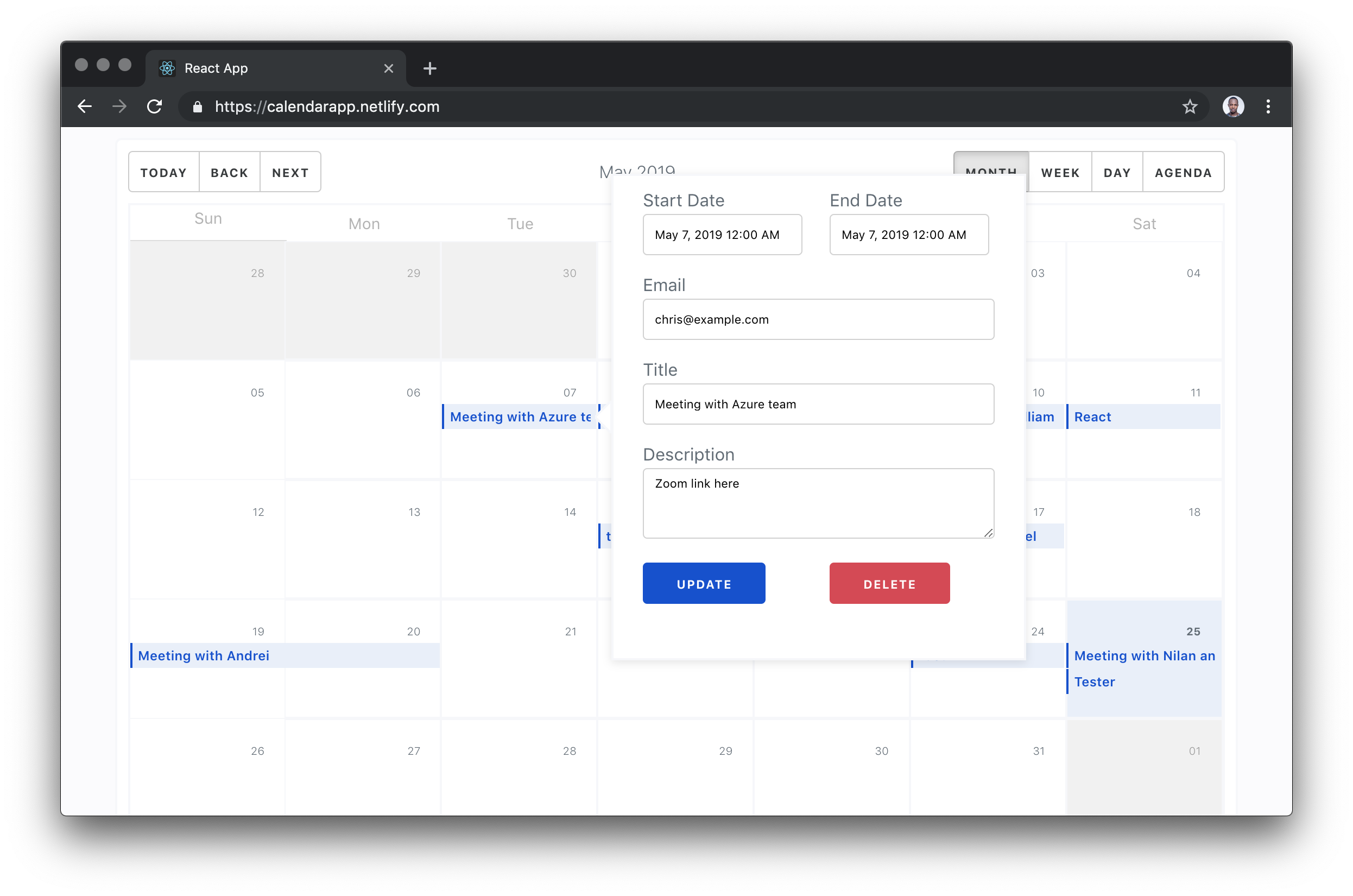
Pretty, right? Make it to the end of the article, because this is what we’ll make.

A calendar month view with a pop-up form for creating a new event as an overlay.

The only knowledge I had about asking my code to run at a later or deferred time was CRON jobs. The easiest way to use a CRON job is to statically define a job in your code. This is ad hoc — statically means that I cannot simply schedule an event like Google Calendar and easily have it update my CRON code. If you are experienced with writing CRON triggers, you feel my pain. If you’re not, you are lucky you might never have to use CRON this way.

To elaborate more on my frustration, I needed to trigger a schedule based on a payload of HTTP requests. The dates and information about this schedule would be passed in through the HTTP request. This means there’s no way to know things like the scheduled date beforehand.

We (my colleagues and I) figured out a way to make this work and — with the help of Sarah Drasner’s article on Durable Functions — I understood what I needed learn (and unlearn for that matter). You will learn about everything I worked in this article, from event creation to email scheduling to calendar listings. Here is a video of the app in action:

You might notice the subtle delay. This has nothing to do with the execution timing of the schedule or running the code. I am testing with a free SendGrid account which I suspect have some form of latency. You can confirm this by testing the serverless function responsible without sending emails. You would notice that the code runs at exactly the scheduled time.

Tools and architecture

Here are the three fundamental units of this project:

  1. React Frontend: Calendar UI, including the UI to create, update or delete events.
  2. 8Base GraphQL: A back-end database layer for the app. This is where we will store, read and update our date from. The fun part is you won’t write any code for this back end.
  3. Durable Functions: Durable functions are kind of Serverless Functions that have the power of remembering their state from previous executions. This is what replaces CRON jobs and solves the ad hoc problem we described earlier.

See the Pen
durable-func1
by Chris Nwamba (@codebeast)
on CodePen.

The rest of this post will have three major sections based on the three units we saw above. We will take them one after the other, build them out, test them, and even deploy the work. Before we get on with that, let’s setup using a starter project I made to get us started.

Project Repo

Getting Started

You can set up this project in different ways — either as a full-stack project with the three units in one project or as a standalone project with each unit living in it's own root. Well, I went with the first because it’s more concise, easier to teach, and manageable since it’s one project.

The app will be a create-react-app project and I made a starter for us to lower the barrier to set up. It comes with supplementary code and logic that we don’t need to explain since they are out of the scope of the article. The following are set up for us:

  1. Calendar component
  2. Modal and popover components for presenting event forms
  3. Event form component
  4. Some GraphQL logic to query and mutate data
  5. A Durable Serverless Function scaffold where we will write the schedulers

Tip: Each existing file that we care about has a comment block at the top of the document. The comment block tells you what is currently happening in the code file and a to-do section that describes what we are required to do next.

Start by cloning the starter form Github:

git clone -b starter --single-branch https://github.com/christiannwamba/calendar-app.git

Install the npm dependencies described in the root package.json file as well as the serverless package.json:

npm install

Orchestrated Durable Functions for scheduling

There are two words we need to get out of the way first before we can understand what this term is — orchestration and durable.

Orchestration was originally used to describe an assembly of well-coordinated events, actions, etc. It is heavily borrowed in computing to describe a smooth coordination of computer systems. The key word is coordinate. We need to put two or more units of a system together in a coordinated way.

Durable is used to describe anything that has the outstanding feature of lasting longer.

Put system coordination and long lasting together, and you get Durable Functions. This is the most powerful feature if Azure’s Serverless Function. Durable Functions based in what we now know have these two features:

  1. They can be used to assemble the execution of two or more functions and coordinate them so race conditions do not occur (orchestration).
  2. Durable Functions remember things. This is what makes it so powerful. It breaks the number one rule of HTTP: stateless. Durable functions keep their state intact no matter how long they have to wait. Create a schedule for 1,000,000 years into the future and a durable function will execute after one million years while remembering the parameters that were passed to it on the day of trigger. That means Durable Functions are stateful.

These durability features unlock a new realm of opportunities for serverless functions and that is why we are exploring one of those features today. I highly recommend Sarah’s article one more time for a visualized version of some of the possible use cases of Durable Functions.

I also made a visual representation of the behavior of the Durable Functions we will be writing today. Take this as an animated architectural diagram:

Shows the touch-points of a serverless system.

A data mutation from an external system (8Base) triggers the orchestration by calling the HTTP Trigger. The trigger then calls the orchestration function which schedules an event. When the time for execution is due, the orchestration function is called again but this time skips the orchestration and calls the activity function. The activity function is the action performer. This is the actual thing that happens e.g. "send email notification".

Create orchestrated Durable Functions

Let me walk you through creating functions using VS Code. You need two things:

  1. An Azure account
  2. VS Code

Once you have both setup, you need to tie them together. You can do this using a VS Code extension and a Node CLI tool. Start with installing the CLItool:


npm install -g azure-functions-core-tools

# OR

brew tap azure/functions
brew install azure-functions-core-tools

Next, install the Azure Function extension to have VS Code tied to Functions on Azure. You can read more about setting up Azure Functions from my previous article.


Now that you have all the setup done, let’s get into creating these functions. The functions we will be creating will map to the following folders.

Folder Function
schedule Durable HTTP Trigger
scheduleOrchestrator Durable Orchestration
sendEmail Durable Activity

Start with the trigger.

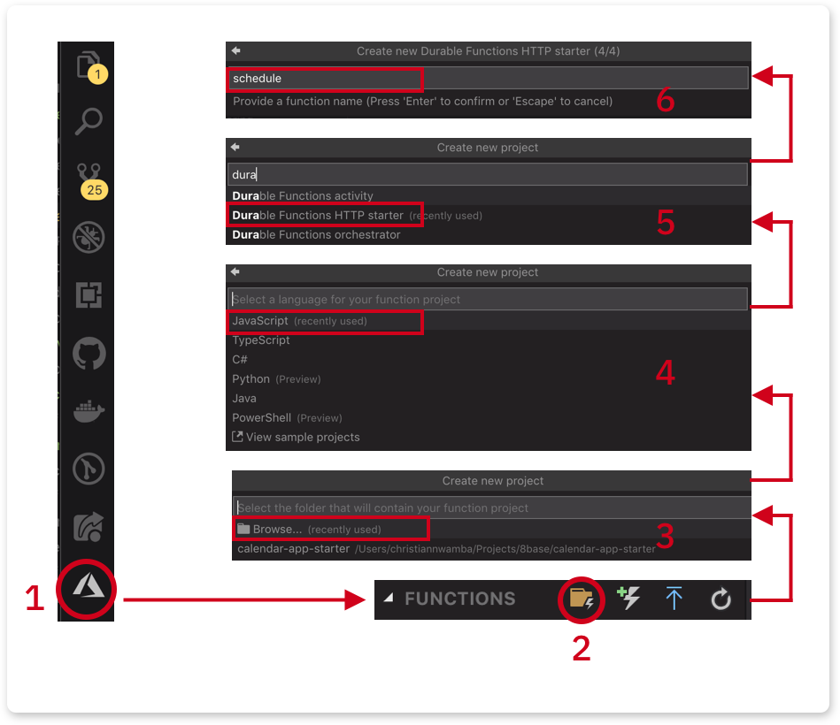
  1. Click on the Azure extension icon and follow the image below to create the schedule function
    Shows the interface steps going from Browse to JavaScript to Durable Functions HTTP start to naming the function schedule.
  2. Since this is the first function, we chose the folder icon to create a function project. The icon after that creates a single function (not a project).
  3. Click Browse and create a serverless folder inside the project. Select the new serverless folder.
  4. Select JavaScript as the language. If TypeScript (or any other language) is your jam, please feel free.
  5. Select Durable Functions HTTP starter. This is the trigger.
  6. Name the first function as schedule

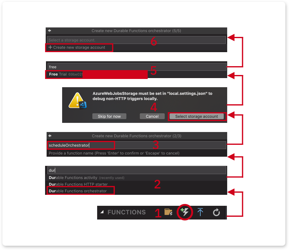
Next, create the orchestrator. Instead of creating a function project, create a function instead.

  1. Click on the function icon:
  2. Select Durable Functions orchestrator.
  3. Give it a name, scheduleOrchestrator and hit Enter.
  4. You will be asked to select a storage account. Orchestrator uses storage to preserve the state of a function-in-process.
  5. Select a subscription in your Azure account. In my case, I chose the free trial subscription.
  6. Follow the few remaining steps to create a storage account.

Finally, repeat the previous step to create an Activity. This time, the following should be different:

  • Select Durable Functions activity.
  • Name it sendEmail.
  • No storage account will be needed.

Scheduling with a durable HTTP trigger

The code in serverless/schedule/index.js does not need to be touched. This is what it looks like originally when the function is scaffolded using VS Code or the CLI tool.

const df = require("durable-functions");
module.exports = async function (context, req) {
  const client = df.getClient(context);
  const instanceId = await client.startNew(req.params.functionName, undefined, req.body);
  context.log(`Started orchestration with ID = '${instanceId}'.`);
  return client.createCheckStatusResponse(context.bindingData.req, instanceId);
};

What is happening here?

  1. We’re creating a durable function on the client side that is based on the context of the request.
  2. We’re calling the orchestrator using the client's startNew() function. The orchestrator function name is passed as the first argument to startNew() via the params object. A req.body is also passed to startNew() as third argument which is forwarded to the orchestrator.
  3. Finally, we return a set of data that can be used to check the status of the orchestrator function, or even cancel the process before it's complete.

The URL to call the above function would look like this:

http://localhost:7071/api/orchestrators/{functionName}

Where functionName is the name passed to startNew. In our case, it should be:

//localhost:7071/api/orchestrators/scheduleOrchestrator

It’s also good to know that you can change how this URL looks.

Orchestrating with a Durable Orchestrator

The HTTP trigger startNew call calls a function based on the name we pass to it. That name corresponds to the name of the function and folder that holds the orchestration logic. The serverless/scheduleOrchestrator/index.js file exports a Durable Function. Replace the content with the following:

const df = require("durable-functions");
module.exports = df.orchestrator(function* (context) {
  const input = context.df.getInput()
  // TODO -- 1
  
  // TODO -- 2
});

The orchestrator function retrieves the request body from the HTTP trigger using context.df.getInput().

Replace TODO -- 1 with the following line of code which might happen to be the most significant thing in this entire demo:

yield context.df.createTimer(new Date(input.startAt))

What this line does use the Durable Function to create a timer based on the date passed in from the request body via the HTTP trigger.

When this function executes and gets here, it will trigger the timer and bail temporarily. When the schedule is due, it will come back, skip this line and call the following line which you should use in place of TODO -- 2.

return yield context.df.callActivity('sendEmail', input);

The function would call the activity function to send an email. We are also passing a payload as the second argument.

This is what the completed function would look like:

const df = require("durable-functions");

module.exports = df.orchestrator(function* (context) {
  const input = context.df.getInput()
    
  yield context.df.createTimer(new Date(input.startAt))
    
  return yield context.df.callActivity('sendEmail', input);
});

Sending email with a durable activity

When a schedule is due, the orchestrator comes back to call the activity. The activity file lives in serverless/sendEmail/index.js. Replace what’s in there with the following:

const sgMail = require('@sendgrid/mail');
sgMail.setApiKey(process.env['SENDGRID_API_KEY']);

module.exports = async function(context) {
  // TODO -- 1
  const msg = {}
  // TODO -- 2
  return msg;
};

It currently imports SendGrid’s mailer and sets the API key. You can get an API Key by following these instructions.

I am setting the key in an environmental variable to keep my credentials safe. You can safely store yours the same way by creating a SENDGRID_API_KEY key in serverless/local.settings.json with your SendGrid key as the value:

{
  "IsEncrypted": false,
  "Values": {
    "AzureWebJobsStorage": "<<AzureWebJobsStorage>",
    "FUNCTIONS_WORKER_RUNTIME": "node",
    "SENDGRID_API_KEY": "<<SENDGRID_API_KEY>"
  }
}

Replace TODO -- 1 with the following line:

const { email, title, startAt, description } = context.bindings.payload;

This pulls out the event information from the input from the orchestrator function. The input is attached to context.bindings. payload can be anything you name it so go to serverless/sendEmail/function.json and change the name value to payload:

{
  "bindings": [
    {
      "name": "payload",
      "type": "activityTrigger",
      "direction": "in"
    }
  ]
}

Next, update TODO -- 2 with the following block to send an email:

const msg = {
  to: email,
  from: { email: 'chris@codebeast.dev', name: 'Codebeast Calendar' },
  subject: `Event: ${title}`,
  html: `<h4>${title} @ ${startAt}</h4> <p>${description}</p>`
};
sgMail.send(msg);

return msg;

Here is the complete version:

const sgMail = require('@sendgrid/mail');
sgMail.setApiKey(process.env['SENDGRID_API_KEY']);

module.exports = async function(context) {
  const { email, title, startAt, description } = context.bindings.payload;
  const msg = {
    to: email,
    from: { email: 'chris@codebeast.dev', name: 'Codebeast Calendar' },
    subject: `Event: ${title}`,
    html: `<h4>${title} @ ${startAt}</h4> <p>${description}</p>`
  };
  sgMail.send(msg);

  return msg;
};

Deploying functions to Azure

Deploying functions to Azure is easy. It’s merely a click away from the VS Code editor. Click on the circled icon to deploy and get a deploy URL:

Still with me this far in? You’re making great progress! It’s totally OK to take a break here, nap, stretch or get some rest. I definitely did while writing this post.

Data and GraphQL layer with 8Base

My easiest description and understanding of 8Base is "Firebase for GraphQL." 8Base is a database layer for any kind of app you can think of and the most interesting aspect of it is that it’s based on GraphQL.

The best way to describe where 8Base fits in your stack is to paint a picture of a scenario.

Imagine you are a freelance developer with a small-to-medium scale contract to build an e-commerce store for a client. Your core skills are on the web so you are not very comfortable on the back end. though you can write a bit of Node.

Unfortunately, e-commerce requires managing inventories, order management, managing purchases, managing authentication and identity, etc. "Manage" at a fundamental level just means data CRUD and data access.

Instead of the redundant and boring process of creating, reading, updating, deleting, and managing access for entities in our backend code, what if we could describe these business requirements in a UI? What if we can create tables that allow us to configure CRUD operations, auth and access? What if we had such help and only focus on building frontend code and writing queries? Everything we just described is tackled by 8Base

Here is an architecture of a back-end-less app that relies on 8Base as it’s data layer:

Create an 8Base table for events storage and retrieval

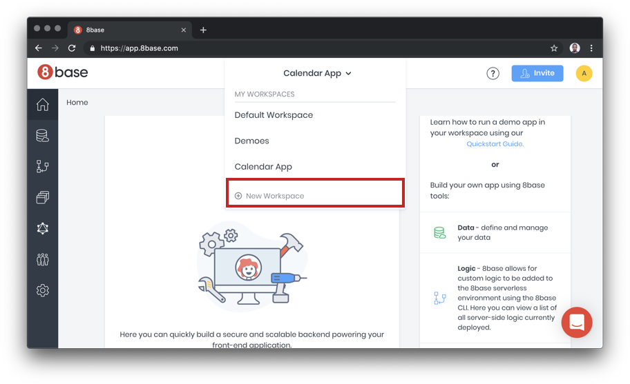
The first thing we need to do before creating a table is to create an account. Once you have an account, create a workspace that holds all the tables and logic for a given project.

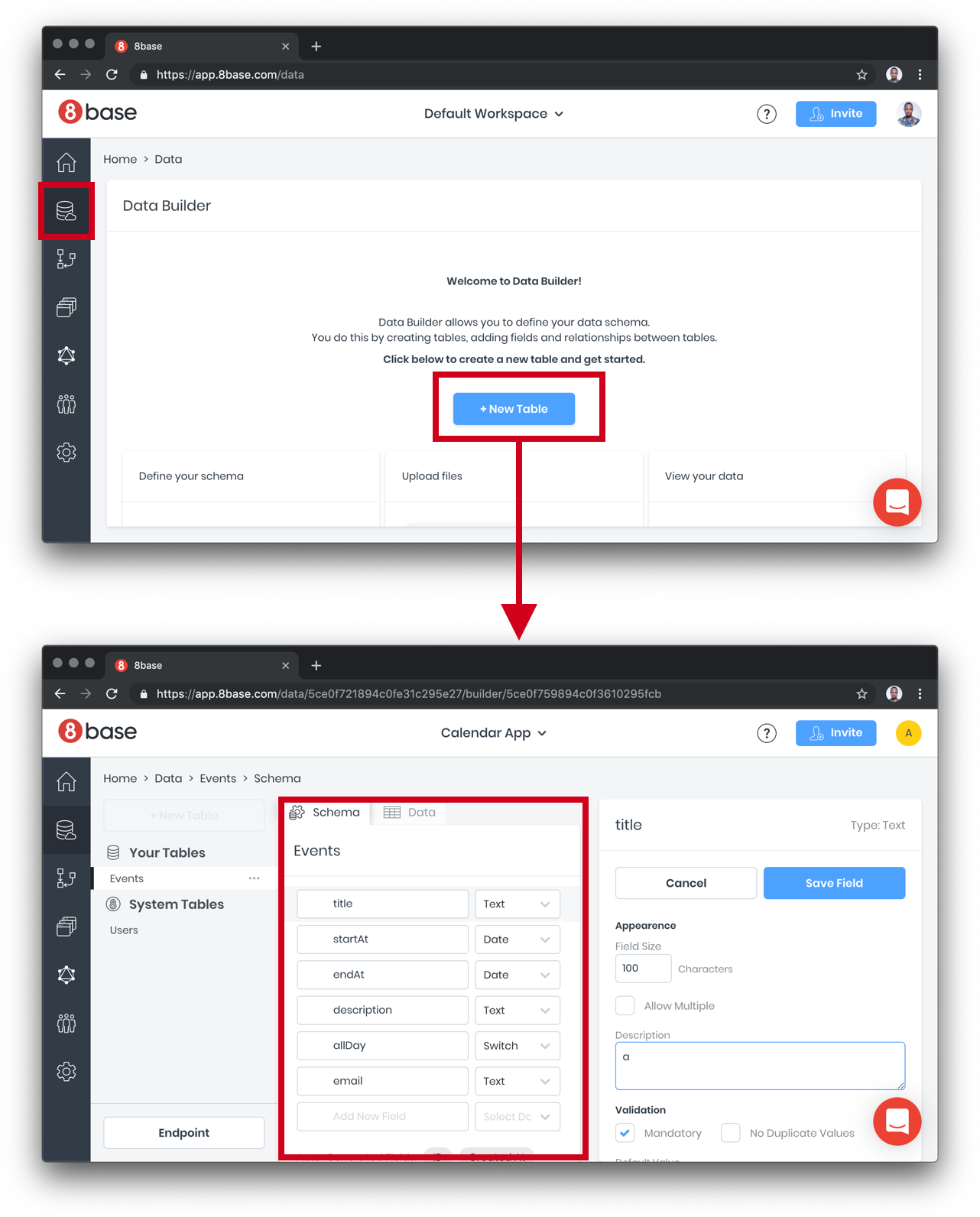
Next, create a table, name the table Events and fill out the table fields.

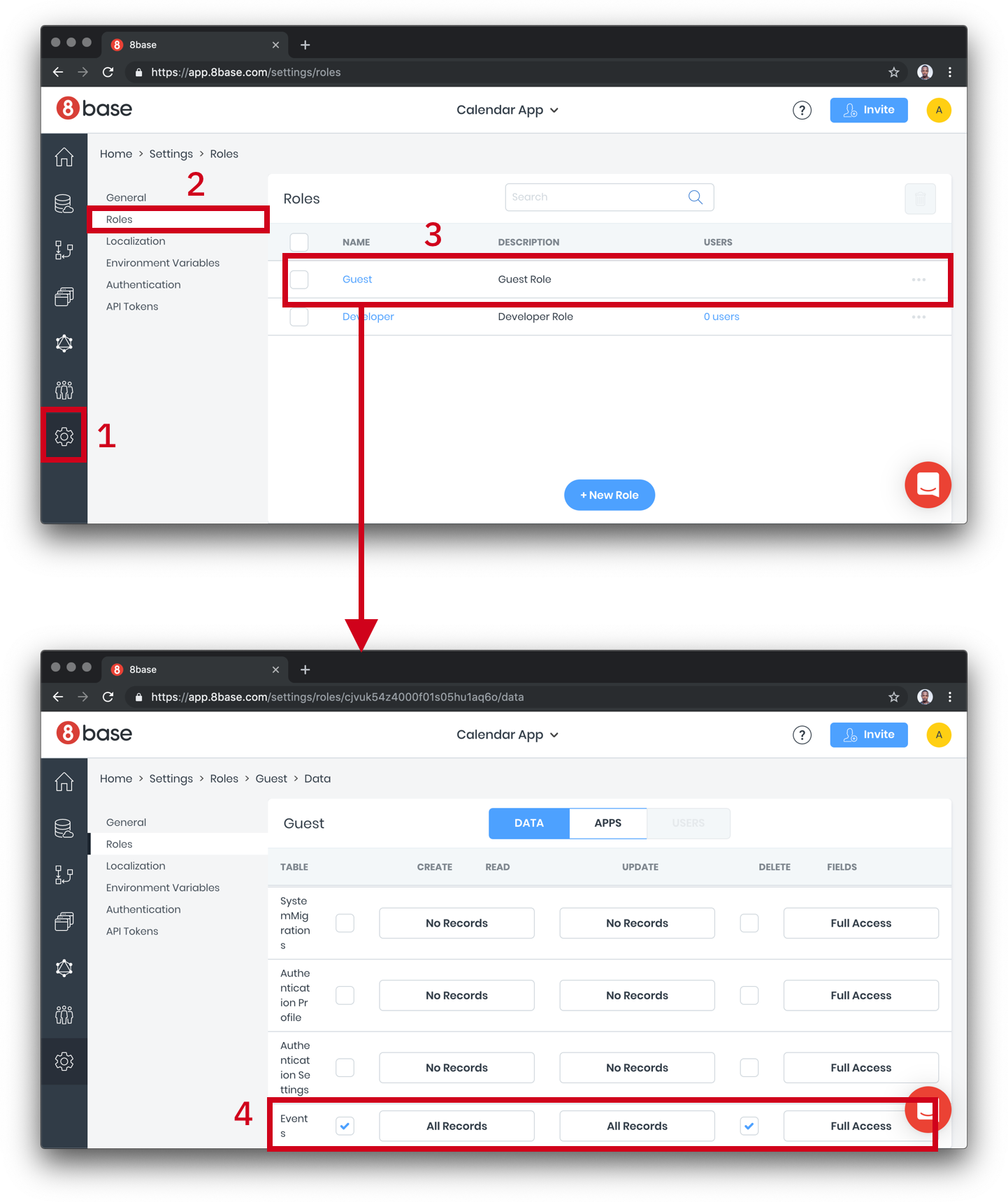
We need to configure access levels. Right now, there’s nothing to hide from each user, so we can just turn on all access to the Events table we created:

Setting up Auth is super simple with 8base because it integrates with Auth0. If you have entities that need to be protected or want to extend our example to use auth, please go wild.

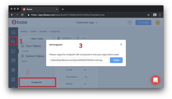
Finally, grab your endpoint URL for use in the React app:

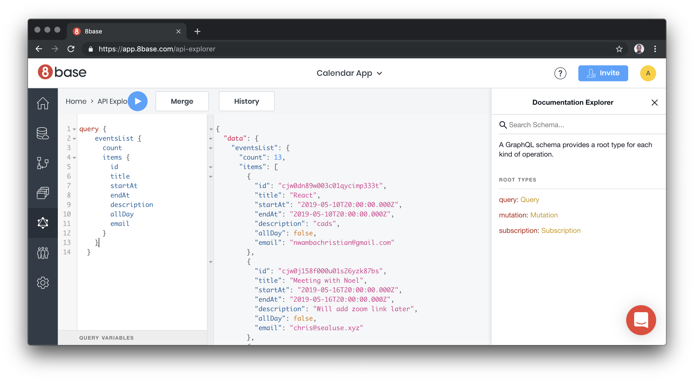
Testing GraphQL Queries and mutation in the playground

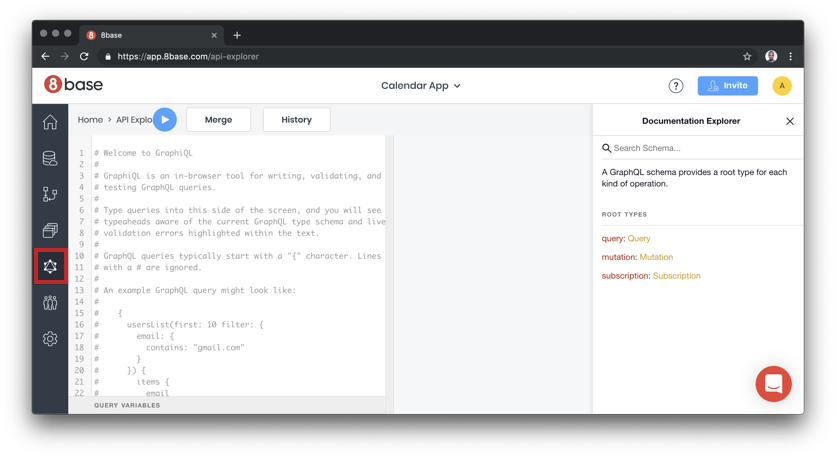
Just to be sure that we are ready to take the URL to the wild and start building the client, let’s first test the API with a GraphQL playground and see if the setup is fine. Click on the explorer.

Paste the following query in the editor.

query {
  eventsList {
    count
    items {
      id
      title
      startAt
      endAt
      description
      allDay
      email
    }
  }
}

I created some test data through the 8base UI and I get the result back when I run they query:

You can explore the entire database using the schema document on the right end of the explore page.

Calendar and event form interface

The third (and last) unit of our project is the React App which builds the user interfaces. There are four major components making up the UI and they include:

  1. Calendar: A calendar UI that lists all the existing events
  2. Event Modal: A React modal that renders EventForm component to create a component
  3. Event Popover: Popover UI to read a single event, update event using EventForm or delete event
  4. Event Form: HTML form for creating new event

Before we dive right into the calendar component, we need to setup React Apollo client. The React Apollo provider empowers you with tools to query a GraphQL data source using React patterns. The original provider allows you to use higher order components or render props to query and mutate data. We will be using a wrapper to the original provider that allows you query and mutate using React Hooks.

In src/index.js, import the React Apollo Hooks and the 8base client in TODO -- 1:

import { ApolloProvider } from 'react-apollo-hooks';
import { EightBaseApolloClient } from '@8base/apollo-client';

At TODO -- 2, configure the client with the endpoint URL we got in the 8base setup stage:

const URI = 'https://api.8base.com/cjvuk51i0000701s0hvvcbnxg';

const apolloClient = new EightBaseApolloClient({
  uri: URI,
  withAuth: false
});

Use this client to wrap the entire App tree with the provider on TODO -- 3:

ReactDOM.render(
  <ApolloProvider client={apolloClient}>
    <App />
  </ApolloProvider>,
  document.getElementById('root')
);

Showing events on the calendar

The Calendar component is rendered inside the App component and the imports BigCalendar component from npm. Then :

  1. We render Calendar with a list of events.
  2. We give Calendar a custom popover (EventPopover) component that will be used to edit events.
  3. We render a modal (EventModal) that will be used to create new events.

The only thing we need to update is the list of events. Instead of using the static array of events, we want to query 8base for all store events.

Replace TODO -- 1 with the following line:

const { data, error, loading } = useQuery(EVENTS_QUERY);

Import the useQuery library from npm and the EVENTS_QUERY at the beginning of the file:

import { useQuery } from 'react-apollo-hooks';
import { EVENTS_QUERY } from '../../queries';

EVENTS_QUERY is exactly the same query we tested in 8base explorer. It lives in src/queries and looks like this:

export const EVENTS_QUERY = gql`
  query {
    eventsList {
      count
      items {
        id
        ...
      }
    }
  }
`;

Let’s add a simple error and loading handler on TODO -- 2:

if (error) return console.log(error);
  if (loading)
    return (
      <div className="calendar">
        <p>Loading...</p>
      </div>
    );

Notice that the Calendar component uses the EventPopover component to render a custom event. You can also observe that the Calendar component file renders EventModal as well. Both components have been setup for you, and their only responsibility is to render EventForm.

Create, update and delete events with the event form component

The component in src/components/Event/EventForm.js renders a form. The form is used to create, edit or delete an event. At TODO -- 1, import useCreateUpdateMutation and useDeleteMutation:

import {useCreateUpdateMutation, useDeleteMutation} from './eventMutationHooks'
  • useCreateUpdateMutation: This mutation either creates or updates an event depending on whether the event already existed.
  • useDeleteMutation: This mutation deletes an existing event.

A call to any of these functions returns another function. The function returned can then serve as an even handler.

Now, go ahead and replace TODO -- 2 with a call to both functions:

const createUpdateEvent = useCreateUpdateMutation(
  payload,
  event,
  eventExists,
  () => closeModal()
);
const deleteEvent = useDeleteMutation(event, () => closeModal());

These are custom hooks I wrote to wrap the useMutation exposed by React Apollo Hooks. Each hook creates a mutation and passes mutation variable to the useMutation query. The blocks that look like the following in src/components/Event/eventMutationHooks.js are the most important parts:

useMutation(mutationType, {
  variables: {
    data
  },
  update: (cache, { data }) => {
    const { eventsList } = cache.readQuery({
      query: EVENTS_QUERY
    });
    cache.writeQuery({
      query: EVENTS_QUERY,
      data: {
        eventsList: transformCacheUpdateData(eventsList, data)
      }
    });
    //..
  }
});

Call the Durable Function HTTP trigger from 8Base

We have spent quite some time in building the serverless structure, data storage and UI layers of our calendar app. To recap, the UI sends data to 8base for storage, 8base saves data and triggers the Durable Function HTTP trigger, the HTTP trigger kicks in orchestration and the rest is history. Currently, we are saving data with mutation but we are not calling the serverless function anywhere in 8base.

8base allows you to write custom logic which is what makes it very powerful and extensible. Custom logic are simple functions that are called based on actions performed on the 8base database. For example, we can set up a logic to be called every time a mutation occurs on a table. Let’s create one that is called when an event is created.

Start by installing the 8base CLI:

npm install -g 8base

On the calendar app project run the following command to create a starter logic:

8base init 8base

8base init command creates a new 8base logic project. You can pass it a directory name which in this case we are naming the 8base logic folder, 8base — don’t get it twisted.

Trigger scheduling logic

Delete everything in 8base/src and create a triggerSchedule.js file in the src folder. Once you have done that, drop in the following into the file:

const fetch = require('node-fetch');

module.exports = async event => {
  const res = await fetch('<HTTP Trigger URL>', {
    method: 'POST',
    body: JSON.stringify(event.data),
    headers: { 'Content-Type': 'application/json' }
  })
  const json = await res.json();
  console.log(event, json)
  return json;
};

The information about the GraphQL mutation is available on the event object as data.

Replace <HTTP Trigger URL> with the URL you got after deploying your function. You can get the URL by going to the function in your Azure URL and click "Copy URL."

You also need to install the node-fetch module, which will grab the data from the API:

npm install --save node-fetch

8base logic configuration

The next thing to do is tell 8base what exact mutation or query that needs to trigger this logic. In our case, a create mutation on the Events table. You can describe this information in the 8base.yml file:

functions:
  triggerSchedule:
    handler:
      code: src/triggerSchedule.js
    type: trigger.after
    operation: Events.create

In a sense, this is saying, when a create mutation happens on the Events table, please call src/triggerSchedule.js after the mutation has occurred.

We want to deploy all the things

Before anything can be deployed, we need to login into the 8Base account, which we can do via command line:

8base login

Then, let’s run the deploy command to send and set up the app logic in your workspace instance.

8base deploy

Testing the entire flow

To see the app in all its glory, click on one of the days of the calendar. You should get the event modal containing the form. Fill that out and put a future start date so we trigger a notification. Try a date more than 2-5 mins from the current time because I haven’t been able to trigger a notification any faster than that.

Yay, go check your email! The email should have arrived thanks to SendGrid. Now we have an app that allows us to create events and get notified with the details of the event submission.

The post Hey, let’s create a functional calendar app with the JAMstack appeared first on CSS-Tricks.