Creative Background Patterns Using Gradients, CSS Shapes, and Even Emojis

You can create stripes in CSS. That’s all I thought about in terms of CSS background patterns for a long time. There’s nothing wrong with stripes; stripes are cool. They can be customized into wide and narrow bands, criss-crossed into a checked pattern, and played with in other ways using the idea of hard stops. But stripes can be boring, too. Too conventional, out of fashion, and sometimes even unpleasant.

Thankfully, we can conjure up far more background patterns than you can even imagine with CSS, with code that is similar in spirit to stripes.

Background patterns are images repeated across a background. They can be done by referencing an external image, like a PNG file, or can be drawn with CSS, which is traditionally done using CSS gradients. 

Linear gradients (and repeating linear gradients) for instance, are typically used for stripes. But there are other ways to create cool background patterns. Let’s see how we can use gradients in other ways and toss in other things, like CSS shapes and emoji, to spice things up.

Gradient patterns

There are three types of CSS gradients.

Linear (left), radial (center) and conic (right) gradients
  1. linear-gradient(): Colors flow from left-to-right, top-to-bottom, or at any angle you choose in a single direction.
  2. radial-gradient(): Colors start at a single point and emanate outward
  3. conic-gradient(): Similar in concept to radial gradients, but the color stops are placed around the circle rather than emanating from the center point.

I recommend checking out the syntax for all the gradients to thoroughly understand how to start and end a color in a gradient.

Radial gradient patterns

Let’s look at radial gradients first because they give us very useful things: circles and ellipses. Both can be used for patterns that are very interesting and might unlock some ideas for you!

background: radial-gradient(<gradient values>)

Here’s a pattern of repeating watermelons using this technique:

background: 
	radial-gradient(circle at 25px 9px, black 2px, transparent 2px), 
	radial-gradient(circle at 49px 28px, black 2px, transparent 2px), 
	radial-gradient(circle at 38px 1px, black 2px, transparent 2px), 
	radial-gradient(circle at 20px 4px, black 2px, transparent 2px), 
	radial-gradient(circle at 80px 4px, black 2px, transparent 2px), 
	radial-gradient(circle at 50px 10px, black 2px, transparent 2px), 
	radial-gradient(circle at 60px 16px, black 2px, transparent 2px), 
	radial-gradient(circle at 70px 16px, black 2px, transparent 2px), 
	radial-gradient(ellipse at 50px 0, red 33px, lime 33px, lime 38px, transparent 38px) 
	white;
background-size: 100px 50px;

We start by providing a background size on the element then stack up the gradients inside it. An ellipse forms the green and red parts. Black circles are scattered across to represent the watermelon seeds. 

The first two parameters for a radial gradient function determine whether the gradient shape is a circle or an ellipse and the starting position of the gradient. That’s followed by the gradient color values along with the start and ending positions within the gradient.

Conic gradient patterns

Conic gradients create ray-like shapes. Like linear and radial gradients, conic gradients can be used to create geometric patterns.

background: conic-gradient(<gradient values>)
background: 
  conic-gradient(yellow 40deg, blue 40deg, blue 45deg, transparent 45deg), 
  conic-gradient(transparent 135deg, blue 135deg, blue 140deg, transparent 140deg) ;
background-size: 60px 60px;
background-color: white;

The rub with conic gradient is that it’s not supported in Firefox, at least at the time of writing. It’s always worth keeping an eye out for deeper support.

This browser support data is from Caniuse, which has more detail. A number indicates that browser supports the feature at that version and up.

Desktop

ChromeFirefoxIEEdgeSafari
69NoNo7912.1

Mobile / Tablet

Android ChromeAndroid FirefoxAndroidiOS Safari
81No8112.2-12.4

Emoji icon patterns

This is where things begin to get interesting. Rather than just using geometric patterns (as in gradients), we now use the organic shapes of emojis to create background patterns. 🎉 

It starts with emoji icons. 

Solid-color emoji patterns

We can create emoji icons by giving emojis a transparent color and text shadow.

color: transparent;
text-shadow: 0 0 black;

Those icons can then be turned into an image that can be used as a background, using SVG.

<svg>
  <foreignObject>
    <!-- The HTML code with emoji -->
  </foreignObject>
</svg>

The SVG can then be referred by the background property using data URL

background: url("data:image/svg+xml,<svg xmlns=%22http://www.w3.org/2000/svg%22 viewBox=%220 0 100 100%22><!-- SVG code --></svg>");

And, voilá! We get something like this:

background: 
    url("data:image/svg+xml,<svg xmlns=%22http://www.w3.org/2000/svg%22 viewBox=%220 0 100 100%22><foreignObject width=%22100px%22 height=%22100px%22><div xmlns=%22http://www.w3.org/1999/xhtml%22 style=%22color:transparent;text-shadow: 0 0 %23e42100, -2px 2px 0 black;font-size:70px%22>🏄‍♀️</div></foreignObject></svg>"), 
    white; 
background-size: 60px 60px; 

Other than emojis, it’s also possible to draw CSS shapes and use them as patterns. Emojis are less work, though. Just saying. 

Gradient-colored emoji patterns

Instead of using plain emoji icons, we can use gradient emoji icons. To do that, skip the text shadow on the emojis. Add a gradient background behind them and use background-clip to trim the gradient background to the shape of the emojis. 

color: transparent;
background: linear-gradient(45deg, blue 20%, fuchsia);
background-clip: text; /* Safari requires -webkit prefix */

Then, just as before, use the combination of SVG and data URL to create the background pattern.

Translucent-colored emoji patterns

This is same as using block colored emoji icons. This time, however, we take away the opaqueness of the colors by using rgba() or hsla() values for the text shadow. 

color: transparent;
text-shadow: 20px 10px rgba(0, 255, 0, .3), 
             0 0 red;

SVG-text emoji patterns

We’ve already looked at all the working methods I could think of to create background patterns, but I feel like I should also mention this other technique I tried, which is not as widely supported as I’d hoped.

 I tried placing the emoji in an SVG <text> element instead of the HTML added using <foreignObject>. But I wasn’t able to create a solid shadow behind it in all the browsers.

background: 
  url("data:image/svg+xml,<svg xmlns=%22http://www.w3.org/2000/svg%22 viewBox=%220 0 100 100%22><text y=%221em%22 font-size=%2270%22 fill=%22transparent%22 style=%22text-shadow: 0 0 %23e42100, -2px 2px 5px black, 0 0 6px white; ;%22>🏄‍♀️</text></svg>")

Just in case, I tried using CSS and SVG filters for the shadow as well, thinking that might work. It didn’t. I also tried using the stroke attribute, to at least create an outline for the emoji, but that didn’t work, either. 

CSS element() patterns

I didn’t think of SVG when I first thought of converting emoji icons or CSS shapes into background images. I tried CSS element(). It’s a function that directly converts an HTML element into an image that can be referenced and used. I really like this approach, but browser support is a huge caveat, which is why I’m mentioning it here at the end.

Basically, we can drop an element in the HTML like this:

<div id=snake >🐍</div>

…then pass it into the element() function to use like an image on other elements, like this:

background: 
  -moz-element(#snake), /* Firefox only */
  linear-gradient(45deg, transparent 20px, blue 20px, blue 30px, transparent 30px) 
  white;
background-size: 60px 60px;
background-color: white;

Now that snake emoji is technically an image that we get to include in the pattern.

Again, browser support is spotty, making this approach super experimental.

This browser support data is from Caniuse, which has more detail. A number indicates that browser supports the feature at that version and up.

Desktop

ChromeFirefoxIEEdgeSafari
No4*NoNoNo

Mobile / Tablet

Android ChromeAndroid FirefoxAndroidiOS Safari
No68*NoNo

In this method, the original emoji (or any CSS shape for that matter) used for the background pattern needs to render on screen for it to appear in the background pattern as well. To hide that original emoji, I used mix-blend-mode — it sort of masks out the original emoji in the HTML so it doesn’t show up on the page.


I hope you find the methods in this post useful in one way or another and learned something new in the process! Give them a try. Experiment with different emojis and CSS shapes because gradients, while cool and all, aren’t the only way to make patterns.. The background property takes multiple values, allowing us to think of creative ways to stack things.

The post Creative Background Patterns Using Gradients, CSS Shapes, and Even Emojis appeared first on CSS-Tricks.

Background Patterns, Simplified by Conic Gradients

For those who have missed the big news, Firefox now supports conic gradients!

Starting with Firefox 75, released on the April 7, we can go to about:config, look for the layout.css.conic-gradient.enabled flag and set its value to true (it’s false by default and all it takes to switch is double-clicking it).

Screenshot. Shows the Firefox URL bar at `about:config`, a search for 'conic' giving the `layout.css.conic-gradient.enabled` flag as the sole result and its value set to `true`.
Enabling conic gradients in Firefox 75+

With that enabled, now we can test our CSS including conic gradients in Firefox as well.

While some of the demos in this article work just fine when using a polyfill, some use CSS variables inside the conic gradient and therefore require native support for this feature.

One thing I particularly like about conic gradients is just how much they can simplify background patterns. So let’s take a few linear-gradient() patterns from the gallery created by Lea Verou about a decade ago and see how we can now simplify them with conic-gradient!

Pyramid

Screenshot. Shows the original pyramid pattern with the code that was used to create it.
The pyramid pattern

The pattern above uses four linear gradients:

background:
  linear-gradient(315deg, transparent 75%, #d45d55 0) -10px 0,
  linear-gradient(45deg, transparent 75%, #d45d55 0) -10px 0,
  linear-gradient(135deg, #a7332b 50%, transparent 0) 0 0,
  linear-gradient(45deg, #6a201b 50%, #561a16 0) 0 0 #561a16;
background-size: 20px 20px;

That’s quite a bit of CSS and perhaps even a bit intimidating. It’s not easy to just look at this and understand how it all adds up to give us the pyramid pattern. I certainly couldn’t do it. It took me a while to get it, even though gradients are one of the CSS features I’m most comfortable with. So don’t worry if you don’t understand how those gradients manage to create the pyramid pattern because, one, it is complicated and, two, you don’t even need to understand that!

Using conic-gradient(), we can now get the same result in a much simpler manner, with a single background layer instead of four!

What I like to do when coding repeating patterns is draw equidistant vertical and horizontal lines delimiting the rectangular boxes defined by the background-size. In this case, it’s pretty obvious we have square boxes and where their limits are, but it’s a really useful technique for more complex patterns.

Annotated screenshot. Shows the rectangles (squares in this case) defined by the `background-size`.
Highlighting the pattern’s cells

By default, conic gradients start from 12 o’clock and go clockwise. However, in our case, we want to offset the start of the gradient by 45° in the clockwise direction and afterwards make every one of the four shades occupy a quarter (25%) of the available space around the midpoint of our square box.

SVG illustration. Shows how we place a conic gradient into a single pattern cell by rotating the gradient start point 45° in the clockwise (positive) direction.
A pattern cell with a conic gradient’s hard stops at every 25% starting from 45° w.r.t. the vertical axis (live).

This means our pyramid pattern can be reduced to:

$s: 20px;
background:
  conic-gradient(from 45deg, 
    #561a16 25%, 
    #6a201b 0% 50%, 
    #a7332b 0% 75%, 
    #d45d55 0%) 
    50%/ #{$s $s};

Not only does the code look simpler, but we’ve also gone from 260 bytes to 103 bytes, reducing the code needed to get this pattern by more than half.

We’re using the double position syntax as that’s also well supported these days.

We can see it in action in the Pen below:

Checkerboard

Screenshot. Shows the original checkerboard pattern with the code that was used to create it.
The checkerboard pattern

This pattern above is created with two linear gradients:

background-color: #eee;
background-image:
  linear-gradient(45deg, black 25%, transparent 25%, 
    transparent 75%, black 75%, black),
  linear-gradient(45deg, black 25%, transparent 25%, 
    transparent 75%, black 75%, black);
background-size: 60px 60px;
background-position: 0 0, 30px 30px;

Let’s see how we can simplify this CSS when replacing these linear gradients with a conic one!

Just like in the previous case, we draw vertical and horizontal lines in order to better see the rectangles defined by the background-size.

Annotated screenshot. Shows the rectangles (squares in this case) defined by the `background-size`.
Highlighting the pattern’s cells

Looking at the square highlighted in deeppink in the illustration above, we see that, in this case, our conic gradient starts from the default position at 12 o’clock. A quarter of it is black, the next quarter is dirty white and then we have repetition (the same black and then dirty white quarter slices once more).

SVG illustration. Shows how we place a conic gradient into a single pattern cell and then make it repeat after the 50% point.
A pattern cell with a conic gradient’s hard stops at every 25%, starting from the default at 12 o’clock and repeating after 50% (demo).

This repetition in the second half of the [0%, 100%] interval means we can use a repeating-conic-gradient(), which gives us the following code (bringing the compiled CSS from 263 bytes down to only 73 bytes – that’s reducing it by over 70%):

$s: 60px;
background:
  repeating-conic-gradient(#000 0% 25%, #eee 0% 50%) 
    50%/ #{$s $s};

The Pen below shows it in action:

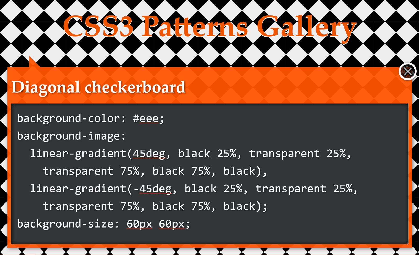
Diagonal checkerboard

Screenshot. Shows the original diagonal checkerboard pattern with the code that was used to create it.
The diagonal checkerboard pattern

Again, we have a pattern created with two linear gradients:

background-color: #eee;
background-image: 
  linear-gradient(45deg, black 25%, transparent 25%, 
    transparent 75%, black 75%, black),
  linear-gradient(-45deg, black 25%, transparent 25%, 
    transparent 75%, black 75%, black);
background-size: 60px 60px;

We draw horizontal and vertical lines to split this pattern into identical rectangles:

Annotated screenshot. Shows the rectangles (squares in this case) defined by the `background-size`.
Highlighting the pattern’s cells

What we now have is pretty much the same checkerbox pattern as before, with the sole difference that we don’t start from the default position at 12 o’clock, but from 45° in the clockwise direction.

If you’re having trouble visualising how simply changing the start angle can make us go from the previous pattern to this one, you can play with it in the interactive demo below:

Note that this demo does not work in browsers that have no native support for conic gradients.

This means our code looks as follows:

$s: 60px;
background:
  repeating-conic-gradient(from 45deg, 
    #000 0% 25%, #eee 0% 50%) 
  50%/ #{$s $s};

We can see it in action below:

Again, not only is the code simpler to understand, but we’ve also gone from 229 bytes to only 83 bytes in the compiled CSS, reducing it by almost two-thirds!

Half-Rombes

Screenshot. Shows the original Half-Rombes pattern with the code that was used to create it.
The half-rombes pattern

This pattern was created with four linear gradients:

background: #36c;
background:
  linear-gradient(115deg, transparent 75%, rgba(255,255,255,.8) 75%) 0 0,
  linear-gradient(245deg, transparent 75%, rgba(255,255,255,.8) 75%) 0 0,
  linear-gradient(115deg, transparent 75%, rgba(255,255,255,.8) 75%) 7px -15px,
  linear-gradient(245deg, transparent 75%, rgba(255,255,255,.8) 75%) 7px -15px,
  #36c;
background-size: 15px 30px;

Just like in the previous cases, we draw equidistant vertical and horizontal lines in order to better see the repeating unit:

Annotated screenshot. Shows the rectangles (squares in this case) defined by the `background-size`.
Highlighting the pattern’s cells.

What we have here is a pattern that’s made up of congruent isosceles triangles (the angled edges are equal and the dark blue triangles are a reflection of the light blue ones) formed by the intersection of equidistant parallel lines that are either horizontal, angled clockwise, or the other way. Each of these three types of parallel lines is highlighted in the illustration below:

Illustration. Shows the equidistant parallel lines which create the pattern of isosceles triangles.
Parallel guides

Every pattern cell contains a full triangle and two adjacent triangle halves in the upper part, then a reflection of this upper part in the lower part. This means we can identify a bunch of congruent right triangles that will help us get the angles we need for our conic-gradient():

SVG illustration. Shows how we place a conic gradient into a single pattern cell by rotating the gradient start point by an angle β in the clockwise (positive) direction such that the 0% line goes through the top right corner and then all the other hard stops are either horizontal or going through the cell corners.
A pattern cell with a conic gradient’s hard stops such that they’re either horizontal or go through the cell corners, all starting from β w.r.t. the vertical axis (demo)

This illustration shows us that the gradient starts from an angle, β, away from the default conic gradient start point at 12 o’clock. The first conic slice (the top right half triangle) goes up to α, the second one (the bottom right dark triangle) up to 2·α, and the third one (the bottom light triangle) goes halfway around the circle from the start (that’s 180°, or 50%). The fourth one (the bottom left dark triangle) goes to 180° + α and the fifth one (the top left light triangle) goes to 180° + 2·α, while the sixth one covers the rest.

SVG illustration. Highlights the right triangle from where we can get α knowing the catheti and shows how we can then compute β.
Getting α and β (demo)

From the highlighted right triangle we get that:

tan(α) = (.5·h)/(.5·w) = h/w

Knowing the width (w) and height (h) of a pattern cell, we can get the angles α and β:

α = atan(h/w)
β = 90° - α

It results in the pattern that’s generated by the following code:

$w: 15px;
$h: 30px;
$a: atan($h/$w)*180deg/pi();
$b: 90deg - $a;
$c0: #36c;
$c1: #d6e0f5;

html {
  background: 
    conic-gradient(from $b, 
      $c1 0% $a, 
      $c0 0% 2*$a, 
      $c1 0% 50%, 
      $c0 0% 180deg + $a, 
      $c1 0% 180deg + 2*$a, 
      $c0 0%) 
    0 0/ #{$w $h};
}

This means going from 343 bytes to only 157 bytes in the compiled CSS. The result can be seen below:

You can tweak the pattern width ($w) and height ($h) in the Sass code in order to see how the pattern gets squished and stretched for different aspect ratios.

In the particular case where the angle between 2*$a and 50% (or 180deg) is also $a, it results that $a is 60deg, our isosceles triangles are equilateral, and our gradient can be reduced to a repeating one (and under 100 bytes in the compiled CSS):

$a: 60deg;
$b: 90deg - $a;
$w: 15px;
$h: $w*tan($a);
$c0: #36c;
$c1: #d6e0f5;

html {
  background: 
    repeating-conic-gradient(from $b, 
      $c1 0% $a, $c0 0% 2*$a) 
    0 0/ #{$w $h}
}

The live result can be seen below:

Bonus: Intersecting line backgrounds!

Screenshot. Shows the original intersecting lines pattern with the code that was used to create it.
Intersecting line background examples

While these are not repeating patterns, they’re examples of a situation where a single conic gradient achieves an effect that would have previously needed a bunch of linear ones.

What we have here is a conic-gradient() created starting from two straight lines intersecting within the rectangular box where we set the background.

SVG illustration. Shows a rectangular box and two random lines intersecting inside it. This intersection point (x,y) is the point the conic gradient goes around, while the gradient's start is from the angle β formed by the line segment closest to the top right corner with the vertical. The hard stops are at α, the angle between the start segment and the next one in clockwise order, at 50% and at 180° + α.
Bonus pattern structure (ldemo)

The gradient goes around the point of coordinates, x,y, where the two straight lines intersect. It starts from an angle, β, which is the angle of the line segment that’s closest to the top-right corner, then has hard stops at α, 50% (or 180°) and 180° + α.

If we want to have multiple elements with similar such patterns created with the help of different intersecting lines and different palettes, we have the perfect use case for CSS variables:

.panel {
  background: 
    conic-gradient(from var(--b) at var(--xy), 
      var(--c0) var(--a), var(--c1) 0% 50%, 
      var(--c2) 0% calc(180deg + var(--a)), var(--c3) 0%);
}

All we have to do is set the position (--xy), the start angle (--b), the first angle (--a) and the palette (--c0 through --c3).

.panel {
  /* same as before */
  
  &:nth-child(1) {
    --xy: 80% 65%; 
    --b: 31deg;
    --a: 121deg; 
    --c0: #be5128;
    --c1: #ce9248;
    --c2: #e4c060;
    --c3: #db9c4e
  }
  
  /* similarly for the other panels */
}

Instead of hardcoding, we could also generate these values randomly or extract them from a data object with the help of a CSS or HTML preprocessor. In this second case, we’d set these custom properties inline, which is precisely what I did in the Pen below:

Since we’re using custom properties inside the conic gradients, this demo does not work in browsers that don’t support them natively.

Well, that’s it! I hope you’ve enjoyed this article and that it gives you some ideas about how conic gradients can make your life easier.

The post Background Patterns, Simplified by Conic Gradients appeared first on CSS-Tricks.

XGBoost: A Deep Dive Into Boosting

Every day we hear about the breakthroughs in artificial intelligence. However, have you wondered what challenges it faces?

Challenges occur in highly unstructured data like DNA sequencing, credit card transactions, and even in cybersecurity, which is the backbone of keeping our online presence safe from fraudsters. Does this thought make you yearn to know more about the science and reasoning behind these systems? Do not worry! We’ve got you covered. In the cyber era, machine learning (ML) has provided us with the solutions to these problems with the implementation of Gradient Boosting Machines (GBM). We have ample algorithms to choose from to do gradient boosting for our training data but still, we encounter different issues like poor accuracy, high loss, large variance in the result. 

Here, we are going to introduce you to a state of the art machine learning algorithm XGBoost built by Tianqi Chen, that will not only overcome the issues but also perform exceptionally well for regression and classification problems. This blog will help you discover the insights, techniques, and skills with XGBoost that you can then bring to your machine learning projects.

While You Weren’t Looking, CSS Gradients Got Better

One thing that caught my eye on the list of features for Lea Verou's conic-gradient() polyfill was the last item:

Supports double position syntax (two positions for the same color stop, as a shortcut for two consecutive color stops with the same color)

Surprisingly, I recently discovered most people aren't even aware that double position for gradient stops is something that actually exists in the spec, so I decided to write about it.

According to the spec:

Specifying two locations makes it easier to create solid-color "stripes" in a gradient, without having to repeat the color twice.

I completely agree, this was the first thing I thought of when I became aware of this feature.

Let's say we want to get the following result: a gradient with a bunch of equal width vertical stripes (which I picked up from an earlier post by Chris):

Screenshot. Shows 8 vertical rainbow stripes, from left to right: violet, magenta, red, orange, yellow, yellowish green, teal, blue.
Desired gradient result.

The hex values are: #5461c8, #c724b1, #e4002b, #ff6900, #f6be00, #97d700, #00ab84 and #00a3e0.

Let's first see how we'd CSS this without using double stop positions!

We have eight stripes, which makes each of them one-eighth of the gradient width. One eighth of 100% is 12.5%, so we go from one to the next at multiples of this value.

This means our linear-gradient() looks as follows:

linear-gradient(90deg, 
             #5461c8 12.5% /* 1*12.5% */, 
  #c724b1 0, #c724b1 25%   /* 2*12.5% */, 
  #e4002b 0, #e4002b 37.5% /* 3*12.5% */, 
  #ff6900 0, #ff6900 50%   /* 4*12.5% */, 
  #f6be00 0, #f6be00 62.5% /* 5*12.5% */, 
  #97d700 0, #97d700 75%   /* 6*12.5% */, 
  #00ab84 0, #00ab84 87.5% /* 7*12.5% */, 
  #00a3e0 0)

Note that we don't need to repeat stop position % values because, whenever a stop position is smaller than a previous one, we automatically have a sharp transition. That's why it's always safe to use 0 (which is always going to be smaller than any positive value) and have #c724b1 25%, #e4002b 0 instead of #c724b1 25%, #e4002b 25%, for example. This is something that can make our life easier in the future if, for example, we decide we want to add two more stripes and make the stop positions multiples of 10%.

Not too bad, especially compared to what gradient generators normally spit out. But if we decide one of those stripes in the middle doesn't quite fit in with the others, then changing it to something else means updating in two places.

Again, not too bad and nothing we can't get around with a little bit of help from a preprocessor:

$c: #5461c8 #c724b1 #e4002b #ff6900 #f6be00 #97d700 #00ab84 #00a3e0;

@function get-stops($c-list) {
  $s-list: ();
  $n: length($c-list);
  $u: 100%/$n;
	
  @for $i from 1 to $n {
    $s-list: $s-list, 
             nth($c-list, $i) $i*$u, 
             nth($c-list, $i + 1) 0
  }

  @return $s-list
}

.strip {
  background: linear-gradient(90deg, get-stops($c)))
}

This generates the exact CSS gradient we saw a bit earlier and now we don't have to modify anything in two places anymore.

See the Pen by thebabydino (@thebabydino) on CodePen.

However, even if a preprocessor can save us from typing the same thing twice, it doesn't eliminate repetition from the generated code.

And we may not always want to use a preprocessor. Leaving aside the fact that some people are stubborn or have an irrational fear or hate towards preprocessors, it sometimes feels a bit silly to use a loop.

For example, when we barely have anything to loop over! Let's say we want to get a much simpler background pattern, such as a diagonal hashes one, which I'd imagine is a much more common use case than an over-the-top rainbow one that's probably not a good fit on most websites anyway.

Screenshot. Shows a pattern of diagonal light grey hashes on a white background.
Desired hashes result

This requires using repeating-linear-gradient() and this means a bit of repetition, even if we don't have the same long list of hex values as we did before:

repeating-linear-gradient(-45deg, 
    #ccc /* can't skip this, repeating gradient won't work */, 
    #ccc 2px, 
    transparent 0, 
    transparent 9px /* can't skip this either, tells where gradient repetition starts */)

Here, we cannot ditch the first and last stops because those are precisely what indicate how the gradient repeats within the rectangle defined by the background-size.

If you want to understand why it's better to use repeating-linear-gradient() instead of a plain old linear-gradient() combined with the proper background-size in order to create such hashes, check out this other article I wrote a while ago.

This is precisely where such feature comes to the rescue — it allows us to avoid repetition in the final CSS code.

For the rainbow stripes case, our CSS becomes:

linear-gradient(90deg, 
    #5461c8 12.5%, 
    #c724b1 0 25%, 
    #e4002b 0 37.5%, 
    #ff6900 0 50%, 
    #f6be00 0 62.5%, 
    #97d700 0 75%, 
    #00ab84 0 87.5%, 
    #00a3e0 0)

And to recreate the hashes, we only need:

repeating-linear-gradient(-45deg, 
    #ccc 0 2px, 
    transparent 0 9px)

See the Pen by thebabydino (@thebabydino) on CodePen.

What about support? Well, glad you asked! It actually happens to be pretty good! It works in Safari, Chromium browsers (which now includes Edge as well!) and Firefox. Pre-Chromium Edge and maybe some mobile browsers could still hold you back, but if you don't have to worry about providing support for every browser under the sun or it's fine to provide a fallback, go ahead and start using this!

The post While You Weren’t Looking, CSS Gradients Got Better appeared first on CSS-Tricks.

Nested Gradients with background-clip

I can't say I use background-clip all that often. I'd wager it's hardly ever used in day-to-day CSS work. But I was reminded of it in a post by Stefan Judis, which coincidentally was itself a learning-response post to a post over here by Ana Tudor.

Here's a quick explanation.

You've probably seen this thing a million times:

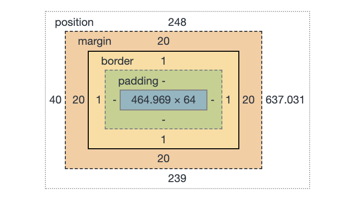
The box model visualizer in DevTools.

That's showing you the size and position of an element, as well as how that size is made up: content size, padding, margin, and border.

Those things aren't just theoretical to help with understanding and debugging. Elements actually have a content-box, padding-box, and border-box. Perhaps we encounter that most often when we literally set the box-sizing property. (It's tremendously useful to universally set it to border-box).

Those values are the same values as background-clip uses! Meaning that you can set a background to only cover those specific areas. And because multiple backgrounds is a thing, that means we can have multiple backgrounds with different clipping on each.

Like this:

See the Pen
Multiple background-clip
by Chris Coyier (@chriscoyier)
on CodePen.

But that's boring and there are many ways to pull off that effect, like using borders, outline, and box-shadow or any combination of them.

What is more interesting is the fact that those backgrounds could be gradients, and that's a lot harder to pull off any other way!

See the Pen
Nested Gradients
by Chris Coyier (@chriscoyier)
on CodePen.

The post Nested Gradients with background-clip appeared first on CSS-Tricks.

Gradient Borders in CSS

Let's say you need a gradient border around an element. My mind goes like this:

  • There is no simple obvious CSS API for this.
  • I'll just make a wrapper element with a linear-gradient background, then an inner element will block out most of that background, except a thin line of padding around it.

Perhaps like this:

See the Pen Gradient with Wrapper by Chris Coyier (@chriscoyier) on CodePen.

If you hate the idea of a wrapping element, you could use a pseudo-element, as long as a negative z-index value is OK (it wouldn't be if there was much nesting going on with parent elements with their own backgrounds).

Here's a Stephen Shaw example of that, tackling border-radius in the process:

See the Pen Gradient border + border-radius by Shaw (@shshaw) on CodePen.

You could even place individual sides as skinny pseudo-element rectangles if you didn't need all four sides.

But don't totally forget about border-image, perhaps the most obtuse CSS property of all time. You can use it to get gradient borders even on individual sides:

See the Pen Gradient Border on 2 sides with border-image by Chris Coyier (@chriscoyier) on CodePen.

Using both border-image and border-image-slice is probably the easiest possible syntax for a gradient border, it's just incompatible with border-radius, unfortunately.

See the Pen CSS Gradient Borders by Chris Coyier (@chriscoyier) on CodePen.

The post Gradient Borders in CSS appeared first on CSS-Tricks.