Qi Theme

Qi Theme 21

Qi Theme is a free WordPress theme created by Qode Interactive – an award-winning studio. This theme perfectly combines top speed and performance with a beautiful design.

It comes with 100 demos, allowing you to easily set up any type of website, whether it’s an online store, an artist’s portfolio, or a simple blog. If you can think it up, this theme will help you build it – it will even grant you free access to premium stock photos.

Qi Theme is fully supported by video tutorials as well as an extensive knowledge base, so you’ll always have a place to look for help.

How to Leverage the Fullscreen API… and Style It

Let’s look at the Fullscreen API in JavaScript. It allows you to do a pretty powerful thing: full screening exactly one particular element you want it to. Not only that, but CSS can help as well with a special selector.

Every major browser has built-in fullscreen functionality in the form of maximizing the browser window itself. You press F11 or ⌃⌘F (WinKey ⬆ on PC) and the browser will fill your monitor, going as far as removing UI components (like the window management buttons).

When you go into fullscreen mode, it maximizes the space for a web page to display, but this isn’t always exactly what you want. More often, you either want to fullscreen some particular element of the page, for example, a video or a game. This is where Fullscreen API comes in handy.

The Fullscreen API helps achieve something that the browser‘s fullscreen modes won’t be able to, like:

  • Fullscreen a specific element of the page and not the whole page.
  • Match elements in CSS with the :fullscreen pseudo-class, which checks if a particular element’s fullscreen flag is set.
  • Full control over when to enter fullscreen.

Let’s do it

First, decide what element needs to be shown in fullscreen mode. After that, the only thing is to check if that element has the requestFullscreen() method, and then call it on the element.

Let’s start with a simple <div> element to fullscreen:

<div id="fullscreen"></div>

First, we’ll select it and check if it has the method. If it does, then we call the requestFullscreen method on it. It’s that simple:

let fullscreen = document.querySelector("#fullscreen");

if (fullscreen.requestFullscreen) {
  fullscreen.requestFullscreen();
}

But, we want to run this code conditionally and not as soon as somebody lands on the page. We’ll make a button that toggles fullscreen mode.

<div id="fullscreen">
  <button id="button">Toggle Fullscreen</button>
</div>
let fullscreen = document.querySelector("#fullscreen");
let button = document.querySelector("#button");

button.addEventListener("click", () => {
  if (!document.fullscreenElement) {
    fullscreen?.requestFullscreen();
  } else {
    document.exitFullscreen();
  }
});

Notice how we’re using document.fullscreenElement. If there is an element that has been fullscreen before, then it will return it; if not, it will return null.

It’s also a good idea to check if fullscreen mode was even enabled in the user’s browser at all. For that, we can use document.fullscreenEnabled. It returns a boolean saying whether or not we can use the Fullscreen API in this particular browser. Fullscreen could be disabled by the user, or the browser might not support it.

The last method that we will cover is document.exitFullscreen(). A user should always have the ability to exit fullscreen mode by pressing ESC on the keyboard. We could do some sort of custom way to exit fullscreen mode using exitFullscreen. It doesn’t matter what element was fullscreen; it will go back to window mode after calling this method.

As you can see in the code for our button element, we first check if fullscreen has already been activated. Then, based on that information, we either go to fullscreen mode or we go back to window mode.

Styling fullscreen

The cool thing about the Fullscreen API is that we can match a fullscreen element in CSS. That’s exactly what the :fullscreen pseudo-selector is designed to do!

#fullscreen:fullscreen {
  background-color: yellow;
}

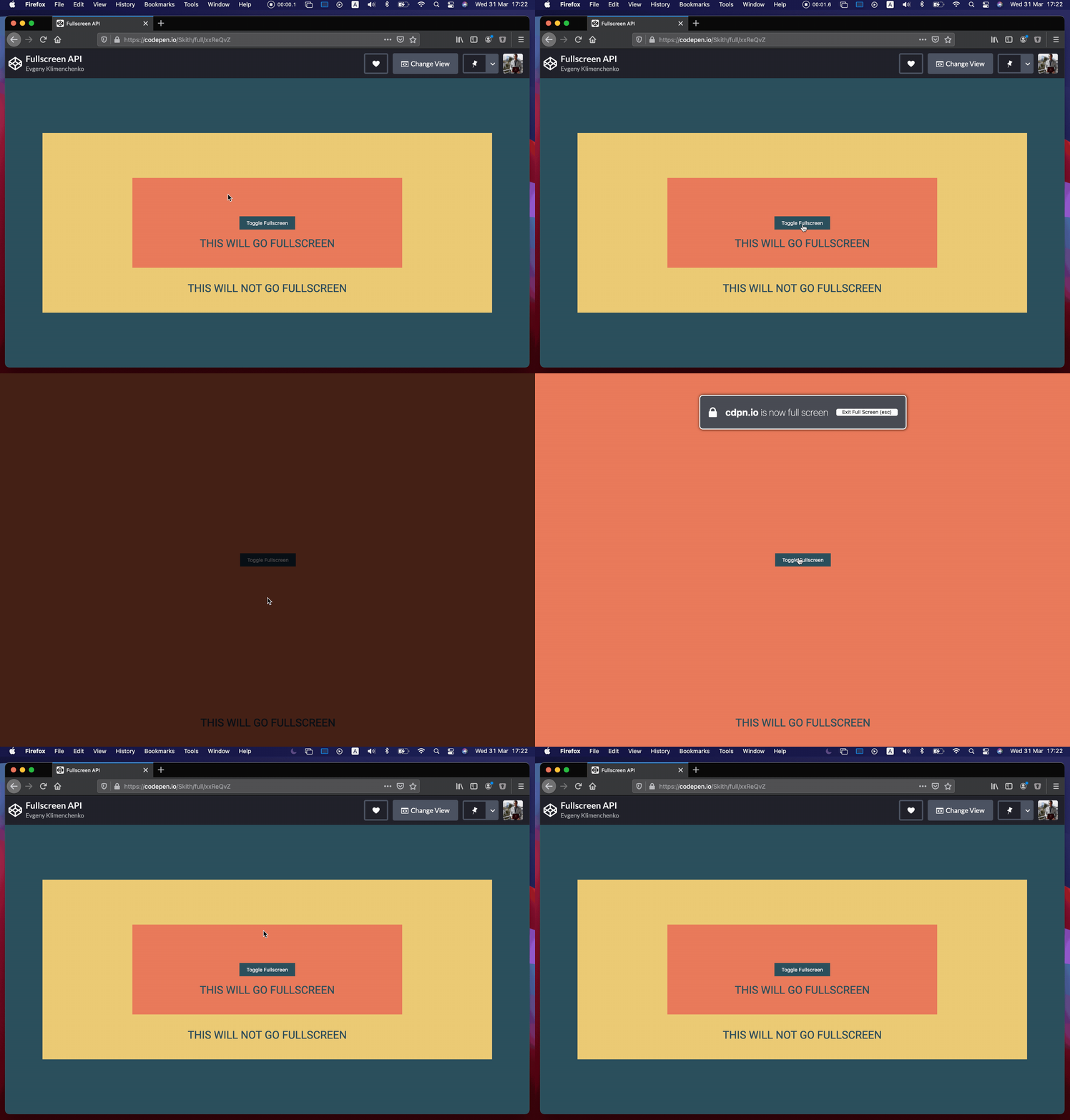
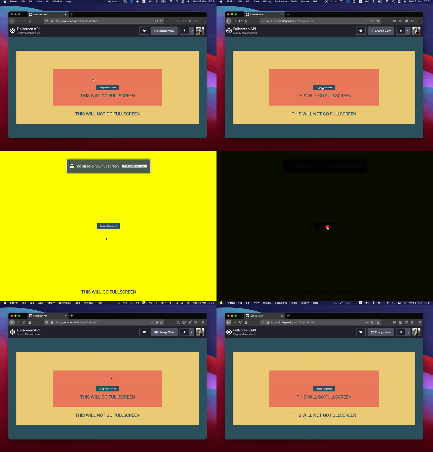
As you can see, the #fullscreen div is the only element that gets a yellow background color when the element is in fullscreen mode, and only in fullscreen mode. The catch is that we can’t actually select any element like this; we can only select the root element that’s in fullscreen mode. None of the child elements will match.

In other words, something like #button:fullscreen won’t select a button that is contained within the fullscreen element — that is, unless we want the button to be fullscreen instead of the div.

Some browsers require a prefix for this to work. Firefox uses -moz-full-screen and WebKit-based browsers use -webkit-full-screen.

#fullscreen:-webkit-full-screen {
  background-color: yellow;
}

#fullscreen:-moz-full-screen {
  background-color: yellow;
}

Did you know that when we’re in fullscreen mode that there is a pseudo-element that is rendered right below your fullscreen element? By default that pseudo-element is black. If you want to change the styles of that pseudo-element you can do it like this:

#fullscreen::backdrop {
  background-color: skyblue;
}

Here’s the final example. Keep in mind that fullscreen mode might not work with embedded Pens, so you will need to view it outside this article.


The post How to Leverage the Fullscreen API… and Style It appeared first on CSS-Tricks.

You can support CSS-Tricks by being an MVP Supporter.

Rapid Image Layers Animation

A while back, I came across this tweet by Twitter Marketing, which shows a video with a really nice intro animation. So I made a quick demo, trying to implement that effect. The idea is to animate some fullscreen images rapidly, like a sequence of covering layers. It’s a nice idea for an intro splash or even a page transition.

The way this can be achieved is by using the reveal trick described in the tutorial How to Create and Animate Rotated Overlays.

Basically, we have a parent wrap that is set to overflow hidden that we translate up (or down), while we translate its child in the opposite direction. It looks the same as if animating a clip-path that cuts off the image. (We could also do that, but clip-path is not a very performant thing to animate like transforms.)

When doing that animation on a set of layers, we get that really nice effect seen in the video.

For this demo, I created an initial (dummy) menu layout where you can click on the middle item to trigger the animation.

By setting a fitting animation duration and delay (I’m using GSAP here), the effect can be adjusted to look as smooth or as fast as needed. Have a look at the result:

The custom cursor animation can be found here: Animated Custom Cursor Effects

I really hope you find this little demo useful!

Credits

Rapid Image Layers Animation was written by Mary Lou and published on Codrops.

Official LEI Registrar

GetLEI is an official and verified Registration Agent (RA) by Global Legal Entity Identifier Foundation (GLEIF). We provide a complete list of services related to LEI issuing, such as New registration, Renewal of expiring codes and transfer. Search and Lookup available for all GetLEI website visitors.

The post Official LEI Registrar appeared first on WeLoveWP.

A Configurator for Creating Custom WebGL Distortion Effects

In one of our previous tutorials we showed you how to create thumbnail to fullscreen WebGL distortion animations. Today we would like to invite you to build your own personalized effects by using the configurator we’ve created.

We’ll briefly go over some main concepts so you can make full use of the configurator. If you’d like to understand the main idea behind the work, and why the animations behave the way they do in more depth, we highly recommend you to read the main tutorial Creating Grid-to-Fullscreen Animations with Three.js.

Basics of the configurator

The configurator allows you to modify all the details of the effect, making it possible to create unique animations. Even though you don’t have to be a programmer to create your own effect, understanding the options available will give you more insight into what you can achieve with it.

To see your personalized effect in action, either click on the image or drag the Progress bar. The Duration option sets the time of the whole animation.

Under Easings you can control the “rate of change” of your animation. For example:

  • Power1.easeOut: Start really fast but end slowly
  • Power1.easeInOut: Start and end slowly, but go really fast in the middle of the animation
  • Bounce: Bounce around like a basketball

The simplest easings to play around with are Power0-4 with ease-out. If you would like to know the difference between each easing, check out this ease visualizer.

Note that the configurator automatically saves your progress for later use. Feel free to close the page and come back to it later.

Timing, Activation and Transformation

Timing, Activation and Transformation are concepts that come from our previous tutorial. Each on of them has their own list of types, that also have their own set of options for you to explore.

You can explore them by changing the types, and expanding the respective options tab. When you swap one type for another, your previous set of options is saved in case you want to go back to it.

configurator

Timing

The timing function maps the activation into actual progress for each vertex. Without timing, the activation doesn’t get applied and all the vertices move at the same rate. Set timing type to none to see it in action.

  • SameEnd: The vertices have different start times, but they all end at the same time. Or vice versa.
  • sections: Move by sections, wait for the previous section to finish before starting.

The same activation with a different timing will result in a very different result.

Activation

The activation determines how the plane is going to move to full screen:

  • side: From left to right.
  • corners: From top-left to bottom-right
  • radial: From the position of the mouse
  • And others.

For a visual representation of the current activation, toggle debug activation and start the animation to see it in action.

Transformation

Transform the plane into a different shape or position over the course of the animation:

  • Flip: Flip the plane on the X axis
  • simplex: Move the vertices with noise over the while transitioning
  • wavy: Make the plane wavy while transitioning
  • And more

Some effects, use seed for their inner workings. You can set the initial seed and determine when this seed is going to be randomized.

Note that although these three concepts allow for a large amount of possible effects, some options won’t work quite well together.

Sharing your effect

To share the effect you can simply copy and share the URL.

We would love to see what you come up with. Please share your effect in the comments or tag us on Twitter using @anemolito and @codrops.

Adding your effect to your site

Now that you made your custom effect, it is time to add it to your site. Let’s see how to do that, step by step.

First, download the code and copy some of the required files over:

  • THREEjs: js/three.min.js
  • TweenLite: js/TweenLite.min.js
  • ImagesLoaded: js/imagesloaded.pkgd.min.js
  • For preloading the images
  • The effect’s code: js/GridToFullscreenEffect.js
  • TweenLite’s CSSPlugin: js/CSSPlugin.min.js (optional)
  • TweenLite’s EasePack:js/EasePack.min.js (optional; if you use the extra easings)

Include these in your HTML file and make sure to add js/GridToFullscreenEffect.js last.

Now let’s add the HTML structure for the effect to work. We need two elements:

  • div#App: Where our canvas is going to be
  • div#itemsWrapper: Where our HTML images are going to be
<body>
    <div id="app"></div>
    <div id="itemsWrapper"></div>    
</body>

Note: You can use any IDs or classes you want as long as you use them when instantiating the effect.

Inside #itemsWrapper we are going to have the HTML items for our effect.

Our HTML items inside #itemsWrapper can have almost any structure. The only requirement is that it has two image elements as the first two children of the item.

The first element is for the small-scale image and the second element is the large-scale image.

Aside from that, you can have any caption or description you may want to add at the bottom. Take a look at how we did ours in our previous post:

<div id="app"></div>
<div id="itemsWrapper">
    <figure class="grid__item">
        <img class="grid__item-img" src="img/1.jpg" alt="An image" />
        <img class="grid__item-img grid__item-img--large" src="img/1_large.jpg" />
        <figcaption class="grid__item-caption">
            <h2 class="grid__item-title">Our Item Title</h2>
            <p class="grid__item-text">
                Our Item Description
            </p>
        </figcaption>
    </figure>
    ...
</div>

You may add as many items as you want. If you add enough items to make your container scrollable. Make sure to send your container in the options, so the effect can account for its scroll.

With our HTML items in place, let’s get the effect up and running.

We’ll instantiate GridToFullscreenEffect, add our custom options, and initialize it.

<script>
  const transitionEffect = new GridToFullscreenEffect(
        document.getElementById("app"),
        document.getElementById("itemsWrapper"),
      {
          "duration":1.8,
          "timing":{"type":"sameEnd","props":{"latestStart":0.5,"reverse":true}},
          "activation":{"type":"snake","props":{"rows":4}},
          "transformation":{"type":"flipX"},
          "easings":{"toFullscreen":Quint.easeOut,"toGrid":Quint.easeOut}
      }
  );
  transitionEffect.init();
</script>

Our effect is now mounted and working. But clicking on an item makes the image disappear and we end up with a black square.

The effect doesn’t take care of loading the images. Instead, it requires you to give them to the effect whenever they load. This might seem a bit inconvenient, but it allows you to load your images the way it’s most suitable for your application.

You could preload all the images upfront, or you could only load the images that are on screen, and load the other ones when needed. It’s up to how you want to do that.

We decided to preload all the images using imagesLoaded like this:

imagesLoaded(document.querySelectorAll("img"), instance => {
    document.body.classList.remove("loading");

    // Make Images sets for creating the textures.
    let images = [];
    for (var i = 0, imageSet = {}; i < instance.elements.length; i++) {
        let image = {
            element: instance.elements[i],
            image: instance.images[i].isLoaded ? instance.images[i].img : null
        };
        if (i % 2 === 0) {
            imageSet = {};
            imageSet.small = image;
        }

        if (i % 2 === 1) {
            imageSet.large = image;
            images.push(imageSet);
        }
    }
    configurator.effect.createTextures(images);
});

With that last piece of code, our effect is running and it shows the correct images. If you are having troubles with adding it to your site, let us know!

Our Creations

While working on this configurator, we managed to create some interesting results of our own. Here are three examples. You can use the parameters and attach it to the URL or use the settings:

Preset 1

?duration=1.75&toFull=Cubic.easeInOut&toGrid=Cubic.easeInOut&timing=sections%2Csections%2C4&transformation=simplex&activation=side%2Ctop%2Ctrue%2Cbottom%2Ctrue
{"timing":{"type":"sections","props":{"sections":4}},"activation":{"type":"side","props":{"top":true,"bottom":true}},"transformation":{"type":"simplex"},"duration":1.75,"easings":{"toFullscreen":"Cubic.easeInOut","toGrid":"Cubic.easeInOut"}}

Preset 2

?duration=1.75&toFull=Cubic.easeInOut&toGrid=Cubic.easeInOut&timing=sections%2Csections%2C4&transformation=simplex&activation=side%2Ctop%2Ctrue%2Cbottom%2Ctrue
{"timing":{"type":"sections","props":{"sections":4}},"activation":{"type":"side","props":{"top":true,"bottom":true}},"transformation":{"type":"simplex"},"duration":1.75,"easings":{"toFullscreen":"Cubic.easeInOut","toGrid":"Cubic.easeInOut"}}

Preset 4

?duration=1.75&toFull=Cubic.easeInOut&toGrid=Cubic.easeInOut&timing=sections%2Csections%2C4&transformation=simplex&activation=side%2Ctop%2Ctrue%2Cbottom%2Ctrue
{"timing":{"type":"sections","props":{"sections":4}},"activation":{"type":"side","props":{"top":true,"bottom":true}},"transformation":{"type":"simplex"},"duration":1.75,"easings":{"toFullscreen":"Cubic.easeInOut","toGrid":"Cubic.easeInOut"}}

Check out all the demos to explore more presets!

We hope you enjoy the configurator and find it useful for creating some unique animations!

A Configurator for Creating Custom WebGL Distortion Effects was written by Daniel Velasquez and published on Codrops.

Golden Gate SEO

Golden Gate SEO is the premier SEO company. Our proven search engine marketing techniques have helped hundreds of clients transform their businesses to the next level. We offer unparalleled search engine optimization, paid and social media marketing services.

The post Golden Gate SEO appeared first on WeLoveWP.

Mauritz – The Burger Café

Mauritz is a burger cafe and restaurant with locations in 3 Danish cities – Odense, Svendborg & Middelfart. All our cafes are decorated with a focus on giving our guests a much-needed break in everyday life. At Café Mauritz there is room for everyone – we can be the meeting place for a quick cup of coffee, “the long-awaited reunion”, your important business meeting or next party.

Mauritz has a mission to deliver good food at reasonable prices, whether our customers enjoy the food in one of our cozy burger cafes, or our take away in their usual home setting. That’s why we at Mauritz go high in quality. The quality already starts with the staff employed in the cafes. The staff represents Mauritz, and so our staff is responsible, smiling, friendly and quality conscious.

Our website gives the customers an idea of our burger cafes, lets them book an event, or order take away from our e-commerce store.

The post Mauritz – The Burger Café appeared first on WeLoveWP.

HighMark SEO Digital

HighMark SEO Digital is a leading digital marketing agency with a focus on Search Engine Optimization (SEO), Facebook Marketing, and Google Ads (PPC). We work closely with businesses to drive targeted traffic with the goal of increasing their sales.

The post HighMark SEO Digital appeared first on WeLoveWP.

Ketamine Media

Ketamine Media was founded to help physicians raise awareness about the clinical use of Ketamine. Our agency works exclusively with infusion centers on a national level. Our mission is to help connect treatment providers with individuals searching for new treatment options to battle depression and other treatment resistant conditions.

The post Ketamine Media appeared first on WeLoveWP.

Grow With Studio

Grow With Studio is Design and Marketing agency focused solely on helping ecommerce stores grow sales. They’ve helped businesses increase their revenue on average by 90% in their first year with them!

The post Grow With Studio appeared first on WeLoveWP.

Themeisle

Themeisle is our main site for our WordPress themes, plugins, and blogging business. We recently rebuilt the site from scratch with Neve, Elementor, and Gutenberg. The site is a gateway to both a store page for theme/plugin purchases and a blog. It was important to balance our fun-loving approach with our business goals. We think we did it!

The post Themeisle appeared first on WeLoveWP.

RepairCarJobs

The website design and implementation of RepairCarJobs.com aims to connect Car Drivers & Local Automotive Service Providers in Singapore, in a simple and transparent way.

The post RepairCarJobs appeared first on WeLoveWP.

Studio 313

We have finally had the chance to finish off our new website after having to put it aside for what seems to have been forever.

This is our new WordPress studio portfolio website and we love it. Bright, informal with a little bit of animation

The post Studio 313 appeared first on WeLoveWP.

Creating Grid-to-Fullscreen Animations with Three.js

Animations play a big role in how users feels about your website. They convey a lot of the personality and feel of your site. They also help the user navigate new and already known screens with more ease.

In this tutorial we want to look at how to create some interesting grid-to-fullscreen animations on images. The idea is to have a grid of smaller images and when clicking on one, the image enlarges with a special animation to cover the whole screen. We’ll aim for making them accessible, unique and visually appealing. Additionally, we want to show you the steps for making your own.

The building blocks

Before we can start doing all sorts of crazy animations, timing calculations and reality deformation we need to get the basic setup of the effect ready:

  • Initialize Three.js and the plane we’ll use
  • Position and scale the plane so it is similar to the item’s image whenever the user clicks an item
  • Animate the plane so it covers the complete screen

For the sake of not going too crazy with all the effects we can make, we’ll focus on making a flip effect like the one in our first demo.

GridFullscreen_demo1

Initialization

To begin, lets make a basic Three.js setup and add a single 1×1 plane which we’ll re-use for the animation of every grid item. Since only one animation can happen at the time. We can have better performance by only using one plane for all animations.

This simple change is going to allow us to have any number of HTML items without affecting the performance of the animation.

As a side note, in our approach we decided to only use Three.js for the time of the animation. This means all the items are good old HTML.

This allows our code to have a natural fallback for browsers that don’t have WebGL support. And it also makes our effect more accessible.

class GridToFullscreenEffect {
	...
	init(){
		... 
		const segments = 128;
		var geometry = new THREE.PlaneBufferGeometry(1, 1, segments, segments);
		// We'll be using the shader material later on ;)
		var material = new THREE.ShaderMaterial({
		  side: THREE.DoubleSide
		});
		this.mesh = new THREE.Mesh(geometry, material);
		this.scene.add(this.mesh);
	}
}

Note: We are skipping over the Three.js initialization since it’s pretty basic.

Setting the the plane geometry’s size to be 1×1 simplifies things a little bit. It removes a some of the math involved with calculating the correct scale. Since 1 scaled by any number is always going to return that same number.

Positioning and resizing

Now, we’ll resize and position the plane to match the item’s image. To do this, we’ll need to get the item’s getBoundingClientRect. Then we need to transform its values from pixels to the camera’s view units. After, we need to transform them from relative to the top left, to relative from the center. Summarized:

  1. Map pixel units to camera’s view units
  2. Make the units relative to the center instead of the top left
  3. Make the position’s origin start on the plane’s center, not on the top left
  4. Scale and position the mesh using these new values
class GridToFullscreenEffect {
...
 onGridImageClick(ev,itemIndex){
	// getBoundingClientRect gives pixel units relative to the top left of the pge
	 const rect = ev.target.getBoundingClientRect();
	const viewSize = this.getViewSize();
	
	// 1. Transform pixel units to camera's view units
	const widthViewUnit = (rect.width * viewSize.width) / window.innerWidth;
	const heightViewUnit = (rect.height * viewSize.height) / window.innerHeight;
	let xViewUnit =
	  (rect.left * viewSize.width) / window.innerWidth;
	let yViewUnit =
	  (rect.top * viewSize.height) / window.innerHeight;
	
	// 2. Make units relative to center instead of the top left.
	xViewUnit = xViewUnit - viewSize.width / 2;
	yViewUnit = yViewUnit - viewSize.height / 2;
   

	// 3. Make the origin of the plane's position to be the center instead of top Left.
	let x = xViewUnit + widthViewUnit / 2;
	let y = -yViewUnit - heightViewUnit / 2;

	// 4. Scale and position mesh
	const mesh = this.mesh;
	// Since the geometry's size is 1. The scale is equivalent to the size.
	mesh.scale.x = widthViewUnit;
	mesh.scale.y = heightViewUnit;
	mesh.position.x = x;
	mesh.position.y = y;

	}
 }

As a side note, scaling the mesh instead of scaling the geometry is more performant. Scaling the geometry actually changes its internal data which is slow and expensive, while scaling the mesh happens at rendering. This decision will come into play later on, so keep it in mind.

Now, bind this function to each item’s onclick event. Then our plane resizes to match the item’s image.

It’s a very simple concept, yet quite performant in the long run. Now that our plane is ready to go when clicked, lets make it cover the screen.

Basic animation

First, lets initialize the few uniforms:

  • uProgress – Progress of the animation
  • uMeshScale – Scale of the mesh
  • uMeshPosition – Mesh’s position from the center
  • uViewSize – Size of the camera’s view

We’ll also create the base for our shaders.

class GridToFullscreenEffect {
	constructor(container, items){
		this.uniforms = {
		  uProgress: new THREE.Uniform(0),
		  uMeshScale: new THREE.Uniform(new THREE.Vector2(1, 1)),
		  uMeshPosition: new THREE.Uniform(new THREE.Vector2(0, 0)),
		  uViewSize: new THREE.Uniform(new THREE.Vector2(1, 1)),
		}
	}
	init(){
		... 
		const viewSize = this.getViewSize();
		this.uniforms.uViewSize.x = viewSize.width;
		this.uniforms.uViewSize.y = viewSize.height;
		var material = new THREE.ShaderMaterial({
			uniform: this.uniforms,
			vertexShader: vertexShader,
			fragmentShader: fragmentShader,
			side: THREE.DoubleSide
		});
		
		...
	}
	...
}
const vertexShader = `
	uniform float uProgress;
	uniform vec2 uMeshScale;
	uniform vec2 uMeshPosition;
	uniform vec2 uViewSize;

	void main(){
		vec3 pos = position.xyz;
		 gl_Position = projectionMatrix * modelViewMatrix * vec4(pos,1.);
	}
`;
const fragmentShader = `
	void main(){
		 gl_FragColor = vec4(vec3(0.2),1.);
	}
`;

We need to update uMeshScale and uMeshPositon uniforms whenever we click an item.

class GridToFullscreenEffect {
	...
	onGridImageClick(ev,itemIndex){
		...
		// Divide by scale because on the fragment shader we need values before the scale 
		this.uniforms.uMeshPosition.value.x = x / widthViewUnit;
		this.uniforms.uMeshPosition.value.y = y / heightViewUnit;

		this.uniforms.uMeshScale.value.x = widthViewUnit;
		this.uniforms.uMeshScale.value.y = heightViewUnit;
	}
}

Since we scaled the mesh and not the geometry, on the vertex shader our vertices still represent a 1×1 square in the center of the scene. But it ends up rendered in another position and with a different size because of the mesh. As a consequence of this optimization, we need to use “down-scaled” values in the vertex shaders. With that out of the way, lets make the effect happen in our vertex Shader:

  1. Calculate the scale needed to match the screen size using our mesh’s scale
  2. Move the vertices by their negative position so they move to the center
  3. Multiply those values by the progress of the effect
...
const vertexShader = `
	uniform float uProgress;
	uniform vec2 uPlaneSize;
	uniform vec2 uPlanePosition;
	uniform vec2 uViewSize;

	void main(){
		vec3 pos = position.xyz;
		
		// Scale to page view size/page size
		vec2 scaleToViewSize = uViewSize / uPlaneSize - 1.;
		vec2 scale = vec2(
		  1. + scaleToViewSize * uProgress
		);
		pos.xy *= scale;
		
		// Move towards center 
		pos.y += -uPlanePosition.y * uProgress;
		pos.x += -uPlanePosition.x * uProgress;
		
		
		 gl_Position = projectionMatrix * modelViewMatrix * vec4(pos,1.);
	}
`;

Now, when we click an item. We are going to:

  • set our canvas container on top of the items
  • make the HTML item invisible
  • tween uProgress between 0 and 1
class GridToFullscreenEffect {
	...
	constructor(container,items){
		...
		this.itemIndex = -1;
		this.animating = false;
		this.state = "grid";
	}
	toGrid(){
		if (this.state === 'grid' || this.isAnimating) return;
		this.animating = true;
		this.tween = TweenLite.to(
		  this.uniforms.uProgress,1.,
		  {
			value: 0,
			onUpdate: this.render.bind(this),
			onComplete: () => {
			  this.isAnimating = false;
			  this.state = "grid";
			this.container.style.zIndex = "0";
			}
		  }
		);
	}
	toFullscreen(){
	if (this.state === 'fullscreen' || this.isAnimating) return;
		this.animating = true;
		this.container.style.zIndex = "2";
		this.tween = TweenLite.to(
		  this.uniforms.uProgress,1.,
		  {
			value: 1,
			onUpdate: this.render.bind(this),
			onComplete: () => {
			  this.isAnimating = false;
			  this.state = "fullscreen";
			}
		  }
		);
	}

	onGridImageClick(ev,itemIndex){
		...
		this.itemIndex = itemIndex;
		this.toFullscreen();
	}
}

We start the tween whenever we click an item. And there you go, our plane goes back and forth no matter which item we choose.

Pretty good, but not too impressive yet.

Now that we have the basic building blocks done, we can start making the cool stuff. For starters, lets go ahead and add timing.

Activation and timing

Scaling the whole plane is a little bit boring. So, lets give it some more flavor by making it scale with different patterns: Top-to-bottom, left-to-right, topLeft-to-bottomRight.

Lets take a look at how those effects behave and figure out what we need to do:

Grid Effects

By observing the effects for a minute, we can notice that the effect is all about timing. Some parts of the plane start later than others.

What we are going to do is to create an “activation” of the effect. We’ll use that activation to determine which vertices are going to start later than others.

Effects with activations

And lets see how that looks like in code:

...
const vertexShader = `
	...
	void main(){
		vec3 pos = position.xyz;
		
		// Activation for left-to-right
		float activation = uv.x;
		
		float latestStart = 0.5;
		float startAt = activation * latestStart;
		float vertexProgress = smoothstep(startAt,1.,uProgress);
	   
		...
	}
`;

We’ll replace uProgress with vertexprogres for any calculations in the vertex shader.

...
const vertexShader = `
	...
	void main(){
		...
		float vertexProgress = smoothstep(startAt,1.,uProgress);
		
		vec2 scaleToViewSize = uViewSize / uMeshScale - 1.;
		vec2 scale = vec2(
		  1. + scaleToViewSize * vertexProgress
		);
		pos.xy *= scale;
		
		// Move towards center 
		pos.y += -uMeshPosition.y * vertexProgress;
		pos.x += -uMeshPosition.x * vertexProgress;
		...
	}
`;

With this little change, our animation is not much more interesting.

Note that the gradients on the demo are there for demonstration purposes. They have nothing to do with the effect itself.

The great thing about these “activation” and “timing” concepts is that they are interchangeable implementations. This allows us to create a ton of variations.

With the activation and timing in place, lets make it more interesting with transformations.

Transformations

If you haven’t noticed, we already know how to make a transformation. We successfully scaled and moved the plane forwards and backwards.

We interpolate or move from one state to another using vertexProgress. Just like we are doing in the scale and movement:

...
const vertexShader = `
	...
	void main(){
	...
		// Base state = 1.
		// Target state = uScaleToViewSize;
		// Interpolation value: vertexProgress
		scale = vec2(
		  1. + uScaleToViewSize * vertexProgress
		);

		// Base state = pos
		// Target state = -uPlaneCenter;
		// Interpolation value: vertexProgress
		pos.y += -uPlaneCenter.y * vertexProgress;
		pos.x += -uPlaneCenter.x * vertexProgress;
	...
	}
`

Lets apply this same idea to make a flip transformation:

  • Base state: the vertex’s current position
  • Target state: The vertex flipped position
  • Interpolate with: the vertex progress
...
const vertexShader = `
	...
	void main(){
		...
		float vertexProgress = smoothstep(startAt,1.,uProgress);
		// Base state: pos.x
		// Target state: flippedX
		// Interpolation with: vertexProgress 
		float flippedX = -pos.x;
		pos.x = mix(pos.x,flippedX, vertexProgress);
		// Put vertices that are closer to its target in front. 
		pos.z += vertexProgress;
		...
	}
`;

Note that, because this flip sometimes puts vertices on top of each other we need to bring some of them slightly to the front to make it look correctly.

Combining these flips with different activations, these are some of the variations we came up with:

If you pay close attention to the flip you’ll notice it also flips the color/image backwards. To fix this issue we have to flip the UVs along with the position.

And there we have it! We’ve not only created an interesting and exciting flip effect, but also made sure that using this structure we can discover all kinds of effects by changing one or more of the pieces.

In fact, we created the effects seen in our demos using the configurations as part of our creative process.

There is so much more to explore! And we would love to see what you can come up with.

Here are the most interesting variations we came up with:

Different timing creation:

GridFullscreen_demo2

Activation based on mouse position, and deformation with noise:

GridFullscreen_demo4

Distance deformation and mouse position activation:

GridFullscreen_demo5

We hope you enjoyed this tutorial and find it helpful!

GitHub link coming soon!

Creating Grid-to-Fullscreen Animations with Three.js was written by Daniel Velasquez and published on Codrops.

Wesley College

Founded in 1923, Wesley College is a day and boarding school in Perth, Western Australia, offering exceptional campus facilities and unique student & community programs.

The post Wesley College appeared first on WeLoveWP.

Golden Pipeline Heritage Trail

The Golden Pipeline Heritage Trail is a historical drive trail through the heart of Western Australia, following the Goldfields Water Supply Scheme from Mundaring to Kalgoorlie. Custodians, National Trust WA, wanted a website to inspire more interest in the trail, driving appreciation and encouraging new visitors.

The post Golden Pipeline Heritage Trail appeared first on WeLoveWP.