MXReflection is a Java math framework based on mXparser library capabilities.
You can calculate complex mathematical operations and functions with Java, just by using class-related fields. MXReflection reads values from the assigned fields and injects the results in the @Expression annotated fields.
With the introduction of Spring, developing services in Java became easier and more productive. More specifically, REST APIs have improved, and the years since Spring's introduction have only added to the new frameworks that have emerged in the community.
Micronaut is one of the most known frameworks—developed by OCI, the company also responsible for Grails. Their goal is to assist developers to create serverless applications and microservices.
In this tutorial we will create an asynchronous servlet that adds contacts to a list, parses requests and processes form validation with the help of ActiveJ framework. You can find the source code of this tutorial on GitHub.
Around eight months ago, I started building a framework which would eventually go on to become Halfmoon. I made a post on this very website announcing the launch of the very first version. Halfmoon has been billed as a Bootstrap alternative with a built-in dark mode feature, that is especially good when it comes to building dashboards and tools. All of this still applies to the framework.
However, today I would like to talk about an area of the framework that is a bit understated. I believe our industry as a whole seriously underestimates the value of customization and user personalization, i.e. users being able to set their own design preferences. Chris has written before about knowing who a design system is made for, pointing out a spectrum of flexibility depending on who a system is meant to help.
But it’s more than design systems. Let’s talk about how Halfmoon addresses these issues because they’re important considerations for knowing which framework works best for your specific needs.
Dashboard built using Halfmoon
Who is Halfmoon for?
Before diving in, let’s address an important question: Is Halfmoon the right framework for you? Here’s a list of questions to help you answer that:
Are you building a dashboard, tool, or even a documentation website? Halfmoon has many unique components and features that are specific to these use cases.
Are you familiar with Bootstrap’s class names, but wish that the design was a bit more premium-looking?
Does your users want or expect a dark mode on your website?
Do you dislike dependencies? Halfmoon does not use jQuery, and also has no build process involving CSS preprocessors. Everything is pure, vanilla CSS and JavaScript.
Are you tired of dealing with complex build systems and front-end tooling? This ties in to the previous point. Personally, I find it difficult to deal with front-end tooling and build processes. As mentioned above, Halfmoon has no build process, so you just pull in the files (local, CDN, or npm), and start building.
If you answered yes to any (or all) of these questions, you should probably give Halfmoon a try. It is important to note however, that Halfmoon is not a UI component library for React/Vue/Angular, so you shouldn’t go into it expecting that. Moreover, if you are more fond of purely utility driven development, then Tailwind CSS is a better option for you. When it comes to CSS utilities, Halfmoon takes a middle of the road approach – there are utilities plus semantic classes for common components.
Using CSS custom properties
First, let’s get the easy stuff out of the way. CSS custom properties are incredible, and I expect them to completely replace preprocessor variables in the future. Browser support is already at a solid ~96%, and with Internet Explorer being phased out by Microsoft, they are expected to become a standard feature.
Halfmoon is built entirely using CSS variables because they provide a huge degree of customization. Now, you might immediately think that all this means is that there are a few custom properties for colors sprinkled in there, but it’s more than that. In fact, there are over 1,500 global variables in Halfmoon. Almost everything can be customized by overriding a property. Here’s a nifty example from the docs:
Swapping out a few custom property values opens up a ton of possibilities in Halfmoon, whether it’s theming things for a brand, or tweaking the UI to get just the right look.
That’s what we’re talking about here when it comes to customization: does the system still stand up and work well if the person using it overrides anything. I have written extensively about this (and much more) in the official Halfmoon docs page.
Variables aren’t a new concept to frameworks. Many frameworks actually use Sass or Less variables and have done so for quite a while. That’s still a good and effective way to establish a customizable experience. But at the same time, those will lock into a preprocessor (which, again, doesn’t have to be a bad thing). By relying instead on CSS custom properties — and variable-izing all the things — we are relying on native CSS, and that doesn’t require any sort of build dependency. So, not only can custom properties make it easier to customize a framework, but they are much more flexible in terms of the tech stack being used.
There is a balance to be had. I know I suggested creating variables for everything, but it can be equally tough to manage and maintain scores and scores of variables (just like anything else in the codebase). So, lean heavily on variables to make a framework or design system more flexible, but also be mindful of how much flexibility you need to provide and whether adding another variable is part of that scope.
Deciding what components to include
When it comes to building a CSS framework, deciding what components to include is a big part of that ordeal. Of course, for a developer working on a passion project, you want to include everything. But that is simply not feasible, so a few decisions were made on my part.
As of right now, Halfmoon has most of the components you can find in similar frameworks such as Bootstrap or Bulma. These frameworks are great and widely used, so they are a good frame of reference. However, as I have mentioned already, a unique thing about Halfmoon is the focus on building tools and dashboards on the web. This niche, if you could call it that, has led me to build some unique components and features:
5 different types of sidebars, with built-in toggle and overlay handlers. Sidebars are very important for most dashboards and tools (and a pain to get right), so this was a no brainer.
2 different types of navbars. There is one that sticks to the bottom of the page, which can be used to great effect for action buttons. Think about the actions that pop up when you select items on data-table. You could place those action buttons here.
Omni-directional dropdowns (with 12 different placements, 3 for each direction).
Beautiful form components.
Built-in keyboard shortcut system, with an easy way to declare new ones for your tool.
Tons of utilities. Of course, this is not comparable to Tailwind CSS, but Halfmoon has enough responsive utility classes to handle a lot of use cases right out of the box.
Moreover, the built-in dark mode, huge customizability, and the standard look and feel to the components, should all work together to make Halfmoon a great tool for building web tools and dashboards. And I am hopefully nowhere close to being done! The next updates will bring in a form validator (demo video), more form components, multi-select component, date and time picker, data-table component, etc.
So what is exactly missing from Halfmoon? Well the most obvious ones are tabs, list group, and spinners. But all of these are planned to be added in v1.2.0, which is the next update. There are also other missing components such as carousels, tree navigation, avatars, etc, which are slightly out of scope.
Providing user preferences
Giving end users the ability to set their preferences is often overlooked by frameworks. Things like setting the font size of an article, or whether to use a dark or light theme. In some ways, it’s sort of funny, because the web is catching up to what operating systems have allowed users to do for decades.
Here are some examples of user personalization on the web:
Being able to select your preferred color mode. And, even better, the website automatically saves and respects your preference when the page is loaded. Or better yet, looking at your operating system preferences and automatically accommodating them.
Setting the default size of elements. Especially font size. A small font might look good in a design, but allowing users to set their ideal font size makes the content actually readable. Technically, every modern browser has an option to zoom into content, but that is often unwieldy, and does not actually save your settings.
Setting the compactness of elements. For example, some people prefer large padding with rounded corners, while others find it a waste of space, instead preferring a tighter UI. Sort of like how Gmail lets you decide whether you want a lot of breathing room in your inbox or make it as small and tight as possible to see more content.
Setting the primary color on the website. While this is entirely cosmetic, it is still charming to be able to set your favorite color on every button and link on a website.
Enabling a high contrast mode. Someone pointed this out to me on GitHub. Apparently, many (and I mean many) CSS frameworks often fail the minimum contrast recommended between foreground and background colors on common elements, such as buttons. That list includes Halfmoon. This is often a tradeoff, because overly contrastive elements often look worse (purely in terms of aesthetic). User personalization can allow you to turn on a high contrast mode, if you have difficulty with the default contrast.
Allowing for user personalizations can be really difficult to pull off — especially for a framework — because that would could mean swapping out huge parts of CSS to accommodate the different personalization settings and combinations. However, with a framework like Halfmoon (i.e. built entirely using CSS variables), this becomes trivial as CSS variables can be set and changed on run-time using JavaScript, like so:
// Get the <html> tag (for reading and setting variables in global scope)
var myElement = document.documentElement;

// Read CSS variable
getComputedStyle(myElement).getPropertyValue("--variable-name");

// Set CSS variable
myElement.style.setProperty("--variable-name", "value");
Therefore, user personalization can be implemented using Halfmoon in the following way:
The user sets a preference. That basically means a variable value gets changed. The variable is set with JavaScript (as shown above), and the new value is stored in a cookie or local storage.
When the user comes back to the website, their preferences are retrieved and set using JavaScript (again, as shown above) once the page is loaded.
Here are visual examples to really hammer the point home.
Setting and saving the default font size
In the example above, whenever the range slider is changed, the variable --base-font-size is updated to the slider’s value. This is great for people who prefer larger text. As explained in the previous section, this new value can be saved in a cookie or local storage, and the next time the user visits the website, the user preference can be set on page load.
Setting the compactness of content
Because there are CSS custom properties used as utilities, like spacing and borders, we can remove or override them easily to create a more compact or expanded component layout.
Only two variables are updated in this example to go from an expanded view to a compact one:
--content-and-card-spacing changed from 3rem (30px) to 2rem (20px).
--card-border-radius changed from 0.4rem (4px) to 0.2rem (2px).
For a real life scenario, you could have a dropdown that asks the user whether they prefer their content to be Default or Compact, and choosing one would obviously set the above CSS variables to theme the site. Once again, this could be saved and set on page load when the user visits the website on their next session.
Wait, but why?
Even with all the examples I have shown so far, you may still be asking why is this actually necessary. The answer is really simple: one size does not fit all. In my estimate, around half of the population prefers a dark UI, while the other half prefers light. Similarly, people have wild variations about the things they like when it comes to design. User personalization is a form of improving the UX, because it lets the user choose what they prefer. This may not be so important on a landing page, but when it comes to a tool or dashboard (that one has to use for a long time to get something done), having a UI that can be personalized is a boon to productivity. And knowing that is what Halfmoon is designed to do makes it ideal for these types of use cases.
Moreover, you know how people often complain that websites made with a certain framework (eg Bootstrap) all look the same? This is a step toward making sure that websites built with Halfmoon will always look distinct, so that the focus is on the website and content itself, and not on the framework that was used to build it.
Again, I am not saying that everything should be allowed to be personalized. But knowing who the framework is for and what it is designed to do helps make it clear what should be personalized.
Looking ahead
I strongly feel that flexibility for customization and accounting for user preferences are often overlooked on the web, especially in the framework landscape. That’s what I’m trying to address with Halfmoon.
In the future, I want to make it a lot easier for developers to implement user preferences, and also promote diversity of design with new templates and themes. That said, here are some things on the horizon for Halfmoon:
I recently launched the first production version of Halfmoon, a front-end framework that I have been building for the last few months. This is a short introductory post about what the framework is, and why I decided to build it.
The elevator pitch
Halfmoon is a front-end framework with a few interesting things going for it:
Dark mode built right in: Creating a dark mode version of a site is baked in and a snap.
Modular components: A lot of consideration has gone into making modular components — such as forms, navbars, sidebars, dropdowns, toasts, shortcuts, etc. — that can be used anywhere to make layouts, even complex ones like dashboards.
JavaScript is optional: Many of the components found in Halfmoon are built to work without JavaScript. However, the framework still comes with a powerful JavaScript library with no extra dependencies.
All the CSS classes you need: The class names should be instantly familiar to anyone who has used Bootstrap because that was the inspiration.
Cross-browser compatibility: Halfmoon fully supports nearly every browser under the sun, including really old ones like Internet Explorer 11.
Easily customizable: Halfmoon uses custom CSS properties for things like colors and layouts, making it extremely easy to customize things to your liking, even without a CSS preprocessor.
In many ways, you can think of Halfmoon as Bootstrap with an integrated dark mode implementation. It uses a lot of Bootstrap’s components with slightly altered markup in many cases.
OK, great, but why this framework?
Whenever a new framework is introduced, the same question is inevitably pops up: Why did you actually build this? The answer is that I freaking love dark modes and themes. Tools that come with both a light and a dark mode (along with a toggle switch) are my favorite because I feel that being able to change a theme on a whim makes me less likely to get bored looking at it for hours. I sometimes read in dim lighting conditions (pray for my eyes), and dark modes are significantly more comfortable in that type of situation.
Anyway, a few months ago, I wanted to build a simple tool for myself that makes dark mode implementation easy for a dashboard project I was working on. After doing some research, I concluded that I had only two viable options: either pickup a JavaScript-based component library for a front-end framework — like Vuetify for Vue — or shell out some cash for a premium dark theme for Bootstrap (and I did not like the look of the free ones). I did not want to use a component library because I like building simple server-rendered websites using Django. That’s just my cup of tea. Therefore, I built what I needed: a free, good-looking front-end framework that’s along the same lines as Bootstrap, but includes equally good-looking light and dark themes out of the box.
Future plans
I just wanted to share Halfmoon with you to let you know that it exists and is freely available if you happen to be looking for an extensible framework in the same vein as Bootstrap that prioritizes dark mode in the implementation.
And, as you might imagine, I’m still working on Halfmoon. In fact I have plenty of enhancements in mind:
More components
More customization options (using CSS variables)
More examples and templates
Better tooling
Improved accessibility examples in the docs
Vanilla JavaScript implementations of useful components, such as custom multi-select (think Select2, only without jQuery), data tables and form validators, among other things.
In short, the plan is to build a framework that is really useful when it comes to building complex dashboards, but is still great for building any website. The documentation for the framework can be found on the project’s website. The code is all open-source and licensed under MIT. You can also follow the project on GitHub. I’d love for you to check it out, leave feedback, open issues, or even contribute to it.
Quarkus is, in its own words, a cloud-native, (Linux) container-first framework for writing Java applications. It has become popular lately because of the amazingly fast boot time, incredibly low RSS memory. In this series of articles about Quarkus, we'll discuss how to deploy a Quarkus application even faster to the cloud with Platform.sh.
The first step is to create the application itself, and Quarkus has proper documentation. You have either a Maven Archetype or the start code link where you can define the dependencies that you need to write your application.
We have big JavaScript frameworks that tons of people already use and like, including React, Vue, Angular, and Svelte. Do we need another JavaScript library? Let’s take a look at Alpine.js and you can decide for yourself. Alpine.js is for developers who aren’t looking to build a single page application (SPA). It’s lightweight (~7kB gzipped) and designed to write markup-driven client-side JavaScript.
The syntax is borrowed from Vue and Angular directive. That means it will feel familiar if you’ve worked with those before. But, again, Alpine.js is not designed to build SPAs, but rather enhance your templates with a little bit of JavaScript.
For example, here’s an Alpine.js demo of an interactive “alert” component.
The alert message is two-way bound to the input using x-model="msg". The “level” of the alert message is set using a reactive level property. The alert displays when when both msg and level have a value.
It’s like a replacement for jQuery and JavaScript, but with declarative rendering
Alpine.js is a Vue template-flavored replacement for jQuery and vanilla JavaScript rather than a React/Vue/Svelte/WhateverFramework competitor.
Since Alpine.js is less than a year old, it can make assumptions about DOM APIs that jQuery cannot. Let’s briefly draw a comparison between the two.
Querying vs. binding
The bulk of jQuery’s size and features comes in the shape of a cross-browser compatibility layer over imperative DOM APIs — this is usually referred to as jQuery Core and sports features that can query the DOM and manipulate it.
The Alpine.js answer to jQuery core is a declarative way to bind data to the DOM using the x-bind attribute binding directive. It can be used to bind any attribute to reactive data on the Alpine.js component. Alpine.js, like its declarative view library contemporaries (React, Vue), provides x-ref as an escape hatch to directly access DOM elements from JavaScript component code when binding is not sufficient (eg. when integrating a third-party library that needs to be passed a DOM Node).
One of jQuery’s key features is its effects, or rather, it’s ability to write easy animations. Where we might use slideUp, slideDown, fadeIn, fadeOut properties in jQuery to create effects, Alpine.js provides a set of x-transition directives, which add and remove classes throughout the element’s transition. That’s largely inspired by the Vue Transition API.
Also, jQuery’s Ajax client has no prescriptive solution in Alpine.js, thanks to the Fetch API or taking advantage of a third party HTTP library (e.g. axios, ky, superagent).
Plugins
It’s also worth calling out jQuery plugins. There is no comparison to that (yet) in the Alpine.js ecosystem. Sharing Alpine.js components is relatively simple, usually requiring a simple case of copy and paste. The JavaScript in Alpine.js components are “just functions” and tend not to access Alpine.js itself, making them relatively straightforward to share by including them on different pages with a script tag. Any magic properties are added when Alpine initializes or is passed into bindings, like $event in x-on bindings.
There are currently no examples of Alpine.js extensions, although there are a few issues and pull requests to add “core” events that hook into Alpine.js from other libraries. There are also discussions happening about the ability to add custom directives. The stance from Alpine.js creator Caleb Porzio, seems to be basing API decisions on the Vue APIs, so I would expect that any future extension point would be inspired on what Vue.js provides.
Size
Alpine.js is lighter weight than jQuery, coming in at 21.9kB minified — 7.1kB gzipped — compared to jQuery at 87.6kB minified — 30.4kB minified and gzipped. Only 23% the size!
Most of that is likely due to the way Alpine.js focuses on providing a declarative API for the DOM (e.g. attribute binding, event listeners and transitions).
For the sake of comparison, Vue comes in at 63.5kB minified (22.8kB gzipped). How can Alpine.js come in lighter despite it’s API being equivalent Vue? Alpine.js does not implement a Virtual DOM. Instead, it directly mutates the DOM while exposing the same declarative API as Vue.
Let’s look at an example
Alpine is compact because since application code is declarative in nature, and is declared via templates. For example, here’s a Pokemon search page using Alpine.js:
This example shows how a component is set up using x-data and a function that returns the initial component data, methods, and x-init to run that function on load.
Bindings and event listeners in Alpine.js with a syntax that’s strikingly similar to Vue templates.
Alpine:x-bind:attribute="express" and x-on:eventName="expression", shorthand is :attribute="expression" and @eventName="expression" respectively
Vue:v-bind:attribute="express" and v-on:eventName="expression", shorthand is :attribute="expression" and @eventName="expression" respectively
Rendering lists is achieved with x-for on a template element and conditional rendering with x-if on a template element.
Notice that Alpine.js doesn’t provide a full templating language, so there’s no interpolation syntax (e.g. {{ myValue }} in Vue.js, Handlebars and AngularJS). Instead, binding dynamic content is done with the x-text and x-html directives (which map directly to underlying calls to Node.innerText and Node.innerHTML).
An equivalent example using jQuery is an exercise you’re welcome to take on, but the classic style includes several steps:
Imperatively bind to the button click using $('button').click(/* callback */).
Within this “click callback” get the input value from the DOM, then use it to call the API.
Once the call has completed, the DOM is updated with new nodes generated from the API response.
If you’re interested in a side by side comparison of the same code in jQuery and Alpine.js, Alex Justesen created the same character counter in jQuery and in Alpine.js.
Back in vogue: HTML-centric tools
Alpine.js takes inspiration from TailwindCSS. The Alpine.js introduction on the repository is as “Tailwind for JavaScript.”
Why is that important?
One of Tailwind’s selling points is that it “provides low-level utility classes that let you build completely custom designs without ever leaving your HTML.” That’s exactly what Alpine does. It works inside HTML so there is no need to work inside of JavaScript templates the way we would in Vue or React Many of the Alpine examples cited in the community don’t even use script tags at all!
Let’s look at one more example to drive the difference home. Here’s is an accessible navigation menu in Alpine.js that uses no script tags whatsoever.
This example leverages aria-labelledby and aria-controls outside of Alpine.js (with id references). Alpine.js makes sure the “toggle” element (which is a button), has an aria-expanded attribute that’s true when the navigation is expanded, and false when it’s collapsed. This aria-expanded binding is also applied to the menu itself and we show/hide the list of links in it by binding to hidden.
Being markup-centric means that Alpine.js and TailwindCSS examples are easy to share. All it takes is a copy-paste into HTML that is also running Alpine.js/TailwindCSS. No crazy directories full of templates that compile and render into HTML!
Since HTML is a fundamental building block of the web, it means that Alpine.js is ideal for augmenting server-rendered (Laravel, Rails, Django) or static sites (Hugo, Hexo, Jekyll). Integrating data with this sort of tooling can be a simple as outputting some JSON into the x-data="{}" binding. The affordance of passing some JSON from your backend/static site template straight into the Alpine.js component avoids building “yet another API endpoint” that simply serves a snippet of data required by a JavaScript widget.
Client-side without the build step
Alpine.js is designed to be used as a direct script include from a public CDN. Its developer experience is tailored for that. That’s why it makes for a great jQuery comparison and replacement: it’s dropped in and eliminates a build step.
While it’s not traditionally used this way, the bundled version of Vue can be linked up directly. Sarah Drasner has an excellent write-up showing examples of jQuery substituted with Vue. However, if you use Vue without a build step, you’re actively opting out of:
the Vue CLI
single file components
smaller/more optimized bundles
a strict CSP (Content Security Policy) since Vue inline templates evaluate expressions client-side
So, yes, while Vue boasts a buildless implementation, its developer experience is really depedent on the Vue CLI. That could be said about Create React App for React, and the Angular CLI. Going build-less strips those frameworks of their best qualities.
There you have it! Alpine.js is a modern, CDN-first library that brings declarative rendering for a small payload — all without the build step and templates that other frameworks require. The result is an HTML-centric approach that not only resembles a modern-day jQuery but is a great substitute for it as well.
If you’re looking for a jQuery replacement that’s not going to force you into a SPAs architecture, then give Alpine.js a go! Interested? You can find out more on Alpine.js Weekly, a free weekly roundup of Alpine.js news and articles.
The need for test automation framework has brewed up in the minds of many software testers. Stakeholders now understand that implementing an automation framework is one of the key factors in the success of software automation projects. From improved test efficiency to minimal manual intervention, the benefits of test automation frameworks are many.
Let us take a deep dive into what exactly is a test automation framework, how do automation scripts work and how test automation frameworks provide you a competitive edge in the testing process.
Last week an idea stuck my mind to explore the frameworks available in the NodeJS ecosystem to develop backend APIs. I had been using ExpressJS for a long time, and I thought it was about time to see what alternative frameworks were like.
I started listing down all the features that I wanted in a good NodeJS framework:
For the last six years, Vue, Angular, and React have run the world of front-end component frameworks. Google and Facebook have their own sponsored frameworks, but they might leave a bitter taste for anyone who advocates for an open and unbiased web. Vue is another popular framework that has multiple sponsors, but isn’t run by a single corporation, which may be attractive to some folks.
There’s another player in the framework space that’s gaining attention and operates very much in the same spirit as Vue as far adopting an open MIT license: Svelte.
Svelte has been covered here on CSS-Tricks before, like Ollie Williams’ excellent overview of how it can be used to write more convenient, component-based CSS. This article is going to zoom out a bit and provide a little more context about Svelt, as well as how it differentiates itself from other frameworks, and how to implement it in your own projects.
What makes Svelte different?
I can confidently say that Svelte has been the easiest JavaScript component library to learn and start putting to use in a productive way.
OK, so Svelte is a JavaScript component library. But so is React. And Angular. And Vue. What makes Svelte stand out from the bunch?
Svelte is trying to do a few things that are different from the rest:
All the code is compiled ahead of time.
There is no virtual DOM.
CSS scoping is baked in.
Let’s break those down a bit because they significantly distinguish Svelte from other front-end frameworks.
All the code is compiled ahead of time.
Svelte is a compiler, meaning that the code in Svelte files gets converted from an easier-to-write hybrid language that mixes HTML, JavaScript, and CSS into lower-level optimized JavaScript, HTML, and CSS files.
This is very similar to the way C# gets compiled down to bytecode, or how Typescript compiles down to JavaScript. But where traditional compilers tend to go down to one language, Svelte mixes all three.
This makes writing code a lot more flexible, and benefits the client (web browser) as the computation is done when the application is built, not on every browser when the web app is visited.
There is no Virtual DOM.
A DOM (or Document Object Model) is an interface that defines the logical structure of a webpage. It takes HTML and converts it to a structure that can be manipulated and accessed. Chris has a classic post that thoroughly explains it.
The Virtual DOM extends the concept of a DOM by creating a “second” DOM in memory. Like the DOM, this is manipulated and accessed by traditional frameworks (e.g. Angular, Vue, and React). At build, this second “virtual” DOM gets consolidated with the actual DOM, allowing the UI to render.
And what about the Shadow DOM? Well, the Shadow DOM is technically part of the “real” DOM, just in the shadows. As such it is a great tool for isolating chunks of code that don’t leak into or conflict with other elements on the page — a little bit like (but at the same time almost nothing like) an iframe. The shadow DOM is sorta the crux for most component-based front-end frameworks because they leverage the siloed nature of the Shadow DOM to serve specific code to specific elements.
While that isn’t exactly a key selling point of Svelte, it is possible to work with the Shadow DOM experimentally. The Shadow DOM hasn’t really quite caught on in progressive web practices, which is a shame, and probably due to the confusion between drafts and lack of support from IE and Edge.
So, where am I going with all this? The difference between Svelte and other JavaScript frameworks is the lack of a Virtual DOM. That’s important because it contributes to faster apps — faster than frameworks using a Virtual DOM. Yes, the Virtual DOM can be super fast because it only updates parts of the DOM when needed, but as applications grow, the impact of a duplicate DOM stored in memory can have an overall negative impact on performance.
Svelte takes a different approach and does a lot of these heavy calculations at build time. All that heavy lifting in advance, which allows Svelte to surgically insert changes only where needed.
CSS scoping is baked in.
Svelte has built-in styling, which is essential in other modern frameworks. The different between CSS in Svelte and CSS in other frameworks is that Svelte takes the CSS from each component and spits it out to a separate CSS file on build.
A personal gripe I have with most CSS-in-JS approaches is that it seems like an over-engineered solution. Svelte’s approach keeps things lean, vanilla, and encapsulated — while keeping everything where it should be.
For those who love preprocessors, there are plugins, whether it for Sass, Less or Gulp. But since Svelte is still in its infancy, I would recommend using plain ol’ CSS with a minified CSS framework of your choice so you can utilize Svelte’s handy dandy component scoping.
You could just as easily keep to your usual styling preferences and completely forgo Svelte’s CSS builder. However, I’d argue that is a massive shame, as Svelte’s solution has been extremely clean and enjoyable, at lease in my experience. But anyone who has to work with IE11 (😬) and even older browsers will know that normalizing styles is a must. This is a good place to stop and check out Ollie’s post because he dives much deeper into Svelte’s styling features and advantages.
How Svelte stacks up to other frameworks
We just looked at what how Svelte has a different approach for compiling, interacting with DOM and writing CSS. You might be wondering: how does Svelte compare to other popular frameworks?
There are plenty of comparisons already out there, but suffice to say that Svelte is pretty darn fast. But speed isn’t the only basis for comparison. Instead, let’s do a side-by-side that looks at a broader overview in a format much loved by the development community: a table!
Svelte is in a strong position considering its late entrance and small community. Developer satisfaction is high, while the big three have been seeing recent declines. The Svelte community is small, but growing, and the code is open source which is a huge plus for the overall web community.
Let’s look at an example of using Svelte
I hope that I have convinced you that Svelte is worth at least a try. If so, let’s fire up the terminal and try a real-world examples of an everyday use case: implementing the Intersection Observer. If you’ve ever run a Lighthouse report, it may have been shouted at you for not using passive scroll events. That may be the most boring sentence I have written in my life, but it’s scores points for performance and isn’t overly complicated to do with the Intersection Observer in Svelte.
Let’s skip all the installation and setup stuff because we can avoid it with REPL, the online editor Svelte uses to demonstrate the framework on its site. The standard “Hello world” boilerplate is in there. Go ahead and download the ZIP file of the app, in the upper-right corner of the screen.
Now, unzip the file and cd into the folder from the terminal and run npm -i to initialize the project. Once that’s done, do npm run build and you’ll get a copy of your lightweight miniature Svelte “Hello, world!” app.
Now we can get into the actual task of adding the IntersectionObserver.
First, we import the code that has already kindly been written by the Svelte team. It’s in the source code of the svelte.dev git repo (the inner cogs of which make for fascinating reading).
<script>
  import { onMount } from 'svelte';
  export let once = false;
  export let top = 0;
  export let bottom = 0;
  export let left = 0;
  export let right = 0;
  let intersecting = false;
  let container;

  onMount(() => {
    if (typeof IntersectionObserver !== 'undefined') {
      const rootMargin = `${bottom}px ${left}px ${top}px ${right}px`;
      const observer = new IntersectionObserver(entries => {
        intersecting = entries[0].isIntersecting;
        if (intersecting && once) {
          observer.unobserve(container);
        }
        }, {
          rootMargin
      });
        observer.observe(container);
        return () => observer.unobserve(container);
  }

  function handler() {
    const bcr = container.getBoundingClientRect();
    intersecting = (
      (bcr.bottom + bottom) > 0 &&
      (bcr.right + right) > 0 &&
      (bcr.top - top) < window.innerHeight &&
      (bcr.left - left) < window.innerWidth
    );
    if (intersecting && once) {
      window.removeEventListener('scroll', handler);
    }
  }

  window.addEventListener('scroll', handler);
    return () => window.removeEventListener('scroll', handler);
  });
</script>

<style>
  div {
    width: 100%;
    height: 100%;
  }
</style>

<div bind:this={container}>
  <slot {intersecting}></slot>
</div>
Stick this in a file called IntersectionObserver.svelte in a src/components folder. Then, reference it from the main Svelte file: App.svelte.
import IntersectionObserver from "../components/IntersectionObserver.svelte";
Now that we have the Intersection Observer available as a component, we can wrap other elements with it.
<IntersectionObserver let:intersecting top={400}>
 {#if intersecting}
    <section>
      This message will Show if it is intersecting
    </section>
  {:else}
    <section>
      This message won't Show if it is intersecting
    </section>
 {/if}
</IntersectionObserver>
That’s really it! You can see how the Intersection Observer component allows us to use <IntersectionObserver> like a wrapper and define where the intersection should trigger, which is 400 pixels from the top in this example. As a reminder, this is all being exported as vanilla JavaScript! Super performant, no funny business. We’re sandwiching JavaScript and HTML together which is cool because we can see what the Intersection Observer is directly affecting, leaving no ambiguity and without being penalized for performance.
The OnMount function is necessary to tell Svelte that this code needs to run within the browser, as the Intersection Observer can’t be figured out ahead of time.
We’ll need to add some styling so that we can experience the observer in action, and we can do that directly in your App.svelte file. This might look super familiar if you have worked with any of the other front-end frameworks:
Finally, we can copy and paste our Intersection Observer element four times to create more intersections. That gives us a mini web app that reactively adds and removes content as it comes into view — perfect to use with media, like lazy-loading. Check out a demo of the final result and be sure to crack open DevTools to see the Intersection Observer
Some final thoughts
My personal recommendation is to give Svelte a try. We’ve only scratched the surface of the framework in this article, but having converted my personal website to Svelte, I can confidently say that it is a pleasure to work with. It is performant, has a brilliant VSCode linter, and best of all, is easy to use. It may be small and new on the block, but I have a keen feeling that it is the relief from bloated “Goliath” frameworks, the “David” that frontend-ers have been looking for.
So should you use Svelte in a real project? Comparing risk and reward definitely comes into play. The community is smaller than other frameworks, meaning you’re likely to find less support and fewer tutorials to guide your along. At the same time, Svelte is in its third generation, meaning most of the gremlins should have been driven away, leaving a lean and reliable framework.
As with anything new, common sense rules, try it out with something non-commercial, take it for a spin, and see how you go.
Is there anything else? Funny you should ask! There are two co-projects that live in the Svelte Ecosystem: Sapper and Native. Sapper is a framework that utilizes Svelte for building full web applications, including routing, service workers, and all the good stuff you need to get started. I have used it to rebuild my personal website, and so far, I am a fan. Svelte Native is the most experimental of the Svelte projects, a NativeScript mobile app builder that utilizes Svelte under the hood. I confess that is where my knowledge on the subject ends. Luckily, it has a website with further information.
What do you think? Have you given Svelte a try? Do you think it stacks up to other frameworks? Let’s discuss it in the comments!
Based on a mix of Github Contributions, NPM Downloads and StackOverflow topics
Knative is an excellent platform for building, deploying and managing serverless workloads on Kubernetes. The Serving resources of Knative extend Istio to support serverless applications. Another class of resources of Knative called Eventing extend Istio to support the production and consumption of Cloud Events.
It's notable that Water.css was the #1 clicked thing from Louis Lazaris' Web Tools Weekly in 2019. It's from a 13-year old developer named Felix!
It's just a little bit of CSS you apply to class-free semantic HTML to give it nice basic responsive styles — the perfect kind of thing for a Pen when you are just tossing some markup together and want it to look nice.
These are signals to pick up on and investigate during framework selection.
When you select frameworks, you check their website first, which is part of their marketing. There's a lot more information in this marketing than you might realize.
This article will take you through some good, bad, and warning signs in framework marketing. These are signals to pick up on and investigate during framework selection.
Learn more about testing new frameworks with this reversible real-world trial.
When selecting an open-source framework, the proof of the pudding is in the eating. You did your research, you did a thorough review process, and one candidate stood out among the rest and offered the best solutions for your use case.
So, the framework looks great, but does it really live up to all of its promises? You must test it thoroughly before adopting it for good. You know that a "try-me" tutorial is not enough. However, performing a real test is a lot of work.
So much care and planning has gone into creating the web platform, to ensure that even as new features are added, they’re added in a way that doesn’t break the web for anyone using an older device or browser. Can you say the same for any framework out there? I don’t mean that to be perceived as throwing shade (as the kids say). Building the actual web platform requires a deeper level of commitment to these sorts of things out of necessity.
The platform (meaning using standard features built into browsers) might not have everything you need (it often won't) and using those features will bring long-term resiliency to what you build in a way that a framework may not. The web evolves and very likely won't break things. Frameworks evolve and very likely will break things.
A lot of companies are considering the agile approach, and it is no secret that the “waves of agile adoption” are everywhere in the business environment.
With Slim 4, we have continued the tradition of allowing you to use the framework in the way that best fits you and your project. You can create a Slim application entirely in a single file, suitable for prototyping through to a few files for a simple web hook or serverless action, all the way to a fully-decoupled application suitable for an enterprise.
From my point of view, the big changes with Slim 4 are:
As you could guess from the title, this tutorial is dedicated to Mavo: a new, approachable way to create complex, reactive, persistent web applications just by writing HTML and CSS, without a single line of JavaScript and no server backend.
In the tutorial, I will guide you through the entire process of building the app.
At the end of some steps, I provide suggestions for you to experiment with Mavo—to learn a bit more—and to make some enhancements to the application we are building.
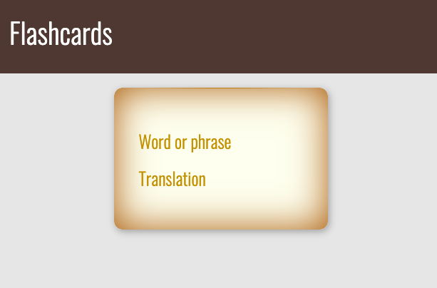
In order to illustrate how Mavo enhances standard HTML, we will first create a purely static HTML page and then use Mavo to turn this static HTML into a fully-functional web application.
Assume we have the following HTML code inside <body>:
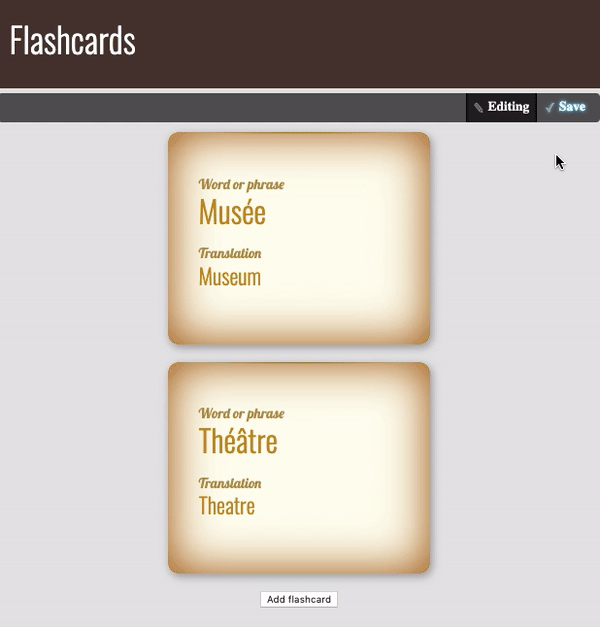
In that code, the <article> element represents a single flashcard.
Let's add some styling in order to make our HTML look more like an actual flashcards app. You can take a look at the source code and play with it here.
Getting started with Mavo
Right now, all we have is a static template. It's time to add functionality, so it can actually work like a flashcard application. Here comes Mavo!
In order to use Mavo, we first need to include its JavaScript and CSS files in our page’s <head> section:
To enable Mavo functionality on an HTML structure, we must use the mv-app attribute on the element that contains our Mavo app (which may even be the <body> or <html> element, that's fine!). Its value is an ID for our app that should be unique in the page.
🐇 Follow the white rabbit!
If we use mv-app without a value and there is no id or name attribute on the same element, a name such as mavo1, mavo2, etc. will be automatically generated.
However, it is strongly recommended to name your Mavo apps, because the name is used in a number of places.
Considering that the <main> element is representing our Mavo app, let's add the mv-app attribute to it and give our app the ID "flashcards":
It's time to tell Mavo what elements of our app are important, i.e., which elements we want to be editable and be saved.
Now we have two such elements, and they are the <p> elements. Let's add the property attribute to those elements to tell Mavo they contain data. Elements with the property attribute are called properties.
🐇 Follow the white rabbit!
We can put the property attribute on any HTML5 element, and Mavo knows how to make it editable. For example, for a <span> you edit its contents, but a <time> lets you edit its date/time via an appropriate date/time picker.
You can also expand this set of rules and make elements editable in new ways (e.g., rich text), via plugins.
Keep in mind that the value of the property attribute should describe the element, similarly to an id or class attribute:
...

  <p property="source">Word or phrase</div>
  <p property="translation">Translation</div>

...
🐇 Follow the white rabbit!
If you already have a class, id, or itemprop attribute that describes the element sufficiently well, you can use property without a value, e.g., <p property class="source">.
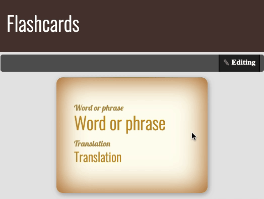
Notice any changes in our app? The Mavo toolbar with an Edit button appeared at the top of the page. The Edit button lets the user switch between read and edit modes. Now our app is in read mode. That means we can't edit the data on the page.
🐇 Follow the white rabbit!
The Mavo toolbar is fully customizable, as is almost all of the UI generated by Mavo: you can change its placement, remove its default styling, add custom button elements, or use your own HTML elements for it, among other things.
We will see one example of such customization later on in this tutorial.
Visit this section of the Mavo website to learn more.
Now lets us switch to edit mode by clicking the Edit button. What has changed? The text of the Edit button becomes Editing to indicate that we are in edit mode. If you hover over the paragraphs, Mavo communicates that you can click to edit them by highlighting them in yellow. Go ahead! Click the text and edit it. Wow! We can change the content of the page right in place!
💻 Let's get our hands dirty!
Assume that in addition to the word and its translation, the flashcard should have an example of the word's usage in a sentence. Enhance the app by adding the appropriate elements to the flashcard.
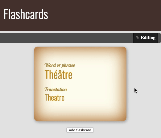
At this point, we have only one flashcard in our app. That's not very useful! For a working flashcard application, we need the ability to add, delete, and rearrange flashcards. How can we do that? We could create more flashcards by adding more <article> elements to our code, but then how does an end user create and delete flashcards?
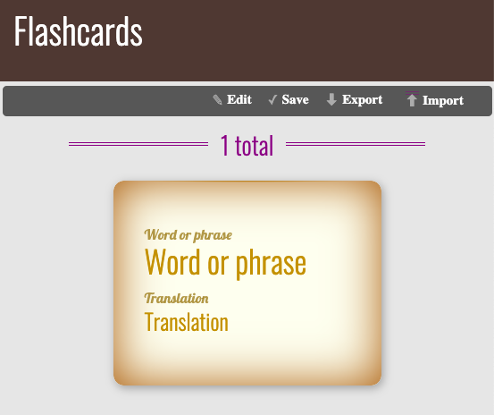
Fortunately, Mavo has something to offer that makes this a breeze: the mv-multiple attribute, which tells Mavo that certain elements can be multiplied. It converts the element it’s used on to an editable collection of items and generates (customizable) UI for adding, deleting, and rearranging items.
🐇 Follow the white rabbit!
If mv-multiple is used on an element without a property attribute, Mavo automatically adds property="collection" to it (or collection2, collection3, etc. so that the name is unique). However, it's recommended to also use a property attribute, to name your collection and make sure its data is preserved if the HTML changes.
Let's use the mv-multiple attribute in our app to convert our lonely flashcard into a collection of flashcards:
It is also possible to specify the property name as a value of mv-multiple, like so: <article mv-multiple="flashcard">.
The mv-multiple attribute goes on the element that will be multiplied, not the container of the collection. It's a common mistake for people to do <ul mv-multiple> instead of <li mv-multiple> and can often go undetected for a while until the element is inspected or the styling makes it obvious.
Now switch the app to edit mode. Note that below the flashcard, there is now an Add flashcard button. Let's give it a try: create a few flashcards with the help of that button. Now we can dynamically add new elements right in the app, even though there are no corresponding elements in the HTML. But that is not all!
🐇 Follow the white rabbit!
Note that the property attribute on <article> does not actually make the entire <article> element editable, but instead acts as a grouping element. This happens when you use the property attribute on elements that contain other properties.
Try hovering over a flashcard and notice the three buttons that appear near its top right corner for adding, deleting and rearranging elements via a drag and drop handle. And by hovering over any item bar button, we can understand which flashcard they correspond: Mavo highlights it. Isn't that amazing?
🐇 Follow the white rabbit!
You can customize any UI element generated by Mavo, e.g., you can create your own drag handle by using an mv-drag-handle class.
🐇 Follow the white rabbit!
The buttons added by Mavo to every item in a collection are also keyboard accessible. Even reordering: you can focus on the drag handle and use the arrow keys to move the item.
Now that we have the basic UI in place, let's try the following:
Switch to edit mode (if you haven't already done so).
Edit the first flashcard's source word and translation. Add a couple more flashcards too.
Switch the app back to read mode.
And finally... refresh the page.
What?! Where did our data go? Wasn't Mavo supposed to save it? What happened?
Actually, we never told Mavo if or where to store our data!
To do so, we need to use the mv-storage attribute. What options do we have? Well, Mavo opens great possibilities for us, and Mavo plugins open up even more!
In our application, we are going to store the data in the browser’s localStorage, which is one of the simplest options available, so it's good for our first Mavo app. We just need to add the attribute mv-storage with the value local to the element with the mv-app attribute (also called the Mavo root).
Have a look at the Mavo toolbar. Notice something? Another button appeared—the Save button.
Try to edit the app data one more time. Note that the Save button is now highlighted. Hover over the Save button, and Mavo will highlight the properties with the unsaved data. Isn't that cool?
Click the Save button and refresh the page (there is no need to switch to read mode before refreshing the page). Is your data still there? Great! We are one step closer to our goal—a fully-fledged flashcard application.
The mv-autosave attribute
Now we have to click the Save button every time we need our data to be saved? That may be safer, to prevent destroying valuable data, but it can often be inconvenient. Can we just save the data automatically? Sure! To save the data automatically every time it is changed, we can use the mv-autosave attribute on our Mavo root. Its value is the number of seconds to throttle saving by. Let's add mv-autosave="3" to the root element of our app:
If mv-autosave="3", Mavo can only save at most once every three seconds. This can be especially useful for backends which keep a change history (e.g., GitHub, Dropbox) to prevent flooding which would render that history useless.
To disable throttling and save immediately, we can use mv-autosave="0" or just mv-autosave, which will also remove the Save button from the UI (since it serves no purpose in that case).
Change the data one more time and have a look at the Save button. See? In the beginning, it was highlighted but after 3 seconds–it is not. All our data is now saved automatically!
So, now the main part of our app would look like that:
We are almost done with the alpha version of our app. Now it’s your turn to make the app even better. No worries, you have all the knowledge you need.
Enhance the app so as flashcards could be organized by end users in different groups related to various topics, e.g., the users could gather all the flashcards corresponding to clothing in one group, all the flashcards associated with kitchen utensils in the other one, etc.
💡 Hints!
There are many ways to achieve that goal, and it's up to you to decide what to follow. However, I'd like you to think about some questions before proceeding:
What HTML element would you use as a grouping element? It would be convenient for the users if they could see the name of the group of flashcards (topic name) and could collapse the group up to the title.
What Mavo attribute(s) are you going to add to that element, if any? Will the element be a property or a collection?
Will end users be able to add new topics, delete and rearrange them, change the title of a topic and move flashcards between different topics?
What if you decide not to organize flashcards in groups, but instead just label them with tags that correspond to various topics? Well, that is perfectly fine. The solution with tags is also appropriate. For the sake of practice, try to accomplish that approach too.
As our app stores the data locally, by default, the users of the app won't be able to share their cards with other users. Wouldn't it be great if we would let them export their flashcards and import somebody else's flashcards? Thankfully, these features are already implemented in Mavo, and we can very easily add them to our app!
The mv-bar attribute controls which buttons are going to appear in the toolbar, if any. It’s typically specified on the Mavo root (an element with the mv-app attribute). Buttons are represented by their ids (which are very logical): edit, import, export, etc.
As we only want to add a few buttons to the default set, we can use the so-called relative syntax, which allows us to add and remove buttons from the default set without having to explicitly list everything out. All we need is to start the mv-bar attribute's value with the with keyword.
Give those features a try: add some flashcards, try to export them in a file. Then delete existing flashcards and import the flashcards from the previously exported file.
Let's now add some statistics to our app, such as the number of flashcards! Sounds interesting? I hoped so. 😀
To do that, we need to learn something new about Mavo.
We can dynamically refer to the value of any property we have defined, anywhere in our Mavo app (including in HTML attributes), by putting its name inside brackets, like this: [propertyName]. This is an example of a simple expression, which allows us to dynamically calculate things, reactively as they change.
🐇 Follow the white rabbit!
Mavo’s expression syntax is called MavoScript. It is similar to spreadsheet formulas and lets us perform computations and other operations (with numbers, texts, lists, etc.), but is designed to be more readable and to accommodate nested relations. You can learn more about Mavo expressions and MavoScript in the documentation.
Now let’s experiment and add a [source] expression inside the flashcard property, e.g., between two properties: the source and the translation.
...
  <p property="source">Word or phrase</div>
  [source]
  <p property="translation">Translation</div>
...
What has changed in our app? The value of the flashcard source property is now shown on the page twice.
Switch to edit mode and try to change the value of the source property. Can you see that? The page content updates while you are changing the property value! That’s why I said earlier that Mavo lets us develop reactive web applications.
That's indeed cool, but unfortunately, in our case, it's not really helpful: we can't use this expression to count the number of flashcards—we would always have only one value.
What if we put the [source] expression outside the flashcard property? We will have something like that:
How does this differ from the previous case? To see the difference add some flashcards if you haven't done so yet. Now instead of one value we have a list of comma separated values: the source property of all flashcards. That's exactly we were looking for: the number of items in the list corresponds the number of flashcards in the app.
Makes sense? Well, yes, but it wouldn't it be more logical if we would count the number of flashcards, not the number of values of its source property? After all, a flashcard added exists even before we fill in its source or translation. I suggest you do the following: let's substitute the [source] expression with [flashcard]:
Noticed the difference? We still have a list, but its values are not simple values but objects, i.e., complex values containing all data that pertains to each flashcard. The good news is that the number of these objects is equal to the number of flashcards, since there is one for each flashcard, even when it's completely empty. So, right now we have an object for each flashcard, but how do we count them and display the total count?
Now let's get familiar with the MavoScript functions and find the one that would let us count the number of flashcards. Remember, we have a list of flashcards, so we need to find a function that would let us count the number of items in a list. And here it is—the count() function does exactly that!
But how can we use functions in expressions? Are there any rules we need to be aware of? Well, yes, there is a couple:
Expressions are denoted by brackets.
Do not nest brackets.
Let's try using the count() function to count the number of flashcards:
And that's exactly what we were aiming for—now we have some statistics in our app! Isn't that cool?
💻 Let's get our hands dirty!
I hope you've already warmed up and ready to continue experimenting with Mavo.
Improve the application so that the statistics are displayed not only for the total number of flashcards in the app but also for the number of flashcards in each topic separately if there are any topics.
💡Hint!
Want to filter a list based on some criteria? The where operator will help.
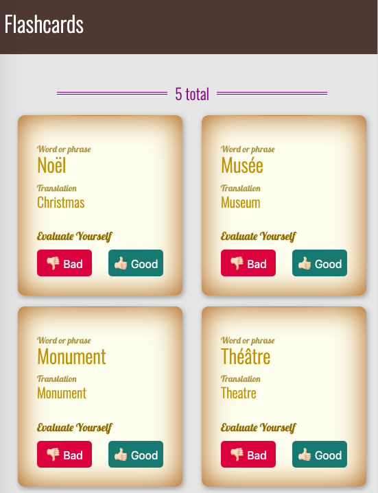
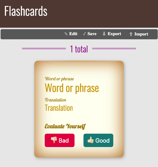
The self-evaluation feature
We already have an application that lets us create, edit and store multiple flashcards. But how do we keep track of which ones we have already learned and which ones we need to practice more? Any respectable flashcards application needs a self-evaluation feature. Let's investigate how we can add that!
Suppose in our app we have two buttons for the self-evaluation: the Bad and the Good. What exactly do we want to happen every time an end user clicks the buttons? Well, the idea is rather simple:
Clicking the Bad button would indicate the user hasn't learned the word yet and we want our app to move the corresponding flashcard to the beginning of the list so they could see it as soon as possible after launching the app.
Clicking the Good button would indicate the user has learned the word and the corresponding flashcard needs to move to the end of the list to let them work with other flashcards which they haven't learned yet.
“Are you sure we can do that without JavaScript?” you may ask. Yep! Mavo is extremely powerful and is able to equip us with all the tools we need!
Now when we know what we are going to implement, let's set the UI in place first and then move on to the next step. Our markup would look something like this:
Mavo actions allow us to create our very own controls that modify data in custom ways when the user interacts with them. Sounds promising right?
To define a custom action we need to use the mv-action attribute on an appropriate element inside our Mavo app. The action is performed every time the element is clicked. That’s exactly what we were looking for.
🐇 Follow the white rabbit!
For <form> elements a custom action is performed when the form is submitted.
The value of the mv-action attribute is an expression. We can use any of the expression functions and syntax that MavoScript provides to us, as well as a few more to facilitate data manipulation, such as add(), set(), move(), or delete(). It is important to note that unlike normal expressions which are evaluated reactively, these expressions are only evaluated each time the action is triggered.
🐇 Follow the white rabbit!
Mavo expects the value of the mv-action attribute would be an expression, so there is no need to enclose it in brackets: mv-action="expression". Moreover, if we include them, they will be considered part of the expression.
So, we need to move flashcards inside the collection, and Mavo has an appropriate function that lets us do that—the move() function. Its first argument refers to the item we are moving, and the second is its position in the collection. Bear in mind that elements of the collection are numbered starting from 0.
🐇 Follow the white rabbit!
Want to learn more about the move function (and its variants), and about custom actions in general, see the documentation.
Let's implement the first point of the outline we discussed earlier: while self-evaluating, an end user clicks the Bad button and the corresponding flashcard moves to the beginning of the collection, i.e., it becomes the first one. So in the code, we have:
Pay attention that in the mv-action attribute we refer to the flashcard property inside the property itself, since we want to deal with the current flashcard.
If we try to implement the second point of the outline, we will face a problem. Can you suggest what problem exactly will it be?
Let's remember that if an end user clicks the Good button the corresponding flashcard moves to the end of the collection, i.e., it becomes the last one. To make a flashcard last in the collection we need to know the number of items in it.
Thankfully, a bit earlier we've already solved that task and implemented the corresponding feature. But could we use that solution to solve our current problem? Unfortunately, we can't: as we already know, we can refer to the collection of flashcards by its name (and evaluate its size) only outside the flashcard property. But in our case, we need to do that inside it: the Good button for which we need to write an expression is inside the flashcard property.
What should we do then? I'm glad you ask. Mavo has the solution.
Using the meta element to hold intermediate values
So, on the one hand, we know that the [count(flashcards)] expression gives us the number of flashcards if it is evaluated outside the flashcard property. On the other hand, we need to use that value inside the flashcard property.
To solve that dilemma, we need to evaluate the number of flashcards outside the flashcard property and somehow hold the result to be able to use it elsewhere in the app, precisely inside the flashcard property. For cases like that, in Mavo, there are so-called computed properties.
To hold an intermediate result so we can refer to it, we need an HTML element in our code. It is recommended to use the <meta> element for that purpose, like so: <meta property="propertyName" content="[expression]">. The advantage of using this element is that it is hidden outside edit mode, both semantically and visually.
🐇 Follow the white rabbit!
Bear in mind that computed properties are not saved by default.
Now let's add the flashcardCount computed property in our app. Remember, we must place it outside the flashcard property, but then we can refer to it from anywhere:
Only one step left to finish the implementation of the self-evaluation feature: if an end user clicks the Good button the corresponding flashcard moves to the end of the collection, i.e., it becomes the last one. Let's add the relevant action in the code of our app:
There is another way to solve that task: with the help of the $allspecial property. The $all property represents a collection itself if it is placed inside the collection. So there is no need to use any computed property in this case. Try to implement that solution on your own.
There is only one more tiny thing left that we need to fix. Remember the part where we added some stats to our app? Remember the expression we built to evaluate the number of flashcards in the app: [count(flashcard)]? Instead, we can (and should) now use the computed property we defined. Make the appropriate changes in the app.
Takeaways
So what have we learned so far? Let's recap. In order to turn any static HTML page into a Mavo app we need to:
Include the Mavo JavaScript and CSS files in the page’s <head> section.
Add the mv-app attribute to the Mavo root element.
Tell Mavo what elements of our app are important by adding the property attribute to them.
Place the mv-multiple attribute on the element that will be multiplied and converted into a collection.
Tell Mavo where to store our data by adding mv-storage attribute to the Mavo root.
Decide whether Mavo should save our data automatically or not. If yes, add the mv-autosave attribute to the Mavo root.
We also know that:
The Mavo toolbar is fully-customizable. The mv-bar attribute controls which buttons are going to appear there.
Expressions let us present the current value of properties in other elements and perform computations. An expression value (and type) vary depending on the place the expression takes in the code. Mavo’s expression syntax is called MavoScript.
Custom actions allow creating controls that modify data in custom ways. To define a custom action set the mv-action attribute on an appropriate element inside a Mavo app
Properties whose values are expressions are called computed properties. To hold an intermediate result to be able to refer to it elsewhere in the app, it is recommended to use the <meta> element.
Instead of an epilogue
So we built our app. Is it already perfect? Of course not, nothing is! There are so many things that can be improved, and so many features that can be added (with the help of Mavo, we can even make our app multilingual!). Go ahead, enhance it more, don't hesitate to try something new!
What we've learned so far about Mavo is just the tip of the iceberg, and there is so much more. I encourage you to give it a closer look, by reading the documentation, by examining examples (on the Mavo site, or on CodePen: made by Lea Verou and a few made by myself), and by creating new stuff! Good luck! 😉
Acknowledgments
I want to thank two great people. First of all, my huge thanks go to Lea Verou, who not only inspired me to write this tutorial (and helped me make it happen) but also inspires me all the time by the way she makes the world of web development a better place. I've never met such a gifted human being, and I am happy having an opportunity to make some stuff with her!