10 Best Free Insta Story Apps That Will Help You Slay the Instagram Game

unfold best free insta story app

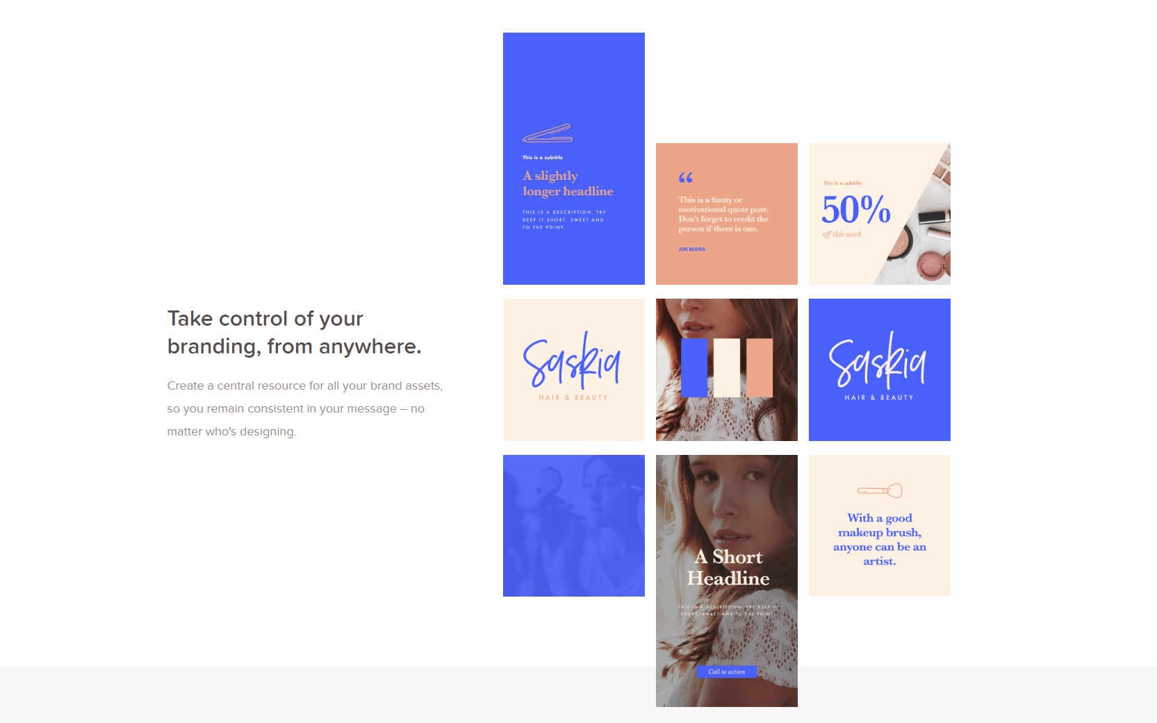
Seeing all the time, effort, emojis, drawings, and true works of art put into an Insta story, we know for sure stories are not what they once were. They’re no longer just pictures and videos shot in real-time. Stories have become a true marketing platform, with intensely strategic moves behind each piece of content published. Every Insta story most likely has a cool (maybe expensive) story app that was used to produce the content.  


With Insta stories looking more polished and aesthetically pleasing than ever, as a designer, you have to be on top of your game. But to what end and to what cost? 


I’m here to help you save a good buck. I’ve got the 10 best free Insta story apps for you to use to improve your Insta stories game without breaking the bank. Without further ado, let’s jump right in.


10 Best Free Insta Story Apps


1. Unfold

unfold best free insta story app

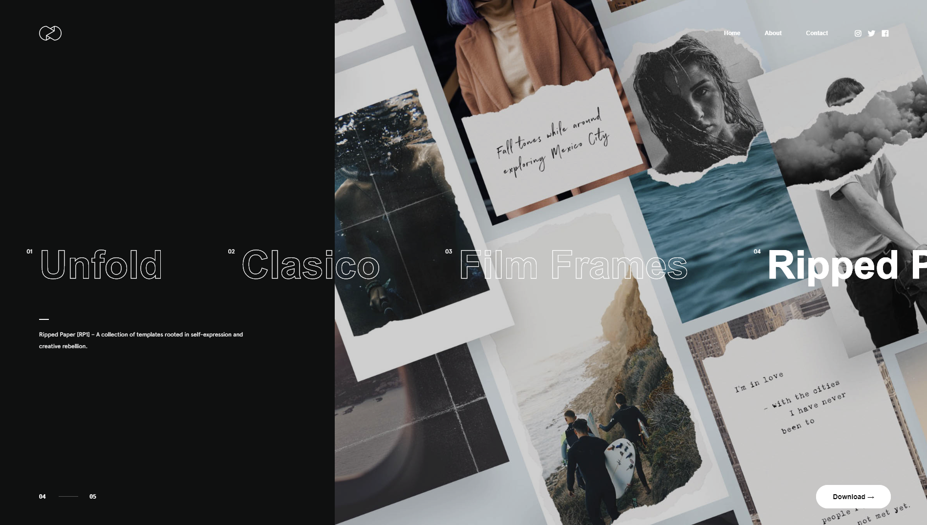
Unfold is an amazing Insta story app that is free, but also has in-app purchases if you fancy a certain look and template theme. With many texts and elements to choose from, and themes spanning from elegant or retro, there’s something for everyone.

Try it out today for free: https://unfoldstori.es/


2. Jane

best free insta story app jane

A very underappreciated and not talked about enough app, in my opinion, is Jane. The app is free and has very many free beautiful templates for you to use to spice up your stories. They are quite girly and are perfect for maintaining an elegant or playful story vibe. Create amazing videos with royalty-free music and amazing visuals. Again, this app is free but has in-app purchases. 

Try it out free today: https://apps.apple.com/us/app/%E7%AE%80%E6%8B%BC-jane/id891640660


3. Canva

canva free insta story app


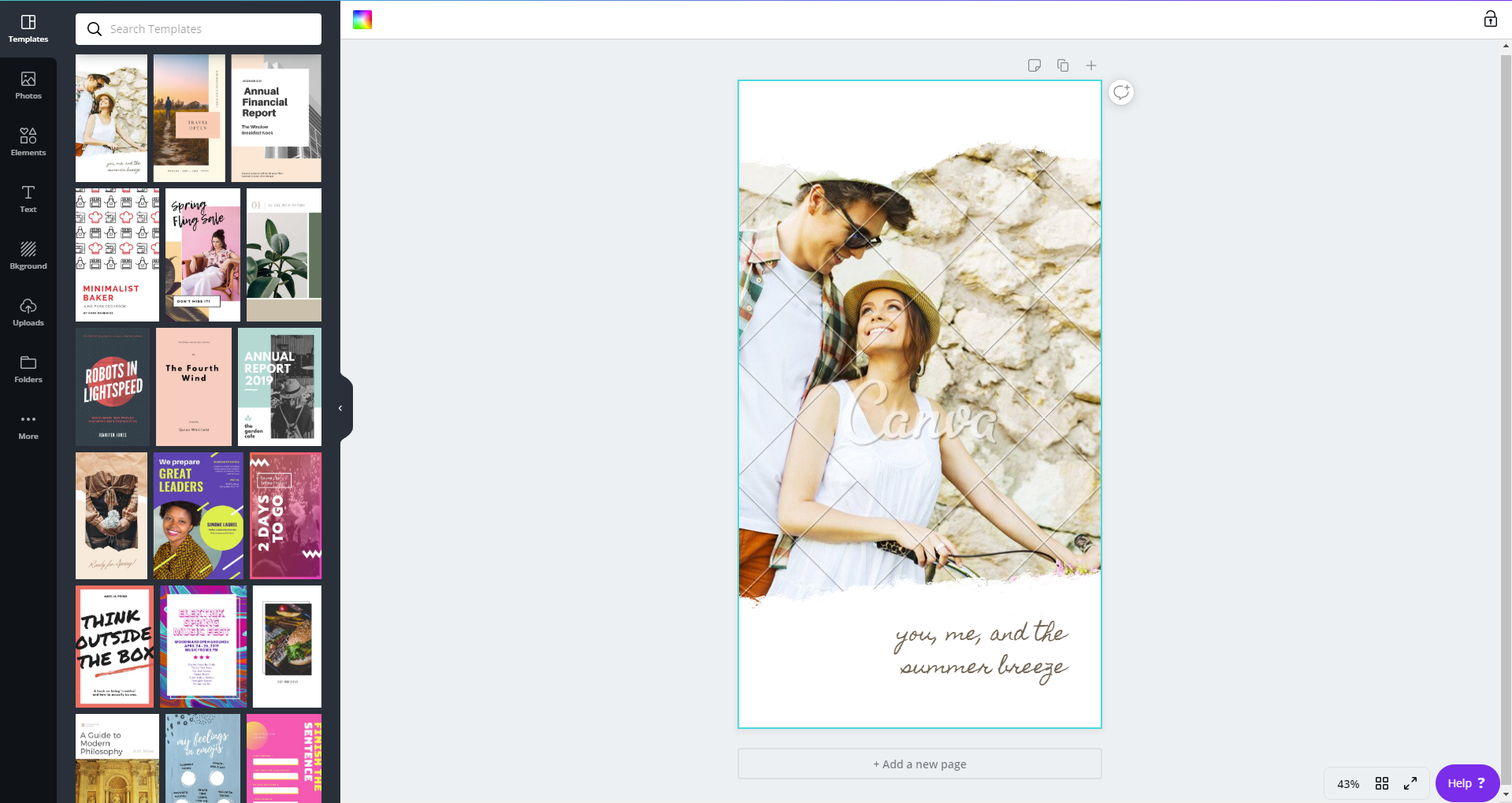
Canva is hands-down one of the best online CMP’s out there. It’s great for beginner and advanced designers alike. With tons of templates to choose from and customize, you’ll surely find the one that suits your style best. The mobile app is free and has in-app purchases, although you can totally rock with all the free elements and templates and just tune them to your liking.

Try out this app out for free today:https://www.canva.com/app/


4. Hype Type

hype type free insta story app

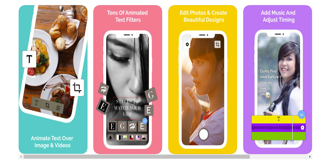
With a vast and wide collection of fonts, you can do some serious designing with this app. Hype type is absolutely killing the font game. If you’re focused on spreading a message, then this is absolutely the app for you. The app is free with some paid features, but it’s up to you to decide if they’re a necessary buy. 

Check out their app now: https://apps.apple.com/us/app/hype-type-moving-text-photo-s/id1152687277


5. Cut Story

Cut story free insta story app

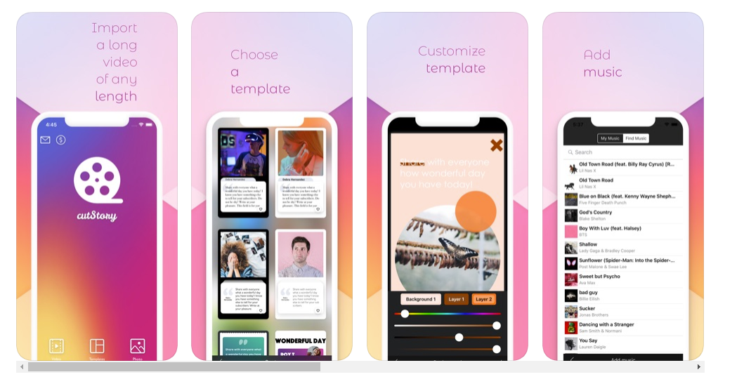
Another great app for managing your stories is Cut Story. Cut Story’s is an amazing video editing app where you can create engaging videos and add music, texts, elements, your logo and more to your video. There are special features that you can buy to enhance your UX, but only if you deem necessary.

Try out their free Insta story app now:https://apps.apple.com/us/app/cutstory-for-instagram-stories/id917630934
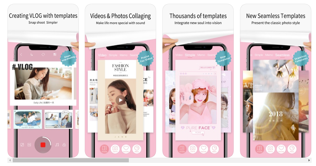
 

6. Mojo Story Maker

free insta story app mojo story

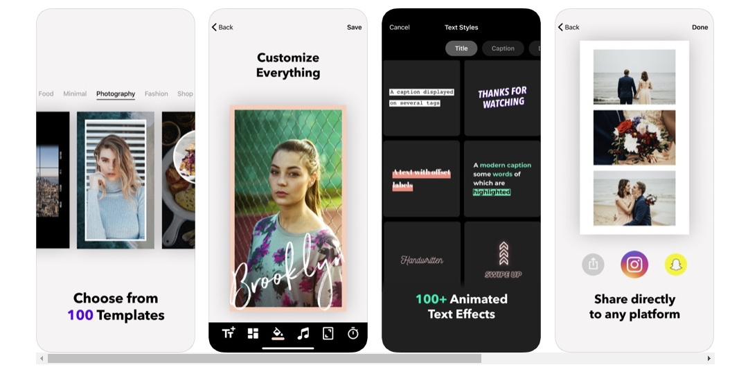
Mojo is the way to go for Insta stories because they have 100 templates for you to choose from! Customize your stories with text to create relevance, engage with your followers and make them feel what you feel, and share the message you want to portray with them. A huge plus to this app is that you can share your new and improved story directly to your Instagram and also your Snapchat!

Try this Insta story app now: https://apps.apple.com/us/app/mojo-stories-editor/id1434861974


7. InShot

in shot free insta story app

For all my influencers out here, Inshot is the app for you. We don’t always have time to film, import, and edit our footage on our laptops or computers, so having this app will be a valuable asset for you. Edit all your video content in a single app on your phone and import it directly to your Instagram. This app is truly a gift to all of us creators out there.

Give it a try if you haven’t already: https://play.google.com/store/apps/details?id=com.camerasideas.instashot&hl=en 


8. Adobe Spark Post

free insta story app adobe spark

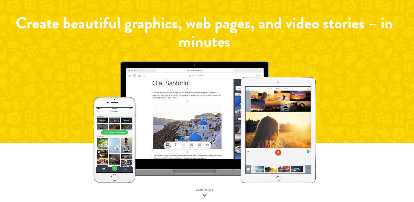
Adobe, king of all things editing programs, in my own personal opinion. Adobe has great editing programs, from video-editing to photoshopping images, and when they saw an opportunity to create an app to help you create amazing stories to tell your followers, well, we all know they wouldn’t pass that up. With this app you can do more than edit stories photos, you can also edit video and image posts. The app is initially free and then they offer you the chance to upgrade if you end up falling in love with the app.

Go ahead and give this Insta story maker a go: https://spark.adobe.com/features 


10. Over

over best free insta story app best free insta story app Over


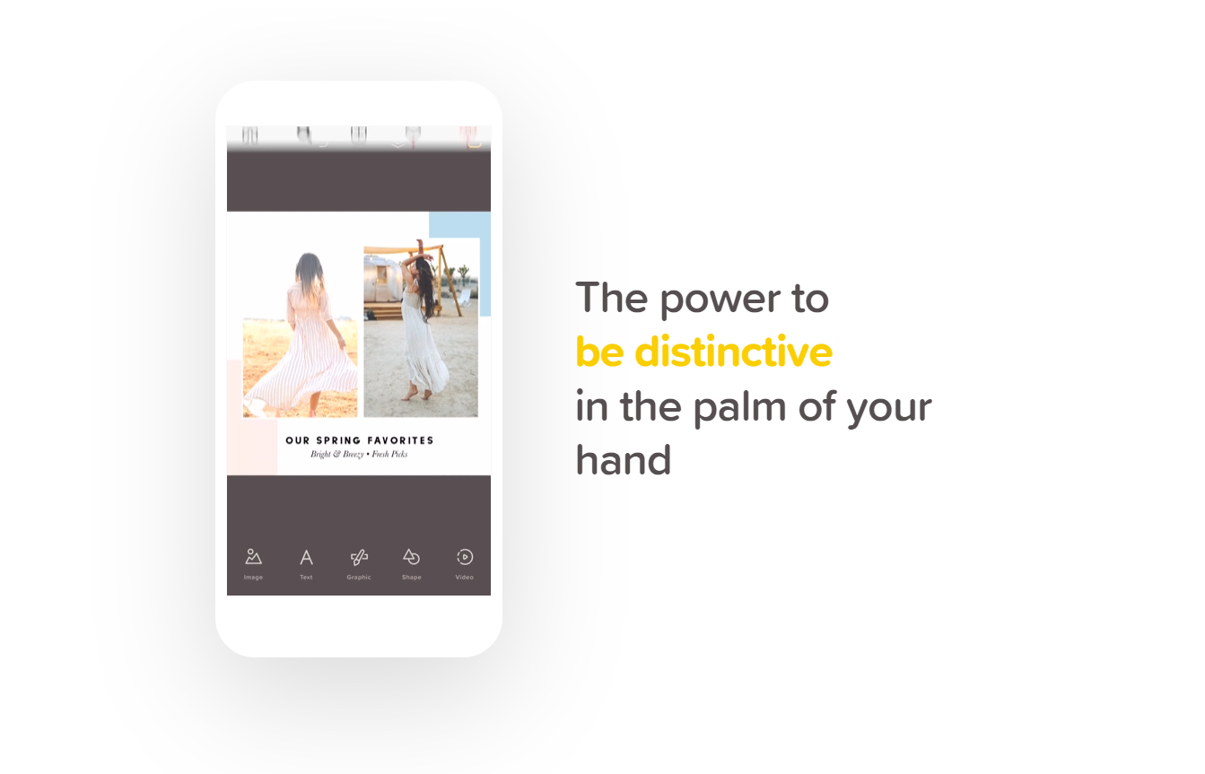
And last, but not least, we have the app called Over. I love that when you visit their webpage, it’s just absolutely inspiring. It inspires you to be different, to stand out, the influence others. A great app for you to use to for free to make your Insta stories more engaging for your followers and for you to really create a brand name and grow your recognizability.

Stand out of the crowd and try this amazing app free today: https://www.madewithover.com/


Now that you have 10 new and fresh apps for you to choose from to start stepping up your Insta story game, it’s time for you to hop on it. Download any one of these apps and tag us in any of your Instagram stories for a chance to be featured on our stories. Our Instagram handle is @webdesignledger.


Don’t sleep on these amazing free Insta story apps! Try them out today. 


Until next time, 

Stay creative.


Read More at 10 Best Free Insta Story Apps That Will Help You Slay the Instagram Game

The Right Pairs of Fonts

Elegant_Hire

The Right Pairs of Fonts Are Like Peas in a Pod

pairing fonts

When fonts are matched together correctly, they really make the perfect pair. Pairs are everywhere around us – our socks, best friend, partner, peanut butter and jelly, and the list could go on. 

Thinking about fonts without thinking about font pairs is half the concept. After all, we’re all better in pairs, and there’s no exception with fonts. When a font is paired with a good partner, the original font is enhanced, and your ultimate design goal is accomplished. Let’s not get ahead of ourselves though.

The key to picking font pairs is to start with the correct font. Sounds simple, enough. When you think about choosing a font, what comes to mind? 

The style and overall design of the project, or rather, the appearance of the words? You aren’t incorrect, yet you’re also not completely correct. Choosing a font has so many layers and complexities to the process, but we’ll map it out for you. First, let’s define the goal of a font.

Change Your Mindset

Fonts are constantly advertised and viewed as just a last minute design. When changing the font for a school paper, or a company proposal, you may not put much thought into the font you change your text to. 

Elegant_Hire

Yet, fonts can add credibility to your content, make content more readable, present content for better conversions, and market your information to evoke feelings within your readers, which ultimately increases sales. 

Sometimes it’s the little changes that matter the most! The beauty and challenge with fonts are that they’re always displayed. 

Meaning, if your font is hard to read, then readers will just click away onto another website with much more readable fonts. The competition is higher than ever to get website visitors on your page and staying – don’t make your font the reason they click away. 

The Goal of the Font: Convey the Message

Although fonts do project a style and design, their main goal is to translate the marketing message. Think about it, without a font, your message wouldn’t be conveyed at all! They are the vehicle that translates the words you want your target audience to read. It doesn’t end there. A font translates much more than the physical message. 

You’re also communicating a feeling. Think about why we dress up for an interview or an important business meeting. We’re communicating an image without saying anything. That image is backed behind emotions. 

If the stakes are high like a proposal meeting, then perhaps you’d dress in business professional in order to seem credible. Think about selling a home. Why did you trust one realtor over the other to work with? 

Sometimes overdressing can separate yourself from your audience rather than associate yourself with them or seem trustworthy to your audience. If you’re aware your price range is on the lower side, you may feel intimidated and unsettled if your realtor is overdressed because they may not understand your situation.

Choosing the correct message to portray to your audience is a challenge within itself, but most likely if you have a marketing campaign, you already know this! If you’re a bank, you want to come across as trustworthy. 

If you’re a rolling skating arena, you want to appear fun. Finding it hard to see which feeling your business is trying to embody? Think of what emotions your business wouldn’t want customers to associate you with.

Serifs and Sans Serifs

pairing san serif and serif fonts

Once you’ve come up with this message, you’re halfway there. Choosing a font is merely finding a style that represents this. Be aware of the different styles of fonts like serifs and sans serif fonts. This could be an easy deciding factor that could narrow down your search! Generally, serif fonts have a traditional style. 

These are the fonts that have the little feet at the end of each character. Sans serif fonts were invented after, and are usually considered a much more modern font. These fonts, not containing the feet at the end of each character, display well on digital screens. Upon picking a serif or sans serif font, experiment with the font against your design and how the font is described online. 

pairing the right fonts

Serifs and sans serif fonts pair extremely well together because they have what the partner doesn’t! 

A great example of this is April Fatface and Roboto. Abril Fatface takes the spotlight, while Roboto takes a backseat, with its simple lines and versatile design. 

pairing the right fonts

Another great example is Dancing Script and Josefin Sans. Both fonts have a similar delicate design that looks handwritten. Yet, Dancing Script could only be displayed on headlines or else it would overwhelm the readers, and Josefin Sans effortlessly simple. 

Finding Your Font’s Perfect Pair

Once you’ve got a font or an idea of a font you’re looking for, it might be time to use a font combination tool. These are great because they make the pairing process much smoother. If you have no idea where to start or aren’t into design, a font combination tool, like this one by Bold Web Design Adelaide, is a great place to find inspiration or start to realize what you like and don’t like in a font. 

pairing the right fonts

Think of pairing fonts like music. There’s a melody and a harmony. One takes precedent: the melody. Without both, the music would feel incredibly empty. It may seem like the melody is more important, and it may relay the main message, but both are needed to make a song. They define each other, as without the melody the support music wouldn’t be called harmony and vice versa.

Pairing fonts is exactly like the melody and harmony in a song. One is the focal point that shines through, which I like to call the focal font. This is the font that usually has more personality, and is used for headlines or larger text. With two focal fonts, your reader would be incredibly overwhelmed when reading through your information. 

Pairing fonts is a balancing act, requiring both fonts to work together and not to take up too much attention from your readers. Secondly, both fonts have to be compatible. This relays back to your marketing messaging. You wouldn’t release a marketing campaign with one ad that’s creative and fun, and another that’s scary and serious. Ensure both fonts align with the message and emotion, and compliment each other. 

Pairing fonts is a great way to differentiate information from each other. Just as we section content within an article with headers and subheaders, different fonts can be used for the headers and paragraphs to further associate a transition within the content. 

Text that you want to stand out can be placed in a standout font, and support with a much simpler font. Even the weights of fonts within a pair can be changed, making a font bold, thin, italicized, and other variations to increase its versatility. The possibilities are truly endless. 

Play around and get familiar with the options out there. Once you’ve accomplished this, pairing fonts is a piece of cake. Your fonts will work together like a seamless song.


What Not to Do 


Don’t choose a font blindly. Picking the correct font for your business takes awareness and understanding. A font that works for another company, may not work for yours. Rather than looking at fonts as a design decision, think of it as a sales decision. 

how to pair fonts

If you’re just picking a random font from a list without much consideration, you could be throwing away potential leads to your products and services without even knowing. Within the age of digital content galore, you want to set yourself apart from the rest. 

A font is the puzzle piece to a unique brand identity and a competitive edge! Don’t put two loud fonts together. A font that definitely has a “personality” should not be paired with another font like it. 

Find a versatile font to pair with loud fonts or pair two versatile fonts together. Versatile fonts are simple and readable like Arial or Roboto. 

Conclusion 

At the end of the day, a font can always be changed if not now, later. Test different fonts and see which ones work well for your company’s design. If you’re working with print materials, print a couple of tests and get your team’s vote. 

A design is just an extension of the company, design, and culture. What better way to decide if it’s a great fit than to ask the ones that work there. When you see a good font pairing, it will seem effortless and you won’t be looking at the fonts, you’ll be reading the content. 

The fonts will balance each other out – working together to differentiate between text and information. After all, the right font pairs are like two peas in a pod. 


Read More at The Right Pairs of Fonts

5 Inspirational Designs Trends to Follow for 2019

Graphic Design trends for 2019

5 Inspirational Designs Trends to Follow for 2019


Design is all about expressing yourself through your art and showing people the beauty in simple or incredibly intricate designs. While you should always stay true to yourself and be authentically you through your designs, it is also good to stay on top of the trend game. 

Today we’re going to go over 10 design trends that we stan this year. And hopefully, always. 

We’ve got 6 months left in 2019 so we better make our designs count. 

So let’s just get right into it, shall we? 


   1. GO BOLD

 You know the saying, go bold or go home. And it rings absolutely true in design. We have two different types of “bold” that we’re going to go over in this section: bold colors and bold text.

Design trends for 2019

Source: https://www.behance.net/erikmusin

Design trends for 2019

Source: https://www.behance.net/erikmusin

Design trends for 2019

Source: https://www.behance.net/erikmusin

Design trends for 2019

Source: https://www.behance.net/erikmusin


Here are some examples where minimalist background color meets bold product color. When photographing and editing a product, enhance its color by using a light, neutral color as the background. When you do this, the eye of your client will be drawn directly to your product. Make sure that the color you choose complements the product’s color and really enhances what you have to offer. This is definitely my favorite trend right now. Hats off to Erik Musen for hitting us with some sweet designs. 


The next bold section is all about text. You have a message to share and you need to grab the attention of your readers. Do this with the same concept as with the products. Beetroot did an awesome job of using big and bold fonts to grab your attention. There’s no missing what you have to say when you use this bold technique. 

Graphic Design trends for 2019

Source: https://www.behance.net/beetrootdesign


    2. 3D Design

Really stand out, literally, with a 3D design. Incorporate real-looking elements into your graphic design to make your design truly unique and eye-catching. Take these designs for example. 

Graphic Design trends for 2019

Source: https://www.behance.net/STATE7

Graphic Design trends for 2019

Source: https://www.behance.net/gallery/71276031/Mulher-3D-Type


3D design is just about everywhere right now, and as you could see above, there’s no specific font that is the set-in-stone font to use. Try out any font you’d like! A font that is skinny, bold, a sans-serif, script, or any other type of font can be rendered in 3D. Use this technique in your next project and drop the link to your portfolio in the comments below so we can check it out! 


  3. Flat Design meets Realism

Another huge design trend right now is flat design combined with realism. Here are some prime examples of what I’m talking about. 

Graphic Design trends for 2019

source:https://dribbble.com/shots/5591883-Puma-sneaker-shop

Graphic Design trends for 2019

Source: https://dribbble.com/shots/4854300-Panda-UI

Graphic Design trends for 2019

Source: https://dribbble.com/shots/3951710-Adidas-Online-Store

Feeding off of the 3D trend, flat design + realism is truly impressive. Two complete opposites, yet the perfect combination that gives a vibe of futuristic design. You can expect to see this trend in the E-commerce world, but not only. Add elements that look like they are floating or fly to add an aesthetic that is overall abstract. Combine 3D objects with a flat design to achieve this amazing look. 


  4. Open composition

We’re taking a step back from mainstream, and a step forward in creativity. This trend exudes art. It’s chaotic, yet beautiful. For this look, the goal is to achieve a free-flowing final product. So say goodbye to a “perfect” framed finish. This trend is a combination of things: combine images with ideas. This is magic in real life. It gives people a sense that they’re just seeing a small piece of a bigger picture. The real magic of open-composition is that gives people the freedom to explore their creative side and see the deeper meaning of what the combined elements could mean. 

Graphic Design trends for 2019

Source: https://www.behance.net/temicoker

Graphic Design trends for 2019

Source: https://www.behance.net/temicoker

Graphic Design trends for 2019

Source: https://www.behance.net/temicoker

Graphic Design trends for 2019

Source: https://www.behance.net/temicoker

Graphic Design trends for 2019

Source: https://www.behance.net/temicoker

And my all-time favorite designer for this technique is Temiloluwa Coker.  Check out his work on Behance. All the images above are all his.


  5. Electrified

I’m about to end this article with a bang. Maybe this trend is actually my favorite. 

Graphic Design trends for 2019

Source: https://www.behance.net/cristianmg

Graphic Design trends for 2019

Source: https://www.behance.net/cristianmg

Graphic Design trends for 2019

Source: https://www.behance.net/gallery/66723565/FETE-DE-TROP-__-Eddy-de-Pretto

Graphic Design trends for 2019

Source: https://www.inspirationde.com/image/85051/


One of my favorite things about social media today is that we’re all pushing for authenticity and being real. There’s no excuse for designers. In this technique, designers are encouraged to let their inner-creator out by drawing, writing, doodling, splashing, and using unique brush strokes and color stains. Imperfections and mistakes are embraced in this trend because there’s absolutely no right or wrong in this style. And I think that’s why I love it so much.


Sadly, our time has come to an end…


But no worries, we’ll be back soon! 

Let us know in the comments below what your favorite design trend was in this article, and if you have any other favorite design trends we didn’t cover, mention those down below as well. 

Drop your portfolio down in the comments for us designers to support each other. 

Until next time, 

Be kind and stay positive.

Read More at 5 Inspirational Designs Trends to Follow for 2019

40 of the Best Free Typography Fonts Choosen by Designers

typography fonts

The past few articles covered four of the most important categories of fonts: modern fonts, classic fonts, retro fonts, and vintage fonts. For today’s article, we won’t focus on a single category, but we will list the best typography fonts out there. What does this mean? Our professional designers have put up a list of the fonts they use the most and like the most. This list will include all kinds of fonts, from script, serif, sans serif, calligraphic, geometric fonts, to rounded, slab serif, and handwritten.

If the word FREE is music to your ears, then you better expect to see the best of the best free typography fonts cataloged below. Most of these amazing typography examples come from awwwards.com, so show your appreciation for their hard work by sharing, liking, and commenting in the comment section below. Let’s get started!

1. Wolf in the City

typography fonts

Wolf in the City is a classic, elegant handwritten font with amazing details, and 3 weights available.


2. WILD YOUTH

typography fonts

Wild Youth is a gorgeous brush script that will give your designs a natural look.

3. Linux Libertine

typography fonts

Linux is for fonts what Zeus is for Greek mythology. This typography font can easily be introduced to many projects, and will always be an important font found in books, dictionaries, and magazines.

4. Bebas Neue

typography fonts

Bebas Neue Sans Serif font inspires a versatility without limits.

5. Somatic Rounded

typography fonts

Risking to be a little bit predictable, this font looks like the best font for any mobile app.

6. Nautilus Pompilius

typography fonts

Nautilus Pompilius is a perfect script font that excels in symmetry and precision.

7. PILSNER & GUTENBERG

typography fonts

Yes, Gutenberg does have the smell of an old newspaper and will give your projects the needed old-school look.

8. Tracks Type

typography fonts

And if I said that Gutenberg smells like old newspapers, Tracks Type screams urban, modern font.

9. Campton Typefamily

typography fonts

This geometric sans that features perfect circles has a futuristic touch, one that will not go outdated any time soon.

10. Gandhi Sans

typography fonts

We need creative typography fonts like Gandi Sans when the meaning of the text is more important than the looks of a text. Use this font for meaningful projects.

11. Blenda Script

typography fonts

Blenda is a classic font that will always look perfect on packaging designs.

12. Bitter Ht

typography fonts

Serif fonts add wight to a font, making it stand out in the crowd. The same thing applied regarding this bold font.

13. Hello Stockholm

typography fonts

Hello Stockholm makes me nostalgic. This is the perfect example of how fonts carry a certain message and a certain feeling with them. You can enhance the meaning of a text by using an expressive font,

14. Poetesen One

typography fonts

Poesten One makes a great font for company logos and branding.

15. Free Font – New Day

typography fonts

New Day talks about a project that needs a futuristic touch.

16. Ginebra free font

typography fonts

Ginebra, as shown in the presentation image, is an amazing font suited for magazines.

17. Big John – Free Font

typography fonts

Both BIG JOHN and SLIM JOE want to be displayed on the billboards. Want to fulfill their wishes?

18. Fibre Free Vintage Font

typography fonts

This free vintage font features a great chuck texture, great for posters, book titles, and packaging.

19. Westfalia Free Font

typography fonts

You’ve probably seen this brush sans before because designers fell in love with it from the first sight. Did you?

20. Islander free font

typography fonts

Islander, just like Somatic Rounded, looks like the perfect font for a mobile app.

21. Simplifica – Free Font

typography fonts

Simplifica is not as simple as its name suggests. It actually comes with many alternatives to the font which will make it very difficult to choose the right one for your project.

22. Bohem Free Font

typography fonts

Bohem vintage font is the perfect font for all vintage product packaging and branding.

23. Playlist Free Font

typography fonts

Playlist has a natural feel to it, the right amount of naturalness for a cursive font.

24. Cast Iron

typography fonts

Cast Iron features elements of a unique 3D typeface which will make your text pop.

25. Noway Free Font

typography fonts

“Functionality is the smart way,” says the motto of this strong, bold font. No further description needed.

26. Elisabeth Font

typography fonts

Elisabeth is simple but modern, easy to incorporate into various projects.

27. Wavehaus Sans Typeface

typography fonts

Details make the difference. Did you not see the details of this font? Look again!

28. Wesley Gothic

typography fonts

If Wesley Gothic is indeed a gothic font, then it must be a modernized one. Use this unique font with care, as it might not do the magic to all your projects due to its complex particularities.

29. Youth Culture

typography fonts

Youth Culture reminds me of tattoo fonts. This says a lot about the personality of this amazing font.

30. Kitchen Sink

typography fonts

This wall texture marks an innovation in the history of textured fonts. Hard to miss in this sea of fonts online.

31. HK NOVA

typography fonts

HK NOVA’s bold font deserves to be placed on the cover of magazines and books of science.

32. Black Animal

typography fonts

This bold brush looks rather like a bold marker that highlights an important message.

33. Belda Regular

typography fonts

Belda is such an elegant and delicate font, exactly the looks this font will offer your designs.

34. Bunday Slab Bold , Light & Italic

typography fonts

Bunday comes with a package of contemporary moods and styles in almost 100 languages/

35. Aloja handwriting font

typography fonts

Aloja is such a joyful font, perfect for party posters, wedding invitations with a twist, and any other project you think it would work with.

36. Space Grotesk

typography fonts

At first glance, Space Grotesk looks like any classic font, but when studied a little bit more, you notice those little details that will intrigue any reader.

37. Fat Font

typography fonts

Fat fonts have one purpose only: to be the center of attention. And oh, do they do it with ease.

38. Labour Union

typography fonts

The Labor Union calls out for all the farmers to gather at the market.

39. Circus Display Font

typography fonts
The Circous explains itself and it does it right. It’s a font so full of personality!

40. Escucha (+ Consuela font duo)

typography fonts

Last, but not least, Escucha is the modern font that every designer needs in their tool kit yesterday.


Did I mention that all these fonts are free? Hurry to download them as soon as possible. Until later,


WDL


Read More at 40 of the Best Free Typography Fonts Choosen by Designers

40 Of the best Free vintage Fonts picked by professional designers

Vintage Fonts

In the past few articles on Web Design Ledger, we tried to bring into your attention some of the most important categories of fonts:

modern, classic, and retro. Today we will continue with another important category: Vintage Fonts. Designers say that, in order for a fashion product, be it clothing, font, or a decorative piece, to become “vintage” they need at least 40-years-period from the time they were released. Based on that definition, we could consider anything older than 40 as being vintage, or new products that have the vintage vibe, well, not vintage. So in order to make peace with everybody, the fonts our professional designers have chosen for this article, are exclusively based on their looks, not on the time they were created.

What particularities do vintage fonts have? you might be wondering. Well, as dictionaries tell us, vintage means “something from the past of high quality, especially something representing the best of its kind.” My question then is: are vintage fonts the best? They may very well be for some. Usually, vintage fonts stand out because of their complex details, exquisite calligraphy, and versatile looks.

Keeping these details in mind, we’ve put together a list of some of our favorite vintage fonts, both free and premium, so you can stay stocked up.

1. Vintage Party – Bold Retro Script

Vintage Fonts

Vintage Party font screams fun. Use this font in any project that is meant to bring people joy.

2. Berringer – Vintage Type Family

Vintage Fonts

Berringer is a beautiful vintage font for when a sans serif is a must.

3. Stamp & Co – Vintage Stamp Font

Vintage Fonts

Nothing gives a project the vintage look better than a stamp vintage font.

4. Bignord – Vintage Typeface

Vintage Fonts

Bignord is a classic vintage featuring amazing and detailed serifs.

5. Vintage Modern Typeface

vintage fonts

If you’ve ever wondered what a vintage font with modern features would look like, here you have it.

6. Hemera II – Vintage Decorative Font

Vintage Fonts

This elegant vintage typeface will make any packaging shine.

7. Sarcastic Typeface + Extras

Vintage Fonts

Can fonts inspire attitudes? Sarcastic can answer that question the best.

8. Rust & Nails Vintage Farmhouse Slab

Vintage Fonts

Rust & Nailsis a rustic and charming font inspired by vintage farmers markets and mid-century modern farmhouse signage.

Vintage Fonts

Caliber is inspired by the Whiskey Labels, and for other lables that need the vintage look.

Vintage Fonts

Hasthon features polished letters, very suitable for label and logo designs.

11. Arber Vintage font

Vintage Fonts

Arber gives your projects a wintery and cinematic look.

12. Chivels – Chiseled Vintage 3D Type

Vintage Fonts

This 3D font would make a great ornament on any packaging designs.

13. Prequel – The vintage Sequel

Vintage Fonts

Prequel’s stony texture will help your poster catch the attention of all pass-byers.

14. Cache – Vintage Font Family

Vintage Fonts

Its authentic vintage look and feel will give you that exact look you’ve been aiming for.

15. Ranch vintage font & illustrations

Vintage Fonts

This layered font reminds me of quality bakery products, quality being the words you should be looking for when designing.

16. Royaland Vintage Font

Vintage Fonts

The Royaland Font is a monoline font which has two styles, Clean and Rough (stamped). Featureing these styles, The Royaland Font will give your projects a more vintage look.

17. OldBarrel Vintage Typeface

Vintage Fonts

Old Barrel is made in a strong and dynamic label style. The font is perfect for any labels designed for whiskey, rum or brandy.

18.  Etherion – Vintage Display

Vintage Fonts

“Etherion” is a font display made by hand and inspired by classic posters.

19. Gold Queen Vintage Font

Vintage Fonts

Remember the saying “Oldie, but Goldie?” Gold Queen is this saying’s illustration.

20. Cairlinn | Vintage Font

Vintage Fonts

Clairlinn was inspired by the old letters that are used in classic advertisements.

21. Grand Baron – A Vintage Typeface

Vintage Fonts

GRANDBARON takes my imagination to Transylvania, in Dracula’s Castle.

22. The Crow – Vintage Style Font

Vintage Fonts

The Crow is an elegant, cinematic, and detailed font, perfect for fantasy-book covers.

23. Aesthetic – vintage typeface

Vintage Fonts

At first glance, Aesthetic has a pixeled look. Use that to your advantage in an original design.

24. Service Station Vintage Market Font

Vintage Fonts

The Farmers Market font is inspired by the classic styles of vintage signage, retro gas stations, and old repair shops.

25. Fisherman – Vintage Ocean Font

Vintage Fonts

Fisherman Fonts is perfect for branding projects, logos, wedding designs, social media posts, product packaging, product designs, labels, photography, watermarks, invitations, stationery and any project that needs an ocean and beach feel.

26. Old Pines Vintage Type

Vintage Fonts

Go Explore is an invitation to adventure. Go Explore, Go Design.

27. Blacktail – Vintage Font

Vintage Fonts

This font presents a vintage and layered style that contains four detailed layers.

28. Striped King Vintage Script

vintage fonts

Striped Kind is the script typeface you need in your tool kit, due to its versatile looks.

29. Wolf Gang – Vintage Typeface

Vintage Fonts

WOLF GANG was created with the concept of the wild in the designer’s mind, by adding pictorial elements such as wolves and other wildlife.

30. Vallely | Vintage Font

Vintage Fonts

Vallely is a classic art-deco-ish serif inspired by the old typography/letterings used in packaging labels and advertisements

31. Java Heritages + Extras (UPDATE)

Vintage Fonts

Java Heritages Typeface is a multi-layered typeface family with OpenType features, inspired by the vintage signage that has unique decorative shapes.

32. Vintage Font – Harvels

Vintage Fonts

This amazing font comes in different weights so that you can customize it to your preferences.

33. Dallas | A Vintage Sans

Vintage Fonts

This beautiful all caps vintage sans serif is so versatile and looks great in just about any context.

34. Greatest – A Vintage Font

Vintage Fonts

Greatest will remind the readers of gardens and forests instantly. It looks like the perfect look for a fantasy book cover.

35. Vintage Wood Type Classics

Vintage Fonts

The Vintage Wood Type Classics set contains the Applewood, Bootstrap and Buckboard families, all worth including to your projects.

36. Hesland – Vintage Font Duo

vintage fonts

Hesland Vintage Font Duo was inspired by the vintage old American labels and has two styles: Clean and Stamped.

37. Fright Night! A vintage horror font

vintage fonts

The Horror! The Horror! will be the first thing that comes to your clients’ minds when they’ll see this font. But that’s a good thing.

38. Forester Vintage Sans Serif

vintahge fonts

Forester Vintage makes a perfect font for branding, logos, magazines, films, websites, headlines, titles, captions, games, apps, posters, t-shirts and more.

39. Vintage Whiskey Typeface

vintage fonts

Whiskey can give your project an eye-turning effect. And it’s suited for more than just Whiskey labels.

40. RR Antique / Vintage branding font

vintage fonts
Designed for branding, stamps, tags or logos, it comes in a regular, denim textured version with rough edges.
All the fonts mentioned above belong to designers who have chosen to market their work on Creative Market. Let’s help the world’s community of designers by purchasing their amazing fonts and sharing this article. Until later,
WDL


Read More at 40 Of the best Free vintage Fonts picked by professional designers

40 Of the Best Free Retro Fonts Picked by Professional Designers

retro fonts

The variety of fonts available online at the moment includes Retro Fonts. From vintage to modern, from fancy to minimalist, we try to include all styles in our blog posts here at Web Design Ledger. But for today’s article, we have the pleasure of mentioning some of the coolest retro fonts you can find online, both free and paid. Why did we choose the retro font as the star of our article today? Because they have the ability to take us back in time, in an era we have never lived, but now we are able to, through design.

Of course, some of the fonts we are about to mention below have been designed in the past two decades. Inspired by the depth that this trend can give to a graphics project, font artists haven’t stopped giving retro fonts the attention they deserve. Retro fonts are characterized by colorful details, bold letters, unique shapes, and other cool details we are about to discover throughout this article.

What does retro mean?

The word “RETRO” comes from Latin and it means backward. We need to look back in history into the font’s evolution to find these amazing creations. We will start off with the best retro fonts of the ’50s, ’60s, ’70s, ending with the ’80s.

So fasten your seatbelts, we are about to dive into this amazing trend that keeps being fashionable even 50, 60, 70 years later.


retro fonts ’50s

The retro fonts of 1950 have a cinematic look. When I take a look at any of the fonts below, images of old movies come to my mind. Many of the movies created in this period used this style of fonts for their posters. The fonts of the ’50s tend to be more dramatic due to their bold characteristics. Today, we can use the ’50s fonts in packaging that requires a vintage look, restaurant branding, business cards for different companies, and in any project you think it would do the magic.

1. Palm Canyon Drive

2. Stiff Staff Font

retro fonts

3. Windpeak Script Font

retro fonts

4. The Lunch Box Font Set

retro fonts

5. Lucy Script

retro fonts

6. Hamburger Heaven

retro fonts

7. TV Dinner Font Set

retro fonts

8. American Captain Font 

retro fonts

9. Hardman Font

retro fonts

10. Cinqcent Font

retro fonts


retro fonts ’60s

The ’60s fonts will get your attention from the first sight. They might not be love at first sight, but it will be interest at first sight for sure. These retro fonts are often used on billboards even today. The retro fonts of the ’60s feature colorful details, another characteristic that makes it steal the show. These can be used in retro games, movie posters set in the ’60s, obviously, catchy packaging, book covers, and many others.

11. Haike

retro fonts

12. Swung Note

retro fonts

13. Sundowners

retro fonts

14. Ziclets

retro fonts

15. Bright Script

retro fonts

15. LHF Retro Ricky Doohickies

retro fonts

16. Roadside | Vintage Slab Serif

retro fonts

17. DRIVER • Retro action typeface

retro fonts

18. Hitchcut Display font

retro fonts

19. Superb 

retro fonts

20. Sunbeat Family

retro fonts

retro fonts ’70s

The fonts of the ’70s are fresh, yet nostalgic, many created for throwback posters or with the sole purpose of helping achieve the look and feel of the era. Many of the ’70s fonts feature retro hand-lettering from the ’70s, added with a touch of pop style, giving them a unique and elegant look. The fonts listed below are best suited for apparel graphics, logos, posters, and fun times, as well as  invitations, flyers, greeting cards, product packaging, book cover, printed quotes, cover album, movie, etc

21. Summer 0f 76 – Multi-Line Font

retro fonts

22. Boardley Script – Layered Font

retro fonts

23. Hornet – Retro Style Font

retro fontsretro fonts

24. “No Worries”

retro fonts

25. Saturday Night Font Family

retro fonts

26. Donatello II new retro script

retro fonts

27. Retro Fonts – Bon Voyage!

retro fonts

29. Ride Slow – Motorcycle Font Bundle

retro fonts

30. Back to the 70s

retro fonts

retro fonts ’80s

The retro fonts of the ’80s begin to evolve into more detailed fonts. We can now observe shadows, neon shades, and tracing elements. The letters are bold, with a strong personality and new features. They are super dynamic, many featuring 3D effects. These amazing fonts are great for any summer projects, due to their bright and joyful looks.

31. Vintage Party – Bold Retro Script

retro fonts

32. Bondie Extrude Font Family

retro fonts

33. Berg layered font (7 Font)

retro fonts

34. NWB UltraViolent – Designer’s Cut

retro fonts

35. Boardson Type

retro fonts

36. Bayshore + New! Neon Glow Styles

retro fonts

37. Thunderstorm + Extras

retro fonts

38. 1980

retro fonts

39. Hermes

retro fonts

40. Default Typeface + 80s Style

retro fonts
We hope you enjoyed these fonts and that you will start adding them to your projects. They will give them a unique look that every designer looks for. We would appreciate if you let us know in the comment section below which is your favorite retro font, be it part of this list or not. Also, make sure you check out our articles about the best modern fonts and the best classic fonts. Until later,
WLD

Read More at 40 Of the Best Free Retro Fonts Picked by Professional Designers

40 Of the Best Classic Fonts Picked by Professional Designers

classic fonts

The professional designers that have chosen these next classic fonts have different opinions on what makes a font stay up to date, even decades after it was created. While some might not look classic to you, they all feature elements that are a trend today and will always be a trend. The font is the frame of any text, you see it and read it, but the font can distract you from the main idea if not chosen with care. This is where classic fonts come into play. Their purpose is to keep the reader’s focus where it should be: on the meaning of the text.

Classic Fonts, due to their simple aspect, are used more than any other categories of fonts. They are versatile and easy to incorporate into any project that is oriented towards offering information. This should not stop you from using them in other types of projects. They have the power to offer a logo, a business card, a packaging, a. o., an unforgettable look. Simple doesn’t mean mediocre, therefore, a simple font can and will always stand out in the crowd.

Our designers at Web Design Ledger have carefully gathered 40 of the Best Classic Fonts so that you can use this resource your own benefit. We have to mention that some of the fonts below are free classic fonts, and some are paid. Let’s get started.

CLASSIC SERIF FONTS

Each classic serif font features sleek lines, delicate serifs, and elegant details. Therefore, they are perfect if used as headers as they create a great visual effect. Such fonts are imposing, yet elegant, authoritative but not strident. Moreover, they have a gentle personality, not as strong as the script classic fonts, for instance. Here are some great ways you can use classic serif fonts: on magazine covers, newspaper headlines, disc packaging, urban companies logo, billboard texts, and others.


1. Manhattan | A High Class Serif

classic fonts

2. Butler

classic fonts

3. Lara – Sophisticated Serif Typeface

classic fonts

4. Forum

classic fonts

5. Giveny – Classy Serif Font

classic fonts

6. Brela 

classic fonts

7. Antique – Luxury Serif Typeface

classic fonts

8. AC Big Serif

classic fonts

9. Joliet 

classic fonts

10. Zorus Serif

classic fonts

CLASSIC SANS SERIF FONTS

The classic sans serif fonts look a little bit more technical than the romantic serif fonts, but still very versatile and unique. However, Sans Serif fonts do have a more modern aspect that will always be a trend.  A sans serif font will never steal the attention from the text, but will remain neutral. Therefore, the reader will be given the opportunity to form a personal opinion. Here are some great ways you can use classic sans serif fonts: in books, instruction brochures, minimalist designs, packaging, official letters and documents, movie titles.

11. Rome | A Stunning Sans Serif

classic fonts

12. Helvetica

classic fonts

13. Denver | A Romantic Sans Serif

classic fonts

14. Avenir

classic fonts

15. Quick – An Elegant Sans Serif

classic fonts

16. Gill Sans

classic fonts

17. Chilead Font — Classic Sans Serif

classic fonts

18. AVANT GARDE

classic fonts

19. Sinclaire | A Classic Sans Serif

classic fonts

20. Univers

classic fonts

CLASSIC VINTAGE FONTS

Classic Vintage Fonts are a trend now more than ever. They give any project a natural touch, an old-school vibe, while still keeping the text stylish. Classic Vintage Fonts are associated with photography and many photographers seem to use them for their logos. Moreover, these fonts have a warm, homey voice, giving any graphics project a charming aspect. Here are some of the best ways you can use them: amazing in packing of any kind, logos and business cards for businesses that deal with people directly, fiction book covers, wedding invitations, and others.

21. Brooks – Classic font + Bonus

classic fonts

22. NATURE SPIRIT – FREE VINTAGE SANS SERIF FONT

23. Quincy CF: vintage serif font family

classic fonts

24. Bauru

classic fonts

25. Grit & Caliber – Vintage Bundle

classic fonts

26. Parker

classic fonts

27. Old Scotch Typeface – 7 Styles

classic fonts

28. ANSLEY DISPLAY

classic fonts

29. HURSTON TYPE

classic fonts

30. CAST IRON FONT

classic fonts

CLASSIC CURSIVE FONTS

Because most Classic Cursive Fonts are handwritten, they have the most humane looks. The cursive font will always be your ally when you want to transmit emotions, feelings, attitudes, states of being through text. Classic Cursive Fonts have the ability to empower words, therefore they feature a strong personality. While the range of projects you can use script font is rather narrow, there are plenty of options to choose from. You can use classic cursive fonts in the packaging of personal, even intimate products, intimate invitations, love letters, history-related projects, posters, stamps, tags for elegant clothing, and others.

31. The Stay Classy Font Duo

classic fonts

32. Bombshell Pro

classic fonts

33. Chairine a classic signature

classic fonts

34. Hipster Script Pro

classic fonts

35. Bodega Script

classic fonts

36. Jacques & Gilles

classic fonts

37. Sweet Little Things Script Font TRIO

38. Dom Loves Mary

classic fonts

39. The Huntsman Script & Sans Typeface

classic fonts

40. Thirsty Rough

classic fonts

All four categories of classic fonts that we mentioned above should feature in every designer’s tool kit. Consider then a one-time investment because they will stay classic forever.

We hope that you enjoyed the list above and that you found what you were looking for. We know that there are hundreds and thousands of cool classic fonts that we could’ve added to this list. But for now, we leave you with these hoping that you will visit our blog again soon.


Read More at 40 Of the Best Classic Fonts Picked by Professional Designers

40 Best Modern Fonts Picked by Professional Designers

sans serif modern fonts

Finding a modern font is not always an easy job. Simply googling “modern fonts” doesn’t mean you will be given a font that meets your expectations. Why? Because fonts, like fashion, go through a rotating process. That means that many times vintage fonts are seen as modern fonts, and recently created fonts will eventually lose their flair. There are some fonts, though, that seem to never die. Professional designers use them on a daily basis and that says a lot. Some of the modern fonts listed below are edgy, sleek, minimalist, and some are classy and versatile. They all have a strong personality, so pay close attention when choosing any of the following fonts for your projects.

We divided the fonts into two big categories: Serif Fonts and Sans Serif Fonts. Within these two categories, you will find two subcategories which are: clean fonts and script fonts. All fonts have been chosen by WDL’s professional designers. We hope that you will enjoy the list below just as much as we do.

40 Best Free Modern Fonts Picked by Professional Designers

Modern Serif Fonts

Clean Modern Fonts


1. Farewell Pro Space Editione

serif modern font

Although it’s not a totally clean font, we loved the originality every letter brings to the table. Perfect for any science-oriented company.

2. Stoked

serif modern font

Stoked is for enthusiast designers only. Such a versatile font can be used in many projects.

3. Decurion

serif modern font

Decurion has a sporty vibe. I think that I’ve seen the word “VIBE” written on a T-shirt using this font. Do you know what I mean?

4. Brassie

serif modern font

Brassie is an urban font, very versatile and with a great effect.

5. Vogue Font

serif modern font

One of the most notorious serif font out there, Vogue will always be a modern, fashionable font.

6. Classy Luxury

serif modern font

The font’s name says it all. Perfect on luxury jewelry packaging, but not only.

7. Ultimus

serif modern font

Ultimus is a complex and closely studied font that guarantees a great impact if used in the right project.

8. Calgary

serif modern font

Calgary is indeed an essential serif. The clean, thin font by Jen Wagner can be easily included in various projects.

9.Coldiac

serif modern font

Luxury can be expressed through simplicity the best. Coldiac may seem like a simple font, but the serif details give it a grandeur aspect.

10. Typewriter

serif modern font

Any typewriter font, be it thin or bold, is an essential part of any designer’s toolkit. Give your work an old-school touch with this amazing font.

Script Modern Fonts

11. Kaylar

Script Modern Font

Kaylar is a new font that is a little bit too precise to be a script font and a little bit too fancy to not be a script font. But we gotta admit, it can be a pretty sweet addition to any packaging.

12. Money Penny

Script Modern Font

This amazing font stands out in the crowd for two reasons: amazing calligraphy and such modern colors.


13. Rustic Gold

Script Modern Font

Many times, quality fonts feature amazing textures. Rustic Gold expresses a rich personality for this very reason.


14. Elise Dafisa

Script Modern Font

Elise Dafisa’s typography was always my goal when trying cursive handwriting. I have to admit, I still have a long way to come.

15. Hellen

Script Modern Font

Hellen sounds and looks like a goddess. It looks pretentious but used in the right project it will always be a head-turner.

16. The Herchey

Script Modern Font

Do you have an important and stylish announcement to make? Use The Herchey as your bold font.

17. Roseroot Cottage

Script Modern Font

Roseroot Cottage is the perfect darling cursive script that mimics imperfect hand-lettering.


18. Halosenseserif modern font

This new modern calligraphy with a more natural feel was handmade created with a small touch of digital design to make the letters flow like a river.

19. farmhouse

serif modern font

Farmhouse is a style itself that you can enrich using this amazing font.

Sans Serif Modern Fonts

Clean Modern Fonts

20. Cornerstone

Sans Serif Modern Fonts

Cornerstone features 90-degree corners that give the font a futuristic aspect.

21. Space Age

Sans Serif Modern Fonts

Another font in the futuristic area, full of personality and originality.

22. Parlour

Sans Serif Modern Fonts

Parlour is the vintage font that will always be a trend.

23. Komoda

Sans Serif Modern Fonts

Komoda can kill or bring to life a message. This pretentious font might be quite hard to read for some, so pay close attention to the projects you want to choose it for.

24. Pier

Sans Serif Modern Fonts

Pier is clean and bold, for clean and bold messages.


25. Nordic

script modern fonts

The parallel lines of Nordic places the font in the top most modern fonts out there.

26. Coco Gothic

Sans Serif Modern Fonts

Can Gothic be simple? This font is more extremely complex for the very simpleness of it.

27. Modeka

Sans Serif Modern Fonts

Modeka can give any company an unforgettable look.

28. Coves

Sans Serif Modern Fonts

Coves Sans is a flexible modern font that stands out due to its minimalist looks.

29. Polya

Sans Serif Modern Fonts

Polya doesn’t need any description. It’s pretty self-explanatory that the font makes itself remarkable due to its original looks.

30. One Day

Sans Serif Modern Fonts

A free font for when uppercases only is demanded.

31. Munich

Sans Serif Modern Fonts

Munich has a strong urban look, yet it’s still very versatile.

32. Ailerons

Sans Serif Modern Fonts

For a second I was tempted to think “hmm, nice details”, but then I realized that the lack of details makes this font unique.

33. Azonix

Sans Serif Modern Fonts

Azonix is another minimalist font that stands out through its cleanliness.

Script Sans Serif Modern Fonts


34. Georgia

script modern fonts

Georgia Script is a modern and feminine font, with every single letter being carefully crafted to make your text look gorgeous.

35. Portrait

script modern fonts


‘Portrait’ is a handwritten signature script with a natural & stylish flow.

36. Mindline

script modern fonts

Mindline Script is a unique blend of a modern calligraphy font with contemporary, classy, and sophisticated accents.

37. anter

script modern fonts

Anter surprizes us in every way possible with its letters that vary in size even within a word.

38. Handwritten love notes

script modern fonts

A classicall handwritten font all in caps that can give any project a very personal and intimate touch.

39. Sonneta

script modern fonts

Sonneta Script is a modern, free-flowing hand-drawn font that gives the text a signature look.


40. Landslide

script modern fonts

With this cute handwritten modern font, we close up our list of Best Modern Fonts Picked by Professional Designers. We’d love to hear which font draws your attention best and if we managed to help you choose a font for your project. We wish you tons of productive creativity,


WLD

Read More at 40 Best Modern Fonts Picked by Professional Designers

What is a Font? The Complete Guide for Typography Designers

what is a font

What is a font? And how are fonts used? How can you create quality typographic projects, using the best characters? This article aims to be the answer to these and many other questions that many young designers ask themselves every day.

Today, with this guide, I want to try to create a complete introductory resource for all the main topics of the font world. In short, it is a super guide for designers to use fonts!

OK, let’s go!

What is a font? And what is a typeface? And a glyph?

Before figuring out how to use fonts, it’s good to know what a font is, the difference between a typeface, a glyph, and so on. Because yes, typeface and fonts don’t mean exactly the same thing. The characters are, in graphics, typography, and publishing, like bricks in architecture, atoms in physics or numbers in mathematics. In short, they are the basis of graphics matter.

what is a font

A set of characters studied coherently and according to the same formal principles, forms a typeface, whose file is called a font. But let’s clarify these aspects better.

Fonts, typefaces, and glyphs

These characters are letters, punctuation marks or symbols. So, for example, the letter “A” is a character. This character can be composed of several glyphs, such as A, ä, ă or â, which will, therefore, be glyphs of the same character and of the same typeface. The set of all the characters and glyphs of the Latin alphabet designed according to the same visual coherence and meaning, takes the name, again, of a typeface.

And it is here that misunderstandings arise in many different languages. English is clearer: the character (understood as a letter) is a character, the glyph is a glyph and the coherent set of all this, the typeface, is a typeface.

what is a font

The font, however, is the file

Font is another thing: font is the medium that allows you to apply a font. That is: while Garamond is a character (typeface), the garamond_semibold.otf file is a font (better: one of the fonts that make up the Garamond font family). To explain it we can make the comparison with music: if a typeface (character) is a song, the font is the .mp3 file that allows us to listen to it. It is, therefore, wrong to say “Listen to this chorus via this mp3!”, While it is much more correct to say “Listen to this song!”

We often use the word “font” instead of character, it is a common mistake of the digital age: to confuse the software (medium) with its purpose (end). It’s a bit like saying “but this is Photoshop” looking at a montage.

And it is a mistake that I myself made for years and in which I still make from time to time. So learn from my mistakes!   

Why do you say “font”?

Many think that font is a term of English origin but in reality, its origin is French. It is, in fact, the English transposition of the term “source”, of medieval French. This word, which pronounced itself “font” (in French the end is truncated and not pronounced) originally meant “fused”. The Latin root of the word is the same as the Italian verb “folder”. The word font was then imported into England where it spread to all English-speaking countries and from there to the whole world over the last century.

What are the font variants and types of typefaces?

Let’s look at the terms that serve to identify the various files that make up a family of fonts and the types of main typefaces:

The variants of a font (weights, italics, etc.)

As mentioned, a font is a file and each file corresponds to a typeface in which all the glyphs that have been designed so that it works together, as a single body, and inserted. Generally, font files are grouped into font families, where there are variations of the original typeface.

what is a font

Types of typographic characters

The typefaces are not all the same, indeed, they are very different! In graphic schools or universities, fonts are often said to be divided into two categories, the serif and the sans serif. These are two French terms that mean “with thanks” and “without thanks”. In reality there are several others, even within these two macro-categories.

Serif and Sans Serif

what is a font

The substantial difference between these two categories of fonts is the use of the “graces”, or those small extensions at the ends of the rods, which derive from manual calligraphic writing.

How does a font work?

As I said before, a character, or a single letter in all its variants, is composed of various different glyphs. Glyphs, in turn, are composed of many different structural elements, which take different names:

How to use fonts

In a complete guide on typography in graphics, one cannot talk about how to use these fonts. How many times have you started searching for the font best suited to your project by scrolling the font drop-down for hours, searching through the hundreds of characters you downloaded or purchased?

To put it simply, the font should always compliment the context. Of course, there are many ways it can do that, so it’s not exactly a science. What it is, however, is a skill that can be adapted and fine-tuned with some practice.

How to use fonts: combine multiple fonts with each other

Choosing a font is a complicated process and requires careful analysis of your project. But knowing how to match fonts can be even more difficult. In reality, there are so many things to talk about in this wonderful and fascinating world. Because the type is really one of the most mysterious and profound aspects of graphic design.

what is a font

There are lots of courses you can take in order to get this right. My advice would be to at least research and study as much as you can. Again, this is one of those things that can only be perfected through practice.

The conclusion

I hope you’ve learned something new today. Although this article aimed to cover a lot, there is still a lot to know.


Fonts have been around for quite a while, and won’t be going away ever. They are an essential part of graphic design, and design as a whole. My advice would be to get as comfortable with them as possible and to practice using a wide variety of them, combine them, and maybe even experimenting with your own.

Read More at What is a Font? The Complete Guide for Typography Designers

How to Recognize a Quality Font

quality font

To understand when a typeface is of good quality and well designed, we must first understand that within type design, or font design, there are innumerable technical aspects to consider, which contribute to the final result of that font. We talk about things like the quantity of styles, typographical variations like bold, italic, black, thin, small caps. But also things like space management and therefore kerning, tracking and leading.

All the proportions between the various glyphs, between the vertical and horizontal rods. Or even the management of open type features of a font. These are all functional, technical and aesthetic aspects that help us understand how the quality font is… or isn’t. The knowledge necessary to build a complete and well-made font are many and are not limited to aesthetic or stylistic choices only.

Technical aspects to be analyzed

The best way to understand if a font is of quality or not is to verify if, within it, there are these technical and design features. A typeface, to be considered quality, obviously also needs to respond to certain aesthetic characteristics.

And here everything becomes a little more complex. Because if, on the one hand, the technical aspects are easily analyzed and identifiable, the aesthetic canons are more subjective, right? No. I will explain this to you shortly.

Now, let’s focus on some technical aspects that I personally use to check the quality of a font:

Glyphs must be well designed

quality font

The first thing to do is to observe and analyze the individual glyphs. There are some features that make a quality typeface, and there are some that make them quite the opposite. The thing to look at is how the various glyphs are consistent with each other in terms of style and design. Individual letters must communicate in the same way within each typeface.

To do this kind of analysis, there are some tricks that type designers have used for hundreds of years. For example, there are some groups of letters that are designed using the same compositional elements, such as h / n / m / r / u. As well as the b / d / p / q or uppercase letters like O / Q / C / G, which have similar structures and curves.

It is this set of elements that make up the supporting structure of a typeface. When you go to analyze the quality of a font, you need to look for that repetition of those shapes, of those curves, of that thickness of the rods. In this way, reading a text with a quality font, one perceives a sense of rhythm. There is nothing out of place.

Furthermore, one way to analyze the design coherence of the glyphs is to compare certain details and their components.

Graces must be visually consistent

In a quality serif font, for example, the graces must be visual all the same or at least coherent with each other. And the same goes for the punctuation, the eyelets, the thickness of the temples, the ends of the temples and, in short, all the details.

Diacritical marks must be well balanced between them

Other things I always look at are the accents and diacritics, especially those of glyphs not commonly used in English as circumflex accents. Even if these elements are well designed and balanced, following the same aesthetic principles and with attention to detail, it is often an excellent sign of quality.

The number of glyphs

Furthermore, the quantity of glyphs contained within a given typeface is also attentive. Having many glyphs is not a collector’s habit, but it is simply a tool that makes the font you use flexible since it makes it adaptable to all the various languages ​​that use those specific glyphs or diacritics. For example, German uses the double S (or scharfes S ) ß, the Polish, the ogonek ę, again the French, the cedilla ç.

quality font

So, if you plan to write a long text, I suggest you choose a font that also contains these diacritical marks, because every now and then you will have to enter foreign words.

How to understand if a font is of quality

Now let’s take an example of everything we’ve said so far. Take the Helvetica Neue, Minion Pro and Melisande Sharp fonts. There is no doubt about the perfection of the first two, both designed with undoubted coherence. Writing a text in one of these two fonts, everything will appear in its place, coherent and linear.

Melisande Pro (downloaded for free), on the other hand, is not horrifying but appears to be of poor quality. Analyzing the first group of letters of the image, we can see that the h / n / m / u have the same basic forms. However, the r does not recall the form of n, as happens in the other two fonts.

quality font

Furthermore, m / n / r do not have optical corrections, which is very important when working with typography.

Another mistake can be seen in the accents, which are inconsistent with one another. This denotes a lack of attention to detail, which makes this font altogether of low quality.

1. Does it have different weights?

The fact that a character has many different weights does not mean that it is by force of quality, but it is a sign of design care, which is often a sign of care in other areas. Furthermore, having fonts with many weights is quite useful for one’s own projects, because it allows us to create contrast and visual hierarchy.

Generally, it goes from a minimum of 4 style and weight variations, namely roman and bold, and roman italic and bold italic. But it’s always better when there is more.

quality font

When you have to use the font only for a logo, or for a single title, it’s not essential, but to have more flexibility, I suggest you consider how many weight variations a font has.

2. Do you have any real text variations?

In particular, I refer to italic, oblique and small caps. Generally, a quality font, especially if it is to be used for a long text, needs true italics that is a variant of the font that has different glyphs, especially if it is a serif or pardoned. For example, in this case, the Minion Pro has true italics. If it does not have an italic type, it must have an oblique, as in the case of geometric or neo-grotesque sans-serif fonts such as Futura, Helvetica or Univers. They do not have a true italics but they still remain quality fonts if used in the right ways. The important thing is that they don’t have an oblique version which is simply a stretched version of the font in the regular version.

quality font

Another variation that I think is very important is the small caps. To understand if a font you already have has a TRUE small-case, just open a program like Illustrator or InDesign, set a few small caps and check the thickness of the rods compared to that of lower case. If they are the same, then it is a real small cap, if they aren’t, then it is not a real small caps.

3. Does it have good space management?

Managing spaces within a typeface is an art. Really. The real type designers keep their tricks to manage the various kerning pairs as something extremely precious. A quality font is one in which, when used, almost no changes are to be made in kerning and spacing (apart from cases where there are design needs to do so).

4. Do you use Open Type features?

The last aspect is that the font has open type functionality. Open Type is a font file format, developed in the late 1990s by Microsoft, which has become the main format when it comes to font files. This is because an open type font allows for many glyphs, many features, such as the use of ligatures, the use of different numbers (such as apex, as a subscript), which are all consistent with the rest of the font.

Conclusion

I really hope this article has been useful to you and that it has provided you with the necessary tools to be able to recognize a quality font for your next projects. Obviously yes, it is important to assess whether a font is of quality or not, but at some point the final question to ask before the fateful choice is: is this font suitable for the project in which it will be used?

Until later,

WDL

Read More at How to Recognize a Quality Font

Famous Fonts Used by Powerful Companies

famous fonts

Have you ever wondered what the most used fonts in the most famous logos are? Those logos that happen to be seen hundreds of times, repeated on all the screens, shirts and sheets of paper that surround you.

Well, then this article is made just for you!

In fact, in this article, I want to talk to you about which fonts are used in some of the most famous logos ever.

We’re going to try and understand why these specific fonts were chosen. Because choosing a font is not a simple thing, and behind the choice of a font, there is a very precise message that any brand wants to convey.

In this article, I wanted to analyze 6 fonts in depth.

Ready? Then let’s get started!

A little clarification before starting: many famous brands use private fonts

Almost every major brand opts for a custom font. Of course, these fonts aren’t generally available to the public.

Very often, however, these proprietary fonts are based on already existing and already famous characters. And in a lot of cases, custom fonts that you can purchase or even download for free follow suit shortly after.

Now, let’s really get into it!

What font does YouTube use in its logo?

Bold and tight, the Alternate Gothic was designed by Morris Fuller Benton in 1903 for the American Type Founders Company.

It is a font with a long history, designed at the beginning of the 20th century so that it could be perfect to insert titles in narrow columns.

It was the font used in the YouTube logotype until a few years ago (August 2017, to be precise) when YouTube rebranded. Since then, they’ve used a custom font called YouTube Sans.

Famous Fonts

This font was designed from scratch, by the Saffron branding agency, starting right from the shapes and aesthetics of the Alternate Gothic used previously.

Why was this font chosen?

This current one, according to what the Saffron designers write, was chosen to “communicate its brand with only a glance”, that is, to be able to immediately communicate that it is YouTube.

With this, being a reference to the Alternate Gothic that they used previously, the recognition of the brand is strengthened.

But why had the Alternate Gothic been chosen?

Nobody can really say for sure. Most people speculate that it was chosen because of its super easy readability. Being a massive international company, readability in the logo font is a must.

It was designed for editorial use in the minuscule dimensions of column headings but also in the enormous dimensions of the main titles. And so it was readable in every dimension.

What font does Adidas use in its logo?

L’Avant Garde, which in French means cutting-edge, is one of the most influential of the 900 fonts. Created in 1970 by Herb Lubalin (along with Tom Carnase), it was introduced into the font family. Its original intention was to be in the logo of their magazine, which was called “Avant Garde”.

The forms of the Avant-Garde recall very much the natural elegance of the Art Deco of the 1920s and 30s. While transmitting a vintage effect, it is nevertheless able to tell it always in a contemporary way, thanks to its flexibility and naturalness.

In reality, however, the font used in the Adidas logo is not the Avant-Garde.

Here too, it is a proprietary font, AdiHaus. A font inspired, of course, by the Avant-Garde but also by the FF Din (one of my absolute favorites).

Why was the Avant-Garde / AdiHaus chosen?

The Avant Garde was chosen in 1971 by the designers who worked on the first restyling of the Adidas logo.

Famous Fonts

It was chosen both because it was a font very similar to the one originally designed in ’49, and, I believe, because of its qualities: elegance, naturalness, cleanliness.

What font does Nike use in its logo?

The Futura is one of the most important and influential typefaces in the history of graphics.

Designed in 1928 by Paul Renner, it is now considered the geometric font par excellence.

And it is also used, among the multitude of applications, for the Nike logo.

In particular,  in the Bold Condensend Oblique version.

Even more specifically, in the Bold Condensend Oblique version, but with some substantial changes regarding the inclination and kerning (the space between the glyphs).

Why the Futura?

Famous Fonts

Because, like the “whisker” of the logo, the chosen font also transmits a message: strength (the bold version), dynamism (inclination), stability (the geometry of the Futura).

And it tells, along with with the rest of the image, a very clear message: Nike is a strong brand, buy Nike and you will be strong too.

What font does Instagram use in its logo?

Instagram, in its new logo of May 2016, does not use a real font.

Before now, the Instagram logo was made using the Billabong font. This is a 2006 script font, which has nothing special, other than the fact that it is the font of the Instagram logo.

In 2016, however, there was the famous Instagram rebrand (extremely criticized at the beginning, but now most people think it’s amazing) in which the logo has also changed.

The new logo was created without using any files, no fonts. It is simply designed to be the word “Instagram”.

It was designed by Mackey Saturday starting from the Billabong font, so that it was more functional and harmonious than the previous one while maintaining some characteristic elements.

Why this font?

Famous Fonts

Here the answer is simple: because Instagram was born as an application that presented itself as something dynamic, fun, and energetic. That font exactly reflected the kind of message they wanted to convey.

What fonts does Linkedin use in its logo?

Very little is known about the Linkedin brand choices, in reality. There are no real studies of designers or agencies that have worked with them, nor is there any mention in the brand manuals.

What is known is that the font used in the logo is certainly the Avenir (at least from 2012 onwards, before it was the Myriad Pro).

The Avenir is one of the many wonderful fonts designed by the extraordinary Adrian Frutiger, in 1988.

It is undoubtedly one of the typefaces I like most. He is able to combine the geometric shapes of the sans serif of the 1920s (such as the Futura), with the more natural and flexible forms of the grotesk characters of the late 1800s (such as the Akzidenz Grotesk) and the post-World War II period (like the Univers, always by Adrian Frutiger).

Why this font?

Because it inspires respect and professionalism. Exactly what a working network like Linkedin wants to convey.

Famous Fonts

Few other typographical choices would be so suitable.

What font does McDonald’s use in its logo?

McDonald’s has been using for years what is among the most important and today undervalued fonts in the history of graphics: the Akzidenz Grotesk.

It is extremely readable, simple, flexible and of great impact.

It was produced by the German foundry H. Berthold AG in 1896 by an unknown author. The current version available is the one reworked by Günter Gerhard Lange in the 1950s.

Why is it so difficult to recognize it? Well, because it is the base on which some of the most used and known fonts have been built today. Like Helvetica, Univers, Arial, Frutiger, all inspired by the ancestor Akzidenz.

Famous Fonts

Why exactly this font?

First of all, in my opinion, because it is very beautiful.

But then, I believe, also because it represents tradition, history. Which at McDonald’s, at the beginning, was very interesting to tell.

Conclusion

In this article, I wanted to talk about the font choices of some of the most famous brands in order to give you creative ideas for choosing a font for your project.

Analyzing what other designers have done before you is crucial.

But even more fundamental is trying to understand the reason for certain choices. What did they want to communicate? Why that font instead of another?

The choice of a font is, in fact, a crucial aspect in the process of creating a logo but also in any other aspect of graphic design.

Read More at Famous Fonts Used by Powerful Companies

10 of the best number fonts out there

number font

Although typography is nothing new, it changes all the time, and we love it. It’s always fun to see what kind of cool and unique combination you can come up with to make your brand, logo, and content stand out. But today, while continuing to talk about fonts, let’s focus on some of the characters that are included with them: numbers.

We know that there are several factors to take into account when it comes to the choice of our typography. For example, if you want to write in uppercase and lowercase, if you have a specific style in kind, and so on. It is also very important to know if you have the numbers and the character of the chosen font.

You might think that this need is pretty specific – number fonts. But the truth is, you use numbers more often than you think, so it’s better to have a specific style and have it all uniform throughout all your content. If these are the point of focus, it is very important that the aesthetics of the numbers correspond to the surrounding content correctly.

With all of that said, number fonts are overlooked quite often. It’s very common to see fancy typography and designs paired with simple numbers. Perhaps it’s because they didn’t want a number font, or perhaps they didn’t even know they existed.

For that reason, we’re going to go over 10 of the best number fonts out there today. Fasten your seatbelts everyone, it’s about to get mathematical.

1. Deadhead Scrip

number fonts

Deadhead Scrip is a handwritten style of font that pairs nicely with other handwritten typography. The thickness of the lines varies as the curves go on, giving it the perfect handwritten look.

You can find these numbers in the link for about $20, so go check it out!

2. Dear Prudence

number fonts

Dear Prudence is another good example of a handwritten font. But, just as handwriting styles vary, so should the fonts. This particular font is a much different and unique take on the traditional handwritten font. I like its irregularity but at the same time harmony. It would go great on a calendar or a homegoods shop.

For the versatility that this font provides, it’s a steal at around $4.

3. Have a Great Day

number fonts

Have a Great Day font is yet another handwritten font that you really don’t see every day. The style is like that of a thick marker. The irregularity shines through and gives each and every line a personal touch that simply can’t be duplicated by a standard font.

4. Story

number fonts

Story is perhaps the simplest typeface of this group. The strokes are perfect and remind us of when we first started to learn to write as kids. Its price is quite admirable as well (about $6), and you can do a lot with it.

5. Amatic SC

number fonts

The Amatic SC font is a Google Font that was quite popular a few years ago. It’s not as popular now, but it still looks great. This is definitely the kind of typography that would go well with a variety of different brands. It could even be paired with other fonts to make a unique combination.

As of right now, Amatic SC is free to download and use, so get downloading!

6. Abril Fatface

number fonts

We could talk about an infinite number of serifs with original numbers, but since I decided to shone a light on more “creative” fonts, we chose this one to fill in for serifs. You can find this particular font in a lot of places, but its thickness and style make it absolutely perfect to be the main focus of any project that include numbers.

To top it all off, this one is a freebie.

7. Montserrat

number fonts

As with most cases, I could probably add an infinite amount of serifs to this list, but we won’t. Instead, I’ll chose this one and the one above to highlight their variety. In this case the Montserrat is well known to all. Just like it’s perfect for a lot of titles, it’s also perfect for its numbers.

Since this is another Google Font, you can get your hands on it completely free of charge.

8. Catamaran

number fonts

As with most typographies, the thickness of Catamaran gives us a lot of font to play with. We can combine these giving more hierarchy to a certain element, or just use them to draw attention to a specific number.

Like the previous few, this one is free since it’s a Google Font.

9. Pacifico

number fonts

Pacifico is a very popular Google Font that has made its name through its use. But, the numbers are often overlooked, and it’s such a shame. The curves and swirly-like design of this number font are quite unique, and give lots of flare to any project that they find themselves in.

10. Monoton

number fonts

Last but most certainly not the least, we find Monton. As you can see, this font has quite the unique design, and comes off very retro. As specific as the niche might seem, this font actually goes well with a variety of projects. It draws attention and leaves people curious.

This one is also a Google Font, so you know what that means. That’s right, it’s free!

The conclusion

Hopefully you find at least one of the number fonts above useful, and you use it in the near future. If you didn’t find one that you like, remember to always check in package deals for the number fonts next time you purchase a font. If not, seek out a number font by itself, and combine it with your own typography to make a truly one-of-a-kind project.

Read More at 10 of the best number fonts out there

10 Alternative Typefaces to the Ubiquitous Gotham

Gotham Alternatives

Gotham has become one of the most ubiquitous typographies of the 21st century. Its versatility and, undoubtedly, its good design makes it useable in many spaces. Even more, since it became the official typography of the campaign that led Obama to become president. However, in the typographic universe, there are hundreds and hundreds of typefaces to choose from. Since we live in a world that loves variety, here are 10 alternative typefaces to the Gotham.

1. Proxima Nova

Gotham Alternatives

Designed by Mark Simonson, Proxima Nova is perhaps one of the fonts that best presents itself as an alternative to the Gotham family. According to the author, this source “closes the gap between fonts such as Futura and Akzidenz Grotesk.” The result is a hybrid that combines modern proportions with a geometric appearance. It is a balanced and versatile source – the complete family includes 48 sources, eight pesos in three widths with their italics – the result of extensive work dating back to 1994. In recent years, Proxima Nova has become of the most popular web sources.

2. Montserrat

Gotham Alternatives

Montserrat was created by the designer Julieta Ulanovsky. He took inspiration from the architecture, the old posters, the luminous signs and the canopies of the neighborhood named after him in Buenos Aires. Ulanovsky’s intention was to rescue the beauty of urban typography from the first half of the 20th century. This inspiration taken from the local signs and architectural ques bring it closer to Gotham. Even so, the Montserrat forms are a little broader, giving a less solemn and more relaxed feeling that Gotham doesn’t provide. Montserrat was chosen to be among the 10 best fonts of Google Fonts in 2017.

3. Nexa

Gotham Alternatives

Directly from FontFabric comes Nexa, a sans serif font available in Light & Bold. This alternative to Gotham is possibly more expressive typography than some of the fonts that appear in this list. For example, the lowercase letter ‘g’ and the capital letters ‘J’ and ‘Q’ are far more expressive. In terms of its uses and applications, Nexa is perfect for branding and packaging projects. Nexa Light & Bold is freely available for download.

4. Sans Museo

Gotham Alternatives

Sans Museo coems directly from Exljbris foundry. This type of sans serif is robust, geometric, low contrast and highly readable; very suitable for use on any screen or for any text. This family of OpenType fonts is in all the languages ​​of the European Union and even in Esperanto. The Sans Museo package contains 10 fonts, 5 pesos, and their respective italics.

5. Pier Sans

Gotham Alternatives

According to Mathieu Desjardins, the designer of Pier Sans, it is a modern and geometric typeface, specially designed to be able to adapt to any size of text without losing legibility. This font, besides being a good alternative to Gotham typography, is quite useful for projects of all kinds, since it is able to cover the needs of any text.

6. Vision

Gotham Alternatives

Vision is a complete typographic package. It is elegant and offers very good readability, both on screen and in the text. It consists of 12 free sources available for commercial and non-commercial work. As an alternative to Gotham, it presents a more humanistic invoice, especially in its lowercase. It was born to be versatile, a clear and modern font with great readability in large and short texts. In addition, it has ligatures, alternative glyphs and OpenType features that provide flexibility and uniqueness wherever they are placed.

7. Avenir

Gotham Alternatives

Designed by Adrian Frutiger in 1988 and published by Linotype, Avenir is one of the best-known sans serif typefaces from the Swiss typographer. The word ‘Avenir’ comes from the French and means ‘future’. Frutiger wanted Avenir to convey a more organic interpretation of the geometric style. He wanted it to be more uniform for extensive texts, with details reminiscent of more traditional typefaces, such as ‘a’ and ‘t’ – two letters with a curl at the bottom, and letters like the ‘o’ that are not exact or perfect circles, but with optical correction. Avenir is not purely geometric. The vertical strokes are thicker than their horizontal ones, the ascending ones are shortened and the ‘o’ is not perfectly round, adjustments that help readability and give the typeface a more harmonious appearance.

8. Lato

Gotham Alternatives

Lato is the most popular font from Łukasz Dziedzic, a designer based in Warsaw. Designed in 2010, this free font contains more than 3,000 glyphs in 18 styles. It offers solutions to virtually everything a designer may need. Lato, which means ‘summer’ in Polish, is a semi-rounded sans serif that, like Gotham, achieves a convincing balance between what can be a serious and friendly conversation.

9. Foundry Sterling

Gotham Alternatives

Foundry Sterling is a functional and eloquent typographic family. It was born from the desire to create a modern sans serif with an essentially English flavor. It has been designed by paying special attention to the classical proportion and the purity of the forms, which has resulted in the creation of functional, beautiful and elegant typography. Like Gotham, Foundry Sterling has a wide range of weights that make it very versatile in its applications, whether for identity, editorial, signage or other uses.

10. Gothvetica

Gotham Alternatives

Its name says it all. Gothvetica is a hybrid between Gotham and Helvetica. This MarkStudio typographic exercise began as a question: How similar are Gotham and Helvetica? What would happen if they both merged? The result is this typographic mix, a kind of Frankenstein font, and we must admit that it works as alternative typography to Gotham and can give a solution to certain projects. Oh! and, by the way, it’s free.

Conclusion

Although Gotham is one of the most popular fonts on the market today, it doesn’t mean we all have to follow its trends. There are plenty of alternatives out there, and we shouldn’t limit ourselves. Try out one or all of the fonts above and let your creative spirit fly.

Read More at 10 Alternative Typefaces to the Ubiquitous Gotham

Spring fonts that will make you as fresh as a daisy

Spring fonts

Soon, the daisies will be in full bloom, and we can finally hang up that winter coat. As we enter these final phases of winter, it’s time that we start thinking about our Spring projects. Of course, no Spring project is complete without Spring fonts, but where do you even begin? Right here, of course! We’ve put together a quick list of some of our favorite spring fonts for you to use in your upcoming projects.

Lazy spring day

Spring fonts

Since winter is over, and we can feel the tips of our toes again, it’s time to relax. Not too much, of course, there’s work to be done. In order to get in that relaxed spirit, try adding Lazy Spring Day to your list of spring fonts.

This handwritten font puts off the perfect vibes for a nice Spring day. The rounded curves give it a welcoming feel that pretty much anyone can relate to. Give it a try.

Ofaly

Spring fonts

It’s pretty easy to see how Ofaly fits into the Spring fonts category. It’s handwritten, beautifully curved, and you practically smell the flowers through the screen. If you’re a fan of the Spring season, consider adding Ofaly to your collection.

Sunny Spring day

Spring fonts

The name of this font perfectly sums up the feel it gives off. Sunny Spring Day is bright, warm, and perfect for a variety of Spring projects. The color theme matches perfectly to that of a daisy, and it couldn’t be more perfect for a Spring project.

Lemon Jelly

Spring fonts

Whether you’re a fan of lemons or not, there’s no arguing the authenticity of this font. Lemon Jelly brings the beauty of Spring right to our computer screens. The bold, rounded letters are perfect for a variety of projects. It’s unique, but still perfectly legible.

Blackberry Jam

Spring fonts

Let’s continue the fruit flavored dessert trend, shall we? Blackberry Jam is another excellent font that displays both rounded curves, and a few sharp edges. It’s almost as if it was handwritten by a fountain pen. Regardless of how it was made, Blackberry Jam would be a great choice for any Spring themed project.

Bunch Blossoms

Spring fonts

Continuing with the handwritten theme, Bunch Blossoms is a great addition to anyone’s collection of Spring fonts. The messy, somewhat cursive style of the letters give a very personal and homemade feel. Just like that apple pie that sits on the windowsill on the perfect Spring day.

Melon Mojito

Spring fonts

Spring brings a freshness like no other season. With that freshness comes fresh fruits and veggies that we all like to enjoy. The Melon Mojito font perfectly captures the fresh feeling Spring brings with it. It’s fun, playful, and one of the best Spring fonts out there.

Vigenta

Spring fonts

Let’s not forget about Easter! Vigenta is a great font to help capture the spirit of Easter. It features tall, but narrow letters that look good on any Spring themed project. It’s classy, simple, and a great addition to your Spring fonts.

Fairy Tales

Spring fonts

Based on old-fashioned ads, the Fairy Tales font makes your next Spring project come to life. It’s not everyday that you get to live in a fairy tale, but this font makes it a little more achievable. This font package also comes with 10 animal vectors to add to your collection. All hand-drawn, of course.

The Fontaholics Colourbox

Spring fonts

Let’s finish off this list of Spring fonts with a bang, shall we? There’s no better way to celebrate Spring than with some color. The Fontaholics Colourbox comes with your own personal Spring care package. It features 10 fonts, 40 watercolors, 100 vectors, and 14 different patterns. Regardless of the project you’re working on, I’m sure this package will have something for you.

Spring, here we come

And there you have it, our favorite Spring fonts for this season. If you like any of them, and want to spice up your Spring projects, follow the links below each font, and enjoy!

Read More at Spring fonts that will make you as fresh as a daisy