Tobi Reif notes how the position of custom fonts set at very large font sizes can be super different, even in the same browser across operating systems. The solution? Well, you know how there are certain CSS properties that only work within @font-face blocks? They are called “descriptors” and font-display is a popular example. There are more that are less-supported, like ascent-override, descent-override, and line-gap-override. Chrome supports them, and lo-and-behold, they can be used to fix this issue.
I really like the idea that these can be used to override the “metrics” of local (fallback) fonts to match a custom font you will load, so that, when it does, there’s little-to-no-movement. I detest FOUT (I know it’s theoretically good for performance), but I can swallow it if the text swap doesn’t move crap around so much.
In this week’s roundup, WebKit’s prefixed autofill becomes a standard, the pointer cursor is for more than just links, and browsers are jumping on board to delay videos set to autoplay until they’re in view… plus more! Let’s jump right into it.
CSS ::-webkit-autofill has become a standard feature
Chrome, Safari, and pretty much every other modern web browser except Firefox (more on that later) have supported the CSS :-webkit-autofill pseudo-class for many years. This selector matches form fields that have been autofilled by the browser. Websites can use this feature to style autofilled fields in CSS (with some limitations) and detect such fields in JavaScript.
let autofilled = document.querySelectorAll(":-webkit-autofill");
There currently does not exist a standard autocomplete or autofill event that would fire when the browser autofills a form field, but you can listen to the input event on the web form and then check if any of its fields match the :-webkit-autofill selector.
The HTML Standard has now standardized this feature by adding :autofill (and :-webkit-autofill as an alias) to the list of pseudo-classes that match HTML elements. This pseudo-class will also be added to the CSS Selectors module.
The :autofill and :-webkit-autofill pseudo-classes must match <input> elements that have been autofilled by the user agent. These pseudo-classes must stop matching if the user edits the autofilled field.
Following standardization, both pseudo-classes have been implemented in Firefox and are expected to ship in Firefox 86 later this month.
You can use CSS Grid to define spacing in buttons and links
In the article “Let’s Bring Spacer GIFs Back!” Josh W. Comeau argues for using a “spacer” <span> element instead of a simple CSS margin to define the spacing between the icon and text of a button component.
In our home-button example, should the margin go on the back-arrow, or the text? It doesn’t feel to me like either element should “own” the space. It’s a distinct layout concern.
CSS Grid is an alternative to such spacer elements. For example, the “Link to issue” link in CSS-Tricks’s newsletter section contains two non-breaking spaces ( ) to increase the spacing between the emoji character and text, but the link could instead be turned into a simple grid layout to gain finer control over the spacing via the gap property.
Websites agree that the pointer cursor is not just for links
The CSS Basic User Interface module defines the CSS cursor property, which allows websites to change the type of cursor that is displayed when the user hovers specific elements. The specification has the following to say about the property’s pointer value:
The cursor is a pointer that indicates a link. … User agents must apply cursor: pointer to hyperlinks. … Authors should use pointer on links and may use on other interactive elements.
Accordingly, browsers display the pointer cursor (rendered as a hand) on links and the default cursor (rendered as an arrow) on buttons. However, most websites (including Wikipedia) don’t agree with this default style and apply cursor: pointer to other interactive elements, such as buttons and checkboxes, as well.
Another interactive element for which it makes sense to use the pointer cursor is the <summary> element (the “toggle button” for opening and closing the parent <details> element).
Browsers delay autoplay until the video comes into view
Compared to modern video formats, animated GIF images are up to “twice as expensive in energy use.” For that reason, browsers have relaxed their video autoplay policies (some time ago) to encourage websites to switch from GIFs to silent or muted videos.
<!-- a basic re-implementation of a GIF using <video> -->
<video autoplay loop muted playsinline src="meme.mp4"></video>
If you’re using <video muted autoplay>, don’t worry about pausing such videos when they’re no longer visible in the viewport (e.g., using an Intersection Observer). All major browsers (except Firefox) already perform this optimization by default:
<video autoplay> elements will only begin playing when visible on-screen such as when they are scrolled into the viewport, made visible through CSS, and inserted into the DOM.
Chrome introduces three new @font-face descriptors
Different browsers and operating systems sometimes use different font metrics even when rendering the same font. These differences affect the vertical position of text, which is especially noticeable on large headings.
Similarly, the different font metrics of a web font and its fallback font can cause a layout shift when the fonts are swapped during page load.
To help websites avoid layout shift and create interoperable text layouts, Chrome recently added the following three new CSS @font-face descriptors for overriding the font’s default metrics:
ascent-override (ascent is the height above the baseline)
descent-override (descent is the depth below the baseline)
line-gap-override
@font-face {
  font-family: Roboto;
  /* Merriweather Sans has 125.875px ascent
   * and 35px descent at 128px font size.
   */
  ascent-override: calc(125.875 / 128 * 100%);
  descent-override: calc(35 / 128 * 100%);
  src: local(Roboto-Regular);
}
The following video shows how overriding the ascent and descent metrics of the fallback font (Roboto) to match the same metrics of the web font (Merriweather Sans) can avoid layout shift when swapping between these two fonts.
Changing specific characters can be a challenge in CSS. Often, we’re forced to implement our desired changes one-by-one in HTML, perhaps using the span element. But, in a few specific cases, a CSS-focused solution may still be possible. In this article, we’ll start by looking at some CSS-first approaches to changing characters, before considering a scenario where we need to turn to JavaScript.
CSS
Right now, CSS doesn’t excel at targeting specific characters without making alterations to the HTML. However, there are a few scenarios where CSS could be the go-to.
@font-face
The @font-face rule is regularly used to create custom fonts, but its unicode-range property can also allow us to target specific characters.
For example, imagine our site often contains ampersands in its headings. Instead of using the heading font, we want something a tad more flamboyant. We can look up the unicode value of an ampersand (U+0026) and use unicode-range to target this specific character.
Of course, this is only useful in a relatively limited number of scenarios. There have been several calls for an ::nth-letter pseudo-element (including here on CSS-Tricks) but, right now, that’s just a pipe dream!
::after
Using the ::after pseudo-element and content property, we can achieve a similar effect for the final character — so long as that character is always the same. For example, here’s how we could add a jazzy, italicized exclamation point after every h2 element:
Finally, there’s the font-variant-alternates property. This is only supported by Firefox, so it’s not recommended for production, but it may be worth knowing about for really specific scenarios: if a font happens to contain alternate glyphs, we can use this property with the character-variant() function to select a preferred glyph for a character of our choice.
JavaScript
Turning to JavaScript doesn’t need to come at a cost to performance, especially if we run HTML-altering functions at build time. The most common use case is probably to find and replace specific characters in our HTML with a span element. For simplicity’s sake, I’ll begin with an example on the client-side, and after that we’ll look into running this at build with webpack.
Find and replace at runtime
Let’s imagine that, whenever we have the text “LOGO” in a header on our site, we want to add a special style to the first “O” character only, by wrapping it in a span element with the class .special-o.
In the JavaScript above, we’re performing a find-and-replace on every heading tag.
Our regular expression uses the metacharacter \b to ensure that LOGO is always a word — rather than an element of a larger word. For example, we don’t want to match the plural “LOGOS.” Right now, it would be impossible to do this with CSS, not least because we only want to target the first “O” in the sequence.
The same principle applies if we want to replace the “O” — or even the whole word “LOGO” — with an image.
Find and replace at build
There are plenty of build tools out there, but as webpack is so popular, we’ll use that for our example — and luckily, there’s a plugin for what we need called string-replace-loader. For those new to webpack, a loader is used to preprocess files. Here, we can perform a find-and-replace on specific files as part of our build.
By changing the test property value, we could target JSX, TSX, PUG, Handlebars or any other templating file format:
/\.html$/i # HTML
/\.[jt]sx$/i # JSX or TSX
/\.pug$/i # PUG
/\.handlebars$/i # Handlebars
The advantage of this approach is that no unnecessary JavaScript will run in our client’s browser.
Final note
Finally, if you’re comfortable creating and editing fonts and would rather avoid CSS or JavaScript, a custom font could be a solution for many of the scenarios set out above. There are plenty of free font-editing tools such as Font Forge or Birdfont for those who want to try this more design-focused approach.
Taimur Abdaal leads design at Retool, a fast way to build internal tools. They're working on a new design system for their platform, to let anyone easily build beautiful custom apps. Typography will be a huge part of this and Taimur wrote this based on that experience.
You may have read the title for this post and thought, "Why on earth does a developer need to know anything about typography?" I mean, there’s already a lot on your plate and you’re making hundreds of decisions a day. Should you use React or Vue? npm or Yarn? ES6 or ES7? Sadly, this often leaves something like type as an afterthought. But, let’s remember that web design is 95% typography:
95% of the information on the web is written language. It is only logical to say that a web designer should get good training in the main discipline of shaping written information, in other words: Typography.
Even though we deal with content everyday — whether reading, writing, or designing it — typography can be daunting to delve into because it’s filled with jargon and subjectivity, and it’s uncommon to see it taught extensively at school.
This is intended as a practical guide for developers to learn web typography. We’ll cover a range of practical and useful topics, like how to choose and use custom fonts on the web, but more importantly, how to lay text out to create a pleasant user experience. We’ll go over the principles of typography and the CSS properties that control them, as well as handy tips to get good results, quickly.
What is typography?
First and foremost, typography is about usability. Type is the user interface for conveying information, and conveying information is what we’re here to do on the web. There are many levers we can pull to affect the usability of reading text, and only by being deliberate about these can we create a pleasant experience for our users.
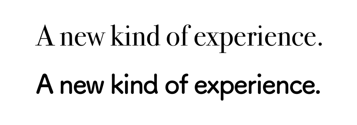
After (and only after) usability, typography is about emotion. Do the letters complement your content, or contradict it? Do they amplify your brand’s personality, or dampen it? Applied to the same text, different type will make people feel different things. Being deliberate about typography lets us control these feelings.
Same text, different personalities. I’ll bet the first experience is much more expensive. Typefaces: Bodoni 72 (Top), Tsukushi A Round Gothic (Bottom)
Despite what many golden ratio enthusiasts might try to tell you, typography isn’t an exact science. Good guidelines will get you most of the way there, but you’ll need to apply a little intuition too. Luckily, you’ve been reading text your whole life — books, magazines, the Internet — so you have a lot more untapped intuition than you think!
What’s in a font?
Let’s start off by getting a handle on some basic terminology and how fonts are categorized.
Typeface vs. Font
This is how the two have traditionally been defined and distinguished from one another:
Typeface: The design of a collection of glyphs (e.g. letters, numbers, symbols)
Font: A specific size, weight, or style of a typeface (e.g. regular, bold, italic)
In essence, a typeface is like a song and a font is like its MP3 file. You’ll see both terms used in typography literature, so it’s worth knowing the distinction. "Font vs. Typeface" is also a bit of meme in the design community — you might see it crop up on Twitter, so it’ll help to be "in the know."
HOW 2 MAJOR IN GRAPHIC DESIGN: - CHOOSE A FONT - "ITS CALLED A TYPEFACE NOT A FONT" - CHOOSE A GODDAMN TYPEFACE - U MADE THE WRONG CHOICE
But, more recently, you can essentially use both terms interchangeably and people will know what you mean.
How fonts are categorized
The broadest split is between serif and sans-serif typefaces. It’s likely you’ve come across these terms just by seeing some some typeface names floating around (like, ahem, Comic Sans).
A "serif" is a small stroke attached to the ends of letters, giving them a traditional feel. In fact, most books and newspapers are set in serif typefaces. On the contrary, sans-serif typefaces don’t have these extra strokes, giving them a smooth, modern feel.
Times (left) and Helvetica Neue (right)
Both serif and sans-serif have categories within them. For example, serif has sub-categories including didone, slab and old style.
Didot (left), Rockwell (center) and Hoefler Text (right)
As far as sans-serif goes, it includes humanist, geometric and grotesk as sub-categories.
Gill Sans (left), Futura (center) and Aktiv Grotesk (right)
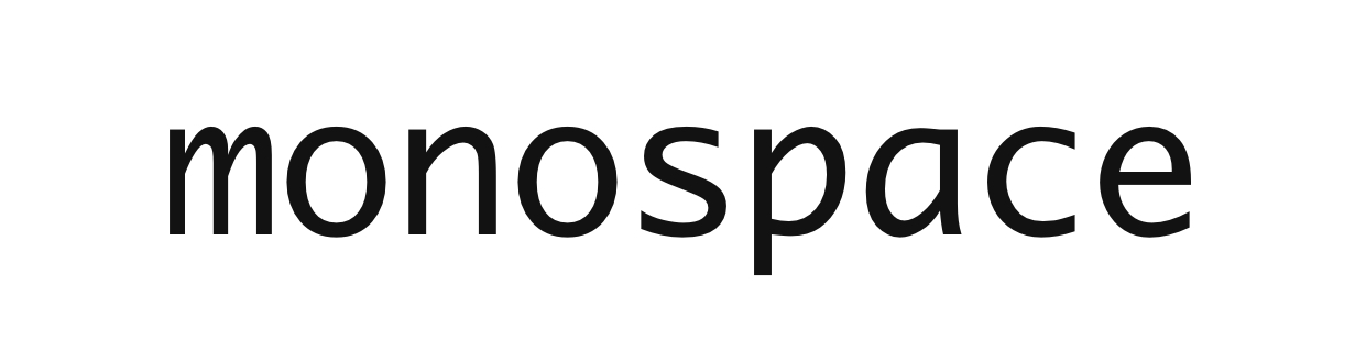
Monospace fonts (yes, fonts) are a noteworthy category all its own. Each glyph (i.e. letter/number/symbol) in a monospace font has the same width (hence the mono spacing terminology), so it’s possible to arrange them into visual structures. You may be well familiar with monospace because we see it often when writing code, where it’s helpful to make brackets and indents line up visually. The code editor you have open right now is likely using monospace.
Monaco
How to choose fonts and font pairings
This is subjective, and depends on what you’re trying to do. Each typeface has its own personality, so you’ll have to find one that aligns with your brand or the content it’s communicating. Typefaces have to be considered within the context that they’re being applied. Are we looking for formality? Maybe start with the serif family. Warm, fun and friendly? That might be a cue for sans-serif. Heck, there’s a time and a place even for Comic Sans… really! Just know that there is no hard science to choosing a font, and even the most trained of typographers are considering contextual cues to find the "right" one.
But fonts can be paired together in the same design. For example, some designs use one typeface for headings and another for body text. This is a good way to get a unique look, but it does take a fair bit of work to get it right. Like colors in a palette, some typefaces work well together while others clash. And even purposeful clashing can make sense, again, given the right context.
The only way to find out if two fonts are complementary is to see them together. Tools like FontPair and TypeConnection can help with this. If a font catches your eye when surfing the web, WhatFont is a great browser extension to help identify it. Another great resource is Typewolf which allows you to see examples of great web typography, including different font combinations in use:
Alice Lee (left), American Documentary (center) and Studio Stereo (right)
While there’s a lot of subjectivity in choosing fonts, there are some objective considerations.
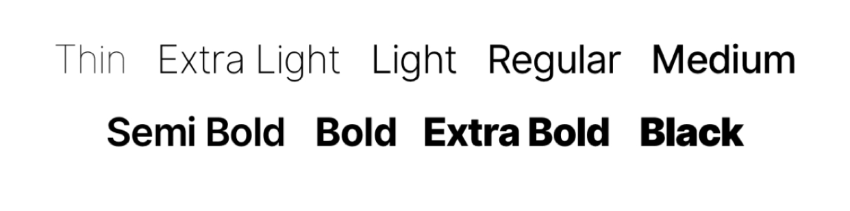
Font weight as a consideration
Some font families have a wide range of font weights — Light, Book, Regular, Medium, Semi-Bold, Bold, Black — whereas others just have a couple.
Inter UI comes with a fantastic range of weights
If you’re building a complex web app UI, you might need a range of font weights to establish hierarchy in different contexts. For something less complex, say a blog, you’ll likely be fine with just a couple.
Complex UI hierarchy (left) and Simple blog hierarchy (right)
It's still early days — there aren't many variable fonts available right now, and browser support is limited. But definitely a space worth watching!
Consider the legibility of a font
Some typefaces are harder to read than others. Stay away from elaborate fonts when it comes to paragraphs, and if you must have tiny text somewhere, make sure its typeface is legible at those tiny sizes.
Of these two examples, which is easier on the eyes? (There is a right answer here. 🙂)
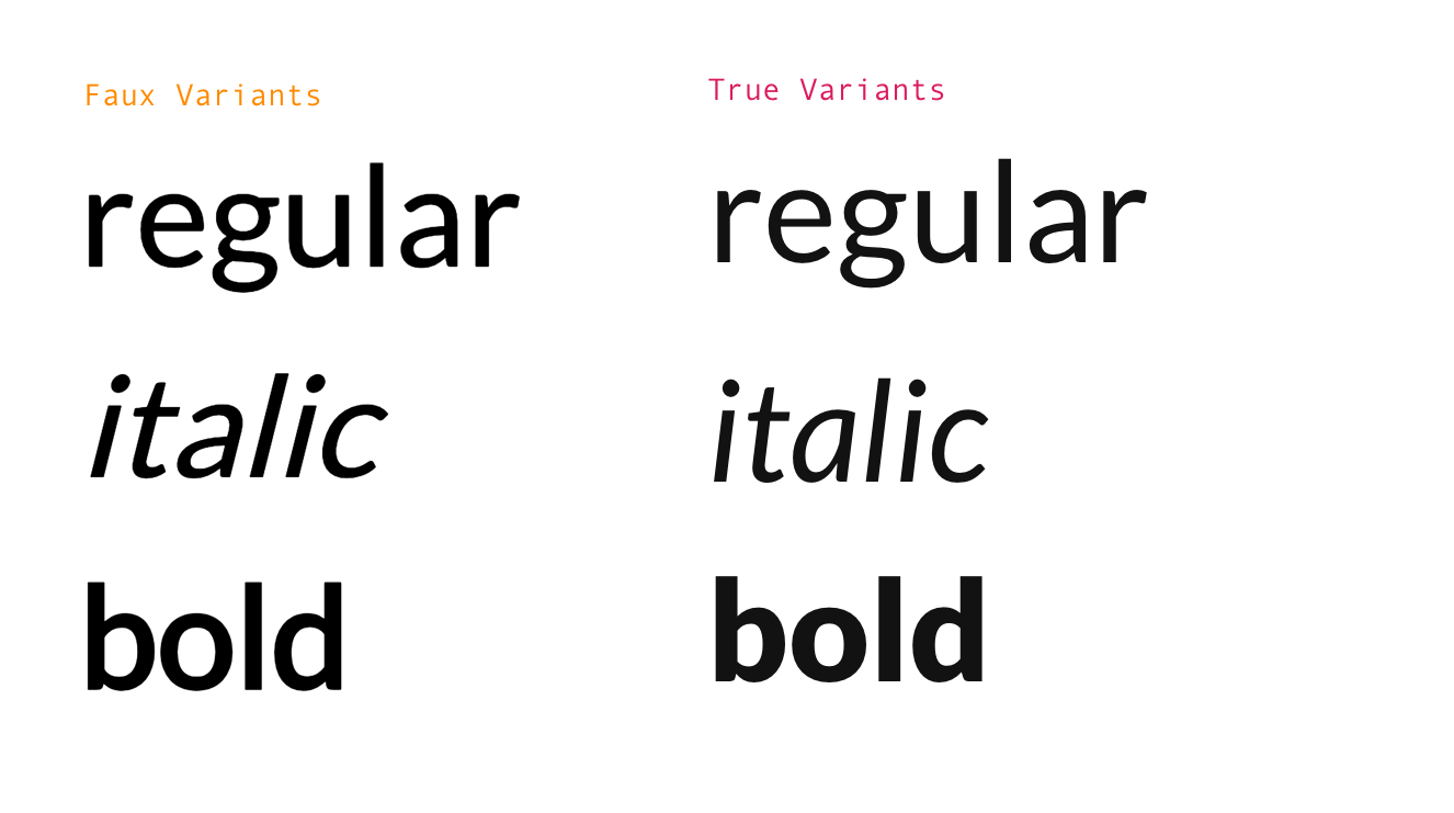
Making a font bold isn’t as simple as adding an outline to the text, and italics are more than slanted letters. Good fonts have specific bold and italic styles, without which the browser tries to "fake" it:
Lato
These faux styles tend to reduce legibility and break the text’s visual cohesion because the browser can only do so much with what it’s given. Stick to fontsthat offertrue bold/italics styles, if you can.
Other things worth consideration
What we’ve looked at so far are the high level characteristics and features of fonts that can help us decide which to choose for a particular design or context. There are many other things that can (and probably should) be taken into consideration, including:
Language support: Some fonts have glyphs for foreign characters, which may be a requirement for a project geared toward a multilingual audience or that contains multilingual content.
Ligatures: Some fonts (typically serifs) have glyphs to replace otherwise awkward characters, like ffi and ffl which are multiple characters in a single glyph.
File size: You’re a developer, so I know you care about performance. Some fonts come in bigger files than others and those can cause a site to take a hit on load times.
Using fonts on the world wide web
A mere 10 years ago, there were two complex ways to use custom fonts on the web:
SiFR: Embedding a Flash (remember that thing?) widget to render text.
cufon: converting the font to a proprietary format, and using a specific JavaScript rendering engine to generate the text using VML on an HTML <canvas>.
Today, there’s all we need is a single simple one: @font-face. It lets you specify a font file URL, which the browser then downloads and uses on your site.
You can use the @font-face declaration to define your custom font:
And then refer to it as normal, by the font-family attribute:
body {
  font-family: 'MyWebFont', Fallback, sans-serif;
}
Even though @font-face is light years ahead of the old school approaches to custom web fonts, there is quite a bit to consider as far as browser support goes. Here’s a guide to getting the right amount of cross-browser support.
The impact of fonts on performance
Performance is the only downside to using custom fonts on the web. Fonts are relatively large assets — often hundreds of kilobytes in size — and will have and adverse effect on the speed of any site.
Disable font features you don’t need, e.g. hinting, kerning.
Remove glyphs that you don’t need, e.g. foreign language characters.
One tool that can help tailor a font file to suit your needs is Transfonter. Just make sure you have the rights to any font that you want to use on your site because, well, it’s just the right thing to do.
Some services will host web fonts for you
One other significant way to shed some of the weight of using custom web fonts is to use a service that will host and serve them for you. The benefit here is that third-parties store the files on a speedy CDN, optimize them, and serve them to your site via a JavaScript snippet that gets dropped into the document head. In short: it takes a lot of hassle off your hands.
How easy is it to use a hosted service? Consider that using anything on Google Fonts only requires a single <link> in the HTML head:
<html>
  <head>
    <link href="https://fonts.googleapis.com/css?family=Roboto" rel="stylesheet">
  <style>
    body {
      font-family: 'Roboto', sans-serif;
    }
  </style>
</head>

<!-- Rest of the document -->
This example was taken from Google Fonts — the most popular hosted font service. It’s free to use, and, at the time of writing, has a catalogue of 915 font families. The quality of these can be hit-or-miss. Some are truly top-notch — beautiful design, many weights, true bold/italics, and advanced features like ligatures. Others, typically the more novel designs, are bare-bones, and might not be suitable for serious projects with evolving needs.
Adobe Fonts is also very popular. It comes bundled with Adobe’s Creative Cloud offering, which starts at $20.99 per month. At the time of writing, it has a catalogue of 1,636 font families. These are typically high quality fonts that you’d have to pay for, but with Adobe Fonts, you can access them all in a Netflix all-you-can-eat model.
Here are some other options:
Adobe Edge Web Fonts: This is the free version of Adobe Fonts. Adobe partnered with Google on this, so there’s a lot of overlap with the Google Fonts library. It has 503 font families in total.
Fontspring: This is a massive library of over 14,000 font families, but with an individual licensing model. This means paying more up-front, starting at ~$20 per individual font (and per weight or style), but no recurring costs. It’s also self-serve — you’ll have to host the files yourself.
MyFonts by Monotype: This is major type foundry. Similar to Fontspring: massive library of font families with an individual licensing model.
Fonts.com: This is similar to Fontspring. Options for one-off or pay-as-you go pricing (based on page views).
Cloud.typography by Hoefler&Co: This is a major type foundry. Over 1,000 font families (all by Hoefler&Co), with options for hosted (subscription, starting at $99 per year) or self-hosted (individually licensed) web fonts. The benefit here is that you get access to a library of fonts you cannot find anywhere else.
Fontstand: This services allows you to "rent" individual fonts cheaply on a monthly basis, starting ~$10 per month), which you get to own automatically after 12 months. To date, it boasts 1,500 families, with a hosted web font service.
CSS and Typography
OK, let’s move on to the intersection of design and development. We’ve covered a lot of the foundational terms and concepts of typography, but now we can turn our attention to what affordances we have to manipulate and style type, specifically with CSS.
Adjusting font sizing
Changing the size of a font is something that inevitably pops up in a typical project. Size is important because it creates hierarchy, implicitly guiding the user through the page. So, in this section, we’re going to look at two CSS features that are available in our tool belt for adjusting font sizes to create better content hierarchy.
Sizes can be expressed in a different units of measure
Did you know that there are 15 different units for sizing in CSS? Crazy, right? Most of us are probably aware of and comfortable working with pixels (px) but there are so many other ways we can define the size of a font.
Some of these are relative units, and others are absolute. The actual size of an element expressed in relative units depends on other parts of the page, while the actual size of an element expressed in absolute units is always the same. And, as you might expect, that difference is important because they serve different functions, depending on a design’s needs.
Of the 15 units we have available, we will selectively look at two in particular: px and em. Not only are these perhaps the two most used units that you’ll see used to define font sizes, but they also perfectly demonstrate the difference between absolute and relative sizing.
First off, px is an absolute unit and it actually doesn’t have much to do with pixels (it’s considered an angular measurement), but it’s defined so that a line of width 1px appears sharp and visible, no matter the screen resolution. The px value corresponds, roughly, to a little more than the distance from the highest ascender (e.g. the top of the letter A) to the lowest descender (e.g. the bottom of the letter p) in the font. Some fonts have taller letters than others, so 16px in one font might look noticeably "bigger" than 16px in another. Yet another consideration to take into account when choosing a font!
Interestingly enough, when it comes to typography, the px is a unit to be understood, but not used. The true purpose of px units is to serve as the foundation of a type system based on relative units. In other words, it’s an absolute value that a relative unit can point to in order to define its own size relative to that value.
Which takes us to em, a relative unit. Text with a font size of 2em would be twice as big as the font-size of its parent element. The body doesn’t have a parent element, but each device has its own default font-size for the body element. For example, desktop browsers usually default to 16px. Other devices (e.g. mobile phones and TVs) might have different defaults that are optimized for their form factors.
The em lets you reason about your typography intuitively: "I want this title to be twice as big as the paragraph text" corresponds directly to 2em. It’s also easy to maintain — if you need a media query to make everything bigger on mobile, it’s a simple matter of increasing one font-size attribute. Dealing in em units also lets you set other typographical elements in relation to font-size, as we’ll see later.
There are semantic HTML elements that CSS can target to adjust size
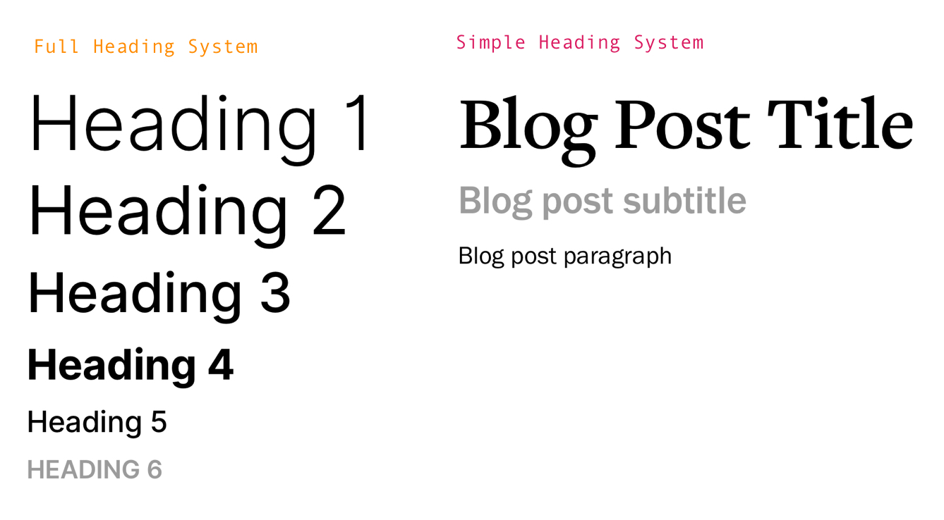
You’re sold on the em, but how many em units should each element be? You’ll want to have a range of text sizes to establish hierarchy between different elements of your page. More often than not, you’ll see hierarchies that are six level deep, which corresponds to the HTML heading elements, h1 through h6.
The right size scale depends on the use case. As a guideline, many people choose to use a modular scale. That refers to a scale based on a constant ratio for successive text elements in the hierarchy.
Example of a modular scale with a ratio of 1.4
Modular Scales is a tool by Tim Brown, who popularized this approach, which makes it easy to visualize different size scales.
Adjusting a font’s vertical spacing and alignment
The physical size of a font is a super common way we use CSS to style a font, but vertical spacing is another incredibly powerful way CSS can help improve the legibility of content.
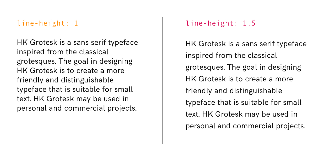
Use line-height to define how tall to make a line of text
Line height is one of the most important factors affecting readability. It’s controlled by the line-height property, best expressed as a unit-less number that corresponds to a multiple of the defined font size.
Let’s say we are working with a computed font size of 16px (specified in the CSS as em units, of course), a line-height of 1.2 would make each line 19.2px tall. (Remember that px aren’t actually pixels, so decimals are valid!)
Most browsers default to a line-height of 1.2 but the problem is that this is usually too tight — you probably want something closer to 1.5 because provides a little more breathing room for your eyes when reading.
Here are some general guidelines to define a good line height:
Increase line-height for thick fonts
Increase line-height when fonts are a dark color
Increase line-height for long-form content
Increasing the line-height can drastically improve legibility
Fonts can’t dance, but they still have rhythm
Rhythm describes how text flows vertically on a page. Much like music, some amount of consistency and structure usually leads to good "rhythm." Like most design techniques, rhythm isn’t an exact science but there are some sensible guidelines that give good results.
One school of thought prescribes the use of paragraph line height as a baseline unit from which all other spacing is derived. This includes gaps between paragraphs and headings, and padding between the text and other page elements.
Under this system, you might set the line height of a heading to twice the line height of paragraphs, and leave a one-line gap between a heading and paragraph. Handily, you can use the same em units to define margins and padding, so there’s really no need to hard-code anything.
Hopefully you’re convinced by now that vertical spacing is an important factor in improving legibility that we can control in CSS. Equally important is the horizontal spacing of individual characters and the overall width of content.
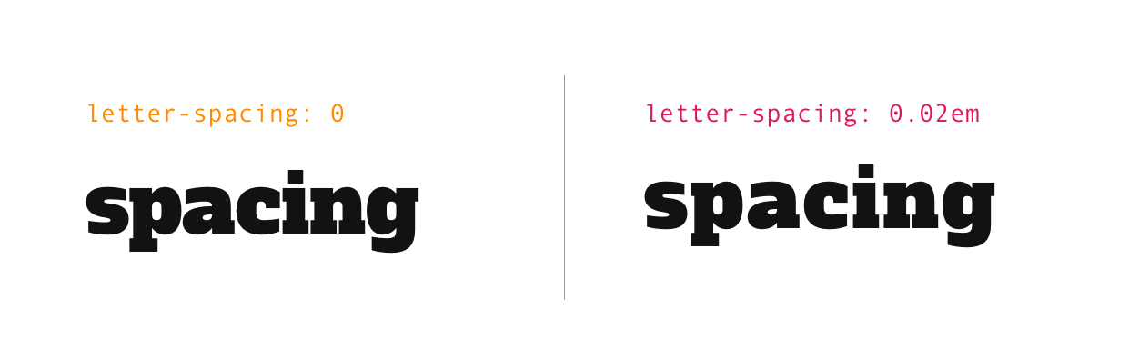
CSS can control the space between letters
Letter spacing is one of the most important factors affecting legibility. It is controlled by the CSS letter-spacing property, best expressed (again) in em units to keep everything relative. Tracking (the typography term for "letter spacing") depends entirely on the font — some fonts will look great by default, while others might need a little tweaking.
In general, you only need to worry about letter spacing for text elements that are particularly big or small because most fonts are spaced well at a typical paragraph size.
For larger text, like headings and titles, you’ll often want to reduce the space between letters. And a little bit of space goes a long way. For example, -0.02em is a tiny decimal, but a good starting point, which can be tweaked until it looks just right to your eye. The only time you should think about increasing letter spacing is when dealing with stylistically unusual text — things like all-capped titles and even some number sequences.
Adding or subtracting as little as 0.02em can refine the appearance of words
Some specific pairs of letters, like AV, can look awkwardly spaced without a little manual tweaking. Well-crafted fonts typically specify custom spacing for such pairs, and setting the font-kerning property to normal lets you enable this. Browsers disable this on smaller text by default. Here is a little more on letter spacing, as well as other CSS tools we have to control font spacing in general.
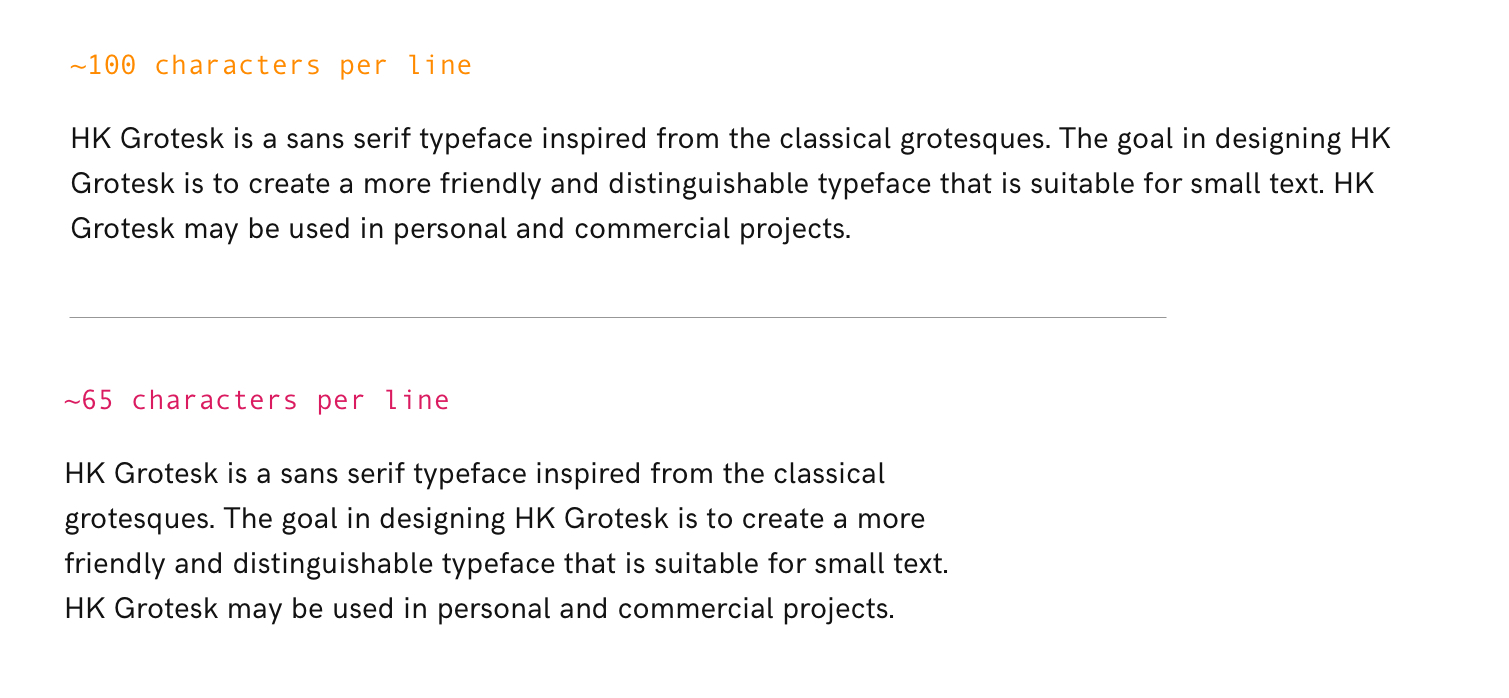
The length of a line of text is more important than you might think
It’s unpleasant for our eyes to move long distances while reading, so the width of lines should be deliberate. General consensus is that a good width is somewhere between 60 and 70 characters per line. If you find that a line of text (especially for long-form content) drastically falls outside this range, then start adjusting.
The ch is a little-known CSS unit that we didn’t cover earlier, but can be helpful to keep line length in check. It’s a relative unit, defined as the width of the 0 character in the element’s font. Because narrow characters like l and i are relatively frequent, setting the width of a text container to something like 50ch should result in lines that are 60-70 character long.
p {
  width: 50ch;
}
CSS can smooth otherwise crispy fonts
-webkit-font-smoothing is a nifty CSS property that controls how fonts are anti-aliased. This is a fancy way of saying it can draw shades of gray around otherwise square pixels to create a smoother appearance. Do note, however, the -webkit prefix there, because that indicates that the property is only supported by WebKit browsers, e.g. Safari.
The default setting is subpixel-antialiased, but it’s worth seeing what your type looks like when it’s set to just antialiased. It can improve the way many fonts look, especially for text on non-white backgrounds.
At small font sizes, this should be used with caution — it lowers contrast, affecting readability. You should also make sure to adjust letter-spacing when using this, since greater anti-aliasing will increase the space between letters.
Anti-aliased (left) Subpixel Anti-aliased (right)
Wrapping up
Phew! We covered a lot of ground in a relatively short amount of space. Still, this is by no means an exhaustive guide, but rather, something that I hope will encourage you to take more control over the typography in your future projects, and to seek an even deeper knowledge of the topic. For that, I’ve compiled a list of additional resources to help you level up from here.