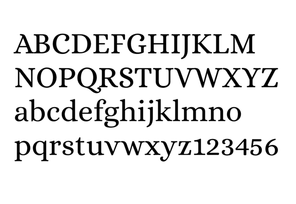
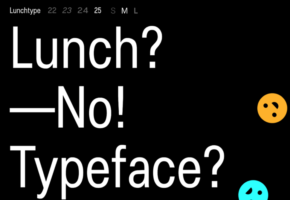
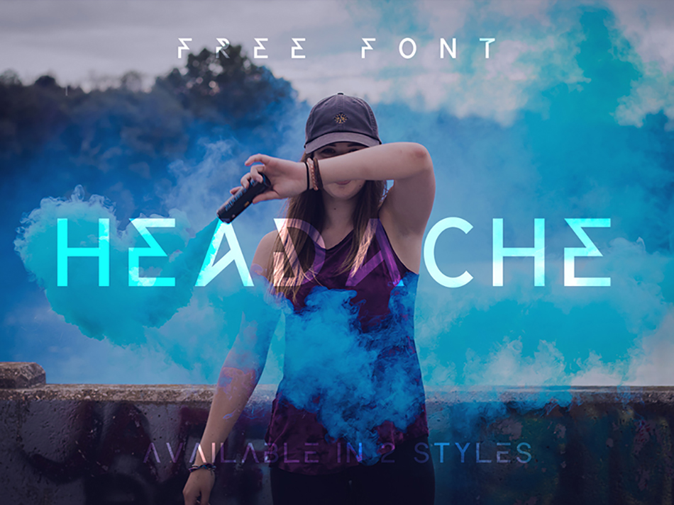
Whether on our phones, websites, or books, we consistently rely on words and their fonts! From instruction books to course content to educational web content, typography exists everywhere! It wouldn’t be a lie to mention...
Basement Grotesque is one of basement studio’s first self-initiated projects. We wanted to create a typeface tailored to the studio’s visual language. It became the perfect excuse to show it off with a website that could suit its inherent bold and striking style.
The Beginnings
Our design team had just redesigned the studio’s identity. For the wordmark, instead of using an existing font, we decided to draw each of the characters in an effort to capture the distinct voice and style of the studio. Once we had drawn those final seven letters (and the period sign), it seemed only natural to expand them to a full-fledged bespoke font. That was the beginning of Basement Grotesque.
From then on, our task was fairly clear: we had to create a strong typeface, suitable for large headings and titling, and it had to be bold. Inspired by the specimens of grotesque typefaces of the early 19th century, and combining them with the renewed brutalist aesthetics of the contemporary visual landscape, Basement Grotesque would become our first venture into the daunting world of type design. We weren’t just designing and releasing a new font; we were on the journey of learning a new craft by doing.
Coincidentally, the studio had established quarterly hackathons to devote specific time and space to develop self-initiated projects where the whole team would get together, work on and ship anything we wanted to explore and test that wouldn’t normally be possible with client work. After some brainstorming, the first project chosen for our first hackathon was the site to launch and share our first typeface. Again, it just felt like a natural decision.
“This font is really the result of a creative itch we wanted to scratch a long time ago. We took on the challenge and now we have a growing typeface, open and available to anyone who wants to use it” — Andres Briganti, Head of Design
The Process
Once the goal was set, the challenge was to finish at least one weight of the typeface and then make a website to promote it and its future additions. We had to do something captivating so that it would motivate our community to use it and share it.
The font quickly got to a stage where it was advanced enough to be released. Part of the appeal of the project was the idea to create something that was an ongoing effort and a work in progress. New weights and widths, and even revisions and updates would become available and open to the public as time goes by.
Starting with the Black Weight (800), each character was carefully designed to convey the studio’s visual style, and some of the features of the current version are:
413 unique glyphs
14 discretionary ligatures
Bold, our voice and tone, of course
Old style and lining figures
Language support for Western and Central European languages
Create, Develop and Show Off
With the font in hand, we now had to build a website to present it. It had to be interactive enough to show the typeface’s features, but also feel solid and performant.
The preferred tech stack at basement is Next.js with TypeScript. Having those as basics, we then chose GSAP for animations, Stitches for CSS-in-JS, and Locomotive Scroll for better scrolling experiences — among other libraries. We started from a template repository, next-typescript, for faster development.
“We worked on a tight deadline, and the team really delivered. Each of us worked on a specific section, and then we arranged everything together to get to the final result.” Julian Benegas, Head of Development.
1) In the “Try this beauty” section, we have an interactive preview, where you can adjust the font size, leading, and tracking, to see how it looks. We had to create a ResizableTextarea component to solve some spacing issues. The syncHeights function synced the height of a placeholder div with the actual textarea node. A bit hacky!
function syncHeights(textarea: HTMLTextAreaElement, div: HTMLDivElement) {
  const value = textarea.value.replace(/\n/g, '<br>')
  div.innerHTML = value + '<br style="line-height: 3px;">'
  div.style.display = 'block'
  textarea.style.height = div.offsetHeight + 'px'
  div.style.display = 'none'
}
2) On the footer, we used the 2d physics library p2.js to get that cool “falling letters” animation. The code is a bit long, but please, feel free to follow the source from here.
3) We integrated with Twitter’s API to get and render tweets hashtagged #basementgrotesque on the website. On the download flow, we suggested that users tweet something to show some love
const handleDownload = useCallback(() => {
    const encoded = {
      text: encodeURIComponent(
        'I’m downloading the #basementgrotesque typeface, the boldest font I’ll ever use on my side-projects. Thank you guys @basementstudio 🏴 Get it now: https://grotesque.basement.studio/'
      )
    }
    window.open(
      `https://twitter.com/intent/tweet?text=${encoded.text}`,
      '_blank'
    )
    download(
      encodeURI(location.origin + '/BasementGrotesque-Black_v1.202.zip')
    )
  }, [])
basement.studio is a small team of like-minded individuals whose purpose is to create visually compelling brands and websites, focusing not only on their looks but also on their performance. As we like to say: we make cool shit that performs.
Our award-winning team of designers and developers are hungry for even more interesting projects to build.
Not a typical one, at least. Each character is an HTML element, built with CSS. A true web font!
Let me elaborate. This is a way to render text without using any font at all. Random text is split with PHP into words and letters, then rendered as HTML elements with classes. Every element is styled with CSS to create the characters. This is “just” HTML controlled with CSS, but still, it is software and it gets the message through. It has all the properties a conventional font does, so we’ll call it a font. A font without a format.
Disclaimer: I’m not an expert in HTML, CSS, or PHP. I’m willing to bet there is a shortcut or an easier solution to achieve what I’ve done here, but since I’m happy with the results, I will present the process and my experience. The presentation is not a tutorial; it is an experiment based on my limited skills and should be treated as such.
The idea
The project was never meant to last for five months, but that’s what it took! It all started with having a play with a CSS icon, using pseudo-elements to make shapes. Once the first S letter was finished, the rest were relatively easy. I checked to see if there were other similar projects but didn’t find much, so I was motivated to see how far I could get.
Initially, an SVG font controlled with CSS seemed like a good idea. It would make this task much easier (SVG is made for drawing) and could focus on design-specific effects, but it doesn’t have the flexibility of a raw HTML element. An SVG cannot be modified depending on context, and the process falls back to the conventional font design, where every character has a fixed shape and code.
How it works
This is a hybrid of web and font design. Each character is built like any web element and used inline to behave like a font. Metrics, Weights, OpenType Features and all the other font properties are controlled exclusively with the CSS file.
The font design is based on the border width of the elements, which makes it extremely versatile. With the exemption of script fonts, several styles and weights can result just from border variations, using the same shape. On more complex characters the clip-path and the background is used to create the cutout effect.
Nested elements are generated when the ::before and ::after pseudo-element is not enough to form a character. Using em values for width, height and border widths will help later in controlling the font size. This is one of the golden rules.
A character (left) is built like any CSS icon (right). There are no major differences. Sometimes a letter is easier to build, just like a stickman, based on circles and lines. But here is when you can really appreciate the role of the border-radius property. Personally, I never was a fan of rounded borders, but this experience changed my mind. Basically, there’s no limit for what a radius can do.
Below are the only two “real” examples of the CSS font in this article, the rest of the example figures are converted to SVG for easier display in a blog post.
1. Gray – main shape 2. Red – pseudo elements 3. Blue – Extra element
Most of the times you have to insist for the desired effect, but in the end you want to carry this icon in your wallet. Icon created with a single shape, the pseudo-element is used only to avoid the rotation of the main element, in case it is used inline.
The serif preview presents a more complex situation, but as usual, a sans font will have fewer elements to deal with, making the file is smaller and load faster. This is not really an issue and it’s only logical — the CSS is read before a font embedded with the @font-face rule.
The challenge
Naive start, putting all the math and the logic to use. None of the values work if a pixel decides so. The final solution in this case was to include a second parent that will keep the “children” tidy.
The hardest part is to beat the pixel ratio, or align the pseudo elements to the base shape. Elaborated mathematical formulas failed when the charater was resized. A browser will treat each element separately and shift them to the closest integer value.
A solution to this was to create as many pseudo-elements as possible (even including extra elements), and use a single reference for a pair of ::before and ::after, not related to the main shape. In this case, the browser will render the elements more or less to the same position.
A character without a point of reference is illustrated with the S letter below. The top and bottom section of the letter are two pseudo elements, without a base shape to rely on (e.g. the gray area in the serif above or here in the digit two).
After creating a few hundred characters, you realize that a character cannot support inline transformation (i.e. skew(), rotate(), and such) because it won’t align to siblings. This becomes more obvious visually on text selection. Because of that, a pseudo-element makes perfect sense. I would say essential: the second golden rule.
The graphic shows the basic principle of construction. When apertures cannot be controlled simply with the {border: 0;} rule, clip-path is used.
In this case, the S letter needs a smaller aperture, so the border eventually is kept and cut at the desired distance with clip-path.
CSS custom properties
It seems easier to create a style in CSS than it is in font softwares. You have the option to control shapes and sizes for multiple characters at once. In CSS, more characters are grouped together in the same ruleset.
CSS custom properties are extremely handy in this situation, especially for controlling borders, widths, and positions. The different weights are the result of changes in the variable, with adjustments afterwards. Fine tuning is unavoidable because character shapes and sizes take the border width into account and may not display proportionally with different borders, especially on asymmetrical shapes.
Cutout effect created by adding the same background color to the overlaying element. Combination of colors and effects using the mix-blend-mode.
The cutout effect is created by adding the same background color to the overlaying element, then using a combination of colors and effects using mix-blend-mode.
A global color variable is required in CSS to create a cutout effect for nested elements that otherwise would follow the parent color (overlaying elements match the background).
The background-image property won’t work on characters built exclusively with borders and the background is changed if the element has size or position transformations (scale, rotate, or other).
Where a background cannot be used, the solution is mix-blend-mode: lighten; on dark backgrounds and mix-blend-mode: darken; on light backgrounds.
Side effects
The downside is that some effects can have unexpected or even opposite results on elements with variable properties. Usually, a filter will read elements as full objects. To prevent any conflict, borders and transformation effects are reserved for the font design.
Font to text
A font won’t make a text. The idea in the first place was to create a text that will load along with the CSS, without any dependencies. For that the best option is PHP (my rookie opinion). Besides rendering HTML with inline functions, it is up to almost any task imaginable. Without PHP this project would not be possible.
Naturally, the first task with PHP was to split a random text, remove extra spaces and create matching groups for every word and letter, each one with its own class. So far, so good. I won’t insist on the part that went smoothly, it is a basic function, using split, explode and all the other words borrowed from a video game.
Still, since I never worked on this before, I had to learn the hard way. Nobody told me that PHP considers the “0” (zero) as null, so there’s a day gone. I couldn’t figure out why my zeros are not displayed.
For anyone with this issue maybe it’s helpful. Instead of using the empty() function, I used the one below:
The other major issue was the character range. It seems that there are way too many settings in HTML, the .htaccess file, and on the server itself just to recognize special characters. The solution was found after a few days in the PHP Documentation, posted by qeremy [atta] gmail [dotta] com, obviously somebody living in a diacritic-heavy area.
A lot of chunks, if you ask me, but it works like a charm and solves every issue. The function basically overlooks the language settings and will read any character, even the non-standard ones. Characters buried deep in the Unicode tables will be recognized if the PHP function includes that character.
This function will only create the possibility to generate each character as typed, without the need for HTML entities. This option won’t limit the use of text in HTML format, but inline codes must be avoided or replaced with alternatives. For example, instead of using non-breaking spaces ( ), elements can be wrapped in the <nobr> tag.
The HTML entities are not decoded, which is an advantage from my point of view. Default system font on the left. On the right is CSS text rendered without any changes.
Structure
With this solved, the next step is to create a specific structure for each character. The class of the HTML elements and the positions of the nested element depends on a long list of characters that correspond with one or more classes. Some of the most basic characters are not excluded from this list (e.g. the small “a” letter needs a finial and that means an extra element/class).
The basic structure looks something like this, just to get the idea …
'Ć' => 'Cacute C acute'
…which will render three elements: the parent Cacute, the C letter, and the acute accent.The result is below, where the red square represents the parent element, containing the other two preset elements.
Cacute — a classic combination between a basic letter and an accent.
The technique is very similar to the way diacritics (sometimes ligatures) are built in font software, based on pairings. When a component element is changed, every other will adjust.
Because any element can have multiple applications, the IDs are avoided and only classes are used.
OpenType features
The PHP function is set to behave differently depending on context. The character recognition is set to replace pairings and create ligatures when rendering the CSS text.
Contextual ligatures in the CSS text are not standalone characters and don’t have specific classes. Different from conventional OpenType features, the characters are restyled, not replaced. The interaction is controlled in CSS by styling the second element, to merge or form a new character.
The features are activated with a specific class added to the parent container. Alternates are rendered in any circumstance, regardless if a character is registered or not, in every browser, with or without font feature support.
Example of the Ordinal Indicator Feature, activated with the .ordn class. The characters are styled inline and change their look according to class and their previous sibling. The same recipe is applied for Stylistic Alternates (salt), Oldstyle Figures (onum), Slashed Zeros (slsh), Superscripts (sups), Subscripts (subs) and Fractions (frac).
Classes with similar functions to OpenType are named after the Registered Features by Microsoft/Adobe.
HTML syntax
Any HTML element can include the CSS font, as long it has the .css class next to the weight of the font. To select a weight, the .thin, .light, .regular or .bold class is used, something like <pre class="regular css"> (the <pre> tag is just a safety measure to avoid any style interference).
Available weights: Thin, Light, Regular and Bold.
The text can have an HTML format. The plain text is not mandatory.
PHP will ignore a bracket (<) if this has a closing correspondent, which means that every HTML tag in a text will remain active and only the text content is rendered as the CSS font. URLs, file paths, or other additional info found in the tag are encoded just the same by the browser. The same tag can style groups of letters or entire sentences, if they’re set in CSS.
Also, depending on layout preferences, specific tags — like <a>, <u>, <ins>, and <del> — can be treated as objects to emulate and customize their native appearance and behavior.
Setup
CSS text is a group of objects with borders, open for size and color treatments. Think color as border-color and vice-versa. :first-child instead of :first-letter.
The font-size is set in the CSS file, the same as any other font, using viewport, percentage, pixels, em or rem units. Values set in pixels work with decimal values.
The text-align and text-indent properties work by default. The text will align to any setup even without text content.
Block-level elements (e.g. <div>, <p>, <ol>) placed inside texts will cause a line break, as it would normally. The <br> tag works as expected.
Except for text formatting elements (e.g. <h1>–<h6>, <strong>, <em>, <small>, <sup>, <sub>, etc.) that will need new rules to have the right effect on the text, most of the semantic elements (e.g. <form>, <ol>, <li>) work with their custom settings.
The font
To test the font in dynamic content, part of the PHP function was reproduced in JavaScript, with paste, mouse events, caret positions, and text selection. A single keystroke now makes it all worthwhile.
The CSS font and the complementary icons. This is what actually started the whole thing!
Review! Pluses (+) vs. Minuses (-)
Instant load
In the absence of actual text, the browser doesn’t wait for a font and a script to render the page. The CSS file along with HTML elements are cached, which means faster loads.
Universal
Every browser and server recognizes CSS. Fewer worries to find the right format that works the same in every browser. A server will not check for a specific format to allow access.
No dependencies
The CSS font doesn’t need alternate or system fonts to display the text. The same CSS that styles the page can include the font. The browser will not display a default font, neither before nor after the page load. The font does not rely on third parties and scripts, and the design is not different on browsers with disabled scripts.
No embedding
The CSS font is fully integrated into a webpage, and adapts to the layout without replacing other elements on load. Every page property is automatically valid for the text and this will show up the way it was intended, without after effects or functional issues.
Selective use
The font can be reduced to a limited number of characters. The full version is not required if the layout has a single word or a symbol, for example.
Full security
The actual text is not present on the page, which means that sensitive informations can be easily displayed without the fear of spam or phishing.
SEO friendly
Important information can be included using tag properties, the same way the alt attribute works for images.
Customizable
To build complex characters or functions, the font is open for any HTML element. No need for scripts to get specific details because every word and letter has its own entity and can be styled individually.
Contextual
The font design is not limited to predefined characters, so the style can change depending on context, without creating new characters.
Consistent
To compensate for the lack of automation found in font softwares, in CSS, the design can control several elements at once. This argument is valid, since a font software works with existing content, while CSS works with properties, creating a template for every existing or future elements.
Public
Anyone can create their own font. Short texts can be rendered manually, and the PHP function is not a requirement.
Basic
The design is accessible with any text editor or developer tool. Elementary skills using border widths, border radius, shapes and sizes is enough to redesign any character.
Live
Every adjustment result is instant. Conversions, exports, uploads or other steps to activate the font are eliminated from the process.
Moderate use
The speed of the page may suffer if a CSS font is generated for extended texts. This technique is only recommended for headlines, titles, excerpts and short paragraphs for that reason.
Common
The CSS font will not benefit from special treatments because, to the browser, this is just another HTML element. As a result, there’s no optimization or kerning support. The pixels have a hard time sharing thin lines and at small sizes the font may display improperly.
Hard coded
Your usual font settings are unavailable by default and styling tags (e.g. <strong>, <em>, etc.) have no effect. The functions must be set in the CSS file and require a different approach, working with HTML elements instead of fonts.
Exclusive
This is a webfont, so it is limited to digital media controlled with CSS. Except for some bitmap effects, the font can only be translated for offline by printing the document as a PDF, which will convert the CSS into a vector format.
Abstract
Without a standalone file the font is hard to be identified, tested, or transferred. It works like the HTML color: it’s invisible until it’s generated.
Not selectable
Without extra scripts, the text cannot be selected or used in inputs and textareas. For dynamic content, the function needs the whole character recognition found in PHP.
Not interactive
The most common display functions, such as sort or filter, will have to work with classes, and not with text content.
Not printable
The online print supports only basic CSS rules, sometimes ignoring graphics in favor of texts. The print quality will rely strictly on the browser’s capabilities.
No accessibility
The CSS font will adjust to page zoom, but the font size and the languages cannot be changed through the browser. Custom browser functions (e.g. Find, Reader) cannot access the text content since there is none.
Limited design
There is no wide selection of styles to choose from and the design is limited to the capabilities of CSS. A CSS rule can have different meanings to different browsers, causing inconsistencies. A CSS font is written, not drawn, so the “hand-made” concept is eliminated completely.
Multitask
You need to know your CSS to make adjustments in the font, and vice versa. The design process is not automated, and some properties that are otherwise generated by a machine must be set manually.
No protection
The design code is accessible to anyone, the same as any online element. The design cannot be really protected from unauthorized copying and usage.
There are over half a million fonts in the world. While most of the web is built upon a handful of popular font types, there’s lots of room to pick a unique path. Since fonts are also visual elements, you …
This article is a complete guide to font identification, containing all the important font tools and methods that we can use to identify fonts. Most of them are absolutely free to use and can be used with no registration which is very useful because everybody wants to keep their money in their pockets, right?
Usually, font identification is a “skill” used by marketers, web developers, web designers, ad makers, and online entrepreneurs. Using fonts daily in their projects, they are adept at identifying new fonts and implementing them to make their designs even more attractive. Improvement is a process that never ends, and this process definitely involves identifying and selecting fonts.
You might’ve seen Inter take a step into the scene as of recent, and I truly believe it’s here to stay.
Inter has become a staple font for many, so don’t be the exception! Add this font to your collection and start adding it to your design projects right away.
And finally, we’ve come to our last free font, which is Monoid.
Monoid is another great font that we know you’ll love and be using on the daily, if you code.
“The clever thing about Monoid is that it has font-awesome built into it, which they call Monoisome. This means when writing code, you can pop a few icons in there easily. Monoid looks just as great when you’re after highly readable website body text.”
Let us know in the comments which font was your favorite of this list and which ones you’ll be incoporating into your daily design life.
You just read the title of this article and you didn’t even think twice about it.
When we read, we don’t even realize that we’re reading and doing something incredible.
Something so simple, so insignificant to us, is an entirely vital part of life.
Something we do all day long and don’t pay any attention to it.
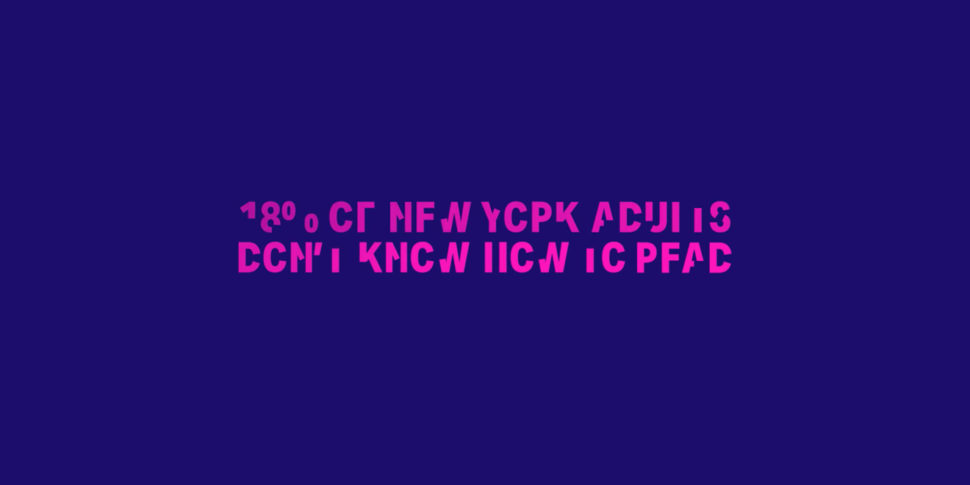
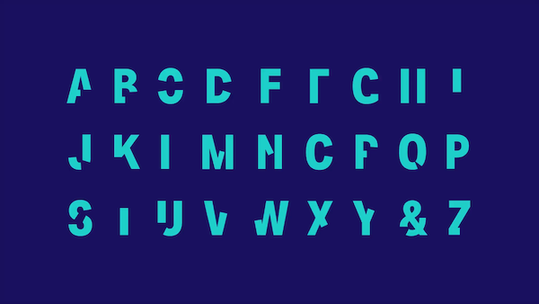
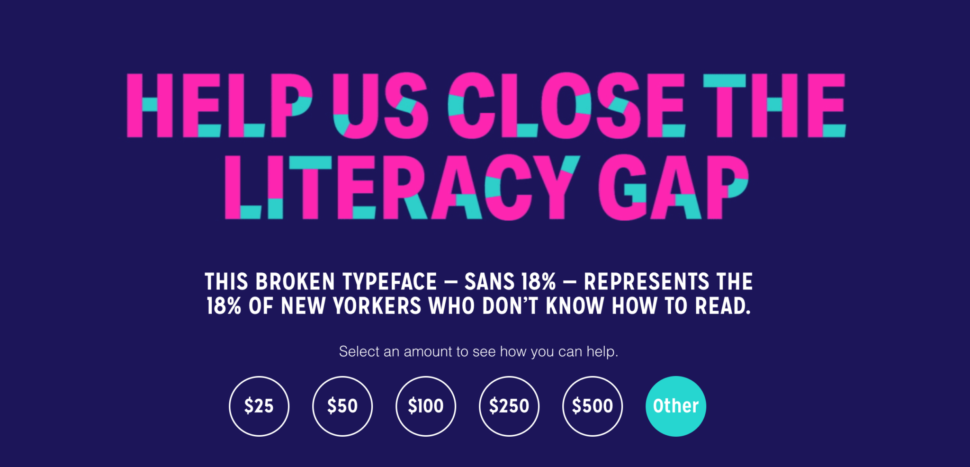
Did you know that 18% percent of New Yorkers face the daily struggle of illiteracy?
Think about what life would be like if you couldn’t read.
How difficult day to day life would be.
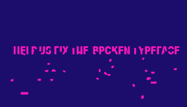
Sans 18% is a broken typeface created specifically to show us what it’s like to not be able to read.
This new typeface was intentionally created to be unintelligible.
To show us the struggle of what it is like to not be able to read, and to put ourselves in the shoes of others.
Sans 18% was created by Literacy Partners with the intent to show us what life is like for roughly 18% of New Yorkers who can not read, and to give a solution to people who face this problem.
When you can’t read, you face problems you would never imagine.
Reading and understanding important documents is impossible.
Being independent becomes a million times harder.
This font shows you what it’s like to look a billboard, document, or even doctor’s prescription and not be able to understand what’s going on.
The video from up above, which is narrated by a person who learned how to read from the Literacy Partners association, shows just how important it is to be able to read.
I personally am all for Literacy Partners.
Literacy Partners provides free classes, books, workshops, and education to immigrants and caregivers in New York who want to learn how to read.
The PSA video was shared on Times Square for one day, and is running digitally with pro bono support from media agency m/SIX.
CEO of Literacy Partners, Anthony Tassi said, “We can’t afford for some members of our community not to be able to read basic public health information. Their inability to do so has potentially fatal consequences for not only their families but for everyone around them.”
They have also ensured that the literacy programs have been made available online for those who cannot attend in person, and they have made sure that the families who participate in these workshops and classes have all the technology they need in order to participate.
If you want to help teach New Yorkers how to read and come together as a community to support Literacy Partners, you can donate directly on their website.
Any donation helps.
You can also download the font by creating an account on their website.
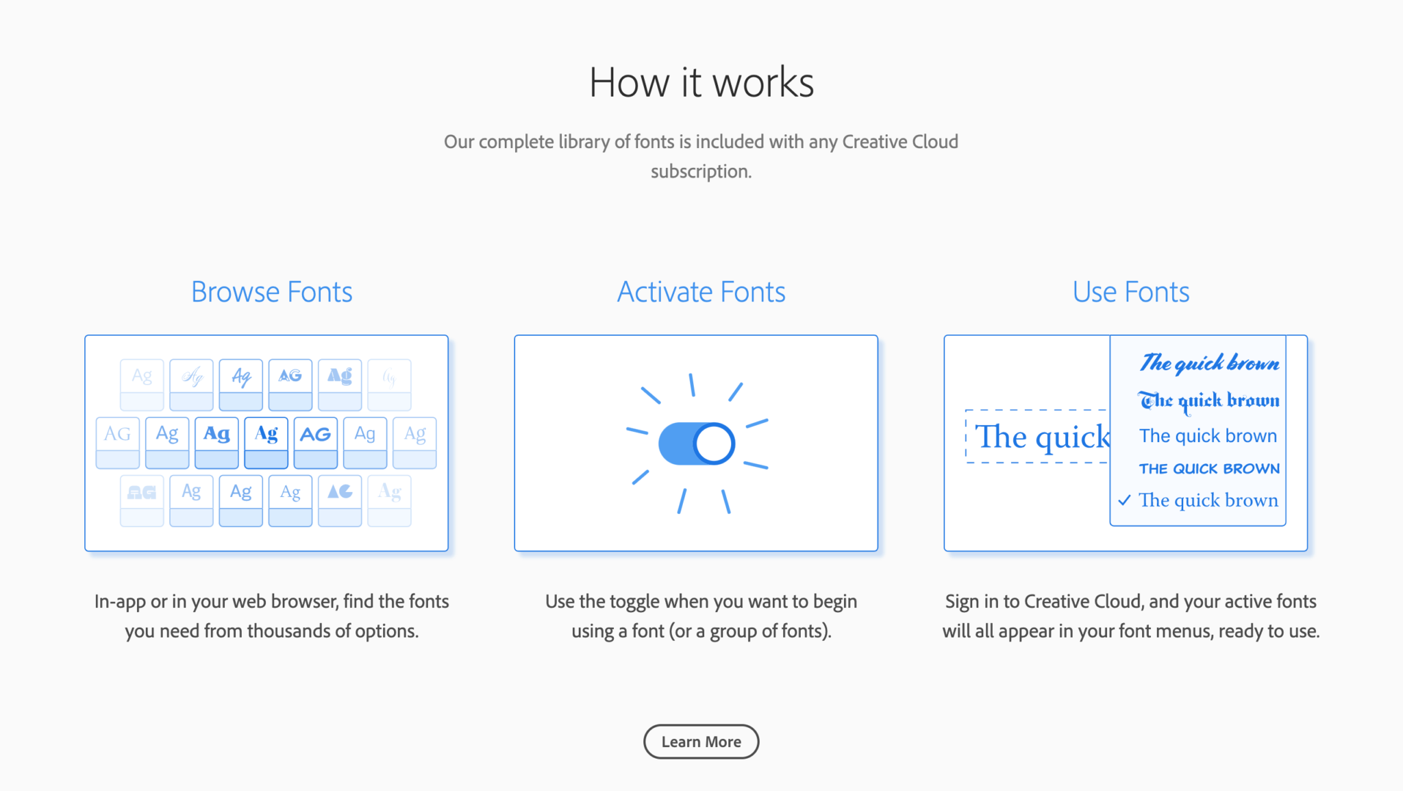
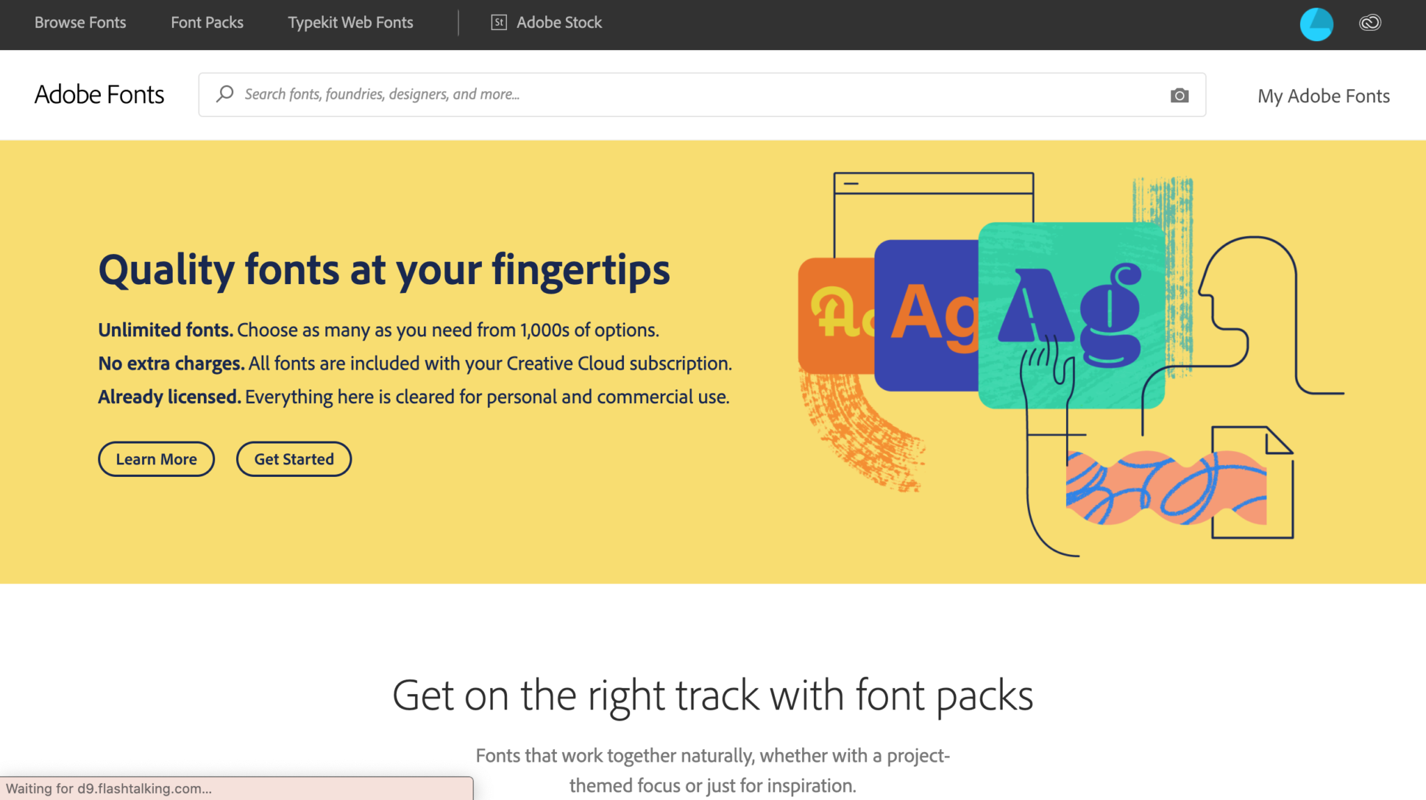
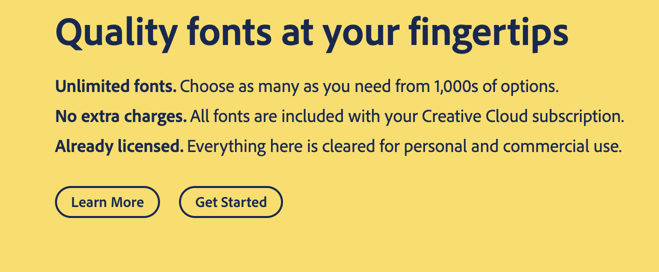
With the release of Creative Cloud 2015, Adobe has continued its tradition of generating a buzz in the tech sector.
In addition to major updates on their programs like Photoshop and Illustrator, Adobe has also released a new platform named Adobe Edge Web Fonts.
Edge Fonts is a stunning font foundry that web designers can use 100% free for all design work.
If you’re familiar with Adobe and the creative cloud platform then you know about TypeKit.
This is Adobe’s premium font service which costs money.
But with the release of Edge Fonts Adobe now provides an alternative to TypeKit, offering web designers over 500 different font-families to choose from.
I’ll give you an overview of Edge Web Fonts and why designers should be excited about this amazing collection of typefaces.
Worth the Wait
In the recent past Google has dominated the web font game. Simply put, no other service provided an extensive collection of web fonts for free.
There is no denying that Adobe TypeKit is extremely popular among web designers. But the price of TypeKit often caused people to stray from using it.
Because Edge Web Fonts is free to use commercially, Adobe now provides an alternative to the once unrivaled Google Webfonts.
Edge Web Fonts aims to provide a free service that is easy to use.
Just like Google Fonts, a person does not need any sort of account to utilize Edge Fonts library (Scroll down for an update on this).
In addition to being easy to use, Edge Fonts is powered by the TypeKit font service.
Users can expect high-end performance and stability for their web fonts.
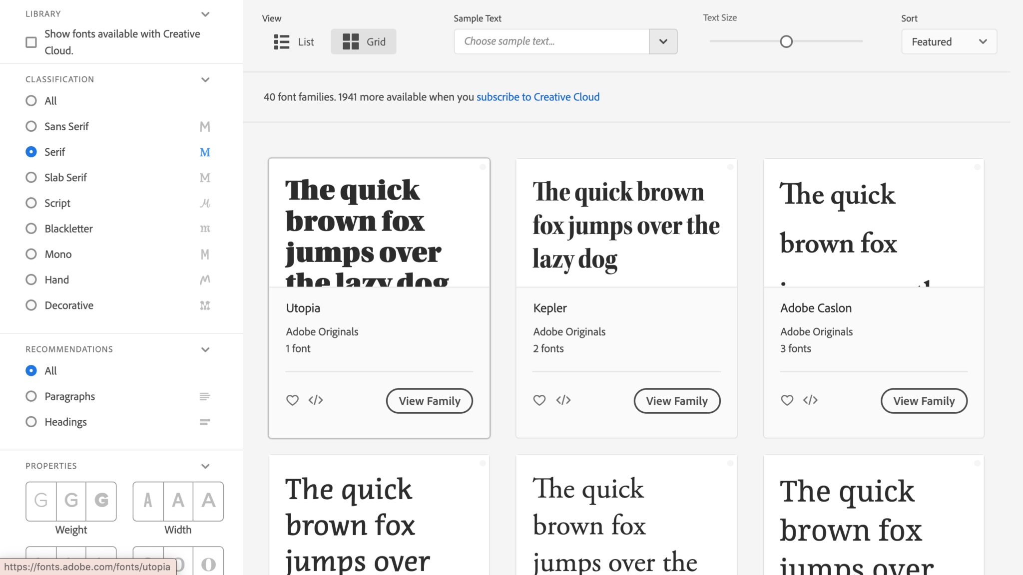
Edge Web Fonts User Interface
In the image above you can see the interface Edge Web Fonts provides for choosing fonts.
For those of you who’ve used Typekit in the past, you’ll notice the Edge Fonts website is strikingly similar to that of TypeKit.
As a TypeKit user myself I think this is pretty important to note.
The user interface was one of the main reasons why I continued to use TypeKit, and now Adobe is providing this to web designers for free.
In the example above I’ve narrowed the choices down to only serif fonts in order to show you a basic example of how Adobe’s interface works.
Although this may not seem very powerful, it allows you to sift through font faces that are alike in some way.
Edge Fonts also allows you to search fonts depending on whether they will be used as a heading or paragraph text.
This interface is much easier to choose the most appropriate font for whatever environment you’re designing.
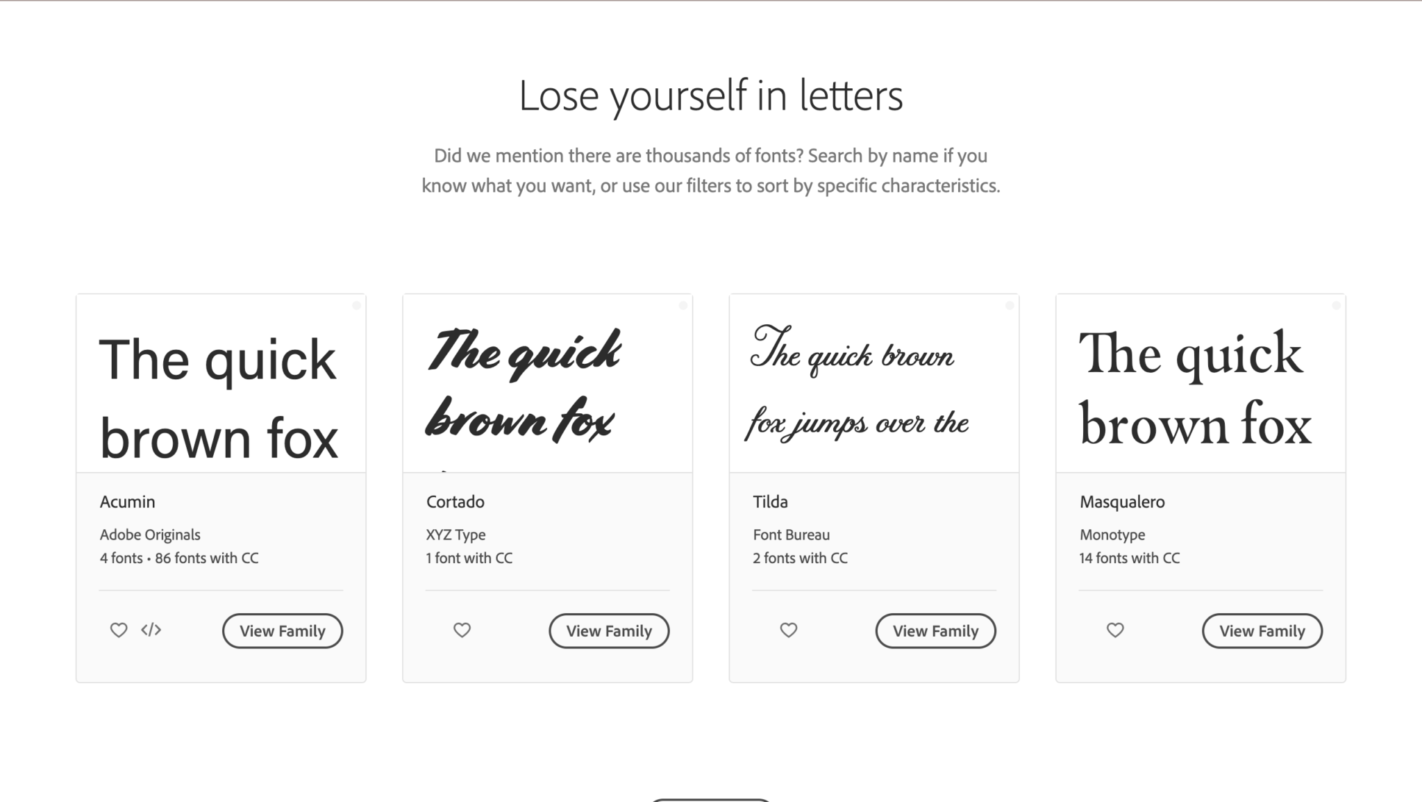
Google Fonts is indeed a tremendous font foundry for web designers, however, sifting through the extensive number of fonts can become a problem.
It seems Edge Web Fonts has a leg up in this regard.
Adobe Edge Web Fonts – 2020 Update
In 2018, Typekit was finally and officially renamed as Adobe Fonts.
And that was great for all of us. With this new name came many new, much-needed updates.
For example, there are no more web-only fonts, no more desktop sync limits, and no more pageview limits.
And now instead of only having 500 fonts like there were when it Adobe fonts was first released, there are now thousands of fonts for you to choose from.
Adobe Fonts is free to use IF you have a subscription to any one of their products.
It is no longer a standalone product like it was when it was Typekit.
That is a bummer, but hey, you gotta do what you gotta do.
And chances are, you probably have a subscription to Adobe.
So you should be good to go.
The great thing about Adobe Fonts is that you don’t have to worry about finding the rights to any font you fall in love with, as Adobe takes care of all of that for you!
All fonts are free to use for personal and commercial use.
This means that once you find that perfect font for your project, that’s literally it.
No more contacting the owner and buying the rights to it.
That’s right, you just get to keep the perfect font.
Isn’t that amazing?
Top 10 Adobe Fonts Designers Use
Before we end our time together today, I want to show you my top 10 favorite fonts from Adobe Fonts.
If you’re not convinced that you need to be using Adobe Fonts yet, well, after this, I’m almost certain you will be.
In order to truly grasp the power of Edge Web Fonts you’ll have to check it out for yourself.
Not only does it provide an extensive number of fonts, it also makes the process of finding them quick & easy. Also you should remember that Edge Web Fonts provides premier performance for your font styles by utilizing TypeKit!
You’ll surely not be disappointed when you see what has been given to web designers with the incredible Edge Web Fonts service.
Starting off the list with a bang, I present to you, Ambit.
Ambit is a classic font that I’ve loved for a long time now and have used it in a fair amount of logos that I designed.
This classic and timeless sans serif was designed by CoType Foundry, with their inspiration coming from early grotesque, but has now been adapted for modern design use in the 21st century.
From Thin to Black, Ambit features 7 different weights, so that there is something for everyone.
Ambit is the perfect font for a modern and sleek logo.
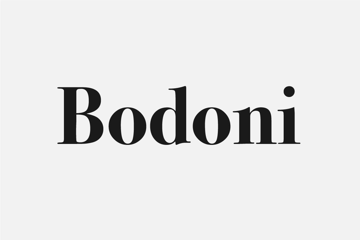
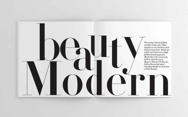
Didot is another gorgeous, yet dramatic serif font that would go great not only with fashion logos, but anything modern, sleek, luxurious, and elegant.
There are many different versions of Didot, but perhaps the most well-known version is the one that Giorgio Armani used in their logo.
With the right tracking and kerning, this logo could be the perfect font for your next elegant logo project.
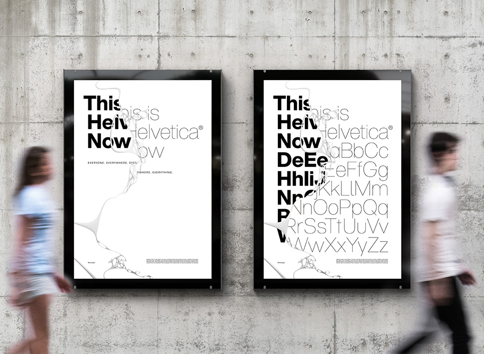
After being named one of the most widely appreciated fonts of 2019, we see no slowing in its widespread use and continual growth.
Helvetica Now is available in 3 optical sizes, Micro, Text, and Display.
Helvetica Now is essentially everything you’ve ever loved about Helvetica, with all sorts of little tweaks and improvements, all wrapped up into one new font.
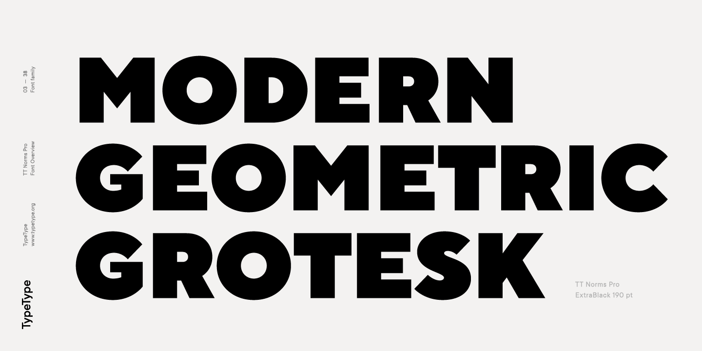
Another great typeface we want to highlight today is TT Norms Pro.
TT Norms Pro was the #1 best selling geometric sans on Myfont in 2017 and continues to trend in 2020.
The font comes in an astounding 22 different styles. 11 uprights and 11 italics.
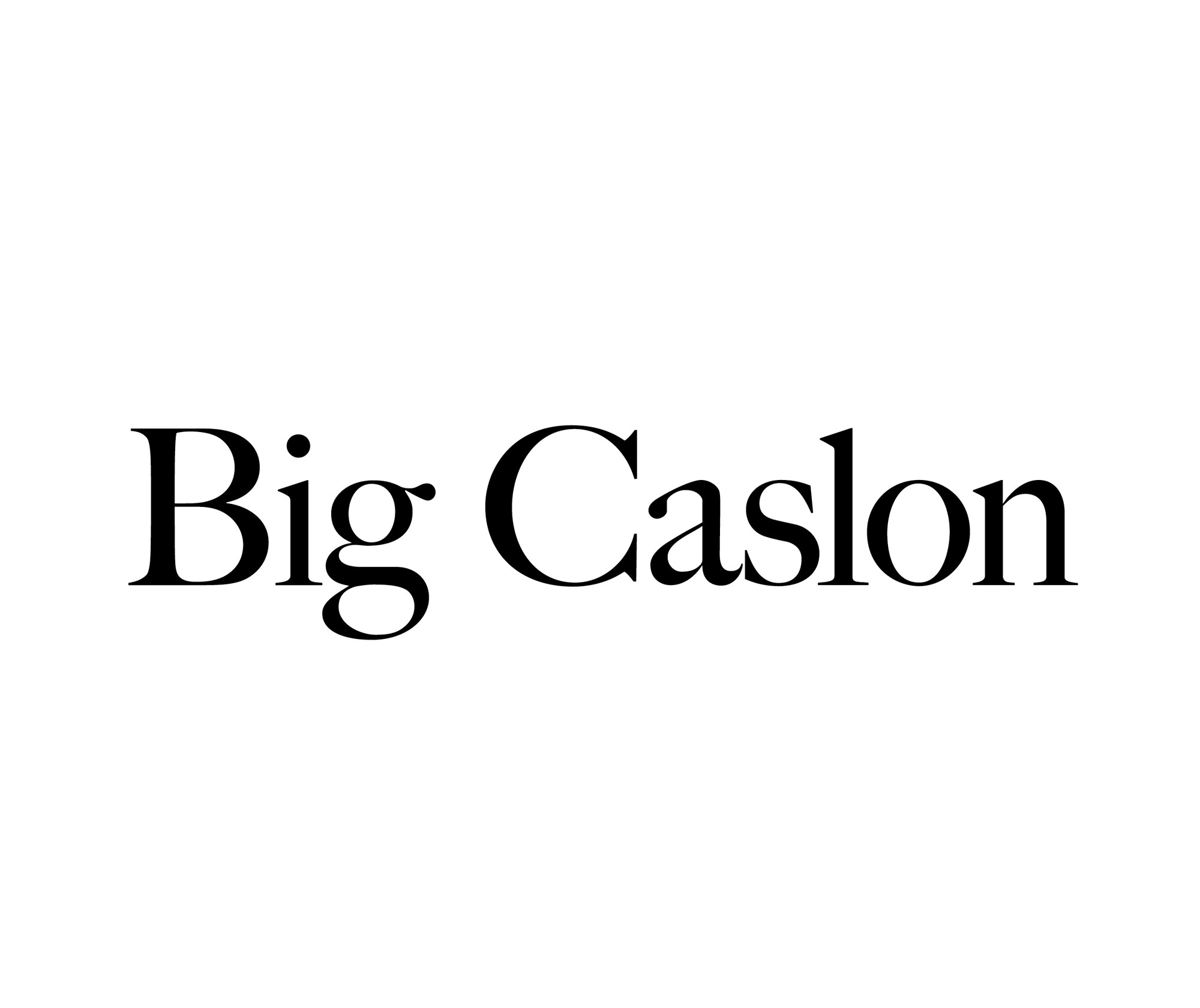
7. Big Caslon
This font is actually pretty historical. Back in the 1600s, there was a group of serif typefaces created by by William Caslon I.
Big Caslon is a revival of the said font group that dates all the way back to the 1600s, and is now making a marvelous appearance in the digital age of the 21st century.
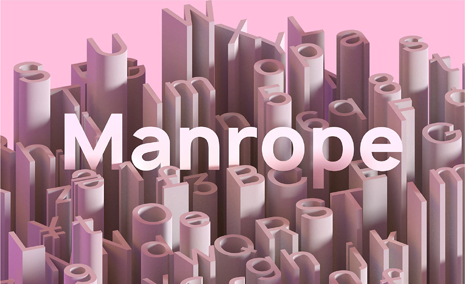
Pixel Surplus created this gorgeous and functional sans-serif that has amazing readability whether it’s upper or lowercased. This font is so sleek and elegant, and what really had me hooked was this visual.
I mean, just look at all that creativity wrapped up in one image.
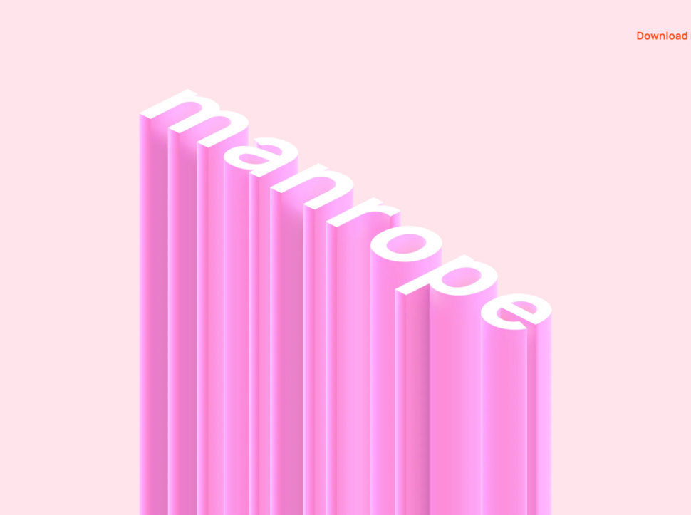
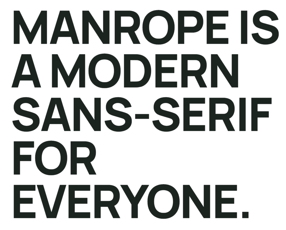
Here’s what the creator of Manrope had to say about their font.
“Sometimes, creativity comes from simplicity, elegance, and readability. This font is an extra mile towards, guided by optical balance, and packed with modern features.”
Moving on to my next favorite font of this list, here I present to you Oneday.
This font is like a modern-day font that is presented in stencil style. As you can see, almost all of the letters have disconnections in them, which make them stand out and look quite futuristic, in my opinion.
Check it out through the link below and get it for free!
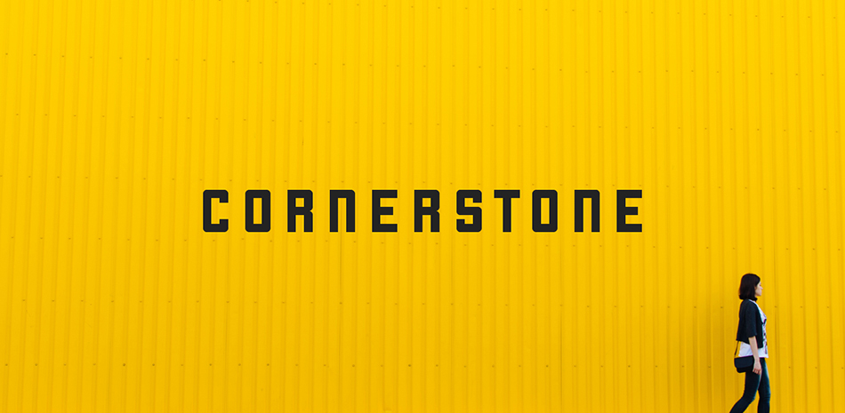
Cornerstone screams professional, modern, and no-nonsense. This modular font is a bit elongated and is great for things like banners, logos, and headers.
It’s definitely got that modern feel that many people are looking for nowadays, and the best part is that it is “free-ninety-nine”! Aka, 100% free.
This classic modern serif called Vanity is absolutely stunning.
With the perfect combination of thick and thin lines, this classic yet modern font is ready for you to use for any beauty product packaging or magazines.
This font that was created by Hendrick Rolandez is ready for you to download for free via the link below.
You’re here because you’re looking for amazing packaging ideas for 2020.
Well, you’re in luck, because I’m showing you 6 ideas for you to implement this year into your packaging designs.
Well, what are we waiting for?
Let’s just jump right in!
Sustainable Packaging
Sustainability. It’s at the forefront of all of our minds nowadays.
As it should be!
It’s so important that we take care of our world because it’s the only one we’ve got.
And what better way for you as a designer to contribute to this world, than to create your own sustainable packaging ideas for yourself and for your clients?
So here are various sustainable packaging design ideas for you to draw inspiration from!
Fonts are used to embody the style, direction, feeling, and overall vibe you want your current design project to have.
Since the year has begun, we’re seeing quite a few font trends.
While many people are using brand-new modern fonts, lots of people are digging up old literature and bringing old retro fonts back to life.
8 Fonts We Expect To See Designers Using in 2020
Today we want to go over the most popular fonts in 2020 that we expect to see.
So without further ado, let’s do this.
1. Ambit
Who doesn’t love an amazing grotesque font? I know I sure do.
Ambit is a unique sans serif font that was inspired by early grotesques but has been adapted and modified to suit the 21st century.
One of the most unique parts of this font is definitely the curly letters, “r” and “f”.
But if you’re not a huge fan of the curly letters, then that’s no problem. The second set of Ambit will be the one for you!
Because Ambit is so sleek and unique, it’s perfect for packaging and branding.
Check it out here: https://cotypefoundry.com/our-fonts/ambit/
2. Helvetica Now
We all know about Helvetica.
You either love it or you hate it, and I’m on the side of the fence that loves it.
I’m a major fan of Helvetica, and Helvetica Now this is the new chapter of this era.
It comes in three different sizes, Micro, Text, and Display. Every character of Helvetica now has been refit and redrawn and they are looking mighty fine in my opinion.
Check it out here: https://www.monotype.com/fonts/helvetica-now
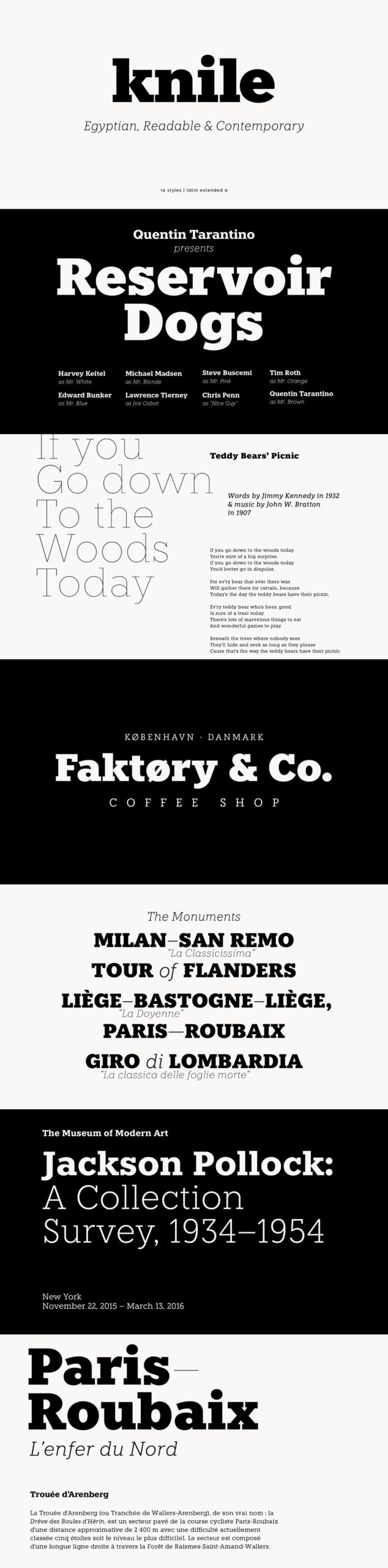
Knile was designed by Atipo Foundry and is a beautiful typeface that you can integrate into your projects today!
Check it out here: http://atipofoundry.com/fonts/knile
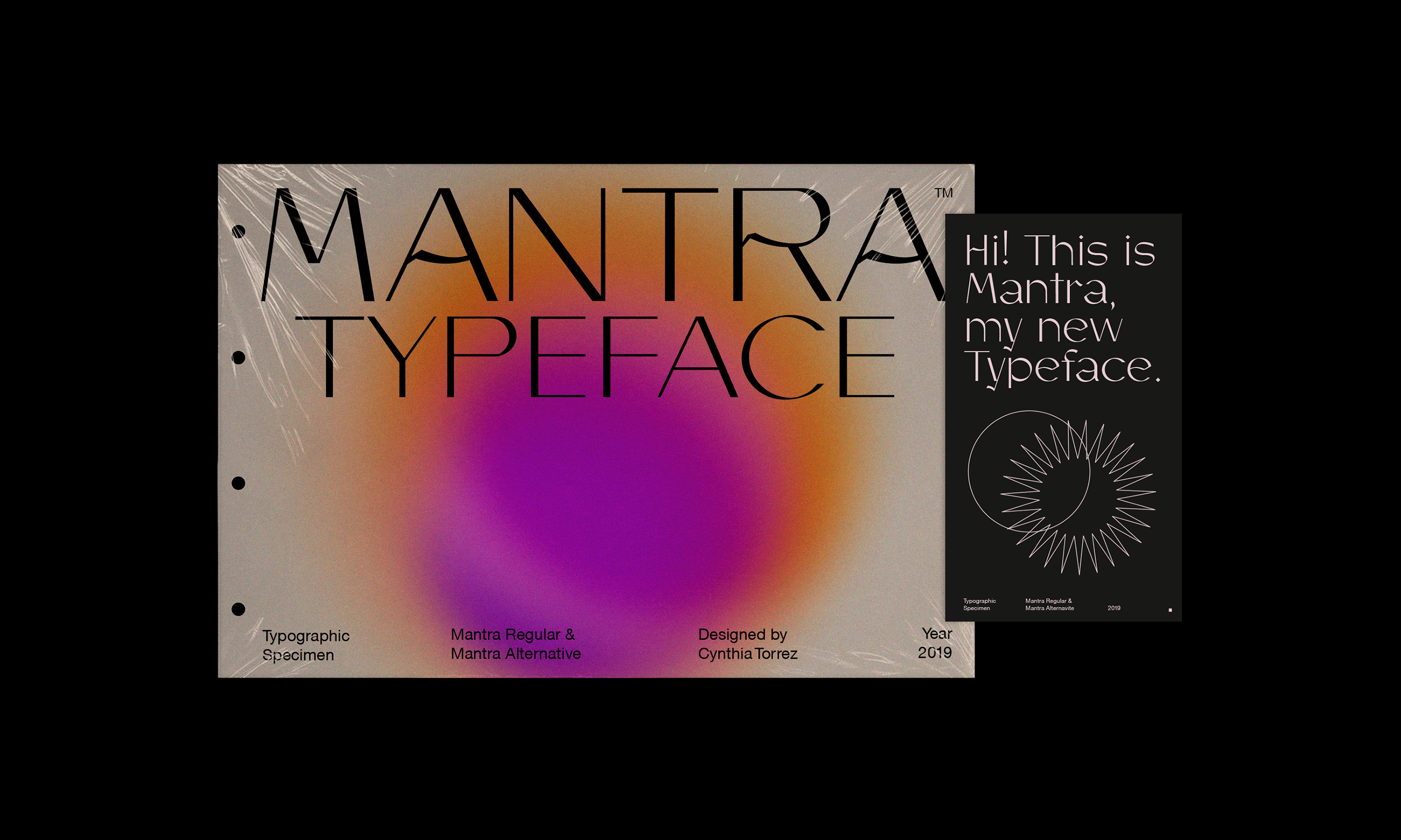
5. Mantra
Mantra is a gorgeous Sans Serif created by Cynthia Torrez. Being the unique sans serif that it is, it’s perfect for branding, using it as a logotype, and more.
You’ll definitely stand out of the crowd with this font and have some amazing brand recognizability.
Check it out here: https://www.behance.net/gallery/81001925/Mantra-Typeface-Type-Editorial-Specimen
6. Supria Sans
Supria Sans is a unique sans serif that was designed by Hannes von Döhren.
Check it out here: https://fonts.adobe.com/fonts/supria-sans
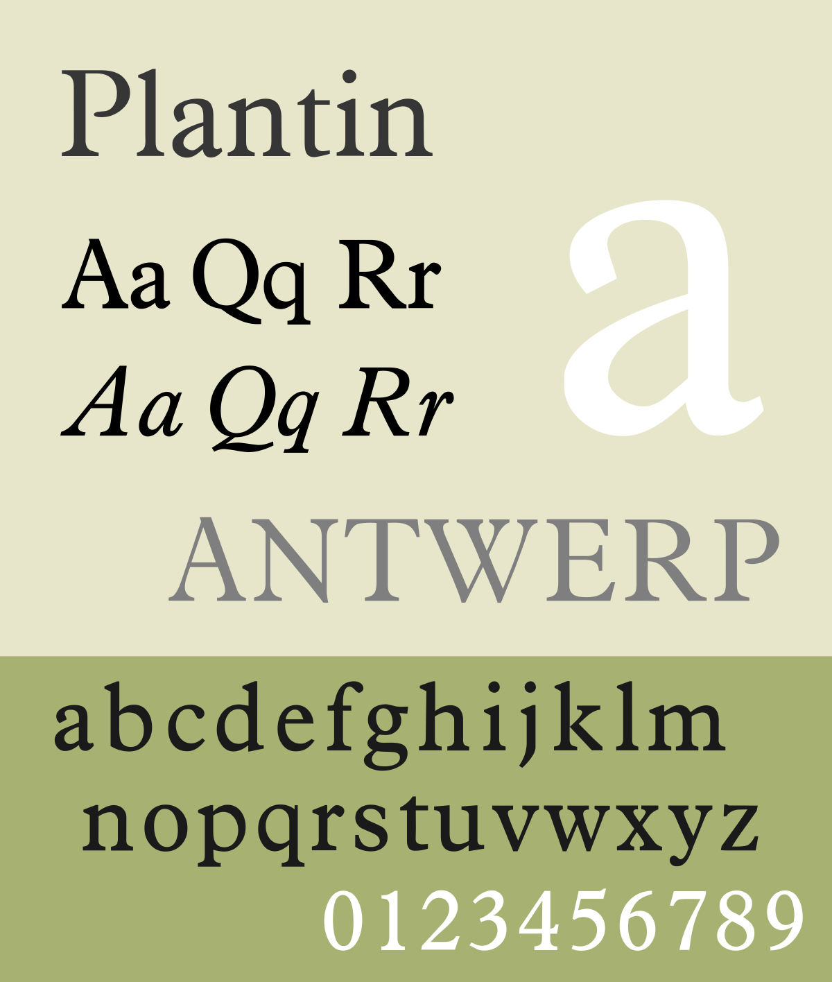
7. Plantin
Alright guys, check out this typeface.
Plantin is an old-style serif typeface that was created in 1913. A true antique font that you can incorporate in your elegant design projects.
Check it out here: https://www.myfonts.com/fonts/mti/plantin/
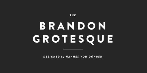
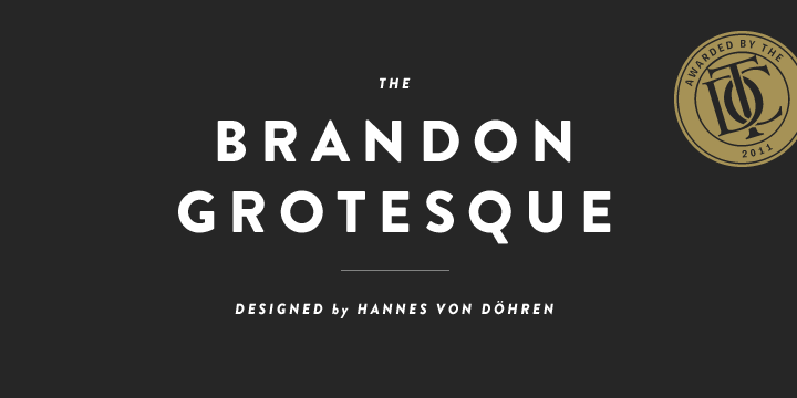
8. Brandon Grotesque
Brandon Grotesque is another sans-serif typeface that we’ll be talking about that was also designed by Hannes von Döhren.
The kerning and spacing of this font were done by Igino Marini of iKern.
Brandon Grotesque is a font that I personally use weekly.
The typefaces of Brandon Grotesque include Thin, Light, Regular, Medium, Bold and Black weights.
There are also italic version for each weight.
Check it out here: https://fonts.adobe.com/fonts/brandon-grotesque
Finally…
We’ve made it to the end of our popular font list of 2020. We hope you enjoyed these fonts that we expect to see in 2020.
Let us know what fonts you’ll be using this year in the comment section below.
Facebook has been around for 15 years and we all know that it needs little to no introduction.
With a boasting 1.63 billion daily active users, Facebook is easily the most popular app to date.
Since 2004, Facebook has been connecting friends and family from all over the globe.
We probably all use it, and we probably use more Facebook apps than we think.
Facebook is the parent company of 74 companies total, which include some of the most popular apps out there, such as Instagram, Whatsapp, Oculus VR and more.
So what started as a single app, grew into something bigger. Connecting families and loved ones from across the world, helping businesses grow, and find other communities.
But Facebook is more than just a social app. They have an astounding 43,000+ employees that work in over 60 offices around the world.
And although they do have great apps that we all probably enjoy using or enjoyed using at one time, we can’t forget about the major scandal of selling private information that went down last year.
But we’re not here to talk about that today.
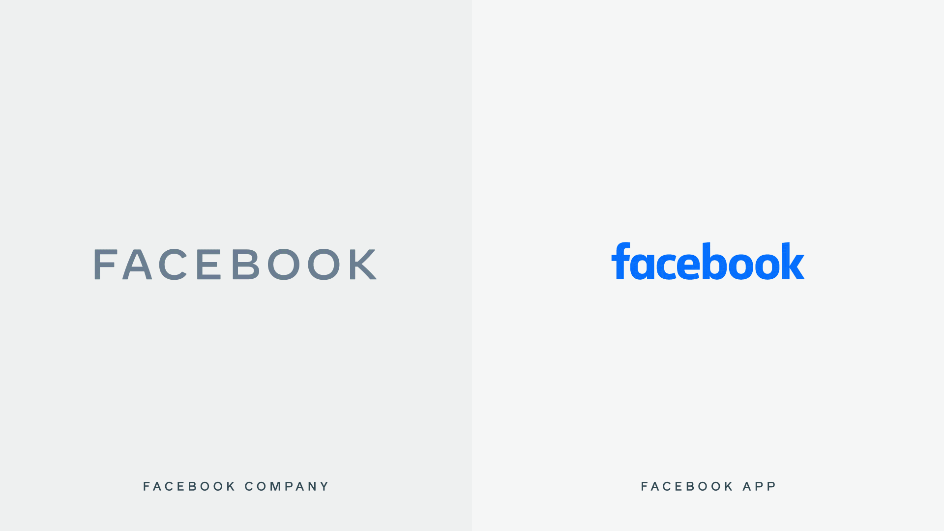
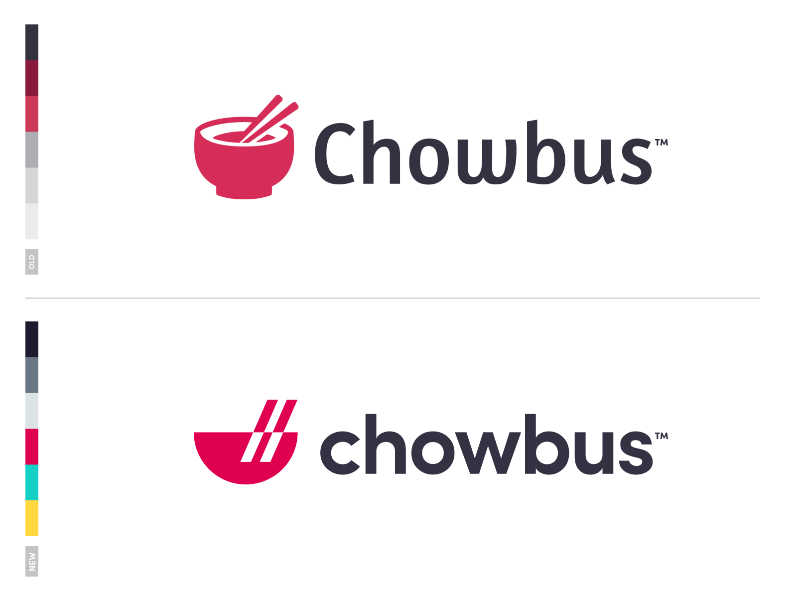
Today we are talking about Facebook’s new logo design that was created in-house by Dalton Maag and Saffron.
To quote the reason why they’re updating their logo…
“The new company branding is designed to help us better represent the diversity of products we build, establish a distinction from the Facebook app and communicate our purpose in the world.
Through the process [of redesigning], three foundational design behaviors that informed our brand system emerged:
Clarity: a brand that simplifies and builds understanding
Empathy: a system that is respectful of context and environment
Creating Space: design that supports people and their stories”
Think of the new logo redesign as a design for the parent company. This way the logo can be distinguished from the app to the parent company.
“Today, when people hear “Facebook” they think of the Facebook app. This posed a unique design challenge. We needed the wordmark to establish distinction from the Facebook app and allow for a clearer connection to the full family of technologies. The new brand system uses custom typography, rounded corners, open tracking and capitalization to create visual distinction between the company and the app.”
As opposed to the Facebook app logo, the corporate logo is written in all caps, in a unique font that was designed in-house. It was designed with an openness of mind and clarity. With a horizontal structure and consistent stroke width, I can’t deny that the new corporate Facebook logo is as beautiful as it is simple.
You may be wondering what color the Facebook corporate logo will be. There is a more complicated answer to that.
The new logo will be fluid when it comes to color. It will adjust according to its environment and present a matching color or gradient. This is great because it could match the green of Whatsapp, the beautiful Instagram color gradient, or the recognizable blue of Facebook.
I personally like the simplicitiy of the new Facebook logo.
But I want to know what you guys have to say. What do you think? Are you here for it, or will you have to go with a hard pass?
When establishing a brand, you should never put your logo on the back burner.
If your logo doesn’t represent you well or it looks unprofessional, then your customers are going to bounce, leaving your business to plummet.
We’re going to go over the 10 elements of every great logo, that you can implement into your logo design.
Let’s get straight into it.
1. Memorable
The first, most important element of every great logo is that it’s memorable. If your logo isn’t memorable, then you’ve got a huge problem. Because people won’t remember who you are, what you offer, and you won’t come to mind in the future when they need the product you have to offer.
Being memorable is key. Make an original first impression on people so that they’ll always remember you when they need to.
2. Simple
A good logo is simple. If you have a great design, then it doesn’t need to be super intricate. Yes, get all the little details and hidden images in there. That’s amazing, but it should still, in its essence, be simple and easy to grasp.
3. Easy to understand
This goes hand-in-hand with simplicity. If your logo is so complicated that no one understands it, then you’ve done something wrong. Your logo shouldn’t need a huge in-depth explanation of what it represents and means. Of course, your logo can have some subliminal messages and hidden images, but it shouldn’t be so hidden that people awkwardly say “oh… okay”.
So make sure your logo comes across well, is creative and original, but also is easy to understand.
4. Recognizable
You want to be easily recognized. On the street, in the store, online- people should see your logo and go “Hey! I know that brand.” This is just as important as memorability. If people don’t remember who you are and don’t recognize you, then your company is going to die. That’s that.
So make sure you’re recognizable, make a statement, and are memorable.
5. Timeless
How terrible if you work months and months on your logo and company, and you fall into some crazy fads, and next year your company logo looks a little bit crazy. You definitely want to follow some great trends, but make sure that your company logo will look just as good this year as it will the next five.
6. Scalable
Your work should look good, big or small. Whether you’re being displayed on a tiny little RDA or a giant billboard in your town. This also means that you need to have a high-quality logo design, so when you blow it up or scale it down, it looks just as good, quality-wise.
7. Relevant
Ask yourself when designing your logo, “Why this logo design? What does it represent for me?” If your logo doesn’t describe what you’re doing and isn’t relevant to your brand… then you may be doing something wrong. You want to make sure people understand why your logo is the way it is, and you want to make sure that your target audience will vibe with it.
8. Attention-grabbing
You’ll want your logo to turn heads. When some3one is walking by and sees your logo, you’ll want them to stop for a minute and dedicate their full attention to you. For this, you can have a cool geometrical design or some bright colors. As long as your intricate design is memorable, relevant and attention-grabbing.
9. Be Different Than Your Competition
The worst thing you can be classified as, if you want to be a reputable company, is a knock-off. If you’re trying to have your own company, then for the love of all things good, don’t copy your competition. Yes, be inspired by them, but don’t try to be exactly like them. Look at them, take some notes, and move forward and do better. You’ve got this!
10. Don’t be afraid of change
Everything evolves, and that means your company logo will evolve as well. Maybe not this year or the next, but somewhere down the road, you’ll need to make adjustments to make your customers happy. So don’t be set in stone, afraid to change. Change is good and should be embraced.
And Finally
Be yourself and have some fun when designing your company brand and logo.
Let us know in the comments what some of your personal tips are when it comes to designing a logo.
Your product could be the most amazing and useful product in the world, but if your packaging is not on point, then your entire business could be in some major trouble.
Imagine this scenario: You’ve designed the best product in your field, invested all of your funds into creating the product, and put packaging design on the back burner. You get on a free mock-up website, make something in an hour, call it day, and show it to your investors.
Terrible idea.
In my personal opinion, you should put just as much effort into the packaging design of your product as you put into the product itself.
According to science, it only takes a person 1/10th of a second to create or form an opinion about someone or something. That gives you literally not even one second to give someone a great first impression.
The first thing your potential customer is going to see is your packaging. And you better hope to goodness that you’ve aced your first impression and wowed your target audience with your packaging design.
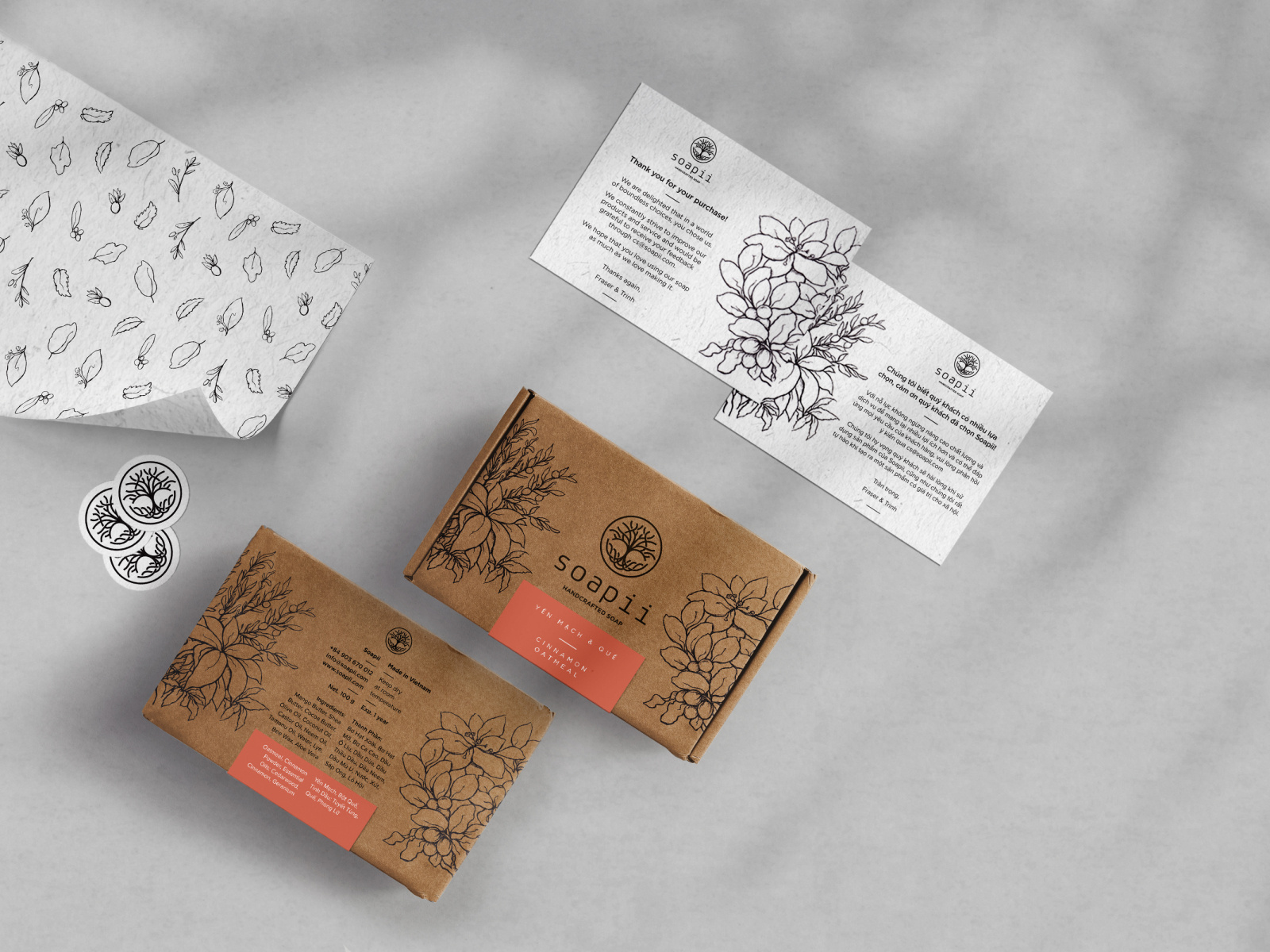
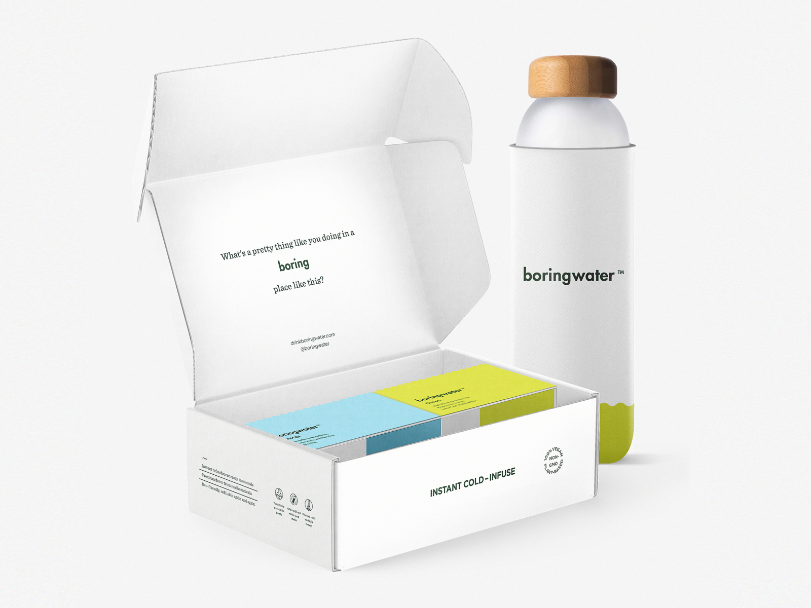
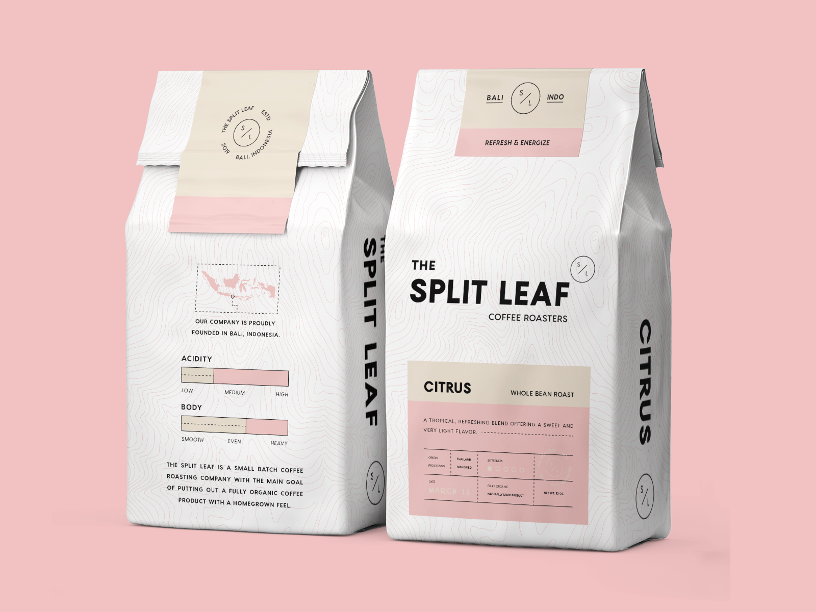
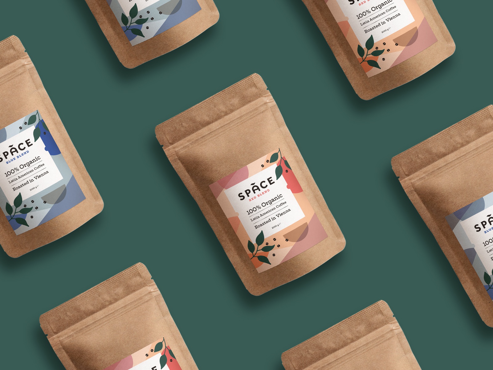
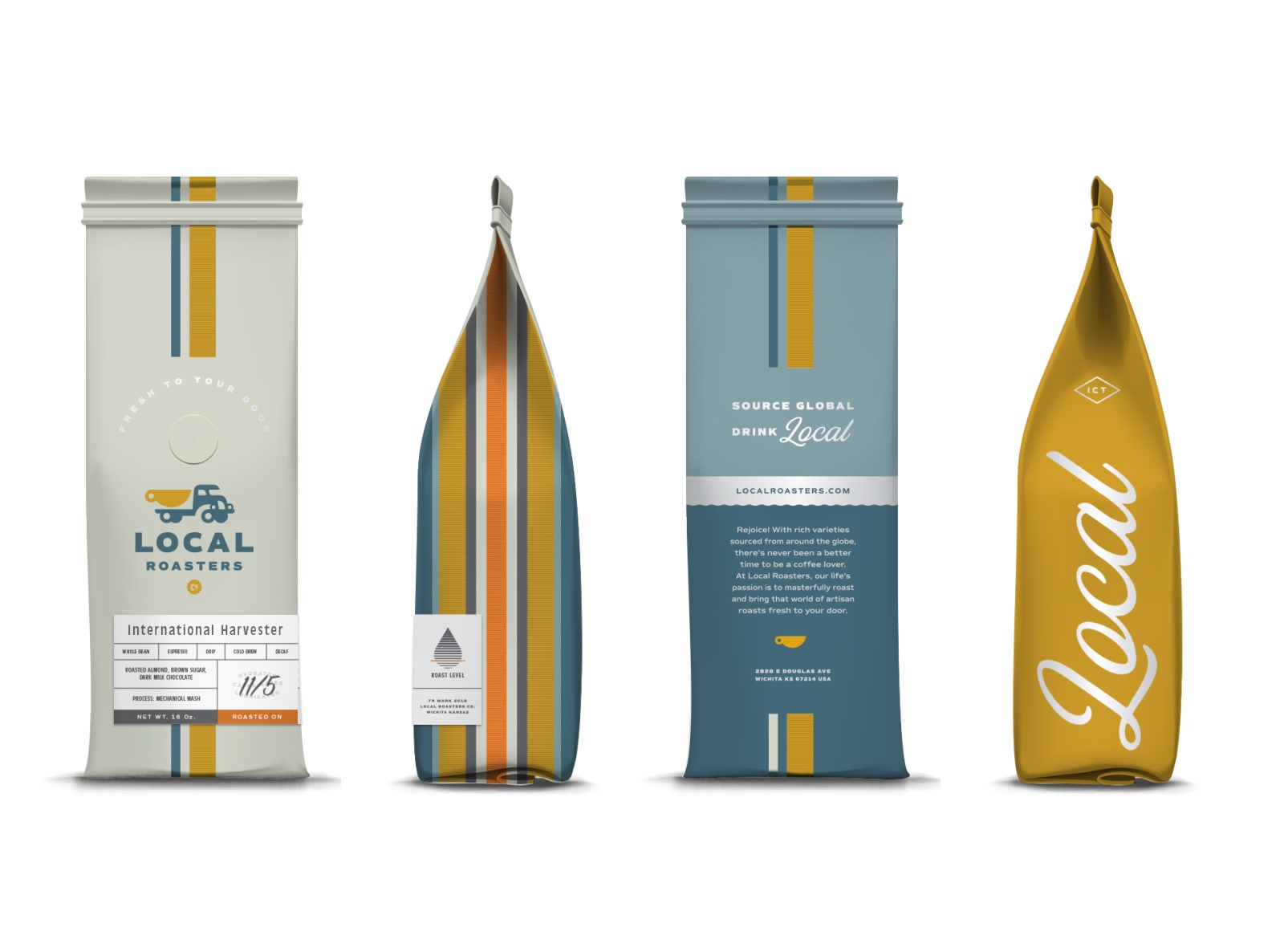
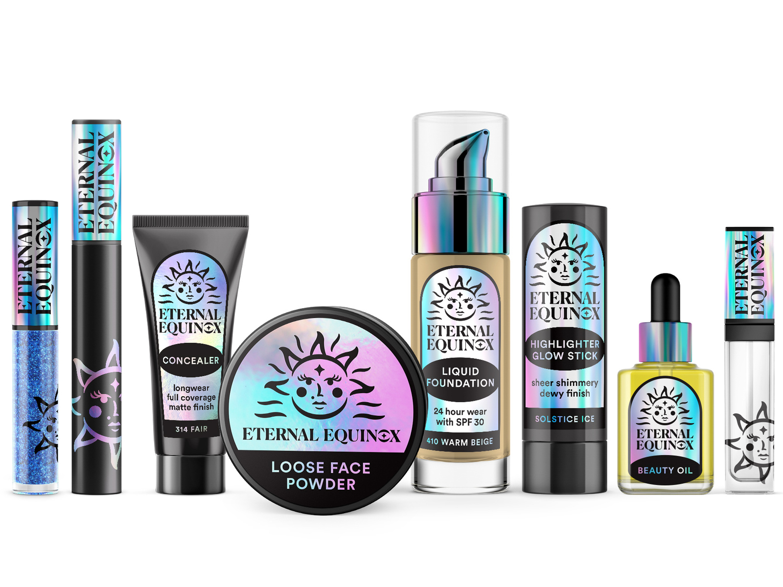
Best Packaging Design Ideas for 2019
I’ve rounded up 20 of my favorite packaging designs for you to be inspired by for your next design project.
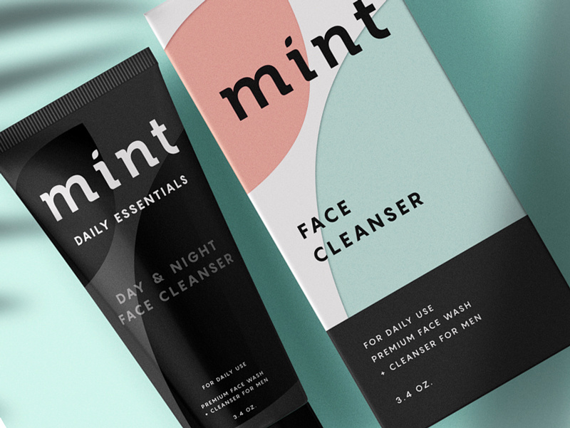
This face wash for men is so simplistic in its design that it’s easy and enjoyable for the eye to look at. The black color of the face wash gives off tones of luxury and the pastel colors on the box, combined with flat design, simply works for this packaging.
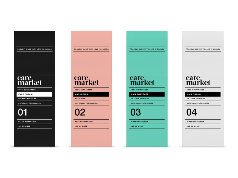
2. Care Market
Continuing on with the pastel trend, we have Care Market packaging design. The palette they chose here is lovely, as pastels have been all over the place this year. The consistency in font usage is just perfect, using only two different fonts and using dividing lines between each new phrase.
This packaging design shows us that you don’t need elaborate graphic designs to exude elegance and professionalism. All you need is a great color palette, and nice, coinciding fonts.
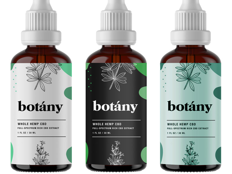
Less is more, as the saying goes, and botany nailed it. Minimalist, flat design is the key here and with three different color schemes that all complement each other, I can wholeheartedly say, I believe this design will catch the eye of anyone who is looking for a high-quality serum.
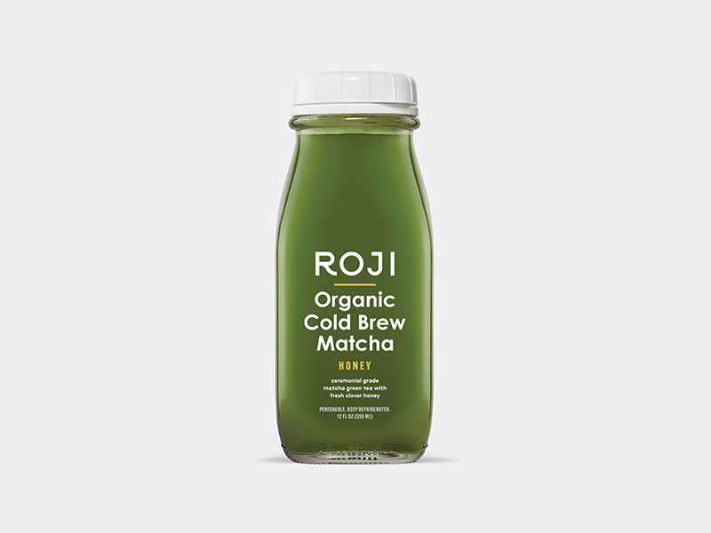
4. Roji
When someone is looking for a healthy drink, they’re going to be looking for sleek, professional fonts that look organic. My favorite part of this packaging design is that the designer thought through the choice of font colors.
Since the bottle is made of glass, you’ll be able to see its contents and the yellow font matches the beverage inside the bottle. The yellow-colored font perfectly complements the contents of the bottle. A simple, well-thought-out packaging design overall.
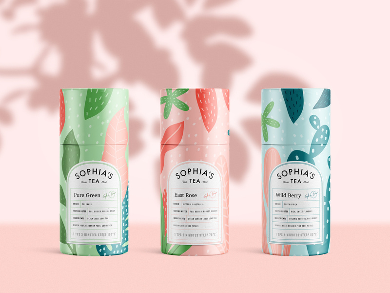
5. Sophia’s Tea
Stepping out a little bit from the pastel color palettes and into something a little bolder, we have Sophia’s Tea packaging design. Flat design really has taken the lead in 2019. We see it all over the place. And luckily for us designers, it makes our job a little easier.
What I appreciate about this design is that the name of each drink matches the design of each recipient. The color scheme on each bottle matches each other, making a buyer recognize the brand, if they were to see each bottle on a shelf in a store.
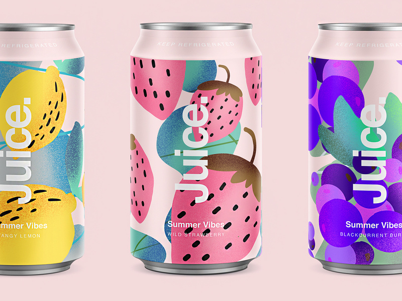
6. Juice.
Since we’re on a drink roll, check out this summery packaging design for juice. Again, we’re hit with flat design and beautiful colors. The font sticks out perfectly on the foreground of the design. Juice. Simple, clean, clear, and to the point.
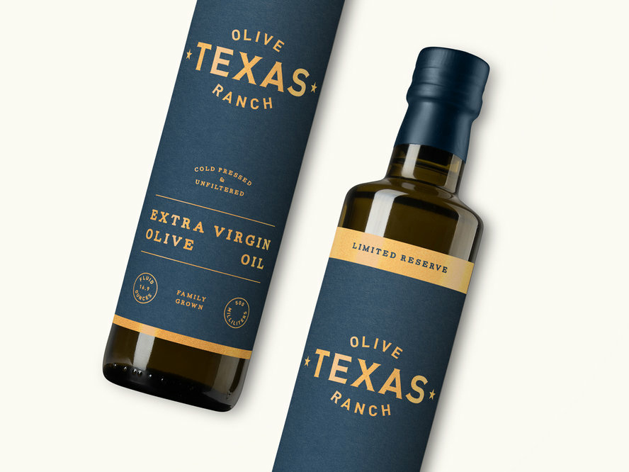
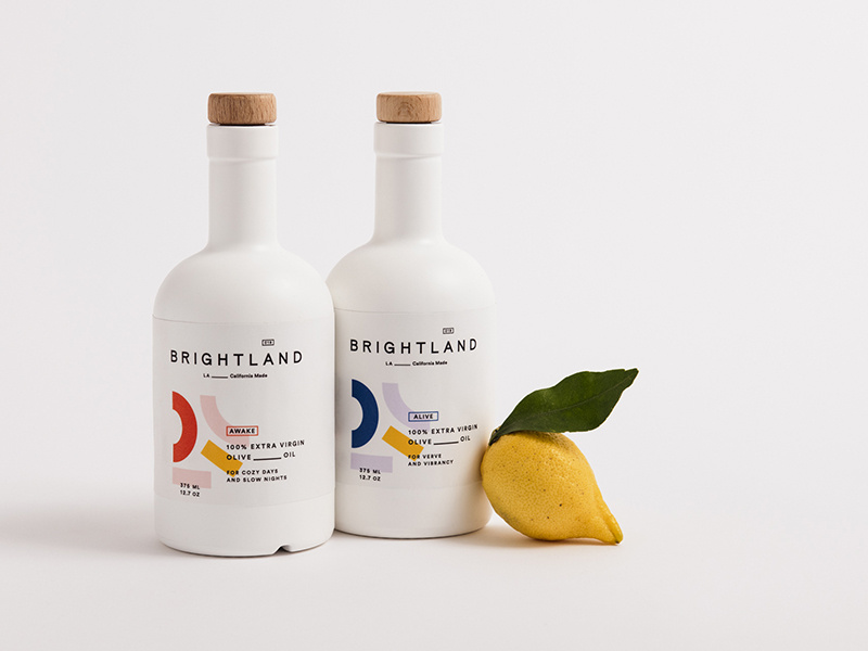
7. Brightland
I’ve never seen an olive oil packaged quite like this. At first glance, you would wonder what this beautiful bottle is doing in the oil section.
You’re inclined to pick it up, you read that it’s olive oil, you’re shook, you compare prices between this and another oil, you realize it’s the same price, and naturally you buy the more beautiful packaging design of the two products. Hit people with original, innovative designs and you’re sales will skyrocket.
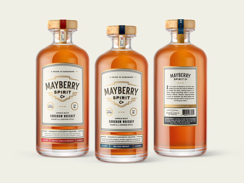
This bottle makes me want to have a nice, classy night at home with all my friends. The vintage font works beautifully with the design of the bottle, and I love that the color schemes match the rich color of the whiskey itself.
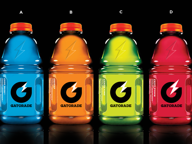
9. Gatorade
Here are some rebranding sketches for Gatorade. Simple design that gets across, yet still embraces the originality of the Gatorade logo. You won’t lose any brand recognizability, and it looks more modern.
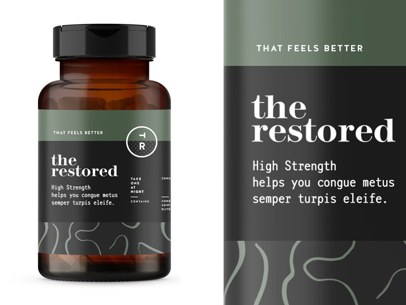
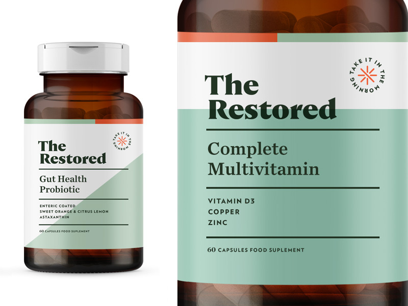
10. The Restored
The packaging design for these vitamins is everything. The manly, muted earth tones will remind a person of organic produce, making them trust your brand even more. Color association is very important when it comes to designing your packaging and establishing your brand, so choose wisely!
11. The Restored
Here’s a second version to Restored vitamins. This packaging design is a touch more feminine, using a more pastel green, and creating more dimension in the background by using two different colors. The pop of orange in the corner brings the eyes to the directions.
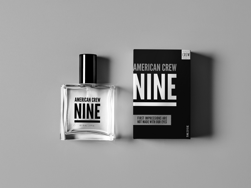
12. American Crew Fragrance
This simplistic design is one way on the box and reversed on the bottle. By using one font, they really had to play with the scaling and spacing of letters and words to make it interesting and captivating. Again, packaging design can be simple and just as engaging as a super complicated design.
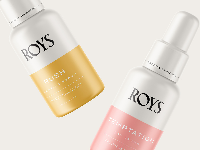
13. Roys Morning Serum
Roys morning serum has two beautiful colors: a muted pink and a relaxing gold. Color association is everything. If you can convince your customers that your product is what they need and you really sell your product by having a luxurious packaging, you’ll have clients talking about you for days.
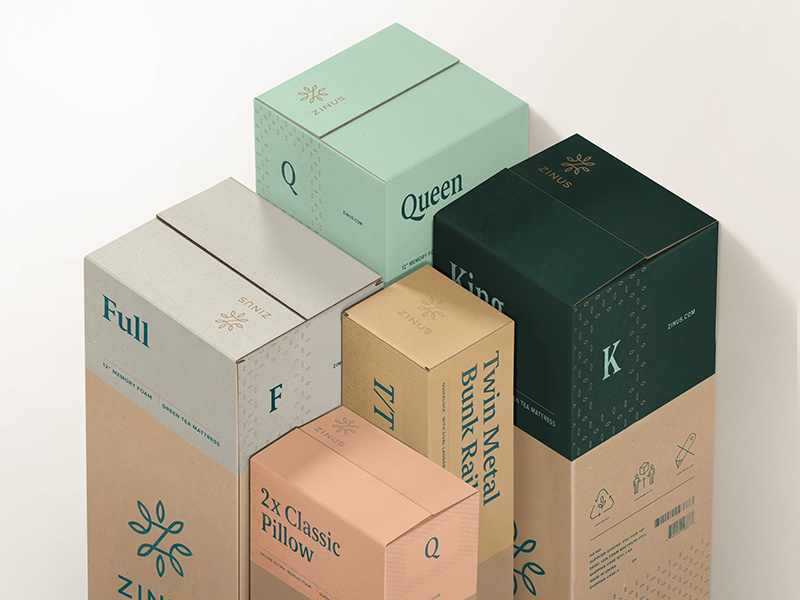
14. Zinus
You can recognize an eco-friendly package design from a mile away, and most people are becoming very concerned and aware of their consumerism and trash contribution to the world. Using a bio-degradable packaging or using recycled material will help you loads when it comes to sales. And you’ll be helping the world. It’s a win-win.
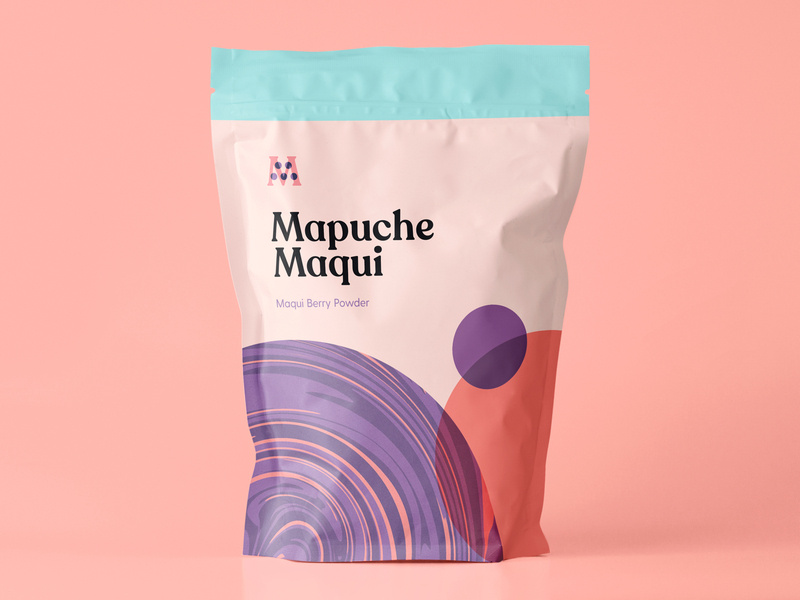
15. Mapuche Maqui
Sometimes, making healthy choices isn’t the easiest or most fun, so presenting a fun looking health product can be key in your sales. This berry powder packaging design looks fun and friendly, used flat design, a beautiful color palette, and bold font. With all these elements combined, surely it’ll catch the eye of a customer.
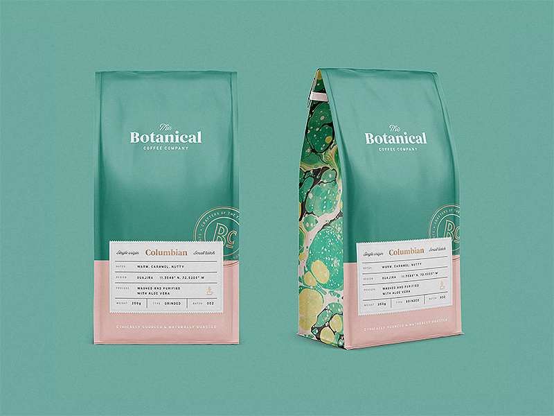
16. Botanical Coffee Co
This coffee design is so relaxing to look at. The intricate design on the sides, the simplicity on the front, and the choice of font combinations are just lovely. Again, going with flat design and pastels. See the pattern?
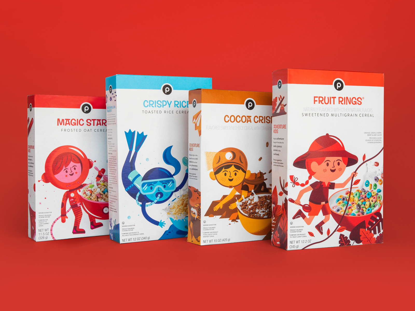
17. Publix Cereal Line
Did you know that the color red increases your appetite significantly? The designer here for kids cereal certainly knew what they were doing. By combining real-life elements and flat design, kids will surely be intrigued by this design and be inclined to beg their parents for the cereal.
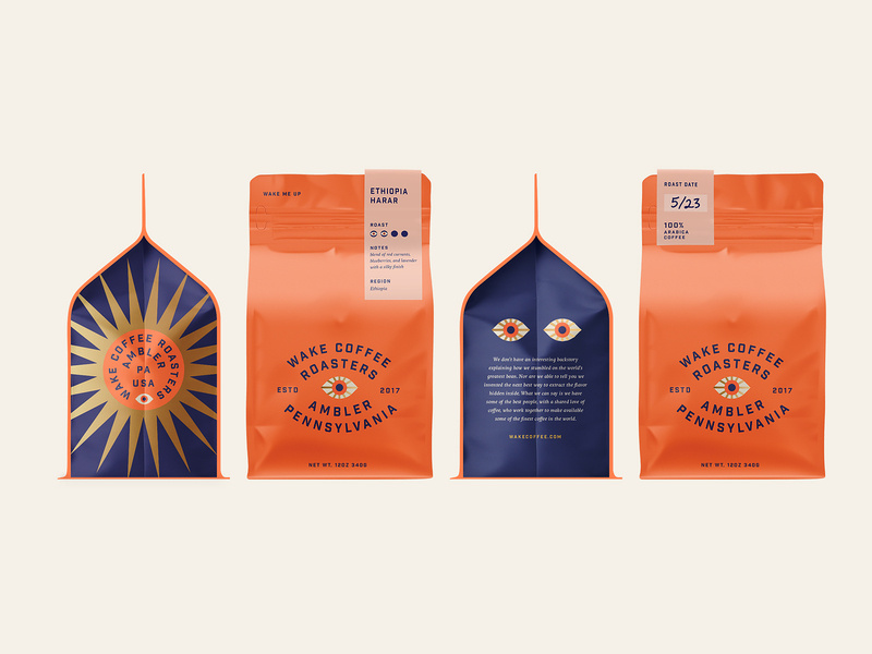
18. Coffee
This coffee packaging is so bright and captivating, yet still has colors that are easy on the eyes. When choosing your color palette, you need to be sure that you’re choosing colors that soothe and colors that people want to look at. And of course, brand colors that represent you and that your audience will enjoy.
19. Tesco Fish
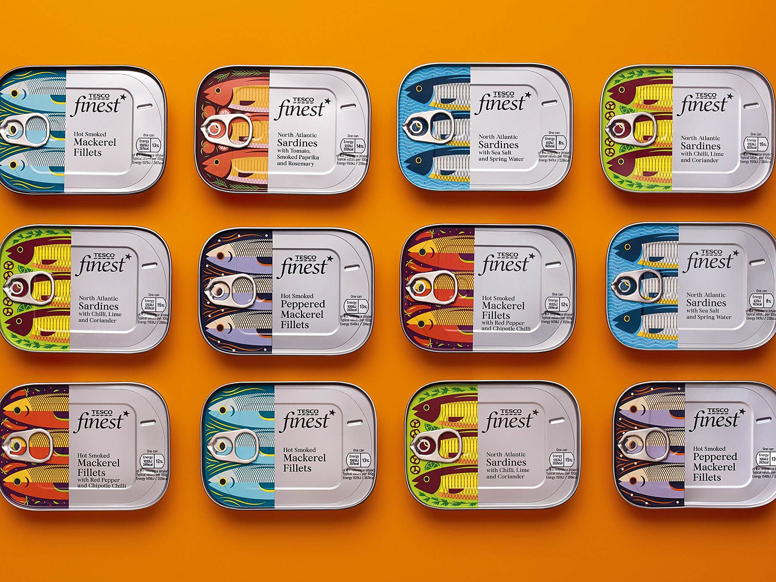
Check out these “fishy” illustrations! What I really enjoyed about this packaging design was the fish. I love the very finely defined, cut-off design of the fish, and then the can and text. Each fish is design to represent its kind, and I find this design very creative, colorful, and appetizing.
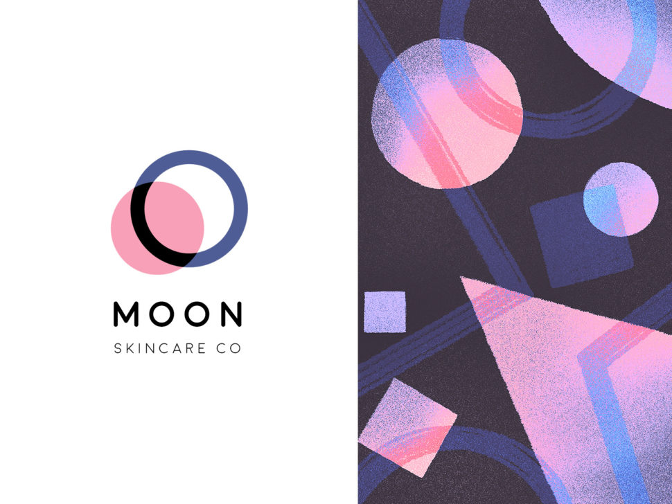
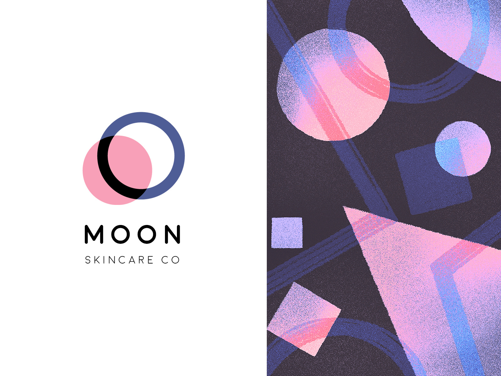
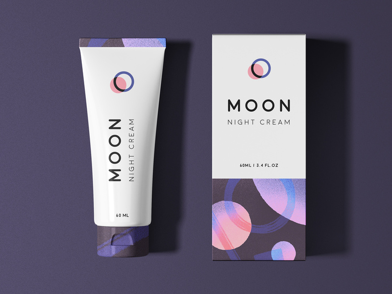
20. Moon
And finally, we have Moon Night Cream. Notice how to colors and graphic designs represent the night. So simple, clean, and fresh-looking that you actually can’t wait to use this cream tonight before bed.
Wrapping things up
As we all know, packaging is everything when it comes down to actually selling your product. Make sure your design represents you, your brand, and your product, and is creative and makes people feel like they need what you have to offer, in their lives.
I hope you found this article inspiring and you’re more than ready to jump into your next design project.
There are many ways of displaying text inside a Three.js application: drawing text to a canvas and use it as a texture, importing a 3D model of a text, creating text geometry, and using bitmap fonts — or BMFonts. This last one has a bunch of helpful properties on how to render text into a scene.
Text in WebGL opens many possibilities to create amazing things on the web. A great example is Sorry, Not Sorry by awesome folks at Resn or this refraction experiment by Jesper Vos. Let’s use Three.js with three-bmfont-text to create text in 3D and give it a nice look using shaders.
Three-bmfont-text is a tool created by Matt DesLauriers and Jam3 that renders BMFont files in Three.js, allowing to batch glyphs into a single geometry. It also supports things like word-wrapping, kerning, and msdf — please watch Zach Tellman’s talk on distance fields, he explains it very good.
With all that said, let’s begin.
Attention: This tutorial assumes you have some understanding of Three.js, GLSL shaders and glslify, so we’ll skip things like how to set up a scene and import shaders.
Getting started
Before everything, we need to load a font file to create a geometry three-bmfont-text provides packed with bitmap glyphs. Then, we load a texture atlas of the font which is a collection of all characters inside a single image. After loading is done, we’ll pass the geometry and material to a function that will initialize a Three.js setup. To generate these files check out this repository.
It’s time to create the mesh with the msdf shader three-bmfont-text comes with. This module has a default vertex and fragment shader that forms sharp text. We’ll change them later to produce a wavy effect.
const MSDFShader = require('three-bmfont-text/shaders/msdf');

function init(geometry, texture) {
  // Create material with msdf shader from three-bmfont-text
  const material = new THREE.RawShaderMaterial(MSDFShader({
    map: texture,
    color: 0x000000, // We'll remove it later when defining the fragment shader
    side: THREE.DoubleSide,
    transparent: true,
    negate: false,
  }));

  // Create mesh of text
  const mesh = new THREE.Mesh(geometry, material);
  mesh.position.set(-80, 0, 0); // Move according to text size
  mesh.rotation.set(Math.PI, 0, 0); // Spin to face correctly
  scene.add(mesh);
}
And now the text should appear on screen. Cool, right? You can zoom and rotate with the mouse to see how crisp the text is.
Let’s make it more interesting in the next step.
GLSL
Vertex shader
To oscillate the text, trigonometry is our best friend. We want to make a sinusoidal movement along the Y and Z axis — up and down, inside and outside the screen. A vertex shader fits the bill for this since it handles the position of the vertices of the mesh. But before this, let’s add the shaders to the material and create a time uniform that will fuel them.
function init(geometry, texture) {
  // Create material with msdf shader from three-bmfont-text
  const material = new THREE.RawShaderMaterial(MSDFShader({
    vertexShader,
    fragmentShader,
    map: texture,
    side: THREE.DoubleSide,
    transparent: true,
    negate: false,
  }));

  // Create time uniform from default uniforms object
  material.uniforms.time = { type: 'f', value: 0.0 };
}

function animate() {
  requestAnimationFrame(animate);
  render();
}

function render() {
  // Update time uniform each frame
  mesh.material.uniforms.time.value = this.clock.getElapsedTime();
  mesh.material.uniformsNeedUpdate = true;

  renderer.render(scene, camera);
}
Frequency and amplitude are properties of a wave that determine their quantity and their “height”. Because we are using a sine wave to move the vertices, these properties can help control the behavior of the wave. I encourage you to tweak the values to observe different results.
Okay, so here is the tidal movement:
Fragment shader
For the fragment shader, I thought about just interpolating between two shades of blue – a light and a dark one. Simple as that.
The built-in GLSL function mix helps interpolating between two values. We can use it along with a cosine function mapped from 1 to 0, so it can go back and forth these values and change the color of the text — a value of 1 will give a dark blue and 0 a light blue, interpolating the colors between.
#ifdef GL_OES_standard_derivatives
#extension GL_OES_standard_derivatives : enable
#endif

// Variable qualifiers that come with the shader
precision highp float;
uniform float opacity;
uniform vec3 color;
uniform sampler2D map;
varying vec2 vUv;
// We passed this one
uniform float time;

// HSL to RGB color conversion module
#pragma glslify: hsl2rgb = require(glsl-hsl2rgb)

float median(float r, float g, float b) {
  return max(min(r, g), min(max(r, g), b));
}

void main() {
  // This is the code that comes to produce msdf
  vec3 sample = texture2D(map, vUv).rgb;
  float sigDist = median(sample.r, sample.g, sample.b) - 0.5;
  float alpha = clamp(sigDist/fwidth(sigDist) + 0.5, 0.0, 1.0);

  // Colors
  vec3 lightBlue = hsl2rgb(202.0 / 360.0, 1.0, 0.5);
  vec3 navyBlue = hsl2rgb(238.0 / 360.0, 0.47, 0.31);

  // Goes from 1.0 to 0.0 and vice versa
  float t = cos(time) * 0.5 + 0.5;

  // Interpolate from light to navy blue
  vec3 newColor = mix(lightBlue, navyBlue, t);

  gl_FragColor = vec4(newColor, alpha * opacity);
  if (gl_FragColor.a < 0.0001) discard;
}
And here it is! The final result:
Other examples
There is plenty of stuff one can do with three-bmfont-text. You can make words fall:
Enter and leave:
Distortion:
Water blend:
Or mess with noise:
I encourage you to explore more to create something that gets you excited, and please share it with me via twitter or email. You can reach me there, too if you got any questions, or comment below.
As we continue through this eventful 2019, there are many newsletter design trends that have already come and gone. But, there are also quite a few that have stuck around, and even more that are just beginning to show up.
So what are they? Great question. Newsletters are one of the most simple and effective marketing strategies out there, so it’s worth knowing what’s trending and what you should avoid. With that said, here are some of the best 2019 newsletter design trends that you’ve gotta know.
Interactive newsletters
Interactivity has been a trend in the design world for a while now. The reason is as cut and dry as it gets: people love to be entertained. There’s just something about being able to navigate, click, and watch the screen evolve in front of you that just can’t be beaten.
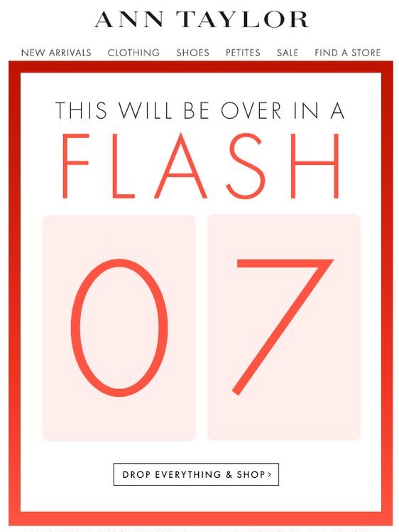
Take this newsletter from Ann Taylor, for example. It has a simple design that allows users to interact with it, see all the new products, and even go straight to the online store. Things like sidebars, drop-down tabs, and shopping links are actually taking off as a trend. This is an interactive email newsletter if I’ve ever seen one. As long as you don’t go overboard with it, this is a great trend to follow.
Simple and clean design
Minimalism is a huge trend in design right now. It’s no big surprise that it’s snuck its way into newsletter design trends, too.
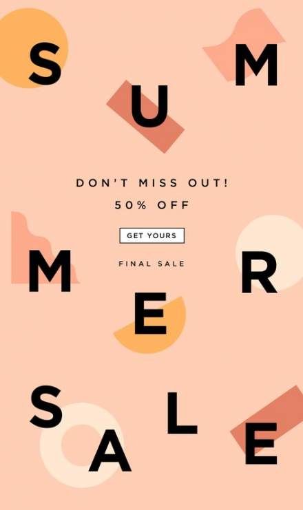
There’s nothing more annoying than getting a newsletter, opening it, and finding an explosion of information that you can’t seem to click away from fast enough. The whole point of a newsletter is to grab someone’s attention quickly and direct them to the announcement.
Something like this simple newsletter design clearly shows the reader that there’s a summer sale, it’s 50% off, and then gives them a link to go shopping. There’s nothing overwhelming or misleading about it. By definition, this is a perfectly simply newsletter, and it does the trick.
Catchy newsletter names
You may think that a name really isn’t part of the design, but I think that the name is the first thing that really grabs the reader’s attention. Amidst the absolute ocean of emails that some of us get daily, the subject lines can easily blend in with the background.
It helps to have a name that people not only recognize as your own but by having a name that stands out. There’s really no guideline for this other than be creative. Overall, you should just try to avoid names like (insert company name)’s newsletter.
Infographics in newsletters
If you absolutely need to give a lot of information, a nice infographic can really help maintain your clean design. One particular style of infographics that a lot of businesses are using is video infographics.
Video marketing, in general, has really rocketed forward in recent years. For many businesses, it’s their main focus. A simple video infographic is an easy way to pump out a lot of your information and still keep the target audience engaged.
Personalization
Creating a newsletter design that is easy to adapt to any reader can be hard to do, but it drives opening rates and engagement like crazy.
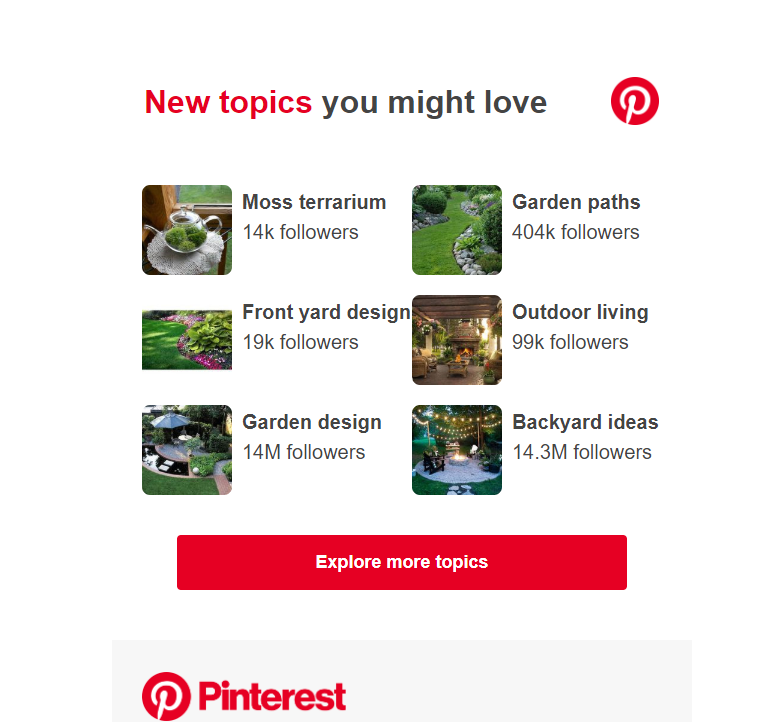
A good example of this would be Pinterest. For years now, they have sent you Pins via email based on the things that you like.
On top of that, they will often use your name in the subject line. It makes it feel less like a corporate cash-grab, and more like a friendly email from a close friend. I don’t know about you, but when scrolling through my inbox, my name in a subject line stands out drastically. Many times, it’s all I look for.
Videos in newsletters
The reason videos work well in newsletters is simple: people love to be entertained. On top of that, listening to a video requires much less effort than reading.
That being said, adding a video to a newsletter can be tricky. If someone has rendering issues, or they can’t watch the video the moment they open it, then they may leave and never come back. There has to be a balance between making the video catchy enough to grab their attention and keep it and being short enough to not waste their time. Basically, keep it short and sweet.
Bright and contrasting colors
A little splash of color never hurt anyone. This statement rings true for a lot of things, but with design, it’s a little more complicated. It’s true that the right colors can really help any design. But, notice I said the RIGHT colors.
Just because you toss in some bright and contrasting colors doesn’t mean that people are going to love it. In fact, if you don’t get the colors almost exactly right, most people are going to hate it.
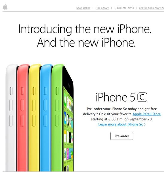
The colors you choose have to make sense. They have to match your brand’s tone, but they don’t necessarily have to be the brand’s colors. Take this newsletter for example:
We’re all familiar with the trillion-dollar company, Apple. They’re infamous for their simplicity in design. Most of the time, their devices are simple gold, black, grey, or white. It was quite a shock when they released the 5c, simply because they were like nothing Apple fans had ever seen.
Granted, this email newsletter design is a few years old at this point, but you can see the strategy in using these colors. They absolutely pop off the screen at you. They used the phone’s colors to highlight the phones themselves on the screen.
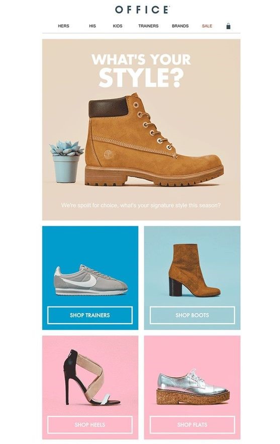
Or, how about this one:
Again, what we have here is an ingeniously implemented design with contrasting colors. They’re not wildly different from each other, but they certainly do a great job of highlighting the products. These colors make sense, and they look good.
Full-width images
Just like the colors, images have become the main focal point of the newsletter in 2019. And, just like the example above with Apple, the images have quickly started to take up the majority of the newsletter.
It makes sense if you think about it. Let your product do the talking for you. Even if you’re newsletter is a software or a simple announcement, you should be confident enough with what you’re proposing in the newsletter.
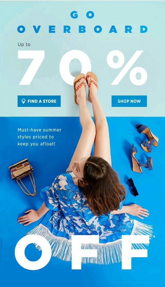
This newsletter advertisement is a perfect example of this. The image of the woman in the middle takes up nearly the entire thing, from end to end.
In fact, this particular design hits on a few of the points we talked about, so we’ll end it here. You have a nice big image, contrasting and bold colors, a simple image, and interactivity.
Get creative
As I hinted at several times throughout this article, creativity is key. Most people will scan their emails, look for only the most important emails, and forget about the rest, newsletters included.
A combination of many or all the design elements above will definitely give you a competitive edge, but don’t forget to play around a little. Just because someone doesn’t open a newsletter email of yours once, doesn’t mean they’ll never do it again. This process will have a lot of trial and error, but you will get the hang of it eventually. Especially is you use these 2019 newsletter design trends.
For a lot of people, the first thing they think of when they hear the names of big companies is their logo. In truth, the logo is probably the biggest marketing decision you can make. It might sound simple, but there are quite a few things you need to keep in mind when designing a logo of your own. So without further ado, let’s talk about the basics behind designing your own logo.
Why do you need a logo?
Ideally, you’ll want to hire a professional to create your logo, but that doesn’t mean you shouldn’t bring some ideas of your own to the table. In fact, it’s best that you have a pretty good idea of what you want before the big design meeting.
But let’s say that you want to go through most, if not all of this process by yourself. Where do you even begin? You need to start this journey off by understanding why you need the logo.
Your logo is an extension of your brand. It’s important that it represents you. That can be hard to do in a single picture, but that’s why this takes time.
Pick something that scales as a favicon
A favicon is that little image that sits in the address bar when a tab is opened. It’s a small detail, but it’s very crucial.
The reason it’s so crucial is because those big, fancy, and incredibly detailed images will look absolutely terrible as a favicon. This is something that a lot of people don’t think about because they generally regard a big and fancy logo as perfect.
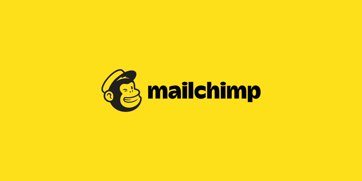
One of my favorite examples of a favicon is that of Mailchimp.
This logo is simple, yes, but it still manages to capture the brand perfectly. Now, if you pay attention, you’ll notice that the main focus of the logo (the chimp) is its own entity. That makes it very easy to scale as a favicon. Just like this:
This is the Mailchimp favicon. They definitely couldn’t have put the entire logo in the address tab, and they knew that. So, they went into the logo design process with that in mind, and came out with this.
Test multiple colors
Speaking of being scalable, you want to make sure the logo looks good on multiple backgrounds in multiple colors. If you don’t you could end up having to redo this entire process when something as simple as a WordPress theme change comes up.
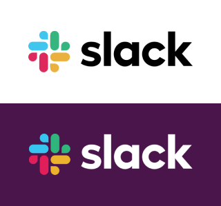
As unusual and controversial as the Slack logo has been here lately, we all have to admit that it works well with multiple colors. Of course, the logo itself has a variety of colors in it, but that really only helps it.
The Slack logo can be seen around the world with all sorts of background and font colors. It’s an iconic logo, so it was important that they got all the design elements right.
Be consistent with the brand
A logo means nothing if it doesn’t embody the brand. This is especially important for startups that are looking to get their name out there.
I don’t think I need to go into this too much, but we definitely need to mention it here. Every tiny little detail is crucial. They have to match the brand’s story, their tone of voice, and their mission.
So, for example, the choice of font is a big one. If you run a SaaS company, you probably don’t want to use a script font. Something like that makes much for sense for a small town candle shop.
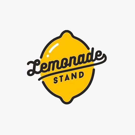
Something like this classy lemonade stand logo is perfect. It’s simple, it will scale well as a favicon, and it’s on brand. The colors work well and the font stands out, but it’s not over the top.
Make your logo easy to incorporate into your brand
This point sort of goes along to the one above, but it deserves its own mention. That being said, even if your logo is on brand, it doesn’t mean that it will be easy to incorporate into the rest of your brand.
What do I mean by that? Well, looks aren’t always everything. Even if you logo looks great and embodies your brand, it might not be easy to use. Yes, there is such a thing as a logo that is too detailed to use.
A logo should not be so complicated that it takes more than a few seconds for someone to recognize what it is. If it’s simple and straightforward, it will be easy to incorporate into your brand anywhere.
Other tips to follow
There are tons of tips to take into consideration here. But, whether you’re designing it yourself or paying someone else to do it, there are some that are pretty fundamental. So, in addition to the ones above, here are some quick tips that you should consider:
Pick a style and stick to it
Just like a good party, a logo has a theme. This is a combination of all the elements. From the typography to the colors, everything should be perfectly thought out and implemented with a purpose. Each element needs to pay respect to the others.
Keep constant communication with the designer
If you choose to hire someone, you have to keep constant communication with them. In the design world, you build off of your own ideas. So if the designer gets one tiny detail wrong, then the entire logo can be off in the end.
Stay inspired
You are designing the face of your company. If you lack inspiration in the project, you should stop and brainstorm a bit. Or, if you really can’t handle it anymore, step away for a bit. Nothing is worse than rushed work in design, so don’t make your logo suffer.
Get a lot of opinions
You’re not designing this logo for your own personal use. This logo will be seen by a lot of people, so get a lot of opinions. Show it off to colleagues, friends, family, or even random strangers. The more input you can get, the better your logo will come out.
Be yourself
This is probably the most important rule in design, so we’ll end here. Being yourself is what got you to the place where you can design your own logo in the first place. Don’t fall into the norms of the industry that you’re in. Be unique!