This is a nice update from Manuel Rego Casasnovas. Igalia has this idea to sort of crowd-source important web platform features that need to get worked on (that’s the sort of work they do). They call it Open Prioritization. The “winner” of that (the one with the most-pledged dollars) is what they’ll do. That turned out to be :focus-visible support in WebKit (Safari). As I write, people have pledged $29,337.13 of the $35,000 goal, so not bad!
That choice was made in January 2021, and as Manuel was writing in June 2021, it’s basically done because it shipped in Safari Technical Preview 125 meaning it’s in Apple’s hands now. Pretty nice speed for a web feature, and a great one since it will highly encourage proper focus styles rather than that bummer situation where people remove focus styles for aesthetic reasons, hurting accessibility.
And, bonus!
In addition, the WPT test suite has been improved counting now ~40 tests for this feature. Also in January neither Firefox or Chrome were using :focus-visible on the UA style sheet, however they both use it there nowadays. Thus, doing the implementation on WebKit has helped to move forward this feature on different places.
There’s a whole lot of accessibility in this week’s news, from the nuances of using :focus-visible and input placeholders, to accessible typefaces and a Safari bug with :display: contents. Plus, a snippet for a bare-bones web component that supports style encapsulation.
Now may be a good time to start using :focus-visible
The CSS :focus-visible pseudo-class replaces :focus as the new way to create custom focus indicators for keyboard users. Chrome recently switched from :focus to :focus-visible in the user agent stylesheet and, as a result of that change, the default focus ring is no longer shown when the user clicks or taps a button.
When switching from :focus to :focus-visible, consider backwards compatibility. Your keyboard focus indicators should be clearly visible in all browsers, not just the ones that support :focus-visible. If you only style :focus-visible, non-supporting browsers will show the default focus ring which, depending on your design, “may not be sufficiently clear or visible at all.”
A good way to start using :focus-visible today is to define the focus styles in a :focus rule and then immediately undo these same styles in a :focus:not(:focus-visible) rule. This is admittedly not the most elegant and intuitive pattern, but it works well in all browsers:
Browsers that don’t support :focus-visible use the focus styles defined in the :focus rule and ignore the second style rule completely (because :focus-visible is unknown to them).
In browsers that do support :focus-visible, the second style rule reverts the focus styles defined in the :focus rule if the :focus-visible state isn’t active as well. In other words, the focus styles defined in the :focus rule are only in effect when :focus-visible is also active.
The BBC created their own custom typeface called Reith (named after the BBC’s founder Sir John Reith). Their goal was to create a font that supports multiple languages and is easier to read, especially on small devices. The font was tested with mixed-ability user groups (dyslexia and vision impairment) and across different screen sizes.
We [the BBC] were using Helvetica or Arial. We also had Gill Sans as the corporate typeface. These typefaces were designed a hundred years ago for the printed page [and] don’t perform well on today’s modern digital screens.
Note: If you’d like to inspect Reith Sans and Reith Serif in Wakamai Fondue, you can quickly access the URLs of the WOFF2 files in the “All fonts on page” section of the Fonts pane in Firefox’s DOM inspector on BBC’s website.
display: contents is still not accessible in Safari
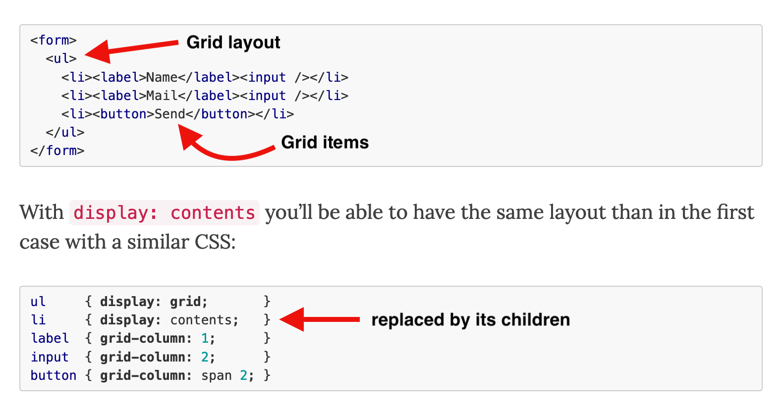
The CSS display: contents value has been supported in browsers since 2018. An element with this value “does not generate any boxes” and is effectively replaced by its children. This is especially useful in flex and grid layouts, where the contents value can be used to “promote” more deeply nested elements to flex/grid items while retaining a semantic document structure.
Unfortunately, this feature originally shipped with an implementation bug that removed the element from the browser’s accessibility tree. For example, applying display: contents to a <ul> element resulted in that element no longer mentioned by screen readers. Since then, this bug has been fixed in Firefox and Chrome (in the latest version).
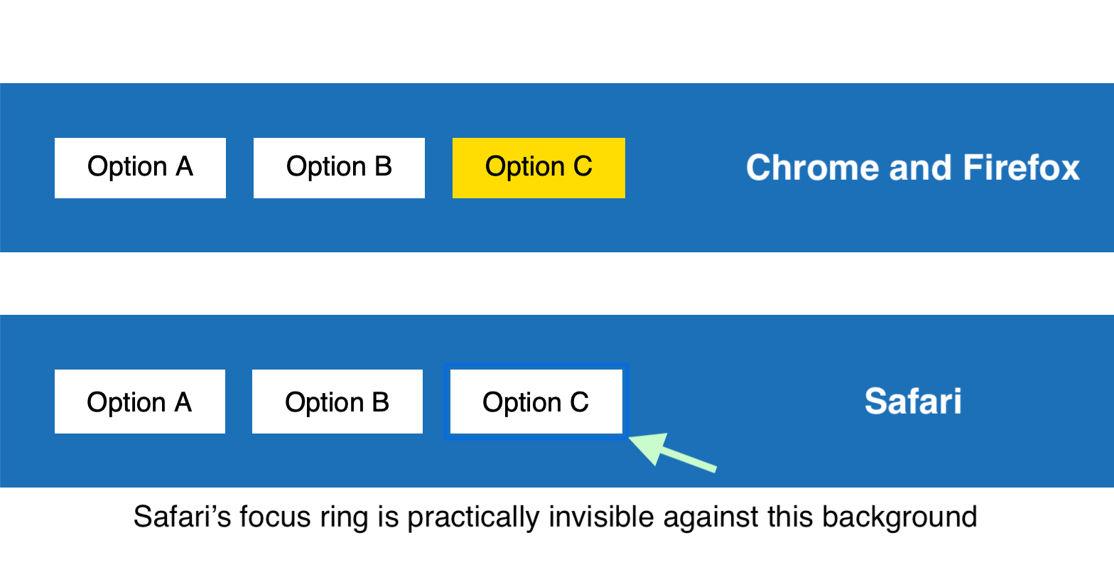
In Chrome and Firefox, the screen reader informs the user that the “Main, navigation” contains a “list, 2 items.” In Safari, the latter part is missing because the <ul> and <li> elements are not present in the accessibility tree. Until Apple fixes this bug in Safari, be careful when using the contents value on semantic elements and test in screen readers to confirm that your pages are accessible in Safari as well.
Set opacity when overriding the color of placeholder text
Accessibility experts recommend avoiding placeholders if possible because they can be confused for pre-populated text and disappear when the user starts entering a value. However, many websites (including Wikipedia and GOV.UK) use placeholders in simple web forms that contain only a single input field, such as a search field.
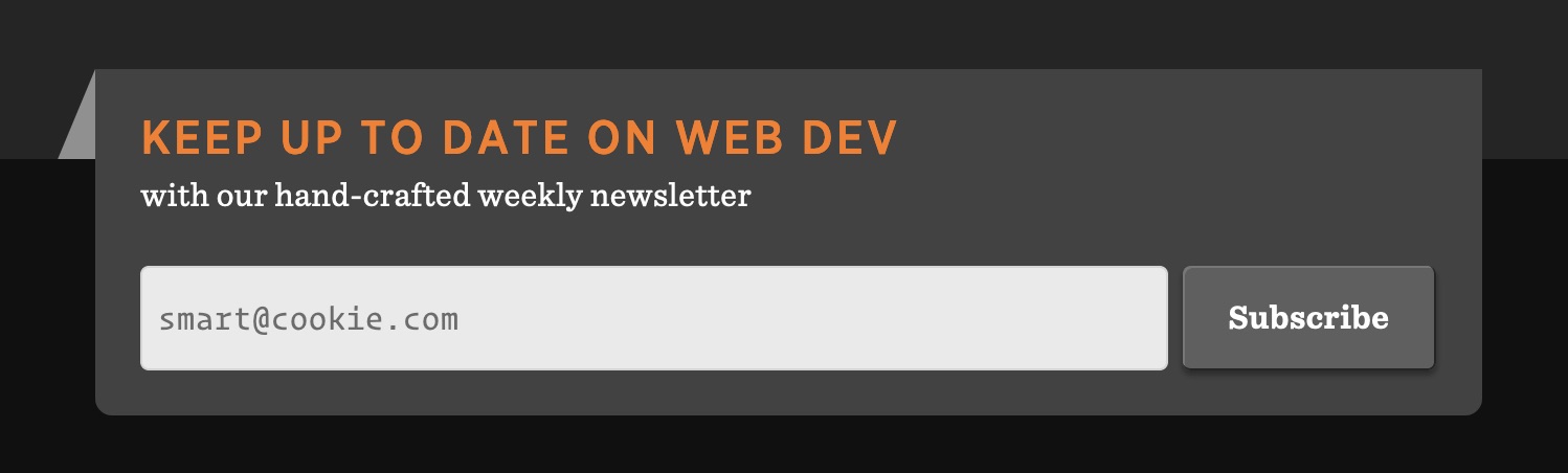
The subscription form for the CSS-Tricks newsletter uses a placeholder in the email field
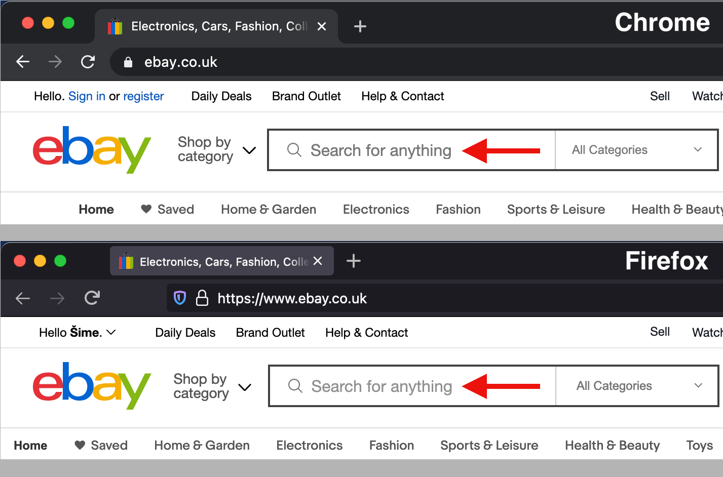
Placeholders can be styled via the widely supported ::placeholder pseudo-element. If your design calls for a custom color for placeholder text, make sure to specify both color and opacity. The latter is needed for Firefox, which appliesopacity: 0.54 to ::placeholder by default. If you don’t override this value, your placeholder text may have insufficient contrast in Firefox.
The placeholder text on eBay’s website is lighter in Firefox and doesn’t meet the minimum contrast requirement of 4.5:1
Declarative shadow DOM could help popularize style encapsulation
One of the key features of shadow DOM is style encapsulation, wherein the outer page’s style rules don’t match elements inside the shadow tree, and vice versa. In order to use this feature, you need to attach a shadow DOM tree to an element (usually a custom element, like <my-element>) and copy the element’s template (usually from a <template> element in the DOM) to the element’s newly created shadow DOM.
These steps can only be performed in JavaScript. If you’re only interested in style encapsulation and don’t need any dynamic functionality for your element, here is the minimum amount of JavaScript required to create a custom element with a shadow DOM:
customElements.define(
  "my-element",
  class extends HTMLElement {
    constructor() {
      super();

      // find <template id="my-template"> in the DOM
      let template = document.getElementById("my-template");

      // make a copy of the template contents…
      let content = template.content.cloneNode(true);

      // …and inject it into <my-element>’s shadow DOM
      this.attachShadow({ mode: "open" }).appendChild(content);
    }
  }
);
For an example of style encapsulation, see Miriam Suzanne’s <media-object> element on CodePen. The scoped styles are located in the <template> element in the HTML pane. Notice how this CSS code can use simple selectors, such as article, that only match elements inside <media-object>’s shadow DOM.
JavaScript may soon no longer be required to create this type of style encapsulation in modern browsers. Earlier this week, Chrome became the first browser to ship Google’s Declarative Shadow DOM proposal. If it becomes a standard, this feature will also make it possible to use Shadow DOM in combination with server-side rendering.
What’s so cool about :focus-visible? It’s all about the blue focus ring that displays around elements that are in focus. It’s sort of a happy medium between loving the outline for accessibility purposes (gotta know what element is selected when tabbing on a keyboard) but not-really-loving how it looks (gotta have everything follow brand).
The strategy has largely been an all-or-nothing choice between using a custom outline when any element is in :focus (great, but that means for both keyboard tabbing and mouse clicks) or ditching the outline altogether (not great, like ever). :focus-visible accomplishes the same thing as :focus, but uses a browser’s knowledge of user inputs (or heuristics) to determine whether the focus is coming from a keyboard or a mouse.
(Are a browser’s heuristics perfect at determining the input? That depends. Things get murky once we start factoring in things like touch interactions.)
That means, we get to remove the default focus ring (yay!) for the right types of interactions (double yay!) and display our own custom styles while we’re at it (triple yay!). Allow me to pluck Andy Adams’ fine example straight from our almanac. Note that :focus-visible cannot remove the focus ring like :focus can, so the two are used together:
Chrome implemented :focus-visibleback in 2018. Firefox had it’s own prefixed version, :-moz-focusring, prior to this implementation. Safari? Go vote for the feature!
Always worth repeating: all interactive elements should have a focus style. That way, a keyboard user can tell when they have moved focus to that element.
But if you use :focus alone for this, it has a side effect that a lot of people don’t like. It means that when you click (with a mouse) on an interactive element, you’ll see the focus style. Arguably, you don’t need that feedback as a mouse user, because you just moved your cursor there and clicked. Whatever you think of that, it’s annoyed so many people over the years that they remove focus styles entirely, which is a gnarly net loss for accessibility on the web.
What if we could apply focus styles only when the keyboard is used to focus something, not the mouse? Lea Verou put a finger on this a few years back:
I’m gonna start blanket adding the following rule to all my stylesheets:
:focus:not(:focus-visible) { outline: none }
Gets rid of the annoying outline for mouse users but preserves it for keyboard users, and is ignored by browsers that don’t support :focus-visible.
That was in response to Chrome dropping the feature behind a flag. Clever clever.
Fast forward a couple of years, Chrome is releasing it without a flag. They are on board with Lea’s idea:
By combining :focus-visible with :focus you can take things a step further and provide different focus styles depending on the user’s input device. This can be helpful if you want the focus indicator to depend on the precision of the input device:
/* Focusing the button with a keyboard will show a dashed black line. */
button:focus-visible {
  outline: 4px dashed black;
}

/* Focusing the button with a mouse, touch, or stylus will show a subtle drop shadow. */
button:focus:not(:focus-visible) {
  outline: none;
  box-shadow: 1px 1px 5px rgba(1, 1, 0, .7);
}
I might suggest trying those selectors without the button, making them globally applied!
There is more to dig into, so I’ll link up some more stuff here:
The Chromium Blog post covers the heuristics of the selector. It’s tricky. It’s like there is an algorithm to determine if :focus-visible is going to match or not, which you just largely need to trust. It also covers the idea that Firefox has long had :-moz-focusring, but the behavior is different enough that they don’t recommend using it if you’re shooting for consistent behavior.
Matthias Ott blogged about it with some good info, like using the official polyfill and how to look at the styles properly in DevTools (there is a new checkbox for it).
We’ve covered this before. In that, we noted Lea’s tweet that she thought usage would explode when it ships for real. Let’s see (and hope)!