Let's go rapid fire and try to answer this question with quick points rather than long explanations. There are a lot of similarities between flexbox and grid, starting with the fact that they are used for layout and much more powerful than any layout technique that came before them. They can stretch and shrink, they can center things, they can re-order things, they can align things... There are plenty of layout situations in which you could use either one to do what we need to do, and plenty of situations where one is more well-suited than the other. Let's focus on the differences rather than the similarities:
Flexbox can optionally wrap. If we allow a flex container to wrap, they will wrap down onto another row when the flex items fill a row. Where they line up on the next row is independent of what happenned on the first row, allowing for a masonry-like look.
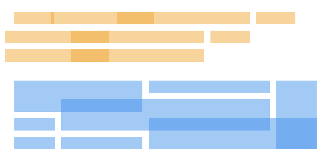
Grid can also optionally wrap (if we allow auto filling) in the sense that items can fill a row and move to the new row (or auto place themselves), but as they do, they will fall along the same grid lines all the other elements do.
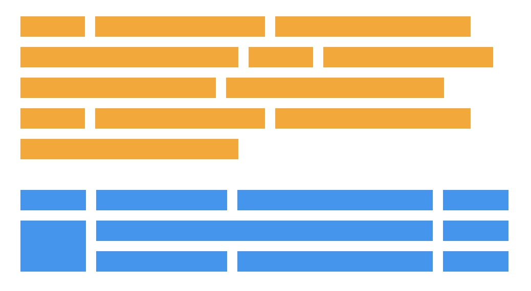
You could think of flexbox as "one dimensional." While flexbox can make rows and columns in the sense that it allows elements to wrap, there's no way to declaratively control where elements end up since the elements merely push along a single axis and then wrap or not wrap accordingly. They do as they do, if you will, along a one-dimensional plane and it's because of that single dimension that we can optionally do things, like align elements along a baseline — which is something grid is unable to do.
.parent {
  display: flex;
  flex-flow: row wrap; /* OK elements, go as far as you can on one line, then wrap as you see fit */
}
You could think of grid as "two dimensional" in that we can (if we want to) declare the sizing of rows and columns and then explicitly place things into both rows and columns as we choose.
.parent {
  display: grid;
  grid-template-columns: 3fr 1fr; /* Two columns, one three times as wide as the other */
  grid-template-rows: 200px auto 100px; /* Three columns, two with explicit widths */
  grid-template-areas:
    "header header header"
    "main . sidebar"
    "footer footer footer";
}

/*
  Now, we can explicitly place items in the defined rows and columns.
*/
.child-1 {
  grid-area: header;
}

.child-2 {
  grid-area: main;
}

.child-3 {
  grid-area: sidebar;
}

.child-4 {
  grid-area: footer;
}
I'm not the world's biggest fan of the "1D" vs. "2D" differentiation of grid vs. flexbox, only because I find most of my day-to-day usage of grid is "1D" and it's great for that. I wouldn't want someone to think they have to use flexbox and not grid because grid is only when you need 2D. It is a strong distinction though that 2D layout is possible with grid though in ways it is not in flexbox.
Grid is mostly defined on the parent element. In flexbox, most of the layout (beyond the very basics) happen on the children.
/*
  The flex children do most of the work
*/
.flexbox {
  display: flex;
  > div {
    &:nth-child(1) { // logo
      flex: 0 0 100px;
    }
    &:nth-child(2) { // search
      flex: 1;
      max-width: 500px;
    }
    &:nth-child(3) { // avatar
      flex: 0 0 50px;
      margin-left: auto;
    }
  }
}

/*
  The grid parent does most of the work
*/
.grid {
  display: grid;
  grid-template-columns: 1fr auto minmax(100px, 1fr) 1fr;
  grid-template-rows: 100px repeat(3, auto) 100px;
  grid-gap: 10px;
}
Grid is better at overlapping. Getting elements to overlap in flexbox requires looking at traditional stuff, like negative margins, transforms, or absolute positioning in order to break out of the flex behavior. With grid, we can place items on overlapping grid lines, or even right within the same exact grid cells.
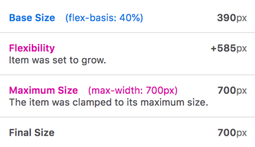
Grid is sturdier. While the flexing of flexbox is sometimes its strength, the way a flex item is sized gets rather complicated. It's a combination of width, min-width, max-width, flex-basis, flex-grow, and flex-shrink, not to mention the content inside and things like white-space, as well as the other items in the same row. Grid has interesting space-occupying features, like fractional units, and the ability for content to break grids, though, generally speaking, we're setting up grid lines and placing items within them that plop right into place.
Flexbox can push things away. It's a rather unique feature of flexbox that you can, for example, put margin-right: auto; on an element and, if there is room, that element will push everything else as far away as it can go can.
Here are some of my favorite tweets on the subject:
flexbox looks like it does what you want
but grid is usually what you want— Old Guard Rupert (@davatron5000) January 25, 2019
Grid makes actual columns and rows. Content will line up from one to the other, as you ask it to. Flexbox doesn’t. Not only in the second dimension (which is easiest to talk about), but also in the first dimension. Flexbox isn’t for most of the things we’ve been using it for.
— Jen Simmons (@jensimmons) January 26, 2019
How about this:#Flexbox is for alignment. #CSSGrid is for layout.
This is almost always how I wind up using them. It allows them to preserve their relationships to one another. It also allows each to be used for its strength, even though each can do the other thing.
— Brian Haferkamp (@BrianHaferkamp) January 25, 2019
If you start constraining all your flex items with a width, then more often than not it will be easier to use grid.
— Rachel Andrew (@rachelandrew) January 25, 2019
Here's another difference, but it's not a favorite way of describing them, just fun dumb knowledge:
flexbox takes 2 passes to finish
grid takes 3so one could say, grid is slow and flexbox is fast lol
— Adam Argyle (@argyleink) January 25, 2019
For me Grid is there to great full layout..grids...with more control over how the whole are/page comes together, whereas flexbox helps me to position and align (whether it’s in a grid or not).
For me it’s about purpose.
— Mandy Michael (@Mandy_Kerr) January 25, 2019
The distinction between the two is often blurry, especially now that we also have `gap` for flexbox. Grid is best suited for a few specific use cases (2D obviously, but also things like overlapping elements) while flexbox usually shines in simpler yet common layout requirements.
— Benjamin De Cock (@bdc) January 25, 2019
Use grid when you already have the layout structure in mind, and flex when you just want everything to fit. Layout first vs content first.
— Beverly (@aszenitha) January 25, 2019
The post Quick! What’s the Difference Between Flexbox and Grid? appeared first on CSS-Tricks.