Equal Columns With Flexbox: It’s More Complicated Than You Might Think

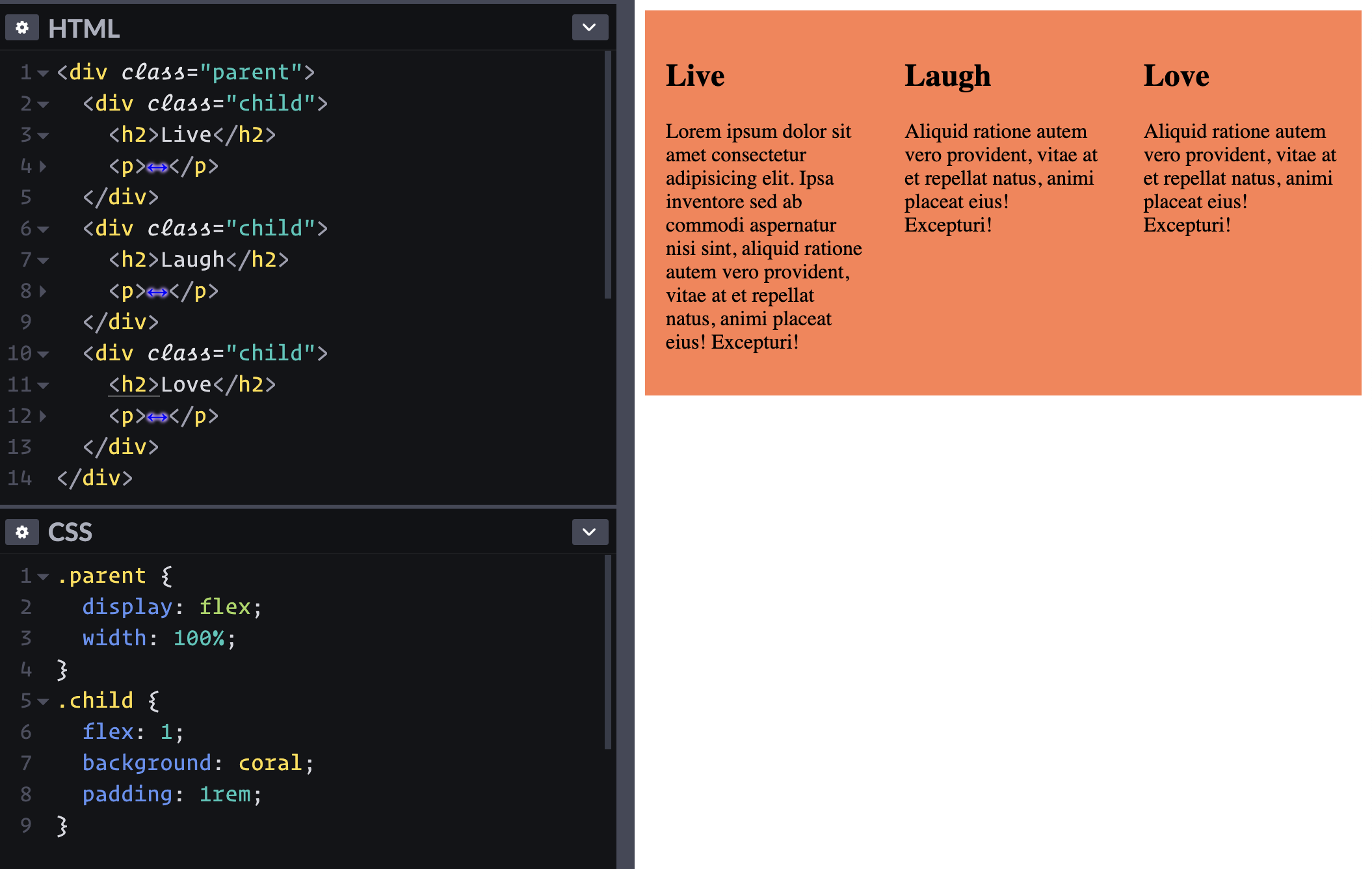
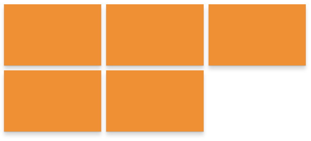
You get a nice-looking design handed to you and it has this nice big hero section, followed by one of those three-up columns right beneath it. You know, like almost every other website you’ve ever worked on.

You bang through the hero section and get to work on the three-column section. It’s time to pull out our trusty friend flexbox! Except, you write display: flex and you get this mess instead of getting the three equal columns you’d expect.

This happens because of how flexbox calculates the base size of an element. You’ve probably read lots of flexbox tutorials, and many of them (including my own) are an overly simplistic example of what flexbox does without really digging into the complex things that flexbox does for us that we take for granted.

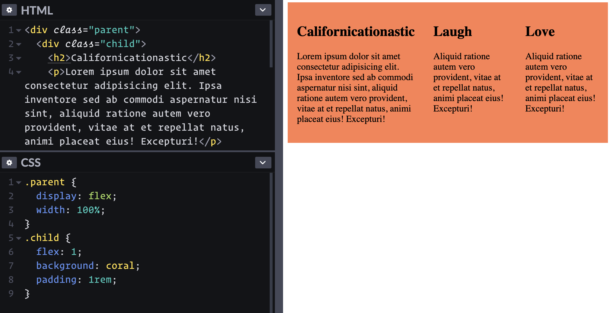
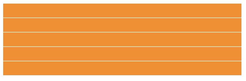
I’m positive you’ve seen examples and tutorials that look at something like this, where three divs shrink down around the content that’s inside them:

In other words, we get some block-level elements shrinking down and slotting next to one another. It feels like flex wants things to be as small as possible. But in reality, flexbox actually wants things to be as big as possible.

Wait, what? Flex shrinks things by default — that can’t be right! Right?

As awesome as flexbox is, what it’s doing under the hood is actually a little strange because, by default, it is doing two things at once. It first looks at the content size which is what we would get if by declaring width: max-content on an element. But on top of that, flex-shrink is also doing some work allowing the items to be smaller, but only if needed.

To really understand what’s going on, let’s break those two down and see how they work together.

Diving into max-content

max-content is a pretty handy property value in certain situations, but we want to understand how it works in this particular situation where we are trying to get three seemingly simple equal columns. So let’s strip away flexbox for a moment and look at what max-content does on its own.

MDN does a good job of explaining it:

The max-content sizing keyword represents the intrinsic maximum width of the content. For text content this means that the content will not wrap at all even if it causes overflows.

Intrinsic might throw you off here, but it basically means we’re letting the content decide on the width, rather than us explicitly setting a set width. Uri Shaked aptly describes the behavior by saying “the browser pretends it has infinite space, and lays all the text in a single line while measuring its width.”

So, bottom line, max-content allows the content itself to define the width of the element. If you have a paragraph, the width of that paragraph will be the text inside it without any line breaks. If it’s a long enough paragraph, then you end up with some horizontal scrolling.

Let’s revisit that overly-simplistic example of three block-level elements that shrink down and slot next to one another. That isn’t happening because of flex-shrink; it’s happening because that’s the size of those elements when their declared width is max-content. That’s literally as wide as they go because that’s as wide as the combined content inside each element.

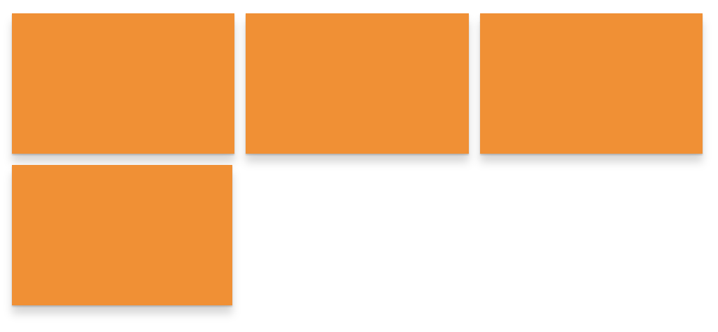
Here, take a look at those elements without flexbox doing it’s flexbox stuff, but with a width: max-content on there instead:

So, when there’s just a small amount of text, the intrinsic max-content shrinks things down instead of flex-shrink. Of course, flexbox also comes in with it’s default flex-direction: row behavior which turns the flex items into columns, putting them right next to one another. Here’s another look but with the free space highlighted.

Adding flex-shrink to the equation

So we see that declaring display: flex pushes that max-content intrinsic size on flex items. Those items want to be as big as their content. But there is another default that comes in here as well, which is flex-shrink.

flex-shrink is basically looking at all the flex items in a flexible container to make sure they don’t overflow the parent. If the flex items can all fit next to each other without overflowing the flexible container, then flex-shrink won’t do anything at all… it’s job is already done.

But if the flex items do overflow the container (thanks to that max-content intrinsic width thing), the flex items are allowed to shrink to prevent that overflow because flex-shrink is looking out for that.

This is why flex-shrink has a default value of 1. Without it, things would get messy pretty quickly.

Here’s why the columns aren’t equal

Going back to our design scenario where we need three equal columns beneath a hero, we saw that the columns aren’t equal widths. That’s because flexbox starts by looking at the content size of each flex item before even thinking about shrinking them.

Using Firefox’s DevTools (because it’s got some unique flexbox visualizations that others don’t), we can actually see how flexbox is calculating everything.

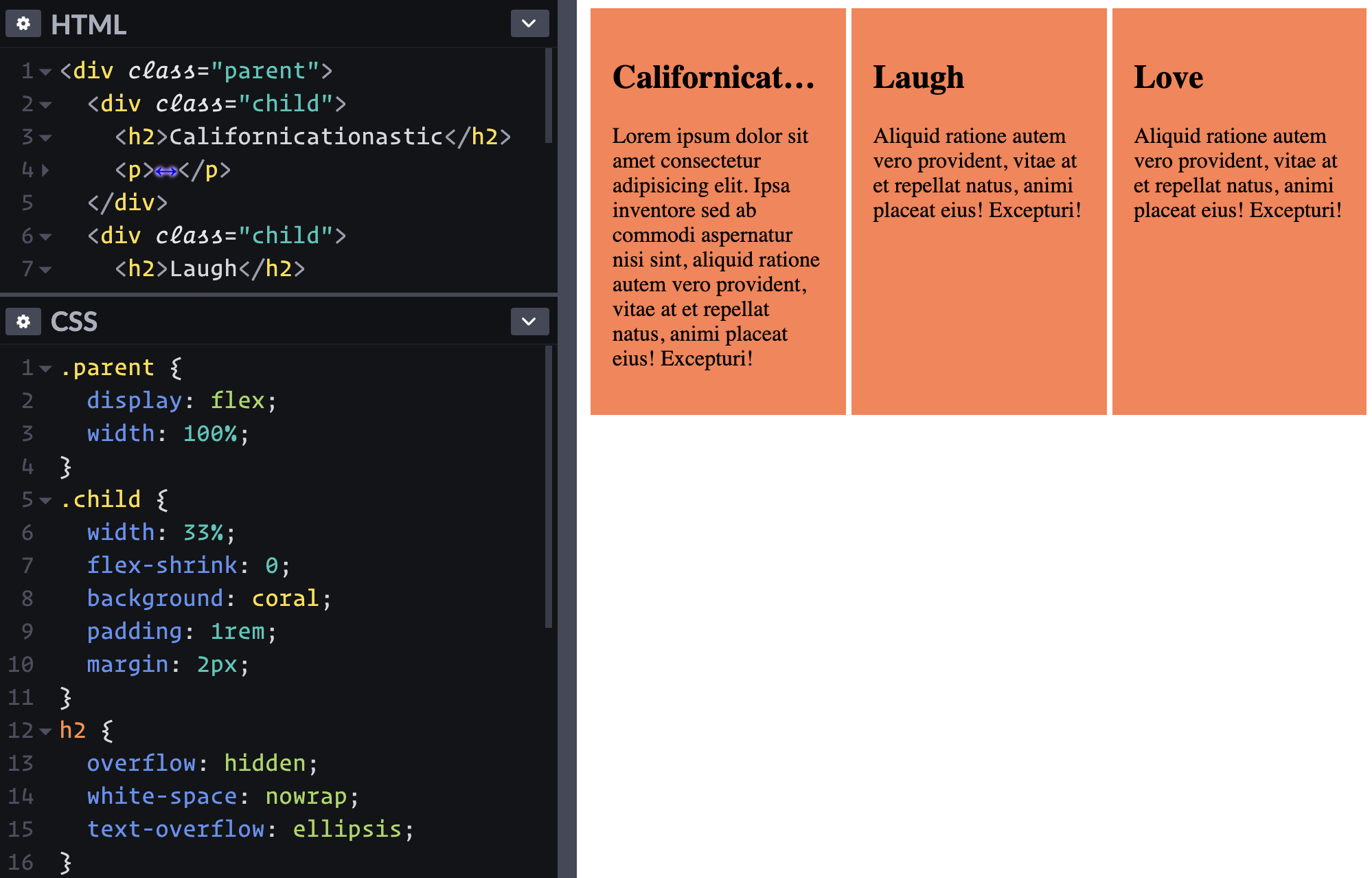
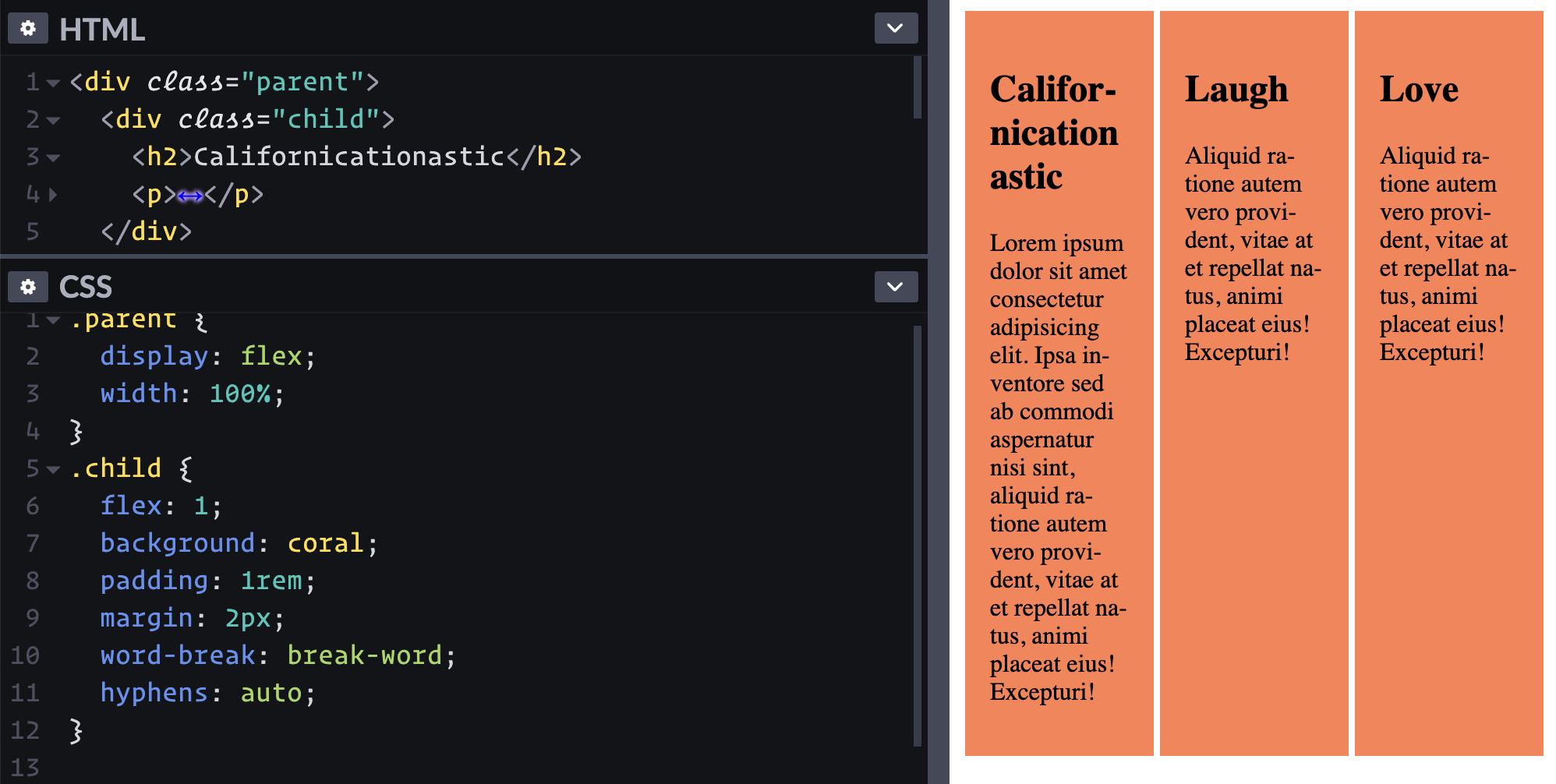
For simplicity’s sake, as we dive deeper into this, let’s work with some nice round numbers. We can do this by declaring widths on our flex items. When we declare a width on a flex item, we throw that intrinsic size out the window, as we’ve now declared an explicit value instead. This makes figuring out what’s really going on a lot easier.

In the Pen below, we have a parent that’s a 600px wide flexible container (display: flex). I’ve removed anything that might influence the numbers, so no gap or padding. I’ve also switched out the border for an outline so we can still visualize everything easily.

The first and third flex items have a width: 300px and the middle one a width: 600px. If we add that all up, it’s a total of 1200px. That’s bigger than the the 600px available within the parent, so flex-shrink kicks in.

flex-shrink is a ratio. If everything has the same flex-shrink (which is 1 by default), they all shrink at the same rate. That doesn’t mean they all shrink to the same size or by the same amount, but they all shrink at the same rate.

If we jump back into Firefox DevTools, we can see the base size, the flex-shrink and the final size. In this case, the two 300px elements are now 150px, and the 600px one is now 300px.

The two elements that have a base width of 300px become 150px.
The larger element with a base width of 600px becomes 300px.

If we add up all the base sizes of all three flex items (the actual widths we declared on them), the total comes out to 1200px. Our flex container is 600px wide. If we divide everything by 2, it fits! They are all shrinking by the same rate, dividing their own widths by 2.

It’s not often that we have nice round numbers like that in the real world, but I think this does a nice job illustrating how flexbox does what it does when figuring out how big to make things.

Getting the columns to be equal

There are a few different ways to get the three columns we want to be equal in width, but some are better than others. For all the approaches, the basic idea is that we want to get all the columns base size to be the same. If they have an equal base size, then they will shrink (or grow, if we use flex-grow) at an equal rate when flexbox does it’s flex things, and in theory, that should make them the same size.

There are a few common ways to do this, but as I discovered while diving into all of this, I have come to believe those approaches are flawed. Let’s look at two of the most common solutions that I see used in the wild, and I’ll explain why they don’t work.

Method 1: Using flex: 1

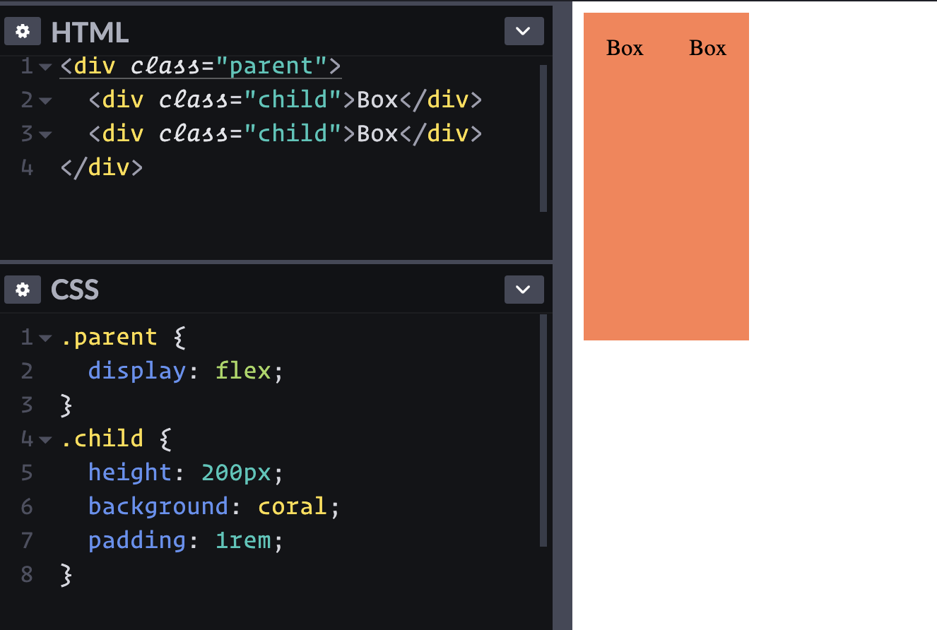
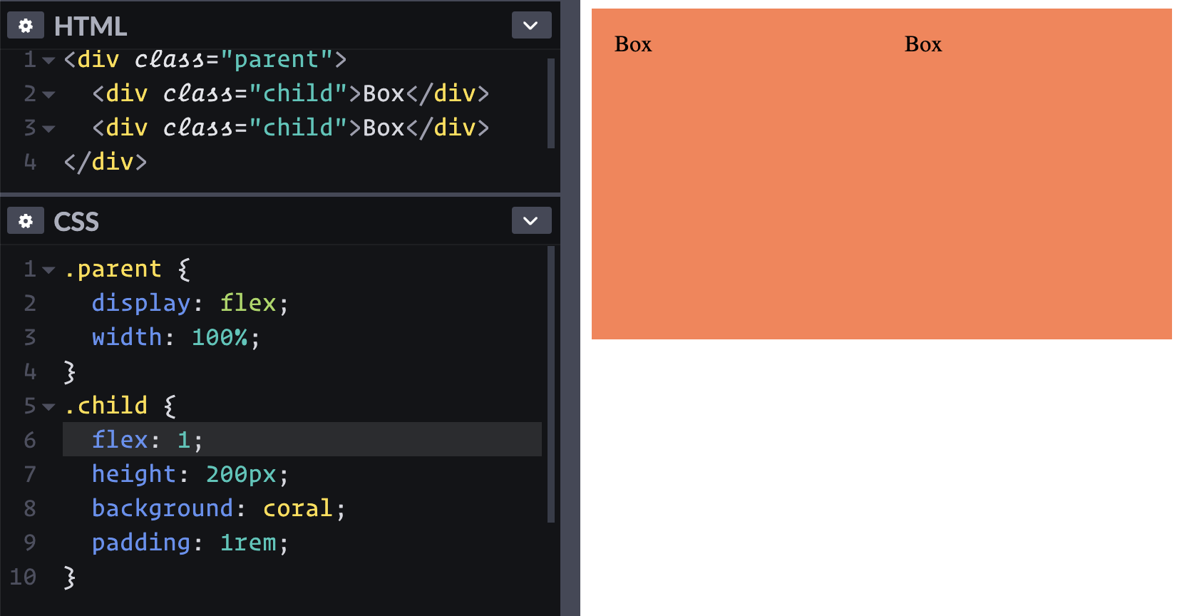
One way we can try to get all the flex items to have the same base size is by declaring flex: 1 on all of them:

.flex-parent { display: flex; }
.flex-parent > * { flex: 1; }

In a tutorial I made once, I used a different approach, and I must have had 100 people asking why I wasn’t using flex: 1 instead. I replied by saying I didn’t want to dive into the flex shorthand property. But then I used flex: 1 in a new demo, and to my surprise, it didn’t work.

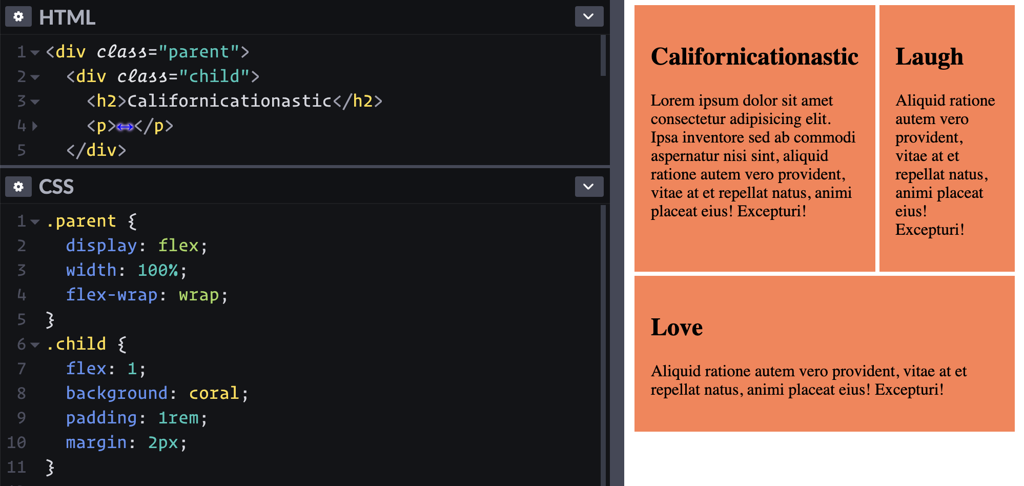
The columns weren’t equal.

The middle column here is larger than the other two. It’s not by a ton, but the whole design pattern I’m creating is just so you have perfectly equal columns every single time, regardless of the content.

So why didn’t it work in this situation? The culprit here is the padding on the component in the middle column.

And maybe you’ll say it’s silly to add padding to one of the items and not the others, or that we can nest things (we’ll get to that). In my opinion, though, I should be able to have a layout that works regardless of the content that we’re putting in it. The web is all about components that we can plug and play these days, after all.

When I first set this up, I was sure it would work, and seeing this issue pop up made me want to learn what was really going on here.

The flex shorthand does more than just set the flex-grow: 1. If you don’t already know, flex is shorthand for flex-grow, flex-shrink, and flex-basis.

The default values for those constituent properties are:

.selector {
  flex-grow: 0;
  flex-shrink: 1;
  flex-basis: auto;
}

I’m not going to deep dive flex-basis in this article, as that’s something Robin has already done well. For now, we can think of it like width to keep things simple since we aren’t playing with flex-direction.

We’ve already seen how flex-shrink works. flex-grow is the opposite. If the size of all the flex items along the main axis is smaller than the parent, they can grow to fill that space.

So by default, flex items:

  • don’t grow;
  • if they would otherwise overflow the parent, they are allowed to shrink;
  • their width acts like max-content.

Putting that all together, the flex shorthand defaults to:

.selector {
  flex: 0 1 auto;
}

The fun thing with the flex shorthand is you can omit values. So, when we declare flex: 1, it’s setting the first value, flex-grow, to 1, which basically turns on flex-grow.

The strange thing here is what happens to the values that you omit. You’d expect them to stay at their defaults, but they don’t. Before we get to what happens, though, let’s first dive into what flex-grow even does.

As we’ve seen, flex-shrink allows elements to shrink if their base sizes add up to a computed value that’s bigger than the available width of the parent container. flex-grow is the opposite. If the grand total of the element base sizes is smaller than the value of the parent container’s width, then they will grow to fill the available space.

If we take that super basic example where we have three small divs next to one another and add flex-grow: 1, they grow to fill that leftover space.

But if we have three divs with unequal widths — like those ones we started with — adding flex-grow to them won’t do anything at all. They won’t grow because they’re already taking up all the available space —so much space, in fact, that flex-shrink needs to kick in and shrink them down to fit!

But, as folks have pointed out to me, setting flex: 1 can work to create equal columns. Well, sort of, as we saw above! In simple situations it does work though, as you can see below.

When we declare flex: 1 it works because, not only does this set the flex-grow to 1, but it also changes the flex-basis!

.selector {
  flex: 1;
  /* flex-grow: 1; */
  /* flex-shrink: 1; */
  /* flex-basis: 0%; Wait what? */
}

Yup, setting flex: 1 sets the flex-basis to 0%. This overwrites that intrinsic sizing we had before that behaved like max-content. All of our flex-items now want to have a base size of 0!

Looking at the expanded view of the flex: 1 shorthand in DevTools shows us that the flex-basis has changed to 0

So their base sizes are 0 now, but because of the flex-grow, they can all grow to fill up the empty space. And really, in this case, flex-shrink is no longer doing anything, as all the flex items now have a width of 0, and are growing to fill the available space.

FireFox’s DevTools showing an element with flex: 1 has a content size of 0 and is growing to fill the available space.

Just like the shrink example before, we’re taking the space that’s available, and letting all the flex items grow at an equal rate. Since they are all a base width of 0, growing at an equal rate means the available space is equally divided between them and they all have the same final size!

Except, as we saw, that’s not always the case…

The reason for this is because, when flexbox does all this stuff and distributes the space, whether it’s shrinking or growing a flex item, it’s looking at the content size of the element. If you remember back to the box model, we have the content size itself, then the padding, border, and margin outside of that.

And no, I didn’t forget * { box-sizing: border-box; }.

This is one of those strange quirks of CSS but it does make sense. If the browser looked at the width of those elements and included their padding and borders in the calculations, how could it shrink things down? Either the padding would also have to shrink or things are going to overflow the space. Both of those situations are terrible, so instead of looking at the box-size of elements when calculating the base size of them, it only looks at the content-box!

So, setting flex: 1 causes a problem in cases where you have borders or padding on some of your elements. I now have three elements that have a content-size of 0, but my middle one has padding on it. If we didn’t have that padding, we’d have the same math we did when we looked at how flex-shrink works.

A parent that is 600px and three flex items with a width of 0px. They all have a flex-grow: 1 so they grow at an equal rate, and they each end up 200px wide. But the padding mucks it all up. Instead, I end up with three divs with a content size of 0, but the middle one has padding: 1rem. That means it has a content size of 0, plus 32px padding as well.

We have 600 - 32 = 568px to divide equally, instead of 600px. All the divs want to grow at an equal rate, so 568 / 3 = 189.3333px.

And that’s what happens!

But… remember, that’s their content size, not the total width! That leaves us with two divs with a width of 189.333px, and another with a which of 189.333px + 32 = 221.333px. That’s a pretty substantial difference!

Method 2: flex-basis: 100%

I have always handled this like this:

.flex-parent {
  display: flex;
}

.flex-parent > * {
  flex-basis: 100%;
}

I thought this worked for the longest time. Actually, this was supposed to be my final solution after showing that flex: 1 doesn’t work. But while I was writing this article, I realized it also falls into the same problem, but it’s a lot less obvious. Enough so that I didn’t notice it with my eyes.

The elements are all trying to be 100% width, meaning they all want to match the width of the parent, which, again, is 600px (and in normal circumstances, is often much bigger, which further reduces the perceivable difference).

The thing is that 100% includes the padding in the computed values (because of * { box-size: border-box; }, which for the sake of this article, I’m assuming everyone is using). So, the outer divs end up with a content size of 600px, whereas the middle div ends up with a content size of 600 - 32 = 568px.

When the browser is working out how to evenly divide the space, it isn’t looking at how to evenly squish 1800px into a 600px space, but rather it’s looking at how to squish 1768px. Plus, as we saw earlier, flex items don’t shrink by the same amount, but at an equal pace! So, the element with padding shrinks slightly less in total than the others do.

This results in the .card having a final width of 214.483px while the others clock in at 192.75px. Again, this leads to unequal width values, though the difference is smaller than we saw with the flex: 1 solution.

Why CSS Grid is the better choice here

While all this is a little frustrating (and even a little confusing), it all happens for a good reason. If margins, padding, or borders changed sizes when flex gets involved, it would be a nightmare.

And maybe this means that CSS Grid might be a better solution to this really common design pattern.

I’ve long thought that flexbox was easier to pick up and start using than grid, but grid gives you more ultimate control in the long run, but that it’s a lot harder to figure out. I’ve changed my mind on that recently though, and I think not only does grid give us better control in this type of situation, but it’s actually more intuitive as well.

Normally, when we use grid, we explicitly declare our columns using grid-template-columns. We don’t have to do that though. We can make it behave a lot like flexbox does by using grid-auto-flow: column.

.grid-container {
  display: grid;
  grid-auto-flow: column;
}

Just like that, we end up with the same type of behavior as throwing display: flex on there. Like flex, the columns can potentially be unbalanced, but the advantage with grid is that the parent has total control over everything. So, rather than the content of the items having an impact like they would in flexbox, we only need one more line of code and we can solve the problem:

.grid-container {
  display: grid;
  grid-auto-flow: column;
  grid-auto-columns: 1fr;
}

I love that this is all on the parent selector, and that we don’t have to select the children to help get the layout that we are after!

The interesting thing here is how fr units work. They are literally called flex units in the spec, and they work just like flexbox does in dividing up space;. The big difference: they’re looking at the other tracks to determine how much space they have, paying no attention to the content inside those tracks.

That’s the real magic here. By declaring grid-auto-columns: 1fr, we are in essence saying, “by default, all my columns should have an equal width,” which is what we’ve been after from the start!

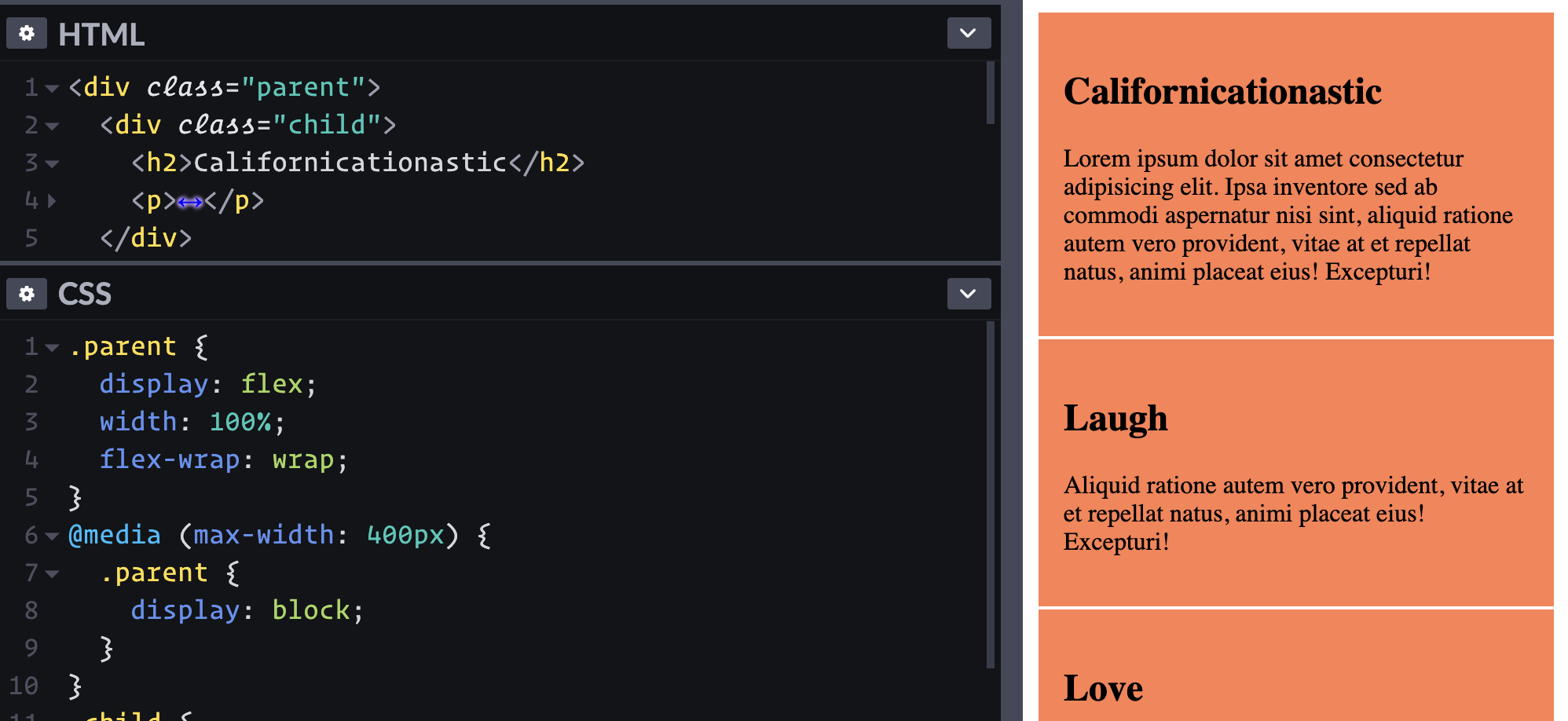
But what about at small screens?

What I love with this approach is we can keep it super simple:

.grid-container {
  display: grid;
  gap: 1em;
}

@media (min-width: 35em) {
  grid-auto-flow: column;
  grid-auto-columns: 1fr;
}

And just like that, it works perfectly. And by declaring display: grid from the start, we can include the gap to maintain equal spacing, whether the children are rows or columns.

I also find this to be a lot more intuitive than changing the flex-direction within a media query to get a similar result. As much as I love flexbox (and I really do still think it has great use cases), the fact that declaring flex-direction: column creates rows, and vice versa, is a little counter-intuitive at first glance.

And of course, if you prefer rolling without media queries, there is nothing stopping you from taking this to the next level with the help of auto-fit, which would be similar to setting something up with flex-wrap (though not exactly the same):

.grid-container {
  display: grid;
  gap: 1em;
  grid-template-columns: repeat(auto-fit, minmax(10em, 25em));
}

Making it work with flexbox

I realize that we can get around this with flexbox by nesting the element with the padding on it. We’ve done this since we started making layouts using floats, and Bootstrap really hammered home this type of design pattern.

<div class="container">
  <div class="row">
    <div class="col"> <div class="">... </div>
    <div class="col"> <div class="element-with-padding">...</div> </div>
    <div class="col"> ... </div>
  </div>
</div>

And there is nothing wrong with that. It works! But floats work too, and we’ve stopped using them for layouts as better solutions have been released in recent years.

One of the reasons that I love grid is because we can simplify our markup quite a bit. Just like we ditched floats for a better solution, I’d at least like to people to keep an open mind that maybe, just maybe, grid could be a better, and more intuitive solution for this type of design pattern.

Flexbox still has it’s place, of course

I still love flexbox, but I think its real power comes from times that we want to rely on the intrinsic width of the flex items, such as with navigations, or groups of elements, such as buttons or other items of varying width that you want to go next to one another.

In those situations, that behavior is an asset that makes things like even spacing between unequal items such a breeze! Flexbox is wonderful, and I have no plans to stop using.

In other situations though, when you find yourself fighting with how flexbox is trying to work, maybe you could turn to grid instead, even if it’s not a typical “2d” grid where you’re told you should be using it for.

People often tell me that they struggle to figure out grid because it’s too complicated, and while it can be, as we saw here, it doesn’t have to be.


The post Equal Columns With Flexbox: It’s More Complicated Than You Might Think appeared first on CSS-Tricks.

You can support CSS-Tricks by being an MVP Supporter.

Float an Element to the Bottom Corner

Need to lay out an element to the right or the left, such that text wraps around it? That’s an easy task for the float property. But what about if you also want to push that element (let’s call it an image) to one of the bottom corners while we’re at it? Sounds a bit tricky, right? We probably need JavaScript?

Nope, few lines of (tricky) CSS can do it! Here’s the CSS-only solution that will make your image to stick to the bottom corner, regardless of the size and content.

Resize the wrapper element and see the magic at work:

Let’s dissect the code.

Markup and layout

We’ll need a wrapper element to contain everything, and we’ll be using flexbox on it. Flexbox allows us to rely on the default stretch alignment to be able to later use height: 100%.

<div class="wrapper">
  <div class="box">
    <div class="float"><img></div>
    Lorem ipsum dolor ...
  </div>
</div>
.wrapper {
  display: flex;
}

.float {
  float: right;
  height: 100%;
  display: flex;
  align-items: flex-end;
  shape-outside: inset(calc(100% - 100px) 0 0);
}

The .box within the .wrapper is our flex item. We don’t need any particular CSS applied to the box. It defines the height of the wrapper and, at the same time, is stretched to the same height. This behavior will give us a “reference height” that can be used by the child elements.

From the specification:

If the flex item has align-self: stretch, redo layout for its contents, treating this used size as its definite cross size so that percentage-sized children can be resolved.

The keyword is the definite which allows us to safely use a percentage (%) height inside the box element.

Now for the floated element

Our .float element will take the entire height next to the text content, thanks to the height calculation we detailed above. Inside this element we push the image to the bottom using flexbox alignment.

A paragraph of lorem i-sum text with a small square image to the right of the text. The image is located at the bottom right of the text and the space above the image is empty.
The image is floated to the right but the free space above it prevents the content from wrapping around it.

Now for the real trickery, using the shape-outside property. Here’s how MDN defines it:

The shape-outside CSS property defines a shape—which may be non-rectangular—around which adjacent inline content should wrap. By default, inline content wraps around its margin box; shape-outside provides a way to customize this wrapping, making it possible to wrap text around complex objects rather than simple boxes.

In other words, shape-outside sets the way content flows around an element’s bounding box.

It takes a number of values. One of those is the inset() function which, again, according to MDN:

Defines an inset rectangle. When all of the first four arguments are supplied they represent the top, right, bottom and left offsets from the reference box inward that define the positions of the edges of the inset rectangle.

So, with shape-outside: inset(calc(100% - X) 0 0) we can create an inset rectangle that starts exactly at the top of the image. And the top is equal to 100% - X, where X is the image height and 100% is the height of the .float element. This allows the text to wrap within the free space on the top of the image. This is responsive, plus we can easily switch between left and right (by adjusting the float property)

That’s it! The only major caveat is that you need to know the image height.

Want more?

We can extend this concept a little further to account for fancier situations. For example, we can float the image to the right, but pin it to the middle of the box with justify-content: center: and also adjust our inset rectangle to the middle by changing the shape-outside from inset(calc(100% - X) 0 0) to inset(calc(50% - X/2) 0 0)

We can also float two images at both bottom corners:

Nothing complex here. I am simply using the same floating element twice, once on the right, and again on the left. And why stop at two corners when we can place images at all four corners:

The same basic idea is at play here, but we’re are also relying on the common float feature for the top images. However, you’ll notice that this is where the concept starts to break down a bit, and we get some unwanted overflow depending on the size of the containing box. We can make the height of the .float element greater than 100% and apply somewhat “magic numbers” that smooth things out by adjusting the padding and margin of the images.

Did you know that shape-outside accepts radial-gradient() as a value? We can use that to place rounded images like below:

The transparent part of the gradient is the free space where the text can go. You may have noticed that we applied a border-radius to the image as well. The shape-outside property will simply affect the .float element and we need to manually adjust the shape of the image to follow the shape defined by shape-outside.

While we’re at it, let’s combine this with our earlier example that pins the image to the vertical center of the box using justify-content: center:

Another radial-gradient() and also another border-radius configuration.

We could have used a linear-gradient() instead to make a triangular shape for the wrapping area:

This is the same idea that we used for the radial-gradient(). The big difference is that we’re using clip-path instead of border-radius to cut our image.

And, since we did it for the others, let’s use the justify-content: center idea to pin the image to the vertical center of the box’s right edge:

We used a conic-gradient() in the above demo with shape-outside to define the triangular shape and clip-path to get a similar shape on the image

All of these examples can still be optimized using less of code in the case that the image is decorative (when it’s not needed inside the HTML for SEO purposes). Let’s replace the .float element with a pseudo-element and apply the image as background instead:

We’re using mask to show just the portion of the image that we need and, guess what, it uses the same value as shape-outside! So, all we had to do is define one value for the shape.

That’s it!

There are a lot of possibilities here to place not just rectangles in corners, but any kind of shape at any position, using largely the same code structure. We only need to:

  • Adjust the shape-outside property to define the shape
  • Apply some styling to the image to follow the previously defined shape or apply the same value to mask in case we are using the pseudo element version

Then everything holds it place, even in responsive designs.


The post Float an Element to the Bottom Corner appeared first on CSS-Tricks.

You can support CSS-Tricks by being an MVP Supporter.

How to Make an Area Chart With CSS

You might know a few ways to create charts with pure CSS. Some of them are covered here on CSS-Tricks, and many others can be found on CodePen, but I haven’t seen many examples of “area charts” (imagine a line chart with the bottom area filled in), particularly any in HTML and CSS alone. In this article, we’ll do just that, using a semantic and accessible HTML foundation.

A red area chart against a dark gray background.

Let’s start with the HTML

To simplify things, we will be using <ul> tags as wrappers and <li> elements for individual data items. You can use any other HTML tag in your project, depending on your needs.

<ul class="area-chart">
  <li> 40% </li>
  <li> 80% </li>
  <li> 60% </li>
  <li> 100% </li>
  <li> 30% </li>
</li>

CSS can’t retrieve the inner HTML text, that is why we will be using CSS custom properties to pass data to our CSS. Each data item will have a --start and an --end custom properties.

<ul class="area-chart">
  <li style="--start: 0.1; --end: 0.4;"> 40% </li>
  <li style="--start: 0.4; --end: 0.8;"> 80% </li>
  <li style="--start: 0.8; --end: 0.6;"> 60% </li>
  <li style="--start: 0.6; --end: 1.0;"> 100% </li>
  <li style="--start: 1.0; --end: 0.3;"> 30% </li>
</li>

Here’s what we need to consider…

There are several design principles we ought to consider before moving into styling:

  • Units data: We will be using unit-less data in our HTML (i.e. no px, em , rem , % or any other unit). The --start and --end custom properties will be numbers between 0 and 1.
  • Columns width: We won’t set a fixed width for each <li> element. We won’t be using % either, as we don’t know how many items are there. Each column width will be based on the main wrapper width, divided by the total number of data items. In our case, that’s the width of the <ul> element divided by the number of <li> elements.
  • Accessibility: The values inside each <li> is optional and only the --start and --end custom properties are required. Still, it’s best to include some sort of text or value for screen readers and other assistive technologies to describe the content.

Now, let’s start styling!

Let’s start with general layout styling first. The chart wrapper element is a flex container, displaying items in a row, stretching each child element so the entire area is filled.

.area-chart {
  /* Reset */
  margin: 0;
  padding: 0;
  border: 0;

  /* Dimensions */
  width: 100%;
  max-width: var(--chart-width, 100%);
  height: var(--chart-height, 300px);

  /* Layout */
  display: flex;
  justify-content: stretch;
  align-items: stretch;
  flex-direction: row;
}

If the area chart wrapper is a list, we should remove the list style to give us more styling flexibility.

ul.area-chart,
ol.area-chart {
  list-style: none;
}

This code styles all of the columns in the entire chart. With bar charts it’s simple: we use background-color and height for each column. With area charts we are going to use the clip-path property to set the region that should be shown.

First we set up each column:

.area-chart > * {
  /* Even size items */
  flex-grow: 1;
  flex-shrink: 1;
  flex-basis: 0;

  /* Color */
  background: var(--color, rgba(240, 50, 50, .75));
}

To create a rectangle covering the entire area, we will reach for the clip-path property and use its polygon() function containing the coordinates of the area. This basically doesn’t do anything at the moment because the polygon covers everything:

.area-chart > * {
  clip-path: polygon(
    0% 0%,     /* top left */
    100% 0%,   /* top right */
    100% 100%, /* bottom right */
    0% 100%    /* bottom left */
  );
}

Now for the best part!

To show just part of the column, we clip it to create that area chart-like effect. To show just the area we want, we use the --start and --end custom properties inside the clip-path polygon:

.area-chart > * {
  clip-path: polygon(
    0% calc(100% * (1 - var(--start))),
    100% calc(100% * (1 - var(--size))),
    100% 100%,
    0% 100%
  );
}

Seriously, this one bit of CSS does all of the work. Here’s what we get:

Working with multiple datasets

Now that we know the basics, let’s create an area chart with multiple datasets. Area charts often measure more than one set of data and the effect is a layered comparison of the data.

This kind of chart requires several child elements, so we are going to replace our <ul> approach with a <table>.

<table class="area-chart">
  <tbody>
    <tr>
      <td> 40% </td>
      <td> 80% </td>
    </tr>
    <tr>
      <td> 60% </td>
      <td> 100% </td>
    </tr>
  </tbody>
</table>

Tables are accessible and search engine friendly. And if the stylesheet doesn’t load for some reason, all the data is still visible in the markup.

Again, we will use the --start and --end custom properties with numbers between 0 and 1.

<table class="area-chart">
  <tbody>
    <tr>
      <td style="--start: 0; --end: 0.4;"> 40% </td>
      <td style="--start: 0; --end: 0.8;"> 80% </td>
    </tr>
    <tr>
      <td style="--start: 0.4; --end: 0.6;"> 60% </td>
      <td style="--start: 0.8; --end: 1.0;"> 100% </td>
    </tr>
  </tbody>
</table>

So, first we will style the general layout for the wrapping element, our table, which we’ve given an .area-chart class:

.area-chart {
  /* Reset */
  margin: 0;
  padding: 0;
  border: 0;

  /* Dimensions */
  width: 100%;
  max-width: var(--chart-width, 600px);
  height: var(--chart-height, 300px);
}

Next, we will make the <tbody> element a flex container, displaying the <tr> items in a row and evenly sized:

.area-chart tbody {
  width: 100%;
  height: 100%;

  /* Layout */
  display: flex;
  justify-content: stretch;
  align-items: stretch;
  flex-direction: row;
}
.area-chart tr {
  /* Even size items */
  flex-grow: 1;
  flex-shrink: 1;
  flex-basis: 0;
}

Now we need to make the <td> elements cover each other, one element on top of each other so we get that layered effect. Each <td> covers the entire area of the <tr> element that contains it.

.area-chart tr {
  position: relative;
}
.area-chart td {
  position: absolute;
  top: 0;
  right: 0;
  bottom: 0;
  left: 0;
}

Let’s put the magical powers of clip-path: polygon() to use! We’re only displaying the area between the --start and --end custom properties which, again, are values between 0 and 1:

.area-chart td {
  clip-path: polygon(
    0% calc(100% * (1 - var(--start))),
    100% calc(100% * (1 - var(--end))),
    100% 100%,
    0% 100%
  );
}

Now let’s add color to each one:

.area-chart td {
  background: var(--color);
}
.area-chart td:nth-of-type(1) {
  --color: rgba(240, 50, 50, 0.75);
}
.area-chart td:nth-of-type(2) {
  --color: rgba(255, 180, 50, 0.75);
}
.area-chart td:nth-of-type(3) {
  --color: rgba(255, 220, 90, 0.75);
}

It’s important to use colors with opacity to get a nicer effect, which is why we’re using rgba() values. You could use hsla() here instead, if that’s how you roll.

And, just like that:

Wrapping up

It doesn’t matter how many HTML elements we add to our chart, the flex-based layout makes sure all the items are equally sized. This way, we only need to set the width of the wrapping chart element and the items will adjust accordingly for a responsive layout.

We have covered one technique to create area charts using pure CSS. For advanced use cases, you can check out my new open source data visualization framework, ChartsCSS.org. See the Area Chart section to see how area charts can be customized with things like different orientations, axes, and even a reversed order without changing the HTML markup, and much more!


The post How to Make an Area Chart With CSS appeared first on CSS-Tricks.

You can support CSS-Tricks by being an MVP Supporter.

Understanding flex-grow, flex-shrink, and flex-basis

When you apply a CSS property to an element, there’s lots of things going on under the hood. For example, let’s say we have some HTML like this:

<div class="parent">
  <div class="child">Child</div>
  <div class="child">Child</div>
  <div class="child">Child</div>
</div>

And then we write some CSS…

.parent {
  display: flex;
}

These are technically not the only styles we’re applying when we write that one line of CSS above. In fact, a whole bunch of properties will be applied to the .child elements here, as if we wrote these styles ourselves:

.child {
  flex: 0 1 auto; /* Default flex value */
}

That’s weird! Why do these elements have these extra styles applied to them even though we didn’t write that code? Well, that’s because some properties have defaults that are then intended to be overridden by us. And if we don’t happen to know these styles are being applied when we’re writing CSS, then our layouts can get pretty darn confusing and tough to manage.

That flex property above is what’s known as a shorthand CSS property. And really what this is doing is setting three separate CSS properties at the same time. So what we wrote above is the same as writing this:

.child {
  flex-grow: 0;
  flex-shrink: 1;
  flex-basis: auto;
}

So, a shorthand property bundles up a bunch of different CSS properties to make it easier to write multiple properties at once, precisely like the background property where we can write something like this:

body {
  background: url(sweettexture.jpg) top center no-repeat fixed padding-box content-box red;                   
}

I try to avoid shorthand properties because they can get pretty confusing and I often tend to write the long hand versions just because my brain fails to parse long lines of property values. But it’s recommended to use the shorthand when it comes to flexbox, which is…weird… that is, until you understand that the flex property is doing a lot of work and each of its sub-properties interact with the others.

Also, the default styles are a good thing because we don’t need to know what these flexbox properties are doing 90% of the time. For example, when I use flexbox, I tend to write something like this:

.parent {
  display: flex;
  justify-content: space-between;
}

I don’t even need to care about the child elements or what styles have been applied to them, and that’s great! In this case, we’re aligning the child items side-by-side and then spacing them equally between each other. Two lines of CSS gives you a lot of power here and that’s the neatest thing about flexbox and these inherited styles — you don’t have to understand all the complexity under the hood if you just want to do the same thing 90% of the time. It’s remarkably smart because all of that complexity is hidden out of view.

But what if we want to understand how flexbox — including the flex-grow, flex-shrink, and flex-basis properties — actually work? And what cool things can we do with them?

Just go to the CSS-Tricks Almanac. Done!

Just kidding. Let’s start with a quick overview that’s a little bit simplified, and return to the default flex properties that are applied to child elements:

.child {
  flex: 0 1 auto;
}

These default styles are telling that child element how to stretch and expand. But whenever I see it being used or overridden, I find it helpful to think of these shorthand properties like this:

/* This is just how I think about the rule above in my head */

.child {
  flex: [flex-grow] [flex-shrink] [flex-basis];
}

/* or... */

.child {
  flex: [max] [min] [ideal size];
}

That first value is flex-grow and it’s set to 0 because, by default, we don’t want our elements to expand at all (most of the time). Instead, we want every element to be dependent on the size of the content within it. Here’s an example:

.parent { 
  display: flex; 
}

I’ve added the contenteditable property to each .child element above so you can click into it and type even more content. See how it responds? That’s the default behavior of a flexbox item: flex-grow is set to 0 because we want the element to grow based on the content inside it.

But! If we were to change the default of the flex-grow property from 0 to 1, like this…

.child {
  flex: 1 1 auto;
}

Then all the elements will grow to take up an equal portion of the .parent element:

This is exactly the same as writing…

.child {
  flex-grow: 1;
}

…and ignoring the other values because those have been set by default anyway. I think this confused me for such a long time when I started working with flexible layouts. I would see code that would add just flex-grow and wonder where the other styles are coming from. It was like an infuriating murder mystery that I just couldn’t figure out.

Now, if we wanted to make just one of these elements grow more than the others we’d just need to do the following:

.child-three {
  flex: 3 1 auto;
}

/* or we could just write... */

.child-three {
  flex-grow: 3;
}

Is this weird code to look at even a decade after flexbox landed in browsers? It certainly is for me. I need extra brain power to say, “Ah, max, min, ideal size,” when I’m reading the shorthand, but it does get easier over time. Anyway, in the example above, the first two child elements will take up proportionally the same amount of space but that third element will try to grow up to three times the space as the others.

Now this is where things get weird because this is all dependent on the content of the child elements. Even if we set flex-grow to 3, like we did in the example above and then add more content, the layout will do something odd and peculiar like this:

That second column is now taking up too much darn space! We’ll come back to this later, but for now, it’s just important to remember that the content of a flex item has an impact on how flex-grow, flex-shrink, and flex-basis work together.

OK so now for flex-shrink. Remember that’s the second value in the shorthand:

.child {
  flex: 0 1 auto; /* flex-shrink = 1 */
}

flex-shrink tells the browser what the minimum size of an element should be. The default value is 1, which is saying, “Take up the same amount of space at all times.” However! If we were to set that value to 0 like this:

.child {
  flex: 0 0 auto;
}

…then we’re telling this element not to shrink at all now. Stay the same size, you blasted element! is essentially what this CSS says, and that’s precisely what it’ll do. We’ll come back to this property in a bit once we look at the final value in this shorthand.

flex-basis is the last value that’s added by default in the flex shorthand, and it’s how we tell an element to stick to an ideal size. By default, it’s set to auto which means, “Use my height or width.” So, when we set a parent element to display: flex

.parent {
  display: flex;
}

.child {
  flex: 0 1 auto;
}

We’ll get this by default in the browser:

Notice how all the elements are the width of their content by default? That’s because auto is saying that the ideal size of our element is defined by its content. To make all the elements take up the full space of the parent we can set the child elements to width: 100%, or we can set the flex-basis to 100%, or we can set flex-grow to 1.

Does that make sense? It’s weird, huh! It does when you think about it. Each of these shorthand values impact the other and that’s why it is recommended to write this shorthand in the first place rather than setting these values independently of one another.

OK, moving on. When we write something like this…

.child-three {
  flex: 0 1 1000px;
}

What we’re telling the browser here is to set the flex-basis to 1000px or, “please, please, please just try and take up 1000px of space.” If that’s not possible, then the element will take up that much space proportionally to the other elements.

You might notice that on smaller screens this third element is not actually a 1000px! That’s because it’s really a suggestion. We still have flex-shrink applied which is telling the element to shrink to the same size as the other elements.

Also, adding more content to the other children will still have an impact here:

Now, if we wanted to prevent this element from shrinking at all we could write something like this:

.child-three {
  flex: 0 0 1000px;
}

Remember, flex-shrink is the second value here and by setting it to 0 we’re saying, “Don’t shrink ever, you jerk.” And so it won’t. The element will even break out of the parent element because it’ll never get shorter than 1000px wide:

Now all of this changes if we set flex-wrap to the parent element:

.parent {
  display: flex;
  flex-wrap: wrap;
}

.child-three {
  flex: 0 0 1000px;
}

We’ll see something like this:

This is because, by default, flex items will try to fit into one line but flex-wrap: wrap will ignore that entirely. Now, if those flex items can’t fit in the same space, they’ll break onto a new line.


Anyway, this is just some of the ways in which flex properties bump into each other and why it’s so gosh darn valuable to understand how these properties work under the hood. Each of these properties can affect the other, and if you don’t understand how one property works, then you sort of don’t understand how any of it works at all — which certainly confused me before I started digging into this!

But to summarize:

  • Try to use the flex shorthand
  • Remember max, min and ideal size when doing so
  • Remember that the content of an element can impact how these values work together, too.

The post Understanding flex-grow, flex-shrink, and flex-basis appeared first on CSS-Tricks.

You can support CSS-Tricks by being an MVP Supporter.

Balancing on a pivot with Flexbox

Let me show you a way I recently discovered to center a bunch of elements around what I call the pivot. I promise you that funky HTML is out of the question and you won’t need to know any bleeding-edge CSS to get the job done.

I’m big on word games, so I recently re-imagined the main menu of my website as a nod to crossword puzzles, with my name as the vertical word, and the main sections of my website across the horizontals.

Here’s how the design looks with the names of some colors instead:

And here’s a sample of the HTML that drives this puzzle:

<div class="puzzle">
  <div class="word">
    <span class="letter">i</span>
    <span class="letter">n</span>
    <span class="letter">d</span>
    <span class="letter">i</span>
    <span class="letter pivot">g</span>
    <span class="letter">o</span>
  </div>
  <!-- MORE WORDS -->
</div>

In this example, the letter g is the pivot. See how it’s not at the halfway mark? That’s the beauty of this challenge.

We could apply an offset to each word using hard-coded CSS or inline custom properties and walk away. It certainly gets an award for being the most obvious way to solve the problem, but there’s a downside — in addition to the .pivot class, we’d have to specify an offset for every word. The voice in my head tells me that’s adding unnecessary redundancy, is less flexible, and requires extra baggage we don’t need every time we add or change a word.

Let’s take a step back instead and see how the puzzle looks without any balancing:

Imagine for a moment that we use display: none to hide all of the letters before the pivot; now all we can see are the pivots and everything after them:

With no further changes, our pivots would already be aligned. But we’ve lost the start of our words, and when we reintroduce the hidden parts, each word gets pushed out to the right and everything is out of whack again.

If we were to hide the trailing letters instead, we’d still be left with misaligned pivots:

All of this back-and-forth seems a bit pointless, but it reveals a symmetry to my problem. If we were to use a right-to-left (RTL) reading scheme, we’d have the opposite problem — we’d be able to solve the right side but the left would be all wrong.

Wouldn’t it be great if there was a way to have both sides line up at the same time?

As a matter of fact, there is.

Given we already have half a solution, let’s borrow a concept from algorithmics called divide and conquer. The general idea is that we can break a problem down into parts, and that by finding a solution for the parts, we’ll find a solution for the whole.

In that case, let’s break our problem down into the positioning of two parts. First is the “head” or everything before the pivot.

Next is the “tail” which is the pivot plus everything after it.

The flex display type will help us here; if you’re not familiar with it, flex is a framework for positioning elements in one-dimension. The trick here is to take advantage of the left and right ends of our container to enforce alignment. To make it work, we’ll swap the head and tail parts by using a smaller order  property value on the tail than the head. The order property is used by flex to determine the sequence of elements in a flexible layout. Smaller numbers are placed earlier in the flow.

To distinguish the head and tail elements without any extra HTML, we can apply styles to the head part to all of the letters, after which we’ll make use of the cascading nature of CSS to override the pivot and everything after it using the subsequent-sibling selector .pivot ~ .letter.

Here’s how things look now:

Okay, so now the head is sitting flush up against the end of the tail. Hang on, don’t go kicking up a stink about it! We can fix this by applying margin: auto to the right of the last element in the tail. That just so happens to also be the last letter in the word which is not sitting somewhere in the middle. The addition of an auto margin serves to push the head away from the tail and all the way over to the right-hand side of our container.

Now we have something that looks like this:

The only thing left is stitch our pieces back together in the right order. This is easy enough to do if we apply position: relative to all of our letters and then chuck a left: 50% on the tail and a right: 50% on our head items.

Here’s a generalized version of the code we just used. As you can see, it’s just 15 lines of simple CSS:

.container {
  display: flex;
}
.item:last-child {
  margin-right: auto;
}
.item {
  order: 2;
  position: relative;
  right: 50%;
}
.pivot, .pivot ~ .item {
  order: 1;
  left: 50%;
}

It’s also feasible to use this approach for vertical layouts by setting the flex-direction to a column value. It should also be said that the same can be achieved by sticking the head and tail elements in their own wrappers — but that would require more markup and verbose CSS while being a lot less flexible. What if, for example, our back-end is already generating an unwrapped list of elements with dynamically generated classes?

Quite serendipitously, this solution also plays well with screen readers. Although we’re ordering the two sections backwards, we’re then shifting them back into place via relative positioning, so the final ordering of elements matches our markup, albeit nicely centered.

Screen readers preserve the element ordering as per the original markup.

Here’s the final example on CodePen:

Conclusion

Developers are better at balancing than acrobats. Don’t believe me? Think about it: many of the common challenges we face require finding a sweet spot between competing requirements ranging from performance and readability, to style and function, and even scalability and simplicity. A balancing act, no doubt.

But the point at which we find balance isn’t always midway between one thing and another. Balance is often found at some inexplicable point in between; or, as we’ve just seen, around an arbitrary HTML element.

So there you have it! Go and tell your friends that you’re the greatest acrobat around.


The post Balancing on a pivot with Flexbox appeared first on CSS-Tricks.

You can support CSS-Tricks by being an MVP Supporter.

Achieving Vertical Alignment (Thanks, Subgrid!)

Our tools for vertical alignment have gotten a lot better as of late. My early days as a website designer involved laying out 960px wide homepage designs and aligning things horizontally across a page using a 12-column grid. Media queries came along which required a serious mental shift. It solved some big problems, of course, but introduced new ones, like dealing with alignment when elements wrap or are otherwise moved around in the layout. 

Let’s take a look at just one particular scenario: a “bar” with some buttons in it. There are two groups of these buttons, each contained within a <fieldset> with a <legend>

On a large screen, we’re all set:

Two groups of two bright pink buttons set on a dark background.

And here’s a very basic CSS method that accomplishes that layout, and also breaks down onto two “rows” at a mobile breakpoint:

.accessibility-tools fieldset {
  width: 48%;
  float: left;
  margin-right: 1%;
}


/* Mobile */
@media only screen and (max-width: 480px) {
  .accessibility-tools fieldset {
    width: 100%;
  }
}

On a small screen, we end up with this:

The same two groups of two pink buttons, with one group of buttons stacked on top of the other, showing the buttons are uneven in width.

This is the problem: lack of vertical alignment. Let’s say we want to align those buttons into a more pleasing arrangement where the button edges align with each other nicely.

To begin, we could go for fixed-width, pixel-based CSS solutions to force elements to line up nicely at various breakpoints, using magic numbers like this:

/* Mobile */
@media only screen and (max-width: 480px) {
  legend {
    width: 160px;
  }
  button {
    width: 130px;
  }
}
the same two groups of pink buttons but where the buttons all have the same consistent width and line up evenly.

That does the trick.

But… this is not exactly a flexible solution to the problem. Aside from the magic numbers (fixed-pixel values based on specific content), it also relied on the use of media queries which I am trying to move away from when I can. I discussed this in a post called “Stepping away from Sass” on my blog.

As I moved towards some of the more modern features of CSS the need to target specific screen sizes with unique code was removed.

What I need is each button and label to respond to:

  1. the space available
  2. their content 

and!

  1. Other elements around them

Available space

The problem with using media queries is that they don’t take into account the space around the elements that are being realigned — a point perfectly demonstrated in this image from “The Flexbox holy albatross” by Heydon Pickering:

Three browsers side-by-side. The first shows three black rectangles in a single row, the second shows three black rectangles stacked vertically, and the third shows three black rectangles set to the right hand of the screen.

What I really want is for the second <fieldset> to wrap under the first only when they can no longer fit neatly on one row.

Can we get this done with flexbox?

A key selling point for flexbox is its ability to create elements that respond to the space around them. Components can “flex” to fill additional space and shrink to fit into smaller spaces. 

For this situation, the flex-wrap property is set to wrap. This means as soon as both <fieldset> elements no longer fit on one line, they will wrap onto a second line.

.wrapper--accessibility-tools {
  display: flex;
  flex-wrap: wrap;
} 

The flex-wrap property has three available values. The default value is nowrap, leaving items on one line. The wrap value allows elements to flow onto multiple lines. Then there’s wrap-reverse, which allows items to wrap but — wait for it — in reverse (it is weird to see: when elements wrap, they go above the previous row in left-to-right situations).

Using flexbox stops the layout from being quite as rigid, but a min-width value is still needed to remove the vertical alignment problem. So: close but no cigar.

Can grid help us? 

CSS Grid is the very first CSS module created specifically to solve the ongoing layout problems faced by web designers and developers. It is not a direct replacement for flexbox; rather the two modules usually work pretty well together.

Like flexbox, grid can be used to allow each <fieldset> to occupy as much or as little space as they need. Getting right to it, we can leverage the auto-fill and auto-fit keywords (within a repeat() function) to allow grid items to flow onto multiple lines without the need for media queries. The difference is a bit subtle, but well-explained in “Auto-Sizing Columns in CSS Grid: auto-fill vs auto-fit” by Sara Soueidan. Let’s use auto-fit:

.wrapper--accessibility-tools {
  display: grid;
  grid-template-columns: repeat(auto-fit, 450px);
  grid-gap: 10px;
}

Like the flexbox example, I still need to set an absolute value for the width of the label to align the <fieldset> elements as they stack.

Another approach with grid

CSS Grid also allows elements to respond based on their content using flexible grid tracks. In addition to other length values like percentages, relative units, or pixels, CSS Grid accepts a Fractional Unit (fr), where 1fr will take up one part of the available space, 2fr will take up two parts of the available space, and so on. Let’s set up two equal columns here:

.wrapper--accessibility-tools {
  display: grid;
  grid-template-columns: 1fr 1fr;
  grid-gap: 10px;
}

There’s also a minmax() function which creates grid tracks that flex to the available space, but also don’t shrink narrower than a specified size.

.wrapper--accessibility-tools {
  display: grid;
  grid-template-columns: minmax(auto, max-content) minmax(auto, max-content);
  grid-gap: 10px;
}

Both of these demos work, and are free from any absolute values or device specific CSS. The results are far from ideal though, each grid now responds at different points. Maybe not a huge problem, but certainly not great.

This happens because when adding display: grid to a container, only the direct children of that container become grid items. This means the intrinsic sizing units we used only relate to elements in the same grid. 

Using subgrid

To really achieve my goal, I need the buttons and labels to react to elements in sibling grid containers. CSS Grid Level 2 includes the subgrid feature. Although we have always been able to nest grids, the elements within each grid container have been independent. With subgrid, we get to set up nested (child) grids that use parent grids tracks.

This makes a number patterns that were previously difficult much easier, in particular the “card” pattern which seems to be the most popular example to show the benefits of subgrid. Without subgrid, each card is defined as an independent grid, meaning track sizing in the first card cannot respond to a change of height in the second. Pulling from an example Rachel Andrew used, here’s a simple group of cards:

Showing three columns of cards where each card has a headers with a dark blue background and white text, content with a white background, and a footer with a dark blue background. The cards are uneven because some of them have more content that others.
Credit: Rachel Andrew

Subgrid allows the cards to use the rows defined in the parent grid, meaning they can react to content in surrounding cards.

The same three columns of cards, but with each card perfectly aligned with the others.
Credit: Rachel Andrew

Each card in this example still spans three row tracks, but those rows are now defined on the parent grid, allowing each card to occupy the same amount of vertical space.

For the example we’ve been working with, we do not need to use rows. Instead, we need to size columns based on content from sibling grids. First, let’s set the parent grid to contain the two <fieldset> elements. This is similar to the code we previously look at in the auto-fit demo.

.wrapper--accessibility-tools {
  display: grid;
  grid-template-columns: repeat(auto-fill, minmax(150px, 1fr));
  grid-gap: 10px;
}

Then we position each subgrid onto the parent grid.

.sub-grid {
  display: grid;
  grid-column: span 3;
  grid-template-columns: subgrid;
  align-items: center;
}
Showing the two groups of bright pink buttons with both groups on the same row and all the buttons have a consistent width.

All of the labels and buttons are now aligned to the tracks of their parent grid, keeping them consistent. They will each have an equal width based on the space that is available. If there is not enough space for each nested grid on one line, the second will wrap onto a new line.

The two groups of buttons vertically stacked and the buttons are all consistently aligned with the same width.

This time, the two nested grid items align perfectly. The grid is also flexible if we introduce a longer title on a one of the buttons, the other elements will respond accordingly.

Browser compatibility

Support for subgrid is not great at the time of writing. It is only supported in Firefox 71+, although there are positive signals from other browsers. CSS feature queries can be used to provide alternative styling to Chrome and Edge.

This browser support data is from Caniuse, which has more detail. A number indicates that browser supports the feature at that version and up.

Desktop

ChromeFirefoxIEEdgeSafari
No71NoNoNo

Mobile / Tablet

Android ChromeAndroid FirefoxAndroidiOS Safari
No79NoNo

Note that I am using an extra wrapper around the fieldsets in these demos. This is to combat a bug with form elements and grid and flexbox.

<fieldset class="accessibility-tools__colour-theme">
  <div class="wrapper"></div>
</fieldset>

The layout CSS is applied to the wrapper with the fieldset being set to display: contents.

.accessibility-tools fieldset {
  display: contents;
  border: 0;
} 

Other writing on the subject


The post Achieving Vertical Alignment (Thanks, Subgrid!) appeared first on CSS-Tricks.

You can support CSS-Tricks by being an MVP Supporter.

Grid for layout, flexbox for components

When should we reach for CSS grid and when should we use flexbox? Rachel Andrew wrote about this very conundrum way back in 2016:

Flexbox is essentially for laying out items in a single dimension – in a row OR a column. Grid is for layout of items in two dimensions – rows AND columns.

Ahmad Shadeed wrote a post where he gives the same advice, but from a different angle. He argues we should use grid for layout and flexbox for components:

Remember that old layout method might be perfect for the job. Overusing flexbox or grid can increase the complexity of your CSS by time. I don’t mean they are complex, but using them correctly and in the right context as explained from the examples in this article is much better.

Speaking of which, there’s so many great layout examples in this post, too.

Direct Link to ArticlePermalink

The post Grid for layout, flexbox for components appeared first on CSS-Tricks.

Chromium lands Flexbox gap

I mentioned this the other day via Michelle Barker’s coverage, but here I’ll link to the official announcement. The main thing is that we’ll be getting gap with flexbox, which means:

.flex-parent {
  display: flex;
  gap: 1rem;
}
.flex-child {
  flex: 1;
}

That’s excellent, as putting space in between flex items has been tough in the past. We have justify-content: space-between, which is nice sometimes, but that doesn’t allow you to explicitly tell the flex container how much space you want. For that, we’d typically use margin, but that means avoiding setting the margin on the first or last element depending on the direction of the margin — which is annoying gets complicated.

We have gap in CSS Grid and it’s way better. It’s great to have it in flexbox.

But it’s going to get weird for a minute. Safari doesn’t support it yet (nor stable Chrome) so we can’t just plop it out there and expect it to work with flexbox. But shouldn’t we be able to do an @supports query these days?

/* Nope, sorry. This "works" but it doesn't 
   actually tell you if it works in *flexbox* or not.
   This works in grid in most browsers now, so it will pass. */
@supports (gap: 1rem) {
  .flex-parent {
     gap: 1rem;
  }
}

That got weird because grid-gap was dropped in favor of just gap. I’m sure grid-gap will be supported forever because that’s generally how these things go, but we’re encouraged to use gap instead. So, you might say gap is a little overloaded, but that should shake out over time (a year?). It’s complicated a smidge more by the fact that column-gap is now going to gap as well. gap has a whole bunch of jobs.

I’d say I’m still in favor of the change, despite the overloading. Simpler mental modals are important for the long-term, and there isn’t exactly anything coming up to challenge CSS for styling in the browser. I’d bet my 2-year old daughter writes some CSS in her lifetime.

Direct Link to ArticlePermalink

The post Chromium lands Flexbox gap appeared first on CSS-Tricks.

Exciting Things on the Horizon For CSS Layout

Michelle Barker notes that it’s been a heck of a week for us CSS layout nerds.

  1. Firefox has long had the best DevTools for CSS Grid, but Chrome is about to catch up and go one bit better by visualizing grid line numbers and names.
  2. Firefox supports gap for display: flex, which is great, and now Chrome is getting that too.
  3. Firefox is trying out an idea for masonry layout.

Direct Link to ArticlePermalink

The post Exciting Things on the Horizon For CSS Layout appeared first on CSS-Tricks.

CSS Flexbox Basics Part 1

Whether it's making your application mobile responsive or getting something to align just right, if you've ever worked on a UI, you probably understand the frustrations that come with CSS:

Every backend dev

To get past whatever issues you may have experienced, you might have turned to a framework, like Bootstrap, looked to CSS Grid, or, if you're old-school, stuck with floats. All of these options have their benefits, but, like everything in development, have some negatives. Using a framework means you have to live with importing the entirety of it into your project. CSS Grid can feel a little clunky at times, especially if you're new to it. Floats are nice but often aren't as expressive as they ideally could be. 

How Auto Margins Work in Flexbox

Robin has covered this before, but I've heard some confusion about it in the past few weeks and saw another person take a stab at explaining it, and I wanted to join the party.

Say you have a flex container with some flex items inside that don't fill the whole area.

See the Pen
ZEYLVEX
by Chris Coyier (@chriscoyier)
on CodePen.

Now I want to push that "Menu" item to the far right. That's where auto margins come in. If I put a margin-left: auto; on it, it'll push as far away as it possibly can on that row.

See the Pen
WNbRLbG
by Chris Coyier (@chriscoyier)
on CodePen.

Actually, you might consider margin-inline-start: auto; instead and start using logical properties everywhere so that you're all set should you need to change direction.

See the Pen
gObgZpb
by Chris Coyier (@chriscoyier)
on CodePen.

Also, note that auto margins work in both directions as long as there is room to push. In this example, it's not alignment that is moving the menu down, it's an auto margin.

See the Pen
XWJpobE
by Chris Coyier (@chriscoyier)
on CodePen.

The post How Auto Margins Work in Flexbox appeared first on CSS-Tricks.

The Thought Process Behind a Flexbox Layout

I just need to put two boxes side-by-side and I hear flexbox is good at stuff like that.

Just adding display: flex; to the parent element lays out the children in a row.

Well, that's cool. I guess I could have floated them, but this is easier.

They should probably take up the full space they have though. Can I just stretch the parent to 100% wide? Well, I can, but that's apparently not going to affect the child elements.

If the parent element has more space than the children need, it doesn't do anything to help the children fill the space alone.

Maybe I can use width: 50%; on the children? That works, but I thought the point of flexbox is that you don't have to be all specific about width. Ah yes, flexbox has all of these ways of expressing the growy-shrinky-initial behavior of children. Looks like flex: 1; is about as easy as it gets here.

Applying flex: 1; to the children allow them to grow and fill the space.

I like how I haven't had to do any math or hard code values so far. Can I make it a three-up pattern without touching CSS?

Nice.

Hmmm, wait. The sizing is a bit, uhhhh, flexy? Nothing is forcing these boxes to be one-third of the container all the time.

Looks like flex-basis: 33% doesn't fix this. flex: 0 0 33%; also doesn't do the trick. Looks like width: 33%; flex-shrink: 0; does though, if we're really wanting to strongarm it.

Sometimes a design calls for exactly equal size boxes. This is maybe CSS Grid territory, but whatever.

The long word forcing that sizing behavior at narrow widths is perhaps an uncommon scenario. We could have also solved it with word-break: break-word; hyphens: auto; on the child.

Another thing we could do it just let the dang items wrap instead of being so strict about it. Flexbox can do that, right?

Oh hey, that reminds me how cool it is that those first two items are the same height. That's the default stretch behavior, but it can be controlled as well. And it's by row, which is why the second row has its own different height.

What if I want that first "Love" block to be on top instead? Looks like I can re-order it, eh? Let's see, the default order is 0, so to be first, I do order: -1;.

Ha! That kinda worked. But I meant that I want it to take up the full width on the top row. I guess I can just kick it up to flex-basis: 100%; and the others will wrap accordingly.

It's pretty weird to have the source order and visual order different like this. Maybe that should go in the "don't ever do this" category.

What if I wanna bail on the whole flexbox thing at a certain point? Part of me wants to change the direction to go vertical with flex-direction: column; and force the children to be full-width. Ah, a simple display: block; on the parent does that in one swoop.

Rather than changing all the flexbox stuff to handle a column layout, we just turn flexbox off.

Flexbox can do way more stuff! One of my favorites is how auto margins work to "push" other elements away when there is space. This is just one little journey playing with some UI and seeing the useful things flexible does along with things that can make it confusing.

The post The Thought Process Behind a Flexbox Layout appeared first on CSS-Tricks.

Adaptive Photo Layout with Flexbox

Let’s take a look at a super lightweight way to create a horizontal masonry effect for a set of arbitrarily-sized photos. Throw any set of photos at it, and they will line up edge-to-edge with no gaps anywhere.

The solution is not only lightweight but also quite simple. We’ll be using an unordered list of images and just 17 lines of CSS, with the heavy lifters being flexbox and object-fit.

Why?

I have two hobbies: documenting my life with photos, and figuring out interesting ways to combine CSS properties, both old and new.

A couple of weeks ago, I attended XOXO and shot a ton of photos which I narrowed down to a nice little set of 39. Wanting to own my content, I’ve spent the past couple of years thinking about putting together a simple photo blog, but was never able to nail the layout I had in mind: a simple masonry layout where photos fill out rows while respecting their aspect ratio (think Photos.app on iOS, Google Photos, Flickr…).

I did some research to see if there were any lightweight, non-JavaScript options, but couldn’t find anything suiting my needs. Facing some delayed flights, I started playing around with some code, limiting myself to keep things as simple as possible (because that’s my definition of fun).

Basic Markup

Since I’m basically creating a list of images, I opted for an unordered list:

<ul>
  <li>
    <img>
  </li>
  <!-- ... -->
  <li>
    <img>
  </li>
</ul>

All hail flexbox

Then came a string of lightbulb moments:

  • Flexbox is great for filling up rows by determining cell width based on cell content.
  • This meant the images (landscape or portrait) all needed to have the same height.
  • I could use object-fit: cover; to make sure the images filled the cells.

In theory, this sounded like a solid plan, and it got me a result I was about 90% happy with.

ul {
  display: flex;
  flex-wrap: wrap;
}

li {
  height: 40vh;
  flex-grow: 1;
}

img {
  max-height: 100%;
  min-width: 100%;
  object-fit: cover;
  vertical-align: bottom;
}

Note: 40vh seemed like the best initial approach for desktop browsers, showing two full rows of photos at a reasonable size, and hinting at more below. This also allowed more photos per line, which dramatically improves the aspect ratios.

Last row stretchiness

The only issue I ran into is that flexbox really wants to fill all the lines, and it did some silly things to the aspect ratios of the photos on the last row. This is probably my least favorite bit of this layout, but I had to add an empty <li> element at the end of the list.

<ul>
  <li>
    <img>
  </li>
  <!-- ... -->
  <li>
    <img>
  </li>
  <li></li>
</ul>

Combined with this bit of CSS:

li:last-child {
  flex-grow: 10;
}

Note: There's no science in using "10" here. In all my testing, this delivered the best results.

Demo

See the Pen
Adaptive Photo Layout
by Tim Van Damme (@maxvoltar)
on CodePen.

Viewport optimization

There are some considerations to keep in mind when working in different viewport orientations.

Portrait

If your viewport is taller than it is wide, this approach limits the amount of photos per line thus messing up their aspect ratios. To solve this, you can make the photo rows less tall with this simple media query:

@media (max-aspect-ratio: 1/1) {
  li {
    height: 30vh;
  }
}

Short Screens

To help with small devices in landscape, increasing the height of photos helps to see them as large as possible:

@media (max-height: 480px) {
  li {
    height: 80vh;
  }
}

Smaller Screens + Portrait

Most phones aren’t wide enough to allow flexbox to properly do its job without miniaturizing the photos, so here I opted to not try to fit multiple photos per line. Still, it’s worth setting a maximum height here so you’ll at least have a hint at the next photo in the list.

@media (max-aspect-ratio: 1/1) and (max-width: 480px) {
  ul {
    flex-direction: row;
  }

  li {
    height: auto;
    width: 100%;
  }

  img {
    width: 100%;
    max-height: 75vh;
    min-width: 0;
  }
}

There we have it!

This approach doesn’t fully respect the aspect ratios of photos (but it’s close) and occasionally leads to some weird results, but I absolutely love the simplicity and flexibility of it all. Want to have your gallery scroll horizontally instead of vertically? A couple of tweaks will allow you to do this. Are there 1,000 photos in the gallery or just one? It’ll all look good. Unclear about aspect ratios? Flexbox is your best friend. Take another look at the demo if you haven't yet, and let me know what you think!

Bonus

Depending on the size of these photos, a page like this can grow to multiple megabytes real quick. On the blog I’m working on, I’ve added loading="lazy" to help with this. With that attribute in place on the images, it only loads photos once you approach them while scrolling. It’s supported just in Chrome for now, but you could roll your own more supported technique.

The post Adaptive Photo Layout with Flexbox appeared first on CSS-Tricks.

Making width and flexible items play nice together

The short answer: flex-shrink and flex-basis are probably what you’re lookin’ for.

The long answer

Let’s say you want to align an image and some text next to each other with like this:

A small image of a yellow illustrated bird to the left of a block of text.

Now let's say you reach for flexbox to make it happen. Setting the parent element to display: flex; is a good first start.

.container { 
  display: flex; 
}

And this results in...

See the Pen
Flex-Shrink Example 1
by Robin Rendle (@robinrendle)
on CodePen.

Yikes! Well, that's kinda okay, I guess. It makes sense that the image would bump right up against the text like that because we haven’t set a width on the image. Ideally, though, we’d like that image to have a fixed width and then the text should take up whatever space is left over.

Okay, so let’s go do that!

.container { 
  display: flex; 
}

img { 
  width: 50px;
  margin-right: 20px; 
}

See the Pen
Flex-Shrink Example 2
by Robin Rendle (@robinrendle)
on CodePen.

This looks great in Chrome. But wait, what? If we inspect the image tag in Firefox DevTools, we’ll find that it’s not the width value that we set at all:

We could use min-width to force the image to the 50px width we want:

img {
  min-width: 50px;
  margin-right: 20px;
}

Buuuuuuut, that only sets helps with the width so we've got to put a margin in as well.

img {
  min-width: 50px;
  margin-right: 20px;
}

There we go. That's better in Firefox and still works in Chrome.

The even longer answer

I realized the image is getting the squished treatment because we need to use the flex-shrink property to tell flex items not to decrease in size, regardless of whether or not they have a width.

All flex-items have a flex-shrink value of 1. We need to set the image element to 0:

.container { 
  display: flex; 
}

img {
  width: 50px;
  margin-right: 20px;
  flex-shrink: 0;
}

See the Pen
Flex-Shrink Example 3
by Robin Rendle (@robinrendle)
on CodePen.

Getting better! But we can still do more to improve this.

The director's cut answer

We can tidy things up further because flex-shrink is included in the flex shorthand property.

flex: none | [ <'flex-grow'> <'flex-shrink'>? || <'flex-basis'> ]

If we set the flex-shrink value to 0 and the flex-basis value to the default width we want the image to be, then we can get rid of the width property altogether.

.container { 
  display: flex; 
}

img {
  flex: 0 0 50px;
  margin-right: 20px;
}

Oh yeah:

See the Pen
Flex-Shrink Example 2
by Geoff Graham (@geoffgraham)
on CodePen.

Another example

That flex-shrink property solves a ton of other problems and is pretty dang important if you want to start using flexbox. Here’s another example why: I stumbled upon yet another problem like the one above and I mentioned it in a recent edition of the newsletter. I was building a navigation component that would let users scroll left and right through multiple items. I noticed the following problem when checking my work:

See the Pen
flex-shrink nav item 1
by Robin Rendle (@robinrendle)
on CodePen.

That longer navigation item shouldn’t break into multiple lines like that — but I finally understood why this was happening, thanks to the previous issue. If you set the flex-shrink property to 0 then it will tell each item in this navigation not to shrink and instead assume the width of the content instead, like this:

See the Pen
flex-shrink nav item
by Robin Rendle (@robinrendle)
on CodePen.

And, yes, we can go the extra step once again to use the flex property instead, this time using auto as the flex-basis since we want the maximum amount of space for all items to be considered when divvying up space in the navigation container.

See the Pen
Setting flex for flexible nav elements
by Geoff Graham (@geoffgraham)
on CodePen.

Huzzah! We figured it out. Even though the answer is a single line of code, it's is pretty essential one to making truly flexible elements.

Grid, content re-ordering and accessibility

Take this:

<ol>
  <li>Get hungry</li>
  <li>Order pizza</li>
  <li>Eat pizza</li>
</ol>

That HTML ends up in the DOM that way (and thus how it is is exposed to assistive technology), and by default, those list items are also visually shown in that order. In most layout situations, the visual order will match that DOM order. Do nothing, and the list items will flow in the block direction of the document. Apply flexbox, and it will flow in the inline direction of the document.

But flexbox and grid also allow you to muck it up. Now take this:

ol { 
  display: flex;
  flex-direction: row-reverse;
}

In this case, the DOM order still makes sense, but the visual order is all wrong. It's not just row-reverse. There are a number of flexbox and grid properties that can get involved and confuse things: the order property, flowing items into columns instead of rows, and positioning items specifically in unusual orders, among others. Even absolute positioning could cause the same trouble.

Manuel Matuzovic says:

If the visual order and the DOM order don’t match, it can irritate and confuse users up to a point where the experience is so bad that the site is unusable.

Rachel Andrew highlights this issue (including things we've published) as a big issue, and hopes we can get tools at the CSS level to help.

I think this is something we sorely need to address at a CSS level. We need to provide a way to allow the tab and reading order to follow the visual order. Source order is a good default, if you are taking advantage of normal flow, a lot of the time following the source is exactly what you want. However not always, not at every breakpoint. If we don’t give people a solution for this, we will end up with a mess. We’ve given people these great tools, and now I feel as if I’m having to tell people not to use them.

Direct Link to ArticlePermalink

The post Grid, content re-ordering and accessibility appeared first on CSS-Tricks.

Animated Image Columns

Today we’d like to share a little layout with you. The idea is based on the current trend of a grid layout where the columns are animated. You can see this kind of animation in Aristide Benoist’s amazing design for Everest or Hrvoje Grubisic’s GETZ — Photography Portfolio Website concept. In our demo, we animate a decorative image grid and make the columns move away in an alternating way, revealing some content underneath. We use a playful hover effect for the menu items and mimic the animating when they fly away. We also added some slight mouse move interaction for the columns.

The animations are powered by TweenMax.

Attention: Note that the demo is experimental and that we use modern CSS properties that might not be supported in older browsers.

The initial view of the demo is the navigation with the decorative grid in the background.

AnimatedColumns_01

When clicking on one of the menu items, we animate the grid out by moving the columns in an alternating fashion, rotating them slightly. We mimic this behavior on the letters of the menu item.

When the grid moves away, the content area underneath is revealed:

AnimatedColumns_02

AnimatedColumns.2019-05-16 17_23_33

We hope you enjoy this experiment and find it useful!

References and Credits

Animated Image Columns was written by Mary Lou and published on Codrops.

Text Trail Effect

Today we’d like to share a little text effect for a slideshow with you. It’s based on the animation seen in the Dribbble shot Abstract is hiring. The idea is to show a trail of a text when transitioning between slides of a slideshow. The animations are made using TweenMax.

Attention: Note that this is very experimental and that we use modern CSS properties that might not be supported in older browsers.

We’ve created five demos with different typography and effects for the images as we go from one slide to another. The text trail layout is made by using a flexbox container that will make the height of each text container shrink so that all fit into the viewport (height). Some of the texts will be visible in full height (we set them specifically to flex: none). Using blend modes and rotations also creates an interesting look.

TextTrailEffect_01

TextTrailEffect_02

TextTrailEffect_03

TextTrailEffect_04

TextTrailEffect_05

We hope you enjoy this effect and find it useful!

References and Credits

Text Trail Effect was written by Mary Lou and published on Codrops.

IE10-Compatible Grid Auto-Placement with Flexbox

If you work on web applications that support older browsers, and have lusted after CSS Grid from the sidelines like I have, I have some good news: I've discovered a clever CSS-only way to use grid auto-placement in IE10+!

Now, it's not actually CSS Grid, but without looking at the code itself, you wouldn't be able to tell. The HTML structure looks like CSS Grid. It has a defined set of columns with an undefined amount of rows and it has gutters that support borders and shadows on the cells without hacks. But what’s actually happening behind the scenes is a combination of flexbox and margins.

In this article, I'll walk through the approach. Here’s a demo of what we’re looking at:

See the Pen
IE10-compatible CSS-Grid-like column layout
by Brian Holt (@bholtbholt)
on CodePen.

Auto-flowing rows with flexbox wrap

Five orange rectangles in two rows with three on the first row and two on the second row.
Flexbox-created auto-placement grid

Getting the basic grid setup is very simple. If you're at all familiar with flexbox, I'm certain you've already guessed flex-wrap: wrap is the trick here. And you'd be right.

Let's get the HTML markup in place before we write any CSS. We want it to resemble the same structure as if we were using auto-placement — a .grid container and an undefined number of .grid__cells.

<div class="grid">
  <div class="grid__cell">...</div>
  ...
</div>

We set three grid breakpoints. A single-column, two-column, and three-column layout for mobile-devices, small screens, and medium screens, respectively. I'm using the breakpoints used in Bootstrap for this article, though we’d want to define them at actual points where the layout breaks if we were working with real content.

$screen-sm-min: 768px;
$screen-sm-max: 991px;
$screen-md-min: 992px;
Five orange rectangles stacked on top of one another.
Mobile-first grid collapses into a single column

A mobile-first approach means our single-column layout is already complete since each .grid__cell is already a block. We set .grid to become a flexbox container after the first breakpoint, and wrap cells.

@media (min-width: $screen-sm-min) {
  .grid {
    display: flex;
    flex-wrap: wrap;
  }
}

Our two- and three-column layouts need explicit widths and flex properties; otherwise they'll cram onto a single line. While testing IE10, I experienced unexpected behavior with the flex-basis property, and found setting an explicit width with flex-basis: auto was more consistent. This didn't seem to be a problem with IE11 though.

.grid__cell {
  min-width: 0;
  flex: 1 1 auto;
}

// Two-column grid
@media (min-width: $screen-sm-min) and (max-width: $screen-sm-max) {
  $width: 50%;

  .grid__cell {
    width: $width;
  }
}

// Three-column grid
@media (min-width: $screen-md-min) {
  $width: 33.33%;

  .grid__cell {
    width: $width;
  }
}

We don't need to wrap .grid__cell in a media query since its flex properties won't have the effect when the parent isn't a flexbox container. We also define an upper-limit to the two-column media query so it doesn't affect the three-column grid.

And that's it! We now have a responsive, fluid, wrapping flexbox grid. The easy part is done… well, as long as we only ever have items that are multiples of two and three. With flex: 1 1 auto, the last item will always take up any remaining space in the last row.

Three rows of orange rectangles. The first two rows have two columns of boxes and the third row has one single box that spans both columns.
Two-column grid on smaller screens
Two rows of orange rectangles. The first row has three columns of rectangles and the second row has two rectnagles that span the full width.
Three-column grid on large screens

Aligning cells in the last row

The elusive last row is why we're here, right? By default, each cell will stretch to the end of the row in a flexbox layout, but grid leaves a blank spot. How do we do that in flexbox? With pseudo-elements!

The trick is to add a pseudo-element to the .grid container and set it like a cell. We define the :after pseudo-element cell at each of our breakpoints with the same width as a real cell.

@media (min-width: $screen-sm-min) {
  .grid {
    ...

    &:after {
      content: '';
      display: block;
      flex: 1 1 auto;
    }
  }
}

@media (min-width: $screen-sm-min) and (max-width: $screen-sm-max) {
  $width: 50%;

  .grid:after {
    width: $width;
  }
}

@media (min-width: $screen-md-min) {
  $width: 33.33%;

  .grid:after {
    width: $width;
  }
}

This creates a fake cell that will push against our real cells and align our two-column grid when the cells are odd. Leaving its height undefined allows it to collapse to nothing when the cells are even.

Three rows of orange rectangles. First two rows have two columns, each with a rectangle. Third row has a single rectangle and an empty column.
Two-column grid with odd cells, snapping into place

Our three-column grid is a bit more complex because we need to handle multiple states, like when there is one empty cell and when there are two empty cells.

Three column grid of orange rectangles with two rows. The second row only has one rectangle and an empty column.
Three-column grid with one empty cell

Our one empty cell state is already handled because it isn't really any different from one empty cell in two columns. The :after cell has its width set and completes the row. The story changes when there are two empty cells though because flex: 1 1 auto rears its head again: the last cell now stretches across 50% of the width when pushed against the pseudo-element.

Three column grid of orange rectangles with two rows. The second row has one rectangle that spans half the grid width leaving an empty white space.
Three-column grid with two empty cells

Using CSS :nth-of-type selectors, we can target the first column in each row. Since our rows are multiples of three, we target them with 3n then count backwards by 2 to get the first element in each row.

@media (min-width: $screen-md-min) {
  .grid__cell {
    ...

    &:nth-of-type(3n-2) {
      background-color: red;
    }
  }
}
Three column grid of rectangles. The first column of rectangles is red indicating the rectangles that are selected with CSS. The other rectangles are orange.
Targeting the first cell in each three-column row

We're broadly targeting all the cells in the first column, but we need to limit the selection to only the last row. Actually, we need to limit it to when it's the last cell in the first column of the last row. Luckily, there's a handy pseudo-selector for targeting the last item of its kind. We chain :last-of-type to create the logical statement.

@media (min-width: $screen-md-min) {
  .grid__cell {
    ...
    &:nth-of-type(3n-2):last-of-type {
      background-color: red;
    }
  }
}

Now that we have the last cell in the first column of the last row selected, we use a margin to push the :after cell to the last column and fill the middle cell.

@media (min-width: $screen-md-min) {
  .grid__cell {
    ...

    &:nth-of-type(3n-2):last-of-type {
      margin-right: $width;
    }
  }
}

Here's our flexbox-defined-auto-placement-grid-imitator in full. Look at its beautifully lined up rows. I bet you can't even tell it's not CSS Grid!

Three column grid with three rows of orange rectangles. The last row has a single rectangle in the first column and the other two columns are empty.
Our complete three-column grid.

Adding gutters with margins

CSS Grid's spec has a column and row gap to provide space between each cell. Creating gutters in flexbox is much more challenging. It looks like it's coming to flexbox, but we're not there yet…and IE will never be.

In Daniel Tonon’s guide on CSS Grid in IE, he used an inner-cell div with negative margins, borders, a bit of padding, and overflow: hidden. While maybe a bit hacky, the effect works, but it breaks our desire to maintain CSS Grid-like HTML structure. The approach I prefer might feel a bit crude, but I also found it the easiest to read and understand. Further, it continues using :nth-of-type pseudo-selectors which makes the overall approach feel consistent.

We want gaps between the cells, but not around the outside. We also want our cells to sit flush with the container.

A three-by-two grid of orange rectangles. A block arrow is pointing at a gap between the rectangles.
Gaps between the cells, not on the outside.

Our mobile or single-column grid only needs a bottom margin on the cells. We add that and override the very last cell with margin-bottom: 0 so the cell fits flush against the container. Normally I'd use initial, but there's no support in IE.

$col-gap: 16px;

.grid__cell {
  ...
  margin-bottom: $col-gap;

  &:last-of-type {
    margin-bottom: 0;
  }
}
A single column of orange rectangles in five rows.
Single-column grid with gaps between each row

Our two- and three-column grids need margins on the right of the cells, no right margins in the last column, and no bottom margins on any of the last row's cells. Because of the margins, we'll also need to recalculate our widths since the cells will wrap if they don't fit.

In a two-column layout, getting the right (or second) column is fairly easy with :nth-of-type(2n) or :nth-of-type(even). I prefer an n-multiplier for consistency with our three-column grid and for calculating the last row.

Our last row is a bit more tricky. When we have odd cells our mobile-first CSS takes care of removing the bottom margins since the cell is the :last-of-type and our :after cell doesn't have margins applied.

A two-by-three grid of orange rectangles. The last rectangle is a little taller than the others.
Two-columns with even cells

When we have even cells we need to target the second last cell, but only when it is in the first column position. If we didn't qualify it, the second last cell will grow vertically with to match the height of the second last row. We can target it with :nth-of-type(2n-1):nth-last-of-type(2).

@media (min-width: $screen-sm-min) and (max-width: $screen-sm-max) {
  $width: calc(50% - #{$col-gap});

  .grid__cell {
    ...
    margin-right: $col-gap;

    // Remove margin in last column
    &:nth-of-type(2n) {
      margin-right: 0;
    }

    // For when the last row is complete
    // . .
    // * .
    &:nth-of-type(2n-1):nth-last-of-type(2) {
      margin-bottom: 0;
    }
  }
}
The same two-by-three grid as before, but with the last rectangle at an even height with the rest.
Two-columns with even cells that sit flush against the container

Our three-column gutters take the same approach. We add margin-right to all of them, remove it from the third column, and remove bottom margins from the last row. Again our last cell is handled by our mobile-first approach, but now we need to cover when there are two cells in the last row and when when there are three cells. We can qualify our selectors with nth-of-type and nth-last-of-type.

@media (min-width: $screen-md-min) {
  $width: calc(33% - #{$col-gap});

  .grid__cell {
    ...
    margin-right: $col-gap;

    // Remove margin in last column
    &:nth-of-type(3n) {
      margin-right: 0;
    }

    // For when there two items in the last row
    // . . .
    // * .
    &:nth-of-type(3n-2):nth-last-of-type(2) {
      margin-bottom: 0;
    }

    // For when the last row is complete
    // . . .
    // * * .
    &:nth-of-type(3n-1):nth-last-of-type(2),
    &:nth-of-type(3n-2):nth-last-of-type(3) {
      margin-bottom: 0;
    }
  }
}
A three-by-three grid of orange rectangles, with the last cell empty.
Three-column grid with gutters and an empty cell

We need to adjust the margin of last cell in the last row when it's alone because of the columns. We use 33% plus a gutter on each side.

@media (min-width: $screen-md-min) {
  $width: calc(33% - #{$col-gap});

  .grid__cell {
    ...
    // When there is only one item in the last rpw
    // Fill the margin so it's like the last item is
    // double the width
    // . . .
    // *->
    &:nth-of-type(3n-2):last-of-type {
      margin-right: calc(33% + #{$col-gap * 2});
    }
  }
}

Now our gutters are installed and the grid is complete! Fill them borders, shadows, or whatever your heart desires.

A three-by-two grid of orange rectangles with the last cell empty.
Complete three-column grid with gutters using flexbox.

Wrapping up

Here’s the final result one more time:

See the Pen
IE10-compatible CSS-Grid-like column layout
by Brian Holt (@bholtbholt)
on CodePen.

I believe this technique could also support IE9 with minor adjustments, like using inline-blocks instead of flexbox. We could also expand to a four-column grid by adding another breakpoint and using the same approach as the three-column grid. Feel free to use this approach and I hope it helps!

The post IE10-Compatible Grid Auto-Placement with Flexbox appeared first on CSS-Tricks.