How to Easily Remove WordPress Icon from Browser Tab

Do you want to remove the WordPress icon from the browser tab of your website?

Removing the WordPress icon can prove to be extremely beneficial for you as it will allow you to design your own site icon and increase your brand recognition among customers.

In this article, we will show you how to easily remove the WordPress icon from the browser tab.

How to Easily Remove WordPress Icon from Browser Tab

Why Should You Remove the WordPress Icon from Browser Tab

The WordPress icon on your browser tab can make your website look generic and unprofessional. Most users have many tabs open in their browser which results in your website title being hidden.

With your website title hidden, users have no way to recognize your site immediately. With just the WordPress logo in the tab, your users will be unable to identify your site among many others.

By removing the WordPress icon from the browser tab and adding a favicon (aka your site icon), you can use your own brand and make your site more user-friendly for your visitors.

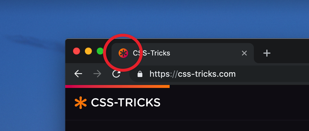
A favicon is a tiny image that appears next to your website’s title in the browser.

Browser tabs

The favicon will help your users immediately recognize your website and switch between different tabs efficiently. More frequent visitors will even build instant recognition for that tiny image on your browser.

How to Remove the WordPress Icon from Browser Tab

The process of removing the WordPress icon and adding a favicon in its place is extremely easy. There are three methods that can be used to remove the WordPress icon from the browser tab.

Today, we’ll be taking a look at all three methods and you can choose the one that feels right for you.

Method 1. Removing the WordPress Icon Without a Plugin

As of WordPress 6.1, the WordPress default theme comes with a full site editor. You can also use this method if you’re using a block theme on your WordPress site to remove the WordPress icon.

At the time of writing this tutorial, the default WordPress 6.1 theme Twenty Twenty-Three doesn’t have a site icon block to change your favicon away from the WordPress logo.

If you navigate to Appearance » Editor from your WordPress admin dashboard, this will open up the full site editor, but you cannot change your favicon from here or remove the WordPress icon from the browser tab.

Go to full site editor from WordPress dashboard

So you can copy and paste the URL below into your browser to open up the theme customizer.

https://example.com/wp-admin/customize.php

Remember to replace ‘example.com’ with your own site’s domain name.

This URL will take you to the Theme Customizer. Once there, simply click the ‘Site Identity’ tab.

Select the Site Identity tab

Now on the ‘Site Identity’ page, scroll down to the ‘Site Icon’ section.

Simply click the ‘Select Site Icon’ button which will open up the WordPress media library.

Click Site Icon button

You can now select any image that you want to use as a favicon to replace the WordPress icon on the browser tab.

For more details on how to create a favicon, you can check out our article on how to add a favicon in WordPress. If the image that you’ve chosen to use as a favicon exceeds the recommended size, then WordPress will allow you to crop it.

Once you’re satisfied with your choice simply click the ‘Publish’ button at the top.

Congratulations! You’ve successfully removed the WordPress icon from the browser tab and replaced it with your own.

Remove the WordPress Icon in a Theme without Full-Site Editing

If you’re using any non-FSE theme, then you can directly navigate to the Theme Customizer at Appearance » Customize to remove the WordPress icon from the browser tab.

In sites that don’t support the full-site editor, the WordPress theme customizer allows you to change details about your site such as the favicon, typography, default colors, footer, and more.

Once in the Theme Customizer, click on the ‘Site Identity’ tab. The process is the same as the one we showcased above. You can remove the WordPress icon simply by uploading a site icon of your choice.

Once you’re happy with your choice, simply click on the ‘Publish’ button to save changes.

Method 2. Removing the WordPress Icon Using a Plugin

You can also use a plugin to remove the WordPress icon and replace it with a favicon. For this tutorial, we will be using the Heroic Favicon Generator plugin.

It is a well-known plugin that is used by many to add a favicon to their website.

Heroic Favicon Generator Plugin

First, all you have to do is install and activate the Heroic Favicon Generator plugin.

For more details, please take a look at our guide on how to install a WordPress plugin.

After the plugin has been activated, simply go to Plugins » Installed Plugins and click on ‘Favicon Settings’ option.

After activating the plugin, click on Favicon Settings

This will take you to the ‘Heroic Favicon Generator Settings’ page. Here, simply click on the ‘Select Favicon’ button under the ‘Select Favicon’ option.

This will open up the WordPress media library. Now, you can choose and upload any image that you want to use as a favicon.

Click on Select Favicon button

After you’ve uploaded your favicon, you can scroll down to the ‘Previews’ section where you will be able to see how the favicon will look on your website.

Once you’re satisfied, simply scroll down and click on the ‘Save Changes’ button.

Previews of favicon

You have successfully removed the WordPress icon and have added a favicon in its place.

We hope this article helped you learn how to remove the WordPress icon from the browser tab. You may also want to see our ultimate WordPress SEO guide to improve your rankings, and check out our article on how to easily move your blog from WordPress.com to WordPress.org.

If you liked this article, then please subscribe to our YouTube Channel for WordPress video tutorials. You can also find us on Twitter and Facebook.

The post How to Easily Remove WordPress Icon from Browser Tab first appeared on WPBeginner.

We Analyzed 425,909 Favicons

This is a neat idea for a research project. The big map is fun, but the research had some tidbits in it worth looking at.

The average favicon network request takes 130ms, at least from our speedy cloud instance.

Fast, but not that fast, particularly for a file that nearly every website in the world has. All the more reason to get it right and ensure only one is downloaded (ideally SVG).

I would have guessed most favicons are ICO, but no:

The vast majority of the favicons offered up by websites are PNG. 71.6% of <link rel=”icon”> images are PNG.

And lol:

21.1% of /favicon.ico files are secretly PNGs

One of the reasons that file extensions, to browsers, are rather meaningless. It’s all about that content-type.

Also, they question the accuracy of the method, but the dominant color in the analysis so far is purple. I hope it ends up true as it kinda makes sense. Unless you’re offering different favicons for dark mode, using white or black seems too dangerous these days.

To Shared LinkPermalink on CSS-Tricks


The post We Analyzed 425,909 Favicons appeared first on CSS-Tricks. You can support CSS-Tricks by being an MVP Supporter.

Favicons: How to Make Sure Browsers Only Download the SVG Version

Šime Vidas DM’d me the other day about this thread from subzey on Twitter. My HTML for favicons was like this:

<!-- Warning! Typo! -->
<link rel="icon" href="/favicon.ico" size="any">
<link rel="icon" href="/favicon.svg" type="image/svg+xml">

The attribute size is a typo there, and should be sizes. Like this:

<!-- Correct -->
<link rel="icon" href="/favicon.ico" sizes="any">
<link rel="icon" href="/favicon.svg" type="image/svg+xml">

And with that, Chrome no longer double downloaded both icons, and instead uses the SVG alone (as it should). Just something to watch out for. My ICO file is 5.8kb, so now that’s 5.8kb saved on every single uncached page load, which feels non-trivial to me.

Šime noted this in Web Platform News #42:

SVG favicons are supported in all modern browsers except Safari. If your website declares both an ICO (fallback) and SVG icon, make sure to add the sizes=any attribute to the ICO <link> to prevent Chrome from downloading and using the ICO icon instead of the SVG icon (see Chrome bug 1162276 for more info). CSS-Tricks is an example of a website that has the optimal icon markup in its <head> (three <link> elements, one each for favicon.ico, favicon.svg, and apple-touch-icon.png).

That note about CSS-Tricks is a bit generous in that it’s only correct because my incorrectness was pointed out ahead of time. I think the root of my typo was Andrey’s article, but that’s been fixed. Andrey’s article is still likely the best reference for the most practical favicon markup.


The post Favicons: How to Make Sure Browsers Only Download the SVG Version appeared first on CSS-Tricks. You can support CSS-Tricks by being an MVP Supporter.

The Right Way to Use Favicons

How to Add a Favicon

To make an icon display, you need to add a file with a graphic image of the icon to a tab. To add an icon to your website, you need to follow the mandatory browser requirements and use a minimum set of favicons, which we will now consider in detail.

Why a set and not a single icon? The fact is that browsers and screens are constantly evolving. More modern formats are usually supported by more modern browsers. For example, you might think that you can add a single SVG icon and the browser will render it correctly. However, not all browsers still support the SVG format for favicons. The following table illustrates the browsers that support the SVG format.

SVG Favicons in Action

Ever heard of favicons made with SVG? If you are a regular reader of CSS-Tricks, you probably have. But does your website actually use one?

The task is more non-trivial than you might think. As we will see in this article, creating a useful SVG favicon involves editing an SVG file manually, which is something many of us try to avoid or are uncomfortable doing. Plus, we are talking about a favicon. We can spend a few hours playing with a hot new CSS framework. But a favicon? It sometimes feels too small to be worth our time.

This article is about creating an SVG favicon for real. If you’re in front of your laptop, get the vector file of a logo ready. By the end of your (active!) reading, your SVG favicon will be ready to shine.

Why an SVG favicon at all?

We are here for the “how” but it’s worth reflecting: what is an SVG favicon even good for? We already have other file types that handle this, right?

SVG is a vector format. As such, it has valuable features over raster formats, including those typically used for favicons, like PNG. SVGs scale and are often more compact than its binary cousins because, well, they’re just code! Everything is drawn in numbers and letters!

That’s good news, but how does this help our favicon? Desktop favicons are small, at most 64×64. And you can ship your icons in several resolutions. Scaling is a feature we don’t really need here.

File size is another source of disappointment. While SVG has a clear edge over a high resolution PNG file, the tables turn in low resolution. It is common for a 48×48 PNG favicon to result in a smaller file size than its SVG equivalent.

Yet, we have a good reason to pay attention to SVG favicon: dark mode support.

Dark mode has received a lot of attention recently. You may even have implemented dark mode for your own websites. What does that mean for favicon? It means the ability to show different icons based on the brightness of the browser tab’s background.

We are going to prepare such an icon.

How to create an SVG favicon (in theory)

Getting dark mode support for an SVG favicon relies on a CSS trick (10 points to Gryffindor), namely that we can drop a <style> tag right inside SVG, and use a media query to detect the user’s current theme preference. Something like this:

<svg>
  <style>
    @media (prefers-color-scheme: dark) {
      // Your dark styles here
    }
  </style>

  <!-- more stuff -->

</svg>

With this pattern, your light/dark favicon is only limited by your imagination. For example, change the color of all lines:

<svg>
  <style>
    path { fill: black; }
    @media (prefers-color-scheme: dark) {
      path { fill: white; }
    }
  </style>

  <!-- more stuff -->

</svg>

Now is the time to actually write these styles. This is when the troubles begin.

SVGs are images, and the logo we are using to build our favicon was probably created with a tool like Adobe Illustrator or InkScape. Why not use the same tool again? That’s because apps like these haven’t really integrated CSS and media queries into their products. It’s not that they can’t handle them, but you have to forget the mouse-only experience they promise. You are going to use the keyboard and type code.

Which leads us to a second option: write the CSS by hand. After all, this is the way to go with front-end development. Why should it be different here? Unfortunately, SVG is often hard to read. Sure, this is an XML dialect, which is (almost) like HTML. But SVG images are cluttered with long path declarations and other markup we often don’t see in our day-to-day work. For example, the Raspberry Pi logo is more than 8KB of raw data. This make manual editing more tedious than it sounds.

That is a lot of code.

How to create an SVG favicon (in practice)

To understand how we can deal with an SVG favicon quickly and easily, we first need to define what we want to achieve.

The technique we covered above calls for creativity: replace a color, invert them all (which we’ll get to), change a shape… But the setup for a favicon is not the right time for this. A favicon should almost always be the website’s logo. Its appearance? Aesthetic? The message it conveys? All these questions have been answered already. Preparing the favicon should be fine-tuning the logo so it fits the small space allocated in browser tabs.

Often, the logo is perfect as-is and its favicon counterpart is a scaled down version of it. Sometimes, we need to add margin to make it square. What motivates a dark icon, then?

Contrast.

Many logos are designed for light backgrounds. When they don’t, another version exists solely for the purpose of darker backgrounds.

Notice that even the colors change slightly to account for the darker background.

Therefore, whether we prepare a favicon manually or with a tool, we automatically pick the light-compatible logo and start with that. After all, desktop tabs are traditionally white or light gray. The problem arises when going dark mode.

Facebook blue logo is suitable for both light and dark backgrounds
In the best case, the logo is naturally a good fit for light and dark backgrounds. This happens with colorful logos, like Facebook’s.
Amazon’s favicon is 16×16, but Amazon’s logo is only 14×14—almost a quarter of the pixels is lost in padding!
The favicon is sometimes made background-proof by embedding its own background. This technique has a drawback, though. It needs padding so the logo doesn’t touch the edge of the background.
Adidas logo is barely noticeable on dark background
The worst case is a dark logo, perfect for light backgrounds and ill-suited for dark ones. Adidas is either clearly visible, or almost invisible.

Now that we have pinpointed the problem, we can formulate a solution: sometimes, we need a brighter icon for dark mode. It’s very simple. For a colorful, yet too dark logo, we can add brightness to a dark mode favicon with a CSS filter:

<svg>
  <style>
    @media (prefers-color-scheme: dark) {
      :root {
        filter: brightness(2);
      }
    }
  </style>

  <!-- more stuff -->
</svg>

If the logo is in shades or gray, we can invert its colors using another CSS filter:

<svg>
  <style>
    @media (prefers-color-scheme: dark) {
      :root {
        filter: invert(100%);
      }
    }
  </style>

  <!-- more stuff -->

</svg>

Your turn! Open your SVG logo in a text editor and drop any of those <style> snippets above just before the closing </svg> tag. Open your logo in a browser, switch from light to dark, then from dark to light (Windows or Mac), and observe the magic. Adjust the brightness or invert filters as needed.

Responsive brightness in action

How fast was that?

Even faster: The SVG favicon editor

That brightness hack we covered didn’t come out of nowhere. I wrote it while upgrading RealFaviconGenerator with the SVG favicon editor. This online tool includes everything we discussed earlier. Submit your SVG logo to get a preview of your favicon in tabs and Google result pages.

After that, play with the editor to produce the perfect favicon. In this example, we make the dark icon lighter, using the brightness filter hack behind te scene:

Grayscale logos benefit from the invert filter as well:

Click on the “Generate Favicon” button, et voilà! Favicon ready, fine tuned for light and dark modes in under a minute. Mission accomplished.

Conclusion

Beyond coolness, SVG favicons actually solve a problem that its PNG counterpart cannot. It’s only been about a year since we’ve had the ability to use SVG this way at all, but so far, it seems seldom used. With intentional purpose and tooling, maybe SVG favivons will rise and find its place among the favicon classics.


The post SVG Favicons in Action appeared first on CSS-Tricks. You can support CSS-Tricks by being an MVP Supporter.

Dynamic Favicons for WordPress

Typically, a single favicon is used across a whole domain. But there are times you wanna step it up with different favicons depending on context. A website might change the favicon to match the content being viewed. Or a site might allow users to personalize their theme colors, and those preferences are reflected in the favicon. Maybe you’ve seen favicons that attempt to alert the user of some event.

Multiple favicons can technically be managed by hand — Chris has shown us how he uses two different favicons for development and production. But when you reach the scale of dozens or hundreds of variations, it’s time to dynamically generate them.

This was the situation I encountered on a recent WordPress project for a directory of colleges and universities. (I previously wrote about querying nearby locations for the same project.) When viewing a school’s profile, we wanted the favicon to use a school’s colors rather than our default blue, to give it that extra touch.

With over 200 schools in the directory and climbing, we needed to go dynamic. Fortunately, we already had custom meta fields storing data on each school’s visual identity. This included school colors, which were being used in the stylesheet. We just needed a way to apply these custom meta colors to a dynamic favicon.

In this article, I’ll walk you through our approach and some things to watch out for. You can see the results in action by viewing different schools.

Each favicon is a different color in the tabs based on the school that is selected.

SVG is key

Thanks to improved browser support for SVG favicons, implementing dynamic favicons is much easier than days past. In contrast to PNG (or the antiquated ICO format), SVG relies on markup to define vector shapes. This makes them lightweight, scaleable, and best of all, receptive to all kinds of fun.

The first step is to create your favicon in SVG format. It doesn’t hurt to also run it through an SVG optimizer to get rid of the cruft afterwards. This is what we used in the school directory:

Hooking into WordPress

Next, we want to add the favicon link markup in the HTML head. How to do this is totally up to you. In the case of WordPress, it could be added it to the header template of a child theme or echo’d through a wp_head() action.

function ca_favicon() {
  if ( is_singular( 'school' ) ) {
    $post_id = get_the_ID();
    $color = get_post_meta( $post_id, 'color', true );

    if ( isset( $color ) ) {
      $color = ltrim( $color, '#' ); // remove the hash
      echo '<link rel="icon" href="' . plugins_url( 'images/favicon.php?color=' . $color, __FILE__ ) . '" type="image/svg+xml" sizes="any">';
    }
  }
}
add_filter( 'wp_head' , 'ca_favicon' );

Here we’re checking that the post type is school, and grabbing the school’s color metadata we’ve previously stored using get_post_meta(). If we do have a color, we pass it into favicon.php through the query string.

From PHP to SVG

In a favicon.php file, we start by setting the content type to SVG. Next, we save the color value that’s been passed in, or use the default color if there isn’t one.

Then we echo the large, multiline chunk of SVG markup using PHP’s heredoc syntax (useful for templating). Variables such as $color are expanded when using this syntax.

Finally, we make a couple modifications to the SVG markup. First, classes are assigned to the color-changing elements. Second, a style element is added just inside the SVG element, declaring the appropriate CSS rules and echo-ing the $color.

Instead of a <style> element, we could alternatively replace the default color with $color wherever it appears if it’s not used in too many places.

<?php
header( 'Content-Type: image/svg+xml' );

$color = $_GET[ 'color' ] ?? '065281';
$color = sanitize_hex_color_no_hash( $color );

echo <<<EOL
<svg xmlns="http://www.w3.org/2000/svg" xmlns:xlink="http://www.w3.org/1999/xlink" width="1000" height="1000">
  <style type="text/css">
  <![CDATA[
  .primary {
    fill: #$color;
  }
  .shield {
    stroke: #$color;
  }
  ]]>
  </style>
  <defs>
    <path id="a" d="M0 34L318 0l316 34v417.196a97 97 0 01-14.433 50.909C483.553 722.702 382.697 833 317 833S150.447 722.702 14.433 502.105A97 97 0 010 451.196V34z"/>
  </defs>
  <g fill="none" fill-rule="evenodd">
    <g transform="translate(183 65)">
      <mask id="b" fill="#fff">
        <use xlink:href="#a"/>
      </mask>
      <use fill="#FFF" xlink:href="#a"/>
      <path class="primary" mask="url(#b)" d="M317-37h317v871H317z"/>
      <path class="primary" mask="url(#b)" d="M0 480l317 30 317-30v157l-317-90L0 517z"/>
      <path fill="#FFF" mask="url(#b)" d="M317 510l317-30v37l-317 30z"/>
    </g>
    <g fill-rule="nonzero">
      <path class="primary" d="M358.2 455.2c11.9 0 22.633-.992 32.2-2.975 9.567-1.983 18.375-4.9 26.425-8.75 8.05-3.85 15.458-8.458 22.225-13.825 6.767-5.367 13.3-11.433 19.6-18.2l-34.3-34.65c-9.567 8.867-19.192 15.867-28.875 21-9.683 5.133-21.525 7.7-35.525 7.7-10.5 0-20.125-2.042-28.875-6.125s-16.217-9.625-22.4-16.625-11.025-15.167-14.525-24.5-5.25-19.25-5.25-29.75v-.7c0-10.5 1.75-20.358 5.25-29.575 3.5-9.217 8.4-17.325 14.7-24.325 6.3-7 13.825-12.483 22.575-16.45 8.75-3.967 18.258-5.95 28.525-5.95 12.367 0 23.508 2.45 33.425 7.35 9.917 4.9 19.658 11.667 29.225 20.3l34.3-39.55a144.285 144.285 0 00-18.2-15.4c-6.533-4.667-13.65-8.633-21.35-11.9-7.7-3.267-16.275-5.833-25.725-7.7-9.45-1.867-19.892-2.8-31.325-2.8-18.9 0-36.167 3.325-51.8 9.975-15.633 6.65-29.05 15.75-40.25 27.3s-19.95 24.967-26.25 40.25c-6.3 15.283-9.45 31.675-9.45 49.175v.7c0 17.5 3.15 33.95 9.45 49.35 6.3 15.4 15.05 28.758 26.25 40.075 11.2 11.317 24.5 20.242 39.9 26.775 15.4 6.533 32.083 9.8 50.05 9.8z"/>
      <path fill="#FFF" d="M582.35 451l22.4-54.95h103.6l22.4 54.95h56.35l-105-246.75h-49.7L527.4 451h54.95zM689.1 348.45H624L656.55 269l32.55 79.45z"/>
    </g>
    <path class="shield" stroke-width="30" d="M183 99l318-34 316 34v417.196a97 97 0 01-14.433 50.909C666.553 787.702 565.697 898 500 898S333.447 787.702 197.433 567.105A97 97 0 01183 516.196V99h0z"/>
  </g>
</svg>
EOL;
?>

With that, you’ve got a dynamic favicon working on your site.

Security considerations

Of course, blindly echo-ing URL parameters opens you up to hacks. To mitigate these, we should sanitize all of our inputs.

In this case, we‘re only interested in values that match the 3-digit or 6-digit hex color format. We can include a function like WordPress’s own sanitize_hex_color_no_hash() to ensure only colors are passed in.

function sanitize_hex_color( $color ) {
  if ( '' === $color ) {
    return '';
  }

  // 3 or 6 hex digits, or the empty string.
  if ( preg_match( '|^#([A-Fa-f0-9]{3}){1,2}$|', $color ) ) {
    return $color;
  }
}

function sanitize_hex_color_no_hash( $color ) {
  $color = ltrim( $color, '#' );

  if ( '' === $color ) {
    return '';
  }

  return sanitize_hex_color( '#' . $color ) ? $color : null;
}

You’ll want to add your own checks based on the values you want passed in.

Caching for better performance

Browsers cache SVGs, but this benefit is lost for PHP files by default. This means each time the favicon is loaded, your server’s being hit.

To reduce server strain and improve performance, it’s essential that you explicitly cache this file. You can configure your server, set up a page rule through your CDN, or add a cache control header to the very top of favicon.php like so:

header( 'Cache-Control: public, max-age=604800' );  // 604,800 seconds or 1 week

In our tests, with no caching, our 1.5 KB SVG file took about 300 milliseconds to process on the first load, and about 100 milliseconds on subsequent loads. That’s pretty lousy. But with caching, we brought this down to 25 ms from CDN on first load, and 1 ms from browser cache on later loads — as good as a plain old SVG.

Browser support

If we were done there, this wouldn’t be web development. We still have to talk browser support.

As mentioned before, modern browser support for SVG favicons is solid, and fully-supported in current versions of Chrome, Firefox, and Edge.

SVG favicons have arrived… except in Safari.

One caveat is that Firefox requires the attribute type="image/svg+xml" in the favicon declaration for it to work. The other browsers are more forgiving, but it‘s just good practice. You should include sizes="any" while you’re at it.

<link rel="icon" href="path/to/favicon.svg" type="image/svg+xml" sizes="any">

Safari

Safari doesn‘t support SVG favicons as of yet, outside of the mask icon feature intended for pinned tabs. In my experimentation, this was buggy and inconsistent. It didn’t handle complex shapes or colors well, and cached the same icon across the whole domain. Ultimately we decided not to bother and just use a fallback with the default blue fill until Safari improves support.

Fallbacks

As solid as SVG favicon support is, it‘s still not 100%. So be sure to add fallbacks. We can set an additional favicon for when SVG icons aren’t supported with the rel="alternative icon" attribute:

<link rel="icon" href="path/to/favicon.svg" type="image/svg+xml" sizes="any">
<link rel="alternate icon" href="path/to/favicon.png" type="image/png">

To make the site even more bulletproof, you can also drop the eternal favicon.ico in your root.

Going further

We took a relatively simple favicon and swapped one color for another. But taking this dynamic approach opens the door to so much more: modifying multiple colors, other properties like position, entirely different shapes, and animations.

For instance, here’s a demo I’ve dubbed Favicoin. It plots cryptocurrency prices in the favicon as a sparkline.

Implementing dynamic favicons like this isn’t limited to WordPress or PHP; whatever your stack, the same principles apply. Heck, you could even achieve this client-side with data URLs and JavaScript… not that I recommend it for production.

But one thing‘s for sure: we’re bound to see creative applications of SVG favicons in the future. Have you seen or created your own dynamic favicons? Do you have any tips or tricks to share?


The post Dynamic Favicons for WordPress appeared first on CSS-Tricks.

You can support CSS-Tricks by being an MVP Supporter.

How to Create a Favicon That Changes Automatically

I found this Free Favicon Maker the other day. It’s a nice tool to make a favicon (true to its name), but unlike other favicon generators, this one lets you create one from scratch starting with a character or an emoji. Naturally, I was curious to look at the code to see how it works and, while I did, it got me thinking in different directions. I was reminded of something I read that says it is possible to dynamically change the favicon of a website. That’s actually what some websites use as a sort of notification for users: change the favicon to a red dot or some other indicator that communicates something is happening or has changed on the page.

I started browsing the emojis via emojipedia.org for inspiration and that’s when it struck: why not show the time with a clock emoji (🕛) and other related favicons? The idea is to check the time every minute and set the favicon with the corresponding clock emoji indicating the current time.

We’re going to do exactly that in this article, and it will work with plain JavaScript. Since I often use Gatsby for static sites though, we will also show how to do it in React. From there, the ideas should be usable regardless of what you want to do with your favicon and how.

Here’s a function that take an emoji as a parameter and returns a valid data URL that can be used as an image (or favicon!) source:

// Thanks to https://formito.com/tools/favicon
const faviconHref = emoji =>
  `data:image/svg+xml,<svg xmlns=%22http://www.w3.org/2000/svg%22 width=%22256%22 height=%22256%22 viewBox=%220 0 100 100%22><text x=%2250%%22 y=%2250%%22 dominant-baseline=%22central%22 text-anchor=%22middle%22 font-size=%2280%22>${emoji}</text></svg>`

And here’s a function that targets the favicon <link> in the <head> and changes it to that emoji:

const changeFavicon = emoji => {
  // Ensure we have access to the document, i.e. we are in the browser.
  if (typeof window === 'undefined') return

  const link =
    window.document.querySelector("link[rel*='icon']") ||
    window.document.createElement("link")
  link.type = "image/svg+xml"
  link.rel = "shortcut icon"
  link.href = faviconHref(emoji)

  window.document.getElementsByTagName("head")[0].appendChild(link)
}

(Shout out to this StackOverflow answer for that nice little trick on creating the link if it doesn’t exist.)

Feel free to give those a try! Open up the DevTools JavaScript console, copy and paste the two functions above, and call changeFavicon("💃"). You can do that right on this website and you’ll see the favicon change to that awesome dancing emoji.

Back to our clock/time project… If we want to show the emoji with the right emoji clock showing the correct time, we need to determine it from the current time. For example, if it’s 10:00 we want to show 🕙. If it’s 4.30 we want to show 🕟. There aren’t emojis for every single time, so we’ll show the best one we have. For example, between 9:45 to 10:14 we want to show the clock that shows 10:00; from 10:15 to 10:44 we want to show the clock that marks 10.30, etc.

We can do it with this function:

const currentEmoji = () => {
  // Add 15 minutes and round down to closest half hour
  const time = new Date(Date.now() + 15 * 60 * 1000)

  const hours = time.getHours() % 12
  const minutes = time.getMinutes() < 30 ? 0 : 30

  return {
    "0.0": "🕛",
    "0.30": "🕧",
    "1.0": "🕐",
    "1.30": "🕜",
    "2.0": "🕑",
    "2.30": "🕝",
    "3.0": "🕒",
    "3.30": "🕞",
    "4.0": "🕓",
    "4.30": "🕟",
    "5.0": "🕔",
    "5.30": "🕠",
    "6.0": "🕕",
    "6.30": "🕡",
    "7.0": "🕖",
    "7.30": "🕢",
    "8.0": "🕗",
    "8.30": "🕣",
    "9.0": "🕘",
    "9.30": "🕤",
    "10.0": "🕙",
    "10.30": "🕥",
    "11.0": "🕚",
    "11.30": "🕦",
  }[`${hours}.${minutes}`]
}

Now we just have to call changeFavicon(currentEmoji()) every minute or so. If we had to do it with plain JavaScript, a simple setInterval would make the trick:

// One minute
const delay = 60 * 1000

// Change the favicon when the page gets loaded...
const emoji = currentEmoji()
changeFavicon(emoji)

// ... and update it every minute
setInterval(() => {
  const emoji = currentEmoji()
  changeFavicon(emoji)
}, delay)

The React part

Since my blog is powered by Gatsby, I want to be able to use this code inside a React component, changing as little as possible. It is inherently imperative, as opposed to the declarative nature of React, and moreover has to be called every minute. How can we do that?

Enter Dan Abramov and his amazing blog post. Dan is a great writer who can explain complex things in a clear way, and I strongly suggest checking out this article, especially if you want a better understanding of React Hooks. You don’t necessarily need to understand everything in it — one of the strengths of hooks is that they can be used even without fully grasping the internal implementation. The important thing is to know how to use it. Here’s how that looks:

import { useEffect } from "react"
import useInterval from "./useInterval"

const delay = 60 * 1000

const useTimeFavicon = () => {
  // Change the favicon when the component gets mounted...
  useEffect(() => {
    const emoji = currentEmoji()
    changeFavicon(emoji)
  }, [])

  // ... and update it every minute
  useInterval(() => {
    const emoji = currentEmoji()
    changeFavicon(emoji)
  }, delay)
}

Finally, just call useTimeFavicon() in your root component, and you are good to go! Wanna see it work? Here’s a deployed CodePen Project where you can see it and here’s the project code itself.

Wrapping up

What we did here was cobble together three pieces of code together from three different sources to get the result we want. Ancient Romans would say Divide et Impera. (I’m Italian, so please indulge me a little bit of Latin!). That means “divide and conquer.” If you look at the task as a single entity, you may be a little anxious about it: “How can I show a favicon with the current time, always up to date, on my React website?” Getting all the details right is not trivial.

The good news is, you don’t always have to personally tackle all the details at the same moment: it is much more effective to divide the problem into sub-problems, and if any of these have already been solved by others, so much the better!

Sounds like web development, eh? There’s nothing wrong with using code written by others, as long as it’s done wisely. As they say, there is no need to reinvent the wheel and what we got here is a nice enhancement for any website — whether it’s displaying notifications, time updates, or whatever you can think of.


The post How to Create a Favicon That Changes Automatically appeared first on CSS-Tricks.

You can support CSS-Tricks by being an MVP Supporter.

SVG, Favicons, and All the Fun Things We Can Do With Them

Favicons are the little icons you see in your browser tab. They help you understand which site is which when you’re scanning through your browser’s bookmarks and open tabs. They’re a neat part of internet history that are capable of performing some cool tricks.

One very new trick is the ability to use SVG as a favicon. It’s something that most modern browsers support, with more support on the way.

Here’s the code for how to add favicons to your site:

<link rel="icon" type="image/svg+xml" href="/favicon.svg">
<link rel="alternate icon" href="/favicon.ico">
<link rel="mask-icon" href="/safari-pinned-tab.svg" color="#ff8a01">

If a browser doesn’t support a SVG favicon, it will ignore the first link element declaration and continue on to the second. This ensures that all browsers that support favicons can enjoy the experience. 

You may also notice the alternate attribute value for our rel declaration in the second line. This programmatically communicates to the browser that the favicon with a file format that uses .ico is specifically used as an alternate presentation.

Following the favicons is a line of code that loads another SVG image, one called safari-pinned-tab.svg. This is to support Safari’s pinned tab functionality, which existed before other browsers had SVG favicon support. There’s additional files you can add here to enhance your site for different apps and services, but more on that in a bit.

Here’s more detail on the current level of SVG favicon support:

This browser support data is from Caniuse, which has more detail. A number indicates that browser supports the feature at that version and up.

Desktop

ChromeFirefoxIEEdgeSafari
8041No80TP

Mobile / Tablet

Android ChromeAndroid FirefoxAndroidiOS Safari
80NoNo13.4

Why SVG?

You may be questioning why this is needed. The .ico file format has been around forever and can support images up to 256×256 pixels in size. Here are three answers for you.

Ease of authoring

It’s a pain to make .ico files. The file is a proprietary format used by Microsoft, meaning you’ll need specialized tools to make them. SVG is an open standard, meaning you can use them without any further tooling or platform lock-in.

Future-proofing

Retina? 5k? 6k? When we use a resolution-agnostic SVG file for a favicon, we guarantee that our favicons look crisp on future devices, regardless of how large their displays get

Performance

SVGs are usually very small files, especially when compared to their raster image counterparts — even more-so if you optimize them beforehand. By only using a 16×16 pixel favicon as a fallback for browsers that don’t support SVG, we provide a combination that enjoys a high degree of support with a smaller file size to boot. 

This might seem a bit extreme, but when it comes to web performance, every byte counts!

Tricks

Another cool thing about SVG is we can embed CSS directly in it. This means we can do fun things like dynamically adjust them with JavaScript, provided the SVG is declared inline and not embedded using an img element.

<svg  version="1.1" xmlns="http://www.w3.org/2000/svg" viewBox="0 0 100 100">
  <style>
    path { fill: #272019; }
  </style>
  <!-- etc. -->
</svg>

Since SVG favicons are embedded using the link element, they can’t really be modified using JavaScript. We can, however, use things like emoji and media queries.

Emoji

Lea Verou had a genius idea about using emoji inside of SVG’s text element to make a quick favicon with a transparent background that holds up at small sizes.

https://twitter.com/LeaVerou/status/1241619866475474946

In response, Chris Coyier whipped up a neat little demo that lets you play around with the concept.

Dark Mode support

Both Thomas Steiner and Mathias Bynens independently stumbled across the idea that you can use the prefers-color-scheme media query to provide support for dark mode. This work is built off of Jake Archibald’s exploration of SVG and media queries.

<svg width="128" height="128" xmlns="http://www.w3.org/2000/svg">
  <style>
    path { fill: #000000; }
    @media (prefers-color-scheme: dark) {
      path { fill: #ffffff; }
    }
  </style>
  <path d="M111.904 52.937a1.95 1.95 0 00-1.555-1.314l-30.835-4.502-13.786-28.136c-.653-1.313-2.803-1.313-3.456 0L48.486 47.121l-30.835 4.502a1.95 1.95 0 00-1.555 1.314 1.952 1.952 0 00.48 1.99l22.33 21.894-5.28 30.918c-.115.715.173 1.45.768 1.894a1.904 1.904 0 002.016.135L64 95.178l27.59 14.59c.269.155.576.232.883.232a1.98 1.98 0 001.133-.367 1.974 1.974 0 00.768-1.894l-5.28-30.918 22.33-21.893c.518-.522.71-1.276.48-1.99z" fill-rule="nonzero"/>
</svg>

For supporting browsers, this code means our star-shaped SVG favicon will change its fill color from black to white when dark mode is activated. Pretty neat!

Other media queries

Dark mode support got me thinking: if SVGs can support prefers-color-scheme, what other things can we do with them? While the support for Level 5 Media Queries may not be there yet, here’s some ideas to consider:

Mockup of four SVG favicon treatments. The first treatment is a pink star with a tab title of, “SVG Favicon.” The second treatment is a hot pink star with a tab title of, “Light Level SVG Favicon.” The third treatment is a light pink star with a tab title of, “Inverted Colors SVG Favicon.” The fourth treatment is a black pink star with a tab title of, “High Contrast Mode SVG Favicon.” The tabs are screen captures from Microsoft Edge, with the browser chrome updating to match each specialized mode.
A mockup of how these media query-based adjustments could work.

Keep it crisp

Another important aspect of good favicon design is making sure they look good in the small browser tab area. The secret to this is making the paths of the vector image line up to the pixel grid, the guide a computer uses to turn SVG math into the bitmap we see on a screen. 

Here’s a simplified example using a square shape:

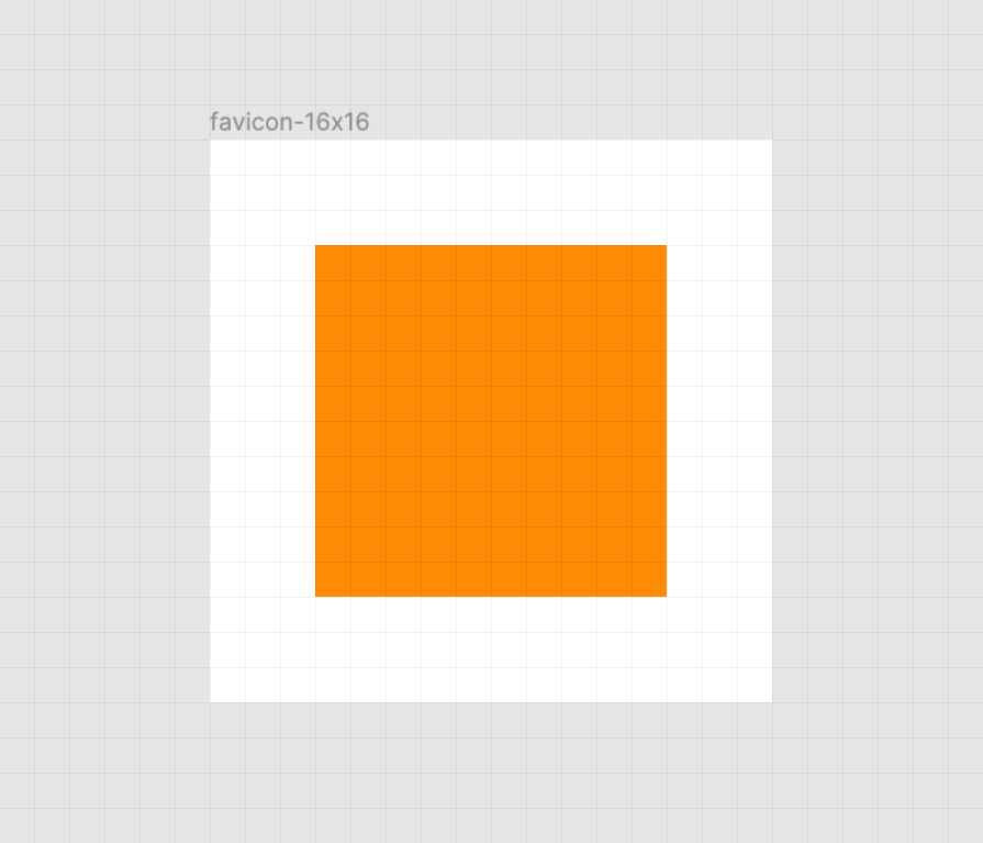
A crisp orange square on a white background. There is also a faint grid of gray horizontal and vertical lines that represent the pixel grid. Screenshot from Figma.

When the vector points of the square align to the pixel grid of the artboard, the antialiasing effect a computer uses to smooth out the shapes isn’t needed. When the vector points aren’t aligned, we get a “smearing” effect:

A blurred orange square on a white background. There is also a faint grid of gray horizontal and vertical lines that represent the pixel grid. Screenshot from Figma.

A vector point’s position can be adjusted on the pixel grid by using a vector editing program such as Figma, Sketch, Inkscape, or Illustrator. These programs export SVGs as well. To adjust a vector point’s location, select each node with a precision selection tool and drag it into position.

Some more complicated icons may need to be simplified, in order to look good at such a small size. If you’re looking for a good primer on this, Jeremy Frank wrote a really good two-part article over at Vidget.

Go the extra mile

In addition to favicons, there are a bunch of different (and unfortunately proprietary) ways to use icons to enhance its experience. These include things like the aforementioned pinned tab icon for Safari¹, chat app unfurls, a pinned Windows start menu tile, social media previews, and homescreen launchers.

If you’re looking for a great place to get started with these kinds of enhancements, I really like realfavicongenerator.net.

Icon output from realfavicongenerator.net arranged in a grid using CSS-Trick’s logo. There are two rows of five icons: android-chrome-192x192.png, android-chrome-384x384.png, apple-touch-icon.png, favicon-16x16.png, favicon-32x32.png, mstile-150x150.png, safari-pinned-tab.svg, favicon.ico, browserconfig.xml, and site.webmanifest.
It’s a lot, but it guarantees robust support.

A funny thing about the history of the favicon: Internet Explorer was the first browser to support them and they were snuck in at the 11th hour by a developer named Bharat Shyam:

As the story goes, late one night, Shyam was working on his new favicon feature. He called over junior project manager Ray Sun to take a look.

Shyam commented, “This is good, right? Check it in?”, requesting permission to check the code into the Internet Explorer codebase so it could be released in the next version. Sun didn’t think too much of it, the feature was cool and would clearly give IE an edge. So he told Shyam to go ahead and add it. And just like that, the favicon made its way into Internet Explorer 5, which would go on to become one of the largest browser releases the web has ever seen.

The next day, Sun was reprimanded by his manager for letting the feature get by so quickly. As it turns out, Shyam had specifically waited until later in the day, knowing that a less experienced Program Manager would give him a pass. But by then, the code had been merged in. Incidentally, you’d be surprised just how many relatively major browser features have snuck their way into releases like this.

From How We Got the Favicon by Jay Hoffmann

I’m happy to see the platform throw a little love at favicons. They’ve long been one of my favorite little design details, and I’m excited that they’re becoming more reactive to user’s needs. If you have a moment, why not sneak a SVG favicon into your project the same way Bharat Shyam did way back in 1999. 


¹ I haven’t been able to determine if Safari is going to implement SVG favicon support, but I hope they do. Has anyone heard anything?

The post SVG, Favicons, and All the Fun Things We Can Do With Them appeared first on CSS-Tricks.

Emojis as Favicons

Lea Verou had a dang genius idea to use an emoji as a favicon. The idea only recently possible as browsers have started supporting SVG for favicons. Chuck an emoji inside an SVG <text> element and use that as the favicon.

https://twitter.com/LeaVerou/status/1241619866475474946

Here's the one-liner in use:

<link rel="icon" href="data:image/svg+xml,<svg xmlns=%22http://www.w3.org/2000/svg%22 viewBox=%220 0 100 100%22><text y=%22.9em%22 font-size=%2290%22>🎯</text></svg>">

Demo Project

I made a quick little demo project so you can see it at work. See the deployed project to actually see the favicons. That works in Firefox and Chrome. Safari only does those "mask" style icons in SVG so this doesn't work there. Maybe it could though? I dunno I'll let you try it.

Here's a video in case you just wanna see it.

Related Concepts

The post Emojis as Favicons appeared first on CSS-Tricks.

Different Favicon for Development

I bet a lot of us tend to have the production website and the development website up simultaneously a lot. It's almost a developer cliché at this point to make some local change, refresh, refresh, refresh, refresh, and just not see the change, only to discover you were looking at the production website, not your local development website.

It's just funny at first, but it's frustrating if it happens a lot. It's also totally avoidable by having an obvious visual¹ difference between the two sites. An easy way to do that? Different favicons.

There is no real trick to this. I literally just have a different favicon.ico file in development than I do in production. On this (WordPress) site, I only version control and deploy the wp-content folder, which is not the root of the site where the favicon lives. Any files at the root I have to manually SFTP in to change. I simply changed my local version, and there it sits, being all different.

Other trickery

Speaking of favicons...

This has me wondering what best practices for favicons are in 2020, at least for garden variety content websites like this.

I hate to say it, but I don't really care about what the icon is when someone adds this site to the home screen on an iPad, ya know? Aside from one fellow who wanted a copy of the whole database to use the site offline to teach prisoners, nobody has ever asked me about "installing" CSS-Tricks.

Nor do I care about the tile color on a Windows 8 tablet or to customize the color of the browser chrome on Android. That kinda stuff tends to be part of the process when "generating" favicons.

I do care that the favicon looks good on high-resolution displays (a 32×32 graphic isn't much of a splurge). I like the idea of SVG favicons. I like the idea of making sure dark mode is handled. I like the idea of doing this with as little code and files as possible. Anyone dig into this lately and want to enlighten me?

  1. "Visual" difference. Hm. I wonder what could be done for developers with visual impairments? Ideas?

The post Different Favicon for Development appeared first on CSS-Tricks.

Dark Mode Favicons

Oooo! A bonafide trick from Thomas Steiner. Chrome will soon be supporting SVG favicons (e.g. <link rel="icon" href="/icon.svg">). And you can embed CSS within an SVG with a <style> element. That CSS can use a perfers-color-sceme media query, and as a result, a favicon that supports dark mode!

<svg width="100" height="100" xmlns="http://www.w3.org/2000/svg">
  <style>
    circle {
      fill: yellow;
      stroke: black;
      stroke-width: 3px;
    }
    @media (prefers-color-scheme: dark) {
      circle {
        fill: black;
        stroke: yellow;
      }
    }
  </style>
  <circle cx="50" cy="50" r="47"/>
</svg>

Safari also supports SVG, but it's different...

<link rel="mask-icon" href="/favicon.svg" color="#990000">

You specify the color, so there is no opportunity there for a dark mode situation. A little surprising, since Apple is so all-in on this dark mode stuff. I have no idea if they plan to address that or what.

The post Dark Mode Favicons appeared first on CSS-Tricks.

The Making of an Animated Favicon

It’s the first thing your eyes look for when you’re switching tabs.

That’s one way of explaining what a favicon is. The tab area is a much more precious screen real-estate than what most assume. If done right, besides being a label with icon, it can be the perfect billboard to represent what’s in or what’s happening on a web page.

The CSS-Tricks Favicon

Favicons are actually at their most useful when you’re not active on a tab. Here’s an example:

Imagine you’re backing up photos from your recent summer vacation to a cloud service. While they are uploading, you’ve opened a new tab to gather details about the places you went on vacation to later annotate those photos. One thing led to the other, and now you’re watching Casey Neistat on the seventh tab. But you can’t continue your YouTube marathon without the anxious intervals of checking back on the cloud service page to see if the photos have been uploaded.

It’s this type of situation where we can get creative! What if we could dynamically change the pixels in that favicon and display the upload progress? That’s exactly what we’ll do in this article.

In supported browsers, we can display a loading/progress animation as a favicon with the help of JavaScript, HTML <canvas> and some centuries-old geometry.

Jumping straight in, we’ll start with the easiest part: adding the icon and canvas elements to the HTML.

<head>
    <link rel="icon" type="image/png" href="" width=32px>
</head>

<body>
    <canvas width=32 height=32></canvas>
</body>

In practical use, you would want to hide the <canvas> on the page, and one way of doing that is with the HTML hidden attribute.

<canvas hidden width=32 height=32></canvas>

I’m going to leave the <canvas> visible on the page for you to see both the favicon and canvas images animate together.

Both the favicon and the canvas are given a standard favicon size: 32 square pixels.

For demo purposes, in order to trigger the loading animation, I’m adding a button to the page which will start the animation when clicked. This also goes in the HTML:

<button>Load</button>

Now let’s set up the JavaScript. First, a check for canvas support:

onload = ()=> {
  canvas = document.querySelector('canvas'),
  context = canvas.getContext('2d');
  if (!!context) {
      /* if canvas is supported */
  }
};

Next, adding the button click event handler that will prompt the animation in the canvas.

button = document.querySelector('button');
button.addEventListener('click', function() { 
    /* A variable to track the drawing intervals */
    n = 0, 
    /* Interval speed for the animation */
    loadingInterval = setInterval(drawLoader, 60); 
});

drawLoader will be the function doing the drawing at intervals of 60 milliseconds each, but before we code it, I want to define the style of the lines of the square to be drawn. Let’s do a gradient.

/* Style of the lines of the square that'll be drawn */
let gradient = context.createLinearGradient(0, 0, 32, 32);
gradient.addColorStop(0, '#c7f0fe');
gradient.addColorStop(1, '#56d3c9');
context.strokeStyle = gradient;
context.lineWidth = 8;

In drawLoader, we’ll draw the lines percent-wise: during the first 25 intervals, the top line will be incrementally drawn; in second quarter, the right line will be drawn; and so forth.

The animation effect is achieved by erasing the <canvas> in each interval before redrawing the line(s) from previous interval a little longer.

During each interval, once the drawing is done in the canvas, it’s quickly translated to a PNG image to be assigned as the favicon.

function drawLoader() {
  with(context) {
    clearRect(0, 0, 32, 32);
    beginPath();
    /* Up to 25% */
    if (n<=25){ 
      /*
        (0,0)-----(32,0)
      */
      // code to draw the top line, incrementally
    }
    /* Between 25 to 50 percent */
    else if(n>25 && n<=50){ 
      /*
        (0,0)-----(32,0)
                  |
                  |
                  (32,32)
      */
      // code to draw the top and right lines.
    }
    /* Between 50 to 75 percent */
    else if(n>50 && n<= 75){ 
      /*
        (0,0)-----(32,0)
                  |
                  |
        (0,32)----(32,32)
      */
      // code to draw the top, right and bottom lines.
    }
      /* Between 75 to 100 percent */
    else if(n>75 && n<=100){
      /*
        (0,0)-----(32,0)
            |      |
            |      |
        (0,32)----(32,32)
      */
      // code to draw all four lines of the square.
    }
    stroke();
  }
  // Convert the Canvas drawing to PNG and assign it to the favicon
  favicon.href = canvas.toDataURL('image/png');
  /* When finished drawing */
  if (n === 100) {
    clearInterval(loadingInterval);
    return;
  }
  // Increment the variable used to keep track of the drawing intervals
  n++;
}

Now to the math and the code for drawing the lines.

Here’s how we incrementally draw the top line at each interval during the first 25 intervals:

n = current interval, 
x = x-coordinate of the line’s end point at a given interval.
(y-coordinate of the end point is 0 and start point of the line is 0,0)

At the completion of all 25 intervals, the value of x is 32 (the size of the favicon and canvas.)

So...

x/n = 32/25
x = (32/25) * n

The code to apply this math and draw the line is:

moveTo(0, 0); lineTo((32/25)*n, 0);

For the next 25 intervals (right line), we target the y coordinate similarly.

moveTo(0, 0); lineTo(32, 0);
moveTo(32, 0); lineTo(32, (32/25)*(n-25));

And here’s the instruction to draw all four of the lines with the rest of the code.

function drawLoader() {
  with(context) {
    clearRect(0, 0, 32, 32);
    beginPath();
    /* Up to 25% of the time assigned to draw */
    if (n<=25){ 
      /*
        (0,0)-----(32,0)
      */
      moveTo(0, 0); lineTo((32/25)*n, 0);
    }
    /* Between 25 to 50 percent */
    else if(n>25 && n<=50){ 
      /*
        (0,0)-----(32,0)
                  |
                  |
                  (32,32)
      */
      moveTo(0, 0); lineTo(32, 0);
      moveTo(32, 0); lineTo(32, (32/25)*(n-25));
    }
    /* Between 50 to 75 percent */
    else if(n>50 && n<= 75){ 
      /*
        (0,0)-----(32,0)
                  |
                  |
        (0,32)----(32,32)
      */
      moveTo(0, 0); lineTo(32, 0);
      moveTo(32, 0); lineTo(32, 32);
      moveTo(32, 32); lineTo(-((32/25)*(n-75)), 32);
    }
      /* Between 75 to 100 percent */
    else if(n>75 && n<=100){
      /*
        (0,0)-----(32,0)
            |      |
            |      |
        (0,32)----(32,32)
      */
      moveTo(0, 0); lineTo(32, 0);
      moveTo(32, 0); lineTo(32, 32);
      moveTo(32, 32); lineTo(0, 32);
      moveTo(0, 32); lineTo(0, -((32/25)*(n-100)));
    }
    stroke();
  }

  // Convert the Canvas drawing to PNG and assign it to the favicon
  favicon.href = canvas.toDataURL('image/png');
  /* When finished drawing */
  if (n === 100) {
      clearInterval(loadingInterval);
      return;
  }
  // Increment the variable used to keep track of drawing intervals
  n++;
}

That’s all! You can see and download the demo code from this GitHub repo. Bonus: if you’re looking for a circular loader, check out this repo.

You can use any shape you want, and if you use the fill attribute in the canvas drawing, that’ll give you a different effect.

The post The Making of an Animated Favicon appeared first on CSS-Tricks.

Weekly Platform News: Favicon Guidelines, Accessibility Testing, Web Almanac

Šime posts regular content for web developers on webplatform.news.

Google posts guidelines for defining favicons

Jamie Leach: Google Search now displays favicons in search results on mobile. Your favicon should be a multiple of 48×48 (Google will re-scale it to 16×16 for use in search results). If a website doesn’t have a favicon or Google deems the favicon inappropriate, a generic globe icon will be displayed instead.

Your favicon should be a visual representation of your website’s brand, in order to help users quickly identify your site when they scan through search results.

Top websites are surprisingly inconsistent in the way they declare icons (via <link> elements in the page’s head). Twitter and Pinterest, two relatively modern progressive web apps, provide icons in two sizes.

<!-- example -->
<link rel="icon" href="/icon-32x32.png">
<link rel="apple-touch-icon" href="/icon-192x192.png">

The Paciello Group releases ARC Toolkit

The Paciello Group: ARC Toolkit, our professional-level accessibility testing tool, is now available as a Chrome DevTools extension. This tool detects issues related to the WCAG 2.1 guidelines. You can run the test on the entire page or just the node selected in the DevTools Elements panel.

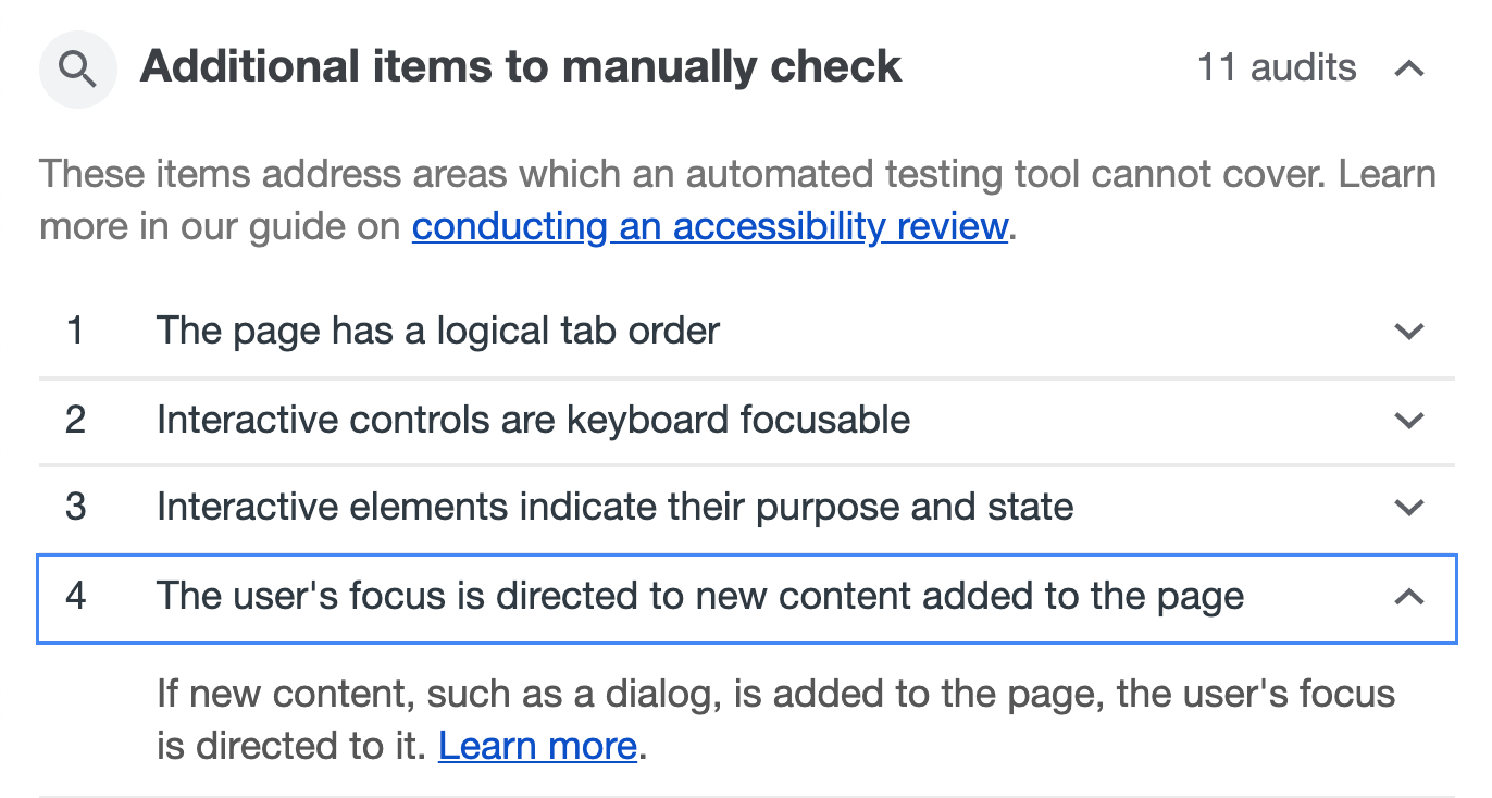
Remember, automated accessibility tools are only able to find some accessibility issues, and manual testing is necessary to ensure full accessibility. Lighthouse (via the Audits panel) suggests manual checks after performing an accessibility audit.

Other news

  • Jeff Jaffe: W3C and WHATWG have reached an agreement to collaborate on the development of HTML. "W3C shall encourage the community ... to contribute directly to the WHATWG HTML and DOM repositories; raising issues, proposing solutions, commenting on proposed solutions, and indicating support or otherwise for proposals."
  • Paul Calvano: "There is a significant gap in the first- vs. third-party resource age of CSS and web fonts. 95% of first-party fonts are older than one week compared to 50% of third-party fonts ... This makes a strong case for self-hosting web fonts!"
  • Rachel Andrew: The CSS subgrid value is a relatively straightforward addition to grid layout. For example, if you have nested grids, and you apply grid-template-rows: subgrid to the child grid, then this grid will use the row tracks of the parent grid instead of creating its own row tracks. That’s all there is to it. (This feature is currently only supported in Firefox Nightly.)
  • GitHub Blog: GitHub can now generate automated security fixes for your dependencies with known security vulnerabilities. On GitHub’s website, check your repository’s Security tab for security alerts. If you open an alert and press the "Create automated security fix" button, GitHub will create an automated pull request that fixes the security vulnerability.
  • Rick Viscomi: HTTP Archive plans to release the first annual Web Almanac in November, a report of the state of the web with interesting insights written by different experts. About 50 volunteers from the web community are currently working on it, and they are looking for more contributors.

The post Weekly Platform News: Favicon Guidelines, Accessibility Testing, Web Almanac appeared first on CSS-Tricks.

Google Updates Mobile Search Results to Include Website Branding

Google is rolling out an update to mobile search results that includes website branding. The new design displays a website’s name and icon at the top of the listing so users can easily scan results. If the result is an ad, it will be indicated in bold next to the website’s address. Below is a before and after look at the visual refresh of the mobile search results page:

image credit: Google

Google automatically fetches a website’s favicon for search results, so most website owners with a favicon already in place should not have to do anything to enable branded mobile search results.

In 2015, WordPress 4.3 added Site Icon support to the Customizer, so users do not need to rely on a plugin to upload a favicon. WordPress stores the icon so that users do not have to upload it again when switching themes.

A simple, recognizable favicon establishes a visual identity for your site, and Google’s updates to mobile search results should be a strong reminder not to forget one when building a new site. Site owners may even want to spend more time designing the icon, now that a favicon’s usefulness extends beyond browser tabs to lend more authority to search results. The changes are just now rolling out to mobile but will likely be coming to desktop searches in the near future.

Beginners Guide: 26 Most Common WordPress Mistakes to Avoid

When creating a WordPress website, everyone make mistakes. However each mistake is a learning opportunity that helps you grow.

Over the years, we have helped thousands of WordPress users start their websites and blogs. In setting up our own websites as well as helping others, we have learned to avoid some common WordPress mistakes.

It has helped us save time, money, and grow our business more effectively.

In this article, we will share those experiences with you, so you can avoid these common WordPress mistakes.

The goal is to help you learn from other people’s mistakes when making your own websites.
Common WordPress mistakes to avoid

1. Choosing The Wrong Platform

Choosing the right WordPress

The biggest mistake people make when starting out is choosing the wrong blogging platform. Basically, there are two types of WordPress. First, there is WordPress.com which is a blog hosting service, and then there is WordPress.org also which is the famous self-hosted WordPress platform that everyone loves.

You need to start with self-hosted WordPress.org because it gives you access to all the features you need out of the box.

To learn more see our article on WordPress.com vs WordPress.org with a side by side comparison of the two platforms.

2. Buying More than What You Need

To get started with a WordPress website, you need a domain name and WordPress hosting.

The challenge is that a lot of domain registrars try to upsell other services. This confuses the small business owners who are just starting out.

The add-on services may include privacy protection, extra email accounts, security services, and more.
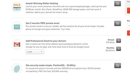
Upselling services

You can skip all of these things and save money to spend on growing your business. If you later decide that you need those services, then you can always purchase them from your hosting company.

You also need to choose the right hosting plan for your website. For 90% of websites that are just starting out, a shared hosting account is quite enough to get you going.

We recommend using Bluehost. They are one of the biggest hosting companies in the world and officially recommended by WordPress.

They are offering WPBeginner users a discount on hosting + free domain and SSL certificate. Basically, you can get started for $2.75 per month.

→ Click Here to Claim This Exclusive Bluehost Offer ←

As your business grows, you can choose to upgrade your hosting plan or move to a managed WordPress hosting company.

For more details, see our guide on the cost of a WordPress website and how to save money when building your website.

3. Not Setting up Automated Backups

Automated backups

Each year billions of dollars worth of damages are caused by data loss. Almost every website on the internet is prone to accidents, theft, hacking attempts, and other disasters.

Your most powerful line of defense against these threats is automated backups. Without a backup, you could lose all your WordPress data, and it would be very difficult to recover it (sometimes even impossible).

We have seen many people lose their entire websites just because they didn’t have an up to date backup.

Setting up backups is extremely easy, and there are excellent WordPress backup plugins available in the market. Once you set up one of these backup plugins, they would automatically create backups for you.

The second part of this mistake is not storing backup files on a remote location. A lot of folks store their WordPress backups on their web hosting server. If they lose their website data, then they also lose the backups.

Make sure that you store your backups on cloud storage service like Google Drive, Dropbox, etc. Backup plugins like UpdraftPlus can automatically do that for you.

4. Not Setting up Google Analytics

Google Analytics

If you want to grow your business with confidence, then you need to know how people find and use your website. That’s where Google Analytics can help.

We recommend using MonsterInsights, the most popular Google Analytics plugin for WordPress. It saves you time during setup, and shows you the stats that matter, right inside your WordPress dashboard.

If you don’t want MonsterInsights Pro, then there’s also a free version of MonsterInsights available that you can get started with.

5. Not Setting up a Contact Form

Contact page

Not setting up a contact form is another easily avoidable mistake that many beginners make. Without a contact form, your website visitors will not be able to contact you, and this can cause you to lose significant opportunities.

You will see a contact page on almost every popular website. It is one of the most important pages every website need to have.

WordPress does not come with a built-in contact form, but there are a lot of great WordPress contact form plugins available that you can use.

We recommend using WPForms Lite which is the free version of the popular WPForms plugin that’s being used by over 2 million websites.

You can see our detailed instructions on how to create a contact form in WordPress.

6. Not Building an Email List
Email list

Did you know that more than 70% of people who visit your website will never come back again?

If you are not building your email list, then you are basically losing money with every website visitor that leaves your site. Converting website visitors into email subscribers allows you to bring back those users to your website.

To learn more about this topic, see our article on why building an email list is important.

You will need an email marketing service to set up your email list. We recommend using Constant Contact because they are one of the best email marketing companies on the market with a very beginner friendly platform.

For step by step instructions, see our complete tutorial on how to start an email newsletter.

7. Not Choosing The Right WordPress Theme
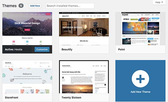
WordPress themes

One of the biggest challenges WordPress beginners face is choosing the right design for their website.

With thousands of WordPress themes out there, an average beginner tries multiple themes before settling for the right one, and this process can even lead the user to rebuild their website multiple times.

To avoid this, we recommend choosing the right WordPress theme from the start and then stick to it.

This allows your website visitors to become familiar with your website, your brand, and its unique style. Consistency and continuity of your design makes a big impact on brand recognition and awareness.

We are often asked by readers, how to choose a theme that just works?

Well, when it comes to design we prefer simplicity over glitter. It has worked really well not just for us, but many successful online businesses.

You need to choose a great looking but simple WordPress theme that pays attention to the following items:

  • It must look equally good on all devices (desktop, mobile, and tablets).
  • It should be easy to customize and flexible to adapt to your needs.
  • It should work with popular plugins and WordPress page builders.
  • It should be optimized for performance and speed.

Now we understand that as a non-techy user, you may not be able to check all those things on your own. In that case, we recommend choosing a theme from a top commercial WordPress theme shop like StudioPress, Themify, or Astra Theme.

If you need more recommendations, then check out these theme showcases where we hand-picked the best WordPress themes in different categories.

8. Ignoring WordPress Updates
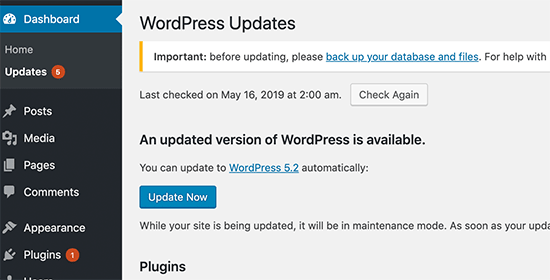
Ignoring WordPress updates

We have seen many beginners and even experienced WordPress users who don’t install updates on their site. Many of them believe that doing so will cause errors and could break their site.

That’s not true.

You can easily and safely update WordPress without breaking your website. By not updating WordPress, you leave your website vulnerable to security breaches while using outdated software.

It’s not just WordPress, your WordPress theme and plugins also regularly release updates for bug fixes, security patches, and new features.

For more details, see our guide on how to safely update WordPress

9. Not Optimizing Your Website for SEO

Optimize WordPress SEO

A lot of WordPress users rely on their best guesses when it comes to promoting their websites. Some completely ignore SEO, while some do it half-heartedly.

SEO (Search Engine Optimization) helps you rank higher in search engines, so more users can find your website.

Search engines are the biggest source of traffic for most websites. SEO is crucial for the success of your online business.

We have a complete step by step WordPress SEO guide for beginners which will help you properly optimize your website for SEO.

10. Not Using Categories and Tags Properly
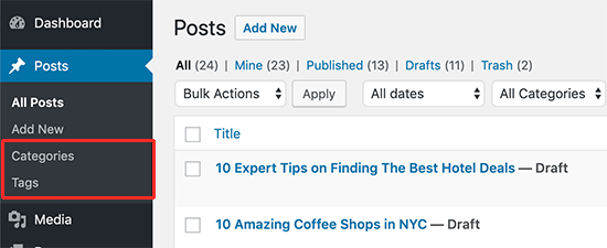
Categories vs Tags

Another big mistake is not using categories and tags properly. Some users end up using categories where they should have used tags and vice-versa.

We have seen websites with dozens of categories and no tags at all. We have seen websites using hundreds of tags and no categories at all.

Basically, categories are your website’s table of contents. If your website was a file cabinet, categories would be its drawers.

On the other hand, tags are like the index page. If your website was a file cabinet, tags would be the labels on individual file folders.

For a more detailed explanation, see our guide on categories vs tags and how to use them properly in WordPress for maximum SEO advantage.

11. Not Using Posts and Pages Properly
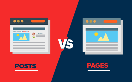
Posts vs Pages - What's the difference?

Sometimes beginner WordPress users end up using posts to create important website pages. Similarly, some users end up using pages for articles when they should have used posts instead.

A lot of users realize their mistake after a while when their website becomes difficult to manage.

Basically, pages are for static pages that don’t change very often like about, contact, privacy policy, etc.

On the other hand, posts are for time-based content like news, updates, articles, and blogs.

Take a look at our complete guide about the difference between posts vs pages and what you can do with them.

12. Not Choosing The Right URL Structure (Permalinks)
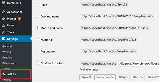
Choosing the right permalinks structure

Selecting the right URL settings (permalink structure) for your website is really important. Changing your URL structure later is not easy, and it can have a significant impact on your website traffic.

We recommend going to the Settings » Permalinks page in your WordPress admin area and choosing a URL structure with that shows your post name in the URL.

13. Ignoring Website Speed and Performance
Website speed and performance

Human attention span is dropping rapidly, and users want instant gratification. With faster internet connections, your users would find a few extra seconds of page load time to be extremely slow.

And it’s not just users, even search engines rank faster websites higher in their results. By ignoring website speed and performance you risk user experience as well as search rankings.

Which is why you need to make sure that your website loads fast. We have a step by step guide that will help you improve WordPress speed and performance without going too deep into the technical stuff.

14. Not Choosing The Right Plugins
WordPress plugins

The real power of WordPress comes with its plugins. There are thousands of free WordPress plugins that you can install with a few clicks.

However, not all plugins are good. In fact, some plugins are bad and could affect your website’s performance and security. Often users end up downloading plugins from unreliable sources that distribute hidden malware.

Here are a few things you need to keep in mind when choosing plugins:

  • Only install plugins from WordPress.org or WordPress companies with good reputation.
  • Look for plugin reviews and support forums because they are a good indicator of a plugin’s quality
  • Check trusted WordPress resources like WPBeginner for plugin recommendations

If you want some recommendations right now, then check out our list of must have WordPress plugins for all websites.

For more information, check out our guide on how to choose the best WordPress plugins for your website.

15. Ignoring WordPress Security Best Practices

WordPress security

Many users do not take any security measures to harden WordPress security. Some believe that their website is too small, and it will not be targeted by hackers.

Hackers target websites indiscriminately. For example, they could use your website to distribute malware, brute force attacks, steal data, and more.

By not securing your website, you can lose search rankings, your website data, and/or customer information. This could cost you a lot of money and headache.

You need to follow the security best practices and build layers of security around your WordPress site. It does not take too much time, and you don’t need any special skills to do that.

Simply follow our complete WordPress security guide with step by step instructions to protect your website.

16. Changing Website URL and Losing All Traffic
Changing domain names

How many of you hated the first domain you registered and wanted to switch away from it when you got serious about blogging? Yup, it happens to all of us.

While you can change the website URL or domain name, it does have a significant SEO impact. What makes matters even worse is when you switch URLs without taking proper steps.

You need to set up proper redirects, inform Google about the change, and add the new domain to Google Search Console.

We have described all the steps in our guide on how to properly move WordPress to new domain.

17. Not Removing WordPress Demo Content
Remove demo content

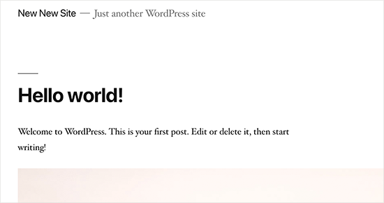
A lot of people don’t delete the default demo content added by a new WordPress install. This includes a sample page, a post titled ‘Hello World’, and a default comment.

Not removing this content allows search engines to crawl and index them. Now if you search for the text in demo content on Google, you’ll find hundreds of thousands of pages. That’s duplicate content and search engines penalize duplicate content as low-quality pages.

Similarly, many people don’t change the default WordPress tag line that says ‘Just another WordPress site’.

You need to delete all default content and the tag line, as they look unprofessional and create a bad impression.

18. Not Setting up Comment Moderation

Moderating comments

Comment spam is annoying and can make your brand look bad. Many beginners have their blogs set up to automatically publish all new comments without moderation.

This means spam comments with links to malware and low-quality sites can go live on your website without your knowledge. This could damage your search rankings and your website’s reputation.

You need to always keep comment moderation turned on for all your WordPress sites. Simply go to Settings » Discussion page and check the box next to ‘A comment must be manually approved’ option.
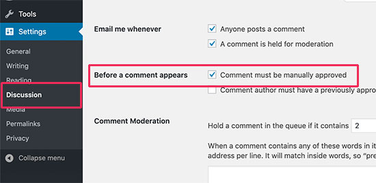
Manually approve comments

After that, you need to make it part of your routine to check and approve comments on your website. For more tips, see our article on how to combat comment spam in WordPress.

19. Not Optimizing Your Images for Web
Compress images

Images are essential in the making of a highly engaging website. However, they are also heavier in filesize than plain text.

If you are adding images to your website without optimizing them, then this would affect your website speed.

You need to make it a habit of saving your images as optimized for the web. You can use Photoshop, GIMP (free), or other online tools to reduce the image file size before uploading it.

For instructions, see our tutorial on how to save images optimized for the web.

20. Saving Unnecessary Code in Theme’s Functions File
Code snippets

Another common mistake that we often come across is when folks add too many code snippets in their theme’s functions.php file.

Functions file is designed to behave like a plugin, but it is not the ideal place for all types of code snippets. You will lose these modifications when you switch the theme. You may even forget that you added some code in there after a while.

We recommend only adding code in your theme’s functions file if the code is related to changing something with that particular theme.

For all other custom code, it is better to use a site-specific plugin or the code snippets plugin.

21. Getting Locked Out by Editing Functions File in WordPress Admin Area
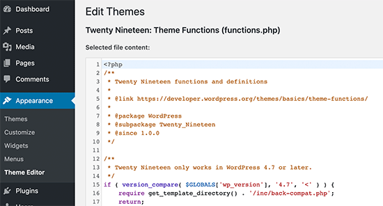
Theme editor in WordPress

Another annoying mistake that is quite common is when folks edit functions file inside the WordPress admin area.

By default, WordPress comes with a built-in code editor to edit theme and plugin files inside WordPress. Often beginners end up breaking their website when adding or removing code using those editors.

Even though WordPress added functionality to catch fatal errors and not save them. You could still lock yourself out and make your website inaccessible.

We recommend disabling theme and plugin editor in WordPress and use FTP to edit files in WordPress.

22. Not Setting Up Google Search Console
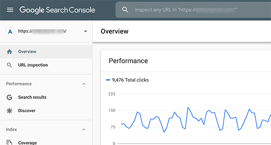
Google Search Console

Data is really important when planning a strategy to grow your business and website. Many users make the mistake of not adding their WordPress site to Google Search Console for a long time.

This means they miss out important search data that could help them grow their website.

Google Search Console is a free tool provided by Google. It allows you to see how your website appears in search results and fix any search indexing problems quickly.

See our complete Google Search Console guide to see how you can use it to improve search rankings and grow your business.

23. Using Uncategorized as Default Category
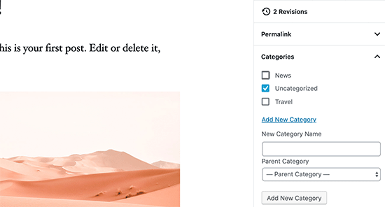
Uncategorized category

A lot of folks leave Uncategorized as their default category. WordPress requires all posts to be filed under a category and when no category is selected, it automatically adds the post under default category.

Many times users forget to select a category for their post and hit the publish button which publishes that post in Uncategorized.

This mistakes can be easily avoided by choosing a proper default category in WordPress settings.

24. Not Using a Professional Branded Email Address

Free business email address

We have seen many folks sending us emails from their Gmail or Hotmail accounts while pitching for a business that already has a website.

Now, how do we know for sure that they are officially representing that company or website?

Similarly if you have a business, and you are still sending people business emails from a free email account, then people will have a hard time taking you seriously.

People do not have the time or skills to verify that you are the actual owner of that website or business.

This mistake is also easily avoidable. See our guide on how to easily get a professional business email address for free.

25. Leaving a Site Public While Working on It

Maintenance mode

People often leave under construction websites publicly accessible. This is not very professional and can harm your business.

A publicly accessible website can be automatically crawled and indexed by search engines anytime. Your competitors can find it and steal your ideas. Your customers can find it and see the unfinished website.

There is an easier solution to avoid this mistake. Simply put your website in maintenance mode and add a coming soon page to build anticipation.

26. Not Learning WordPress

Learn WordPress

WordPress is very easy to use even for non-technical users. This allows many users to keep running their websites without learning more about WordPress.

By doing so, you miss the opportunity to explore the incredibly helpful features of WordPress. Things that are very simple to implement but could transform your business.

Learning WordPress is quite easy, particularly when you already have a running WordPress site. Explore different sections of WordPress, try out new plugins, learn more about SEO, and email marketing.

WPBeginner is the largest free WordPress resource site for beginners with tons of awesome resources, videos, how-tos, step-by-step tutorials, and more.

Following are just some of the helpful resources you’ll find on WPBeginner (all of them are completely free).

  • WPBeginner Dictionary – The best place for beginners to start and familiarize themselves with the WordPress lingo
  • WPBeginner Videos – New to WordPress? Watch these 23 videos to master WordPress.
  • WPBeginner Blog – The central place for all our WordPress tutorials.

You can also subscribe to our YouTube Channel where we regularly share video tutorials to help you learn WordPress.

We hope this article helped you learn about common WordPress mistakes and how to easily avoid them. You may also want to see our tips on effective ways to increase your website traffic without spending too much money.

If you liked this article, then please subscribe to our YouTube Channel for WordPress video tutorials. You can also find us on Twitter and Facebook.

The post Beginners Guide: 26 Most Common WordPress Mistakes to Avoid appeared first on WPBeginner.