Warner Bros New Logo Design and Identity – Honest Thoughts?

Warner Bros.


Don’t those two words just spark loads of childhood memories for you? 


Anyone else?


Harry Potter, Lord of the Rings, Friends, and basically all good movies/shows ever!


I gotta be honest, I really didn’t know how to feel when I heard about the brand new logo and identity that WB was going for.


And after looking at it and letting it sink in, I think I can properly voice my opinion. 


But first, let’s get into a brief history of WB Studios. 


A Brief History of the Warner Bros Studio


Warner Bros has been around since 1923 and is surely one of the most well-known entertainment companies ever.


 With great, recognizable shows and movies like The Big Bang Theory, The DC Universe, Harry Potter, The Lego movie and loads and loads more, the library has more than 100,000, let me say that again, 100,000 hours of programming.


Not only do they have movies and tv shows, but they also have, as you probably know, comics books, video games that we all know and love. 


And now that they’re coming up on their centenary, they are celebrating with a brand new logo. 

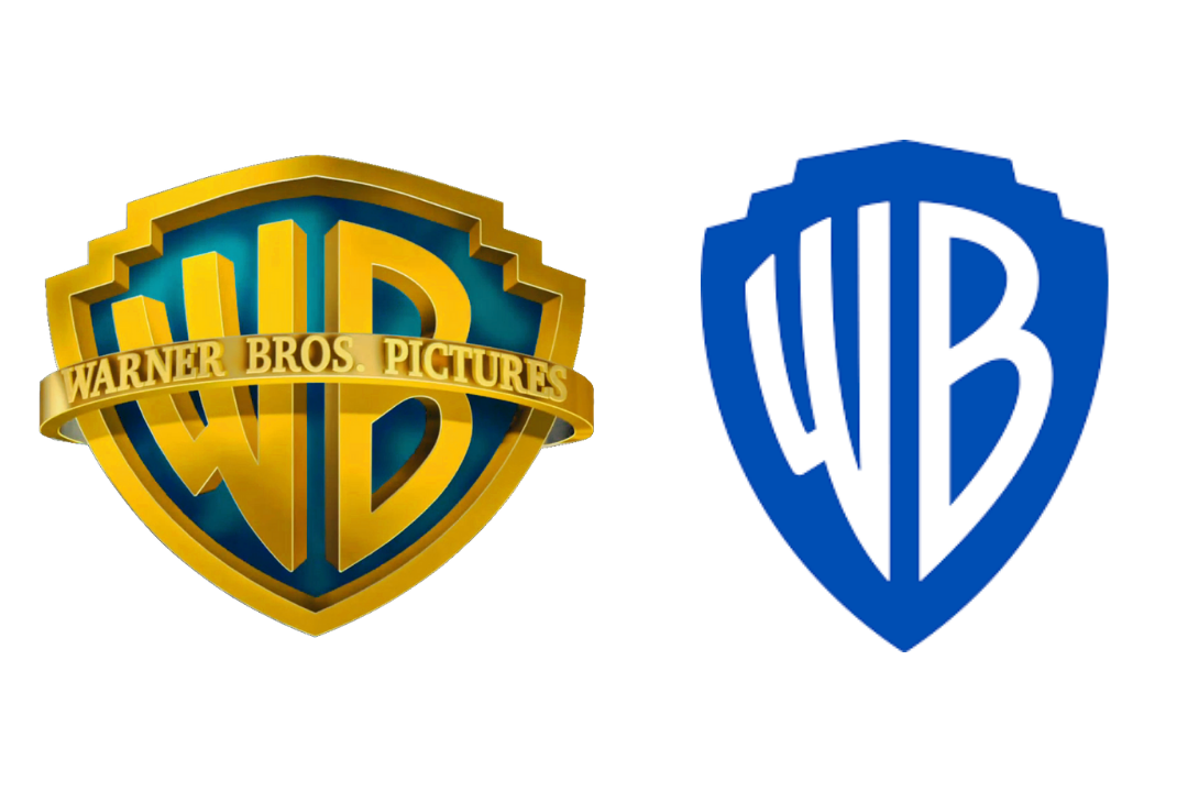
Out with the old and in with the new. 


We can thank Pentagram for this new design that will suit all branches of the studio. 


Keeping many of the same, iconic elements of the original logo, we can look at this rebranding as kind of a great make-over, rather than a brand new reinvention of the logo.


Vice president of public affairs and worldwide corporate communications, DeeDee Myers, said that the “visual identity looked a little dated.


And that’s where Emily and her team came in. 


Emily Oberman, who headed up the redesign team, said she wanted to keep the original and iconic shield, but make it “more sleek and clean”. 


Here you can see the process of the redesign.


Instead of looking at the old logo as dated and needing an entirely new look, they kept the original elements and just kind of gave it a pick-me-up. 


By just making some simple changes and tweaking things here and there, a whole new design came out of the process. 


Even though the changes may have been small, they were able to maintain the original identity of the logo and brand, while giving it a whole new look.


The team said that they wanted the new logo to give people a sense of WB Studios moving into the future with us. 


While the shield has suffered a few changes, it was vital to the team and WB Studio that it was still easily recognizable to all fans and viewers. 


And I truly believe they were able to do just that.


It is more sleek and clean, just like they wanted. 


The shield was put into a golden ratio and thinned out a bit, and the letters were redrawn to give it a better sense of balance.


The iconic blue color of the WB Studios Logo was made more modern by brightening it just enough.


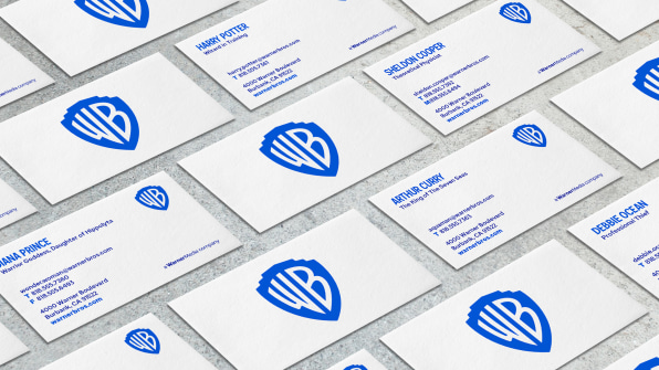
With this new logo came room for variation. 


This new logo needed to fit across all platforms and needed to look natural. 


The new logo can be modified to fit any occasion, or as DeeDee Myers liked to call it, logo soup. 


This logo comes in two different variations. A flat version, and a more dimensional version. 

This logo needs to fit any movie, show, comic book, etc, and that’s why it is so important that it can be easily modified to fit any occasion, while simultaneously keeping that originality and recognizability. 


Myers told us that “There is a tremendous ability to play with it and bring it to life.”. 


And that’s what Emily Oberman and the team were going for when they said, they wanted the logo to be “contemporary, while also being able to be used as a sponge for any story they wanted to tell,”. 


Amongst the two new design variations of this logo is also a new font. 

Warner Bros Sans is an original font that came from the original shield of the logo and was inspired by the 1920s Art Deco. 


By doing this, Oberman said that the brand would still be present through the custom font, even if the shield was not there. 


“We’re excited about refreshing the brand,” says Myers, “connecting it to the past, but with eyes firmly ahead.”


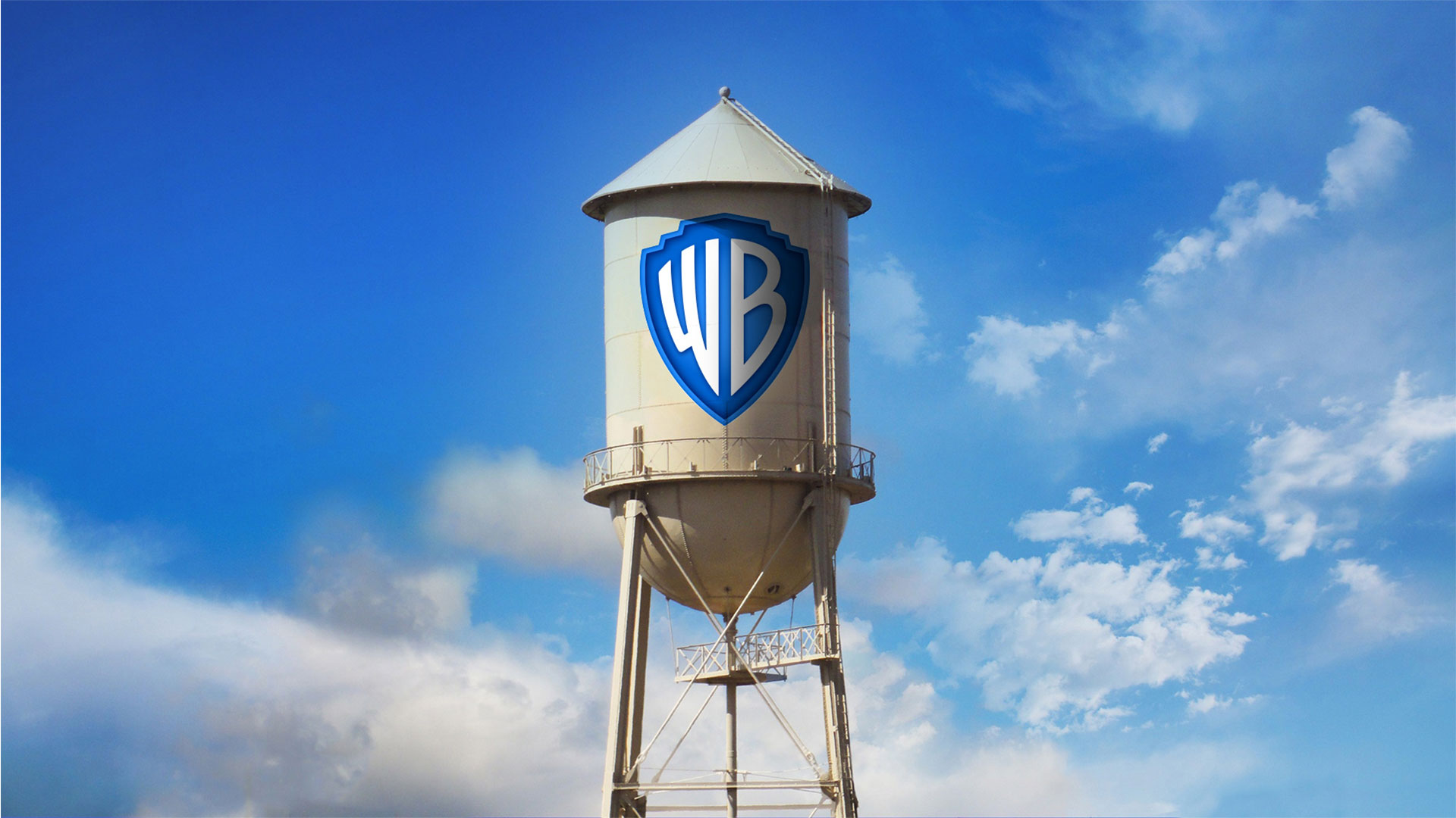
This project that took 3 years to complete is finally here, and it’s here to stay. 


The new logo is on the iconic water tower located on the WB Studio lot, and will soon be everywhere, from literature to social media, to big screens and on the sides of trucks.

We’re curious what you think about the new logo redesign that Warner Brothers Studio went through.


Are you a fan? Will you be missing the old logo? 


Let us know all of your opinions in the comment section below.


Until next time,


Stay creative, folks!  


Read More at Warner Bros New Logo Design and Identity – Honest Thoughts?

The Ultimate Collection of Free Christmas Design Resources

gift boxes free design resources for Christmas

With Christmas coming up very soon, you might be swamped with Christmas-themed designs.


Everyone wants to get their job done as efficiently and quickly as possible. 


That’s why I collected loads of free Christmas design resources for you.

Everything from free Christmas icons to free Christmas PNGs, vectors and images, I’ve got you covered. 


You’ll be “sleigh-in’” it this winter season with all these free Christmas design resources, let’s get right into it.


Free Christmas Icons


Last week I wrote The Ultimate Collection of Design Resources that you should definitely check out for your day to day use. 


But today, we’re talking all about free Christmas design resources.


Having some free Christmas icons will surely save you lots of time, so you don’t have to start from scratch. 


3Here is my pick of free Christmas icons that you can use. 


Flaticon

free christmas icons

Flaticon has lots of free Christmas icons for you to use for any of your Christmas projects that are coming up.


 It’ll save you lots of time, and the fact that hundreds of these icons are free will help you save a buck as well! 


Upgrade to premium in order to get thousands of icons! 


Freepik

free christmas icon design

Freepik will help you spread tons of Christmas cheer with their hundreds of free Christmas elements. 


They have flat designs and 3D designs alike in their Christmas icons. You don’t want to miss out! 


Vecteezy

free vectors for christmas holidays

Vecteezy has lots of color and happy icons for you to use for free. 


Just choose the ones you like, download, and use to your liking! 


Free Christmas PNGs


Make your clients happy with the best Christmas PNGs out there. 


Here are my top favorite free PNG websites that will certainly help you out this season. 


Pngtree

free pngs for christmas

Pngtree is great for everyday use but especially has some great Christmas PNGs. 


Their quality has never once disappointed me.


The only downside to their site, in my opinion, is that you only get 2 free PNGs a day.


So choose wisely, or consider upgrading to a premium account! 


Pngfly

free christmas png icons and images

Pngfly has over 20,000 free resources for you to use this Christmas. That’s definitely not an offer you want to miss out on.


Pngmart

free pngs for christmas desgin

Pngmart has tens of pages for you to browse through when looking for the perfect free Christmas PNGs. 


Check em out!


Free Christmas Vectors


Vectors are a huge part of graphic design, so it’s only right that we go over the best websites with the best free Christmas vectors that the internet has to offer.


Let’s do it.


Vexels

free vectors for holidays and christmas

Vexels has some of the best vectors I’ve laid my eyes on. Colorful, cheerful, perfect for Christmas. 


If you’re looking for great free Christmas vectors, then you definitely need to check them out!


Vectorstock

free christmas vectors design

But wait—there’s “myrrh”. Vectorstock has over 13,000 free Christmas vectors for you to use!


Vector4free

free vectors reindeer christmas holidays santa

Vector4free is a great choice for using in your everyday designs, but not only.


They have lots of Christmas vectors for you to choose from, so I recommend you get to it! 


Free Christmas Images


Christmas images will give a warm, homey feel to any project. 


If you don’t have a camera or time to take any Christmas pictures, definitely give these free Christmas stock images websites for your work! 


Pexels

free christmas stock images

Pexels is definitely one of my personal favorite stock images websites. 


They have lots of high-quality images from great individual photographers.


 And if you want to, you can support the artist, by donating to them! 


Pixabay

christmas stock images for free

Pixabay has loads of photo choices for you to choose from.


With over 20,00 free images solely dedicated to Christmas time, you’re bound to find the photo you’re looking for.


Unsplash

free images for christmas holidays

And finally, we have Unsplash


Unsplash has tons of Christmas photos for you to choose from, that are extremely festive.


Check out their site and find all your Christmas photo needs there! 


“Wrapping” up


Well, you guys snow the drill. This is the end of our time together.


I hope you found these design resources helpful! 


Until next time,


Stay creative, folks!


Read More at The Ultimate Collection of Free Christmas Design Resources

The 10 Elements of Every Great Logo + 10 Logo Examples

When establishing a brand, you should never put your logo on the back burner. 


If your logo doesn’t represent you well or it looks unprofessional, then your customers are going to bounce, leaving your business to plummet. 


We’re going to go over the 10 elements of every great logo, that you can implement into your logo design. 


Let’s get straight into it. 


1. Memorable


The first, most important element of every great logo is that it’s memorable. If your logo isn’t memorable, then you’ve got a huge problem. Because people won’t remember who you are, what you offer, and you won’t come to mind in the future when they need the product you have to offer. 


Being memorable is key. Make an original first impression on people so that they’ll always remember you when they need to. 


2. Simple


A good logo is simple. If you have a great design, then it doesn’t need to be super intricate. Yes, get all the little details and hidden images in there. That’s amazing, but it should still, in its essence, be simple and easy to grasp.


3. Easy to understand


This goes hand-in-hand with simplicity. If your logo is so complicated that no one understands it, then you’ve done something wrong. Your logo shouldn’t need a huge in-depth explanation of what it represents and means. Of course, your logo can have some subliminal messages and hidden images, but it shouldn’t be so hidden that people awkwardly say “oh… okay”.


So make sure your logo comes across well, is creative and original, but also is easy to understand.


4. Recognizable


You want to be easily recognized. On the street, in the store, online- people should see your logo and go “Hey! I know that brand.” This is just as important as memorability. If people don’t remember who you are and don’t recognize you, then your company is going to die. That’s that. 


So make sure you’re recognizable, make a statement, and are memorable.


5. Timeless


How terrible if you work months and months on your logo and company, and you fall into some crazy fads, and next year your company logo looks a little bit crazy. You definitely want to follow some great trends, but make sure that your company logo will look just as good this year as it will the next five. 


6. Scalable


Your work should look good, big or small. Whether you’re being displayed on a tiny little RDA or a giant billboard in your town. This also means that you need to have a high-quality logo design, so when you blow it up or scale it down, it looks just as good, quality-wise. 


7. Relevant


Ask yourself when designing your logo, “Why this logo design? What does it represent for me?” If your logo doesn’t describe what you’re doing and isn’t relevant to your brand… then you may be doing something wrong. You want to make sure people understand why your logo is the way it is, and you want to make sure that your target audience will vibe with it. 


8. Attention-grabbing


You’ll want your logo to turn heads. When some3one is walking by and sees your logo, you’ll want them to stop for a minute and dedicate their full attention to you. For this, you can have a cool geometrical design or some bright colors. As long as your intricate design is memorable, relevant and attention-grabbing. 


9. Be Different Than Your Competition


The worst thing you can be classified as, if you want to be a reputable company, is a knock-off. If you’re trying to have your own company, then for the love of all things good, don’t copy your competition. Yes, be inspired by them, but don’t try to be exactly like them. Look at them, take some notes, and move forward and do better. You’ve got this! 


10. Don’t be afraid of change


Everything evolves, and that means your company logo will evolve as well. Maybe not this year or the next, but somewhere down the road, you’ll need to make adjustments to make your customers happy. So don’t be set in stone, afraid to change. Change is good and should be embraced. 


And Finally


Be yourself and have some fun when designing your company brand and logo. 


Let us know in the comments what some of your personal tips are when it comes to designing a logo.


Until next time,


Stay creative, folks! 

Read More at The 10 Elements of Every Great Logo + 10 Logo Examples

The Best Packaging Design Ideas for 2019 You Need to See

sofias tea packaging design ideas

Your product could be the most amazing and useful product in the world, but if your packaging is not on point, then your entire business could be in some major trouble.

Imagine this scenario: You’ve designed the best product in your field, invested all of your funds into creating the product, and put packaging design on the back burner. You get on a free mock-up website, make something in an hour, call it day, and show it to your investors. 

Terrible idea. 

juice summery packaging ideas

In my personal opinion, you should put just as much effort into the packaging design of your product as you put into the product itself.

According to science, it only takes a person 1/10th of a second to create or form an opinion about someone or something. That gives you literally not even one second to give someone a great first impression. 

The first thing your potential customer is going to see is your packaging. And you better hope to goodness that you’ve aced your first impression and wowed your target audience with your packaging design.

Best Packaging Design Ideas for 2019

I’ve rounded up 20 of my favorite packaging designs for you to be inspired by for your next design project.

Let’s check em out!

1. Mint

mint pastel color packaging design

[source]

This face wash for men is so simplistic in its design that it’s easy and enjoyable for the eye to look at. The black color of the face wash gives off tones of luxury and the pastel colors on the box, combined with flat design, simply works for this packaging. 


2. Care Market

care-market-pt2_5_2x packaging design pastels

Continuing on with the pastel trend, we have Care Market packaging design. The palette they chose here is lovely, as pastels have been all over the place this year. The consistency in font usage is just perfect, using only two different fonts and using dividing lines between each new phrase. 


This packaging design shows us that you don’t need elaborate graphic designs to exude elegance and professionalism. All you need is a great color palette, and nice, coinciding fonts. 

3. Botany

botany-hemp-packaging-design

[source]

Less is more, as the saying goes, and botany nailed it. Minimalist, flat design is the key here and with three different color schemes that all complement each other, I can wholeheartedly say, I believe this design will catch the eye of anyone who is looking for a high-quality serum. 

4. Roji

roji juice packaging design

When someone is looking for a healthy drink, they’re going to be looking for sleek, professional fonts that look organic. My favorite part of this packaging design is that the designer thought through the choice of font colors. 


Since the bottle is made of glass, you’ll be able to see its contents and the yellow font matches the beverage inside the bottle. The yellow-colored font perfectly complements the contents of the bottle. A simple, well-thought-out packaging design overall.


5. Sophia’s Tea

sofias tea packaging design ideas

Stepping out a little bit from the pastel color palettes and into something a little bolder, we have Sophia’s Tea packaging design. Flat design really has taken the lead in 2019. We see it all over the place. And luckily for us designers, it makes our job a little easier. 


What I appreciate about this design is that the name of each drink matches the design of each recipient. The color scheme on each bottle matches each other, making a buyer recognize the brand, if they were to see each bottle on a shelf in a store. 

6. Juice.

juice summery packaging ideas

Since we’re on a drink roll, check out this summery packaging design for juice. Again, we’re hit with flat design and beautiful colors. The font sticks out perfectly on the foreground of the design. Juice. Simple, clean, clear, and to the point. 

7. Brightland

brightland_packaging ideas

I’ve never seen an olive oil packaged quite like this. At first glance, you would wonder what this beautiful bottle is doing in the oil section. 


You’re inclined to pick it up, you read that it’s olive oil, you’re shook, you compare prices between this and another oil, you realize it’s the same price, and naturally you buy the more beautiful packaging design of the two products. Hit people with original, innovative designs and you’re sales will skyrocket. 


8. Mayberry Spirit Co.

mayberrylables_2x packaging whiskey ideas

[source

This bottle makes me want to have a nice, classy night at home with all my friends. The vintage font works beautifully with the design of the bottle, and I love that the color schemes match the rich color of the whiskey itself. 

9. Gatorade

gatorade_iconoptions_packaging_design

Here are some rebranding sketches for Gatorade. Simple design that gets across, yet still embraces the originality of the Gatorade logo. You won’t lose any brand recognizability, and it looks more modern.


10. The Restored 

the-restored-packaging design for vitamins

The packaging design for these vitamins is everything. The manly, muted earth tones will remind a person of organic produce, making them trust your brand even more. Color association is very important when it comes to designing your packaging and establishing your brand, so choose wisely! 


11. The Restored

the restored womens vitamins packaging design ideas

Here’s a second version to Restored vitamins. This packaging design is a touch more feminine, using a more pastel green, and creating more dimension in the background by using two different colors. The pop of orange in the corner brings the eyes to the directions.


12. American Crew Fragrance

american_crew_fragrance packaging ideas

This simplistic design is one way on the box and reversed on the bottle. By using one font, they really had to play with the scaling and spacing of letters and words to make it interesting and captivating. Again, packaging design can be simple and just as engaging as a super complicated design.  


13. Roys Morning Serum


roys morning serum packaging ideas and design

Roys morning serum has two beautiful colors: a muted pink and a relaxing gold. Color association is everything. If you can convince your customers that your product is what they need and you really sell your product by having a luxurious packaging, you’ll have clients talking about you for days. 


14. Zinus

zinus-packaging-design box


You can recognize an eco-friendly package design from a mile away, and most people are becoming very concerned and aware of their consumerism and trash contribution to the world. Using a bio-degradable packaging or using recycled material will help you loads when it comes to sales. And you’ll be helping the world. It’s a win-win.

15. Mapuche Maqui

Sometimes, making healthy choices isn’t the easiest or most fun, so presenting a fun looking health product can be key in your sales. This berry powder packaging design looks fun and friendly, used flat design, a beautiful color palette, and bold font. With all these elements combined, surely it’ll catch the eye of a customer. 


16. Botanical Coffee Co

This coffee design is so relaxing to look at. The intricate design on the sides, the simplicity on the front, and the choice of font combinations are just lovely. Again, going with flat design and pastels. See the pattern? 


17. Publix Cereal Line

magic star snack packaging for kids

Did you know that the color red increases your appetite significantly? The designer here for kids cereal certainly knew what they were doing. By combining real-life elements and flat design, kids will surely be intrigued by this design and be inclined to beg their parents for the cereal. 


18. Coffee

easy_on_the_eyes_coffee packaging desing

This coffee packaging is so bright and captivating, yet still has colors that are easy on the eyes. When choosing your color palette, you need to be sure that you’re choosing colors that soothe and colors that people want to look at. And of course, brand colors that represent you and that your audience will enjoy. 


19. Tesco Fish

fish packaging branding design

Check out these “fishy” illustrations! What I really enjoyed about this packaging design was the fish. I love the very finely defined, cut-off design of the fish, and then the can and text. Each fish is design to represent its kind, and I find this design very creative, colorful, and appetizing. 


20. Moon 

And finally, we have Moon Night Cream. Notice how to colors and graphic designs represent the night. So simple, clean, and fresh-looking that you actually can’t wait to use this cream tonight before bed.


Wrapping things up 

As we all know, packaging is everything when it comes down to actually selling your product. Make sure your design represents you, your brand, and your product, and is creative and makes people feel like they need what you have to offer, in their lives. 

I hope you found this article inspiring and you’re more than ready to jump into your next design project.

Until next time,

Stay creative! 

Read More at The Best Packaging Design Ideas for 2019 You Need to See