I don't care about religious wars over "which logger is the best". They all have their issues. Having said that, the worst logger is probably the one built "in-house"... So yes, they suck, but re-inventing the wheel is probably far worse.
Let's discuss making these loggers suck less with proper usage guidelines that range from the obvious to subtle. Hopefully, you can use this post as the basis of your company's standard for logging best practices.
When it comes to locating files or directories on your system, the find command on Linux is unparalleled. It's simple to use, yet has a lot of different options that allow you to fine-tune your search for files.
Read on to see examples of how you can wield this command to find anything on your system. Every file is only a few keystrokes away once you know how to use the find command in Linux.
5
Critical Elements that Can Make or Break Your Design
At first glance, designing a one-page
website would seem to be intuitively easy. Especially, when compared to
building a multi-pager. Designing one page takes one-third the effort of
designing three pages – right?
In reality, designing a single-pager is
generally much more difficult. The challenge you face is having to get all the
necessary information on a single page. At the same time, you need to make sure
the page is both visually appealing and user-friendly.
This guide for designing one-page websites
is centered around 5 critical elements. Depending on how well you take them
into account they can make or break your design.
As we outline each of these critical
elements, we’ll provide examples. They will illustrate their importance – 15
examples in all.
#1
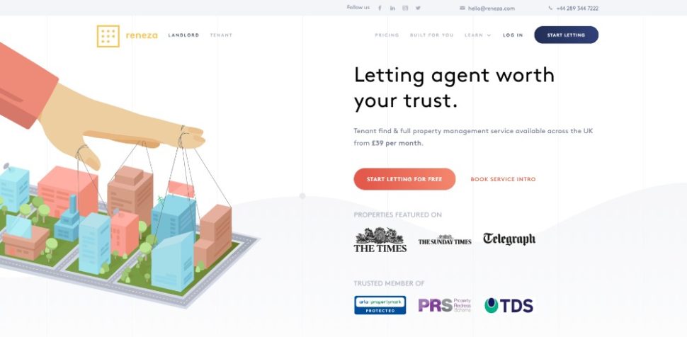
The GOAL: Identify & Understand the Goal of Your Website & Work Toward
It
You might not understand perfectly what you
expect your website to accomplish. Then, there’s little sense in proceeding
with its design. It needs to have a single goal. Your design needs to take the
user on a journey that reaches that goal and responds accordingly.
Is the goal to promote or sell something?
Is it to invite a visitor to view your
portfolio?
Do you intend to announce an event or a
series of events?
Once you’ve identified the goal, you’re
almost halfway there. You still need to take into account what you need to do.
You need to avoid chasing visitors away from the page before they hit the CTA
button.
Some users are sensitive to page load speed
(more than a few are oversensitive!). So, you might choose to avoid special
effects (like parallax) that tend to reduce page load speeds.
You don’t need a detailed technical dissertation
to promote an app when a cool visual presentation will do the trick.
#2 TEXT: Keep It to the Minimum & Make It Easy
to Read
A one-pager
featuring clunky blocks of text or reads like a book is going to engage
visitors for a second. Sometimes, even less before they head elsewhere. Keep
text brief and in nicely-spaced sections. Strip the information down to its
bare essence.
Rely on bold
headlines, brief paragraphs, and bullet lists to make your point.
Here are several examples worth bookmarking
for future reference:
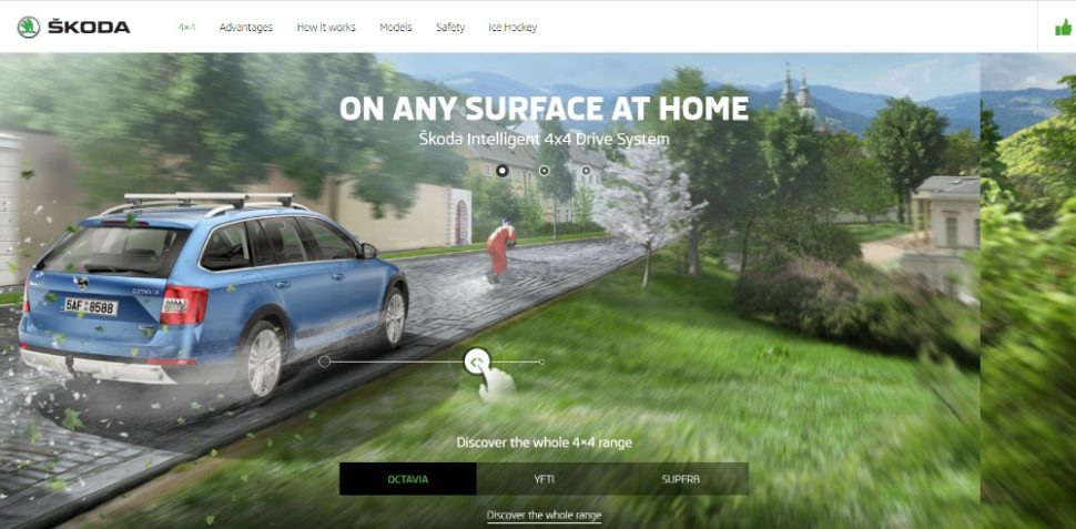
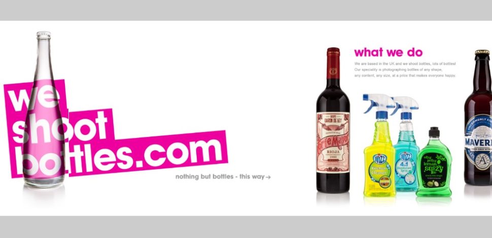
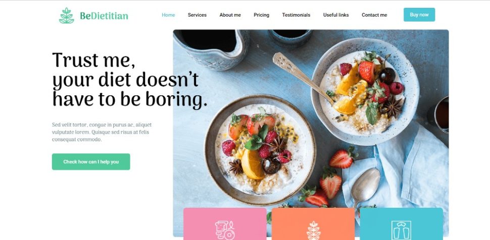
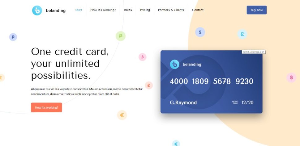
When a vehicle has the stature of a Mercedes,
high quality images accompanied by a minimal amount of text is often
sufficient.
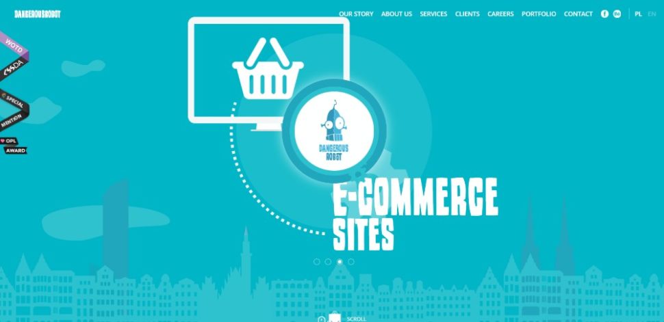
#3 VISUALS: Identify the Right Patterns & Use Negative
Space Wisely
Knowing how most people will scan a page is
helpful. People tend to read text in an F pattern and scan an image in a Z
pattern. Keep this in mind when you mix elements. You want the natural flow of
the information to be directed toward your goal. Wise use of white space can be
helpful.
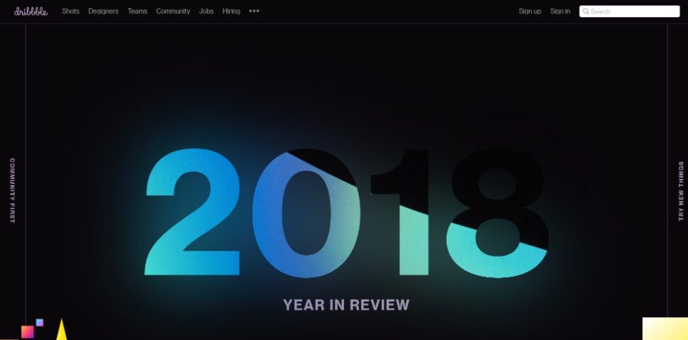
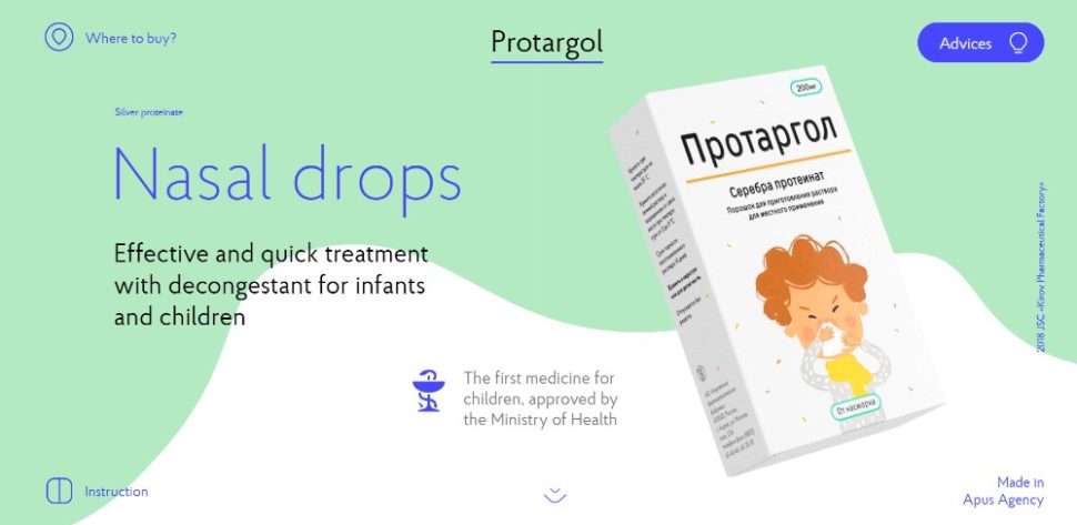
Not a particularly exciting subject for a
one pager is it? This ingenious use of slides, white space, and animations
actually succeeds in making a nasal drops one-pager exciting.
#4 NAVIGATION: Make It Easy to Navigate & Entertaining
to Scroll
When
you have a long-form one-page website you have to pay close attention to how
you manage navigation. Depending on your approach, you can keep visitors locked
in or chase them off the page.
Alternative navigation is the key here.
Horizontal sticky menu or a sidebar menu are examples. Your goal should be to
enable users to jump to where they want to go with a single click, as opposed
to scrolling. Auto-scroll links enable visitors to watch the page do the
scrolling. This is yet another approach.
These folks really want to help you
navigate their site quickly by provided a menu on the top and one on the left.
#5 CALL TO ACTION: Identify the Correct CTA & Don’t
Hesitate to Use It
What’s nice about
a one-pager is its aim is to get people to take a single action. This normally
would involve using a single CTA button. You also might be selling several
products or services, however. Then, you may want to place a CTA button at the
end of every major section.
This site doesn’t fool around with its use
of CTA buttons. They’re used judiciously however; and with a proper choice of
colors and text sizes.
Wrapping
It Up
Now you know the 5 critical one-page
website elements. It’s simply a matter of practicing with them until their use
becomes habitual.
They may seem simple at first. Once you
start mixing them in a one-pager and attempt to do so with consistency you’ll
find it can be quite a challenge.
The good news is there’s a shortcut. Try
using pre-built websites that have already incorporated these critical
elements.
A good pre-built website resource is Be Theme It has an impressive library of more than 60 one-pagers, and 400+
pre-built websites of all kinds. Simply choose a pre-built website and
customize it to fit your needs.