How to Easily Add Emojis in Your WordPress Blog

Do you want to add emoji support to your WordPress blog?

Using emojis in WordPress is super easy because WordPress has built-in emoji support. You can use emojis in WordPress anywhere without installing any separate plugins.

In this article, we’ll show you how to easily use emojis in WordPress on different devices.

Easily add and use Emojis in WordPress

What are Emojis?

Emojis are tiny image icons that can be used in line with text to express emotions and other expressions.

Using emojis on the web

Emojis came from the textual representation of facial expressions in online communications. In the early days of the internet, text and punctuation were used to represent facial expressions, and these were called smileys.

Gradually, this evolved into graphical representations of those expressions. They were called several names Emoticons, Emojis, Twemojis, and more.

They have been around since the late 90s and were gradually adapted by different platforms on the web and mobile devices.

WordPress added support for modern emoji characters in WordPress 4.2. Before that, you needed a separate WordPress emoji plugin to add emoji on your WordPress website.

That being said, let’s look at how to add emojis in WordPress.

Using Emojis in WordPress on Windows

Simply edit the post or page where you want to insert emojis. In the WordPress content editor, click on a text area and then press the Windows + . (Period) shortcut keys on your keyboard.

Adding emojis in WordPress on Windows computers

This will bring up a popup showing emojis. You can search for emojis you want to use or browse them.

Once you have found the Emoji that you want to use, click to insert it into the text area.

Using Emojis in WordPress on Mac

Once again, you need to edit the post, page, or any other text edit area on your WordPress blog.

Click to ensure the cursor is inside a text area, and then press the Command + Control + Space keys together.

Inserting emojis in WordPress on a Mac computer

This will bring up a popup where you can browse and look for emojis. Once you find the emoji you want to use, you’ll need to double-click to insert it into your text.

Using Emojis in WordPress on iOS and iPadOS

If you are working on your WordPress website using iPhone or iPad, then you can easily switch to the emoji keyboard on your device to add emojis.

Simply login to WordPress on your iOS or iPad device. Edit the post or page where you want to use emojis and tap on a text area. You’ll now see the native keyboard appear on screen.

Emoji button in iOS

Now tap the Emoji button to switch to the Emoji keyboard. Your device will show emojis that you can add.

iOS emoji keyboard

You can browse emojis by category or search for an emoji icon. Once you have found the emoji, simply tap to insert it into your post.

You can then tap on the ABC button to switch back to the text keyboard.

Using Emojis in WordPress on Android

Android phones and tablets also come with built-in support for emojis.

Simply edit the WordPress post or page where you want to use emojis. On the edit screen, tap on a text area and your device’s native keyboard will appear.

On the keyboard, tap on the Emoji button to switch to the Emoji keyboard.

You’ll now see the emoji keyboard where you can search or browse to find the emoji that you want to add.

Android Emoji keyboard

Simply tap on the emoji to add it to your WordPress post.

You can switch back to the text keyboard by taping on the ABC button.

How to Disable Emoji in WordPress

You can turn off Emoji support in WordPress by using the Disable Emojis plugin. For more details, see our step by step guide on how to install a WordPress plugin.

Disable Emojis plugin disables Emoji functionality in WordPress. However, you can still add emojis in all modern web browsers.

The plugin only disables the DNS prefetching of emojis within WordPress. This is done to improve privacy and make a WordPress website more GDPR compliant.

We hope this article helped you learn how to use Emojis support in WordPress. You may also want to see our beginner’s guide to WordPress keyboard shortcuts or see our pick of the most useful WordPress plugins for all websites.

If you liked this article, then please subscribe to our YouTube Channel for WordPress video tutorials. You can also find us on Twitter and Facebook.

The post How to Easily Add Emojis in Your WordPress Blog first appeared on WPBeginner.

WordPress 5.8 Adds Support for New Emoji Introduced in Twemoji 13.1.0

In the upcoming 5.8 release, WordPress is updating its version of Twemoji, Twitter’s open source emoji library that supports the latest Unicode emoji specification. Version 13.1.0 introduces five new smileys and emotions, including heart on fire, mending heart, face with spiral eyes, face in clouds, and face exhaling.

Version 13.1 adds mixed skin tone support for all variations of the “Kiss” emoji and the “Couple with Heart” emoji. It also makes it possible to add a bearded man or a bearded woman in all skin tone variations.

WordPress 5.8 will also include significant changes to the syringe emoji that were committed to a previous version of Twemoji (13.0.2) earlier this year. Instead of a blood-filled barrel accented with drops of blood leaking out of the tip, the new syringe emoji contains a non-specific liquid. This makes it more flexible for use cases that don’t involve removing blood. Emojipedia has a fascinating look at the syringe emoji’s history, dating back to 1999 when it was primarily used in Japan for blood donation. A 2021 refresh on the syringe makes it possible for it to be used in reference to vaccines, a topic of public conversation across the globe.

In addition to changes to the syringe, Jonathan Desrosiers, who opened the trac ticket to initiate the update, summarized a few other changes from previous Twemoji versions that modify existing emoji:

  • Cricket: the colors have been adjusted to improve readability on small screens and to prevent confusion with other Emoji that had a similar color.
  • T-Rex: The color and posture of the T-Rex has been adjusted.
  • Portuguese flag: A line within the flag’s circle has been corrected.
  • Thai flag: The proportions of the stripes for this flag have been corrected.
  • Fox face: The symmetry has been improved.
  • Transgender flag: The lines have been updated to prevent small gaps between stripes from showing when rendered with antialiasing.
  • Rolling on the floor laughing: Adjusted to be less exaggerated and appear more natural.

The official emoji lexicon is constantly being tweaked and updated for accuracy, and to better serve conversations, as current events increase demand for visual representations of specific objects and emotions. Although many of these updates and new additions may seem pandemic-inspired, there’s a lengthy, official process for proposing changes to the Unicode Consortium. The Unicode Emoji Subcommittee reviews proposals, which require compelling data on compatibility, expected usage level, distinctiveness, and other factors. Candidates approved for inclusion do not arrive to major platforms for approximately a year.

WordPress 5.8 will bump Twemoji from 13.0.1 to 13.1.0. Unicode 14.0, the next major update, is expected for release in late 2021. Emojipedia has a draft list of what is on deck for the next version and those that are approved would likely make it to major platforms by the end of 2022.

How to Create CSS Charts With Interesting Shapes, Glyphs and Emoji

Let’s forego the usual circles and bars we typically see used in charts for more eccentric shapes. With online presentations more and more common today, a quick way to spruce up your web slides and make them stand out is to give the charts a shapely makeover 🪄

I’ll show you how to create charts with interesting shapes using glyphs, CSS shapes, and emojis with minimal effort.

Let’s start with a simple example.

Using glyphs

<div id="chart">
  <div id="chart-shape">⬠</div>
  <div id="chart-value"></div> 
</div>
#chart {
  width: 300px; 
  height: 300px;
  display: grid;
  background: white;
}
#chart * {
  height: inherit;
  grid-area: 1 / 1;
}

We first give the chart some dimensions and stack the two div inside it by assigning them to the same grid cell. They can be stacked up using any other way, too — with position property, for instance.

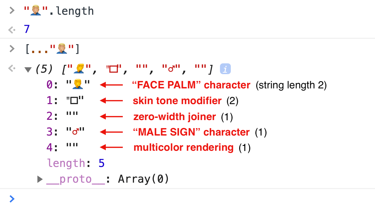
Look at the HTML above one more time. One of the divs has a pentagon symbol — the chart shape we want. I added that symbol using the “Emoji and Symbols” keyboard, though it can also be done with the HTML entity value for pentagon, &#x2B20;, inside the div.

The div with the symbol is then styled with CSS font properties as well as a desired chart color. It’s large enough and centered.

#chart-shape {
  font: 300px/300px serif;
  text-align: center; 
  color: limegreen;
}

To the second div in the HTML contains a conic gradient background image. The percentage of the gradient represents the visual value of the chart. The same div also has mix-blend-mode: screen;.

#chart-value {
  background: conic-gradient(transparent 75%, darkseagreen 75%);
  mix-blend-mode: screen;
}

The mix-blend-mode property blends colors inside an element with its backdrop. The screen blend mode value causes a lighter blend to come through. A lighter green shows through the portion where the darkseagreen colored part of the conic gradient overlaps with the limegreen colored pentagram, while the rest of the darskseagreen gradient disappears against the white backdrop of the chart.

An alternative to adding the chart shape in the HTML is to add it as another background layer in CSS and use background-blend-mode instead of mix-blend-mode. However, the code for a chart shape inside the CSS can be less legible for a quick glance. So it’s up to you to see where it’ll be easier for you to add the chart shape in: HTML or CSS. You’ve both options.

#chart {
  width: 300px; 
  height: 300px;
  background:
  url("data:image/svg+xml,<svg xmlns='http://www.w3.org/2000/svg'><foreignObject width='300px' height='100%'><div xmlns='http://www.w3.org/1999/xhtml' style='font:300px/300px serif;color:limegreen;text-align: center;background:white'>⬠</div></foreignObject></svg>"),
  conic-gradient(transparent 75%, darkseagreen 75%);
  background-blend-mode: screen;
}

The pentagon symbol is added as a background image in addition to the conic gradient. Then, finally, the property-value pair background-blend-mode: screen; kicks in and the result looks same as the previous demo.

The pentagon background image is created by embedding the HTML with the pentagon symbol () into an SVG that is embedded into a data URL.

<!-- Unwrapped SVG code from the Data URL -->
<svg xmlns='http://www.w3.org/2000/svg'>
  <foreignObject width='300px' height='100%'>
    <div xmlns='http://www.w3.org/1999/xhtml' 
         style='
          font:300px/300px serif;
          color:limegreen;
          text-align: center;
          background:white;'>
          ⬠
    </div>
  </foreignObject>
</svg>

Which becomes this in CSS:

background: url("data:image/svg+xml,<svg xmlns='http://www.w3.org/2000/svg'><foreignObject width='300px' height='100%'><div xmlns='http://www.w3.org/1999/xhtml' style='font:300px/300px serif;color:limegreen;text-align: center;background:white'>⬠</div></foreignObject></svg>");

Using CSS shapes

Next, let’s use CSS shapes in place of symbols. CSS shapes are primarily created with the use of border properties. We have a collection of CSS shapes in our archive for your reference.

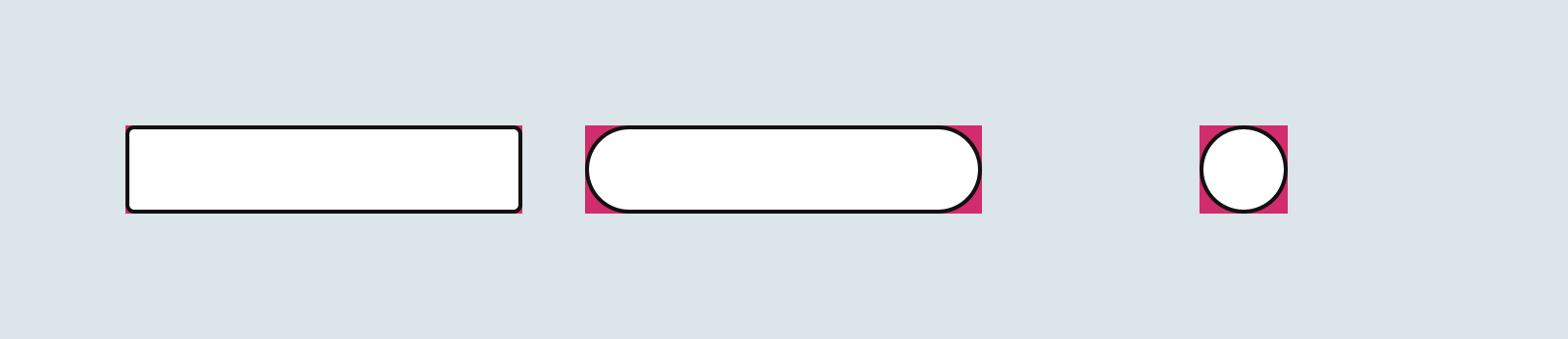
Here’s a set of properties that can create a simple triangle shape in an element we’ll later add to the SVG, replacing the symbol:

border: 150px solid white; 
border-bottom: 300px solid lime; 
border-top: unset;

When combined with the conic gradient and the background blend, the result is:

<div id="chart"></div>
#chart {
  width: 300px;
  height: 300px;
  background:
  url("data:image/svg+xml,<svg xmlns='http://www.w3.org/2000/svg'><foreignObject width='300px' height='100%'><html xmlns='http://www.w3.org/1999/xhtml'><div style='border:150px solid white; border-bottom:300px solid lime; border-top:unset'></div><div style='border:150px solid transparent; border-bottom:300px solid white; border-top:unset; transform:scale(0.8) translateY(-360px);'></div></html></foreignObject></svg>"),
  conic-gradient(transparent 75%, darkseagreen 75%);
  background-blend-mode: screen;
}

To restrict the design to the border, a smaller white triangle was added to the design.

<!-- Unwrapped SVG code from the Data URL -->
<svg xmlns='http://www.w3.org/2000/svg'>
  <foreignObject width='300px' height='100%'>
   <html xmlns='http://www.w3.org/1999/xhtml'>
    /* green triangle */
    <div style='
         border: 150px solid white; 
         border-bottom: 300px solid lime; 
         border-top: unset'></div>
    /* smaller white triangle */
    <div style='
         border: 150px solid transparent; 
         border-bottom: 300px solid white; 
         border-top: unset; 
         transform: scale(0.8) translateY(-360px);'></div>
   </html>
  </foreignObject>
</svg>

Which, again, becomes this in CSS:

background: url("data:image/svg+xml,<svg xmlns='http://www.w3.org/2000/svg'><foreignObject width='300px' height='100%'><html xmlns='http://www.w3.org/1999/xhtml'><div style='border:150px solid white; border-bottom:300px solid lime; border-top:unset'></div><div style='border:150px solid transparent; border-bottom:300px solid white; border-top:unset; transform:scale(0.8) translateY(-360px);'></div></html></foreignObject></svg>");

Using emojis

Will emojis work with this approach to charts? You bet it will! 🥳

A block-colored emoji is fed into the SVG image the same way the HTML symbols are. The block color of the emoji is created by giving it a transparent color value, followed by adding a desired color as text-shadow. I covered this technique in another post.

<div id="chart"></div>
#chart {
  width: 300px; 
  height: 300px;
  background: url("data:image/svg+xml,<svg xmlns='http://www.w3.org/2000/svg'><foreignObject width='300px' height='300px'><body style='margin:0;text-align:center;color:transparent;' xmlns='http://www.w3.org/1999/xhtml'><div style='text-shadow: 0 0 limegreen;font:200px/300px serif;background:white;'>🍏</div><div style='text-shadow:0 0 white;font:170px/300px serif;position:relative;top:-300px;'>🍏</div></body></foreignObject></svg>"),
  conic-gradient(transparent 64%, darkseagreen 64%);
  background-blend-mode: screen;
}

Just as with the last demo, a smaller white apple shape is added at the center to create the border design.

<!-- Unwrapped SVG code from the Data URL -->
<svg xmlns='http://www.w3.org/2000/svg'>
  <foreignObject width='300px' height='300px'>
    <body xmlns='http://www.w3.org/1999/xhtml' style='
          margin: 0;
          text-align: center;
          color:transparent;'>
       /* green apple shape */
       <div style='
            text-shadow: 0 0 limegreen; 
            font-size: 200px; 
            background: white;'>🍏</div>
       /* smaller white apple shape */
       <div style='
            text-shadow:0 0 white; 
            font-size: 170px; 
            position: relative; 
            top: -300px;'>🍏</div>
    </body>
  </foreignObject>
</svg>

I added the two divs inside the <body> element so the repeating style properties of the divs are declared only once in the body element. The divs will then automatically inherit those properties.

Chris had the idea to animate the conic gradient — its percent value to be specific — using the CSS @property (supported in Chrome at the time of writing this article), and it just has the most beautiful effect on the design. @property is a CSS at-rule that explicitly defines a custom CSS property. In supported browsers, when a custom property is defined using @property it can be animated.

@property --n {
  syntax: '<percentage>';
  inherits: true;
  initial-value: 30%;
}
#chart {
  width: 300px; 
  height: 300px;
  --n: 30%;  /*declaration for browsers with no @property support */
  background: 
    url("data:image/svg+xml,<svg xmlns='http://www.w3.org/2000/svg'><foreignObject width='300px' height='300px'><body style='margin:0;text-align:center;color:transparent;' xmlns='http://www.w3.org/1999/xhtml'><div style='text-shadow: 0 0 limegreen;font:200px/300px serif;background:white;'>🍏</div><div style='text-shadow:0 0 white;font:170px/300px serif;position:relative;top:-300px;'>🍏</div></body></foreignObject></svg>"),
    conic-gradient(transparent var(--n), darkseagreen var(--n));
  background-blend-mode: screen;
  transition: --n 2s ease-in-out	
}
#chart:hover { --n: 70%; }

The chart above will change its value on hover. In Chrome, the change will look animated.

And although it won’t be as smooth as CSS animation, you can also try animating the gradient using JavaScript. The following JavaScript will cause a somewhat similar animating effect as the above when the cursor moves over the chart.

const chart = document.querySelector('#chart')
chart.onpointerover = ()=>{
  var i = 30,
      timer = setInterval(()=> {
        if (i < 70)
          chart.style.setProperty('--n', i++ + '%')
        else clearInterval(timer)
      }, 10)
}
chart.onpointerout = ()=>{
  var i = 70,
      timer = setInterval(()=> {
        if (i >= 30) 
          chart.style.setProperty('--n', i-- + '%')
        else clearInterval(timer)
      }, 10)
}

When trying your own designs, keep in mind how the different blend modes work. I used the screen blend mode in all my demos just to keep things simple. But with different blend modes, and different backdrop colors, you’ll get varying results. So, I recommend going deeper into blend modes if you haven’t already.

Also, if you want to exclude an element’s color from the final result, try isolation: isolate; on the element — the browser will ignore that backdrop color when applying the blend.

And even though there are all kinds of unusual and quirky shapes we can use in any wild colors we want, always be mindful of the legibility by making the chart value large and clear enough to read.


The post How to Create CSS Charts With Interesting Shapes, Glyphs and Emoji appeared first on CSS-Tricks. You can support CSS-Tricks by being an MVP Supporter.

Creating Colorful, Smart Shadows

A bona fide CSS trick from Kirupa Chinnathambi here. To match a colored shadow with the colors in the background-image of an element, you inherit the background in a pseudo-element, kick it behind the original, then blur and filter it.

.colorfulShadow {
  position: relative;
}

.colorfulShadow::after {
  content: "";
  width: 100%;
  height: 100%;
  position: absolute;
  background: inherit;
  background-position: center center;
  filter: drop-shadow(0px 0px 10px rgba(0, 0, 0, 0.50)) blur(20px);
  z-index: -1;
}

Negative z-index is always a yellow flag for me as that only works if there are no intermediary backgrounds. But the trick holds. There would always be some other way to layer the backgrounds (like a <span> or whatever).

For some reason this made me think of a demo I saw (I can’t remember who to credit!). Emojis had text-shadow on them, which really made them pop. And those shadows could also be colorized to a similar effect.

Direct Link to ArticlePermalink


The post Creating Colorful, Smart Shadows appeared first on CSS-Tricks.

You can support CSS-Tricks by being an MVP Supporter.

Creating CSS Shapes with Emoji

CSS Shapes is a standard that lets us create geometric shapes over floated elements that cause the inline contents — usually text — around those elements to wrap along the specified shapes.

Such a shaped flow of text looks good in editorial designs or designs that work with text-heavy contents to add some visual relief from the chunks of text.

Here’s an example of CSS Shape in use:

The shape-outside property specifies the shape of a float area using either one of the basic shape functions — circle(), ellipse(), polygon() or inset() — or an image, like this:

Inline content wraps along the right side of a left-floated element, and the left side of a right-floated element.

In this post, we’ll use the concept of CSS Shapes with emoji to create interesting text-wrapping effects. Images are rectangles. Many of the shapes we draw in CSS are also boxy or at least limited to standard shapes. Emoji, on the other hand, offers neat opportunities to break out of the box!

Here’s how we’ll do it: We’ll first create an image out of an emoji, and then float it and apply a CSS Shape to it.

I’ve already covered multiple ways to convert emojis to images in this post on creative background patterns. In that I said I wasn’t able to figure out how to use SVG <text> to do the conversion, but I’ve figured it out now and will show you how in this post.  You don’t need to have read that article for this one to make sense, but it’s there if you want to see it.

Let’s make an emoji image

The three steps we’re using to create an emoji image are:

  • Create an emoji-shaped cutout in SVG
  • Convert the SVG code to a DataURL by URL encoding and prefixing it with data:image/svg+xml
  • Use the DataURL as the url() value of an element’s background-image.

Here’s the SVG code that creates the emoji shaped cutout:

<svg width='150px' height='150px' xmlns='http://www.w3.org/2000/svg'> 
  <clipPath id='emojiClipPath'> 
    <text x='0' y='130px' font-size='130px'>🦕</text> 
  </clipPath> 
  <text x='0' y='130px' font-size='130px' clip-path='url(#emojiClipPath)'>🦕</text>
</svg>

What’s happening here is we’re providing a <text> element with an emoji character for a <clipPath>. A clip path is an outline of a region to be kept visible when that clip path is applied to an element. In our code, that outline is the shape of the emoji character.

Then the emoji’s clip path is referenced by a <text> element carrying the same emoji character, using its clip-path property, creating a cutout in the shape of the emoji.

Now, we convert the SVG code to a DataURL. You can URL encode it by hand or use online tools (like this one!) that can do it for you.

Here’s the resulted DataURL, used as the url() value for the background image of an .emoji element in CSS:

.emoji {
  background: url("data:image/svg+xml,<svg width='150px' height='150px' xmlns='http://www.w3.org/2000/svg'> <clipPath id='emojiClipPath'> <text x='0' y='130px'  font-size='130px'>🦕</text> </clipPath> <text x='0' y='130px' font-size='130px' clip-path='url(%23emojiClipPath)'>🦕</text></svg>");
}

If we were to stop here and give the .emoji element dimensions, we’d see our character displayed as a background image:

Now let’s turn this into a CSS Shape

We can do this in two steps:

  • Float the element with the emoji background
  • Use the DataURL as the url() value for the element’s shape-outside property
.emoji {
  --image-url: url("data:image/svg+xml,<svg width='150px' height='150px' xmlns='http://www.w3.org/2000/svg'> <clipPath id='emojiClipPath'> <text x='0' y='130px'  font-size='130px'>🦕</text> </clipPath> <text x='0' y='130px'  font-size='130px' clip-path='url(#emojiClipPath)'>🦕</text></svg>");
  background: var(--image-url);
  float: left;
  height: 150px;
  shape-outside: var(--image-url);
  width: 150px;
  margin-left: -6px; 
}

We placed the DataURL in a custom property, --image-url, so we can easily refer it in both the background and the shape-outside properties without repeating that big ol’ string of encoded SVG multiple times.

Now, any inline content near the floated .emoji element will flow in the shape of the emoji. We can adjust things even further with margin or shape-margin to add space around the shape.

If you want a color-blocked emoji shape, you can do that by applying the clip path to a <rect> element in the SVG:

<svg width='150px' height='150px' xmlns='http://www.w3.org/2000/svg'> 
    <clipPath id='emojiClipPath'> 
        <text x='0' y='130px' font-size='130px'>🦕</text> 
    </clipPath> 
    <rect x='0' y='0' fill='green' width='150px' height='150px' clip-path='url(#emojiClipPath)'/> 
</svg>

The same technique will work with letters!

Just note that Firefox doesn’t always render the emoji shape. We can work around that by updating the SVG code.

<svg xmlns='http://www.w3.org/2000/svg' width='150px' height='150px'>
  <foreignObject width='150px' height='150px'>
    <div xmlns='http://www.w3.org/1999/xhtml' style='width:150px;height:150px;line-height:150px;text-align:center;color:transparent;text-shadow: 0 0 black;font-size:130px;'>🧗</div>
  </foreignObject>
</svg>

This creates a block-colored emoji shape by making the emoji transparent and giving it text-shadow with inline CSS. The <div> containing the emoji and inline CSS style is then inserted into a <foreignObject> element of SVG so the HTML <div> code can be used inside the SVG namespace. The rest of the code in this technique is same as the last one.

Now we need to center the shape

Since CSS Shapes can only be applied to floated elements, the text flows either to the right or left of the element depending on which side it’s floated. To center the element and the shape, we’ll do the following:

  • Split the emoji in half
  • Float the left-half of the emoji to the right, and the right-half to the left
  • Put both sides together!

One caveat to this strategy: if you’re using running sentences in the design, you’ll need to manually align the letters on both sides.

Here’s what we’re aiming to make:

First, we see the HTML for the left and right sides of the design. They are identical.

<div id="design">
  <p id="leftSide">A C G T A <!-- more characters --> C G T A C G T A C G T <span class="emoji"></span>A C G <!-- more characters --> C G T </p>
  <p id="rightSide">A C G T A <!-- more characters --> C G T A C G T A C G T <span class="emoji"></span>A C G <!-- more characters --> C G T </p>
</div>

p#leftSide and p#rightSide inside #design are arranged side-by-side in a grid.

#design {
  border-radius: 50%; /* A circle */
  box-shadow: 6px 6px 20px silver;
  display: grid; 
  grid: "1fr 1fr"; /* A grid with two columns */
  overflow: hidden;
  width: 400px; height: 400px;
}

Here’s the CSS for the emoji:

span.emoji {
  filter: drop-shadow(15px 15px 5px green);
  shape-margin: 10px;
  width: 75px; 
  height: 150px;
}

/* Left half of the emoji */
p#leftSide>span.emoji {
  --image-url:url("data:image/svg+xml,<svg width='150px' height='150px' xmlns='http://www.w3.org/2000/svg'> <clipPath id='emojiClipPath'> <text x='0' y='130px'  font-size='130px'>🦎</text> </clipPath> <rect x='0' y='0' width='150px' height='150px' clip-path='url(%23emojiClipPath)'/></svg>");
  background-image: var(--image-url);
  float: right;
  shape-outside: var(--image-url);
}

/* Right half of the emoji */
p#rightSide>span.emoji {
  --image-url:url("data:image/svg+xml,<svg width='150px' height='150px' xmlns='http://www.w3.org/2000/svg'> <clipPath id='emojiClipPath'> <text x='-75px' y='130px'  font-size='130px'>🦎</text> </clipPath> <rect x='0' y='0' width='150px' height='150px' clip-path='url(%23emojiClipPath)'/></svg>");
  background-image: var(--image-url);
  float: left;
  shape-outside: var(--image-url);
}

The width of the <span> elements that hold the emoji images (span.emoji) is 75px whereas the width of the SVG emoji images is 150px. This automatically crops the image in half when displayed inside the spans.

On the right side of the design, with the left-floated emoji (p#rightSide>span.emoji), we need to move the emoji halfway to the left to show the right-half, so the x value in the <text> in the DataURL is changed to 75px. That’s the only difference in the DataURLs from the left and right sides of the design.

Here’s that result once again:


That’s it! You can try the above method to center any CSS Shape as long as you can split the element up into two and put the halves back together with CSS.


The post Creating CSS Shapes with Emoji appeared first on CSS-Tricks.

You can support CSS-Tricks by being an MVP Supporter.

Changing Emoji Skin Tones Programmatically

So, you know how many emoji have different skin tones? Emoji skin tones are extremely popular, especially over text and on social media. The raised black fist emoji (✊🏿) was voted “The Most 2020 Emoji” by Emojipedia’s World Emoji Awards.

Each tone is a modifier and many emoji are made up of modifiers and base encodings that map to specific characters. Unfortunately, not every emoji library supports modifiers. But, given their popularity, emoji skin tone modifiers are more than a “nice to have” feature. Plus, they’re a smart way to work because they allow us to write more modular and efficient code.

So that’s what we’re doing in this article: figure out how to work with emoji modifiers programmatically. This way, if you’re ever stuck without skin tone support — or want to create custom variations of other emoji — then you’ll know how!

Meet the Fitzpatrick scale

Skin tone modifiers were officially added to emoji in 2015 as part of Unicode 8.0. They are based on the Fitzpatrick scale, which is a formal classification of human skin tones. The following chart shows how the emoji characters match to Fitzpatrick types:

Skin tone characterFitzpatrick type
🏻1-2
🏼3
🏽4
🏾5
🏿6

In the simplest use case, when one of these characters is appended to an emoji that supports skin tone modifiers, it will change the skin tone of the emoji.

Another way to say that: 👶 +🏽 = 👶🏽

Applying skin tone modifiers with CSS

To swap between emoji skin tones using CSS, we would start with the base emoji character (👶) and then append the skin tone using the ::after pseudo-selector.

In addition to using the rendered emoji characters, we could use the Unicode hex codes instead:

Removing and swapping skin tone modifiers with JavaScript

What if the emoji you’re working with has already had a skin tone modifier applied? For that, we’ll need to move beyond CSS. Here’s an example using JavaScript:

What’s going on here? First, we start with a baby emoji with Fitzpatrick Type 4. We then pass it into the function removeModifier, which searches for any of the skin tone modifiers and removes it from the string. Now that we have the emoji without a modifier, we can add whichever modifier we like.

While this approach works with many emoji, we run into problems when other modifiers are introduced. That’s why we now need to talk about…

Working with ZWJ sequences

Zero width joiner (ZWJ) sequences are like the compound words of Unicode. They consist of two or more emoji joined by the zero width joiner, U+200D.

ZWJ sequences are most commonly used to add gender modifiers to emoji. For example, a person lifting weights, plus ZWJ, plus the female sign, equals a woman lifting weights (️🏋️ + ♀︎ = 🏋️‍♀️).

There’s a few important things to need to keep in mind when working with ZWJ sequences:

  • The sequences are only recommendations. They come from the Unicode Consortium and are not guaranteed to be supported on every platform. If they are not supported by a platform, then a fallback sequence of regular emoji will be displayed instead.
  • Skin tone modifiers, if present, must be included after the emoji but before the ZWJ.
  • Some ZWJ sequences include multiple emoji that each have different skin tone modifiers.

Given this information, we need to make the following changes to the previous code example:

  • The skin tone modifiers need to be inserted immediately after any base emoji rather than simply being appended to the end of the emoji.
  • If there are multiple emoji in a ZWJ sequence that have skin tone modifiers, then the modifiers will need to be replaced for each of those emoji.

Limitations

From this example, you may notice the limitation of consistency. The editor view shows each of the characters in a ZWJ sequence separately, with exception to the skin tone modifiers, which are immediately applied to their corresponding emoji. The console or results views, on the other hand, will attempt render the character for the entire sequence.

Support for this will vary by platform. Some editors may attempt to render ZWJ sequences, and not all browsers will support the same sets of ZWJ sequences.

Additionally, adding skin tones in a ZWJ sequence requires knowing what’s being used as the base emoji. While this would be relatively simple in a situation where the emoji are provided by a known collection, things become more difficult if we want to be able to handle arbitrary input from a user.

Also, be aware that the CSS solutions in this post are not compatible with ZWJ sequences.

Questions to guide development

I put some questions together you may want to ask yourself when you’re designing a system that needs to handle emoji skin tone modifiers:

  • Do I have control over which emoji my system will interact with?
  • Does my emoji library have information about which emoji support skin tone modifiers?
  • Does my system need to add, remove, or change the modifiers?
  • Does my platform support ZWJ sequences? If so, which ones?
  • Does my system need to support ZWJ sequences with multiple skin tone modifiers?

Hopefully, between the answers to these questions and the examples we’ve looked at here, you’ll have everything you need to support emoji skin tone modifiers in situations where you need them.


The post Changing Emoji Skin Tones Programmatically appeared first on CSS-Tricks.

You can support CSS-Tricks by being an MVP Supporter.

Weekly Platform News: Emoji String Length, Issues with Rounded Buttons, Bundled Exchanges

In this week's roundup, the string length of two emojis is not always equal, something to consider before making that rounded button, and we may have a new way to share web apps between devices, even when they are offline.

The JavaScript string length of emoji characters

A single rendered emoji can have a JavaScript string length of up to 7 if it contains additional Unicode scalar values that represent a skin tone modifier, gender specification, and multicolor rendering.

(via Henri Sivonen)

An accessibility issue with rounded buttons

Be aware that applying CSS border-radius to a <button> element reduces the button’s interactive area (“those lost corner pixels are no longer clickable”).

You can avoid this accessibility issue in CSS, e.g., by emulating rounded corners via border-image instead, or by overlaying the button with an absolutely positioned, transparent ::before pseudo-element.

(via Tyler Sticka)

Sharing web pages while offline with Bundled Exchanges

Chrome plans to add support for navigation to Bundled Exchanges (part of Web Packaging). A bundled exchangeis a collection of HTTP request/response pairs, and it can be used to bundle a web page and all of its resources.

The browser should be able to parse and verify the bundle’s signature and then navigate to the website represented by the bundle without actually connecting to the site as all the necessary subresources could be served by the bundle.

Kinuko Yasuda from Google has posted a video that demonstrates how Bundled Exchanges enable sharing web pages (e.g., a web game) with other devices while offline.

(via Kinuko Yasuda)


Read even more news in my weekly Sunday issue, which can be delivered to you via email every Monday morning. Visit webplatform.news for more information.

The post Weekly Platform News: Emoji String Length, Issues with Rounded Buttons, Bundled Exchanges appeared first on CSS-Tricks.