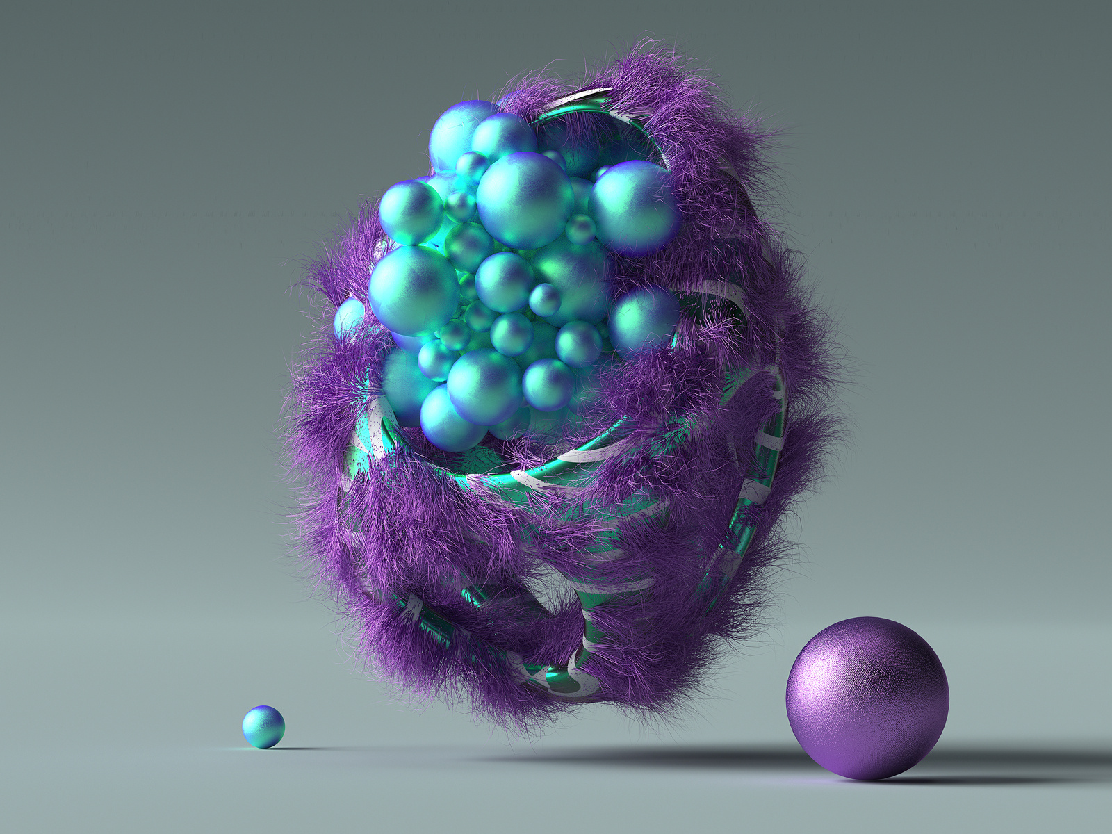
I believe I speak for everyone when I say that I love to find amazing, high-quality design resources for free.
Sometimes, when you’re in the middle of a design process, you find that you’re about to have to invest more money than you originally intended. You should save money when you can and you should spend money on things that require investment.
That’s why I came up with the ultimate collection of free design resources for you to check out.
Whether it’s free vectors or mockups, or free images and presets you’re looking for, I have it all right here in one incredibly comprehensive list for you, so you don’t have to search all around for your answers. Everything is right here, in one place.
Now, let’s get into it.
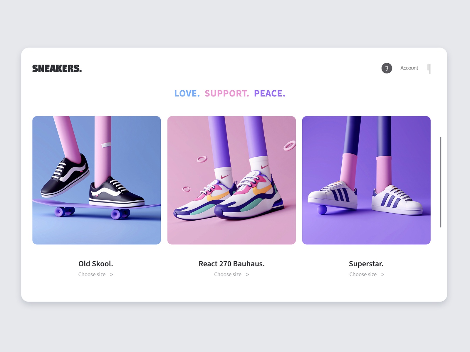
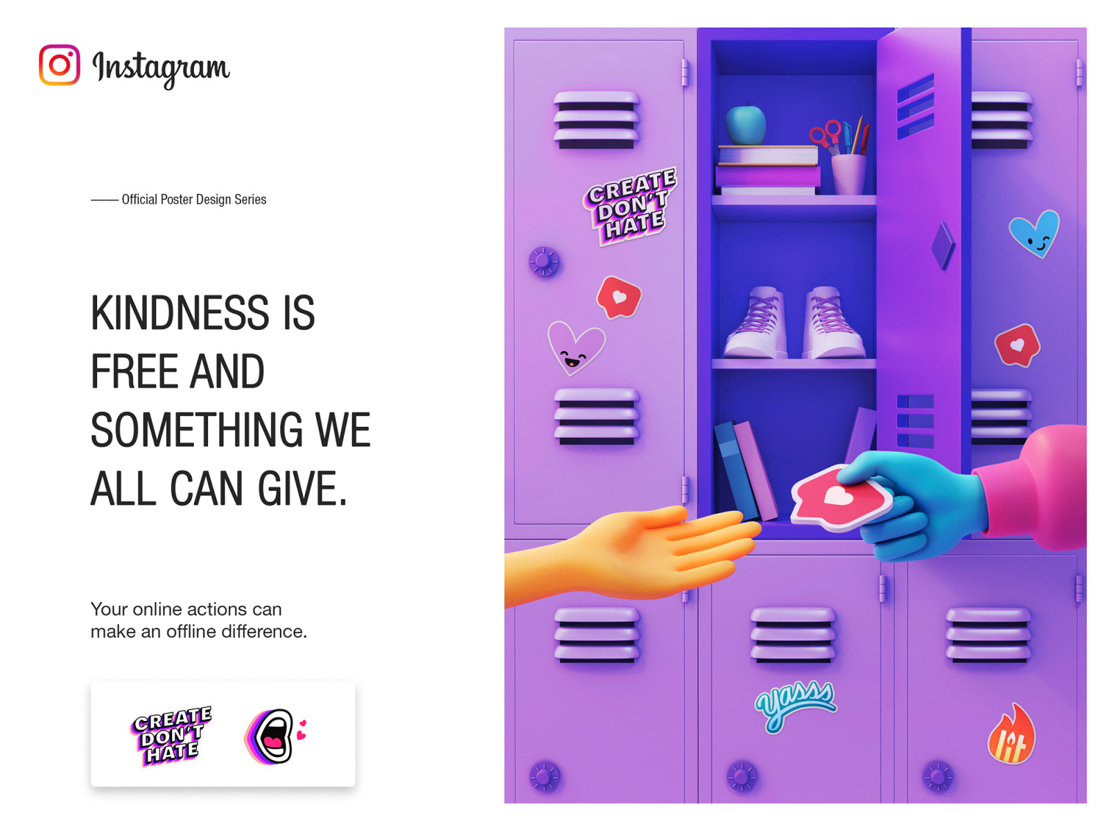
Free Stock Images
Photography has been and will always be a key piece of design. Stock photos are no longer what they used to be, luckily. No longer will you be seeing just those awkward group photos of people laughing or two businessmen shaking hands.
No, there are so many stock photo sites for you to choose from with quality work from real photographers. Check out these 10 awesome free stock images websites!
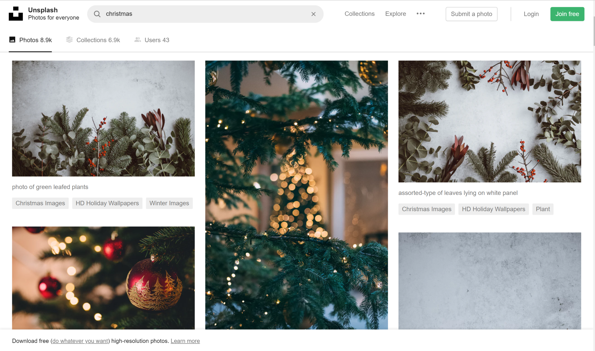
Unsplash
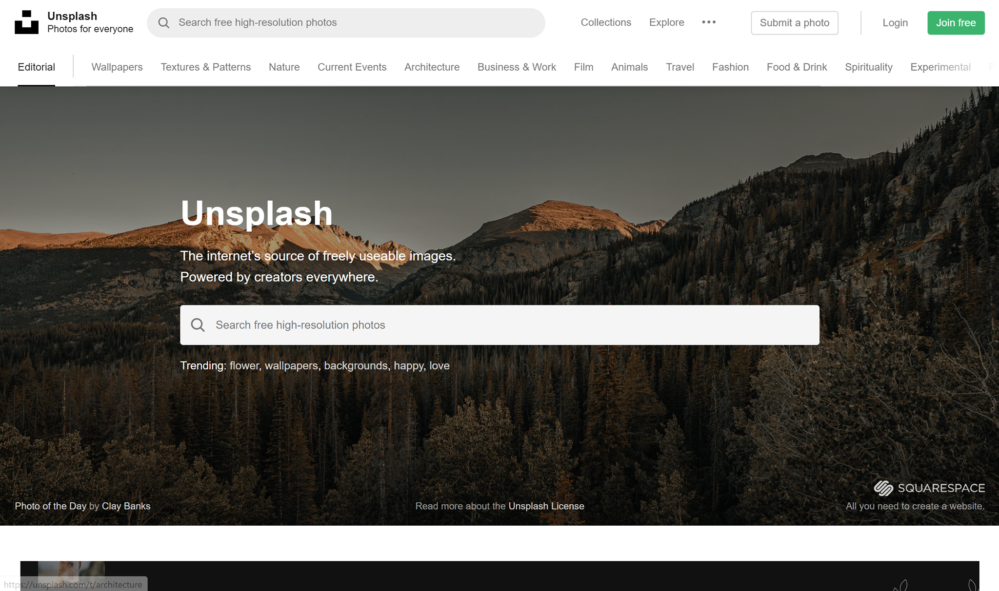
I want to start this list off with a bang. Unsplash is my personal favorite free stock image website. I use it for everything from article writing to making designs. Unsplash has a huge collection of images, consisting of over 110,000 high-quality free stock images. Just type in a keyword and see hundreds of images that can suit your needs. All images are released under Unsplash’s copyright policy.
Stocksnap
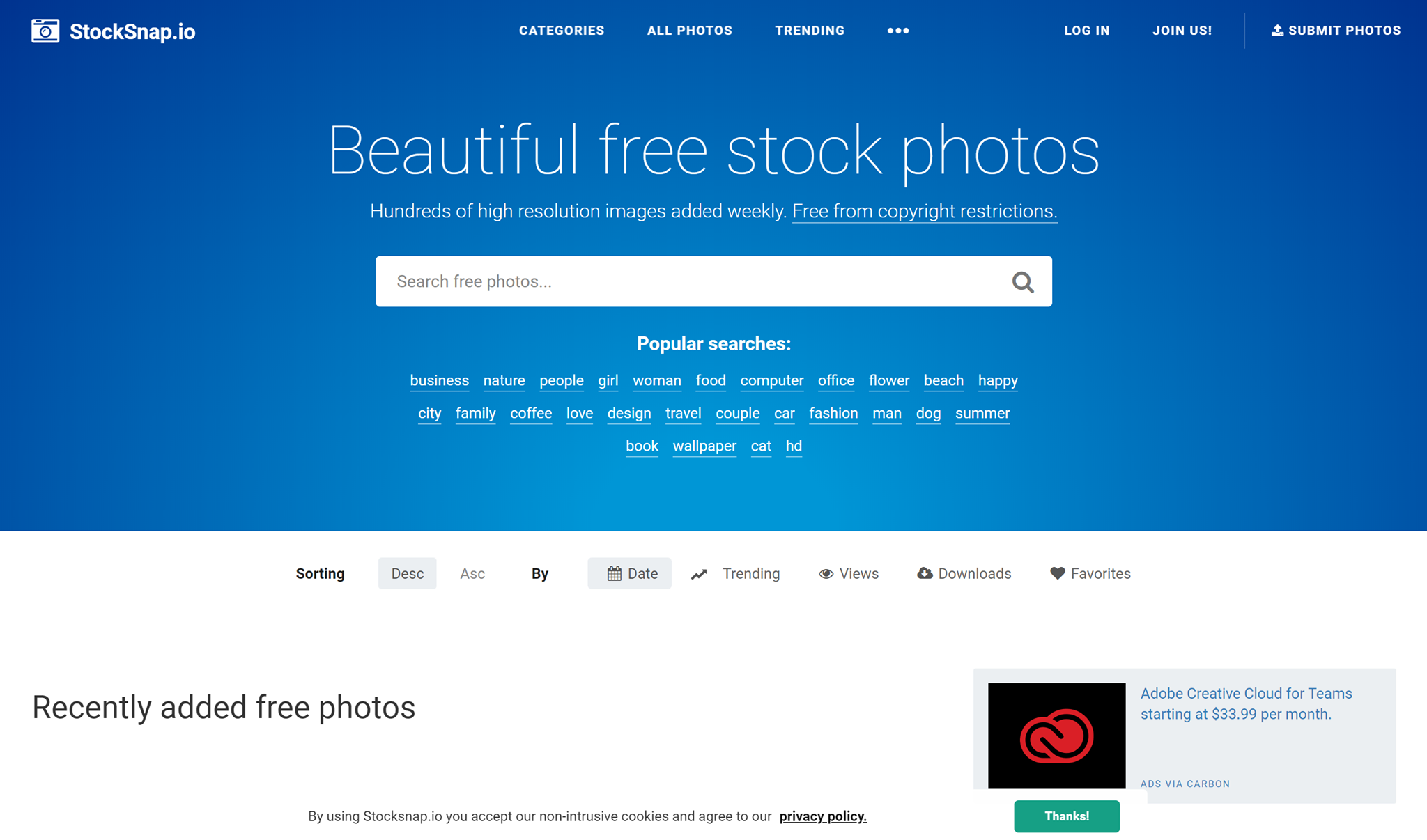
Stocksnap has hundreds of new high-quality free stock images added to their library every week. They have stock images to fit just about any occasion you can think of. From website building to brochure making, they having everything you need. You can find any image you need by typing in tag words, and you’ll be presented with hundreds of images that will be perfect for you. All images are free for you to use!
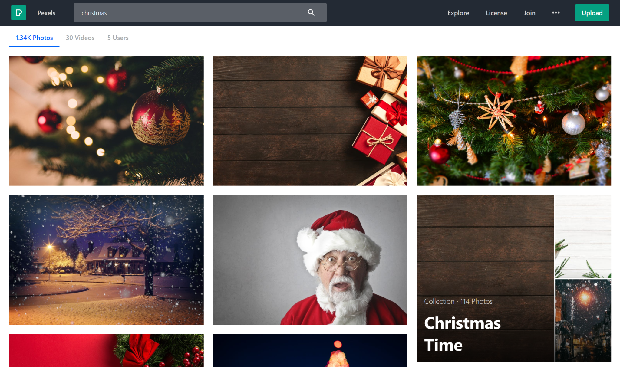
Pexels
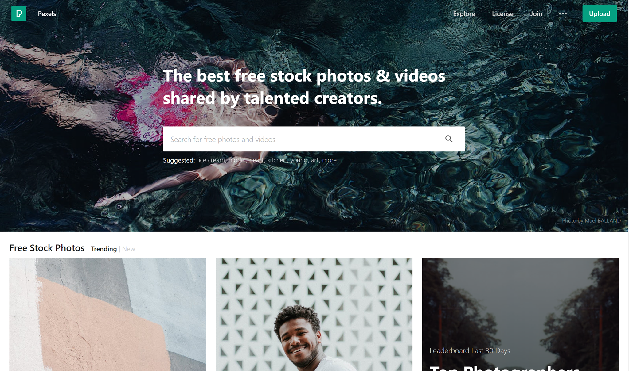
Pexels has one of the most beautiful stock images website interfaces I’ve ever seen. Pexels provides tons of high-quality stock images that are free for you to use under their license. With hundreds of thousands of beautiful free images of you to choose from, surely you’ll find what you need here.
Reshot
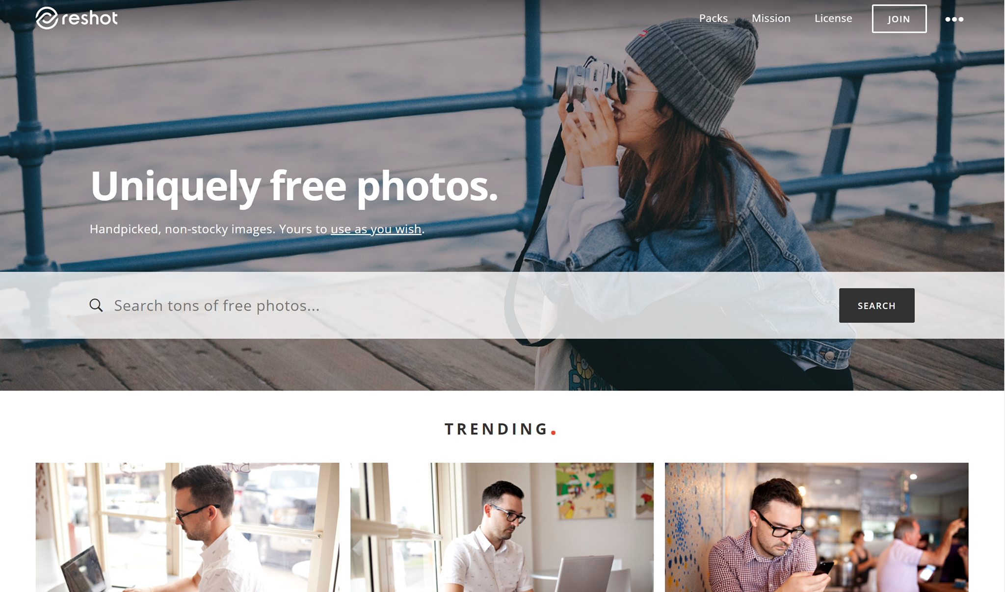
“Reshot. Uniquely free photos. Handpicked, non-stocky images. Yours to use as you wish”. That’s a pretty self-explanatory and sweet tagline. They work hand-in-hand with amazing professional photographers and give them a great place to display their work and be discovered. Find amazing free stock images on Reshot!
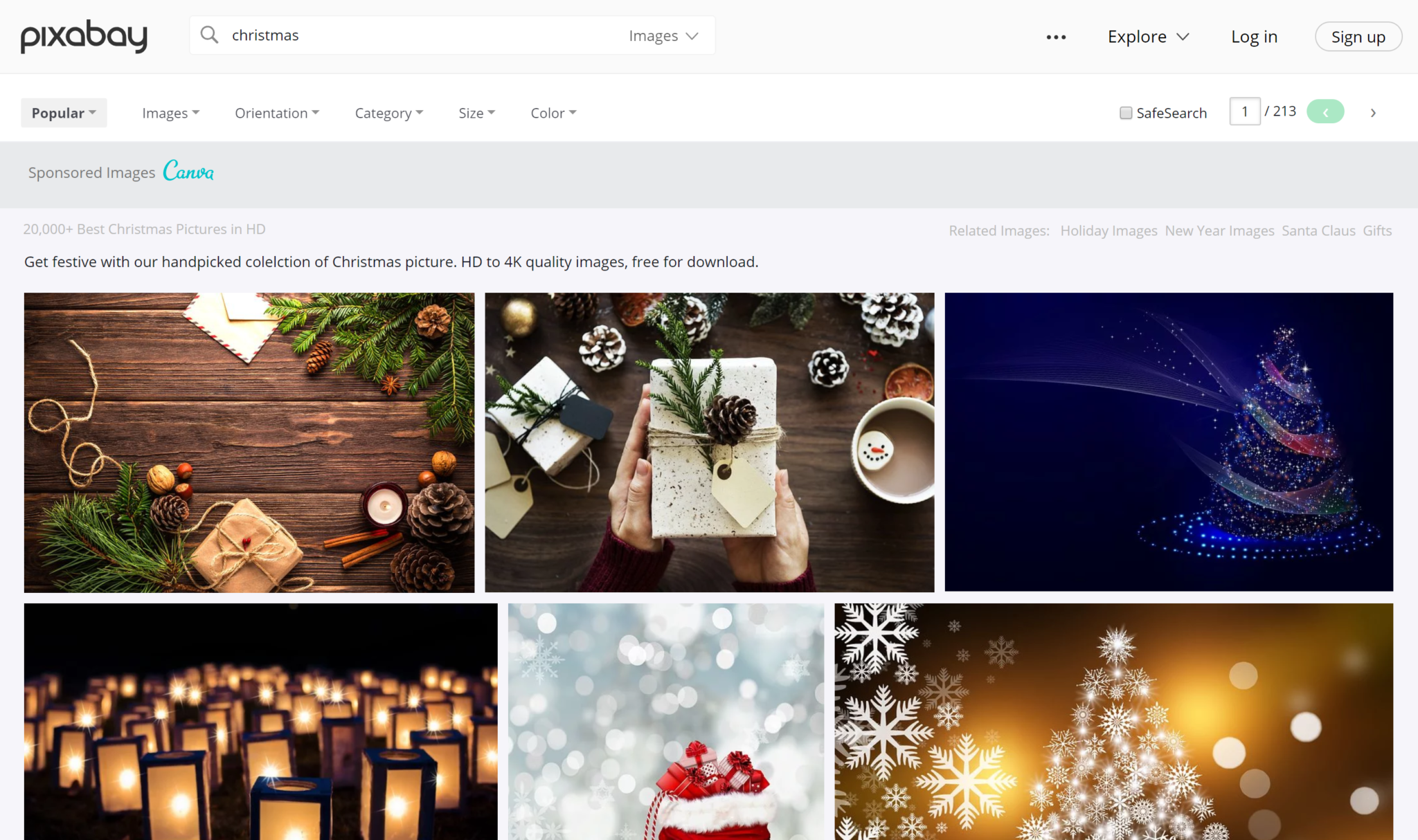
Pixabay
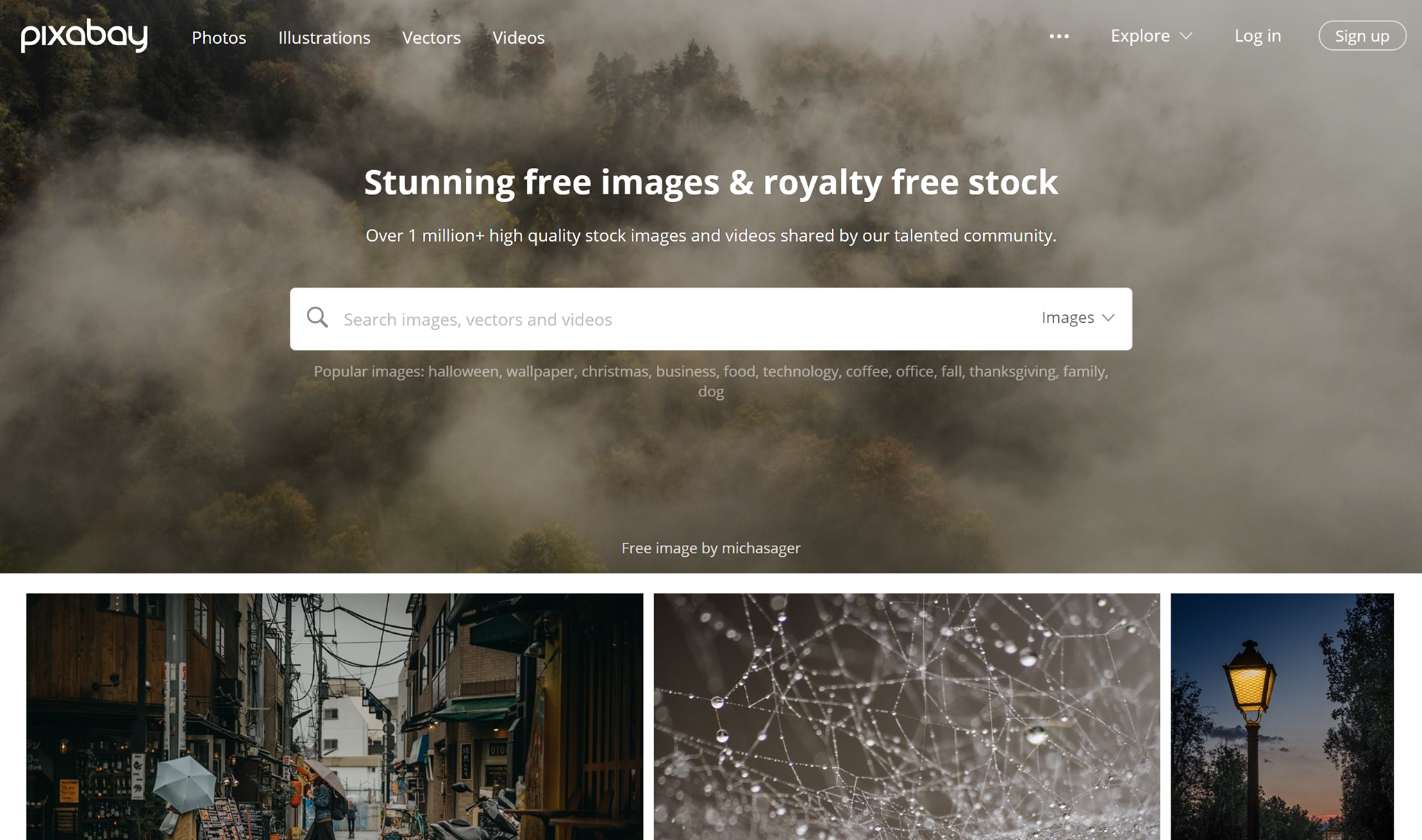
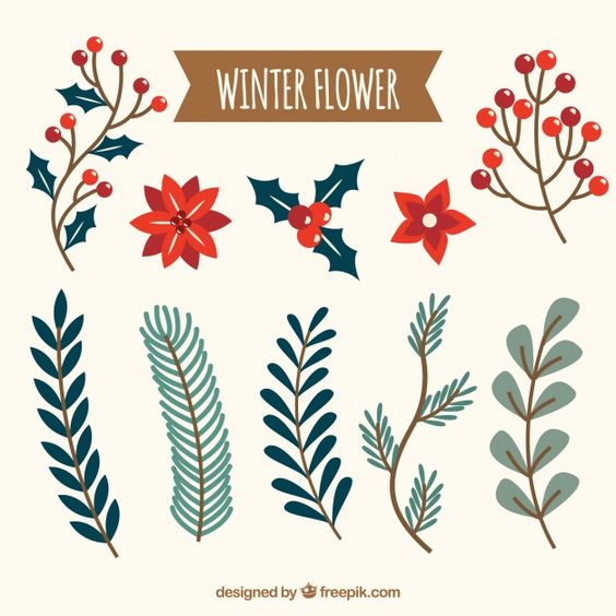
Pixabay has loads of free photos, but not only. They also have art illustrations and vectors. All images, art illustrations vectors, etc are released under Creative Commons CC0.
Life of Pix
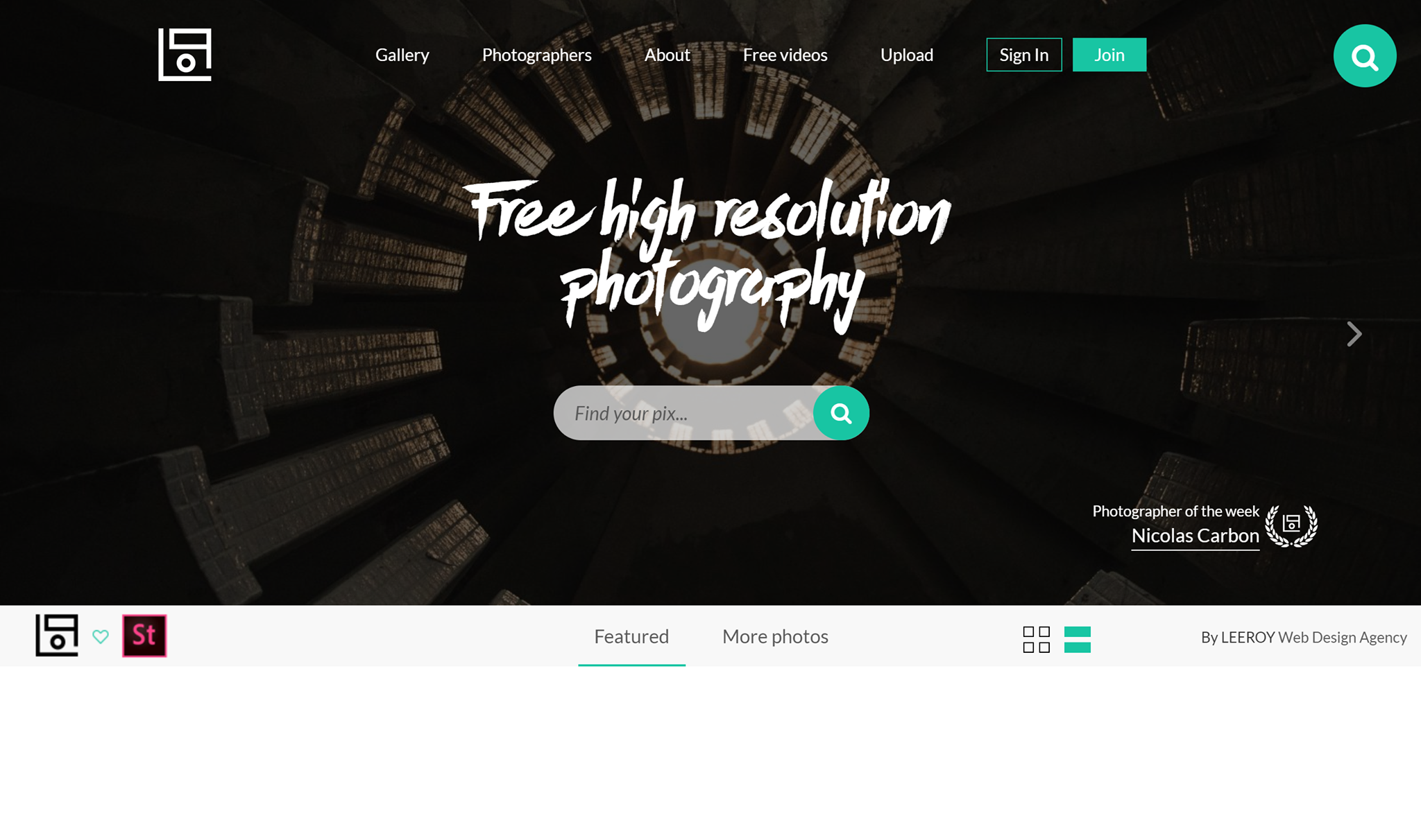
Next up, we have Life of Pix. Free high-resolution photography for everyone. Besides having loads of amazing photos to choose from, they also feature a new photographer of the week. Find new photographers whose work you love every week and in turn, have tons of stock photos to choose from!
Foodiesfeed
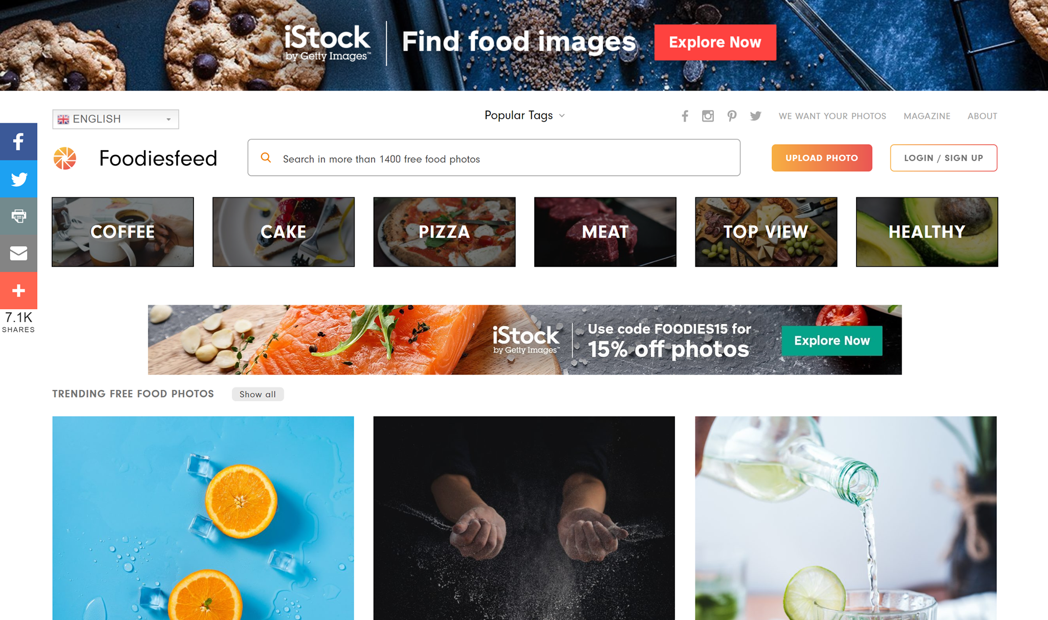 Foodiesfeed is for the foodie at heart. Which gorgeous, appetizing stock images that look so delicious that you can almost smell them just by looking at them. If you have a food blog or just need some inspiration, check out this awesome stock image site.
Gratisography
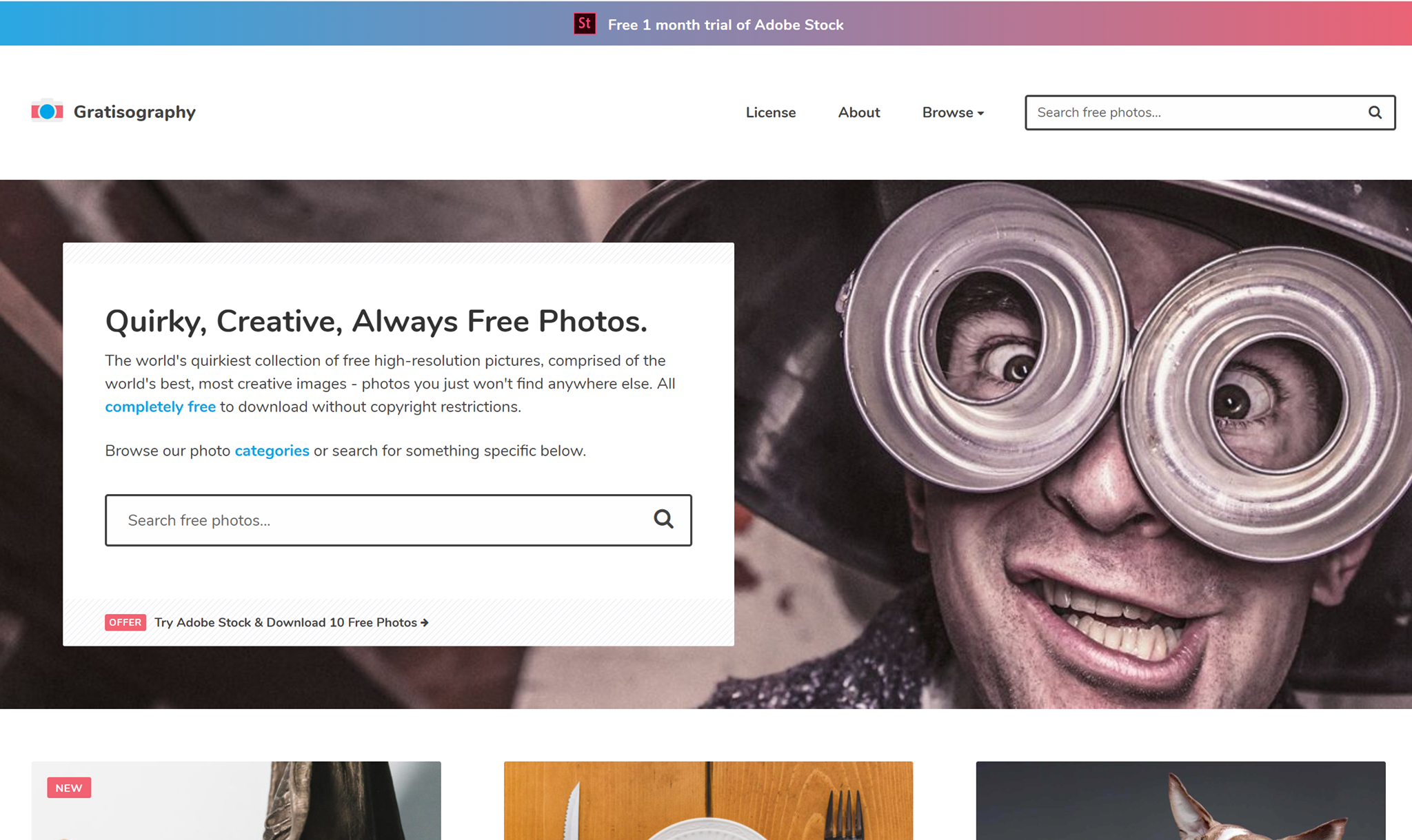
Gratisography is for the non-mainstream person. If you’re looking for the complete opposite of the classic boring stock photo, this website is for you. You truly won’t find photos like these anywhere else.
Foca
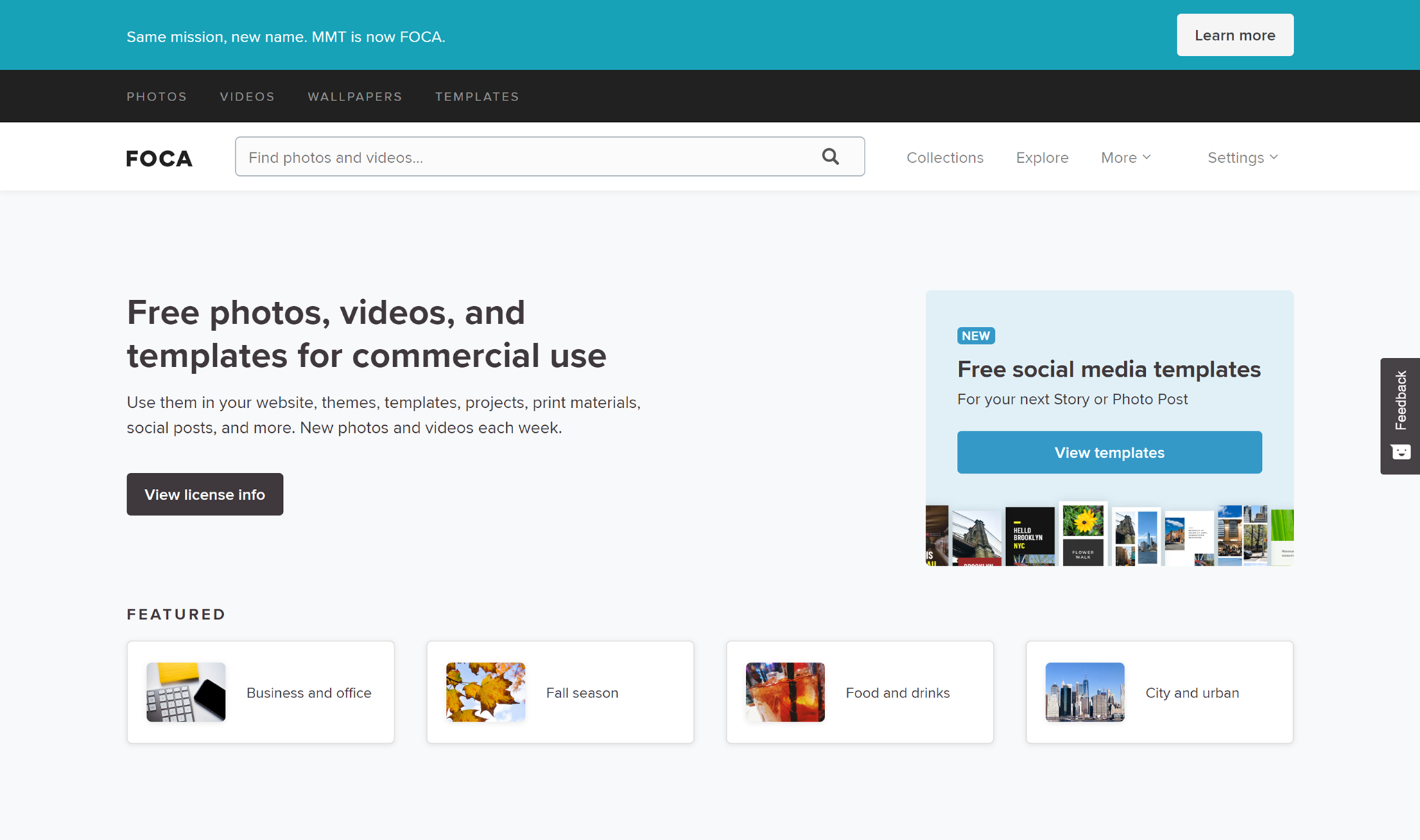
FOCA is a great stock website if you’re looking for a little more than just some stock images. They have everything from free photos to videos and templates!
Kaboompics
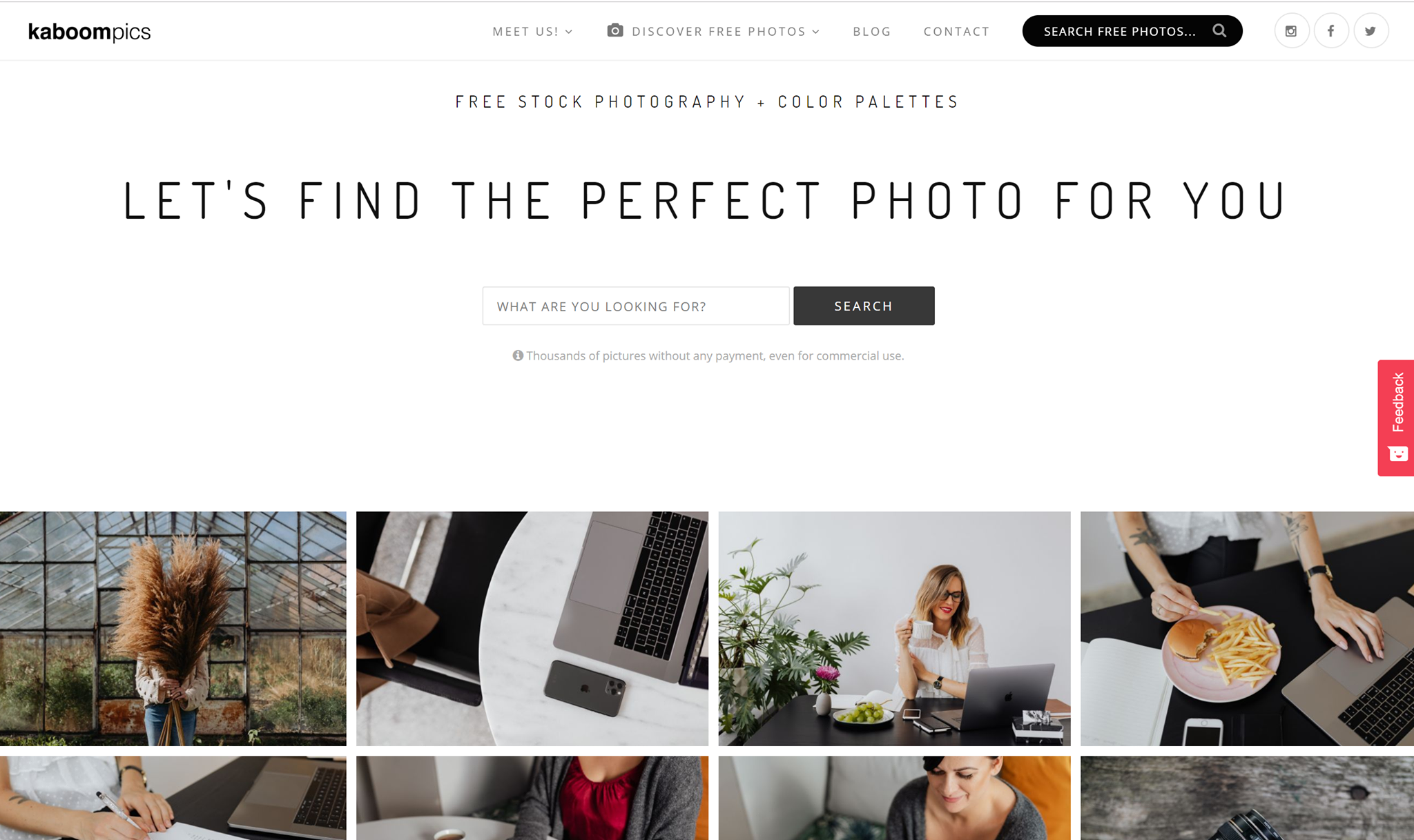
Kaboompics is so aesthetically pleasing, it hurts. The amazing blog pictures are everything. According to their about page, Kaboompics is one of the most popular sources of free images for lifestyle, interior design and specialized bloggers in the world.
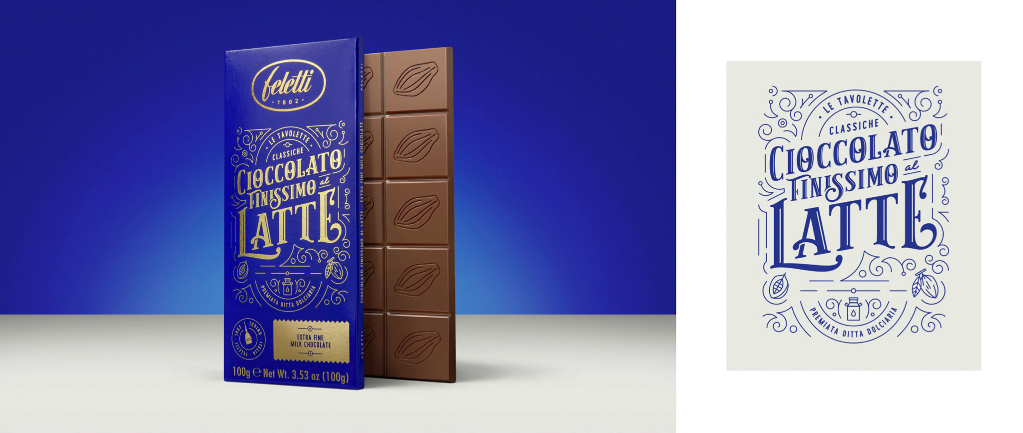
Free Vectors
Creating your own vectors can take up so much of your precious time, and that’s why finding perfect vector art or vector icons can be a major time-saver, but finding them for free is like finding treasure. That’s why I picked out my 10 favorite free vector websites. Check ‘em out.
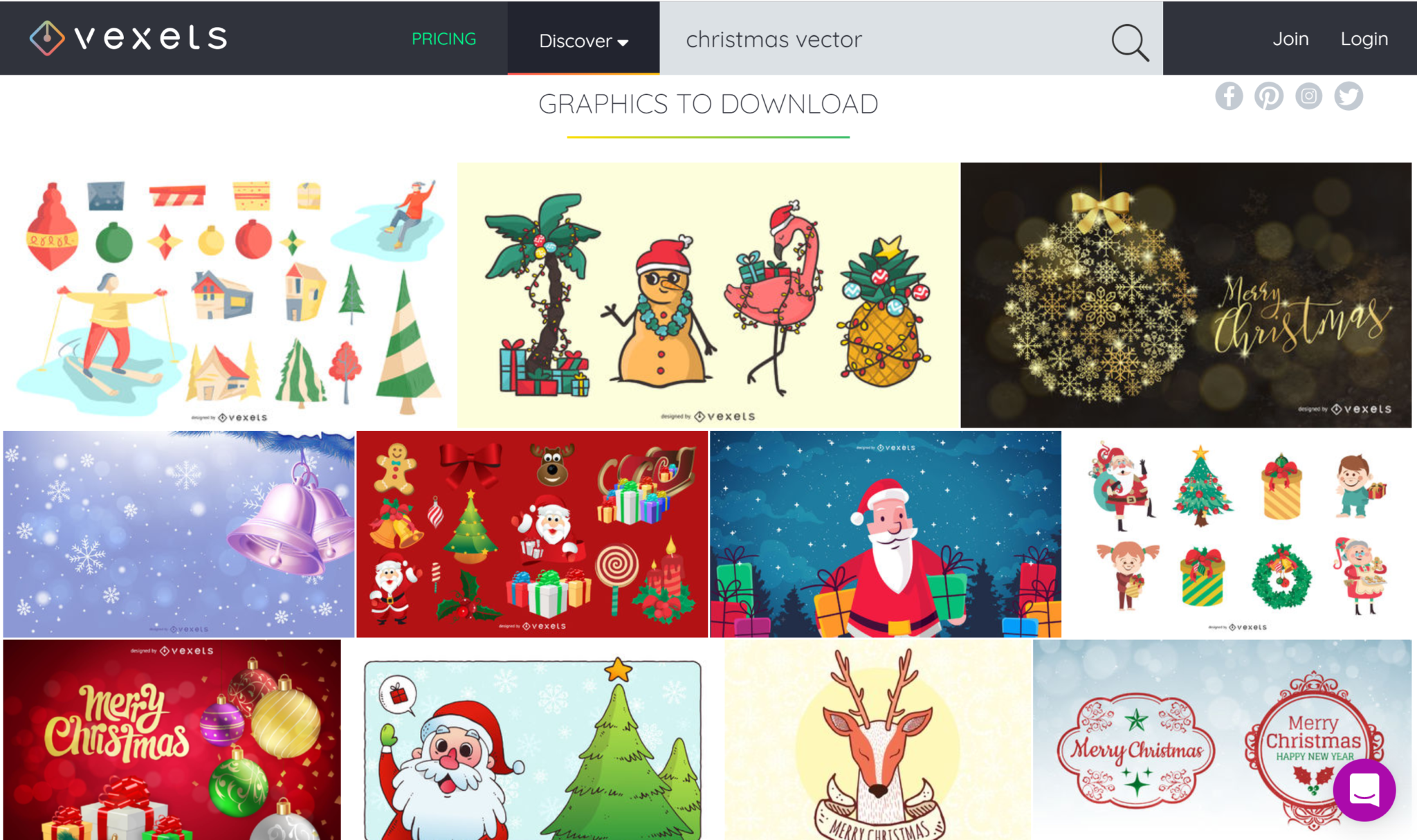
Vexels
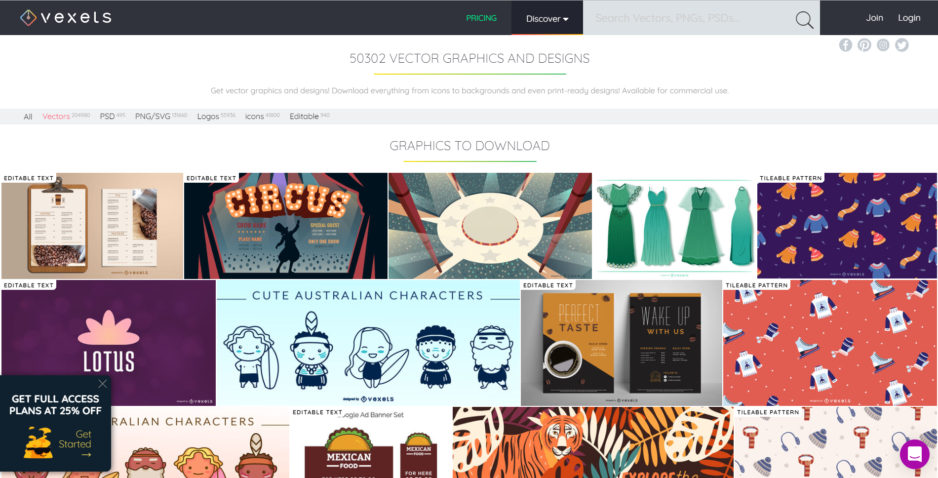
Vexels has great free vectors for you to use for personal and commercial use. What I really like about their vectors is that many of them are editable. You can get everything from icons to backgrounds and designs that are ready for print. Give them a try!
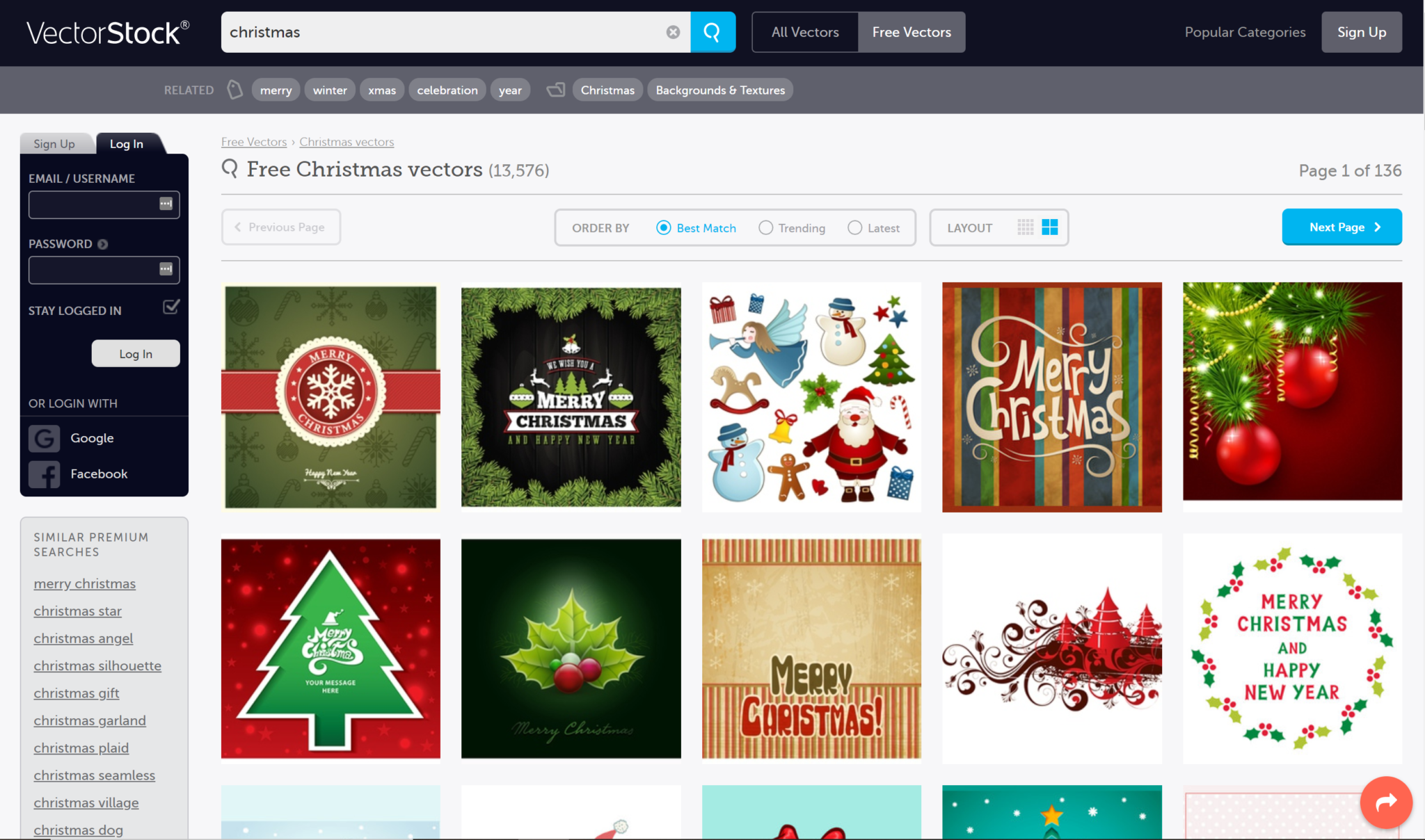
Vector Stock
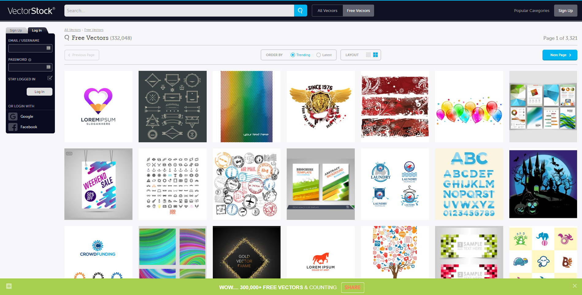
Vector stock has over 300,000 vectors for you to choose from. With such a wide variety of vectors, surely you’ll find something that’ll suit your project and save you loads of time.
The Noun Project
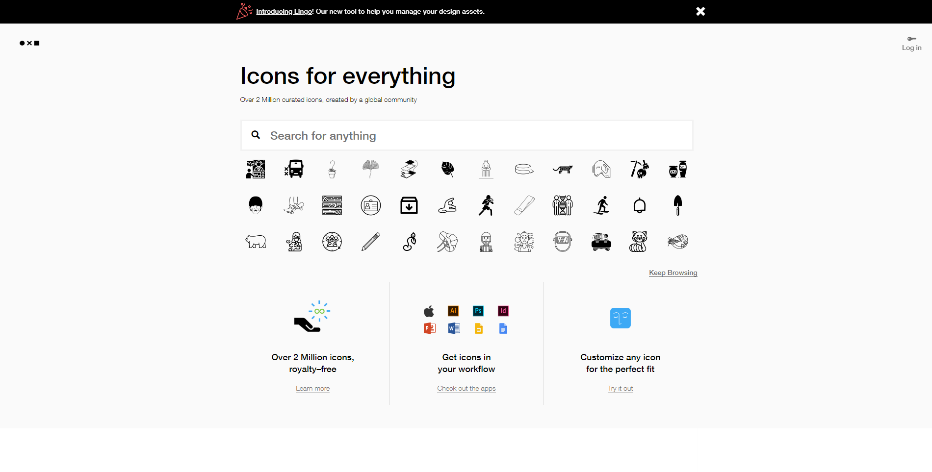
The Noun Project can be summed up in icons, icons, icons! They have over 2 million royalty-free vector icons for you to use. And what’s better? You can edit them. That is insane, people. Don’t sleep on the noun-project. They have all those quality things you’re looking for.
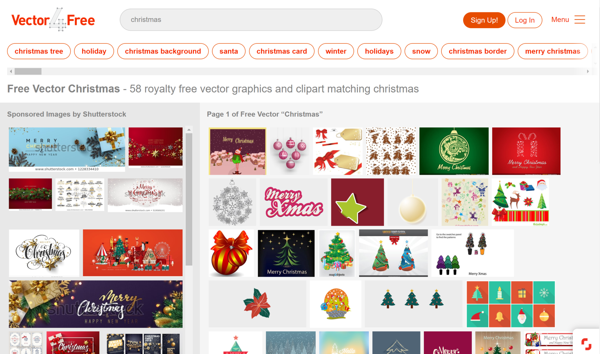
Vector 4 Free
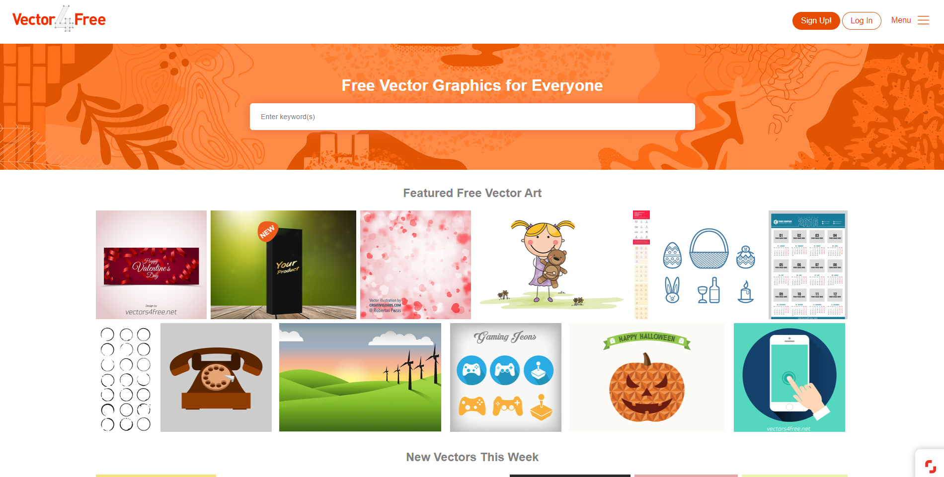
Vector 4 Free has vector art for everyone. Their goal is to share vector art created by professional designers with everyone. They have all sorts of formats, such as .ai format, but also .eps, .pdf, .svg, and even .cdr. All of their vectors are free for personal use, but for commercial use, you have to check each artist’s terms of use, as they all differ.
Freepik
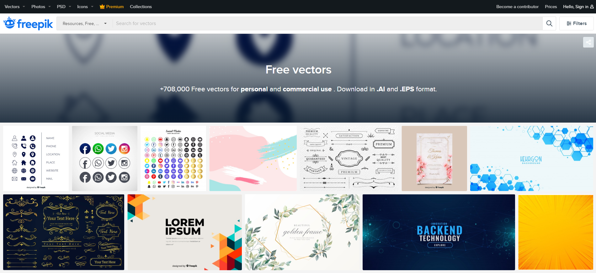
Freepik has over 708,000 free vectors for you to use for personal use and also for commercial use. The styles vary as far as feminine and elegant-looking invitations to vectors that are perfect for backend technology promotion. You’ll find every style you could need here, and you can download everything in .Ai and .EPS formats.
Free Vector
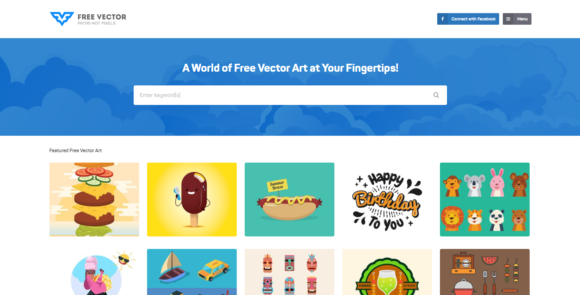
Free Vector is full of fun and colorful cartoonish vectors. They are basically a world full of free vector art that is simply at your fingertips. Type in your keywords in the search bar to find vectors that suit your style, or scroll to the end of the page and find tons of categories to browse through.
Vecteezy
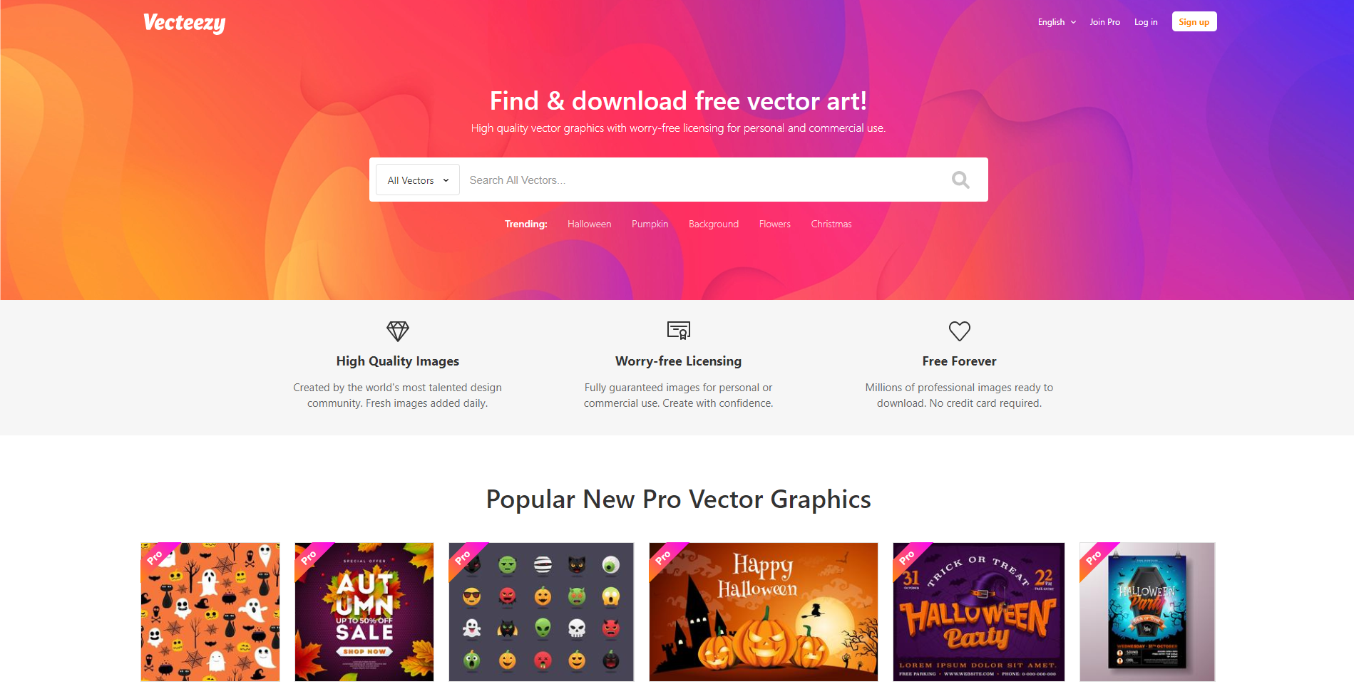
Vecteezy has thousands of gorgeous vector art for you to use. Everything is copyright free, so you never have to worry about that. There are tons of free vectors for you to use, or you can upgrade your account to a pro account and have access to everything at your fingertips.
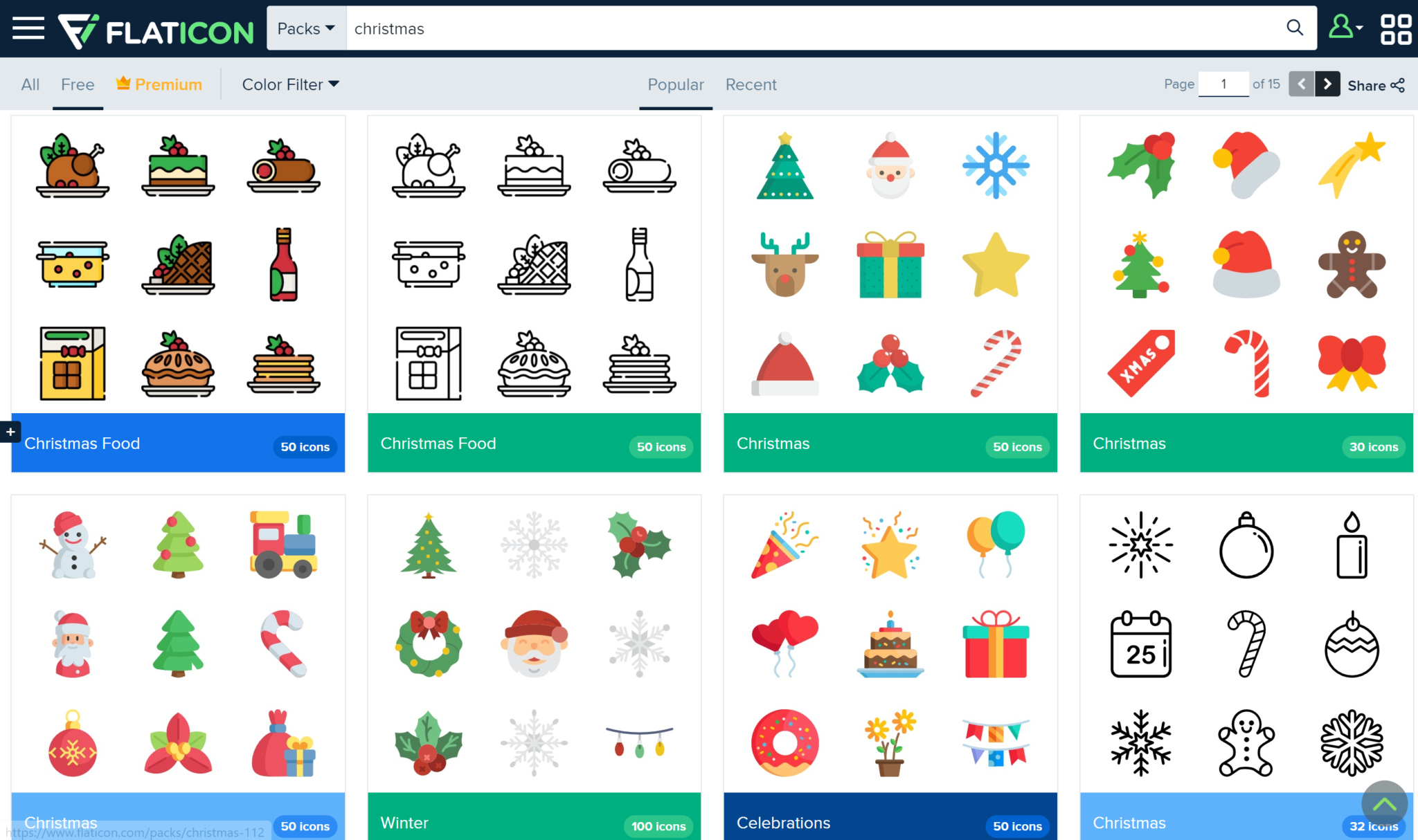
Flat Icon
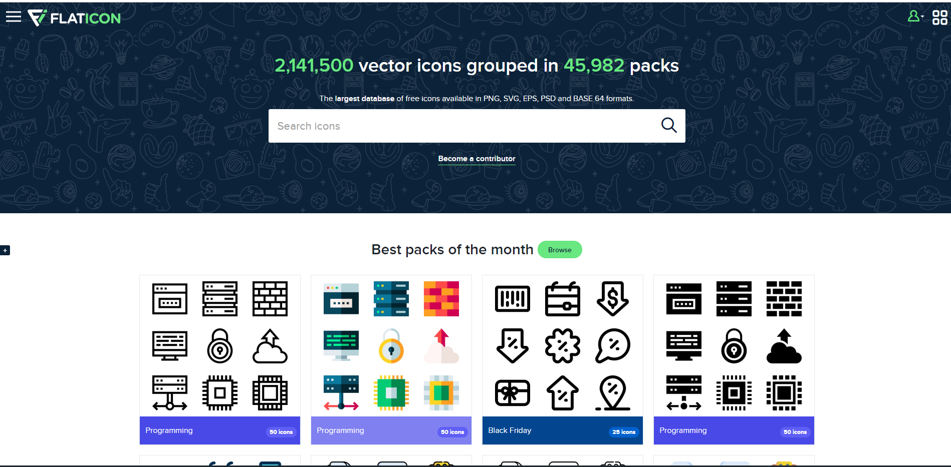
Flat Icon is the largest database of free icons that are available in PNG, SVG, EPS, PSD, and BASE 64 formats to date! With a free account, you can access thousands of free icons, or you can upgrade your account and get millions of icons for free.
Pngtree
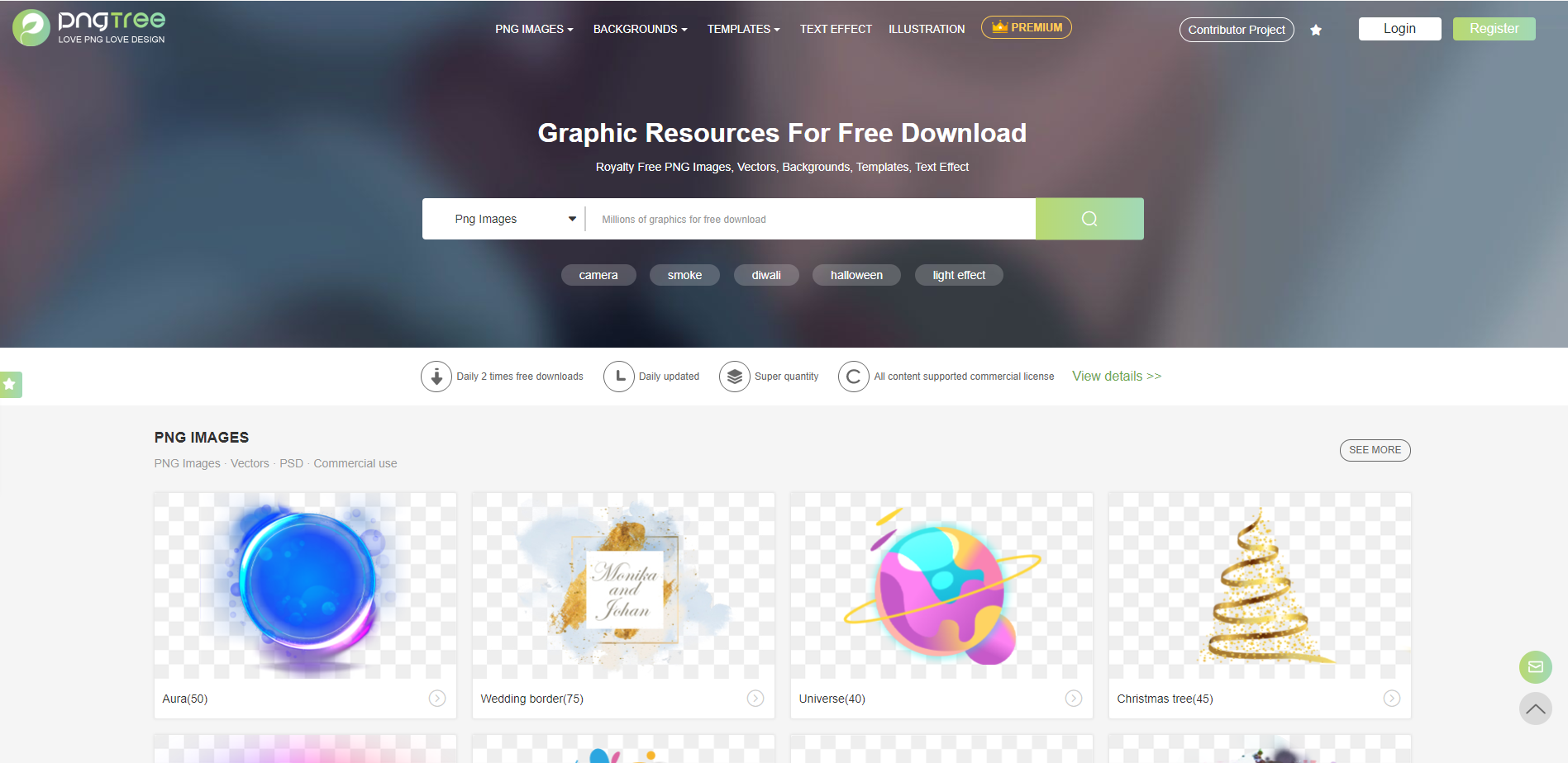
Pngtree has wonderful vectors for you to choose from, and with a free account, you have access to 2 daily downloads. Get royalty-free PNG images, vectors, backgrounds, templates, and text effects from Pngtree.
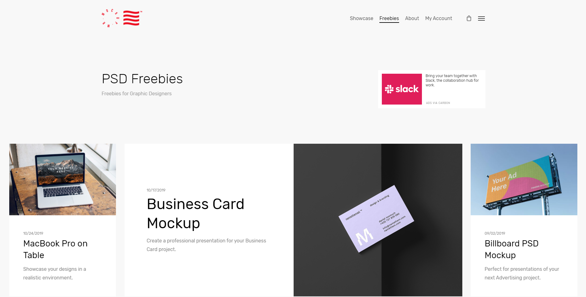
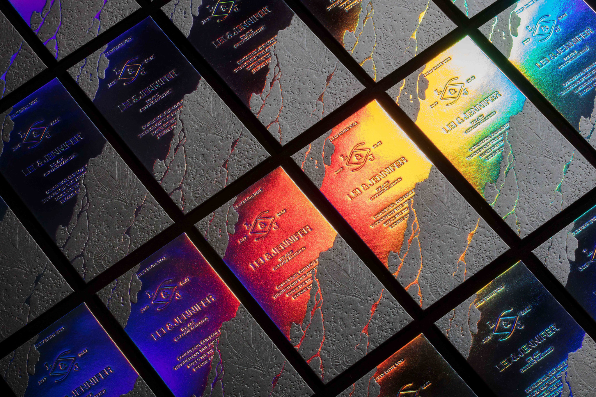
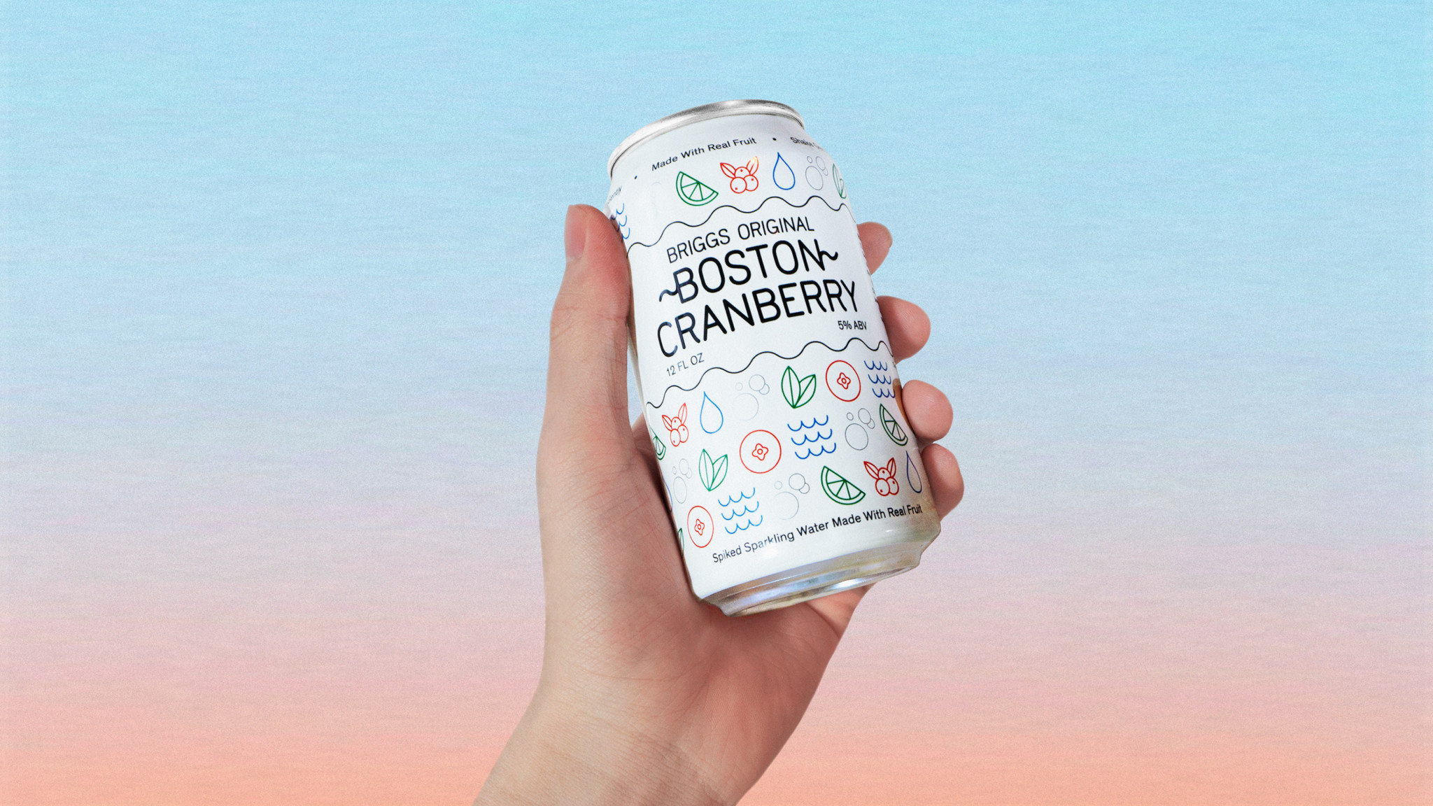
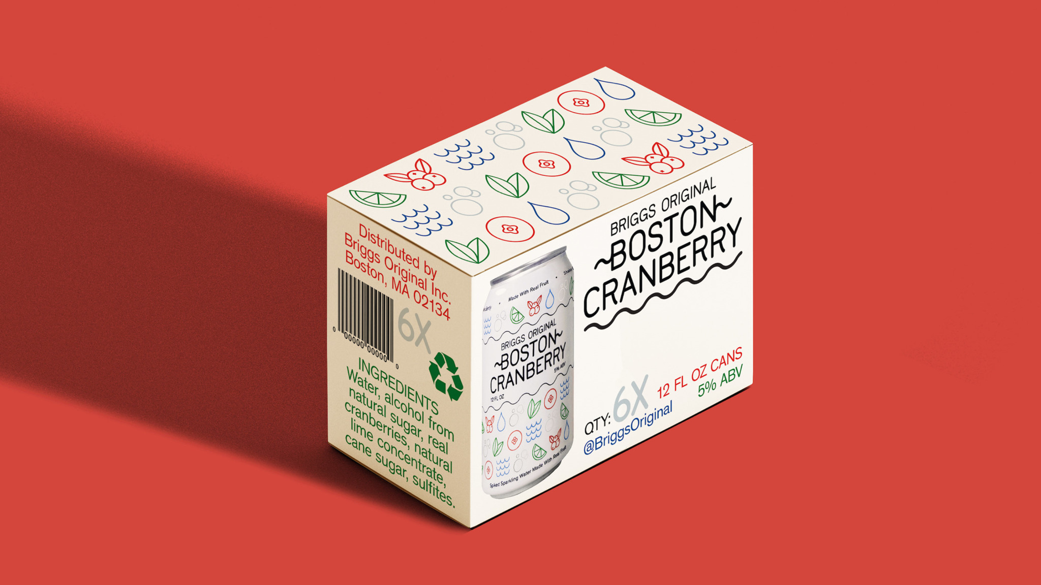
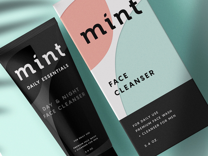
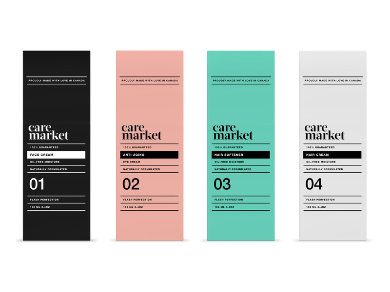
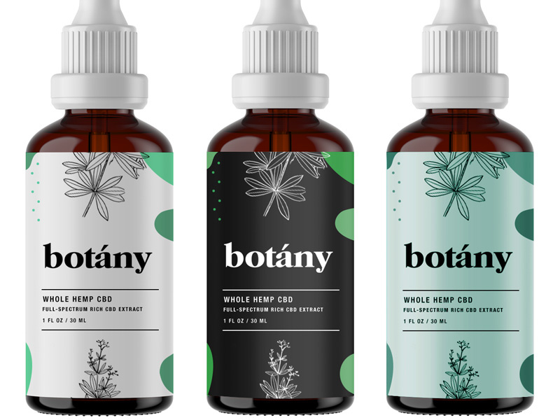
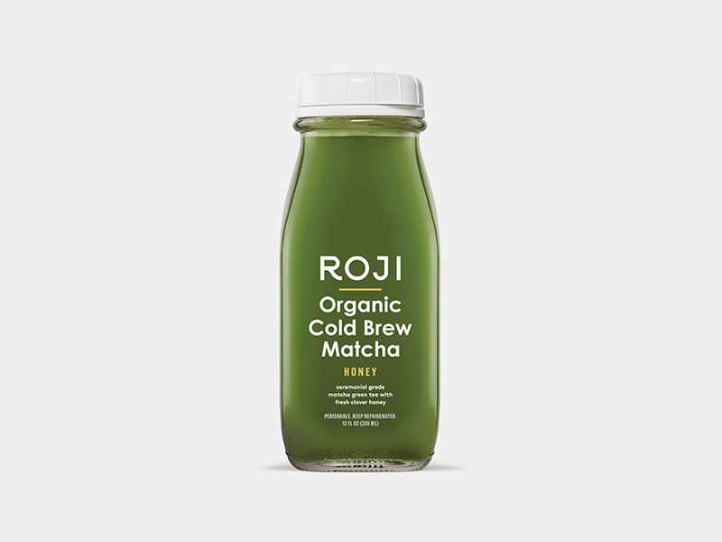
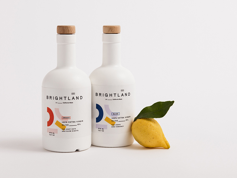
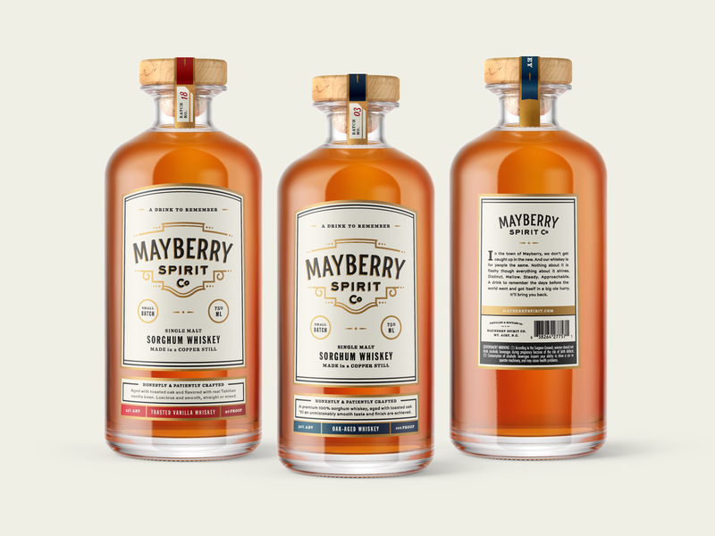
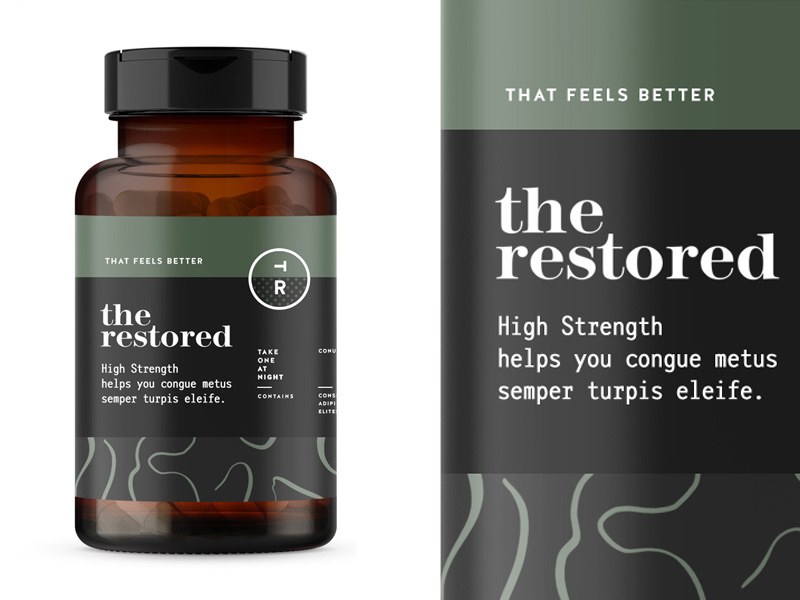
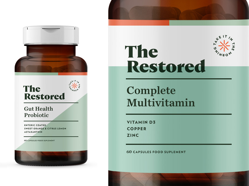
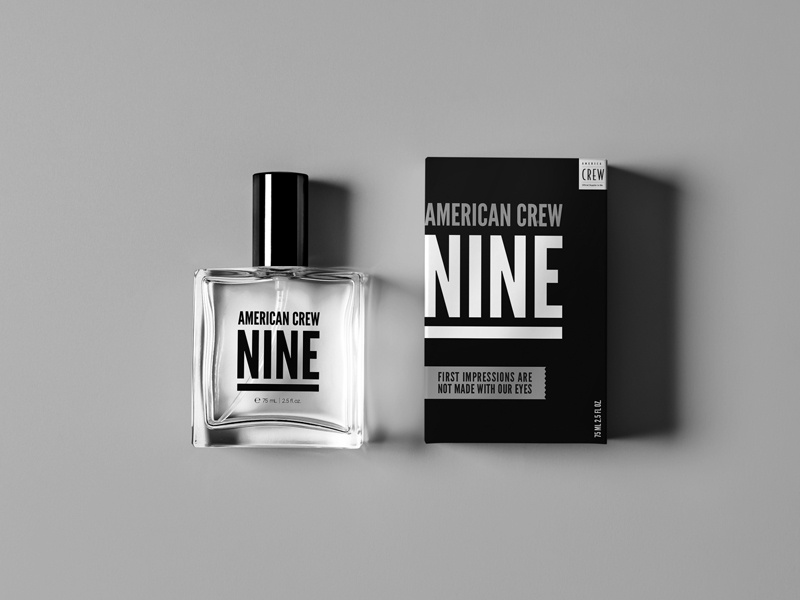
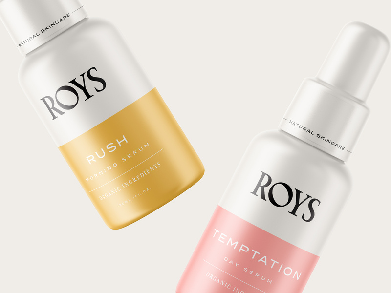
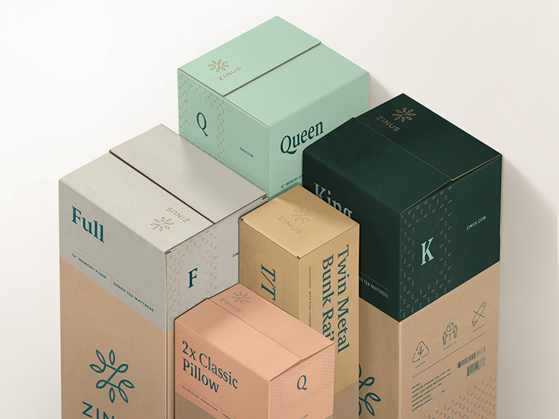
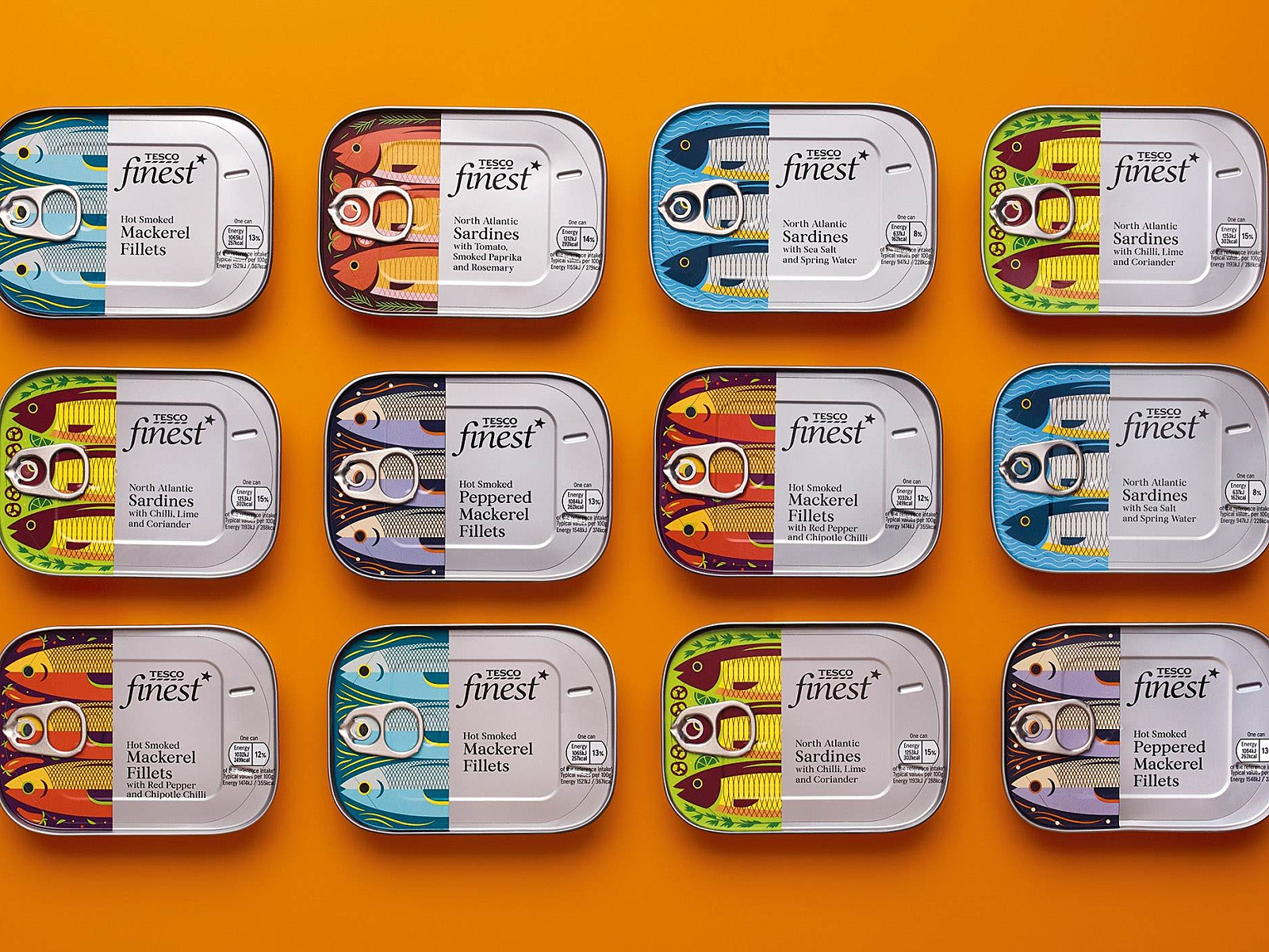
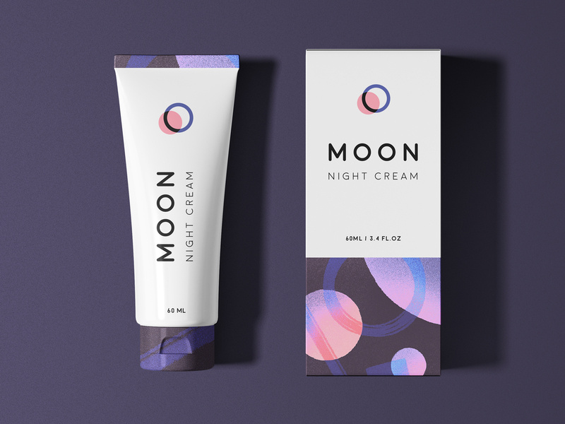
Free Mockups
Showing real-life visuals of your work to your client is a vital selling point, and that’s one of the huge reasons that mockups are so crucially important. Here are 10 free amazing mockup websites for you to use for your next project.
Placeit
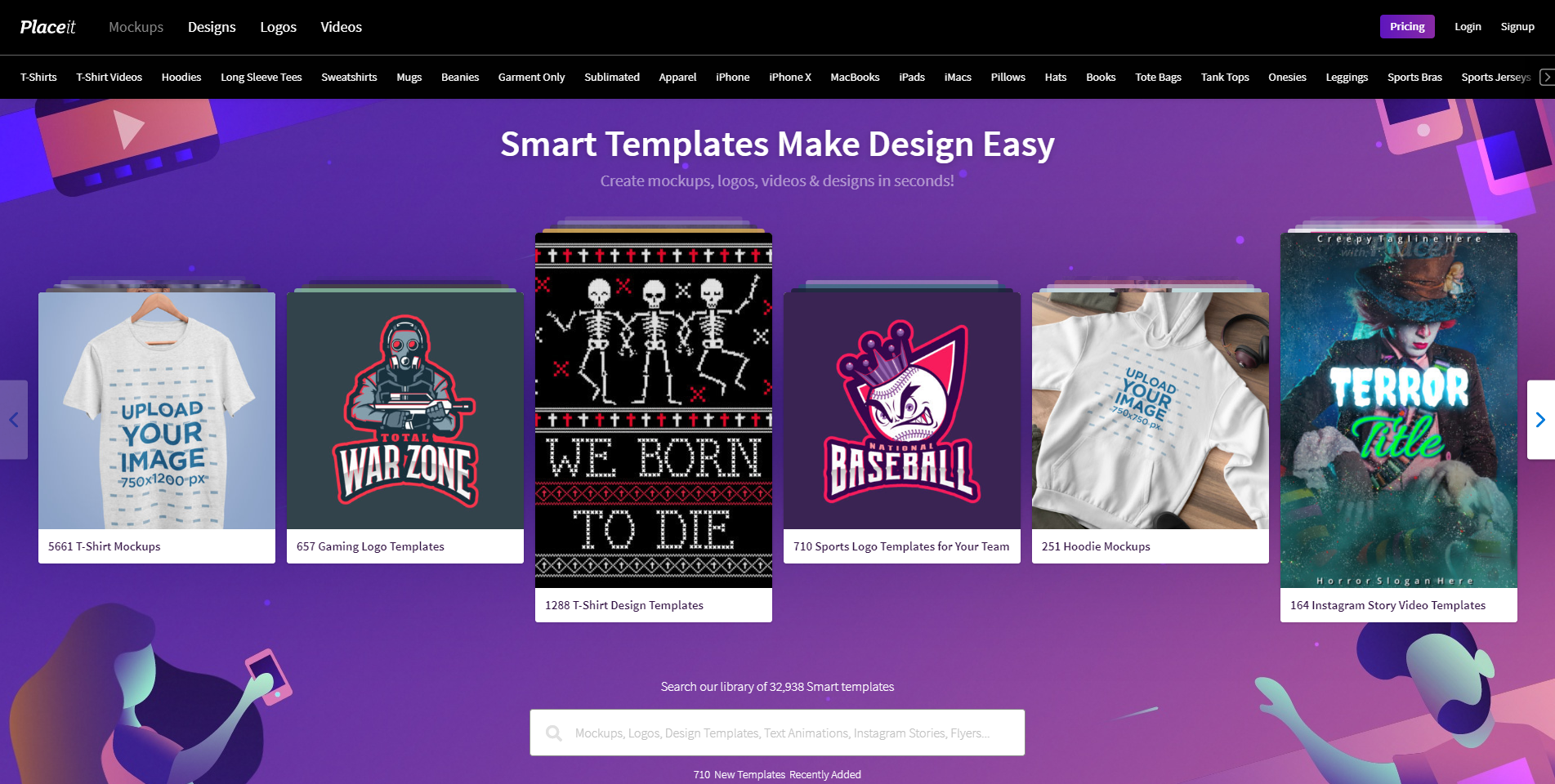
Placeit is a site where you can visualize all of your designs on products within seconds. Not only can you just upload your images, but you can also make designs on the platform, and create videos. Create your own design, or try out one of their 32,938 smart templates!
Smart Mockups
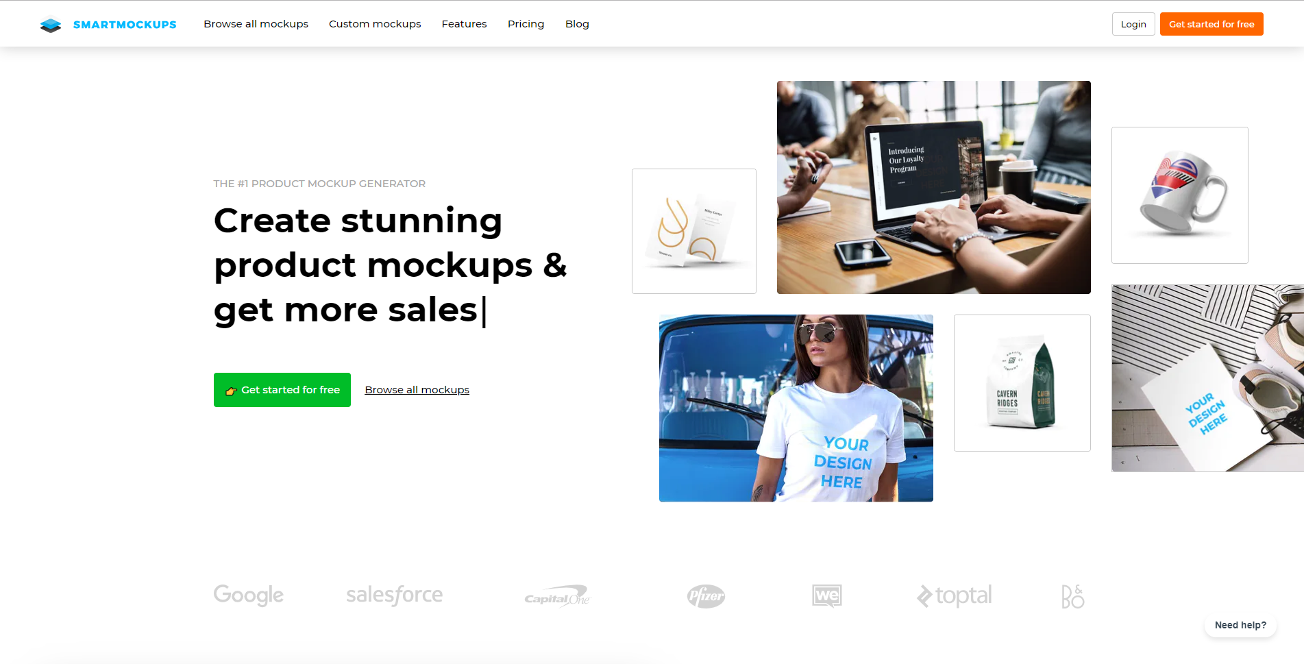
Smart Mockups is the fastest web-based mockup tool out there right now. It’s user-friendly in the manner that advanced designers and beginners alike can use and understand their product. You can use a free account and create 200 mockups and use basic features, or you can upgrade your account and have access to all mockups and features.
Mockuuups
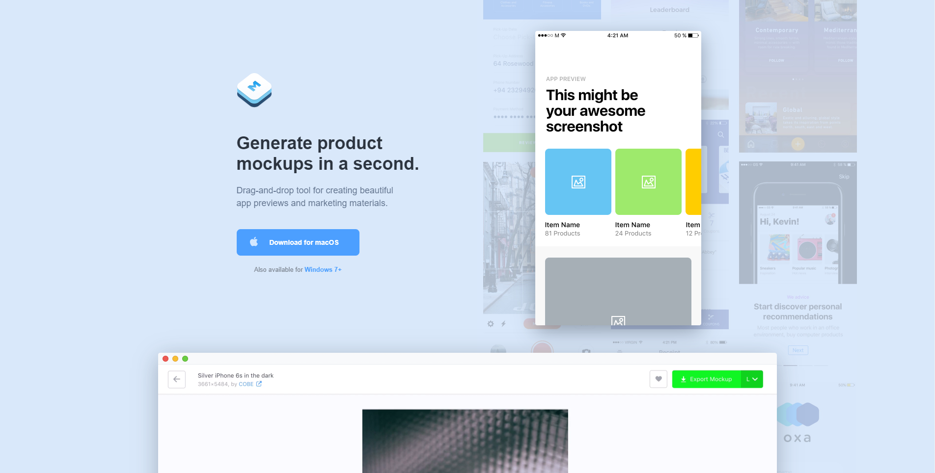
Mockuuups will generate tour product mockups in literally a second. The tool is easy to use, as it is drag-and-drop based. Download the app to your computer to start using. You can use a free account and still have access to lots of features and mockups, or you can upgrade your account to have access to everything!
Mckups
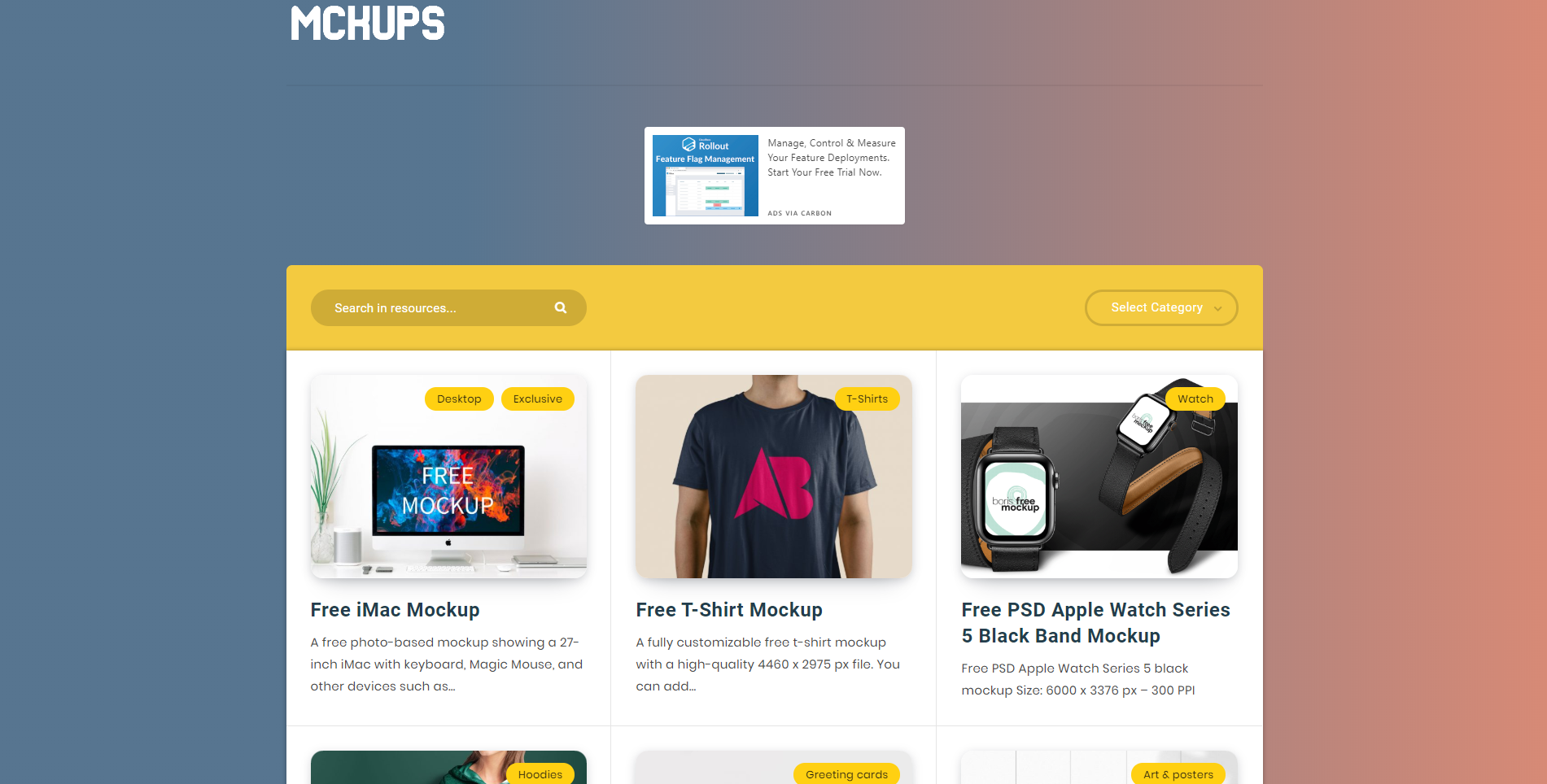
Mckups has a beautiful, minimalist interface and beautiful, free mockups for you to use. The mockups are hand-crafted by professional designers and are just waiting for you to use them.
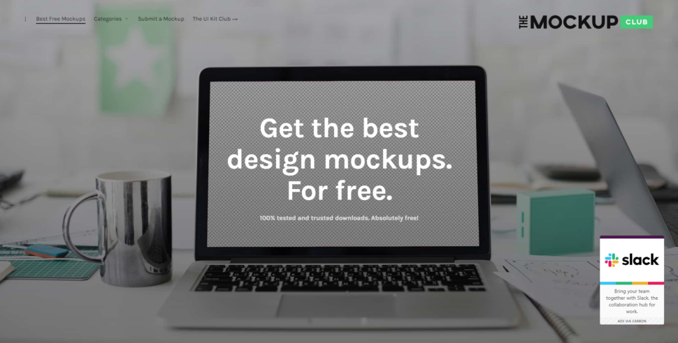
The Mockup Club
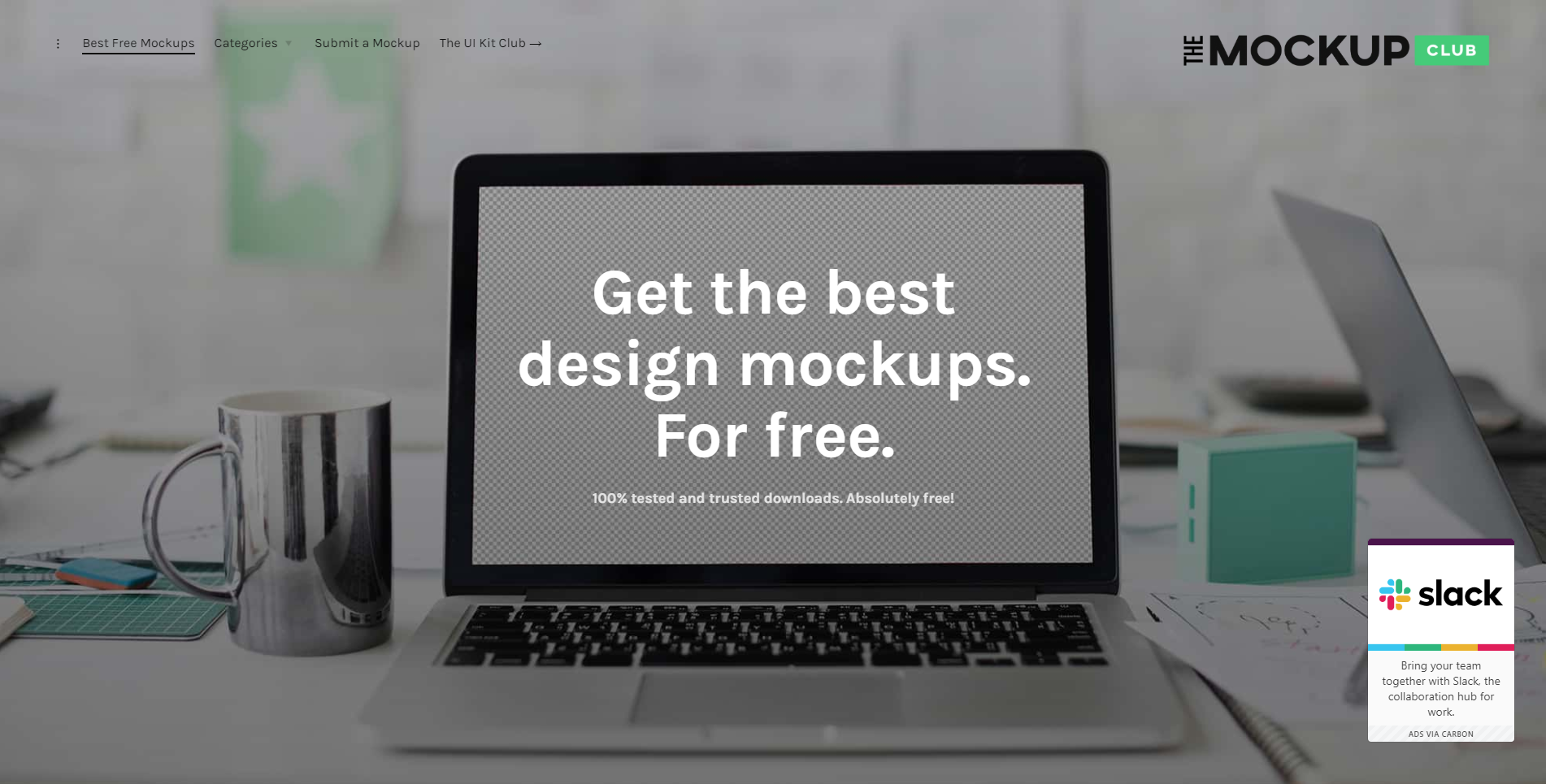
The Mockup Club is absolutely free and that might just be my favorite part. It’s a one-stop shop with loads of free mockups for you to use to showcase your lovely designs.
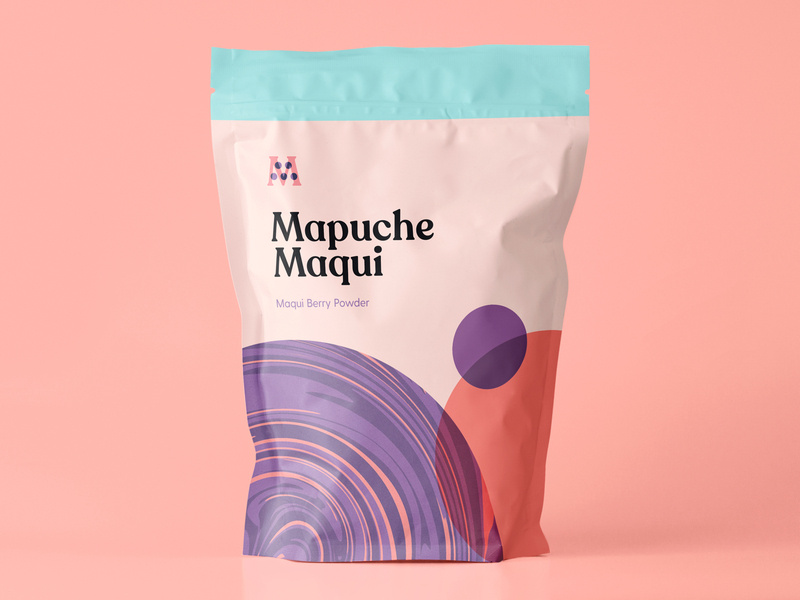
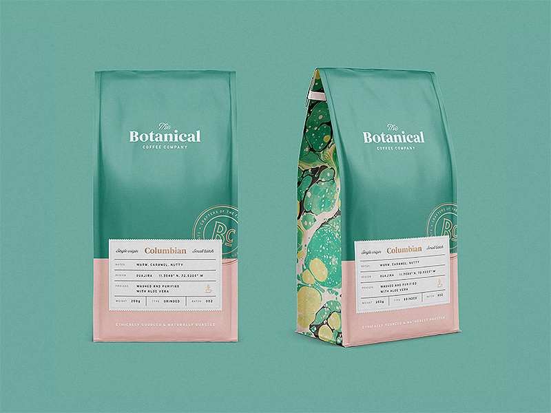
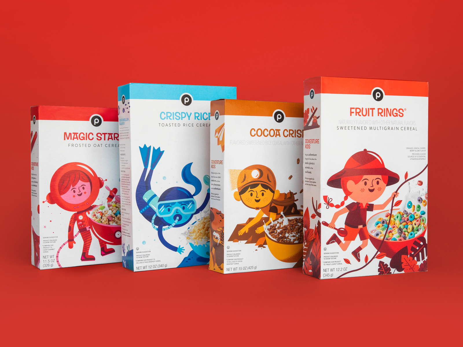
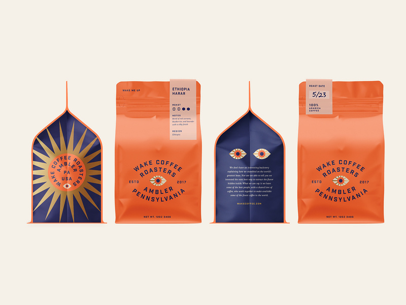
Psd Repo
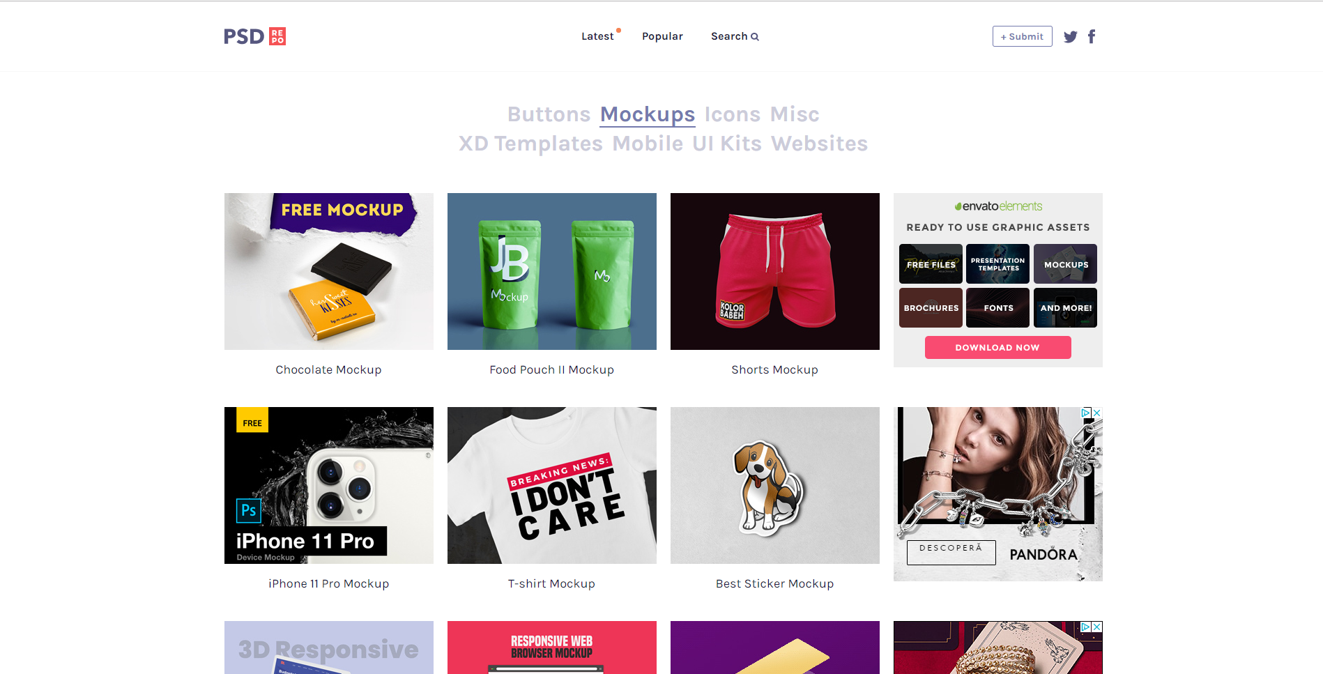
Psd Repo has every mockup imaginable. From key-chains to shorts, to t-shirts, to protein powder packaging, I think I can safely say they have it all. The mockups are made by talented designers who want to share their work with you for free. Download your favorite mockup as a PSD file and get to designing!
Mockups Design
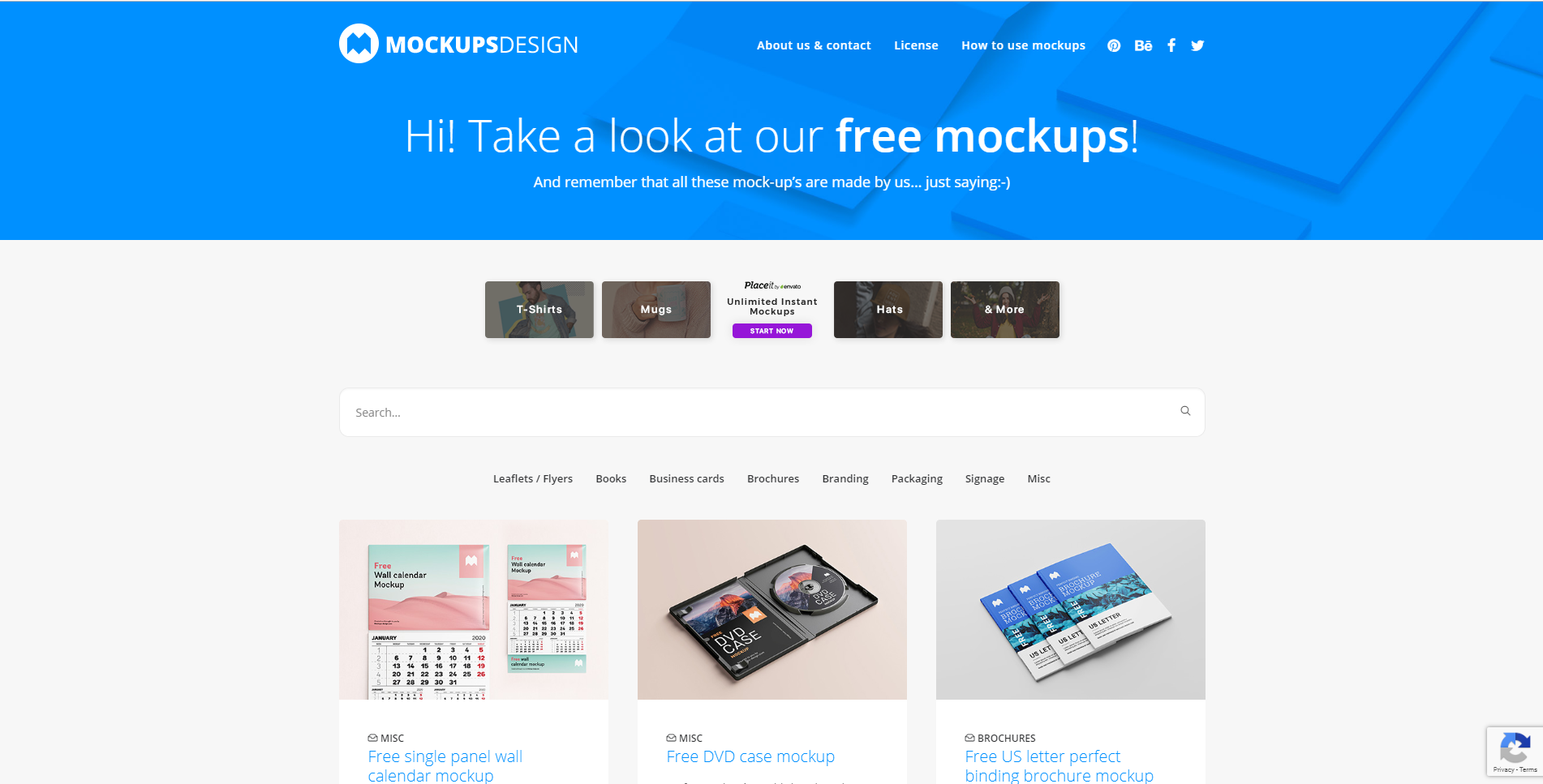
Mockups Design is an easy-to-use website where designers can find professional mockups for free to use in their next design project. From DVDs and CD to letterheads and brochures. They have lots to choose from.
Good Mockups
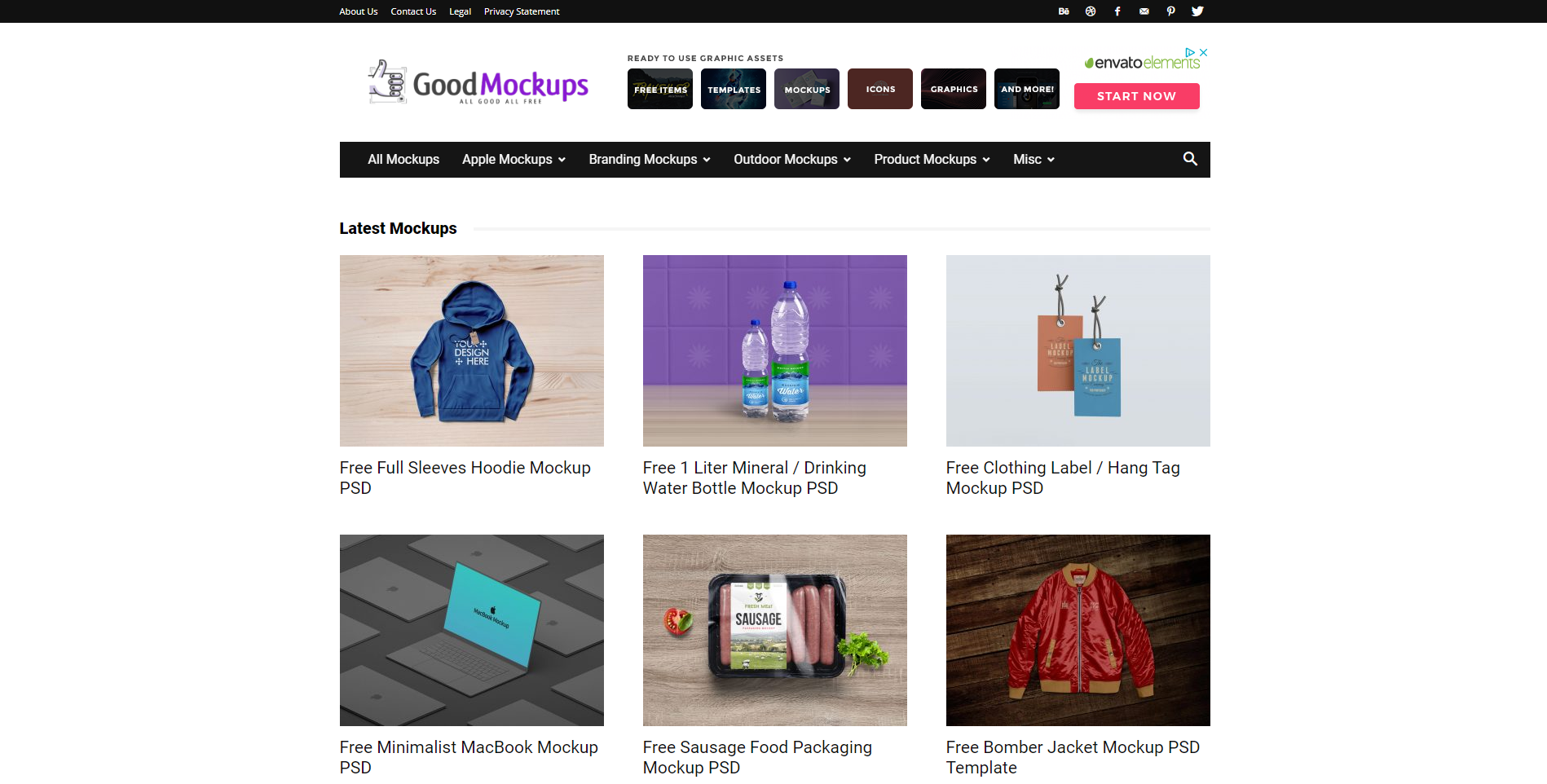
Good Mockups can be summed up about something like this: High-quality, hand-picked, premium mockups for all to use. They strive to have mockups to fit everyone and every design. With an entire list for you to go through, I believe that they are truly well worth your time.
Mr. Mockup
Last but not least, we have Mr. Mockup. They have a team of professional and creative designers working to mockups for everyone. With a vast experience in designing just about anything, you can count on them to find beautiful mockups for your next design project.
Wrapping up
I hope you guys found this ultimate collection of free design resources helpful! Let us know in the comment section below what sites you’ll be using in the near future, or tell us about a website you know that you think is worth mentioning.
Until next time,
Stay creative!
Read More at The Ultimate Collection of Free Design Rersources


