SRS, BRS, and FRS play important roles in designing software.
Professionals working in software development and testing have to deal with specific kinds of requirement specifications when tackling a new product. Accurate and clear requirements are needed for a software development team to work on the creation of the right product, and this documentation makes the overall development process easier.
You can have the best open source project in the world but, if it doesn’t have good documentation, chances are it’ll never take off. In the office, good documentation could save you having to repeatedly answer the same questions. Documentation ensures that people can figure out how things work if key employees decide to leave the company or change roles. Well documented coding guidelines help bring consistency to a codebase.
If you’re writing long-form text, Markdown is clearly a great alternative to authoring HTML. Sometimes though, Markdown syntax isn’t enough. It’s always been possible to write straight HTML inside of Markdown documents. This includes custom elements so, if you’re building a design system with native web components, it’s easy to incorporate them inside your text-based documentation. If you’re working with React (or any other framework that speaks JSX, like Preact or Vue), you can do the same thing by using MDX.
This article is a broad overview of the tools available for writing documentation and for building style guides. Not all the tools listed here make use of MDX but it’s increasingly being incorporated into documentation tooling.
What is MDX?
A .mdx file has exactly the same syntax as a regular Markdown file, but lets you import interactive JSX components and embed them within your content. Support for Vue components is in alpha. It’s easy to get MDX set up with Create React App. There are MDX plugins for Next.js and Gatsby. The forthcoming version two release of Docusaurus will also come with built-in support.
Writing documentation with Docusaurus
Docusaurus is made by Facebook and used by every Facebook open source project, apart from React. It’s also used by many major open source projects outside of Facebook, including Redux, Prettier, Gulp and Babel.
Projects making use of Docusaurus.
You can use Docusaurus to document anything — it isn’t front-end specific. Docusaurus uses React under the hood, but you don’t have to know that framework to make use of it. It’ll take your Markdown files and turn them into a nicely-structured, well-formatted and readable documentation site, with a nice design right out of the box.
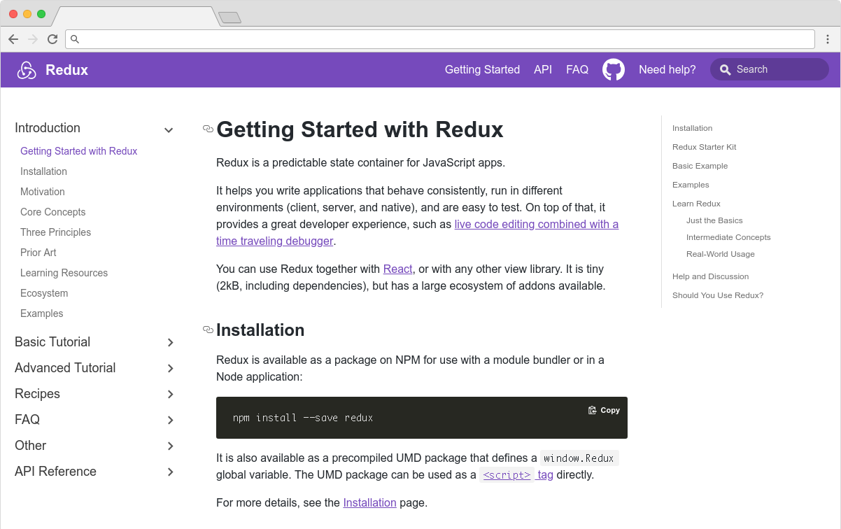
The Redux site shows the typical Docusaurus layout
Sites created with Docusaurus can also include a Markdown-based blog. Prism.js is included by default for zero-setup syntax highlighting. While relatively new, Docusaurus has proven popular, being voted the number one new tool of 2018 on StackShare.
Other options for written content
Docusaurus specifically caters to building documentation. Of course, there are a million and one ways to make a website — so you could roll your own solution with any back-end language, CMS, or static site generator.
The documentation sites for React, IBM’s design system, Apollo and Ghost CMS use Gatsby, for example — a generic static site generator often used for blogs. If you work with the Vue framework, VuePress is becoming a popular option. MkDocs is an open source static site generator for creating documentation, written in Python and configured with a single YAML file. GitBook is a popular paid product that’s free for open-source and non-profit teams. If you're building internal documentation and want something easy, the reading experience on GitHub itself isn’t half bad, so you could just commit some Markdown files and leave it at that.
Documenting components: Docz, Storybook and Styleguidist
Style guides, design systems, pattern libraries — whatever you want to call them — have become a hugely popular area of concern in the last decade. What’s really made the difference in turning them from vanity projects into useful tools isn’t the pontificating of thought leaders but the emergence of component-driven frameworks, like React, and the tools mentioned here.
Storybook, Docz and Styleguidist all do much the same thing: display interactive UI components and document their API. A project may have dozens or even hundreds of components to keep track of — all with a variety to states and styles. If you want components to be reused, people have to know that they exist. We aid discoverability when we catalog components. A style guide gives an easily searchable and scannable overview of all your UI components. This helps to maintain visual consistency and avoid duplicating work.
These tools provide a convenient way to review different states. It can be difficult to reproduce every state of a component in the context of a real application. Rather than needing to click through an actual app, developing a component in isolation can be helpful. Hard-to-reach states (like a loading state, for example) can be mocked.
Dan Green wrote a nice synopsis of the benefits of using Storybook, but it applies equally to Docz and Styleguidist:
"Storybook has made it really easy for designers who code to collaborate with engineers. By working in storybook they don't need to get a whole environment running (docker container, etc). For Wave, we have many important components that are only visible in the middle of a process that is short lived and time consuming to reproduce (i.e. a loading screen that only shows while a user is having their payment account set up). Before Storybook, we didn't have a good way to work on these components and were forced to temporary hacks in order to make them visible. Now, with Storybook we have an isolated place to easily work on them, which has the bonus feature of being easily accessible for designers and PMs. It also makes it really easy for us to show off these states in sprint demos."
- Dan Green, Wave Financial
As well as visualizing different states side-by-side and listing props, its often helpful to have written content about a component — whether its explaining the design rationale, use-cases, or describing the results of user-testing. Markdown is easy enough for *anybody* to learn — ideally a style guide should be a joint resource for designers and developers that both disciplines contribute to. Docz, Styleguidist and Storybook all offer a way to seamlessly intermingle Markdown with the components themselves.
Docz
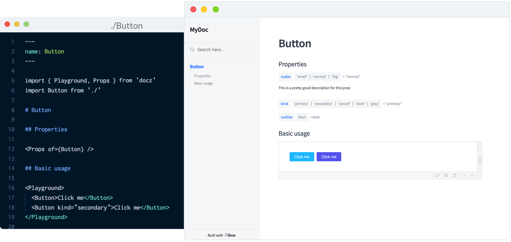
Currently, Docz is a React-only project, but is working on support for Preact, Vue and web components. Docz is the newest of the three tools, but has already amounted over 14,000+ stars on GitHub. It is, to my mind, the easiest solution to work with. Docz provides two components — <Playground> and <Props>. These are imported and used directly in .mdx files.
import { Playground, Props } from "docz";
import Button from "../src/Button";

## You can _write_ **markdown**
### You can import and use components

<Button>click</Button>
You can wrap your own React components with <Playground> to create the equivalent of an embedded CodePen or CodeSandbox — a view of your component alongside editable code.
<Playground>
  <Button>click</Button>
</Playground>
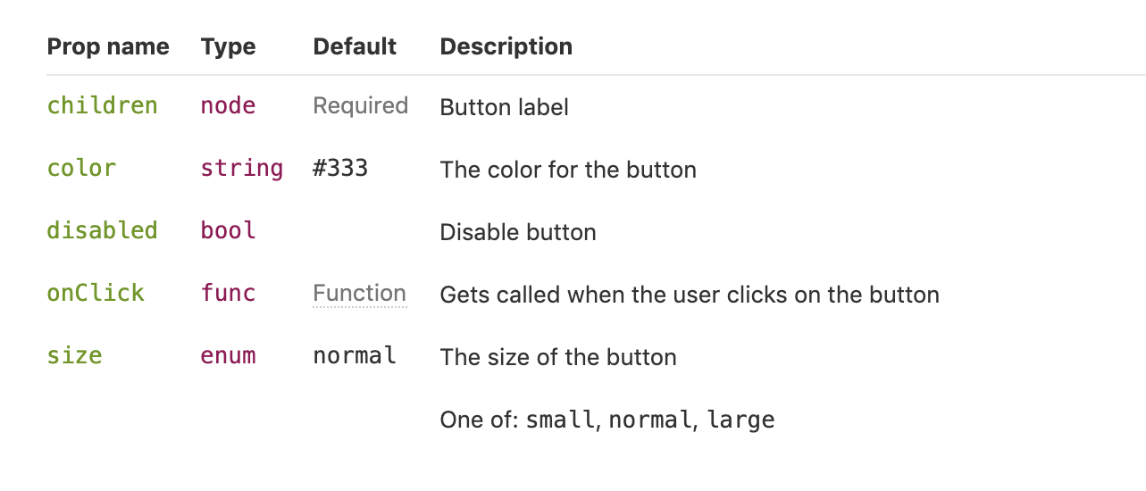
<Props> will show all the available props for a given React component, default values, and whether the prop is required.
<Props of={Button} />
I personally find this MDX-based approach the simplest to understand and the easiest to work with.
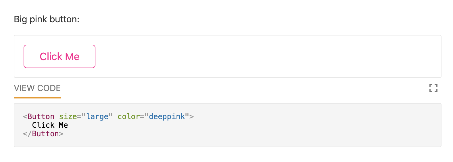
Just like with Docz, examples are written using Markdown syntax. Styleguidist uses Markdown code blocks (triple backticks) in regular .md files rather than MDX:
Code blocks in Markdown usually just show the code. With Styleguidist, any code block with a language tag of js, jsx or javascript will be rendered as a React component along with the code. Just like with Docz, the code is editable — you can change props and instantly see the result.
Styleguidist will automatically create a table of props from either PropTypes, Flow or Typescript declarations.
Styleguidist currently supports React and Vue.
Storybook
Storybook markets itself as "a development environment for UI components." Rather than writing examples of components inside Markdown or MDX files, you write *stories* inside Javascript files. A *story* documents a particular state of a component. A component might have stories for a loading state and a disabled state, for example.
Storybook is less straightforward to use than Styleguidist and Docz. At over 36,000 GitHub stars though, it’s the most popular option. It’s an open source project with 657 contributors and a full-time maintainer. It is used by, among others, Airbnb, Algolia, Atlassian, Lyft, and Salesforce. Storybook supports more frameworks than any other offering — React, React Native, Vue, Angular, Mithril, Ember, Riot, Svelte and plain HTML are all supported.
Writing documentation about components currently requires addons. In a future release, Storybook is taking inspiration from Docz and adopting MDX.
# Button

Some _notes_ about your button written with **markdown syntax**.

<Story name="disabled">
  <Button disabled>lorem ipsum</Button>
</Story>
Storybook’s new Docs feature is being rolled out incrementally over the next couple of months and looks set to be a big step forward.
Do you use @storybookjs for component docs or design systems? You're gonna love DocBlocks: 📦 Drop into MDX 🏗 Modular and composable 🤝 Compatible w/ @gatsbyjs, #nextjs, etc
The benefits of pattern libraries have been extolled at nauseating length in a million Medium articles. When done well, they aid visual consistency and facilitate the creation of cohesive products. Of course, none of these tools can magic up a design system. That takes careful thought about both design and CSS. But when it comes time to communicate that system to the rest of an organization, Docz, Storybook and Styleguidist are all great options.
Documentation in an Agile environment is an interesting topic. The Agile Manifesto places more value on working software than on comprehensive documentation, and one of the Agile principles states, “Simplicity–the art of maximizing the amount of work not done–is essential." But does this mean we shouldn’t write documentation when we use an Agile framework? Not at all. I use these three key practices to create effective Agile documentation.
Minimize Artifacts
First, minimize documentation to just what’s needed to get the job done. While software solutions must be maintained and need supporting documentation (either as commented code or external documentation), there is a tendency to create documents simply because “we’ve always written them," whether they are ever read or not. Creating unneeded documents expends valuable time and is counter to delivering the highest value first. Documentation effort should be treated like a requirement if it’s not part of your Definition of Done; it should be estimated and prioritized along with other work. This means weighing the cost of documentation against the anticipated benefit.
In a sense, it's just an app for keeping documents in one place: little notes, to-do lists, basic spreadsheets, etc. I like the native macOS Notes app just fine. It's quick and easy, it's desktop and mobile, it syncs... but there are enough limitations that I wanted something better. Plus, I wanted something team-based and web-friendly (shared URLs!) and Notion hits those nails on the head.
Here's a bunch of ways to use Notion as well as some scattered random notes and ideas about it.
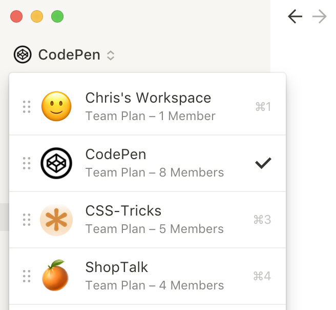
Workspaces are your teams
The word "workspace" almost makes it seem like you could or should use them as your top-level organization structure within a team. Like different projects would use different workspaces. But I'd say: don't do that. Workspaces are teams, even if it's a party of you and only you.
Pricing is billed by workspace. Team members are organized by workspace. Search is scoped by workspace. Switching workspaces isn't too difficult, but it's not lightning fast, either. I'd say it's worth honoring those walls and keeping workspaces to a minimum. It's almost like Slack. It's easy to get Too-Many-Slack'd, so best to avoid getting Too-Many-Notion'd.
Meeting notes
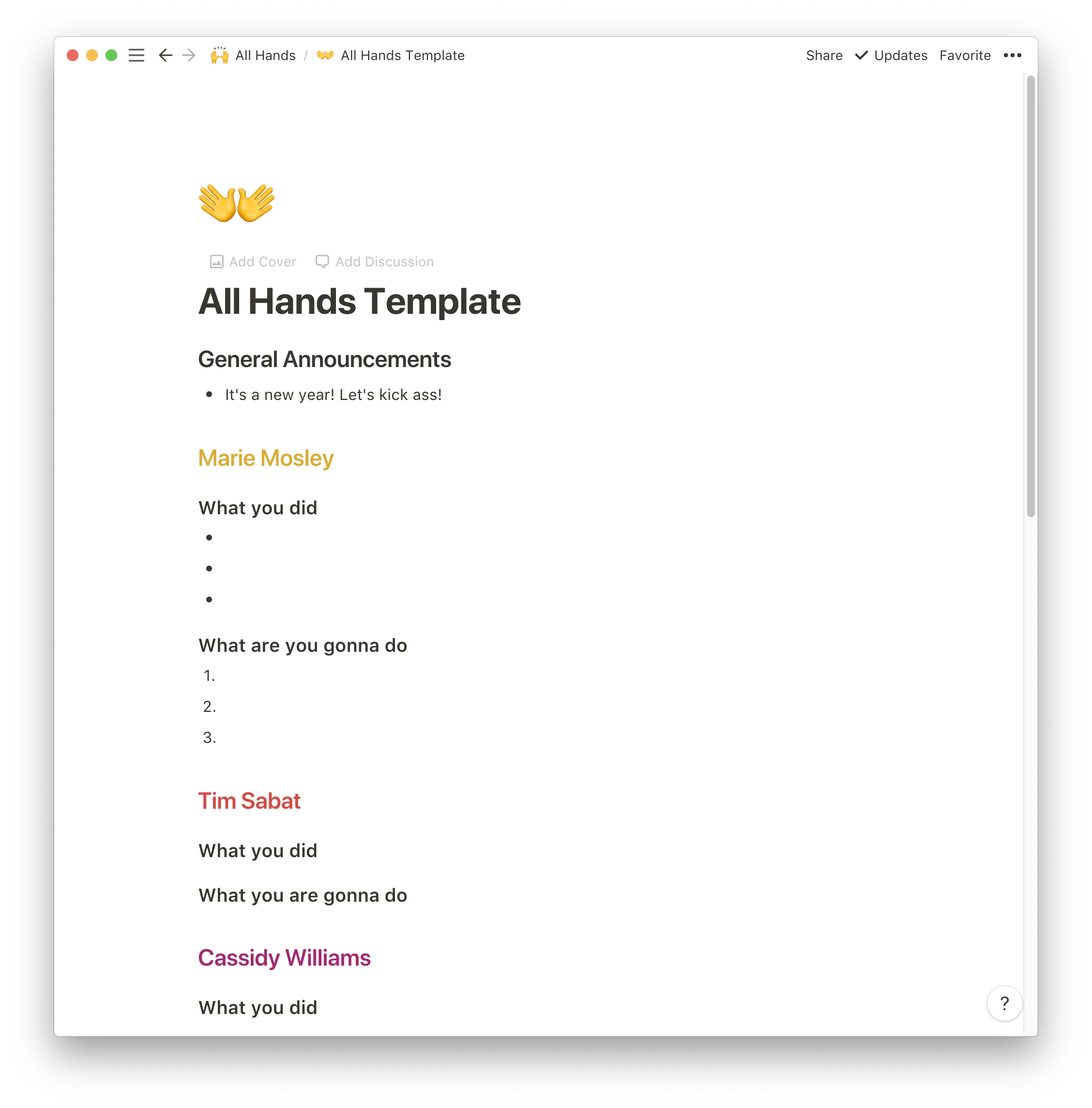
We have a weekly all-hands meeting at CodePen where we lay out what we've done and what we're going to do. It's nice to have that as a document so it can include links, notes, comments, embeds, etc.
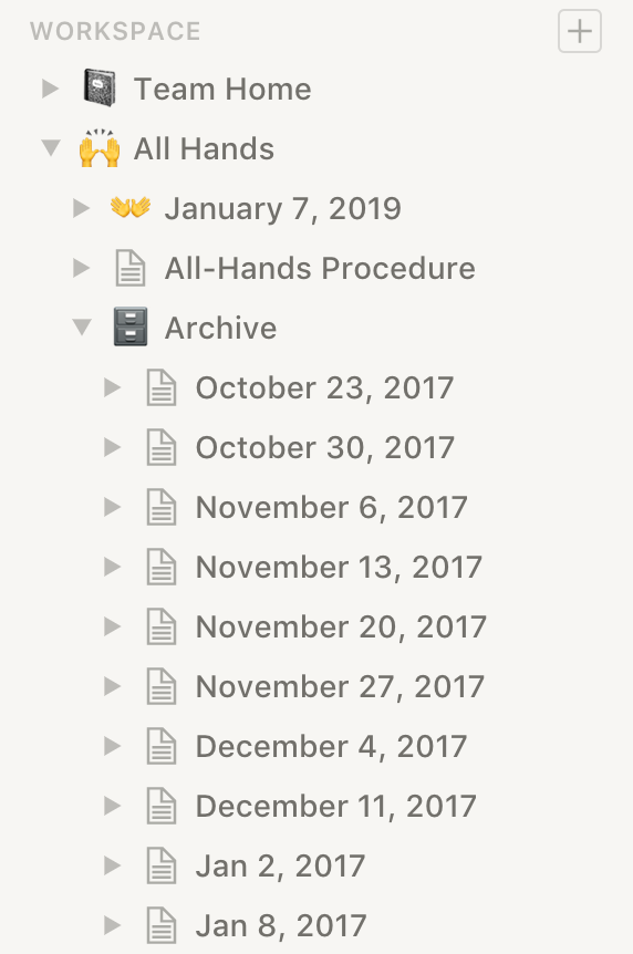
Those notes don't disappear next week — we archive them as a historical record of everything we do.
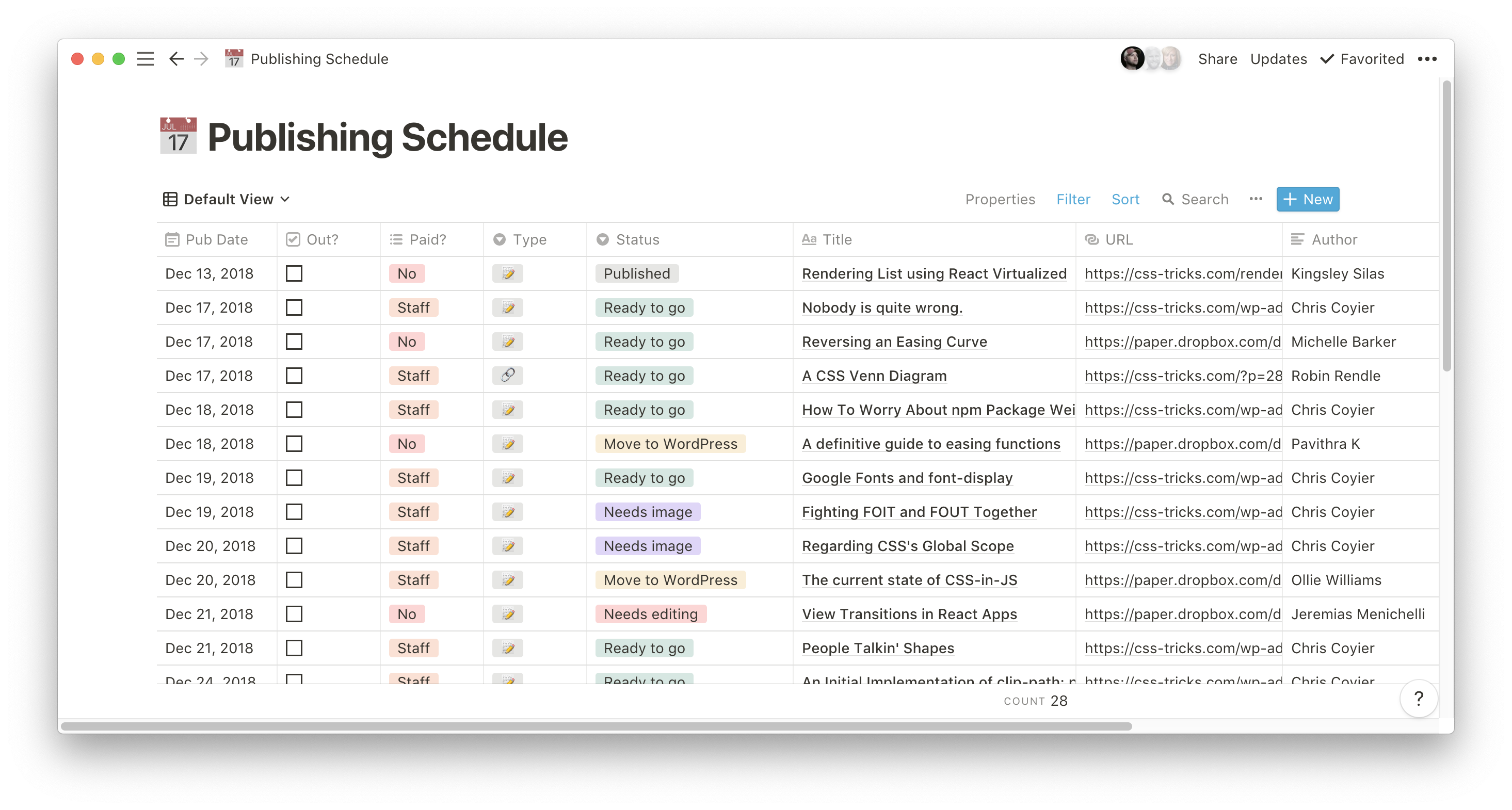
Publishing and advertising schedules
I like looking at a spreadsheet-like document to see upcoming CSS-
Tricks articles with their statuses:
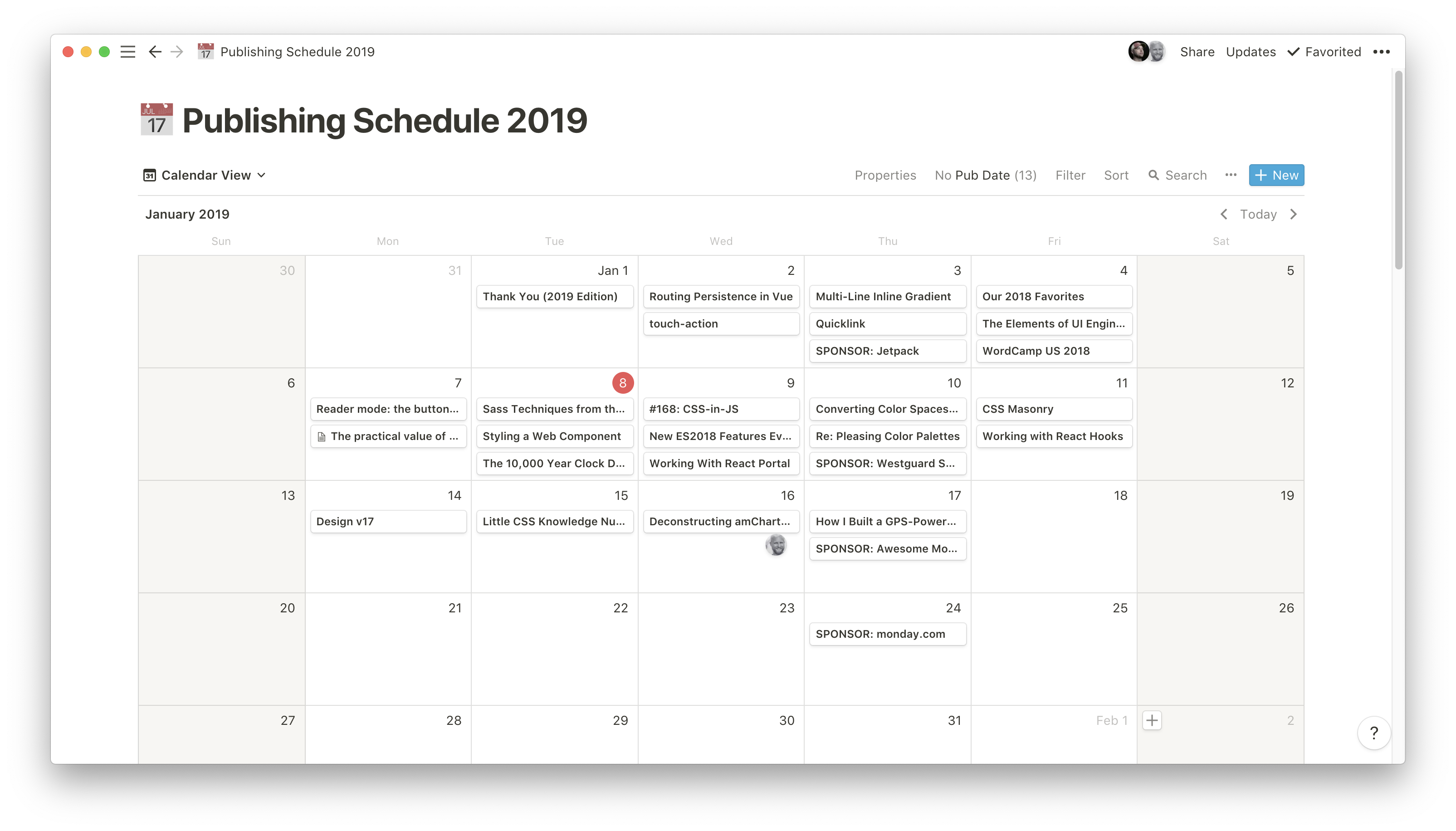
But that same exact document can be viewed as a calendar as well, if that's easier to look at:
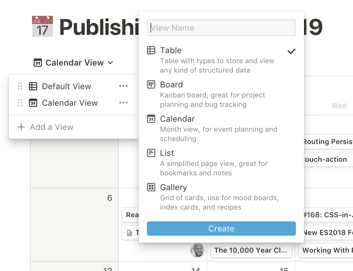
There can be all sorts of views for the same table of content, which is a terrific feature:
Knowledge bases
This might be the easiest selling point for Notion. I'm sure a lot of companies have a whole bunch of documents that get into how the company works, including employee databases, coding guidelines, deployment procedures, dashboards to other software, etc. Sometimes that works as a wiki, but I've never seen a lovely setup for this kind of thing. Notion works fantastically as a collaborative knowledge base.
Public documents
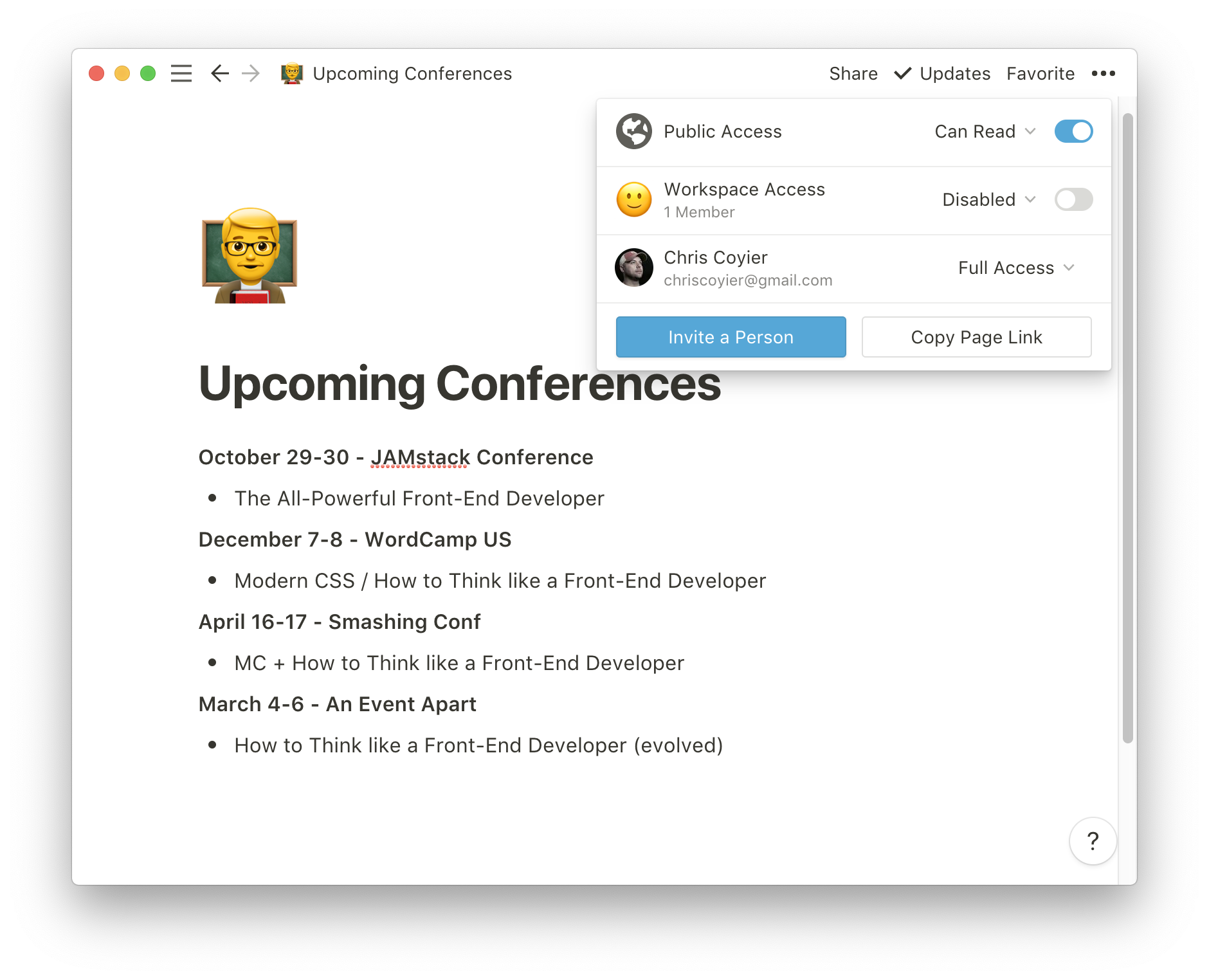
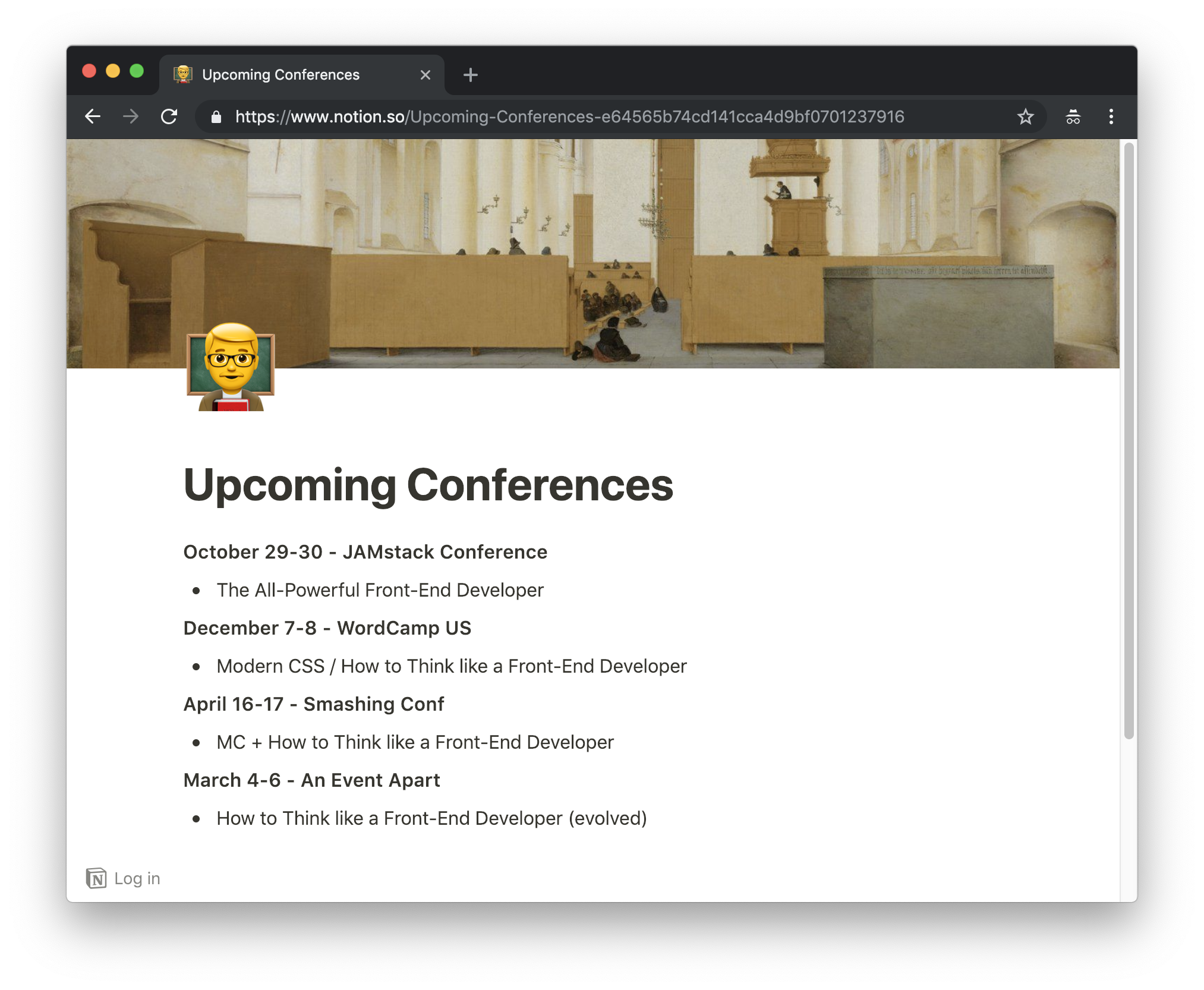
I can make a document public, and even open it to public comments with the flip of a switch.
Another super fun thing in Notion is applying a header image and emoji, which gives each document a lot of personality. It's done in a way that can't really be screwed up and made into a gross-looking document. Here's an example where I've customized the page header — and look at the public URL!
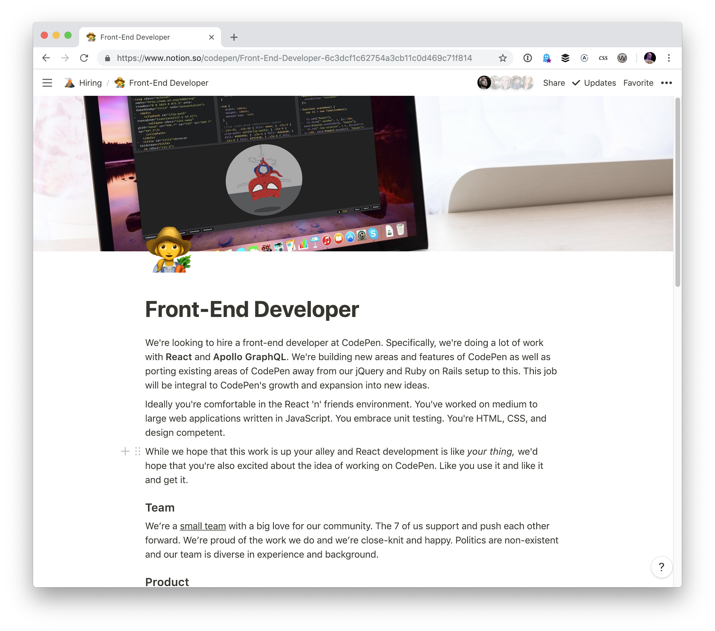
I've also used that for job postings:
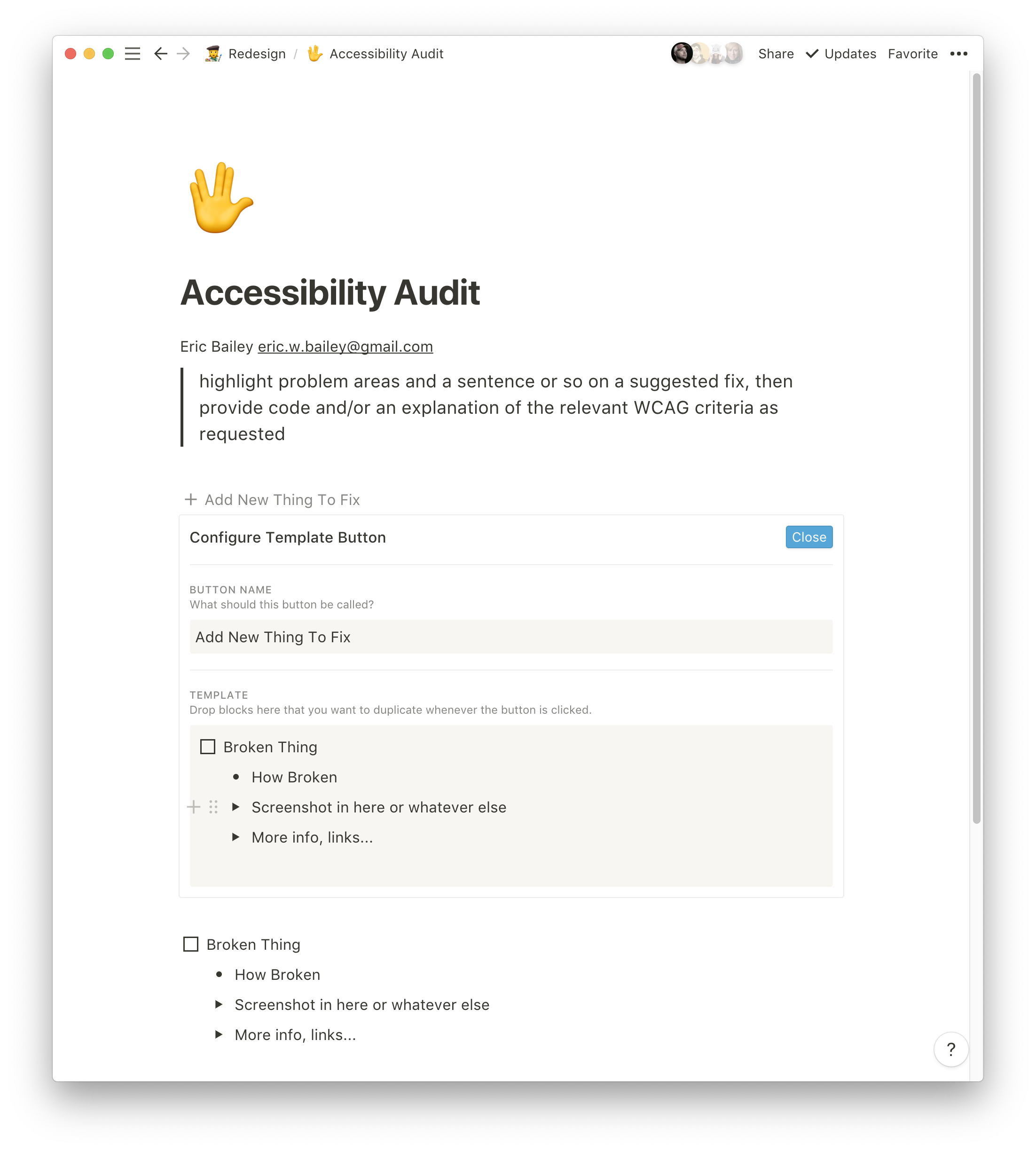
It's also great for things like public accessibility audits where people can be sent to a public page to see what kinds of things are being worked on with the ability to comment on items.
Quick, collaborative documents
Any document can be shared. I can create a quick document and share it with a particular person easily. That could be a private document shared only with team members, or with someone totally outside the team. Or I can make the document publicly visible to all.
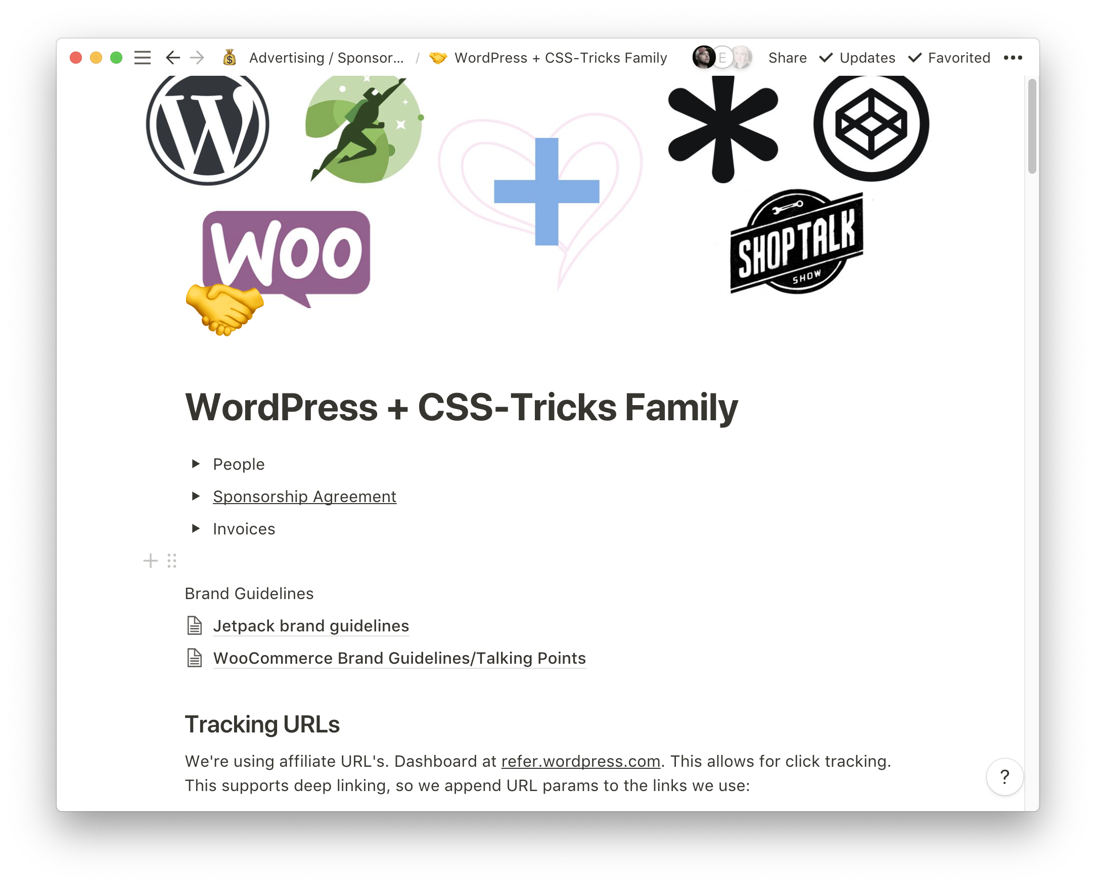
I use Notion to create pages to present possibilities with potential sponsorship partners, then morph that into a document to keep track of everything we're doing together.
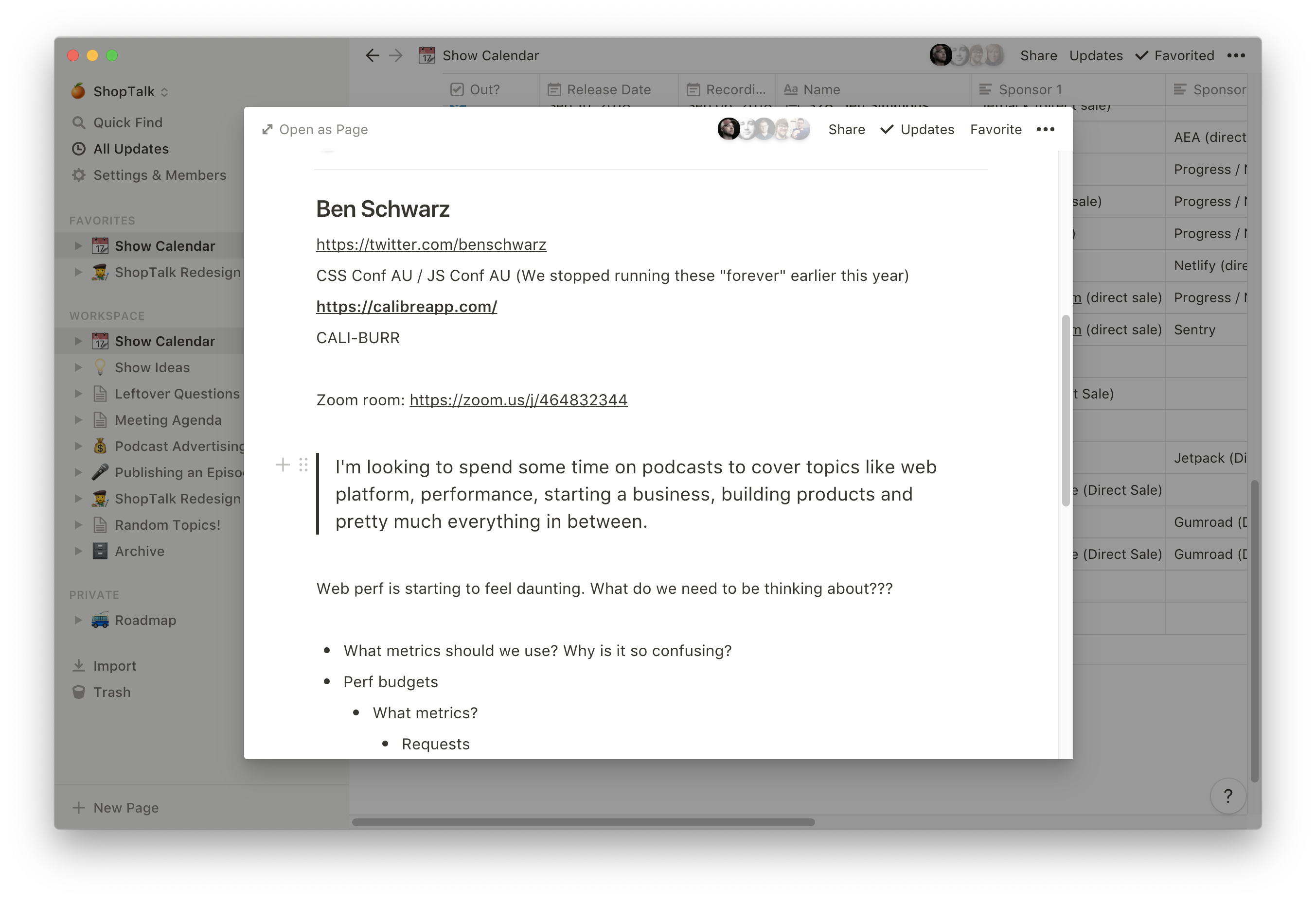
We use a show calendar for ShopTalk episodes. Each show added to the calendar automatically creates a page that we use as collaborative show notes with our guests.
It's worth noting that a Notion account is required to edit a document. So anyone that's invited will have to register and be logged in. Plus, you'll need to share it with the correct email address so that person can associate their account with that address.
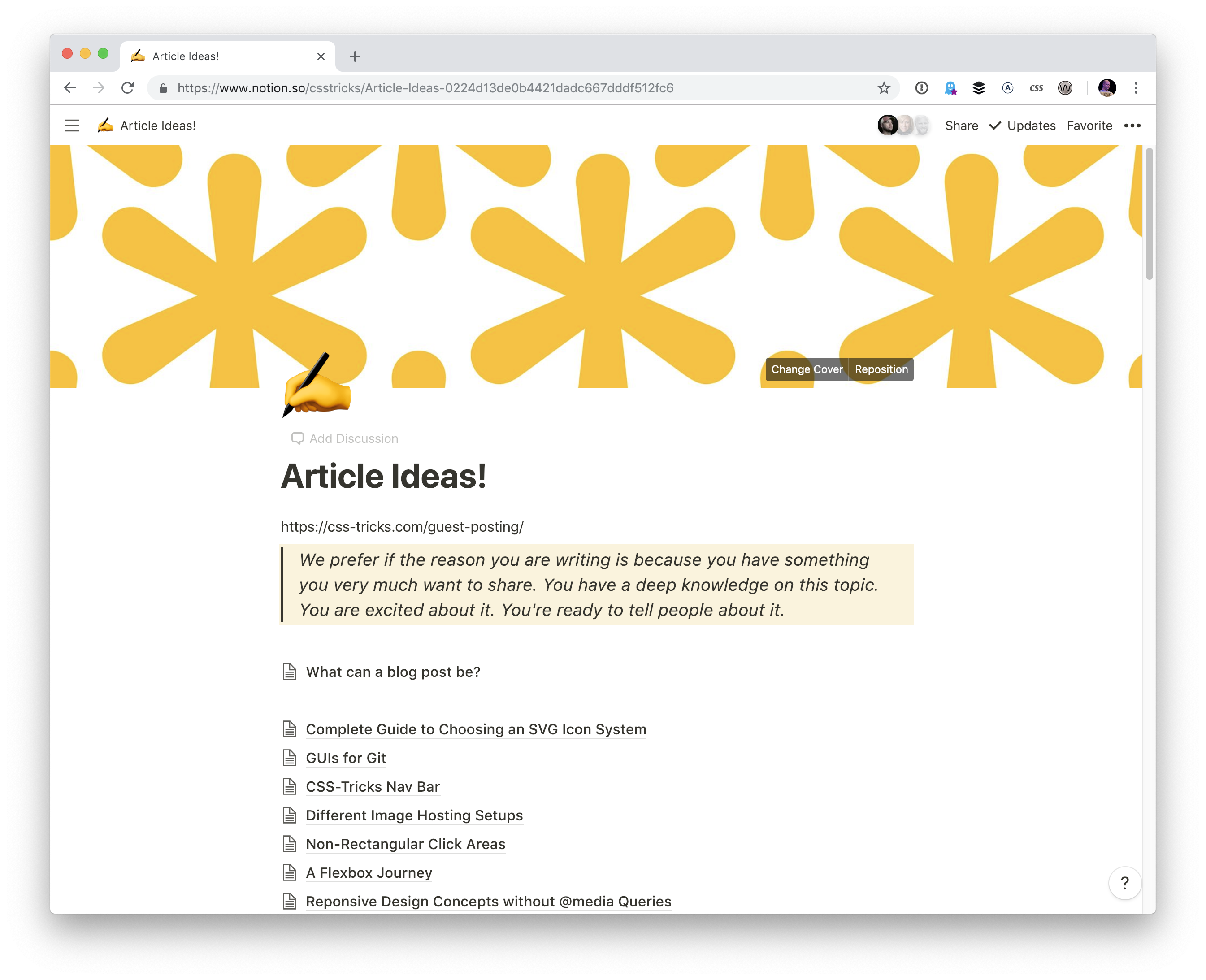
Blog post drafts
I've been trying to keep all my blog post drafts in Notion. That way, they can easily be shared individually and I can browse all the collected ideas at once.
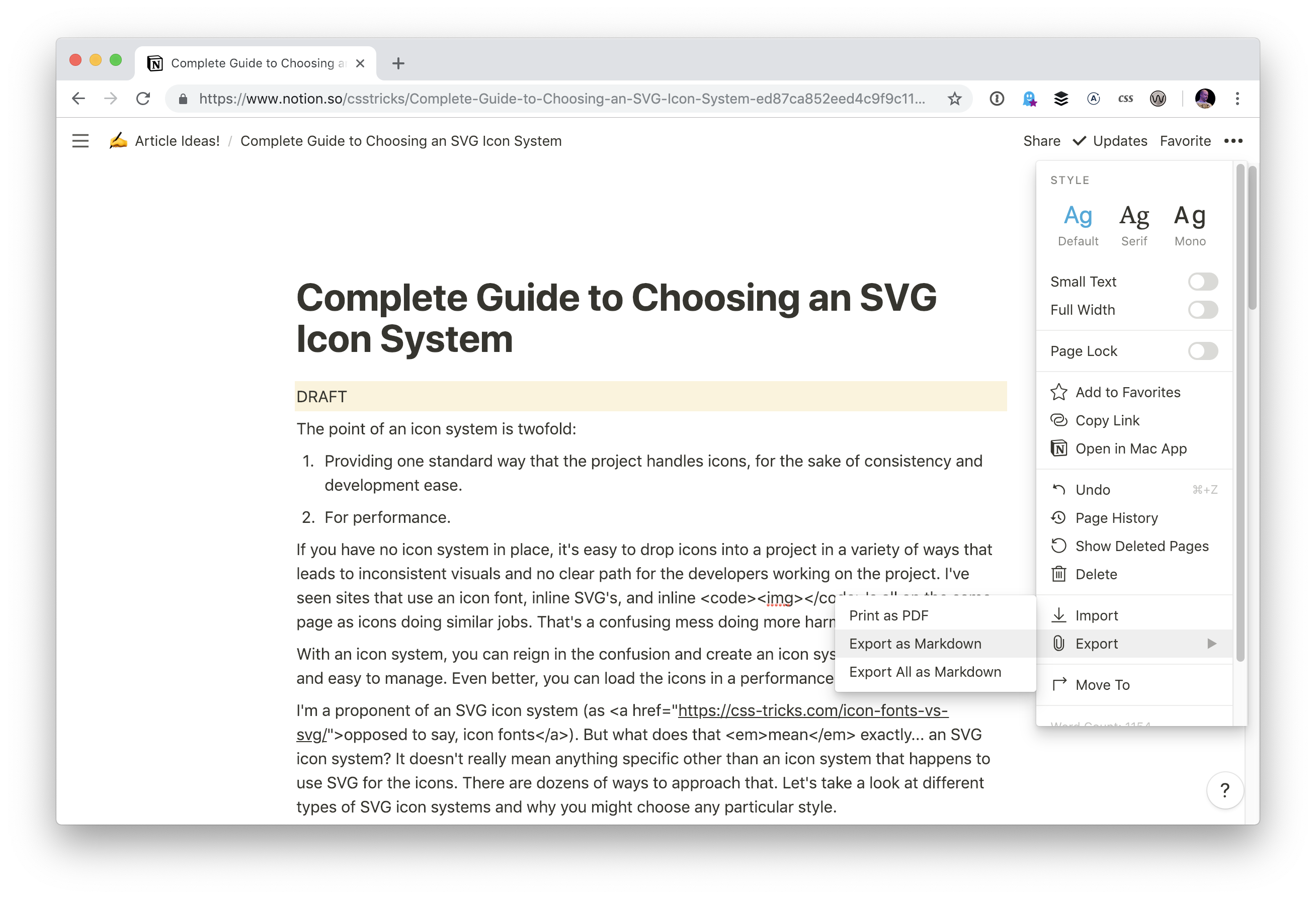
Exporting posts come out as Markdown too, and that's great for blog post drafts because it translates nicely:
Private sub-team documents
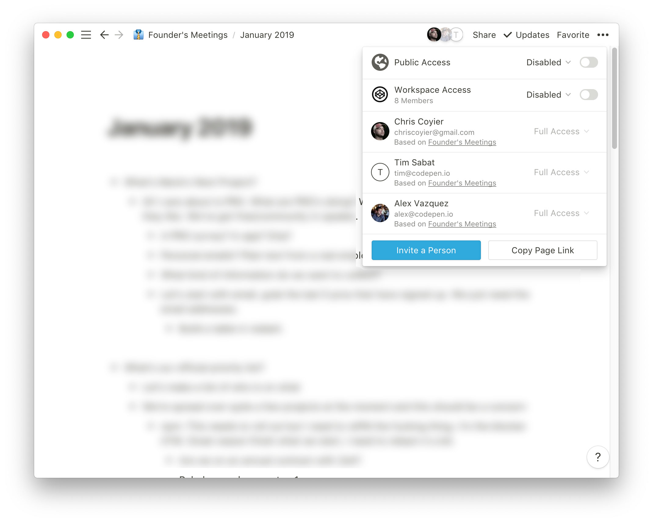
Being able to share documents with specific people is great. For example, we have a Founder's Meetings section on CodePen:
There are probably a million more things
Notion is simply documents with interesting blocks. Simple, but brilliant. For me, it can replace and consolidate things like Trello and other kanban tools, lightweight project management platforms, GitHub issues (if you don't need the public-ness), wikis, Google Docs and Spreadsheets, and even simple one-off public websites.
I'd love to see Notion's web app links open in their desktop app instead of the web. I prefer the app because I have plenty of browser tabs open as it is. It's gotta be possible to do this with a browser extension. There used to be "Paws" for Trello and there was a browser extension that would open Trello links in that app, so there is prior precedent out there.
I'd also like Notion to explore a tabs feature. I constantly need more than one document open at a time and right now the only way to do that is with multiple windows. There is some back-and-forth arrow action that's possible, but it would be interesting to see native tabs or native window splitting somehow.
I'd love to see some performance upgrades too. It's not terribly bad, but working in Notion is so ubiquitous and important in my day-to-day that I'd love for it to feel more instantaneous than it currently does.