The CSS Working Group gave that a thumbs-up a couple weeks ago. The super-duper conceptual proposal being that we can animate or transition from, say, display: block to display: none.
It’s a bit of a brain-twister to reason about because setting display: none on an element cancels animations. And adding it restarts animations. Per the spec:
Setting the display property to none will terminate any running animation applied to the element and its descendants. If an element has a display of none, updating display to a value other than none will start all animations applied to the element by the animation-nameproperty, as well as all animations applied to descendants with display other than none.
That circular behavior is what makes the concept seemingly dead on arrival. But if@keyframes supported any display value other thannone, then there’s no way for none to cancel or restart things. That gives non-none values priority, allowing none to do its thing only after the animation or transition has completed.
Miriam’s toot (this is what we’re really calling these, right?) explains how this might work:
We’re not exactly interpolating between, say, block and none, but allowing block to stay intact until the time things stop moving and it’s safe to apply none. These are keywords, so there are no explicit values between the two. As such, this remains a discrete animation. We’re toggling between two values once that animation is complete.
This is a helpful example because it shows how the first frame sets the element to display: block, which is given priority over the underlying display: none as a non-none value. That allows the animation to run and finish without none cancelling or resetting it in the process since it only resolves after the animation.
This is the example Miriam referenced on Mastodon:
We’re dealing with a transition this time. The underlying display value is set to none before anything happens, so it’s completely out of the document flow. Now, if we were to transition this on hover, maybe like this:
.hide:hover {
  display: block;
  opacity: 1;
}
…then the element should theoretically fade in at 200ms. Again, we’re toggling between display values, but block is given priority so the transition isn’t cancelled up front and is actually applied after opacity finishes its transition.
At least that’s how my mind is reading into it. I’m glad there are super smart people thinking these things through because I imagine there’s a ton to sort out. Like, what happens if multiple animations are assigned to an element — will none reset or cancel any of those? I’m sure everything from infinite animations, reversed directions, and all sorts of other things will be addressed in time.
There’s a whole lot of accessibility in this week’s news, from the nuances of using :focus-visible and input placeholders, to accessible typefaces and a Safari bug with :display: contents. Plus, a snippet for a bare-bones web component that supports style encapsulation.
Now may be a good time to start using :focus-visible
The CSS :focus-visible pseudo-class replaces :focus as the new way to create custom focus indicators for keyboard users. Chrome recently switched from :focus to :focus-visible in the user agent stylesheet and, as a result of that change, the default focus ring is no longer shown when the user clicks or taps a button.
When switching from :focus to :focus-visible, consider backwards compatibility. Your keyboard focus indicators should be clearly visible in all browsers, not just the ones that support :focus-visible. If you only style :focus-visible, non-supporting browsers will show the default focus ring which, depending on your design, “may not be sufficiently clear or visible at all.”
A good way to start using :focus-visible today is to define the focus styles in a :focus rule and then immediately undo these same styles in a :focus:not(:focus-visible) rule. This is admittedly not the most elegant and intuitive pattern, but it works well in all browsers:
Browsers that don’t support :focus-visible use the focus styles defined in the :focus rule and ignore the second style rule completely (because :focus-visible is unknown to them).
In browsers that do support :focus-visible, the second style rule reverts the focus styles defined in the :focus rule if the :focus-visible state isn’t active as well. In other words, the focus styles defined in the :focus rule are only in effect when :focus-visible is also active.
The BBC created their own custom typeface called Reith (named after the BBC’s founder Sir John Reith). Their goal was to create a font that supports multiple languages and is easier to read, especially on small devices. The font was tested with mixed-ability user groups (dyslexia and vision impairment) and across different screen sizes.
We [the BBC] were using Helvetica or Arial. We also had Gill Sans as the corporate typeface. These typefaces were designed a hundred years ago for the printed page [and] don’t perform well on today’s modern digital screens.
Note: If you’d like to inspect Reith Sans and Reith Serif in Wakamai Fondue, you can quickly access the URLs of the WOFF2 files in the “All fonts on page” section of the Fonts pane in Firefox’s DOM inspector on BBC’s website.
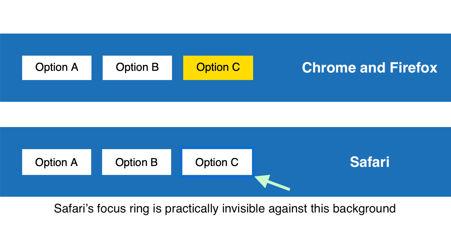
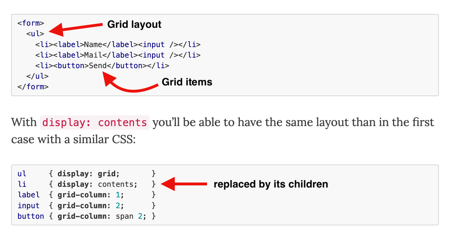
display: contents is still not accessible in Safari
The CSS display: contents value has been supported in browsers since 2018. An element with this value “does not generate any boxes” and is effectively replaced by its children. This is especially useful in flex and grid layouts, where the contents value can be used to “promote” more deeply nested elements to flex/grid items while retaining a semantic document structure.
Unfortunately, this feature originally shipped with an implementation bug that removed the element from the browser’s accessibility tree. For example, applying display: contents to a <ul> element resulted in that element no longer mentioned by screen readers. Since then, this bug has been fixed in Firefox and Chrome (in the latest version).
In Chrome and Firefox, the screen reader informs the user that the “Main, navigation” contains a “list, 2 items.” In Safari, the latter part is missing because the <ul> and <li> elements are not present in the accessibility tree. Until Apple fixes this bug in Safari, be careful when using the contents value on semantic elements and test in screen readers to confirm that your pages are accessible in Safari as well.
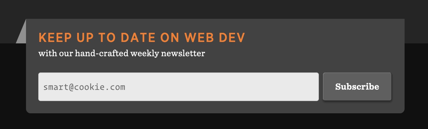
Set opacity when overriding the color of placeholder text
Accessibility experts recommend avoiding placeholders if possible because they can be confused for pre-populated text and disappear when the user starts entering a value. However, many websites (including Wikipedia and GOV.UK) use placeholders in simple web forms that contain only a single input field, such as a search field.
The subscription form for the CSS-Tricks newsletter uses a placeholder in the email field
Placeholders can be styled via the widely supported ::placeholder pseudo-element. If your design calls for a custom color for placeholder text, make sure to specify both color and opacity. The latter is needed for Firefox, which appliesopacity: 0.54 to ::placeholder by default. If you don’t override this value, your placeholder text may have insufficient contrast in Firefox.
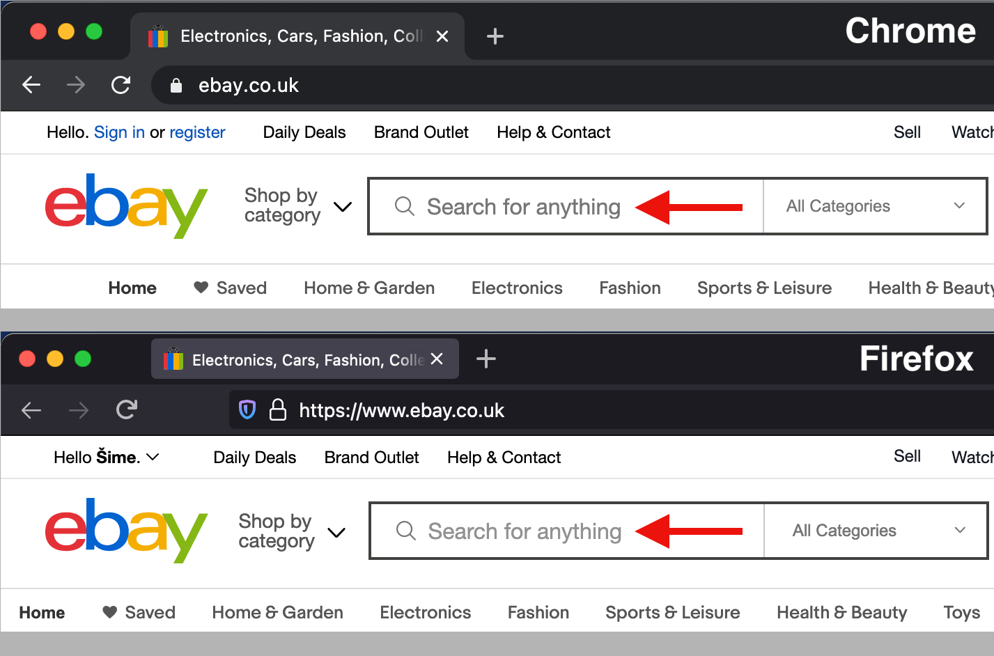
The placeholder text on eBay’s website is lighter in Firefox and doesn’t meet the minimum contrast requirement of 4.5:1
Declarative shadow DOM could help popularize style encapsulation
One of the key features of shadow DOM is style encapsulation, wherein the outer page’s style rules don’t match elements inside the shadow tree, and vice versa. In order to use this feature, you need to attach a shadow DOM tree to an element (usually a custom element, like <my-element>) and copy the element’s template (usually from a <template> element in the DOM) to the element’s newly created shadow DOM.
These steps can only be performed in JavaScript. If you’re only interested in style encapsulation and don’t need any dynamic functionality for your element, here is the minimum amount of JavaScript required to create a custom element with a shadow DOM:
customElements.define(
  "my-element",
  class extends HTMLElement {
    constructor() {
      super();

      // find <template id="my-template"> in the DOM
      let template = document.getElementById("my-template");

      // make a copy of the template contents…
      let content = template.content.cloneNode(true);

      // …and inject it into <my-element>’s shadow DOM
      this.attachShadow({ mode: "open" }).appendChild(content);
    }
  }
);
For an example of style encapsulation, see Miriam Suzanne’s <media-object> element on CodePen. The scoped styles are located in the <template> element in the HTML pane. Notice how this CSS code can use simple selectors, such as article, that only match elements inside <media-object>’s shadow DOM.
JavaScript may soon no longer be required to create this type of style encapsulation in modern browsers. Earlier this week, Chrome became the first browser to ship Google’s Declarative Shadow DOM proposal. If it becomes a standard, this feature will also make it possible to use Shadow DOM in combination with server-side rendering.
I recently accepted a teaching position at a local college here in SoCal where I'll be spouting off whatever I know (or more likely don't know!) about HTML and CSS. It's suffice to say I was all ears (well, actually eyes) when Rachel Andrew recently published a post on teaching CSS.
The display property is a core piece to understanding the layout possibilities of CSS, particularly, as Rachel points out, the outer value (block and inline) and the inner formatting context (coming in grid, flex and normal flow varieties). Understanding that difference is what led to my personal CSS "A-ha!" moment.
That's why I'm so glad to see Rachel publish the slides from her presentation at An Event Apart in San Francisco this month.
We're talking 114 slides of pure box-y goodness! Pay close attention to slides 37-42 because they cover information on the refactored two-value display syntax.
You know the single-value syntax: .thing { display: block; }. The value "block" being a single value. There are lots of single values for display. For example, inline-flex, which is like flex in that it becomse a flex container, but behaves like an inline-level element rather than a block-level element. Somewhat intuitive, but much better served by a two-value system that can apply that same concept more broadly and just as intuitively.
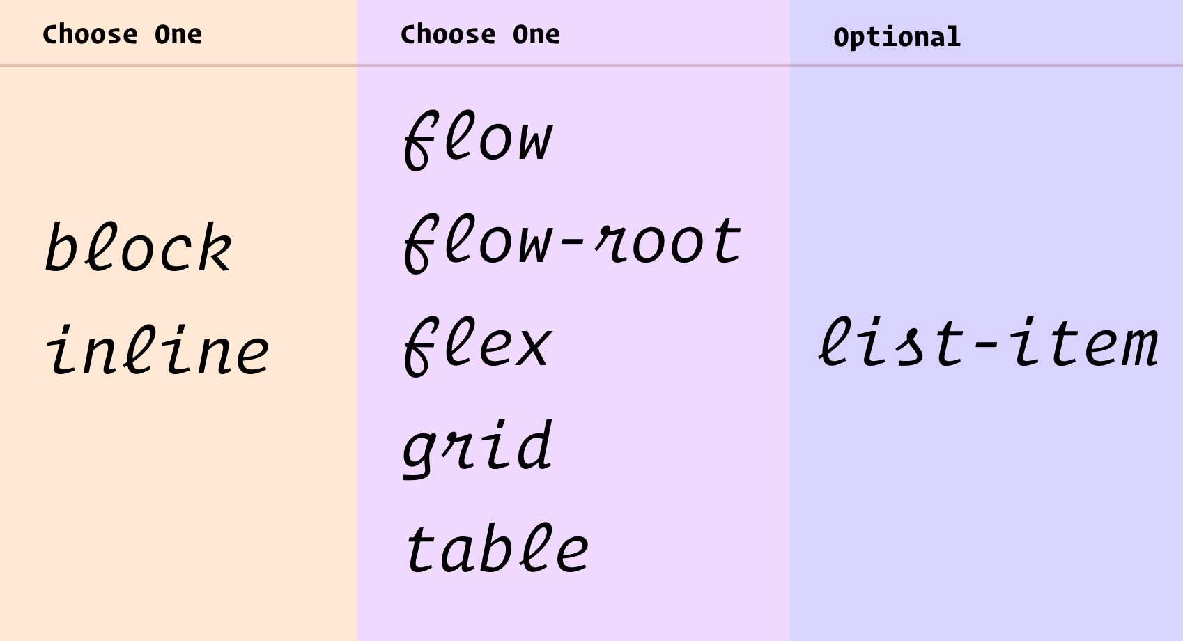
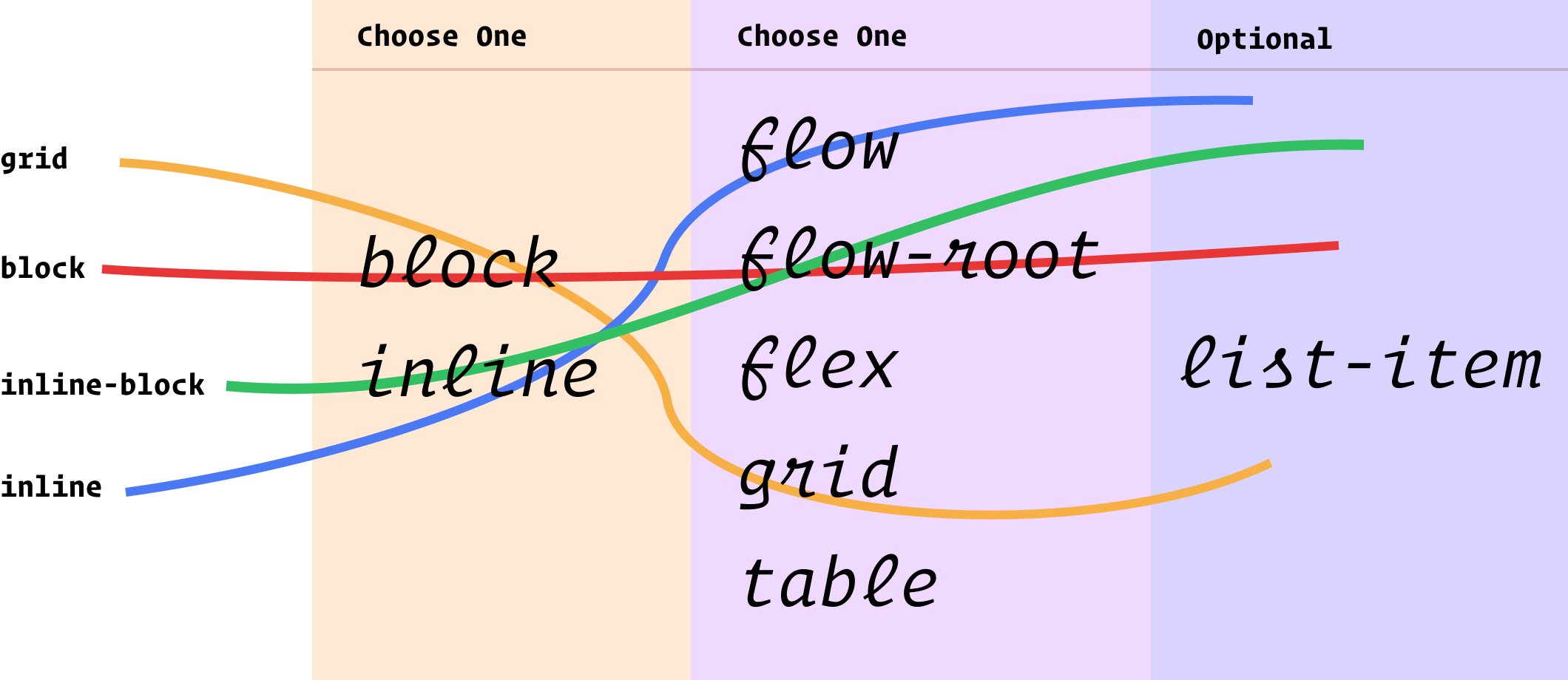
Choose block or inline, then choose flow, flow-root, flex, grid, or table. If it's a list-item that's a third thing.
You essentially pick one from each column to describe the layout you want. So the existing values we use all the time map out something like this:
Another way to think about those two columns I have there is "outside" and "inside" display values. Outside, as in, how it flows with other elements around it. Inside, as in, how layout happens inside those elements.
Can you actually use it?
Not really. Firefox 70 is first out of the gate with it, and there are no other signals for support from Chrome-land or Safari-land that I know about. It's a great evolution of CSS, but as far as day-to-day usage, it'll be years out. Something as vital as layout isn't something you wanna let fail just for this somewhat minor descriptive benefit. Nor is it probably worth the trouble to progressively enhance with @supports and such.
Weirdnesses
You can't block flow because that doesn't really make sense. It'll be reset to block flow-root.
There is implied shorthand. Like if you inline list-item, that's really inline flow list-item whereas list-item is block flow list-item. Looks all fairly intuitive.
You still use stuff like table-row and table-header-group. Those are single-value deals, as is contents and none.
Column one technically includes run-in too, but as far as I know, no browser has ever supported run-in display.
Column two technically includes ruby, but I have never understood what that even is.
How we talk about CSS
I like how Rachel ties this change to a more rational mental and teaching model:
... They properly explain the interaction of boxes with other boxes, in terms of whether they are block or inline, plus the behavior of the children. For understanding what display is and does, I think they make for a very useful clarification. As a result, I’ve started to teach display using these two values to help explain what is going on when you change formatting contexts.
It is always exciting to see new features being implemented, I hope that other browsers will also implement these two-value versions soon. And then, in the not too distant future we’ll be able to write CSS in the same way as we now explain it, clearly demonstrating the relationship between boxes and the behavior of their children.
the hidden rule is a User Agent style, which means it's less specific than a moderate sneeze. This means that your favourite display style will override it:
<style>
  div { display: block; }
</style>
<div hidden>
  lol guess who's not hidden anymore
  hint: it's this thing
</div>
So two related problems...
It's extremely weak. Literally any change to the display property other than the none value on the element with any strength selector will override it. Much like any other display property, like width or whatever, except the it feels somehow worse to have a hidden attribute actively on an element and have it not actually be hidden.
The display property is sadly overloaded with responsibility. It would be way cool if hidden was a CSS property that could be in charge of the visibility/access of elements rather than the same property that controls the type of block it is. But alas, backward compatibility 4-lyfe of the web stops that (which is a good thing for the health of the web overall).
If you really love the semantics of the attribute, Monica suggests:
[hidden] { display: none !important; }
Seems like a nice addition to any "reset" or base stylesheet.
Otherwise, the classic technique of hiding things with a class is absolutely fine. I typically have a utility class:
.hide, .hidden {
  display: none;
}
But remember there are always a million ways to do things. I find myself regularly doing one-off hide/show mechanisms. For example, a menu that you need to toggle the visibility of with flair, but remain accessible at all times...