I spend a lot of time in DevTools, and I’m sure you do too. Sometimes I even bounce between them, especially when I’m debugging cross-browser issues. DevTools is a lot like browsers themselves — not all of the features in one browser’s DevTools will be the same or supported in another browser’s DevTools.
But there are quite a few DevTools features that are interoperable, even some lesser-known ones that I’m about to share with you.
For the sake of brevity, I use “Chromium” to refer to all Chromium-based browsers, like Chrome, Edge, and Opera, in the article. Many of the DevTools in them offer the exact same features and capabilities as one another, so this is just my shorthand for referring to all of them at once.
Search nodes in the DOM tree
Sometimes the DOM tree is full of nodes nested in nodes that are nested in other nodes, and so on. That makes it pretty tough to find the exact one you’re looking for, but you can quickly search the DOM tree using Cmd + F (macOS) or Ctrl + F (Windows).
Additionally, you can also search using a valid CSS selector, like .red, or using an XPath, like //div/h1.
Searching text in Chrome DevTools (left), selectors in Firefox DevTools (center), and XPath in Safari DevTools (right)
In Chromium browsers, the focus automatically jumps to the node that matches the search criteria as you type, which could be annoying if you are working with longer search queries or a large DOM tree. Fortunately, you can disable this behavior by heading to Settings (F1) → Preferences → Global → Search as you type → Disable.
After you have located the node in the DOM tree, you can scroll the page to bring the node within the viewport by right-clicking on the nod, and selecting “Scroll into view”.
Access nodes from the console
DevTools provides many different ways to access a DOM node directly from the console.
For example, you can use $0 to access the currently selected node in the DOM tree. Chromium browsers take this one step further by allowing you to access nodes selected in the reverse chronological order of historic selection using, $1, $2, $3, etc.
Another thing that Chromium browsers allow you to do is copy the node path as a JavaScript expression in the form of document.querySelector by right-clicking on the node, and selecting Copy → Copy JS path, which can then be used to access the node in the console.
Here’s another way to access a DOM node directly from the console: as a temporary variable. This option is available by right-clicking on the node and selecting an option. That option is labeled differently in each browser’s DevTools:
Chromium: Right click → “Store as global variable”
Firefox: Right click → “Use in Console”
Safari: Right click → “Log Element”
Access a node as a temporary variable in the console, as shown in Chrome (left), Firefox (center), and Safari (right)
Visualize elements with badges
DevTools can help visualize elements that match certain properties by displaying a badge next to the node. Badges are clickable, and different browsers offer a variety of different badges.
In Safari, there is a badge button in the Elements panel toolbar which can be used to toggle the visibility of specific badges. For example, if a node has a display: grid or display: inline-grid CSS declaration applied to it, a grid badge is displayed next to it. Clicking on the badge will highlight grid areas, track sizes, line numbers, and more, on the page.
Grid overlay with badges in Safari DevTools
The badges that are currently supported in Firefox’s DevTools are listed in the Firefox source docs. For example, a scroll badge indicates a scrollable element. Clicking on the badge highlights the element causing the overflow with an overflow badge next to it.
In Chromium browsers, you can right-click on any node and select “Badge settings…” to open a container that lists all of the available badges. For example, elements with scroll-snap-type will have a scroll-snap badge next to it, which on click, will toggle the scroll-snap overlay on that element.
Taking screenshots
We’ve been able to take screenshots from some DevTools for a while now, but it’s now available in all of them and includes new ways to take full-page shots.
The process starts by right-clicking on the DOM node you want to capture. Then select the option to capture the node, which is labeled differently depending on which DevTools you’re using.
Chrome (left), Safari (middle), and Firefox (right)
Repeat the same steps on the html node to take a full-page screenshot. When you do, though, it’s worth noting that Safari retains the transparency of the element’s background color — Chromium and Firefox will capture it as a white background.
Comparing screenshots in Safari (left) and Chromium (right)
There’s another option! You can take a “responsive” screenshot of the page, which allows you to capture the page at a specific viewport width. As you might expect, each browser has different ways to get there.
Chromium: Cmd + Shift + M (macOS) or Ctrl + Shift + M (Windows). Or click the “Devices” icon next to the “Inspect” icon.
Launching responsive design mode in Safari (left), Firefox (right), and Chromium (bottom)
Chrome tip: Inspect the top layer
Chrome lets you visualize and inspect top-layer elements, like a dialog, alert, or modal. When an element is added to the #top-layer, it gets a top-layer badge next to it, which on click, jumps you to the top-layer container located just after the </html> tag.
The order of the elements in the top-layer container follows the stacking order, which means the last one is on the top. Click the reveal badge to jump back to the node.
Firefox tip: Jump to ID
Firefox links the element referencing the ID attribute to its target element in the same DOM and highlights it with an underline. Use CMD + Click (macOS) or CTRL + Click (Windows) )to jump to the target element with the identifier.
Wrapping up
Quite a few things, right? It’s awesome that there are some incredibly useful DevTools features that are supported in Chromium, Firefox, and Safari alike. Are there any other lesser-known features supported by all three that you like?
There are a few resources I keep close by to stay on top of what’s new. I thought I’d share them with here:
DevTools Tips (Patrick Brosset): A curated collection of helpful cross-browser DevTools tips and tricks.
Dev Tips (Umar Hansa): DevTools tips sent to your inbox!
But if you’re looking for gains on the CSS side of things, Patrick has a nice way of sniffing out your most expensive selectors using Edge DevTools:
Crack open DevTools.
Head to the Performance Tab.
Make sure you have the “Enable advanced rendering instrumentation” option enabled. This tripped me up in the process.
Record a page load.
Open up the “Bottom-Up” tab in the report.
Check out your the size of your recalculated styles.
From here, click on one of the Recalculated Style events in the Main waterfall view and you’ll get a new “Selector Stats” tab. Look at all that gooey goodness!
Now you see all of the selectors that were processed and they can be sorted by how long they took, how many times they matched, the number of matching attempts, and something called “fast reject count” which I learned is the number of elements that were easy and quick to eliminate from matching.
A lot of insights here if CSS is really the bottleneck that needs investigating. But read Patrick’s full post over on the Microsoft Edge Blog because he goes much deeper into the why’s and how’s, and walks through an entire case study.
Programming is a team sport and without proper communication, you can’t really expect spectacular results. A remote setup can make developer-to-developer communication challenging, but equipped with the right tools you have nothing to fear.
Let’s take a look at the best VS Code extensions that can seriously improve your remote working routine.
The idea is that VS Code can be used as the editor for DevTools and we can do it today by enabling it as an experimental feature, alongside Microsoft Edge. So, no, this is not like a prime-time ready universal thing, but watch Chris as he activates the feature, connects VS Code to DevTools, gives DevTools access to write files, then inspects the page of a local URL.
Now, those changes I make in DevTools can be synced back to VS Code, and I have direct access to open and view specific files from DevTools to see my code in context. Any changes I make in DevTools get reflected back in the VS Code files, and any changes I make in VS Code are updated live in the browser. Brilliant.
I’m not sure if this will become a thing beyond Edge but that sort of cross-over work between platforms is something that really excites me.
These are my general steps, starting with not even using iOS Safari.
1. Is this just a small-screen problem?
Lemme just use the device mode in Chrome quick.
Note that this does a smidge more than just display your site in a smaller area: it sends the correct User Agent String and Client Hints for that device.
2. Does it seem actually specific to Safari? Lemme check Desktop Safari first since that’s just a few clicks away.
Now you’re actually using Safari, which is way closer to iOS Safari than desktop Chrome is.
3. Problem not showing here? Then the problem is actually unique to iOS Safari. Try emulation.
I happen to have a Mac, so I can have XCode installed and thus have an iOS simulator that is pretty easy to pop open. And if you can run the iOS simulator, that means you can run desktop Safari as well, and thus even have access to DevTools that can reach into the simulator.
4. I’ve seen real-device-only bugs. Sometimes you need a real device.
If you have a Mac, doing this is pretty similar to what we just did. You have to have the phone plugged in via USB (no wireless charging connection or whatever) and then you’ll see the device in that same Develop menu. Select the real device (which must have Safari open on some website) and you’ll get a DevTools instance of that website.
5. No Mac? Use an online emulator.
I have heard of people running over to Best Buy or an Apple Store to quick debug something on a display machine. But that’s — uhhhh — not super practical. You can use something like CrossBrowserTesting to do this right on the web.
They even jack Chrome DevTools in there somehow. I just did a little testing and I found the Chrome DevTools a little janky to use (a giant left panel renders, the click-to-select element feature didn’t work, and I kept losing WebSocket connection). But hey, it’s cool that it’s possible.
6. No Mac and still need to test on a real device?
I didn’t think this was really possible, but then I saw Inspect. (This is not an ad, I’m just shouting this out as a very cool tool.) With Inspect, I can plug in my real iOS device via USB and get a Chrome DevTools instance for it.
Remember to change this iOS Safari (Advanced) Setting to make it work with Inspect (and probably the “normal” Safari debugging described above).
I’m running Inspect on my Mac there. I guess the only real reason I would do that is to use Chrome DevTools instead of Safari DevTools (which, fair play, I might). And it looks like there will be more reasons soon enough. For example, it will bundle React, Vue, and Angular DevTools so you even have those for on-device testing, plus Wi-Fi testing, meaning you don’t have to plug in at all.
But I feel like the real clutch feature here is that it runs on Windows. So now there is a really clear answer for web developers on Windows who need to test on a real iOS device.
I think that the above additions could help to educate developers about CSS tremendously. The only downside I can think of is that additional information might overwhelm developers, but I would take that risk in favor of more people learning CSS properly.
I’d be for it. The crossed-off UI for the “losing” selectors is attempting to teach this, but without actually teaching it. I wouldn’t be that worried about the information being overwhelming. I think if they are considerate about the design, it can be done tastefully. DevTools is a very information-dense place anyway.
You love to see it. DevTools have a massive impact on how front-end developers think about, build, and of course, debug websites. Stuff like seeing the numbered grid lines visually is a huge deal. I’ve done enough mentally counting what rows/columns I want to place things on, thank you very much.
Site performance is potentially the most important metric. The better the performance, the better chance that users stay on a page, read content, make purchases, or just about whatever they need to do. A 2017 study by Akamai says as much when it found that even a 100ms delay in page load can decrease conversions by 7% and lose 1% of their sales for every 100ms it takes for their site to load which, at the time of the study, was equivalent to $1.6 billion if the site slowed down by just one second. Google’s industry benchmarks from 2018 also provide a striking breakdown of how each second of loading affects bounce rates.
On the flip side, Firefox made their webpages load 2.2 seconds faster on average and it drove 60 million more Firefox downloads per year. Speed is also something Google considers when ranking your website placement on mobile. Having a slow site might leave you on page 452 of search results, regardless of any other metric.
This is a very basic site made with simple HTML, CSS, and JavaScript. I’ve intentionally tried to keep this as simple as possible, meaning the reason it is slow has nothing to do with the complexity of the site itself, or because of some framework it uses. About the most complex part are some social media buttons for people to share the page.
Here’s the thing: performance is more than a one-off task. It’s inherently tied to everything we build and develop. So, while it’s tempting to solve everything in one fell swoop, the best approach to improving performance might be an iterative one. Determine if there’s any low-hanging fruit, and figure out what might be bigger or long-term efforts. In other words, incremental improvements are a great way to score performance wins. Again, every millisecond counts.
In that spirit, what we’re looking at in this article is focused more on the incremental wins and less on providing an exhaustive list or checklist of performance strategies.
Lighthouse
We’re going to be working with Lighthouse. Many of you may already be super familiar with it. It’s even been covered a bunch right here on CSS-Tricks. It’s is a Google service that audit things performance, accessibility, SEO, and best practices. I’m going to audit the performance of my slow site before and after the things we tackle in this article. The Lighthouse reports can be accessed directly in Chrome’s DevTools.
Go ahead, briefly look at the things that Lighthouse says are wrong with the website. It’s good to know what needs to be solved before diving right in.
On the bright side, we’re one-third of the way to our goal!
We can totally fix this, so let’s get started!
Improvement #1: Redirects
Before we do anything else, let’s see what happens when we first hit the website. It gets redirected. The site used to be at one URL and now it lives at another. That means any link that references the old URL is going to redirect to the new URL.
Redirects are often pretty light in terms of the latency that they add to a website, but they are an easy first thing to check, and they can generally be removed with little effort.
We can try to remove them by updating wherever we use the previous URL of the site, and point it to the updated URL so users are taken there directly instead of redirected. Using a network request inspector, I’m going to see if there’s anything we can remove via the Network panel in DevTools. We could also use a tool, like Postman if we need to, but we’ll limit our work to DevTools as much as possible for the sake of simplicity.
First, let’s see if there are any HTTP or HTML redirects. I like using Fiddler, and when I inspect the network requests I see that there are indeed some old URLs and redirects floating around.
It looks like the first request we hit is https://anonrobot.github.io/redirect-to-slow-site/ before it HTML redirects to https://anonrobot.github.io/slow-site/. We can repoint all our redirect-to-slow-site URLs to the updated URL. In DevTools, the Network inspector helps us see what the first webpage is doing too. From my view in Fiddler it looks like this:
This tell us that the site is using an HTML redirect to the next site. I’m going to update my referenced URL to the new site to help decrease latency that adds drag to the initial page load.
Improvement #2: The Critical Render Path
Next, I’m going to profile the sit with the Performance panel in DevTools. I am most interested in unblocking the site from rendering content as fast as it can. This is the process of turning HTML, CSS and JavaScript into a fully fleshed out, interactive website.
It begins with retrieving the HTML from the server and converting this into the Document Object Model (DOM). We’ll run any inline JavaScript as we see it, or download it if it’s an external asset as we go line-by-line parsing the HTML. We’ll also build the CSS into the CSS Object Model (CSSOM). The CSSOM and the DOM combine to make the render tree. From there, we run the layout which places everything on the screen in the correct place before finally running paint.
This process can be “blocked” if it has to wait for resources to load before it runs. That’s what we call the Critical Render Path, and the things that block the path are critical resources.
The most common critical resources are:
A <script> tag that is in the <head> and doesn’t contain an async, or defer, or module attribute.
A <link rel="stylesheet"> that doesn’t have the disabled attribute to inform the browser to not download the CSS and doesn’t have a media attribute that matches the user’s device.
There’s a few more types of resources that might block the Critical Render Path, like fonts, but the two above are by far the most common. These resources block rendering because the browser thinks the page is “unfinished” and has no idea what resources it needs or has. For all the browser knows, the site could download something that expects the browser to do even more work, like styling or color changes; hence, the site is incomplete to the browser, so it assumes the worst and blocks rendering.
An example CSS file that wouldn’t block rendering would be:
The "media="print" attribute only downloads the stylesheet when the user prints the webpage (because perhaps you want to style things differently in print), meaning the file itself isn’t blocking anything from rendering before it.
As Chris likes to say, a front-end developer is aware. And being aware of what a page needs to download before rendering begins is vitally important for improving performance audit scores.
Improvement #3: Unblock parsing
Blocking the render path is one thing we can immediately speed up, and we can also block parsing if we aren’t careful with our JavaScript. Parsing is what makes HTML elements part of the DOM, and whenever we encounter JavaScript that needs to run now, we block that HTML parsing from happening.
Some of the JavaScript in my slow webpage doesn’t need to block parsing. In other words, we can download the scripts asynchronously and continue parsing the HTML into the DOM without delay.
The <async> tag is what allows the browser to download the JavaScript asset asynchronously. The <defer> tag only runs the JavaScript once the page construction is complete.
There’s a trade off here between inlining JavaScript (so running it doesn’t require a network request) versus placing it into it’s own JavaScript file (for modularity and code-reuse). Feel free to make your own judgement call here as the best route is going to depend on the use case. The actual performance of applying CSS and JavaScript to a webpage will be the same whether it’s an external asset or inlined, once it has arrived. The only thing we are removing when we inline is the network request time to get the external assets (which sometimes makes a big difference).
The main thing we’re aiming for is to do as little as we can. We want to defer loading assets and make those assets as small as possible at the same time. All of this will translate into a better performance outcome.
My slow site is chaining multiple critical requests, where the browser has to read the next line of HTML, wait, then read the next on to check for another asset, then wait. The size of the assets, when they get downloaded, and whether they block are all going to play hugely into how fast our webpage can load.
I approached this by profiling the site in the DevTools Performance panel, which is simply records the way the site loads over time. I briefly scanned my HTML and what it was downloading, then added <async> to any external JavaScript script that was blocking things (like the social media <script>, which isn’t necessary to load before rendering).
Profiling the slow site reveals what assets are loading, how big they are, where they are located, and how much time it takes to load them.
It’s interesting that Chrome has a browser limit where it can only deal with six inflight HTTP connections per domain name, and will wait for an asset to return before requesting another once those six are in-flight. That makes requesting multiple critical assets even worse for HTML parsing. Allowing the browser to continue parsing will speed up the time it takes to show something to the user, and improve our performance audit.
Improvement #4: Reduce the payload size
The total size of a site is a huge determining factor as to how fast it will load. According to web.dev, sites should aim to be below 1,600 KB interactive under 10 seconds. Large payloads are strongly correlated with long times to load. You can even consider a large payload as an expense to the end user, as large downloads may require larger data plans that cost more money.
At this exact point in time, my slow site is a whopping 9,701 KB — more than six times the ideal size. Let’s trim that down.
Identifying unused dependencies
At the beginning of my development, I thought I might need certain assets or frameworks. I downloaded them onto my page and now can’t even remember which ones are actually being used. I definitely have some assets that are doing nothing but wasting time and space.
Using the Network inspector in DevTools (or a tool you feel comfortable with), we can see some things that can definitely be removed from the site without changing its underlying behavior. I found a lot of value in the Coverage panel in DevTools because it will show just how much code is being used after everything’s downloaded.
As we’ve already discussed, there is always a fine balance when it comes to inlining CSS and JavaScript versus using an external asset. But, at this very moment, it certainly appears that the site is downloading far too much than it really needs.
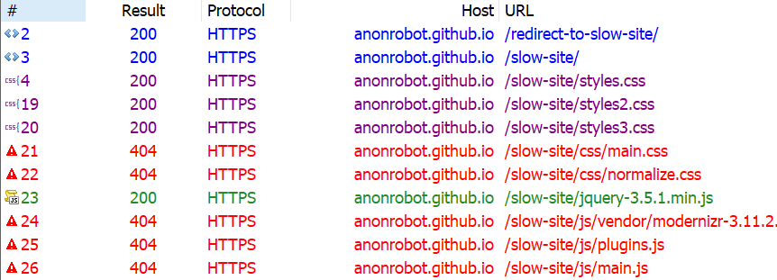
Another quick way to trim things down is to find whether any of the assets the site is trying to load 404s. Those requests can definitely be removed without any negative impact to the site since they aren’t loading anyway. Here’s what Fiddler shows me:
Looking again at the Coverage report, we know there are things that are downloaded but have a significant amount of unused code still making its way to the page. In other words, these assets are doing something, but are also ready to do things we don’t even need them to do. That includes React, jQuery and Vue, so those can be removed from my slow site with no real impact.
Why so many JavaScript libraries? Well, we know there are real-life scenarios where we reach for something because it meets our requirements; but then those requirements change and we need to reach for something else. Again, we’ve got to be aware as front-end developers, and continually keeping an eye on what resources are relevant to site is part of that overall awareness.
Compressing, minifying and caching assets
Just because we need to serve an asset doesn’t mean we have to serve it as its full size, or even re-serve that asset the next time the user visits the site. We can compress our assets, minify our styles and scripts, and cache things responsibly so we’re serving what the user needs in the most efficient way possible.
Compressing means we optimize a file, such as an image, to its smallest size without impacting its visual quality. For example, gzip is a common compression algorithm that makes assets smaller.
Minification improves the size of text-based assets, like external script files, by removing cruft from the code, like comments and whitespace, for the sake of sending fewer bytes over the wire.
Caching allows us to store an asset in the browser’s memory for an amount of time so that it is immediately available for users on subsequent page loads. So, load it once, enjoy it many times.
Let’s look at three different types of assets and how to crunch them with these tactics.
Text-based assets
These include text files, like HTML, CSS and JavaScript. We want to do everything in our power to make these as lightweight as possible, so we compress, minify, and cache them where possible.
At a very high level, gzip works by finding common, repeated parts in the content, stores these sequences once, then removes them from the source text. It keeps a dictionary-like look-up so it can quickly reference the saved pieces and place them back in place where they belong, in a process known as gunzipping. Check out this gzipped examples a file containing poetry.
The text in-between the curly braces is text that has been matched multiple times and is removed from the source text by gzip to make the file smaller. There are still unique parts of the string that gzip is unable to abstract to its dictionary, but things like { a }, for example, can be removed from wherever it appears and can be added back once it is received. (View the full example)
We’re doing this to make any text-based downloads as small as we can. We are already making use of gzip. I checked using this tool by GIDNetwork. It shows that the slow site’s content is 59.9% compressed. That probably means there are more opportunities to make things even smaller.
I decided to consolidate the multiple CSS files into one single file called styles.css. This way, we’re limiting the number of network requests necessary. Besides, if we crack open the three files, each one contained such a tiny amount of CSS that the three network requests are simply unjustified.
And, while doing this, it gave me the opportunity to remove unnecessary CSS selectors that weren’t being applied in the DOM anywhere, again reducing the number of bytes sent to the user.
We are also able to optimize the images on the slow site. As reports consistently show, images are the most common asset request. In fact, the median data transfer for images is 948.1 KB for desktops and 902 KB for mobile devices from 2016 to 2021. That already more than half of the ideal 1,600KB size for an entire page load.
My slow site doesn’t serve that many images, but the images it does serve can be smaller. I ran the images through an online tool called Squoosh, and achieved a 40% savings (18.6 KB to 11.2 KB). That’s a win! Of course, this is something you can do either before upload using a desktop application, like ImageOptim, or even as part of your build process.
I couldn’t see any visual differences between the original images and the optimized versions (which is great!) and I was even able to reduce the size further by resizing the actual file, reducing the quality of the image, and even changing the color palette. But those are things I did in image editing software. Ideally, that’s something you or a designer would do when initially making the assets.
Caching
We’ve touched on minification and compression and what we can do to try and use these to our advantage. The final thing we can check is caching.
I have been requesting the slow site over and over and, so far, I can see it always looks like it’s requested fresh every time without any caching whatsoever. I looked through the HTML and saw caching was disabling here:
I removed that line, so browser caching should now be able to take place, helping serve the content even faster.
Improvement #5: Use a CDN
Another big improvement we can make on any website is serving as much as you can from a Content Delivery Network (CDN). David Attard has a super thorough piece on how to add and leverage a CDN. The traditional path of delivering content is to hit the server, request data, and wait for it to return. But if the user is requesting data from way across the other side of the world from where your data is served, well, that adds time. Making the bytes travel further in the response from the server can add up to large losses of speed, even if everything else is lightning quick.
A CDN is a set of distributed servers around the world that are capable of intelligently delivering content closer to the user because it has multiple locations it choose to serve it from.
We discussed earlier how I was making the user download jQuery when it doesn’t actually make use of the downloaded code, and we removed it. One easy fix here, if I did actually need jQuery, is to request the asset from a CDN. Why?
A user may have already downloaded the asset from visiting another site, so we can serve a cached response for the CDN. 75.49% of the top one million sites still use jQuery, after all.
It doesn’t have to travel as far from the user requesting the data.
We can do something as simple as grabbing jQuery from Google’s CDN, which they make available for anyone to reference in their own sites:
That serves jQuery significantly faster than a standard request from my server, that’s for sure.
Are things better?
If you have implemented along with me so far, or just read, it’s time to re-profile and see if any improvements has been made on what we’ve done so far.
Recall where we started:
After our changes:
I hope this has been a helpful and encourages you to search for incremental performance wins on your own site. By optimally requesting assets, deferring some assets from loading, and reducing the overall size of the site size will get a functional, fully interactive site in front of the user as fast as possible.
Want to keep the conversation going? I share my writing on Twitter if you want to see more or connect.
Monitoring vs. observability: Is there even a difference and is your monitoring system observable?
Observability has gained a lot of popularity in recent years. Modern DevOps paradigms encourage building robust applications by incorporating automation, Infrastructure as Code, and agile development. To assess the health and “robustness” of IT systems, engineering teams typically use logs, metrics, and traces, which are used by various developer tools to facilitate observability. But what is observability exactly, and how does it differ from monitoring?
By creating custom DevTools specific to an app, they can operate at an even higher abstraction to handle things like user interactions, or debugging tracking events. While this requires building and maintaining the custom DevTools, it also means it can be tailored to the needs of the app and engineers to streamline development.
I think it’s super cool and smart to build custom tools for your team of developers. Even if custom tools are just for yourself they can be a productivity boon. But by building custom tools for your whole team, and opening the door to their ideas, that’s extra smart and compounds the value.
Spender showcased a variety of different tools they have, all under the umbrellas of a UI popup widget thingy:
Shows current branch and CI status
Fills out forms, performs user actions, switches between users
Highlights components
Clever stuff.
We don’t have a fancy UI widget like that at CodePen, but do have some productivity-helping fuctionality sprinkled into the app. For example, many forms have a prefill button that only shows up for devs:
And we have a custom tool for our support inbox that gives context to the users and content that the support ticket references:
Not to mention a whole protected admin area on the site itself to perform a whole slew of admin and developer focused tasks:
I think the “component highlighter” that Spencer talked about is particularly neat:
React DevTools can be helpful in seeing what parts of the current page are which components, but that’s not on-page like this. I think it would be rad to have a little 🔗 next to each title that would open that file in VS Code.
Shawn wrote his own dang proxy for Google Search Results to optimize them and present them how he likes:
Once in a while, I’m in the mood to focus on tooling, which leads me to do stuff like when I decided to “Run Gulp as You Open a VS Code Project using VS Code Tasks” which I had to learn all about and struggle through weird problems. I’d think a great DevOps person at a company would be all over stuff like this—constantly thinking of developer experience for their own people.
I even scripted the opening of a text-based multi-player video game I play not long ago to save myself some time.
And speaking of building your own tools generally, I think of Dick Proenneke’s in Alone in the Wilderness documentary. In this intro clip, you can hear Dick talk about quite literally building tools, which was useful for him as he didn’t need to hand-haul them deep into the Alaskan wilderness.
I still think the Google-devised Core Web Vitals are smart. When I first got into caring about performance, it was all: reduce requests! cache things! Make stuff smaller! And while those are all very related to web performance, they are abstractly related. Actual web performance to users are things like how long did I have to wait to see the content on the page? How long until I can actually interact with the page, like type in a form or click a link? Did things obnoxiously jump around while I was trying to do something? That’s why Core Web Vitals are smart: they measure those things.
The Lighthouse Tab in Chrome DevTools has them now:
They are nice to keep an eye on, because remember, aside those numbers having a direct benefit for your users once they get to your site, they might affect users getting to your site at all. Web Core Vitals are factoring into SEO and for the new carousel requirements that were previously reserved only for AMP pages.
Tracking these numbers on one-off audits is useful, but more useful is watching them over time to protect yourself from slipping. Performance tooling like Calibre covers them. New Relic has got it. SpeedCurve tracks them.
Cumulative Layout Shift (CLS) is a tricky one. That’s the one where, say, the site has an advertisement at the top of an article. The request for that ad is asynchronous, so there is a good chance the ad comes in late and pushes the content of the article down. That’s not just annoying, but a real ding to performance metrics and, ultimately, SEO.
CLS isn’t just “does page do it or not?” There is a score, as that illustration above points out. I’d say 0 is a good goal as there is no version of CLS that is good for anybody. There is lots of nuance to this, like tracking it “synthetically” (e.g. in a headless browser, especially for performance tooling) and with real users on your real site (which is called RUM, or Real User Metrics). Both are useful.
If you’ve got CLS that you need to fight, that can be tricky. SpeedCurve has some new tooling that helps:
For each layout shift, we show you the filmstrip frame right before and right after the shift. We then draw a red box around the elements that moved, highlighting exactly which elements caused the shift. The Layout Shift Score for each shift also helps you understand the impact of that shift and how it adds to the cumulative score.
That would make it pretty easy to root out and fix, I’d hope. Particularly the tricky ones. I didn’t know this, but CLS can be caused by far more subtle things which Mark Zeman points out in the post. For example:
An image carousel that only moves horizontally can trigger CLS. That feels like a bummer as that’s what they are supposed to do, but apparently, you can trick it by moving carousels only with CSS transform.
If you have a very large area, that’s extra risky to move. If it moves just a smidge, it will affect CLS by a lot.
Flash of Unstyled Text (FOUT) is a cause of CLS. Even though that’s good for performance for other reasons! Catch 22! It’s a good excuse to reach for perfect font fallbacks.
Tricky, yet important stuff. I really need to get performance tests into my CI/CD, which will really help with this. Feels more and more like web performance is a full-on career subgenre of web development. Front-end web developers really need to understand this stuff and help to some degree, but we’ve already got so much to do.
Amber Wilson on making bookmarklets to help yo-self. She shows off one that injects an accessibility script — I like this approach, as it means you don’t have to maintain the bookmarklet, just the script it links to). Another example runs some code contained right in the link. The result is literally a bookmark in your browser you can click to do something that is useful to you on any site.
Well, I say “any” site, but what I mean is “sites that don’t have a Content Security Policy (CSP)” which is capable of totally blocking inline scripts (and that’s probably the best thing a CSP can do). That’s wonderful for security, but completely stops bookmarklets. The answer is browser extensions. The story with those is getting better as browsers converge on a standard format.
Browser extensions are much harder to write. Someone should make a browser extension that allows you to create arbitrary bookmarklet-ish snippets to run. I found a few attempts at this in a quick search, but nothing that looks particularly nice. Another thought: DevTools has snippets.
Of all the productivity tools available to UI/UX developers today, few are as ubiquitous and effective as the humble checklist.
In "The Checklist Manifesto", Atul Gawande explains that simple checklists can transform the way we work. In his book, Gawande was trying to find a way that doctors, surgeons, and nurses could deliver better, more consistent outcomes when working in an operating room - a literal life-or-death situation.
I’m excited to share some of the newer features in Chrome DevTools with you. There’s a brief introduction below, and then we’ll cover many of the new DevTools features. We’ll also look at what’s happening in some other browsers. I keep up with this stuff, as I create Dev Tips, the largest collection of DevTools tips you’ll find online!
It’s a good idea to find out what’s changed in DevTools because it’s constantly evolving and new features are specifically designed to help and improve our development and debugging experience.
Let’s jump into the latest and greatest. While the public stable version of Chrome does have most of these features, I’m using Chrome Canary as I like to stay on the bleeding edge.
Lighthouse
Lighthouse is an open source tool for auditing web pages, typically around performance, SEO, accessibility and such. For a while now, Lighthouse has been bundled as part of DevTools meaning you can find it in a panel named… Lighthouse!
Well done, Mr. Coyier. 🏆
I really like Lighthouse because it’s one of easiest parts of DevTools to use. Click “Generate report” and you immediately get human-readable notes for your webpage, such as:
Document uses legible font sizes 100% legible text
Or:
Avoid an excessive DOM size (1,189 elements)
Almost every single audit links to developer documentation that explains how the audit may fail, and what you can do to improve it.
The best way to get started with Lighthouse is to run audits on your own websites:
Open up DevTools and navigate to the Lighthouse panel when you are on one of your sites
Select the items you want to audit (Best practices is a good starting point)
Click on any passed/failed audits to investigate the findings
Even though Lighthouse has been part of DevTools for a while now (since 2017!), it still deserves a significant mention because of the user-facing features it continues to ship, such as:
An audit that checks that anchor elements resolve to their URLs (Fun fact: I worked on this!)
An audit that checks whether the Largest Contentful Paint metic is fast enough
This is a subtle and, in some ways, very small feature, but it can have profound effects on how we treat web accessibility.
Here’s how it works. When you use Inspect Element — what is arguably the most common use of DevTools — you now get a tooltip with additional information on accessibility.
Accessibility is baked right in!
The reason I say this can have a profound impact is because DevTools has had accessibility features for quite some time now, but how many of us actually use them? Including this information on a commonly used feature like Inspect Element will gives it a lot more visibility and makes it a lot more accessible.
The tooltip includes:
the contrast ratio of the text (how well, or how poorly, does the foreground text contrast with the background color)
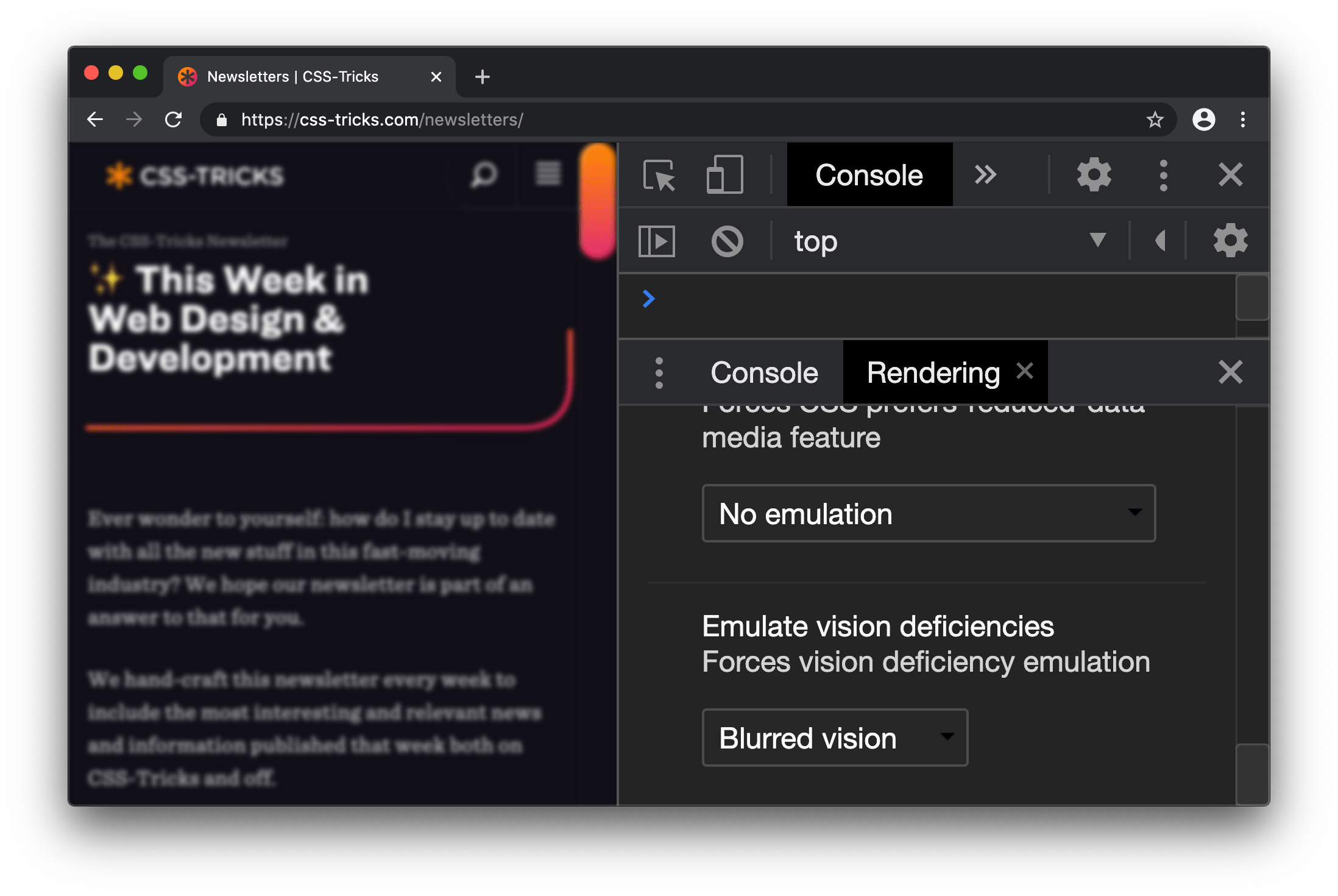
Exactly as it says on the tin, you can use Chrome DevTools to emulate vision impairments. For example, we can view a site through the lens of blurred vision.
That’s a challenge to read!
How can you do this in DevTools? Like this:
Open DevTools (right click and “Inspect” or Cmd + Shift + C).
Open the DevTools Command menu (Cmd + Shift + P on Mac, Ctrl + Shift + P on Windows).
Select Show Rendering in the Command menu.
Select a deficiency in the Rendering pane.
We used blurred vision as an example, but DevTools has other options, including: protanopia, deuteranopia, tritanopia, and achromatopsia.
Like with any tool of this nature, it’s designed to be a complement to our (hopefully) existing accessibility skills. In other words, it’s not instructional, but rather, influential on the designs and user experiences we create.
Here are a couple of extra resources on low vision accessibility and emulation:
The Performance Panel in DevTools can sometimes look like a confusing mish-mash of shapes and colors.
This update to it is great because it does a better job surfacing meaningful performance metrics.
What we want to look at are those extra timing rectangles shown in the “Timings” in the Performance Panel recording. This highlights:
DOMContentLoaded: The event which triggers when the initial HTML loads
First Paint: When the browser first paints pixels to the screen
First Contentful Paint: The point at which the browser draws content from the DOM which indicates to the user that content is loading
Onload: When the page and all of its resources have finished loading
Largest Contentful Paint: The largest image or text element, which is rendered in the viewport
As a bonus, if you find the Largest Contentful Paint event in a Performance Panel recording, you can click on it to get additional information.
Nice work, CSS-Tricks! The Largest Contentful Paint happens early on in the page load.
While there is a lot of golden information here, the “Related Node” is potentially the most useful item because it specifies exactly which element contributed to the LCP event.
To try this feature out:
Open up DevTools and navigate to the Performance panel
Click “Start profiling and reload page”
Observe the timing metrics in the Timings section of a recording
Click the individual metrics to see what additional information you get
Monitor performance
If you want to quickly get started using DevTools to analyze performance and you’ve already tried Lighthouse, then I recommend the Performance Monitor feature. This is sort of like having WebPageTest.org right at your fingertips with things like CPU usage.
Here’s how to access it:
Open DevTools
Open up the Command menu (Cmd + Shift + P on Mac, Ctrl + Shift + P on Windows)
Select “Show performance monitor” from the Command menu
Interact and navigate around the website
Observe the results
The Performance Monitor can give you interesting metrics, however, unlike Lighthouse, it’s for you to figure out how to interpret them and take action. No suggestions are provided. It’s up to you to study that CPU usage chart and ask whether something like 90% is an acceptable level for your site (it probably isn’t).
The Performance Monitor has an interactive legend, where you can toggle metrics on and off, such as:
CPU usage
JS heap size
DOM Nodes
JS event listeners
Documents
Document Frames
Layouts / sec
Style recalcs / sec
CSS overview and local overrides
CSS-Tricks has already covered these features, so go and check them out!
CSS Overview: A handy DevTools panel that gives a bunch of interesting stats on the CSS your page is using
Local Overrides: A powerful feature that lets you override production websites with your local resources, so you can easily preview changes
So, what about DevTool in other browsers?
I’m sure you noticed that I’ve been using Chrome throughout this article. It’s the browser I use personally. That said, it’s worth considering that:
Firefox DevTools is looking pretty great right now
With Microsoft Edge extending from Chromium, it too will benefit from these DevTools features
In other words, keep an eye out because this is a quickly evolving space!
Conclusion
We covered a lot in a short amount of space!
Lighthouse: A panel that provides tips and suggestions for performance, accessibility, SEO and best practices.
Inspect Element: An enhancement to the Inspect Element feature that provides accessibility information to the Inspect Element tooltip
Emulate vision deficiencies: A feature in the Rendering Pane to view a page through the lens of low vision.
Performance Panel Timings: Additional metrics in the Performance panel recording, showing user-orientated stats, like Largest Contentful Paint
Performance Monitor – A real-time visualization of performance metrics for the current website, such as CPU usage and DOM size
Please check out my mailing list, Dev Tips, if you want to stay keep up with the latest updates and get over 200 web development tips! I also have a premium video course over at ModernDevTools.com. And, I tend to post loads of bonus web development resources on Twitter.
Here’s a fancy new experimental feature in Chrome! Now, we can get an overview of the CSS used on a site, from how many colors there are to the number of unused declarations… even down to the total number of defined media queries.
Again, this is an experimental feature. Not only does that mean it’s still in progress, but it means you’ll have to enable it to start using it in DevTools.
Open up DevTools (Command+Option+I on Mac; Control+Shift+I on Windows)
Head over to DevTool Settings (? or Function+F1 on Mac; ? or F1 on Windows)
Click open the Experiments section
Enable the CSS Overview option
And, oh hey, look at that! We get a new “CSS Overview” tab in the DevTools menu tray when the settings are closed. Make sure it’s not hidden in the overflow menu if you’re not seeing it.
Lovely color palette you got there, Mr. Coyier. 😍
Notice that the report is broken out into a number of sections, including Colors, Font info, Unused declarations and Media queries. That’s a lot of information available in a small amount of space right at our fingertips.
This is pretty nifty though, huh? I love that tools like this are starting to move into the browser. Think about how this can help us not only as front-enders but also how we collaborate with designers. Like, a designer can crack this open and start checking our work to make sure everything from the color palette to the font stack are all in tact.
It’s useful when DevTools tells you that a declaration is invalid. For example, colr: red; isn’t valid because colr isn’t a valid property. Likewise color: rd; isn’t valid because rd isn’t a valid value. For the most part, a browser’s DevTools shows the declaration as crossed out with a warning () icon. It would be nice if they went a step further to tell you which thing was wrong (or both) and suggest likely fixes, but hey, I don’t wanna look a gift horse in the mouth.
Firefox is starting to go a step further in telling you when certain declarations aren’t valid, not because of a syntax error, but because they don’t meet other qualifications. For example, I tossed a grid-column-gap: 1rem on a random <p> and I was told this in a little popup:
grid-column-gap has no effect on this element since it’s not a flex container, a grid container, or a multi-column container.
Try adding either display:grid, display:flex, or columns:2. Learn more
Well that’s awful handy.
Elijah Manor has a blog post and video digging into this a bit.
The integration of APIs is one of the most effective ways to build new features in online businesses and increase their revenue and growth. Smartly chosen APIs not only save time but are also quality-driven and cost-effective. In this article, we've highlighted a curated collection of 25 of the best APIs available to achieve common features.
The benefits of these APIs are not always obvious or visible as these are something that works behind the scenes. Therefore, before we dig right into the Best APIs, let us first understand what an API is.
I’d like to tell you how I see code and design intersect and support one another. Specifically, I want to cover how designers can use code in their everyday work. I suggest this not because it’s a required skill, but because even a baseline understanding of coding can make designs better and the hand-off from design to development smoother.
As a UX Designer, I am always looking for good ways to both explore my UX design problems and communicate the final designs to others. Over the past 30 years, my work has always involved working alongside developers, but generally there has been a great divide between what I do and what developers do.
I can code at a basic level. For example, I’ve helped teach C to undergraduates back when I was a post-graduate student. I’ve worked on the usability of JDeveloper Oracle’s Integrated Development Environment (IDE) for Java. I also worked for a very short while on simplifying the UX of a WordPress content management environment to make it accessible to less technical users. This required a good understanding of HTML and CSS. I also volunteered on the design of the PHP website and had to develop some understanding of the server side of web development.
But even given these experiences, I am not a developer in any true sense of the word. If I happen to be looking at code, it’s in a “just in time” learning model — I look up what I need and then hack it until it works. Learning this way has often been frowned upon, a bit like learning to drive without lessons. You pick up bad development habits but maybe that's OK for the work I do.
So, no I don’t develop or write code. My day-to-day work is mostly been spent drawing, talking and gathering requirements. As far as design goes, I’ll start by sketching concepts in a notebook or using Balsamiq. Then I draw up UX wireframes and prototypes using tools like Axure, Adobe XD, InVision Studio, Figma and Sketch. By the time I'm ready to hand off my deliverables to development, all the visual assets and documentation have been defined and communicated. But I don’t step over the line into code development. That is just not my area of expertise.
So, why should designers know code?
We’ve already established that I’m no developer, but I have recently become an advocate for designers getting a good feel for how design and code interact.
In fact, I’d call it “playing with code.” I am definitely not suggesting that UX designers become developers, but at the very least, I think designers would benefit by becoming comfortable with a basic understanding of what is currently possible with CSS and best practices in HTML.
Being experimental is a huge part of doing design. Code is just another medium with which we can experiment and build beautiful solutions. So, we're going to look at a couple of ways designers can experiment with code, even with a light understanding of it. What we're covering here may be obvious to developers, but there are plenty of designers out there who have never experimented with code and will be seeing these for the first time.
So, it's for them (and maybe a refresher for you) that we look at the following browser tools.
DevTools: The ultimate code playground
One of the concerns a UX designer might have is knowing how a design holds up once it’s in the browser. Are the colors accurate? Are fonts legible throughout? How do the elements respond on various devices? Will my grey hover state work with the white/grey zebra striping on my application grids in practice? These are some of the styling and interaction issues designers are thinking about when we hand our work off for development.
This is where DevTools can be a designer’s best friend. Every browser has its own version of it. You may have already played with such tools before. It’s that little “Inspect” option when right clicking on the screen.
Entering the wonderful world of DevTools can be done from any webpage.
What makes DevTools such a wonderful resource is that it provides a way to manipulate the code of a live website or web application without having to set up a development environment. And it’s disposable. Any edits you make are for your eyes only and are washed away the very moment the browser refreshes.
Editing code in DevTools makes changes to the page on the fly.
Further, DevTools can mimic other devices.
Need to see how a page or changes to it look on other devices? DevTools can give you an idea.
And, if you haven’t seen it yet, Firefox released a wonderful new shape path editor that's very valuable for exploring interesting designs.
Over the past few months, I have been working on a complex web client for an enterprise-level application. Last sprint, my UX design story was to explore the look of the entry page of the web application and how to introduce a new color scheme. It was hard to envision how the changes I was making were going to impact the tool as a whole as some of the components I was changing are used throughout the product.
One day, when discussing a design decision, one of the developers tested out my suggested change to a component using the latest DevTools in his browser. I was amazed by how much DevTools has grown and expanded since I last remember it. I could immediately see the impact of that change across our whole web application and how different design decisions interacted with the existing design. I started to experiment with DevTools myself and was able to preview and experiment with how my own simple CSS changes to components would impact the whole web application. Super helpful!
However, it was also a little frustrating to not be able store my experiments and changes for future reference. So, I went exploring to see what else was out there to support my design process.
Chrome browser extensions
DevTools is are amazing right out of the box, but experimenting with code gets even more awesome when browser extensions are added to the mix. Chrome, in particular, has a couple that I really like.
Chrome Extension 1: User CSS
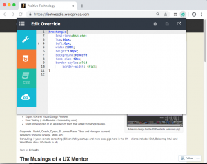
User CSS is a Chrome browser extension that allows you to save the changes you make in DevTools in an editable CSS code tab. These CSS changes are automatically executed on that page if User CSS is enabled. This means that you can set up CSS overrides for any page on the web, view them later, and share them with others. This can be an incredible tool when, say, doing a design review of a staging site prior to release, or really any design exploration for a web application or website that is viewable in a browser.
User CSS has a nice built-in code editor, so my code is always well formatted and includes syntax highlighting so I don't have to worry about that sort of thing. I particularly like the fact that overrides are executed immediately so you can see changes on the fly. It also has a useful switch that allows you to turn your overrides on and off. This makes it very simple to demonstrate a set of changes to a team. This extension has allowed me to easily present a comparison between an existing page design and proposed changes. I’ve even used it to make a simple video demonstrating the proposed design changes.
In this video I make some simple edits to my web page and then show how I can turn on and off the edits by simply clicking the on/off button on User CSS:
This extension is a perfect if you all you need to do is edit CSS, particularly if you have some very simple design changes to make want to those changes to persist. However, the complexity of a design increases, I have found myself wanting to save more than one snippet of code at a time. Copying and pasting code in and out of the User CSS editor was becoming a pain. I wanted something with more flexibility and freedom to experiment. I also wanted to be able to look at simple changes to the HTML of my web application and even play with a bit of JavaScript.
That's where the next extension comes into play.
Chrome Extension 2: Web Overrides
The second Chrome extension I found is called Web Override and it provides a way to override HTML, CSS and JavaScript. All of them! This is presented as three tabs, much the same way CodePen does, which makes it a very powerful tool for creating rough working design prototypes.
Web Overrides also allows you to save multiple files so that you can switch different parts of a design on or off in different combinations. It also quickly switches between the different options to show off different design concepts.
This video shows how I added an HTML element into a page and edited the new element with some basic CSS:
Using the HTML tab makes it possible to edit any element on the page, like swap out a logo, remove unnecessary elements, or add new ones. The JavaScript tab is similar in that I can do simple changes, like inject additional text into the website title so that I can test how dynamic changes might affect the layout — this can be useful for testing different scenarios, such as differences with internationalization.
These edits may be trivial from a coding perspective, but they allow me to explore hundreds of alternative designs in a much shorter time and with a lot less risk than scooting pixels around in a design application. I literally could not explore as many ideas as quickly using my traditional UX prototyping tools as I can with this one extension.
And, what is more, both me and my team have confidence in the design deliverables because we tested them early on in the browser. Even the most pixel-perfect Photoshop file can get lost in translation when the design is in the browser because it's really just a snapshot of a design in a static state. Testing designs first in the browser using these extensions prove that what we have designed is possible.
On the flip side of this, you might want to check out how Jon Kantner used similar browser extensions to disable CSS as a means to audit the semantic markup various sites. It's not exactly design-related, but interesting to see how these tools can have different use cases.
What I’ve learned so far
I am excited about what I have learned since leaning into DevTools and browser extensions. I believe my designs are so much better as a result. I also find myself able to have more productive conversations with developers because we now have a way to communicate well. The common ground between design and code in rapid prototypes really helps facilitate discussion. And, because I am playing around with actual code, I have a much better sense about how the underlying code will eventually be written and can empathize a lot more with the work developers do — and perhaps how I can make their jobs easier in the process.
It has also created a culture of collaborative rapid prototyping on my team which is a whole other story.
Playing with code has opened up new ideas and encouraged me to adapt my work to the context of the web. It’s been said that getting into the browser earlier in the design process is ideal and these are the types of tools that allow me (and you) to do just that!
Do you have other tools or processes that you use to facilitate the collaboration between design and code? Please share them in the comments!


 ) icon. It would be nice if they went a step further to tell you which thing was wrong (or both) and suggest likely fixes, but hey, I don’t wanna look a gift horse in the mouth.