Have you ever wondered why some apps feel like a natural extension of your mind, while others leave you scratching your head? The answer is UX design. It’s all about crafting something that feels tailor-made for you, without you even realizing it’s there. Let’s explore some of the top principles at play in great UX […]
Designing a beautiful “article” is wrought with tons of considerations. Unlike, say, a homepage, a long-form article is less about designing an interface than it is designing text in a way that creates a relaxed and comfortable reading experience.
That’s because articles deal with long-form content which, in turn, tends to be valued by a ”time on page” interaction with users. We want someone to read a complete narrative. There’s a natural space between the time someone lands on an article and reads all the words. And hopefully, that space is immersive enough to not only hold a user’s, but provoke thoughts, ideas, and, possibly, actions. At least that’s what I’m hoping as I have your attention and you make your way through the very article you’re reading.
There’s a balance. On one hand, we hear that “no one reads the Internet.” On the other, a long-form article demands careful attention. Considering the current value of content marketing and the growing impatience in users, captivating readers for as long as possible should be a key concern. Let’s take a look at some best practices and examples of incredible article pages to get a better idea of what makes a visually appealing reading experience for long-form articles (without sacrificing user experience), and how we can replicate the effects.
Quick wins
Let me quickly list out what I think might already be obvious to many of you, but are effective things for content legibility:
Increase the font size: We know that 16px is the default and is perfectly fine in many designs, but a larger font size is inviting in that it implies the user is free to lean back and settle in without having to angle forward with the screen in their face to read.
Aim for characters per line: Very few people I know like to work harder than they need to, and that goes for reading too. Rather than using the full viewport width, try to narrow things down and balance that with your larger font size to get fewer characters on each line of text. Your sweet spot may vary, though many folks suggest somewhere between 45-75 characters per line to help limit how far the reader’s eye has to work to go from left to right. Chris has a bookmarklet to help count characters, but we also have the ch unit in CSS to get predictable results.
Bump up the line height: A default line height is going to feel smashed. It’s funny, but more space between lines (up to a point, of course) is less work for eyes, which seems antithetical to the characters-per-line advice where we generally want eyes to travel a shorter distance. A line height between 1.2 and 1.5 seems to be a pretty typical range for long-form content.
You may be accustomed to designing “above the fold” where real estate is a prime commodity. That’s sort of like beach-front property in the web world because it’s where we’re used to packing in high-value things, like hero banners, calls to action, and anything else to help sell a thing. Above the fold can be a lot like a dense urban downtown with high traffic and high-rise buildings.
Articles are different. They allow you to stretch out a bit. If we want to take the city development analogy a little further, articles have the acreage to lean into a “less is more” sort of design approach. That’s what makes seemingly small design choices — like type — so important to the overall experience.
Check out the example below. The link underlines have a little more room to breathe (specifically, they appear below the descenders). This is actually something that you can enable sitewide but looks especially nice on article pages since it increases readability. That’s the sort of subtle design choice that contributes to extra breathing room.
text-underline-position: under; is the line of CSS that makes this work. Naturally, text-decoration must be set to something other than none (underline in this case), too.
The example above also features text-decoration-thickness, which alters the thickness of underlines (and other line types). You can use this CSS property to match a line’s thickness to a font’s size and/or weight.
Here’s a full example:
a {
  text-decoration: underline;
  text-decoration-thickness: 2px;

  /* or */
  text-decoration: underline 2px;
  text-underline-position: under;
}
But before you reach for the text-decoration shorthand, Šime Vidas has a few “gotchas” when it comes to using it that are worth reviewing.
Leading into the content
Drop caps are stylized letters that can be placed at the beginning of a document or document section. They were once used in Latin texts, but today they’re mostly used for decorative reasons.
Personally, I think that drop caps hinder readability. However, they can be a nice way to “lead” a reader into the main content, and they shouldn’t introduce any serious accessibility issues as long as you’re using the ::first-letter pseudo-element. There are other (older)methods that involve more HTML and CSS as well as the use of ARIA attributes in order for the content to remain accessible.
Using ::first-letter, the CSS would look something like this:
/* select the first letter of the first paragraph */
article > p:first-child::first-letter {
  color: #903;
  float: left;
  font-family: Georgia;
  font-size: 75px;
  line-height: 60px;
  padding-top: 4px;
  padding-right: 8px;
  padding-left: 3px;
}
It sure would be nice if we could use the initial-letter property, but there’s pretty much no support for it at the time I’m writing this. If we had it, all that math for font size and line height would be calculated for us!
CodePen challenged folks to show off their drop-cap-styling skills several years ago and you can see a whole bunch of neat examples from it in this collection.
Skip to main content
Screen readers allow users to skip to the main content as long as it wraps it within a <main> element. However, those who navigate websites by tabbing don’t benefit from this. Instead, we must create a “skip to main content” anchor link. This link is customarily hidden but revealed once the user makes their first tab (i.e. show on focus).
It would look something like this:
<!-- anchor -->
<a id="skip-link" href="#main">Skip to main content</a>

<!-- target -->
<main class="main">
  <!-- main content -->
</main>
#skip-link {
  position: absolute; /* remove it from the flow */
  transform: translateX(-100%); /* move it off-screen so that it appears hidden but remains focusable */
}
#skip-link:focus {
  position: unset; /* insert it back into the flow */
  transform: unset; /* move it back onto the screen */
}

.main {
  scroll-margin: 1rem; /* adds breathing room above the scroll target */
}
There are other ways to go about it, of course. Here are a couple of deeper dives on creating skip links.
I love the illustrations in this article. Despite how incredible they look, they don’t demand too much cognitive attention. They introduce brief moments of delight but also suggest that the article itself has something more important to say. Partly, this comes down to the use of transparency, whereas rectangular images capture more negative space and therefore demand more attention (which is fine if that’s the desired effect and images are crucial to the story).
However, it’s important to know that the images aren’t actually transparent at all, but instead are non-transparent JPEGs with the same background color as the content. I’m presuming that’s to keep the size of the images smaller compared to PNGs that support transparency.
The downside to “faking” a transparent background like this is that it would require additional trickery (and maintenance) to support a dark mode UI if your site happens to offer one. If the illustrations are pretty flat and simple, then SVG might be the way to go instead since it’s small, scalable, and capable of blending into whatever background it’s on.
But if you’re bound to using raster images and would rather work with PNG files for transparency, you’ll want to look into using responsive images and the loading="lazy" attribute for faster loading times.
Put the focus on the type and semantics
You may have very little say over how or where someone reads content on the web these days. Whether the user receives it in an RSS feed, gets it delivered by email, sees it copy-and-pasted from a colleague, finds it on a scraped site, or whatnot, your content might look different than you prefer. You could design what you think is the most gorgeous article in all the land and the user still might smash that Reader Mode button to your dismay.
That’s ok! The discoverability of content is very much as important as the design of it, and many users have their own ways of discovering content and preferences for what makes a good reading experience.
But there are reasons why someone would want a Reader Mode. For one, it’s like “not seeing any CSS” at all. By that, I mean Safari’s Reader Mode or Brave SpeedReader, which use machine learning to detect articles. There’s no fetching or executing of CSS, JavaScript, or non-article images, which boosts performance and also blocks ads and tracking.
This sort of “brute minimalism” puts the focus on the content rather than the styles. So, you might actually want to embrace a browser’s opinionated reading styles specifically for that purpose.
The way to do that is not by using CSS, but by paying closer attention to your HTML. Reader modes work best with markup that uses simple, semantic, article-related HTML. You’ve got to do more than simply slapping <article> tags around the article to get the most from it.
You might just find that a minimal design that emphasizes legibility over slickness is actually a good strategy to use in your site’s design. I’d strongly suggest reading Robin’s post on the “smallest CSS” for a solid reading experience.
Roundup of long-form articles!
I’ve shared a lot of what I think makes for a great reading experience for long-form articles on the web. But seeing is believing and I’ve rounded up a bunch of examples that showcase what we’ve covered.
Polygon uses a strong, provacative visual to hook readers into the ain content. Notice how the drop cap, larger font size, and increased line height make this feel like a page you can sit back with and relax.
The TASTE website uses transparent images that blend into the background color of the content. There’s plenty of space between elements and bold accents — like thick borders and a heavy drop cap — pull the reader’s eye down the page.
The Outline is a prime example of minimalism. Notice how something as subtle as a squiggly horizontal rule can be an eye-catching embellishment when there are fewer things competing for attention.
The brutalist style of the Dropbox blog is probably a controversial one. The colors, fonts, and use of space are all over the place, and the content being floated to the right just feels unfamiliar. But does it break any design ‘rules’? Nope. I could grow to like it in time, especially in a milder form.
Urban Beardsman’s design is extremely linear. As somebody that has difficulty concentrating and is easily distracted by sidebars, in-article CTA boxes, and even blockquotes, I very much enjoy how easy it is to read this blog like a book. The perfect example of “less is more.”
There’s nothing unique about the GoSquared blog, but it managed to include pretty much all of the things we discussed in the article — a better underline design, seamless images, and some very readable typography. Quite impressive.
The Smart Passive Income blog proves how far you can get just by choosing a legible font and using readable font sizes, line heights, letter spacings, and paragraph spacings.
Recipe pages are consistently sucky, but not Little Fat Boy. The lack of sameness throughout the page makes it easy jump to different parts of the recipe without getting lost. Plus, the ingredients are pinned to the top-right for your convenience.
The SolarWinds hack in December of 2020 is considered one of the largest and most sophisticated attacks known to date. The attack, which potentially put 18,000 public and private organizations at risk, was used as a springboard to compromise a raft of U.S. government agencies. SolarWinds later claimed that less than 100 were actually hacked as a result.
According to experts, this hack could be the catalyst for broad changes in the cybersecurity industry, prompting companies and governments to devise new methods on how to protect themselves and react better to breaches and attacks.
Dependency Inversion Principle(in C++) is the fifth and last design principle of a series SOLID as a Rock design principles. The SOLID design principles focus on developing software that is easy to maintainable, reusable, and extendable. In this article, we will see an example code with the flow and correct it with help of DIP. We will also see guidelines and benefits of DIP at the ens of the article.
By the way, If you haven't gone through my previous articles on design principles, then check out the following quick links:
It is technically true that anyone can cook. But there’s a difference between actually knowing how to prepare a delicious meal and hoping for the best as you throw a few ingredients in a pot. Just like web development, you might know the ingredients—<span>, background-color, .heading-1—but not everyone knows how to turn those ingredients into a beautiful, easy-to-use website.
Whenever you use HTML and CSS, you are designing—giving form and structure to content so it can be understood by someone else. People have been designing for centuries and have developed principles along the way that are applicable to digital interfaces today. These principles manifest in three key areas: how words are displayed (typography), how content is arranged (spacing), and how personalty is added (color). Let’s discover how to use each of these web design ingredients through the mindset of a developer with CSS properties and guidelines to take the guesswork out of web design.
Websites that are easy to read don’t happen by mistake. In fact, Taimur Abdaal wrote an entire article on the topic that’s chock-full of advice for developers working with type. We’re going to focus specifically on two fundamental principles of design that can help you display words in a more visually pleasing and easy-to-read way: repetition and hierarchy.
Use repetition for consistency and maintainability
Repetition comes fairly naturally on the web thanks to the importance of reusability in software. For example, CSS classes allow you to define a particular style for text and then reuse that style across the site. This results in repeating, consistent text styles for similar content which helps users navigate the site.
If, for example, you are working on styles for a new paragraph, first consider if there is existing content that has a similar style and try to use the same CSS class. If not, you can create a new class with a generic name that can be repeated elsewhere in your site. Think .paragraph--emphasize as opposed to .footer__paragraph--emphasize or .heading-1 as opposed to .hero__site-title. The first examples can be used across your site as opposed to the second which are scoped to specific components. You can even add a prefix like text- to indicate that the class is used specifically for text styles. This method will reduce the CSS file size and complexity while making it much easier to update global styles in the future.
Left: The black text is similar but uses a slightly different font size and line height. Right: The black text uses the same styles and therefore can use the same CSS class. Reducing the amount of CSS needed and adding repetition and consistency.
In design, there are endless ways to experiment with styles. Designers can sometimes go a little crazy with their font styles by creating numerous slight variations of similar styles. However, in code, it’s valuable to restrict text styles to a minimum. Developers should urge designers to combine similar styles in order to reduce code weight and increase reusability and consistency.
These headings look very similar but are slightly different and would require three separate CSS classes to style them. They could probably be combined into one and styled with a single class.
Hierarchy provides a clear visual order to content
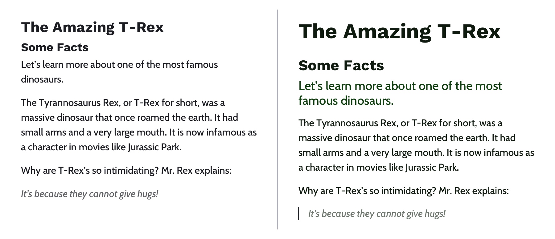
Hierarchy is something you really only notice when it’s not there. In typography, hierarchy refers to the visual difference between various pieces of text. It’s the distinction between headings, paragraphs, links, and other text styles. This distinction is made by choosing different fonts, colors, size, capitalization, and other properties for each type of text content. Good hierarchy makes complex information easier to digest and guides users through your content.
Left: Poor hierarchy. There’s not much differentiation in the size or color of the text to help users digest the content. Right: Better hierarchy that uses more variety in font size, color, and spacing to help users quickly navigate the content.
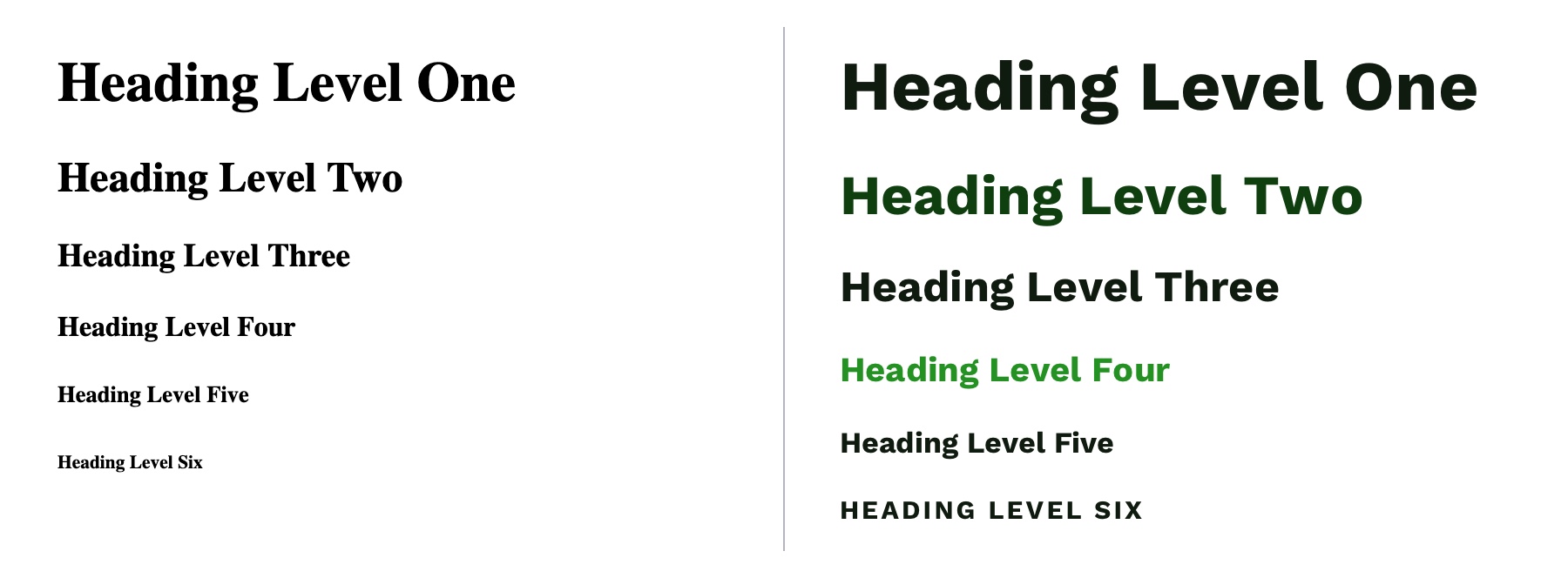
Out of the box, HTML provides some hierarchy (like how the font size of headings gets smaller as you go from <h1> to <h6>), but CSS opens the door for even more creativity. By giving <h1> tags an even larger font size, you can quickly establish greater difference in size between heading levels—and therefore more hierarchy. To create more variety, you can also change the color, text-align, and text-transform properties.
A comparison of the way HTML headings look without styles versus adding more contrast with CSS.
A note on choosing fonts
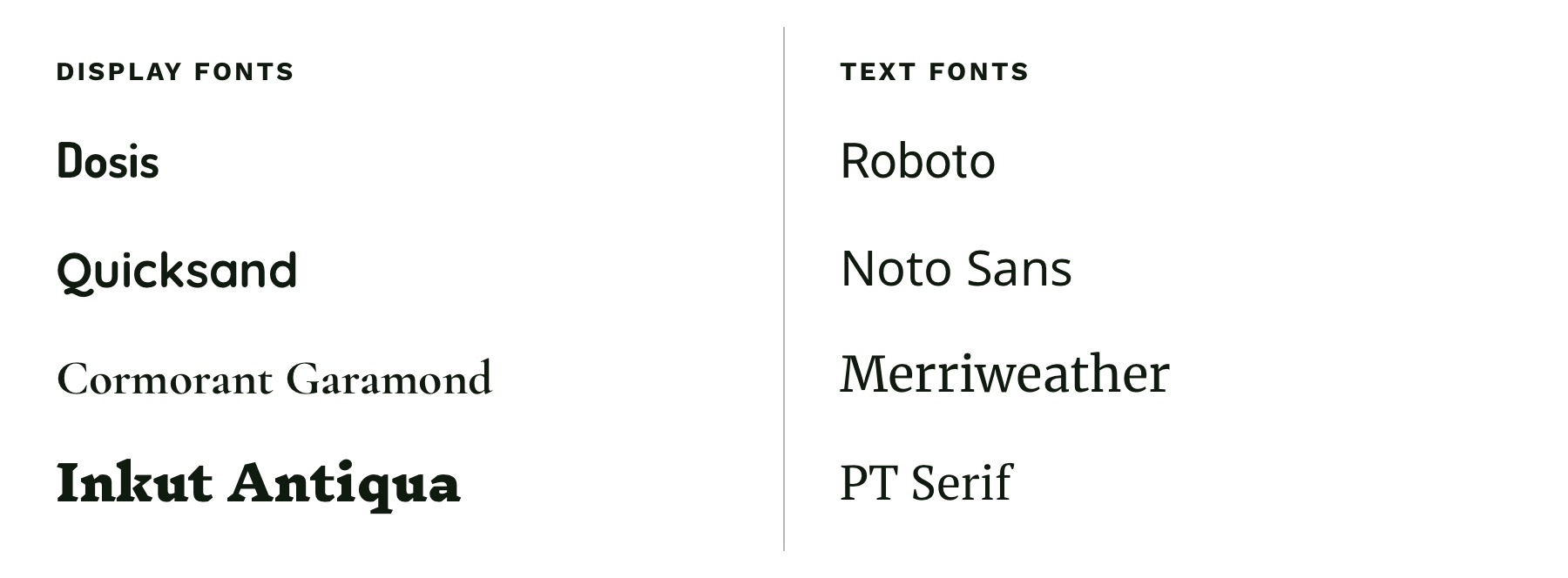
With typography, we need to make sure it is as easy to read as possible. The greatest overall factor in readability is the font you choose—which is a huge topic. There are many factors that determine how "readable" a font is. Some fonts are made specifically to be used as headings or short lines of text; these are called "display" fonts, and they often have more personality than fonts designed to be used for text. Unique flourishes and quirks make display fonts harder to read at small sizes and when part of a large paragraph. As a rule of thumb, use a more straightforward font for text and only use display fonts for headings.
Left: Examples of display fonts that work better as headings. Right: Examples of text fonts that are more readable and can be used for headings, paragraphs, and any other text that needs to be easy to read.
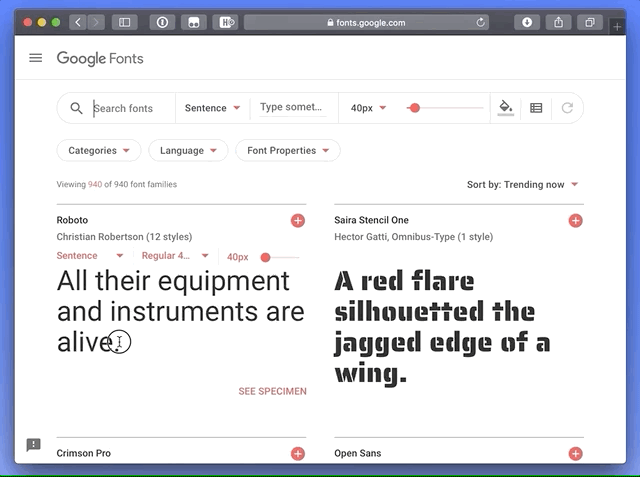
If you’re in a pinch and need a readable font, try Google Fonts. Add a paragraph of text to the preview field and size it roughly how it will display on your website. You can then narrow down your results to serif or sans-serif and scan the list of fonts for one that is easy to read. Roboto, Noto Sans, Merriweather, and PT Serif are all very readable options.
CSS properties for better readability
The main paragraph font-size should be between 16pxand 18px (1em and 1.25em) depending on the font you choose.
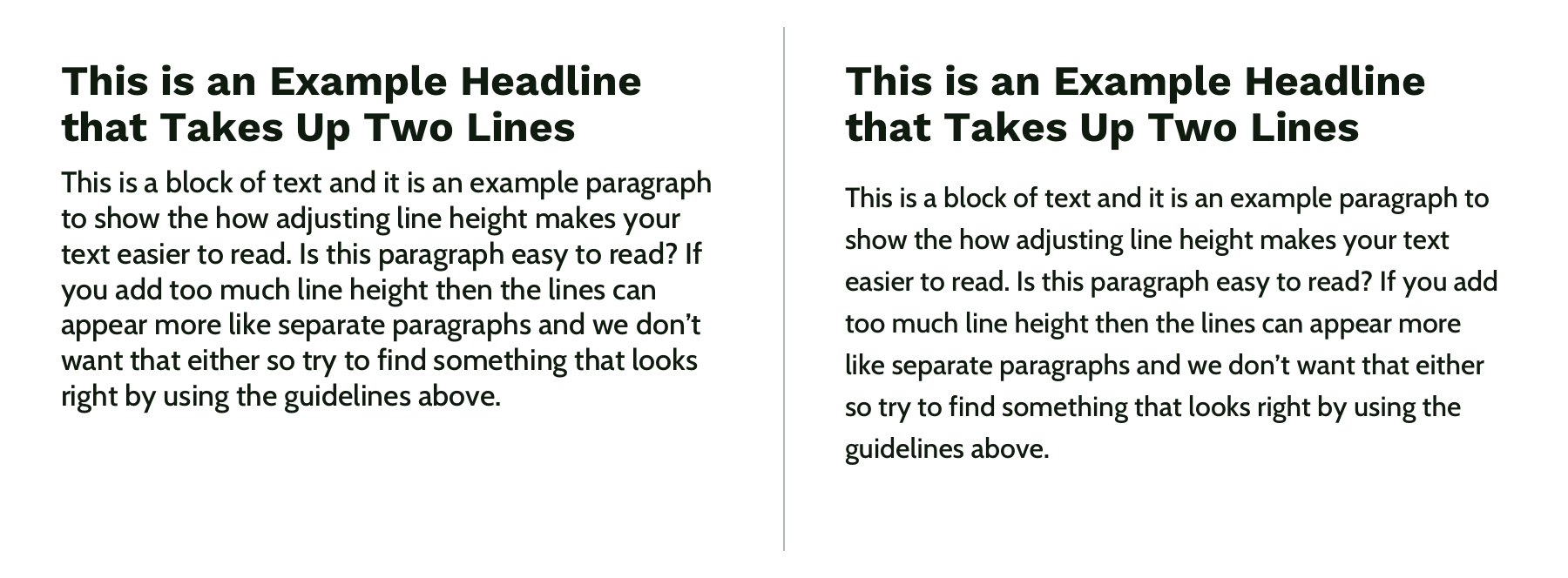
Manually set line-height (the vertical space between two lines of text) to make your text less cramped and easier to read. Start with line-height: 1.25 (that is 1.25 times the font-size) for headings and at least 1.5 for paragraphs (but no more than 1.9) and adjust from there. The longer the line of text, the larger the line-height should be. To keep your text flexible, avoid adding a unit to your line-height. Without a unit the line-height you set will be proportional to your font-size. For example, line-height: 1.5 and font-size: 18px would give you a line height of 27 pixels. If you changed your font size to font-size: 16px on smaller screens, the computed line height would then change to 24 pixels automatically.
Left: line-height is 1.1 for the heading and 1.2 for the paragraph, which is roughly the default setting. Right: line-height is 1.25 for the headings and 1.5 for the paragraph.
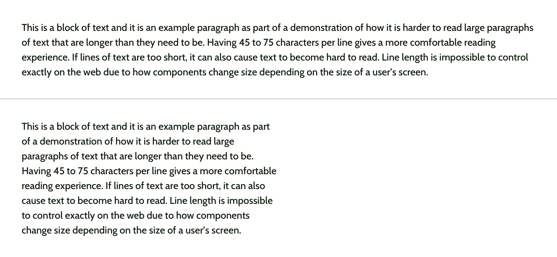
Pay attention to how many characters are in a line of text and aim for 45 and 75 characters long (including punctuation and spaces). Doing so reduces reading fatigue for your users by limiting the eye and head movement needed to follow a line of text. With the variable nature of the web, it’s impossible to completely control line length, but you can use max-width values and breakpoints to prevent lines of text from getting too long. Generally speaking, the shorter the line of text, the faster it will be to scan for quick reading. And don’t worry too much about counting the characters in every line. Once you do it a few times, you’ll develop a sense for what looks right.
Top: line length of around 125 characters. Bottom: line length of around 60 characters.
Spacing
After looking at typography, you can take a step back and examine the layout, or spacing, of your content. Movement and proximity are two design principles that relate to spacing.
Movement is about content flow
Movement refers to how your eye moves through the page or the flow of the page. You can use movement to direct a user’s eye in order to tell a story, point to a main action item, or encourage them to scroll. This is done by structuring the content within individual components and then arranging those components to form the layout of the page. By paying attention to how your eye moves through content, you can help users know where to look as they scan the page.
Unlike books, which tend to have very linear structure, websites can be more creative with their layout—in literally endless ways. It is important to make sure you are intentional with how you layout content and do so in a way which guides users through your content as easily as possible.
Three potential ways to arrange a heading, image, and button.
Consider these three examples above. Which is the easiest to follow? The arrangement on the left draws your eye off the screen to the left due to how the image is positioned which makes it hard to find the button. In the center option, it’s easy to skip over the headline because the image is too large in comparison. On the right, the heading draws your attention first and the image is composed so that it points to the main action item—the button.
White space is a helpful tool for creating strong movement, but it’s easy to use too much or too little. Think about how you are using it to direct the user’s eye and divide your content. When used well, users won’t notice the whitespace itself but will be able to better focus on the content you are presenting. For example, you can use whitespace to separate content (instead of a colored box) which results in a less cluttered layout.
Left: Using a graphic element to separate content and aligning images in the center. Right: Using whitespace to separate content and aligning images on the left to let the whitespace flow better around groups of related content and create a cleaner layout.
Proximity establishes relationships
When objects are closer together, they are perceived as being related. By controlling spacing around elements, you can imply relationships between them. It can be helpful to create a system for spacing to help build consistency through repetition and avoid the use of random numbers. This system is based off the default browser font size (1rem or 16px) and uses distinct values that cover most scenarios:
0.25rem (4px)
0.5rem (8px)
1rem (16px)
2rem (32px)
4rem (64px)
You can use Sass or CSS variables so that the values are kept consistent across the project. A system might look like this—but use whatever you’re comfortable with because naming things is hard:
$space-sm
$space-med
$space-lg
$space-xl
$space-xxl
Left: A component with uneven spacing between elements. Right: A component that uses consistent spacing.
Color conveys personality and calls attention
Color greatly affects a website’s personality. When used well, it gives pages life and emotion; used poorly, it can distract from the content, or worse, make it inaccessible. Color goes hand in hand with most design principles. It can be used to create movement by directing users’ eyes and can be used to create emphasis by calling attention to the most important action items.
A note on choosing colors
With color, it can be hard to know where to start. To help, you can use a four-step process to guide your color choices and build a color palette for the site.
Step 1: Know your mood
You have to know the mood or attitude of your site and brand before choosing colors. Look at your content and decide what you are trying to communicate. Is it funny, informative, retro, loud, somber? Typically, you can boil down the mood of your site to a few adjectives. For example, you might summarize The North Face as adventurous and rugged while Apple would be minimalistic and beautiful.
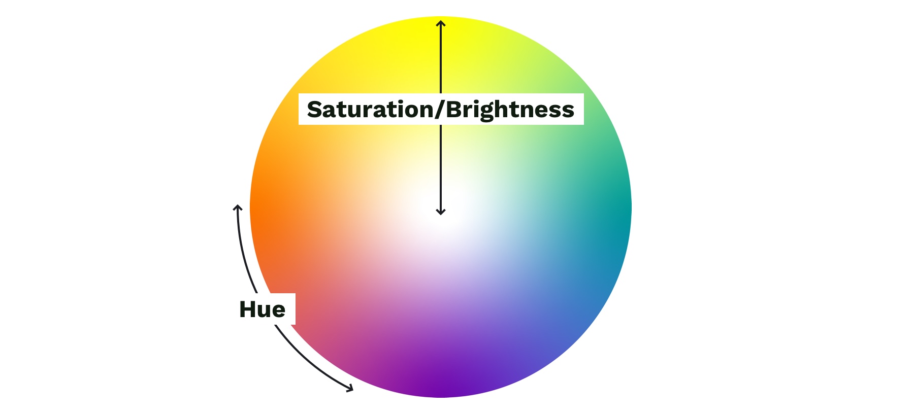
Step 2: Find your main color
With your mood in mind, try to visualize a color that represents it. Start with the color’s saturation (how intense the color is) and brightness (how close the color is to white or black). If your mood is upbeat or flashy, a lighter (more saturated) color is probably best. If your mood is serious or reserved, a darker (less saturated) color is better.
Next, choose a hue. Hue refers to what most people think of as colors—where does is fall on the rotation of the color wheel? The hue of a color is what gives it the most meaning. People tend to associate hues with certain ideas. For instance, red is often associated with power or danger and green relates to money or nature. It can be helpful to look at similar websites or brands to see what colors they use—although you don’t need to follow their lead. Don’t be afraid to experiment!
Color wheel showing saturation and brightness versus hue.
Step 3: Add supporting colors
Sometimes, two or three main colors are needed, but this is not necessary. Think about the colors of different brands. Some use a single color, and others have a main color and one or two that support it. Coca-Cola uses its distinct red. IKEA is mostly blue with some yellow. Tide is orange with some blue and yellow. Depending on your site’s mood, you might need a few colors. Try using a tool like Adobe Color or Coolors), both of which allow you to add a main color and then try different color relationships, like complementary or monochromatic, to quickly see if any work well.
Step 4: Expand your palette
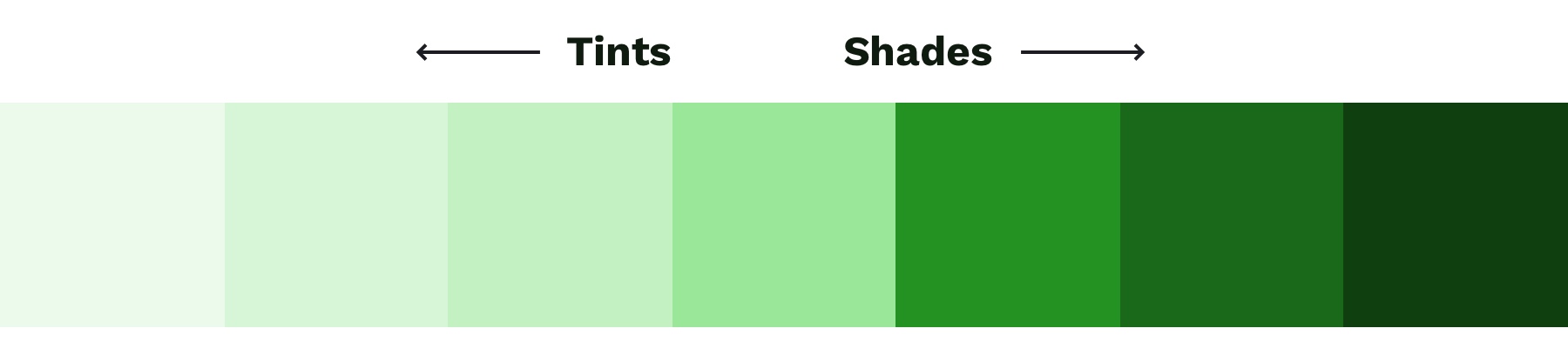
Now that you’ve narrowed things down and found your main color(s), it’s time to expand your scope with a palette that gives your project versatility and constraint—here’s a methodology I’ve found helpful. Tints and shades are the trick here. Tints are made by mixing your main color(s) with white, and shades are made by mixing with black. You can quickly create an organized system with Sass color functions:
A palette of color options created with Sass color functions. Make sure to use percent values for the functions that create distinct colors—not too similar to the main color.
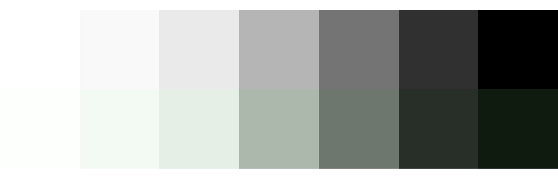
To round out your palette, you’ll need a few more colors, like a white and black. Try creating a "rich black" using a dark, almost black shade of your main color and, on the other end of the spectrum, pick a few light grays that are tinted with your main color. Tinting the white and black adds a little more personality to your page and helps create a cohesive look and feel.
Top: Basic white, gray, and black. Bottom: Tinted white, grays, and black to match the main color.
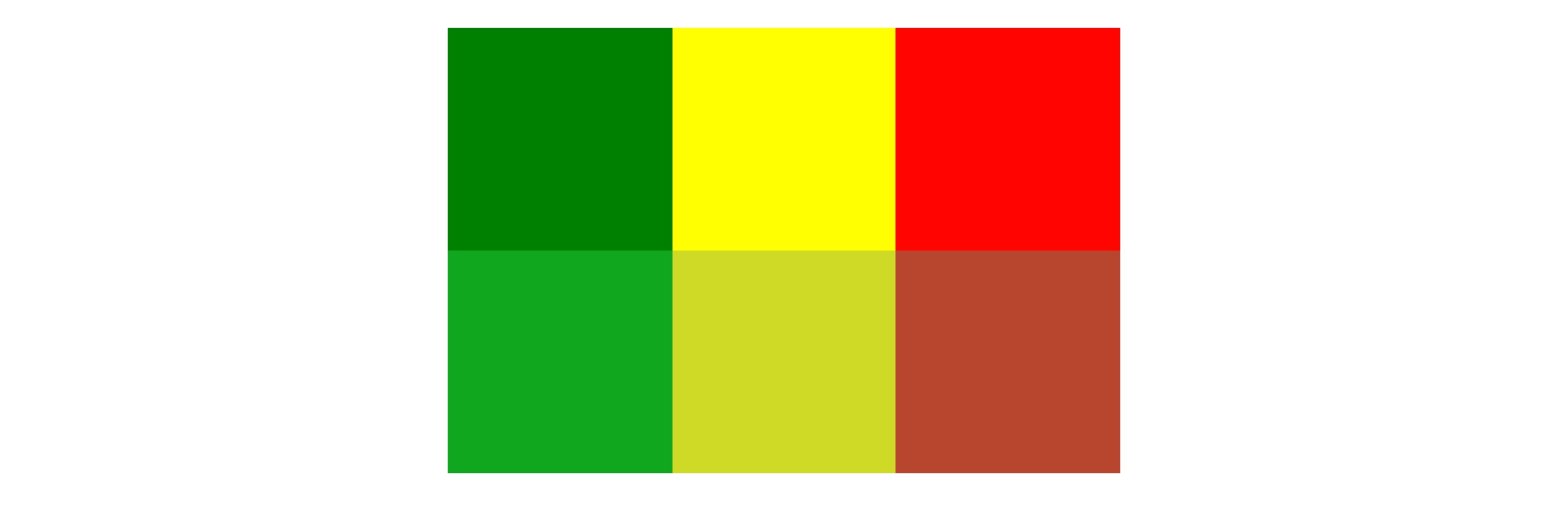
Last but not least, if you are working on an interactive product, you should add colors for success, warning, and error states. Typically a green, yellow, and red work for these but consider how you can adjust the hue to make them fit better with your palette. For example, if your mood is friendly and your base color is green, you might want to desaturate the error state colors to make the red feel less negative.
You can do this with the mix Sass color function by giving it your base color, the default error color, and the percentage of base color that you want to mix in with the error color. Adding desaturate functions helps tone down the colors:
Top: Default colors for success, warning, and error states. Bottom: Tinted and desaturated colors for the success, warning and error states.
When it comes to the web, there’s one color principle that you have to pay extra attention to: contrast. That’s what we’ll cover next.
Contrast
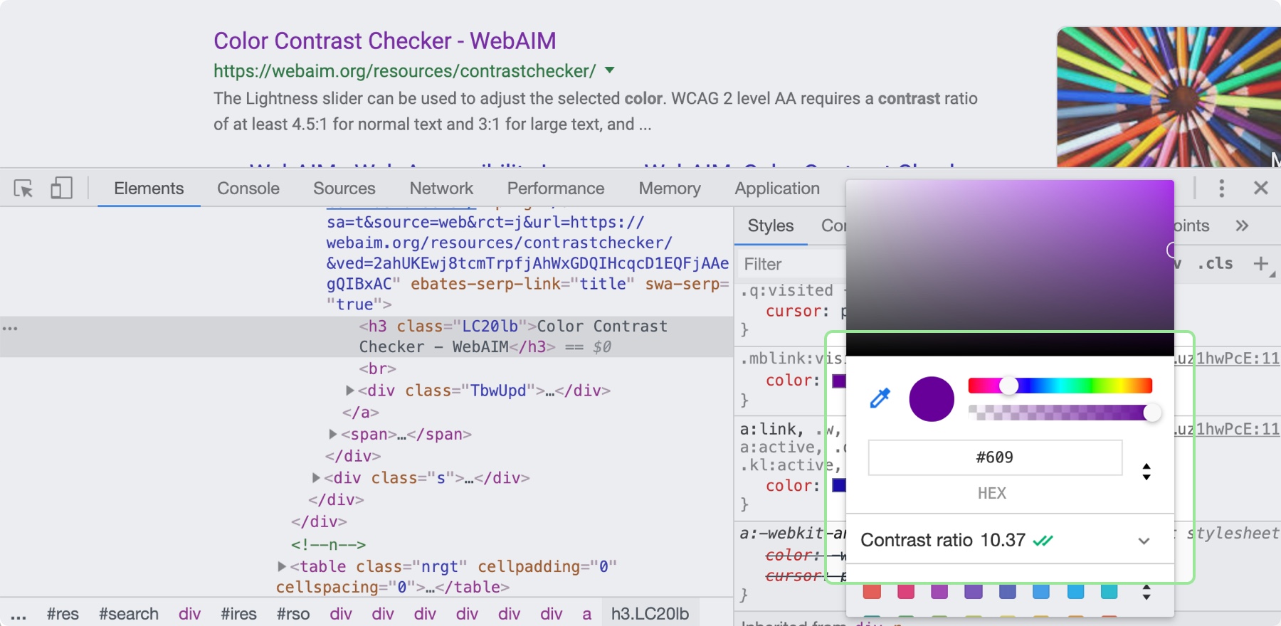
Color contrast—the difference in saturation, brightness, and hue between two colors—is an important design principle for ensuring the web is accessible to those with low vision or color blindness. By ensuring there is enough contrast between your text and whatever is behind it on your site will be more accessible for all sighted users. When looking at accessibility, be sure to follow the color contrast guidelines provided by W3C’s Web Content Accessibility Guidelines (WCAG). There are many tools that can help you follow these guidelines, including the inspect panel in Chrome’s dev tools.
By clicking on the color property in the Chrome Inspect tool, you can see the contrast ratio and whether it is passing.
Now, it’s time to put these principles to practice! You can use these processes and CSS tips to help take the guesswork out of design and create better solutions. Start with what you are familiar with, and eventually, the design principles mentioned here will become second nature.
Let me just frame this for you: we're going to take a piece of production UI from a Sketch file, break it down into pieces of information and then build it up into a story we tell our friends. Our friends might be hearing, or seeing, or touching the story so we are going to interpret and translate the same information for different people. We're going to interpret the colors and the typography and even the sizes, and express them in different ways. And we really want everyone to pay attention. This story mustn't be boring or frustrating; it's got to be easy to follow, understand and remember. And it's got to, got to, make sense, from beginning to end.
I've asked my colleague Katie to choose a component she has designed in Sketch. I'll go through and mark it up (we mainly use SCSS, Twig and Craft but the templating language is not very important), then she will respond briefly. Hopefully I'll get most of it right, and then one or two things wrong, so we can look at how things get lost during handoff.
In white label or framework type front-end, the focus is on building pieces that are as flexible and adaptable as possible, as content and style-agnostic as possible (within the scope of the product), because you simply will never know where the code is going and for what, ultimately it is being used. But recently I moved to a web design agency, which has a complete inversion of this focus. It is particular. It is bespoke. It's all about really deeply engaging with the particular client you have and the particular clients they have, and designing something that suits them, as a tailor would.
Working so closely with a graphic designer like Katie, with highly finished pixel-spaced UI, instead of directly from wireframes or stories is an adjustment and an education, but there are still lots of things I can bring to the table. Chiefly: document design.
Document design, which admittedly is just the old semantic web with an accessibility hat on, is really looking at graphic design, engaging with it as a system of communication, and translating the underlying purpose of the colors/type/layout into an accessible, linearizable, and traversable DOM. It's HTML, kids. It's just HTML. You'd think we all knew it by now… but look around you. You'd be wrong!
Katie has slung me a Sketch file chock full of artboards, and she's pretty great at writing out what she wants so I don't have to think too hard:
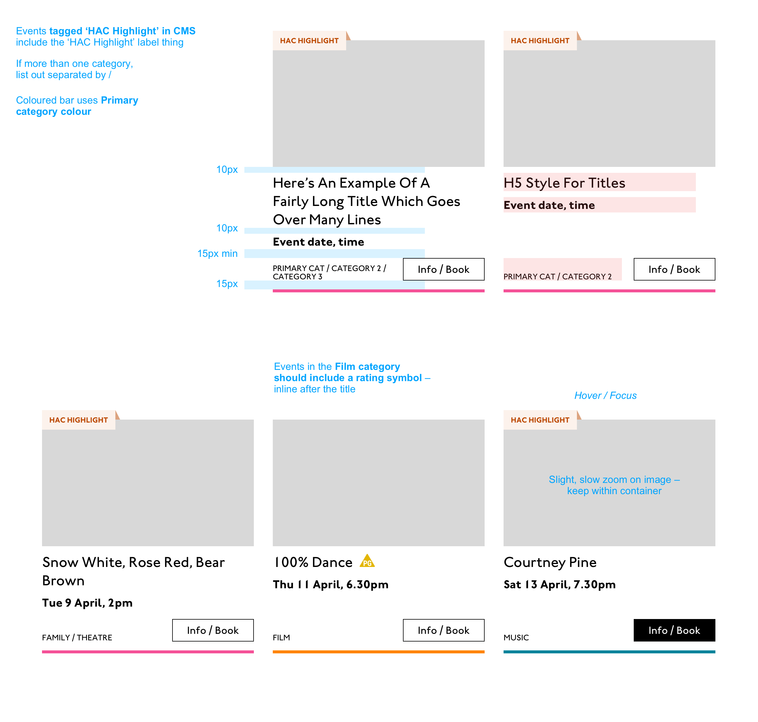
Event card
First I look through the whole UI file and figure out what is actually a card on this site — it turns out there are six or seven components that use this paradigm. Let's make some observations:
Zoom out on section of artboardsAnother card, classes this time.
A card is a block of meta data about a page on the site.
It has an image/media and metadata — it's a media object.
It's shown in a group of objects.
That group is always typed (there's no view where there are search results and news articles and classes are all mixed up).
Each object has a single link to a page and no other actions.
Each object has a call to action (Book, etc.).
Each object may have times, categories, badges, and calls to action.
Each object must have media, title, and link.
So a card is the major way my user is going to find their way around this site. They are going to be clicking through guided pathways where they get a set of cards they can choose from, based on top pages like "what's on" or "classes." They're not getting options on this card. It's not really an interactive element — it's a guide, an index card, that sets her onto her path: in this case a purchase path where she books a ticket for a show at this arts centre.
Before going on, let me just frame this for you:
Imagine you were looking at a flyer for a show and discussing it on the phone. If you actually wanted to go to this show in real life. What would you do? You wouldn't just read the flyer out, would you? That's the text. And it might have all kinds of random stuff on it if you started literally at the top. You wouldn't start with "Twentieth Century Fox" or "Buy Hot Dog Get Cola Free" or "Comedy Drama Musical Family Friendly." (I would actually hang up on you if you did!) And you wouldn't simply describe the color or fonts. That's the CSS. You'd talk through the information on the flyer. You'd say, "It's The Greatest Showman and it's on Tuesday, starts at 7:30. It's at the Odeon on Oxford Street by the tram." Right?
This is the document. Keep that person on the phone in your mind.
Count, group, and name
So let's say we'll deliver a card as the inside of a list item. We want a group and that group should be countable. We've already named the page with an <h1> so we'll introduce and describe the group with a heading, an <h2>. First we'll name it, then we'll deliver it, so someone using a screen reader can:
Get the list signaled in the headings overview.
Get a count up front of the number of items on a page.
Know they can skip to the next list item to get the next card.
Know they can skip the group at any point and go to the next page — the pagination is the very next element and it will be labelled as a landmark.
In this particular case, I'm gonna wrap this whole card in an anchor element (<a>). There's only one link on the card and I want to front load that information so someone can click as soon as they know it's the right card, instead of having to search forward for the action. A big clickable area is nice too, though of course that can be taken too far and make an interface a sort of booby trap! But these cards are not too enormous and I can see they have a nice gutter around them, so there's a rest space that will reduce accidental clicking for people with more limited dexterity.
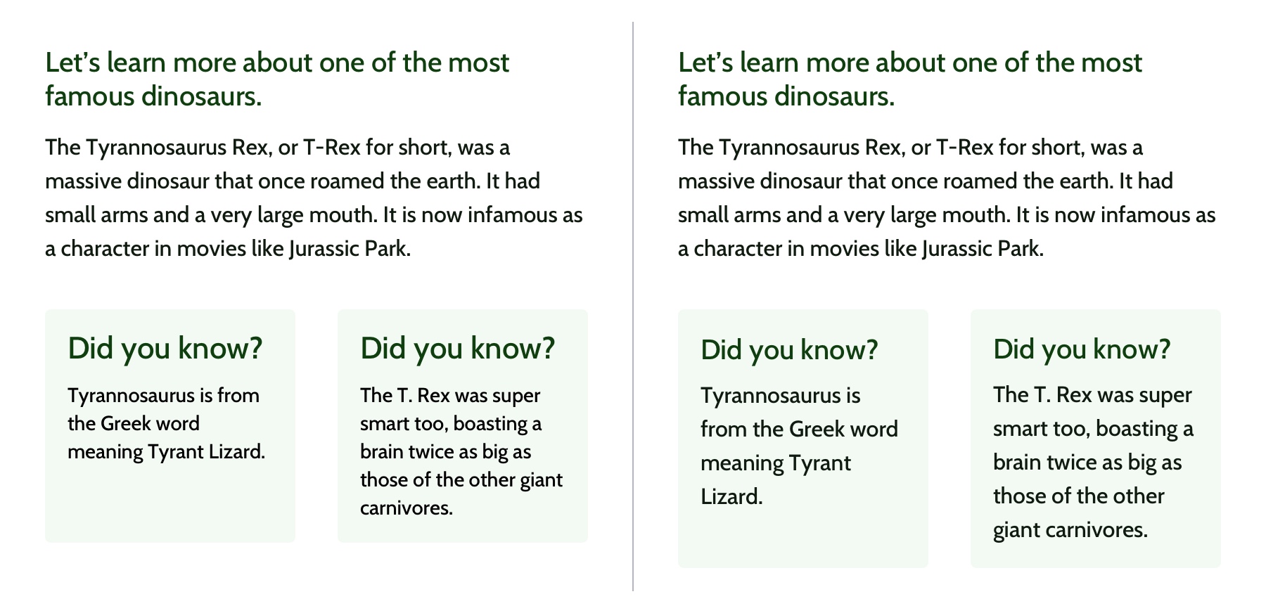
Title
Event card "title" element
Then we'll jump down a heading level and mark up the name of each show as a heading, an <h3>. The designer has made this type the focus and we will too. Some people browse super fast by jumping to the next heading, then next heading, so I'm not going to put any important information before the heading — they'll jump right over it. I will put the image there, though, as I know in this case, I can't get meaningful image descriptions from the API so those images are hidden and have empty alt attributes. Now the user can guess (correctly in my case) that the developer is actually describing the content in some meaningful way and might flip back to headings overview (list headings level 3) and just get a list of the shows.
Now let's deliver our metadata. Let's list it:
Badge
Date/Time
Categories
Badge
Event card "badge" element
This seems to be something the venue adds to a card to highlight it. As a developer, I can't immediately see why a user would look for this, but it's emphasized strongly by the designer, so I'll make sure it stays in. Katie has moved the badge up out of the flow, but I know that with a headings jump our user could miss it. So I'll just put the wording directly after the title, I think. I'll either put it first or last, so make it easier to account for in a non-visual browse and not be too crazy paving in a tabbing, visual browse.
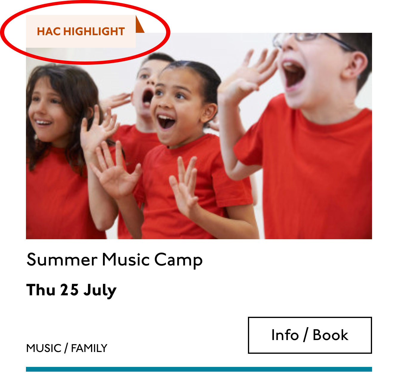
<p class="c-card__badge"><abbr title="Harrow Arts Centre">HAC</abbr> Highlight.</p>
...But on second thought, I won't put an <abbr> after all. It's the brand color, so it's really a statement of ownership by this venue, and we've already said HAC a million times by now, so the user knows where they are.
A quick aside: the 'badging' is very specific to this organisation. They want to show people clearly and quickly which events they've programmed themselves, and which are run by other organizations who've hired their venue.
Date/Time
Event card "date/time" element
Now date and time. Katie is keying me in to this decision point by styling the dates in bold. Dates are important. I'm going to pop it in an <h4>, because I'm thinking it looks like someone might be quickly scanning a page of events looking for the matinee, for example, or looking for a news article published on a particular day. I don't always put dates into headings, especially if there are millions on a page, but I do always make sure they're in a <time> element with a complete value so the <time>Thu</time> or <time>Mon</time> Katie has specified is read out as comprehensible English words "Thursday" instead of garblage. I could also have used hidden completion or <abbr> with a title.
Categories/ Tags
Event card "categories/tags" element
Next come the categories, and I'm putting them after badge and date. This section is next in the visual order reading top-to-bottom, left-to-right, of course, but it also seems to be deprioritized: it's been pushed down on the left and the type is smaller. This works for our linear storytelling. As a rule, we don't want people to sit through repeated or more general content (cinema, cinema, cinema) to get to unique or more specific content (Monday, Tuesday, Wednesday). Remember, we are inside our card: we know it has already been sorted in a few general ways (news, show, class, etc), so it's likely to have a lot of repeated pieces. We want to ensure that the user will go from specific to general if we can.
There is a primary category that is sorted first and then some other categories sometimes. I won't deliver this as a countable list as there's mostly just one category, and loads of lists of one item is not much use. But I will put a little tag beforehand because otherwise, it's a slightly impenetrable announcement. MOVEMENT! SPOKEN WORD! (I mean, you can work it out retrospectively, but we always try to name things first and then show them, in linear order. This isn't Memento.) I used to use title="" fairly heavily but I've gotten complaints about the tooltip so I route around. Note the use of colon or full stop to give us a "breath." That's a nice bit of polish.
<p class="c-card__tags h-text--label>
  <span class="h-accessibility">Categories: </span>
{% for category in categories.all() %}
  <span class="c-card__tag c-tag">{{category}}{% if not loop.last %} / {% endif %}</span>
{% endfor %}</p>
Also I'm hard-coding in my spaces to make sure the categories never run together into complete garblage even with text compression or spaceless rendering turned on somewhere down the pipeline. (This can happen with screen readers and spans and it's rather alarming!)
There's a piece of this design I will do in the CSS but haven't really pulled into the document design: the color-coding on primary category. I am not describing the color to the reader as it seems arbitrary, not evocative. If there were some subtextual element to the color coding beyond tagging categories (if horticultural classes were green, say), then I might bring it through, but in this case it's a non-verbal key to a category, so we don't want it in our verbal key.
I'm sorting the primary category to the front of the category paragraph, but I'm not labeling it as primary. This is because there's a sorting filter before this list that sorts on primary category, and it's my surmise that it would be easier and less annoying to select a category from that dropdown than to read through each card saying Categories Primary Category Music Secondary Categories Dance. I could be wrong about that! Striking a balance between useful and too much labeling is sometimes a bit tricky. You have to consider the page context. We may be building components but our user is on a page.
Last, the action. The direction to the user, to Book, or Learn More, or whatever it is, has been styled as a button. It's not actually a button, it's just a direction, so I'll mark it up as a span in this case. I definitely want this to come last in the linear document. It's a call to action and also a signal that we've reached the end of this card. The action is the exit point in both cases: if the user acts, we go to the target entry; if they do not, we go to the next card. We definitely never want any data to come after the action, as they might have left by then.
This markup, which counts, groups, and names data, delivers linear and non-linear interactions. The page makes sense if you read it top to bottom, makes sense if you read parts of it out of context, and helps you jump around.
Katie, over to you...
Katie Parry, designer
What an ace article! Really interesting. (I particularly like that "," "," etc. on cards are read as "Monday," "Tuesday"... smart!)
One thing that struck me is that using assistive tech means users get information served to them in a "set" order that we've decided. So, unless there's a filter, someone browsing for dance events, for example, has to sit/tab through a title, badge, dates, and maybe several other categories to find out whether an event's for them or not. Bit tiresome. But that's not something you've got wrong — it's just how the internet works. Something for me to think about in the future.
Most of our clients are arts and cultural venues that need to sell tickets for events so I design a lot of event cards. They're one of the very first things I'll work on when designing a site. (Before even settling on a type hierarchy for the rest of the site.)
Thinking visually, here's how I'd describe the general conventions of an event card:
It must look like a list – so people understand how to use it.
It needs to provide enough information for folks to decide if they're interested or not. (The minimum information is likely an image, title, date, and link.)
It needs to include a clear call to action — usually a link to find out more information.
It needs to be easily scannable, visually.
Making information visually scannable is a pretty straightforward case of ensuring every information type (e.g. image, title, date, category, link) is sitting in the same place on every card and follows a clear hierarchy.
I focus a lot on typography in my work anyway but clearly: titles are styled to be highly prominent; dates are styled the same as each other but are different from titles; categories look different again – so that folks can easily pick-out the information they're interested in from simply scanning the page. I'm composing the card for the user, saying, "Hey, look here's the event's name, this is when it's on — and here's where you go to get your tickets!"
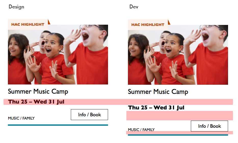
The type styles – and particularly the spacing between them – are doing a lot of work, so I will point out here that the spacings are not quite right in the code sample:
Spacing between the title and dates, dates and button, and button and piping don't match the design.
This is important. Users need to be able to scan information quickly as they aren't all looking for the same thing in order to make the decision to go to an event. Too much or too little space between elements can be distracting.
Some people just want a general mooch at what's coming up at their local venue. Others may have seen an advert for a specific show that tickles their fancy, and want to buy tickets. There are people who love music but don't care for theatre who just want a list of gigs; nothing else. And some folks who feel like going out at the weekend but aren't that fussed about what it is they go to. So, I design cards to be easy to scan — because most users aren't at all reading from top to bottom.
Despite the conventions I just laid out, cards certainly don't all look the same — or work in the same way — across projects.
There is always a tension in web design between making an interface familiar to the user and original to the client. Custom typefaces and color palettes do a lot here, but the other piece of it is through discovery.
I spend time reading-up about a client, including who their audience is by reading what they say on review sites and social media, as well as working directly with the client. Listening to people talk through how they work, what feedback they get from their audience/users often uncovers some interesting little nuggets which influence a design. Developers aren't typically involved much in discovery, which is something I'd like to change, but for now, I need to make it super-clear to Sally what's special about this event card for each new project. I write many, many (many) notes on Sketch files, but find they can tend to get lost, so sometimes we have a spreadsheet defining particular functionality.
In music, that might be a bit of a melody that asserts itself periodically and kinda informs the rest of the song. It's equally interesting in design, where a theme — perhaps a geometric element — is sprinkled in tastefully that helps the gestalt. Ties the room together, as they say.
Anyway, if you're serious about getting better at design, his course is where it's at and opens up in mid-June. So, now's the time to think about it.
Cloud computing is proliferating each passing year, meaning that there are plenty of opportunities. Creating a cloud solution calls for a strong architecture. If the foundation is not solid then the solution faces issues of integrity and system workload. AWS's five pillars help cloud architects to create a secure, high-performing, resilient and efficient infrastructure.
Every software system is built to serve a specific purpose and to achieve clear objectives for a business. Everything from the design of a system to the infrastructure supporting it needs to be geared towards those collective objectives. In many ways, the way a system is designed mimics how buildings are structured: integrity and functionality are two inseparable elements that make both a structure and a system perform the best way possible to realize their intention.
Amazon Web Services (AWS) serves as the perfect foundation for a well-designed system, but in order for AWS to serve its purpose as a cloud platform designed to provide the optimal cost-effective and secure environment for its customers, it needs to be well-architected.
In the new year edition of the Clearleft newsletter, Jeremy Keith linked to the design principals Danny Hillis thought about while considering a clock that would work for 10,000 years.
Here's part of that page, satisfyingly displayed as a <dl>:


