Ever heard of favicons made with SVG? If you are a regular reader of CSS-Tricks, you probably have. But does your website actually use one?
The task is more non-trivial than you might think. As we will see in this article, creating a useful SVG favicon involves editing an SVG file manually, which is something many of us try to avoid or are uncomfortable doing. Plus, we are talking about a favicon. We can spend a few hours playing with a hot new CSS framework. But a favicon? It sometimes feels too small to be worth our time.
This article is about creating an SVG favicon for real. If you’re in front of your laptop, get the vector file of a logo ready. By the end of your (active!) reading, your SVG favicon will be ready to shine.
Why an SVG favicon at all?
We are here for the “how” but it’s worth reflecting: what is an SVG favicon even good for? We already have other file types that handle this, right?
SVG is a vector format. As such, it has valuable features over raster formats, including those typically used for favicons, like PNG. SVGs scale and are often more compact than its binary cousins because, well, they’re just code! Everything is drawn in numbers and letters!
That’s good news, but how does this help our favicon? Desktop favicons are small, at most 64×64. And you can ship your icons in several resolutions. Scaling is a feature we don’t really need here.
File size is another source of disappointment. While SVG has a clear edge over a high resolution PNG file, the tables turn in low resolution. It is common for a 48×48 PNG favicon to result in a smaller file size than its SVG equivalent.
Yet, we have a good reason to pay attention to SVG favicon: dark mode support.
Dark mode has received a lot of attention recently. You may even have implemented dark mode for your own websites. What does that mean for favicon? It means the ability to show different icons based on the brightness of the browser tab’s background.
We are going to prepare such an icon.
How to create an SVG favicon (in theory)
Getting dark mode support for an SVG favicon relies on a CSS trick (10 points to Gryffindor), namely that we can drop a <style> tag right inside SVG, and use a media query to detect the user’s current theme preference. Something like this:
<svg>
  <style>
    @media (prefers-color-scheme: dark) {
      // Your dark styles here
    }
  </style>

  <!-- more stuff -->

</svg>
With this pattern, your light/dark favicon is only limited by your imagination. For example, change the color of all lines:
Now is the time to actually write these styles. This is when the troubles begin.
SVGs are images, and the logo we are using to build our favicon was probably created with a tool like Adobe Illustrator or InkScape. Why not use the same tool again? That’s because apps like these haven’t really integrated CSS and media queries into their products. It’s not that they can’t handle them, but you have to forget the mouse-only experience they promise. You are going to use the keyboard and type code.
Which leads us to a second option: write the CSS by hand. After all, this is the way to go with front-end development. Why should it be different here? Unfortunately, SVG is often hard to read. Sure, this is an XML dialect, which is (almost) like HTML. But SVG images are cluttered with long path declarations and other markup we often don’t see in our day-to-day work. For example, the Raspberry Pi logo is more than 8KB of raw data. This make manual editing more tedious than it sounds.
That is a lot of code.
How to create an SVG favicon (in practice)
To understand how we can deal with an SVG favicon quickly and easily, we first need to define what we want to achieve.
The technique we covered above calls for creativity: replace a color, invert them all (which we’ll get to), change a shape… But the setup for a favicon is not the right time for this. A favicon should almost always be the website’s logo. Its appearance? Aesthetic? The message it conveys? All these questions have been answered already. Preparing the favicon should be fine-tuning the logo so it fits the small space allocated in browser tabs.
Often, the logo is perfect as-is and its favicon counterpart is a scaled down version of it. Sometimes, we need to add margin to make it square. What motivates a dark icon, then?
Contrast.
Many logos are designed for light backgrounds. When they don’t, another version exists solely for the purpose of darker backgrounds.
Notice that even the colors change slightly to account for the darker background.
Therefore, whether we prepare a favicon manually or with a tool, we automatically pick the light-compatible logo and start with that. After all, desktop tabs are traditionally white or light gray. The problem arises when going dark mode.
In the best case, the logo is naturally a good fit for light and dark backgrounds. This happens with colorful logos, like Facebook’s.
The favicon is sometimes made background-proof by embedding its own background. This technique has a drawback, though. It needs padding so the logo doesn’t touch the edge of the background.
The worst case is a dark logo, perfect for light backgrounds and ill-suited for dark ones. Adidas is either clearly visible, or almost invisible.
Now that we have pinpointed the problem, we can formulate a solution: sometimes, we need a brighter icon for dark mode. It’s very simple. For a colorful, yet too dark logo, we can add brightness to a dark mode favicon with a CSS filter:
Your turn! Open your SVG logo in a text editor and drop any of those <style> snippets above just before the closing </svg> tag. Open your logo in a browser, switch from light to dark, then from dark to light (Windows or Mac), and observe the magic. Adjust the brightness or invert filters as needed.
Responsive brightness in action
How fast was that?
Even faster: The SVG favicon editor
That brightness hack we covered didn’t come out of nowhere. I wrote it while upgrading RealFaviconGenerator with the SVG favicon editor. This online tool includes everything we discussed earlier. Submit your SVG logo to get a preview of your favicon in tabs and Google result pages.
After that, play with the editor to produce the perfect favicon. In this example, we make the dark icon lighter, using the brightness filter hack behind te scene:
Grayscale logos benefit from the invert filter as well:
Click on the “Generate Favicon” button, et voilà! Favicon ready, fine tuned for light and dark modes in under a minute. Mission accomplished.
Conclusion
Beyond coolness, SVG favicons actually solve a problem that its PNG counterpart cannot. It’s only been about a year since we’ve had the ability to use SVG this way at all, but so far, it seems seldom used. With intentional purpose and tooling, maybe SVG favivons will rise and find its place among the favicon classics.
There is a lot to think about when implementing a dark mode theme on a website. We have a huge guide on it. There are some very clever quick wins out there, but there are also some quite tricky things to pull off. One of those tricky things is how it’s not a dark mode “toggle” between dark and light, but really three modes you need to support: dark, light, anduse system preference. That’s similar to how audio preferences work in many apps, which allow you to very specifically choose which audio input or output you want, or default to the system preference.
CSS and JavaScript can handle the system preference angle, via the prefers-color-scheme API, but if the user preference has changed, and that preference is now different than the user preference, you’re in the territory of “Flash of inAccurate coloR Theme” or FART. Ok ok, it’s a tounge-in-cheek acronym, but it’s potentially quite a visually obnoxious problem so I’m keeping it. It’s in the same vein that FOUT (Flash of Unstyled Text) is for font loading.
Storing a user preference means something like a cookie, localStorage, or some kind of database. If access to that data means running JavaScript, e.g. localStorage.getItem('color-mode-preference');, then you’re in FART territory, because your JavaScript is very likely running after a page’s first render, lest you’re otherwise unnecessarily delaying page render.
User preference is “dark” mode, but the system preference is “light” mode (or unset), so when the page refreshes, you get FART.
You can access a cookie with a server-side language before page-render, meaning you could use it to output something like <html class="user-setting-dark-mode"> and style accordingly, which deftly avoids FART, but that means a site that even has access to a server-side language (Jamstack sites do not, for example).
Allllll that to say that I appreciated Rob Morieson’s article about dark mode because it didn’t punt on this important issue. It’s very specifically about doing this in Next.js, and uses localStorage, but because Next.js is JavaScript-rendered, you can force it to check the user-saved preference as the very first thing it does. That means it will render correctly the the first time (no flash). You do have to turn off server-side rendering for this to work, which is a gnarly trade-off though.
I’m not convinced there is a good way to avoid FART without a server-side language or force-delayed page renders.
Like many companies, we have a Hack Week at Sentry. In 2017, we coded an app which blared entrance music for anyone who stepped foot in our office. In 2019, we encouraged folks to be nice on the Internet. Noble causes, sure, but for this year’s Hack Week I was determined to advance a cause near and dear to my cold British heart: dark mode.
Little did I know that what started as a minor hack week project would become a major lift that included pantone colors, hex codes, and all sorts of variables.
The other day, Florens Verschelde asked about defining dark mode styles for both a class and a media query, without repeat CSS custom properties declarations. I had run into this issue in the past but hadn’t come up with a proper solution.
What we want is to avoid redefining—and thus repeating—custom properties when switching between light and dark modes. That’s the goal of DRY (Don’t Repeat Yourself) programming, but the typical pattern for switching themes is usually something like this:
See what I mean? Sure, it might not seem like a big deal in an abbreviated example like this, but imagine juggling dozens of custom properties at a time—that’s a lot of duplication!
Then I remembered Lea Verou’s trick using --var: ;, and while it didn’t hit me at first, I found a way to make it work: not with var(--light-value, var(--dark-value)) or some nested combination like that, but by using both side by side!
Certainly, someone smarter must have discovered this before me, but I haven‘t heard of leveraging (or rather abusing) CSS custom properties to achieve this. Without further ado, here’s the idea:
If the --light value is set to initial, the fallback will be used (orchid), which means --dark should be set to a whitespace character (which is a valid value), making the final computed value look like this:
--color: orchid ; /* Note the additional whitespace */
Conversely, if --light is set to a whitespace and --dark to initial, we end up with a computed value of:
--color: rebeccapurple; /* Again, note the whitespace */
Now, this is great but we do need to define the --light and --dark custom properties, based on the context. The user can have a system preference in place (either light or dark), or can have toggled the website‘s theme with some UI element. Just like Florens‘s example, we’ll define these three cases, with some minor readability enhancement that Lea proposed using “on” and “off” constants to make it easier to understand at a glance:
:root {
  /* Thanks Lea Verou! */
  --ON: initial;
  --OFF: ;
}

/* Light theme is on by default */
.theme-default,
.theme-light {
  --light: var(--ON);
  --dark: var(--OFF);
}

/* Dark theme is off by default */
.theme-dark {
  --light: var(--OFF);
  --dark: var(--ON);
}

/* If user prefers dark, then that's what they'll get */
@media (prefers-color-scheme: dark) {
  .theme-default {
    --light: var(--OFF);
    --dark: var(--ON);
  }
}
We can then set up all of our theme variables in a single declaration, without repetition. In this example, the theme-* classes are set to the html element, so we can use :root as a selector, as many people like to do, but you could set them on the body, if the cascading nature of the custom properties makes more sense that way:
And to use them, we use var() with built-in fallbacks, because we like being careful:
body {
  color: var(--text, navy);
  background-color: var(--bg, lightgray);
}
Hopefully you’re already starting to see the benefit here. Instead of defining and switching armloads of custom properties, we’re dealing with two and setting all the others just once on :root. That’s a huge improvement from where we started.
Even DRYer with pre-processors
If you were to show me this following line of code out of context, I’d certainly be confused because a color is a single value, not two!
--text: var(--light, black) var(--dark, white);
That’s why I prefer to abstract things a bit. We can set up a function with our favorite pre-processor, which is Sass in my case. If we keep our code above defining our --light and --dark values in various contexts, we need to make a change only on the actual custom property declaration. Let’s create a light-dark function that returns the CSS syntax for us:
You’ll notice there are interpolation delimiters #{ … } around the function call. Without these, Sass would output the code as is (like a vanilla CSS function). You can play around with various implementations of this but the syntax complexity is up to your tastes.
How’s that for a much DRYer codebase?
More than one theme? No problem!
You could potentially do this with more than two modes. The more themes you add, the more complex it becomes to manage, but the point is that it is possible! We add another theme set of ON or OFF variables, and set an extra variable in the list of values.
.theme-pride {
  --light: var(--OFF);
  --dark: var(--OFF);
  --pride: var(--ON);
}

:root {
  --text:
    var(--light, black)
    var(--dark, white)
    var(--pride, #ff8c00)
  ; /* Line breaks are absolutely valid */

  /* Other variables to declare… */
}
Is this hacky? Yes, it absolutely is. Is this a great use case for potential, not-yet-existing CSS booleans? Well, that’s the dream.
How about you? Is this something you’ve figured out with a different approach? Share it in the comments!
WordPress 5.6 is set to include a new default theme, Twenty Twenty-One, designed to give users a blank canvas for the block editor. The theme doesn’t fall under any particular category and is meant to be suitable for use across different types of websites. One new feature that has very recently come under consideration is support for a dark mode that can be toggled on or off.
Contributors have raised the possibility of including a dark mode in several issues while the theme has been in development. Mel Choyce, who is leading the design on the default theme, published a summary of the team’s recent discussions about which options the theme should make available for site owners and viewers in support of dark mode, or if the feature should simply be scrapped.
“We’ve built in a Customizer setting that lets site owners opt their sites out of supporting Dark Mode, for greater design control,” Choyce said. “Additionally, we’re considering adding a front-end toggle so site viewers can turn Dark Mode on/off, regardless of their OS/Browser preference. This setting would only show if a site allows Dark Mode support.”
Twenty Twenty-One Light and Dark Modes
Choyce outlined five different combinations of options for supporting it, including two options that allow site owners to disable it, regardless of the user’s selection in their OS/browser. Two other options require the site to support dark mode but differ in whether or not the visitor is allowed to toggle it on or off.
Does Twenty Twenty-One Need a Dark Mode?
Dark mode was a late addition to the default theme’s development. Choyce said the idea seems like a good opportunity to explore but ideally the team would have intentionally designed the feature before development started.
In the comments of the post, contributors are discussing the many intricacies of adding this feature to a theme that will be on by default for new WordPress sites. A few commenters noted there might be issues and surprises with logos and transparent images. For this reason, several made the case for shipping it as an opt-in feature and not on by default.
Others did not see the need for users to be able to toggle dark mode on/off for individual websites when they already have controls available through their system or browser preferences.
Kjell Reigstad contends that users’ expectations have not yet translated into demand for this feature.
“As much as I’m a fan of dark mode in general (I use it on all my devices and it definitely helps to reduce eye strain), I think the general public views it as ‘a thing that apps do’ — not something that websites do yet,” Reigstad said. “As mentioned above, this theme could be a step towards changing that perception, but the feature’s novelty is something to keep in mind.”
WordPress 5.6 core tech lead Helen Hou-Sandí suggested it might be better to develop the feature as a plugin, instead of pushing for it to be ready in a short time frame.
“My instinct right now is that it would be best to split dark mode for Twenty Twenty-One out into a plugin as a form of opt-in, primarily because I think that will both ease the burden for meeting the bar for core ship and also gives space for the feature to be iterated on outside of the core development cycle,” Hou-Sandí said. She also noted that users will be doing things with the theme that core contributors cannot anticipate and a plugin is an easier route for responding to those needs.
“By separating it out, I think it has a better chance of reaching a point where it encompasses enough by default to be a theme setting without too much futzing on the user’s part, or even enough of a thing to be a feature for all themes at large,” Hou-Sandí said.
Choyce and Carolina Nymark agreed with this suggestion and announced a decision in the WordPress Slack #core-themes channel this morning, based on feedback on the post.
“Carolina Nymark and I made the decision to move Dark Mode out into a plugin,” Choyce said. “This will allow us to better address all of the edge cases we’ve been encountering without slowing down the progress of bug fixing within the core theme.”
The plugin is being developed on GitHub where contributors will explore how to support the feature moving forward.
Dark mode has gained a lot of traction recently. Like Apple, for instance, has added dark mode to its iOS and MacOS operating systems. Windows and Google have done the same.
DuckDuckGo’s light and dark themes
Let’s get into dark mode in the context of websites. We’ll delve into different options and approaches to implementing a dark mode design and the technical considerations they entail. We’ll also touch upon some design tips along the way.
The typical scenario is that you already have a light theme for your site, and you’re interested in making a darker counterpart. Or, even if you’re starting from scratch, you’ll have both themes: light and dark. One theme should be defined as the default that users get on first visit, which is the light theme in most cases (though we can let the user’s browser make that choice for us, as we’ll see). There also should be a way to switch to the other theme (which can be done automatically, as we’ll also see) — as in, the user clicks a button and the color theme changes.
There several approaches to go about doing this:
Using a Body Class
The trick here is to swap out a class that can be a hook for changing a style anywhere on the page.
<body class="dark-theme || light-theme">
Here’s a script for a button that will toggle that class, for example:
// Select the button
const btn = document.querySelector('.btn-toggle');

// Listen for a click on the button
btn.addEventListener('click', function() {
  // Then toggle (add/remove) the .dark-theme class to the body
  document.body.classList.toggle('dark-theme');
})
Here’s how we can use that idea:
<body>
  <button class="btn-toggle">Toggle Dark Mode</button>
  <h1>Hey there! This is just a title</h2>
  <p>I am just a boring text, existing here solely for the purpose of this demo</p>
  <p>And I am just another one like the one above me, because two is better than having only one</p>
  <a href="#">I am a link, don't click me!</a>
</body>
The general idea of this approach is to style things up as we normally would, call that our “default” mode, then create a complete set of color styles using a class set on the <body> element we can use as a “dark” mode.
Let’s say our default is a light color scheme. All of those “light” styles are written exactly the same way you normally write CSS. Given our HTML, let’s apply some global styling to the body and to links.
body {
  color: #222;
  background: #fff;
}
a {
  color: #0033cc;
}
Good good. We have dark text (#222) and dark links (#0033cc) on a light background (#fff). Our “default” theme is off to a solid start.
Now let’s redefine those property values, this time set on a different body class:
body {
  color: #222;
  background: #fff;
}
a {
  color: #0033cc;
}


/* Dark Mode styles */
body.dark-theme {
  color: #eee;
  background: #121212;
}
body.dark-theme a {
  color: #809fff;
}
Dark theme styles will be descendants of the same parent class — which is .dark-theme in this example — which we’ve applied to the <body> tag.
How do we “switch” body classes to access the dark styles? We can use JavaScript! We’ll select the button class (.btn-toggle), add a listener for when it’s clicked, then add the dark theme class (.dark-theme) to the body element’s class list. That effectively overrides all of the “light” colors we set, thanks to the cascade and specificity.
Here’s the complete code working in action. Click the toggle button to toggle in and out of dark mode.
Using Separate Stylesheets
Rather than keeping all the styles together in one stylesheet, we could instead toggle between stylesheets for each theme. This assumes you have full stylesheets ready to go.
For example, a default light theme like light-theme.css:
/* light-theme.css */


body {
  color: #222;
  background: #fff;
}
a {
  color: #0033cc;
}
Then we create styles for the dark theme and save them in a separate stylesheet we’re calling dark-theme.css.
/* dark-theme.css */


body {
  color: #eee;
  background: #121212;
}
body a {
  color: #809fff;
}
This gives us two separate stylesheets — one for each theme — we can link up in the HTML <head> section. Let’s link up the light styles first since we’re calling those the default.
We are using a #theme-link ID that we can select with JavaScript to, again, toggle between light and dark mode. Only this time, we’re toggling files instead of classes.
// Select the button
const btn = document.querySelector(".btn-toggle");
// Select the stylesheet <link>
const theme = document.querySelector("#theme-link");

// Listen for a click on the button
btn.addEventListener("click", function() {
  // If the current URL contains "ligh-theme.css"
  if (theme.getAttribute("href") == "light-theme.css") {
    // ... then switch it to "dark-theme.css"
    theme.href = "dark-theme.css";
  // Otherwise...
  } else {
    // ... switch it to "light-theme.css"
    theme.href = "light-theme.css";
  }
});
We can also leverage the power of CSS custom properties to create a dark theme! It helps us avoid having to write separate style rulesets for each theme, making it a lot faster to write styles and a lot easier to make changes to a theme if we need to.
We still might choose to swap a body class, and use that class to re-set custom properties:
// Select the button
const btn = document.querySelector(".btn-toggle");


// Listen for a click on the button
btn.addEventListener("click", function() {
  // Then toggle (add/remove) the .dark-theme class to the body
  document.body.classList.toggle("dark-theme");
});
First, let’s define the default light color values as custom properties on the body element:
body {
  --text-color: #222;
  --bkg-color: #fff;
  --anchor-color: #0033cc;
}
Now we can redefine those values on a .dark-theme body class just like we did in the first method:
Here are our rulesets for the body and link elements using custom properties:
body {
  color: var(--text-color);
  background: var(--bkg-color);
}
a {
  color: var(--anchor-color);
}
We could just as well have defined our custom properties inside the document :root. That’s totally legit and even common practice. In that case, all the default theme styles definitions would go inside :root { } and all of the dark theme properties go inside :root.dark-mode { }.
Using Server-Side Scripts
If we’re already working with a server-side language, say PHP, then we can use it instead of JavaScript. This is a great approach if you prefer working directly in the markup.
We can have the user send a GET or POST request. Then, we let our code (PHP in this case) apply the appropriate body class when the page is reloaded. I am using a GET request (URL params) for the purpose of this demonstration.
And, yes, we can swap stylesheets just like we did in the second method.
This method has an obvious downside: the page needs to be refreshed for the toggle to take place. But a server-side solution like this is useful in persisting the user’s theme choice across page reloads, as we will see later.
Which method should you choose?
The “right” method comes down to the requirements of your project. If you are doing a large project, for example, you might go with CSS properties to help wrangle a large codebase. On the other hand, if your project needs to support legacy browsers, then another approach will need to do instead.
Moreover, there’s nothing saying we can only use one method. Sometimes a combination of methods will be the most effective route. There may even be other possible methods than what we have discussed.
Dark Mode at the Operating System Level
So far, we’ve used a button to toggle between light and dark mode but we can simply let the user’s operating system do that lifting for us. For example, many operating systems let users choose between light and dark themes directly in the system settings.
The “General” settings in MacOS System Preferences
Pure CSS
Details
Fortunately, CSS has a prefers-color-scheme media query which can be used to detect user’s system color scheme preferences. It can have three possible values: no preference, light and dark. Read more about it on MDN.
@media (prefers-color-scheme: dark) {
  /* Dark theme styles go here */
}


@media (prefers-color-scheme: light) {
  /* Light theme styles go here */
}
To use it, we can put the dark theme styles inside the media query.
@media (prefers-color-scheme: dark) {
  body {
    color: #eee;
    background: #121212;
  }


  a {
    color: #809fff;
  }
}
Now, if a user has enabled dark mode from the system settings, they will get the dark mode styles by default. We don’t have to resort to JavaScript or server-side scripts to decide which mode to use. Heck, we don’t even need the button anymore!
JavaScript
Details
We can turn to JavaScript to detect the user’s preferred color scheme. This is a lot like the first method we worked with, only we’re using matchedMedia() to detect the user’s preference.
There is a downside to using JavaScript: there will likely be a quick flash of the light theme as JavaScript is executed after the CSS. That could be misconstrued as a bug.
And, of course, we can swap stylesheets instead like we did in the second method. This time, we link up both stylesheets and use the media query to determine which one is applied.
Overriding OS Settings
We just looked at how to account for a user’s system-wide color scheme preferences. But what if users want to override their system preference for a site? Just because a user prefers dark mode for their OS doesn’t always mean they prefer it on a website. That’s why providing a way to manually override dark mode, despite the system settings, is a good idea.
View Code
Let’s use the CSS custom properties approach to demonstrate how to do this. The idea is to define the custom properties for both themes like we did before, wrap dark styles up in the prefers-color-scheme media query, then define a .light-theme class inside of that we can use to override the dark mode properties, should the user want to toggle between the two modes.
/* Default colors */
body {
  --text-color: #222;
  --bkg-color: #fff;
}
/* Dark theme colors */
body.dark-theme {
  --text-color: #eee;
  --bkg-color: #121212;
}

/* Styles for users who prefer dark mode at the OS level */
@media (prefers-color-scheme: dark) {
  /* defaults to dark theme */
  body {
    --text-color: #eee;
    --bkg-color: #121212;
  }
  /* Override dark mode with light mode styles if the user decides to swap */
  body.light-theme {
    --text-color: #222;
    --bkg-color: #fff;
  }
}
Now we can turn back to our trusty button to toggle between light and dark themes. This way, we’re respecting the OS color preference by default and allowing the user to manually switch themes.
// Listen for a click on the button
btn.addEventListener("click", function() {
  // If the OS is set to dark mode...
  if (prefersDarkScheme.matches) {
    // ...then apply the .light-theme class to override those styles
    document.body.classList.toggle("light-theme");
    // Otherwise...
  } else {
    // ...apply the .dark-theme class to override the default light styles
    document.body.classList.toggle("dark-theme");
  }
});
Browser Support
The prefers-color-scheme media query feature enjoys support by major browsers, including Chrome 76+, Firefox 67+, Chrome Android 76+ and Safari 12.5+ (13+ on iOS). It doesn’t support IE and Samsung Internet Browser.
That’s a promising amount of support! Can I Use estimates 80.85% of user coverage.
Operating systems that currently support dark mode include MacOS (Mojave or later), iOS (13.0+), Windows (10+), and Android (10+).
Storing a User’s Preference
What we’ve looked at so far definitely does what it says in the tin: swap themes based on an OS preference or a button click. This is great, but doesn’t carry over when the user either visits another page on the site or reloads the current page.
We need to save the user’s choice so that it will be applied consistently throughout the site and on subsequent visits. To do that, we can save the user’s choice to the localStorage when the theme is toggled. Cookies are also well-suited for the job.
Let’s look at both approaches.
Using localStorage
We have a script that saves the selected theme to localStorage when the toggle takes place. In other words, when the page is reloaded, the script fetches the choice from localStorage and applies it. JavaScript is often executed after CSS, so this approach is prone to a “flash of incorrect theme” (FOIT).
View Code
// Select the button
const btn = document.querySelector(".btn-toggle");
// Select the theme preference from localStorage
const currentTheme = localStorage.getItem("theme");


// If the current theme in localStorage is "dark"...
if (currentTheme == "dark") {
  // ...then use the .dark-theme class
  document.body.classList.add("dark-theme");
}


// Listen for a click on the button
btn.addEventListener("click", function() {
  // Toggle the .dark-theme class on each click
  document.body.classList.toggle("dark-theme");

  // Let's say the theme is equal to light
  let theme = "light";
  // If the body contains the .dark-theme class...
  if (document.body.classList.contains("dark-theme")) {
    // ...then let's make the theme dark
    theme = "dark";
  }
  // Then save the choice in localStorage
  localStorage.setItem("theme", theme);
});
Using Cookies with PHP
To avoid FLIC, we can use a server-side script like PHP. Instead of saving the user’s theme preference in localStorage, we will create a cookie from JavaScript and save it there. But again, this may only be feasible if you’re already working with a server-side language.
View Code
// Select the button
const btn = document.querySelector(".btn-toggle");


// Listen for a click on the button
btn.addEventListener("click", function() {
  // Toggle the .dark-theme class on the body
  document.body.classList.toggle("dark-theme");

  // Let's say the theme is equal to light
  let theme = "light";
  // If the body contains the .dark-theme class...
  if (document.body.classList.contains("dark-theme")) {
    // ...then let's make the theme dark
    theme = "dark";
  }
  // Then save the choice in a cookie
  document.cookie = "theme=" + theme;
});
We can now check for the existence of that cookie and load the appropriate theme by applying the proper class to the <body> tag.
If your website has user accounts — like a place to log in and manage profile stuff — that’s also a great place to save theme preferences. Send those to the database where user account details are stored. Then, when the user logs in, fetch the theme from the database and apply it to the page using PHP (or whatever server-side script).
There are various ways to do this. In this example, I am fetching the user’s theme preference from the database and saving it in a session variable at the time of login.
<?php
// Login action
if (!empty($_POST['login'])) {
  // etc.


  // If the uuser is authenticated...
  if ($loginSuccess) {
    // ... save their theme preference to a session variable
    $_SESSION['user_theme'] = $userData['theme'];
  }
}


// Pick the session variable first if it's set; otherwise pick the cookie
$themeChoice = $_SESSION['user_theme'] ?? $_COOKIE['theme'] ?? null;
$themeClass = '';
if ($themeChoice == 'dark') {
  $themeClass = 'dark-theme';
}
?>


<!DOCTYPE html>
<html lang="en">
<!-- etc. -->
<body class="<?php echo $themeClass; ?>">
<!-- etc. -->
</body>
</html>
I am using PHP’s null coalesce operator (??) to decide where to pick the theme preference: from the session or from the cookie. If the user is logged in, the value of the session variable is taken instead that of the cookie. And if the user is not logged in or has logged out, the value of cookie is taken.
Handling User Agent Styles
To inform the browser UA stylesheet about the system color scheme preferences and tell it which color schemes are supported in the page, we can use the color-scheme meta tag.
For example, let’s say the page should support both “dark” and “light” themes. We can put both of them as values in the meta tag, separated by spaces. If we only want to support a “light” theme, then we only need to use “light” as the value. This is discussed in a CSSWG GitHub issue, where it was originally proposed.
<meta name="color-scheme" content="dark light">
When this meta tag is added, the browser takes the user’s color scheme preferences into consideration when rendering UA-controlled elements of the page (like a <button>). It renders colors for the root background, form controls, and spell-check features (as well as any other UA-controlled styles) based on the user’s preference.
Although themes are manually styled for the most part (which overrides the UA styles), informing the browser about the supported themes helps to avoid even the slightest chance of a potential FOIT situation. This is true for those occasions where HTML has rendered but CSS is still waiting to load.
We can also set this in CSS:
:root {
  color-scheme: light dark; /* both supported */
}
At the time of writing, the color-scheme property lacks broad browser support, though Safari and Chrome both support it.
Combining all the things!
Let’s combine everything and create a working demo that:
Automatically loads a dark or light theme based on system preferences
Allows the user to manually override their system preference
Maintains the user’s preferred theme on page reloads
Using JavaScript & Local Storage
// Select the button
const btn = document.querySelector(".btn-toggle");
// Check for dark mode preference at the OS level
const prefersDarkScheme = window.matchMedia("(prefers-color-scheme: dark)");


// Get the user's theme preference from local storage, if it's available
const currentTheme = localStorage.getItem("theme");
// If the user's preference in localStorage is dark...
if (currentTheme == "dark") {
  // ...let's toggle the .dark-theme class on the body
  document.body.classList.toggle("dark-mode");
// Otherwise, if the user's preference in localStorage is light...
} else if (currentTheme == "light") {
  // ...let's toggle the .light-theme class on the body
  document.body.classList.toggle("light-mode");
}


// Listen for a click on the button
btn.addEventListener("click", function() {
  // If the user's OS setting is dark and matches our .dark-mode class...
  if (prefersDarkScheme.matches) {
    // ...then toggle the light mode class
    document.body.classList.toggle("light-mode");
    // ...but use .dark-mode if the .light-mode class is already on the body,
    var theme = document.body.classList.contains("light-mode") ? "light" : "dark";
  } else {
    // Otherwise, let's do the same thing, but for .dark-mode
    document.body.classList.toggle("dark-mode");
    var theme = document.body.classList.contains("dark-mode") ? "dark" : "light";
  }
  // Finally, let's save the current preference to localStorage to keep using it
  localStorage.setItem("theme", theme);
});
I often hear that implementing dark mode is easier than designing one. While I’ll refrain from judgement, let’s look at some considerations for designing a dark theme.
You already know the basic task: swap lighter color values for darker ones and vice versa. But there are some UI elements and enhancements that are more nuanced and require more attention. Let’s take a look at those.
Dark Mode Images
A good rule is to decrease the brightness and contrast of images a bit so that it looks comfortable to the eyes when it’s against a dark background. A super bright image on a super dark background can be jarring and dimming the image reduces some of that heavy contrast.
The CSS filter() function is more than capable of handling this for us:
/* Apply the filter directly on the body tag */
body.dark-theme img {
  filter: brightness(.8) contrast(1.2);
}


/* Or apply it via media query */
@media (prefers-color-scheme: dark) {
  img {
    filter: brightness(.8) contrast(1.2);
  }
}
We can do the same sort of thing directly in the markup using the <picture> element to load different versions of an image:
<picture>
  <!-- Use this image if the user's OS setting is light or unset -->
  <source srcset="photo-light.png" media="(prefers-color-scheme: light) or (prefers-color-scheme: no-preference)">
  <!-- Use this image if the user's OS setting is dark -->
  <source srcset="photo-dark.png" media="(prefers-color-scheme: dark)">
</picture>
The downside here is that it requires supplying two files where we only have to deal with one when using CSS. This also doesn’t fully account for the user toggling the color theme on the site.
Dark Mode Shadows
Dark mode shadows are tricky. If we simply invert a dark shadow using light colors, then we get this funky thing with a light shadow on a dark background… and it’s not a good look.
It’s possible to use a dark shadow in dark mode, but the background color has to be “light” enough (like a dark gray) to provide enough contrast to actually see the shadow against it.
🔥 When implementing dark mode, don’t throw away the visual cues in the light version by naively inverting the color scheme.
Close elements should still be lighter and distant elements should still be darker – even in a dark UI. pic.twitter.com/RNxgIppDmn
Use opacity to convey depth, with high opacity regions having a lower depth. That’s to say, elements that have a higher elevation should have a lower opacity than elements that are “closer” in depth to the background.
Different shades of color create different perceptions of “depth”
Dark Mode Typography
The trick here is a lot like images: we’ve gotta balance the contrast. Use too heavy of a font and we get blaring text that’s makes us want to move away from the screen. Use too light of a font and we’ll strain our eyes while inching toward the screen to get a closer look.
The balance is somewhere in the middle. Robin has a nice write-up where he suggests a small bit of CSS that makes a big difference in legibility.
Dark Mode Icons
Icons fall into this “tricky” category because they’re sort of a cross between text and images. If we’re working with SVG icons, though, we can change the fill with CSS. On the other hand, if we’re using font icons, we can simply change the color property instead.
/* SVG icon */
body.dark-theme svg.icon path {
  fill: #efefef;
}
/* Font icon (using Font Awesome as an example) */
body.dark-theme .fa {
  color: #efefef;
}
A lot of the same design considerations that are true for text, are also generally applicable to icons. For example, we ought to avoid using full white and heavy outlines.
Dark Mode Colors
Pure white text on a pure black background will look jarring. The trick here is to use an off-white for the text and off-black for the background. Material Design Guidelines for example recommends #121212 for the background.
Dark Mode Color Palettes
We’ve seen the difference using off-white and off-black colors makes for text and images. Let’s expand on that a bit with tips on how to develop a full color palette.
Most things boil down to one thing: contrast. That’s why the first tip before settling on any color is to run ideas through a contrast checker to ensure color ratios conform to WCAG’s guidelines for at least a AA rating, which is a contrast ratio of 4.5:1.
That means desaturated colors are our friends when working with a dark mode design. They help prevent overbearingly bright images and still give us plenty of room to create an effective contrast ratio.
Next, remember that accent colors are meant to be enhancements. They’re likely brighter than the dark theme background color, so using them like a primary color or the background color of a large container is just as jarring and hard on the eyes as a bright image or heavy white text.
If contrast is the balance we’re trying to strike, then remember that dark mode is more than blacks and grays. What about dark blue background with pale yellow text? Or dark brown with tan? There’s an entire (and growing) spectrum of color out there and we can leverage any part of it to fuel creativity.
A few examples of colors that are dark without resorting to full-on black:
YouTube uses the CSS variables technique. They’ve defined all their colors in variables under the html selector while dark mode colors are defined under html:not(.style-scope)[dark]. When dark mode is enabled, YouTube adds a dark="true" attribute to the <html> tag. This is what they use to override the variables defined in the HTML.
YouTube adds dark=true attribute to the <html> when it switches to the dark mode.
In the wild, the CSS custom properties approach seems to be most popular. It’s being used by Dropbox Paper, Slack, and Facebook.
Simplenote uses the class-swapping method where all light style rules are descendants of a .theme-light parent class and all the dark styles fall under a .theme-dark class. When the theme is toggled, the appropriate class is applied to the <body> tag.
Simplenote uses two classes: .light-theme and .dark-theme to style the themes.
Twitter goes the extra mile and offers several themes to choose from: “Default,” “Dim,” and “Lights out.” The “Dim” option employs dark blue for a background color. Compare that to “Lights out” which uses a stark black.
Twitter offers three themes to choose from.
Dark mode or no dark mode? That is the question.
There are perfectly valid reasons on both sides. Some of those reasons even go beyond the scope of user experience and include things like timing, budget and resources.
While being considerate of why you might not want to implement a dark mode, here are reasons why you might want to have one:
It’s cool and trendy (although that’s not a reason alone to do it)
It enhances accessibility by supporting users who are sensitive to eye strain in starkly bright themes.
It allows users to decide the most comfortable way to consume content while providing us a way to maintain control over the look and feel of things. Remember, we want to beat the Reader Mode button!
It helps to preserve battery life for devices with OLED screen where brighter colors consume more energy.
It’s extremely popular and appears to be going nowhere. It’s possible that your users who prefer a dark mode (like me!) will expect your site to have one. Might as well be ready for it.
Favicons are the little icons you see in your browser tab. They help you understand which site is which when you’re scanning through your browser’s bookmarks and open tabs. They’re a neat part of internet history that are capable of performing some cool tricks.
One very new trick is the ability to use SVG as a favicon. It’s something that most modern browsers support, with more support on the way.
Here’s the code for how to add favicons to your site:
If a browser doesn’t support a SVG favicon, it will ignore the first link element declaration and continue on to the second. This ensures that all browsers that support favicons can enjoy the experience.
You may also notice the alternate attribute value for our rel declaration in the second line. This programmatically communicates to the browser that the favicon with a file format that uses .ico is specifically used as an alternate presentation.
Following the favicons is a line of code that loads another SVG image, one called safari-pinned-tab.svg. This is to support Safari’s pinned tab functionality, which existed before other browsers had SVG favicon support. There’s additional files you can add here to enhance your site for different apps and services, but more on that in a bit.
Here’s more detail on the current level of SVG favicon support:
This browser support data is from Caniuse, which has more detail. A number indicates that browser supports the feature at that version and up.
Desktop
Chrome
Firefox
IE
Edge
Safari
80
41
No
80
TP
Mobile / Tablet
Android Chrome
Android Firefox
Android
iOS Safari
80
No
No
13.4
Why SVG?
You may be questioning why this is needed. The .ico file format has been around forever and can support images up to 256×256 pixels in size. Here are three answers for you.
Ease of authoring
It’s a pain to make .ico files. The file is a proprietary format used by Microsoft, meaning you’ll need specialized tools to make them. SVG is an open standard, meaning you can use them without any further tooling or platform lock-in.
Future-proofing
Retina? 5k? 6k? When we use a resolution-agnostic SVG file for a favicon, we guarantee that our favicons look crisp on future devices, regardless of how large their displays get.
Performance
SVGs are usually very small files, especially when compared to their raster image counterparts — even more-so if you optimize them beforehand. By only using a 16×16 pixel favicon as a fallback for browsers that don’t support SVG, we provide a combination that enjoys a high degree of support with a smaller file size to boot.
This might seem a bit extreme, but when it comes to web performance, every byte counts!
Tricks
Another cool thing about SVG is we can embed CSS directly in it. This means we can do fun things like dynamically adjust them with JavaScript, provided the SVG is declared inline and not embedded using an img element.
Since SVG favicons are embedded using the link element, they can’t really be modified using JavaScript. We can, however, use things like emoji and media queries.
Emoji
Lea Verou had a genius idea about using emoji inside of SVG’s text element to make a quick favicon with a transparent background that holds up at small sizes.
For supporting browsers, this code means our star-shaped SVG favicon will change its fill color from black to white when dark mode is activated. Pretty neat!
Other media queries
Dark mode support got me thinking: if SVGs can support prefers-color-scheme, what other things can we do with them? While the support for Level 5 Media Queries may not be there yet, here’s some ideas to consider:
Use light-level to desaturate favicon colors in a low-light environment.
Use inverted-colors to “flip” inverted colors to preserve branding, or to ensure a photorealistic favicon looks as intended.
A mockup of how these media query-based adjustments could work.
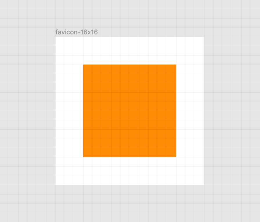
Keep it crisp
Another important aspect of good favicon design is making sure they look good in the small browser tab area. The secret to this is making the paths of the vector image line up to the pixel grid, the guide a computer uses to turn SVG math into the bitmap we see on a screen.
Here’s a simplified example using a square shape:
When the vector points of the square align to the pixel grid of the artboard, the antialiasing effect a computer uses to smooth out the shapes isn’t needed. When the vector points aren’t aligned, we get a “smearing” effect:
A vector point’s position can be adjusted on the pixel grid by using a vector editing program such as Figma, Sketch, Inkscape, or Illustrator. These programs export SVGs as well. To adjust a vector point’s location, select each node with a precision selection tool and drag it into position.
In addition to favicons, there are a bunch of different (and unfortunately proprietary) ways to use icons to enhance its experience. These include things like the aforementioned pinned tab icon for Safari¹, chat app unfurls, a pinned Windows start menu tile, social media previews, and homescreen launchers.
If you’re looking for a great place to get started with these kinds of enhancements, I really like realfavicongenerator.net.
It’s a lot, but it guarantees robust support.
A funny thing about the history of the favicon: Internet Explorer was the first browser to support them and they were snuck in at the 11th hour by a developer named Bharat Shyam:
As the story goes, late one night, Shyam was working on his new favicon feature. He called over junior project manager Ray Sun to take a look.
Shyam commented, “This is good, right? Check it in?”, requesting permission to check the code into the Internet Explorer codebase so it could be released in the next version. Sun didn’t think too much of it, the feature was cool and would clearly give IE an edge. So he told Shyam to go ahead and add it. And just like that, the favicon made its way into Internet Explorer 5, which would go on to become one of the largest browser releases the web has ever seen.
The next day, Sun was reprimanded by his manager for letting the feature get by so quickly. As it turns out, Shyam had specifically waited until later in the day, knowing that a less experienced Program Manager would give him a pass. But by then, the code had been merged in. Incidentally, you’d be surprised just how many relatively major browser features have snuck their way into releases like this.
I’m happy to see the platform throw a little love at favicons. They’ve long been one of my favorite little design details, and I’m excited that they’re becoming more reactive to user’s needs. If you have a moment, why not sneak a SVG favicon into your project the same way Bharat Shyam did way back in 1999.
¹ I haven’t been able to determine if Safari is going to implement SVG favicon support, but I hope they do. Has anyone heard anything?
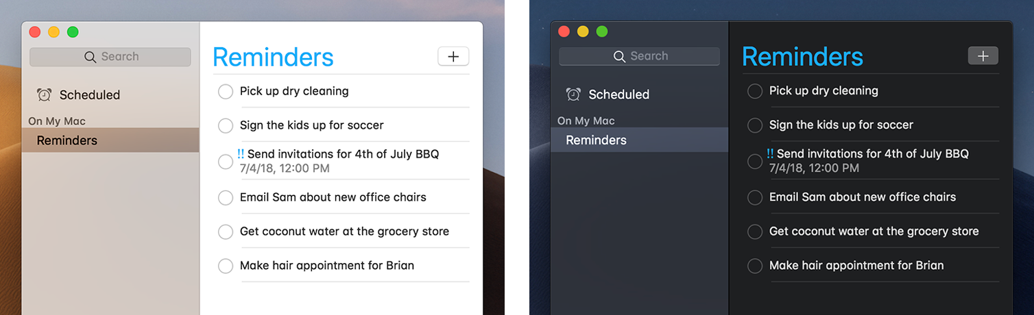
I like when websites have a dark mode option. Dark mode makes web pages easier for me to read and helps my eyes feel more relaxed. Many websites, including YouTube and Twitter, have implemented it already, and we’re starting to see it trickle onto many other sites as well.
In this tutorial, we’re going to build a toggle that allows users to switch between light and dark modes, using a <ThemeProvider wrapper from the styled-components library. We’ll create a useDarkMode custom hook, which supports the prefers-color-scheme media query to set the mode according to the user’s OS color scheme settings.
If that sounds hard, I promise it’s not! Let’s dig in and make it happen.
Next, open a separate terminal window and install styled-components:
yarn add styled-components
Next thing to do is create two files. The first is global.js, which will contain our base styling, and the second is theme.js, which will include variables for our dark and light themes:
Go to the App.js file. We’re going to delete everything in there and add the layout for our app. Here’s what I did:
import React from 'react';
import { ThemeProvider } from 'styled-components';
import { lightTheme, darkTheme } from './theme';
import { GlobalStyles } from './global';

function App() {
  return (
    <ThemeProvider theme={lightTheme}>
      <>
        <GlobalStyles />
        <button>Toggle theme</button>
        <h1>It's a light theme!</h1>
        <footer>
        </footer>
      </>
    </ThemeProvider>
  );
}

export default App;
This imports our light and dark themes. The ThemeProvider component also gets imported and is passed the light theme (lightTheme) styles inside. We also import GlobalStyles to tighten everything up in one place.
Here’s roughly what we have so far:
Now, the toggling functionality
There is no magic switching between themes yet, so let’s implement toggling functionality. We are only going to need a couple lines of code to make it work.
First, import the useState hook from react:
// App.js
import React, { useState } from 'react';
Next, use the hook to create a local state which will keep track of the current theme and add a function to switch between themes on click:
// App.js
const [theme, setTheme] = useState('light');

// The function that toggles between themes
const toggleTheme = () => {
  // if the theme is not light, then set it to dark
  if (theme === 'light') {
    setTheme('dark');
  // otherwise, it should be light
  } else {
    setTheme('light');
  }
}
After that, all that’s left is to pass this function to our button element and conditionally change the theme. Take a look:
// App.js
import React, { useState } from 'react';
import { ThemeProvider } from 'styled-components';
import { lightTheme, darkTheme } from './theme';
import { GlobalStyles } from './global';

// The function that toggles between themes
function App() {
  const [theme, setTheme] = useState('light');
  const toggleTheme = () => {
    if (theme === 'light') {
      setTheme('dark');
    } else {
      setTheme('light');
    }
  }

  // Return the layout based on the current theme
  return (
    <ThemeProvider theme={theme === 'light' ? lightTheme : darkTheme}>
      <>
        <GlobalStyles />
        // Pass the toggle functionality to the button
        <button onClick={toggleTheme}>Toggle theme</button>
        <h1>It's a light theme!</h1>
        <footer>
        </footer>
      </>
    </ThemeProvider>
  );
}

export default App;
Earlier in our GlobalStyles, we assigned background and color properties to values from the theme object, so now, every time we switch the toggle, values change depending on the darkTheme and lightTheme objects that we are passing to ThemeProvider. The transition property allows us to make this change a little more smoothly than working with keyframe animations.
Now we need the toggle component
We’re generally done here because you now know how to create toggling functionality. However, we can always do better, so let’s improve the app by creating a custom Toggle component and make our switch functionality reusable. That’s one of the key benefits to making this in React, right?
We’ll keep everything inside one file for simplicity’s sake,, so let’s create a new one called Toggle.js and add the following:
// Toggle.js
import React from 'react'
import { func, string } from 'prop-types';
import styled from 'styled-components';
// Import a couple of SVG files we'll use in the design: https://www.flaticon.com
import { ReactComponent as MoonIcon } from 'icons/moon.svg';
import { ReactComponent as SunIcon } from 'icons/sun.svg';

const Toggle = ({ theme, toggleTheme }) => {
  const isLight = theme === 'light';
  return (
    <button onClick={toggleTheme} >
      <SunIcon />
      <MoonIcon />
    </button>
  );
};

Toggle.propTypes = {
  theme: string.isRequired,
  toggleTheme: func.isRequired,
}

export default Toggle;
We passed two props inside: the theme will provide the current theme (light or dark) and toggleTheme function will be used to switch between them. Below we created an isLight variable, which will return a boolean value depending on our current theme. We’ll pass it later to our styled component.
We’ve also imported a styled function from styled-components, so let’s use it. Feel free to add this on top your file after the imports or create a dedicated file for that (e.g. Toggle.styled.js) like I have below. Again, this is purely for presentation purposes, so you can style your component as you see fit.
Importing icons as components allows us to directly change the styles of the SVG icons. We’re checking if the lightTheme is an active one, and if so, we move the appropriate icon out of the visible area — sort of like the moon going away when it’s daytime and vice versa.
Don’t forget to replace the button with the ToggleContainer component in Toggle.js, regardless of whether you’re styling in separate file or directly in Toggle.js. Be sure to pass the isLight variable to it to specify the current theme. I called the prop lightTheme so it would clearly reflect its purpose.
The last thing to do is import our component inside App.js and pass required props to it. Also, to add a bit more interactivity, I’ve passed condition to toggle between "light" and “dark" in the heading when the theme changes:
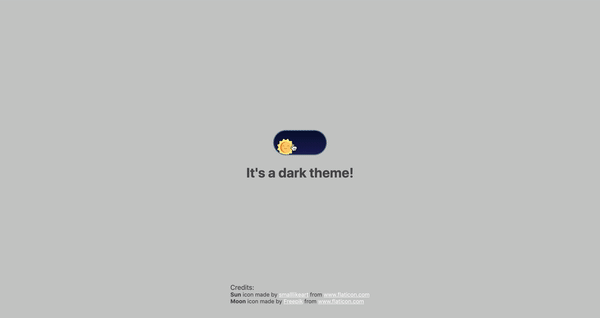
Don’t forget to credit the flaticon.com authors for the providing the icons.
// App.js
<span>Credits:</span>
<small><b>Sun</b> icon made by <a href="https://www.flaticon.com/authors/smalllikeart">smalllikeart</a> from <a href="https://www.flaticon.com">www.flaticon.com</a></small>
<small><b>Moon</b> icon made by <a href="https://www.freepik.com/home">Freepik</a> from <a href="https://www.flaticon.com">www.flaticon.com</a></small>
Now that’s better:
The useDarkMode hook
While building an application, we should keep in mind that the app must be scalable, meaning, reusable, so we can use in it many places, or even different projects.
That is why it would be great if we move our toggle functionality to a separate place — so, why not to create a dedicated account hook for that?
Let’s create a new file called useDarkMode.js in the project src directory and move our logic into this file with some tweaks:
We’ve added a couple of things here. We want our theme to persist between sessions in the browser, so if someone has chosen a dark theme, that’s what they’ll get on the next visit to the app. That’s a huge UX improvement. For this reasons we use localStorage.
We’ve also implemented the useEffect hook to check on component mounting. If the user has previously selected a theme, we will pass it to our setTheme function. In the end, we will return our theme, which contains the chosen theme and toggleTheme function to switch between modes.
Now, let’s implement the useDarkMode hook. Go into App.js, import the newly created hook, destructure our theme and toggleTheme properties from the hook, and, put them where they belong:
// App.js
import React from 'react';
import { ThemeProvider } from 'styled-components';
import { useDarkMode } from './useDarkMode';
import { lightTheme, darkTheme } from './theme';
import { GlobalStyles } from './global';
import Toggle from './components/Toggle';

function App() {
  const [theme, toggleTheme] = useDarkMode();
  const themeMode = theme === 'light' ? lightTheme : darkTheme;

  return (
    <ThemeProvider theme={themeMode}>
      <>
        <GlobalStyles />
        <Toggle theme={theme} toggleTheme={toggleTheme} />
        <h1>It's a {theme === 'light' ? 'light theme' : 'dark theme'}!</h1>
        <footer>
          Credits:
          <small>Sun icon made by smalllikeart from www.flaticon.com</small>
          <small>Moon icon made by Freepik from www.flaticon.com</small>
        </footer>
      </>
    </ThemeProvider>
  );
}

export default App;
This almost works almost perfectly, but there is one small thing we can do to make our experience better. Switch to dark theme and reload the page. Do you see that the sun icon loads before the moon icon for a brief moment?
That happens because our useState hook initiates the light theme initially. After that, useEffect runs, checks localStorage and only then sets the theme to dark.
So far, I found two solutions. The first is to check if there is a value in localStorage in our useState:
However, I am not sure if it’s a good practice to do checks like that inside useState, so let me show you a second solution, that I’m using.
This one will be a bit more complicated. We will create another state and call it componentMounted. Then, inside the useEffect hook, where we check our localTheme, we’ll add an else statement, and if there is no theme in localStorage, we’ll add it. After that, we’ll set setComponentMounted to true. In the end, we add componentMounted to our return statement.
You might have noticed that we’ve got some pieces of code that are repeated. We always try to follow the DRY principle while writing the code, and right here we’ve got a chance to use it. We can create a separate function that will set our state and pass theme to the localStorage. I believe, that the best name for it will be setTheme, but we’ve already used it, so let’s call it setMode:
We’ve only changed code a little, but it looks so much better and is easier to read and understand!
Did the component mount?
Getting back to componentMounted property. We will use it to check if our component has mounted because this is what happens in useEffect hook.
If it hasn’t happened yet, we will render an empty div:
// App.js
if (!componentMounted) {
  return <div />
};
Here is how complete code for the App.js:
// App.js
import React from 'react';
import { ThemeProvider } from 'styled-components';
import { useDarkMode } from './useDarkMode';
import { lightTheme, darkTheme } from './theme';
import { GlobalStyles } from './global';
import Toggle from './components/Toggle';

function App() {
  const [theme, toggleTheme, componentMounted] = useDarkMode();

  const themeMode = theme === 'light' ? lightTheme : darkTheme;

  if (!componentMounted) {
    return <div />
  };

  return (
    <ThemeProvider theme={themeMode}>
      <>
        <GlobalStyles />
        <Toggle theme={theme} toggleTheme={toggleTheme} />
        <h1>It's a {theme === 'light' ? 'light theme' : 'dark theme'}!</h1>
        <footer>
          <span>Credits:</span>
          <small><b>Sun</b> icon made by <a href="https://www.flaticon.com/authors/smalllikeart">smalllikeart</a> from <a href="https://www.flaticon.com">www.flaticon.com</a></small>
          <small><b>Moon</b> icon made by <a href="https://www.freepik.com/home">Freepik</a> from <a href="https://www.flaticon.com">www.flaticon.com</a></small>
        </footer>
      </>
    </ThemeProvider>
  );
}

export default App;
Using the user’s preferred color scheme
This part is not required, but it will let you achieve even better user experience. This media feature is used to detect if the user has requested the page to use a light or dark color theme based on the settings in their OS. For example, if a user’s default color scheme on a phone or laptop is set to dark, your website will change its color scheme accordingly to it. It’s worth noting that this media query is still a work in progress and is included in the Media Queries Level 5 specification, which is in Editor’s Draft.
This browser support data is from Caniuse, which has more detail. A number indicates that browser supports the feature at that version and up.
Desktop
Chrome
Opera
Firefox
IE
Edge
Safari
76
62
67
No
76
12.1
Mobile / Tablet
iOS Safari
Opera Mobile
Opera Mini
Android
Android Chrome
Android Firefox
13
No
No
76
No
68
The implementation is pretty straightforward. Because we’re working with a media query, we need to check if the browser supports it in the useEffect hook and set appropriate theme. To do that, we’ll use window.matchMedia to check if it exists and whether dark mode is supported. We also need to remember about the localTheme because, if it’s available, we don’t want to overwrite it with the dark value unless, of course, the value is set to light.
If all checks are passed, we will set the dark theme.
As mentioned before, we need to remember about the existence of localTheme — that’s why we need to implement our previous logic where we’ve checked for it.
Give it a try! It changes the mode, persists the theme in localStorage, and also sets the default theme accordingly to the OS color scheme if it’s available.
Congratulations, my friend! Great job! If you have any questions about implementation, feel free to send me a message!
Key considerations while implementing Dark Mode in an iPhone app.
Before we step ahead with the tutorial, let's check some basic information about the dark mode in iOS 13.
Dark Mode
Dark Mode is a dark system-wide appearance that uses a darker color palette for all screens, menus, and controls. Similar to Android Dark Mode, it changes a bright theme to a darker one. It also maintains vibrancy and contrast to make foreground content stand out against the darker background.
We've been talking a lot about Dark Mode around here ever since Apple released it as a system setting in MacOS 10.14 and subsequently as part of Safari. It's interesting because of both what it opens up as as far as design opportunities as well as tailoring user experience based on actual user preferences.
This week, we got an Editor's Draft for the Color Adjust Module Level 1 specification and the First Public Working Draft of it. All of this is a work-in-progress, but the progression of it has been interesting to track. The spec introduces three new CSS properties that help inform how much control the user agent should have when determining the visual appearance of a rendered page based on user preferences.
color-scheme is the first property defined in the spec and perhaps the centerpiece of it. It accepts light and dark values which — as you may have guessed — correspond to Light Mode and Dark Mode preferences for operating systems that support them. And, for what it's worth, we could be dealing with labels other than "Light" and "Dark" (e.g. "Day" and "Night") but what we're dealing with boils down to a light color scheme versus a dark one.
This single property carries some important implications. For one, the idea is that it allows us to set styles based on a user's system preferences which gives us fine-grained control over that experience.
Another possible implication is that declaring the property at all enables the user agent to take some responsibility for determining an element's colors, where declaring light or dark informs the user agent that an element is "aware" of color schemes and should be styled according to a preference setting matching the value. On the other hand, we can give the browser full control to determine what color scheme to use based on the user's system preferences by using the auto value. That tells the browser that an element is "unaware" of color schemes and that the browser can determine how to proceed using the user preferences and a systems's default styling as a guide.
It's worth noting at this point that we may also have a prefers-color-scheme media feature (currently in the Editor's Draft for the Media Queries Level 5 specification) that also serves to let us detect a user's preference and help gives us greater control of the user experience based on system preferences. Robin has a nice overview of it. The Color Adjust Module Level 1 Working Draft also makes mention of possibly using a color scheme value in a <meta> element to indicate color scheme support.
There's more to the property, of course, including an only keyword, chaining values to indicate an order of preference, and even an open-ended custom ident keyword. So definitely dig in there because there's a lot to take in.
Pretty interesting, right? Hopefully you're starting to see how this draft could open up new possibilities and even impacts how we make design decisions. And that's only the start because there are two more properties!
forced-color-adjust: This is used when we want to support color schemes but override the user agent's default stylesheet with our own CSS. This includes a note about possibly merging this into color-adjust.
color-adjust: Unlike forcing CSS overrides onto the user agent, this property provides a hint to browsers that they can change color values based on the both the user's preferences and other factors, such as screen quality, bandwidth, or whatever is "deem[ed] necessary and prudent for the output device." Eric Bailey wrote up the possibilities this property could open up as far as use cases, enhanced accessibility, and general implementations.
The current draft is sure to expand but, hey, this is where we get to be aware of the awesome work that W3C authors are doing, gain context for the challenges they face, and even contribute to the work. (See Rachel Andrew's advice on making contributions.)
Dark mode designs are all the rage right now but here’s an interesting take: Wei Gao has built a night mode on her own site that uses mix-blend-mode: difference to create an effect that looks like this:
Wei explains how she implemented this technique and the edge cases she encountered along the way. I especially love what she had to say about mix-blend-mode functions here:
I remember first playing around with them in Photoshop years ago. Now that browsers are becoming more powerful and we are seeing complex graphical features native to browser rendering. This doesn’t mean we should implement a full photoshop in browsers and nor should we limit our imaginations to just that. Browsers and web pages have their own contexts and goals, as well as a different set of limits. Maybe we should welcome them like new habitants and discover use cases native to this territory.
Indeed! Although Wei's technique is pretty unique and awesome on its own, this all ties back into the thing that kicked off the whole trend: the prefers-color-scheme media feature that was released in Safari as part of the MacOS 10.4 release that gave us a dark mode preference setting. This is a developing space, so we're certain to see more innovations and approaches ahead.
Today we’d like to share an experimental slideshow with you. The main idea is to show three slides of a slideshow that is slightly rotated. The titles of each slide, which serve as a decorative element, overlay the images and are rotated in an opposing angle. This creates an interesting look, especially when animated. When clicking on one of the lateral slides, the whole thing moves, and when we click on the middle slide, we move everything up and reveal a content area.
Attention: Note that the demo is experimental and that we use modern CSS properties that might not be supported in older browsers. Edge has a problem with SVG data-uri cursors, so you won’t see the custom cursors in the demo there.
The initial view of the slideshow looks as follows:
When we click on the lateral slides, we can navigate. When clicking on the middle one, we open the respective content view for that item:
We also have a dark mode option:
Here’s how the animations look:
We hope you enjoy this slideshow and find it useful!
In this episode, John James Jacoby and I are joined by Sandy Edwards. Sandy gave us a behind the scenes look at what it takes to organize a WordPress event for children and teens.
She also provides background information on a new group that’s been formed called the Kids Events Working Group. This group is responsible for setting the foundation for organizers to create and manage WordPress events geared towards children.
John recaps his experience at WordCamp Miami last weekend and we discussed some noteworthy news items.
Daniel James is putting his Dark Mode plugin up for adoption.
“I’m stepping back from plugin development (and WordPress contributions) and would like to see someone passionate about it pick it up,” James said.
Dark Mode has 2,000 active installations and is the most popular among a handful of dark or “night mode” plugins in the official directory. In August 2018, James submitted a merge proposal for including Dark Mode in core, but it was shot down the same day it was published. Gary Pendergast said the proposal “seemed premature” and noted that the project was lacking several merge criteria outlined on the Handbook page for feature plugins. He cited a lack of weekly chats, no kickoff and update posts, and no testing from the Flow team, among other concerns.
“I decided recently that because of the direction WordPress is going in with the move towards React with Gutenberg that I should probably focus my efforts elsewhere,” James said.
“That’s mostly to do with the merge proposal getting rejected fairly quickly without any helpful next steps on how to improve it. Plus, with how rapidly Gutenberg is being developed, I’d have to pretty much work in tandem with the Gutenberg team to ensure the Dark Mode plugin styled the UI correctly. That’s spare time I just don’t have.
“I feel like WordPress leadership is another reason. It’s really difficult (I think/feel) to get something like Dark Mode pushed through. It’s very much near the bottom of the priority list, which I get, but sucks a bit when you’re volunteering in spare time of course.” James said the plugin currently requires a few hours per week in support and maintenance.
The popularity of dark modes for applications has taken off after macOS Mojave introduced a dark mode, and has also been spurred on by the news that Apple’s 2020 iPhone lineup will be produced with OLED screens. Many popular applications, such as YouTube, Facebook Messenger, Twitter, and Google Maps already have a dark mode that either works automatically based on light conditions or can be manually enabled. Chrome also recently added a dark browsing mode for Mac users. Fans of dark mode claim it is easier on the eyes and conserves battery.
Users who tend to gravitate towards dark mode are still a small subset, but the feature is gaining momentum. A dark mode may one day come to WordPress core but it doesn’t seem likely in the near future. Daniel James’ Dark Mode plugin isn’t ready for core, since it doesn’t support the new editor, but he said he hopes the new owner will find the time to take it where it needs to go.
“I’m happy to transfer the plugin to someone else to continue it, as long as they’re well known/respected,” James said. “I won’t just be giving it away for security reasons. It would be great for it to be included in core one day, but at the very least it would be nice for someone who really likes it to just continue it.”


