Gooey Cursor Effect

A fun gooey cursor background effect with SVG filters and CSS blend modes.

Tips, Expertise, Articles and Advice from the Pro's for Your Website or Blog to Succeed
From the custom cursor on my portfolio marvinx.com using blurred SVG circles, I created several variations which I would like to share with you today.
Without going into too much detail, I’d like to explain some points on how I approached the making of this set.
For the demos, the idea is to set a main class grouping all the functions inherent to all cursors.
Then, I separate demos in different classes where each variable is configurable: number of particles, colors, size, gradient, opacity, filters, radius, speed, acceleration, direction, etc.
Everything is coded in native JavaScript and does not use any libraries (only d3.js if we want to sort particles).
This is how particles are drawn in the Cursor class:
  drawParticles() {
    return `<g class="particles" filter=${this.filterParticles || "none"}>
      ${(() => {
        if (this.strokeGradient) {
          return `
          <defs>
            <linearGradient id=${this.strokeGradient.idStrokeGradient} x1="0%" y1="0%" x2="0%" y2="100%">
              <stop offset="0%" stop-color=${this.strokeGradient.color1} />
              <stop offset="100%" stop-color=${this.strokeGradient.color2} />
            </linearGradient>
          </defs>`
        }
      })()}
      ${Array(this.nbrParticles).fill().map((_,i) =>
        `<circle
          r="${this.setRadiusParticles(i)}"
          cx=${this.pos.x} cy=${this.pos.y}
          fill="${this.fillParticles || "none"}"
          fill-opacity="${this.fillOpacityParticles || 1}"
          stroke="${this.strokeGradient ? `url(#${this.strokeGradient.idStrokeGradient})` : this.strokeColorParticles}"
          stroke-width="${this.strokeWidthParticles || 0}"
          stroke-opacity="${this.strokeOpacityParticles || 1}"
          id="${i}">
        </circle>`).join('')}
    </g>`
  }
This is how each parameter is then configured:
export class Cursor1 extends Cursors{

  constructor(index) {
    super(index);
    this.speed = !isTouchDevices ? 0.5 : 1;
    this.init();
    this.loop();
  }

  setParamsCursor() {
    this.radiusCursor = 15;
    this.fillCursor = getComputedStyle(document.body).getPropertyValue('--primary');
    this.maxSqueeze = 0.6;
    this.accelerator = 1000;
  }

  setParamsParticles() {
    this.strokeGradient = {
      idStrokeGradient : "gradient",
      color2 : getComputedStyle(document.body).getPropertyValue('--primary'),
      color1 : getComputedStyle(document.body).getPropertyValue('--secondary'),
    }
    this.strokeWidthParticles = 1.5;
    this.strokeOpacityParticles = .15;
    this.radiusDiff = 7;
    this.radiusStart = this.radiusCursor*3;
    this.nbrParticles = Math.round((this.diagonalWindow() + this.radiusDiff - this.radiusStart) / this.radiusDiff);
    this.transitionParticles = {
      duration: 18,
      delay: !isTouchDevices ? 4 : 14,
      easing : "linear"
    };
  }
}On this last demo, I use twice the same superimposed video (from Mikhail Nilov‘s beautiful royalty free collection).
The first video uses a grayscale filter:
  filterImageBack() {
    return
    `<filter id=${this.filterBackId}>
      <feColorMatrix type="matrix" values=".33 .33 .33 0 0
        .33 .33 .33 0 0
        .33 .33 .33 0 0
        0 0 0 1 0">
      </feColorMatrix>
    </filter>`
  }
And the second one is placed inside a mask where I apply a duotone filter:
  filterImageCursor() {
    return
     `<filter id=${this.filterCursorId} filterUnits="objectBoundingBox" primitiveUnits="userSpaceOnUse" color-interpolation-filters="sRGB">
      <feColorMatrix type="matrix" values=".44 .44 .44 0 0
        .44 .44 .44 0 0
        .44 .44 .44 0 0
        0 0 0 1 0">
      </feColorMatrix>
      <feComponentTransfer color-interpolation-filters="sRGB" result="duotone">
        <feFuncR type="table" tableValues="0.55 0.25"></feFuncR>
        <feFuncG type="table" tableValues="0.06 1"></feFuncG>
        <feFuncB type="table" tableValues="0.93 0.91"></feFuncB>
        <feFuncA type="table" tableValues="0 1"></feFuncA>
      </feComponentTransfer>
    </filter>`
  }
I also thank Ghislain Auzillon, for his help on the design.
Hope you enjoy it!
Today I’d like to show you how to code a special cursor effect. Custom cursors have been very popular and there’s so many creative possibilities that can enhance a certain design and an interaction logic.
Let’s have a look how to create a fullscreen crosshair cursor in SVG and how to distort the cursors’s lines with an SVG filter when hovering over links. We’ll also add a nice hover animation for some menu items using Splitting.js.
For the SVG cursor we want a singe SVG for each line that has enough of space to get the distortion effect applied to it:
<div class="cursor">
	<svg class="cursor__line cursor__line--horizontal" viewBox="0 0 200 20" preserveAspectRatio="none">
		<line class="cursor__line-element" x1="0" y1="10" x2="200" y2="10" shape-rendering="crispEdges" vector-effect="non-scaling-stroke" />
	</svg>
	<svg class="cursor__line cursor__line--vertical" viewBox="0 0 20 200" preserveAspectRatio="none">
		<line class="cursor__line-element" x1="10" y1="0" x2="10" y2="200" shape-rendering="crispEdges" vector-effect="non-scaling-stroke" />
	</svg>
</div>
We’ll add the filters like this:
<div class="cursor">
	<svg class="cursor__line cursor__line--horizontal" viewBox="0 0 200 20" preserveAspectRatio="none">
		<defs>
			<filter id="filter-noise-x" x="-50%" y="-50%" width="200%" height="200%"
			filterUnits="objectBoundingBox">
				<feTurbulence type="fractalNoise" baseFrequency="0" numOctaves="1" result="warp" />
				<feOffset dx="-30" result="warpOffset" />
				<feDisplacementMap xChannelSelector="R" yChannelSelector="G" scale="30" in="SourceGraphic" in2="warpOffset" />
			</filter>
		</defs>
		<line class="cursor__line-element" x1="0" y1="10" x2="200" y2="10" shape-rendering="crispEdges" vector-effect="non-scaling-stroke" />
	</svg>
	<svg class="cursor__line cursor__line--vertical" viewBox="0 0 20 200" preserveAspectRatio="none">
		<defs>
			<filter id="filter-noise-y" x="-50%" y="-50%" width="200%" height="200%"
			filterUnits="objectBoundingBox">
				<feTurbulence type="fractalNoise" baseFrequency="0" numOctaves="1" result="warp" />
				<feOffset dy="-30" result="warpOffset" />
				<feDisplacementMap xChannelSelector="R" yChannelSelector="G" scale="30" in="SourceGraphic" in2="warpOffset" />
			</filter>
		</defs>
		<line class="cursor__line-element" x1="10" y1="0" x2="10" y2="200" shape-rendering="crispEdges" vector-effect="non-scaling-stroke" />
	</svg>
</div>
Let’s set up our menu with some data-splitting attributes:
<nav class="menu">
	<a href="#content-1" class="menu__item">
		<span data-splitting class="menu__item-title">Maputo</span>
		<span data-splitting class="menu__item-sub">Nights</span>
	</a>
	<a href="#content-1" class="menu__item">
		<span data-splitting class="menu__item-title">Gaborone</span>
		<span data-splitting class="menu__item-sub">Vibes</span>
	</a>
	<a href="#content-1" class="menu__item">
		<span data-splitting class="menu__item-title">Kinshasa</span>
		<span data-splitting class="menu__item-sub">Walks</span>
	</a>
</nav>First, we need to hide our cursor by default, and we just want to show it if the user has a pointing device, like a mouse. So we add a media query with the any-pointer media feature:
.cursor {
	display: block;
}

@media (any-pointer:fine) {
	.cursor {
		position: fixed;
		top: 0;
		left: 0;
		display: block;
		pointer-events: none;
		z-index: 1001;
	}

	.no-js .cursor {
		display: none;
	}

	.cursor__line {
		position: fixed;
		display: block;
		will-change: transform, opacity;
	}

	.cursor__line--horizontal {
		top: -10px;
		left: -10%;
		width: 120%;
		height: 20px;
	}

	.cursor__line--vertical {
		left: -10px;
		top: -10%;
		height: 120%;
		width: 20px;
	}

	.cursor__line-element {
		fill: none;
		stroke: var(--cursor-stroke);
		stroke-width: var(--cursor-stroke-width);
	}

}
The variables are define in the body.
For the menu, we’ll use some flexbox magic to lay out the menu items beneath each other:
.menu {
	display: flex;
	flex-direction: column;
	width: 100vw;
	height: calc(100vh - 13rem);
	position: relative;
	justify-content: flex-start;
	align-items: center;
}

.menu {
	text-align: center;
	padding-top: 10vh;
}

.menu__item {
	display: inline-block;
	margin-bottom: 3rem;
	text-decoration: none;
	color: var(--color-menu);
	font-family: vortice-concept, sans-serif;
}

.menu__item-title {
	line-height: 1;
	font-size: 7.5vw;
}

.menu__item-sub {
	font-size: 1.5vw;
	display: block;
}

@media screen and (min-width: 53em) {
	.menu {
		height: 100vh;
		justify-content: center;
	}
}Let’s create our custom cursor. So we have two SVGs, one for each line. As we saw in the markup earlier, each one of the SVGs will include a filter that we’ll apply to the respective line when hovering over a menu link.
Let’s start coding the entry JavaScript file (index.js):
import { Cursor } from './cursor';

// initialize custom cursor
const cursor = new Cursor(document.querySelector('.cursor'));

// mouse effects on all links
[...document.querySelectorAll('a')].forEach(link => {
    link.addEventListener('mouseenter', () => cursor.enter());
    link.addEventListener('mouseleave', () => cursor.leave());
});
Now, let’s create a class for the cursor (in cursor.js):
import { gsap } from 'gsap';
import { getMousePos } from './utils';

// Track the mouse position and update it on mouse move
let mouse = {x: 0, y: 0};
window.addEventListener('mousemove', ev => mouse = getMousePos(ev));

export class Cursor {
    constructor(el) {
    }
    // hovering over a link
    enter() {
    }
    // hovering out a link
    leave() {
    }
    // create the turbulence animation timeline on the cursor line elements
    createNoiseTimeline() {
    }
    // render styles and loop
    render() {
        // ...
        requestAnimationFrame(() => this.render());
    }
}
What we do here is to update the mouse position as we move the mouse around. For that, we use the getMousePos function (in utils.js).
Let’s move on to the next interesting part:
...
constructor(el) {
    // main DOM element which includes the 2 svgs, each for each line
    this.DOM = {el: el};
    // both horizontal and vertical lines
    this.DOM.lines = this.DOM.el.children;
    [this.DOM.lineHorizontal, this.DOM.lineVertical] = this.DOM.lines;
    // hide initially
    gsap.set(this.DOM.lines, {opacity: 0});
    ...
}
...
We initialize the line DOM elements and hide them initially.
We want to update the lines transform (translation values) as we move the mouse. For that, let’s create an object that stores the translation state:
...
constructor(el) {
    ...
    // style properties that will change as we move the mouse (translation)
    this.renderedStyles = {
        tx: {previous: 0, current: 0, amt: 0.15},
        ty: {previous: 0, current: 0, amt: 0.15}
    };
    ...
}
...
With interpolation, we can achieve a smooth animation effect when moving the mouse. The “previous” and “current” values are the values we’ll be interpolating. The current value of one of these “animatable” properties will be one between these two values at a specific increment. The value of “amt” is the amount to interpolate. As an example, the following formula calculates our current translationX value:
this.renderedStyles.tx.previous = lerp(this.renderedStyles.tx.previous, this.renderedStyles.tx.current, this.renderedStyles.tx.amt);
...
constructor(el) {
    ...
    // svg filters (ids)
    this.filterId = {
        x: '#filter-noise-x',
        y: '#filter-noise-y'
    };
    // the feTurbulence elements per filter
    this.DOM.feTurbulence = {
        x: document.querySelector(`${this.filterId.x} > feTurbulence`),
        y: document.querySelector(`${this.filterId.y} > feTurbulence`)
    }
    // turbulence current value
    this.primitiveValues = {turbulence: 0};
    // create the gsap timeline that will animate the turbulence value
    this.createNoiseTimeline();
}
...
Next, we initialize the filter ids, the feTurbulence elements for each SVG filter (one per line) and also the current turbulence value. Then we create the GSAP timeline that will take care of updating the baseFrequency of each filter with the current turbulence value. Here’s how that timeline and the methods that start/stop it look like:
...
createNoiseTimeline() {
    // turbulence value animation timeline:
    this.tl = gsap.timeline({
        paused: true,
        onStart: () => {
            // apply the filters for each line element
            this.DOM.lineHorizontal.style.filter = `url(${this.filterId.x}`;
            this.DOM.lineVertical.style.filter = `url(${this.filterId.y}`;
        },
        onUpdate: () => {
            // set the baseFrequency attribute for each line with the current turbulence value
            this.DOM.feTurbulence.x.setAttribute('baseFrequency', this.primitiveValues.turbulence);
            this.DOM.feTurbulence.y.setAttribute('baseFrequency', this.primitiveValues.turbulence);
        },
        onComplete: () => {
            // remove the filters once the animation completes
            this.DOM.lineHorizontal.style.filter = this.DOM.lineVertical.style.filter = 'none';
        }
    })
    .to(this.primitiveValues, {
        duration: 0.5,
        ease: 'power1',
        // turbulence start value
        startAt: {turbulence: 1},
        // animate to 0
        turbulence: 0
    });
}
enter() {
    // start the turbulence timeline
    this.tl.restart();
}
leave() {
    // stop the turbulence timeline
    this.tl.progress(1).kill();
}
...
The animation will change the turbulence value (which starts at 1 and ends at 0) and apply it to each feTurbulence’s baseFrequency attribute. The filters get applied to the lines in the beginning and removed once the animation is completed.
To finalize the constructor method we fade in the lines and start updating the translation values the first time we move the mouse:
...
constructor(el) {
    ...
    import { lerp, getMousePos } from './utils';
    ...
    // on first mousemove fade in the lines and start the requestAnimationFrame rendering function
    this.onMouseMoveEv = () => {
        this.renderedStyles.tx.previous = this.renderedStyles.tx.current = mouse.x;
        this.renderedStyles.ty.previous = this.renderedStyles.ty.previous = mouse.y;
        gsap.to(this.DOM.lines, {duration: 0.9, ease: 'Power3.easeOut', opacity: 1});
        requestAnimationFrame(() => this.render());
        window.removeEventListener('mousemove', this.onMouseMoveEv);
    };
    window.addEventListener('mousemove', this.onMouseMoveEv);
}
...
Now we’re only missing the actual method that updates the lines’ translation values as we move the mouse:
...
render() {
    // update the current translation values
    this.renderedStyles['tx'].current = mouse.x;
    this.renderedStyles['ty'].current = mouse.y;
    // use linear interpolation to delay the translation animation
    for (const key in this.renderedStyles ) {
        this.renderedStyles[key].previous = lerp(this.renderedStyles[key].previous, this.renderedStyles[key].current, this.renderedStyles[key].amt);
    }
    // set the new values
    gsap.set(this.DOM.lineVertical, {x: this.renderedStyles['tx'].previous});
    gsap.set(this.DOM.lineHorizontal, {y: this.renderedStyles['ty'].previous});
    // loop this until the end of time
    requestAnimationFrame(() => this.render());
}
As an extra, let’s add a little glitch effect to the menu items texts when we hover over them. We’ll use the Splitting library to split the menu texts into spans/chars so we can animate each one individually. We want to change the translation values of each character and also it’s color. Let’s update our index.js file:
import { Cursor } from './cursor';
import { MenuItem } from './menuItem';
// Splitting (used to split the menu item texts to spans/characters)
import 'splitting/dist/splitting.css';
import 'splitting/dist/splitting-cells.css';
import Splitting from 'splitting';

// initialize Splitting
const splitting = Splitting();

// initialize custom cursor
const cursor = new Cursor(document.querySelector('.cursor'));

// Menu Items
[...document.querySelectorAll('.menu > a')].forEach(el => new MenuItem(el));

// mouse effects on all links
[...document.querySelectorAll('a')].forEach(link => {
    link.addEventListener('mouseenter', () => cursor.enter());
    link.addEventListener('mouseleave', () => cursor.leave());
});
Assuming we have data-splitting set in all elements we want to split into chars, then we only need to call Splitting() and we then have each text split into a bunch of spans, for every letter of the text.
Let’s now have a look at our MenuItem class:
import { gsap } from 'gsap';

export class MenuItem {
    constructor(el) {
        this.DOM = {el};
        // all text chars (Splittingjs)
        this.DOM.titleChars = this.DOM.el.querySelectorAll('span.char');
        // initial and final colors for each span char (before and after hovering)
        const bodyComputedStyle = getComputedStyle(document.body);
        this.colors = {
            initial: bodyComputedStyle.getPropertyValue('--color-menu'),
            final: bodyComputedStyle.getPropertyValue('--color-link')
        };
        this.initEvents();
    }
    ...
}
We get a reference to all the characters of the menu item text and also it’s initial and final colors for the hover animation.
...
initEvents() {
    this.onMouseEnterEv = () => this.onMouseEnter();
    this.DOM.el.addEventListener('mouseenter', this.onMouseEnterEv);

    this.onMouseLeaveEv = () => this.onMouseLeave();
    this.DOM.el.addEventListener('mouseleave', this.onMouseLeaveEv);
}
...
We initialize the mouseenter/mouseleave events which will triggger the animation on the characters.
When hovering over a menu item we will randomly change its characters position and color, and when hovering out we reset the original color:
onMouseEnter() {
    if ( this.leaveTimeline ) {
        this.leaveTimeline.kill();
    }

    // let's try to do an animation that resembles a glitch effect on the characters
    // we randomly set new positions for the translation and rotation values of each char and also set a new color
    // and repeat this for 3 times
    this.enterTimeline = gsap.timeline({
        defaults: {
            duration: 0.05,
            ease: 'power3',
            x: () => gsap.utils.random(-15, 15),
            y: () => gsap.utils.random(-20, 10),
            rotation: () => gsap.utils.random(-5, 5),
            color: () => gsap.utils.random(0, 3) < 0.5 ? this.colors.final : this.colors.initial
        }
    })
    // repeat 3 times (repeatRefresh option will make sure the translation/rotation values will be different for each iteration)
    .to(this.DOM.titleChars, {
        repeat: 3,
        repeatRefresh: true
    }, 0)
    // reset translation/rotation and set final color
    .to(this.DOM.titleChars, {
        x: 0,
        y: 0,
        rotation: 0,
        color: this.colors.final
    }, '+=0.05');
}
onMouseLeave() {
    // set back the initial color for each char
    this.leaveTimeline = gsap.timeline()
    .to(this.DOM.titleChars, {
        duration: 0.4,
        ease: 'power3',
        color: this.colors.initial
    });
}
And that is all!
I hope this has not been too difficult to follow and that you have gained some insight into constructing this fancy effect.
Please let me know if you have any question @codrops or @crnacura.
Thank you for reading!
The post How to Code a Crosshair Mouse Cursor with Distortion Hover Effect appeared first on Codrops.
Let’s look at how to get the user’s mouse position and map it into CSS custom properties: --positionX and --positionY.
We could do this in JavaScript. If we did, we could do things like make make an element draggable or move a background. But actually, we can still do similar things, but not use any JavaScript!
I’ve used this method as a part of a demo I’ve made for getting a ‘Click and drag’ effect with pure CSS. I used the perspective tips from my pervious article. It’s a pretty neat effect to get this done entirely in CSS, which might have wider usefulness than my demo, so let’s take a look.
Our first demo is going to use --positionX and --positionY custom properties to set the width and height of an element.
Heads up that we’re only using SCSS here for brevity, but all of this can be done in pure CSS.
This is our initial state. We have here a ‘wrapper’ <div> with a .content class of that is spread to the width and height of the body. This <div> will host the content of our project, and the elements we want to control using the mouse position – in this case, the .square element.
We’ve also added the two custom-properties to the content. we will use the mouse position to set the value of these properties, and then use them set the .square element’s width and height accordingly.
Once we have mapped the custom properties for mouse position, we can use them to do pretty much anything we want . For example, we could use them to set the top / left properties of an absolute positioned element, control a transform property, set the background-position, manipulate colors, or even set the content of a pseudo-element. We’ll see some of these bonus demos at the end of the article.
The goal is to create an invisible grid on the screen, and use the :hover pseudo-class to map each ‘cell’ to a set of values that we will allocate to the custom properties. So, when the mouse cursor moves to the right side of the screen, the value of the --positionX will be higher; and when it moves to left, it gets lower. We’ll do the same with --positionY: the value will be lower as the cursor moves to the top, and higher when it moves to the bottom.
A few words about the grid size we’re using: We can actually make the grid whatever size we want. The larger it is, the more accurate our custom property values will be. But that also means we will have more cells, which can lead to performance issues. It’s important to maintain proper balance and adjust the grid size to the specific needs of each project.
For now, lets say that we want a 10×10 grid for a total of 100 cells in our markup. (And yes, it’s OK to use Pug for that, even though I won’t in this example.)
<div class="cell"></div>
<div class="cell"></div>
<div class="cell"></div>
<!-- 97 more cells -->

<div class="content">
  <div class="square"></div>
</div>
You’re probably wondering why the .cell elements come before the .content. That’s because of the cascade.
We want to use the .cell class to control the .square, and the way the cascade works (for now) is that an element can only control its children (or descendants) and its siblings (or their descendants) — but only as long as the sibling is after the controlling element.
That means two things:
.cell must come before the element we want to control (in this case, the .square)..cells in a container, because if we do, the .content is no longer their sibling.There are a few ways to position the .cells. we can position: absolute them and offset them with the top and left properties. Or we can translate them into position using transform. But the easiest option is likely using display: grid.
body {
  background-color: #000;
  height: 100vh;
  display: grid;
  grid-template: repeat(10, 1fr) / repeat(10, 1fr);
}

.cell {
  width: 100%;
  height: 100%;
  border: 1px solid gray;
  z-index: 2;
}border is just temporary, so we could see the cells on the screen. we’ll remove it later on.z-index is important, because we want the cells to be in front of the content.Here’s what we have so far:
We want to use .cell to set the --positionX and --positionY values.
When we hover over a .cell that is in the first (left) column, the value of --positionX should be 0. When we hover over a .cell in the second column, the value should be 1. It should be 2 in the third column, and so on.
The same goes for the y-axis. When we hover over a .cell that is in the first (top) row, --positionY should be 0, and when we hover over a cell in the second row, the value should be 1, and so on.
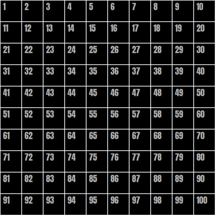
The numbers in this image represent the numbers of the cell elements in the grid. If we take just a single .cell as an example — let’s say cell 42 — we can select it using :nth-child():
.cell:nth-child(42) { }But we need to remember a couple of things:
:hover to it..content instead of the cell itself, so we’ll use the General Sibling Combinator (~) to do that.So now, to set --positionX to 1 and --positionY to 3 for .content when the 42nd cell is hovered, we need to do something like this:
.cell:nth-child(42):hover ~ .content {
  --positionX: 1;
  --positionY: 3;
}
But who wants to do that 100 times!? There are a few approaches to make things easier:
@for loop to go through all 100 cells, and do some math to set the proper --positionX and --positionY values for each iteration.:nth-child’s functional notation.@for loop and :nth-child functional notation.I thought long and hard about what would be the best and easiest approach to take, and while all of then have pros and cons, I landed on the third approach. The amount of code to write, the quality of the compiled code, and the math complexity all went into my thinking. Don’t agree? Tell my why in the comments!
@for loop@for $i from 0 to 10 {
.cell:nth-child(???):hover ~ .content {
--positionX: #{$i};
}
.cell:nth-child(???):hover ~ .content {
--positionY: #{$i};
}
}This is the basic loop. We’re going over it 10 times since we have 10 rows and 10 columns. And we’ve separated the x- and y-axes to set --positionX for each column, and the --positionY for each row. All we need to do now is to replace those ??? things with the proper notation to select each row and column.
Going back to our grid image (the one with numbers),We can see that the numbers of all the cells in the second column are multiples of 10, plus 2. The cells in the third column are multiples of 10 plus 3. And so on.
Now let’s ‘translate’ it into the :nth-child functional notation. Here’s how that looks for the second column:
:nth-child(10n + 2)10n selects every multiple of 10.2 is the column number.And for our loop, we will replace the column number with #{$i + 1} to iterate sequentially:
.cell:nth-child(10n + #{$i + 1}):hover ~ .content {
  --positionX: #{$i};
}Look again at the grid image and focus on the fourth row. The cell numbers are somewhere between 41 and 50. The cells in the fifth row are between 51 to 60, and so on. To select each row, we’ll need to define its range. For example, the range for the fourth row is:
.cell:nth-child(n + 41):nth-child(-n + 50)(n + 41) is the start of the range.(-n + 50) is the end of the range.Now we’ll replace the numbers with some math on the $i value. For the start of the range, we get (n + #{10 * $i + 1}), and for the end of the range we get (-n + #{10 * ($i + 1)}).
So the final @for loop is:
@for $i from 0 to 10 {
 .cell:nth-child(10n + #{$i + 1}):hover ~ .content {
    --positionX: #{$i};
  }
  .cell:nth-child(n + #{10 * $i + 1}):nth-child(-n + #{10 * ($i + 1)}):hover ~ .content {
    --positionY: #{$i};
  }
}
The mapping is done! When we hover over elements, --positionX and --positionY change according to the mouse position. That means we can use them to control the elements inside the .content.
OK, so now we have the mouse position mapped to two custom-properties, The next thing is to use them to control the .square element’s width and height values.
Let’s start with the width and say that we want the minimum width of the .square to be 100px (i.e. when the mouse cursor is at the left side of the screen), and we want it to grow 20px for each step the mouse cursor moves to the right.
Using calc(), we can do that:
.square {
  width: calc(100px + var(--positionX) * 20px);
}
And of course, we’ll do the same for the height, but with --positionY instead:
.square {
  width: calc(100px + var(--positionX) * 20px);
  height: calc(100px + var(--positionY) * 20px);
}
That’s it! Now we have a simple .square element, with a width and height that is controlled by the mouse position. Move your mouse cursor over the window, and see how the square changes its width and height accordingly.
I added a small transition to make the effect smoother. That’s not required, of course. And I’ve also commented out on the .cell border.
There might be a case where you want to ‘bypass’ --positionX and --positionY, and set the end value directly inside the @for loop. So, for our example it would look like this:
@for $i from 0 to 10 {
 .cell:nth-child(10n + #{$i + 1}):hover ~ .content {
    --squareWidth: #{100 + $i * 20}px;
  }
  .cell:nth-child(n + #{10 * $i + 1}):nth-child(-n + #{10 * ($i + 1)}):hover ~ .content {
    --squareHeight: #{100 + $i * 20}px;: #{$i};
  }
}
Then the .square would use the custom properties like this:
.square {
  width: var(--squareWidth);
  height: var(--squareHeight);
}
This method is a little more flexible because it allows for more advanced Sass math (and string) functions. That said, the general principle is absolutely the same as what we already covered.
Well, the rest is up to you — and the possibilities are endless! How do you think you’d use it? Can you take it further? Try using this trick in your CSS, and share your work in the comments or let me know about it on Twitter. It will be great to see a collection of these come together.
Here are a few examples to get your hamster wheel turning:
The post How to Map Mouse Position in CSS appeared first on CSS-Tricks.
You can support CSS-Tricks by being an MVP Supporter.
In this week’s roundup, WebKit’s prefixed autofill becomes a standard, the pointer cursor is for more than just links, and browsers are jumping on board to delay videos set to autoplay until they’re in view… plus more! Let’s jump right into it.
::-webkit-autofill has become a standard featureChrome, Safari, and pretty much every other modern web browser except Firefox (more on that later) have supported the CSS :-webkit-autofill pseudo-class for many years. This selector matches form fields that have been autofilled by the browser. Websites can use this feature to style autofilled fields in CSS (with some limitations) and detect such fields in JavaScript.
let autofilled = document.querySelectorAll(":-webkit-autofill");There currently does not exist a standard autocomplete or autofill event that would fire when the browser autofills a form field, but you can listen to the input event on the web form and then check if any of its fields match the :-webkit-autofill selector.
The HTML Standard has now standardized this feature by adding :autofill (and :-webkit-autofill as an alias) to the list of pseudo-classes that match HTML elements. This pseudo-class will also be added to the CSS Selectors module.
The
:autofilland:-webkit-autofillpseudo-classes must match<input>elements that have been autofilled by the user agent. These pseudo-classes must stop matching if the user edits the autofilled field.
Following standardization, both pseudo-classes have been implemented in Firefox and are expected to ship in Firefox 86 later this month.
In the article “Let’s Bring Spacer GIFs Back!” Josh W. Comeau argues for using a “spacer” <span> element instead of a simple CSS margin to define the spacing between the icon and text of a button component.
In our home-button example, should the margin go on the back-arrow, or the text? It doesn’t feel to me like either element should “own” the space. It’s a distinct layout concern.
CSS Grid is an alternative to such spacer elements. For example, the “Link to issue” link in CSS-Tricks’s newsletter section contains two non-breaking spaces ( ) to increase the spacing between the emoji character and text, but the link could instead be turned into a simple grid layout to gain finer control over the spacing via the gap property.

The CSS Basic User Interface module defines the CSS cursor property, which allows websites to change the type of cursor that is displayed when the user hovers specific elements. The specification has the following to say about the property’s pointer value:
The cursor is a pointer that indicates a link. … User agents must apply
cursor: pointerto hyperlinks. … Authors should usepointeron links and may use on other interactive elements.
Accordingly, browsers display the pointer cursor (rendered as a hand) on links and the default cursor (rendered as an arrow) on buttons. However, most websites (including Wikipedia) don’t agree with this default style and apply cursor: pointer to other interactive elements, such as buttons and checkboxes, as well.
Another interactive element for which it makes sense to use the pointer cursor is the <summary> element (the “toggle button” for opening and closing the parent <details> element).
autoplay until the video comes into viewCompared to modern video formats, animated GIF images are up to “twice as expensive in energy use.” For that reason, browsers have relaxed their video autoplay policies (some time ago) to encourage websites to switch from GIFs to silent or muted videos.
<!-- a basic re-implementation of a GIF using <video> -->
<video autoplay loop muted playsinline src="meme.mp4"></video>
If you’re using <video muted autoplay>, don’t worry about pausing such videos when they’re no longer visible in the viewport (e.g., using an Intersection Observer). All major browsers (except Firefox) already perform this optimization by default:
<video autoplay>elements will only begin playing when visible on-screen such as when they are scrolled into the viewport, made visible through CSS, and inserted into the DOM.
@font-face descriptorsDifferent browsers and operating systems sometimes use different font metrics even when rendering the same font. These differences affect the vertical position of text, which is especially noticeable on large headings.

Similarly, the different font metrics of a web font and its fallback font can cause a layout shift when the fonts are swapped during page load.
To help websites avoid layout shift and create interoperable text layouts, Chrome recently added the following three new CSS @font-face descriptors for overriding the font’s default metrics:
ascent-override (ascent is the height above the baseline)descent-override (descent is the depth below the baseline)line-gap-override@font-face {
font-family: Roboto;
/* Merriweather Sans has 125.875px ascent
* and 35px descent at 128px font size.
*/
ascent-override: calc(125.875 / 128 * 100%);
descent-override: calc(35 / 128 * 100%);
src: local(Roboto-Regular);
}The following video shows how overriding the ascent and descent metrics of the fallback font (Roboto) to match the same metrics of the web font (Merriweather Sans) can avoid layout shift when swapping between these two fonts.
The post Weekly Platform News: WebKit autofill, Using Cursor Pointer, Delaying Autoplay Videos appeared first on CSS-Tricks.
You can support CSS-Tricks by being an MVP Supporter.
Editor’s note: We want to share more of the web dev and design community directly here on Codrops, so we’re very happy to start featuring Yuriy’s newest live coding sessions plus the demo!
In this episode of ALL YOUR HTML, I decompile the particles effect from Mark Appleby’s website and show you how you can create a particle system from scratch, using no libraries at all. I also address some performance tips, and ideas about SDF in the 2D world.
This coding session was streamed live on Oct 11, 2020.
Check out the live demo.
Original website: Mark Appleby
Support: https://www.patreon.com/allyourhtml
Setup: https://gist.github.com/akella/a19954…
The post Coding the Mouse Particle Effect from Mark Appleby’s Website appeared first on Codrops.
So I have been playing with distortion effects using SVG filters recently and wanted to now try and apply these to a custom cursor. Imagine animating a circular custom cursor with those distortions when hovering over links (or any other element). Here are four demos that explore this idea.
The effects are done by applying SVG filters to a custom cursor element which is an SVG. Besides animating the cursor itself (scaling it up), the SVG filter is animated when hovering over anchors (or any other element you’d like this to interact with).
If you are interested in more of these kind of effects, have a look some previous related experiments:


I really hope you enjoy these and can make use of them! As always, feel free to use the designs in your projects.
Show me what you come up with and ping me @codrops!
Animated Custom Cursor Effects was written by Mary Lou and published on Codrops.
Kinda! There is no simple or standard way to do it, but it's possible. You can change the cursor to different built-in native versions with CSS with the cursor property, but that doesn't help much here. You can also use that property to set a static image as the cursor. But again that doesn't help much because you can't rotate it once it's there.
The trick is to totally hide the cursor with cursor: none; and replace it with your own element.
Here's an example of that:
See the Pen
Move fake mouse with JavaScript by Chris Coyier (@chriscoyier)
on CodePen.
That's not rotating yet. But now that the cursor is just some element on the page, CSS's transform: rotate(); is fully capable of that job. Some math is required.
I'll leave that to Aaron Iker's really fun demo:
See the Pen
Mouse cursor pointing to cta by Aaron Iker (@aaroniker)
on CodePen.
Is this an accessibility problem? Something about it makes me think it might be. It's a little extra motion where you aren't expecting it and perhaps a little disorienting when an element you might rely on for a form of stability starts moving on you. It's really only something you'd do for limited-use novelty and while respecting the prefers-reduced-motion. You could also keep the original cursor and do something under it, as Jackson Callaway has done here.
The post Can you rotate the cursor in CSS? appeared first on CSS-Tricks.
Custom cursors certainly were a big trend in web development in 2018. In the following tutorial we’ll take a look at how to create a magnetic noisy circle cursor for navigation elements as shown in Demo 4. We’ll be using Paper.js with Simplex Noise.

The markup for the cursor will be split up into two elements. A simple <div> for the small white dot and a <Canvas> element to draw the red noisy circle using Paper.js.
<body class="tutorial">
  <main class="page">
    <div class="page__inner">

      <!-- The cursor elements -->
      <div class="cursor cursor--small"></div>
      <canvas class="cursor cursor--canvas" resize></canvas>

    </div>
  </main>
</body>
To give our demo some color and layout we’re defining some basic styles.
body.tutorial {
  --color-text: #fff;
  --color-bg: #171717;
  --color-link: #ff0000;
  background-color: var(--color-bg);
}
.page {
  position: absolute;
  width: 100%;
  height: 100%;
  display: flex;
  justify-content: center;
  align-items: center;
}
.page__inner {
  display: flex;
  justify-content: center;
  width: 100%;
}
Basically both cursor elements have a fixed position. To be exactly at the tip of the mouse pointer, we adjust left and top of the small cursor. The canvas will simply fill the whole viewport.
.cursor {
  position: fixed;
  left: 0;
  top: 0;
  pointer-events: none;
}
.cursor--small {
  width: 5px;
  height: 5px;
  left: -2.5px;
  top: -2.5px;
  border-radius: 50%;
  z-index: 11000;
  background: var(--color-text);
}
.cursor--canvas {
  width: 100vw;
  height: 100vh;
  z-index: 12000;
}
For the sake of simplicity we will just take one link element which contains an SVG icon that we can then animate on hover.
<nav class="nav">
 <a href="#" class="link">
  <svg class="settings-icon" xmlns="http://www.w3.org/2000/svg" viewBox="0 0 100 100">
   <g class="settings-icon__group settings-icon__group--1">
     <line class="settings-icon__line" x1="79.69" y1="16.2" x2="79.69" y2="83.8"/>
     <rect class="settings-icon__rect" x="73.59" y="31.88" width="12.19" height="12.19"/>
    </g>
   <g class="settings-icon__group settings-icon__group--2">
     <line class="settings-icon__line" x1="50.41" y1="16.2" x2="50.41" y2="83.8"/>
     <rect class="settings-icon__rect" x="44.31" y="54.33" width="12.19" height="12.19"/>
   </g>
   <g class="settings-icon__group settings-icon__group--3">
     <line class="settings-icon__line" x1="20.31" y1="16.2" x2="20.31" y2="83.8"/>
     <rect class="settings-icon__rect" x="14.22" y="26.97" width="12.19" height="12.19"/>
   </g>
  </svg>
 </a>
 <!-- you can add more links here -->
</nav>
Here we’re defining some styles for the navigation, its items and hover transitions.
.nav {
  display: flex;
  position: absolute;
  left: 50%;
  top: 50%;
  transform: translate(-50%, -50%);
}
.link {
  display: flex;
  width: 75px;
  height: 75px;
  margin: 0 5px;
  justify-content: center;
  align-items: center;
}
.settings-icon {
  display: block;
  width: 40px;
  height: 40px;
}
.settings-icon__line {
  stroke: var(--color-text);
  stroke-width: 5px;
  transition: all 0.2s ease 0.05s;
}
.settings-icon__rect {
  stroke: var(--color-text);
  fill: var(--color-bg);
  stroke-width: 5px;
  transition: all 0.2s ease 0.05s;
}
.link:hover .settings-icon__line,
.link:hover .settings-icon__rect {
  stroke: var(--color-link);
  transition: all 0.2s ease 0.05s;
}
.link:hover .settings-icon__group--1 .settings-icon__rect {
  transform: translateY(20px);
}
.link:hover .settings-icon__group--2 .settings-icon__rect {
  transform: translateY(-20px);
}
.link:hover .settings-icon__group--3 .settings-icon__rect {
  transform: translateY(25px);
}

As mentioned before, we need to include Paper.js. To animate the noisy circle we need Simplex Noise in addition to that.
<script src="https://cdnjs.cloudflare.com/ajax/libs/paper.js/0.12.0/paper-core.min.js"></script>
<script src="https://cdnjs.cloudflare.com/ajax/libs/simplex-noise/2.4.0/simplex-noise.min.js"></script>
Because we’re building our own cursor, we need to make sure to not show the system’s cursor in its normal state and when hovering links.
.page, .page a {
 cursor: none;
}
In order to have smooth performance we use a requestAnimationFrame()-loop.
// set the starting position of the cursor outside of the screen
let clientX = -100;
let clientY = -100;
const innerCursor = document.querySelector(".cursor--small");

const initCursor = () => {
  // add listener to track the current mouse position
  document.addEventListener("mousemove", e => {
    clientX = e.clientX;
    clientY = e.clientY;
  });

  // transform the innerCursor to the current mouse position
  // use requestAnimationFrame() for smooth performance
  const render = () => {
    innerCursor.style.transform = `translate(${clientX}px, ${clientY}px)`;
    // if you are already using TweenMax in your project, you might as well
    // use TweenMax.set() instead
    // TweenMax.set(innerCursor, {
    //   x: clientX,
    //   y: clientY
    // });

    requestAnimationFrame(render);
  };
  requestAnimationFrame(render);
};

initCursor();
The following is the basis for the red circle part of the cursor. In order to move the red circle around we’ll use a technique called linear interpolation.
let lastX = 0;
let lastY = 0;
let isStuck = false;
let showCursor = false;
let group, stuckX, stuckY, fillOuterCursor;

const initCanvas = () => {
  const canvas = document.querySelector(".cursor--canvas");
  const shapeBounds = {
    width: 75,
    height: 75
  };
  paper.setup(canvas);
  const strokeColor = "rgba(255, 0, 0, 0.5)";
  const strokeWidth = 1;
  const segments = 8;
  const radius = 15;

  // we'll need these later for the noisy circle
  const noiseScale = 150; // speed
  const noiseRange = 4; // range of distortion
  let isNoisy = false; // state

  // the base shape for the noisy circle
  const polygon = new paper.Path.RegularPolygon(
    new paper.Point(0, 0),
    segments,
    radius
  );
  polygon.strokeColor = strokeColor;
  polygon.strokeWidth = strokeWidth;
  polygon.smooth();
  group = new paper.Group([polygon]);
  group.applyMatrix = false;

  const noiseObjects = polygon.segments.map(() => new SimplexNoise());
  let bigCoordinates = [];

  // function for linear interpolation of values
  const lerp = (a, b, n) => {
    return (1 - n) * a + n * b;
  };

  // function to map a value from one range to another range
  const map = (value, in_min, in_max, out_min, out_max) => {
    return (
      ((value - in_min) * (out_max - out_min)) / (in_max - in_min) + out_min
    );
  };

  // the draw loop of Paper.js
  // (60fps with requestAnimationFrame under the hood)
  paper.view.onFrame = event => {
    // using linear interpolation, the circle will move 0.2 (20%)
    // of the distance between its current position and the mouse
    // coordinates per Frame
    lastX = lerp(lastX, clientX, 0.2);
    lastY = lerp(lastY, clientY, 0.2);
    group.position = new paper.Point(lastX, lastY);
  }
}

initCanvas();

const initHovers = () => {

  // find the center of the link element and set stuckX and stuckY
  // these are needed to set the position of the noisy circle
  const handleMouseEnter = e => {
    const navItem = e.currentTarget;
    const navItemBox = navItem.getBoundingClientRect();
    stuckX = Math.round(navItemBox.left + navItemBox.width / 2);
    stuckY = Math.round(navItemBox.top + navItemBox.height / 2);
    isStuck = true;
  };

  // reset isStuck on mouseLeave
  const handleMouseLeave = () => {
    isStuck = false;
  };

  // add event listeners to all items
  const linkItems = document.querySelectorAll(".link");
  linkItems.forEach(item => {
    item.addEventListener("mouseenter", handleMouseEnter);
    item.addEventListener("mouseleave", handleMouseLeave);
  });
};

initHovers();
The following snipped is the extended version of the above-mentioned paper.view.onFrame method.
// the draw loop of Paper.js
// (60fps with requestAnimationFrame under the hood)
paper.view.onFrame = event => {
  // using linear interpolation, the circle will move 0.2 (20%)
  // of the distance between its current position and the mouse
  // coordinates per Frame
  if (!isStuck) {
    // move circle around normally
    lastX = lerp(lastX, clientX, 0.2);
    lastY = lerp(lastY, clientY, 0.2);
    group.position = new paper.Point(lastX, lastY);
  } else if (isStuck) {
    // fixed position on a nav item
    lastX = lerp(lastX, stuckX, 0.2);
    lastY = lerp(lastY, stuckY, 0.2);
    group.position = new paper.Point(lastX, lastY);
  }

  if (isStuck && polygon.bounds.width < shapeBounds.width) {
    // scale up the shape
    polygon.scale(1.08);
  } else if (!isStuck && polygon.bounds.width > 30) {
    // remove noise
    if (isNoisy) {
      polygon.segments.forEach((segment, i) => {
        segment.point.set(bigCoordinates[i][0], bigCoordinates[i][1]);
      });
      isNoisy = false;
      bigCoordinates = [];
    }
    // scale down the shape
    const scaleDown = 0.92;
    polygon.scale(scaleDown);
  }

  // while stuck and big, apply simplex noise
  if (isStuck && polygon.bounds.width >= shapeBounds.width) {
    isNoisy = true;
    // first get coordinates of large circle
    if (bigCoordinates.length === 0) {
      polygon.segments.forEach((segment, i) => {
        bigCoordinates[i] = [segment.point.x, segment.point.y];
      });
    }

    // loop over all points of the polygon
    polygon.segments.forEach((segment, i) => {

      // get new noise value
      // we divide event.count by noiseScale to get a very smooth value
      const noiseX = noiseObjects[i].noise2D(event.count / noiseScale, 0);
      const noiseY = noiseObjects[i].noise2D(event.count / noiseScale, 1);

      // map the noise value to our defined range
      const distortionX = map(noiseX, -1, 1, -noiseRange, noiseRange);
      const distortionY = map(noiseY, -1, 1, -noiseRange, noiseRange);

      // apply distortion to coordinates
      const newX = bigCoordinates[i][0] + distortionX;
      const newY = bigCoordinates[i][1] + distortionY;

      // set new (noisy) coodrindate of point
      segment.point.set(newX, newY);
    });

  }
  polygon.smooth();
};

I hope you enjoyed this tutorial and have fun playing around with it in your own projects. Of course this is just a starting point and you can go crazier with animations, shapes, colors etc. If you have any questions, please feel free to reach out or shoot me a tweet!
Custom Cursor Effects was written by Stefan Kaltenegger and published on Codrops.