Oh, Bootstrap, that old standard web library that either you hate or you spend all your time defending as “it’s fine, it’s not that bad.” Regardless of what side you fall on, it’s a powerful UI framework that’s everywhere, most people know the basics of it, and it gives you extremely predictable results.
For better or worse, Bootstrap is opinionated. It wants you to construct your HTML a certain way, it wants you to override styles a certain way, it wants to be built from core files a certain way, and it wants to be included in websites a certain way. Most of the time, unless you have a coworker who writes Bootstrap badly, this is fine, but it doesn’t cover all use cases.
Bootstrap wants to be generated server-side and it does not like having its styles overridden at runtime. If you’re in a situation where you want some sort of visual theme feature in your application, what Bootstrap wants you to do is generate separate stylesheets for each theme and swap out stylesheets as you need. This is a great way to do it if you have pre-defined themes you’re offering to users. But what if you want user-defined themes? You could set up your app to run Sass and compile new stylesheets and save them to the server, but that’s a lot of work—plus you have to go talk to the back-end guys and DevOps which is a bunch of hassle if you only want to, say, swap out primary and secondary colors, for example.
So this is where I was.
I’m building a multi-user SaaS app using Django and Vue with a fixed layout, but also a requirement to be able to change the branding colors for each user account with an automatic default color theme. There is another requirement that we don’t re-deploy the app every time a new user is added. And, finally, every single back-end and DevOps dev is currently swamped with other projects, so I have to solve this problem on my own.
Since I really don’t want to compile Sass at runtime, I could just create stylesheets and inject them into pages, but this is a bad solution since we’re focusing on colors. Compiled Bootstrap stylesheets render out the color values as explicit hex values, and (I just checked) there are 23 different instances of primary blue in my stylesheet. I would need to override every instance of that just for primary colors, then do it again for secondary, warning, danger, and all the other conventions and color standardizations we want to change. It’s complicated and a lot of work. I don’t want to do that.
Luckily, this new app doesn’t have a requirement to support Internet Explorer 11, so that means I have CSS variables at my disposal. They’re great, too, and they can be defined after loading a stylesheet, flowing in every direction and changing all the colors I want, right? And Bootstrap generates that big list of variables in the :root element, so this should be simple.
This is when I learned that Bootstrap only renders some of its values as variables in the stylesheet, and that this list of variables is intended entirely for end-user consumption. Most of the variables in that list ate not referenced in the rest of the stylesheet, so redefining them does nothing. (However, it’s worth a note that better variable support at runtime may be coming in the future.)
So what I want is my Bootstrap stylesheet to render with CSS variables that I can manipulate on the server side instead of static color values, and strictly speaking, that’s not possible. Sass won’t compile if you set color variables as CSS variables. There are a couple of clever tricks available to make Sass do this (here’s one, and another), but they require branching Bootstrap, and branching away from the upgrade path introduces a bit of brittleness to my app that I’m unwilling to add. And if I’m perfectly honest, the real reason I didn’t implement those solutions was that I couldn’t figure out how to make any of them work with my Sass compiler. But you might have better luck.
This is where I think it’s worth explaining my preferred workflow. I prefer to run Sass locally on my dev machine to build stylesheets and commit the compiled stylesheets to the repo. Best practices would suggest the stylesheets should be compiled during deployment, and that’s correct, but I work for a growing, perpetually understaffed startup. I work with Sass because I like it, but in what is clearly a theme for my job, I don’t have the time, power or spiritual fortitude to integrate my Sass build with our various deployment pipelines.
It’s also a bit of lawful evil self-defense: I don’t want our full-stack developers to get their mitts on my finely-crafted styles and start writing whatever they want; and I’ve discovered that for some reason they have a terrible time getting Node installed on their laptops. Alas! They just are stuck asking me to do it, and that’s exactly how I want things.
All of which is to say: if I can’t get the stylesheets to render with the variables in it, there’s nothing stopping me from injecting the variables into the stylesheet after it’s been compiled.
Behold the power of find and replace!
What we do is go into Bootstrap and find the colors we want to replace, conveniently found at the top of your compiled stylesheet in the :root style:
Grab the value for, say, --bs-primary, the good ol’ Bootstrap blue. I use Gulp to compile my stylesheets, so let’s take a look at the Sass task function for that in the gulpfile.js:
var gulp = require('gulp');
var sass = require('gulp-sass')(require('sass'));
var sourcemaps = require('gulp-sourcemaps');

function sassCompile() {
  return gulp.src('static/sass/project.scss')
  .pipe(sourcemaps.init())
  .pipe(sass({outputStyle: 'expanded'}))
  .pipe(sourcemaps.write('.'))
  .pipe(gulp.dest('/static/css/'));
}
exports.sass = sassCompile;
I want to copy and replace this color throughout my entire stylesheet with a CSS variable, so I installed gulp-replace to do that. We want our find-and-replace to happen at the very end of the process, after the stylesheet is compiled but before it’s saved. That means we ought to put the pipe at the end of the sequence, like so:
var gulp = require('gulp');
var sass = require('gulp-sass')(require('sass'));
var sourcemaps = require('gulp-sourcemaps');
var gulpreplace = require('gulp-replace');
function sassCompile() {
  return gulp.src('static/sass/project.scss')
    .pipe(sourcemaps.init())
    .pipe(sass({outputStyle: 'expanded'}))
    .pipe(sourcemaps.write('.'))
    .pipe(gulpreplace(/#002E6D/ig, 'var(--ct-primary)'))
    .pipe(gulp.dest('static/css/'));
}
exports.sass = sassCompile;
Cool, OK, we now have an entire stylesheet that wants a variable value for blue. Notice it changed both the primary color and the “blue” color. This isn’t a subtle technique. I call it quick-and-dirty for a reason, but it’s fairly easy to get more fine-grained control of your color replacements if you need them. For instance, if you want to keep “blue” and “primary” as separate values, go into your Sass and redefine the $blue and $primary Sass variables into different values, and then you can separately find-and-replace them as needed.
Next, we need to define our new default variable value in the app. It’s as simple as doing this in the HTML head:
Run that and everything shows up. Everything that needs to be blue is blue. Repeat this process a few times, and you suddenly have lots of control over the colors in your Bootstrap stylesheet. These are the variables I’ve chosen to make available to users, along with their default color values:
Now the fun begins! From here, you can directly manipulate these defaults if you like, or add a second :root style below the defaults to override only the colors you want. Or do what I do, and put a text field in the user profile that outputs a :root style into your header overriding whatever you need. Voilà, you can now override Bootstrap at runtime without recompiling the stylesheet or losing your mind.
This isn’t an elegant solution, certainly, but it solves a very specific use case that developers have been trying to solve for years now. And until Bootstrap decides it wants to let us easily override variables at runtime, this has proven to be a very effective solution for me.
For quite a while now, the CSS spec has included a lot of really useful mathematical functions, such as trigonometric functions (sin(), cos(), tan(), asin(), acos(), atan(), atan2()), exponential functions (pow(), exp(), sqrt(), log(), hypot()), sign-related functions (abs(), sign()) and stepped value functions (round(), mod(), rem()).
However, these are not yet implemented in any browser, so this article is going to show how, using CSS features we already have, we can compute the values that abs(), sign(), round() and mod() should return. And then we’ll see what cool things this allows us to build today.
A few of the things these functions allow us to make.
Note that none of these techniques were ever meant to work in browsers from back in the days when dinosaurs roamed the internet. Some of them even depend on the browser supporting the ability to register custom properties (using @property), which means they’re limited to Chromium for now.
The computed equivalents
--abs
We can get this by using the new CSS max() function, which is already implemented in the current versions of all major browsers.
Let’s say we have a custom property, --a. We don’t know whether this is positive or negative and we want to get its absolute value. We do this by picking the maximum between this value and its additive inverse:
--abs: max(var(--a), -1*var(--a));
If --a is positive, this means it’s greater than zero, and multiplying it with -1 gives us a negative number, which is always smaller than zero. That, in turn, is always smaller than the positive --a, so the result returned by max() is equal to var(--a).
If --a is negative, this means it’s smaller than zero, and that multiplying it by -1 gives us a positive number, which is always bigger than zero, which, in turn, is always bigger than the negative --a. So, the result returned by max() is equal to -1*var(--a).
--sign
This is something we can get using the previous section as the sign of a number is that number divided by its absolute value:
A very important thing to note here is that this only works if --a is unitless, as we cannot divide by a number with a unit inside calc().
Also, if --a is 0, this solution works only if we register --sign (this is only supported in Chromium browsers at this point) with an initial-value of 0:
@property --sign {
  syntax: '<integer>';
  initial-value: 0;
  inherits: false /* or true depending on context */
}
This is because --a, being 0, also makes --abs compute to 0 — and dividing by 0 is invalid in CSS calc() — so we need to make sure --sign gets reset to 0 in this situation. Keep in mind that this does not happen if we simply set it to 0 in the CSS prior to setting it to the calc() value and we don’t register it:
In practice, I’ve also often used the following version for integers:
--sign: clamp(-1, var(--a), 1);
Here, we’re using a clamp() function. This takes three arguments: a minimum allowed value -1, a preferred value var(--a) and a maximum allowed value, 1. The value returned is the preferred value as long as it’s between the lower and upper bounds and the limit that gets exceeded otherwise.
If --a is a negative integer, this means it’s smaller or equal to -1, the lower bound (or the minimum allowed value) of our clamp() function, so the value returned is -1. If it’s a positive integer, this means it’s greater or equal to 1, the upper bound (or the maximum allowed value) of the clamp() function, so the value returned is 1. And finally, if --a is 0, it’s between the lower and upper limits, so the function returns its value (0 in this case).
This method has the advantage of being simpler without requiring Houdini support. That said, note that it only works for unitless values (comparing a length or an angle value with integers like ±1 is like comparing apples and oranges — it doesn’t work!) that are either exactly 0 or at least as big as 1 in absolute value. For a subunitary value, like -.05, our method above fails, as the value returned is -.05, not -1!
My first thought was that we can extend this technique to subunitary values by introducing a limit value that’s smaller than the smallest non-zero value we know --a can possibly take. For example, let’s say our limit is .000001 — this would allow us to correctly get -1 as the sign for -.05, and 1 as the sign for .0001!
Temani Afif suggested a simpler version that would multiply --a by a very large number in order to produce a superunitary value.
--sign: clamp(-1, var(--a)*10000, 1);
I eventually settled on dividing --a by the limit value because it just feels a bit more intuitive to see what minimum non-zero value it won’t go below.
This is one I was stuck on for a while until I got a clever suggestion for a similar problem from Christian Schaefer. Just like the case of the sign, this only works on unitless values and requires registering the --round variable as an <integer> so that we force rounding on whatever value we set it to:
This builds on the --floor technique in order to get an integer quotient, which then allows us to get the modulo value. This means that both our values must be unitless.
What sort of things can we do with the technique? Let’s take a good look at three use cases.
Effortless symmetry in staggered animations (and not only!)
While the absolute value can help us get symmetrical results for a lot of properties, animation-delay and transition-delay are the ones where I’ve been using it the most, so let’s see some examples of that!
We put --n items within a container, each of these items having an index --i. Both --n and --i are variables we pass to the CSS via style attributes.
- let n = 16;

.wrap(style=`--n: ${n}`)
  - for(let i = 0; i < n; i++)
    .item(style=`--i: ${i}`)
This gives us the following compiled HTML:
<div class='wrap' style='--n: 16'>
  <div class='item' style='--i: 0'></div>
  <div class='item' style='--i: 1'></div>
  <!-- more such items -->
</div>
We set a few styles such that the items are laid out in a row and are square with a non-zero edge length:
Now we add two sets of keyframes to animate a scaling transform and a box-shadow. The first set of keyframes, grow, makes our items scale up from nothing at 0% to full size at 50%, after which they stay at their full size until the end. The second set of keyframes, melt, shows us the items having inset box shadows that cover them fully up to the midway point in the animation (at 50%). That’s also when the items reach full size after growing from nothing. Then the spread radius of these inset shadows shrinks until it gets down to nothing at 100%.
Now comes the interesting part! We compute the middle between the index of the first item and that of the last one. This is the arithmetic mean of the two (since our indices are zero-based, the first and last are 0 and n - 1 respectively):
--m: calc(.5*(var(--n) - 1));
We get the absolute value, --abs, of the difference between this middle, --m, and the item index, --i, then use it to compute the animation-delay:
The absolute value ,--abs, of the difference between the middle, --m, and the item index, --i, can be as small as 0 (for the middle item, if --n is odd) and as big as --m (for the end items). This means dividing it by --m always gives us a value in the [0, 1] interval, which we then multiply with the animation duration $t to ensure every item has a delay between 0s and the animation-duration.
Note that we’ve also set animation-fill-mode to backwards. Since most items will start the animations later, this tells the browser to keep them with the styles in the 0% keyframes until then.
In this particular case, we wouldn’t see any difference without it either because, while the items would be at full size (not scaled to nothing like in the 0% keyframe of the grow animation), they would also have no box-shadow until they start animating. However, in a lot of other cases, it does make a difference and we shouldn’t forget about it.
Another possibility (one that doesn’t involve setting the animation-fill-mode) would be to ensure the animation-delay is always smaller or at most equal to 0 by subtracting a full animation-duration out of it.
Both options are valid, and which one you use depends on what you prefer to happen at the very beginning. I generally tend to go for negative delays because they make more sense when recording the looping animation to make a gif like the one below, which illustrates how the animation-delay values are symmetrical with respect to the middle.
The staggered looping animation.
For a visual comparison between the two options, you can rerun the following demo to see what happens at the very beginning.
A fancier example would be the following:
Navigation links sliding up and then back down with a delay proportional to how far they are from the selected one.
Here, each and every one of the --n navigation links and corresponding recipe articles have an index --idx. Whenever a navigation link is hovered or focused, its --idx value is read and set to the current index, --k, on the body. If none of these items is hovered or focused, --k gets set to a value outside the [0, n) interval (e.g. -1).
The absolute value, --abs, of the difference between --k and a link’s index, --idx, can tell us whether that’s the currently selected (hovered or focused) item. If this absolute value is 0, then our item is the currently selected one (i.e. --not-sel is 0 and --sel is 1). If this absolute value is bigger than 0, then our item is not the currently selected one (i.e. --not-sel is 1 and --sel is 0).
Given both --idx and --k are integers, it results that their difference is also an integer. This means the absolute value, --abs, of this difference is either 0 (when the item is selected), or bigger or equal to 1 (when the item is not selected).
When we put all of this into code, this is what we get:
The --sel and --not-sel properties (which are always integers that always add up to 1) determine the size of the navigation links (the width in the wide screen scenario and the height in the narrow screen scenario), whether they’re greyscaled or not and whether or not their text content is hidden. This is something we won’t get into here, as it is outside the scope of this article and I’ve already explained in a lot of detail in a previous one.
What is relevant here is that, when a navigation link is clicked, it slides out of sight (up in the wide screen case, and left in the narrow screen case), followed by all the others around it, each with a transition-delay that depends on how far they are from the one that was clicked (that is, on the absolute value, --abs, of the difference between their index, --idx, and the index of the currently selected item, --k), revealing the corresponding recipe article. These transition-delay values are symmetrical with respect to the currently selected item.
transition: transform 1s calc(var(--abs)*.05s);
The actual transition and delay are actually a bit more complex because more properties than just the transform get animated and, for transform in particular, there’s an additional delay when going back from the recipe article to the navigation links because we wait for the <article> element to disappear before we let the links slide down. But what were’re interested in is that component of the delay that makes the links is closer to the selected one start sliding out of sight before those further away. And that’s computed as above, using the --abs variable.
You can play with the interactive demo below.
Things get even more interesting in 2D, so let’s now make our row a grid!
We start by changing the structure a bit so that we have 8 columns and 8 rows (which means we have 8·8 = 64 items in total on the grid).
- let n = 8;
- let m = n*n;

style
  - for(let i = 0; i < n; i++)
    | .item:nth-child(#{n}n + #{i + 1}) { --i: #{i} }
    | .item:nth-child(n + #{n*i + 1}) { --j: #{i} }
.wrap(style=`--n: ${n}`)
  - for(let i = 0; i < m; i++)
    .item
The above Pug code compiles to the following HTML:
<style>
  .item:nth-child(8n + 1) { --i: 0 } /* items on 1st column */
  .item:nth-child(n + 1) { --j: 0 } /* items starting from 1st row */
  .item:nth-child(8n + 2) { --i: 1 } /* items on 2nd column */
  .item:nth-child(n + 9) { --j: 1 } /* items starting from 2nd row */
  /* 6 more such pairs */
</style>
<div class='wrap' style='--n: 8'>
  <div class='item'></div>
  <div class='item'></div>
  <!-- 62 more such items -->
</div>
Just like the previous case, we compute a middle index, --m, but since we’ve moved from 1D to 2D, we now have two differences in absolute value to compute, one for each of the two dimensions (one for the columns, --abs-i, and one for the rows, --abs-j).
We use the exact same two sets of @keyframes, but the animation-delay changes a bit, so it depends on both --abs-i and --abs-j. These absolute values can be as small as 0 (for tiles in the dead middle of the columns and rows) and as big as --m (for tiles at the ends of the columns and rows), meaning that the ratio between either of them and --m is always in the [0, 1] interval. This means the sum of these two ratios is always in the [0, 2] interval. If we want to reduce it to the [0, 1] interval, we need to divide it by 2 (or multiply by .5, same thing).
This gives us delays that are in the [0s, $t] interval. We can take the denominator, var(--m), out of the parenthesis to simplify the above formula a bit:
Just like the previous case, this makes grid items start animating later the further they are from the middle of the grid. We should use animation-fill-mode: backwards to ensure they stay in the state specified by the 0% keyframes until the delay time has elapsed and they start animating.
Alternatively, we can subtract one animation duration $t from all delays to make sure all grid items have already started their animation when the page loads.
Let’s now see a few more interesting examples. We won’t be going into details about the “how” behind them as the symmetrical value technique works exactly the same as for the previous ones and the rest is outside the scope of this article. However, there is a link to a CodePen demo in the caption for each of the examples below, and most of these Pens also come with a recording that shows me coding them from scratch.
In the first example, each grid item is made up of two triangles that shrink down to nothing at opposite ends of the diagonal they meet along and then grow back to full size. Since this is an alternating animation, we let the delays to stretch across two iterations (a normal one and a reversed one), which means we don’t divide the sum of ratios in half anymore and we subtract 2 to ensure every item has a negative delay.
In the second example, each grid item has a gradient at an angle that animates from 0deg to 1turn. This is possible via Houdini as explained in this article about the state of animating gradients with CSS.
The third example is very similar, except the animated angle is used by a conic-gradient instead of a linear one and also by the hue of the first stop.
In the fourth example, each grid cell contains seven rainbow dots that oscillate up and down. The oscillation delay has a component that depends on the cell indices in the exact same manner as the previous grids (the only thing that’s different here is the number of columns differs from the number of rows, so we need to compute two middle indices, one along each of the two dimensions) and a component that depends on the dot index, --idx, relative to the number of dots per cell, --n-dots.
In the fifth example, the tiles making up the cube faces shrink and move inwards. The animation-delay for the top face is computed exactly as in our first 2D demo.
The animation-delay isn’t the only property we can set to have symmetrical values. We can also do this with the items’ dimensions. In the seventh example below, the tiles are distributed around half a dozen rings starting from the vertical (y) axis and are scaled using a factor that depends on how far they are from the top point of the rings. This is basically the 1D case with the axis curved on a circle.
The eighth example shows ten arms of baubles that wrap around a big sphere. The size of these baubles depends on how far they are from the poles, the closest ones being the smallest. This is done by computing the middle index, --m, for the dots on an arm and the absolute value, --abs, of the difference between it and the current bauble index, --j, then using the ratio between this absolute value and the middle index to get the sizing factor, --f, which we then use when setting the padding.
Different styles for items before and after a certain (selected or middle) one
Let’s say we have a bunch of radio buttons and labels, with the labels having an index set as a custom property, --i. We want the labels before the selected item to have a green background, the label of the selected item to have a blue background and the rest of the labels to be grey. On the body, we set the index of the currently selected option as another custom property, --k.
- let n = 8;
- let k = Math.round((n - 1)*Math.random());

body(style=`--k: ${k}`)
  - for(let i = 0; i < n; i++)
    - let id = `r${i}`;
    input(type='radio' name='r' id=id checked=i===k)
    label(for=id style=`--i: ${i}`) Option ##{i}
We set a few layout and prettifying styles, including a gradient background on the labels that creates three vertical stripes, each occupying a third of the background-size (which, for now, is just the default 100%, the full element width):
From the JavaScript, we update the value of --k whenever we select a different option:
addEventListener('change', e => {
  let _t = e.target;

  document.body.style.setProperty('--k', +_t.id.replace('r', ''))
})
Now comes the interesting part! For our label elements, we compute the sign, --sgn, of the difference between the label index, --i, and the index of the currently selected option, --k. We then use this --sgn value to compute the background-position when the background-size is set to 300% — that is, three times the label’s width because we may have of three possible backgrounds: one for the case when the label is for an option before the selected one, a second for the case when the label is for the selected option, and a third for the case when the label is for an option after the selected one.
If --i is smaller than --k (the case of a label for an option before the selected one), then --sgn is -1 and the background-position computes to 50%*(1 + -1) = 50%*0 = 0%, meaning we only see the first vertical stripe (the green one).
If --i is equal --k (the case of the label for the selected option), then --sgn is 0 and the background-position computes to 50%*(1 + 0) = 50%*1 = 50%, so we only see the vertical stripe in the middle (the blue one).
If --i is greater than --k (the case of a label for an option after the selected one), then --sgn is 1 and the background-position computes to 50%*(1 + 1) = 50%*2 = 100%, meaning we only see the last vertical stripe (the grey one).
A more aesthetically appealing example would be the following navigation where the vertical bar is on the side closest to the selected option and, for the selected one, it spreads across the entire element.
This uses a structure that’s similar to that of the previous demo, with radio inputs and labels for the navigation items. The moving “background” is actually an ::after pseudo-element whose translation value depends on the sign, --sgn. The text is a ::before pseudo-element whose position is supposed to be in the middle of the white area, so its translation value also depends on --sgn.
Let’s now quickly look at a few more demos where computing the sign (and maybe the absolute value as well) comes in handy.
First up, we have a square grid of cells with a radial-gradient whose radius shrinks from covering the entire cell to nothing. This animation has a delay computed as explained in the previous section. What’s new here is that the coordinates of the radial-gradient circle depend on where the cell is positioned with respect to the middle of the grid — that is, on the signs of the differences between the column --i and row --j indices and the middle index, --m.
Then we have a double spiral of tiny spheres where both the sphere diameter --d and the radial distance --x that contributes to determining the sphere position depend on the absolute value --abs of the difference between each one’s index, --i, and the middle index, --m. The sign, --sgn, of this difference is used to determine the spiral rotation direction. This depends on where each sphere is with respect to the middle – that is, whether its index ,--i, is smaller or bigger than the middle index, --m.
/* relevant styles */
--m: calc(.5*(var(--p) - 1));
--abs: max(calc(var(--m) - var(--i)), calc(var(--i) - var(--m)));
--sgn: clamp(-1, var(--i) - var(--m), 1);
--d: calc(3px + var(--abs)/var(--p)*#{$d}); /* sphere diameter */
--a: calc(var(--k)*1turn/var(--n-dot)); /* angle used to determine sphere position */
--x: calc(var(--abs)*2*#{$d}/var(--n-dot)); /* how far from spiral axis */
--z: calc((var(--i) - var(--m))*2*#{$d}/var(--n-dot)); /* position with respect to screen plane */
width: var(--d); height: var(--d);
transform:
  /* change rotation direction by changing x axis direction */
  scalex(var(--sgn))
  rotate(var(--a))
  translate3d(var(--x), 0, var(--z))
  /* reverse rotation so the sphere is always seen from the front */
  rotate(calc(-1*var(--a)));
  /* reverse scaling so lighting on sphere looks consistent */
  scalex(var(--sgn))
Finally, we have a grid of non-square boxes with a border. These boxes have a mask created using a conic-gradient with an animated start angle, --ang. Whether these boxes are flipped horizontally or vertically depends on where they are with respect to the middle – that is, on the signs of the differences between the column --i and row --j indices and the middle index, --m. The animation-delay depends on the absolute values of these differences and is computed as explained in the previous section. We also have a gooey filter for a nicer “wormy” look, but we won’t be going into that here.
Let’s say we have an element for which we store a number of seconds in a custom property, --val, and we want to display this in a mm:ss format, for example.
We use the floor of the ratio between --val and 60 (the number of seconds in a minute) to get the number of minutes and modulo for the number of seconds past that number of minutes. Then we use a clever little counter trick to display the formatted time in a pseudo-element.
@property --min {
  syntax: '<integer>';
  initial-value: 0;
  inherits: false;
}

code {
  --min: calc(var(--val)/60 - .5);
  --sec: calc(var(--val) - var(--min)*60);
  counter-reset: min var(--min) sec var(--sec);

  &::after {
    /* so we get the time formatted as 02:09 */
    content:
      counter(min, decimal-leading-zero) ':'
      counter(sec, decimal-leading-zero);
  }
}
This works in most situations, but we encounter a problem when --val is exactly 0. In this case, 0/60 is 0 and then subtracting .5, we get -.5, which gets rounded to what’s the bigger adjacent integer in absolute value. That is, -1, not 0! This means our result will end up being -01:60, not 00:00!
Fortunately, we have a simple fix and that’s to slightly alter the formula for getting the number of minutes, --min:
--min: max(0, var(--val)/60 - .5);
There are other formatting options too, as illustrated below:
/* shows time formatted as 2:09 */
content: counter(min) ':' counter(sec, decimal-leading-zero);

/* shows time formatted as 2m9s */
content: counter(min) 'm' counter(sec) 's';
We can also apply the same technique to format the time as hh:mm:ss (live test).
Time isn’t the only thing we can use this for. Counter values have to be integer values, which means the modulo trick also comes in handy for displaying decimals, as in the second slider seen below.
Styled range inputs, one of which has a decimal output (live demo)
A couple more such examples:
Styled range inputs, one of which has a decimal output (live demo)Styled range inputs, one of which has a decimal output (live demo)
Even more use cases
Let’s say we have a volume slider with an icon at each end. Depending on the direction we move the slider’s thumb in, one of the two icons gets highlighted. This is possible by getting the absolute value, --abs, of the difference between each icon’s sign, --sgn-ico (-1 for the one before the slider, and 1 for the one after the slider), and the sign of the difference, --sgn-dir, between the slider’s current value, --val, and its previous value, --prv. If this is 0, then we’re moving in the direction of the current icon so we set its opacity to 1. Otherwise, we’re moving away from the current icon, so we keep its opacity at .15.
This means that, whenever the range input’s value changes, not only do we need to update its current value, --val, on its parent, but we need to update its previous value, which is another custom property, --prv, on the same parent wrapper:
addEventListener('input', e => {
  let _t = e.target, _p = _t.parentNode;

  _p.style.setProperty('--prv', +_p.style.getPropertyValue('--val'))
  _p.style.setProperty('--val', +_t.value)
})
The sign of their difference is the sign of the direction, --sgn-dir, we’re going in and the current icon is highlighted if its sign, --sgn-ico, and the sign of the direction we’re going in, --sgn-dir, coincide. That is, if the absolute value, --abs, of their difference is 0 and, at the same time, the parent wrapper is selected (it’s either being hovered or the range input in it has focus).
Another use case is making property values of items on a grid depend on the parity of the sum of horizontal --abs-i and vertical --abs-j distances from the middle, --m. For example, let’s say we do this for the background-color:
A more interesting variation of the previous demo (live demo)
We could also make both the direction of a rotation and that of a conic-gradient() depend on the same parity of the sum, --sum, of horizontal --abs-i and vertical --abs-j distances from the middle, --m. This is achieved by horizontally flipping the element if the sum, --sum, is even. In the example below, the rotation and size are also animated via Houdini (they both depend on a custom property, --f, which we register and then animate from 0 to 1), and so are the worm hue, --hue, and the conic-gradient() mask, both animations having a delay computed exactly as in previous examples.
Finally, another big use case for the techniques explained so far is shading not just convex, but also concave animated 3D shapes using absolutely no JavaScript! This is one topic that’s absolutely massive on its own and explaining everything would take an article as long as this one, so I won’t be going into it at all here. But I have made a few videos where I code a couple of such basic pure CSS 3D shapes (including a wooden star and a differently shaped metallic one) from scratch and you can, of course, also check out the CSS for the following example on CodePen.
In the news this week, Firefox gets rounded outlines, SVG animations are now GPU-accelerated in Chrome, there are no physical units in CSS, The New York Times crossword is accessible, and CSS variables are resolved before the value is inherited.
Let’s jump in the news!
Rounded outlines are coming to Firefox
The idea to have the outline follow the border curve has existed ever since it became possible to create rounded borders via the border-radius property in the mid 2000s. It was suggested to Mozilla, WebKit, and Chromium over ten years ago, and it’s even been part of the CSS UI specification since 2015:
The parts of the outline are not required to be rectangular. To the extent that the outline follows the border edge, it should follow the border-radius curve.
Fast-forward to today in 2021 and outlines are still rectangles in every browser without exception:
But this is finally starting to change. In a few weeks, Firefox will become the first browser with rounded outlines that automatically follow the border shape. This will also apply to Firefox’s default focus outline on buttons.
Please star Chromium Issue #81556 (sign in required) to help prioritize this bug and bring rounded outlines to Chrome sooner rather than later.
SVG animations are now GPU-accelerated in Chrome
Until recently, animating an SVG element via CSS would trigger repaint on every frame (usually 60 times per second) in Chromium-based browsers. Such constant repainting can have a negative impact on the smoothness of the animation and the performance of the page itself.
The latest version of Chrome has eliminated this performance issue by enabling hardware acceleration for SVG animations. This means that SVG animations are offloaded to the GPU and no longer run on the main thread.
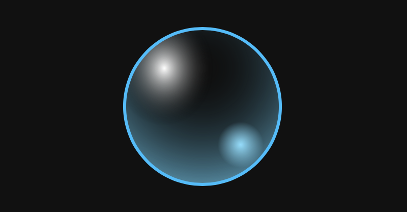
In this example, the SVG circle is continuously faded in and out via a CSS animation (see code)
The switch to GPU acceleration automatically made SVG animations more performant in Chromium-based browsers (Firefox does this too), which is definitely good news for the web:
Hooray for more screen reader-accessible, progressively enhanced SVG animations and less Canvas.
There cannot be real physical units in CSS
CSS defines six physical units, including in (inches) and cm (centimeters). Every physical unit is in a fixed ratio with the pixel unit, which is the canonical unit. For example, 1in is always exactly 96px. On most modern screens, this length does not correspond to 1 real-world inch.
The FAQ page of the CSS Working Group now answers the question why there can’t be real physical units in CSS. In short, the browser cannot always determine the exact size and resolution of the display (think projectors). For websites that need accurate real-world units, the Working Group recommends per-device calibration:
Have a calibration page, where you ask the user to measure the distance between two lines that are some CSS distance apart (say, 10cm), and input the value they get. Use this to find the scaling factor necessary for that screen (CSS length divided by user-provided length).
This scaling factor can then be set to a custom property and used to compute accurate lengths in CSS:
The Times crossword is accessible to screen reader users
The NYT Open team wrote about some of the improvements to the New York Times website that have made it more accessible in recent years. The website uses semantic HTML (<article>, <nav>, etc.), increased contrast on important components (e.g., login and registration), and skip-to-content links that adapt to the site’s paywall.
Furthermore, the Games team made the daily crossword puzzle accessible to keyboard and screen reader users. The crossword is implemented as a grid of SVG <rect> elements. As the user navigates through the puzzle, the current square’s aria-label attribute (accessible name) is dynamically updated to provide additional context.
The screen reader announces the clue, the number of letters in the solution, and the position of the selected square
You can play the mini crossword without an account. Try solving the puzzle with the keyboard.
CSS variables are resolved before the value is inherited
Yuan Chuan recently shared a little CSS quiz that I didn’t answer correctly because I wasn’t sure if a CSS variable (the var() function) is resolved before or after the value is inherited. I’ll try to explain how this works on the following example:
html {
  --text-color: var(--main-color, black);
}

footer {
  --main-color: brown;
}

p {
  color: var(--text-color);
}
The question: Is the color of the paragraph in the footer black or brown? There are two possibilities. Either (A) the declared values of both custom properties are inherited to the paragraph, and then the color property resolves to brown, or (B) the --text-color property resolves to black directly on the <html> element, and then this value is inherited to the paragraph and assigned to the color property.
The correct answer is option B (the color is black). CSS variables are resolved before the value is inherited. In this case, --text-color falls back to black because --main-color does not exist on the <html> element. This rule is specified in the CSS Variables module:
It is important to note that custom properties resolve any var() functions in their values at computed-value time, which occurs before the value is inherited.
Recently, CSS has added a lot of new cool features such as custom properties and new functions. While these things can make our lives a lot easier, they can also end up interacting with preprocessors, like Sass, in funny ways.
So this is going to be a post about the issues I’ve encountered, how I go around them, and why I still find Sass necessary these days.
The errors
If you’ve played with the new min() and max() functions, you may have ran into an error message like this when working with different units: “Incompatible units: vh and em.”
An error when working with different types of units in the min()/ max() function
This is because Sass has its ownmin() function, and ignores the CSS min() function. Plus, Sass cannot perform any sort of computation using two values with units that don’t have a fixed relation between them.
For example, cm and in units have a fixed relation between them, so Sass can figure out what’s the result of min(20in, 50cm) and doesn’t throw an error when we try to use it in our code.
The same things goes for other units. Angular units, for example, all have a fixed relation between them: 1turn, 1rad or 1grad always compute to the same deg values. Same goes for 1s which is always 1000ms, 1kHz which is always 1000Hz, 1dppx which is always 96dpi, and 1in which is always 96px. This is why Sass can convert between them and mix them in computations and inside functions such as its own min() function.
But things break when these units don’t have a fixed relation between them (like the earlier case with em and vh units).
And it’s not just different units. Trying to use calc() inside min() also results in an error. If I try something like calc(20em + 7px), the error I get is, “calc(20em + 7px) is not a number for min.”
An error when using different unit values with calc() nested in the min()function
Another problem arises when we want to use a CSS variable or the result of a mathematical CSS function (such as calc(), min() or max()) in a CSS filter like invert().
In this case, we get told that “$color: 'var(--p, 0.85) is not a color for invert.”
var() in filter: invert() error
The same thing happens for grayscale(): “$color: ‘calc(.2 + var(--d, .3))‘ is not a color for grayscale.”
calc() in filter: grayscale() error
opacity() causes the same issue: “$color: ‘var(--p, 0.8)‘ is not a color for opacity.”
var() in filter: opacity() error
However, other filter functions — including sepia(), blur(), drop-shadow(), brightness(), contrast() and hue-rotate()— all work just fine with CSS variables!
Turns out that what’s happening is similar to the min() and max() problem. Sass doesn’t have built-in sepia(), blur(), drop-shadow(), brightness(), contrast(), hue-rotate() functions, but it does have its own grayscale(), invert() and opacity() functions, and their first argument is a $color value. Since it doesn’t find that argument, it throws an error.
For the same reason, we also run into trouble when trying to use a CSS variable that lists at least two hsl()or hsla() values.
var() in color: hsl() error.
On the flip side, color: hsl(9, var(--sl, 95%, 65%)) is perfectly valid CSS and works just fine without Sass.
The exact same thing happens with the rgb()and rgba() functions.
var() in color: rgba() error.
Furthermore, if we import Compass and try to use a CSS variable inside a linear-gradient() or inside a radial-gradient(), we get another error, even though using variables inside conic-gradient() works just fine (that is, if the browser supports it).
var() in background: linear-gradient() error.
This is because Compass comes with linear-gradient() and radial-gradient() functions, but has never added a conic-gradient() one.
The problems in all of these cases arise from Sass or Compass having identically-named functions and assuming those are what we intended to use in our code.
Drat!
The solution
The trick here is to remember that Sass is case-sensitive, but CSS isn’t.
That means we can write Min(20em, 50vh)and Sass won’t recognize it as its own min() function. No errors will be thrown and it’s still valid CSS that works as intended. Similarly, writing HSL()/ HSLA()/ RGB()/ RGBA() or Invert() allows us to avoid issues we looked at earlier.
As for gradients, I usually prefer linear-Gradient() and radial-Gradient() just because it’s closer to the SVG version, but using at least one capital letter in there works just fine.
But why?
Almost every time I tweet anything Sass-related, I get lectured on how it shouldn’t be used now that we have CSS variables. I thought I’d address that and explain why I disagree.
First, while I find CSS variables immensely useful and have used them for almost everything for the past three years, it’s good to keep in mind that they come with a performance cost and that tracing where something went wrong in a maze of calc() computations can be a pain with our current DevTools. I try not to overuse them to avoid getting into a territory where the downsides of using them outweigh the benefits.
Not exactly easy to figure out what’s the result of those calc() expressions.
In general, if it acts like a constant, doesn’t change element-to-element or state-to-state (in which case custom properties are definitely the way to go) or reduce the amount of compiled CSS (solving the repetition problem created by prefixes), then I’m going to use a Sass variable.
Secondly, variables have always been a pretty small portion of why I use Sass. When I started using Sass in late 2012, it was primarily for looping, a feature we still don’t have in CSS. While I’ve moved some of that looping to an HTML preprocessor (because it reduces the generated code and avoids having to modify both the HTML and the CSS later), I still use Sass loops in plenty of cases, like generating lists of values, stop lists inside gradient functions, lists of points inside a polygon function, lists of transforms, and so on.
Here’s an example. I used to generate n HTML items with a preprocessor. The choice of preprocessor matters less, but I’ll be using Pug here.
- let n = 12;

while n--
  .item
Then I would set the $n variable into the Sass (and it would have to be equal to that in the HTML) and loop up to it to generate the transforms that would position each item:
However, this meant that I would have to change both the Pug and the Sass when changing the number of items, making the generated code very repetitive.
CSS generated by the above code
I have since moved to making Pug generate the indices as custom properties and then use those in the transform declaration.
- let n = 12;

body(style=`--n: ${n}`)
  - for(let i = 0; i < n; i++)
    .item(style=`--i: ${i}`)
Sure, I could generate it as a list variable from Pug, but doing so doesn’t take advantage of the dynamic nature of CSS variables and it doesn’t reduce the amount of code that gets served to the browser, so there’s no benefit coming out of it.
Another big part of my Sass (and Compass) use is tied to built-in mathematical functions (such as trigonometric functions), which are part of the CSS spec now, but not yet implemented in any browser. Sass doesn’t come with these functions either, but Compass does and this is why I often need to use Compass.
And, sure, I could write my own such functions in Sass. I did resort to this in the beginning, before Compass supported inverse trigonometric functions. I really needed them, so I wrote my own based on the Taylor series. But Compass provides these sorts of functions nowadays and they are better and more performant than mine.
Mathematical functions are extremely important for me as I’m a technician, not an artist. The values in my CSS usually result from mathematical computations. They’re not magic numbers or something used purely for aesthetics. A example is generating lists of clip paths points that create regular or quasi-regular polygons. Think about the case where we want to create things like non-rectangular avatars or stickers.
Let’s consider a regular polygon with vertices on a circle with a radius 50% of the square element we start from. Dragging the slider in the following demo allows us to see where the points are placed for different numbers of vertices:
Putting it into Sass code, we have:
@mixin reg-poly($n: 3) {
  $ba: 360deg/$n; // base angle
  $p: (); // point coords list, initially empty

  @for $i from 0 to $n {
    $ca: $i*$ba; // current angle
    $x: 50%*(1 + cos($ca)); // x coord of current point
    $y: 50%*(1 + sin($ca)); // y coord of current point
    $p: $p, $x $y // add current point coords to point coords list
  }

  clip-path: polygon($p) // set clip-path to list of points
}
Note that here we’re also making use of looping and of things such as conditionals and modulo that are a real pain when using CSS without Sass.
A slightly more evolved version of this might involve rotating the polygon by adding the same offset angle ($oa) to the angle of each vertex. This can be seen in the following demo. This example tosses in a star mixin that works in a similar manner, except we always have an even number of vertices and every odd-indexed vertex is situated on a circle of a smaller radius ($f*50%, where $f is sub-unitary):
We can also have chubby stars like this:
Or stickers with interesting border patterns. In this particular demo, each sticker is created with a single HTML element and the border pattern is created with clip-path, looping and mathematics in Sass. Quite a bit of it, in fact.
Another example are these card backgrounds where looping, the modulo operation and exponential functions work together to generate the dithering pixel background layers:
This demo just happens to rely heavily on CSS variables as well.
Then there’s using mixins to avoid writing the exact same declarations over and over when styling things like range inputs. Different browsers use different pseudo-elements to style the components of such a control, so for every component, we have to set the styles that control its look on multiple pseudos.
Sadly, as tempting as it may be to put this in our CSS:
input::-webkit-slider-runnable-track,
input::-moz-range-track,
input::-ms-track { /* common styles */ }
…we cannot do it because it doesn’t work! The entire rule set is dropped if even one of the selectors isn’t recognized. And since no browser recognises all three of the above, the styles don’t get applied in any browser.
We need to have something like this if we want our styles to be applied:
input::-webkit-slider-runnable-track { /* common styles */ }
input::-moz-range-track { /* common styles */ }
input::-ms-track { /* common styles */ }
But that can mean a lot of identical styles repeated three times. And if we want to change, say, the background of the track, we need to change it in the ::-webkit-slider-runnable-track styles, in the ::-moz-range-track styles and in the ::-ms-track styles.
The only sane solution we have is to use a mixin. The styles get repeated in the compiled code because they have to be repeated there, but we don’t have to write the same thing three times anymore.
You have noticed that there is a new design trend that is floating around web design since 2019, the dark mode. Facebook, Apple, and Google both introduced the dark version of their software.
Why a dark theme
Most of you probably think this is just a trend that will disappear after some years, well, let me say that this is not like many other trends, dark UI provide different advantages and they are not something just related to the “designer mood”. Let’s see why a dark mode on your applications and websites are something useful.
Better for batteries
Pixels on a screen consume more energy to display light colors rather than dark ones. Consequently, devices’ batteries can save energy and improve their daily duration while using dark UI.
Better for dark environments
Most of us use their smartphone and laptops while at home. Such environments are typically not so bright. The dark mode can help the use of the application while indoor, without causing visual disturbances.
Better for people
Some people with — or without — visual diseases, like epilepsy, can have unfortunate events by being flashed by bright applications. Having a dark mode means being more accessible.
Preparing styles
A very simple theme switcher should offer at least 3 options:
Dark theme
Light theme
Automatic theme (should be on by default)
Wait, what’s the automatic theme? Well, modern operating systems allow users to change the global visual appearance by setting os-wide options that enable the dark or light mode. The automatic option make sure to respect the OS preference if the user has not specified any theme.
To make this even more simple, we’ll use PostCSS and a simple but useful plugin called postcss-dark-theme-class.
yarn add postcss-dark-theme-class
This plugin will do 70% of the work, once installed, add it to your PostCSS config and configure the selectors you want to use to activate the correct theme, which will be used by the plugin to generate the correct CSS:
Once the plugin is up and running, we can start defining our dark and light themes using a CSS specific media query prefers-color-scheme. This special media query will handle the automatic part of our themes by applying the correct theme based on the user’s OS preferences:
If the user is using a dark version of his OS, the set inside the media query will apply, overwriting others, otherwhise the set of properties outside the media query is used. Since it’s pure CSS, this behaviour is on by default.
Browsers will now adapt the color scheme automatically based on the users’ OS preferences. Nice done! 🚀 Now it’s time to make the theme switcher allow users to specify what theme to use, overriding the OS preference.
We’ll build the switcher using vanilla JS, but you can do it with any framework you want, the concept is the same: we have to add the selectors we defined inside the PostCSS plugin to the root element, based on the clicked button.
Each time we click on a theme button, the value set as data-set-theme is applied as value of the data-theme attribute on the docEach time we click on a theme button, the value set as `data-set-theme` is applied as value of the `data-theme` attribute on the document root element, we also change the [aria-current] attribute.
Check it live:
Where is the magic?
The magic is made by postcss-dark-theme-class — which will add our [data-theme] custom attribute to the :root selectors we wrote — during the CSS transpilation. Here what it generates from our code:
You may notice that the --accent-color custom property defined inside themes doesn’t change. If you have colors that will not change based on the theme, you can remove them from the prefers-color-scheme at-rule.
In this way, they will not be duplicated and the one defined outside the media query will always apply.
The first part of this two-part series detailed how we can get a two-thumb slider. Now we'll look at a general multi-thumb case, but with a different and better technique for creating the fills in between the thumbs. And finally, we'll dive into the how behind the styling a realistic 3D-looking slider and a flat one.
This is a concept I first came across a few years back when Lea Verou wrote an article on it. Multi-range sliders have sadly been removed from the spec since, but something else that has happened in the meanwhile is that CSS got better — and so have I, so I recently decided to make my own 2019 version.
In this two-part article, we'll go through the how, step-by-step, first building an example with two thumbs, then identify the issues with it. We'll solve those issues, first for the two-thumb case then, in part two, come up with a better solution for the multi-thumb case.
Note how the thumbs can pass each other and we can have any possible order, with the fills in between the thumbs adapting accordingly. Surprisingly, the entire thing is going to require extremely little JavaScript.
Article Series:
Multi-Thumb Sliders: Particular Two-Thumb Case (This Post)
Multi-Thumb Sliders: General Case (Coming Tomorrow!)
Basic structure
We need two range inputs inside a wrapper. They both have the same minimum and maximum value (this is very important because nothing is going to work properly otherwise), which we set as custom properties on the wrapper (--min and --max). We also set their values as custom properties (--a and --b).
- let min = -50, max = 50
- let a = -30, b = 20;

.wrap(style=`--a: ${a}; --b: ${b}; --min: ${min}; --max: ${max}`)
  input#a(type='range' min=min value=a max=max)
  input#b(type='range' min=min value=b max=max)
We have two range inputs and they should probably each have a <label>, but we want our multi-thumb slider to have a single label. How do we solve this issue? We can make the wrapper a <fieldset>, use its <legend> to describe the entire multi-thumb slider, and have a <label> that's only visible to screen readers for each of our range inputs. (Thanks to Zoltan for this great suggestion.)
But what if we want to have a flex or grid layout on our wrapper? That's something we probably want, as the only other option is absolute positioning and that comes with its own set of issues. Then we run into a Chromium issue where <fieldset> cannot be a flex or grid container.
To go around this, we use the following ARIA equivalent (which I picked up from this post by Steve Faulkner):
- let min = -50, max = 50
- let a = -30, b = 20;

.wrap(role='group' aria-labelledby='multi-lbl' style=`--a: ${a}; --b: ${b}; --min: ${min}; --max: ${max}`)
  #multi-lbl Multi thumb slider:
  label.sr-only(for='a') Value A:
  input#a(type='range' min=min value=a max=max)
  label.sr-only(for='b') Value B:
  input#b(type='range' min=min value=b max=max)
If we set an aria-label or an aria-labelledby attribute on an element, we also need to give it a role.
Basic styling
We make the wrapper a middle-aligned grid with two rows and one column. The bottom grid cell gets the dimensions we want for the slider, while the top one gets the same width as the slider, but can adjust its height according to the group label's content.
To visually hide the <label> elements, we absolutely position them and clip them to nothing:
.wrap {
  // same as before
  overflow: hidden; // in case <label> elements overflow
  position: relative;
}

.sr-only {
  position: absolute;
  clip-path: inset(50%);
}
Some people might shriek about clip-path support, like how using it cuts out pre-Chromium Edge and Internet Explorer, but it doesn't matter in this particular case! We're getting to the why behind that in a short bit.
We place the sliders, one on top of the other, in the bottom grid cell:
We can already notice a problem however: not only does the top slider track show up above the thumb of the bottom one, but the top slider makes it impossible for us to even click and interact with the bottom one using a mouse or touch.
In order to fix this, we remove any track backgrounds and borders and highlight the track area by setting a background on the wrapper instead. We also set pointer-events: none on the actual <input> elements and then revert to auto on their thumbs.
@mixin track() {
  background: none; /* get rid of Firefox track background */
  height: 100%;
  width: 100%;
}

@mixin thumb() {
  background: currentcolor;
  border: none; /* get rid of Firefox thumb border */
  border-radius: 0; /* get rid of Firefox corner rounding */
  pointer-events: auto; /* catch clicks */
  width: $h; height: $h;
}

.wrap {
  /* same as before */
  background: /* emulate track with wrapper background */
    linear-gradient(0deg, #ccc $h, transparent 0);
}

input[type='range'] {
  &::-webkit-slider-runnable-track,
  &::-webkit-slider-thumb, & { -webkit-appearance: none; }

  /* same as before */
  background: none; /* get rid of white Chrome background */
  color: #000;
  font: inherit; /* fix too small font-size in both Chrome & Firefox */
  margin: 0;
  pointer-events: none; /* let clicks pass through */

  &::-webkit-slider-runnable-track { @include track; }
  &::-moz-range-track { @include track; }

  &::-webkit-slider-thumb { @include thumb; }
  &::-moz-range-thumb { @include thumb; }
}
Note that we've set a few more styles on the input itself as well as on the track and thumb in order to make the look consistent across the browsers that support letting clicks pass through the actual input elements and their tracks, while allowing them on the thumbs. This excludes pre-Chromium Edge and IE, which is why we haven't included the -ms- prefix — there's no point styling something that wouldn't be functional in these browsers anyway. This is also why we can use clip-path to hide the <label> elements.
If you'd like to know more about default browser styles in order to understand what's necessary to override here, you can check out this article where I take an in-depth look at range inputs (and where I also detail the reasoning behind using mixins here).
Alright, we now have something that looks functional. But in order to really make it functional, we need to move on to the JavaScript!
Functionality
The JavaScript is pretty straightforward. We need to update the custom properties we've set on the wrapper. (For an actual use case, they'd be set higher up in the DOM so that they're also inherited by the elements whose styles that depend on them.)
addEventListener('input', e => {
  let _t = e.target;
  _t.parentNode.style.setProperty(`--${_t.id}`, +_t.value)
}, false);
However, unless we bring up DevTools to see that the values of those two custom properties really change in the style attribute of the wrapper .wrap, it's not really obvious that this does anything. So let's do something about that!
Showing values
Something we can do to make it obvious that dragging the thumbs actually changes something is to display the current values. In order to do this, we use an output element for each input:
- let min = -50, max = 50
- let a = -30, b = 20;

.wrap(role='group' aria-labelledby='multi-lbl' style=`--a: ${a}; --b: ${b}; --min: ${min}; --max: ${max}`)
  #multi-lbl Multi thumb slider:
  label.sr-only(for='a') Value A:
  input#a(type='range' min=min value=a max=max)
  output(for='a' style='--c: var(--a)')
  label.sr-only(for='b') Value B:
  input#b(type='range' min=min value=b max=max)
  output(for='b' style='--c: var(--b)')
It's now obvious these values change as we drag the sliders, but the result is ugly and it has messed up the wrapper background alignment, so let's add a few tweaks! We could absolutely position the <output> elements, but for now, we simply squeeze them in a row between the group label and the sliders:
.wrap {
  // same as before
  grid-template: repeat(2, max-content) #{$h}/ 1fr 1fr;
}

[id='multi-lbl'] { grid-column: 1/ span 2 }

input[type='range'] {
  // same as before
  grid-column: 1/ span 2;
  grid-row: 3;
}

output {
  grid-row: 2;

  &:last-child { text-align: right; }

  &::after {
    content: '--' attr(for) ': ' counter(c) ';'
    counter-reset: c var(--c);
  }
}
All we need now is to create the fill between the thumbs.
The tricky part
We can recreate the fill with an ::after pseudo-element on the wrapper, which we place on the bottom grid row where we've also placed the range inputs. This pseudo-element comes, as the name suggests, after the inputs, but it will still show up underneath them because we've set positive z-index values on them. Note that setting the z-index works on the inputs (without explicitly setting their position to something different from static) because they're grid children.
The width of this pseudo-element should be proportional to the difference between the higher input value and the lower input value. The big problem here is that they pass each other and we have no way of knowing which has the higher value.
First approach
My first idea on how to solve this was by using width and min-width together. In order to better understand how this works, consider that we have two percentage values, --a and --b, and we want to make an element's width be the absolute value of the difference between them.
Either one of the two values can be the bigger one, so we pick an example where --b is bigger and an example where --a is bigger:
<div style='--a: 30%; --b: 50%'><!-- first example, --b is bigger --></div>
<div style='--a: 60%; --b: 10%'><!-- second example, --a is bigger --></div>
We set width to the second value (--b) minus the first (--a) and min-width to the first value (--a) minus the second one (--b).
If the second value (--b) is bigger, then the width is positive (which makes it valid) and the min-width negative (which makes it invalid). That means the computed value is the one set via the width property. This is the case in the first example, where --b is 70% and --a is 50%. That means the width computes to 70% - 50% = 20%, while the min-width computes to 50% - 70% = -20%.
If the first value is bigger, then the width is negative (which makes it invalid) and the min-width is positive (which makes it valid), meaning the computed value is that set via the min-width property. This is the case in the second example, where --a is 80% and --b is 30%, meaning the width computes to 30% - 80% = -50%, while the min-width computes to 80% - 30% = 50%.
In order to represent the width and min-width values as percentages, we need to divide the difference between our two values by the difference (--dif) between the maximum and the minimum of the range inputs and then multiply the result we get by 100%.
The ::after always has the right computed width, but we also need to offset it from the track minimum by the smaller value and we can't use the same trick for its margin-left property.
My first instinct here was to use left, but actual offsets don't work on their own. We'd have to also explicitly set position: relative on our ::after pseudo-element in order to make it work. I felt kind of meh about doing that, so I opted for margin-left instead.
The question is what approach can we take for this second property. The one we've used for the width doesn't work because there is no such thing as min-margin-left.
A min() function is now in the CSS spec, but at the time when I coded these multi-thumb sliders, it was only implemented by Safari (it has since landed in Chrome as well). Safari-only support was not going to cut it for me since I don't own any Apple device or know anyone in real life who does... so I couldn't play with this function! And not being able to come up with a solution I could actually test meant having to change the approach.
Second approach
This involves using both of our wrapper's (.wrap) pseudo-elements: one pseudo-element's margin-left and width being set as if the second value is bigger, and the other's set as if the first value is bigger.
With this technique, if the second value is bigger, the width we're setting on ::before is positive and the one we're setting on ::after is negative (which means it's invalid and the default of 0 is applied, hiding this pseudo-element). Meanwhile, if the first value is bigger, then the width we're setting on ::before is negative (so it's this pseudo-element that has a computed width of 0 and is not being shown in this situation) and the one we're setting on ::after is positive.
Similarly, we use the first value (--a) to set the margin-left property on the ::before since we assume the second value --b is bigger for this pseudo-element. That means --a is the value of the left end and --b the value of the right end.
For ::after, we use the second value (--b) to set the margin-left property, since we assume the first value --a is bigger this pseudo-element. That means --b is the value of the left end and --a the value of the right end.
Let's see how we put it into code for the same two examples we previously had, where one has --b bigger and another where --a is bigger:
We now have a nice functional slider with two thumbs. But this solution is far from perfect.
Issues
The first issue is that we didn't get those margin-left and width values quite right. It's just not noticeable in this demo due to the thumb styling (such as its shape, dimensions relative to the track, and being full opaque).
But let's say our thumb is round and maybe even smaller than the track height:
We can now see what the problem is: the endlines of the fill don't coincide with the vertical midlines of the thumbs.
This is because of the way moving the thumb end-to-end works. In Chrome, the thumb's border-box moves within the limits of the track's content-box, while in Firefox, it moves within the limits of the slider's content-box. This can be seen in the recordings below, where the padding is transparent, while the content-box and the border are semi-transparent. We've used orange for the actual slider, red for the track and purple for the thumb.
Recording of the thumb motion in Chrome from one end of the slider to the other.
Note that the track's width in Chrome is always determined by that of the parent slider - any width value we may set on the track itself gets ignored. This is not the case in Firefox, where the track can also be wider or narrower than its parent <input>. As we can see below, this makes it even more clear that the thumb's range of motion depends solely on the slider width in this browser.
Recording of the thumb motion in Firefox from one end of the slider to the other. The three cases are displayed from top to bottom. The border-box of the track perfectly fits the content-box of the slider horizontally. It's longer and it's shorter).
In our particular case (and, to be fair, in a lot of other cases), we can get away with not having any margin, border or padding on the track. That would mean its content-box coincides to that of the actual range input so there are no inconsistencies between browsers.
But what we need to keep in mind is that the vertical midlines of the thumbs (which we need to coincide with the fill endpoints) move between half a thumb width (or a thumb radius if we have a circular thumb) away from the start of the track and half a thumb width away from the end of the track. That's an interval equal to the track width minus the thumb width (or the thumb diameter in the case of a circular thumb).
This can be seen in the interactive demo below where the thumb can be dragged to better see the interval its vertical midline (which we need to coincide with the fill's endline) moves within.
The fill width and margin-left values are not relative to 100% (or the track width), but to the track widthminus the thumb width (which is also the diameter in the particular case of a circular thumb). Also, the margin-left values don't start from 0, but from half a thumb width (which is a thumb radius in our particular case).
This one issue has been taken care of, but we still have a way bigger one. Let's say we want to have more thumbs, say four:
An example with four thumbs.
We now have four thumbs that can all pass each other and they can be in any order that we have no way of knowing. Moreover, we only have two pseudo-elements, so we cannot apply the same techniques. Can we still find a CSS-only solution?
Well, the answer is yes! But it means scrapping this solution and going for something different and way more clever — in part two of this article!
Article Series:
Multi-Thumb Sliders: Particular Two-Thumb Case (This Post)
Multi-Thumb Sliders: General Case (Coming Tomorrow!)
You’re probably already at least a little familiar with CSS variables. If not, here’s a two-second overview: they are really called custom properties, you set them in declaration blocks like --size: 1em and use them as values like font-size: var(--size);, they differ from preprocessor variables (e.g. they cascade), and here’s a guide with way more information.
But are we using them to their full potential? Do we fall into old habits and overlook opportunities where variables could significantly reduce the amount of code we write?
This article was prompted by a recent tweet I made about using CSS variables to create dynamic animation behavior.
That’s an awful lot of code for something not particularly complex. We haven’t added many styles and we’ve added a lot of rules to cater to the button’s different states and colors. We could significantly reduce the code with a scoped variable.
In our example, the only differing value between the two button variants is the hue. Let’s refactor that code a little then. We won’t change the markup but cleaning up the styles a little, we get this:
This not only reduces the code but makes maintenance so much easier. Change the core button styles in one place and it will update all the variants! 🙌
I’d likely leave it there to make it easier for devs wanting to use those buttons. But, we could take it further. We could inline the variable on the actual element and remove the class declarations completely. 😲
Inlining those variables might not be best for your next design system or app but it does open up opportunities. Like, for example, if we had a button instance where we needed to override the color.
You may be writing straightforward HTML, but in many cases, you may be using a framework, like React or a preprocessor like Pug, to write your markup. These solutions allow you to leverage JavaScript to create random inline variables. For the following examples, I’ll be using Pug. Pug is an indentation-based HTML templating engine. If you aren’t familiar with Pug, do not fear! I’ll try to keep the markup simple.
Let’s start by randomizing the hue for our buttons:
button.button(style=`--hue: ${Math.random() * 360}`) First
With Pug, we can use ES6 template literals to inline randomized CSS variables. 💪
So, now that we have the opportunity to define random characteristics for an element, what else could we do? Well, one overlooked opportunity is animation. True, we can’t animate the variable itself, like this:
@keyframes grow {
  from { --scale: 1; }
  to   { --scale: 2; }
}
But we can create dynamic animations based on scoped variables. We can change the behavior of animation on the fly! 🤩
Example 1: The excited button
Let’s create a button that floats along minding its own business and then gets excited when we hover over it.
Start with the markup:
button.button(style=`--hue: ${Math.random() * 360}`) Show me attention
But, we need to introduce another keyframes definition. What if we could merge the two animations into one? They aren’t too far off from each other in terms of structure.
Although this works, we end up with an animation that isn’t quite as smooth because of the translation steps. So what else could we do? Let’s find a compromise by removing the steps at 25% and 75%.
Nice! Now our button has two different types of animations but defined via one set of keyframes. 🤯
Let’s have a little more fun with it. If we take it a little further, we can make the button a little more playful and maybe stop animating altogether when it’s active. 😅
Now that we’ve gone through some different techniques for things we can do with the power of scope, let’s put it all together. We are going to create a randomly generated bubble scene that heavily leverages scoped CSS variables.
Let’s start by creating a bubble. A static bubble.
We are using background with multiple values and a border to make the bubble effect — but it’s not very dynamic. We know the border-radius will always be the same. And we know the structure of the border and background will not change. But the values used within those properties and the other property values could all be random.
Let’s add some more bubbles and leverage the inline scope to position them as well as size them. Since we are going to start randomizing more than one value, it’s handy to have a function to generate a random number in range for our markup.
- const randomInRange = (max, min) => Math.floor(Math.random() * (max - min + 1)) + min
With Pug, we can utilize iteration to create a large set of bubbles:
- const baseHue = randomInRange(0, 360)
- const bubbleCount = 50
- let b = 0
while b < bubbleCount
  - const size = randomInRange(10, 50)
  - const x = randomInRange(0, 100)
  .bubble(style=`--x: ${x}; --size: ${size}; --hue: ${baseHue}`)
  - b++
Updating our .bubble styling allows us to make use of the new inline variables.
That’s pretty boring. They all do the same thing at the same time. So let’s randomize the speed, delay, end scale and distance each bubble is going to travel.
Very often, while using switch variables (a variable that's either 0 or 1, a concept that's explained in a greater detail in in this post), I wish I could perform logical operations on them. We don't have functions like not(var(--i)) or and(var(--i), var(--k)) in CSS, but we can emulate these and more with arithmetic operations in a calc() function.
This article is going to show you what calc() formulas we need to use for each logical operation and explain how and why they are used with a couple of use cases that lead to the writing of this article.
How: the formulas
not
This is a pretty straightforward one: we subtract the switch variable (let's call it --j) from 1:
--notj: calc(1 - var(--j))
If --j is 0, then --notj is 1 (1 - 0). If j is 1, then --notj is 0 (1 - 1).
and
Now, if you've ever taken electronics classes (particularly something like Programmed Logic Systems or Integrated Circuits), then you already know what formula we need to use here. But let's not jump straight into it.
The and of two operands is true if and only if both are true. The two operands in our case are two switch variables (let's call them --k and --i). Each of them can be either 0 or 1, independently of the other. This means we can be in one out of four possible scenarios:
--k: 0, --i: 0
--k: 0, --i: 1
--k: 1, --i: 0
--k: 1, --i: 1
The result of the and operation is 1 if both our switch variables are 1 and 0 otherwise. Looking at it the other way, this result is 0 if at least one of the two switch variables is 0.
Now you need to think of it this way: the result of what arithmetic operation is 0 if at least one of the two operands is 0? That's multiplication, as multiplying anything by 0 gives us 0!
So, our --and formula is:
--and: calc(var(--k)*var(--i))
Considering each of our four possible scenarios, we have:
for --k: 0, --i: 0, we have that --and is 0 (0*0)
for --k: 0, --i: 1, we have that --and is 0 (0*1)
for --k: 1, --i: 0, we have that --and is 0 (1*0)
for --k: 1, --i: 1, we have that --and is 1 (1*1)
nand
Since nand is not and, we need to replace the --j in the not formula with the formula for and:
--nand: calc(1 - var(--k)*var(--i))
For each of our four possible scenarios, we get:
for --k: 0, --i: 0, we have that --nand is 1 (1 - 0*0 = 1 - 0)
for --k: 0, --i: 1, we have that --nand is 1 (1 - 0*1 = 1 - 0)
for --k: 1, --i: 0, we have that --nand is 1 (1 - 1*0 = 1 - 0)
for --k: 1, --i: 1, we have that --nand is 0 (1 - 1*1 = 1 - 1)
or
The result of the or operation is 1 if at least one of our switch variables is 1 and 0 otherwise (if both of them are 0).
The first instinct here is to go for addition, but while that gives us 0 if both --k and --i are 0 and 1 if one is 0 and the other one is 1, it gives us 2 if both of them are 1. So that doesn't really work.
But we can use the good old De Morgan's laws, one of which states:
not (A or B) = (not A) and (not B)
This means the result of the or operation is the negation of the and operation between the negations of --k and --i. Putting this into CSS, we have:
--or: calc(1 - (1 - var(--k))*(1 - var(--i)))
For each scenario, we get:
for --k: 0, --i: 0, we have that --or is 0 (1 - (1 - 0)*(1 - 0) = 1 - 1*1 = 1 - 1)
for --k: 0, --i: 1, we have that --or is 1 (1 - (1 - 0)*(1 - 1) = 1 - 1*0 = 1 - 0)
for --k: 1, --i: 0, we have that --or is 1 (1 - (1 - 1)*(1 - 0) = 1 - 0*1 = 1 - 0)
for --k: 1, --i: 1, we have that --or is 1 (1 - (1 - 1)*(1 - 1) = 1 - 0*0 = 1 - 0)
nor
Since nor is not or, we have:
--nor: calc((1 - var(--k))*(1 - var(--i)))
For each of our four possible scenarios, we get:
for --k: 0, --i: 0, we have that --nor is 1 ((1 - 0)*(1 - 0) = 1*1)
for --k: 0, --i: 1, we have that --nor is 0 ((1 - 0)*(1 - 1) = 1*0)
for --k: 1, --i: 0, we have that --nor is 0 ((1 - 1)*(1 - 0) = 0*1)
for --k: 1, --i: 1, we have that --nor is 0 ((1 - 1)*(1 - 1) = 0*0)
xor
The result of the xor operation is 1 when one of the two operands is 1 and the other one is 0. This feels trickier at first, but, if we think this means the two operands need to be different for the result to be 1 (otherwise it's 0), we stumble upon the right arithmetic operation to use inside calc(): subtraction!
If --k and --i are equal, then subtracting --i from --k gives us 0. Otherwise, if we have --k: 0, --i: 1, the result of the same subtraction is -1; if we have --k: 1, --i: 0, the result is 1.
Close, but not quite! We get the result we want in three out of four scenarios, but we need to get 1, not -1 in the --k: 0, --i: 1 scenario.
However, one thing that -1, 0 and 1 have in common is that multiplying them with themselves gives us their absolute value (which is 1 for both -1 and 1). So the actual solution is to multiply this difference with itself:
Testing each of our four possible scenarios, we have:
for --k: 0, --i: 0, we have that --xor is 0 ((0 - 0)*(0 - 0) = 0*0)
for --k: 0, --i: 1, we have that --xor is 1 ((0 - 1)*(0 - 1) = -1*-1)
for --k: 1, --i: 0, we have that --xor is 1 ((1 - 0)*(1 - 0) = 1*1)
for --k: 1, --i: 1, we have that --xor is 0 ((1 - 1)*(1 - 1) = 0*0)
Why: Use cases
Let's see a couple of examples that make use of logical operations in CSS. Note that I won't detail other aspects of these demos as they're outside the scope of this particular article.
Hide disabled panel only on small screens
This is a use case I came across while working on an interactive demo that lets users control various parameters to change a visual result. For more knowledgeable users, there's also a panel of advanced controls that's disabled by default. It can, however, be enabled in order to get access to manually controlling even more parameters.
Since this demo is supposed to be responsive, the layout changes with the viewport. We also don't want things to get crammed on smaller screens if we can avoid it, so there's no point in showing the advanced controls if they're disabled and we're in the narrow screen case.
The screenshot collage below shows the results we get for each the four possible scenarios.
Collage of the possible cases.
So let's see what this means in terms of CSS!
First off, on the <body>, we use a switch that goes from 0 in the narrow screen case to 1 in the wide screen case. We also change the flex-direction this way (if you want a more detailed explanation of how this works, check out my second article on DRY switching with CSS variables).
We then have a second switch on the advanced controls panel. This second switch is 0 if the checkbox is unchecked and 1 if the checkbox is :checked. With the help of this switch, we give our advanced controls panel a disabled look (via a filter chain) and we also disable it (via pointer-events). Here, not comes in handy, as we want to decrease the contrast and the opacity in the disabled case:
We want the advanced controls panel to stay expanded if we're in the wide screen case (so if --k is 1), regardless of whether the checkbox is :checked or not, or if the checkbox is :checked (so if --i is 1), regardless of whether we're in the wide screen case or not.
This is precisely the or operation!
So we compute an --or variable:
.advanced {
  /* same as before */
  --or: calc(1 - (1 - var(--k))*(1 - var(--i)));
}
If this --or variable is 0, this means we're in the narrow screen case and our checkbox is unchecked, so we want to zero the height of the advanced controls panel and also its vertical margin:
.advanced {
  /* same as before */
  margin: calc(var(--or)*#{$mv}) 0;
  height: calc(var(--or)*#{$h});
}
Use the same formulas to position multiple faces of a 3D shape
This is a use case I came across while working on the personal project of CSS-ing the Johnson solids this summer.
Let's take a look at one of these shapes, for example, the gyroelongated pentagonal rotunda (J25), in order to see how logical operations are useful here.
The shape we want to get.
This shape is made up out of a pentagonal rotunda without the big decagonal base and a decagonal antiprism without its top decagon. The interactive demo below shows how these two components can be built by folding their nets of faces into 3D and then joined to give us the shape we want.
As it can be seen above, the faces are either a part of the antiprism or a part of the rotunda. This is where we introduce our first switch variable --i. This is 0 for the faces that are a part of the antiprism and 1 for the faces that are a part of the rotunda. The antiprism faces have a class of .mid because we can add another rotunda to the other antiprism base and then the antiprism would be in the middle. The rotunda faces have a class of .cup because this part does look like a coffee cup... without a handle!
The rotunda looks like an upside down up cup without a handle.
.mid { --i: 0 }
.cup { --i: 1 }
Focusing only on the lateral faces, these can have a vertex pointing up or down. This is where we introduce our second variable --k. This is 0 if they have a vertex pointing up (such faces have a .dir class) and 1 if they're reversed and have a vertex pointing down (these faces have a class of .rev)
.dir { --k: 0 }
.rev { --k: 1 }
The antiprism has 10 lateral faces (all triangles) pointing up, each attached to an edge of its decagonal base that's also a base for the compound shape. It also has 10 lateral faces (all triangles as well) pointing down, each attached to an edge of its other decagonal base (the one that's also the decagonal base of the rotunda and is therefore not a base for the compound shape).
The rotunda has 10 lateral faces pointing up, alternating triangles and pentagons, each attached to the decagonal base that's also a base for the antiprism (so it's not a base for the compound shape as well). It also has 5 lateral faces, all triangles, pointing down, each attached to an edge of its pentagonal base.
The interactive demo below allows us to better see each of these four groups of faces by highlighting only one at a time. You can use the arrows at the bottom to pick which group of faces gets highlighted. You can also enable the rotation around the y axis and change the shape's tilt.
As previously mentioned, the lateral faces can be either triangles or pentagons:
.s3gon { --p: 0 }
.s5gon { --p: 1 }
Since all of their lateral faces (.lat) of both the antiprism and the rotunda have one edge in common with one of the two base faces of each shape, we call these common edges the base edges of the lateral faces.
The interactive demo below highlights these edges, their end points and their mid points and allows viewing the shapes from various angles thanks to the auto-rotations around the y axis which can be started/ paused at any moment and to the manual rotations around the x axis which can be controlled via the sliders.
In order to make things easier for ourselves, we set the transform-origin of the .lat faces on the middle of their base edges (bottom horizontal edges).
Highlighting the base edges and their midpoints (live).
We also make sure we position these faces such as to have these midpoints dead in the middle of the scene element containing our entire 3D shape.
Having the transform-origin coincide with the midpoint the base edge means that any rotation we perform on a face is going to happen around the midpoint of its base edge, as illustrated by the interactive demo below:
We place our lateral faces where we want them to be in four steps:
We rotate them around their y axis such that their base edges are now parallel to their final positions. (This also rotates their local system of coordinates — the z axis of an element always points in the direction that element faces.)
We translate them such that their base edges coincide with their final positions (along the edges of the base faces of the two components).
If they need to have a vertex pointing down, we rotate them around their z axis by half a turn.
We rotate them around their x axis into their final positions
These steps are illustrated by the interactive demo below, where you can go through them and also rotate the entire shape (using the play/pause button for the y axis rotation and the slider for the x axis rotation).
The y axis rotation value is based mostly on the face indices and less on our switch variables, though it depends on these as well.
The structure is as follows:
- var n = 5; //- number of edges/ vertices of small base

section.scene
  //- 3D shape element
  .s3d
    //- the faces, each a 2D shape element (.s2d)

    //- lateral (.lat) antiprism (.mid) faces,
    //- first half pointing up (.dir), others pointing down (.rev)
    //- all of them being triangles (.s3gon)
    - for(var j = 0; j < 4*n; j++)
      .s2d.mid.lat.s3gon(class=j < 2*n ? 'dir' : 'rev')

    //- lateral (.lat) rotunda (.cup) faces that point up (.dir),
    //- both triangles (.s3gon) and pentagons (.s5gon)
    - for(var j = 0; j < n; j++)
      .s2d.cup.lat.s3gon.dir
      .s2d.cup.lat.s5gon.dir
    //- lateral (.lat) rotunda (.cup) faces that point down (.rev)
    //- all of them triangles (.s3gon)
    - for(var j = 0; j < n; j++)
      .s2d.cup.lat.s3gon.rev

    //- base faces,
    //- one for the antiprism (.mid),
    //- the other for the rotunda (.cup)
    .s2d.mid.base(class=`s${2*n}gon`)
    .s2d.cup.base(class=`s${n}gon`)
Which gives us the following HTML:
<section class="scene">
  <div class="s3d">
    <!-- LATERAL faces -->
    <div class="s2d mid lat s3gon dir"></div>
    <!-- 9 more identical faces,
         so we have 10 lateral antiprism faces pointing up -->

    <div class="s2d mid lat s3gon rev"></div>
    <!-- 9 more identical faces,
         so we have 10 lateral antiprism faces pointing down -->

    <div class="s2d cup lat s3gon dir"></div>
    <div class="s2d cup lat s5gon dir"></div>
    <!-- 4 more identical pairs,
         so we have 10 lateral rotunda faces pointing up -->

    <div class="s2d cup lat s3gon rev"></div>
    <!-- 4 more identical faces,
         so we have 5 lateral rotunda faces pointing down -->

    <!-- BASE faces -->
    <div class="s2d mid base s10gon"></div>
    <div class="s2d cup base s5gon"></div>
  </div>
</section>
This means faces 0... 9 are the 10 lateral antiprism faces pointing up, faces 10... 19 are the 10 lateral antiprism faces pointing down, faces 20... 29 are the 10 lateral rotunda faces pointing up and faces 30... 34 are the 5 lateral rotunda faces pointing down.
So what we do here is set an index --idx on the lateral faces.
$n: 5; // number of edges/ vertices of small base

.lat {
  @for $i from 0 to 2*$n {
    &:nth-child(#{2*$n}n + #{$i + 1}) { --idx: #{$i} }
  }
}
This index starts at 0 for each group of faces, which means the indices for faces 0... 9, 10... 19 and 20... 29 go from 0 through 9, while the indices for faces 30... 34 go from 0 through 4. Great, but if we just multiply these indices with the base angle1 of the common decagon to get the y axis rotation we want at this step:
...then we get the following final result. I'm showing the final result here because it's a bit difficult to see what's wrong by looking at the intermediate result we get after only applying the rotation around the y axis.
So let's see what problems the above result has and how to solve them with the help of our switch variables and boolean operations on them.
The first issue is that the lateral antiprism faces pointing up need to be offset by half of a regular decagon's base angle. This means adding or subtracting .5 from --idx before multiplying with the base angle, but only for these faces.
The second issue is that the lateral rotunda faces pointing down are not distributed as they should be, such that each of them has a base edge in common with the base pentagon and the vertex opposing the base in common with the triangular rotunda faces pointing up. This means multiplying --idx by 2, but only for these faces.
What we're targeting now are the faces for which both --i and --k are 1 (so the faces for which the result of the and operation is 1), so what we need is to multiply --idx with 1 plus their and:
The next step is the translation for which we use translate3d(). We don't move any of our faces left or right, so the value along the x axis is always 0. We do move them however vertically (along the y axis) and forward (along the z axis)
Vertically, we want the cup faces that will later get rotated to point down to have their base edge in the plane of the small (pentagonal) base of the cup (and of the compound shape). This means the faces for which --i is 1 and --k is 1 get moved up (negative direction) by half the total height of the compound shape (a total height which we have computed to be $h). So we need the and operation here.
// same as before
--and: calc(var(--i)*var(--k));
--y: calc(var(--and)*#{-.5*$h});

transform: rotatey(var(--ay))
           translate3d(0, var(--y, 0), var(--z, 0));
We also want all the other cup faces as well as the antiprism faces that will eventually point down to have their base edge in the common plane between the cup and the antiprism. This means the faces for which --i is 1 and --k is 0 as well as the faces for which --i is 0 and --k is 1 get translated down (positive direction) by half the height of the compound shape and then back up (negative direction) by the height of the antiprism ($h-mid). And what do you know, this is the xor operation!
// same as before
--xor: calc((var(--k) - var(--i))*(var(--k) - var(--i)));
--and: calc(var(--i)*var(--k));
--y: calc(var(--xor)*#{.5*$h - $h-mid} -
          var(--and)*#{.5*$h});

transform: rotatey(var(--ay))
           translate3d(0, var(--y, 0), var(--z, 0));
Finally, we want the antiprism faces that will remain pointing up to be in the bottom base plane of the compound shape (and of the antiprism). This means the faces for which --i is 0 and --k is 0 get translated down (positive direction) by half the total height of the compound shape. So what we use here is the nor operation!
Along the z direction, we want to move the faces such that their base edges coincide with the edges of the base faces of the compound shape or the edges of the common base (which is not a face of the compound shape) shared by the two 3D components. For the top faces of the cup (which we later rotate to point down), the placement is on the edges of a pentagon, while for all the other faces of the compound shape, the placement is on the edges of a decagon.
This means the faces for which --i is 1 and --k is 1 get translated forward by the inradius of the pentagonal base while all the other faces get translated forward by the inradius of a decagonal base. So the operations we need here are and and nand!
// same as before
--and: calc(var(--i)*var(--k));
--nand: calc(1 - var(--and));
--z: calc(var(--and)*#{$ri5gon} + var(--nand)*#{$ri10gon});

transform: rotatey(var(--ay))
           translate3d(0, var(--y, 0), var(--z, 0));
Next, we want to make all .rev (for which --k is 1) faces point down. This is pretty straightforward and doesn't require any logical operation, we just need to add a half a turn rotation around the z axis to the transform chain, but only for the faces for which --k is 1:
// same as before
--az: calc(var(--k)*.5turn);

transform: rotatey(var(--ay))
           translate3d(0, var(--y), var(--z))
           rotate(var(--az));
The pentagonal faces (for which --p is 1) are then all rotated around the x axis by a certain angle:
--ax: calc(var(--p)*#{$ax5});
In the case of the triangular faces (for which --p is 0, meaning we need to use --notp), we have a certain rotation angle for the faces of the antiprism ($ax3-mid), another angle for the faces of the rotunda that point up ($ax3-cup-dir) and yet another angle for the rotunda faces pointing down ($ax3-cup-red).
The antiprism faces are those for which --i is 0, so we need to multiply their corresponding angle value with --noti here. The rotunda faces are those for which --i is 1, and out of these, the ones pointing up are those for which --k is 0 and the ones pointing down are those for which --k is 1.
1 For any regular polygon (such as any of the faces of our shapes), the arc corresponding to one edge, as well as the angle between the circumradii to this edge's ends (our base angle) is a full circle (360°) over the number of edges. In the case of an equilateral triangle, the angle is 360°/3 = 120°. For a regular pentagon, the angle is 360°/5 = 72°. For a regular decagon, the angle is 360°/10 = 36°. ↪️
CSS Custom Properties have been a hot topic for a while now, with tons of great articles about them, from great primers on how they work to creative tutorials to do some real magic with them. If you’ve read more than one or two articles on the topic, then I’m sure you’ve noticed that they start by setting up the custom properties on the :root about 99% of the time.
While putting custom properties on the :root is great for things that you need to be available throughout your site, there are times when it makes more sense to scope your custom properties locally.
In this article, we’ll be exploring:
Why we put custom properties on the :root to begin with.
Why global scoping isn’t right for everything.
How to overcome class clashing with locally scoped custom properties
What’s the deal with custom properties and :root?
Before we jump into looking at the global scope, I think it’s worth looking at why everyone sets custom properties in the :root to begin with.
I’ve been declaring custom properties on the :root without even a second thought. Pretty much everyone does it without even a mention of why — including the official specification.
When the subject of :root is actually breached, it mentions how :root is the same as html, but with higher specificity, and that’s about it.
But does that higher specificity really matter?
Not really. All it does is select html with a higher specificity, the same way a class selector has higher specificity than an element selector when selecting a div.
:root {
  --color: red;
}

html {
  --color: blue;
}

.example {
  background: var(--color);
  /* Will be red because of :root's higher specificity */
}
In the case of XML and SVG files, :root isn’t selecting the html element, but rather their root (such as the svg tag in an SVG file).
Because of this, the best practice for a globally-scoped custom property is the :root. But if you’re making a website, you can throw it on an html selector and not notice a difference.
That said, with everyone using :root, it has quickly become a “standard.” It also helps separate variables to be used later on from selectors which are actively styling the document.
Why global scope isn’t right for everything
With CSS pre-processors, like Sass and Less, most of us keep variables tucked away in a partial dedicated to them. That works great, so why should we consider locally scoping variables all of a sudden?
One reason is that some people might find themselves doing something like this.
Sure, this gives us one place where we can manage styling with custom properties. But, why do we need to define my --header-color or --header-shadow in my :root? These aren’t global properties, I’m clearly using them in my header and no where else.
If it’s not a global property, why define it globally? That’s where local scoping comes into play.
Locally scoped properties in action
Let’s say we have a list to style, but our site is using an icon system — let’s say Font Awesome for simplicity’s sake. We don’t want to use the disc for our ul bullets — we want a custom icon!
If I want to switch out the bullets of an unordered list for Font Awesome icons, we can do something like this:
While that’s super easy to do, one of the problems is that the icon becomes abstract. Unless we use Font Awesome a lot, we aren’t going to know that f14a means, let alone be able to identify it as a checkbox icon. It’s semantically meaningless.
We can help clarify things with a custom property here.
ul {
  --checkbox-icon: "\f14a";
  list-style: none;
}
This becomes a lot more practical once we start having a few different icons in play. Let’s up the complexity and say we have three different lists:
If we’re working with an icon system, like Font Awesome, then I’m going to assume that we’d be using them for more than just replacing the bullets in unordered lists. As long as we're using them in more than one place it makes sense to move the icons to the :root as we want them to be available globally.
Having icons in the :root doesn’t mean we can’t still take advantage of locally scoped custom properties, though!
We could either put in a default icon by setting it as the fallback (e.g. var(--icon, "/f1cb")), or, since we’re using the content property, we could even put in an error message var(--icon, "no icon set").
By locally scoping the --icon and the --icon-color variables, we’ve greatly increased the readability of our code. If someone new were to come into the project, it will be a whole lot easier for them to know how it works.
This isn’t limited to Font Awesome, of course. Locally scoping custom properties also works great for an SVG icon system:
Using locally scoped properties for more modular code
While the example we just looked at works well to increase the readability of our code — which is awesome — we can do a lot more with locally scoped properties.
Some people love CSS as it is; others hate working with the global scope of the cascade. I’m not here to discuss CSS-in-JS (there are enough really smart people already talking about that), but locally scoped custom properties offer us a fantastic middle ground.
By taking advantage of locally scoped custom properties, we can create very modular code that takes a lot of the pain out of trying to come up with meaningful class names.
Let’s um, scope the scenario.
Part of the reason people get frustrated with CSS is that the following markup can cause problems when we want to style something.
<div class="card">
  <h2 class="title">This is a card</h2>
  <p>Lorem ipsum dolor sit, amet consectetur adipisicing elit. Libero, totam.</p>
  <button class="button">More info</button>
</div>

<div class="cta">
  <h2 class="title">This is a call to action</h2>
  <p>Lorem, ipsum dolor sit amet consectetur adipisicing elit. Aliquid eveniet fugiat ratione repellendus ex optio, ipsum modi praesentium, saepe, quibusdam rem quaerat! Accusamus, saepe beatae!</p>
  <button class="button">Buy now</button>
</div>
If I create a style for the .title class, it will style both the elements containing the .card and .cta classes at the same time. We can use a compound selector (i.e. .card .title), but that raises the specificity which can lead to less maintainability. Or, we can take a BEM approach and rename our .title class to .card__title and .cta__title to isolate those elements a little more.
Locally scoped custom properties offer us a great solution though. We can apply them to the elements where they’ll be used:
Chances are, there are some defaults, or commonalities, between buttons or titles even when they are in different components. For that, we could build in fallbacks, or simply style those as we usually would.
.button {
  /* Custom variables with default values */
  border: var(--button-border, 0);    /* Default: 0 */
  background: var(--button-bg, #333); /* Default: #333 */
  color: var(--button-text, white);   /* Default: white */

  /* Common styles every button will have */
  padding: .5em 1.25em;
  text-transform: uppercase;
  letter-spacing: 1px;
}
We could even use calc() to add a scale to our button, which would have the potential to remove the need for .btn-sm, btn-lg type classes (or it could be built into those classes, depending on the situation).
.button {
  font-size: calc(var(--button-scale) * 1rem);
  /* Multiply `--button-scale` by `1rem` to add unit */
}

.cta {
  --button-scale: 1.5;
}
Here is a more in-depth look at all of this in action:
Notice in that example above that I have used some generic classes, such as .title and .button, which are styled with locally scoped properties (with the help of fallbacks). With those being setup with custom properties, I can define those locally within the parent selector, effectively giving each its own style without the need of an additional selector.
I also set up some pricing cards with modifier classes on them. Using the generic .pricing class, I set everything up, and then using modifier classes, I redefined some of the properties, such as --text, and --background, without having to worry about using compound selectors or additional classes.
By working this way, it makes for very maintainable code. It’s easy to go in and change the color of a property if we need to, or even come in and create a completely new theme or style, like the rainbow variation of the pricing card in the example.
It takes a bit of foresight when initially setting everything up, but the payoff can be awesome. It might even seem counter-intuitive to how you are used to approaching styles, but next time you go to create a custom property, try keeping it defined locally if it doesn’t need to live globally, and you’ll start to see how useful it can be.
CSS custom properties (a.k.a. CSS variables) are becoming more and more popular. They finally reached decent browser support and are slowly making their way into various production environments. The popularity of custom properties shouldn’t come as a surprise, because they can be really helpful in numerous use cases, including managing color palettes, customizing components, and theming. But CSS variables can also be really helpful when it comes to responsive design.
Article Series:
Defining Variables and Breakpoints (This Post)
Building a Flexible Grid System (Coming Tomorrow!)
Let’s consider an <article> element with a heading and a paragraph inside:
It’s a common scenario in such a case to change some sizes and dimensions depending on the viewport’s width. One way to accomplish this is by using media queries:
Such an approach gives us an easy way to control CSS properties on different screen sizes. However, it may be hard to maintain as the complexity of a project grows. When using media queries, keeping code readable and DRY at the same time quite often turns out to be challenging.
The most common challenges when scaling this pattern include:
Repeated selectors: Apart from bloating code with multiple declarations, it also makes future refactoring more difficult, e.g. every time a class name changes it requires remembering to update it in multiple places.
Repeated properties: Notice that when overwriting CSS rules within media queries, it requires repeating the entire declaration (e.g. font-size: 3rem;) even though it’s just the value (3rem) that actually changes.
Repeated media queries: To keep responsive styles contextual, it’s a common practice to include the same media queries in multiple places, close to the styles they override. Unfortunately, it not only makes code heavier, but also might make breakpoints much harder to maintain. On the other hand, keeping all responsive styles in one place, away from their original declarations, may be very confusing: we end up with multiple references to the same elements sitting in completely different places.
We can argue that repeated declarations and queries shouldn’t be such a big deal with proper file compression enabled, at least as long as we’re referring to performance. We can also merge multiple queries and optimize your code with post-processing tools. But wouldn’t it be easier to avoid these issues altogether?
There’s a lot of ways to avoid the issues listed above. One of them, that we will explore in this article, is to use CSS custom properties.
Using CSS variables for property values
There are plenty of amazing articles on the web explaining the concept of CSS custom properties. If you haven’t got chance to get familiar with them yet, I would recommend starting with one of the beginner articles on this topic such as this awesome piece by Serg Hospodarets as we are not going to get into details of the basic usage in this article.
The most common way of utilizing CSS custom properties in responsive design is to use variables to store values that change inside of media queries. To accomplish this, declare a variable that holds a value that is supposed to change, and then reassign it inside of a media query:
Assigning variables to the :root selector is not always a good idea. Same as in JavaScript, having many global variables is considered a bad practice. In real life, try to declare the custom properties in the scope they will actually be used.
This way, we are avoiding multiple rules of the .foo class. We are also separating the logic (changing values) from the actual designs (CSS declarations). Adapting this approach in our example from above gives us the following CSS:
Notice that the use of variables in shorthand properties (e.g. padding, margin or font) allow some very interesting repercussions. As custom properties may hold almost any value (more on this later), even an empty string, it’s unclear how the value of a shorthand property will be separated out into longhand properties that are used in the cascade later. For example, the auto used in the margin property above may turn out to be a top-and-bottom margin, a left-and-right margin, a top margin, a right margin, a bottom margin or a left margin — it all depends on the values of the custom properties around.
It’s questionable whether the code looks cleaner than the one from the previous example, but on a larger scale, it’s definitely more maintainable. Let’s try to simplify this code a bit now.
Notice that some values are repeated here. What if we try to merge duplicate variables together? Let’s consider the following alteration:
It looks cleaner but is it actually better? Not necessarily. For the sake of flexibility and readability, this may not be the right solution in every case. We definitely shouldn’t merge some variables just because they accidentally turned out to hold the same values. Sometimes, as long as we’re doing this as a part of a well thought out system, it may help us simplify things and preserve consistency across the project. However, in other cases, such a manner may quickly prove to be confusing and problematic. Now, let’s take a look at yet another way we can approach this code.
Using CSS variables as multipliers
CSS custom properties are a fairly new feature to the modern web. One of the other awesome features that rolled out in the last years is the calc() function. It lets us perform real math operations in live CSS. In terms of the browser support, it’s supported in all browsers that support CSS custom properties.
calc() tends to play very nicely with CSS variables, making them even more powerful. This means we can both use calc() inside custom properties and custom properties inside calc()!
For example, the following CSS is perfectly valid:
Why does this matter to us and our responsive designs? It means that we can use a calc() function to alter CSS custom properties inside media queries. Let’s say we have a padding that should have a value of 5px on mobile and 10px on desktop. Instead of declaring this property two times, we can assign a variable to it and multiply it by two on larger screens:
Looks fine, however all the values (--padding, calc(--padding * 2)) are away from their declaration (padding). The syntax may also be pretty confusing with two different padding variables (--padding and --foo-padding) and an unclear relationship between them.
To make things a bit clearer, let’s try to code it the other way around:
This way, we accomplished the same computed output with much cleaner code! So, instead of using a variable for an initial value of the property (1rem), a variable was used to store a multiplier (1 on small screens and 2 on larger screens). It also allows us to use the --multiplier variable in other declarations. Let’s apply this technique to paddings and margins in our previous snippet:
You may have noticed that 3 / 2 is not a valid CSS value at all. Why does it not cause an error then? The reason is that the syntax for CSS variables is extremely forgiving, which means almost anything can be assigned to a variable, even if it’s not a valid CSS value for any existing CSS property. Declared CSS custom properties are left almost entirely un-evaluated until they are computed by a user agent in certain declarations. So, once a variable is used in a value of some property, this value will turn valid or invalid at the computed-value time.
Oh, and another note about that last note: in case you’re wondering, I used a value of 3 / 2 simply to make a point. In real life, it would make more sense to write 1.5 instead to make the code more readable.
Now, let’s take a look at the finished live example combining everything that we discussed above:
Again, I would never advocate for combining calc() with custom properties to make the code more concise as a general rule. But I can definitely imagine scenarios in which it helps to keep code more organized and maintainable. This approach also allows the weight of CSS to be significantly reduced, when it’s used wisely.
In terms of readability, we can consider it more readable once the underlying rule is understood. It helps to explain the logic and relations between values. On the other hand, some may see it as less readable, because it’s tough to instantly read what a property holds as a value without first doing the math. Also, using too many variables and calc() functions at once may unnecessarily obscure code and make it harder to understand, especially for juniors and front-end developers who are not focused on CSS.
Conclusion
Summing up, there’s a lot of ways to use CSS custom properties in responsive design, definitely not limited to the examples shown above. CSS variables can be used simply to separate the values from the designs. They can also be taken a step further and be combined with some math. None of the presented approaches is better nor worse than the others. The sensibility of using them depends on the case and context.
Now that you know how CSS custom properties can be used in responsive design, I hope you will find a way to introduce them in your own workflow. Next up, we’re going to look at approaches for using them in reusable components and modules, so stay tuned for the next post tomorrow!
As you may know, the recent updates and additions to CSS are extremely powerful. From Flexbox to Grid, and — what we’re concerned about here — Custom Properties (aka CSS variables), all of which make robust and dynamic layouts and interfaces easier than ever while opening up many other possibilities we used to only dream of.
The other day, I was thinking that there must be a way to use Custom Properties to color an element's background while maintaining a contrast with the foreground color that is high enough (using either white or black) to pass WCAG AA accessibility standards.
It’s astonishingly efficient to do this in JavaScript with a few lines of code:
var rgb = [255, 0, 0];

function setForegroundColor() {
  var sum = Math.round(((parseInt(rgb[0]) * 299) + (parseInt(rgb[1]) * 587) + (parseInt(rgb[2]) * 114)) / 1000);
  return (sum > 128) ? 'black' : 'white';
}
This takes the red, green and blue (RGB) values of an element’s background color, multiplies them by some special numbers (299, 587, and 144, respectively), adds them together, then divides the total by 1,000. When that sum is greater than 128, it will return black; otherwise, we’ll get white. Not too bad.
The only problem is, when it comes to recreating this in CSS, we don't have access to a native if statement to evaluate the sum. So,how can we replicate this in CSS without one?
Luckily, like HTML, CSS can be very forgiving. If we pass a value greater than 255 into the RGB function, it will get capped at 255. Same goes for numbers lower than 0. Even negative integers will get capped at 0. So, instead of testing whether our sum is greater or less than 128, we subtract 128 from our sum, giving us either a positive or negative integer. Then, if we multiply it by a large negative value (e.g. -1,000), we end up with either very large positive or negative values that we can then pass into the RGB function. Like I said earlier, this will get capped to the browser’s desired values.
If my math is correct (and it's very possible that it's not) we get a total of 16,758, which is much greater than 255. Pass this total into the rgb() function for all three values, and the browser will set the text color to white.
At this point, everything seems to be working in both Chrome and Firefox, but Safari is a little cranky and gives a different result. At first, I thought this might be because Safari was not capping the large values I was providing in the function, but after some testing, I found that Safari didn't like the division in my calculation for some reason.
Taking a closer look at the calc() function, I noticed that I could remove the division of 1,000 by increasing the value of 128 to 128,000. Here’s how that looks so far:
Throw in a few range sliders to adjust the color values, and there you have it: a dynamic UI element that can swap text color based on its background-color while maintaining a passing grade with WCAG AA.
Below is a Pen showing how this technique can be used to theme a user interface. I have duplicated and moved the --accessible-color variable into the specific CSS rules that require it, and to help ensure backgrounds remain accessible based on their foregrounds, I have multiplied the --accessible-color variable by -1 in several places. The colors can be changed by using the controls located at the bottom-right. Click the cog/gear icon to access them.
A little while back, Facundo Corradini explained how to do something very similar in this post. He uses a slightly different calculation in combination with the hsl function. He also goes into detail about some of the issues he was having while coming up with the concept:
Some hues get really problematic (particularly yellows and cyans), as they are displayed way brighter than others (e.g. reds and blues) despite having the same lightness value. In consequence, some colors are treated as dark and given white text despite being extremely bright.
What in the name of CSS is going on?
He goes on to mention that Edge wasn’t capping his large numbers, and during my testing, I noticed that sometimes it was working and other times it was not. If anyone can pinpoint why this might be, feel free to share in the comments.
Further, Ana Tudor explains how using filter + mix-blend-mode can help contrast text against more complex backgrounds. And, when I say complex, I mean complex. She even goes so far as to demonstrate how text color can change as pieces of the background color change — pretty awesome!
So, count this as yet another approach to throw into the mix. It’s incredibly awesome that Custom Properties open up these sorts of possibilities for us while allowing us to solve the same problem in a variety of ways.
I recently came across an interesting sliced disc design. The disc had a diagonal gradient and was split into horizontal slices, offset a bit from left to right. Naturally, I started to think what would the most efficient way of doing it with CSS be.
Sliced gradient disc.
The first thought was that this should be doable with border-radius, right? Well, no! The thing with border-radius is that it creates an elliptical corner whose ends are tangent to the edges it joins.
My second thought was to use a circle() clipping path. Well, turns out this solution works like a charm, so let's take a close look at it!
Note that the following demos won't work in Edge as Edge doesn't yet support clip-path on HTML elements. It could all be emulated with nested elements with overflow: hidden in order to have cross-browser support, but, for simplicity, we dissect the clip-path method in this article.
Slicing a disc into equal parts
As far as the HTML structure goes, we generate it with a preprocessor to avoid repetition. First off, we decide upon a number of slices n. Then we pass this number to the CSS as a custom property --n. Finally, we generate the slices in a loop, passing the index of each to the CSS as another custom property --i.
- var n = 8;

style :root { --n: #{n} }

- for(var i = 0; i < n; i++)
  .slice(style=`--i: ${i}`)
Moving on to the CSS, we first decide upon a diameter $d for our disc. This is the width of our slices. The height is the diameter divided by the number of items calc(#{$d}/var(--n)).
In order to be able to tell them apart, we give our slices dummy backgrounds determined by parity.
To get the disc shape we use a circle() clipping path having the radius $r equal to half the diameter .5*$d and the central point dead in the middle of the assembly. Since we set this clip-path on the slices, the position of the central point for each slice is relative to the slice itself.
Horizontally, it's always in the middle, at 50% of the slice. Vertically, it needs to be in the middle of the assembly, so that's where the total number of items and the item's index which we've passed as CSS variables from the preprocessor code come into play.
In the middle of the assembly means at half the height of the assembly from the top of the assembly. Half the height of the assembly is half the diameter .5*$d, which is equivalent to the radius $r. But this value is relative to the whole assembly and we need one that's relative to the current slice. In order to get this, we subtract the vertical position of the current slice relative to the assembly, that is, how far the top of the current slice is relative to the top of the assembly.
The first slice (of index --i: 0) is at the very top of the assembly, so the amount we subtract in this case is 0.
The second slice (of index --i: 1) is at one slice height from the top of the assembly (the space occupied by the first slice), so the amount we subtract in this case is 1 slice heights.
The third slice (of index --i: 2) is at two slice heights from the top of the assembly (the space occupied by the first and second slices), so the amount we subtract in this case is 2 slice heights.
In the general case, the amount we subtract for each slice is the slice's index (--i) multiplied by one slice height.
The one little problem in this case is that it also cuts off the top of the first slice and the bottom of the last slice. This may not be an issue in some cases and we can always reset the padding-top on the :first-of-type and the padding-bottom on the :last-of-type to 0:
However, we also have a one-line solution to this problem of creating gaps in between the slices: add a mask on the container!
This mask is a repeating-linear-gradient() which creates transparent stripes of the thickness of the gap $g, repeats itself after a slice height and is limited to the disc diameter $d horizontally and to the disc diameter $d minus a gap $g vertically (so that we don't mask out the very top and the very bottom as we also did initially with the padding approach).
In order to have a continuous gradient background, we need to give this background a height equal to that of the disc and set its vertical position relative to each slice such that it always starts from the top of the assembly... wherever that may be located relative to the slice.
The top of the first slice (of index --i: 0) coincides with that of the assembly, so our background starts from 0 vertically.
The top of the second slice (of index --i: 1) is 1 slice height below that of the assembly, so its background starts from 1 slice height above vertically. Since the positive direction of the y axis is down, this means our background-position along the y axis is calc(-1*var(--h)) in this case.
The top of the third slice (of index --i: 2) is 2 slice heights below that of the assembly, so its background starts from 2 slice heights above vertically. This makes our background-position along the y axis is calc(-2*var(--h)).
We notice a pattern here: in general, the background-position along the y axis for a slice is calc(-1*var(--i)*var(--h)).
But if we want a left to right gradient, then our background isn't continuous anymore, something that becomes really obvious if we tweak the stop positions a bit in order to have abrupt changes:
In order to fix this issue, we set the offset as a Sass variable $o, set the horizontal background-size to the slice width (100% or $d) plus twice the offset and make sure we attach the background for the slices that move to the left (in the negative direction of the x axis, so by -$o) on the left side of the slice (background-position along the x axis is 0%) and for the slices that move to the right (in the positive direction of the x axis, so by $o) on the right side of the slice (background-position along the x axis is 100%).
It also works for images, though in this case we need to remove the second background-size value so the image doesn't get distorted, which leaves us with the caveat of getting vertical repetition if the image's aspect ratio is greater than calc(#{$d} + #{2*$o}) : #{$d}. This isn't the case for the square image we're using below, but it's still something to keep in mind.
Another thing to note is that above, the top of the image is attached to the top of of the assembly. If we want the middle of the image to be attached to the middle of the assembly, we need to tweak the vertical component of the background-position a bit.
First off, to attach the middle of the image to the middle of a slice, we use a background-position value of 50%. But we don't want the middle of the image in the middle of each slice, we want it in the middle of the assembly for all slices. We already know the distance from the top of each slice to the vertical midpoint of the whole assembly - it's the y coordinate of the clipping circle's central point:
--y: calc(#{$r} - var(--i)*var(--h));
clip-path: circle($r at 50% var(--y))
The distance from the vertical midpoint of each slice to that of the assembly is this value --y minus half a slice's height. So it results that the background-position we need along the y axis in order to have the vertical midpoint of the image attached to that of the assembly is calc(50% + var(--y) - .5*var(--h)).
This means our slices don't have the same height anymore. For example, the first one could have a unit height, the second one twice this height, the third one three times this height and so on...
The added heights of all these slices should equal the disc diameter. In other words, we should have the following equality:
h + 2*h + 3*h + ... + n*h = d
This can also be written as:
h*(1 + 2 + 3 + ... + n) = d
which makes it easier to notice something! Within the parenthesis, we have the sum of the first n natural numbers, which is always n*(n + 1)/2!
Just like in the case of equal slices, the y coordinate of the central point of the clipping circle() is the disc radius $r minus the distance from the top of the assembly to the top of the current slice. This is the sum of the heights of all previous slices.
In the case of the first slice (--i: 0), we have no previous slice, so this sum is 0.
In the case of the second slice (--i: 1), we only have the first slice before and its height is the unit height (--h).
In the case of the third slice (--i: 2), the sum we want is that between the height of the first slice, which equals the unit height and that of the second slice, which is twice the unit height. That's calc(var(--h) + 2*var(--h)) or calc(var(--h)*(1 + 2)).
In the case of the third slice (--i: 3), the sum is that between the height of the first slice, which equals the unit height, that of the second slice, which is twice the unit height and that of the third slice, which is three times the unit height. That's calc(var(--h) + 2*var(--h) + 3*var(--h)) or calc(var(--h)*(1 + 2 + 3)).
Now we can see a pattern emerging! For every slice of index --i, we have that the added height of its previous slices is the unit height --h times the sum of the first --i natural numbers (and the sum of the first --i natural numbers is calc(var(--i)*(var(--i) + 1)/2)). This means our clip-path value becomes:
circle($r at 50% calc(var(--h)*var(--i)*(var(--i) + 1)/2))
We add the offset back in and we have the following result:
Sadly, having incremental slices means the repeating-linear-gradient() mask method of creating gaps cannot work anymore. What still works however just fine is the vertical padding method and we can set the padding values such that the top one is 0 for the first slice and the bottom one is 0 for the last slice.
For a gradient background, the main idea remains the same as in the case of the equal slices. There are just two things we need to take into account.
One, the background-position along the y axis is minus the distance (in absolute value) between the top of the assembly and the top of the current slice. This distance isn't calc(var(--i)*var(--h)) like in the case of equal slices of height --h anymore. Instead it's, as computed a bit earlier, calc(var(--i)*(var(--i) + 1)/2*var(--h)). So the background-position along the y axis is calc(-1*var(--i)*(var(--i) + 1)/2*var(--h)).
And two, we want our background clipped to the content-box so that we keep the gaps, but we need to keep the background-origin to its initial value of padding-box so that our gradient stays continuous.
For an image background whose midpoint is attached to the middle of our assembly, we need to take into account the fact that half a slice height isn't the same value for all slices anymore. Now the height of a slice is calc((var(--i) + 1)*var(--h)), so this is the value we need to subtract in the formula for the y component of the background-position.
We can also slice our disc along the other direction. This means removing the flex-direction: column declaration from the container and letting the flex-direction be the initial one (row), switching the width and the height, the x and y coordinates of the circular clipping path's central point, the direction along which we shift the slices, the dimensions and x and y positions of the masking gradient, which we also need to rotate so that it goes along the x axis.
body {
  /* same as before */
  --w: calc(#{$d}/var(--n));
  mask: repeating-linear-gradient(90deg,
                                  red 0, red calc(var(--w) - #{$g}),
                                  transparent 0, transparent var(--w))
          calc(50% - #{.5*$g}) 50% / calc(#{$d} - #{$g}) #{$d}
}

.slice {
  /* same as before */
  width: var(--w); height: $d;
  transform: translatey(calc(var(--sign)*2%));
  background: hsl(36, calc(var(--parity)*100%), calc(80% - var(--parity)*30%));
  clip-path: circle($r at calc(#{$r} - var(--i)*var(--w)) 50%)
}
This gives us equal vertical slices with alternating backgrounds:
For incremental slices, we combine the incremental case with the vertical case, which means swapping the values we have for the previous incremental case along the two axes:
To create the gaps, we use the padding method. But since we're now in the vertical case, we need horizontal paddings, on the left and on the right and to make sure the padding-left for the first slice is 0 and the padding-right for the last slice is also 0:
box-sizing: border-box;
padding:
  0 /* top */
  calc((var(--n) - 1 - var(--i))*#{$g}/var(--n)) /* right */
  0 /* bottom */
  calc(var(--i)*#{$g}/var(--n)) /* left */;
background:
  hsl(36, calc(var(--parity)*100%), calc(80% - var(--parity)*30%))
  content-box
Again, we generate it with a bit of Pug, the total number of items being the product between the number of columns and the number of rows. For simplicity, we keep the number of rows and the number of columns equal.
- var n = 8, m = Math.pow(n, 2);

style :root { --n: #{n}; --i: 0; --j: 0 }
  - for(var i = 1; i < n; i++) {
    | .tile:nth-of-type(#{n}n + #{i + 1}) { --i: #{i} }
    | .tile:nth-of-type(n + #{n*i + 1}) { --j: #{i} }
  - }
- for(var i = 0; i < m; i++)
  .tile
We've also passed the column and row indices (--i and --j respectively) to the CSS.
Since we're in the 2D case, we switch from using a 1D layout (flex) to using a 2D one (grid). We also start with the disc diameter $d and, given the number of columns is equal to that of rows (--n), our disc gets divided into identical tiles of edge length --l: calc(#{$d}/var(--n)).
To create the gaps in between the tiles, we use the padding approach on the .tile elements and combine the horizontal and vertical cases such that we have the padding-top for the first row is 0, the padding-left for the first column is 0, the padding-bottom for the last row is 0 and the padding-right for the last-column is 0.
padding:
  calc(var(--j)*#{$g}/var(--n)) /* top */
  calc((var(--n) - 1 - var(--i))*#{$g}/var(--n)) /* right */
  calc((var(--n) - 1 - var(--j))*#{$g}/var(--n)) /* bottom */
  calc(var(--i)*#{$g}/var(--n)) /* left */
Note that we've used the row index --j for the top to bottom direction (vertical paddings) and the column index --i from the left to right direction (lateral paddings).
To get the disc shape, we again combine the horizontal and vertical cases, using the column index --i to get the x coordinate of the circular clipping path's central point and the row index --j to get its y coordinate.
clip-path:
  circle($r at calc(#{$r} - var(--i)*var(--l))
               calc(#{$r} - var(--j)*var(--l)))
For a gradient background, it's again combining the horizontal and the vertical cases and taking into account that here we have no offset at this point, which means the background-size is the disc diameter $d along both axes.
For an image background, we remove the second background-size value so we prevent the image from getting stretched if it's not square. We also adapt the code for attaching the image's midpoint to that of the grid from the 1D case to the 2D case:
For a gradient background, we adapt the equal tiles version to the incremental case. This means tweaking the background-position as we did before for the incremental slices, only this time we do it along both axes, not just along one:
There are probably more variations we could be coming up with, but we'll stop here. If you have more ideas on how to push this further, I'd love to hear about them!