How CSS Subgrids Make Vertical Alignment Easy

Do you know that both the grids and alignment CSS properties are always talked about together? Why? Because of the nature of their existence and the mess that alignment creates on different screen devices. How easy and convenient would web developers’ lives become if all the devices in this world existed with the same screen size. That would be a dream! But coming back to reality, we have to deal with hundreds of devices with varying screen sizes, and the problems they create for the developers with alignment is an add-on. CSS grids and CSS subgrids were introduced to tackle the alignment problem with multiple elements existing side by side.

Grids were responsive, and instead of the “hit and try” of pixel and margin values, setting display: grid worked like a charm. As time stands witness to the issues tackled by web developers, if they do not have one, they invent one themselves. Now the developers have started to create complex web designs with one grid nested with other grids. That was a makeshift arrangement, and making it work was an endeavor in itself.

Finally, a CSS Only Solution to :hover on Touchscreens

CSS :hover
There have been problems with the :hover pseudo-class ever since the first web browser was installed on a touchscreen device. Of course, there were solutions, but none were the solution. With the new Level 4 Media Queries, this issue seems like it’s solved for good.

‘Uhm… What’s the Problem Again?’

So let’s say you simply added a :hover styling to an element of your webpage, so it gets some styling when the mouse hovers over it. Easy.

Hovering on desktop. Source: https://proper-hovering.glitch.me

Feature Detection With Modernizr for Cross-Browser Compatibility

Modernizr is an open source and compact JavaScript library that allows developers to craft various levels of experiences for users with respect to cross-browser compatibility. Modernizr helps developers to perform cross-browser testing to check whether new the generation of HTML5 and CSS3 features are natively supported by their visitor’s browsers or not and to provide dedicated fallbacks for older browsers that are notorious for their poor feature support. Modernizr coupled with the principle of progressive enhancement helps to design cutting-edge websites layer by layer, taking advantage of powerful modern web technologies without discarding users that are still using older browsers like IE.

How Does Modernizr Work?

Modernizr was launched in July 2009 by Faruk Ateş to battle cross-browser compatibility issues in a uniform, standardized manner. Today, Modernizr as feature detection library is one of the most popular JavaScript libraries, offering more than 270 tests, and is being used in 8.76% websites globally (half a million websites in the US alone). Instead of relying on highly untrustworthy browser detection methods using “User-Agent” sniffing, Modernizr is, instead, based on feature detection. While browser detection is centered around the question “what browser is the visitor using?” feature detection revolves around the question, “what features are supported by the visitor’s browser?” Modernizr runs a series of JavaScript-based feature detection tests in a user’s browser to check for cross-browser compatibility for HTML and CSS by allowing you to target each browser's functionality separately.

CSS With Feature Detection for Cross-Browser Compatibility

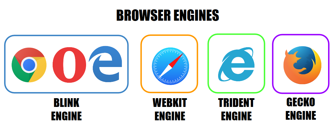
The primary goal of every web developer is to build websites with modern and intuitive designs that deliver a smooth and seamless user experience, irrespective of which browser they might be using to surf the web. The Internet has witnessed a massive unprecedented boom in recent decades. As of December 2018, there are more than 4.1 billion internet users in the world and close to 1.94 billion websites on the web. This consequently implies an expansion in a number of ways websites are being accessed by audiences across the globe. This gives rise to the conundrum of cross-browser compatibility, which poses a huge challenge to developers. As the number of browsers and their versions are growing at such a rapid pace every year, the task of trying to make a website appear and perform consistently across all browsers is every developer’s nightmare. However, as tedious and time-consuming as cross-browser testing may be, it is an imperative phase of every testing cycle. While it is considered nearly impossible to have a website appear and work identically on every browser, there still are a number of ways to deliver consistent user experience and reach a wider target audience. In this article, we’ll explore what cross-browser compatibility issues are and why they occur, how CSS with feature detection is more favorable to browser detection, and tips to achieve near perfect browser compatibility when designing websites.

Why Browsers Render Content Inconsistently

browsers