Today I’d like to share a simple grid concept with you. The idea is to “zoom” or scale up a small grid image and show some more content (i.e. a project slideshow that is not implemented) and a small map that shows a miniature version of the whole image grid so that it becomes easy to navigate.
Combined with some text animations that we’ve previously explored in Layout with Reveal Animations and Content Preview, the whole design comes to life. We are using the same code as in the other demo.
The initially view looks as follows:
When clicking on a grid image, we animate it to the right side of the screen and scale it up.
And this is how it all comes together:
I hope you enjoy this little experiment and find it useful!
Do you know that both the grids and alignment CSS properties are always talked about together? Why? Because of the nature of their existence and the mess that alignment creates on different screen devices. How easy and convenient would web developers’ lives become if all the devices in this world existed with the same screen size. That would be a dream! But coming back to reality, we have to deal with hundreds of devices with varying screen sizes, and the problems they create for the developers with alignment is an add-on. CSS grids and CSS subgrids were introduced to tackle the alignment problem with multiple elements existing side by side.
Grids were responsive, and instead of the “hit and try” of pixel and margin values, setting display: grid worked like a charm. As time stands witness to the issues tackled by web developers, if they do not have one, they invent one themselves. Now the developers have started to create complex web designs with one grid nested with other grids. That was a makeshift arrangement, and making it work was an endeavor in itself.
Editor’s note: We want to share more of the web dev and design community directly here on Codrops, so we’re very happy to start featuring Yuriy’s newest live coding sessions that he records twice a month plus the demo he creates during the session!
For this episode of ALL YOUR HTML, I decided to replicate the effect seen on 100 DAYS OF POETRY with the technologies I know. So I did a fragment shader for the background effect, then coded a dummy CSS grid, and connected both of them with the power of GSAP’s ScrollTrigger plugin. This is of course a really simplified version of the website, but I hope you will learn something from the process of recreating this.
This coding session was streamed live on Oct 4, 2020.
Today I have a little layout for you. The idea is to show a menu with a nice background grid of images and when choosing to explore a project, an animation happens where the images of the background grid fly away and an inner page shows.
This kind of layout is interesting for a photography portfolio or some other project presentation.
I hope you like this little layout and find it useful!
Whether it's making your application mobile responsive or getting something to align just right, if you've ever worked on a UI, you probably understand the frustrations that come with CSS:
To get past whatever issues you may have experienced, you might have turned to a framework, like Bootstrap, looked to CSS Grid, or, if you're old-school, stuck with floats. All of these options have their benefits, but, like everything in development, have some negatives. Using a framework means you have to live with importing the entirety of it into your project. CSS Grid can feel a little clunky at times, especially if you're new to it. Floats are nice but often aren't as expressive as they ideally could be.
A Gantt chart is a handy type of bar chart that is used in project management for showcasing the schedule of tasks. This chart visualizes project activities as cascading horizontal bars, with width depicting the project’s duration.
As a front-end web designer or developer, you can make use of Gantt charts to manage projects and enhance the productivity within your team. In this article, I’m going to show you how to create a simple Gantt chart using the CSS Grid Layout system — no external libraries or other fluff, just pure CSS.
Disclaimer: This event is fake, it’s made up. I got the name from a generator, I recommend not going. But if you do, don’t you dare @ me!
In this article, I’ll show you how to create an accessible and responsive layout using semantic HTML and modern CSS. As a bonus, we’ll add some spice with a little bit of JavaScript to make the design feel more alive. We’ll be covering the following:
Accessible and semantic HTML
Responsive design
Flexbox
CSS Grid
Clip-path
As a bonus, we’ll look at how to bring the layout to live by adding a subtle parallax scroll effect.
You can skip to the sections that most interest you, or follow along on our journey of building the entire layout. This article is for developers of all experience levels. So, if I’m covering something you already know, you can simply skip ahead, no hard feelings.
Getting Started
For following along visually, have a look at the Figma file here, that lays out the desktop, tablet, and mobile designs.
Note that I’ll be using rems for units instead of pixels. In case a user zooms in, it’ll keep the design and fonts scalable. Our root pixel size is 16px, so the formula for wanting to know how many rems a pixel value would be is to divide the pixel size by 16. So, if we wanted to convert 20px into rems, we’d calculate 20 / 16 = 1.25rem.
First, let’s build out the basic layout that involves a <header> that contains a <nav> element and adjacent to the header, we have a <main> element which houses the heading and main component (the magazine cutout).
Let’s cover the body element’s styles which have a background radial gradient:
.site {
  background: radial-gradient(50% 50% at 50% 50%, rgba(123, 131, 126, 0.9) 0%, rgba(54, 75, 73, 0.9) 100%), #364b49;
  color: #FFF;
  height: 100%;
  min-height: 120vh; // we’re adding an extra 20vh here for scrolling purposes we'll use later
}
This line is the gradient: background: radial-gradient(50% 50% at 50% 50%, rgba(123, 131, 126, 0.9) 0%, rgba(54, 75, 73, 0.9) 100%), #898989;. If you’re unfamiliar with background gradients, the first argument 50% 50% indicates the width and height of the inner shape and at 50% 50% refers to the x and y position of the container. Next, the rgba value is the color with a .1 value of transparency and the color starts from the middle of the circle (0%). The next rgba value indicates the last color which starts at the very end (100%). Finally, the last value of #364b49is the background color that shows beneath the gradient since we’re using a little bit of the transparency in the alpha channel for the two gradient values. And just like that, we have an ambient radial-gradient! Neat!
Next, we place a min-height on the body to span at least 120% of the viewport. This allows the gradient to cover the entire screen, but don’t stare too closely at it… it can read your thoughts.
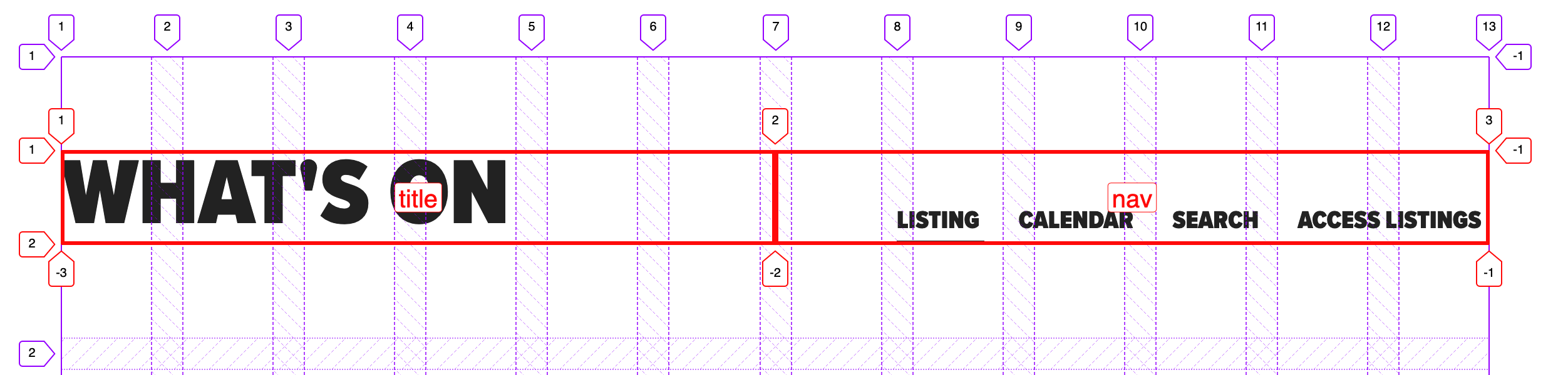
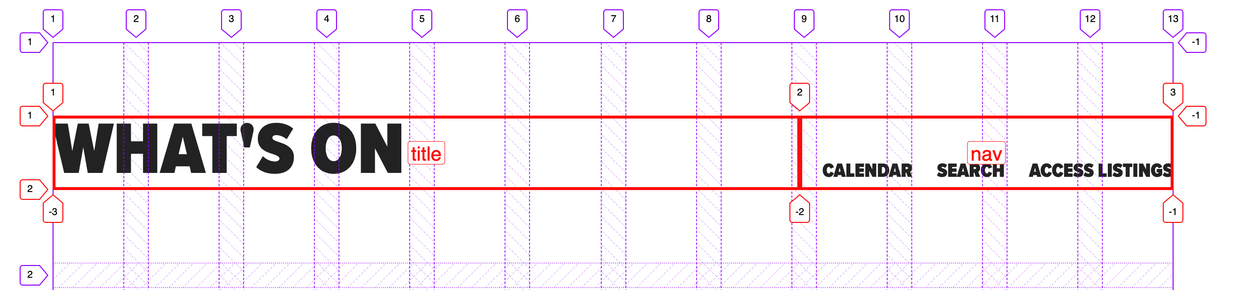
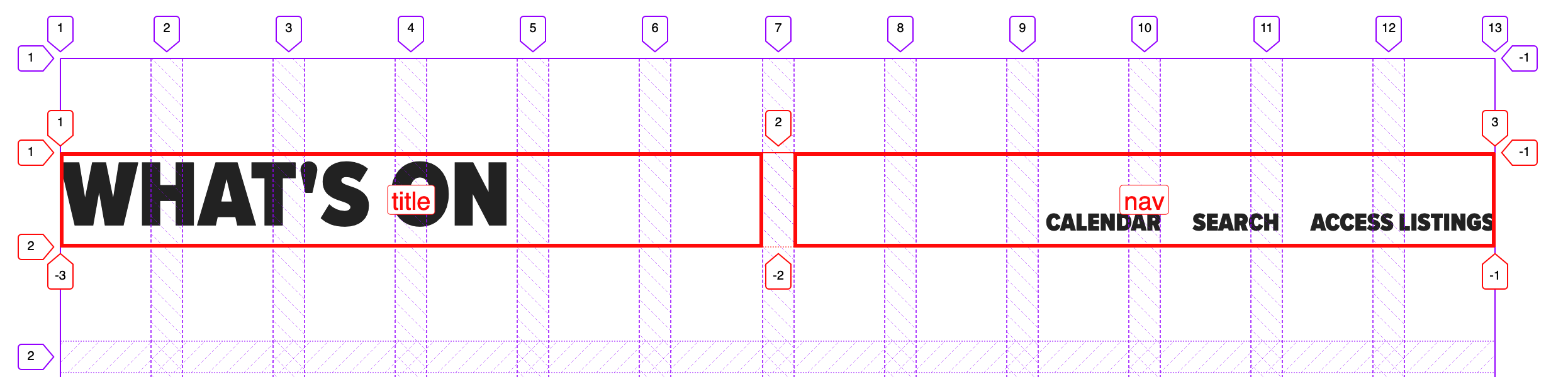
We’re using the <header> element here since it contains a group of information about the site which makes up important conference details and the navigation to all of the links. In the case that a screen reader is reading it, it’s concise and accessible to the user.
Ok, let’s talk about the styles now. What’s required of this component is the following:
Spread elements across the height of the viewport
Align items at their top
Fix it to the window
Display the text on its side
CSS that requires equal spacing and can align at the top or center is a perfect use case for Flexbox. We don’t have to do too much in order to get that.
For the parent element .site__header and the .site__nav-list, we’ll add this flex style:
.site__header,
.site__nav-list {
  display: flex;
}
What this does is lay out the direct children of the elements to situate beside each other and align at the top of the elements.
For the direct children of .site__header, we want them to grow to fill the available space by adding the following:
.site__header > * {
  flex: 1 1 auto;
}
The flex property is a shorthand property for flex children. The three values stand for flex-grow, flex-shrink, and flex-basis. These values indicate to grow to the available space and be able to shrink/get smaller if need be, and auto is the default value which tells the browser to look at the element’s width or height property rather than specifying a particular width value like a percentage.
Finally for the .site__nav-list, we’ll add justify-content: space-between so the elements spread out equally among the available space.
In order for the text to turn 90 degrees, we give the writing-mode property the value of vertical-rl. The writing-mode property determines if lines of text are horizontal, vertical, and what direction the blocks should be laid out.
Next, we fix the position of the header which means the element stays at a specific point relative to the window as one scrolls, so the user always sees it and never scrolls away from it. It’s best practice to put at least one Y or X value for fixed and absolute positioned elements. We have our Y value of top: 0, and the X value of right: 1.25rem to move it to the top and right of the window. Then we want to have some padding on both ends so the text doesn’t hit the sides of the window by adding `1.25rem` which is equal to 20px.
Note: since we’re dealing with a different writing mode, we have a padding-top and bottom instead of padding-left/right as the element now behaves as a vertical element. And to get the header to span the entire height of the body, we add 100% to the height property.
What we have so far is a responsive foundation of a fixed navigation and background. Great job for making it all this way, dear reader. Now let’s cover the <h1> and the grid cutout section.
For the <main> element we have the following styles:
.main {
  padding: 5rem 0;
  display: flex;
  justify-content: center; // centers content horizontally
  align-items: center; // centers content vertically
  min-height: 100vh; // make content at least as tall as the viewport
  width: 100%;
}

.container {
  position: relative;
}
Heading
If we look at the desktop, tablet, and mobile designs we notice that the heading is on top of the cutout component for desktop and tablet indicating it’s out of the document flow, and on mobile, it’s back in the normal document flow. We’ll implement this via the position property and a media query. Since we’re going to absolutely position the heading, we need to add position: relative to its parent element so the heading position value is relative to the .container vs the window.
To implement this layout we’ll leave it a static positioned element (which means it’s in the normal document flow), and then absolutely position it on screens larger than 40rem (640px) and above. We position it 6rem (92px) from the top of the <main> element and to be exactly on the left edge as we’ll need that for tablet and mobile screens.
.heading {
  font-size: 1.5rem;
  text-transform: uppercase;
  margin-bottom: 2rem;

  @media screen and (min-width: 40rem) {
    font-size: 2rem;
    left: 0;
    position: absolute;
    top: 6rem;
    z-index: 10; // to be on top of grid
  }
}
We also slightly change font sizes to be 1.5rem on mobile and 2rem on larger screens:
For the heading, we’re using the <mark> HTML element for the highlight styles instead of a <span> since it’s a little more semantic. It’s how we get the background color to show beneath the text.
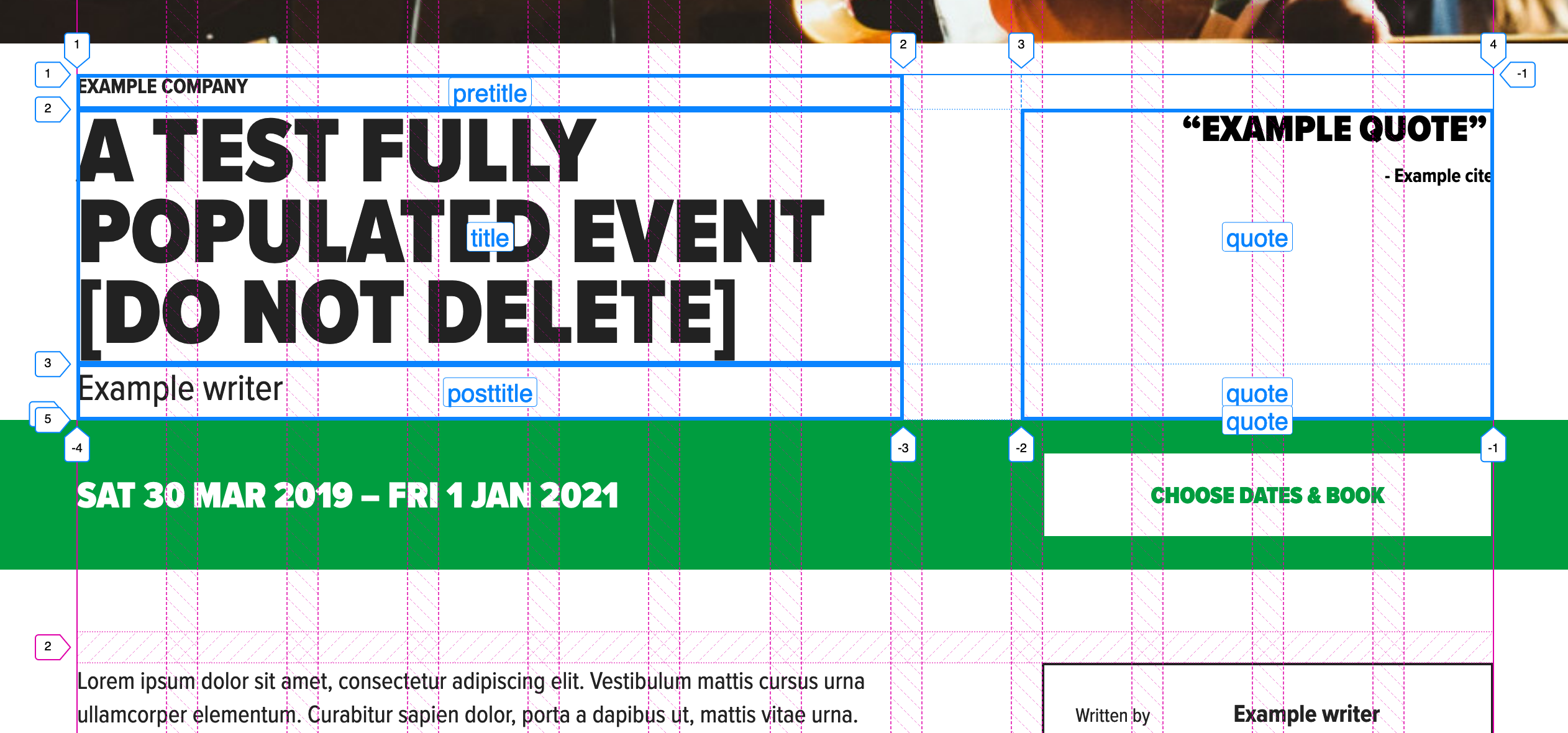
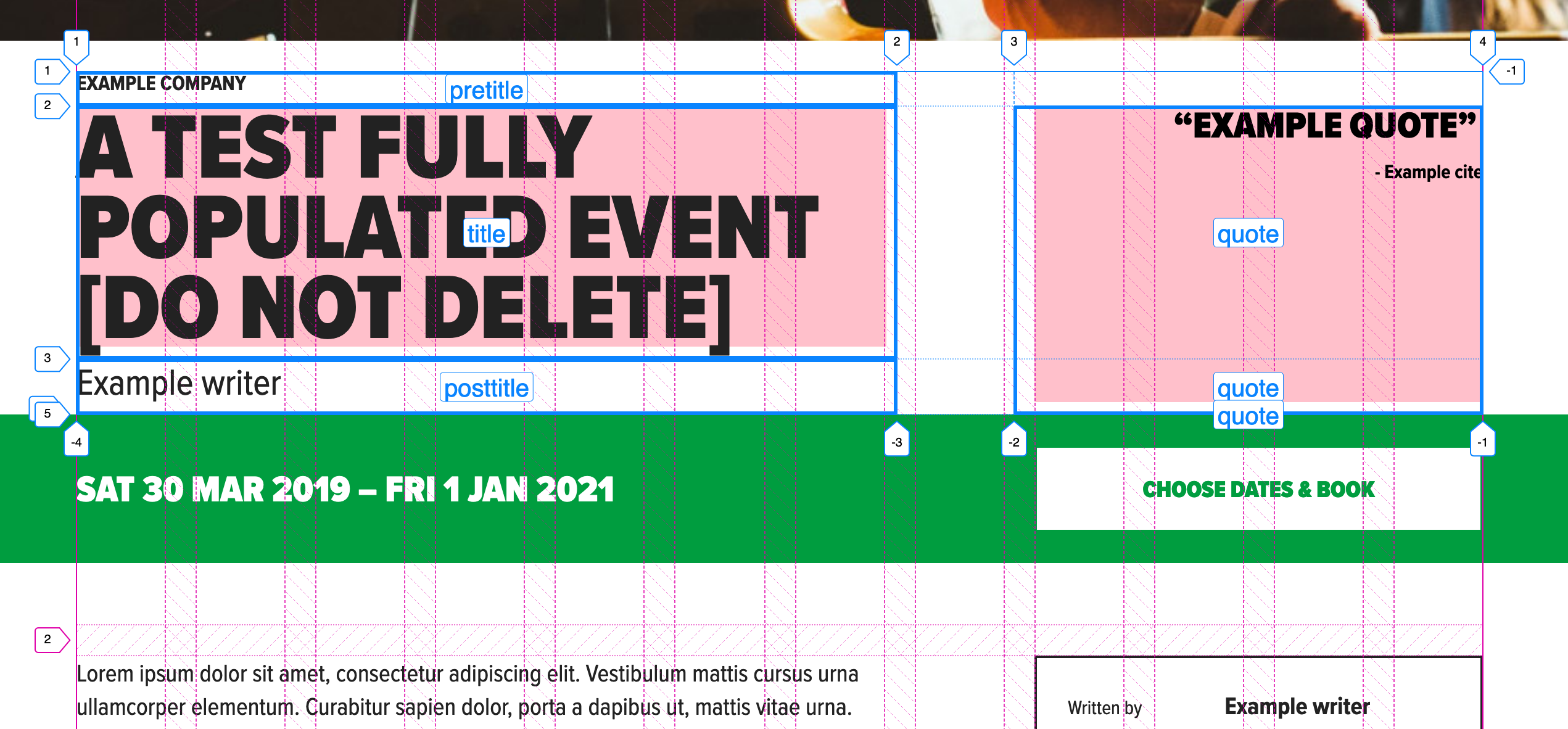
Now it’s time for the magazine cutout. Since there’s a lot of images overlapping each other, we’re going to use CSS Grid. Wahoo, let’s get started!
Alright, let’s take a look at how we can best implement this via a grid.
This image shows us the grid and clip-path outlines of the images so we can easily see what’s happening here with the different layers. The design allows us to divide the grid into 12 equal columns. Perfect! This image will be our rough guide for where to put each item in the grid.
We have a parent div that’ll contain the grid and its styles with an aria-hidden=“true" attribute which tells screenreaders to not add this element and its children to the Accessibility Tree or in other words, skip over this element because it’s purely for decoration. If you’d like to learn more about when to use aria-hidden=“true” or role=“presentation”, I encourage reading this wonderful article explaining the differences and when to use what.
For the grid styles we’ll add:
.grid-container {
  margin: 0 auto; // centers itself horizontally
  padding: 0 10%;
  max-width: 65rem; // restricts the grid from getting too big
}

.grid {
  display: grid;
  grid-template-columns: repeat(12, 1fr);
  grid-template-rows: repeat(12, 1fr);
  position: relative;
}
In order for the grid to act like a grid, we define the display property as, well, grid. Next, we want to be explicit about how many columns and rows we want for this grid since we’ll be laying out the images at a particular column and row value.
This line: grid-template-columns: repeat(12, 1fr) means to make 12 equal columns with the available space of 1fr. fr is a flexible unit that indicates the fraction of the available space in the grid. To learn more, I’d recommend reading this article and this article to see different fr unit use cases.
The same goes for grid-template-rows; we’ll want 12 equally spaced rows. This allows the images to scale beautifully and keep their positions in the grid once the browser is resized. Lastly, we add position: relative for the ability to overlap images which we’ll be covering soon.
Let’s look at the assets needed for this:
Since we’re dealing with images, we’ll want them to act as a block-level element and take up the entire space of the container. So we’ll add this to all of our images:
img {
  display: block;
  width: 100%;
}
Next, we add the .grid__item children elements with their specific classes and placements. I will write about a couple of them so you can see the thinking behind them.
For each .grid__item element, we have 3 very important properties that we’ll use to place the element where we want in the grid and where in the z-stack we want it to reside.
The grid-column property is a shorthand that takes the grid-column-start and grid-column-end property values separated by a “/“. Let’s take grid-column: 2 / span 9. This rule says to start at the second grid-line and span 9 columns. I recommend using Firefox’s dev tools when you’re working with grid so you can easily see the grid lines. The grid-row property acts very similarly to grid-column; it’s a shorthand property that combines grid-row-start and grid-row-end. This line grid-row: 1 / -1 says start at grid-row 1, and stretch all the way to the end which is -1. It’s the same as saying grid-row: 1 / span 12. Last we have the z-index property to be at the very bottom or background of the grid which is what we get with the value of 0.
We start at grid-line 6 and span 6 columns, make it stretch the entire height of the grid with the grid-row property, and with a higher z-index than the background, so it sits right on top of the background.
Since there are a total of 10 grid elements I won’t list them all out here but here’s a demo so you can see what I did for each and every one of them:
Now we want to add the clip-paths to make the cutout shapes appear on the images. Cool cool, but what’s a clip-path?
I’m glad you asked! A clip-path is a clipping area that determines what part of an element can be seen. What’s inside of the area is shown, while what’s outside of the area is hidden. Clip-paths can take several values, but we’re going to use the polygon shape for the most part.
The anatomy of a clip-path property value is this:
clip-path: polygon(x1 y1, x2 y2, x3 y3);
You can add more than 3 x/y values, which we’ll be doing for our images. Since it can be complicated to write out clip-path values by hand, I find it necessary to use clip-path tools that make clip-path shapes. I like to use Clippy and Firefox’s dev tools to create the clip-paths because they both make it incredibly easy to get the exact shapes you want and give you the values for it. So nice!
In order to make this shape:
It consists of these values: the first point value (the white dots in the above photo) indicates 5% from the left and 10% from the top, then the second point is 27% from the left and 3% from the top, and so on and so forth for all of the points.
I apply different clip-paths to each element to make each image look cutout and unique. I highly recommend experimenting with the different points, it’s loads of fun!
And there you have it, a responsive, accessible layout that employs modern CSS and semantic HTML. You’re probably thinking, cool, but how can we spice this up a bit? In the next section, we’ll make the image’s layers come alive!
Bonus: Interactivity and Animation
To get this spice party started there are a two things we could do:
1. Add some fun little parallax
2. Animate the clip-path on hover with the transition property
I recommend doing one instead of both. As much as I love animation, there’s a fine line between a little spice and completely over the top psychopathic.
We’re going to cover the first option, a little bit of parallax, since the overlapping images call for it, in my opinion! If you wanted to see an example of an animated clip-path, check out the demo in the reference section at the bottom of this article.
Adding animation comes with great responsibility. We need to be mindful of users that have vestibular disorders who might get dizzy when seeing parallax. After we implement the parallax we’ll cover how to remove it if the user has their “Prefers Reduced Motion” Preference turned on via their operating system.
This section will cover a basic implementation of the very small parallax library called rellax.js. We only need one line of JavaScript to make it happen, which is great!
Depending on your project, you can import the library via npm/yarn or add the minified file itself in your project. We’re going to go with the latter by way of their CDN. So, before the end of the closing body tag we’ll add:
In our JavaScript file, all we need to do to instantiate the Rellax object in the following line:
const rellax = new Rellax(‘.js-rellax');
There are many options you can also pass in via JavaScript but for our purposes, we only need this line. We’ll handle the different scrolling speeds in the HTML.
In order for Rellax to know what elements should be used for parallax we need to add the class js-rellax to them. I like to prepend js to classes that are only used in JavaScript so it’s easy to tell if it’s tied to JavaScript, i.e. if you remove that class from the HTML, something will likely break!
We’ll add the class to the all of the elements in the .grid so it’s easy to control what we want. Next, Rellax has a handy data attribute called data-rellax-speed which handles the scrolling speed of the element. If you don’t specify the speed, it’ll fall back to its default speed of -2. It’s recommended to use the values of -10 through 10. -10 is the slowest while 10 is the fastest. In order to add a speed, we add this line to each element with a different value, for example: data-rellax-speed="3". I encourage you to play around with different speeds, I find it a ton of fun!
For users who have vestibular (or inner ear) disorders, where they can get dizzy by seeing animations they can tell their operating systems to reduce motion in their system preferences. Wonderfully, there’s a media query that captures that information and is called prefers-reduced-motion and takes the values of no-preference and reduce. Read more about where the browsers look for various operating systems here: prefers-reduced-motion on MDN
Since we’re not animating anything via CSS and only JS, we’ll detect the media query via JavaScript and kill the parallax animations if the media query is set to reduce.
To turn off the animations for users who prefer reduced motion we’ll add these two lines of code:
// grabs the media query
const motionMediaQuery = window.matchMedia('(prefers-reduced-motion: reduce)');

// if there is a prefers-reduced-motion media query set to reduce, destroy animations
if (motionMediaQuery.matches) rellax.destroy();
If you made it this far, you get 5 gold stars! This was a full tutorial that builds from a Figma file, is responsive, uses modern CSS, semantic HTML, and accessible animations. I hope you enjoyed it!
“CSS Grid or CSS Framework? What should I use for my next project?” It is a question often asked by web developers, specifically new ones after they are introduced to the CSS Grid layout. CSS Grid layouts allow developers to build custom complex layouts with absolute control only by using Native CSS properties without relying on any frameworks which are bound by basic 12 column grid layouts plagued with default styling rules and do not offer a lot of room for customization.
On the other hand building grid layouts with frameworks like Bootstrap feels like a breeze without the need of writing any CSS style rules or media queries to make the layout responsive.
It’s hard to beat the feeling of finding a perfect use for a new technology. You can read every handy primer under the sun and ooh-and-ahh at flashy demos, but the first time you use it on your own project… that’s when things really click.
I gained a new appreciation for CSS Grid when building a flexible layout for a conference schedule. The needs of the project aligned perfectly with grid’s strengths: a two-dimensional (vertical and horizontal) layout with complex placement of child elements. In the process of building a proof of concept, I found a few techniques that made the code highly readable and outright fun to work with.
The resulting demo included some interesting uses of CSS Grid features and forced me to grapple with some details of grid you don’t run into in every day.
Before we get started, it might be a good idea to keep another tab open with the CSS-Tricks guide to CSS Grid to reference the concepts we cover throughout the post.
Defining our layout requirements
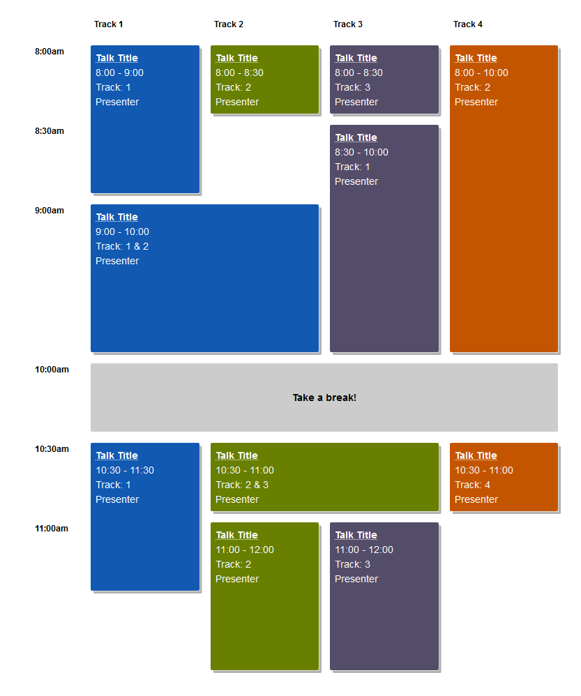
I set out to create the following layout thanks to WordCamp, the hundreds of WordPress-focused conferences that happen around the world each year. These varied events range in size and format, yet all use the same schedule layout tool.
The final layout we’ll build.
I helped schedule a couple WordCamps and styled a WordCamp website, so I knew the shortcomings of the existing HTML table layout. If your schedule didn’t fit in a uniform grid, well…¯\_(ツ)_/¯
Setting out to find a better way, I started by listing the layout requirements:
Sessions of variable length (limited to set time increments)
Imagine back-to-back one-hour talks in three rooms alongside a two-hour workshop in another.
Sessions spanning one or more "Tracks"Tracks are usually associated with a specific room in the venue. In the case of my local WordCamp in Seattle, the venue can literally remove a wall to combine two rooms!
Schedule can include empty space
A last-minute cancellation or extra-short session creates gaps in a schedule.
Design is easy to customize with CSS
WordCamp websites allow theming only via CSS.
Layout can be automatically generated from CMS content
Since we’re building a layout from structured session data on thousands of websites, we can’t rely on any HTML or CSS that’s too clever or bespoke.
Getting started: Solid HTML
Before I write any CSS, I always start with rock-solid HTML.
The top-level <div> will have a class of .schedule and serve as the grid parent. Each unique start time gets its own heading followed by all sessions starting at that time. The markup for each session isn’t very important, but make sure that seeing the layout isn’t required to understand when and where a session happens. (You’ll see why in a moment.)
Adding in a bit of up-to-you CSS to make things pretty, our mobile layout and fallback for browsers that don’t support CSS Grid is already complete!
Here’s how mine looks with the colors I used:
People on phones, zooming in their browsers, or even using Internet Explorer will have no problem finding their favorite sessions at this conference!
Adding the grid layout
Now for the actual CSS Grid part!
My ah-ha moment when building this came from reading Robin’s article here on CSS-Tricks, "Making a Bar Chart with CSS Grid." TL;DR: One grid row represents 1% of the chart's height, so a bar spans the same number of rows as the percentage it represents.
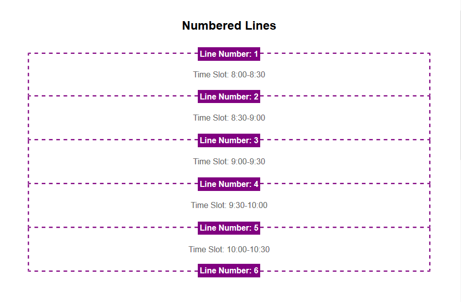
That helped me realize that grid is perfect for any layout tied to some regular incremental unit. In the case of a schedule, that unit is time! For this demo, we’ll use increments of 30 minutes, but do whatever makes sense for you. (Just watch out for the Chrome bug that limits Grid layouts to 1000 rows.)
The first version I tried used similar syntax to the bar chart in Robin’s and some basic math to place the sessions. We’re using eight rows because there are eight 30-minute increments between 8 a.m. and 12 p.m. Remember that implicit grid line numbers start at one (not zero), so the grid rows are numbered one through nine.
The problem with this technique is that placing items on a grid with a lot of rows is very abstract and confusing. (This issue added a ton of complexity to Robin’s bar chart demo, too.)
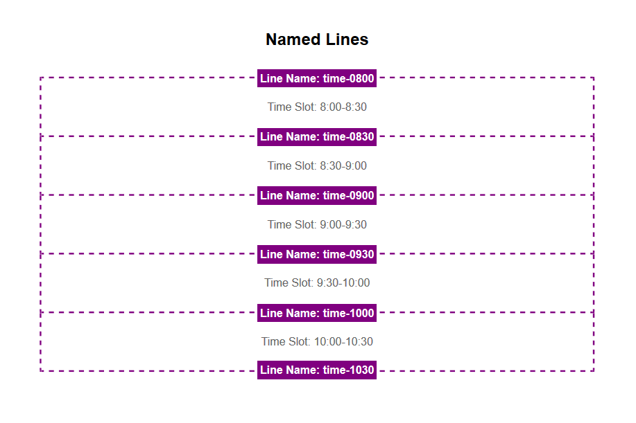
This is where named grid lines come to the rescue! Instead of relying on grid line numbers, we can give each line a predictable name based on the corresponding time of day.
.schedule {
  display: grid;
  grid-template-rows:
    [time-0800] 1fr
    [time-0830] 1fr
    [time-0900] 1fr
    [time-0930] 1fr;
    /* etc...
        Note: Use 24-hour time for line names */
}

.session-1 {
  grid-row: time-0800 / time-0900;
}

.session-2 {
  grid-row: time-0900 / time-1030;
}
That is gloriously easy to understand. There is no complicated math to figure out how many rows there are before and after a session starts or ends. Even better, we can generate grid line names and session layout styles with information stored in WordPress. Throw a start and end time at the grid, and you’re good to go!
Since the schedule has multiple tracks, we’ll need a column for each one. The tracks work in a similar way to the times, using named track lines for each grid column line. There’s also an extra first column for the start time headings.
Here though, we take named grid lines one step further. Each line gets two names: one for the track it starts and one for the track it ends. This isn’t strictly necessary, but it makes the code much clearer, especially when a session spans more than one column.
With the time- and track-based grid lines defined, we can now place any session we want just from knowing it’s time and track!
The final code uses inline styles for session placement which feels right to me. If you don’t like this and are working with more modern browsers, you could pass the line names to CSS via CSS variables.
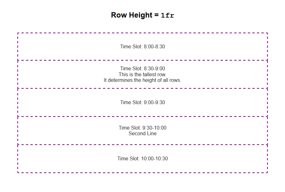
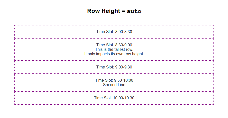
Quick note: using fr units versus the auto value for row heights
One detail worth noting is the use of the fr unit for defining row heights.
When using 1fr to determine row heights, all rows have the same height. That height is determined by the content of the tallest row in the schedule. (I had to read the W3C spec for fr to figure this out!) That produces a beautiful schedule where height is proportional to time, but can also lead to a very tall layout.
For example, if your schedule grid has 15-minute increments from 7 a.m. to 6 p.m., that’s a total of 48 grid rows. In that case, you probably want to use auto for your row height because the schedule is much more compact with each grid row's height determined by its content.
This layout uses that ability to arbitrarily place items on a grid, so some caution is warranted. However, because the heading and source order align with the visualization of start times, this seems like a safe use to me.
If you’re inspired to do something similar, carefully consider accessibility. It makes sense to order information by time in this case, but I can imagine a legitimate case for TAB order to go down columns rather than across rows. (Modifying this demo to do that shouldn’t be too hard!)
Whatever you do, always consider accessibility.
Adding sticky track names
Finally, it’s time to add in the track names that look like table headers at the top of each column. Since a session’s track is already visible, I chose to hide the "headers" from assistive technology with aria-hidden="true".
The track names go in the first grid row, conveniently named "tracks." As long as you don’t have any weird overflow issues, position: sticky keeps those in view while you scroll.
This schedule is definitely the most satisfying use of CSS Grid I’ve ever made. I love how "data-driven" and semantic the line naming is, and the accessibility and CMS requirements fit in perfectly without any inconvenience.
The only question left for me is what other types of "data-driven" grids are out there to build? I’ve seen some great calendar layouts and here’s a Monopoly board layout. What about a football field, a timeline, restaurant tables, or theater seats? What else?
Rachel Andrew’s talk at CSSconf is wonderful because it digs into one of the most exciting changes that’s coming soon to a browser near you: subgrid! That’s a change to the CSS Grid spec that allows for much greater flexibility for our visual designs. Subgrid allows us to set one grid on an entire page and let child elements use that very same grid tracks.
The reason why I’m very excited is because this solves one of the most annoying visual layout issues that I’ve come across since becoming a web developer, and if that sounds bonkers and/or wonderful to you, then make sure to check out Rachel’s talk because she does a much better job of describing this than I possibly could:
Shepherds are good at tending to their sheep, bringing order and structure to their herds. Even if there are hundreds of those wooly animals, a shepherd still herds them back to the farm at the end of the day.
When dealing with data, programmers often don't know if it is correctly filtered or sorted. This is especially painful when iterating over an array then displaying the data on a site without knowing the locations of each element receiving it. The Grid Shepherd is a technique that helps position and sort items where you want them to be, using CSS Grid instead of JavaScript.
That’s what we’re going to look at in this post. The Grid Shepherd technique can bring order and structure to the data we work with while giving us greater visibility to where and how it’s being used than we would be able to otherwise.
Let’s dig in.
Sorting with JavaScript
We’re going to start by iterating over an unordered array of farm animals. Imagine that cows and sheep are happily grazing the fields. They can be grouped together programmatically with the Array.prototype.sort method and listed on a page:
To herd the animals, we have to fence them into a common area, which is what we’re using the <main> element to do. By setting that fence with display: grid, we’re creating a grid formatting context where we can define the column (or row) each animal should occupy.
And with grid-auto-flow: dense, each animal orders itself into the first available spot of each defined area. This can also be used with as many different sort options as you want — simply define another column and the data will be shepherded magically into it.
Quantity queries rely on some sort of selector for counting the classes — which would be great with the :nth-child(An+B [of S]?) pseudo-class notation, but it’s currently only available in Safari). That means we have to use the :nth-of-type() selector as a workaround.
We need some new element types for this to work. This could be realized through Web Components or renaming any HTML element to a custom name. This works even if these elements are not in the HTML spec, as browsers use HTMLUnknownElement for undefined tags which results in them behaving much like a div. The document looks now like this:
Additionally the the counters can be simply realized by using counter-reset: countsheep countcow; on the parent element and using the before selector to target each element and count up.
Here, we’re going to reach for Vue to dynamically add and remove animals using Vue transitions with two different sort options. Watch as the animals naturally occupy the correct columns, even as more are added and some are removed:
Grid Shepherd can also be used with any non-ordered data to:
separate and count voters in a poll (maybe as two sections with their corresponding profile picture) with live insertion;
group people / co-workers according to their position, age, height; and
create any hierarchical structure
Shepherding and accessibility
grid-auto-flow: dense does not change the DOM structure of the grid — it merely reorders the contained elements visually. A side effect can be seen in the last example when ordering alphabetically as the counter numbers get mixed up. Changing the DOM structure not only affects people who use screen readers, but also effects tab traversal.
Also note that a flat document structure might not be good for screen readers. Instead, I would treat these presentational grids as graphs and provide the information with a longer textual alternative.
Round ‘em up!
It’s pretty neat to see how a powerful CSS layout tool like grid can be leveraged for use cases that fall outside of traditional layouts needs and into things where we may have reached for other languages in the past. In this case, we can see how the layout benefits of CSS Grid and the dynamic data-handling capabilities of JavaScript overlap and how that gives us more choices — and power — to bend rendered data to our will.
I work for Supercool, a fast-moving design agency that makes custom built sites for arts clients, powered by the off-the-shelf system, Craft CMS; it's high-spec graphic design with relatively demanding typography and art direction. Over the past few months we’ve been moving to CSS grid. We’re transitioning slowly, allowing ourselves to discover new paradigms and design methods, instead of simply porting old habits to a new syntax.
So far, we've developed a number of really useful strategies for keeping track of the layout. I've written a couple of surprisingly nifty mixins, using named areas and templates, and we've hit upon some basic conventions to create highly readable code. I thought it would be valuable to walk through a fully-developed production implementation of a single major component using grid, digging in to some of the design questions it throws up and steering you away from some pitfalls we’ve encountered. CSS grid is a large spec, with lots of possible approaches and lots of right ways to do things, but at some point you have to lock down your method and get it live.
I’m expecting some basic familiarity with CSS, Sass, BEM, and some interest in the task of prototyping fully-realized, accessible, custom frameworks with 50+ components from Sketch or Photoshop-type documents on a tight timeline (say, a week).
First, let’s identify and separate out the design into distinct coding tasks and plan how we’ll approach them:
Type: The designer has already defined a type system.
Colors: First, we build a theme model and then include that in the partial.
Content: What elements are in this block? What are its variations? This is where our BEM mixin comes in.
Layout: This is how the content is placed in the block. You might want to skip directly to this.
Conventions: This is exactly how we choose to write all the above. There are many right answers in CSS, so what is important is that we all just agree to a convention, the rules of the road. This really comes first, but for the sake of this article, we’ll conclude here.
Type system
We use utility classes (e.g. h-text--h1, h-text--badge) for type styles. There may be a hundred type styles in a project. We export those styles from Sketch right into our Patternlab using Typex. That’s a whole other article on its own, so let’s just stipulate type as handled. We won’t bring type into our component partial.
Theming is a few tiny mixins dropped in, so we ideally won’t see a ton of color rules in our partial. We store them all together in a _themer.scss partial in our "Mixins and Models" library, so we can be sure to follow the design system of the site. This way, when someone comes back to the build later on, they have a key reference partial describing the design and branding rules. When building and maintaining numerous sites in broadly the same market — but each all with different brand spec — you’ve gotta make sure you don’t mix up one brand with another! So, much like type, we abstract the color rules away from the partial. In essence, we’re really only looking at layout (as much as possible) in our _header.scss file.
Given that we agree the convention to always theme using our mixin, this is how it would be included on an element:
@include var($property, $value);
Then we’ll set a theme model, of how colors work on this particular site and apply that theme to a component with:
@include theme;
Here’s the sample theme model we’re going to use with this page header. It’s super simple.
We’re pairing a color with black or white. We depend on a contrast rule and flip them for emphasis, maybe on events, like hover, or a highlighted call to action. This is all we need to do to make that happen and now we have a document of how color should really work on this site. We can go to and check against if we need to debug or expand the UI.
We also want to prep inheritance to help us, so let’s identify some helpful conventions:
Using this theme model, we might generate any number of themes, perhaps storing them as utility classes, or looping over a list of modifiers inside a component, or just allowing the user to set variables right on the block in the CMS. When IE 11 drops below 1% in our stats, we can do much more with variables, but this is enough for our current purposes.
Let’s not get side-tracked. What about grid?!
Content components
Grid lets us describe exactly what content we have in each partial in a new way. It’s really a game changer for design agencies building new UI for every project and we’re discovering new (and fun) applications for it as we explore.
To give context: we customize each interface for our clients, with custom fields made to suit their specific needs and their content model, using Craft CMS. We have internal tools that pull in events from ticketing APIs and create entries from that data, which may then be edited and expanded (or created entirely) in the CMS. The client can fill in or edit named fields in permanent page regions, and also add in whole designed, branded content blocks into the layout of each page as they build them.
There’s a lot of UI. The clients have a lot of control over content and we have a lot of control over the HTML, so we can ensure a high standard of accessible, semantic code on the page. We develop the content model together during discovery and then turn ’em loose on content creation. They add what they want and we ensure that it works and always looks right. Better than right! Super. (Sorry! :P)
Accessible, logical HTML is my jam. At minimum, I require a green accessibility score on Lighthouse score for my projects. (Who am I kidding, I want that delicious 100!) Core paths and pages are tested with a couple of screen readers, the keyboard tab, keyboard navigation), low vision simulators, dasher, voice access and binary switch. (I also work for Robots and Cake so this is a big part of my development.) I add giant clickable phone numbers and email addresses to pages over and over. I just want to get people where they are going.
I’ve been concerned about the way content can be re-ordered with grid (and flexbox, for that matter). Having gone through a few builds now, I actually think grid can help us with this problem. With CSS Grid, there’s no reason to move around HTML in service to the layout. We can go back to thinking about the whole document as a logical, linear sequence as our first concern.
Branding vs. Performance vs. Maintenance
Arts venues require high-spec graphic design, unified across print and web, and have constantly changing materials (e.g. programs, brochures, tickets, posters, microsites, etc.) they need to get out to their audiences, including contractual marketing obligations that must be met. As you can imagine, we have a lot of high quality large images we have to prioritize and typically come with strong print-led branding. That means we may be serving around fifteen custom fonts (including weight variations, display faces, etc.) and complex CSS to the page as well. We have to keep ourselves as lean as we can. We are shipping CSS that’s around 20 KB nano Gzipped at the moment but I’m working on reducing it further.
However, we do keep the grid area names full length by setting reduce identifiers to false in our PostCSS task. It’s vastly more useful to have the layout maps available in DevTools than it is to save those few bytes. For maintenance, self-documentation, and the sake of your future self who is debugging this site without repo access on a delayed train in Sowerby Bridge: keep the maps.
Code health
The way to balance all these competing needs is to articulate and agree on conventions so that there’s less to fix in testing and so that solved problems stay solved. We examine all the components we build and make sure they always start with a heading, that links go places, and buttons trigger actions, that countable objects are delivered as a list and preceded by a landmark heading, that navs are <nav> and times are <time> and div soup is eaten for breakfast— the basics.
With CSS Grid, there’s no excuse to move aroundHTMLin service to the layout. Your content can always flow logically while changes in layout happen in CSS. And, as there’s no need for margins or padding to create gutters, you can simply declare:
.o-grid .o-grid { width:100%; }
...to be sure any number of nested groups all visually occupy the same page grid. The HTML can be a clearer guide to what things really are: a closer document.
There’s a lot to manage between the heading and the action, and it’s my challenge to keep track of all these fields in all those components and make it traversable, scannable, linearizable, and easily read in some kind of logical, understandable manner, while making sure I’m faithfully executing the design spec.
Let’s bring in my first, surprisingly useful, grid mixin.
Each component partial now starts out with a list of all its possible elements, which is a very handy piece of documentation, especially when Twigging the actual front-end component.
The mixin takes care of assigning the grid areas.
Element and component names stay consistent across Sketch, CSS, and HTML and any inconsistencies will be very obvious, as the layout will fail. I’m firm, but fair.
BEM naming is enforced automatically but isn’t muddling things up in the partial.
Now, in the partial, we will just declare grid-template-areas, using normal English words, giving us a series of maps of the layouts that also match the database fields. Super readable!
We decided to stick to named areas for internal grids because I read a great article on this very site explaining how Autoprefixer can handle grid for IE 11 if you stick to the listed supported properties — and it does for the most part. If you view this test case with Autoprefixer applied in the super useful Debug Mode in a browser test, you’ll see it working.
So far, so good.
But there are pitfalls! You must set inline elements to block to make sure they always operate as grid cells in IE 11. Comment out the marked line in the example to see what happens otherwise:
Debug has caught an issue.
Ouch! Be careful with those blocks. You may find some versions of IE 11 don’t even pick up this fix, in which case you might try just using plain ol’ <p> tags... sigh.
I don’t include display:grid in this mixin because there are scenarios where the actual grid is set on an inner container, for example, but we’d still want the grid-areas to match on the correct BEM class.
Let’s identify a few more rules of the road to ensure this component slides right into a page layout without hassle. At time of writing, there’s no subgrid) available (but there will be!), so this component knows nothing of the parent grid it’s living in. This happens to match the BEM component approach well — as each component is written flat, and orphaned, to limit inheritance. I’m not advocating for BEM (or BEM-ish as we obviously use) here — I’m just saying that if you’re already using it, this is a bonus.
In this example, the designer has set a page layout of 12 column grid with 20px (1.25rem) gutters, site-wide, with no offset pieces. Our component is a page region and will occupy all 12 grid columns. In this transitional period, we’re still using this kind of set grid as we have a ton of systems still based on this idea that we have to integrate with. So, here’s our convention for this condition: for a full width region drop the grip gap and write the grid template columns as fractional units (fr) of 12.
Doing things this way means:
the sight lines of this internal grid broadly follow the grid it sits within;
it’s easy to see the underlying design rules in the code; and
it’s easy to line things up exactly, if required.
A quick note on "lining up"
Wait... what do I mean 'to have things line up exactly'? Doesn’t it already line up exactly?
Two equal columns split mid-gutter of the parent 12-column grid.
Well, no. The fractional units approach divides across the space perfectly, so you end up in the gutter. Two even columns lands you halfway across the gutter. Two columns where one is 2/3 and the other is 1/3 will split 1/3 of the way across that gutter, and so on.
Two unequal columns (set to 2fr and 1fr, respectively) split a third of the way into a gutter of the 12-column parent grid.
It’s not exactly hard to fix the alignment, as we know the width of our page grid gutter. For example, on an even split, we could include the grid gap.
However, we can’t do that with any other division. What we can do is add that gap as a margin — the margin is added inside no matter what box sizing you have set. In this example, we have three columns (two named areas and one empty space), splitting our gutter into thirds:
This is how to calculate those margins: Make sure the total fr units sum results in 12. Divide the grid gap by the number of columns in the parent grid, then multiply that like so:
The right margin multiplier of n is equal to the sum of the fr units to the right of n. The left margin of n is equal to the sum of the fr units to the left of n.
So, for grid-template-columns with a value of 2fr 3fr 2fr 4fr 1fr:
I’m sure you can think of other solutions, like switching to named lines, or adding in extra fixed-width columns or even writing all maps with 12 named areas per row. There are so many ways you can deal with this, but I think a lot of them remove the advantage of named areas. Areas give us a readable layout map that contains what our future selves need to know. It is code as documentation.
To be clear, the design problem I’m walking us through is not one of alignment. Alignment is easy with grid. The question is not of solving the immediate, trivial, layout problem, but of solving it in a way that supports our goal of being able to come back in six months and grasp:
What elements are in the component.
How they are laid out.
Why the code is written in this way.
The grid specification is huge and it’s easy to get lost in the options. Perhaps it’s a better plan to reset to a 12-column grid and use the number spec (i.e. explicitly link to our page grid, which uses the number spec) when absolute alignment is required — but I do feel there’s a smarter, simpler solution waiting to be found. For this site, we ended up writing a page grid object and added nested internal grid cells to it with classes: .o-page-grid__sidebar.
What do you all think? I definitely foresee differing perspectives on this. 🤦♀️
What next? A themed event header with a full width info bar that sticks and an internal button that lines up with the sidebar on the parent grid? You bet. I’ll include a parent grid so it’s easier to see:
Here’s a demo of all these variations as one partial. Yes, it’s a map! And it’s a wrap!
Conventions
Phew, we covered a lot! But you can see how flexible and self-documenting a system like this can be, right?
Type is handled with a separate type system.
Colors are handled by a theme partial that describes the underlying color rules of the design, rather than simply coloring elements ad hoc.
Elements are called what they are, in English, and included as a list at the top of the partial with the template mixin. This list can be taken into Twig or a template as a reference.
Correct HTML is always used and nesting doesn’t break grid. That means you can apply any number of nested grids to the same layout space by setting a convention.
Precise alignment is done in a number spec, and not a name spec (but note that alignment is possible with name spec).
IE 11 is supported.
I do have one more quick note and example of another component built with named areas. In this example, cards are not regions, but components placed in a grid, so there’s no reason to use the fr of 12 convention. You can expect a media object partial to look like this:
.c-card {
  &--news {
    align-content: start;
    grid-template-areas:
      "image"
      "datetime"
      "title";
  }

  &--search {
    justify-content: start;
    grid-template-columns: 1fr 3fr;
    grid-template-areas:
      "image page"
      "image title"
      "image summary";
  }

  &--merchandise {
    grid-gap: 0;
    grid-template-columns: $b 1fr 1fr $b;
    grid-template-areas:
      "image image   image   image"
      ".     title   title   ."
      ".     summary summary ."
      ".     price   action  .";
  }

  &--donations {
    // donations thanks button is too long and must take up more space than input
    grid-gap: 0;
    grid-template-columns: $b 1fr 2fr $b;
    grid-template-areas:
      "image image   image   image"
      ".     title   title   ."
      ".     summary summary ."
      ".     input   action  .";
  }
}

// ...
Animations play a big role in how users feels about your website. They convey a lot of the personality and feel of your site. They also help the user navigate new and already known screens with more ease.
In this tutorial we want to look at how to create some interesting grid-to-fullscreen animations on images. The idea is to have a grid of smaller images and when clicking on one, the image enlarges with a special animation to cover the whole screen. We’ll aim for making them accessible, unique and visually appealing. Additionally, we want to show you the steps for making your own.
The building blocks
Before we can start doing all sorts of crazy animations, timing calculations and reality deformation we need to get the basic setup of the effect ready:
Initialize Three.js and the plane we’ll use
Position and scale the plane so it is similar to the item’s image whenever the user clicks an item
Animate the plane so it covers the complete screen
For the sake of not going too crazy with all the effects we can make, we’ll focus on making a flip effect like the one in our first demo.
Initialization
To begin, lets make a basic Three.js setup and add a single 1×1 plane which we’ll re-use for the animation of every grid item. Since only one animation can happen at the time. We can have better performance by only using one plane for all animations.
This simple change is going to allow us to have any number of HTML items without affecting the performance of the animation.
As a side note, in our approach we decided to only use Three.js for the time of the animation. This means all the items are good old HTML.
This allows our code to have a natural fallback for browsers that don’t have WebGL support. And it also makes our effect more accessible.
class GridToFullscreenEffect {
	...
	init(){
		...
		const segments = 128;
		var geometry = new THREE.PlaneBufferGeometry(1, 1, segments, segments);
		// We'll be using the shader material later on ;)
		var material = new THREE.ShaderMaterial({
		  side: THREE.DoubleSide
		});
		this.mesh = new THREE.Mesh(geometry, material);
		this.scene.add(this.mesh);
	}
}
Setting the the plane geometry’s size to be 1×1 simplifies things a little bit. It removes a some of the math involved with calculating the correct scale. Since 1 scaled by any number is always going to return that same number.
Positioning and resizing
Now, we’ll resize and position the plane to match the item’s image. To do this, we’ll need to get the item’s getBoundingClientRect. Then we need to transform its values from pixels to the camera’s view units. After, we need to transform them from relative to the top left, to relative from the center. Summarized:
Map pixel units to camera’s view units
Make the units relative to the center instead of the top left
Make the position’s origin start on the plane’s center, not on the top left
Scale and position the mesh using these new values
class GridToFullscreenEffect {
...
 onGridImageClick(ev,itemIndex){
	// getBoundingClientRect gives pixel units relative to the top left of the pge
	 const rect = ev.target.getBoundingClientRect();
	const viewSize = this.getViewSize();

	// 1. Transform pixel units to camera's view units
	const widthViewUnit = (rect.width * viewSize.width) / window.innerWidth;
	const heightViewUnit = (rect.height * viewSize.height) / window.innerHeight;
	let xViewUnit =
	  (rect.left * viewSize.width) / window.innerWidth;
	let yViewUnit =
	  (rect.top * viewSize.height) / window.innerHeight;

	// 2. Make units relative to center instead of the top left.
	xViewUnit = xViewUnit - viewSize.width / 2;
	yViewUnit = yViewUnit - viewSize.height / 2;


	// 3. Make the origin of the plane's position to be the center instead of top Left.
	let x = xViewUnit + widthViewUnit / 2;
	let y = -yViewUnit - heightViewUnit / 2;

	// 4. Scale and position mesh
	const mesh = this.mesh;
	// Since the geometry's size is 1. The scale is equivalent to the size.
	mesh.scale.x = widthViewUnit;
	mesh.scale.y = heightViewUnit;
	mesh.position.x = x;
	mesh.position.y = y;

	}
 }
As a side note, scaling the mesh instead of scaling the geometry is more performant. Scaling the geometry actually changes its internal data which is slow and expensive, while scaling the mesh happens at rendering. This decision will come into play later on, so keep it in mind.
Now, bind this function to each item’s onclick event. Then our plane resizes to match the item’s image.
It’s a very simple concept, yet quite performant in the long run. Now that our plane is ready to go when clicked, lets make it cover the screen.
We need to update uMeshScale and uMeshPositon uniforms whenever we click an item.
class GridToFullscreenEffect {
	...
	onGridImageClick(ev,itemIndex){
		...
		// Divide by scale because on the fragment shader we need values before the scale
		this.uniforms.uMeshPosition.value.x = x / widthViewUnit;
		this.uniforms.uMeshPosition.value.y = y / heightViewUnit;

		this.uniforms.uMeshScale.value.x = widthViewUnit;
		this.uniforms.uMeshScale.value.y = heightViewUnit;
	}
}
Since we scaled the mesh and not the geometry, on the vertex shader our vertices still represent a 1×1 square in the center of the scene. But it ends up rendered in another position and with a different size because of the mesh. As a consequence of this optimization, we need to use “down-scaled” values in the vertex shaders. With that out of the way, lets make the effect happen in our vertex Shader:
Calculate the scale needed to match the screen size using our mesh’s scale
Move the vertices by their negative position so they move to the center
Multiply those values by the progress of the effect
We start the tween whenever we click an item. And there you go, our plane goes back and forth no matter which item we choose.
Pretty good, but not too impressive yet.
Now that we have the basic building blocks done, we can start making the cool stuff. For starters, lets go ahead and add timing.
Activation and timing
Scaling the whole plane is a little bit boring. So, lets give it some more flavor by making it scale with different patterns: Top-to-bottom, left-to-right, topLeft-to-bottomRight.
Lets take a look at how those effects behave and figure out what we need to do:
By observing the effects for a minute, we can notice that the effect is all about timing. Some parts of the plane start later than others.
What we are going to do is to create an “activation” of the effect. We’ll use that activation to determine which vertices are going to start later than others.
With this little change, our animation is not much more interesting.
Note that the gradients on the demo are there for demonstration purposes. They have nothing to do with the effect itself.
The great thing about these “activation” and “timing” concepts is that they are interchangeable implementations. This allows us to create a ton of variations.
With the activation and timing in place, lets make it more interesting with transformations.
Transformations
If you haven’t noticed, we already know how to make a transformation. We successfully scaled and moved the plane forwards and backwards.
We interpolate or move from one state to another using vertexProgress. Just like we are doing in the scale and movement:
...
const vertexShader = `
	...
	void main(){
	...
		// Base state = 1.
		// Target state = uScaleToViewSize;
		// Interpolation value: vertexProgress
		scale = vec2(
		  1. + uScaleToViewSize * vertexProgress
		);

		// Base state = pos
		// Target state = -uPlaneCenter;
		// Interpolation value: vertexProgress
		pos.y += -uPlaneCenter.y * vertexProgress;
		pos.x += -uPlaneCenter.x * vertexProgress;
	...
	}
`
Lets apply this same idea to make a flip transformation:
Base state: the vertex’s current position
Target state: The vertex flipped position
Interpolate with: the vertex progress
...
const vertexShader = `
	...
	void main(){
		...
		float vertexProgress = smoothstep(startAt,1.,uProgress);
		// Base state: pos.x
		// Target state: flippedX
		// Interpolation with: vertexProgress
		float flippedX = -pos.x;
		pos.x = mix(pos.x,flippedX, vertexProgress);
		// Put vertices that are closer to its target in front.
		pos.z += vertexProgress;
		...
	}
`;
Note that, because this flip sometimes puts vertices on top of each other we need to bring some of them slightly to the front to make it look correctly.
Combining these flips with different activations, these are some of the variations we came up with:
If you pay close attention to the flip you’ll notice it also flips the color/image backwards. To fix this issue we have to flip the UVs along with the position.
And there we have it! We’ve not only created an interesting and exciting flip effect, but also made sure that using this structure we can discover all kinds of effects by changing one or more of the pieces.
In fact, we created the effects seen in our demos using the configurations as part of our creative process.
There is so much more to explore! And we would love to see what you can come up with.
Here are the most interesting variations we came up with:
Different timing creation:
Activation based on mouse position, and deformation with noise:
Distance deformation and mouse position activation:
We hope you enjoyed this tutorial and find it helpful!
Today we’d like to share a little layout with you. The idea is based on the current trend of a grid layout where the columns are animated. You can see this kind of animation in Aristide Benoist’s amazing design for Everest or Hrvoje Grubisic’s GETZ — Photography Portfolio Website concept. In our demo, we animate a decorative image grid and make the columns move away in an alternating way, revealing some content underneath. We use a playful hover effect for the menu items and mimic the animating when they fly away. We also added some slight mouse move interaction for the columns.
Attention: Note that the demo is experimental and that we use modern CSS properties that might not be supported in older browsers.
The initial view of the demo is the navigation with the decorative grid in the background.
When clicking on one of the menu items, we animate the grid out by moving the columns in an alternating fashion, rotating them slightly. We mimic this behavior on the letters of the menu item.
When the grid moves away, the content area underneath is revealed:
We hope you enjoy this experiment and find it useful!
Violet Peña has shared her recommendations for using CSS Grid. They basically boil down to these high-level points:
Use names instead of numbers for setting up our grid columns.
fr should be our flexible unit of choice.
We don’t really need a grid system anymore.
Although this is all great advice and Violet provides a few examples to support her recommendations, I particularly like what she has to say about learning CSS Grid:
“Learning” CSS Grid requires developing working knowledge of many new properties that don’t just describe one aspect of appearance or behavior, but feed into a completely new layout system. This system includes around 18 properties which use paradigms and syntax rarely (or never) seen anywhere else in the CSS spec.
This means that CSS Grid has a pretty high skill floor — a developer needs to learn and internalize lots of new information in order to be effective with it. Once you’re above that skill floor, Grid is an amazing ally in layout creation. Below that skill floor, Grid is an encumbrance. You wonder why you’re bothering to use it at all, since it seems to require lots of additional work for little reward.
In this post, I want to help you overcome that skill floor by showing you the most effective ways to leverage the Grid spec.
Also this post reminded me that, although I’m not sure why, I tend to avoid naming my grid columns up. Like in this bit of code that Violet walks us through:
Now we can use the sidebar or content names when we define our grid-column like this:
.content {
  grid-column: content;
}
I really like that! It seems super easy to read and if we wanted to change the size of our .content, class then it only requires going back to where the grid is defined in the first place. Anyway, I’ll be sure to name my grid columns from here on out.
Recently, a new version of anime.js was released. One of the great new features is its staggering system that makes complex follow through and overlapping animations really simple. We wanted to give it a try and experiment with this new feature on an image grid with many thumbnails. We’ve created four demos, each with a different staggering effect that hides and shows small images to reveal some content underneath.
Attention: Note that this is highly experimental and that we use modern CSS properties that might not be supported in older browsers.
If you want to learn more about staggering in anime, you can check out the great documentation: Staggering in anime.js
In the first demo, we make the thumbnails disappear from the point where we clicked and then reverse this animation when closing the full view.
In the second demo, we fade and scale the thumbnails down. Not from the center though but from the edges. We also make the thumbnails appear again in the same way when closing the full view.
The third demo shows how to make the items disappear towards the bottom right corner.
The last demo is a more playful example: here we let the thumbnails “fall down”. When closing the view, we make them show again by moving them upwards.
We hope you like these effects and find them useful!
Today we’d like to share yetanother CSS Grid-powered slideshow with you. The idea is to show and hide images with a reveal effect and add a parallax like effect to the main image and the title. For the title we’ve added two copied layers with an outline style which creates an interesting motion effect. For the animations we use TweenMax.
Attention: Note that we use modern CSS properties that might not be supported in older browsers.
The initial view of the slideshow looks as follows:
For each slide we have a custom grid layout with one main image that spans the full height of the page. When we go next, the images will be hidden with a sliding motion and the title letters disappear randomly. The new slide will reveal its images and the title in a similar fashion.
When moving the mouse, we move copied layers of the main image and the title to create a trail-like effect.
Once the plus after the excerpt is clicked, we show the content of the slide and change the background color:
We hope you like this slideshow and find it useful!
Masonry layout, on the web, is when items of an uneven size are laid out such that there aren't uneven gaps. I would guess the term was coined (or at least popularized) for the web by David DeSandro because of his popular Masonry JavaScript library, which has been around since 2010.
JavaScript library. Nothing against JavaScript, but it's understandable we might not want to lean on it for doing layout. Is there anything we can do in CSS directly these days? Sorta.
Flexbox can do vertical columns with ragged endings too
But it's not quite as clever, because you'll need to set a height of some kind to get it to wrap the columns. You'll also have to be explicit about widths rather than having it decide columns for you.
But it's doable and it does auto space the gaps if there is room.
If it's just the uneven brick-like look you're after, then horizontal masonry is way easier. You could probably even float stuff if you don't care about the ragged edge. If you wanna keep it a block... flexbox with allowed flex-grow is the ticket.
CSS grid is very amazing and useful in a CSS developer’s everyday life, but it's not really designed for masonry style layouts. CSS grid is about defining lines and placing things along those lines, where masonry is about letting elements end where they may, but still exerting some positional influence.
Balázs Sziklai has a nice example of auto-flowing grids that all stack together nicely, with pretty good horiziontal ordering:
But you can see how strict the lines are. There is a way though!
Grid + JavaScript-maniplated row spans
Andy Barefoot wrote up a great guide. The trick is setting up repeating grid rows that are fairly short, letting the elements fall into the grid horizontally as they may, then adjusting their heights to match the grid with some fairly light math to calculate how many rows they should span.
What people generally want is column-stacking (varied heights on elements), but with horizontal ordering. That last grid demo above handles it pretty well, but it's not the only way.
Jesse Korzan tackled it with CSS columns. It needs JavaScript as well to get it done. In this case, it shifts the elements in the DOM to order them left-to-right while providing a horizontal stack using a CSS columns layout. This introduces a bit of an accessibility problem since the visual order (left-to-right) and source order (top-to-bottom) are super different & dash; though perhaps fixable with programmatic tabindex?