CSS Infinite Slider Flipping Through Polaroid Images

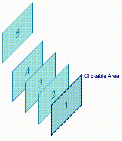
In the last article, we made a pretty cool little slider (or “carousel” if that’s what you prefer) that rotates in a circular direction. This time we are going to make one that flips through a stack of Polaroid images.

Cool right? Don’t look at the code quite yet because there’s a lot to unravel. Join me, will ya?

CSS Sliders series

The basic setup

Most of the HTML and CSS for this slider is similar to the circular one we made last time. In fact, we’re using the exact same markup:

<div class="gallery">
  <img src="" alt="">
  <img src="" alt="">
  <img src="" alt="">
  <img src="" alt="">
</div>

And this is the basic CSS that sets our parent .gallery container as a grid where all the images are stacked one on top of one another:

.gallery  {
  display: grid;
  width: 220px; /* controls the size */
}
.gallery > img {
  grid-area: 1 / 1;
  width: 100%;
  aspect-ratio: 1;
  object-fit: cover;
  border: 10px solid #f2f2f2;
  box-shadow: 0 0 4px #0007;
}

Nothing complex so far. Even for the Polaroid-like style for the images, all I’m using is some border and box-shadow. You might be able to do it better, so feel free to play around with those decorative styles! We’re going to put most of our focus on the animation, which is the trickiest part.

What’s the trick?

The logic of this slider relies on the stacking order of the images — so yes, we are going to play with z-index. All of the images start with the same z-index value (2) which will logically make the last image on the top of the stack.

We take that last image and slide it to the right until it reveals the next image in the stack. Then we decrease the image’s z-index value then we slide it back into the deck. And since its z-index value is lower than the rest of the images, it becomes the last image in the stack.

Here is a stripped back demo that shows the trick. Hover the image to activate the animation:

Now, imagine the same trick applied to all the images. Here’s the pattern if we’re using the :nth-child() pseudo-selector to differentiate the images:

  • We slide the last image (N). The next image is visible (N - 1).
  • We slide the next image (N - 1). The next image is visible (N - 2)
  • We slide the next image (N - 2). The next image is visible (N - 3)
  • (We continue the same process until we reach the first image)
  • We slide the first image (1). The last image (N) is visible again.

That’s our infinite slider!

Dissecting the animation

If you remember the previous article, I defined only one animation and played with delays to control each image. We will be doing the same thing here. Let’s first try to visualize the timeline of our animation. We will start with three images, then generalize it later for any number (N) of images.

Diagramming the three parts of the animation.

Our animation is divided into three parts: “slide to right”, “slide to left” and “don’t move”. We can easily identify the delay between each image. If we consider that the first image starts at 0s, and the duration is equal to 6s, then the second one will start at -2s and the third one at -4s.

.gallery > img:nth-child(2) { animation-delay: -2s; } /* -1 * 6s / 3 */
.gallery > img:nth-child(3) { animation-delay: -4s; } /* -2 * 6s / 3 */

We can also see that the “don’t move” part takes two-thirds of the whole animation (2*100%/3) while the “slide to right” and “slide to left” parts take one-third of it together — so, each one is equal to 100%/6 of the total animation.

We can write our animation keyframes like this:

@keyframes slide {
  0%     { transform: translateX(0%); }
  16.67% { transform: translateX(120%); }
  33.34% { transform: translateX(0%); }
  100%   { transform: translateX(0%); } 
}

That 120% is an arbitrary value. I needed something bigger than 100%. The images need to slide to the right away from the rest of the images. To do that, it needs to move by at least 100% of its size. That’s why I went 120% — to gain some extra space.

Now we need to consider the z-index. Don’t forget that we need to update the image’s z-index value after it slides to the right of the pile, and before we slide it back to the bottom of the pile.

@keyframes slide {
  0%     { transform: translateX(0%);   z-index: 2; }
  16.66% { transform: translateX(120%); z-index: 2; }
  16.67% { transform: translateX(120%); z-index: 1; } /* we update the z-order here */
  33.34% { transform: translateX(0%);   z-index: 1; }
  100%   { transform: translateX(0% );  z-index: 1; }  
}

Instead of defining one state at the 16.67% (100%/6) point in the timeline, we are defining two states at nearly identical points (16.66% and 16.67%) where the z-index value decreases before we slide back the image back to the deck.

Here’s what happens when we pull of all that together:

Hmmm, the sliding part seems to work fine, but the stacking order is all scrambled! The animation starts nicely since the top image is moving to the back… but the subsequent images don’t follow suit. If you notice, the second image in the sequence returns to the top of the stack before the next image blinks on top of it.

We need to closely follow the z-index changes. Initially, all the images have are z-index: 2. That means the stacking order should go…

Our eyes 👀 --> 3rd (2) | 2nd (2) | 1st (2)

We slide the third image and update its z-index to get this order:

Our eyes 👀 --> 2nd (2) | 1st (2) | 3rd (1)

We do the same with the second one:

Our eyes 👀 --> 1st (2) | 3rd (1) | 2nd (1)

…and the first one:

Our eyes 👀 --> 3rd (1) | 2nd (1) | 1st (1)

We do that and everything seems to be fine. But in reality, it’s not! When the first image is moved to the back, the third image will start another iteration, meaning it returns to z-index: 2:

Our eyes 👀 --> 3rd (2) | 2nd (1) | 1st (1)

So, in reality we never had all the images at z-index: 2 at all! When the images aren’t moving (i.e., the “don’t move” part of the animation) the z-index is 1. If we slide the third image and update its z-index value from 2 to 1, it will remain on the top! When all the images have the same z-index, the last one in the source order — our third image in this case — is on top of the stack. Sliding the third image results in the following:

Our eyes 👀 --> 3rd (1) | 2nd (1) | 1st (1)

The third image is still on the top and, right after it, we move the second image to the top when its animation restarts at z-index: 2:

Our eyes 👀 --> 2nd (2) | 3rd (1) | 1st (1)

Once we slide it, we get:

Our eyes 👀 --> 3rd (1) | 2nd (1) | 1st (1)

Then the first image will jump on the top:

Our eyes 👀 --> 1st(2) | 3rd (1) | 2nd (1)

OK, I am lost. All the logic is wrong then?

I know, it’s confusing. But our logic is not completely wrong. We only have to rectify the animation a little to make everything work the way we want. The trick is to correctly reset the z-index.

Let’s take the situation where the third image is on the top:

Our eyes 👀 -->  3rd (2) | 2nd (1) | 1st (1)

We saw that sliding the third image and changing its z-index keeps it on top. What we need to do is update the z-index of the second image. So, before we slide the third image away from the deck, we update the z-index of the second image to 2.

In other words, we reset the z-index of the second image before the animation ends.

Diagramming the parts of the animation with indicators for where z-index is increased or decreased.

The green plus symbol represents increasing z-index to 2, and the red minus symbol correlates to z-index: 1. The second image starts with z-index: 2, then we update it to 1 when it slides away from the deck. But before the first image slides away from the deck, we change the z-index of the second image back to 2. This will make sure both images have the same z-index, but still, the third one will remain on the top because it appears later in the DOM. But after the third image slides and its z-index is updated, it moves to the bottom.

This two-thirds through the animation, so let’s update our keyframes accordingly:

@keyframes slide {
  0%     { transform: translateX(0%);   z-index: 2; }
  16.66% { transform: translateX(120%); z-index: 2; }
  16.67% { transform: translateX(120%); z-index: 1; } /* we update the z-order here */
  33.34% { transform: translateX(0%);   z-index: 1; }
  66.33% { transform: translateX(0%);   z-index: 1; }
  66.34% { transform: translateX(0%);   z-index: 2; } /* and also here */
  100%   { transform: translateX(0%);   z-index: 2; }  
}

A little better, but still not quite there. There’s another issue…

Oh no, this will never end!

Don’t worry, we are not going to change the keyframes again because this issue only happens when the last image is involved. We can make a “special” keyframe animation specifically for the last image to fix things up.

When the first image is on the top, we have the following situation:

Our eyes 👀 -->  1st (2) | 3rd (1) | 2nd (1)

Considering the previous adjustment we made, the third image will jump on the top before the first image slides. It only happens in this situation because the next image that moves after the first image is the last image which has a higher order in the DOM. The rest of the images are fine because we have N, then N - 1, then we go from 3 to 2, and 2 to 1… but then we go from 1 to N.

To avoid that, we will use the following keyframes for the last image:

@keyframes slide-last {
  0%     { transform: translateX(0%);   z-index: 2;}
  16.66% { transform: translateX(120%); z-index: 2; }
  16.67% { transform: translateX(120%); z-index: 1; } /* we update the z-order here */
  33.34% { transform: translateX(0%);   z-index: 1; }
  83.33% { transform: translateX(0%);   z-index: 1; }
  83.34% { transform: translateX(0%);   z-index: 2; } /* and also here */
  100%   { transform: translateX(0%);   z-index: 2; }
}

We reset the z-index value 5/6 through the animation (instead of two-thirds) which is when the first image is out of the pile. So we don’t see any jumping!

TADA! Our infinite slider is now perfect! Here’s our final code in all its glory:

.gallery > img {
  animation: slide 6s infinite;
}
.gallery > img:last-child {
  animation-name: slide-last;
}
.gallery > img:nth-child(2) { animation-delay: -2s; } 
.gallery > img:nth-child(3) { animation-delay: -4s; }

@keyframes slide {
  0% { transform: translateX(0%); z-index: 2; }
  16.66% { transform: translateX(120%); z-index: 2; }
  16.67% { transform: translateX(120%); z-index: 1; } 
  33.34% { transform: translateX(0%); z-index: 1; }
  66.33% { transform: translateX(0%); z-index: 1; }
  66.34% { transform: translateX(0%); z-index: 2; } 
  100% { transform: translateX(0%); z-index: 2; }
}
@keyframes slide-last {
  0% { transform: translateX(0%); z-index: 2; }
  16.66% { transform: translateX(120%); z-index: 2; }
  16.67% { transform: translateX(120%); z-index: 1; }
  33.34% { transform: translateX(0%); z-index: 1; }
  83.33% { transform: translateX(0%); z-index: 1; }
  83.34% { transform: translateX(0%); z-index: 2; } 
  100%  { transform: translateX(0%); z-index: 2; }
}

Supporting any number of images

Now that our animation works for three images, let’s make it work for any number (N) of images. But first, we can optimize our work a little by splitting the animation up to avoid redundancy:

.gallery > img {
  z-index: 2;
  animation: 
    slide 6s infinite,
    z-order 6s infinite steps(1);
}
.gallery > img:last-child {
  animation-name: slide, z-order-last;
}
.gallery > img:nth-child(2) { animation-delay: -2s; } 
.gallery > img:nth-child(3) { animation-delay: -4s; }

@keyframes slide {
  16.67% { transform: translateX(120%); }
  33.33% { transform: translateX(0%); }
}
@keyframes z-order {
  16.67%,
  33.33% { z-index: 1; }
  66.33% { z-index: 2; }
}
@keyframes z-order-last {
  16.67%,
  33.33% { z-index: 1; }
  83.33% { z-index: 2; }
}

Way less code now! We make one animation for the sliding part and another one for the z-index updates. Note that we use steps(1) on the z-index animation. That’s because I want to abruptly change the z-index value, unlike the sliding animation where we want smooth movement.

Now that the code is easier to read and maintain, we have a better view for figuring out how to support any number of images. What we need to do is update the animation delays and the percentages of the keyframes. The delay are easy because we can use the exact same loop we made in the last article to support multiple images in the circular slider:

@for $i from 2 to ($n + 1) {
  .gallery > img:nth-child(#{$i}) {
    animation-delay: calc(#{(1 - $i)/$n}*6s);
  }
}

That means we’re moving from vanilla CSS to Sass. Next, we need to imagine how the timeline scale with N images. Let’s not forget that the animation happens in three phases:

Showing the three parts of the animation in a series of lines with arrows.

After “slide to right” and “slide to left”, the image should stay put until the rest of the images go through the sequence. So the “don’t move” part needs to take the same amount of time as (N - 1) as “slide to right” and “slide to left”. And within one iteration, N images will slide. So, “slide to right” and “slide to left” both take 100%/N of the total animation timeline. The image slides away from the pile at (100%/N)/2 and slides back at 100%/N .

We can change this:

@keyframes slide {
  16.67% { transform: translateX(120%); }
  33.33% { transform: translateX(0%); }
}

…to this:

@keyframes slide {
  #{50/$n}%  { transform: translateX(120%); }
  #{100/$n}% { transform: translateX(0%); }
}

If we replace N with 3, we get 16.67% and 33.33% when there are 3 images in the stack. It’s the same logic with the stacking order where we will have this:

@keyframes z-order {
  #{50/$n}%,
  #{100/$n}% { z-index: 1; }
  66.33% { z-index: 2; }
}

We still need to update the 66.33% point. That’s supposed to be where the image resets its z-index before the end of the animation. At that same time, the next image starts to slide. Since the sliding part takes 100%/N, the reset should happen at 100% - 100%/N:

@keyframes z-order {
  #{50/$n}%,
  #{100/$n}% { z-index: 1; }
  #{100 - 100/$n}% { z-index: 2; }
}

But for our z-order-last animation to work, it should happen a bit later in the sequence. Remember the fix we did for the last image? Resetting the z-index value needs to happen when the first image is out of the pile and not when it starts sliding. We can use the same reasoning here in our keyframes:

@keyframes z-order-last {
  #{50/$n}%,
  #{100/$n}% { z-index: 1; }
  #{100 - 50/$n}% { z-index: 2; }
}

We are done! Here’s what we get when using five images:

We can add a touch of rotation to make things a bit fancier:

All I did is append rotate(var(--r)) to the transform property. Inside the loop, --r is defined with a random angle:

@for $i from 1 to ($n + 1) {
  .gallery > img:nth-child(#{$i}) {
    --r: #{(-20 + random(40))*1deg}; /* a random angle between -20deg and 20deg */
  }
}

The rotation creates small glitches as we can sometimes see some of the images jumping to the back of the stack, but it’s not a big deal.

Wrapping up

All that z-index work was a big balancing act, right? If you were unsure how stacking order work before this exercise, then you probably have a much better idea now! If you found some of the explanations hard to follow, I highly recommend you to take another read of the article and map things out with pencil and paper. Try to illustrate each step of the animation using a different number of images to better understand the trick.

Last time, we used a few geometry tricks to create a circular slider that rotates back to the first image after a full sequence. This time, we accomplished a similar trick using z-index. In both cases, we didn’t duplicate any of the images to simulate a continuous animation, nor did we reach for JavaScript to help with the calculations.

Next time, we will make 3D sliders. Stay tuned!


CSS Infinite Slider Flipping Through Polaroid Images originally published on CSS-Tricks, which is part of the DigitalOcean family. You should get the newsletter.

CSS Infinite and Circular Rotating Image Slider

Image sliders (also called carousels) are everywhere. There are a lot of CSS tricks to create the common slider where the images slide from left to right (or the opposite). It’s the same deal with the many JavaScript libraries out there that create fancy sliders with complex animations. We are not going to do any of that in this post.

Through a little series of articles, we are going to explore some fancy and uncommon CSS-only sliders. If you are of tired seeing the same ol’ classic sliders, then you are in the right place!

CSS Sliders series

For this first article, we will start with something I call the “circular rotating image slider”:

Cool right? let’s dissect the code!

The HTML markup

If you followed my series of fancy image decorations or CSS grid and custom shapes, then you know that my first rule is to work with the smallest HTML possible. I always try hard to find CSS solutions before cluttering my code with a lot <div>s and other stuff.

The same rule applies here — our code is nothing but a list of images in a container.

Let’s say we’re working with four images:

<div class="gallery">
  <img src="" alt="">
  <img src="" alt="">
  <img src="" alt="">
  <img src="" alt="">
</div>

That’s it! Now let’s move to the interesting part of the code. But first, we’re going to dive into this to understand the logic of how our slider works.

How does it work?

Here is a video where I remove overflow: hidden from the CSS so we can better understand how the images are moving:

It’s like our four images are placed on a large circle that rotates counter-clockwise.

All the images have the same size (denoted by S in the figure). Note the blue circle which is the circle that intersects with the center of all the images and has a radius (R). We will need this value later for our animation. R is equal to 0.707 * S. (I’m going to skip the geometry that gives us that equation.)

Let’s write some CSS!

We will be using CSS Grid to place all the images in the same area above each other:

.gallery  {
  --s: 280px; /* control the size */

  display: grid;
  width: var(--s);
  aspect-ratio: 1;
  padding: calc(var(--s) / 20); /* we will see the utility of this later */
  border-radius: 50%;
}
.gallery > img {
  grid-area: 1 / 1;
  width: 100%;
  height: 100%;
  object-fit: cover;
  border-radius: inherit;
}

Nothing too complex so far. The tricky part is the animation.

We talked about rotating a big circle, but in reality, we will rotate each image individually creating the illusion of a big rotating circle. So, let’s define an animation, m, and apply it to the image elements:

.gallery > img {
  /* same as before */
  animation: m 8s infinite linear;
  transform-origin: 50% 120.7%;
}

@keyframes m {
  100% { transform: rotate(-360deg); }
}

The main trick relies on that highlighted line. By default, the CSS transform-origin property is equal to center (or 50% 50%) which makes the image rotate around its center, but we don’t need it to do that. We need the image to rotate around the center of the big circle that contains our images hence the new value for transform-origin.

Since R is equal to 0.707 * S, we can say that R is equal to 70.7% of the image size. Here’s a figure to illustrate how we got the 120.7% value:

Let’s run the animation and see what happens:

I know, I know. The result is far from what we want, but in reality we are very close. It may looks like there’s just one image there, but don’t forget that we have stacked all the images on top of each other. All of them are rotating at the same time and only the top image is visible. What we need is to delay the animation of each image to avoid this overlap.

.gallery > img:nth-child(2) { animation-delay: -2s; } /* -1 * 8s / 4 */
.gallery > img:nth-child(3) { animation-delay: -4s; } /* -2 * 8s / 4 */
.gallery > img:nth-child(4) { animation-delay: -6s; } /* -3 * 8s / 4 */

Things are already getting better!

If we hide the overflow on the container we can already see a slider, but we will update the animation a little so that each image remains visible for a short period before it moves along.

We’re going to update our animation keyframes to do just that:

@keyframes m {
  0%, 3% { transform: rotate(0); }
  22%, 27% { transform: rotate(-90deg); }
  47%, 52% { transform: rotate(-180deg); }
  72%, 77% { transform: rotate(-270deg); }
  98%, 100% { transform: rotate(-360deg); }
}

For each 90deg (360deg/4, where 4 is the number of images) we will add a small pause. Each image will remain visible for 5% of the overall duration before we slide to the next one (27%-22%, 52%-47%, etc.). I’m going to update the animation-timing-function using a cubic-bezier() function to make the animation a bit fancier:

Now our slider is perfect! Well, almost perfect because we are still missing the final touch: the colorful circular border that rotates around our images. We can use a pseudo-element on the .gallery wrapper to make it:

.gallery {
  padding: calc(var(--s) / 20); /* the padding is needed here */
  position: relative;
}
.gallery::after {
  content: "";
  position: absolute;
  inset: 0;
  padding: inherit; /* Inherits the same padding */
  border-radius: 50%;
  background: repeating-conic-gradient(#789048 0 30deg, #DFBA69 0 60deg);
  mask: 
    linear-gradient(#fff 0 0) content-box, 
    linear-gradient(#fff 0 0);
  mask-composite: exclude;
}
.gallery::after,
.gallery >img {
  animation: m 8s infinite cubic-bezier(.5, -0.2, .5, 1.2);
}

I have created a circle with a repeating conic gradient for the background while using a masking trick that only shows the padded area. Then I apply to it the same animation we defined for the images.

We are done! We have a cool circular slider:

Let’s add more images

Working with four images is good, but it would be better if we can scale it to any number of images. After all, this is the purpose of an image slider. We should be able to consider N images.

For this, we are going to make the code more generic by introducing Sass. First, we define a variable for the number of images ($n) and we will update every part where we hard-coded the number of images (4).

Let’s start with the delays:

.gallery > img:nth-child(2) { animation-delay: -2s; } /* -1 * 8s / 4 */
.gallery > img:nth-child(3) { animation-delay: -4s; } /* -2 * 8s / 4 */
.gallery > img:nth-child(4) { animation-delay: -6s; } /* -3 * 8s / 4 */

The formula for the delay is (1 - $i)*duration/$n, which gives us the following Sass loop:

@for $i from 2 to ($n + 1) {
  .gallery > img:nth-child(#{$i}) {
    animation-delay: calc(#{(1 - $i) / $n} * 8s);
  }
}

We can make the duration a variable as well if we really want to. But let’s move on to the animation:

@keyframes m {
  0%, 3% { transform: rotate(0); }
  22%, 27% { transform: rotate(-90deg); }
  47%, 52% { transform: rotate(-180deg); }
  72%, 77% { transform: rotate(-270deg); }
  98%, 100% {transform: rotate(-360deg); }
}

Let’s simplify it to get a better view of the pattern:

@keyframes m {
  0% { transform: rotate(0); }
  25% { transform: rotate(-90deg); }
  50% { transform: rotate(-180deg); }
  75% { transform: rotate(-270deg); }
  100% { transform: rotate(-360deg); }
}

The step between each state is equal to 25% — which is 100%/4 — and we add a -90deg angle — which is -360deg/4. That means we can write our loop like this instead:

@keyframes m {
  0% { transform: rotate(0); }
  @for $i from 1 to $n {
    #{($i / $n) * 100}% { transform: rotate(#{($i / $n) * -360}deg); }  
  }
  100% { transform: rotate(-360deg); }
}

Since each image takes 5% of the animation, we change this:

#{($i / $n) * 100}%

…with this:

#{($i / $n) * 100 - 2}%, #{($i / $n) * 100 + 3}%

It should be noted that 5% is an arbitrary value I choose for this example. We can also make it a variable to control how much time each image should stay visible. I am going to skip that for the sake of simplicity, but for homework, you can try to do it and share your implementation in the comments!

@keyframes m {
  0%,3% { transform: rotate(0); }
  @for $i from 1 to $n {
    #{($i / $n) * 100 - 2}%, #{($i / $n) * 100 + 3}% { transform: rotate(#{($i / $n) * -360}deg); }  
  }
  98%,100% { transform: rotate(-360deg); }
}

The last bit is to update transform-origin. We will need some geometry tricks. Whatever the number of images, the configuration is always the same. We have our images (small circles) placed inside a big circle and we need to find the value of the radius, R.

You probably don’t want a boring geometry explanation so here’s how we find R:

R = S / (2 * sin(180deg / N))

If we express that as a percentage, that gives us:

R = 100% / (2 * sin(180deg / N)) = 50% / sin(180deg / N)

…which means the transform-origin value is equal to:

transform-origin: 50% (50% / math.sin(180deg / $n) + 50%);

We’re done! We have a slider that works with any number images!

Let’s toss nine images in there:

Add as many images as you want and update the $n variable with the total number of images.

Wrapping up

With a few tricks using CSS transforms and standard geometry, we created a nice circular slider that doesn’t require a lot of code. What is cool about this slider is that we don’t need to bother duplicating the images to keep the infinite animation since we have a circle. After a full rotation, we will get back to the first image!


CSS Infinite and Circular Rotating Image Slider originally published on CSS-Tricks, which is part of the DigitalOcean family. You should get the newsletter.

Hacking CSS Animation State and Playback Time

CSS-only Wolfenstein is a little project that I made a few weeks ago. It was an experiment with CSS 3D transformations and animations.

Inspired by the FPS demo and another Wolfenstein CodePen, I decided to build my own version. It is loosely based on Episode 1 – Floor 9 of the original Wolfenstein 3D game.

Editor: This game intentionally requires some quick reaction to avoid a Game Over screen.

Here is a playthrough video:

In a nutshell, my project is nothing but a carefully scripted long CSS animation. Plus a few instances of the checkbox hack.

:checked ~ div { animation-name: spin; }

The environment consists of 3D grid faces and the animations are mostly plain 3D translations and rotations. Nothing really fancy.

However, two problems were particularly tricky to solve:

  • Play the “weapon firing” animation whenever the player clicks on an enemy.
  • When the fast-moving boss got the last hit, enter a dramatic slow motion.

At a technical-level, this meant:

  • Replay an animation when the next checkbox is checked.
  • Slow down an animation, when a checkbox is checked.

In fact, neither was properly solved in my project! I either ended up using workarounds or just gave up.

On the other hand, after some digging, eventually I found the key to both problems: altering the properties of running CSS animations. In this article, we will explore further on this topic:

  • Lots of interactive examples.
  • Dissections: how does each example work (or not work)?
  • Behind-the-scene: how do browsers handle animation states?

Let me “toss my bricks”.

Problem 1: Replaying Animation

The first example: “just another checkbox”

My first intuition was “just add another checkbox”, which does not work:

Each checkbox works individually, but not both together. If one checkbox is already checked, the other no longer works.

Here’s how it works (or “does not work”):

  1. The animation-name of <div> is none by default.
  2. The user clicks on one checkbox, animation-name becomes spin, and the animation starts from the beginning.
  3. After a while, the user clicks on the other checkbox. A new CSS rule takes effect, but animation-name is still spin, which means no animation is added nor removed. The animation simply continues playing as if nothing happened.

The second example: “cloning the animation”

One working approach is to clone the animation:

#spin1:checked ~ div { animation-name: spin1; }
#spin2:checked ~ div { animation-name: spin2; }

Here’s how it works:

  1. animation-name is none initially.
  2. The user clicks on “Spin!”, animation-name becomes spin1. The animation spin1 is started from the beginning because it was just added.
  3. The user clicks on “Spin again!”, animation-name becomes spin2. The animation spin2 is started from the beginning because it was just added.

Note that in Step #3, spin1 is removed because of the order of the CSS rules. It won’t work if “Spin again!” is checked first.

The third example: “appending the same animation”

Another working approach is to “append the same animation”:

#spin1:checked ~ div { animation-name: spin; }
#spin2:checked ~ div { animation-name: spin, spin; }

This is similar to the previous example. You can actually understand the behavior this way:

#spin1:checked ~ div { animation-name: spin1; }
#spin2:checked ~ div { animation-name: spin2, spin1; }

Note that when “Spin again!” is checked, the old running animation becomes the second animation in the new list, which could be unintuitive. A direct consequence is: the trick won’t work if animation-fill-mode is forwards. Here’s a demo:

If you wonder why this is the case, here are some clues:

  • animation-fill-mode is none by default, which means “The animation has no effect at all if not playing”.
  • animation-fill-mode: forwards; means “After the animation finishes playing, it must stay at the last keyframe forever”.
  • spin1’s decision always override spin2’s because spin1 appears later in the list.
  • Suppose the user clicks on “Spin!”, waits for a full spin, then clicks on “Spin again!”. At this moment. spin1 is already finished, and spin2 just starts.

Discussion

Rule of thumb: you cannot “restart” an existing CSS animation. Instead, you want to add and play a new animation. This may be confirmed by the W3C spec:

Once an animation has started it continues until it ends or the animation-name is removed.

Now comparing the last two examples, I think in practice, “cloning animations” should often work better, especially when CSS preprocessor is available.

Problem 2: Slow Motion

One might think that slowing an animation is just a matter of setting a longer animation-duration:

div { animation-duration: 0.5s; }
#slowmo:checked ~ div { animation-duration: 1.5s; }

Indeed, this works:

… or does it?

With a few tweaks, it should be easier to see the issue.

Yes, the animation is slowed down. And no, it does not look good. The dog (almost) always “jumps” when you toggle the checkbox. Furthermore, the dog seems to jump to a random position rather than the initial one. How come?

It would be easier to understand it if we introduced two “shadow elements”:

Both shadow elements are running the same animations with different animation-duration. And they are not affected by the checkbox.

When you toggle the checkbox, the element just immediately switches between the states of two shadow elements.

Quoting the W3C spec:

Changes to the values of animation properties while the animation is running apply as if the animation had those values from when it began.

This follows the stateless design, which allows browsers to easily determine the animated value. The actual calculation is described here and here.

Another Attempt

One idea is to pause the current animation, then add a slower animation that takes over from there:

div {
  animation-name: spin1;
  animation-duration: 2s;
}

#slowmo:checked ~ div {
  animation-name: spin1, spin2;
  animation-duration: 2s, 5s;
  animation-play-state: paused, running;
}

So it works:

… or does it?

It does slow down when you click on “Slowmo!”. But if you wait for a full circle, you will see a “jump”. Actually, it always jumps to the position when “Slowmo!” is clicked on.

The reason is we don’t have a from keyframe defined – and we shouldn’t. When the user clicks on “Slowmo!”, spin1 is paused at some position, and spin2 starts at exactly the same position. We simply cannot predict that position beforehand … or can we?

A Working Solution

We can! By using a custom property, we can capture the angle in the first animation, then pass it to the second animation:

div {
  transform: rotate(var(--angle1));
  animation-name: spin1;
  animation-duration: 2s;
}

#slowmo:checked ~ div {
  transform: rotate(var(--angle2));
  animation-name: spin1, spin2;
  animation-duration: 2s, 5s;
  animation-play-state: paused, running;
}

@keyframes spin1 {
  to {
    --angle1: 360deg;
  }
}

@keyframes spin2 {
  from {
    --angle2: var(--angle1);
  }
  to {
    --angle2: calc(var(--angle1) + 360deg);
  }
}

Note: @property is used in this example, which is not supported by all browsers.

The “Perfect” Solution

There is a caveat to the previous solution: “exiting slowmo” does not work well.

Here is a better solution:

In this version, slow motion can be entered or exited seamlessly. No experimental feature is used either. So is it the perfect solution? Yes and no.

This solution works like “shifting” “gears”:

  • Gears: there are two <div>s. One is the parent of the other. Both have the spin animation but with different animation-duration. The final state of the element is the accumulation of both animations.
  • Shifting: At the beginning, only one <div> has its animation running. The other is paused. When the checkbox is toggled, both animations swap their states.

While I really like the result, there is one problem: it is a nice exploit of the spin animation, which does not work for other types of animations in general.

A Practical Solution (with JS)

For general animations, it is possible to achieve the slow motion function with a bit of JavaScript:

A quick explanation:

  • A custom property is used to track the animation progress.
  • The animation is “restarted” when the checkbox is toggled.
  • The JS code computes the correct animation-delay to ensure a seamless transition. I recommend this article if you are not familiar with negative values of animation-delay.

You can view this solution as a hybrid of “restarting animation” and the “gear-shifting” approach.

Here it is important to track the animation progress correctly. Workarounds are possible if @property is not available. As an example, this version uses z-index to track the progress:

Side-note: originally, I also tried to create a CSS-only version but did not succeed. While not 100% sure, I think it is because animation-delay is not animatable.

Here is a version with minimal JavaScript. Only “entering slowmo” works.

Please let me know if you manage to create a working CSS-only version!

Slow-mo Any Animation (with JS)

Lastly, I’d like to share a solution that works for (almost) any animation, even with multiple complicated @keyframes:

Basically, you need to add an animation progress tracker, then carefully compute animation-delay for the new animation. However, sometimes it could be tricky (but possible) to get the correct values.

For example:

  • animation-timing-function is not linear.
  • animation-direction is not normal.
  • multiple values in animation-name with different animation-duration’s and animation-delay’s.

This method is also described here for the Web Animations API.

Acknowledgments

I started down this path after encountering CSS-only projects. Some were delicate artwork, and some were complex contraptions. My favorites are those involving 3D objects, for example, this bouncing ball and this packing cube.

In the beginning, I had no clue how these were made. Later I read and learned a lot from this nice tutorial by Ana Tudor.

As it turned out, building and animating 3D objects with CSS is not much different from doing it with Blender, just with a bit different flavor.

Conclusion

In this article we examined the behavior of CSS animations when an animate-* property is altered. Especially we worked out solutions for “replaying an animation” and “animation slow-mo”.

I hope you find this article interesting. Please let me know your thoughts!


Hacking CSS Animation State and Playback Time originally published on CSS-Tricks, which is part of the DigitalOcean family. You should get the newsletter.

Diagonal Stripes Wipe Animation

I was playing this game on Apple Arcade the other day called wurdweb. It’s a fun little game! Little touches like the little shape dudes that walk around the screen (but otherwise don’t do anything) give it a lot of character. I kinda want little shape dudes that walk around on websites. But another UI choice caught my eye, the way that transitions between screens have these diagonal lines that grow and fill the screen, like window blinds closing, kinda.

Here’s a quick screencast showing how those wipes work:

I wanted to have a crack at building this.

The first thing that went through my mind is repeating-linear-gradient and how that can be used to build stripes. So say we set up like this:

.gradient {
  background-image:
    repeating-linear-gradient(
      45deg,
      #ff8a00,
      #ff8a00 10px,
      #e52e71 10px,
      #e52e71 20px
    );
}

That would buy us stripes like this:

We can use transparent as a color though. Meaning if we covered the screen with stripes like these, we could see through where that color is. Say like this:

In that gradient definition, we use 10px as the “start” and 20px as the “end” of the gradient before it repeats. Part of the trick here is keeping that 20px “end” the same and animating the “start” number up to it. When we do that, it actually covers the screen in a solid color. The problem is… how do you animate it? You can’t do this:

Screenshot of a CSS code snippet on a dark gray background with syntax highlighting. An arrow is pointing from the repeating linear gradient on the element to another repeating linear gradient inside keyframes. A note that says not going to animate is displayed in large white letters above a crying emoji.

What we need to do is animate that “start” pixel value number alone. We can use a custom property, but it’s a little tricky because without declaring them, custom properties are just strings, and not animatable lengths. So we’d have to do it like this.

@property --start {
  syntax: "<length>";
  inherits: false;
  initial-value: 10px;
}
#cover {
  position: fixed;
  top: 0;
  left: 0;
  width: 100%;
  height: 100%;
  background-image: repeating-linear-gradient(
    45deg,
    #ff8a00,
    #ff8a00 var(--start),
    transparent var(--start),
    transparent var(--end, 20px)
  );
  animation: cover 1s linear infinite;
}
@keyframes cover {
  to {
    --start: 20px;
  }
}

We’ve got to use @property here to do this, which I really like but, sadly, has limited browser support. It does work though! I’ve got all that set up, including a quick prefers-reduced-motion media query. I’m using a smidge of JavaScript to change the background halfway through the animation (while the screen is covered) so you can see how it might be used for a screen transition. Again, note that this is only working in Chromium-based browsers at the moment:

Notice I’ve used CSS custom properties for other things as well, like the angle and size of the stripes and the speed of the animation. They are both very trivial to change! I’ve chucked in knobs so you can adjust things to your liking. Knobs? Yeah, they are cool:

Like and subscribe

This whole thing started as a tweet. In this case, I’m glad I did as Temani Afif chimed in with a way to do it with masks as well, meaning pretty solid support across all browsers:

I don’t think animating background color stops or a mask position is particularly performant, but since we’re talking “screen wipes” here, one could imagine that the page isn’t likely to be interacted with anymore until the page transition is over, so maybe that’s not the world’s biggest deal.

Recreating the Apple Music Hits Playlist Animation in CSS

Apple Music has this “Spatial Audio” feature where the direction of the music in your headphones is based on the location of the device. It’s tough to explain just how neat it is. But that’s not what I’m here to talk about.

I opened up the Apple Music app and saw a featured playlist of hit songs that support Spatial Audio. The cover for it is this brightly-colored pink container that holds a bunch of boxes stacked one on top of another. The boxes animate in one at a time, fading in at the center of the container, then fading out as it scales to the size of the container. Like an infinite loop.

Animated GIF showing the Apple Music UI we are recreating. It's brightly colored shades of pink against a dark gray background with information about the playlist to the right of the pattern, and options to play and shuffle the sings in orange buttons.

Cool! I knew I had to re-create it in CSS. So I did.

Here’s how it works…

The markup

I started with the HTML. There’s obviously a container we need to define, plus however many boxes we want to animate. I went with an even 10 boxes in the container.

<div class="container">
  <div class="box"></div>
  <div class="box"></div>
  <div class="box"></div>
  <!-- etc. -->
</div>

That’s literally it for HTML. We are free to jump right into the CSS!

Styling the container

Nothing too fancy here. I measured approximate dimensions based on what I saw in Apple Music, which happened to be 315px × 385px. then I took a screenshot of the cover and dropped it into my image editing app to get the lightest possible color, which is around the outside edges of the container. My color picker landed on #eb5bec.

.container {
  background-color: #eb5bec;
  height: 315px;
  width: 385px;
}

As I was doing this, I knew I would probably want this to be a grid container to align the boxes and any other elements in the center. I also figured that the boxes themselves would start from the center of the container and stack on top of one another, meaning there will be some absolute positioning. That also means the container ought to have relative positioning to reign them in.

.container {
  background-color: #eb5bec;
  height: 315px;
  position: relative;
  width: 385px;
}

And since we want the boxes to start from the center, we can reach for grid to help with that:

.container {
  background-color: #eb5bec;
  display: grid;
  height: 315px;
  place-items: center;
  position: relative;
  width: 385px;
}

If the boxes in the container are growing outward, then there’s a chance that they could expand beyond the container. Better hide any possible overflow.

.container {
  background-color: #eb5bec;
  height: 315px;
  overflow: hidden;
  position: relative;
  width: 385px;
}

I also noticed some rounded corners on it, so let’s drop that in while we’re here.

.container {
  background-color: #eb5bec;
  border-radius: 16px;
  height: 315px;
  position: relative;
  width: 385px;
}

So far, so good!

Styling the boxes

We have 10 .box elements in the markup and we want them stacked on top of one another. I started with some absolute positioning, then sized them at 100px square. Then I did the same thing with my image editing app to find the darkest color value of a box, which was #471e45.

.box {
  background: #471e45;
  height: 100px;
  position: absolute;
  width: 100px;
}

The boxes seem to fade out as they grow. That allows one box to be seen through the other, so let’s make them opaque to start.

.box {
  background: #471e45;
  height: 100px;
  opacity: 0.5;
  position: absolute;
  width: 100px;
}

Cool, cool. We’re unable to see all the boxes as they’re stacked on top of one another, but we’re making progress!

Creating the animation

Ready to write some @keyframes? We’re gonna make this super simple, going from 0 to 100% without any steps in between. We don’t even need those percentages!

@keyframes grow {
  from {
    /* do stuff */
  }
  to {
    /* do stuff */
  }
}

Specifically, we want two things to happen from start to finish:

  • The boxes go from our starting opacity value of 0.5 to 0 (fully transparent).
  • The boxes scale up to the edges of the container.
@keyframes grow {
  from {
    opacity: 0.5;
    transform: scale(0);
  }
  to {
    opacity: 0;
    transform: scale(3.85);
  }
}

How’d I land on scaling the boxes up by 3.85? Our boxes are 100px square and the container is 385px tall. A value of 3.85 gets the boxes up to 385px as they fade completely out which makes for a nice linear animation when we get there.

Speaking of which…

Applying the animation

It’s pretty easy to call the animation on our boxes. Just gotta make sure it moves in a liner timing function on an infinite basis so it’s like the Energizer Bunny and keeps going and going and going and going and…

.box {
  animation: grow 10s linear infinite; /* 10s = 10 boxes */
  /* etc. */
}

This gives us the animation we want. But! The boxes are all moving at the same time, so all we see is one giant box growing.

We’ve gotta stagger those little fellers. No loops in vanilla CSS, unfortunately, so we have to delay each box individually. We can start by setting a custom property for the delay, set it to one second, then redefine the custom property on each instance.

.box {
  --delay: 1s;
  
  animation-delay: var(--delay);
  /* same as before */
}
.box:nth-child(2) {
  --delay: 2s;
}
.box:nth-child(3) {
  --delay: 3s;
}
.box:nth-child(4) {
  --delay: 4s;
}
.box:nth-child(5) {
  --delay: 5s;
}
/* five more times... */

Huzzah!

Keep on rockin’

That’s it! We just recreated the same sort of effect used by Apple Music. There are a few finishing touches we could plop in there, like the content and whatnot. Here’s my final version again:


The post Recreating the Apple Music Hits Playlist Animation in CSS appeared first on CSS-Tricks. You can support CSS-Tricks by being an MVP Supporter.

A Handy Little System for Animated Entrances in CSS

I love little touches that make a website feel like more than just a static document. What if web content wouldn’t just “appear” when a page loaded, but instead popped, slid, faded, or spun into place? It might be a stretch to say that movements like this are always useful, though in some cases they can draw attention to certain elements, reinforce which elements are distinct from one another, or even indicate a changed state. So, they’re not totally useless, either.

So, I put together a set of CSS utilities for animating elements as they enter into view. And, yes, this pure CSS. It not only has a nice variety of animations and variations, but supports staggering those animations as well, almost like a way of creating scenes.

You know, stuff like this:

Which is really just a fancier version of this:

We’ll go over the foundation I used to create the animations first, then get into the little flourishes I added, how to stagger animations, then how to apply them to HTML elements before we also take a look at how to do all of this while respecting a user’s reduced motion preferences.

The basics

The core idea involves adding a simple CSS @keyframes animation that’s applied to anything we want to animate on page load. Let’s make it so that an element fades in, going from opacity: 0 to opacity: 1 in a half second:

.animate {
  animation-duration: 0.5s;
  animation-name: animate-fade;
  animation-delay: 0.5s;
  animation-fill-mode: backwards;
}

@keyframes animate-fade {
  0% { opacity: 0; }
  100% { opacity: 1; }
}

Notice, too, that there’s an animation-delay of a half second in there, allowing the rest of the site a little time to load first. The animation-fill-mode: backwards is there to make sure that our initial animation state is active on page load. Without this, our animated element pops into view before we want it to.

If we’re lazy, we can call it a day and just go with this. But, CSS-Tricks readers aren’t lazy, of course, so let’s look at how we can make this sort of thing even better with a system.

Fancier animations

It’s much more fun to have a variety of animations to work with than just one or two. We don’t even need to create a bunch of new @keyframes to make more animations. It’s simple enough to create new classes where all we change is which frames the animation uses while keeping all the timing the same.

There’s nearly an infinite number of CSS animations out there. (See animate.style for a huge collection.) CSS filters, like blur(), brightness() and saturate() and of course CSS transforms can also be used to create even more variations.

But for now, let’s start with a new animation class that uses a CSS transform to make an element “pop” into place.

.animate.pop {
  animation-duration: 0.5s;
  animation-name: animate-pop;
  animation-timing-function: cubic-bezier(.26, .53, .74, 1.48);
}

@keyframes animate-pop {
  0% {
    opacity: 0;
    transform: scale(0.5, 0.5);
  }

  100% {
    opacity: 1;
    transform: scale(1, 1);
  }
}

I threw in a little cubic-bezier() timing curve, courtesy of Lea Verou’s indispensable cubic-bezier.com for a springy bounce.

Adding delays

We can do better! For example, we can animate elements so that they enter at different times. This creates a stagger that makes for complex-looking motion without a complex amount of code.

This animation on three page elements using a CSS filter, CSS transform, and staggered by about a tenth of a second each, feels really nice:

All we did there was create a new class for each element that spaces when the elements start animating, using animation-delay values that are just a tenth of a second apart.

.delay-1 { animation-delay: 0.6s; }  
.delay-2 { animation-delay: 0.7s; }
.delay-3 { animation-delay: 0.8s; }

Everything else is exactly the same. And remember that our base delay is 0.5s, so these helper classes count up from there.

Respecting accessibility preferences

Let’s be good web citizens and remove our animations for users who have enabled their reduced motion preference setting:

@media screen and (prefers-reduced-motion: reduce) {
  .animate { animation: none !important; }
}

This way, the animation never loads and elements enter into view like normal. It’s here, though, that is worth a reminder that “reduced” motion doesn’t always mean “remove” motion.

Applying animations to HTML elements

So far, we’ve looked at a base animation as well as a slightly fancier one that we were able to make even fancier with staggered animation delays that are contained in new classes. We also saw how we can respect user motion preferences at the same time.

Even though there are live demos that show off the concepts, we haven’t actually walked though how to apply our work to HTML. And what’s cool is that we can use this on just about any element, whether its a div, span, article, header, section, table, form… you get the idea.

Here’s what we’re going to do. We want to use our animation system on three HTML elements where each element gets three classes. We could hard-code all the animation code to the element itself, but splitting it up gives us a little animation system we can reuse.

  • .animate: This is the base class that contains our core animation declaration and timing.
  • The animation type: We’ll use our “pop” animation from before, but we could use the one that fades in as well. This class is technically optional but is a good way to apply distinct movements.
  • .delay-<number>: As we saw earlier, we can create distinct classes that are used to stagger when the animation starts on each element, making for a neat effect. This class is also optional.

So our animated elements might now look like:

<h2 class="animate pop">One!</h2>
<h2 class="animate pop delay-1">Two!</h2>
<h2 class="animate pop delay-2">Three!</h2>

Let’s count them in!

Conclusion

Check that out: we went from a seemingly basic set of @keyframes and turned it into a full-fledged system for applying interesting animations for elements entering into view.

This is ridiculously fun, of course. But the big takeaway for me is how the examples we looked at form a complete system that can be used to create a baseline, different types of animations, staggered delays, and an approach for respecting user motion preferences. These, to me, are all the ingredients for a flexible system that easy to use, while giving us a lot with a little and without a bunch of extra cruft.

What we covered could indeed be a full animation library. But, of course, I did’t stop there and have my entire CSS file of animations in all its glory for you. There are several more types of animations in there, including 15 classes of different delays that can be used for staggering things. I’ve been using these on my own projects, but it’s still an early draft and I love feedback on it—so please enjoy and let me know what you think in the comments!

/* ==========================================================================
Animation System by Neale Van Fleet from Rogue Amoeba
========================================================================== */
.animate {
  animation-duration: 0.75s;
  animation-delay: 0.5s;
  animation-name: animate-fade;
  animation-timing-function: cubic-bezier(.26, .53, .74, 1.48);
  animation-fill-mode: backwards;
}

/* Fade In */
.animate.fade {
  animation-name: animate-fade;
  animation-timing-function: ease;
}

@keyframes animate-fade {
  0% { opacity: 0; }
  100% { opacity: 1; }
}

/* Pop In */
.animate.pop { animation-name: animate-pop; }

@keyframes animate-pop {
  0% {
    opacity: 0;
    transform: scale(0.5, 0.5);
  }
  100% {
    opacity: 1;
    transform: scale(1, 1);
  }
}

/* Blur In */
.animate.blur {
  animation-name: animate-blur;
  animation-timing-function: ease;
}

@keyframes animate-blur {
  0% {
    opacity: 0;
    filter: blur(15px);
  }
  100% {
    opacity: 1;
    filter: blur(0px);
  }
}

/* Glow In */
.animate.glow {
  animation-name: animate-glow;
  animation-timing-function: ease;
}

@keyframes animate-glow {
  0% {
    opacity: 0;
    filter: brightness(3) saturate(3);
    transform: scale(0.8, 0.8);
  }
  100% {
    opacity: 1;
    filter: brightness(1) saturate(1);
    transform: scale(1, 1);
  }
}

/* Grow In */
.animate.grow { animation-name: animate-grow; }

@keyframes animate-grow {
  0% {
    opacity: 0;
    transform: scale(1, 0);
    visibility: hidden;
  }
  100% {
    opacity: 1;
    transform: scale(1, 1);
  }
}

/* Splat In */
.animate.splat { animation-name: animate-splat; }

@keyframes animate-splat {
  0% {
    opacity: 0;
    transform: scale(0, 0) rotate(20deg) translate(0, -30px);
    }
  70% {
    opacity: 1;
    transform: scale(1.1, 1.1) rotate(15deg));
  }
  85% {
    opacity: 1;
    transform: scale(1.1, 1.1) rotate(15deg) translate(0, -10px);
  }

  100% {
    opacity: 1;
    transform: scale(1, 1) rotate(0) translate(0, 0);
  }
}

/* Roll In */
.animate.roll { animation-name: animate-roll; }

@keyframes animate-roll {
  0% {
    opacity: 0;
    transform: scale(0, 0) rotate(360deg);
  }
  100% {
    opacity: 1;
    transform: scale(1, 1) rotate(0deg);
  }
}

/* Flip In */
.animate.flip {
  animation-name: animate-flip;
  transform-style: preserve-3d;
  perspective: 1000px;
}

@keyframes animate-flip {
  0% {
    opacity: 0;
    transform: rotateX(-120deg) scale(0.9, 0.9);
  }
  100% {
    opacity: 1;
    transform: rotateX(0deg) scale(1, 1);
  }
}

/* Spin In */
.animate.spin {
  animation-name: animate-spin;
  transform-style: preserve-3d;
  perspective: 1000px;
}

@keyframes animate-spin {
  0% {
    opacity: 0;
    transform: rotateY(-120deg) scale(0.9, .9);
  }
  100% {
    opacity: 1;
    transform: rotateY(0deg) scale(1, 1);
  }
}

/* Slide In */
.animate.slide { animation-name: animate-slide; }

@keyframes animate-slide {
  0% {
    opacity: 0;
    transform: translate(0, 20px);
  }
  100% {
    opacity: 1;
    transform: translate(0, 0);
  }
}

/* Drop In */
.animate.drop { 
  animation-name: animate-drop; 
  animation-timing-function: cubic-bezier(.77, .14, .91, 1.25);
}

@keyframes animate-drop {
0% {
  opacity: 0;
  transform: translate(0,-300px) scale(0.9, 1.1);
}
95% {
  opacity: 1;
  transform: translate(0, 0) scale(0.9, 1.1);
}
96% {
  opacity: 1;
  transform: translate(10px, 0) scale(1.2, 0.9);
}
97% {
  opacity: 1;
  transform: translate(-10px, 0) scale(1.2, 0.9);
}
98% {
  opacity: 1;
  transform: translate(5px, 0) scale(1.1, 0.9);
}
99% {
  opacity: 1;
  transform: translate(-5px, 0) scale(1.1, 0.9);
}
100% {
  opacity: 1;
  transform: translate(0, 0) scale(1, 1);
  }
}

/* Animation Delays */
.delay-1 {
  animation-delay: 0.6s;
}
.delay-2 {
  animation-delay: 0.7s;
}
.delay-3 {
  animation-delay: 0.8s;
}
.delay-4 {
  animation-delay: 0.9s;
}
.delay-5 {
  animation-delay: 1s;
}
.delay-6 {
  animation-delay: 1.1s;
}
.delay-7 {
  animation-delay: 1.2s;
}
.delay-8 {
  animation-delay: 1.3s;
}
.delay-9 {
  animation-delay: 1.4s;
}
.delay-10 {
  animation-delay: 1.5s;
}
.delay-11 {
  animation-delay: 1.6s;
}
.delay-12 {
  animation-delay: 1.7s;
}
.delay-13 {
  animation-delay: 1.8s;
}
.delay-14 {
  animation-delay: 1.9s;
}
.delay-15 {
  animation-delay: 2s;
}

@media screen and (prefers-reduced-motion: reduce) {
  .animate {
    animation: none !important;
  }
}

The post A Handy Little System for Animated Entrances in CSS appeared first on CSS-Tricks. You can support CSS-Tricks by being an MVP Supporter.

Of Course We Can Make a CSS-Only Clock That Tells the Current Time!

Let’s build a fully functioning and settable “analog” clock with CSS custom properties and the calc() function. Then we’ll convert it into a “digital” clock as well. All this with no JavaScript!

Here’s a quick look at the clocks we’ll make:

Brushing up on the calc() function

CSS preprocessors teased us forever with the ability to calculate numerical CSS values. The problem with pre-processors is that they lack knowledge of the context after the CSS code has compiled. This is why it’s impossible to say you want your element width to be 100% of the container minus 50 pixels. This produces an error in a preprocessor:

width: 100% - 50px;
// error: Incompatible units: 'px' and '%'

Preprocessors, as their name suggests, preprocess your instructions, but their output is still just plain old CSS which is why they can’t reconcile different units in your arithmetic operations. Ana has gone into great detail on the conflicts between Sass and CSS features.

The good news is that native CSS calculations are not only possible, but we can even combine different units, like pixels and percentages with the calc() function:

width: calc(100% - 50px);

calc() can be used anywhere a length, frequency, angle, time, percentage, number, or integer is allowed. Check out the CSS Guide to CSS Functions for a complete overview.

What makes this even more powerful is the fact that you can combine calc() with CSS custom properties—something preprocessors are unable to handle.

The hands of the clock

Image of a round clock with a light grey background. The hours hand is dark blue pointed at 2, the minutes are light blue pointed at 9 and the seconds are yellow and pointed at 2.

Let’s lay out the foundations first with a few custom properties and the animation definition for the hands of the analog clock:

:root {
  --second: 1s;
  --minute: calc(var(--second) * 60);
  --hour: calc(var(--minute) * 60);
}
@keyframes rotate {
  from { transform: rotate(0); }
  to { transform: rotate(1turn); }
}

Everything starts in the root context with the --second custom property where we defined that a second should be, well, one second (1s). All future values and timings will be derived from this.

This property is essentially the heart of our clock and controls how fast or slow all of the clock’s hands go. Setting --second to 1s makes the clock match real-life time but we could make it go at half speed by setting it to 2s, or even 100 times faster by setting it to 10ms.

The first property we are calculating is the --minute hand, which we want equal to 60 times one second. We can reference the value from the --second property and multiply it by 60 with the help of calc() :

--minute: calc(var(--second) * 60);

The --hour hand property is defined using the exact same principle but multiplied by the --minute hand value:

--hour: calc(var(--minute) * 60);

We want all three hands on the clock to rotate from 0 to 360 degrees—around the shape of the clock face! The difference between the three animations is how long it takes each to go all the way around. Instead of using 360deg as our full-circle value, we can use the perfectly valid CSS value of 1turn.

@keyframes rotate {
  from { transform: rotate(0); }
  to { transform: rotate(1turn); }
}

These @keyframes simply tell the browser to turn the element around once during the animation. We have defined an animation named rotate and it is now ready to be assigned to the clock’s second hand:

.second.hand {
  animation: rotate steps(60) var(--minute) infinite;
}

We’re using the animation shorthand property to define the details of the animation. We added the name of the animation (rotate), how long we want the animation to run (var(--minute), or 60 seconds) and how many times to run it (infinite, meaning it never stops running). steps(60) is the animation timing function which tells the browser to perform the 1-turn animation in 60 equal steps. This way, the seconds hand ticks at each second rather than rotating smoothly along the circle.

While we are discussing CSS animations, we can define an animation delay (animation-delay) if we want the animation to start later, and we can change whether the animation should play forwards or backwards using animation-direction. We can even pause and restart the animations with animation-play-state.

The animation on the minute and hour hands will work very much like on the second hand. The difference is that multiple steps are unnecessary here—these hands can rotate in a smooth, linear fashion.

The minute hand takes one hour to complete one full turn, so:

.minute.hand {
  animation: rotate linear var(--hour) infinite;
}

On the other hand (pun intended) the hour hand takes twelve hours to go around the clock. We don’t have a separate custom property for this amount of time, like --half-day, so we will multiply --hour by twelve:

.hour.hand {
  animation: rotate linear calc(var(--hour) * 12) infinite;
}

You probably get the idea of how the hands of the clock work by now. But it would not be a complete example if we didn’t actually build the clock.

The clock face

So far, we’ve only looked at the CSS aspect of the clock. We also need some HTML for all that to work. Here’s what I’m using:

<main>
  <div class="clock">
    <div class="second hand"></div>
    <div class="minute hand"></div>
    <div class="hour hand"></div>
  </div>
</main>

Let’s see what we have to do to style our clock:

.clock {
  width: 300px;
  height: 300px;
  border-radius: 50%;
  background-color: var(--grey);
  margin: 0 auto;
  position: relative;
}

We made the clock 300px tall and wide, made the background color grey (using a custom property, --grey, we can define later) and turned it into a circle with a 50% border radius.

There are three hands on the clock. Let’s first move these to the center of the clock face with absolute positioning:

.hand {
  position: absolute;
  left: 50%;
  top: 50%;
}

Notice the name of this class (.hands) because all three hands use it for their base styles. That’s important because any changes to this class are applied to all three hands.

Let’s define the hand dimensions and color things up:

.hand {
  position: absolute;
  left: 50%;
  top: 50%;
  width: 10px;
  height: 150px;
  background-color: var(--blue);
}

The hands are now all in place:

A round clock with just one light blue hand pointing directly at 6.

Getting proper rotation

Let’s hold off celebrating just a moment. We have a few issues and they might not be obvious when the clock hands are this thin. What if we change them to be 100px wide:

A round clock with a light grey background. The light blue hand is thick and still pointed at 6, but

We can now see that if an element is positioned 50% from the left, it is aligned to the center of the parent element—but that’s not exactly what we need. To fix this, the left coordinate needs to be 50%, minus half the width of the hand, which is 50px in our case:

Grey circle with a red vertical line bisecting it in the center. Two red arrows are on the clock, one labeled 50% pointing at the red line and another labeled negative 50 pixels pointing away from the red line.

Working with multiple different measurements is a breeze for the calc() function:

.hand {
  position: absolute;
  left: calc(50% - 50px);
  top: 50%;
  width: 100px;
  height: 150px;
  background-color: var(--grey);
}

This fixes our initial positioning, however, if we try to rotate the element we can see that the transform origin, which is the pivot point of the rotation, is at the center of the element:

Grey circle showing a blue rectangle on top rotated counter-clockwise.

We can use the transform-origin property to change the rotation origin point to be at the center of the x-axis and at the top on the y-axis:

.hand {
  position: absolute;
  left: calc(50% - 50px);
  top: 50%;
  width: 100px;
  height: 150px;
  background-color: var(--grey);
  transform-origin: center 0;
}

This is great, but not perfect because our pixel values for the clock hands are hardcoded. What if we want our hands to have different widths and heights, and scale with the actual size of the clock? Yes, you guessed right: we need a few CSS custom properties!

.second {
  --width: 5px;
  --height: 140px;
  --color: var(--yellow);
}
.minute {
  --width: 10px;
  --height: 90px;
  --color: var(--blue);
}
.hour {
  --width: 10px;
  --height: 50px;
  --color: var(--dark-blue);
}

With this, we’ve defined custom properties for the individual hands. What’s interesting here is that we gave these properties the same names: --width, --height, and --color. How is it possible that we gave them different values but they don’t overwrite each other? And which value will I get back if I call var(--width), var(--height) or var(--color)?

Let’s look at the hour hand:

<div class="hour hand"></div>

We assigned new custom properties to the .hour class and they are locally scoped to the element, which includes the element and all its children. This means any CSS style applied to the element—or its children accessing the custom properties—will see and use the specific values that were set within their own scope. So if you call var(--width) inside the hour hand element or any ancestor elements inside that, the value returned from our example above is 10px. This also means that if we try using any of these properties outside these elements—for example inside the body element—they are inaccessible to those elements outside the scope.

Moving on to the hands for seconds and minutes, we enter a different scope. That means the custom properties can be redefined with different values.

.second {
  --width: 5px;
  --height: 140px;
  --color: var(--yellow);
}
.minute {
  --width: 10px;
  --height: 90px;
  --color: var(--blue);
}
.hour {
  --width: 10px;
  --height: 50px;
  --color: var(--dark-blue);
}
.hand {
  position: absolute;
  top: 50%;
  left: calc(50% - var(--width) / 2);
  width: var(--width);
  height: var(--height);
  background-color: var(--color);
  transform-origin: center 0;
}

The great thing about this is that the .hand class (which we assigned to all three hand elements) can reference these properties for the calculations and declarations. And each hand will receive its own properties from its own scope. In a way, we’re personalizing the .hand class for each element to avoid unnecessary repetition in our code.

Our clock is up and running and all hands are moving at the correct speed:

The finished clock. Grey background, with minutes and hours pointing to 6 and seconds pointing to 7.

We could stop here but let me suggest a few improvements. The hands on the clock start at 6 o’clock, but we could set their initial positions to 12 o’clock by rotating the clock 180 degrees. Let’s add this line to the .clock class:

.clock {
  /* same as before */
  transform: rotate(180deg);
}

The hands might look nice with rounded edges:

.hand {
  /* same as before */
  border-radius: calc(var(--width) / 2);
}

Our clock looks and works great! And all hands start from 12 o’clock, exactly how we want it!

Setting the clock

Even with all these awesome features, the clock is unusable as it fails terribly at telling the actual time. However, there are some hard limitations to what we can do about this. It’s simply not possible to access the local time with HTML and CSS to automatically set our clock. But we can prepare it for manual setup.

We can set the clock to start at a certain hour and minute and if we run the HTML at exactly that time it will keep the time accurately afterwards. This is basically how you set a real-world clock, so I think this is an acceptable solution. 😅

Let’s add the time we want to start the clock as custom properties inside the .clock class:

.clock {
  --setTimeHour: 16;
  --setTimeMinute: 20;
  /* same as before */
}

The current time for me as I write is coming up to 16:20 (or 4:20) so the clock will be set to that time. All I need to do is refresh the page at 16:20 and it will keep the time accurately.

OK, but… how can we set the time to these positions and rotate the hands if a CSS animation is already controlling the rotation?

Ideally, we want to rotate and set the hands of the clock to a specific position when the animation starts at the very beginning. Say you want to set the hour hand to 90 degrees so it starts at 3:00 pm and initialize the rotation animation from this position:

/* this will not work */
.hour.hand {
  transform: rotate(90deg);
  animation: rotate linear var(--hour) infinite;
}

Well, unfortunately, this will not work because the transform is immediately overridden by the animation, as it modifies the very same transform property. So, no matter what we set this to, it will go back to 0 degrees where the first keyframe of the animation starts.

We can set the rotation of the hand independently from the animation. For example, we could wrap the hand into an extra element. This extra parent element, the “setter,” would be responsible for setting the initial position, then the hand element inside could animate from 0 to 360 degrees independently. The starting 0-degree position would then be relative to what we set the parent setter element to.

This would work but luckily there’s a better option! Let me amaze you! 🪄✨✨

The animation-delay property is what we usually use to start the animation with some predefined delay.

The trick is to use a negative value, which starts the animation immediately, but from a specific point in the animation timeline!

To start 10 seconds into the animation:

animation-delay: -10s;

In case of the hour and minute hands, the actual value we need for the delay is calculated from the --setTimeHour and --setTimeMinute properties. To help with the calculation, let’s create two new properties with the amount of time shifting we need:

  • The hour hand needs to be the hour we want to set the clock, multiplied by an hour.
  • The minute hand shifts the minute we want to set the clock multiplied by a minute.
--setTimeHour: 16;
--setTimeMinute: 20;
--timeShiftHour: calc(var(--setTimeHour) * var(--hour));
--timeShiftMinute: calc(var(--setTimeMinute) * var(--minute));

These new properties contain the exact amount of time we need for the animation-delay property to set our clock. Let’s add these to our animation definitions:

.second.hand {
  animation: rotate steps(60) var(--minute) infinite;
}
.minute.hand {
  animation: rotate linear var(--hour) infinite;
  animation-delay: calc(var(--timeShiftMinute) * -1);
}
.hour.hand {
  animation: rotate linear calc(var(--hour) * 12) infinite;
  animation-delay: calc(var(--timeShiftHour) * -1);
}

Notice how we multiplied these values by -1 to convert them to a negative number.

We have almost reached perfection with this, but there’s a slight issue: if we set the number of minutes to 30, for example, the hour hand needs to already be halfway through to the next hour. An even worse situation would be to set the minutes to 59 and the hour hand is still at the beginning of the hour.

fix this, all we need to do is add the minute shift and the hour shift values together for the hour hand:

.hour.hand {
  animation: rotate linear calc(var(--hour) * 12) infinite;
  animation-delay: calc(
    (var(--timeShiftHour) + var(--timeShiftMinute)) * -1
  );
}

And I think with this we have fixed everything. Let’s admire our beautiful, pure CSS, settable, analog clock:

Let’s go digital

In principle, an analog and a digital clock both use the same calculations, the difference being the visual representation of the calculations.

Clock with a rectangular light grey background with the numeric time reading 14 45 18 in 24-hour format.

Here’s my idea: we can create a digital clock by setting up tall, vertical columns of numbers and animate these instead of rotating the clock hands. Removing the overflow mask from the final version of the clock container reveals the trick:

The new HTML markup needs to contain all the numbers for all three sections of the clock from 00 to 59 on the second and minute sections and 00 to 23 on the hour section:

<main>
  <div class="clock">
    <div class="hour section">
      <ul>
        <li>00</li>
        <li>01</li>
        <!-- etc. -->
        <li>22</li>
        <li>23</li>
      </ul>
    </div>
    <div class="minute section">
      <ul>
        <li>00</li>
        <li>01</li>
        <!-- etc. -->
        <li>58</li>
        <li>59</li>
      </ul>
    </div>
    <div class="second section">
      <ul>
        <li>00</li>
        <li>01</li>
        <!-- etc. -->
        <li>58</li>
        <li>59</li>
      </ul>
    </div>
  </div>
 </main>

To make these numbers line up, we need to write some CSS, but to get started with the styling we can copy over the custom properties from the :root scope of the analog clock straight away, as time is universal:

:root {
  --second: 1s;
  --minute: calc(var(--second) * 60);
  --hour: calc(var(--minute) * 60);
}

The outermost wrapper element, the .clock, still has the very same custom properties for setting the initial time. All that’s changed is that it becomes a flexbox container:

.clock {
  --setTimeHour: 14;
  --setTimeMinute: 01;
  --timeShiftHour: calc(var(--setTimeHour) * var(--hour));
  --timeShiftMinute: calc(var(--setTimeMinute) * var(--minute));

  width: 150px;
  height: 50px;
  background-color: var(--grey);
  margin: 0 auto;
  position: relative;
  display: flex;
}

The three unordered lists and the list items inside them that hold the numbers don’t need any special treatment. The numbers will stack on top of each other if their horizontal space is limited. Let’s just make sure that there is no list styling to prevent bullet points and that we center things for consistent placement:

.section > ul {
  list-style: none;
  margin: 0;
  padding: 0;
}
.section > ul > li {
  width: 50px;
  height: 50px;
  font-size: 32px;
  text-align: center;
  padding-top: 2px;
}

The layout is done!

Outside each unordered list is a <div> with a .section class. This is the element that wraps each section, so we can use it as a mask to hide the numbers that fall outside the visible area of the clock:

.section {
  position: relative;
  width: calc(100% / 3);
  overflow: hidden;
}

The structure of the clock is done and the rails are now ready to be animated.

Animating the digital clock

The basic idea behind the whole animation is that the three strips of numbers can be moved up and down within their masks to show different numbers from 0 to 59 for seconds and minutes, and 0 to 23 for hours (for a 24-hour format).

We can do this by changing the translateY transition function in CSS for the individual strips of numbers from 0 to -100%. This is because 100% on the y-axis represents the height of the whole strip. A value of 0% will show the first number, and 100% will show the last number of the current strip.

Previously, our animation was based on rotating a hand from 0 to 360 degrees. We now have a different animation that moves the number strips from 0 to -100% on the y-axis:

@keyframes tick {
  from { transform: translateY(0); }
  to { transform: translateY(-100%); }
}

Applying this animation to the seconds number strip can be done the same way as the analog clock. The only difference is the selector and the name of the animation that’s referenced:

.second > ul {
  animation: tick steps(60) var(--minute) infinite;
}

With the step(60) setting, the animation ticks between numbers like we did for the second hand on the analog clock. We could change this to ease and then the numbers would smoothly slide up and down as if they were on a ribbon of paper.

Assigning the new tick animation to the minute and hour sections is just as straightforward:

.minute > ul {
  animation: tick steps(60) var(--hour) infinite;
  animation-delay: calc(var(--timeShiftMinute) * -1);
}
.hour > ul {
  animation: tick steps(24) calc(24 * var(--hour)) infinite;
  animation-delay: calc(var(--timeShiftHour) * -1);
}

Again, the declarations are very similar, what’s different this time is the selector, the timing function, and the animation name.

The clock now ticks and keeps the correct time:

Time reading 14 1 10 in 24-hour format.

One more detail: The blinking colon (:)

Again we could stop here and call it a day. But there’s one last thing we can do to make our digital clock a little more realistic: make the colon separator between the minutes and seconds blink as each second passes.

We could add these colons in the HTML but they are not part of the content. We want them to be an enhancement to the appearance and style of the clock, so CSS is the right place to store this content. That’s what the content property is for and we can use it on the ::after pseudo-elements for the minutes and hours:

.minute::after,
.hour::after {
  content: ":";
  margin-left: 2px;
  position: absolute;
  top: 6px;
  left: 44px;
  font-size: 24px;
}

That was easy! But how can we make the seconds colon blink too? We want it animated so we need to define a new animation? There are many ways to achieve this but I thought we should change the content property this time to demonstrate that, quite unexpectedly, it is possible to change its value during an animation:

@keyframes blink {
  from { content: ":"; }
  to { content: ""; }
}

Animating the content property is not going to work in every browser, so you could just change that to opacity or visibility as a safe option…

The final step is to assign the blink animation to the pseudo-element of the minute section:

.minute::after {
  animation: blink var(--second) infinite;
}

And with that, we are all done! The digital clock keeps the time accurately and we even managed to add a blinking separator between the numbers.

Book: All you need is HTML and CSS

This is just one example project from my new book, All you need is HTML and CSS. It’s available on Amazon in both the U.S and U.K.

If you are just getting started with web development, the ideas in the book will help you level up and build interactive, animated web interfaces without touching any JavaScript.

If you are a seasoned JavaScript developer, the book is a good reminder that many things can be built with HTML and CSS alone, especially now that we have a lot more powerful CSS tools and features, like the ones we covered in this article. There are many examples in the book pushing the limits including interactive carousels, accordions, calculating, counting, advanced input validation, state management, dismissible modal windows, and reacting to mouse and keyboard inputs. There’s even a fully working star rating widget and a shopping basket.

Thanks for spending the time to build clocks with me!


The post Of Course We Can Make a CSS-Only Clock That Tells the Current Time! appeared first on CSS-Tricks. You can support CSS-Tricks by being an MVP Supporter.

Advanced CSS Animation Using cubic-bezier()

When dealing with complex CSS animations, there is a tendency to create expansive @keyframes with lots of declarations. There are a couple of tricks though that I want to talk about that might help make things easier, while staying in vanilla CSS:

  1. Multiple animations
  2. Timing functions

The first one is more widely used and familiar but the second one is less common. There could be good reasons for that — chaining animations with commas is relatively easier than grokking the various timing functions that are available to us and what they do. There’s one especially neat timing function that gives us total control to create custom timing functions. That would be cubic-bezier() and in this post I will show you the power of it and how it can be used to create fancy animation without too much complexity.

Let’s start with a basic example showing how we can move a ball around in interesting directions, like an infinity (∞) shape:

As you can see, there is no complex code — only two keyframes and a cubic-bezier() function. And yet, a pretty complex-looking final infinity-shape animation is what we get.

Cool, right? Let’s dig into this!

The cubic-bezier() function

Let’s start with the official definition:

A cubic Bézier easing function is a type of easing function defined by four real numbers that specify the two control points, P1 and P2, of a cubic Bézier curve whose end points P0 and P3 are fixed at (0, 0) and (1, 1) respectively. The x coordinates of P1 and P2 are restricted to the range [0, 1].

The above curve defines how the output (y-axis) will behave based on the time (x-axis). Each axis has a range of [0, 1] (or [0% 100%] ). If we have an animation that lasts two-second (2s), then:

0 (0%) = 0s 
1 (100%) = 2s

If we want to animate left from 5px to 20px, then:

0 (0%) = 5px 
1 (100%) = 20px

X, the time, is always restricted to [0 1]; however, Y, the output, can go beyond [0 1].

My goal is to adjust P1 and P2 in order to create the following curves:

Parabolic curve
Sinusoidal curve

You may think this is impossible to achieve because, as stated in the definition, P0 and P3 are fixed at (0,0) and (1,1) meaning they cannot be on the same axis. That’s true, and we will use some math tricks to “approximate” them.

Parabolic curve

Let’s start with the following definition: cubic-bezier(0,1.5,1,1.5). That gives us the following curve:

cubic-bezier(0,1.5,1,1.5)

Our goal is to move (1,1) and make it at (0,1) which isn’t technically possible. So we will try to fake it.

We previously said that our range is [0 1] (or [0% 100%]) so let’s imagine the case when 0% is very close to 100%. If, for example, we want to animate top from 20px (0%) to 20.1px (100%) then we can say that both the initial and final states are equal.

Hm, but our element will not move at all, right?

Well, it will move a little because the Y value exceeds 20.1px (100%). But that’s not enough to give us perceptible movement:

Let’s update the curve and use cubic-bezier(0,4,1,4) instead. Notice how our curve is way taller than before:

cubic-bezier(0,4,1,4)

But yet, still no movement — even if the top value is crossing 3 (or 300%). Let’s try cubic-bezier(0,20,1,20):

cubic-bezier(0,20,1,20)

Yes! it started to move a little. Did you notice the evolution of the curve each time we increase the value? It’s making our point (1,1) “visually” closer to (0,1) when we zoom out to see the full curve and this is the trick.

By using cubic-bezier(0,V,1,V) where V is some very big value and both the initial and final states are very close together (or almost equal), we can simulate the parabolic curve.

An example is worth a thousand words:

I applied the “magic” cubic-bezier function in there to the top animation, plus a linear one applied to left. This gives us the curve we want.

Digging into the math

For those of you math-minded folks out there, we can break that explanation down further. A cubic bezier can be defined using the following formula:

P = (1−t)³P0 + 3(1−t)²tP1 + 3(1−t)t²P2 + t³P3

Each point is defined as follows: P0 = (0,0), P1 = (0,V), P2 = (1,V), and P3 = (1,1).

This gives us the two functions for x and y coordinates:

  • X(t) = 3(1−t)t² + t³ = 3t² - 2t³
  • Y(t) = 3(1−t)²tV +3(1−t)t²V + t³ = t³ - 3Vt² + 3Vt

V is our big value and t is within the range [0 1]. If we consider our previous example, Y(t) will give us the value of top while X(t) is the time progress. The points (X(t),Y(t)) will then define our curve.

Let’s find the maximum value of Y(t). For this, we need to find the value of t that will give us Y'(t) = 0 (when the derivative is equal to 0):

Y'(t) = 3t² - 6Vt + 3V

Y'(t) = 0 is a quadratic equation. I will skip the boring part and will give you the result, which is t = V - sqrt(V² - V).

When V is a large value, t will be equal to 0.5. So, Y(0.5) = Max and X(0.5) will be equal to 0.5. That means we reach the maximum value at the halfway point in the animation, which conforms to the parabolic curve we want.

Also, Y(0.5) will give us (1 + 6V)/8 and this will allow us to find the max value based on V. And since we will always use a big value for V, we can simplify to 6V/8 = 0.75V.

We used V = 500 in the last example, so the max value there would come out to 375 (or 37500%) and we get the following:

  • Initial state (0): top: 200px
  • Final state (1): top: 199.5px

There’s a difference of -0.5px between 0 and 1. Let’s call it the increment. For 375 (or 37500%) we have an equation of 375*-0.5px = -187.5px. Our animated element is reaching top: 12.5px (200px - 187.5px) and gives us the following animation:

top: 200px (at 0% of the time ) → top: 12.5px (at 50% of the time) → top: 199.5px (at 100% of the time) 

Or, expressed another way:

top: 200px (at 0%) → top: 12.5px (at 50%) → top: 200px (at 100%)

Let’s do the opposite logic. What value of V should we use to make our element reach top: 0px? The animation will be 200px → 0px → 199.5px, so we need -200px to reach 0px. Our increment is always equal to -0.5px. The max value will be equal to 200/0.5 = 400, so 0.75V = 400 which means V = 533.33.

Our element is touching the top!

Here is a figure that sums up that math we just did:

Parabolic Curve using cubic-bezier(0,V,1,V)

Sinusoidal curve

We will use almost the exact same trick to create a sinusoidal curve but with a different formula. This time we will use cubic-bezier(0.5,V,0.5,-V)

Like we did before, let’s see how the curve will evolve when we increase the value:

Three graphs from left to right, showing how the sinusoidal curve gets narrower as the V value increases.

I think you probably get the idea by now. Using a big value for V gets us close to a sinusoidal curve.

Here’s another one with a continuous animation — a real sinusoidal animation!

The math

Let’s get in the math for this one! Folllowing the same formula as before, we will get the following functions:

  • X(t) = 3/2(1−t)²t + 3/2(1−t)t² + t³ = (3/2)t - (3/2)t² + t³
  • Y(t) = 3(1−t)²tV - 3(1−t)t²V + t³ = (6V + 1)t³ - 9Vt² + 3Vt

This time we need to find the minimum and maximum values for Y(t). Y'(t) = 0 will give us two solutions. After solving for this:

Y'(t) = 3(6V + 1)t² - 18Vt + 3V = 0

…we get:

  • t' = (3V + sqrt(3V² - V))/(6V + 1)
  • t''= (3V - sqrt(3V² - V))/(6V + 1)

For a big value of V, we have t'=0.211 and t"=0.789. That means that Y(0.211) = Max and Y(0.789) = Min. That also means that X(0.211)= 0.26 and X(0.789) = 0.74. In other words, we reach the Max at 26% of the time and Min at 74% of the time.

Y(0.211) is equal to 0.289V and Y(0.789) to -0.289V. We got those values with some rounding considering that V is very big.

Our sinusoidal curve should also cross the x-axis (or Y(t) = 0) at half the time (or X(t) = 0.5). In order to prove this, we use the second derivate of Y(t) — which should be equal to 0 — so Y''(t) = 0.

Y''(t) = 6(6V + 1)t - 18V = 0

The solution is 3V/(6V + 1), and for a big V value, the solution is 0.5. That give us Y(0.5) = 0 and X(0.5) = 0.5 which confirms that our curve crosses the (0.5,0) point.

Now let’s consider the previous example and try to find the value of V that gets us back to top: 0%. We have:

  • Initial state (0): top: 50%
  • Final state (1): top: 49.9%
  • Increment: -0.1%

We need -50% to reach top: 0%, so 0.289V*-0.1% = -50% which gives us V = 1730.10.

As you can see, our element is touching the top and disappearing at the bottom because we have the following animation:

top: 50% → top: 0% → top: 50% → top: 100% → top: 50% → and so on ... 

A figure to sum up the calculation:

Sinusoidal Curve using cubic-bezier(0.5,V,0.5,-V)

And an example to illustrate all curves together:

Yes, you see four curves! If you look closely, you will notice that I am using two different animations, one going to 49.9% (an increment of -0.01%) and another going to 50.1% (an increment of +0.01%). By changing the sign of the increment, we control the direction of the curve. We can also control the other parameters of the cubic bezier (not the V one that should remain a big value) to create more variations from the same curves.

And below, an interactive demo:

Getting back to our example

Let’s get back to our initial example of a ball moving around in the shape of an infinity symbol. I simply combined two sinusoidal animations to make it work.

If we combine what we did previously with the concept of multiple animations, we can get astonishing results. Here again is the initial example, this time as an interactive demo. Change the values and see the magic:

Let’s go further and add a little CSS Houdini to the mix. We can animate a complex transform declaration thanks to @property (but CSS Houdini is limited to Chrome and Edge support at the moment).

What kind of drawings can you make with that? Here is a few that I was able to make:

And here is a spirograph animation:

And a version without CSS Houdini:

There’s a few things to take away from these examples:

  • Each keyframe is defined using only one declaration that contain the increment.
  • The position of the element and the animation are independent. We can easily place the element anywhere without the need to adjust the animation.
  • We made no calculations. There isn’t a ton of angles or pixel values. We only need a tiny value within the keyframe and a big value within the cubic-bezier() function.
  • The whole animation can be controlled just by adjusting the duration value.

What about transition?

The same technique can also be used with the CSS transition property since it follows the same logic when it comes to timing functions. This is great because we’re able to avoid keyframes when creating some complex hover effect.

Here’s what I made without keyframes:

Mario is jumping thanks to the parabolic curve. We needed no keyframes at all to create that shake animation on hover. The sinusoidal curve is perfectly capable of doing all the work.

Here is another version of Mario, this time using CSS Houdini. And, yep, he’s still jumping thanks to the parabolic curve:

For good measure, here are more fancy hover effects without keyframes (again, Chrome and Edge only):

That’s it!

Now you have some magic cubic-bezier() curves and the math behind them. The benefit, of course, is that custom timing functions like this let us do fancy animations without the complex keyframes we generally reach for.

I understand that not everyone is math-minded and that’s okay. There are tools to help, like Matthew Lein’s Ceaser, which lets you drag the curve points around to get what you need. And, if you don’t already have it bookmarked, cubic-bezier.com is another one. If you want to play with cubic-bezier outside the CSS world, I recommend desmos where you can see some math formulas.

Regardless of how you get your cubic-bezier() values, hopefully now you have a sense of their powers and how they can help make for nicer code in the process.


The post Advanced CSS Animation Using cubic-bezier() appeared first on CSS-Tricks.

You can support CSS-Tricks by being an MVP Supporter.

Image Fragmentation Effect With CSS Masks and Custom Properties

Geoff shared this idea of a checkerboard where the tiles disappear one-by-one to reveal an image. In it, an element has a background image, then a CSS Grid layout holds the “tiles” that go from a filled background color to transparent, revealing the image. A light touch of SCSS staggers the animation.

I have a similar idea, but with a different approach. Instead of revealing the image, let’s start with it fully revealed, then let it disappear one tile at a time, as if it’s floating away in tiny fragments.

Here’s a working demo of the result. No JavaScript handling, no SVG trickery. Only a single <img> and some SCSS magic.

Cool, right? Sure, but here’s the rub. You’re going to have to view this in Chrome, Edge or Opera because those are the only browsers with support for @property at the moment and that’s a key component to this idea. We won’t let that stop us because this is a great opportunity to get our hands wet with cool CSS features, like masks and animating linear gradients with the help of @property.

Masking things

Masking is sometimes hard to conceptualize and often gets confused with clipping. The bottom line: masks are images. When an image is applied as mask to an element, any transparent parts of the image allow us see right through the element. Any opaque parts will make the element fully visible.

Masks work the same way as opacity, but on different portions of the same element. That’s different from clipping, which is a path where everything outside the path is simply hidden. The advantages of masking is that we can have as many mask layers as we want on the same element — similar to how we can chain multiple images on background-image.

And since masks are images, we get to use CSS gradients to make them. Let’s take an easy example to better understand the trick.

img {
  mask:
    linear-gradient(rgba(0,0,0,0.8) 0 0) left,  /* 1 */
    linear-gradient(rgba(0,0,0,0.5) 0 0) right; /* 2 */
  mask-size: 50% 100%;
  mask-repeat: no-repeat;
}

Here, we’re defining two mask layers on an image. They are both a solid color but the alpha transparency values are different. The above syntax may look strange but it’s a simplified way of writing linear-gradient(rgba(0,0,0,0.8), rgba(0,0,0,0.8)).

It’s worth noting that the color we use is irrelevant since the default mask-mode is alpha. The alpha value is the only relevant thing. Our gradient can be linear-gradient(rgba(X,Y,Z,0.8) 0 0) where X, Y and Z are random values.

Each mask layer is equal to 50% 100% (or half width and full height of the image). One mask covers the left and the other covers the right. At the end, we have two non-overlapping masks covering the whole area of the image and, as we discussed earlier, each one has a differently defined alpha transparency value.

We’re looking at two mask layers created with two linear gradients. The first gradient, left, has an alpha value of 0.8. The second gradient, right, has an alpha value of 0.5. The first gradient is more opaque meaning more of the image shows through. The second gradient is more transparent meaning more of the of background shows through.

Animating linear gradients

What we want to do is apply an animation to the linear gradient alpha values of our mask to create a transparency animation. Later on, we’ll make these into asynchronous animations that will create the fragmentation effect.

Animating gradients is something we’ve been unable to do in CSS. That is, until we got limited support for @property. Jhey Tompkins did a deep dive into the awesome animating powers of @property, demonstrating how it can be used to transition gradients. Again, you’ll want to view this in Chrome or another Blink-powered browser:

In short, @property lets us create custom CSS properties where we’re able to define the syntax by specifying a type. Let’s create two properties, --c-0 and--c-1 , that take a number with an initial value of 1.

@property --c-0 {
   syntax: "<number>";
   initial-value: 1;
   inherits: false;
}
@property --c-1 {
   syntax: "<number>";
   initial-value: 1;
   inherits: false;
}

Those properties are going to represent the alpha values in our CSS mask. And since they both default to fully opaque (i.e. 1 ), the entire image shows through the mask. Here’s how we can rewrite the mask using the custom properties:

/* Omitting the @property blocks above for brevity */

img {
  mask:
    linear-gradient(rgba(0,0,0,var(--c-0)) 0 0) left,  /* 1 */
    linear-gradient(rgba(0,0,0,var(--c-1)) 0 0) right; /* 2 */
  mask-size: 50% 100%;
  mask-repeat: no-repeat;
  transition: --c-0 0.5s, --c-1 0.3s 0.4s;
}

img:hover {
  --c-0:0;
  --c-1:0;
}

All we’re doing here is applying a different transition duration and delay for each custom variable. Go ahead and hover the image. The first gradient of the mask will fade out to an alpha value of 0 to make the image totally see through, followed but the second gradient.

More masking!

So far, we’ve only been working with two linear gradients on our mask and two custom properties. To create a tiling or fragmentation effect, we’ll need lots more tiles, and that means lots more gradients and a lot of custom properties!

SCSS makes this a fairly trivial task, so that’s what we’re turning to for writing styles from here on out. As we saw in the first example, we have a kind of matrix of tiles. We can think of those as rows and columns, so let’s define two SCSS variables, $x and $y to represent them.

Custom properties

We’re going to need @property definitions for each one. No one wants to write all those out by hand, though, so let’s allow SCSS do the heavy lifting for us by running our properties through a loop:

@for $i from 0 through ($x - 1) {
  @for $j from 0 through ($y - 1) {
    @property --c-#{$i}-#{$j} {
      syntax: "<number>";
      initial-value: 1;
      inherits: false;
    }
  }
}

Then we make all of them go to 0 on hover:

img:hover {
  @for $i from 0 through ($x - 1) {
    @for $j from 0 through ($y - 1) {
      --c-#{$i}-#{$j}: 0;
    }
  }
}

Gradients

We’re going to write a @mixin that generates them for us:

@mixin image() {
  $all_t: (); // Transition
  $all_m: (); // Mask
  @for $i from 0 through ($x - 1) {
    @for $j from 0 through ($y - 1) {
      $all_t: append($all_t, --c-#{$i}-#{$j} transition($i,$j), comma);
      $all_m: append($all_m, linear-gradient(rgba(0,0,0,var(--c-#{$i}-#{$j})) 0 0) calc(#{$i}*100%/(#{$x} - 1)) calc(#{$j}*100%/(#{$y} - 1)), comma);
    }
  }
  transition: $all_t;
  mask: $all_m;
}

All our mask layers equally-sized, so we only need one property for this, relying on the $x and $y variables and calc():

mask-size: calc(100%/#{$x}) calc(100%/#{$y})

You may have noticed this line as well:

$all_t: append($all_t, --c-#{$i}-#{$j} transition($i,$j), comma);

Within the same mixing, we’re also generating the transition property that contains all the previously defined custom properties.

Finally, we generate a different duration/delay for each property, thanks to the random() function in SCSS.

@function transition($i,$j) {
  @return $s*random()+s $s*random()+s;
}

Now all we have to do is to adjust the $x and $y variables to control the granularity of our fragmentation.

Playing with the animations

We can also change the random configuration to consider different kind of animations.

In the code above, I defined the transition() function like below:

// Uncomment one to use it
@function transition($i,$j) {
  // @return (($s*($i+$j))/($x+$y))+s (($s*($i+$j))/($x+$y))+s; /* diagonal */
  // @return (($s*$i)/$x)+s (($s*$j)/$y)+s; /* left to right */
  // @return (($s*$j)/$y)+s (($s*$i)/$x)+s; /* top to bottom */
  // @return  ($s*random())+s (($s*$j)/$y)+s; /* top to bottom random */
  @return  ($s*random())+s (($s*$i)/$y)+s; /* left to right random */
  // @return  ($s*random())+s (($s*($i+$j))/($x+$y))+s; /* diagonal random */
  // @return ($s*random())+s ($s*random())+s; /* full random*/
}

By adjusting the formula, we can get different kinds of animation. Simply uncomment the one you want to use. This list is non-exhaustive — we can have any combination by considering more forumlas. (I’ll let you imagine what’s possible if we add advanced math functions, like sin(), sqrt(), etc.)

Playing with the gradients

We can still play around with our code by adjusting the gradient so that, instead of animating the alpha value, we animate the color stops. Our gradient will look like this:

linear-gradient(white var(--c-#{$i}-#{$j}),transparent 0)

Then we animate the variable from 100% to 0%. And, hey, we don’t have to stick with linear gradients. Why not radial?

Like the transition, we can define any kind of gradient we want — the combinations are infinite!

Playing with the overlap

Let’s introduce another variable to control the overlap between our gradient masks. This variable will set the mask-size like this:

calc(#{$o}*100%/#{$x}) calc(#{$o}*100%/#{$y})

There is no overlap if it’s equal to 1. If it’s bigger, then we do get an overlap. This allows us to make even more kinds of animations:

That’s it!

All we have to do is to find the perfect combination between variables and formulas to create astonishing and crazy image fragmentation effects.


The post Image Fragmentation Effect With CSS Masks and Custom Properties appeared first on CSS-Tricks.

You can support CSS-Tricks by being an MVP Supporter.

Exploring @property and its Animating Powers

Uh, what’s @property? It’s a new CSS feature! It gives you superpowers. No joke, there is stuff that @property can do that unlocks things in CSS we’ve never been able to do before.

While everything about @property is exciting, perhaps the most interesting thing is that it provides a way to specify a type for custom CSS properties. A type provides more contextual information to the browser, and that results in something cool: We can give the browser the information is needs to transition and animate those properties!

But before we get too giddy about this, it’s worth noting that support isn’t quite there. As it current stands at the time of this writing, @property is supported in Chrome and, by extension, Edge. We need to keep an eye on browser support for when we get to use this in other places, like Firefox and Safari.

First off, we get type checking

@property --spinAngle {
  /* An initial value for our custom property */
  initial-value: 0deg;
  /* Whether it inherits from parent set values or not */
  inherits: false;
  /* The type. Yes, the type. You thought TypeScript was cool */
  syntax: '<angle>';
}

@keyframes spin {
  to {
    --spinAngle: 360deg;
  }
}

That’s right! Type checking in CSS. It’s sorta like creating our very own mini CSS specification. And that’s a simple example. Check out all of the various types we have at our disposal:

  • length
  • number
  • percentage
  • length-percentage
  • color
  • image
  • url
  • integer
  • angle
  • time
  • resolution
  • transform-list
  • transform-function
  • custom-ident (a custom identifier string)

Before any of this, we may have relied on using “tricks” for powering animations with custom properties.

What cool stuff can we do then? Let’s take a look to spark our imaginations.

Let’s animate color

How might you animate an element either through a series of colors or between them? I’m a big advocate for the HSL color space which breaks things down into fairly understandable numbers: hue, saturation, and lightness, respectively.

Animating a hue feels like something fun we can do. What’s colorful? A rainbow! There’s a variety of ways we could make a rainbow. Here’s one:

In this example, CSS Custom Properties are set on the different bands of the rainbow using :nth-child() to scope them to individual bands. Each band also has an --index set to help with sizing.

To animate those bands, we might use that --index to set some negative animation delays, but then use the same keyframe animation to cycle through hues.

.rainbow__band {
  border-color: hsl(var(--hue, 10), 80%, 50%);
  animation: rainbow 2s calc(var(--index, 0) * -0.2s) infinite linear;
}

@keyframes rainbow {
  0%, 100% {
    --hue: 10;
  }
  14% {
    --hue: 35;
  }
  28% {
    --hue: 55;
  }
  42% {
    --hue: 110;
  }
  56% {
    --hue: 200;
  }
  70% {
    --hue: 230;
  }
  84% {
    --hue: 280;
  }
}

That might work out okay if you want a “stepped” effect. But, those keyframe steps aren’t particularly accurate. I’ve used steps of 14% as a rough jump.

We could animate the border-color and that would get the job done. But, we’d still have a keyframe step calculation issue. And we need to write a lot of CSS to get this done:

@keyframes rainbow {
  0%, 100% {
    border-color: hsl(10, 80%, 50%);
  }
  14% {
    border-color: hsl(35, 80%, 50%);
  }
  28% {
    border-color: hsl(55, 80%, 50%);
  }
  42% {
    border-color: hsl(110, 80%, 50%);
  }
  56% {
    border-color: hsl(200, 80%, 50%);
  }
  70% {
    border-color: hsl(230, 80%, 50%);
  }
  84% {
    border-color: hsl(280, 80%, 50%);
  }
}

Enter @property. Let’s start by defining a custom property for hue. This tells the browser our custom property, --hue, is going to be a number (not a string that looks like a number):

@property --hue {
  initial-value: 0;
  inherits: false;
  syntax: '<number>';
}

Hue values in HSL can go from 0 to 360. We start with an initial value of 0. The value isn’t going to inherit. And our value, in this case, is a number. The animation is as straightforward as:

@keyframes rainbow {
  to {
    --hue: 360;
  }
}

Yep, that’s the ticket:

To get the starting points accurate, we could play with delays for each band. This gives us some cool flexibility. For example, we can up the animation-duration and we get a slow cycle. Have a play with the speed in this demo.

It may not be the “wildest” of examples, but I think animating color has some fun opportunities when we use color spaces that make logical use of numbers. Animating through the color wheel before required some trickiness. For example, generating keyframes with a preprocessor, like Stylus:

@keyframes party 
  for $frame in (0..100)
    {$frame * 1%}
      background 'hsl(%s, 65%, 40%)' % ($frame * 3.6)

We do this purely because this isn’t understood by the browser. It sees going from 0 to 360 on the color wheel as an instant transition because both hsl values show the same color.

@keyframes party {
  from {
    background: hsl(0, 80%, 50%); 
  }
  to {
    background: hsl(360, 80%, 50%);
  }
}

The keyframes are the same, so the browser assumes the animation stays at the same background value when what we actually want is for the browser to go through the entire hue spectrum, starting at one value and ending at that same value after it goes through the motions.

Think of all the other opportunities we have here. We can:

  • animate the saturation
  • use different easings
  • animate the lightness
  • Try rgb()
  • Try degrees in hsl() and declare our custom property type as <angle>

What’s neat is that we can share that animated value across elements with scoping! Consider this button. The border and shadow animate through the color wheel on hover.

Animating color leads me think… wow!

Straight-up numbering

Because we can define types for numbers—like integer and number—that means we can also animate numbers instead of using those numbers as part of something else. Carter Li actually wrote an article on this right here on CSS-Tricks. The trick is to use an integer in combination with CSS counters. This is similar to how we can work the counter in “Pure CSS” games like this one.

The use of counter and pseudo-elements provides a way to convert a number to a string. Then we can use that string for the content of a pseudo-element. Here are the important bits:

@property --milliseconds {
  inherits: false;
  initial-value: 0;
  syntax: '<integer>';
}

.counter {
  counter-reset: ms var(--milliseconds);
  animation: count 1s steps(100) infinite;
}

.counter:after {
  content: counter(ms);
}

@keyframes count {
  to {
    --milliseconds: 100;
  }
}

Which gives us something like this. Pretty cool.

Take that a little further and you’ve got yourself a working stopwatch made with nothing but CSS and HTML. Click the buttons! The rad thing here is that this actually works as a timer. It won’t suffer from drift. In some ways it may be more accurate than the JavaScript solutions we often reach for such as setInterval. Check out this great video from Google Chrome Developer about JavaScript counters.

What other things could you use animated numbers for? A countdown perhaps?

Animated gradients

You know the ones, linear, radial, and conic. Ever been in a spot where you wanted to transition or animate the color stops? Well, @property can do that!

Consider a gradient where we‘re creating some waves on a beach. Once we’ve layered up some images we could make something like this.

body {
  background-image:
    linear-gradient(transparent 0 calc(35% + (var(--wave) * 0.5)), var(--wave-four) calc(75% + var(--wave)) 100%),
    linear-gradient(transparent 0 calc(35% + (var(--wave) * 0.5)), var(--wave-three) calc(50% + var(--wave)) calc(75% + var(--wave))),
    linear-gradient(transparent 0 calc(20% + (var(--wave) * 0.5)), var(--wave-two) calc(35% + var(--wave)) calc(50% + var(--wave))),
    linear-gradient(transparent 0 calc(15% + (var(--wave) * 0.5)), var(--wave-one) calc(25% + var(--wave)) calc(35% + var(--wave))), var(--sand);
}

There is quite a bit going on there. But, to break it down, we’re creating each color stop with calc(). And in that calculation, we add the value of --wave. The neat trick here is that when we animate that --wave value, all the wave layers move.

This is all the code we needed to make that happen:

body {
  animation: waves 5s infinite ease-in-out;
}
@keyframes waves {
  50% {
    --wave: 25%;
  }
}

Without the use of @property, our waves would step between high and low tide. But, with it, we get a nice chilled effect like this.

It’s exciting to think other neat opportunities that we get when manipulating images. Like rotation. Or how about animating the angle of a conic-gradient… but, within a border-image. Bramus Van Damme does a brilliant job covering this concept.

Let’s break it down by creating a charging indicator. We’re going to animate an angle and a hue at the same time. We can start with two custom properties:

@property --angle {
  initial-value: 0deg;
  inherits: false;
  syntax: '<number>';
}

@property --hue {
  initial-value: 0;
  inherits: false;
  syntax: '<angle>';
}

The animation will update the angle and hue with a slight pause on each iteration.

@keyframes load {
  0%, 10% {
    --angle: 0deg;
    --hue: 0;
  }
  100% {
    --angle: 360deg;
    --hue: 100;
  }
}

Now let’s apply it as the border-image of an element.

.loader {
  --charge: hsl(var(--hue), 80%, 50%);
  border-image: conic-gradient(var(--charge) var(--angle), transparent calc(var(--angle) * 0.5deg)) 30;
  animation: load 2s infinite ease-in-out;
}

Pretty cool.

Unfortunately, border-image doesn‘t play nice with border-radius. But, we could use a pseudo-element behind it. Combine it with the number animation tricks from before and we’ve got a full charging/loading animation. (Yep, it changes when it gets to 100%.)

Transforms are cool, too

One issue with animating transforms is transitioning between certain parts. It often ends up breaking or not looking how it should. Consider the classic example of a ball being throw. We want it to go from point A to point B while imitating the effect of gravity.

An initial attempt might look like this

@keyframes throw {
  0% {
    transform: translate(-500%, 0);
  }
  50% {
    transform: translate(0, -250%);
  }
  100% {
    transform: translate(500%, 0);
  }
}

But, we’ll soon see that it doesn’t look anything like we want.

Before, we may have reached for wrapper elements and animated them in isolation. But, with @property, we can animate the individual values of the transform. And all on one timeline. Let’s flip the way this works by defining custom properties and then setting a transform on the ball.

@property --x {
  inherits: false;
  initial-value: 0%;
  syntax: '<percentage>';
}

@property --y {
  inherits: false;
  initial-value: 0%;
  syntax: '<percentage>';
}

@property --rotate {
  inherits: false;
  initial-value: 0deg;
  syntax: '<angle>';
}

.ball {
  animation: throw 1s infinite alternate ease-in-out;
  transform: translateX(var(--x)) translateY(var(--y)) rotate(var(--rotate));
}

Now for our animation, we can compose the transform we want against the keyframes:

@keyframes throw {
  0% {
    --x: -500%;
    --rotate: 0deg;
  }
  50% {
    --y: -250%;
  }
  100% {
    --x: 500%;
    --rotate: 360deg;
  }
}

The result? The curved path we had hoped for. And we can make that look different depending on the different timing functions we use. We could split the animation into three ways and use different timing functions. That would give us different results for the way the ball moves.

Consider another example where we have a car that we want to drive around a square with rounded corners.

We can use a similar approach to what we did with the ball:

@property --x {
  inherits: false;
  initial-value: -22.5;
  syntax: '<number>';
}

@property --y {
  inherits: false;
  initial-value: 0;
  syntax: '<number>';
}

@property --r {
  inherits: false;
  initial-value: 0deg;
  syntax: '<angle>';
}

The car’s transform is using calculated with vmin to keep things responsive:

.car {
  transform: translate(calc(var(--x) * 1vmin), calc(var(--y) * 1vmin)) rotate(var(--r));
}

Now can write an extremely accurate frame-by-frame journey for the car. We could start with the value of --x.

@keyframes journey {
  0%, 100% {
    --x: -22.5;
  }
  25% {
    --x: 0;
  }
  50% {
    --x: 22.5;
  }
  75% {
    --x: 0;
  }
}

The car makes the right journey on the x-axis.

Then we build upon that by adding the travel for the y-axis:

@keyframes journey {
  0%, 100% {
    --x: -22.5;
    --y: 0;
  }
  25% {
    --x: 0;
    --y: -22.5;
  }
  50% {
    --x: 22.5;
    --y: 0;
  }
  75% {
    --x: 0;
    --y: 22.5;
  }
}

Well, that’s not quite right.

Let’s drop some extra steps into our @keyframes to smooth things out:

@keyframes journey {
  0%, 100% {
    --x: -22.5;
    --y: 0;
  }
  12.5% {
    --x: -22.5;
    --y: -22.5;
  }
  25% {
    --x: 0;
    --y: -22.5;
  }
  37.5% {
    --y: -22.5;
    --x: 22.5;
  }
  50% {
    --x: 22.5;
    --y: 0;
  }
  62.5% {
    --x: 22.5;
    --y: 22.5;
  }
  75% {
    --x: 0;
    --y: 22.5;
  }
  87.5% {
    --x: -22.5;
    --y: 22.5;
  }
}

Ah, much better now:

All that‘s left is the car‘s rotation. We‘re going with a 5% window around the corners. It’s not precise but it definitely shows the potential of what’s possible:

@keyframes journey {
  0% {
    --x: -22.5;
    --y: 0;
    --r: 0deg;
  }
  10% {
    --r: 0deg;
  }
  12.5% {
    --x: -22.5;
    --y: -22.5;
  }
  15% {
    --r: 90deg;
  }
  25% {
    --x: 0;
    --y: -22.5;
  }
  35% {
    --r: 90deg;
  }
  37.5% {
    --y: -22.5;
    --x: 22.5;
  }
  40% {
    --r: 180deg;
  }
  50% {
    --x: 22.5;
    --y: 0;
  }
  60% {
    --r: 180deg;
  }
  62.5% {
    --x: 22.5;
    --y: 22.5;
  }
  65% {
    --r: 270deg;
  }
  75% {
    --x: 0;
    --y: 22.5;
  }
  85% {
    --r: 270deg;
  }
  87.5% {
    --x: -22.5;
    --y: 22.5;
  }
  90% {
    --r: 360deg;
  }
  100% {
    --x: -22.5;
    --y: 0;
    --r: 360deg;
  }
}

And there we have it, a car driving around a curved square! No wrappers, no need for complex Math. And we composed it all with custom properties.

Powering an entire scene with variables

We‘ve seen some pretty neat @property possibilities so far, but putting everything we’ve looked at here together can take things to another level. For example, we can power entire scenes with just a few custom properties.

Consider the following concept for a 404 page. Two registered properties power the different moving parts. We have a moving gradient that’s clipped with -webkit-background-clip. The shadow moves by reading the values of the properties. And we swing another element for the light effect.

That’s it!

It’s exciting to think about what types of things we can do with the ability to define types with @property. By giving the browser additional context about a custom property, we can go nuts in ways we couldn’t before with basic strings.

What ideas do you have for the other types? Time and resolution would make for interesting transitions, though I’ll admit I wasn’t able to make them work that way I was hoping. url could also be neat, like perhaps transitioning between a range of sources the way an image carousel typically does. Just brainstorming here!

I hope this quick look at @property inspires you to go check it out and make your own awesome demos! I look forward to seeing what you make. In fact, please share them with me here in the comments!


The post Exploring @property and its Animating Powers appeared first on CSS-Tricks.

You can support CSS-Tricks by being an MVP Supporter.

Re-Creating the Porky Pig Animation from Looney Tunes in CSS

You know, Porky Pig coming out of those red rings announcing the end of a Looney Tunes cartoon. We’ll get there, but first we need to cover some CSS concepts.

Everything in CSS is a box, or rectangle. Rectangles stack, and can be displayed on top of, or below, other rectangles. Rectangles can contain other rectangles and you can style them such that the inner rectangle is visible outside the outer rectangle (so they overflow) or that they’re clipped by the outer rectangle (using overflow: hidden). So far, so good.

What if you want a rectangle to be visible outside its surrounding rectangle, but only on one side. That’s not possible, right?

The first rectangle contains an inner element that overflows both the top and bottom edges with the text "Possible" below it. The second rectangle clips the inner element on both sides, with "Also possible" below it. The third rectangle clips the inner element on the bottom, but shows it overflowing at the top, with the text "...Not possible" below it.

Perhaps, when you look at the image above, the wheels start turning: What if I copy the inner rectangle and clip half of it and then position it exactly?. But when it comes down to it, you can’t choose to have an element overflow at the top but clip at the bottom.

Or can you?

3D transforms

Using 3D transforms you can rotate, transform, and translate elements in 3D space. Here’s a group of practical examples I gathered showcasing some possibilities.

For 3D transforms to do their thing, you need two CSS properties:

  • perspective, using a value in pixels, to determine how pronounced the 3D effect is
  • transform-style: preserve-3d, to tell the browser to keep elements positioned in 3D space.

Even with the good support that 3D transforms have, you don’t see 3D transforms ‘in the wild’ all that much, sadly. Websites are still a “2D” thing, a flat page that scrolls. But as I started playing around with 3D transforms and scouting examples, I found one that was by far the most interesting as far as 3D transforms go:

Three planes floating above each other in 3D space

The image clearly shows three planes but this effect is achieved using a single <div>. The two other planes are the ::before and ::after pseudo-elements that are moved up and down respectively, using translate(), to stack on top of each other in 3D space. What is noticeable here is how the ::after element, that normally would be positioned on top of an element, is behind that element. The creator was able to achieve this by adding transform: translateZ(-1px);.

Even though this was one of many 3D transforms I had seen at this point, it was the first one that made me realize that I was actually positioning elements in 3D space. And if I can do that, I can also make elements intersect:

Two planes intersecting each other in 3D space

I couldn’t think of how this sort of thing would be useful, but then I saw the Porky Pig cartoon animation. He emerges from behind the bottom frame, but his face overlaps and stacks on top of the top edge of the same frame — the exact same sort of clipping situation we saw earlier. That’s when my wheels started turning. Could I replicate that effect using just CSS? And for extra credit, could I replicate it using a single <div>?

I started playing around and relatively quickly had this to show for it:

An orange rectangle that intersects through a blue frame. At the top of the image it's above the frame and at the bottom of the image it's below the blue frame.

Here we have a single <div> with its ::before and an ::after pseudo-elements. The div itself is transparent, the ::before has a blue border and the ::after has been rotated along the x-axis. Because the div has perspective, everything is positioned in 3D and, because of that, the ::after pseudo-element is above the border at the top edge of the frame and behind the border at the bottom edge of the frame.

Here’s that in code:

div {
  transform: perspective(3000px);
  transform-style: preserve-3d;
  position: relative;
  width: 200px;
  height: 200px;
}

div::before {
  content: "";
  width: 100%;
  height: 100%;
  border:10px solid darkblue;
}

div::after {
  content: "";
  position: absolute;
  background: orangered;
  width: 80%;
  height: 150%;
  display: block;
  left: 10%;
  bottom: -25%;
  transform: rotateX(-10deg);
}

With perspective, we can determine how far a viewer is from “z=0” which we can consider to be the “horizon” of our CSS 3D space. The larger the perspective, the less pronounced the 3D effect, and vice versa. For most 3D scenes, a perspective value between 500 and 1,000 pixels works best, though you can play around with it to get the exact effect you want. You can compare this with perspective drawing: If you draw two horizon points close together, you get a very strong perspective; but if they’re far apart, then things appear flatter.

From rectangles to cartoons

Rectangles are fun, but what I really wanted to build was something like this:

A film cell of Porky Pig coming out of a circle with the text "That's all folks."

I couldn‘t find or create a nicely cut-out version of Porky Pig from that image, but the Wikipedia page contains a nice alternative, so we’ll use that.

First, we need to split the image up into three parts:

  • <div>: the blue background behind Porky
  • ::after: all the red circles that form a sort of tunnel
  • ::before: Porky Pig himself in all his glory, set as a background image

We’ll start with the <div>. That will be the background as well as the base for the rest of the elements. It’ll also contain the perspective and transform-style properties I called out earlier, along with some sizes and the background color:

div {
  transform: perspective(3000px);
  transform-style:preserve-3d;
  position: relative;
  width: 200px;
  height: 200px;
  background: #4992AD;
}

Alright, next up, we‘ll move to the red circles. The element itself has to be transparent because that’s the opening where Porky emerges. So how shall we go about it? We can use a border just like the example earlier in this article, but we only have one border and that can have a solid color. We need a bunch of circles that can accept gradients. We can use box-shadow instead, chaining multiple shadows in the property values. This gets us all of the circles we need, and by using a blur radius value of 0 with a large spread radius, we can create the appearance of multiple “borders.”

box-shadow: <x-offset> <y-offset> <blur-radius> <spread-radius> <color>;

We‘ll use a border-radius that‘s as large as the <div> itself, making the ::before a circle. Then we’ll add the shadows. When we add a few red circles with a large spread and add blurry white, we get an effect that looks very similar to the Porky’s tunnel.

box-shadow: 0 0 20px   0px #fff, 0 0 0  30px #CF331F,
            0 0 20px  30px #fff, 0 0 0  60px #CF331F,
            0 0 20px  60px #fff, 0 0 0  90px #CF331F,
            0 0 20px  90px #fff, 0 0 0 120px #CF331F,
            0 0 20px 120px #fff, 0 0 0 150px #CF331F;

Here, we’re adding five circles, where each is 30px wide. Each circle has a solid red background. And, by using white shadows with a blur radius of 20px on top of that, we create the gradient effect.

The background and circles in pure CSS without Porky

With the background and the circles sorted, we’re now going to add Porky. Let’s start with adding him at the spot we want him to end up, for now above the circles.

div::before {
  position: absolute;
  content: "";
  width: 80%;
  height: 150%;
  display: block;
  left: 10%;
  bottom: -12%;
  background: url("Porky_Pig.svg") no-repeat center/contain;
}

You might have noticed that slash in “center/contain” for the background. That’s the syntax to set both the position (center) and size (contain) in the background shorthand CSS property. The slash syntax is also used in the font shorthand CSS property where it’s used to set the font-size and line-height like so: <font-size>/<line-height>.

The slash syntax will be used more in future versions of CSS. For example, the updated rgb() and hsl() color syntax can take a slash followed by a number to indicate the opacity, like so: rgb(0 0 0 / 0.5). That way, there’s not need to switch between rgb() and rgba(). This already works in all browsers, except Internet Explorer 11.

Porky Pig positioned above the circles

Both the size and positioning here is a little arbitrary, so play around with that as you see fit. We’re a lot closer to what we want, but now need to get it so the bottom portion of Porky is behind the red circles and his top half remains visible.

The trick

We need to transpose both the circles as well as Porky in 3D space. If we want to rotate Porky, there are a few requirements we need to meet:

  • He should not clip through the background.
  • We should not rotate him so far that the image distorts.
  • His lower body should be below the red circles and his upper body should be above them.

To make sure Porky doesn‘t clip through the background, we first move the circles in the Z direction to make them appear closer to the viewer. Because preserve-3d is applied it means they also zoom in a bit, but if we only move them a smidge, the zoom effect isn’t noticeable and we end up with enough space between the background and the circles:

transform: translateZ(20px);

Now Porky. We’re going to rotate him around the X-axis, causing his upper body to move closer to us, and the lower part to move away. We can do this with:

transform: rotateX(-10deg);

This looks pretty bad at first. Porky is partially hidden behind the blue background, and he’s also clipping through the circles in a weird way.

Porky Pig partially clipped by the background and the circles

We can solve this by moving Porky “closer” to us (like we did with the circles) using translateZ(), but a better solution is to change the position of our rotation point. Right now it happens from the center of the image, causing the lower half of the image to rotate away from us.

If we move the starting point of the rotation toward the bottom of the image, or even a little bit below that, then the entirety of the image rotates toward us. And because we already moved the circles closer to us, everything ends up looking as it should:

transform: rotateX(-10deg);
transform-origin: center 120%;
Porky Pig emerges from the circle, with his legs behind the circles but his head above them.

To get an idea of how everything works in 3D, click “show debug” in the following Pen:

Animation

If we keep things as they are — a static image — then we wouldn’t have needed to go through all this trouble. But when we animate things, we can reveal the layering and enhance the effect.

Here‘s the animation I’m going for: Porky starts out small at the bottom behind the circles, then zooms in, emerging from the blue background over the red circles. He stays there for a bit, then moves back out again.

We’ll use transform for the animation to get the best performance. And because we’re doing that, we need to make sure we keep the rotateX in there as well.

@keyframes zoom {
  0% {
    transform: rotateX(-10deg) scale(0.66);
  }
  40% {
    transform: rotateX(-10deg) scale(1);
  }
  60% {
    transform: rotateX(-10deg) scale(1);
  }
  100% {
    transform: rotateX(-10deg) scale(0.66);
  }
}

Soon, we’ll be able to directly set different transforms, as browsers have started implementing them as individual CSS properties. That means that repeating that rotateX(-10deg) will eventually be unnecessary; but for now, we have a little bit of duplication.

We zoom in and out using the scale() function and, because we’ve already set a transform-origin, scaling happens from the center-bottom of the image, which is precisely the effect we want! We’re animating the scale up to 60% of Porky’s actual size, we have the little break at the largest point, where he fully pops out of the circle frame.

The animation goes on the ::before pseudo-element. To make the animation look a little more natural, we’re using an ease-in-out timing function, which slows down the animation at the start and end.

div::before {
  animation-name: zoom;
  animation-duration: 4s;
  animation-iteration-count: infinite;
  animation-fill-mode:forwards;
  animation-timing-function: ease-in-out;
}

What about reduced motion?

Glad you asked! For people who are sensitive to animations and prefer reduced or no motion, we can reach for the prefers-reduced-motion media query. Instead of removing the full animation, we’ll target those who prefer reduced motion and use a more subtle fade effect rather than the full-blown animation.

@media (prefers-reduced-motion: reduce) {
   @keyframes zoom {
    0% {
      opacity:0;
    }
    100% {
      opacity: 1;
    }
  }

  div::before {
    animation-iteration-count: 1;
  }
}

By overwriting the @keyframes inside a media query, the browser will automatically pick it up. This way, we still accentuate the effect of Porky emerging from the circles. And by setting animation-iteration-count to 1, we still let people see the effect, but then stop to prevent continued motion.

Finishing touches

Two more things we can do to make this a bit more fun:

  • We can create more depth in the image by adding a shadow behind Porky that grows as he emerges and appears to zoom in closer to the view.
  • We can turn Porky as he moves, to embellish the pop-out effect even further.

That second part we can implement using rotateZ() in the same animation. Easy breezy.

But the first part requires an additional trick. Because we use an image for Porky, we can’t use box-shadow because that creates a shadow around the box of the ::before pseudo-element instead of around the shape of Porky Pig.

That’s where filter: drop-shadow() comes to the rescue. It looks at the opaque parts of the element and adds a shadow to that instead of around the box.

@keyframes zoom {
  0% {
    transform: rotateX(-10deg) scale(0.66);
    filter: drop-shadow(-5px 5px 5px rgba(0,0,0,0));
  }
  40% {
    transform: rotateZ(-10deg) rotateX(-10deg) scale(1);
    filter: drop-shadow(-10px 10px 10px rgba(0,0,0,0.5));
  }

  60% {
    transform: rotateZ(-10deg) rotateX(-10deg) scale(1);
    filter: drop-shadow(-10px 10px 10px rgba(0,0,0,0.5));
  }

  100% {
    transform: rotateX(-10deg) scale(0.66);
    filter: drop-shadow(-5px 5px 5px rgba(0,0,0,0));
  }
}

And that‘s how I re-created the Looney Tunes animation of Porky Pig. All I can say now is, “That’s all Folks!”


The post Re-Creating the Porky Pig Animation from Looney Tunes in CSS appeared first on CSS-Tricks.

You can support CSS-Tricks by being an MVP Supporter.

Checkerboard Reveal

Back when I was 10, I remember my cousin visiting our house. He was (and still is) a cool kid, the kind who’d bring his own self-programmed chess game on a floppy disk. And his version of chess was just as cool as him because a piece of the board would disappear after each move.

Even cooler? Each disappearing piece of the game board revealed a pretty slick picture.

It was a really hard game.

I thought that same sort of idea would make for some pretty slick UI. Except, maybe instead of requiring user interaction to reveal the background, it could simply play as an animation. Here’s where I landed:

The idea’s pretty simple and there are lots of other ways to do it, but here’s the rabbit trail I followed…

First, I created some markup

The image can be handled as a background in CSS on the <body>, or some <div> that’s designed to be a specific size. So, no need to deal with that just yet.

But the checkerboard is interesting. That’s a pattern that has CSS Grid written all over it, so I went with an element to act as a grid container with a bunch of other <div> elements right inside it. I don’t know how many tiles/squares/whatever a legit chess board has, so I just chose the number seven out of thin air and squared it to get 49 total squares.

<div class="grid">
  <div></div>
  <!-- etc. -->
  <div></div>
</div>

Yeah, writing out all those divs is a pain and where JavaScript could certainly help. But if I’m just experimenting and only need the developer convenience, then that’s where using Haml can help instead:

.grid
  - 49.times do
    %div

It all comes out the same in the end. Either way, that gave me all the markup I needed to start styling!

Setting the background image

Again, this can happen as a background-image on the <body> or some other element, depending on how this is being used — just as long as it covers the entire space. Since I needed a grid container anyway, I decided to use that.

.checkerboard {
  background-image: url('walrus.jpg');
  background-size: cover;
  /* Might need other properties to position the image just right */
}

The gradient is part of the raster image file, but I could’ve gotten clever with some sort of overlay on the <body> using a pseudo-element, like :after. Heck, that’s a widely used technique right here on the current design of CSS-Tricks.

Styling the grid

And yes, I went with CSS Grid. Making a 7×7 grid is pretty darn easy that way.

.checkerboard {
  background-image: url('walrus.jpg');
  background-size: cover;
  display: grid;
  grid-template-columns: repeat(7, 1fr);
  grid-template-rows: repeat(7, 1fr);
}

I imagine this will be a lot better once we see aspect-ratio widely supported, at least if I correctly understand it. The problem I have right now is that the grid doesn’t stay in any sort of proportion. That means the checkerboard’s tiles get all squishy and such at different viewport sizes. Boo. There are hacky little things we can do in the meantime, if that’s super important, but I decided to leave it as is.

Styling the tiles

They alternate between white and a dark shade of grey, so:

.checkerboard > div {
  background-color: #fff;
}
.checkerboard > div:nth-child(even) {
  background-color: #2f2f2f;
}

Believe it or not, our markup and styling is done! All that’s left is…

Animating the tiles

All the animation needs to do is transition each tile from opacity: 1; to opacity: 0; and CSS Animations are perfect for that.

@keyframes poof {
  to {
    opacity: 0;
  }
}

Great! I didn’t even need to set a starting keyframe! All I had to do was call the animation on the tiles.

.checkerboard > div {
  animation-name: poof;
  animation-duration: 0.25s;
  animation-fill-mode: forwards;
  background: #fff;
}

Yes, I could have used the animation shorthand property here, but I often find it easier to break its constituent properties out individually because… well, there’s so gosh darn many of them and things get hard to read and identify on a single line.

If you’re wondering why animation-fill-mode is needed here, it’s because it prevents the animation from looping back to the start of the animation when set to forwards. In other words, each tile will stay at opacity: 0; when the animation finishes rather than coming back into view.

I really, really wanted to do something smart and clever to stagger the animation-delay of the tiles, but I hit a bunch of walls and ultimately decided to ditch my effort to go 100% vanilla CSS for some light SCSS. That way, I could loop through all of the tiles and offset the animation for each one with a pretty standard function. So, sorry for the abrupt switch! That was just part of the journey.

$columns: 7;
$rows: 7;
$cells: $columns * $rows;

@for $i from 1 through $cells {
  .checkerboard > div:nth-child(#{$i}) {
    animation-delay: (random($cells) / $columns) + s;
  }
}

Let’s break that down:

  • There are variables for the number of grid columns ($columns), grid rows ($rows), and total number of cells ($cells). That last one is the product of multiplying the first two. If we know we are always working in with a grid that’s a perfect square, then we could refactor that a bit to calculate the number cells with exponents.
  • Then for every instance of cells between 1 and the total number of $cells (which is 49 in this case), each individual tile gets an animation-delay based on its :nth-child() value. So, the first tile is div:nth-child(1), then div:nth-child(2), and so on. View the compiled CSS in the demo and you’ll see how it all breaks out.
.checkerboard > div:nth-child(1) {}
.checkerboard > div:nth-child(2) {}
/* etc. */
  • Finally, the animation-delay is a calculation that takes a random number between 1 and the total number of $cells, divided by the number of $columns with seconds appended to the value. Is this the best way to do it? I dunno. It comes down to playing around with things a bit and landing on something that feels “right” to you. This felt “right” to me.

I really, really wanted to get creative and use CSS Custom Properties instead of resorting to SCSS. I like that custom properties and values can be updated client-side, as opposed to SCSS where the calculated values are compiled on build and stay that way. Again, this is exactly where I would be super tempted to reach for JavaScript instead. But, I made my bed and have to lie in it.

If you peeked at the compiled CSS earlier, then you would have seen the calculated values:

/* Yes, Autoprefixer is in there... */
.checkerboard > div:nth-child(1) {
  -webkit-animation-delay: 4.5714285714s;
          animation-delay: 4.5714285714s;
}

.checkerboard > div:nth-child(2) {
  -webkit-animation-delay: 5.2857142857s;
          animation-delay: 5.2857142857s;
}

.checkerboard > div:nth-child(3) {
  -webkit-animation-delay: 2.7142857143s;
          animation-delay: 2.7142857143s;
}

.checkerboard > div:nth-child(4) {
  -webkit-animation-delay: 1.5714285714s;
          animation-delay: 1.5714285714s;
}

Hmm, perhaps that animation should be optional…

Some folks are sensitive to motion and movement, so it’s probably a good idea to switch things up so the tiles are only styled and animation if — and only if — a user prefers it. We have a media query for that!

@media screen and (prefers-reduced-motion: no-preference) {
  .checkerboard > div {
    animation-name: poof;
    animation-duration: 0.25s;
    animation-fill-mode: forwards;
    background: #fff;
  }
  .checkerboard > div:nth-child(even) {
    background: #2f2f2f;
  }
}

There you have it!

Here’s that demo one more time:


The post Checkerboard Reveal appeared first on CSS-Tricks.

You can support CSS-Tricks by being an MVP Supporter.

AnimXYZ

There are quite a few CSS animation libraries. They tend to be a pile of class names that you can apply as needed like “bounce” or “slide-right” and it’ll… do those things. They tend to be pretty opinionated with nice defaults, and not particularly designed around customization.

It looks like AnimXYZ is designed to be highly customizable, calling itself “the first composable CSS animation toolkit.”

You use as many of the different composable bits as you need to get the in/out animation you want. Play with their builder and you’ll see output like:

<div
  class="square-group"
  xyz="tall-2 duration-6 ease-out-back stagger-1 skew-left-2 big-25% fade-50% right-5"
>
  <div class="square xyz-out"></div>
  <div class="square xyz-out"></div>
  <div class="square xyz-out"></div>
</div>

The class name xyz-out becomes xyz-in to trigger the opposite animation.

I don’t love it when libraries use made up HTML attributes to control themselves. It’s unlikely that web standards will use xyz in the future, but who knows, and if this goes on enough production sites, that door is closed forever. But worse, it encourages other libraries to do the same.

All those attribute values are reminiscent of Tailwind. To use Tailwind effectively, the build process runs PurgeCSS to remove all unused classes, which will serve a tiny fraction of the complete set of classes Tailwind offers. I think of that because the processed stylesheet of AnimXYZ is ~9.7 kB compressed, which is larger than the file size Tailwind uses as an example on their marketing page. The point being, if classes were used, there would probably be a more straightforward way of purging the unused classes, which I bet would make the size almost negligible. Perhaps the JavaScript framework-specific usage is more clever.

But those criticisms aside, it’s cool! Not only are there smart defaults that are highly composable, you have 100% control via CSS Custom Properties.

Don’t miss the XYZ-ray button on the lower right of the website that lets you see what animations are powering what elements. It’s also on the docs which are super nice.

There is just something nice about declarative animations. I remember chatting with Matt Perry about Framer Motion and enjoying its approach.


The post AnimXYZ appeared first on CSS-Tricks.

You can support CSS-Tricks by being an MVP Supporter.

Lessons Learned from Sixty Days of Re-Animating Zombies with Hand-Coded CSS

Caution: Terrible sense of humor ahead. We’ll talk about practical stuff, but the examples pretty much all involve zombies and silly jokes. You have been warned.

I’ll be linking to individual Pens as I discuss the lessons I learned, but if you’d like to get a sense of the entire project, check out 60 days of Animation on Undead Institute. I started this project to end on August 1st, 2020, coinciding with the publication of a book I wrote featuring CSS animation, humor, and zombies — because, obviously, zombies will destroy the world if you don’t brandish your web skills and stop the apocalypse. Nothing puts the hurt on the horde like a HTML element on the move!

I had a few rules for myself throughout the project. 

  1. I would hand-code all CSS. (I’m a masochist.)
  2. The user would initiate all of the animation. (I hate coming upon an animation that’s already halfway through.) 
  3. I would use JavaScript as little as possible and never for animation. (I only ended up using JavaScript once, and that was to start audio with the final animation. I have nothing against JavaScript, it’s just not what I wanted to do here.)

Lesson 1: Eighty days is a long time.

Uh, doesn’t the title say “sixty” days? Yes, but my original goal was to do eighty days and as day one approached with less than twenty animations prepared and a three day average for each production, I freaked out and switched to sixty days. That gave me both twenty more days till the beginning date and twenty fewer pieces to do.

Lesson 1A: Sixty days is still a long time.

That’s a lot of animation to do with a limited amount of time, ideas, and even more limited artistic skills. And while I thought of dropping to thirty days, I’m glad I didn’t. Sixty days stretched me and forced me to go deeper into how CSS animation — and by extension, CSS itself — works. I’m also proudest of many of the later pieces I did as my skills increased, and I had to be more innovative and think harder about how to make things interesting. Once you’ve used all the easy options, the actual work and best results begin. (And yes, it ended up being sixty-two days because I started on June 1 and wanted to do a final animation on August 1. Starting June 3 just felt icky and wrong.)

So, the real Lesson 1: stretch yourself.

Lesson 2: Interactive animations are hard, and even harder to make responsive. 

If you want something to fly across the screen and connect with another element or appear to start another element’s move, you must use either all standard, inflexible units or all flexible units. 

Three variables determine when and where an animated element will be during any animation: duration, velocity, and distance. The duration of the animation is set in the animation property and cannot be changed in relation to screen size. The animation timing function determines the velocity; screen size can’t change that either. Thus, if the distance varies with the screen size, the timing will be off everywhere except a specific screen width and height. 

Look at Tank!. Run the animation at wide and narrow screen sizes. While I got the timing close, if you compare the two, you’ll see that the tank is in a different place relative to the zombies when the last zombies fall.

Showing the same brown take, side by side, where the tank on the left is further along than the tank on the right.

To avoid these timing issues, you can use fixed units and a large number, like 2000 or 5000 pixels or more, so that the animation will cover the width (or height) of the screen for all but the largest monitors.  

Lesson 3: If you want a responsive animation, put everything in (one of the) viewport units. 

Going halfsies on unit proportions (e.g. setting width and height in pixels, but location and movement with viewport units) will lead to unpredictable results. Don’t use both vw and vh either but one or the other; whichever will be the dominant orientation. Mixing vh and vw units will make your animation go “wonky” which I believe is the technical term. 

Take Superbly Zomborrific, for instance. It mixes pixel, vw, and vh units. The premise is that the Super Zombie is flying upward as the “camera” follows. Super Zombie smashes into a ledge and falls as the camera continues, but you wouldn’t understand that if your screen was sufficiently tall.

Two animation frames, side by side where the left shows the flying green zombie hitting a building ceiling and the right shows the zombie leaving the frame after impact.

That also means that if you need something to come in from the top — like I did in Nobody Here But Us Humans —you must set the vw height high enough to ensure that the ninja zombie isn’t visible at most aspect ratios.

Lesson 3A: Use pixel units for movements within an SVG element. 

All that said, transforming elements within an SVG element should not use viewport units. SVG tags are their own proportional universe. The SVG “pixel” will stay proportional within the SVG element to all the other SVG element children while viewport units will not. So transform with pixel units within an SVG element, but use viewport units everywhere else.

Lesson 4: SVGs scale horribly at runtime.

For animations, like Oops…, I made the SVG image of the zombie scale up to five times his size, but that makes the edges fuzzy. [Shakes fist at “scalable” vector graphics.]

/* Original code resulting in fuzzy edges */
.zombie {
  transform: scale(1);
  width: 15vw;
}

.toggle-checkbox:checked ~ .zombie {
  animation: 5s ease-in-out 0s reverseshrinkydink forwards;
}

@keyframes reverseshrinkydink {
  0% {
    transform: scale(1);
  }
  100% {
    transform: scale(5);
  }
}

I learned to set their dimensions to the final dimensions that would be in effect at the end of the animation, then use a scale transform to shrink them down to the size for the start of the animation. 

/* Revised code */
.zombie {
  transform: scale(0.2);
  width: 75vw;
}

.toggle-checkbox:checked ~ .zombie {
  animation: 5s ease-in-out 0s reverseshrinkydink forwards;
}

@keyframes reverseshrinkydink {
  0% {
    transform: scale(0.2);
  }
  100% {
    transform: scale(1);
  }
}

In short, the revised code moves from a scaled-down version of the image up to the full width and height. The browser always renders at 1, making the edges crisp and clean at a scale of 1. So instead of scaling from 1 to 5, I scaled from 0.2 to 1.

The same animation frame of a scientist holding a coffee mug standing to the left of a growing zombie where the frame on the left shows the zombie with blurry edges and the frame on the right is clear.

Lesson 5: The axis Isn’t a universal truth. 

An element’s axes stay in sync with the element, not the page. A 90-degree rotation before a translateX will change the direction of the translateX from horizontal to vertical. In Nobody Here But Us Humans… 2, I flipped the zombies using a 180-degree rotation. But positive Y values move the ninjas towards the top, and negative ones move them towards the bottom (the opposite of normal). Beware of how a rotation may affect transforms further down the line.

Showing the main character facing us in the foreground with 7 ninja characters hanging upside down from the ceiling against a light pink background.

Lesson 6. Separate complex animations into concentric elements to make easier adjustments.

When creating a complex animation that moves in multiple directions, adding wrapper divs, or rather parent elements, and animating each one individually will cut down on conflicting transforms, and prevent you from becoming a weepy mess.

For instance, in Space Cadet, I had three different transforms going on. The first is the zomb-o-naut’s moving in an up and down motion. The second is a movement across the screen. The third is a rotation. Rather than trying to do everything in a single transform, I added two wrapping elements and did one animation on each element (I also saved my hair… at least some of it.) This helped avoid the axis issues discussed in the last lesson because I performed the rotation on the innermost element, leaving its parent’s and grandparent’s axes in place.

Lesson 7: SVG and CSS transforms are the same. 

Some paths and groups and other SVG elements will already have transforms defined on them. It could be from an optimization algorithm, or perhaps it’s just how the illustration software generates the code. If a path, group, or whatever element in an SVG already has an SVG transform on it, removing that transform will reset the element, often to a bizarre location or size compared to the rest of the drawing. 

Since SVG and CSS transforms are the same, any CSS transform you do replaces the SVG transform, meaning your CSS transform will start from that bizarre location or size rather than the location or size that is set in the the SVG.

You can copy the transform from the SVG element to your CSS and set it as the starting position in CSS (updating it to the CSS syntax first, of course). You can then modify it in your CSS animation.

For instance, in Uhhh, Yeah…, my tribute to Office Space, Undead Lumbergh’s right upper arm (the #arm2 element) had a transform on it in the original SVG code.

<path id="arm2" fill="#91c1a3" fill-rule="nonzero" d="M0 171h9v9H0z" transform="translate(0 -343) scale(4 3.55)"/>
A side by side comparison of a zombie dressed in a blue button-up shirt and black suspenders while holding a coffee cup. On the left, the arm holding the coffee mugs the the correct position but the right shows the arm detached from the body.

Moving that transform to CSS like this:

<path id="arm2" fill="#91c1a3" fill-rule="nonzero" d="M0 171h9v9H0z"/>
#arm2 {
  transform: translate(0, -343px) scale(4, 3.55);
}

…I could then create an animation that doesn’t accidentally reset the location and scale:

.toggle-checkbox:checked ~ .z #arm2 { 
  animation: 6s ease-in-out 0.15s arm2move forwards;
}

@keyframes arm2move {
  0%, 100% {
    transform: translate(0, -343px) scale(4, 3.55);
  }
  40%, 60% {
    transform: translate(0, -403px) scale(4, 3.55);
  }
  50% {
    transform: translate(0, -408px) scale(4, 3.55);
  }
} 

This process is harder when the tool generating the SVG code attempts to “simplify” the transform into a matrix. While you can recreate the matrix transform by copying it into the CSS, it is a difficult task to do. You’re a better developer than me — which might be true anyway — if you can take a matrix transform and manipulate it to scale, rotate, or translate in the exact way you want.

Alternatively, you can recreate the matrix transform using translation, rotation, and scaling, but if the path is complex, the likelihood that you can recreate it in a timely manner without finding yourself in a straight jacket is low. 

The last and probably easiest option is to wrap the element in a group (<g>) tag. Add a class or ID to it for easy CSS access and transform the group itself, thus separating out the transforms as discussed in the last lesson. 

Lesson 8: Keep your sanity by using transform-origin when transforming part of an SVG

The CSS transform-origin property moves the point around which the transform happens. If you’re trying to rotate an arm — like I did in Clubbin’ It —  your animation will look more natural if you rotate the arm from the center of the shoulder, but that path’s natural transform origin is in the upper-left. Use transform-origin to fix this for smoother, more natural feel… you know that really natural pixel art look…

Four sequential frames of an animation showing a caveman character facing left, holding a large wooden club, and raising it up from the bottom to behind his head.

Transforming the origin can also be useful when scaling, like I did in Mustachioed Oops, or when rotating mouth movements, such as the dinosaur’s jaw in Super Tasty. If you don’t change the origin, the transforms will use an origin point at the upper left corner of the SVG element. 

Lesson 9: Sprite animations can be responsive

I ended up doing a lot of sprite animations for this project (i.e., where you use multiple, incremental frames and switch between them fast enough that the characters seem to move). I created the images in one wide file, added them as a background image to an element the size of a single frame, used background-size to set the background image to the width of the image, and hid the overflow. Then I used background-position and the animation timing function, step(), to walk through the images; for example: Post-Apocalyptic Celebrations.

Before the project, I always used inflexible images. I’d scale things down a little so that there would be at least a little responsive give, but I didn’t think you could make it a fully flexible width. However, if you use SVG as the background image you can then use viewport units to scale the element along with the changing screen size. The only problem is the background position. However, if you use viewport units for that, it will stay in sync. Check that out in Finally, Alone with my Sandwich…

Lesson 9A: Use viewport units to set the background size of an image when creating responsive sprite animation

As I’ve learned throughout this project, using a single type of unit  is almost always the way to go. Initially, I’d set my sprite’s background size using percentages. The math was easy (100% * (number of steps + 1)) and it worked fine in most cases. In longer animations, however, the exact frame tracking could be off and parts of the wrong sprite frame might display. The problem grows as more frames are added to the sprite. 

I’m not sure the exact reason this causes an issue, but I believe it’s because of rounding errors that compound over the length of the sprite sheet (the amount of the shift increases with the number of frames). 

For my final animation, It Ain’t Over Till the Zombie Sings, I had a dinosaur open his mouth to reveal a zombie Viking singing (while lasers fired in the background plus there was dancing, accordions playing and zombies fired from cannons, of course). Yeah, I know how to throw a party… a nerd party.

The dinosaur and viking was one of the longest sprite animations I did for the project. But when I used percentages to set the background size, the tracking would be off at certain sizes in Safari. By the end of the animation, part of the dinosaur’s nose from a different frame would appear to the right and a similar part of the nose would be missing on the left.

A large green dinosaur behind a crowd of people, all facing and looking forward.
The dinosaur on the left is missing part of his left cheek and growing a new one next to his right cheek.

This was super frustrating to diagnose because it seemed to work fine in Chrome and I’d think I fixed it in Safari only to look at a slightly different screen size and see the frame off again. However, if I used consistent units — i.e. vw for background-size, frame width, and background-position — everything worked fine. Again, it comes down to working with consistent units!

Lesson 10: Invite people into the project.

A crowd of 32 pixel-art characters from the previous demos facing the screen.

While I learned tons of things during this process, I beat my head against the wall for most of it (often until the wall broke or my head did… I can’t tell). While that’s one way to do it, even if you’re hard-headed, you’ll still end up with a headache. Invite others into your project, be it for advice, to point out an obvious blind spot you missed, provide feedback, help with the project, or simply to encourage you to keep going when the scope is stupidly and arbitrarily large. 

So let me put this lesson into practice. What are your thoughts? How will you stop the zombie hordes with CSS animation? What stupidly and arbitrarily large project will you take on to stretch yourself?


The post Lessons Learned from Sixty Days of Re-Animating Zombies with Hand-Coded CSS appeared first on CSS-Tricks.

You can support CSS-Tricks by being an MVP Supporter.

Ground Rules for Web Animations

Animations can make a site stand out. Or, they can just as easily kill the experience. When working with web animations, there are a few things that could go wrong like adding animations that serve no purpose, setting durations that are  too long or too quick, or not using right type of animation in the first place. Even if all of these things are done correctly, an animation  style may not feel good, especially if they are not in sync with other animations or in line with the overall personality of the site.

Another important thing to note is that not all digital experiences should share the exact same animations. A marketing website might need different animations than a product website or a mobile app. Although the same basic principles of motion apply for all, there’re some nuances based on content type and screen size. 

For example, say you want to make a boring form more exciting to fill out. You add some delightful animations in each step moving forward, but is that a good idea for a form you know a user needs to visit and fill often? Watching the same animations over and over could get annoying in that case.

Clearly, there are conditions and considerations that will serve animations well. In this article, we’ll discuss about adding animations into product websites. Let’s dig into that a bit and lay down some ground rules for working with them. Not so much a manifesto, but more like a baseline we can reference and sort of rally around.

First off, what’s a good situation for an animation?

When used well, an animation is almost like content — it provides context and has meaning that helps inform the user that something has happened and even what to expect next. Here are a few good situations where animation can do exactly that.

Transitioning UI blocks

This might be the most common use case for animations. When a UI block is moved from its original position, or is added or removed from the DOM, it’s a good idea to let users see that happen.

It’s easy to see the change with animation
…but it’s hard to figure out what changed without it.

Loading content

A loading animation is something we’ve all seen and encountered at some point in time! If not, a quick trip to CodePen shows you just how popular loading animations are. They’re ideal as placehholders for content, where users are not only given a hint at what to expect when the content loads, but confidence that something is being loaded at all.

Besides making the site feel fast, it also avoids janky content reflow, which can be super disorienting as elements render at different times.

Loading placeholders are best, of course, when you know the height of content blocks ahead of time.

Hinting

This is generally a one-time animation where the point is to give users a hint for where to look or what to do next. Some UIs are complex by nature. A little glow or ripple can help guide users through the process of completing a task or calling out a particular feature.

It doesn’t have to be all up in the user’s face. Instead, a little visual hint that informs without taking over the entire experience will do just fine.

Micro-interactions

Generally used on individual elements, micro-interactions give users instant visual feedback after performing an action. They instill confidence that a performed action has taken place and that something happened as a result — all while adding a little delight at the same time. 

These do not have to be fancy, like Twitter’s heart animation, but they totally should indicate some kind of feedback or response to the user’s action. Just check out how subtle — yet delightful — that is when a user does something as small as adding an item from one line to another:

It’s small, but that little bounce provides instant feedback to user’s action.
Um, ok, so what just happened? It’s hard to tell when there’s no response.

OK, so when should we avoid animations?

We’ve just seen handful of situations where animations make a lot of sense. Let’s spell out the opposite conditions where animations generally contribute very little or nothing to the user experience. In other words, they become noticeable for bad reasons and are probably best left out of the equation.

Route transitions

Yes, we usually don’t see these sorts of animations on product websites but it’s worth mentioning to understand why they don’t make sense. These transitions work better on mobile apps because of the small screen area. On desktop screens there’s much larger area to animate. To animate the whole content smoothly, you’ll require to set more duration than on mobile screen. This will simply annoy the users making them wait to see the content as they are already used to see instant content visibility on the web. And in the worst cases, route transitions can not only be distracting, but a severe accessibility concern when it comes to motion sensitivity.

On initial load of page content

You may do it in marketing websites when you want to educate users or move their focus  to a particular block. For product websites, it will be again annoying to see the same animation each time users navigates between pages.

When it’s unexpected

It’s a good idea to consider a user’s state of mind while they use a particular feature. Is visual feedback expected where the animation is being used? If not, it can confuse more than it helps.

For example, checkout this calculator app. There’s nothing new in the UI pattern when numbers are entered and calculations run. Users already know where to focus. There’s no point in making users wait before they can see results or surprise them with something that provides no additional meaning or benefit.

A snappy change without an animation is perfect in this case. The button hover and active states are more than enough.

When you’re unsure how well it performs

It’s worth bearing in mind that not all devices, internet connections, and browsers are equal in the eyes of animation. Eric Bailey sums this up nicely in his deep-dive on the prefers-reduced-motion media query:

We also need to acknowledge that not every device that can access the web can also render animation, or render animation smoothly. When animation is used on a low-power or low quality device that “technically” supports it, the overall user experience suffers. Some people even deliberately seek this experience out as a feature.

The heading above that quote is a sage reminder: Animation is progressive enhancement. If we plan on using an animation — especially ones that threaten to dominate the experience — we’ve gotta at least consider a way to opt out of it and whether the experience still works without the animation. prefers-reduced-motion is the best place to start.

When the purpose isn’t clear

Lastly, I’d say don’t add animations wherever you’re not absolutely sure about the purpose it serves. Superfluous animation can be distracting and hurt more than it helps. This tweet from 2018 is still very true:

How long should an animation last?

The length of an animation is just as important as the type of animation being used. Wait too long, and the animation can appear to drag on. Go too fast, and the nice details of the animation can get lost (in best cases) or completely disorient the user (in worse cases).

So, how long should we set the duration of an animation? I’ll give you a classic answer: It depends.

The bigger the distance, generally the longer the duration

Animations (like the ones we looked at earlier) can be limited to a short duration. But if we’re taking about a massive transition where an object is traveling a long distance, we may feel it needs something a little longer to make sure things don’t move too fast. But avoid using duration longer than 400ms.

Check out this example. Notice how the content takes a little longer to transition because it has a greater distance to travel. But also notice that the it doesn’t have to last too long because the object that leaves fades into the object that enters, and the object that enters comes at a shorter distance rather than making it travel across the entire screen.

Goes to show that even big animations can be optimized in ways that make it feel shorter without getting lost in the mix.

Use a shorter duration when the user triggers the action

This is important and a common mistake. If the user already expects something to happen — and the focus is already clearly where it should be — then there’s no point in making the user wait seconds to complete what they already expect.

Instant reaction to what user is expecting
Making user wait…

On the other hand, if the change is automatically triggered by the system, a longer duration makes sense, as it will allow the user to catch up to speed with the change taking place. Think of tooltips or modals that are not triggered by the user do not require a their immediate attention.

Less distracting with subtle entrance
Too distracting with short animation duration

Enter and exit animations can have different durations 

Sometimes it makes sense to keep the animation for an object that is entering view a little faster than an animation for an object that is exiting, especially when the user is expecting to see that content change.

Take the previous example of dropdown menu. When a user clicks on it, they’d want to see the menu items right away — at least, I wouldn’t have to wait to see menu items. When the user clicks, let the submenu enter quickly and then smoothly leave when it’s dismissed so that it avoids distracting the user on the way out, when it’s no longer needed.

But this does not apply for large UI blocks. On larger blocks, for most cases, a duration longer than 200ms is required. In such cases, reversing the durations and letting a block exit faster than it entered ensures it won’t block the existing page view.

Doesn’t block the page view on exit
Blocks the page view on exit

Animation duration across the product should be in sync with each other and with the brand’s personality

I’ve came across many products where one feature has really nice animations and another is simply too quick, slow or lacks any animation at all. 

Even worse is when animations within the same feature aren’t in sync.

Notice how the sidebar animates when it enters view, but also how it is totally out of sync with the animation that changes the width of the main content. It feels unnatural when they aren’t in harmony.

That’s where having a style guide with thoughtful animation guidelines that can be used consistently across the experience can be a huge help.

How simple is too simple? Or how complex is too complex?

The complexity of an animation ought to be based on how frequently users are expected to encounter it, among the other things we’ve looked at so far. The more often users are expected to see it, the simpler the animation should be. This should override the previous rules of duration where necessary.

For example, the below animation would work in a main menu, but using the same staggering effect in drop-down menus across the product is just too much to take in. There is indeed a point of diminishing returns in animations, just as there is in economics.

But, hey, if this sort of complex animation is used sparingly in intentional instances, then it can be incredibly delightful!

But yes, you can be creative with the animations where there’s a decision pending at the user or while processing data. This makes waiting times more engaging, like when network breaks or a wrong passcode is submitted.

Which easing function should you use?

Ease? Ease in? Ease out? Ease in and out? Some cubic bezier curve?

The right easing adheres to the laws of physics. Disney’s principles of animation is the gold standard when it comes to that.

For enter animations, use bounce effect if you want immediate attention of the user, otherwise use a smooth acceleration (and deceleration, for that matter) that is incremental rather than linear. Bouncing should reflect gravity. Brandon Gregory’s post on natural-feeling animations provides all kinds of examples that fall in line with the laws of physics.

You can refer to this Gist by Adam Argyle for defining easings in CSS.

Lights, camera, and… intentional action!

Attention to detail is what separates outstanding animations from ordinary (or even straight up broken) ones. If you’re in the process of learning web animations or currently working on a project that calls for them, I sure hope this post can serve as a set of useful ground rules to help you get the most out of your work.

Apart from the rules, I’d also mention that good animations take time and practice. Sure, a lot of the stuff I covered here is somewhat anecdotal and based on personal experience, but that’s the result of developing an eye for animations after years of working with them. Learn, try, improve, and keep learning. Otherwise, you may end up with a collection of animations that deliver poor user experiences and even hurt the accessibility of your site.


The post Ground Rules for Web Animations appeared first on CSS-Tricks.

You can support CSS-Tricks by being an MVP Supporter.

How to Re-Create a Nifty Netflix Animation in CSS

The design for Netflix’s browse page has remained pretty similar for a few years now. One mainstay component is the preview slider that allows users to scroll through content and hover on items to see a preview.

One unique characteristic of the UI is its hover behavior. When a show preview expands on hover, the cards next to it are pushed outward so that they don’t overlap. 

Like this:

It’s like Bill Murray and Brad Pitt are fighting for the spotlight.

We can do this in CSS! No JavaScript. No dependencies. Plain CSS. But before getting into any code, here’s exactly what we want to do:

  1. The card that is hovered over should expand while keeping its aspect ratio.
  2. When a card is hovered, the other cards should not change size and move outwards so that they don’t overlap one another.
  3. All the cards should remain vertically centered with one another.

Sound good? Now let’s get into the code.

HTML and flexible elements

Let’s set up a row of images that represents Netflix’s video previews. That includes:

  • A  .container parent element with several .item elements inside
  • Each .item element consisting of an image wrapped in an anchor tag
  • Turning .container into a flex container that aligns the items in a row
  • Setting the flex behavior for the .item class so they take up equal space in the row

Expanding an item on hover

Our next step is getting an item to expand when it is hovered. We could do this by animating the element’s width, but that would affect the flow of the document and cause the hovered item’s siblings to shrink – plus, animating the width property is known to be poor for performance in some cases.

To avoid squeezing the sibling of the hovered item, we are going to animate the transform property — specifically, its scale() function — instead. This won’t affect document flow the same way width does.

Moving siblings outward

Getting the siblings of a hovered item to move away from the hovered item is the tricky part of this whole thing. One CSS feature we have at our disposal is the general sibling combinator. This lets us select all of the sibling items that are positioned after the hovered item.

We’ll turn to the transform property’s translateX() function to move things around. Again, animating transform is much nicer than other properties that impact document flow, like margins and padding.

Since we’ve set an item to scale up 150% on hover, the translation should be set to 25%. That’s half of the additional space that is being occupied by the hovered item.

.item:hover ~ .item {
  transform: translateX(25%);
}

That handles moving things to the right, but how can we translate the items on the left? Since the general sibling combinator only applies to siblings positioned after a given selector (no going “backwards”), we’ll need another approach.

One way is to add an additional hover rule on the parent container itself. Here is the plan:

  • When hovering the parent container, shift all the items inside that container to the left.
  • Use the general sibling combinator to make the items positioned after the hovered item move to the right.
  • Get super specific so a hovered item isn’t translated like the rest of the items.

We’re making a big assumption that your document uses a left-to-right writing mode. If you want to use this effect in a right-to-left context, you will need to set all items inside the hovered outer container to move right and use the general sibling combinator to move all selected items left.

Demo time!

One little thing to note: this final version is using :focus and :focus-within pseudo-classes to support keyboard navigation. The Netflix example isn’t using it, but I think that’s a nice touch for accessibility.


There we have it! Yes, we could have used JavaScript event listeners instead of CSS hover rules., and that could possibly be better for maintainability and readability. But it’s sometimes fun to see just how far CSS can take us!

The post How to Re-Create a Nifty Netflix Animation in CSS appeared first on CSS-Tricks.

Weaving a Line Through Text in CSS

Earlier this year, I came across this demo by Florin Pop, which makes a line go either over or under the letters of a single line heading. I thought this was a cool idea, but there were a few little things about the implementation I felt I could simplify and improve at the same time.

First off, the original demo duplicates the headline text, which I knew could be easily avoided. Then there's the fact that the length of the line going through the text is a magic number, which is not a very flexible approach. And finally, can't we get rid of the JavaScript?

So let's take a look into where I ended up taking this.

HTML structure

Florin puts the text into a heading element and then duplicates this heading, using Splitting.js to replace the text content of the duplicated heading with spans, each containing one letter of the original text.

Already having decided to do this without text duplication, using a library to split the text into characters and then put each into a span feels a bit like overkill, so we're doing it all with an HTML preprocessor.

- let text = 'We Love to Play';
- let arr = text.split('');

h1(role='image' aria-label=text)
  - arr.forEach(letter => {
    span.letter #{letter}
  - });

Since splitting text into multiple elements may not work nicely with screen readers, we've given the whole thing a role of image and an aria-label.

This generates the following HTML:

<h1 role="image" aria-label="We Love to Play">
  <span class="letter">W</span>
  <span class="letter">e</span>
  <span class="letter"> </span>
  <span class="letter">L</span>
  <span class="letter">o</span>
  <span class="letter">v</span>
  <span class="letter">e</span>
  <span class="letter"> </span>
  <span class="letter">t</span>
  <span class="letter">o</span>
  <span class="letter"> </span>
  <span class="letter">P</span>
  <span class="letter">l</span>
  <span class="letter">a</span>
  <span class="letter">y</span>
</h1>

Basic styles

We place the heading in the middle of its parent (the body in this case) by using a grid layout:

body {
  display: grid;
  place-content: center;
}
Screenshot of grid layout lines around the centrally placed heading when inspecting it with Firefox DevTools.
The heading doesn't stretch across its parent to cover its entire width, but is instead placed in the middle.

We may also add some prettifying touches, like a nice font or a background on the container.

Next, we create the line with an absolutely positioned ::after pseudo-element of thickness (height) $h:

$h: .125em;
$r: .5*$h;

h1 {
  position: relative;
  
  &::after {
    position: absolute;
    top: calc(50% - #{$r}); right: 0;
    height: $h;
    border-radius: 0 $r $r 0;
    background: crimson;
  }
}

The above code takes care of the positioning and height of the pseudo-element, but what about the width? How do we make it stretch from the left edge of the viewport to the right edge of the heading text?

Line length

Well, since we have a grid layout where the heading is middle-aligned horizontally, this means that the vertical midline of the viewport coincides with that of the heading, splitting both into two equal-width halves:

SVG illustration. Shows how the vertical midline of the viewport coincides with that of the heading and splits both into equal width halves.
The middle-aligned heading.

Consequently, the distance between the left edge of the viewport and the right edge of the heading is half the viewport width (50vw) plus half the heading width, which can be expressed as a % value when used in the computation of its pseudo-element's width.

So the width of our ::after pseudo-element is:

width: calc(50vw + 50%);

Making the line go over and under

So far, the result is just a crimson line crossing some black text:

What we want is for some of the letters to show up on top of the line. In order to get this effect, we give them (or we don't give them) a class of .over at random. This means slightly altering the Pug code:

- let text = 'We Love to Play';
- let arr = text.split('');

h1(role='image' aria-label=text)
  - arr.forEach(letter => {
    span.letter(class=Math.random() > .5 ? 'over' : null) #{letter}
  - });

We then relatively position the letters with a class of .over and give them a positive z-index.

.over {
  position: relative;
  z-index: 1;
}

My initial idea involved using translatez(1px) instead of z-index: 1, but then it hit me that using z-index has both better browser support and involves less effort.

The line passes over some letters, but underneath others:

Animate it!

Now that we got over the tricky part, we can also add in an animation to make the line enter in. This means having the crimson line shift to the left (in the negative direction of the x-axis, so the sign will be minus) by its full width (100%) at the beginning, only to then allow it to go back to its normal position.

@keyframes slide { 0% { transform: translate(-100%); } }

I opted to have a bit of time to breathe before the start of the animation. This meant adding in the 1s delay which, in turn, meant adding the backwards keyword for the animation-fill-mode, so that the line would stay in the state specified by the 0% keyframe before the start of the animation:

animation: slide 2s ease-out 1s backwards;

A 3D touch

Doing this gave me another idea, which was to make the line go through every single letter, that is, start above the letter, go through it and finish underneath (or the other way around).

This requires real 3D and a few small tweaks.

First off, we set transform-style to preserve-3d on the heading since we want all its children (and pseudo-elements) to a be part of the same 3D assembly, which will make them be ordered and intersect according to how they're positioned in 3D.

Next, we want to rotate each letter around its y-axis, with the direction of rotation depending on the presence of the randomly assigned class (whose name we change to .rev from "reverse" as "over" isn't really suggestive of what we're doing here anymore).

However, before we do this, we need to remember our span elements are still inline ones at this point and setting a transform on an inline element has absolutely no effect.

To get around this issue, we set display: flex on the heading. However, this creates a new issue and that's the fact that span elements that contain only a space (" ") get squished to zero width.

Screenshot showing how the span containing only a space gets squished to zero width when setting `display: flex` on its parent.
Inspecting a space only <span> in Firefox DevTools.

A simple fix for this is to set white-space: pre on our .letter spans.

Once we've done this, we can rotate our spans by an angle $a... in one direction or the other!

$a: 2deg;

.letter {
  white-space: pre;
  transform: rotatey($a);
}

.rev { transform: rotatey(-$a); }

Since rotation around the y-axis squishes our letters horizontally, we can scale them along the x-axis by a factor ($f) that's the inverse of the cosine of $a.

$a: 2deg;
$f: 1/cos($a)

.letter {
  white-space: pre;
  transform: rotatey($a) scalex($f)
}

.rev { transform: rotatey(-$a) scalex($f) }

If you wish to understand the why behind using this particular scaling factor, you can check out this older article where I explain it all in detail.

And that's it! We now have the 3D result we've been after! Do note however that the font used here was chosen so that our result looks good and another font may not work as well.

The post Weaving a Line Through Text in CSS appeared first on CSS-Tricks.

Are There Random Numbers in CSS?

CSS allows you to create dynamic layouts and interfaces on the web, but as a language, it is static: once a value is set, it cannot be changed. The idea of randomness is off the table. Generating random numbers at runtime is the territory of JavaScript, not so much CSS. Or is it? If we factor in a little user interaction, we actually can generate some degree of randomness in CSS. Let’s take a look!

Randomization from other languages

There are ways to get some "dynamic randomization" using CSS variables as Robin Rendle explains in an article on CSS-Tricks. But these solutions are not 100% CSS, as they require JavaScript to update the CSS variable with the new random value.

We can use preprocessors such as Sass or Less to generate random values, but once the CSS code is compiled and exported, the values are fixed and the randomness is lost. As Jake Albaugh explains:

Why do I care about random values in CSS?

In the past, I've developed simple CSS-only apps such as a trivia game, a Simon game, and a magic trick. But I wanted to do something a little bit more complicated. I'll leave a discussion about the validity, utility, or practicality of creating these CSS-only snippets for a later time.

Based on the premise that some board games could be represented as Finite State Machines (FSM), they could be represented using HTML and CSS. So I started developing a game of Snakes and Ladders (aka Chutes and Ladders). It is a simple game. The goal is to advance a pawn from the beginning to the end of the board by avoiding the snakes and trying to go up the ladders.

The project seemed feasible, but there was something that I was missing: rolling dice!

The roll of dice (along with the flip of a coin) are universally recognized for randomization. You roll the dice or flip the coin, and you get an unknown value each time.

Simulating a random dice roll

I was going to superimpose layers with labels, and use CSS animations to "rotate" and exchange which layer was on top. Something like this:

Simulation of how the layers animate on a browser

The code to mimic this randomization is not excessively complicated and can be achieved with an animation and different animation delays:

/* The highest z-index is the numbers of sides in the dice */ 
@keyframes changeOrder {
  from { z-index: 6; } 
  to { z-index: 1; } 
} 

/* All the labels overlap by using absolute positioning */ 
label { 
  animation: changeOrder 3s infinite linear;
  background: #ddd;
  cursor: pointer;
  display: block;
  left: 1rem;
  padding: 1rem;
  position: absolute;
  top: 1rem; 
  user-select: none;
} 
    
/* Negative delay so all parts of the animation are in motion */ 
label:nth-of-type(1) { animation-delay: -0.0s; } 
label:nth-of-type(2) { animation-delay: -0.5s; } 
label:nth-of-type(3) { animation-delay: -1.0s; } 
label:nth-of-type(4) { animation-delay: -1.5s; } 
label:nth-of-type(5) { animation-delay: -2.0s; } 
label:nth-of-type(6) { animation-delay: -2.5s; }

The animation has been slowed down to allow easier interaction (but still fast enough to see the roadblock explained below). The pseudo-randomness is clearer, too.

See the Pen
Demo of pseudo-randomly generated number with CSS
by Alvaro Montoro (@alvaromontoro)
on CodePen.

But then I hit a roadblock: I was getting random numbers, but sometimes, even when I was clicking on my "dice," it was not returning any value.

I tried increasing the times in the animation, and that seemed to help a bit, but I was still having some unexpected values.

That's when I did what most developers do when they find a roadblock they cannot resolve just by searching online: I asked other developers for help in the form of a StackOverflow question.

Luckily for me, the always resourceful Temani Afif came up with an explanation and a solution.

To simplify a little, the problem was that the browser only triggers the click/press event when the element that is active on mouse down is the same element that is active on mouse up.

Because of the rotating animation, the top label on mouse down was not the top label on mouse up, unless I did it fast or slow enough for the animation to circle around. That's why increasing the animation times hid these issues.

The solution was to apply a position of "static" to break the stacking context, and use a pseudo-element like ::before or ::after with a higher z-index to occupy its place. This way, the active label would always be on top when the mouse went up.

/* The active tag will be static and moved out of the window */ 
label:active {
  margin-left: 200%;
  position: static;
}

/* A pseudo-element of the label occupies all the space with a higher z-index */
label:active::before {
  content: "";
  position: absolute;
  top: 0;
  right: 0;
  left: 0;
  bottom: 0;
  z-index: 10;
}

Here is the code with the solution with a faster animation time:

See the Pen
Demo of pseudo-randomly generated number with CSS
by Alvaro Montoro (@alvaromontoro)
on CodePen.

After making this change, the one thing left was to create a small interface to draw a fake dice to click, and the CSS Snakes and Ladders was completed.

This technique has some obvious inconveniences

  • It requires user input: a label must be clicked to trigger the "random number generation."
  • It doesn't scale well: it works great with small sets of values, but it is a pain for large ranges.
  • It’s not really random, but pseudo-random: a computer could easily detect which value would be generated in each moment.

But on the other hand, it is 100% CSS (no need for preprocessors or other external helpers) and, for a human user, it can look 100% random.

And talking about hands... This method can be used not only for random numbers but for random anything. In this case, we used it to "randomly" pick the computer choice in a Rock-Paper-Scissors game:

See the Pen
CSS Rock-Paper-Scissors
by Alvaro Montoro (@alvaromontoro)
on CodePen.

The post Are There Random Numbers in CSS? appeared first on CSS-Tricks.