👋 The demos in this article experiment with a non-standard bug related to CSS gradients and sub-pixel rendering. Their behavior may change at any time in the future. They’re also heavy as heck. We’re serving them async where you click to load, but still want to give you a heads-up in case your laptop fan starts spinning.
Do you remember that static noise on old TVs with no signal? Or when the signal is bad and the picture is distorted? In case the concept of a TV signal predates you, here’s a GIF that shows exactly what I mean.
View image (contains auto-playing media)
Yes, we are going to do something like this using only CSS. Here is what we’re making:
Before we start digging into the code, I want to say that there are better ways to create a static noise effect than the method I am going to show you. We can use SVG, <canvas>, the filter property, etc. In fact, Jimmy Chion wrote a good article showing how to do it with SVG.
What I will be doing here is kind of a CSS experiment to explore some tricks leveraging a bug with gradients. You can use it on your side projects for fun but using SVG is cleaner and more suitable for a real project. Plus, the effect behaves differently across browsers, so if you’re checking these out, it’s best to view them in Chrome, Edge, or Firefox.
Let’s make some noise!
To make this noise effect we are going to use… gradients! No, there is no secret ingredient or new property that makes it happen. We are going to use stuff that’s already in our CSS toolbox!
The “trick” relies on the fact that gradients are bad at anti-aliasing. You know those kind of jagged edges we get when using hard stop colors? Yes, I talk about them in most of my articles because they are a bit annoying and we always need to add or remove a few pixels to smooth things out:
As you can see, the second circle renders better than the first one because there is a tiny difference (0.5%) between the two colors in the gradient rather than using a straight-up hard color stop using whole number values like the first circle.
Here’s another look, this time using a conic-gradient where the result is more obvious:
An interesting idea struck me while I was making these demos. Instead of fixing the distortion all the time, why not trying to do the opposite? I had no idea what would happen but it was a fun surprise! I took the conic gradient values and started to decrease them to make the poor anti-aliasing results look even worse.
Do you see how bad the last one is? It’s a kind of scrambled in the middle and nothing is smooth. Let’s make it full-screen with smaller values:
I suppose you see where this is going. We get a strange distorted visual when we use very small decimal values for the hard colors stops in a gradient. Our noise is born!
We are still far from the grainy noise we want because we can still see the actual conic gradient. But we can decrease the values to very, very small ones — like 0.0001% — and suddenly there’s no more gradient but pure graininess:
Tada! We have a noise effect and all it takes is one CSS gradient. I bet if I was to show this to you before explaining it, you’d never realize you’re looking at a gradient. You have to look very carefully at center of the gradient to see it.
We can increase the randomness by making the size of the gradient very big while adjusting its position:
The gradient is applied to a fixed 3000px square and placed at the 60% 60% coordinates. We can hardly notice its center in this case. The same can be done with radial gradient as well:
And to make things even more random (and closer to a real noise effect) we can combine both gradients and use background-blend-mode to smooth things out:
Our noise effect is perfect! Even if we look closely at each example, there’s no trace of either gradient in there, but rather beautiful grainy static noise. We just turned that anti-aliasing bug into a slick feature!
Now that we have this, let’s see a few interesting examples where we might use it.
Animated no TV signal
Getting back to the demo we started with:
If you check the code, you will see that I am using a CSS animation on one of the gradients. It’s really as simple as that! All we’re doing is moving the conic gradient’s position at a lightning fast duration (.1s) and this is what we get!
I used this same technique on a one-div CSS art challenge:
Grainy image filter
Another idea is to apply the noise to an image to get an old-time-y look. Hover each image to see them without the noise.
I am using only one gradient on a pseudo-element and blending it with the image, thanks to mix-blend-mode: overlay.
We can get an even funnier effect if we use the CSS filter property
And if we add a mask to the mix, we can make even more effects!
Grainy text treatment
We can apply this same effect to text, too. Again, all we need is a couple of chained gradients on a background-image and then blend the backgrounds. The only difference is that we’re also reaching for background-clip so the effect is only applied to the bounds of each character.
Generative art
If you keep playing with the gradient values, you may get more surprising results than a simple noise effect. We can get some random shapes that look a lot like generative art!
Of course, we are far from real generative art, which requires a lot of work. But it’s still satisfying to see what can be achieved with something that is technically considered a bug!
I hope you enjoyed this little CSS experiment. We didn’t exactly learn something “new” but we took a little quirk with gradients and turned it into something fun. I’ll say it again: this isn’t something I would consider using on a real project because who knows if or when anti-aliasing will be addressed at some point in time. Instead, this was a very random, and pleasant, surprise when I stumbled into it. It’s also not that easy to control and it behaves inconsistently across browsers.
This said, I am curious to see what you can do with it! You can play with the values, combine different layers, use a filter, or mix-blend-mode, or whatever, and you will for sure get something really cool. Share your creations in the comment section — there are no prizes but we can get a nice collection going!
Every once in a while, the blogging zeitgiest seems to coalesce around a certain topic and it’s like the saved articles in my bookmarks folder are having a conversation. The conversation sitting in there now is all about CSS Gradients and I thought I’d link some of the more interesting pieces.
Day 22: conic gradients — Manuel Matuzovic looked at conic gradients on Day 21 of his 100-day series about modern CSS, providing a nice high-level look at colors, angles, placement, and color stops. Then, on Day 22, he puts it use on the ::backdrop pseudo-element. (By the way, Twitter unexpectedly suspended his account — let’s help right that ship if we can.)
Do you really understand CSS radial-gradients? — Patrick Brosset has done guide-worthy work here and I’m honestly still working my way through it. But I apready appreciate his clear explanations and demos of things that I still muff up, like keywords for the size and shape of a radial gradient. I’m already linking this up in our own CSS Gradients Guide!
Highly Customizable Background Gradients — Hey, speaking of radial gradient, Scott Vandehey‘s recipe for one with multiple color stops made the rounds last week. His challenge was to create a gradient pattern that could support different color variations, which would normally be a hot mess of CSS classes and color values for each variation if not for using custom properties. This way, he can assign a custom property for the different colors and placement values for each color stop, then simply update the values depending on the context. And what’s more is that the way custom properties can be updated with JavaScript allowed Scott to build a tool for customizing his gradient pattern, which is generously shared at the end of the post.
CSS Halftone Patterns — Michelle Barker with a detailed breakdown of Ana Tudor’s “halftone” patterns. The effect is sorta like the dotted ink print of old school newspapers. While Ana uses Houdini under the hood for animation and hover effects, Michelle looks specifically at the halftone effect itself and how it’s constructed with a radial gradient. I especially love the way Michelle shows how to get from a straightforward grid of dots to one where the pattern is staggered a bit. And stick around to the end to see how she punctuates the effect with a mask-image that uses a linear gradient to create a fading effect. I riffed with this pattern a bit, too, and wound up with something neat that looks like a runny ink blot filter.
A Dashing Navbar Solution — Eric Meyer was given an interesting design challenge for a menu where a dotted line comes out of the “current page” link and becomes part of a larger dotted border along the left edge of the content container. Eric is always a great example of how to think like a front-end developer, and he does it here as he describes the alternate route he took using a linear gradient when he hit a snag with the standard approach of setting border-style: dotted on the element.
Masked Gradient Dashed Lines — Eric with a follow-up to that last link showing not only how he connected the dashes of a left border to the dashes of a raster image, but how his persnickety design eye convinced him to change his solution to mimic the lower resolution of the image’s dashes using two repeating linear background gradients as a mask-image on the background gradient. So nerdy and great!
As the title says, we are going to decorate images! There’s a bunch of other articles out there that talk about this, but what we’re covering here is quite a bit different because it’s more of a challenge. The challenge? Decorate an image using only the <img> tag and nothing more.
That right, no extra markup, no divs, and no pseudo-elements. Just the one tag.
Sounds difficult, right? But by the end of this article — and the others that make up this little series — I’ll prove that CSS is powerful enough to give us great and stunning results despite the limitation of working with a single element.
Fancy Image Decorations series
Single Element Magic — you are here
Masks and Advanced Hover Effects (coming October 21 )
Outlines and Complex Animations (coming October 28 )
Let’s start with our first example
Before digging into the code let’s enumerate the possibilities for styling an <img> without any extra elements or pseudo-elements. We can use border, box-shadow, outline, and, of course, background. It may look strange to add a background to an image because we cannot see it as it will be behind the image — but the trick is to create space around the image using padding and/or border and then draw our background inside that space.
I think you know what comes next since I talked about background, right? Yes, gradients! All the decorations we are going to make rely on a lot of gradients. If you’ve followed me for a while, I think this probably comes as no surprise to you at all. 😁
We are defining padding and a transparent border using the variable --s to create a space around our image equal to three times that variable.
Why are we using both padding and border instead of one or the other? We can get by using only one of them but I need this combination for my gradient because, by default, the initial value of background-clip is border-box and background-origin is equal to padding-box.
Here is a step-by-step illustration to understand the logic:
Initially, we don’t have any borders on the image, so our gradient will create two segments with 1px of thickness. (I am using 3px in this specific demo so it’s easier to see.) We add a colored border and the gradient still gives us the same result inside the padding area (due to background-origin) but it repeats behind the border. If we make the color of the border transparent, we can use the repetition and we get the frame we want.
The outline in the demo has a negative offset. That creates a square shape at the top of the gradient. That’s it! We added a nice decoration to our image using one gradient and an outline. We could have used more gradients! But I always try to keep my code as simple as possible and I found that adding an outline is better that way.
Here is a gradient-only solution where I am using only padding to define the space. Still the same result but with a more complex syntax.
Let’s try another idea:
For this one, I took the previous example removed the outline, and applied a clip-path to cut the gradient on each side. The clip-path value is a bit verbose and confusing but here is an illustration to better see its points:
I think you get the main idea. We are going to combine backgrounds, outlines, clipping, and some masking to achieve different kinds of decorations. We are also going to consider some cool hover animations as an added bonus! What we’ve looked at so far is merely a small overview of what’s coming!
The Corner-Only Frame
This one takes four gradients. Each gradient covers one corner and, on hover, we expand them to create a full frame around the image. Let’s dissect the code for one of the gradients:
--b: 5px; /* border thickness */
background: conic-gradient(from 90deg at top var(--b) left var(--b), #0000 90deg, darkblue 0) 0 0;
background-size: 50px 50px;
background-repeat: no-repeat;
We are going to draw a gradient with a size equal to 50px 50px and place it at the top-left corner (0 0). For the gradient’s configuration, here’s a step-by-step illustration showing how I reached that result.
We tend to think that gradients are only good for transitioning between two colors. But in reality, we can do so much more with them! They are especially useful when it comes to creating different shapes. The trick is to make sure we have hard stops between colors — like in the example above — rather than smooth transitions:
#0000 25%, darkblue 0
This is basically saying: “fill the gradient with a transparent color until 25% of the area, then fill the remaining area with darkblue.
You might be scratching your head over the 0 value. It’s a little hack to simplify the syntax. In reality, we should use this to make a hard stop between colors:
#0000 25%, darkblue 25%
That is more logical! The transparent color ends at 25% and darkblue starts exactly where the transparency ends, making a hard stop. If we replace the second one with 0, the browser will do the job for us, so it is a slightly more efficient way to go about it.
if a color stop or transition hint has a position that is less than the specified position of any color stop or transition hint before it in the list, set its position to be equal to the largest specified position of any color stop or transition hint before it.
0 is always smaller than any other value, so the browser will always convert it to the largest value that comes before it in the declaration. In our case, that number is 25%.
Now, we apply the same logic to all the corners and we end with the following code:
img {
  --b: 5px; /* border thickness */
  --c: #0000 90deg, darkblue 0; /* define the color here */
  padding: 10px;
  background:
    conic-gradient(from 90deg  at top    var(--b) left  var(--b), var(--c)) 0 0,
    conic-gradient(from 180deg at top    var(--b) right var(--b), var(--c)) 100% 0,
    conic-gradient(from 0deg   at bottom var(--b) left  var(--b), var(--c)) 0 100%,
    conic-gradient(from -90deg at bottom var(--b) right var(--b), var(--c)) 100% 100%;
  background-size: 50px 50px; /* adjust border length here */
  background-repeat: no-repeat;
}
I have introduced CSS variables to avoid some redundancy as all the gradients use the same color configuration.
For the hover effect, all I’m doing is increasing the size of the gradients to create the full frame:
img:hover {
  background-size: 51% 51%;
}
Yes, it’s 51% instead of 50% — that creates a small overlap and avoids possible gaps.
Let’s try another idea using the same technique:
This time we are using only two gradients, but with a more complex animation. First, we update the position of each gradient, then increase their sizes to create the full frame. I also introduced more variables for better control over the color, size, thickness, and even the gap between the image and the frame.
Why do the --_i and --_p variables have an underscore in their name? The underscores are part of a naming convention I use to consider “internal” variables used to optimize the code. They are nothing special but I want to make a difference between the variables we adjust to control the frame (like --b, --c, etc.) and the ones I use to make the code shorter.
The code may look confusing and not easy to grasp but I wrote a three-part series where I detail such technique. I highly recommend reading at least the first article to understand how I reached the above code.
Here is an illustration to better understand the different values:
The Frame Reveal
Let’s try another type of animation where we reveal the full frame on hover:
Cool, right? And you if you look closely, you will notice that the lines disappear in the opposite direction on mouse out which makes the effect even more fancy! I used a similar effect in a previous article.
But this time, instead of covering all the element, I cover only a small portion by defining a height to get something like this:
This is the top border of our frame. We repeat the same process on each side of the image and we have our hover effect:
As you can see, I am applying the same gradient four times and each one has a different position to cover only one side at a time.
Another one? Let’s go!
This one looks a bit tricky and it indeed does require some imagination to understand how two conic gradients are pulling off this kind of magic. Here is a demo to illustrate one of the gradients:
The pseudo-element simulates the gradient. It’s initially out of sight and, on hover, we first change its position to get the top edge of the frame. Then we increase the height to get the right edge. The gradient shape is similar to the ones we used in the last section: two segments to cover two sides.
But why did I make the gradient’s width 200%? You’d think 100% would be enough, right?
100% should be enough but I won’t be able to move the gradient like I want if I keep its width equal to 100%. That’s another little quirk related to how background-position works. I cover this in a previous article. I also posted an answer over at Stack Overflow dealing with this. I know it’s a lot of reading, but it’s really worth your time.
Now that we have explained the logic for one gradient, the second one is easy because it’s doing exactly the same thing, but covering the left and bottom edges instead. All we have to do is to swap a few values and we are done:
img {
  --c: #8A9B0F; /* the border color */
  --b: 10px; /* the border thickness*/
  --g: 5px;  /* the gap */

  padding: calc(var(--g) + var(--b));
  --_g: #0000 25%, var(--c) 0;
  background:
    conic-gradient(from 180deg at top    var(--b) right var(--b), var(--_g))
     var(--_i, 200%) 0 / 200% var(--_i, var(--b))  no-repeat,
    conic-gradient(            at bottom var(--b) left  var(--b), var(--_g))
     0 var(--_i, 200%) / var(--_i, var(--b)) 200%  no-repeat;
  transition: .3s, background-position .3s .3s;
  cursor: pointer;
}
img:hover {
  --_i: 100%;
  transition: .3s, background-size .3s .3s;
}
As you can see, both gradients are almost identical. I am simply swapping the values of the size and position.
The Frame Rotation
This time we are not going to draw a frame around our image, but rather adjust the look of an existing one.
You are probably asking how the heck I am able to transform a straight line into an angled line. No, the magic is different than that. That’s just the illusion we get after combining simple animations for four gradients.
Let’s see how the animation for the top gradient is made:
I am simply updating the position of a repeating gradient. Nothing fancy yet! Let’s do the same for the right side:
Are you starting to see the trick? Both gradients intersect at the corner to create the illusion where the straight line is changed to an angled one. Let’s remove the outline and hide the overflow to better see it:
Now, we add two more gradients to cover the remaining edges and we are done:
If we take this code and slightly adjust it, we can get another cool animation:
Can you figure out the logic in this example? That’s your homework! The code may look scary but it uses the same logic as the previous examples we looked at. Try to isolate each gradient and imagine how it animates.
Wrapping up
That’s a lot of gradients in one article!
It sure is and I warned you! But if the challenge is to decorate an image without an extra elements and pseudo-elements, we are left with only a few possibilities and gradients are the most powerful option.
Don’t worry if you are a bit lost in some of the explanations. I always recommend some of my old articles where I go into greater detail with some of the concepts we recycled for this challenge.
Hover effect using background properties: This article covers different background tricks to create cool animations with efficient code. This one is a must-read because there’s a lot on CSS variables and calc() which are big parts of what we covered here.
I am gonna leave with one last demo to hold you over until the next article in this series. This time, I am using radial-gradient() to create another funny hover effect. I’ll let you dissect the code to grok how it works. Ask me questions in the comments if you get stuck!
Fancy Image Decorations series
Single Element Magic — you are here
Masks and Advanced Hover Effects (coming October 21 )
Outlines and Complex Animations (coming October 28 )
Gradients have been a part of the CSS spectrum for quite some time now. We see a lot of radial and linear gradients in a lot of projects, but there is one type of gradient that seems to be a bit lonely: the conic gradient. We’re going to make a watch face using this type of gradient.
Working with conic gradients
What we’re making consists of a gradient with color transitions rotated around a center point and can have multiple color values. For this clock to work, we will also be using the angle value of a conic gradient which defines the rotation or starting point. The angle is defined by using a from value.
What is interesting about this, is that a starting angle can have a negative value in CSS, which will come in handy later.
A simple elegant example of a conical gradient:
Building our basic clock
Let’s start by adding some HTML for the clock and the hands:
Let’s create some default styling for our clock. For this to work properly, we will update CSS variables with JavaScript later on, so let’s scope these variables inside our .clock selector. For easy tweaking, let’s add the colors of the hands as well.
This sets us up with the general styling we need for the clock. We’ve set transform-origin on the hands so that they properly rotate around the face of the clock. There are also a few custom properties in there to set angles on the hands that we’ll update with JavaScript to get the timing just right so that each hand maps to seconds, minutes, and hours accordingly.
Here’s what we have so far:
Alright, let’s move on to updating those custom properties!
Adding the JavaScript for our basic clock
First off, we’re going to target our clock and create a function:
const clock = document.getElementById("clock");
function setDate() {
  // Code to set the current time and hand angles.
}
setDate();
Inside of our function we’re going to fetch the current time using the Date() function to calculate the correct angle of the hands:
Seconds: We take 60 seconds and multiply it by 6, which happens to be 360, the perfect number of angles in a full circle.
Minutes: Same as seconds, but now we add the seconds angle and divide it by 60 to increase the angle just a little bit within the minute for a more accurate result.
Hours: First, we calculate the remainder of the hour and divide it by 12. Then we divide that remainder by 12 again to get a decimal value we can multiply by 360. For example, when we’re at the 23rd hour, 23 / 12 =remain11. Divide this by 12 and we get 0.916 which then gets multiplied by 360 for a grand total of 330. Here, we will do the same thing we did with the minutes and add the minutes angle, divided by 12, for a more accurate result.
Now that we have our angles, the only thing left to do is to update the variables of our clock by adding the following at the end of our function:
Last, but not least, we will trigger the function with an interval of a second to get a working clock:
const clock = document.getElementById("clock");
function setDate() {
  // etc.
}
// Tick tick tick
setInterval(setDate, 1000);
setDate();
See the working demo of our basic clock:
Applying this to a conical gradient
OK, so the hands of our clock are working. What we really want is to map them to a conical gradient that updates as the time changes. You may have seen the same effect if you have an Apple Watch with the “Gradient” face active:
To do this, let’s start by updating our .clock element with a conic gradient and two custom properties that control the starting and ending angles :
.clock {
  /* same as before */

  /* conic gradient vars */
  --start: 0deg;
  --end: 0deg;

  /* same as before */

  background:
    conic-gradient(
      from var(--start),
      rgb(255 255 255) 2deg,
      rgb(0 0 0 / 0.5) var(--end),
      rgb(255 255 255) 2deg,
      rgb(0 0 0 / 0.7)
  );
}
You can play around with this a bit to style it just the way you like it. I added some extra colors in the gradient to my liking, but as long as you have a starting point and an ending point, you’re good to go.
Next up, we will update our setDate() function so that it updates the variables for our starting and ending points on the conic gradient. The starting point will be our seconds hand, which is easy to find because it will be the same as the angle of our minutes. To make this end at the hours hand, we should make our ending point the same as the hourAngle variable in the script, but subtract our starting point from it.
let startPosition = minsAngle;
let endPosition = hourAngle - minsAngle;
Now we can update our variables with JavaScript again:
It looks like we could be done at this point, but there is a catch! This calculation works fine as long as the minutes hand has a smaller angle than the hours hand. Our conic gradient will get messy the moment when the minutes hand has moved past it. To fix this, we will use a negative value as a starting point. Luckily, it’s easy to spot when this happens. Before updating our variables we’ll add the following:
By subtracting 360 from our minutes angle, we are able to set a negative value for our startposition variable. Because of this negative starting point, our end position should be updated by the hour angle, subtracted by the starting position.
There we go — now the hour and minute hands are set to gradient angles:
That’s it! But don’t let that stop you from taking this even further. Create your own styles and share them with me in the comments so I can check them out.. Here is a little inspiration to get you going:
The wonderful company I work for, Payoneer, has a new logo, and my job was to recreate it and animate it for a loader component in our app. I’ll explain exactly how I did it, share the problems I had, and walk you through the solution I came up with. And, as a bonus, we’ll look at animating it!
But first, I guess some of you are asking yourselves… Recreate it? Why?
The branding agency that designed our logo sent us a full set of assets categorized by themes. They came in all sizes and in every available format. We had everything, including SVGs, for the logo and the loader animation. But we couldn’t use them.
Here’s why. Let’s take a look at the logo:
We call the new logo “The Halo.”
The logo is a ring with a conic gradient that consists of five colors, and… that’s it. The problem is that SVG doesn’t support angled gradients (for now, at least), so when we export a design that has a conic gradient as an SVG, we need some sort of hack to get the desired result.
Now, I’m no expert when it comes to working with vector graphic software, so there might be a different (and perhaps better) way to do this, but I know that the most common way to export conic gradients to SVG is to convert the gradient element to an image and insert that image into the SVG as a base64 string. That’s also what we got from the branding agency, and I trust them to know the best way to export an SVG.
But, since the final SVG file now contains a PNG base64 string, the file size jumped to nearly 1MB, which might not be a total disaster, but it’s much higher than the 2KB that it should be. Multiply that difference by three themes (no text, light text, and dark text variations), and we’re looking at 3MB worth of images instead of 3KB worth of code. That’s a big difference, so we’ve decided to recreate the logo with SVG.
But how?!
Even though CSS fully supports conic gradients, SVG does not. So the first question I asked myself was how to create a conic gradient in SVG. Actually, I asked Google. And what I found was a lot of cool, unique, creative ways to add a conic gradients to SVG, most of them relying on some sort of clip-path implementation. I first created a short <path> that represents the shape of the ring and used it as a clip-path on a simple <rect> element.
Next, I needed to fill the <rect> with conic gradients, but first, I had to find all the correct color stops to recreate the look. That took a while, but after a lot of fine tuning, I got a result I’m happy with:
The last step was to replace the <rect> with something else that supports conic gradients, and the simplest way I’ve found is to use an SVG <foreignObject> element with a regular <div> inside it, and a conic-gradient as a background-image. Then all I needed to do was to set the clip-path on the <foreignObject> element, and that’s it.
So, that’s how I used a conic gradient in an SVG to keep the design fully vector and scalable with less than 20 lines of code, and less than 2KB in file size.
But that was the easy part. Now let’s talk animation.
The loader
Our app shows a loading animation every time a user logs in. We had been using a GIF file for it, but I had been meaning to update it to a pure CSS/SVG animation for months. The benefits are obvious: faster render means a more seamless loading experience, and a smaller file size means even faster loading. We simply get more for less, which is especially ideal for a loading animation.
Here’s the animation I was aiming for:
This type of animation is actually fairly easy with SVG. All we really need is a trick using stroke-dasharray and stroke-dashoffset. That was my starting point. I created a new <path> in the center of the ring, removed the fill, added a stroke with the right stroke-width, and then worked on the animation.
It took me some playing around to get the movement just like the designers wanted it. I ended up using two animations, actually: one controls the stroke-dashoffset, and the second rotates the entire <path> a full turn.
But, since the clip-path property refers to the fill of the shape, animating the stroke meant I had to solve one of two problems: I could either find a different way to animate the movement, or find a different way to add the colors to the stroke.
So I went back to Google and all of the creative ideas I found before, but most of them were pretty much un-animatable, so I started looking for a good non-clip-path way to add colors to the stroke. I looked at a few “out-of-the-box” solutions, checked out masking, and ended up with the simplest perfect solution:
.logoBlend {
  mix-blend-mode: lighten;
}
A lighten blend mode looks at the RGB colors of each pixel of the rendered element, compares it to the RGB value of the background pixel that’s behind it, and keeps whichever is highest. That means that the parts of the element that are white will remain white, and the dark parts will get the values of the background pixel.
By adding a white <rect> to the black path, I essentially blocked anything that’s behind it. Meanwhile, everything that’s behind the animated black stroke is visible. That meant I could bring back the <foreignObject> with the conic-gradient, put it behind the mix-blend-mode layer, and give it a simple rotate animation to match the design.
Note that the end result of this method will have a white background, not transparent like the static logo, but I was fine with that. If you need to, you can flip it around, use black background, and hide the light parts of your element by setting the blend mode to darken.
Final touches
I was pretty much done at this point, and quite happy with the end result. But a couple of days later, I got a Lottie-based JSON file from the branding agency with the exact same animation. In retrospect, maybe I could spare my work and use their file, it would have worked just fine. Even the file size was surprisingly small, but it was still 8✕ bigger than the SVG, so we ended up using my animation anyway.
But, that meant I had one last thing to do. The Lottie animation had a “start animation” where the small orange dot grows into view, and I had to add it to my animation as well. I added a short 0.5s delay to all three animations as well as a scaling animation in the beginning.
Click on “Rerun” on the Pen to see the animation again from the initial dot.
That’s it! Now my company has a new logo and a set of lightweight, fully scalable assets to use across our web platforms.
And for those of you wondering, yes, I did end up creating a nice little Logo component in React since we’re using it. It even renders the SVG according to a theme passed to it as a prop, making the implementation easier, and keeping all future changes in a single location.
What about you?
Do you think there’s a better way to get the same result? Share your thoughts in the comments! And thank you for reading.
I recently came across an interesting problem. I had to implement a grid of cards with a variable (user-set) aspect ratio that was stored in a --ratio custom property. Boxes with a certain aspect ratio are a classic problem in CSS and one that got easier to solve in recent years, especially since we got aspect-ratio, but the tricky part here was that each of the cards needed to have two conic gradients at opposite corners meeting along the diagonal. Something like this:
User set aspect ratio cards.
The challenge here is that, while it’s easy to make an abrupt change in a linear-gradient() along the diagonal of a variable aspect ratio box using for example a direction like to top left which changes with the aspect ratio, a conic-gradient() needs either an angle or a percentage representing how far it has gone around a full circle.
Check out this guide for a refresher on how conic gradients work.
The simple solution
The spec now includes trigonometric and inverse trigonometric functions, which could help us here — the angle of the diagonal with the vertical is the arctangent of the aspect ratio atan(var(--ratio)) (the left and top edges of the rectangle and the diagonal form a right triangle where the tangent of the angle formed by the diagonal with the vertical is the width over the height — precisely our aspect ratio).
The angle of the diagonal with the vertical (edge).
However, no browser currently implements trigonometric and inverse trigonometric functions, so the simple solution is just a future one and not one that would actually work anywhere today.
The JavaScript solution
We can of course compute the --angle in the JavaScript from the --ratio value.
let angle = Math.atan(1/ratio.split('/').map(c => +c.trim()).reduce((a, c) => c/a, 1));
document.body.style.setProperty('--angle', `${+(180*angle/Math.PI).toFixed(2)}deg`)
But what if using JavaScript won’t do? What if we really need a pure CSS solution? Well, it’s a bit hacky, but it can be done!
The hacky CSS solution
This is an idea I got from a peculiarity of SVG gradients that I honestly found very frustrating when I first encountered.
Let’s say we have a gradient with a sharp transition at 50% going from bottom to top since in CSS, that’s a gradient at a 0° angle. Now let’s say we have the same gradient in SVG and we change the angle of both gradients to the same value.
As it can be seen below, these two don’t give us the same result. While the CSS gradient really is at 45°, the SVG gradient rotated by the same 45° has that sharp transition between orange and red along the diagonal, even though our box isn’t square, so the diagonal isn’t at 45°!
This is because our SVG gradient gets drawn within a 1x1 square box, rotated by 45°, which puts the abrupt change from orange to red along the square diagonal. Then this square is stretched to fit the rectangle, which basically changes the diagonal angle.
Note that this SVG gradient distortion happens only if we don’t change the gradientUnits attribute of the linearGradient from its default value of objectBoundingBox to userSpaceOnUse.
Basic idea
We cannot use SVG here since it only has linear and radial gradients, but not conic ones. However, we can put our CSS conic gradients in a square box and use the 45° angle to make them meet along the diagonal:
aspect-ratio: 1/ 1;
width: 19em;
background:
  /* below the diagonal */
  conic-gradient(from 45deg at 0 100%,
      #319197, #ff7a18, #af002d 45deg, transparent 0%),
  /* above the diagonal */
  conic-gradient(from calc(.5turn + 45deg) at 100% 0,
      #ff7a18, #af002d, #319197 45deg);
Then we can stretch this square box using a scaling transform – the trick is that the ‘/’ in the 3/ 2 is a separator when used as an aspect-ratio value, but gets parsed as division inside a calc():
You can play with changing the value of --ratio in the editable code embed below to see that, this way, the two conic gradients always meet along the diagonal:
Note that this demo will only work in a browser that supportsaspect-ratio. This property is supported out of the box in Chrome 88+ (current version is 90), but Firefox still needs the layout.css.aspect-ratio.enabled flag to be set to true in about:config. And if you’re using Safari… well, I’m sorry!
Enabling the flag in Firefox.
Issues with this approach and how to get around them
Scaling the actual .card element would rarely be a good idea though. For my use case, the cards are on a grid and setting a directional scale on them messes up the layout (the grid cells are still square, even though we’ve scaled the .card elements in them). They also have text content which gets weirdly stretched by the scaley() function.
The solution is to give the actual cards the desired aspect-ratio and use an absolutely positioned ::before placed behind the text content (using z-index: -1) in order to create our background. This pseudo-element gets the width of its .card parent and is initially square. We also set the directional scaling and conic gradients from earlier on it. Note that since our absolutely positioned ::before is top-aligned with the top edge of its .card parent, we should also scale it relative to this edge as well (the transform-origin needs to have a value of 0 along the y axis, while the x axis value doesn’t matter and can be anything).
body {
  --ratio: 3/ 2;
  /* other layout and prettifying styles */
}

.card {
  position: relative;
  aspect-ratio: var(--ratio);

  &::before {
    position: absolute;
    z-index: -1; /* place it behind text content */

    aspect-ratio: 1/ 1; /* make card square */
    width: 100%;

    /* make it scale relative to the top edge it's aligned to */
    transform-origin: 0 0;
    /* give it desired aspect ratio with transforms */
    transform: scaley(calc(1/(var(--ratio))));
    /* set background */
    background:
      /* below the diagonal */
      conic-gradient(from 45deg at 0 100%,
      #319197, #af002d, #ff7a18 45deg, transparent 0%),
      /* above the diagonal */
      conic-gradient(from calc(.5turn + 45deg) at 100% 0,
      #ff7a18, #af002d, #319197 45deg);
    content: '';
  }
}
Note that we’ve moved from CSS to SCSS in this example.
This is much better, as it can be seen in the embed below, which is also editable so you can play with the --ratio and see how everything adapts nicely as you change its value.
Padding problems
Since we haven’t set a padding on the card, the text may go all the way to the edge and even slightly out of bounds given it’s a bit slanted.
Lack of padding causing problems.
That shouldn’t be too difficult to fix, right? We just add a padding, right? Well, when we do that, we discover the layout breaks!
This is because the aspect-ratio we’ve set on our .card elements is that of the .card box specified by box-sizing. Since we haven’t explicitly set any box-sizing value, its current value is the default one, content-box. Adding a padding of the same value around this box gives us a padding-box of a different aspect ratio that doesn’t coincide with that of its ::before pseudo-element anymore.
In order to better understand this, let’s say our aspect-ratio is 4/ 1 and the width of the content-box is 16rem (256px). This means the height of the content-box is a quarter of this width, which computes to 4rem (64px). So the content-box is a 16rem×4rem (256px×64px) rectangle.
Now let’s say we add a padding of 1rem (16px) along every edge. The width of the padding-box is therefore 18rem (288px, as it can be seen in the animated GIF above) — computed as the width of the content-box, which is 16rem (256px) plus 1rem (16px) on the left and 1rem on the right from the padding. Similarly, the height of the padding-box is 6rem (96px) — computed as the height of the content-box, which is 4rem (64px), plus 1rem (16px) at the top and 1rem at the bottom from the padding).
This means the padding-box is a 18rem×6rem (288px×96px) rectangle and, since 18 = 3⋅6, it has a 3/ 1 aspect ratio which is different from the 4/ 1 value we’ve set for the aspect-ratio property! At the same time, the ::before pseudo-element has a width equal to that of its parent’s padding-box (which we’ve computed to be 18rem or 288px) and its aspect ratio (set by scaling) is still 4/ 1, so its visual height computes to 4.5rem (72px). This explains why the background created with this pseudo — scaled down vertically to a 18rem×4.5rem (288px×72px) rectangle — is now shorter than the actual card — a 18rem×6rem (288px×96px) rectangle now with the padding.
So, it looks like the solution is pretty straightforward — we need to set box-sizing to border-box to fix our problem as this applied the aspect-ratio on this box (identical to the padding-box when we don’t have a border).
Sure enough, this fixes things… but only in Firefox!
Showing the difference between Chromium (top) and Firefox (bottom).
The text should be middle-aligned vertically as we’ve given our .card elements a grid layout and set place-content: center on them. However, this doesn’t happen in Chromium browsers and it becomes a bit more obvious why when we take out this last declaration — somehow, the cell in the card’s grid gets the 3/ 1 aspect ratio too and overflows the card’s content-box:
Checking the card’s grid with vs. without place-content: center.
In the meantime, what we can do to get around this is remove the box-sizing, padding and place-content declarations from the .card element, move the text in a child element (or in the ::after pseudo if it’s just a one-liner and we’re lazy, though an actual child is the better idea if we want the text to stay selectable) and make that a grid with a padding.
.card {
  /* same as before,
     minus the box-sizing, place-content and padding declarations
     the last two of which which we move on the child element */

  &__content {
    place-content: center;
    padding: 1em
  }
}
Rounded corners
Let’s say we also want our cards to have rounded corners. Since a directional transform like the scaley on the ::before pseudo-element that creates our backgroundalso distorts corner rounding, it results that the simplest way to achieve this is to set a border-radius on the actual .card element and cut out everything outside that rounding with overflow: hidden.
However, this becomes problematic if at some point we want some other descendant of our .card to be visible outside of it. So, what we’re going to do is set the border-radius directly on the ::before pseudo that creates the card background and reverse the directional scaling transform along the y axis on the y component of this border-radius:
$r: .5rem;

.card {
  /* same as before */

  &::before {
    border-radius: #{$r}/ calc(#{$r}*var(--ratio));
    transform: scaley(calc(1/(var(--ratio))));
    /* same as before */
  }
}
Final result
Putting it all together, here’s an interactive demo that allows changing the aspect ratio by dragging a slider – every time the slider value changes, the --ratio variable is updated:
Erik D. Kennedy notes an interesting phenomenon of color gradients. If you have a gradient between two colors where the line between them in the color space goes through the zero-saturation middle, you get this “gray dead zone” in the middle.
It’s a real thing. See the gray middle here:
You can also see how colors might not do that, like red and blue here shooting right through purple instead, which you can visualize on that color circle above.
Erik says one solution can be taking a little detour instead of going straight through the gray zone:
His updated gradient tool deals with this by using different “interpolation modes” and easing the gradient with a choice of precision stops. Don’t miss the radial and conic options as well, with the ability to place the centers “offscreen” which can yield pretty cool looks you can’t do any other way.
Conic gradients are circular, just like their radial counterpart, but place color stops around the circle instead of from the center of the circle.
Adding more color stops gives it a “cone-like” appearance that’s fitting of the name:
Prior to Firefox 83, cross-browser support for conic gradients meant using a polyfill, like this one from Lea Verou. But browser support is much nicer with Firefox in the mix.
This browser support data is from Caniuse, which has more detail. A number indicates that browser supports the feature at that version and up.
Desktop
Chrome
Firefox
IE
Edge
Safari
69
83
No
79
12.1
Mobile / Tablet
Android Chrome
Android Firefox
Android
iOS Safari
86
No
81
12.2-12.4
And wouldn’t you know it! We just so happen to have a brand-spankin’ new CSS Gradients guide that not only covers conic gradients, but linear, radial, and repeating gradients as well, including explanations, examples and, of course, plenty of CSS tricks sprinkled in along the way.
One of those tricks? Using hard color stops to create a pie chart.
For those who have missed the big news, Firefox now supports conic gradients!
Starting with Firefox 75, released on the April 7, we can go to about:config, look for the layout.css.conic-gradient.enabled flag and set its value to true (it’s false by default and all it takes to switch is double-clicking it).
Enabling conic gradients in Firefox 75+
With that enabled, now we can test our CSS including conic gradients in Firefox as well.
While some of the demos in this article work just fine when using a polyfill, some use CSS variables inside the conic gradient and therefore require native support for this feature.
One thing I particularly like about conic gradients is just how much they can simplify background patterns. So let’s take a few linear-gradient() patterns from the gallery created by Lea Verou about a decade ago and see how we can now simplify them with conic-gradient!
That’s quite a bit of CSS and perhaps even a bit intimidating. It’s not easy to just look at this and understand how it all adds up to give us the pyramid pattern. I certainly couldn’t do it. It took me a while to get it, even though gradients are one of the CSS features I’m most comfortable with. So don’t worry if you don’t understand how those gradients manage to create the pyramid pattern because, one, it is complicated and, two, you don’t even need to understand that!
Using conic-gradient(), we can now get the same result in a much simpler manner, with a single background layer instead of four!
What I like to do when coding repeating patterns is draw equidistant vertical and horizontal lines delimiting the rectangular boxes defined by the background-size. In this case, it’s pretty obvious we have square boxes and where their limits are, but it’s a really useful technique for more complex patterns.
Highlighting the pattern’s cells
By default, conic gradients start from 12 o’clock and go clockwise. However, in our case, we want to offset the start of the gradient by 45° in the clockwise direction and afterwards make every one of the four shades occupy a quarter (25%) of the available space around the midpoint of our square box.
A pattern cell with a conic gradient’s hard stops at every 25% starting from 45° w.r.t. the vertical axis (live).
Not only does the code look simpler, but we’ve also gone from 260 bytes to 103 bytes, reducing the code needed to get this pattern by more than half.
We’re using the double position syntax as that’s also well supported these days.
We can see it in action in the Pen below:
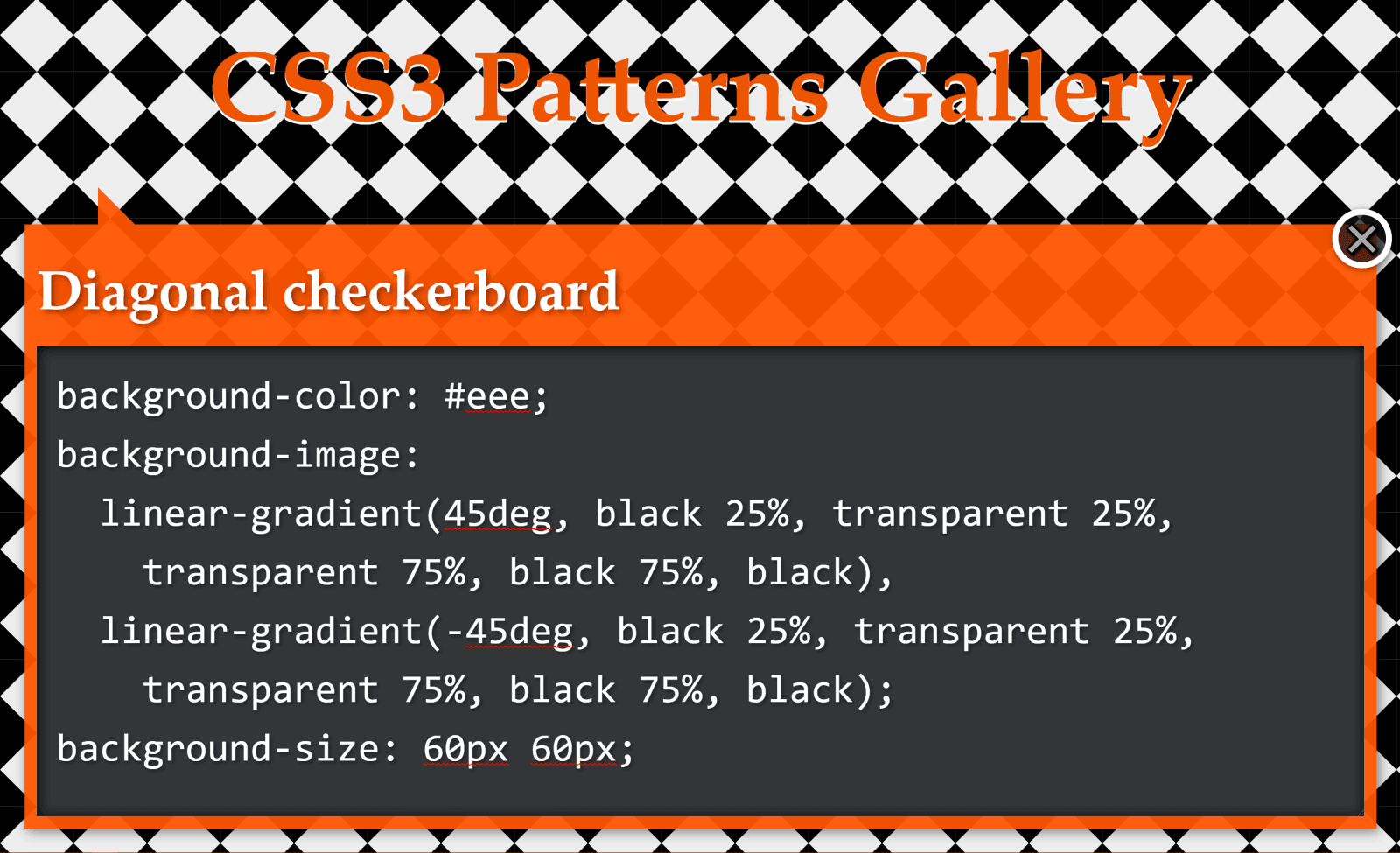
Checkerboard
The checkerboard pattern
This pattern above is created with two linear gradients:
background-color: #eee;
background-image:
  linear-gradient(45deg, black 25%, transparent 25%,
    transparent 75%, black 75%, black),
  linear-gradient(45deg, black 25%, transparent 25%,
    transparent 75%, black 75%, black);
background-size: 60px 60px;
background-position: 0 0, 30px 30px;
Let’s see how we can simplify this CSS when replacing these linear gradients with a conic one!
Just like in the previous case, we draw vertical and horizontal lines in order to better see the rectangles defined by the background-size.
Highlighting the pattern’s cells
Looking at the square highlighted in deeppink in the illustration above, we see that, in this case, our conic gradient starts from the default position at 12 o’clock. A quarter of it is black, the next quarter is dirty white and then we have repetition (the same black and then dirty white quarter slices once more).
A pattern cell with a conic gradient’s hard stops at every 25%, starting from the default at 12 o’clock and repeating after 50% (demo).
This repetition in the second half of the [0%, 100%] interval means we can use a repeating-conic-gradient(), which gives us the following code (bringing the compiled CSS from 263 bytes down to only 73 bytes – that’s reducing it by over 70%):
Again, we have a pattern created with two linear gradients:
background-color: #eee;
background-image:
  linear-gradient(45deg, black 25%, transparent 25%,
    transparent 75%, black 75%, black),
  linear-gradient(-45deg, black 25%, transparent 25%,
    transparent 75%, black 75%, black);
background-size: 60px 60px;
We draw horizontal and vertical lines to split this pattern into identical rectangles:
Highlighting the pattern’s cells
What we now have is pretty much the same checkerbox pattern as before, with the sole difference that we don’t start from the default position at 12 o’clock, but from 45° in the clockwise direction.
If you’re having trouble visualising how simply changing the start angle can make us go from the previous pattern to this one, you can play with it in the interactive demo below:
Note that this demo does not work in browsers that have no native support for conic gradients.
Again, not only is the code simpler to understand, but we’ve also gone from 229 bytes to only 83 bytes in the compiled CSS, reducing it by almost two-thirds!
Half-Rombes
The half-rombes pattern
This pattern was created with four linear gradients:
Just like in the previous cases, we draw equidistant vertical and horizontal lines in order to better see the repeating unit:
Highlighting the pattern’s cells.
What we have here is a pattern that’s made up of congruent isosceles triangles (the angled edges are equal and the dark blue triangles are a reflection of the light blue ones) formed by the intersection of equidistant parallel lines that are either horizontal, angled clockwise, or the other way. Each of these three types of parallel lines is highlighted in the illustration below:
Parallel guides
Every pattern cell contains a full triangle and two adjacent triangle halves in the upper part, then a reflection of this upper part in the lower part. This means we can identify a bunch of congruent right triangles that will help us get the angles we need for our conic-gradient():
A pattern cell with a conic gradient’s hard stops such that they’re either horizontal or go through the cell corners, all starting from β w.r.t. the vertical axis (demo)
This illustration shows us that the gradient starts from an angle, β, away from the default conic gradient start point at 12 o’clock. The first conic slice (the top right half triangle) goes up to α, the second one (the bottom right dark triangle) up to 2·α, and the third one (the bottom light triangle) goes halfway around the circle from the start (that’s 180°, or 50%). The fourth one (the bottom left dark triangle) goes to 180° + α and the fifth one (the top left light triangle) goes to 180° + 2·α, while the sixth one covers the rest.
This means going from 343 bytes to only 157 bytes in the compiled CSS. The result can be seen below:
You can tweak the pattern width ($w) and height ($h) in the Sass code in order to see how the pattern gets squished and stretched for different aspect ratios.
In the particular case where the angle between 2*$a and 50% (or 180deg) is also $a, it results that $a is 60deg, our isosceles triangles are equilateral, and our gradient can be reduced to a repeating one (and under 100 bytes in the compiled CSS):
While these are not repeating patterns, they’re examples of a situation where a single conic gradient achieves an effect that would have previously needed a bunch of linear ones.
What we have here is a conic-gradient() created starting from two straight lines intersecting within the rectangular box where we set the background.
The gradient goes around the point of coordinates, x,y, where the two straight lines intersect. It starts from an angle, β, which is the angle of the line segment that’s closest to the top-right corner, then has hard stops at α, 50% (or 180°) and 180° + α.
If we want to have multiple elements with similar such patterns created with the help of different intersecting lines and different palettes, we have the perfect use case for CSS variables:
All we have to do is set the position (--xy), the start angle (--b), the first angle (--a) and the palette (--c0 through --c3).
.panel {
  /* same as before */

  &:nth-child(1) {
    --xy: 80% 65%;
    --b: 31deg;
    --a: 121deg;
    --c0: #be5128;
    --c1: #ce9248;
    --c2: #e4c060;
    --c3: #db9c4e
  }

  /* similarly for the other panels */
}
Instead of hardcoding, we could also generate these values randomly or extract them from a data object with the help of a CSS or HTML preprocessor. In this second case, we’d set these custom properties inline, which is precisely what I did in the Pen below:
Since we’re using custom properties inside the conic gradients, this demo does not work in browsers that don’t support them natively.
Well, that’s it! I hope you’ve enjoyed this article and that it gives you some ideas about how conic gradients can make your life easier.