For those who may not come from a design background, selecting a color palette is often based on personal preferences. Choosing colors might be done with an online color tool, sampling from an image, "borrowing" from favorite brands, or just sort of randomly picking from a color wheel until a palette "just feels right."
Our goal is to better understand what makes a palette "feel right" by exploring key color attributes with Sass color functions. By the end, you will become more familiar with:
The value of graphing a palette’s luminance, lightness, and saturation to assist in building balanced palettes
The importance of building accessible contrast checking into your tools
Advanced Sass functions to extend for your own explorations, including a CodePen you can manipulate and fork
What you’ll ultimately find, however, is that color on the web is a battle of hardware versus human perception.
What makes color graphing useful
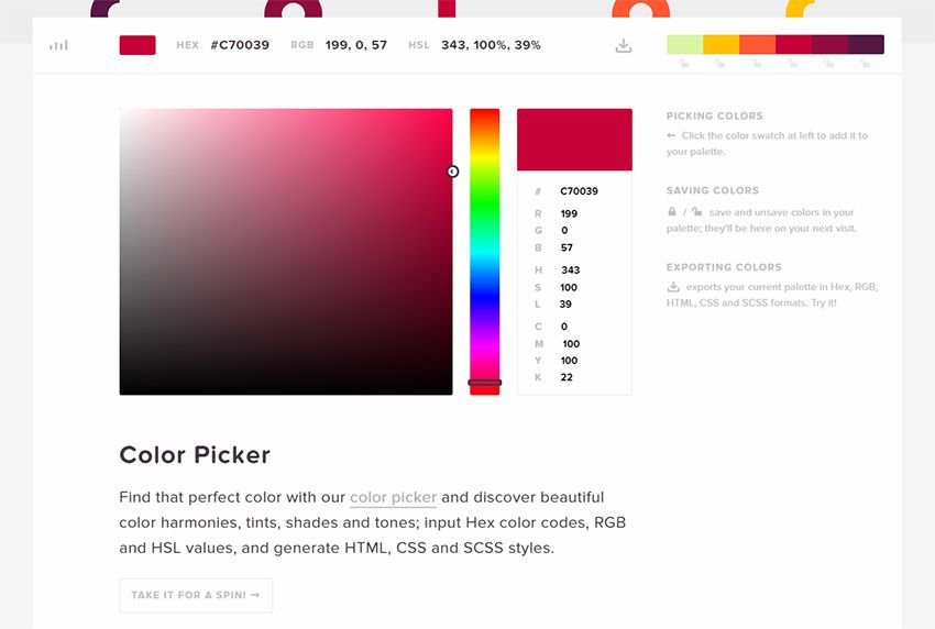
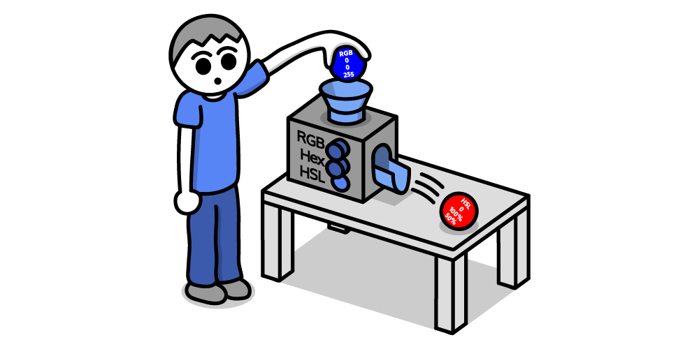
You may be familiar with ways of declaring colors in stylesheets, such as RGB and RGBA values, HSL and HSLA values, and HEX codes.
Those values give devices instructions on how to render color. Deeper attributes of a color can be exposed programmatically and leveraged to understand how a color relates to a broader palette.
The value of graphing color attributes is that we get a more complete picture of the relationship between colors. This reveals why a collection of colors may or may not feel right together. Graphing multiple color attributes helps hint at what adjustments can be made to create a more harmonious palette. We’ll look into examples of how to determine what to change in a later section.
Two useful measurements we can readily obtain using built-in Sass color functions are lightness and saturation.
Lightness refers to the mix of white or black with the color.
Saturation refers to the intensity of a color, with 100% saturation resulting in the purest color (no grey present).
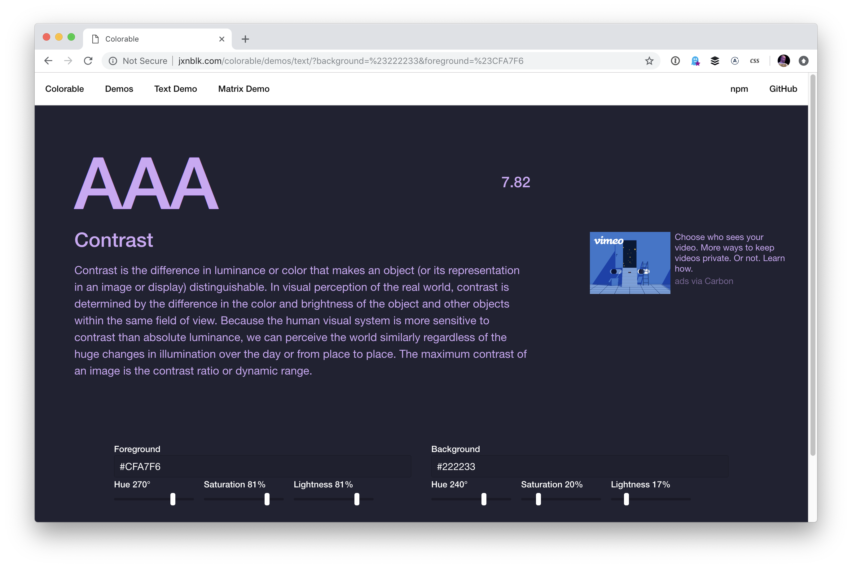
However, luminance may arguably be the most useful color attribute. Luminance, as represented in our tool, is calculated using the WCAG formula which assumes an sRGB color space. Luminance is used in the contrast calculations, and as a grander concept, also aims to get closer to quantifying the human perception of relative brightness to assess color relationships. This means that a tighter luminance value range among a palette is likely to be perceived as more balanced to the human eye. But machines are fallible, and there are exceptions to this rule that you may encounter as you manipulate palette values. For more extensive information on luminance, and a unique color space called CIELAB that aims to even more accurately represent the human perception of color uniformity, see the links at the end of this article.
Additionally, color contrast is exceptionally important for accessibility, particularly in terms of legibility and distinguishing UI elements, which can be calculated programmatically. That’s important in that it means tooling can test for passing values. It also means algorithms can, for example, return an appropriate text color when passed in the background color. So our tool will incorporate contrast checking as an additional way to gauge how to adjust your palette.
The functions demonstrated in this project can be extracted for helping plan a contrast-safe design system palette, or baked into a Sass framework that allows defining a custom theme.
Sass as a palette building tool
Sass provides several traditional programming features that make it perfect for our needs, such as creating and iterating through arrays and manipulating values with custom functions. When coupled with an online IDE, like CodePen, that has real-time processing, we can essentially create a web app to solve specific problems such as building a color palette.
Here is a preview of the tool we’re going to be using:
It outputs an aspect ratio-controlled responsive graph for accurate plot point placement and value comparing.
It leverages the result of Sass color functions and math calculations to correctly plot points on a 0–100% scale.
It generates a gradient to provide a more traditional "swatch" view.
It uses built-in Sass functions to extract saturation and lightness values.
It creates luminance and contrast functions (forked from Material Web Components in addition to linking in required precomputed linear color channel values).
It returns appropriate text color for a given background, with a settings variable to change the ratio used.
It provides functions to uniformly scale saturation and lightness across a given palette.
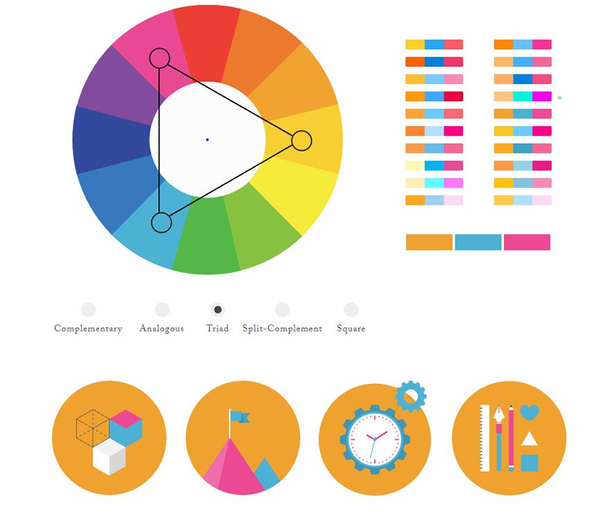
Using the palette builder
To begin, you may wish to swap from among the provided example palettes to get a feel for how the graph values change for different types of color ranges. Simply copy a palette variable name and swap it for $default as the value of the $palette variable which can be found under the comment SWAP THE PALETTE VARIABLE.
Next, try switching the $contrastThreshold variable value between the predefined ratios, especially if you are less familiar with ensuring contrast passes WCAG guidelines.
Then try to adjust the $palette-scale-lightness or $palette-scale-saturation values. Those feed into the palette function and uniformly scale those measurements across the palette (up to the individual color's limit).
Finally, have a go at adding your own palette, or swap out some colors within the examples. The tool is a great way to explore Sass color functions to adjust particular attributes of a color, some of which are demonstrated in the $default palette.
Interpreting the graphs and creating balanced, accessible palettes
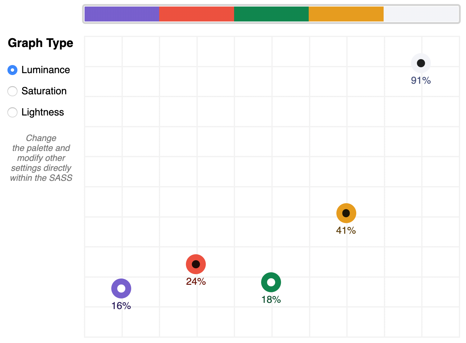
The graphing tool defaults to displaying luminance due to it being the most reliable indicator of a balanced palette, as we discussed earlier. Depending on your needs, saturation and lightness can be useful metrics on their own, but mostly they are signalers that can help point to what needs adjusting to bring a palette's luminance more in alignment. An exception may be creating a lightness scale based on each value in your established palette. You can swap to the $stripeBlue example for that.
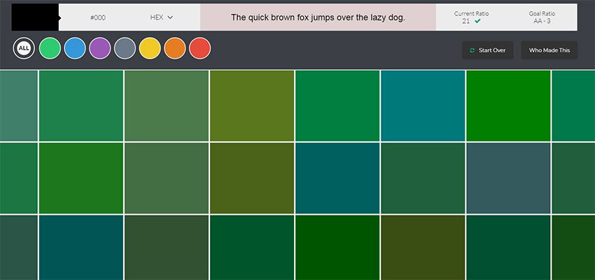
The $default palette is actually in need of adjustment to get closer to balanced luminance:
The $default palette’s luminance graph
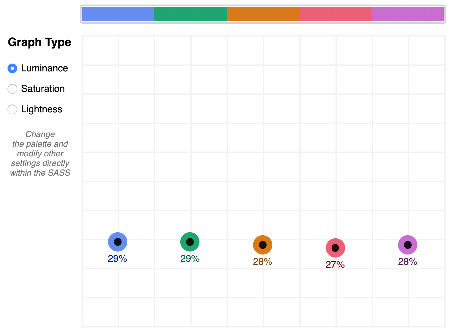
A palette that shows well-balanced luminance is the sample from Stripe ($stripe):
The $stripe palette luminance graph
Here's where the tool invites a mind shift. Instead of manipulating a color wheel, it leverages Sass functions to programmatically adjust color attributes.
Check the saturation graph to see if you have room to play with the intensity of the color. My recommended adjustment is to wrap your color value with the scale-color function and pass an adjusted $saturation value, e.g. example: scale-color(#41b880, $saturation: 60%). The advantage of scale-color is that it fluidly adjusts the value based on the given percent.
Lightness can help explain why two colors feel different by assigning a value to their brightness measured against mixing them with white or black. In the $default palette, the change-color function is used for purple to align it's relative $lightness value with the computed lightness() of the value used for the red.
The scale-color function also allows bundling both an adjusted $saturation and $lightness value, which is often the most useful. Note that provided percents can be negative.
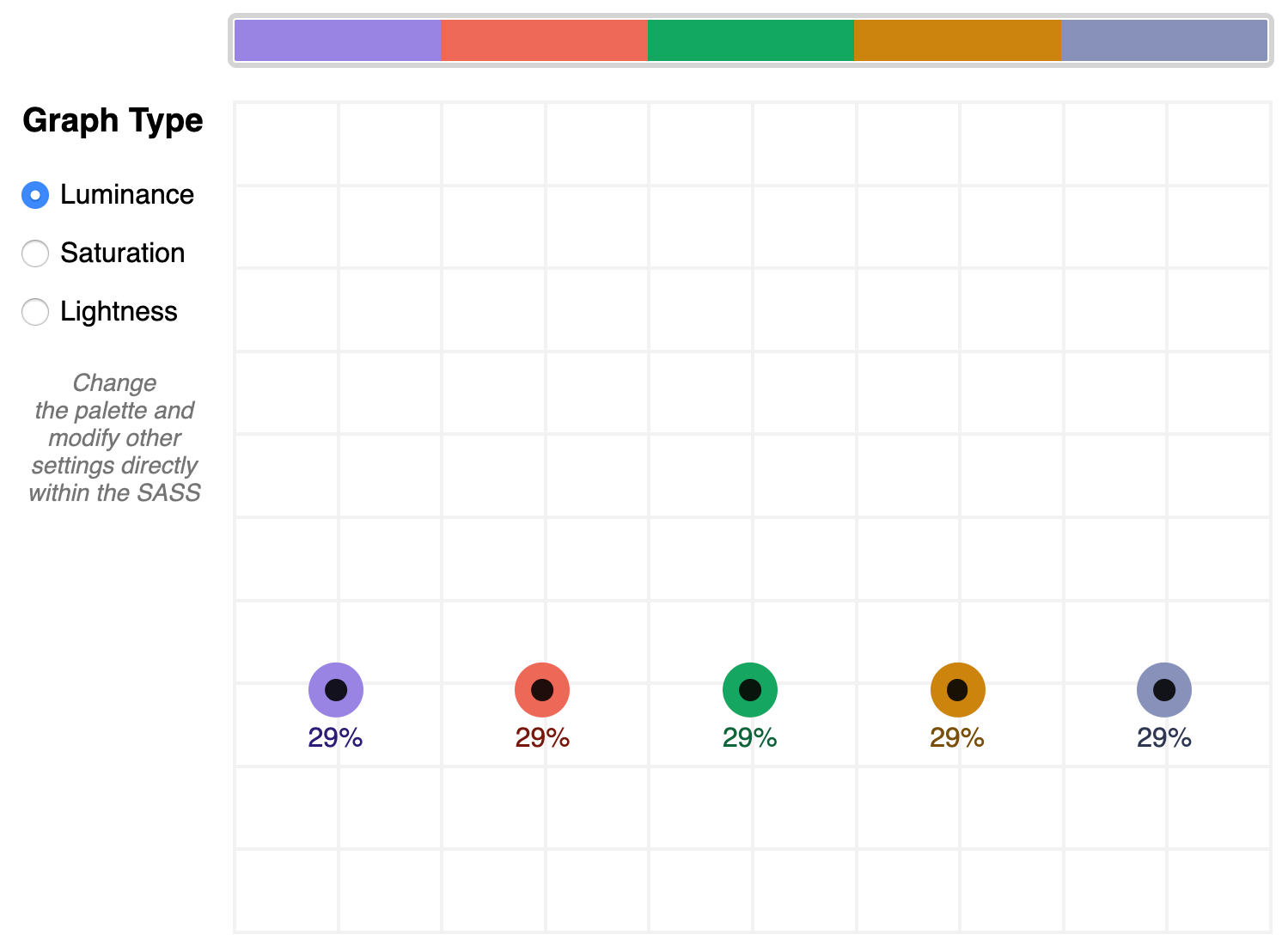
By making use of Sass functions and checking the saturation and lightness graphs, the $defaultBalancedLuminance achieves balanced luminance. This palette also uses the map-get function to copy values from the $default palette and apply further adjustments instead of overwriting them, which is handy for testing multiple variations such as perhaps a hue shift across a palette.
Contrast comes into play when considering how the palette colors will actually be used in a UI. The tool defaults to the AA contrast most appropriate for all text: 4.5. If you are building for a light UI, then consider that any color used on text should achieve appropriate contrast with white when adjusting against luminance, indicated by the center color of the plot point.
Tip: The graph is set up with a transparent background, so you can add a background rule on body if you are developing for a darker UI.
Further reading
Color is an expansive topic and this article only hits the aspects related to Sass functions. But to truly understand how to create harmonious color systems, I recommend the following resources:
Color Spaces - is a super impressive deep-dive with interactive models of various color spaces and how they are computed.
Understanding Colors and Luminance - A beginner-friendly overview from MDN on color and luminance and their relationship to accessibility.
Perpetually Uniform Color Spaces - More information on perceptually uniform color systems, with an intro the tool HSLuv that converts values from the more familiar HSL color space to the luminance-tuned CIELUV color space.
Accessible Color Systems - A case study from Stripe about their experience building an accessible color system by creating custom tooling (which inspired this exploration and article).
A Nerd's Guide to Color on the Web - This is a fantastic exploration of the mechanics of color on the web, available right here on CSS-Tricks.
Tanaguru Contrast Finder - An incredible tool to help if you are struggling to adjust colors to achieve accessible contrast.
ColorBox - A web app from Lyft that further explores color scales through graphing.
Designing Systematic Colors - Describes Mineral UI's exceptional effort to create color ramps to support consistent theming via a luminance-honed palette.
How we designed the new color palettes in Tableau 10 - Tableau exposed features of their custom tool that helped them create a refreshed palette based on CIELAB, including an approachable overview of that color space.
But today, we’re talking all about free Christmas design resources.
Having some free Christmas icons will surely save you lots of time, so you don’t have to start from scratch.
3Here is my pick of free Christmas icons that you can use.
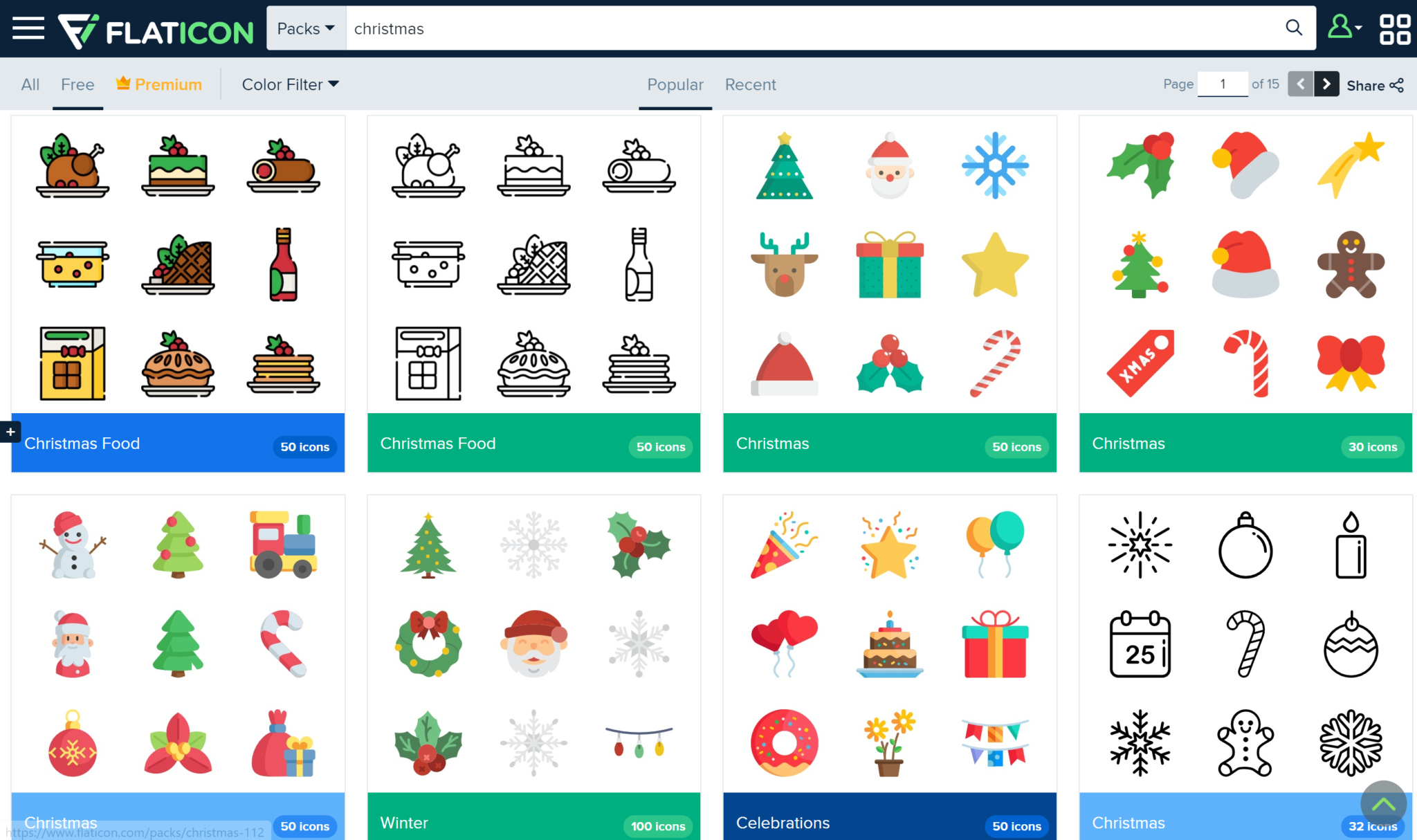
Flaticon
Flaticon has lots of free Christmas icons for you to use for any of your Christmas projects that are coming up.
It’ll save you lots of time, and the fact that hundreds of these icons are free will help you save a buck as well!
Upgrade to premium in order to get thousands of icons!
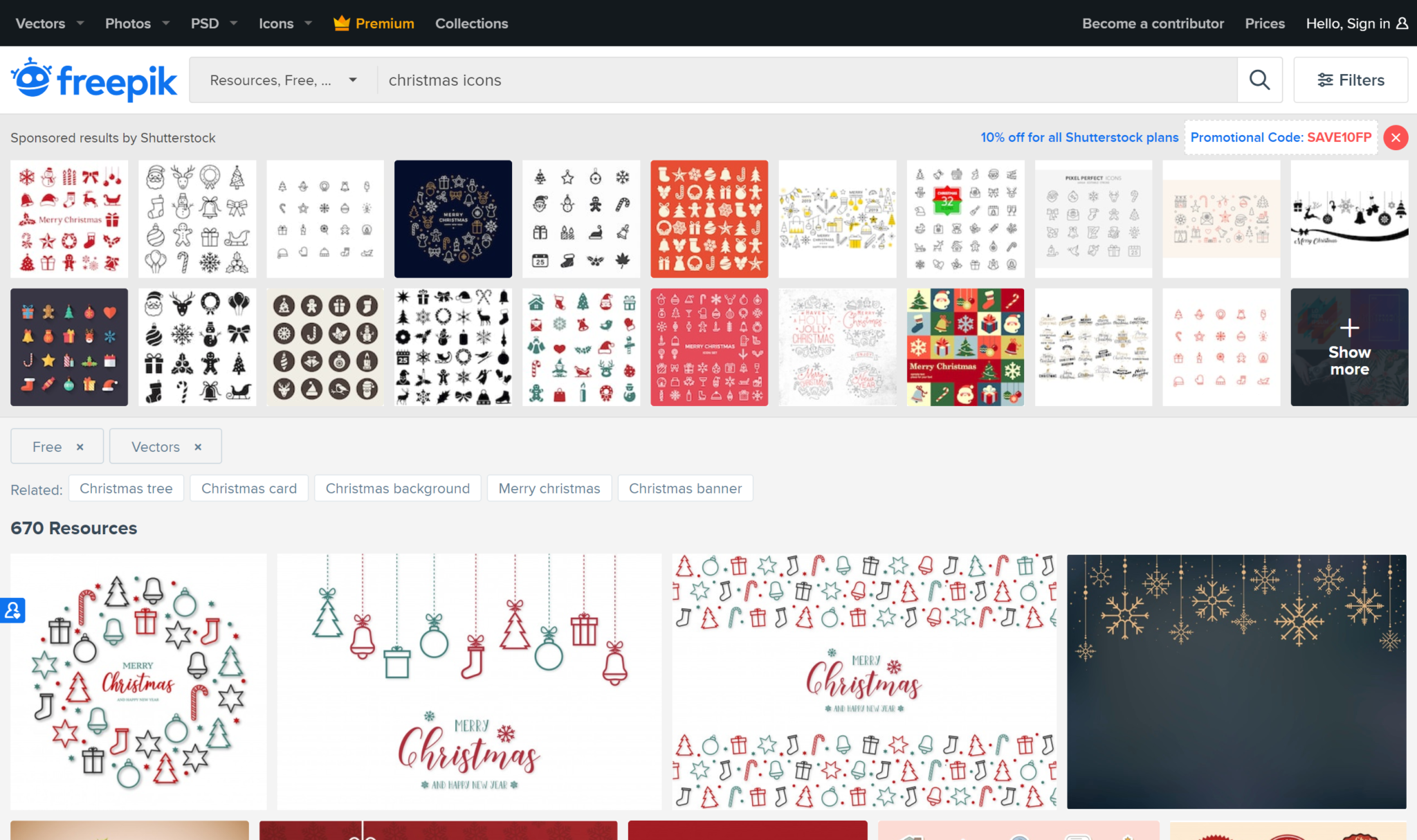
Freepik
Freepik will help you spread tons of Christmas cheer with their hundreds of free Christmas elements.
They have flat designs and 3D designs alike in their Christmas icons. You don’t want to miss out!
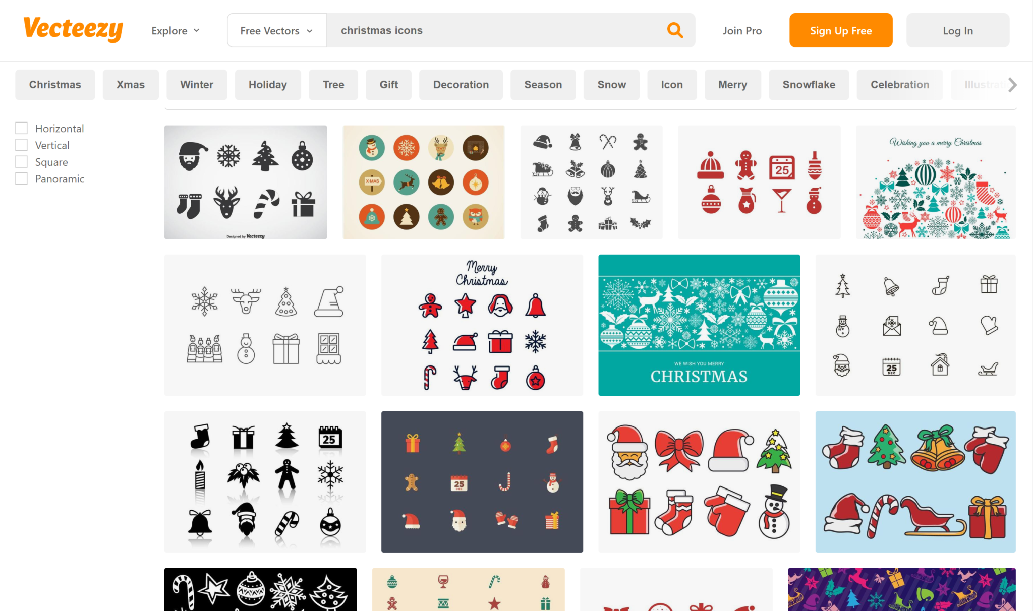
Vecteezy
Vecteezyhas lots of color and happy icons for you to use for free.
Just choose the ones you like, download, and use to your liking!
Free Christmas PNGs
Make your clients happy with the best Christmas PNGs out there.
Here are my top favorite free PNG websites that will certainly help you out this season.
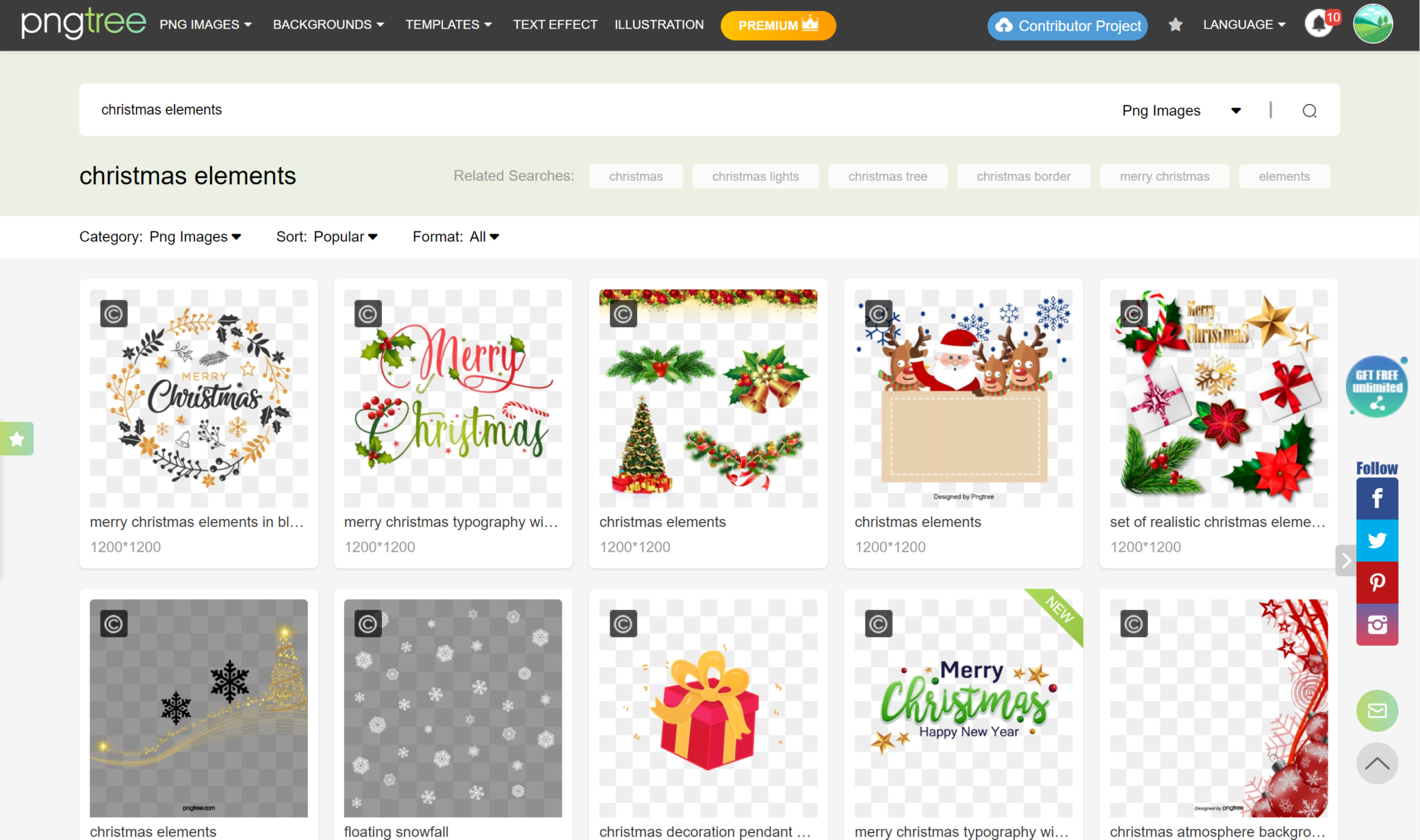
Pngtree
Pngtreeis great for everyday use but especially has some great Christmas PNGs.
Their quality has never once disappointed me.
The only downside to their site, in my opinion, is that you only get 2 free PNGs a day.
So choose wisely, or consider upgrading to a premium account!
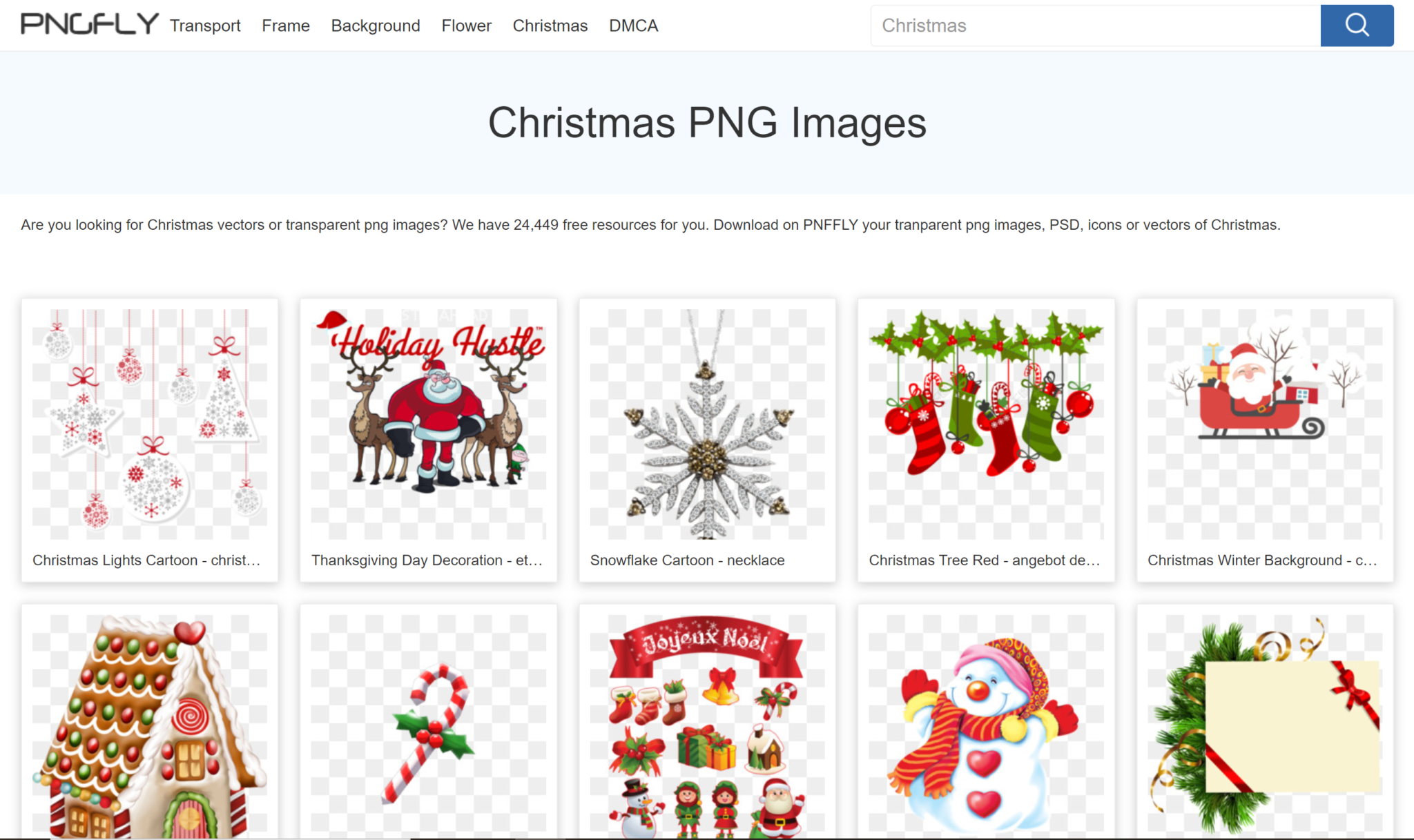
Pngfly
Pngfly has over 20,000 free resources for you to use this Christmas. That’s definitely not an offer you want to miss out on.
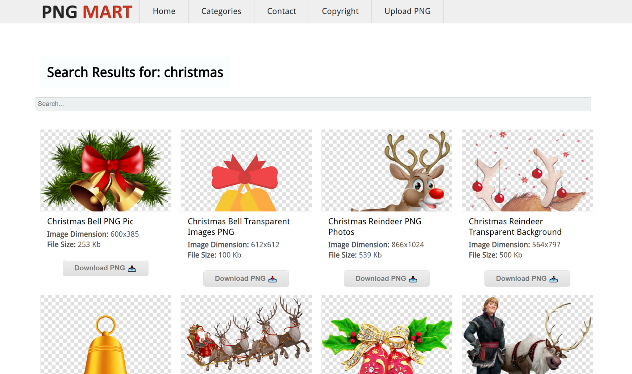
Pngmart
Pngmarthas tens of pages for you to browse through when looking for the perfect free Christmas PNGs.
Check em out!
Free Christmas Vectors
Vectors are a huge part of graphic design, so it’s only right that we go over the best websites with the best free Christmas vectors that the internet has to offer.
Let’s do it.
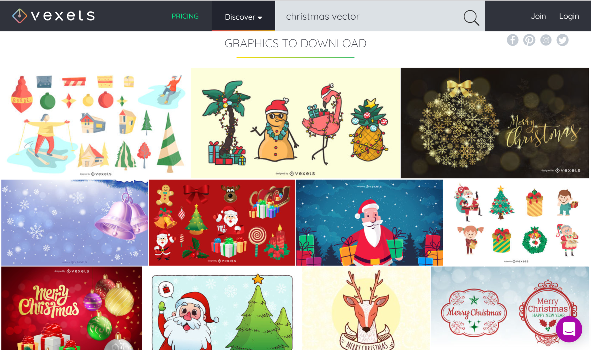
Vexels
Vexels has some of the best vectors I’ve laid my eyes on. Colorful, cheerful, perfect for Christmas.
If you’re looking for great free Christmas vectors, then you definitely need to check them out!
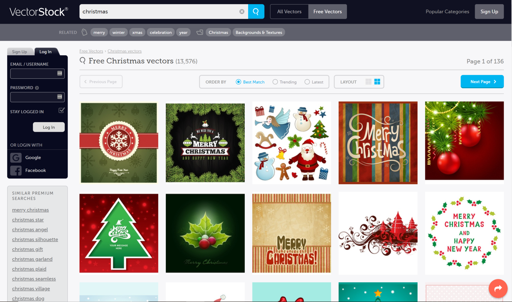
Vectorstock
But wait—there’s “myrrh”.Vectorstockhas over 13,000 free Christmas vectors for you to use!
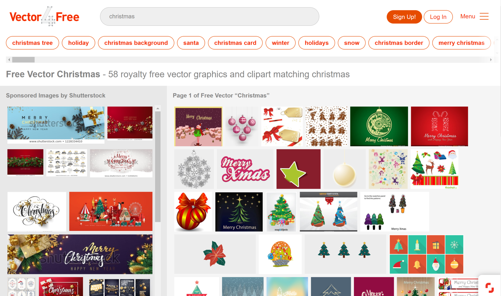
Vector4free
Vector4free is a great choice for using in your everyday designs, but not only.
They have lots of Christmas vectors for you to choose from, so I recommend you get to it!
Free Christmas Images
Christmas images will give a warm, homey feel to any project.
If you don’t have a camera or time to take any Christmas pictures, definitely give these free Christmas stock images websites for your work!
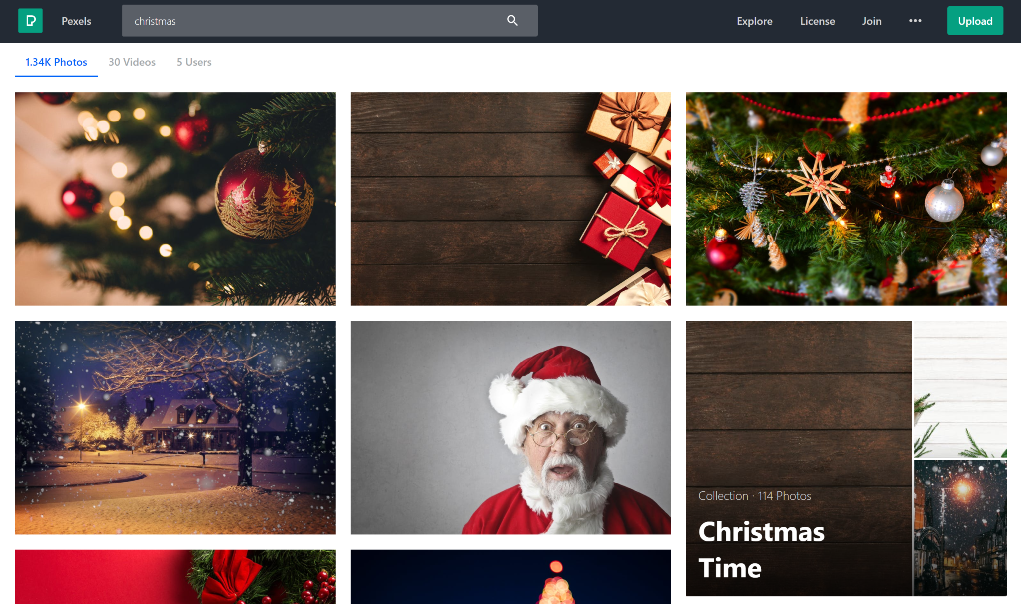
Pexels
Pexelsis definitely one of my personal favorite stock images websites.
They have lots of high-quality images from great individual photographers.
And if you want to, you can support the artist, by donating to them!
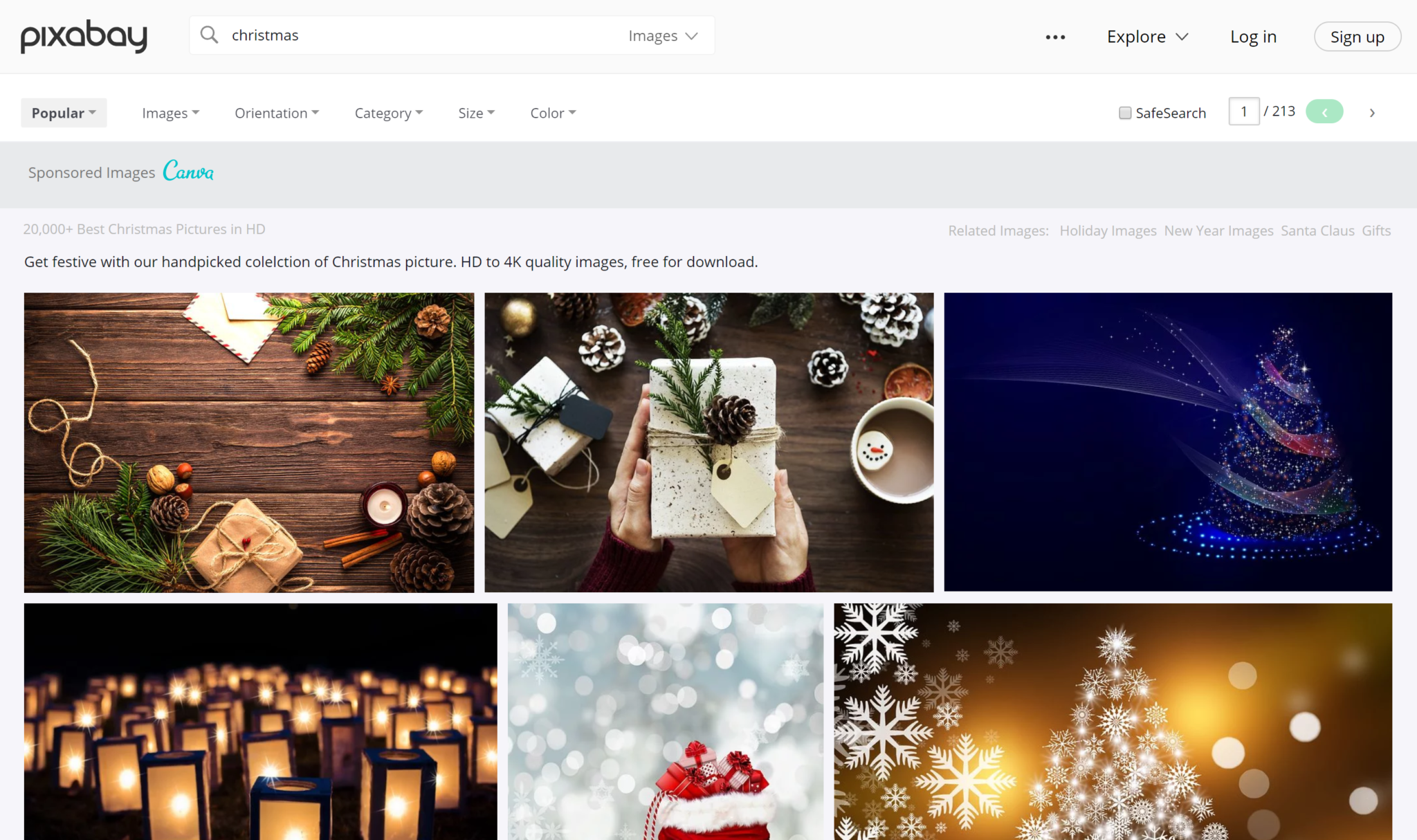
Pixabay
Pixabayhas loads of photo choices for you to choose from.
With over 20,00 free images solely dedicated to Christmas time, you’re bound to find the photo you’re looking for.
Your product could be the most amazing and useful product in the world, but if your packaging is not on point, then your entire business could be in some major trouble.
Imagine this scenario: You’ve designed the best product in your field, invested all of your funds into creating the product, and put packaging design on the back burner. You get on a free mock-up website, make something in an hour, call it day, and show it to your investors.
Terrible idea.
In my personal opinion, you should put just as much effort into the packaging design of your product as you put into the product itself.
According to science, it only takes a person 1/10th of a second to create or form an opinion about someone or something. That gives you literally not even one second to give someone a great first impression.
The first thing your potential customer is going to see is your packaging. And you better hope to goodness that you’ve aced your first impression and wowed your target audience with your packaging design.
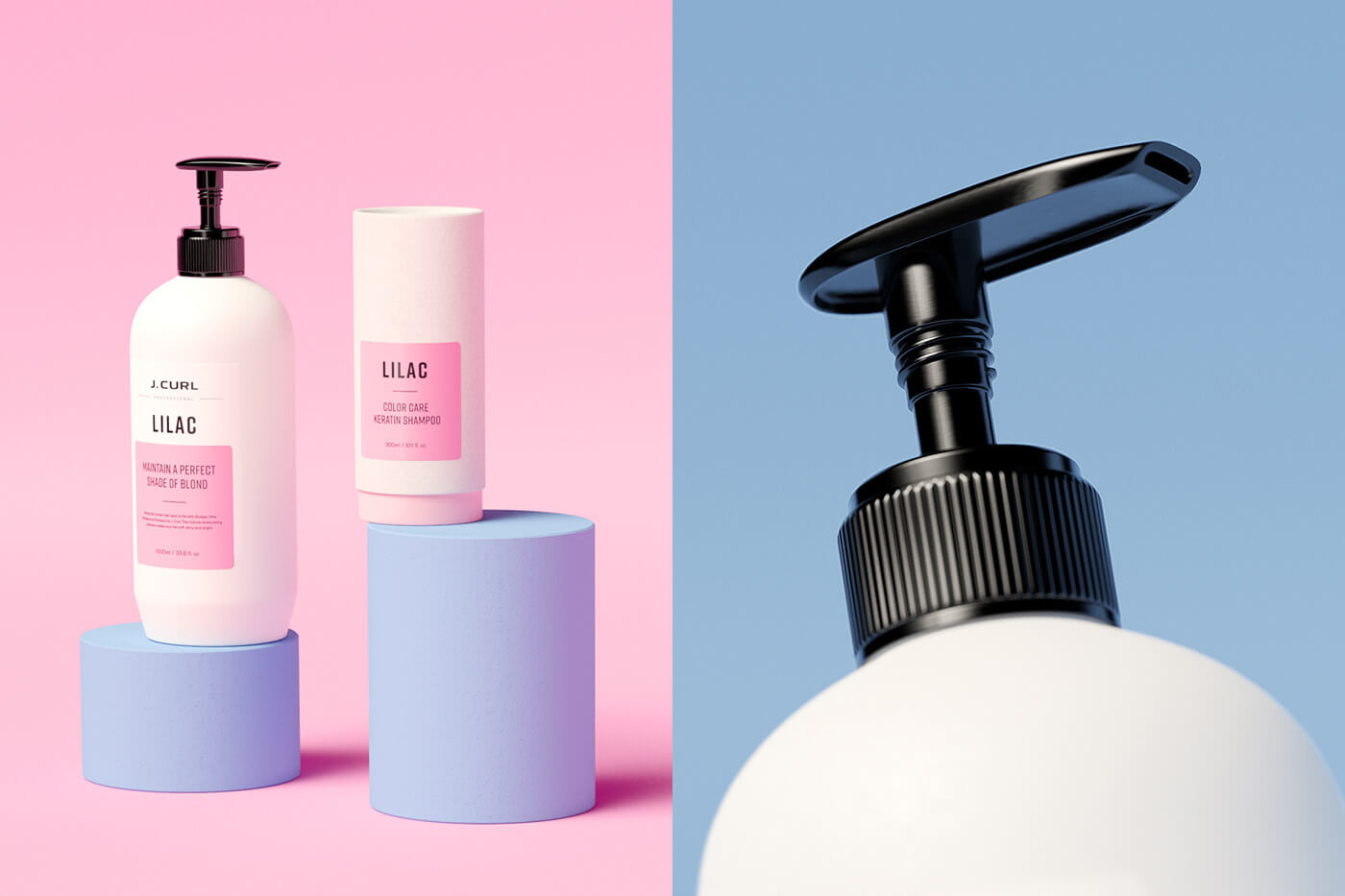
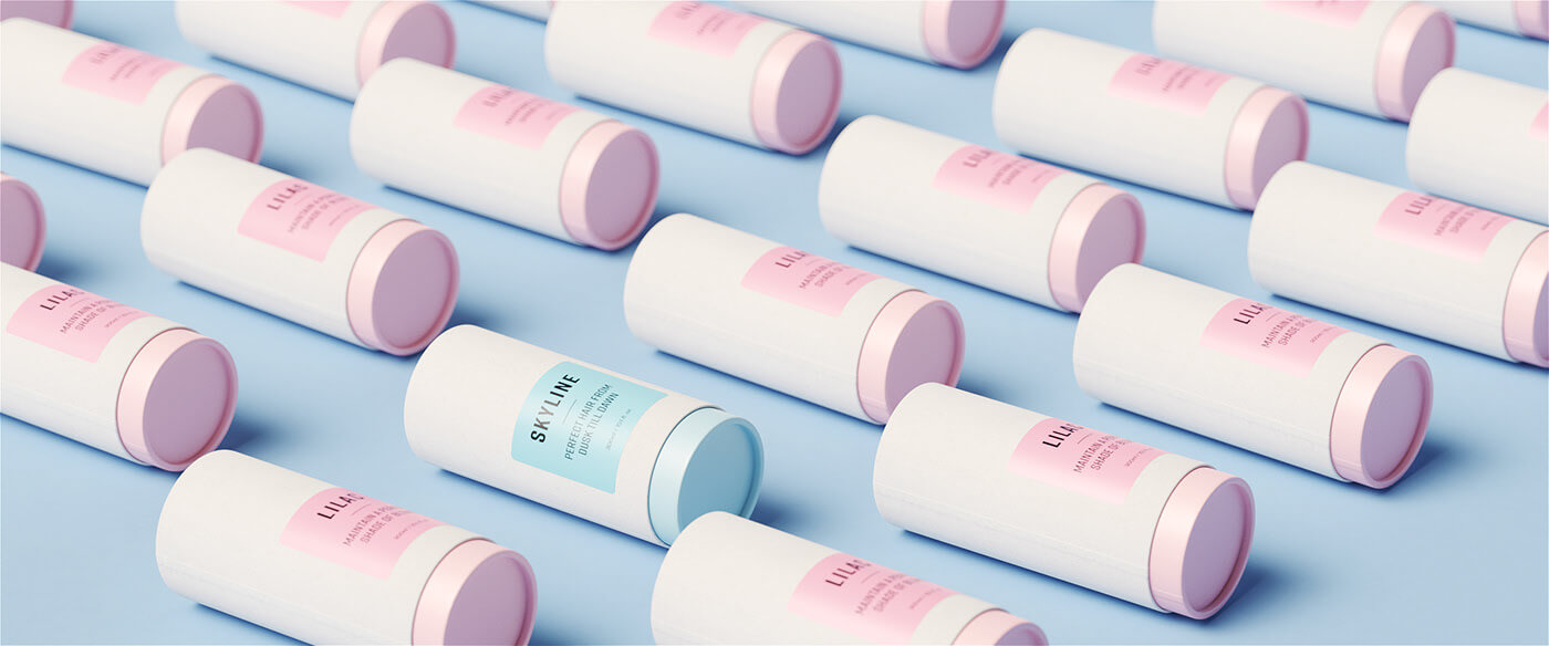
Best Packaging Design Ideas for 2019
I’ve rounded up 20 of my favorite packaging designs for you to be inspired by for your next design project.
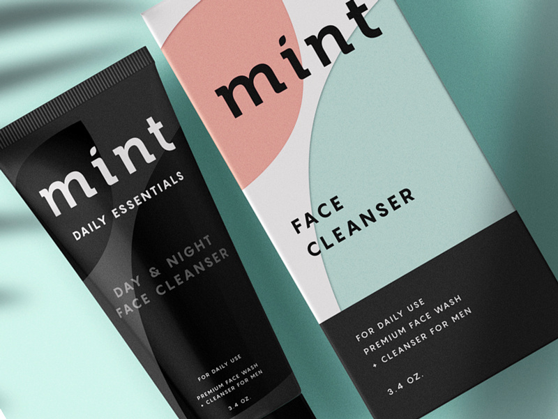
This face wash for men is so simplistic in its design that it’s easy and enjoyable for the eye to look at. The black color of the face wash gives off tones of luxury and the pastel colors on the box, combined with flat design, simply works for this packaging.
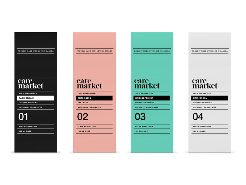
2. Care Market
Continuing on with the pastel trend, we have Care Market packaging design. The palette they chose here is lovely, as pastels have been all over the place this year. The consistency in font usage is just perfect, using only two different fonts and using dividing lines between each new phrase.
This packaging design shows us that you don’t need elaborate graphic designs to exude elegance and professionalism. All you need is a great color palette, and nice, coinciding fonts.
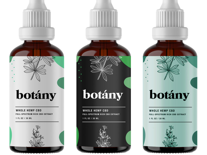
Less is more, as the saying goes, and botany nailed it. Minimalist, flat design is the key here and with three different color schemes that all complement each other, I can wholeheartedly say, I believe this design will catch the eye of anyone who is looking for a high-quality serum.
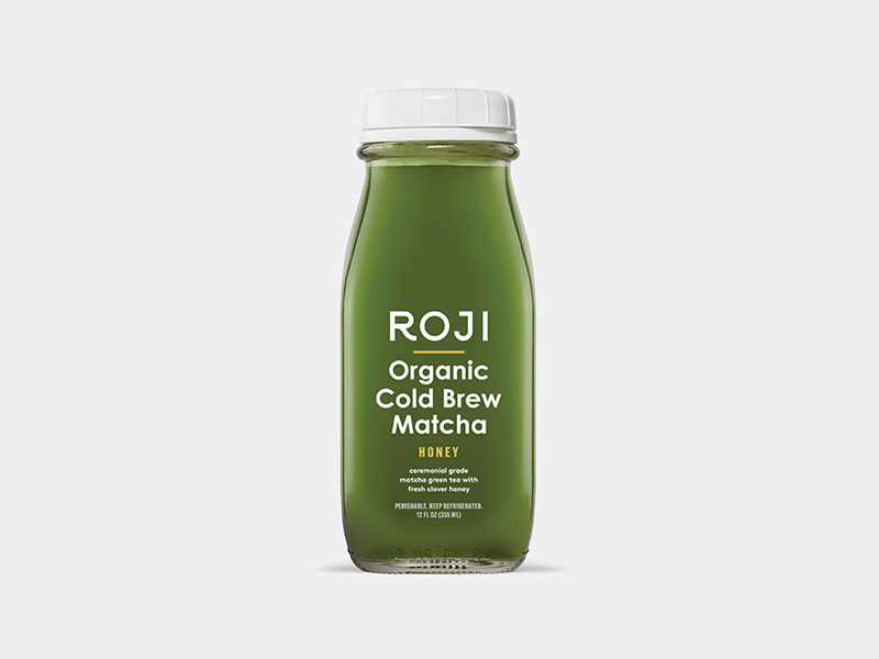
4. Roji
When someone is looking for a healthy drink, they’re going to be looking for sleek, professional fonts that look organic. My favorite part of this packaging design is that the designer thought through the choice of font colors.
Since the bottle is made of glass, you’ll be able to see its contents and the yellow font matches the beverage inside the bottle. The yellow-colored font perfectly complements the contents of the bottle. A simple, well-thought-out packaging design overall.
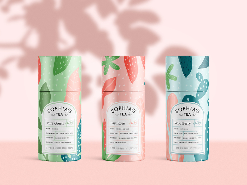
5. Sophia’s Tea
Stepping out a little bit from the pastel color palettes and into something a little bolder, we have Sophia’s Tea packaging design. Flat design really has taken the lead in 2019. We see it all over the place. And luckily for us designers, it makes our job a little easier.
What I appreciate about this design is that the name of each drink matches the design of each recipient. The color scheme on each bottle matches each other, making a buyer recognize the brand, if they were to see each bottle on a shelf in a store.
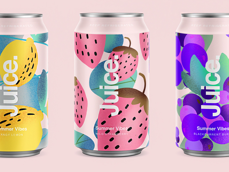
6. Juice.
Since we’re on a drink roll, check out this summery packaging design for juice. Again, we’re hit with flat design and beautiful colors. The font sticks out perfectly on the foreground of the design. Juice. Simple, clean, clear, and to the point.
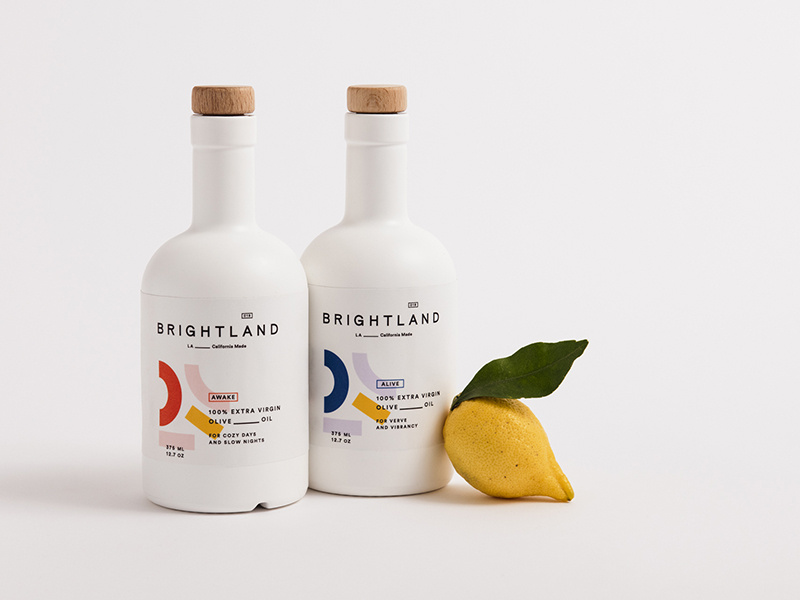
7. Brightland
I’ve never seen an olive oil packaged quite like this. At first glance, you would wonder what this beautiful bottle is doing in the oil section.
You’re inclined to pick it up, you read that it’s olive oil, you’re shook, you compare prices between this and another oil, you realize it’s the same price, and naturally you buy the more beautiful packaging design of the two products. Hit people with original, innovative designs and you’re sales will skyrocket.
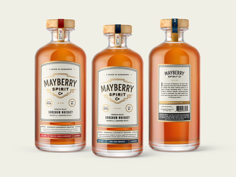
This bottle makes me want to have a nice, classy night at home with all my friends. The vintage font works beautifully with the design of the bottle, and I love that the color schemes match the rich color of the whiskey itself.
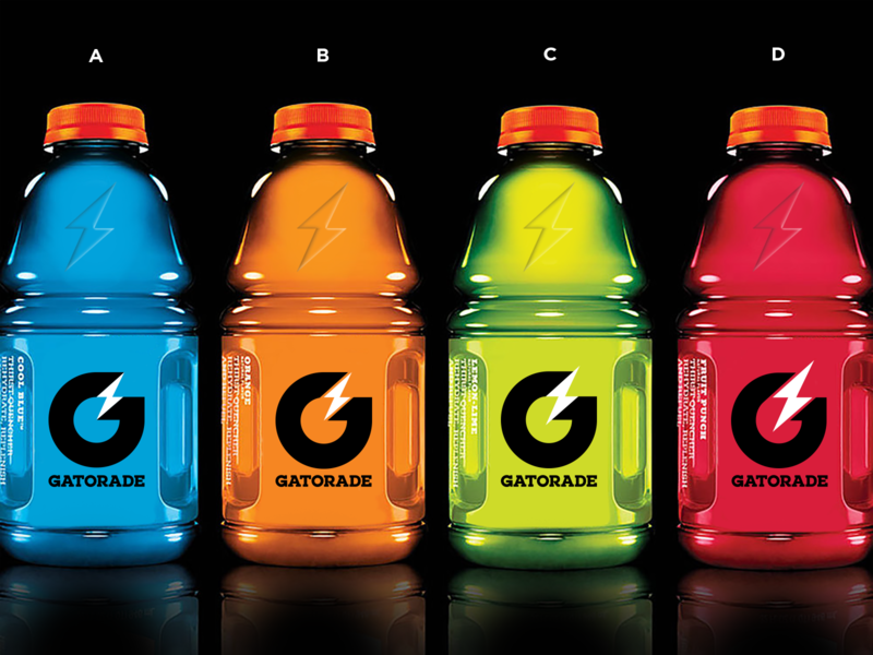
9. Gatorade
Here are some rebranding sketches for Gatorade. Simple design that gets across, yet still embraces the originality of the Gatorade logo. You won’t lose any brand recognizability, and it looks more modern.
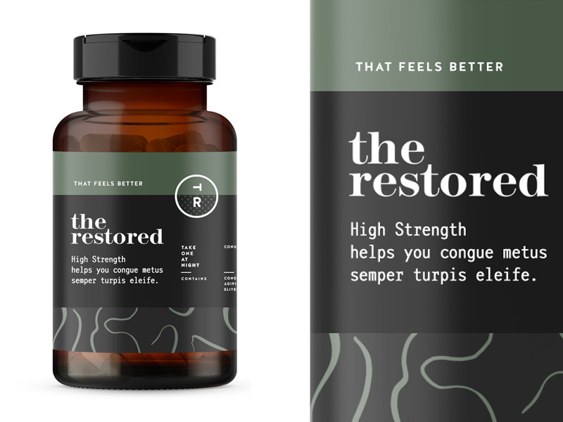
10. The Restored
The packaging design for these vitamins is everything. The manly, muted earth tones will remind a person of organic produce, making them trust your brand even more. Color association is very important when it comes to designing your packaging and establishing your brand, so choose wisely!
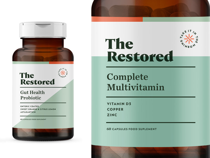
11. The Restored
Here’s a second version to Restored vitamins. This packaging design is a touch more feminine, using a more pastel green, and creating more dimension in the background by using two different colors. The pop of orange in the corner brings the eyes to the directions.
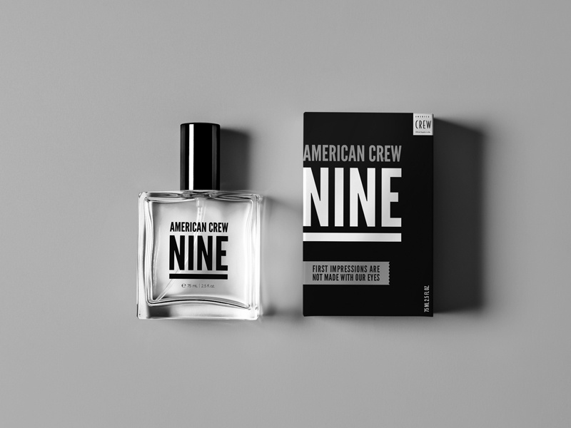
12. American Crew Fragrance
This simplistic design is one way on the box and reversed on the bottle. By using one font, they really had to play with the scaling and spacing of letters and words to make it interesting and captivating. Again, packaging design can be simple and just as engaging as a super complicated design.
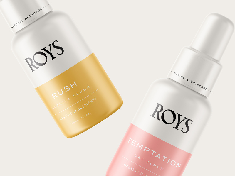
13. Roys Morning Serum
Roys morning serum has two beautiful colors: a muted pink and a relaxing gold. Color association is everything. If you can convince your customers that your product is what they need and you really sell your product by having a luxurious packaging, you’ll have clients talking about you for days.
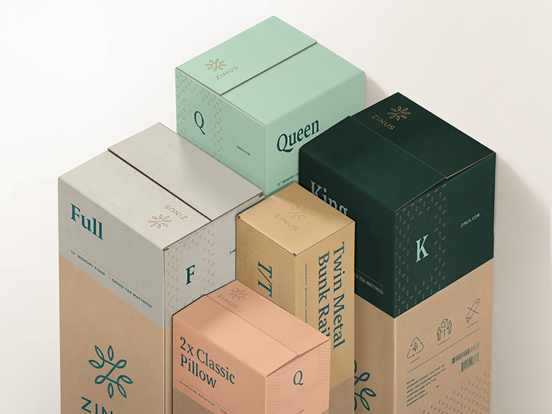
14. Zinus
You can recognize an eco-friendly package design from a mile away, and most people are becoming very concerned and aware of their consumerism and trash contribution to the world. Using a bio-degradable packaging or using recycled material will help you loads when it comes to sales. And you’ll be helping the world. It’s a win-win.
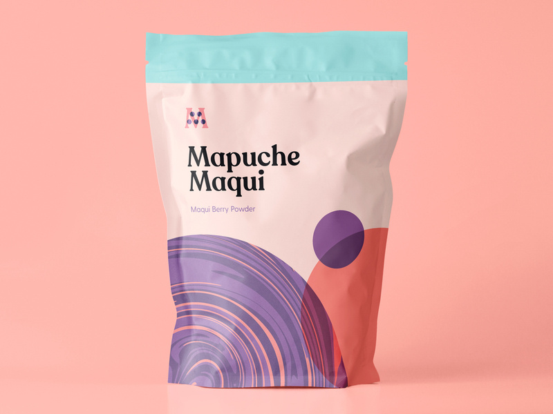
15. Mapuche Maqui
Sometimes, making healthy choices isn’t the easiest or most fun, so presenting a fun looking health product can be key in your sales. This berry powder packaging design looks fun and friendly, used flat design, a beautiful color palette, and bold font. With all these elements combined, surely it’ll catch the eye of a customer.
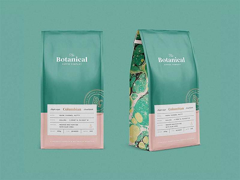
16. Botanical Coffee Co
This coffee design is so relaxing to look at. The intricate design on the sides, the simplicity on the front, and the choice of font combinations are just lovely. Again, going with flat design and pastels. See the pattern?
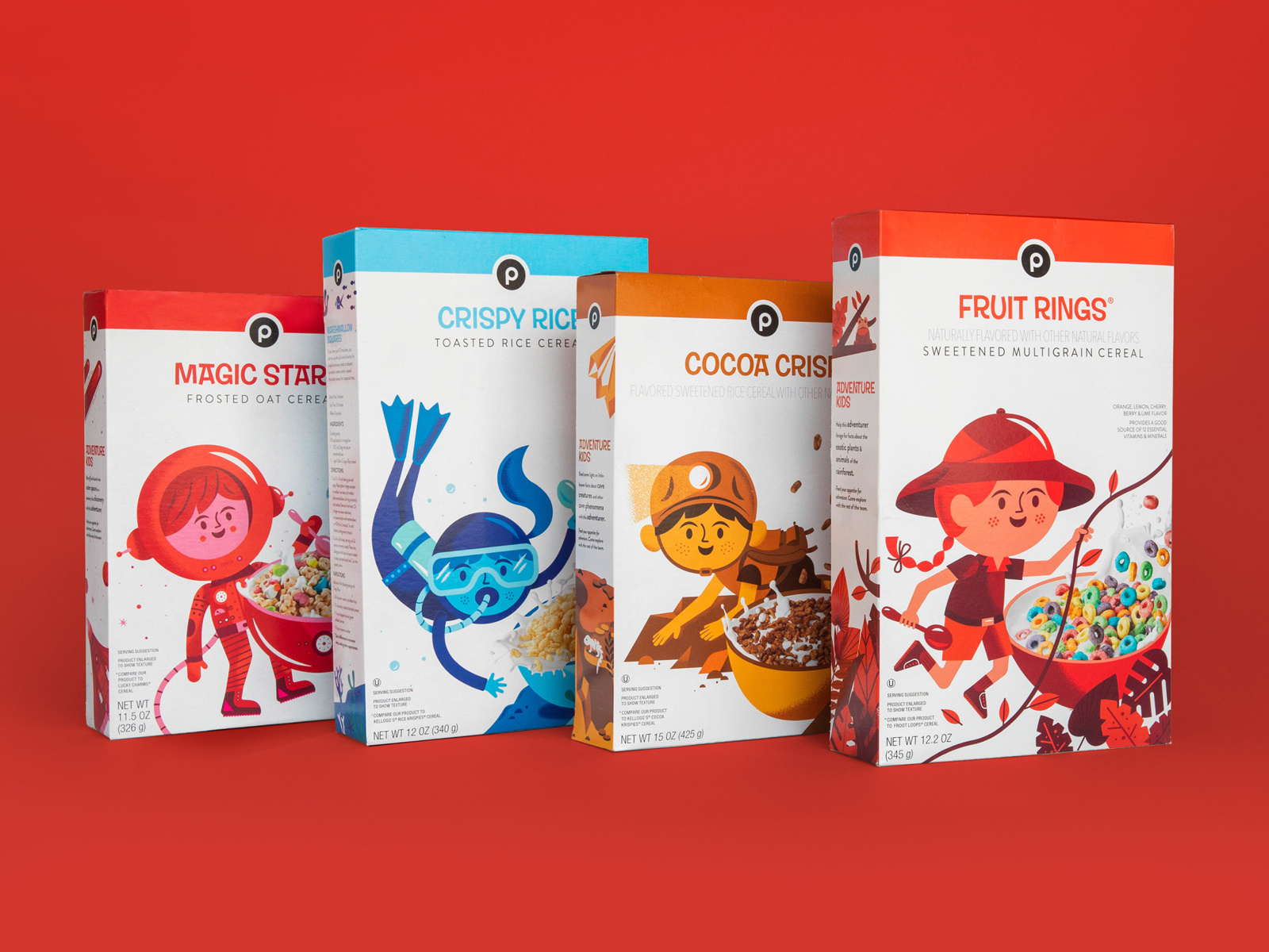
17. Publix Cereal Line
Did you know that the color red increases your appetite significantly? The designer here for kids cereal certainly knew what they were doing. By combining real-life elements and flat design, kids will surely be intrigued by this design and be inclined to beg their parents for the cereal.
18. Coffee
This coffee packaging is so bright and captivating, yet still has colors that are easy on the eyes. When choosing your color palette, you need to be sure that you’re choosing colors that soothe and colors that people want to look at. And of course, brand colors that represent you and that your audience will enjoy.
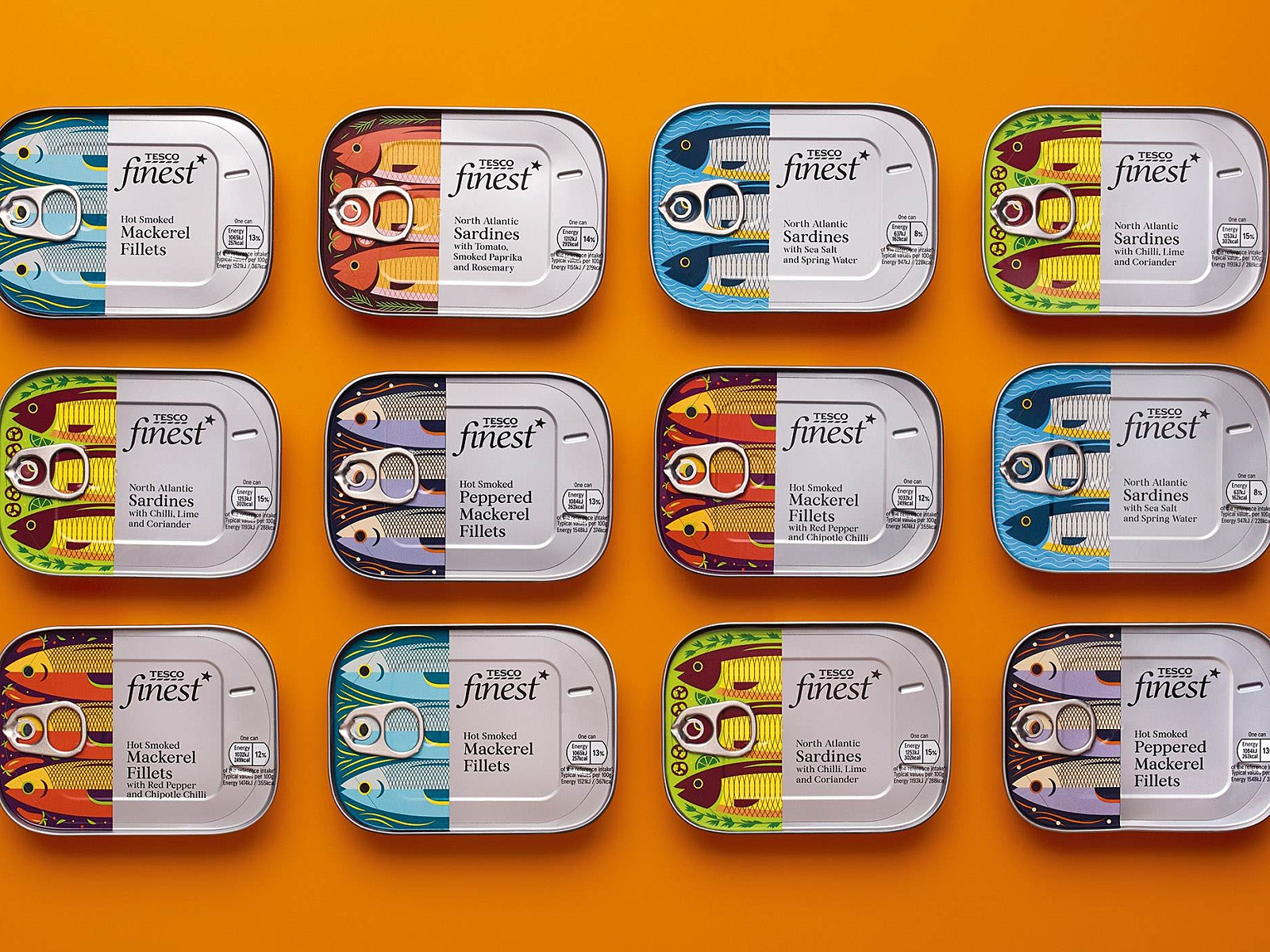
19. Tesco Fish
Check out these “fishy” illustrations! What I really enjoyed about this packaging design was the fish. I love the very finely defined, cut-off design of the fish, and then the can and text. Each fish is design to represent its kind, and I find this design very creative, colorful, and appetizing.
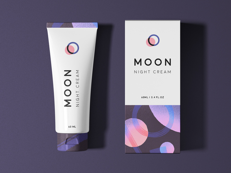
20. Moon
And finally, we have Moon Night Cream. Notice how to colors and graphic designs represent the night. So simple, clean, and fresh-looking that you actually can’t wait to use this cream tonight before bed.
Wrapping things up
As we all know, packaging is everything when it comes down to actually selling your product. Make sure your design represents you, your brand, and your product, and is creative and makes people feel like they need what you have to offer, in their lives.
I hope you found this article inspiring and you’re more than ready to jump into your next design project.
For a lot of people, the first thing they think of when they hear the names of big companies is their logo. In truth, the logo is probably the biggest marketing decision you can make. It might sound simple, but there are quite a few things you need to keep in mind when designing a logo of your own. So without further ado, let’s talk about the basics behind designing your own logo.
Why do you need a logo?
Ideally, you’ll want to hire a professional to create your logo, but that doesn’t mean you shouldn’t bring some ideas of your own to the table. In fact, it’s best that you have a pretty good idea of what you want before the big design meeting.
But let’s say that you want to go through most, if not all of this process by yourself. Where do you even begin? You need to start this journey off by understanding why you need the logo.
Your logo is an extension of your brand. It’s important that it represents you. That can be hard to do in a single picture, but that’s why this takes time.
Pick something that scales as a favicon
A favicon is that little image that sits in the address bar when a tab is opened. It’s a small detail, but it’s very crucial.
The reason it’s so crucial is because those big, fancy, and incredibly detailed images will look absolutely terrible as a favicon. This is something that a lot of people don’t think about because they generally regard a big and fancy logo as perfect.
One of my favorite examples of a favicon is that of Mailchimp.
This logo is simple, yes, but it still manages to capture the brand perfectly. Now, if you pay attention, you’ll notice that the main focus of the logo (the chimp) is its own entity. That makes it very easy to scale as a favicon. Just like this:
This is the Mailchimp favicon. They definitely couldn’t have put the entire logo in the address tab, and they knew that. So, they went into the logo design process with that in mind, and came out with this.
Test multiple colors
Speaking of being scalable, you want to make sure the logo looks good on multiple backgrounds in multiple colors. If you don’t you could end up having to redo this entire process when something as simple as a WordPress theme change comes up.
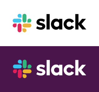
As unusual and controversial as the Slack logo has been here lately, we all have to admit that it works well with multiple colors. Of course, the logo itself has a variety of colors in it, but that really only helps it.
The Slack logo can be seen around the world with all sorts of background and font colors. It’s an iconic logo, so it was important that they got all the design elements right.
Be consistent with the brand
A logo means nothing if it doesn’t embody the brand. This is especially important for startups that are looking to get their name out there.
I don’t think I need to go into this too much, but we definitely need to mention it here. Every tiny little detail is crucial. They have to match the brand’s story, their tone of voice, and their mission.
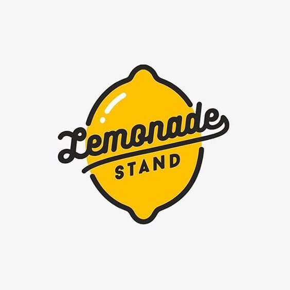
So, for example, the choice of font is a big one. If you run a SaaS company, you probably don’t want to use a script font. Something like that makes much for sense for a small town candle shop.
Something like this classy lemonade stand logo is perfect. It’s simple, it will scale well as a favicon, and it’s on brand. The colors work well and the font stands out, but it’s not over the top.
Make your logo easy to incorporate into your brand
This point sort of goes along to the one above, but it deserves its own mention. That being said, even if your logo is on brand, it doesn’t mean that it will be easy to incorporate into the rest of your brand.
What do I mean by that? Well, looks aren’t always everything. Even if you logo looks great and embodies your brand, it might not be easy to use. Yes, there is such a thing as a logo that is too detailed to use.
A logo should not be so complicated that it takes more than a few seconds for someone to recognize what it is. If it’s simple and straightforward, it will be easy to incorporate into your brand anywhere.
Other tips to follow
There are tons of tips to take into consideration here. But, whether you’re designing it yourself or paying someone else to do it, there are some that are pretty fundamental. So, in addition to the ones above, here are some quick tips that you should consider:
Pick a style and stick to it
Just like a good party, a logo has a theme. This is a combination of all the elements. From the typography to the colors, everything should be perfectly thought out and implemented with a purpose. Each element needs to pay respect to the others.
Keep constant communication with the designer
If you choose to hire someone, you have to keep constant communication with them. In the design world, you build off of your own ideas. So if the designer gets one tiny detail wrong, then the entire logo can be off in the end.
Stay inspired
You are designing the face of your company. If you lack inspiration in the project, you should stop and brainstorm a bit. Or, if you really can’t handle it anymore, step away for a bit. Nothing is worse than rushed work in design, so don’t make your logo suffer.
Get a lot of opinions
You’re not designing this logo for your own personal use. This logo will be seen by a lot of people, so get a lot of opinions. Show it off to colleagues, friends, family, or even random strangers. The more input you can get, the better your logo will come out.
Be yourself
This is probably the most important rule in design, so we’ll end here. Being yourself is what got you to the place where you can design your own logo in the first place. Don’t fall into the norms of the industry that you’re in. Be unique!
It’s no secret anymore that a good social media presence can bring anyone some sweet cash. It’s also no secret that in order to start making money online and become an “influencer,” you have to put a lot of work into your online activity and image. From personalized messages, engaging videos, spontaneous stories, charming photos, to matching backgrounds and fonts, they are all contributing keys to an attractive and followable account. But nothing would matter if the style, the theme, and the design you choose doesn’t match YOU.
If color, glow, bold typography, radical shapes, and retro aesthetics define you, you have to show it to your audience in the purerest forms. How? Let me introduce you to the ultimate social media kits with a retro vibe. Start being your true self online and the followers with flow.
Let’s get started.
1. OMG80s Background Image Pack
The combination of bright colors and radical shapes has always been the ace up the sleeve of many big companies when it came to marketing. Why not use this trend to your own benefit? OMG80s Image Pack not only features eye-catching colors, but the images also come in a square shape, ready for Instagram or Facebook!
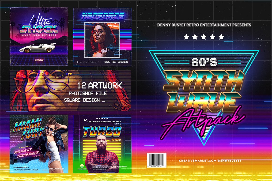
2. 80s Synthwave Square Art Pack
Words and images go hand-in-hand when transmitting a message. But words need to have their own personality, too, which can simply be achieved if you use the right font. What looks more like the 80s and sounds more like the 80s than Synthwave? The music genre transcribed into this font masterpiece will wow your followers and fans. Now, the message is just as important. Whether you are the girly, all pink type or the high-fashion guy that prefers quality over anything, use this versatile Art Pack. It will do the job well. Moreover, the files are highly editable and the guide will teach you how to use them.
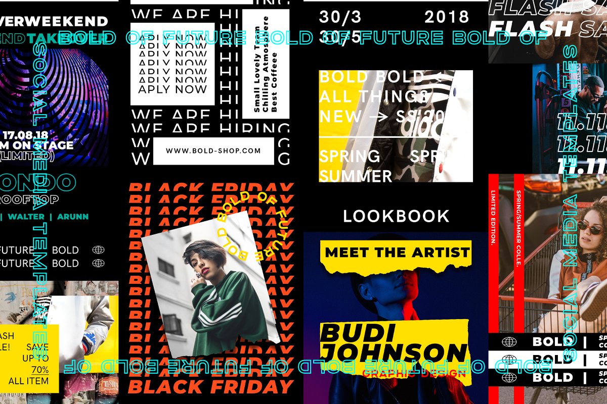
3. BOLD Social Media Brand Templates
Do you plan on creating your own brand or do you already own a brand? Get your campaign going the right, retro way! Inspired by the Swiss design, this pack of Bold Social Media Brand Templates features bold fonts and overlaying images that create a visual impact. With only a few clicks you can design perfect, captivating Instagram, Facebook, Twitter, and Pinterest posts. The 90 PSD File Design will make your account on any of the mentioned platforms popular in no time.
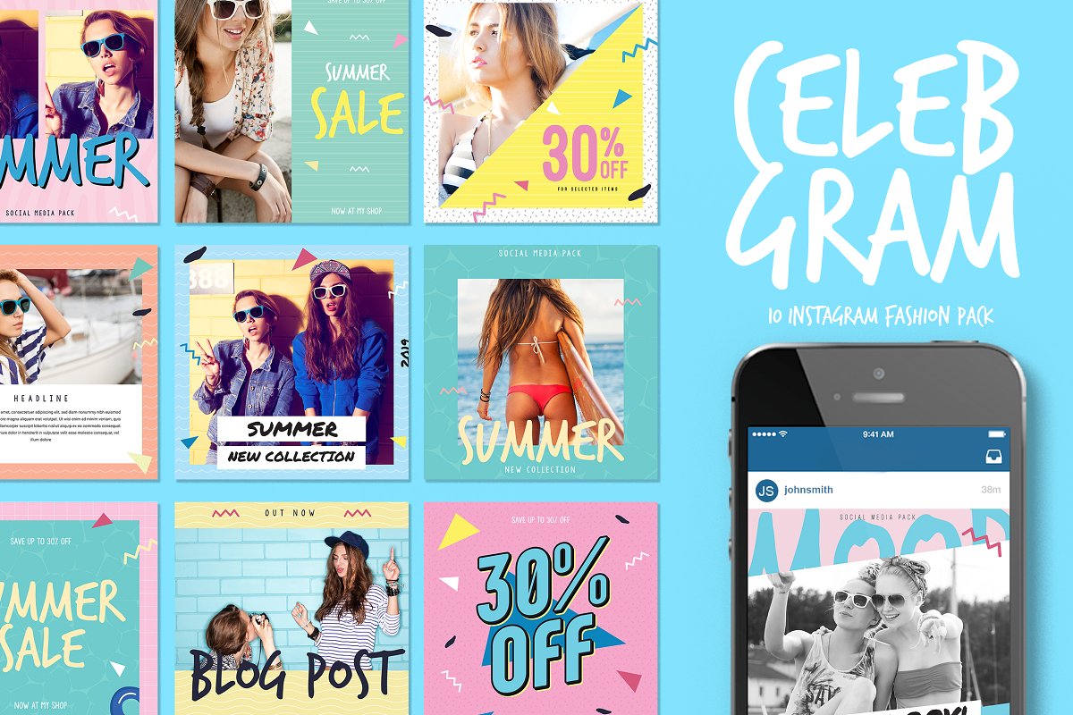
4. Celebgram Instagram Fashion Pack
Everybody can sell clothes online, but not everybody can do it with style. This particular pack screams glam-retro, and it’s perfect for anyone going for that vibe. The kit comes with 10 Photoshop/Illustrator files, and the templates are optimized for Instagram. You can customize pretty much every aspect of these templates, so let your inner retro-glam shine.
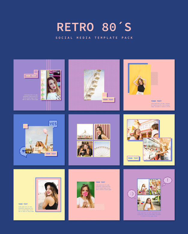
5. Retro 80’s Social Media Template Pack
One of the biggest fashion trends from the 80s and 90s were the colors! Pastels, pinks, blues, and many more lit up the design world back then, and it’s definitely something that needs to be incorporated into any retro-themed social media kit. This particular kit comes with 9 templates in 5 different colors. All of which can be edited in Photoshop.
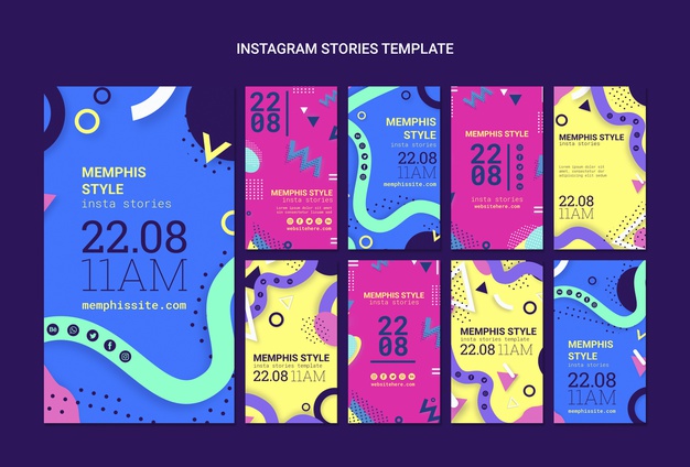
The 80s were wild, weren’t they? Any time you look back on old pictures, or see movies from that time, they had the strangest patterns on their clothes, in their carpets, and painted on their walls. These abstract patterns are definitely signature 80s retro, and they’re differently the perfect fit for any retro-inspired design. The Flat Memphis Style Instagram Stories Collection takes everything we remember and loved about the 80s and crammed it into 9 templates. Each template has similar style, but they all most cool colors and wild patterns that is unmistakably retro 80s.
7. NEORD Social Media Brand Templates
As we’ve stated before, bold is the theme for the 80s and 90s. At least, what is considered bold to us now. The NEORD kit has lots of bold lines, sharp patterns, and interesting color choices, making it perfect for a retro vibe. Everything is easily editable, and it includes 30 files for Insta, Facebook, and Pinterest. It’s worth the purchase for the uniqueness alone.
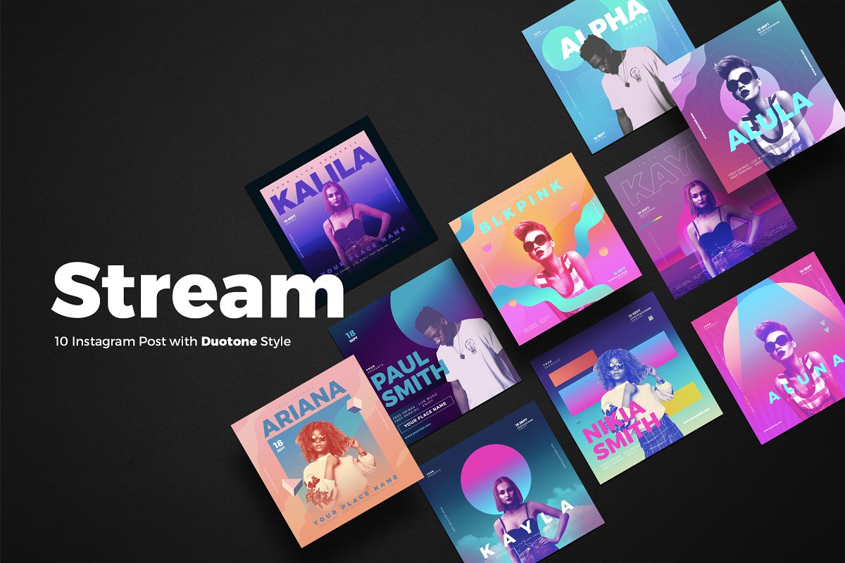
8. Stream 10 Duotone Instagram Posts
Some of the best designs out there take inspiration from previous trends, and put a modern twist on it. The Stream 10 Duotone Instagram Posts are a perfect example of reimagined design. These10 Photoshop files take all the vibrant colors from the 80s and 90s and turns them into unique gradients that are sure to light up anyone’s Instagram feed. But, as cool as the colors are, you can certainly edit them if you want to in Photoshop.
9. Colorful Summer Party
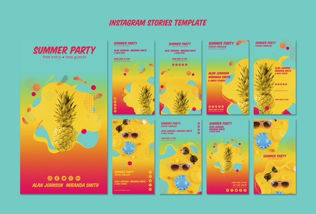
Hosting a party soon? Want to shout it out on Instagram? Then you’ve found the perfect retro-inspired stories template to do it. This social media kit comes with 9 vibrant templates that are perfect to share your upcoming house party. Or, maybe you have other ideas for how to use this. No worries. Simply drop it into Photoshop, and change any aspect you’d like.
Start posting
These are just a few of our favorite retro inspired social media kits out there right now. That being said, there are plenty more on the market you can choose from. There is a very clear theme present throughout all of them, but the uniqueness of each one is why they made this list
The key to nailing any retro-themed design is clearly the right choice of colors and imagery. Often times, as we saw in a few examples above, it really only takes a few shapes to pull of the 80s vibe.
We hope you enjoyed this fun little list. If you have any other suggestions and want to share, feel free to let us know in the comments below. Not every occasion allows you to rock a retro design on social media, so make sure you find the perfect one to fit the mood. But, most importantly, have some fun!
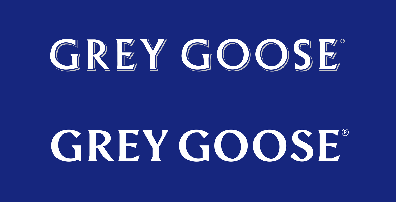
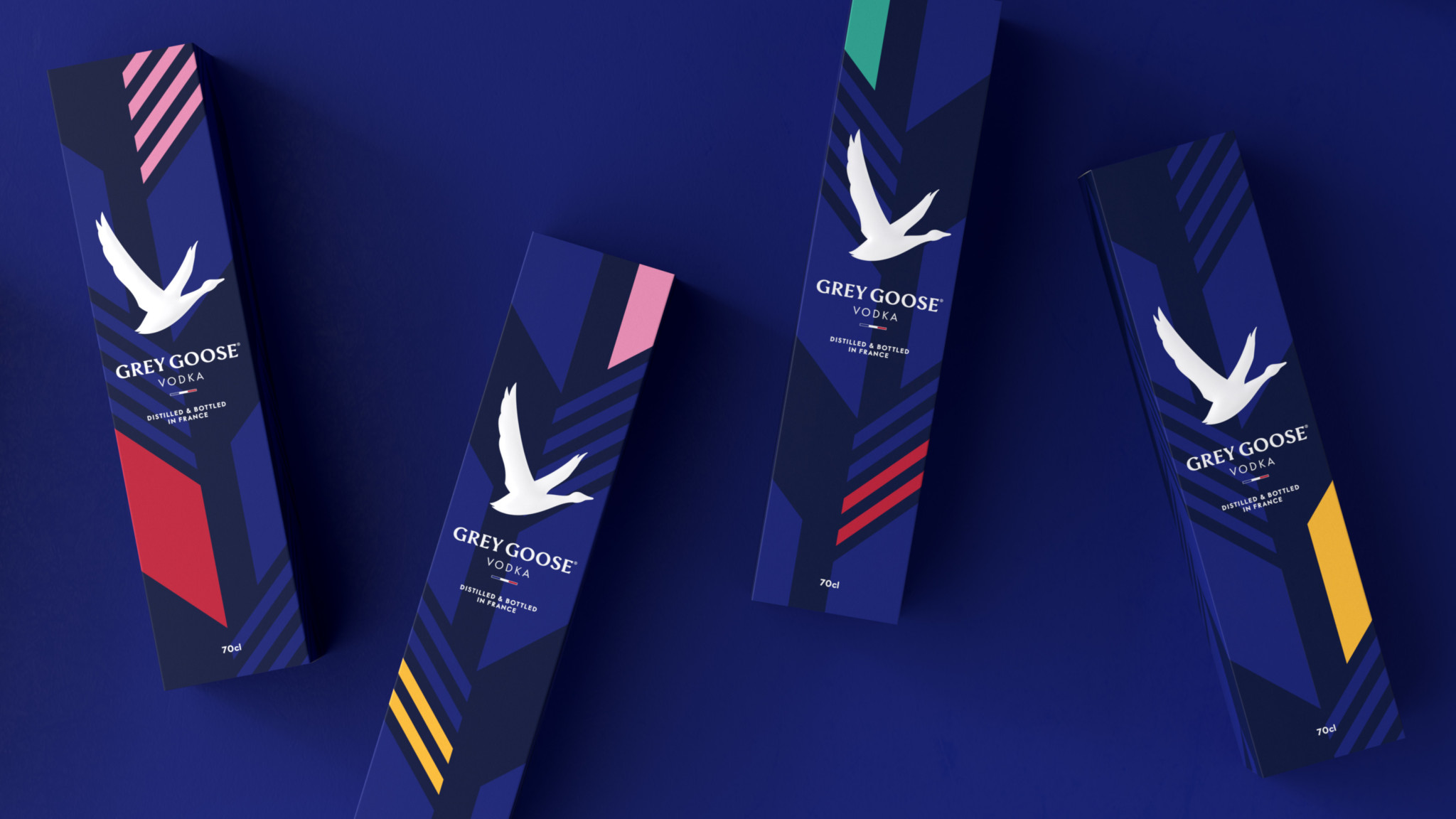
Grey Goose has revamped their visual identity and we love it. The redesign was done by London, UK-based Ragged Edge.
“We needed a bold statement. So we started by redrawing the logotype from scratch – the biggest change to the brand’s identity since its launch in 1997. [The] bespoke type is more contemporary, with just a hint of swagger. The perfect complement to the iconic lone goose symbol.”
When it comes to the goose logo, I have some reservations regarding just how distinctive the goose will actually be.
Although I love the movement towards a more minimalistic icon, the 3D texturing that the logo previously had gave it character and a more luxurious identity.
Ragged Edge has successfully made the brand feel more accessible in their attempt to, as they said it, “build a flexible identity full of optimism”
From a marketing perspective, the shorter tagline that spells just “Vodka” now instead of “World’s best tasting Vodka” makes a lot of sense. Most people shop for alcohol based on the label. In recent years, more and more consumers will go for a more minimal tag. This is a trend we’ve seen in wine bottles as well.
However, having a splash of color on your label does help a lot as this study proves. This is why the new Grey Goose packaging will definitely draw your attention in a duty free store. The new subtle patters and their dynamic with the other visuals are definitely my favorite part of the redesign.
Now back to you. What do you think about the Grey Goose Vodka redesign? What do you like and what do you dislike about it?
Let us know in the comments bellow.
When designing a website, many people think very little of the color scheme. Some people just randomly pick their colors or simply choose their favorite colors whether they go together or not. Some people may think, “How important could the color scheme of my website really be?” This is the wrong mindset.
Truthfully, this is one of the most important aspects of your website. The color will be the first thing the viewer notices and, in that short time, they will make a judgement right then and there about you without any real information. So, take time to think over your color scheme because it is the first thing visitors to your website will see and use to experience your brand.
Having a strong color scheme will make it easier for people to recognize your brand. For example, what are some favorite companies you think of when you think of red and white? If you guessed Coca-Cola or Netflix then you would be like most folks. Neither Coca-Cola nor Netflix own the colors red and white, but when you see those colors together, they are usually the first two brands to pop into your mind.
Why Color Matters
A clever and thoughtful color scheme can give your website a unique and modern feel. A poorly chosen color scheme can make your website feel dated and old school. The impact of a good color scheme cannot be stressed enough. 90% of judgements made when viewing a product in the first few seconds are based solely on color. The color is important because it can impact the user’s ability to read your content and possibly lead to eye strain.
These are very important factors, because you want users to easily be able to view the information you present to them. Eye strain affects how long a user will be able to stay on your website – something that is often overlooked. Bombarding your visitors with a lot of bright colors and visuals may look interesting and cool, but will ultimately impact the amount of time a user spends on your site.
According to HubSpot, 46% of people will judge the authenticity and credibility of your website based on the design and colors. This means that choosing the design’s color scheme should be in the forefront of your mind. Another 40% of people will respond better to visual information rather than plain text. One of the objectives of your website should be to present information that is easily digestible for the reader. A strong color scheme will help you accomplish that.
There are only seven base colors in the world. But once you factor in different shades and combinations, that number reaches well into the millions. You definitely have tons of options at your disposal – which can be overwhelming. But don’t worry, it’s not that hard.
If you are building a new website from scratch and trying to find the right color scheme or you’re trying to give your old website a makeover, then you’ve come to the right place. This article will help you find a color scheme that will both keep up with the trends and give your website the unique look you want it to have.
Hot Reds
Red is a very dominant color that has many different meanings. It can represent things such as anger, love, fire, and passion. With all the meanings this color can convey, the possibilities are endless when using red within your website.
This color will surely draw attention to important elements, but be careful not to overdo it. A little of this hot red can go a long way. Make sure that this color goes with the tone you are trying to convey.
Contrasts
Highly-contrasting colors are a dangerous area when it comes to web design. When done poorly, these designs are an eyesore and will make people look away and perhaps never come back. However, when done correctly you get something so visually striking that people can’t help but look.
The result is a beautiful webpage that draws users in and encourages them to explore. Contrast can be achieved by combining different colors, but also different patterns, which is not as common. In 2019, look to see web designers pushing the creative limit using contrasts to create beautiful web designs.
Earth Tones
Earth tones remind us of the natural world. They offer a modern look to web design when used correctly. They are often muted colors that are best used sparingly, so as to not overwhelm users.
Shades of browns, yellows, tans, blues, greens and many more are great for giving your website that Earthy feel. All of those tones are often found out in nature or within our homes. This helps to give your website a warm and friendly feel to it.
Be sure to keep an eye out for this trend in 2019, as it has already been becoming more popular in website design.
Black on Black
Black is a very timeless color that never goes out of style. It often gives off a very sleek and elegant look. In the fashion world, black is often used to display elegance and luxury. This same principle can be taken into web design.
Using black on black to display your site is a great way to attract people and make it feel as if they are partaking something extravagant. Using different shades on your website is a surefire way to attract attention to it. This look has been trendy forever, and that will surely continue this year.
Make Your Statement
There’s no better way to make a statement than with color. Whether bold and bright, or soft and muted, the colors you choose to display will say a lot about your brand. Take these trends into account and choose wisely!
Design is all about expressing yourself through your art and showing people the beauty in simple or incredibly intricate designs. While you should always stay true to yourself and be authentically you through your designs, it is also good to stay on top of the trend game.
Today we’re going to go over 10 design trends that we stan this year. And hopefully, always.
We’ve got 6 months left in 2019 so we better make our designs count.
So let’s just get right into it, shall we?
1. GO BOLD
You know the saying, go bold or go home. And it rings absolutely true in design. We have two different types of “bold” that we’re going to go over in this section: bold colors and bold text.
Here are some examples where minimalist background color meets bold product color. When photographing and editing a product, enhance its color by using a light, neutral color as the background. When you do this, the eye of your client will be drawn directly to your product. Make sure that the color you choose complements the product’s color and really enhances what you have to offer. This is definitely my favorite trend right now. Hats off to Erik Musen for hitting us with some sweet designs.
The next bold section is all about text. You have a message to share and you need to grab the attention of your readers. Do this with the same concept as with the products. Beetroot did an awesome job of using big and bold fonts to grab your attention. There’s no missing what you have to say when you use this bold technique.
Really stand out, literally, with a 3D design. Incorporate real-looking elements into your graphic design to make your design truly unique and eye-catching. Take these designs for example.
3D design is just about everywhere right now, and as you could see above, there’s no specific font that is the set-in-stone font to use.Try out any font you’d like! A font that is skinny, bold, a sans-serif, script, or any other type of font can be rendered in 3D. Use this technique in your next project and drop the link to your portfolio in the comments below so we can check it out!
3. Flat Design meets Realism
Another huge design trend right now is flat design combined with realism. Here are some prime examples of what I’m talking about.
Feeding off of the 3D trend, flat design + realism is truly impressive. Two complete opposites, yet the perfect combination that gives a vibe of futuristic design. You can expect to see this trend in the E-commerce world, but not only. Add elements that look like they are floating or fly to add an aesthetic that is overall abstract. Combine 3D objects with a flat design to achieve this amazing look.
4. Open composition
We’re taking a step back from mainstream, and a step forward in creativity. This trend exudes art. It’s chaotic, yet beautiful. For this look, the goal is to achieve a free-flowing final product. So say goodbye to a “perfect” framed finish. This trend is a combination of things: combine images with ideas. This is magic in real life. It gives people a sense that they’re just seeing a small piece of a bigger picture. The real magic of open-composition is that gives people the freedom to explore their creative side and see the deeper meaning of what the combined elements could mean.
One of my favorite things about social media today is that we’re all pushing for authenticity and being real. There’s no excuse for designers. In this technique, designers are encouraged to let their inner-creator out by drawing, writing, doodling, splashing, and using unique brush strokes and color stains. Imperfections and mistakes are embraced in this trend because there’s absolutely no right or wrong in this style. And I think that’s why I love it so much.
Sadly, our time has come to an end…
But no worries, we’ll be back soon!
Let us know in the comments below what your favorite design trend was in this article, and if you have any other favorite design trends we didn’t cover, mention those down below as well.
Drop your portfolio down in the comments for us designers to support each other.
Nothing looks nicer than a good gradient in a design. Gradients can completely transform a website color scheme from mundane to gorgeous, and you’ll often find them in the centerpiece of a site’s design. Looking for some inspiration for your own backgrounds and banners? Take a look at these beautiful blends.
Dazzling is barely enough to describe this stunning banner. A gradient made of opposite colors is bound to be striking, and the way the strong lighting in the background reflects off the model just makes this a fantastic example of great gradients in design.
This page makes abundant use of gradients, from the animations and the background as you scroll down, to the various banners and illustrations peppered throughout. The cool purples, blues and pinks blend together perfectly thanks to the colorful style.
Obviously, a site designed to generate gradients would know how to utilize them effectively. The banner on the right is an instant eye-catcher, and the same color scheme is used to draw attention to the logo/homepage link as well as the call to action button.
The effect here is super subtle, especially at the beginning of the page. But as you scroll, you’ll stumble upon a huge background image overlain with a pretty blue to red color palette. It then naturally flows into a big red text box, which is sure to grab attention.
Smooth gradients can give a page a clean and elegant look. Professional doesn’t have to mean blacks and whites – add a splash of color and see what happens! This is a landing page that would definitely make conversions.
This game has a strong concept, its artistic style just as much so. Various abstract levels can be explored and discovered, each sporting a beautiful blended background. There’s even a gradient generator for this purpose. It all comes together to make an app you won’t easily forget.
The beautifully designed landing page opens with vibrant blues and purples that cleanly fade to white as you scroll. Who needs a hero image when you can create a “hero gradient” that naturally transitions into your feature list?
Effective gradients can be simple and subtle, or flashy and gorgeous – all that matters is that it’s done well. This landing page sports the latter, with an image that serves both as a good background and yet is also the centerpiece of the design. It doesn’t distract from the text, but you can’t help but stare at the amazingly blended colors with the logo right in the middle.
This is just fantastic work from a graphic designer. A clean and simple, yet so very pretty logo. Made to look like ocean waves, every piece of the water blends together beautifully. The reverse gradient effect on the lighting makes the logo look interesting and dynamic as well.
Flat, simple design is a fairly popular trend online. It’s clean, easy to create, and looks nice. But it can also be boring! The slight gradient effect here adds a ton of beauty and dynamic, while still retaining that smooth, clean-cut appearance that’s super satisfying to look at.
Gradients work great with light colors and pastels, and here’s the perfect example. The effect is slight, but compelling, with the central character getting a more dramatic gradient while the background is pale enough to almost blend in with the white.
Inspiring Effective Gradients
Gradients are a great tool for designers. Used well, they can add a dynamic look and a spark of beauty to a design. Subtle or flashy, there’s a place for a good gradient in any creation.
And a skilled designer can utilize one to add contrast to important elements, highlight areas of interest, incorporate UI elements into the gradient, or any other number of clever tricks.
Picking the perfect color scheme shouldn’t be a miserable task. All you need are the right tools for the job and an eye for design.
I can’t help develop your eye for picking colors, but I can share a bunch of handy color tools that’ll likely improve your eye as you use them.
These tools are all 100% free, so they’re easy to bookmark and reuse time & time again. They can also work for web, mobile, print, or any other medium that needs incredible colors.
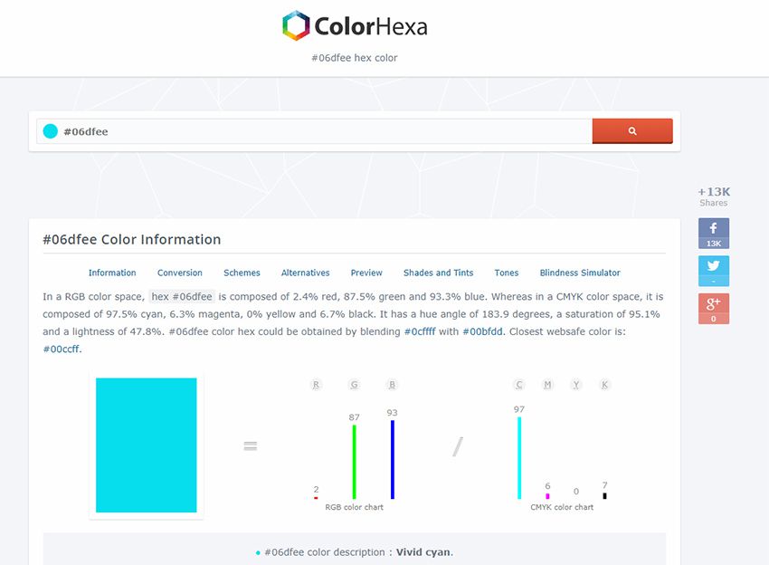
1. ColorHexa
Recently I was browsing the web and stumbled onto ColorHexa. It’s by far one of the coolest color tools I’ve ever seen.
This isn’t technically a color generator or a scheme design tool. Instead, it’s an information library on all colors with suggested gradient ideas, related shades, and dozens of color codes(ex: hex, RGB, CMYK, CIE-LAB, HSL and more).
You’ll never find a more complete list of information on color. This is super useful for all designers, including web designers, and it’s a great place to start researching colors for your projects.
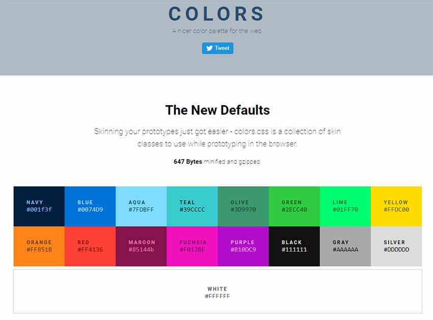
2. Colors.css
If you do some research into color psychology you’ll learn how different colors stack together & what sort of mood they give. This plays into contrast for certain types of colors and how they work together.
Every browser comes with default colors that are often too harsh. Colors.css fixes that.
It’s a free CSS library that restyles the default color palette. This means you can use color names like “blue” and “red” with totally different values.
They even have an entire accessibility page full of ideas for matching color schemes that’ll improve readability on your site.
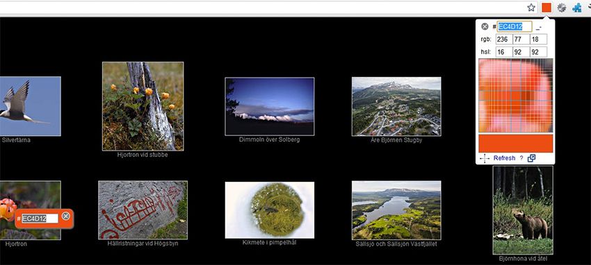
3. ColorPick Eyedropper Extension
How often do you find a site with a beautiful color scheme? I find amazing sites all the time and it’s difficult to export those colors from the stylesheet.
You can use Chrome DevTools but this requires digging around in the code to pick out the hex colors. Instead you can use the ColorPick Eyedropper extension made exclusively for Google Chrome.
You just click the toggle window in the extensions panel, then hover any color you want to study. This gives you the full hex code along with a “copy” link to copy the exact color to your clipboard.
Pretty cool right? And it’s a free plugin, so there’s nothing to lose by trying it out.
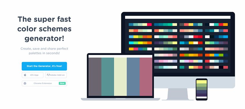
4. Coolors
The Coolors site is a large color scheme generator. You can find dozens of generators on the web, but this one’s a little different since it supports Adobe programs with its own add-on.
You can also get this as a Chrome extension or even as a custom iOS app for your phone.
Really the true value is in the browser webapp that auto-generates color schemes on the fly. You can then mix & match colors, change settings, adjust for color blindness, and randomize your own schemes based on certain criteria.
It’s a great application, but it comes with a small learning curve. Shouldn’t take you more than 15-20 minutes to figure out how it all works.
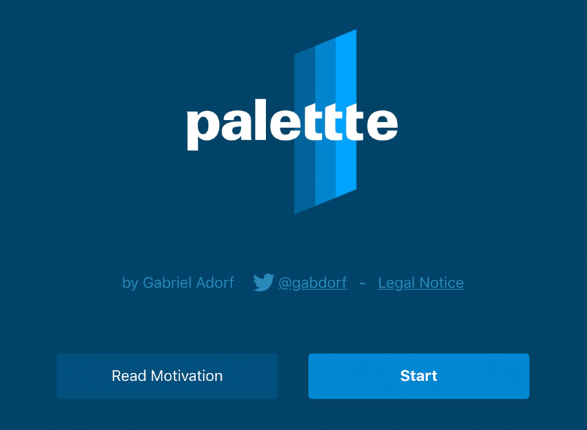
5. Palettte App
Palettte is color editing and remapping tool. It allows you to build color schemes that flow from one to another and fine-tune individual color swatches. You can also import, analyze, and editing existing color schemes. The creator has written more on the motivations behind this color app.
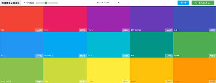
6. Material UI Colors
With a quick Google search you’ll find a bunch of sweet material design tools on the web. They seem never-ending and many of them rely on the color styles typically found in Android apps.
With the Material UI Colors webapp you can find perfect color schemes that match with Google’s material guidelines.
Easily change the tint of all colors with the slider in the top-left corner of the screen. Or randomize your selections to match an existing site’s color choices.
You can also switch between hex and RGB depending on whatever format you want. A great app for material design lovers.
7. Color Supply
The Color Supply website is pretty unique but also very strange. It gives you a bunch of interesting color tools for matching color schemes, picking the foregrounds & backgrounds, plus different ways to compare how those colors would look on a page.
But this doesn’t have any guide or specific purpose. It acts like a color scheme generator that you have to just kind of learn as you go.
It will output different colors with hex codes near the bottom of the page to copy. Plus it’ll show you how those colors work in a gradient, in icons, and with text. Nice tool but it comes with an awkward learning curve.
8. Color Safe
The WCAG works hard towards a more accessible web. Color is one of the easiest ways to build your accessibility without losing time testing.
Color Safe is a free webapp that can test your color choices. You pick from a small set of fonts & sizes, then pick whatever colors you want for your foreground & background.
From there you’ll get an accessibility rating along with suggestions on how to improve your color choices(if needed).
Really great tool for anyone concerned about accessibility on the web.
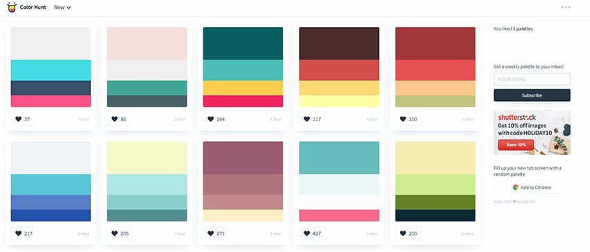
9. Color Hunt
For a user-curated gallery of color schemes take a look at Color Hunt.
This free project was launched a couple of years back and continues to be a source of design inspiration. People submit their own color schemes into the site, then others vote on those color schemes.
You can sort by newest or by most popular and even vote on your favorites. Pretty cool right?
It’s an extremely simple web app so don’t expect too many features. It’s just a neat way to visually browse through many different color patterns at once.
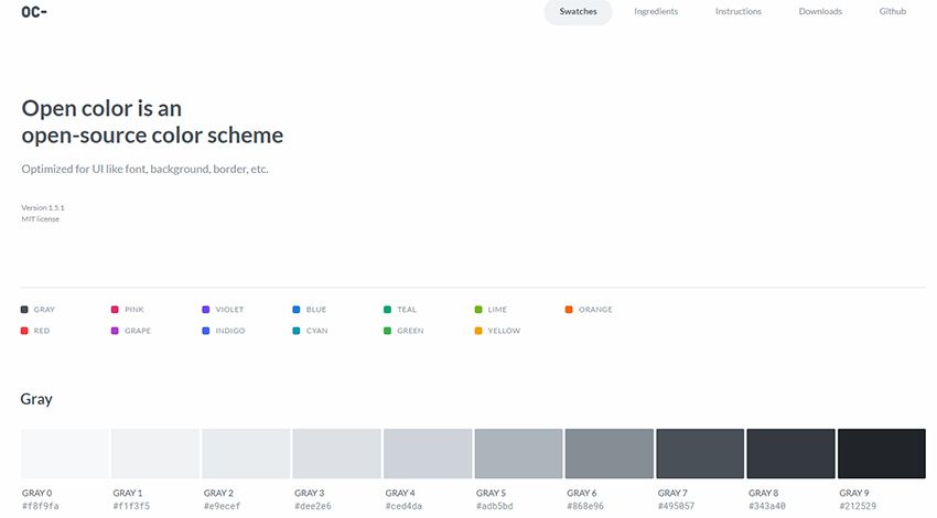
10. Open Color
Looking for something a little more web-friendly? Then check out the Open Color library.
This is a massive open source collection of color choices built around accessibility and browser support. Each color has been optimized for easy matching regardless of your layout’s design.
Check out the GitHub repo for more info and to download a copy of the styles.
This lets you pull all forms of HTML/CSS code for your color choices right from the app. You can search for any color you want, or go by their recommendations. Plus this even has a tool for generating color palettes that you can download as Adobe Swatch files.
Don’t let the name fool you: this app is for more than just HTML color.
It’s a brilliant tool for digital designers of all types who want easy access to color codes and reusable palettes.
This free tool used to be called Adobe Kuler but it’s gone through a few iterations over the years. It’s still a free color picker but the interface has changed to make it easier for designers to build & save color schemes.
If you’re an Adobe user this tool is worth bookmarking. It supports up to 5 different colors in one scheme, and you can even upload images to pull dynamic color schemes automatically.
There are so many tools out there to help you pick colors. I totally get it! It's hard! When colors are done well, it's like magic. It adds a level of polish to a design that can really set it apart.
Let's look at some, then talk about this idea some more.
Generating random colors won’t guarantee pleasing palettes, especially if a bunch of random colors are paired together. PleaseJS can help build color schemes that work together. You provide it a base color and other options (like what type of color scheme) and it spits out colors for you.
generates attractive colors by default. More specifically, randomColor produces bright colors with a reasonably high saturation. This makes randomColor particularly useful for data visualizations and generative art.
It doesn't claim to make multiple colors part of a cohesive theme aside from passing in a base hue or luminosity.
But the thing about just being handed colors is...
...they don't exactly tell you how to use them. Steve Schoger makes a point of this, rather hilariously in a blog post. This is a perfectly lovely color palette:
But if you just pick those colors and plop them onto a design, you could end up with something like this:
You might like that, but you'd be in the minority. It's not a refined design that gets out of the way and would be nice to use every day. Color usage is a bit more complicated than plopping five nice colors into a design. It's variations on those and using them in tasteful ways, like this:
A challenge I faced in building an image "emojifier" was that I needed to change the color spaces of values obtained using getImageData() from RGB to HSL. I used arrays of emojis arranged by brightness and saturation, and they were HSL-based for the best matches of average pixel colors with the emojis.
In this article, we’ll study functions that will be useful for converting both opaque and alpha-enabled color values. Modern browsers currently support the color spaces RGB(A), hex, and HSL(A). The functions and notations for these are rgb(), rgba(), #rgb/#rrggbb, #rgba/#rrggbbaa, hsl(), and hsla(). Browsers have always supported built-in names like aliceblue as well.
Along the way, we’ll encounter use of some color syntaxes provided by a new Level 4 of the CSS Colors Module. For example, we now have hex with alpha as we mentioned (#rgba/#rrggbbaa) and RGB and HSL syntaxes no longer require commas (values like rgb(255 0 0) and hsl(240 100% 50%) became legal!).
Browser support for CSS Colors Level 4 isn’t universal as of this writing, so don’t expect new color syntaxes to work in Microsoft browsers or Safari if trying them in CSS.
RGB to Hex
Converting RGB to hex is merely a change of radices. We convert the red, green, and blue values from decimal to hexadecimal using toString(16). After prepending 0s to single digits and under, we can concatenate them and # to a single return statement.
function RGBToHex(r,g,b) {
  r = r.toString(16);
  g = g.toString(16);
  b = b.toString(16);

  if (r.length == 1)
    r = "0" + r;
  if (g.length == 1)
    g = "0" + g;
  if (b.length == 1)
    b = "0" + b;

  return "#" + r + g + b;
}
RGB in String
Alternatively, we can use a single string argument with the red, green and blue separated by commas or spaces (e.g. "rgb(255,25,2)", "rgb(255 25 2)"). Substring to eliminate rgb(, split what’s left by the ), then split that result’s first item by whichever the separator (sep) is. r, g, and b shall become local variables now. Then we use + before the split strings to convert them back to numbers before obtaining the hex values.
function RGBToHex(rgb) {
  // Choose correct separator
  let sep = rgb.indexOf(",") > -1 ? "," : " ";
  // Turn "rgb(r,g,b)" into [r,g,b]
  rgb = rgb.substr(4).split(")")[0].split(sep);

  let r = (+rgb[0]).toString(16),
      g = (+rgb[1]).toString(16),
      b = (+rgb[2]).toString(16);

  if (r.length == 1)
    r = "0" + r;
  if (g.length == 1)
    g = "0" + g;
  if (b.length == 1)
    b = "0" + b;

  return "#" + r + g + b;
}
In addition, we can allow strings with channel values as percentages by adding the loop after redefining rgb. It'll strip the %s and turn what’s left into values out of 255.
function RGBToHex(rgb) {
  let sep = rgb.indexOf(",") > -1 ? "," : " ";
  rgb = rgb.substr(4).split(")")[0].split(sep);

  // Convert %s to 0–255
  for (let R in rgb) {
    let r = rgb[R];
    if (r.indexOf("%") > -1)
      rgb[R] = Math.round(r.substr(0,r.length - 1) / 100 * 255);
      /* Example:
      75% -> 191
      75/100 = 0.75, * 255 = 191.25 -> 191
      */
  }

  ...
}
Now we can supply values like either of these:
rgb(255,25,2)
rgb(255 25 2)
rgb(50%,30%,10%)
rgb(50% 30% 10%)
RGBA to Hex (#rrggbbaa)
Converting RGBA to hex with the #rgba or #rrggbbaa notation follows virtually the same process as the opaque counterpart. Since the alpha (a) is normally a value between 0 and 1, we need to multiply it by 255, round the result, then convert it to hexadecimal.
function RGBAToHexA(r,g,b,a) {
  r = r.toString(16);
  g = g.toString(16);
  b = b.toString(16);
  a = Math.round(a * 255).toString(16);

  if (r.length == 1)
    r = "0" + r;
  if (g.length == 1)
    g = "0" + g;
  if (b.length == 1)
    b = "0" + b;
  if (a.length == 1)
    a = "0" + a;

  return "#" + r + g + b + a;
}
To do this with one string (including with percentages), we can follow what we did earlier. Also note the extra step of splicing out a slash. Since CSS Colors Level 4 supports the syntax of rgba(r g b / a), this is where we allow it. Alpha values can now be percentages! This removes the 0-1-only shackles we used to have. Therefore, the for loop cycling through rgba shall include a part to wipe the % from the alpha without multiplying by 255 (when R is 3 for alpha). Soon we can use values like rgba(255 128 0 / 0.8) and rgba(100% 21% 100% / 30%)!
function RGBAToHexA(rgba) {
  let sep = rgba.indexOf(",") > -1 ? "," : " ";
  rgba = rgba.substr(5).split(")")[0].split(sep);

  // Strip the slash if using space-separated syntax
  if (rgba.indexOf("/") > -1)
    rgba.splice(3,1);

  for (let R in rgba) {
    let r = rgba[R];
    if (r.indexOf("%") > -1) {
      let p = r.substr(0,r.length - 1) / 100;

      if (R < 3) {
        rgba[R] = Math.round(p * 255);
      } else {
        rgba[R] = p;
      }
    }
  }
}
Then, where the channels are converted to hex, we adjust a to use an item of rgba[].
function RGBAToHexA(rgba) {
  ...

  let r = (+rgba[0]).toString(16),
      g = (+rgba[1]).toString(16),
      b = (+rgba[2]).toString(16),
      a = Math.round(+rgba[3] * 255).toString(16);

  if (r.length == 1)
    r = "0" + r;
  if (g.length == 1)
    g = "0" + g;
  if (b.length == 1)
    b = "0" + b;
  if (a.length == 1)
    a = "0" + a;

  return "#" + r + g + b + a;
}
Now the function supports the following:
rgba(255,25,2,0.5)
rgba(255 25 2 / 0.5)
rgba(50%,30%,10%,0.5)
rgba(50%,30%,10%,50%)
rgba(50% 30% 10% / 0.5)
rgba(50% 30% 10% / 50%)
Hex to RGB
We know that the length of hex values must either be 3 or 6 (plus #). In either case, we begin each red (r), green (g), and blue (b) value with "0x" to convert them to hex. If we provide a 3-digit value, we concatenate the same value twice for each channel. If it’s a 6-digit value, we concatenate the first two for red, next two for green, and last two for blue. To get the values for the final rgb() string, we prepend the variables with + to convert them from strings back to numbers, which will yield the decimals we need.
function hexToRGB(h) {
  let r = 0, g = 0, b = 0;

  // 3 digits
  if (h.length == 4) {
    r = "0x" + h[1] + h[1];
    g = "0x" + h[2] + h[2];
    b = "0x" + h[3] + h[3];

  // 6 digits
  } else if (h.length == 7) {
    r = "0x" + h[1] + h[2];
    g = "0x" + h[3] + h[4];
    b = "0x" + h[5] + h[6];
  }

  return "rgb("+ +r + "," + +g + "," + +b + ")";
}
Output RGB with %s
If we want to return rgb() using percentages, then we can modify the function to utilize an optional isPct parameter like so:
function hexToRGB(h,isPct) {
  let r = 0, g = 0, b = 0;
  isPct = isPct === true;

  if (h.length == 4) {
    r = "0x" + h[1] + h[1];
    g = "0x" + h[2] + h[2];
    b = "0x" + h[3] + h[3];

  } else if (h.length == 7) {
    r = "0x" + h[1] + h[2];
    g = "0x" + h[3] + h[4];
    b = "0x" + h[5] + h[6];
  }

  if (isPct) {
    r = +(r / 255 * 100).toFixed(1);
    g = +(g / 255 * 100).toFixed(1);
    b = +(b / 255 * 100).toFixed(1);
  }

  return "rgb(" + (isPct ? r + "%," + g + "%," + b + "%" : +r + "," + +g + "," + +b) + ")";
}
Under the last if statement, using +s will convert r, g, and b to numbers. Each toFixed(1) along with them will round the result to the nearest tenth. Additionally, we won’t have whole numbers with .0 or the decades old quirk that produces numbers like 0.30000000000000004. Therefore, in the return, we omitted the +s right before the first r, g, and b to prevent NaNs caused by the %s. Now we can use hexToRGB("#ff0",true) to get rgb(100%,100%,0%)!
Hex (#rrggbbaa) to RGBA
The procedure for hex values with alpha should again be similar with the last. We simply detect a 4- or 8-digit value (plus #) then convert the alpha and divide it by 255. To get more precise output but not long decimal numbers for alpha, we can use toFixed(3).
function hexAToRGBA(h) {
  let r = 0, g = 0, b = 0, a = 1;

  if (h.length == 5) {
    r = "0x" + h[1] + h[1];
    g = "0x" + h[2] + h[2];
    b = "0x" + h[3] + h[3];
    a = "0x" + h[4] + h[4];

  } else if (h.length == 9) {
    r = "0x" + h[1] + h[2];
    g = "0x" + h[3] + h[4];
    b = "0x" + h[5] + h[6];
    a = "0x" + h[7] + h[8];
  }
  a = +(a / 255).toFixed(3);

  return "rgba(" + +r + "," + +g + "," + +b + "," + a + ")";
}
Output RGBA with %s
For a version that outputs percentages, we can do what we did in hexToRGB()—switch r, g, and b to 0–100% when isPct is true.
function hexAToRGBA(h,isPct) {
  let r = 0, g = 0, b = 0, a = 1;
  isPct = isPct === true;

  // Handling of digits
  ...

  if (isPct) {
    r = +(r / 255 * 100).toFixed(1);
    g = +(g / 255 * 100).toFixed(1);
    b = +(b / 255 * 100).toFixed(1);
  }
  a = +(a / 255).toFixed(3);

  return "rgba(" + (isPct ? r + "%," + g + "%," + b + "%," + a : +r + "," + +g + "," + +b + "," + a) + ")";
}
Here’s a quick fix if the alpha ought to be a percentage, too: move the statement where a is redefined above the last if statement. Then in that statement, modify a to be like r, g, and b. When isPct is true, a must also gain the %.
function hexAToRGBA(h,isPct) {
  ...

  a = +(a / 255).toFixed(3);
  if (isPct) {
    r = +(r / 255 * 100).toFixed(1);
    g = +(g / 255 * 100).toFixed(1);
    b = +(b / 255 * 100).toFixed(1);
    a = +(a * 100).toFixed(1);
  }

  return "rgba(" + (isPct ? r + "%," + g + "%," + b + "%," + a + "%" : +r + "," + +g + "," + +b + "," + a) + ")";
}
When we enter #7f7fff80 now, we should get rgba(127,127,255,0.502) or rgba(49.8%,49.8%,100%,50.2%).
RGB to HSL
Obtaining HSL values from RGB or hex is a bit more challenging because there’s a larger formula involved. First, we must divide the red, green, and blue by 255 to use values between 0 and 1. Then we find the minimum and maximum of those values (cmin and cmax) as well as the difference between them (delta). We need that result as part of calculating the hue and saturation. Right after the delta, let’s initialize the hue (h), saturation (s), and lightness (l).
function RGBToHSL(r,g,b) {
  // Make r, g, and b fractions of 1
  r /= 255;
  g /= 255;
  b /= 255;

  // Find greatest and smallest channel values
  let cmin = Math.min(r,g,b),
      cmax = Math.max(r,g,b),
      delta = cmax - cmin,
      h = 0,
      s = 0,
      l = 0;
}
Next, we need to calculate the hue, which is to be determined by the greatest channel value in cmax (or if all channels are the same). If there is no difference between the channels, the hue will be 0. If cmax is the red, then the formula will be ((g - b) / delta) % 6. If green, then (b - r) / delta + 2. Then, if blue, (r - g) / delta + 4. Finally, multiply the result by 60 (to get the degree value) and round it. Since hues shouldn’t be negative, we add 360 to it, if needed.
function RGBToHSL(r,g,b) {
  ...
  // Calculate hue
  // No difference
  if (delta == 0)
    h = 0;
  // Red is max
  else if (cmax == r)
    h = ((g - b) / delta) % 6;
  // Green is max
  else if (cmax == g)
    h = (b - r) / delta + 2;
  // Blue is max
  else
    h = (r - g) / delta + 4;

  h = Math.round(h * 60);

  // Make negative hues positive behind 360°
  if (h < 0)
      h += 360;
}
All that’s left is the saturation and lightness. Let’s calculate the lightness before we do the saturation, as the saturation will depend on it. It’s the sum of the maximum and minimum channel values cut in half ((cmax + cmin) / 2). Then delta will determine what the saturation will be. If it’s 0 (no difference between cmax and cmin), then the saturation is automatically 0. Otherwise, it’ll be 1 minus the absolute value of twice the lightness minus 1 (1 - Math.abs(2 * l - 1)). Once we have these values, we must convert them to values out of 100%, so we multiply them by 100 and round to the nearest tenth. Now we can string together our hsl().
function RGBToHSL(r,g,b) {
  ...
  // Calculate lightness
  l = (cmax + cmin) / 2;

  // Calculate saturation
  s = delta == 0 ? 0 : delta / (1 - Math.abs(2 * l - 1));

  // Multiply l and s by 100
  s = +(s * 100).toFixed(1);
  l = +(l * 100).toFixed(1);

  return "hsl(" + h + "," + s + "%," + l + "%)";
}
RGB in String
For one string, split the argument by comma or space, strip the %s, and localize r, g, and b like we did before.
function RGBToHSL(rgb) {
  let sep = rgb.indexOf(",") > -1 ? "," : " ";
  rgb = rgb.substr(4).split(")")[0].split(sep);

  for (let R in rgb) {
    let r = rgb[R];
    if (r.indexOf("%") > -1)
      rgb[R] = Math.round(r.substr(0,r.length - 1) / 100 * 255);
  }

  // Make r, g, and b fractions of 1
  let r = rgb[0] / 255,
      g = rgb[1] / 255,
      b = rgb[2] / 255;

  ...
}
RGBA to HSLA
Compared to what we just did to convert RGB to HSL, the alpha counterpart will be basically nothing! We just reuse the code for RGB to HSL (the multi-argument version), leave a alone, and pass a to the returned HSLA. Keep in mind it should be between 0 and 1.
function RGBAToHSLA(r,g,b,a) {
  // Code for RGBToHSL(r,g,b) before return
  ...

  return "hsla(" + h + "," + s + "%," +l + "%," + a + ")";
}
RGBA in String
For string values, we apply the splitting and stripping logic again but use the fourth item in rgba for a. Remember the new rgba(r g b / a) syntax? We’re employing the acceptance of it as we did for RGBAToHexA(). Then the rest of the code is the normal RGB-to-HSL conversion.
function RGBAToHSLA(rgba) {
  let sep = rgba.indexOf(",") > -1 ? "," : " ";
  rgba = rgba.substr(5).split(")")[0].split(sep);

  // Strip the slash if using space-separated syntax
  if (rgba.indexOf("/") > -1)
    rgba.splice(3,1);

  for (let R in rgba) {
    let r = rgba[R];
    if (r.indexOf("%") > -1) {
      let p = r.substr(0,r.length - 1) / 100;

      if (R < 3) {
        rgba[R] = Math.round(p * 255);
      } else {
        rgba[R] = p;
      }
    }
  }

  // Make r, g, and b fractions of 1
  let r = rgba[0] / 255,
      g = rgba[1] / 255,
      b = rgba[2] / 255,
      a = rgba[3];

  // Rest of RGB-to-HSL logic
  ...
}
Wish to leave the alpha as is? Remove the else statement from the for loop.
for (let R in rgba) {
  let r = rgba[R];
  if (r.indexOf("%") > -1) {
    let p = r.substr(0,r.length - 1) / 100;

    if (R < 3) {
      rgba[R] = Math.round(p * 255);
    }
  }
}
HSL to RGB
It takes slightly less logic to convert HSL back to RGB than the opposite way. Since we’ll use a range of 0–100 for the saturation and lightness, the first step is to divide them by 100 to values between 0 and 1. Next, we find chroma (c), which is color intensity, so that’s (1 - Math.abs(2 * l - 1)) * s. Then we use x for the second largest component (first being chroma), the amount to add to each channel to match the lightness (m), and initialize r, g, b.
function HSLToRGB(h,s,l) {
  // Must be fractions of 1
  s /= 100;
  l /= 100;

  let c = (1 - Math.abs(2 * l - 1)) * s,
      x = c * (1 - Math.abs((h / 60) % 2 - 1)),
      m = l - c/2,
      r = 0,
      g = 0,
      b = 0;
}
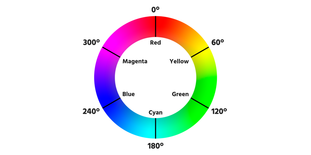
The hue will determine what the red, green, and blue should be depending on which 60° sector of the color wheel it lies.
The color wheel divided into 60° segments
Then c and x shall be assigned as shown below, leaving one channel at 0. To get the final RGB value, we add m to each channel, multiply it by 255, and round it.
function HSLToRGB(h,s,l) {
  ...

  if (0 <= h && h < 60) {
    r = c; g = x; b = 0;
  } else if (60 <= h && h < 120) {
    r = x; g = c; b = 0;
  } else if (120 <= h && h < 180) {
    r = 0; g = c; b = x;
  } else if (180 <= h && h < 240) {
    r = 0; g = x; b = c;
  } else if (240 <= h && h < 300) {
    r = x; g = 0; b = c;
  } else if (300 <= h && h < 360) {
    r = c; g = 0; b = x;
  }
  r = Math.round((r + m) * 255);
  g = Math.round((g + m) * 255);
  b = Math.round((b + m) * 255);

  return "rgb(" + r + "," + g + "," + b + ")";
}
HSL in String
For the single string version, we modify the first few statements basically the same way we did for RGBToHSL(r,g,b). Remove s /= 100; and l /= 100; and we’ll use the new statements to wipe the first 4 characters and the ) for our array of HSL values, then the %s from s and l before dividing them by 100.
function HSLToRGB(hsl) {
  let sep = hsl.indexOf(",") > -1 ? "," : " ";
  hsl = hsl.substr(4).split(")")[0].split(sep);

  let h = hsl[0],
      s = hsl[1].substr(0,hsl[1].length - 1) / 100,
      l = hsl[2].substr(0,hsl[2].length - 1) / 100;

  ...
}
The next handful of statements shall handle hues provided with a unit—degrees, radians, or turns. We multiply radians by 180/π and turns by 360. If the result ends up over 360, we compound modulus divide to keep it within the scope. All of this will happen before we deal with c, x, and m.
function HSLToRGB(hsl) {
  ...

  // Strip label and convert to degrees (if necessary)
  if (h.indexOf("deg") > -1)
    h = h.substr(0,h.length - 3);
  else if (h.indexOf("rad") > -1)
    h = Math.round(h.substr(0,h.length - 3) * (180 / Math.PI));
  else if (h.indexOf("turn") > -1)
    h = Math.round(h.substr(0,h.length - 4) * 360);
  // Keep hue fraction of 360 if ending up over
  if (h >= 360)
    h %= 360;

  // Conversion to RGB begins
  ...
}
After implementing the steps above, now the following can be safely used:
hsl(180 100% 50%)
hsl(180deg,100%,50%)
hsl(180deg 100% 50%)
hsl(3.14rad,100%,50%)
hsl(3.14rad 100% 50%)
hsl(0.5turn,100%,50%)
hsl(0.5turn 100% 50%)
Whew, that’s quite the flexibility!
Output RGB with %s
Similarly, we can modify this function to return percent values just like we did in hexToRGB().
function HSLToRGB(hsl,isPct) {
  let sep = hsl.indexOf(",") > -1 ? "," : " ";
  hsl = hsl.substr(4).split(")")[0].split(sep);
  isPct = isPct === true;

  ...

  if (isPct) {
    r = +(r / 255 * 100).toFixed(1);
    g = +(g / 255 * 100).toFixed(1);
    b = +(b / 255 * 100).toFixed(1);
  }

  return "rgb("+ (isPct ? r + "%," + g + "%," + b + "%" : +r + "," + +g + "," + +b) + ")";
}
HSLA to RGBA
Once again, handling alphas will be a no-brainer. We can reapply the code for the original HSLToRGB(h,s,l) and add a to the return.
function HSLAToRGBA(h,s,l,a) {
  // Code for HSLToRGB(h,s,l) before return
  ...

  return "rgba(" + r + "," + g + "," + b + "," + a + ")";
}
HSLA in String
Changing it to one argument, the way we’ll handle strings here will be not too much different than what we did earlier. A new HSLA syntax from Colors Level 4 uses (value value value / value) just like RGBA, so having the code to handle it, we’ll be able to plug in something like hsla(210 100% 50% / 0.5) here.
function HSLAToRGBA(hsla) {
  let sep = hsla.indexOf(",") > -1 ? "," : " ";
  hsla = hsla.substr(5).split(")")[0].split(sep);

  if (hsla.indexOf("/") > -1)
    hsla.splice(3,1);

  let h = hsla[0],
      s = hsla[1].substr(0,hsla[1].length - 1) / 100,
      l = hsla[2].substr(0,hsla[2].length - 1) / 100,
      a = hsla[3];

  if (h.indexOf("deg") > -1)
    h = h.substr(0,h.length - 3);
  else if (h.indexOf("rad") > -1)
    h = Math.round(h.substr(0,h.length - 3) * (180 / Math.PI));
  else if (h.indexOf("turn") > -1)
    h = Math.round(h.substr(0,h.length - 4) * 360);
  if (h >= 360)
    h %= 360;

  ...
}
Furthermore, these other combinations have become possible:
hsla(180,100%,50%,50%)
hsla(180 100% 50% / 50%)
hsla(180deg,100%,50%,0.5)
hsla(3.14rad,100%,50%,0.5)
hsla(0.5turn 100% 50% / 50%)
RGBA with %s
Then we can replicate the same logic for outputting percentages, including alpha. If the alpha should be a percentage (searched in pctFound), here’s how we can handle it:
If r, g, and b are to be converted to percentages, then a should be multiplied by 100, if not already a percentage. Otherwise, drop the %, and it’ll be added back in the return.
If r, g, and b should be left alone, then remove the % from a and divide a by 100.
function HSLAToRGBA(hsla,isPct) {
  // Code up to slash stripping
  ...

  isPct = isPct === true;

  // h, s, l, a defined to rounding of r, g, b
  ...

  let pctFound = a.indexOf("%") > -1;

  if (isPct) {
    r = +(r / 255 * 100).toFixed(1);
    g = +(g / 255 * 100).toFixed(1);
    b = +(b / 255 * 100).toFixed(1);
    if (!pctFound) {
      a *= 100;
    } else {
      a = a.substr(0,a.length - 1);
    }

  } else if (pctFound) {
    a = a.substr(0,a.length - 1) / 100;
  }

  return "rgba("+ (isPct ? r + "%," + g + "%," + b + "%," + a + "%" : +r + ","+ +g + "," + +b + "," + +a) + ")";
}
Hex to HSL
You might think this one and the next are crazier processes than the others, but they merely come in two parts with recycled logic. First, we convert the hex to RGB. That gives us the base 10s we need to convert to HSL.
function hexToHSL(H) {
  // Convert hex to RGB first
  let r = 0, g = 0, b = 0;
  if (H.length == 4) {
    r = "0x" + H[1] + H[1];
    g = "0x" + H[2] + H[2];
    b = "0x" + H[3] + H[3];
  } else if (H.length == 7) {
    r = "0x" + H[1] + H[2];
    g = "0x" + H[3] + H[4];
    b = "0x" + H[5] + H[6];
  }
  // Then to HSL
  r /= 255;
  g /= 255;
  b /= 255;
  let cmin = Math.min(r,g,b),
      cmax = Math.max(r,g,b),
      delta = cmax - cmin,
      h = 0,
      s = 0,
      l = 0;

  if (delta == 0)
    h = 0;
  else if (cmax == r)
    h = ((g - b) / delta) % 6;
  else if (cmax == g)
    h = (b - r) / delta + 2;
  else
    h = (r - g) / delta + 4;

  h = Math.round(h * 60);

  if (h < 0)
    h += 360;

  l = (cmax + cmin) / 2;
  s = delta == 0 ? 0 : delta / (1 - Math.abs(2 * l - 1));
  s = +(s * 100).toFixed(1);
  l = +(l * 100).toFixed(1);

  return "hsl(" + h + "," + s + "%," + l + "%)";
}
Hex (#rrggbbaa) to HSLA
There aren’t too many lines that change in this one. We’ll repeat what we recently did to get the alpha by converting the hex, but won’t divide it by 255 right away. First, we must get the hue, saturation, and lightness as we did in the other to-HSL functions. Then, before the ending return, we divide the alpha and set the decimal places.
function hexAToHSLA(H) {
  let r = 0, g = 0, b = 0, a = 1;

  if (H.length == 5) {
    r = "0x" + H[1] + H[1];
    g = "0x" + H[2] + H[2];
    b = "0x" + H[3] + H[3];
    a = "0x" + H[4] + H[4];
  } else if (H.length == 9) {
    r = "0x" + H[1] + H[2];
    g = "0x" + H[3] + H[4];
    b = "0x" + H[5] + H[6];
    a = "0x" + H[7] + H[8];
  }

  // Normal conversion to HSL
  ...

  a = (a / 255).toFixed(3);

  return "hsla("+ h + "," + s + "%," + l + "%," + a + ")";
}
HSL to Hex
This one starts as a conversion to RGB, but there’s an extra step to the Math.round()s of converting the RGB results to hex.
function HSLToHex(h,s,l) {
  s /= 100;
  l /= 100;

  let c = (1 - Math.abs(2 * l - 1)) * s,
      x = c * (1 - Math.abs((h / 60) % 2 - 1)),
      m = l - c/2,
      r = 0,
      g = 0,
      b = 0;

  if (0 <= h && h < 60) {
    r = c; g = x; b = 0;
  } else if (60 <= h && h < 120) {
    r = x; g = c; b = 0;
  } else if (120 <= h && h < 180) {
    r = 0; g = c; b = x;
  } else if (180 <= h && h < 240) {
    r = 0; g = x; b = c;
  } else if (240 <= h && h < 300) {
    r = x; g = 0; b = c;
  } else if (300 <= h && h < 360) {
    r = c; g = 0; b = x;
  }
  // Having obtained RGB, convert channels to hex
  r = Math.round((r + m) * 255).toString(16);
  g = Math.round((g + m) * 255).toString(16);
  b = Math.round((b + m) * 255).toString(16);

  // Prepend 0s, if necessary
  if (r.length == 1)
    r = "0" + r;
  if (g.length == 1)
    g = "0" + g;
  if (b.length == 1)
    b = "0" + b;

  return "#" + r + g + b;
}
HSL in String
Even the first few lines of this function will be like those in HSLToRGB() if we changed it to accept a single string. This is how we’ve been obtaining the hue, saturation, and lightness separately in the first place. Let’s not forget the step to remove the hue label and convert to degrees, too. All of this will be in place of s /= 100; and l /= 100;.
function HSLToHex(hsl) {
  let sep = hsl.indexOf(",") > -1 ? "," : " ";
  hsl = hsl.substr(4).split(")")[0].split(sep);

  let h = hsl[0],
      s = hsl[1].substr(0,hsl[1].length - 1) / 100,
      l = hsl[2].substr(0,hsl[2].length - 1) / 100;

  // Strip label and convert to degrees (if necessary)
  if (h.indexOf("deg") > -1)
    h = h.substr(0,h.length - 3);
  else if (h.indexOf("rad") > -1)
    h = Math.round(h.substr(0,h.length - 3) * (180 / Math.PI));
  else if (h.indexOf("turn") > -1)
    h = Math.round(h.substr(0,h.length - 4) * 360);
  if (h >= 360)
    h %= 360;

  ...
}
HSLA to Hex (#rrggbbaa)
Adding alpha to the mix, we convert a to hex and add a fourth if to prepend a 0, if necessary. You probably already familiar with this logic because we last used it in RGBAToHexA().
function HSLAToHexA(h,s,l,a) {
  // Repeat code from HSLToHex(h,s,l) until 3 `toString(16)`s
  ...

  a = Math.round(a * 255).toString(16);

  if (r.length == 1)
    r = "0" + r;
  if (g.length == 1)
    g = "0" + g;
  if (b.length == 1)
    b = "0" + b;
  if (a.length == 1)
    a = "0" + a;

  return "#" + r + g + b + a;
}
HSLA in String
Finally, the lines of the single argument version up to a = hsla[3] are no different than those of HSLAToRGBA().
function HSLAToHexA(hsla) {
  let sep = hsla.indexOf(",") > -1 ? "," : " ";
  hsla = hsla.substr(5).split(")")[0].split(sep);

  // Strip the slash
  if (hsla.indexOf("/") > -1)
    hsla.splice(3,1);

  let h = hsla[0],
      s = hsla[1].substr(0,hsla[1].length - 1) / 100,
      l = hsla[2].substr(0,hsla[2].length - 1) / 100,
      a = hsla[3];

  ...
}
Built-in Names
To convert a named color to RGB, hex, or HSL, you might consider turning this table of 140+ names and hex values into a massive object at the start. The truth is that we really don’t need one because here’s what we can do:
Create an element
Give it a text color
Obtain the value of that property
Remove the element
Return the stored color value, which will be in RGB by default
So, our function to get RGB will only be seven statements!
function nameToRGB(name) {
  // Create fake div
  let fakeDiv = document.createElement("div");
  fakeDiv.style.color = name;
  document.body.appendChild(fakeDiv);

  // Get color of div
  let cs = window.getComputedStyle(fakeDiv),
      pv = cs.getPropertyValue("color");

  // Remove div after obtaining desired color value
  document.body.removeChild(fakeDiv);

  return pv;
}
Let’s go even further. How about we change the output to hex instead?
function nameToHex(name) {
  // Get RGB from named color in temporary div
  let fakeDiv = document.createElement("div");
  fakeDiv.style.color = name;
  document.body.appendChild(fakeDiv);

  let cs = window.getComputedStyle(fakeDiv),
      pv = cs.getPropertyValue("color");

  document.body.removeChild(fakeDiv);

  // Code ripped from RGBToHex() (except pv is substringed)
  let rgb = pv.substr(4).split(")")[0].split(","),
      r = (+rgb[0]).toString(16),
      g = (+rgb[1]).toString(16),
      b = (+rgb[2]).toString(16);

  if (r.length == 1)
    r = "0" + r;
  if (g.length == 1)
    g = "0" + g;
  if (b.length == 1)
    b = "0" + b;

  return "#" + r + g + b;
}
Or, why not HSL? 😉
function nameToHSL(name) {
  let fakeDiv = document.createElement("div");
  fakeDiv.style.color = name;
  document.body.appendChild(fakeDiv);

  let cs = window.getComputedStyle(fakeDiv),
      pv = cs.getPropertyValue("color");

  document.body.removeChild(fakeDiv);

  // Code ripped from RGBToHSL() (except pv is substringed)
  let rgb = pv.substr(4).split(")")[0].split(","),
      r = rgb[0] / 255,
      g = rgb[1] / 255,
      b = rgb[2] / 255,
      cmin = Math.min(r,g,b),
      cmax = Math.max(r,g,b),
      delta = cmax - cmin,
      h = 0,
      s = 0,
      l = 0;

  if (delta == 0)
    h = 0;
  else if (cmax == r)
    h = ((g - b) / delta) % 6;
  else if (cmax == g)
    h = (b - r) / delta + 2;
  else
    h = (r - g) / delta + 4;

  h = Math.round(h * 60);

  if (h < 0)
    h += 360;

  l = (cmax + cmin) / 2;
  s = delta == 0 ? 0 : delta / (1 - Math.abs(2 * l - 1));
  s = +(s * 100).toFixed(1);
  l = +(l * 100).toFixed(1);

  return "hsl(" + h + "," + s + "%," + l + "%)";
}
In the long run, every conversion from a name becomes a conversion from RGB after cracking the name.
Validating Colors
In all these functions, there haven’t been any measures to prevent or correct ludicrous input (say hues over 360 or percentages over 100). If we’re only manipulating pixels on a <canvas> fetched using getImageData(), validation of color values isn’t necessary before converting because they’ll be correct no matter what. If we’re creating a color conversion tool where users supply the color, then validation would be much needed.
It’s easy to handle improper input for channels as separate arguments, like this for RGB:
// Correct red
if (r > 255)
  r = 255;
else if (r < 0)
  r = 0;
If validating a whole string, then a regular expression is needed. For instance, this is the RGBToHex() function given a validation step with an expression:
function RGBToHex(rgb) {
  // Expression for rgb() syntaxes
  let ex = /^rgb\((((((((1?[1-9]?\d)|10\d|(2[0-4]\d)|25[0-5]),\s?)){2}|((((1?[1-9]?\d)|10\d|(2[0-4]\d)|25[0-5])\s)){2})((1?[1-9]?\d)|10\d|(2[0-4]\d)|25[0-5]))|((((([1-9]?\d(\.\d+)?)|100|(\.\d+))%,\s?){2}|((([1-9]?\d(\.\d+)?)|100|(\.\d+))%\s){2})(([1-9]?\d(\.\d+)?)|100|(\.\d+))%))\)$/i;

  if (ex.test(rgb)) {
    // Logic to convert RGB to hex
    ...

  } else {
    // Something to do if color is invalid
  }
}
To test other types of values, below is a table of expressions to cover both opaque and alpha-enabled:
Looking at the expressions for RGB(A) and HSL(A), you probably have big eyes right now; these were made comprehensive enough to include most of the new syntaxes from CSS Colors Level 4. Hex, on the other hand, doesn’t need expressions as long as the others because of only digit counts. In a moment, we’ll dissect these and decipher the parts. Note that case-insensitive values (/i) pass all these.
Because rgb() accepts either all integers or all percentages, both cases are covered. In the outmost group, between the ^rgb\( and \)$, there are inner groups for both integers and percentages, all comma-spaces or spaces only as separators:
In the first half, we accept two instances of integers for red and green from 0–99 or 111-199 ((1?[1-9]?\d)), 100–109 (10\d), 200-249 ((2[0-4]\d)), or 250–255 (25[0-5]). We couldn’t simply do \d{1,3} because values like 03 or 017 and those greater than 255 shouldn’t be allowed. After that goes the comma and optional space (,\s?). On the other side of the |, after the first {2} (which indicates two instances of integers), we check for the same thing with space separators if the left side is false. Then for blue, the same should be accepted, but without a separator.
In the other half, acceptable values for percentages, including floats, should either be 0–99, explicitly 100 and not a float, or floats under 1 with the 0 dropped. Therefore, the segment here is (([1-9]?\d(\.\d+)?)|100|(\.\d+)), and it appears three times; twice with separator (,\s?){2}, %\s){2}), once without.
It is legal to use percentages without space separators (rgb(100%50%10%) for instance) in CSS, but the functions we wrote don’t support that. The same goes for rgba(100%50%10%/50%), hsl(40 100%50%), and hsla(40 100%50%/0.5). This could very well be a plus for code golfing and minification!
The next expression is very similar to the pervious, but three instances of integers (((((1?[1-9]?\d)|10\d|(2[0-4]\d)|25[0-5]),\s?){3})) or percentages ((((([1-9]?\d(\.\d+)?)|100|(\.\d+))%,\s?){3})), plus comma optional space are checked. Otherwise, it looks for the same thing but with space separators, plus a slash and space (\/\s) after the blue. Next to that is ((0?\.\d+)|[01]|(([1-9]?\d(\.\d+)?)|100|(\.\d+))%) where we accept floats with or without the first 0 ((0?\.\d+)), 0 or 1 ([01]) on the dot, or 0–100% ((([1-9]?\d(\.\d+)?)|100|(\.\d+))%).
For both hex—with and without alpha—instances of numbers or letters a–f ([\da-f]) are accepted. Then one or two instances of this are counted for either short or longhand values supplied (#rgb or #rrggbb). As an illustration, we have this same short pattern: /^#([\da-f]{n}){1,2}$/i. Simply change n to 3 or 4.
([12]?[1-9]?\d) covers 0–99, 110–199, and 210–299. [12]0\d covers 110–109 and 200–209. Then (3[0-5]\d) takes care of 300–359. The reason for this division of ranges is similar to that of integers in the rgb() syntax: ruling out zeros coming first and values greater than the maximum. Since hues can be floating point numbers, the first (\.\d+)? is for that.
Next to the | after the aforementioned segment of code, the second (\.\d+) is for floats without a leading zero.
Now let’s move up a level and decipher the next small chunk:
This contains the labels we can use for the hue—degrees, turns, or radians. We can include all or none of deg. Values in turn must be under 1. For radians, we can accept any float between 0–7. We do know, however, that one 360° turn is 2π, and it stops approximately at 6.28. You may think 6.3 and over shouldn’t be accepted. Because 2π is an irrational number, it would be too messy for this example to try to satisfy every decimal place provided by the JavaScript console. Besides, we have this snippet in our HSLTo_() functions as a second layer of security if hues 360° or over were to happen:
// Keep hue fraction of 360 if ending up over
if (h >= 360)
  h %= 360;
Now let’s move up a level and decipher the second chunk:
(,\s?(([1-9]?\d(\.\d+)?)|100|(\.\d+))%){2}
We’re counting two instances of comma-space-percentages for the saturation and lightness (space optional). In the group after the ,\s?, we test for values 0–99 with or without decimal points (([1-9]?\d(\.\d+)?)), exactly 100, or floats under 1 without the leading 0 ((\.\d+)).
The last part the HSL expression, before the ending (\)$/i), is a similar expression if spaces are the only separator:
(\s(([1-9]?\d(\.\d+)?)|100|(\.\d+))%){2}
\s is in the beginning instead of ,\s?. Then in the HSLA expression, this same chunk is inside another group with ,\s? after its {2}.
((,\s?(([1-9]?\d(\.\d+)?)|100|(\.\d+))%){2},\s?)
That counts the comma-space between the lightness and alpha. Then if we have spaces as separators, we need to check for a space-slash-space (\s\/\s) after counting two instances of space and a percentage.
((\s(([1-9]?\d(\.\d+)?)|100|(\.\d+))%){2}\s\/\s))
After that, we have this left to check the alpha value:
Matches for (0?\.\d+) include floats under 1 with or without the leading 0, 0 or 1 for [01], and 0–100%.
Conclusion
If your current challenge is to convert one color space to another, you now have some ideas on how to approach it. Because it would be tiresome to walk through converting every color space ever invented in one post, we discussed the most practical and browser-supported ones. If you’d like to go beyond supported color spaces (say CMYK, XYZ, or CIE L*a*b*), EasyRGB) provides an amazing set of code-ready formulas.
To see all the conversions demonstrated here, I’ve set up a CodePen demo that shows inputs and outputs in a table. You can try different colors in lines 2–10 and see the complete functions in the JavaScript panel.