How to Animate a Progress Bar with CSS

Today, we’re exploring progress bars and their role in user interaction on websites. Progress bars provide users with visual cues for ongoing activities, such as page loading, file uploads, or form completions. In this tutorial, we’ll guide you through creating an animated, color-shifting progress bar using only CSS. This example not only demonstrates some capabilities of CSS but also serves as a foundation for further exploration and expansion. Let’s get started!

Kinsta

The HTML and CSS Setup

We start with a straightforward HTML structure: a parent <div> with the class progress-container that houses the overall progress bar, a progress <div> that styles the progress bar’s container and a child <div> with the class <progress-bar> which represents the advancing progress.

<div class="progress-container">
  <div class="progress progress-moving">
    <div class="progress-bar"></div>
  </div>
</div>

In the CSS, we’ll specify the appearance and behavior of these div elements. We’ll also detail the animation, governed by the progress-moving class, that visually communicates the progress.

/* The .progress-container is a wrapper around the progress bar that sets its overall width. */
.progress-container {
  width: 400px;
}

/* The .progress class sets the background, shadow, and border properties of the bar's container. */
.progress {
  padding: 6px; /* Adds space around the progress bar */
  border-radius: 30px; /* Rounds the corners of the bar's container */
  background: rgba(0, 0, 0, 0.25); /* Sets a semi-transparent black background */
  box-shadow: inset 0 1px 2px rgba(0, 0, 0, 0.25), 0 1px rgba(255, 255, 255, 0.08); /* Adds inner shadow for 3D effect and slight outer highlight */
}

/* The .progress-bar class defines the appearance and the animation behavior of the actual progress bar. */
.progress-bar {
  height: 18px; /* Sets the height of the progress bar */
  border-radius: 30px; /* Ensures the progress bar has rounded corners */
  background-image: linear-gradient(to bottom, rgba(255, 255, 255, 0.3), rgba(255, 255, 255, 0.05)); /* Adds a subtle gradient to the progress bar */
  transition: 0.4s linear; /* Smoothens the transition when properties change */
  transition-property: width, background-color; /* Specifies which properties the transition effect applies to */
}

/* The .progress-moving .progress-bar selector applies when the progress bar is moving. */
.progress-moving .progress-bar {
  width: 85%; /* Sets the final width the progress bar should reach */
  background-color: #EF476F; /* Sets the final color the bar should transition to */
  animation: progressAnimation 6s; /* Specifies the animation that will play */
}

/* Defines the start and end states of the progress bar during the animation. */
@keyframes progressAnimation {
  0%   { width: 5%; background-color: #F9BCCA; } /* The progress bar starts at 5% width and a light pink color */
  100% { width: 85%; background-color: #EF476F; } /* It ends at 85% width and a darker pink color */
}

In our setup, the progress bar is housed in a .progress-container, which controls the overall width of the progress bar. The .progress class gives styling to the progress bar’s container, adding padding, a rounded border, a semi-transparent black background, and a subtle shadow effect for depth.

  • The .progress-bar class defines the visual characteristics and animation behavior of the progress bar itself. Its height, rounded corners, and background gradient are set, and it uses the transition property to ensure that changes in width and background color occur smoothly over time.
  • The .progress-moving .progress-bar selector is used to specify the animation when the progress bar is in motion. This is where the final width and color of the progress bar are set, along with the details of the animation that will play.
  • The @keyframes progressAnimation rule specifies the start and end states of the progress bar during the animation. At the start (0%), the progress bar has a width of 5% and a light pink color (#F9BCCA). At the end (100%), the progress bar expands to 85% of its container width and changes to a darker pink color (#EF476F).

Potential Improvements

In addition, here are some areas to consider for augmenting the progress bar:

  • Dimensions: Adjusting the progress bar’s dimensions to harmonize with your page’s other elements can help enhance your user interface’s overall aesthetics. Ensuring the progress bar is not disproportionately large or small is crucial for maintaining a balanced display.
  • Design Coherence: Aligning the progress bar’s visual elements, such as color and animation, with your website’s overall design can enhance the consistency of your user interface.
  • Device Compatibility: Guaranteeing your progress bar’s functional and visual consistency across various devices and screen sizes is vital. This will cater to users regardless of their device preferences.

Final Thoughts

While we discussed the standalone design in this guide, such progress bars are typically paired with JavaScript to reflect real-time changes in data, enhancing user interaction further. The techniques shown here can also serve as a base for creating other interactive components on your site. We’ve only scratched the surface of what’s possible with CSS animations. We encourage you to explore, experiment, and create with your newfound knowledge!

Colorful World: Gradient Backgrounds in CSS

Gradients—a seamless transition of colors—are a powerful visual tool that can transform a plain background into a dynamic digital landscape. With CSS, you can create linear, radial, conic, and repeating gradients, each offering unique ways to infuse depth and vibrancy into web pages. This guide will primarily focus on the most widely used types: linear and radial gradients. Let’s delve into the versatile world of CSS gradient backgrounds and uncover their possibilities.

Kinsta

Understanding Linear and Radial Gradients

To craft visually striking gradient backgrounds, you need to grasp two core types that CSS offers – linear and radial gradients. These form the bedrock for crafting complex and stunning color transitions.

Dawn Inspiration with Linear Gradients

Creating a gradient that mirrors the mesmerizing hues of sunrise is quite straightforward with CSS linear gradients.

body {
    background: linear-gradient(to right, #ff7e5f, #feb47b);
}

In this code snippet, the gradient starts with a warm, pinkish hue (#ff7e5f), slowly transitioning to a brighter, sun-touched tone (#feb47b). The phrase ‘to right’ defines the direction of the gradient flow, leading to a seamless left-to-right color transition.

Sky Aesthetics with Radial Gradients

Radial gradients can be used to emulate the vastness of a clear blue sky. Here’s an example:

body {
    background: radial-gradient(circle, #3e92cc, #070d59);
}

This radial gradient creates a circular pattern that transitions from a bright blue (#3e92cc) at the center to a deep night blue (#070d59) at the edges, resulting in a sky-like visual effect.

Exploring the Rainbow with Linear Gradients

A sound understanding of linear and radial gradients allows for exploration into slightly more complex color transitions. Let’s demonstrate this by creating a CSS linear gradient that transitions through the vibrant spectrum of a rainbow.

body {
  background: linear-gradient(
    90deg,
    red,
    orange,
    yellow,
    green,
    blue,
    indigo,
    violet
  );
}

The code above generates a vivid rainbow gradient starting with red on the far left, flowing through the colors of the spectrum, and concluding with violet on the far right. The 90deg directive indicates the gradient transition’s direction.

Wrapping Up

While the examples presented only scratch the surface of gradients’ potential, they serve as a springboard for further experimentation. Don’t be afraid to mix colors, shift directions, or change gradient types to discover unique and captivating designs. CSS gradients also allow advanced control over the gradient process by using color stops, and other values like percentages or pixels, to fine-tune the color transition’s position and range. When strategically employed, they can accentuate specific sections of a webpage, such as a call-to-action button or a promotional banner, effectively drawing user attention.

Neon Glow Text: A CSS Showcase

Web design provides a canvas where technological precision and creativity converge. In this exploration, we’ll be embarking more on the creative side, unmasking an exciting feature of CSS – the neon glow text effect. This visually appealing trick is a delightful experiment with the capabilities of CSS.

Kinsta

Constructing Neon Glow Text with CSS

In this section, we’ll illuminate how CSS can generate a neon glow text effect. We’re going to incorporate the Monoton font from Google Fonts. By using CSS text-shadow, we’ll create our neon glow, and add a sprinkle of animation for that flickering neon allure.

/* Import Monoton font from Google Fonts */
@import url('https://fonts.googleapis.com/css2?family=Monoton&display=swap');

body {
    /* Create a dark background to enhance the neon effect */
    background-color: #000;
}

.neon {
    /* Apply the Monoton font and set color to white */
    font-family: 'Monoton', cursive;
    font-size: 70px;
    color: #ffffff;

    /* Create the neon effect using multiple text shadows */
    text-shadow:
        0 0 10px #ff4da6,
        0 0 20px #ff4da6,
        0 0 30px #ff4da6,
        0 0 40px #ff4da6;

    /* Add a glow animation for a flickering effect */
    animation: glow 1s infinite alternate;
}

/* Define the glow animation */
@keyframes glow {
    from {
        text-shadow:
            0 0 10px #ff4da6,
            0 0 20px #ff4da6,
            0 0 30px #ff4da6,
            0 0 40px #ff4da6;
    }
    to {
        text-shadow:
            0 0 20px #ff4da6,
            0 0 30px #ff4da6,
            0 0 40px #ff4da6,
            0 0 50px #ff4da6,
            0 0 60px #ff4da6;
    }
}

The text-shadow property acts as our magic tool here, infusing a radiant glow to the text. We stack multiple shadows with varying blur radii to build the glowing aura. The animation property adds dynamic behavior to our text, mimicking a flickering neon sign.

We’re going to add this to the corresponding HTML:

<h1 class="neon">Neon Glow</h1>

Beyond the Showcase: Practical Applications

The neon glow text effect, while not a staple in traditional web design, opens up an array of intriguing possibilities. For instance, imagine infusing a bit of vibrancy into HTTP response status messages or error pages. A 404 error page with a neon, flickering glow could turn a frustrating user experience into an amusing one.

Similarly, you could use this effect to emphasize promotional elements on a website. A neon glow effect announcing a limited-time discount might serve as a unique attention-grabber.

Wrapping Up

CSS can be an immensely powerful tool in a web designer’s arsenal, offering numerous possibilities to let creativity shine. Our demonstration is a testament to that, a creative possibility where a simple text gets a vibrant, retro makeover. We encourage you to keep exploring and experimenting, for every line of code holds the potential to make your designs distinct and memorable.

The Importance of Color Contrast in Web Design

One of the most important aspects of web design is color contrast, which refers to the difference in brightness and/or color between two elements on a page. In this article, we’ll explore why color contrast is important for accessibility, and provide some code examples to help you improve the color contrast on your own website.

Your Designer Toolbox
Unlimited Downloads: 500,000+ Web Templates, Icon Sets, Themes & Design Assets


Why is color contrast important for accessibility?

Color contrast is important for accessibility because it allows users with visual impairments to easily distinguish between different elements on a page. For example, a user with color blindness may have difficulty differentiating between text and background colors that are too similar. Similarly, a user with low vision may struggle to read text that is too small or doesn’t have enough contrast with its background.

To ensure that your website is accessible to all users, it’s important to consider the contrast between all elements on your page, including text, graphics, and backgrounds. The Web Content Accessibility Guidelines (WCAG) provide specific guidelines for color contrast ratios that must be met in order to ensure accessibility for all users.

What are the WCAG color contrast guidelines?

The WCAG provides specific guidelines for color contrast ratios based on the size and weight of the text being displayed. The guidelines are divided into two levels: Level AA and Level AAA. Level AA is the minimum standard for web accessibility, while Level AAA provides a higher level of accessibility for users with more severe visual impairments.

For Level AA compliance, the WCAG requires a contrast ratio of at least 4.5:1 for normal text and 3:1 for large text (18pt or 14pt bold). For Level AAA compliance, the contrast ratio must be at least 7:1 for normal text and 4.5:1 for large text.

To calculate the contrast ratio between two colors, you can use a tool such as the Contrast Checker from WebAIM. Simply enter the hex codes for your foreground and background colors, and the tool will calculate the contrast ratio for you.

Code examples for improving color contrast

Here are some code examples to help you improve the color contrast on your own website:

Increase text contrast

To increase the contrast between your text and background, you can adjust the color of your text or background. For example, if you have white text on a light gray background, you could darken the background or lighten the text to improve the contrast.

/* Before */
body {
  background-color: #f2f2f2;
}
h1 {
  color: #ffffff;
}

/* After */
body {
  background-color: #d6d6d6;
}
h1 {
  color: #ffffff;
}

Add text shadows

Another way to improve text contrast is to add a text shadow. This can help the text stand out from its background, especially if the background is a pattern or image that makes it difficult to read text.

/* Before */
h2 {
  color: #ffffff;
  background-image: url("background.jpg");
}

/* After */
h2 {
  color: #ffffff;
  text-shadow: 1px 1px #000000;
  background-image: url("background.jpg");
}

Use a color contrast checker

To ensure that your website meets the WCAG guidelines, you can use a color contrast checker. There are many free online tools available, such as the Contrast Checker from WebAIM or the Contrast Checker from Acart Communications.

/* Before */
body {
  background-color: #ffffff;
  color: #dddddd;
}

/* After */
body {
  background-color: #ffffff;
  color: #333333;
}

Avoid color combinations that are difficult to read

Certain color combinations can be difficult to read, especially for users with color vision deficiencies. For example, red and green are often difficult to distinguish for users with protanopia (a type of color blindness). To ensure that your website is accessible to all users, it’s important to avoid using color combinations that may be difficult to read.

/* Before */
a {
  color: #ff0000;
  background-color: #00ff00;
}

/* After */
a {
  color: #000000;
  background-color: #ffffff;
}

Provide alternative text for images

Images can also impact color contrast on a page. If an image contains text, it’s important to ensure that the text has enough contrast with its background. Additionally, if an image cannot be displayed for any reason, it’s important to provide alternative text that describes the image.

/* Before */
<img src="image.jpg">

/* After */
<img src="image.jpg" alt="A blue sky with white clouds">

Conclusion

Color contrast is an important aspect of web design that can have a significant impact on the accessibility of your website. By following the WCAG guidelines and implementing some of the code examples provided in this article, you can ensure that your website is accessible to all users, regardless of their visual abilities. Remember that accessibility is not only important for users with disabilities, but it also benefits all users, including those who may be using a mobile device or browsing in a noisy environment. By prioritizing accessibility in your web design, you can create a better experience for all users.

A Guide to Choosing the Best Color Method for Web Design

When it comes to web design, color is a crucial element that can make or break the overall user experience. While there are several ways to define colors in web design, three of the most popular methods are HSL, RGBA, and hex codes. In this article, we will compare the pros and cons of each color method and provide code examples to help you make an informed decision when choosing which method to use.

UNLIMITED DOWNLOADS: 400,000+ Fonts & Design Assets

Starting at only $16.50 per month!

HSL Color

HSL stands for Hue, Saturation, and Lightness. This color model is based on the color wheel and allows you to define colors by their hue (color), saturation (intensity), and lightness (brightness). HSL colors are defined in CSS using the following syntax: hsl(hue, saturation, lightness).

Pros:

One of the biggest advantages of using HSL colors is that they are incredibly flexible. With HSL, you can easily adjust the hue, saturation, and lightness of a color to create a wide range of different shades and tones. This makes it easy to create a cohesive color palette for your website.

Another advantage of using HSL is that it is easy to read and understand. The values are intuitive, and the syntax is straightforward, making it easy to write and modify code.

Cons:

One of the main disadvantages of using HSL is that it can be challenging to match colors across different devices and browsers. While HSL is designed to be device-independent, there can be subtle differences in how colors are rendered on different screens.

Another disadvantage of using HSL is that it can be difficult to remember the exact values of specific colors. While this is not a major issue for small projects, it can become a problem when working on larger websites with many different colors.

Example:

body {
  background-color: hsl(240, 100%, 50%);
  color: hsl(0, 0%, 20%);
}

RGBA Color

RGBA stands for Red, Green, Blue, and Alpha. This color model is similar to RGB, but with the addition of an alpha channel that defines the opacity of a color. RGBA colors are defined in CSS using the following syntax: rgba(red, green, blue, alpha).

Pros:

One of the biggest advantages of using RGBA is that it allows you to control the opacity of a color. This can be useful when designing overlays, shadows, and other visual effects that require transparency.

Another advantage of using RGBA is that it is supported by all modern browsers, including Internet Explorer 9 and later.

Cons:

One of the main disadvantages of using RGBA is that it can be more challenging to create a cohesive color palette. Because you are defining each color channel separately, it can be more challenging to create harmonious color combinations.

Another disadvantage of using RGBA is that it can be more difficult to read and understand the code. The values are not as intuitive as HSL, and the syntax can be more complicated.

Example:

body {
  background-color: rgba(255, 0, 0, 0.5);
  color: rgba(0, 0, 255, 0.75);
}

Hex Code Color

Hex code colors are a way of representing colors using hexadecimal notation. This method of color definition is based on the RGB color model and uses a combination of six characters to represent each color channel. Hex code colors are defined in CSS using the following syntax: #RRGGBB.

Pros:

One of the main advantages of using hex code colors is that they are easy to use and remember. Once you are familiar with the syntax, you can quickly and easily define any color you need. Additionally, hex code colors are widely supported by all modern browsers and devices.

Another advantage of using hex code colors is that they can be used to define a wide range of colors, including shades and tones. By manipulating the values of each color channel, you can create a virtually unlimited number of colors.

Cons:

One of the main disadvantages of using hex code colors is that it can be challenging to adjust the saturation and lightness of a color. Because hex code colors are based on the RGB color model, adjusting the saturation and lightness requires complex calculations that can be time-consuming.

Another disadvantage of using hex code colors is that they can be challenging to read and understand, especially for beginners. The values are not intuitive, and it can be difficult to remember the exact values of specific colors.

Example:

body {
  background-color: #ff0000;
  color: #0000ff;
}

When it comes to choosing which color method to use in web design, there is no one-size-fits-all answer. Each method has its pros and cons, and the best choice depends on the specific project’s requirements and the designer’s personal preference. In general, HSL is an excellent choice for designers looking for flexibility and easy-to-read code. RGBA is a good choice for designers looking for control over opacity, while hex code colors are a good choice for designers looking for ease of use and compatibility across all devices and browsers.

Regardless of which method you choose, remember that color is a crucial element in web design. Make sure to carefully consider the color palette you use and how it affects the overall user experience. By using the right color method and carefully selecting your colors, you can create a beautiful and engaging website that your users will love.

Using Different Color Spaces for Non-Boring Gradients

A little gradient generator tool from Tom Quinonero. You’d think fading one color to another would be an obvious, simple, solved problem — it’s actually anything but!

Tom’s generator does two things that help make a gradient better:

  1. You can pick an “interpolation space.” Gradients that use the sRGB color space (pretty much all the color stuff we have in CSS today) have a bad habit of going through a gray dead zone, and if you interpolate the gradient in another color space, it can turn out nicer (and yet convert it back to RGB to use today).
  2. Easing the colors, though the use of multiple color-stops, which can result in a less abrupt and more pleasing look.
Showing a color wheel with a line indicating the two colors in a gradient that goes from yellow to light blue. The resulting gradient is at top showing some gray tones as a result of the color space.
See the gray in the middle there?

Different gradient apps with different color spaces

Josh has another similar app, as does Erik Kennedy. So stinkin’ interesting how different gradients are in different color spaces. Think of the color spaces as a physical map where individual colors are points on the map. Gradients are dumb. They just walk straight from one point on the map to the next. The colors underneath their feet as they walk make a massive difference in how the gradient turns out.

To Shared LinkPermalink on CSS-Tricks


Using Different Color Spaces for Non-Boring Gradients originally published on CSS-Tricks. You should get the newsletter and become a supporter.

How to Use Different CSS Color Values (RGB, Keywords, HSL)

This article was originally posted at https://christinatruong.medium.com/how-to-use-different-css-color-values-rgb-keywords-hsl-a6b09dc1061 and was kindly shared by Christina Truong. Check out more of her work at https://christinatruong.com.

One of the properties that are used quite often in CSS is color. It can be used with many different types of values such as RGB, HSL and keywords.

Prefer to watch a video? This article is a companion piece to my Decoded by Christina series on YouTube. Or refer to the Codepen snippet to follow along with the examples.

UNLIMITED DOWNLOADS: 500,000+ WordPress & Design Assets

Sign up for Envato Elements and get unlimited downloads starting at only $16.50 per month!


RGB color values

RGB values are defined according to its red, green, and blue components. There are two types of RGB values: hexadecimal and functional.

Hexadecimal RGB values

Hexadecimal RGB values, or hex for short, begin with a number sign followed by six characters, using a combination of numbers from 0–9 and the letters A-F. The first two values represent the red component, followed by the green and blue component values. 0 represents black, F represents white. All other colors are a combination of the numbers and letters.

color: #rrggbb;
color: #000000; /* black */
color: #ffffff; /* white */
color: #ff0000; /* red */
color: #00ff00; /* green */
color: #0000ff; /* blue */

The letters in the hexadecimal notation are case-insensitive so whether you use all lowercase, uppercase or both, they will be read as the same color by the browser.

color: #ffffff;
color: #FFFFFF;
color: #FFFfff;

The hex value can also be abbreviated if the RGB pairs are the same letters or numbers. For example, #f00 is the same color as #ff0000 and #000000 is the same as #000.

color: #f00;    /* shorthand */
color: #ff0000; /* longhand */

color: #000;    /* shorthand */
color: #000000; /* longhand */

Functional rgb() values

The functional rgb() value is defined by using 3 comma-separated numbers between a set of parentheses. The numbers range from 0 to 255 or a percentage between 0-100% to represent the red, green and blue color channels.

color: rgb(0, 0, 0);          /* black */
color: rgb(0%, 0%, 0%);       /* black */

color: rgb(255, 255, 255);    /* white */
color: rgb(100%, 100%, 100%); /* white */

color: rgb(0, 128, 0);        /* green */
color: rgb(0%, 50%, 0%);      /* green */

The spaces between the commas are not a requirement but can be added for readability.

color: rgb(0, 0, 0);
color: rgb(0,0,0);

An optional alpha channel can also be added by using the rgba() function instead. This fourth value is defined with a number between 0 and 1, or a percentage between 0 to 100% to change the opacity level and add transparency to the color.

color: rgba(r, g, b, a);
color: rgba(0, 0, 0, 0);     /* black with 0% opacity */
color: rgba(0, 0, 0, 0.5);   /* black with 50% opacity */
color: rgba(0, 0, 0, 1);     /* black with 100% opacity */

Keyword color values

Another color value type are keywords which are predefined values and include most basic colors like red, black, or yellow. But there are also other keywords that may not immediately come to mind such as lavenderblush or skyblue.

So how do we know which keywords are valid?

One place to find all the keyword values is in the official W3C documentation, which is the organization is responsible for developing the web standards. But it’s pretty barebones in terms of visuals so I usually go to another website I’ve mentioned before in other posts: colours.neilorangepeel.com. You can sort by different color categories and see their corresponding rgb values.

color: red;
color: #FF0000;
color: rgb(255,0,0);

color: lime;
color: #00FF00;
color: rgb(0,255,0);

color: blue;
color: #0000FF;
color: rgb(0,0,255);

All keywords have a corresponding RGB value but there are a finite number of keywords. So using RGB values will provide a wider range of color options.

HSL color values

Another functional color value is hsl() which defines a color by its hue, saturation, and lightness.

The hue is specified as an angle within the color wheel, relative to red. So that means the color red is equal to 0° or 360° while all the other colors are spread around the circle/color wheel. For example, green equals 120°, blue equals 240° and so on.

CSS color values (hue)

Saturation and lightness are represented by the second and third value and are defined using percentages.

  • 100% is full saturation, and 0% is a shade of gray
  • 100% lightness is white, 0% lightness is black

The hue can be defined with or without the degree unit but the saturation and lightness is defined with a percentage.

hsl(270, 60%, 70%)
hsl(270deg, 60%, 70%)

An optional alpha channel component can also be added using the hsla() function to add a fourth value, represented as a number between 0 and 1 or a percentage. 1 or 100% is full opacity.

hsla(270, 60%, 50%, .15)
hsla(270, 60%, 50%, 15%)

Resources

These different types of color values can be found in image or graphics editing software like Photoshop and Illustrator or with online platforms like Canva.

There are also online tools such as CSS Tricks HSLa Explorer and coolors.co for inspiration and to generate color palettes. randoma11y.com is another great resource for creating high contrast color combinations for those with color blindness.

In case you missed it, the links to the Codepen examples used in this tutorial can be found here. To see a more detailed breakdown of the techniques mentioned in the article, check out the corresponding video.

useRainbow()

I took a break from work and started some small, personal projects (toys). One of those small projects is potato.horse where I keep all of my doodles, visual short stories and jokes. Check it out!

However, this post is not about my break from work, other experiments, or the site itself. People seem to like one particular technique I used in the design, notably, the background effect applied that transitions between colors when the user browses the content:

Some asked me how this effect was implemented (including going as far as reading the minified code, which is very flattering).

So, here’s a quick gist, followed up with some context:

export const useRainbowBg = () =>
useEffect(() => {
  const cb = () => {
    const viewportHeight = window.innerHeight
    const contentHeight = document.body.getBoundingClientRect().height
    const viewportsPerRotation = Math.min(
      3,
      contentHeight / viewportHeight
    )
    const from = 51
    const progress =
      window.scrollY / (viewportHeight * viewportsPerRotation)
    const h = (from + 360 * progress) % 360

    document.body.style.backgroundColor = `hsl(${h}deg, 100%, 50%)`
  }
  window.addEventListener('scroll', cb, { passive: true })
  return () => window.removeEventListener('scroll', cb)
})

In short, I map the scroll position into the hue in the HSL color notation. Let’s break this down.

Color models

There are many ways of describing colors in CSS, with the two most common ones being RGB (left) and HSL (right):

RGB is an additive color palette. This means that mixing 100% of red, green and blue produces white, mixing 100% red and 100% green but 0% blue produces yellow, and so on. This is different from, say, using oil paint or the CMYK color model, where the resulting tone would be black(-ish)1.

We’re used to this approach because it’s easy to describe in code, but specifying colors in terms of hue, saturation and luminosity seems more natural, especially if you come from a design background, or… you know, are a human being using a human language.

We’ve gotten used to RGB as developers, but in spoken language, using it would feel unnatural and confusing. Façade would be very hard to use in RGB.

On the other hand, HSL can often be much more intuitive to work with. For instance, if I want to make a color slightly colder, I can just move the hue slider a bit towards blue and I should get closer to what I have in mind. With RGB, if we make the color appear colder by including more blue, the resulting tone will be a bit brighter as the blue component contributes to the overall lightness. This means that you’d have to lower the red and green values to compensate.

To see how this works in practice, try maxing out the blue color in the example below.

The first thing that stands out is that all tones are shifted towards blue and the overall brightness of the picture is increased. In the case of the effect we’re discussing, that would be undesirable.

Now, let’s try to do the same with the HSL color circle. Drag the slider to the left, by ca. 90 degrees:

In this scenario, using HSL not only turns Susan into a vampire, but also maintains a similar2 level of brightness. And that’s exactly what I’m looking for.

So, what I mean by saying this:

How does this work? In short, I map the scroll position into the hue in the HSL color notation. Rafal, 2 days earlier

…is that that every time we detect a scroll event, I try to map it to an angle on the hue circle:

I didn’t want to start with red as it would make me hungry and the base yellow fits the design a bit better, so I applied a small initial shift—hence const from = 51 set as the initial offset.

And, as far as the basic implementation goes, that’s it!

Now, there are three other areas of improvement.

useRainbow performance

We’re triggering a repaint on every scroll, so I was a bit worried that older mobile devices, or even some hi-end laptops plugged in to 4k screens might not be able to maintain solid 60fps. But, I’m happy with the results so far. Using passive event listeners provided a bit of a boost, especially on mobile.

If I realize that performance is a problem, especially with more content down the line, I’ll probably focus on:

  • removing the unnecessary call to getBoundingClientRect on every scroll handler call, and
  • deferring or throttling background color changes using requestAnimationFrame.

I expect the first improvement to have some impact, but the benefits of the second one should be negligible.

Measure before optimizing. Obsessing about the performance only makes sense when issues become noticeable, be it through a drop in framerate or battery impact. Your iPhone Pro has more computing power than many low-end laptops, so it’s a good idea to test on those devices too. It’s good to have a crappy old Android phone exacly for that purpose if you can spare a few quid.

Perceptually uniform color spaces

You might’ve noticed that in the previous illustrations some fully saturated colors seemed darker than others. That’s because the color spaces we normally use when coding don’t reflect the way the human eye works. I’ll leave the in-depth explanation to someone much more experienced than me, but suffice to say (gross oversimplification alert!) that, generally, the same amount of red/green/yellow will appear brighter than blue. This means that in some cases the text on the page will be harder to read.

For now, this isn’t an issue as I’ve just put this thing online and titles serve a secondary purpose. But there’s a solution to the problem and it’s not overly complicated: use a perceptually uniform color space. There’s a bunch of libraries that do it out of the box, both in JavaScript/TypeScript and CSS/Sass/<pick your CSS flavor here>. hsluv seems like a good starting point.

Accessiblity

Note that I’ll be focusing on the visual effect itself and not discussing the rest of the site (e.g. alt tags, document structure, etc…). I’d like to focus on contrast, color blindness and people who rely on prefers-reduced-motion. The site is a living document; there’s always so much to improve. For instance, contrast can be an issue in a few, non-critical places. I’m happy to accept feedback and implement it: hit me up!.

color blindness

I wanted to make sure that the effect doesn’t break the site completely for people with color blindness. So I focused on the most common types: deuteranomaly and protanomaly (red-green color blindness), but also ran wider tests. I used Photoshop and Colorblindly (Chrome extension) for some rudimentary checks.

prefers-reduced-motion

The prefers-reduced-motion CSS media feature is used to detect if the user has requested that the system minimize the amount of non-essential motion it uses.

MDN

This site doesn’t contain many animations (besides the Little Sausage Angels you’ll see if you hit “Share”), but I was wondering if people who rely on prefers-reduced-motion would like the background color to stay constant.

The short answer is: I don’t know. My intuition is that rotating colors don’t really qualify as motion, but my experience and understanding of the problem is, to say the least, limited. In situations like this, I’d rather depend on user research than guesses.

Luckily, the site had its five minutes of fame on Reddit which proved to be a decent opportunity to collect feedback. None of the users brought up an issue with the background effect so far. I’m also lucky enough to know a bunch of accessibility specialists, such as Sandrina Pereira. Her suggestion was that (a) background animations definitely qualify as motion, and (b) perhaps the effect feels natural because it’s a direct result of a user interaction.

Summary

The late-90s Geocities web felt playful and weird. It was fun in an uninhibited, somewhat less performative, way. I wanted to incorporate some of this look and feel in the site. But still, I didn’t want to make it feel esoteric to the point where you’d need to up your hipsterdom-level to 9000 and browse it exclusively throught Netscape 7. All of that, while listening to the new Nirvana Unplugged album.

I still wanted decent UX on mobile and desktop, and some space for easter eggs (something you can’t do when living in the strange and abusive relationship with social media we’ve grown so accustomed to).

As a kid, I had built six websites before I even got access to the Internet for the first time. Now, after being burned out for three years, even considering changing my job, it was the first time I genuinely enjoyed coding. I forgot how much fun it was!

Now, go out, pet your cat, and make stuff!


P.S. Check out Cameron’s World.

P.P.S. The code for interactive diagrams can be found on GitHub.

Footnotes

  1. Hence the K component in CMYK meaning “black.” Using B would be confusing as it means “blue” in other color models.
  2. It’s not perfect since the perceptual color space differs from what’s described using RGB/HSL.

useRainbow() originally published on CSS-Tricks. You should get the newsletter and become a supporter.

Wanna see a whiter white?

Heck of a CSS trick here from Dongsung Kim.

There are hidden HDR videos playing at the corners of this page. When a HDR-capable browser encounters one, it switches to HDR mode. For some reason, CSS backdrop-filter + brightness >100% combo seems to behave like HDR—reaching beyond the user-controlled display brightness, up to the maximum HDR brightness—while the everything in between follow[s] along. At least that’s the overall idea, but I still don’t know exactly why it works; especially why with those two CSS properties.

As I look at that demo in Chrome, I see an extra-white text-shadow. In Safari, I see extra-white text. In Firefox, the whites match so I see nothing. Probably a bug.

I wouldn’t recommend actually using the trick, as I’d think the extra-whiteness almost certainly takes extra battery power that a user isn’t opting into, even without the video playing—even though it does feel like a bummer that our screens are capable of whiter whites than we normally have access to. The good news is that the gamut of color on the web is expanding, generally.

Direct Link to ArticlePermalink


The post Wanna see a whiter white? appeared first on CSS-Tricks. You can support CSS-Tricks by being an MVP Supporter.

10 Color Palette Generators & Tools For Your Web Design Projects

In today’s article we’ve rounded up ten of the best tools and websites to generate a color palette for your web design project. With some of these tools you can use a photo or image to generate your palette. Some use artificial intelligence. And some are completely unique, with communities that you can check out other designers’ submitted palettes as well as share your own. Let’s check them out!

Your Web Designer Toolbox
Unlimited Downloads: 500,000+ Web Templates, Icon Sets, Themes & Design Assets


Coolors

Create the perfect palette or get inspired by thousands of beautiful color schemes, available in the browser, iOS app, Adobe extension, and Chrome extension.

Coolors - color palette generator

Paletton

Whether you’re a professional designer, a starting artist or just a curious beginner in the world of art and design, Paletton is here to help you with all your color palette needs. You don’t need to know the ins and outs of color theory in order to use Paletton’s unique and easy color wheel. All you need to do is choose the basic color you are interested in exploring, and get inspired.

Paletton - color palette generator

Colormind

Colormind is a color scheme generator that uses deep learning AI. It can learn color styles from photographs, movies, and popular art. Different datasets are loaded each day.

Colormind - color palette generator

Adobe Color

With Adobe Color, you have access to the powerful harmonization engines for creating beautiful color themes to use in Adobe products. Start your color journey by exploring themes from the Color community. Be inspired by other creatives in curated Trend Galleries from Behance and Adobe Stock. Import photos and images to generate cohesive color palettes from your artwork.

Adobe Color - color palette generator

Canva Color Palette Generator

Want a color scheme that perfectly matches your favorite images? With Canva’s color palette generator, you can create color combinations in seconds. Simply upload a photo, and they’ll use the hues in the photo to create your palette.

Canva - color palette generator

COLOURlovers

COLOURlovers is a creative community where people from around the world create and share colors, palettes and patterns, discuss the latest trends and explore colorful articles… All in the spirit of love.

COLOURlovers - color palette generator

Color Hunt

Color Palettes for Designers and Artists. Discover the newest hand-picked palettes of Color Hunt, similar to Product Hunt, but for colors.

Color Hunt - color palette tool

Colordot

Colordot is “a color picker for humans”, using a unique interface. It also has an iOS app.

Colordot

Palettr

Generate fresh, new color palettes inspired by a theme or a place.

Palettr

Mudcube

Last in our collection is Mucube, a color wheel to generate unique color palettes that are downloadable in .AI and .ACO file formats.

Mudcube

Mixing Colors in Pure CSS

Red + Blue = Purple… right?

Is there some way to express that in CSS? Well, not easily. There is a proposal draft for a color-mix function and some degree of interest from Chrome, but it doesn’t seem right around the corner. It would be nice to have native CSS color mixing, as it would give designers greater flexibility when working with colors. One example is to create tinted variants of a single base color to form a design palette.

But this is CSS-Tricks so let’s do some CSS tricks.

We have a calc() function in CSS for manipulating numbers. But we have very few ways to operate directly on colors, even though some color formats (e.g. hsl() and rgb()) are based on numeric values.

Mixing colors with animation

We can transition from one color to another in CSS. This works:

div {
  background: blue;
  transition: 0.2s;
}
div:hover {
  background: red; 
}

And here’s that with animations:

div {
  background: blue;
  transition: 0.2s;
}
div:hover {
  animation: change-color 0.2s forwards;
}


@keyframes change-color {
  to {
    background: red;
  }
}

This is an keyframe animation that runs infinitely, where you can see the color moving between red and blue. Open the console and click the page — you can see that even JavaScript can tell you the current color at any exact point in the animation.

So what if we pause the animation somewhere in the middle? Color mixing works! Here is a paused animation that is 0.5s through it’s 1s duration, so exactly halfway through:

We accomplished that by setting an animation-delay of -0.5s. And what color is halfway between red and blue? Purple. We can adjust that animation-delay to specify the percentage of two colors.

This works for Chromium core browsers and Firefox. In Safari, you must change animation-name to force browser to recalculate the animation progress.

Getting the mixed color to a CSS custom property

This is a neat trick so far, but it’s not very practical to apply an animation on any element you need to use a mixed color on, and then have to set all the properties you want to change within the @keyframes.

We can improve on this a smidge if we add in a couple more CSS features:

  1. Use a @property typed CSS custom property, so it can be created as a proper color, and thus animated as a color.
  2. Use a Sass @function to easily call keyframes at a particular point.

Now we still need to call animation, but the result is that a custom property is altered that we can use on any other property.


The post Mixing Colors in Pure CSS appeared first on CSS-Tricks.

You can support CSS-Tricks by being an MVP Supporter.

Using JavaScript to Adjust Saturation and Brightness of RGB Colors

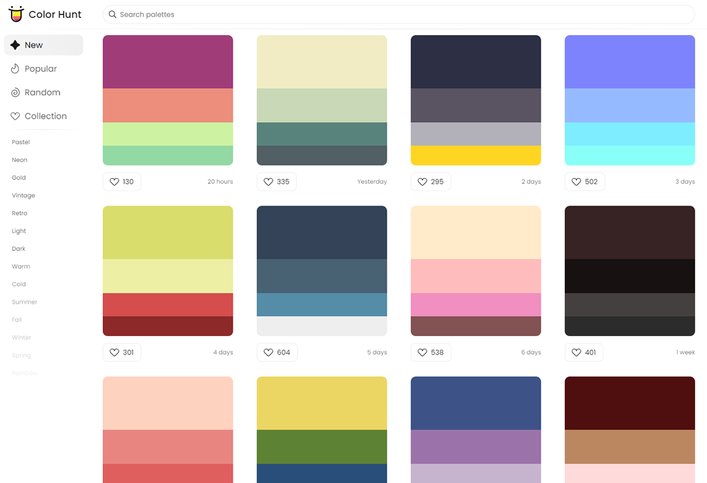
Lately I’ve been taking a look into designing with color (or “colour” as we spell it where I’m from in New Zealand). Looking at Adam Wathan and Steve Schroger’s advice on the subject, we find that we’re going to need more than just five nice looking hex codes from a color palette generator when building an application. We’re going to need a lot of grays and a few primary colors. From these primary colors we’ll want a variety of levels of brightness and saturation.

I’ve mainly been using hex codes or RGB colors when developing applications and I’ve found I get slowed down by trying to work out different levels of lightness and saturation from a single hue.  So, to save you from getting RSI by carefully moving the color picker in VS Code, or continually opening hexcolortool, let’s look at some code to help you manipulate those colors.

HSL values

An effective way to write web colors is to use HSL values, especially if you plan to alter the colors manually. HSL stands for hue, saturation, lightness. Using HSL, you can declare your hue as a number from 0 to 360. Then you can note down a percentage for saturation and lightness respectively. For instance:

div {
  background-color: hsl(155, 30%, 80%);
}

This will give you a light, muted, mint green color. What if we needed to throw some dark text over this div? We could use a color close to black, but consistent with the background. For example, we can grab the same HSL values and pull the lightness down to 5%: 

div {
  background-color: hsl(155, 30%, 80%);
  color: hsl(155, 30%, 5%);
}

Nice. Now we have text that is very close to black, but looks a bit more natural, and is tied to its background. But what if this wasn’t a paragraph of text, but a call-to-action button instead? We can draw some more attention by ramping up the saturation and lowering the lightness a little on the background:

.call-to-action {
  background-color: hsl(155, 80%, 60%);
  color: hsl(155, 30%, 5%);
}

Or, what if there was some text that wasn’t as important? We could turn back up the brightness on the text, and lower the saturation. This takes away some of the contrast and allows this less important text to fade into the background a bit more. That said, we need to be careful to keep a high enough contrast for accessibility and readability, so let’s lighten the background again:

div {
  background-color: hsl(155, 30%, 80%);
  color: hsl(155, 30%, 5%);
}

.lessimportant {
  color: hsl(155, 15%, 40%);
}

HSL values are supported in all major browsers and they are a superior way of defining colors compared to RGB. This is because they allow you to be more declarative with the hue, saturation and lightness of a color.

But, what if you’ve already committed to using RGB values? Or you get an email from your boss asking “is this going to work on IE 8?”

Libraries

There are a lot of great color libraries out there that are able to convert HSL values back into hex codes or RGB colors. Most of them also have a variety of manipulation functions to help build a color scheme.

Here is a list of some libraries I know:

  • If converting between formats is a problem, try colvertize by Philipp Mildenberger. It’s a lightweight library providing a lot of conversion methods and a few manipulation methods.
  • Then we have color, maintained by Josh Junon. This allows you to declare, process and extract colors using a fluent interface. It provides a variety of conversions and manipulation methods.
  • Another one is TinyColor by Brian Grinstead over at Mozilla, which can handle a whole lot of input types as well as utility functions. It also provides a few functions to help generate color schemes.

Also here is a great CSS-Tricks article on converting color formats.
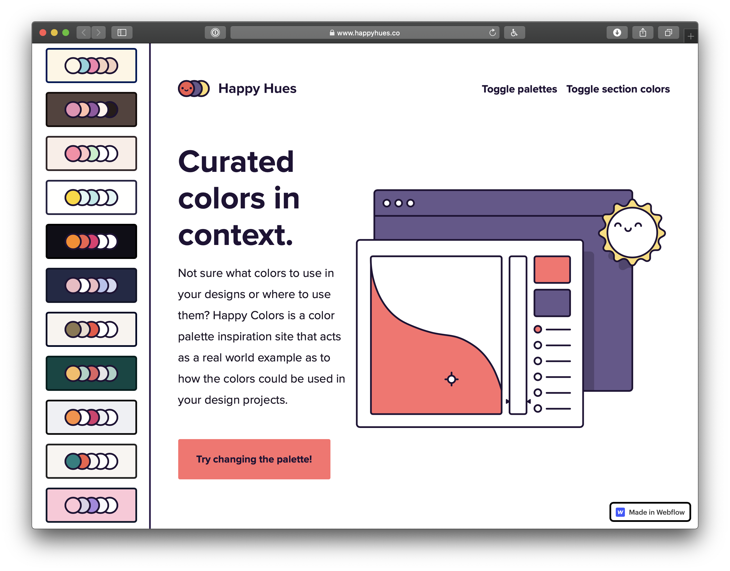
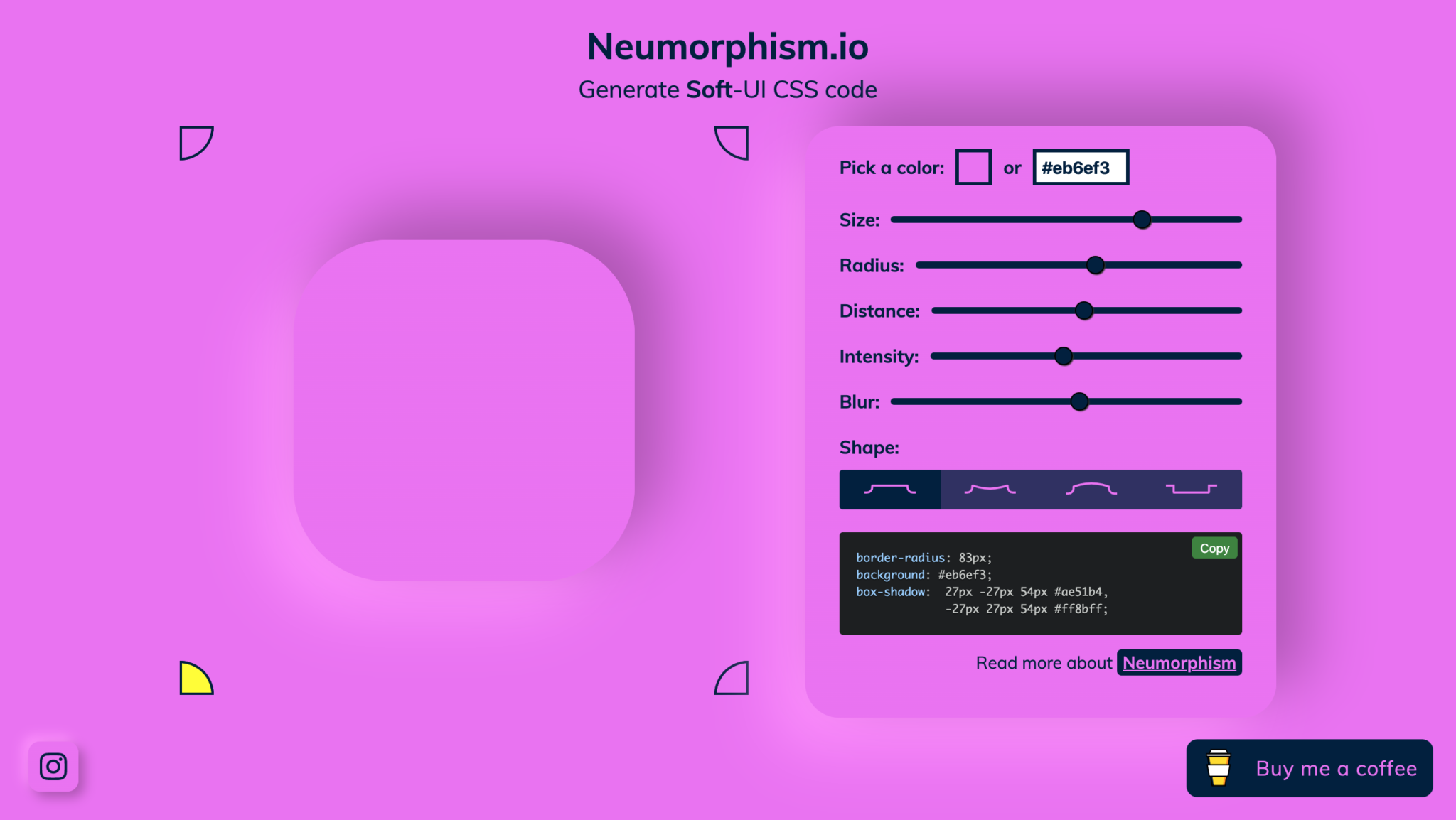
Colour Grid Tool

Another option is you can try out a color tool I built called Colour Grid. To quote Refactoring UI, “As tempting as it is, you can’t rely purely on math to craft the perfect color palette.”

Naturally, after reading this, I built a React app to mathematically craft a color palette. Okay, it won’t solve all your problems, but it might start you off with some options. The app will create 100 different levels of saturation and lightness based the hue you select. You can either click a grid item to copy the hex code, or copy a color as a CSS custom property from a text area at the end. This could be something to try if you need a quick way to get variations from one or two hues. 

Here are some techniques I learned for processing RGB colors as well for if you are using RGB colors and need a way to transform them.

How to find the lightness of an RGB color

Disclaimer: This technique does not account for the intrinsic value of a hue. The intrinsic value of a hue is its inherent brightness before you’ve started adding any black or white. It’s illustrated by the fact pure yellow looks a lot brighter to us than a pure purple.

This technique produces the level of lightness based on a programmatic measure of how much white or black is mixed in. The perceived brightness is affected by more than this measure so remember to also use your eyes to judge the level of light you need.

The level of lightness of an RGB color can be worked out by finding the average of the highest and lowest of the RGB values, then dividing this by 255 (the middle color does not affect the lightness).

This will give you a decimal between zero and one representing the lightness. Here is a JavaScript function for this:

function getLightnessOfRGB(rgbString) {
  // First convert to an array of integers by removing the whitespace, taking the 3rd char to the 2nd last then splitting by ','
  const rgbIntArray = (rgbString.replace(/ /g, '').slice(4, -1).split(',').map(e => parseInt(e)));


  // Get the highest and lowest out of red green and blue
  const highest = Math.max(...rgbIntArray);
  const lowest = Math.min(...rgbIntArray);


  // Return the average divided by 255
  return (highest + lowest) / 2 / 255;
}

Here’s a CodePen using this function:

How to saturate an RGB color without changing lightness or hue

What can we do with our newfound ability to find the lightness of an RGB? It can help us saturate an RGB color without changing the lightness.

Saturating an RGB comes with a few problems, though:

  • There is no information in the RGB format of a gray color to tell us what the saturated version will look like because gray doesn’t have a hue. So if we’re going to write a function to saturate a color, we need to deal with this case.
  • We can’t actually get to a pure hue unless the color is 50% lightness — anything else will be diluted by either black or white. So we have a choice of whether to keep the same lightness as we saturate the color, or move the color towards 50% lightness to get the most vibrant version. For this example, we’ll keep the same level of lightness.

Let’s start start with the color rgb(205, 228, 219) — a light, muted cyan. To saturate a color we need to increase the difference between the lowest and highest RGB value. This will move it toward a pure hue.

If we want to keep the lightness the same, we’re going to need to increase the highest value and decrease the lowest value by an equal amount. But because the RGB values need to be clamped between 0 and 255, our saturation options will be limited when the color is lighter or darker. This means there is a range of saturation we have available for any given lightness.

Let’s grab the saturation range available for our color. We can work it out by finding the lowest of these two:

  • The difference between the RGB values of a gray with the same lightness as our color, and 255
  • The difference between the RGB values of a gray with the same lightness as our color, and 0 (which is just the gray value itself)

To get a fully gray version of a color, we can grab the end result of the getLightnessOfRGB function from the previous section and multiply it by 255. Then use this number for all three of our RGB values to get a gray that’s the same lightness as our original color. 

Let’s do this now:

// Using the previous "getLightnessOfRGB" function
const grayVal = getLightnessOfRGB('rgb(205, 228, 219)')*255; // 217
// So a gray version of our color would look like rgb(217,217,217);
// Now let's get the saturation range available:
const saturationRange =  Math.round(Math.min(255-grayVal,grayVal)); // 38

Let’s say we want to saturate the color by 50%. To do this  want to increase the highest RGB value and decrease the lowest by 50% of the saturation range. However, this may put us over 255 or under zero, so we need to clamp the change by the minimum of these two values:

  • The difference between the highest RGB value and 255
  • The difference between the lowest RGB value and 0 (which is the value itself)
// Get the maximum change by getting the minimum out of: 
// (255 - the highest value) OR (the lowest value)
const maxChange = Math.min(255-228, 205); // 27


// Now we will be changing our values by the lowest out of:
// (the saturation range * the increase fraction) OR (the maximum change)
const changeAmount = Math.min(saturationRange/0.5, maxChange) // 19

This means we need to add 19 to the highest RGB value (green) and subtract 19 from the lowest RGB value:

const redResult = 205 - 19; // 186
const greenResult= 228 + 19; // 247

What about the third value?

This is where things get a bit more complicated. The middle value’s distance from gray can be worked with the ratio between it and the distance from gray of either of the other two values.

As we move the highest and lowest values further away from gray, the middle value increases/decreases in proportion with them. 

Now let’s get the difference between the highest value and full gray. Then the difference between the middle value and the full gray. Then we’ll get the ratio between these. I’m going to also remove the rounding from working out the gray value to make this more exact:

const grayVal = getLightnessOfRGB('rgb(205, 228, 219)')*255;
const highDiff = grayVal - 228; // -11 subtracting green - the highest value
const midDiff = grayVal - 219; // -2 subtracting blue - the middle value
const middleValueRatio = midDiff / highDiff; // 0.21739130434782608

Then what we need to do is get the difference between our new RGB green value (after we added 19 to it) and the gray value, then multiply this by our ratio. We add this back on to the gray value and that’s our answer for our newly saturated blue:

// 247 is the green value after we applied the saturation transformation
const newBlue = Math.round(grayVal+(247-grayVal)*middleValueRatio); // 223

So after we’ve applied our transformations, we we get an RGB color of rgb(186, 247, 223 — a more vibrant version of the color we started with. But its kept its lightness and hue.

Here are a couple of JavaScript functions that work together to saturate a color by 10%. The second function here returns an array of objects representing the RGB values in order of size. This second function is used in all of the rest of the functions in this article.

If you give it a gray, it will just return the same color:

function saturateByTenth(rgb) {
  const rgbIntArray = (rgb.replace(/ /g, '').slice(4, -1).split(',').map(e => parseInt(e)));
  const grayVal = getLightnessOfRGB(rgb)*255;
  const [lowest,middle,highest] = getLowestMiddleHighest(rgbIntArray);


  if(lowest.val===highest.val){return rgb;}
  
  const saturationRange =  Math.round(Math.min(255-grayVal,grayVal));
  const maxChange = Math.min((255-highest.val),lowest.val);
  const changeAmount = Math.min(saturationRange/10, maxChange);
  const middleValueRatio =(grayVal-middle.val)/(grayVal-highest.val);
  
  const returnArray=[];
  returnArray[highest.index]= Math.round(highest.val+changeAmount);
  returnArray[lowest.index]= Math.round(lowest.val-changeAmount);
  returnArray[middle.index]= Math.round(grayVal+(returnArray[highest.index]-grayVal)*middleValueRatio);
   return (`rgb(${[returnArray].join()})`);
}


function getLowestMiddleHighest(rgbIntArray) {
  let highest = {val:-1,index:-1};
  let lowest = {val:Infinity,index:-1};


  rgbIntArray.map((val,index)=>{
    if(val>highest.val){
      highest = {val:val,index:index};
    }
    if(val<lowest.val){
      lowest = {val:val,index:index};
    }
  });


  if(lowest.index===highest.index){
    lowest.index=highest.index+1;
  }
  
  let middle = {index: (3 - highest.index - lowest.index)};
  middle.val = rgbIntArray[middle.index];
  return [lowest,middle,highest];
}

How to desaturate an RGB Color

If we completely desaturate a color, we’ll end up with a shade of gray. RGB grays will always have three equal RGB values, so we could just use the grayVal from the previous function to make a gray color with the same lightness as any given color.

What if we don’t want to go straight to gray, and only want to slightly desaturate a color? We can do this by reversing the previous example.

Let’s look at another example. If we start with rgb(173, 31, 104), we have a saturated rouge. Let’s grab the decimal measure of lightness and multiply it by 255 to get the gray version:

const grayVal = Math.round(getLightnessOfRGB('rgb(173, 31, 104)') * 255); // 102

This means that if we fully desaturate this color to gray we’re going to end up with rgb(102, 102, 102). Let’s desaturate it by 30%.

First, we need to find the saturation range of the color again:

const saturationRange = Math.round(Math.min(255-grayVal,grayVal)); // 102

To desaturate our color by 30%, we want to move the highest and lowest color by 30% of this range toward full gray. But we also need to clamp the change amount by the distance between either of these colors (the distance will be the same for the highest and lowest), and full gray.

// Get the maximum change by getting the difference between the lowest (green) and the gray value
const maxChange = grayVal-31; // 71
// Now grab the value that represents 30% of our saturation range
const changeAmount = Math.min(saturationRange * 0.3, maxChange) // 30.59999

And add this change amount to the lowest RGB value and subtract it from the highest value: 

const newGreen =Math.Round(31+changeAmount); // 62
const newRed =Math.Round(173-changeAmount); // 142

Then use the same ratio technique as the last function to find the value for the third color:

const highDiff = grayVal - 173; // -71 subtracting red - the highest value
const midDiff = grayVal - 104; // -2 subtracting blue - the middle value
const middleValueRatio = midDiff / highDiff; // 0.02816901408
const newBlue = Math.Round(grayVal+(142.4-grayVal)*middleValueRatio); // 103

So that means the RGB representation of our rouge desaturated by 30% would be rgb(142, 62, 103). The hue and the lightness are exactly the same, but it’s a bit less vibrant.

Here’s a JavaScript function that will desaturate a color by 10%. It’s basically a reverse of the previous function.

function desaturateByTenth(rgb) {
  const rgbIntArray = (rgb.replace(/ /g, '').slice(4, -1).split(',').map(e => parseInt(e)));
  //grab the values in order of magnitude 
  //this uses the getLowestMiddleHighest function from the saturate section
  const [lowest,middle,highest] = getLowestMiddleHighest(rgbIntArray);
  const grayVal = getLightnessOfRGB(rgb) * 255;


  if(lowest.val===highest.val){return rgb;}
  
  const saturationRange =  Math.round(Math.min(255-grayVal,grayVal));
  const maxChange = grayVal-lowest.val;
  const changeAmount = Math.min(saturationRange/10, maxChange);
                               
  const middleValueRatio =(grayVal-middle.val)/(grayVal-highest.val);
  
  const returnArray=[];
  returnArray[highest.index]= Math.round(highest.val-changeAmount);
  returnArray[lowest.index]= Math.round(lowest.val+changeAmount);
  returnArray[middle.index]= Math.round(grayVal+(returnArray[highest.index]-grayVal)*middleValueRatio);
  return (`rgb(${[returnArray].join()})`);
}


Here’s a CodePen to experiment with the effect of these saturation functions:

How to lighten an RGB color keeping the hue the same

To lighten an RGB value and keep the hue the same, we need to increase each RGB value by the same proportion of difference between the value and 255. Let’s say we have this color: rgb(0, 153, 255). That’s a fully saturated blue/cyan. Let’s look at the difference between each RGB value and 255: 

  • Red is zero, so the difference is 255. 
  • Green is 153, so the difference is 102. 
  • Blue is 255, so the difference is zero. 

Now when we lighten the color, we need to increase each RGB value by the same fraction of our differences. One thing to note is that we are essentially mixing white into our color. This means that the color will slowly lose its saturation as it lightens.

Let’s increase the lightness on this color by a tenth. We’ll start with out lowest RGB value, red. We add on a tenth of 255 to this value. We also need to use Math.min to make sure that the value doesn’t increase over 255:

const red = 0;
const newRed = Math.round( red + Math.min( 255-red, 25.5 )); // 26

Now the other two RGB values need to increase by the same fraction of distance to 255.

To work this out, we get the difference between the lowest RGB value (before we increased it) and 255. Red was zero so our difference is 255. Then we get the amount the lowest RGB value increased in our transformation. Red increased from zero to 26, so our increase is 26.

Dividing the increase by the difference between the original color and 255 gives us a fraction we can use to work out the other values.

const redDiff = 255 - red; // 255
const redIncrease = newRed - red; // 26
const increaseFraction = redIncrease / redDiff; // 0.10196

Now we multiply the difference between the other RGB values and 255 by this fraction. This gives us the amount we need to add to each value.

const newGreen = Math.round(153 + (255 - 153) * increaseFraction); // 163
const newBlue = Math.round(255 + (255 - 255) * increaseFraction); // 255

This means the color we end up with is rgb(26, 163, 255). That’s still the same hue, but a touch lighter.

Here’s a function that does this: 

function lightenByTenth(rgb) {

  const rgbIntArray = rgb.replace(/ /g, '').slice(4, -1).split(',').map(e => parseInt(e));
  // Grab the values in order of magnitude 
  // This uses the getLowestMiddleHighest function from the saturate section
  const [lowest,middle,highest]=getLowestMiddleHighest(rgbIntArray);
  
  if(lowest.val===255){
    return rgb;
  }
  
  const returnArray = [];

  // First work out increase on lower value
  returnArray[lowest.index]= Math.round(lowest.val+(Math.min(255-lowest.val,25.5)));

  // Then apply to the middle and higher values
  const increaseFraction  = (returnArray[lowest.index]-lowest.val)/ (255-lowest.val);
  returnArray[middle.index]= middle.val +(255-middle.val)*increaseFraction ;
  returnArray[highest.index]= highest.val +(255-highest.val)*increaseFraction ;
  
  // Convert the array back into an rgb string
  return (`rgb(${returnArray.join()})`);
}

How to darken an RGB color keeping the hue the same

Darkening an RGB color is pretty similar. Instead of adding to the values to get 255, we’re subtracting from the values to get toward zero.

Also we start our transformation by reducing the highest value and getting the fraction of this decrease. We use this fraction to reduce the other two values by their distance to zero. This is a reversal of what we did lightening a color.

Darkening a color will also cause it to slowly lose its level of saturation.

function darkenByTenth(rgb) {
  
  // Our rgb to int array function again
  const rgbIntArray = rgb.replace(/ /g, '').slice(4, -1).split(',').map(e => parseInt(e));
  //grab the values in order of magnitude 
  //this uses the function from the saturate function
  const [lowest,middle,highest]=getLowestMiddleHighest(rgbIntArray);
  
  if(highest.val===0){
    return rgb;
  }

  const returnArray = [];

  returnArray[highest.index] = highest.val-(Math.min(highest.val,25.5));
  const decreaseFraction  =(highest.val-returnArray[highest.index])/ (highest.val);
  returnArray[middle.index]= middle.val -middle.val*decreaseFraction; 
  returnArray[lowest.index]= lowest.val -lowest.val*decreaseFraction;              
                            
  // Convert the array back into an rgb string
  return (`rgb(${returnArray.join()}) `);
}

Here’s a CodePen to experiment with the effect of the lightness functions:


If you ever do need to work with RGB colors, these functions will help you get you started. You can also give the HSL format a try, as well as the color libraries to extend browser support, and the Colour Grid tool for conversions.


The post Using JavaScript to Adjust Saturation and Brightness of RGB Colors appeared first on CSS-Tricks.

You can support CSS-Tricks by being an MVP Supporter.

The Expanding Gamut of Color on the Web

CSS was introduced to the web all the way back in 1996. At the time, most computer monitors were pretty terrible. The colors of CSS — whether defined with the RGB, HSL, or hexadecimal format — catered to the monitors of the time, all within the sRGB colorspace.

Most newer devices have a wide-gamut display. A gamut is the range of colors that can be displayed. A wide-gamut display is capable of showing more colors than sRGB. They use the Display P3 colorspace. (There’s also Rec.2020, an even larger colorspace, but that’s pretty rare and not currently worth thinking about.) As Lea Verou of the CSS working group put it, “Our websites are washed out because screens advanced faster than CSS Color did.” If we want to make full use of the range of colors that the majority of screens are capable of displaying, we need to use new CSS colors formats: lab, lch or display-p3.

Examples in the wild can be found on the website of Panic (creators of the once popular Coda text editor and the still very popular Untitled Goose Game) or the marketing site for a product called Playdate. They both make use of strikingly vibrant and intense colors that are uniquely vivid by making use of display-p3.

Screenshot taken from the Panic website showing bright pink text against a stark black background.
Panic’s website features an eye-catching shade of pink.

To get some idea of the range of colors that are missing from sRGB, check out the following Pen. The inner boxes contain a color beyond the sRGB gamut. The outer boxes show that color clamped to the sRGB color gamut (meaning the nearest equivalent color that a browser is capable of showing without using display-p3, lab, or lch). (Note that support is currently limited to Safari users.)

The color picker in Safari Technology Preview helpfully shows which colors lie outside of the sRGB color gamut.

Screenshot of a color picker going from bright green to black with a light curved line signifying the point where colors go past the typical sRGB range.
Any color above or to the right of the white line lie outside of the sRGB gamut

A tale of new syntaxes

Before jumping into the syntax for lab(), lch(), and the color() function, let’s take a look at the new rgb() and hsl() syntaxes (which are supported in all web browsers, minus Internet Explorer).

TypeOld SyntaxNew Syntax
RGBrgb(0, 128, 255)rgb(0 128 255)
RGBargba(0, 128, 255, 0.5)rgb(0 128 255 50%)
HSLhsl(198, 28%, 50%)hsl(198 28% 50%)
HSLahsla(198, 28%, 0.5)hsl(198deg 28% 50% / 50%)
Source: @mathias 

In the older syntax, each number is comma separated: rgb(200, 100, 20);. Commas are no longer necessary, so the space separated value rgb(200 100 20); is valid. To specify transparency, we can now use rgb(200 100 20 / 50%) rather than using  rgba() or hsla(). There’s no real benefit to the newer syntaxes but it’s worth looking at because they match the syntax for lch(), lab() and color()

TypeSyntax
Lablab(56.29% -10.93 16.58 / 50%)
color()color(sRGB 0 0.5 1 / 50%)
LCHlch(56.29% 19.86 236.62 / 50%

lab(), lch() and color() always use space separated numbers (no commas allowed) and a forward slash followed by a percentage to specify transparency. Let’s take a look at how they work.  

The CSS color() function and display-p3 colorspace

The color() function allows a color to be specified in a particular colorspace (rather than using the sRGB colorspace used by rgb(), hsl(), or hex). The colorspace we need to specify in order to use wide-gamut color is display-p3, which uses three numeric values, representing the red, green, and blue channels of the color: 1 0 0 is total red, 0 0 1 is total blue, and 0 1 0 is total green.

background-color: color(display-p3 1 0 0.331); /* vibrant pink color */

At the time of writing, display-p3 is the only way to access high-gamut colors, having been supported in Safari since 2017. However, lab() and lch() will be better options once they are implemented (Chrome and Safari are currently working on it). Here’s a take from Lea Verou

display-p3 is not perceptually uniform, and is difficult to create variants (lighter or darker, more or less vivid etc) by tweaking its parameters. Furthermore, it’s a short-term solution. It works now, because screens that can display a wider gamut than P3 are rare. Once hardware advances again, color(display-p3 ...) will have the same problem as sRGB colors have today. LCH and Lab are device independent, and can represent the entire gamut of human vision so they will work regardless of how hardware advances.

A better lightness: Lab and LCH

You may have seen articles around the web arguing that HSL is easier to reason about than RGB or Hexadecimal values. 

Here’s Chris Coyier in 2015:

The real appeal of HSLa is that it makes more intuitive sense what changing the values will do to the color. Increasing the second value will increase the saturation of that color. Decreasing the third value will decrease the lightness of that color. That makes creating your own color variations on the fly way easier.

While HSL might be easier to understand than hexadecimal or RGB, it’s far from perfect. The way it calculates lightness simply doesn’t match human perception. According to HSL, hsl(240deg 100% 50%) and hsl(60deg 100% 50%) have the same lightness, 50%. Let’s compare the two.

To the human eye, the blue looks darker. As Brian Kardell puts it: 

Doing things like mixing colors, lightening, darkening, can be done well only if they include a sense of how our eyes really work rather than how machines like to think about storing and displaying.

Here’s a visual example from Lea Verou that demonstrates the superiority of Lab/LCH over HSL. She comments

A trick for aesthetically pleasing gradients of the same color at different lightnesses is to convert to Lab, vary the L instead, and then convert back to HSL/RGB.

“The perceived brightness of all of the hues in a spectrum with the same saturation and lightness. […] It’s quite clear they’re different.” —Brian Kardell (Image: Rob Waychert)

Lab and LCH both use the CIELAB colorspace which is designed to align with human vision. If you give two colors the same lightness value, they appear to the human eye to have the same lightness, regardless of their hue.

Lab

background-color: lab(40% 83 -104); /* a shade of purple */

The L in lab() stands for lightness and is written as a percentage (which can go up to 400% for extra bright white, but will generally be between 0% and 100% ). A and B don’t stand for anything — they’re color channels. A is a numerical value between green (negative values) and red (positive values) while B is a numerical value between blue (negative values) and yellow (positive values). Lightness is pretty easy for us to understand. The red/green value and blue/yellow value, however, aren’t exactly intuitive. LCH is probably a better alternative.

LCH

background-color: lch(69% 56 244); /* a shade of blue */

lch() is the most human-readable of the new color values. L again stand for lightness (and works in exactly the same way), C is for chroma, and H is for hue. Chroma is largely analogous to saturation, but it can also be thought of as the color intensity or vibrancy. Unlike the other new color formats, you can actually predict the sort of effect changing these individual values will have — its similar to HSL in this way. The best way to get your head around it is to try out this LCH color picker.

Defining fallbacks 

We have two kinds of support to think about: browser support for the new CSS color values and the ability of screens to display these colors.

Falling back to the closest matching sRGB value for browsers that don’t support color functions is easy and exactly like we’re used to defining fallback properties:

.pink-text {
  color: rgb(255, 0, 79); /* Will be used as a fallback */
  color: color(display-p3 1 0 0.331); /* Will be used if supported */
}

The second line of code in the example above will be ignored if the browser doesn’t understand it and the rgb() value will be used instead, thanks to the cascade. It would be laborious to type out two lines of CSS every time you want to specify a color. CSS variables are a great way to deal with this. In this example we’ll use @supports to tell if the browser has support for color functions in CSS:

/* https://webkit.org/blog/10042/wide-gamut-color-in-css-with-display-p3/ */
:root {
  --bright-green: rgb(0, 255, 0);
}


/* Display-P3 color, when supported. */
@supports (color: color(display-p3 1 1 1)) {
  :root {
    --bright-green: color(display-p3 0 1 0);
  }
}


header {
  color: var(--bright-green);
}

If the color is particularly important to your design, you could utilize a background-image as most browsers do support high-gamut colors in images.

@supports not (color: color(display-p3 1 0 0.331)) {
  @supports (-webkit-background-clip: text){
    .pink-text {
      background-image: url("pink-P3.png");
      background-size: cover;
      -webkit-background-clip: text;
      -webkit-text-fill-color: transparent;
    }
  }
}


.pink-text {
  color: rgb(255, 0, 79);
  color: color(display-p3 1 0 0.331);
}

There is a PostCSS plugin that converts lab() and lch() functions to rgb(). If you’re into Sass there is a tool from Miriam Suzanne called Blend.

A media query for color

@supports tells us whether the browser supports the relevant CSS syntax. What it doesn’t tell us  is whether a user’s monitor can actually display certain color values. If a monitor doesn’t support high-gamut color, the screen will display the nearest equivalent sRGB color. This means all monitors are catered for without writing any extra code.

However, if you’d rather choose the fallback color manually yourself rather than let the browser calculate one for you, you can pass a second color value to the color()  function. This would, however, require browser support for the color function (but support for the second argument hasn’t landed in any browser yet).

background-color: color(display-p3 1 0 0.331, #f54281);

Should you need greater control to do something fancy, the Media Queries Level 4 spec brings a new color-gamut media query that can help us here.

@media (color-gamut: p3) { 
  /* Code to run only on hardware that supports P3 color */
}

In this example, we are obviously checking for P3 support, but we could also check for the rec-2020 colorspace we alluded to earlier, which has an even wider gamut than P3. The number of screens supporting rec-2020 is currently minimal and only include high-definition televisions, meaning they won’t be a common target for developers in the near future. You can also check for sRGB support, but that is almost all monitors nowadays. The color-gamut query, on the other hand, has reasonably good browser support at the time of writing.

Sidenote: dynamic-range media query

In the Safari 13.1 release notes, the dynamic-range media query is is used to conditionally apply a P3 color.  Apparently, that’s not a good use case. According to Florian Rivoal (editor of the Media Queries specification), this query is designed to be used for video:

[S]ome screen can show ultra-bright lights for brief amounts of times, that are used in videos for things like sparks, direct sunlight, etc. This is much brighter than white, and isn’t meant to be used with static images. It would be uncomfortable, and would also damage the screen.

One more sidenote: Design tool support

Unfortunately popular web design tools like Figma, Sketch and XD do not currently support Lab, LCH or P3 colorspaces. Photoshop, however, does have a Lab color picker.


There we have it! CSS colors are expanding at a time when screens support more colors than ever. It’s an exciting time for color nerds out there!

The post The Expanding Gamut of Color on the Web appeared first on CSS-Tricks.

Creating Color Themes With Custom Properties, HSL, and a Little calc()

Before the advent of CSS custom properties (we might call them “variables” in this article as that’s the spirit of them), implementing multiple color schemes on the same website usually meant writing separate stylesheets. Definitely not the most maintainable thing in the world. Nowadays, though, we can define variables in a single stylesheet and let CSS do the magic.

Even if you aren’t offering something like user-generated or user-chosen color themes, you might still use the concept of theming on your website. For example, it is fairly common to use different colors themes across different areas of the site.

We’re going to build out an example like this:

Same layout, different colors.

In this example, all that changes between sections is the color hue; the variations in lightness are always the same. Here’s an example of a simplified color palette for a specific hue:

A palette of multiple hues might look something like this:

This would take effort to do with RGB color value, but in HSL only one value changes.

Enter custom properties

Custom properties have been around for a while and are widely supported. Polyfills and other solutions for IE 11 are also available.

The syntax is very similar to traditional CSS. Here is an overview of the basic usage:

It’s common to see variables defined on the :root pseudo-element, which is always <html> in HTML, but with higher specificity. That said, variables can be defined on any element which is useful for scoping specific variables to specific elements. For example, here are variables defined on data attributes:

Adding calc() to the mix

Variables don’t have to be fixed values. We can leverage the power of the calc() function to automatically calculate values for us while adhering to a uniform pattern:

Since CSS doesn’t support loops, a preprocessor would be handy to generate a part of the code. But remember: CSS variables are not the same as Sass variables.

Implementing CSS variables

What we’re basically trying to do is change the color of the same component on different sections of the same page. Like this:

We have three sections in tabs with their own IDs: #food, #lifestyle, and #travel. Each section corresponds to a different hue. The  data-theme-attribute on the div.wrapper element defines which hue is currently in use.

When #travel is the active tab, we’re using the --first-hue variable, which has a value of 180°. That is what gets used as the --hue value on the section, resulting in a teal color:

<div class="wrapper" data-theme="travel">
.wrapper[data-theme="travel"] {
  --hue: var(--first-hue);  /* = 180° = teal */
}

Clicking any of the tabs updates the data-theme attribute to the ID of the section, while removing the hash (#) from it. This takes a smidge of JavaScript. That’s one of the (many) nice things about CSS: they can be accessed and manipulated with JavaScript. This is a far cry from preprocessor variables, which compile into values at the build stage and are no longer accessible in the DOM.

<li><a href="#food">Food</a></li>
const wrapper = document.querySelector('.wrapper');
document.querySelector("nav").addEventListener('click', e => {
  e.preventDefault();
  e.stopPropagation();
  // Get theme name from URL and ditch the hash
  wrapper.dataset.theme = e.target.getAttribute('href').substr(1);
})

Progressive enhancement

When we use JavaScript, we should be mindful of scenarios where a user may have disabled it. Otherwise, our scripts — and our UI by extension — are inaccessible. This snippet ensures that the site content is still accessible, even in those situations:

document.querySelectorAll('section').forEach((section, i) => {
  if (i) { // hide all but the first section
    section.style.display = 'none';
  }
})

This merely allows the tabs to scroll up the page to the corresponding section. Sure, theming is gone, but providing content is much more important.

While I chose to go with a single-page approach, it’s also possible to serve the sections as separate pages and set [data-theme] on the server side. 

Another approach

So far, we’ve assumed that color values change linearly and are thus subject to a mathematical approach. But even in situations where this is only partially true, we may still be able to benefit from the same concept. For instance, if lightness follows a pattern but hue doesn’t, we could split up the stylesheet like this:

<head>
  <style>
    :root {
      --hue: 260;
    }
  </style>
  <link rel="stylesheet" href="stylesheet-with-calculations-based-on-any-hue.css">
</head>

Supporting web components

Web components are an exciting (and evolving) concept. It’s enticing to think we can have encapsulated components that can be reused anywhere and theme them on a case-by-case basis. One component with many contexts!

We can use CSS variable theming with web components. It requires us to use a host-context() pseudo-selector. (Thanks to habemuscode for pointing this out to me!)

:host-context(body[data-theme="color-1"]) {
  --shade-1: var(--outsideHSL);
}

In summary…

Theming a website with CSS custom properties is much easier than the workaround approaches we’ve resorted to in the past. It’s more maintainable (one stylesheet), performant (less code), and opens up new possibilities (using JavaScript). Not to mention, CSS custom properties become even more powerful when they’re used with HSL colors and the calc() function.

We just looked at one example where we can change the color theme of a component based on the section where it is used. But again, there is much more opportunity here when we start to get into things like letting users change themes themselves – a topic that Chris explores in this article.

The post Creating Color Themes With Custom Properties, HSL, and a Little calc() appeared first on CSS-Tricks.

5 Incredible Free Tools For Designers That You Need To Try

There’s nothing better than finding a new design tool that will make your life a million times easier.

After all, we all want to get our work done as quickly and efficiently as possible, and if there’s a tool for that, then I want it.

And I did find some tools that I absolutely love that come in handy, and that’s why I want to share my life of new favorite design tools.

5 Design Tools You Have to Try

Once you try these tools, there’s no going back.

Let me tell you all about them.

1. Opensource Builders

Opensoure Builder app for designers

I want to start this list off strongly, so let’s hit it off with Opensource Builders.

Have you ever found an app that you absolutely love but your budget doesn’t allow you to purchase?

Or maybe you’re just a cheapo(aka, maximizer) like me, and try to get the most bang for your buck.

Opensource Builder will help you find open-source alternatives for your favorite apps!

Just type in the name of the app you’re looking for, and you’ll find a ton of alternatives for it.

Compare the cons and pros, prices, and more to find the ideal app for your project.

2. Unscreen

Unscreen design apps

Next up, we have Unscreen.

Have you ever tried to remove the background of a video? It’s not that easy.

Unscreen will automatically remove the background of any video 100% automatically, and for free.

We love a double-whammy.

This means you can record any video, upload the clip into Unscreen, use their tool to scrub the background of your video, and then you can add any background element of your own!

All of this, for free.

Soon enough, they’ll have a pro version as well. I’m excited to see what else they will come up with when they already have such an amazing free design tool.

3. Neumorphism.io

Neumorphism.io design app

Neumorphism seems like it’s everywhere nowadays, and I know an app that can help you integrate that into your CSS code.

Neumorphism.io is a generator that will create the CSS for this soft UI style that we’ve been seeing everywhere. This makes your job a lot easier and you can experiment quickly to see what you like for your website.

4. Glitch Art Generator

glitch art generator design apps

We have another generator on our list!

Glitch Art Generator will help you achieve the perfect glitch background for your project.

You can easily adjust all the colors, the amount of glitching, the space from the center, gradient, etc! You can adjust basically anything.

Once you like what you see, you can just download the file and integrate it right into your project.

5. Vangogh

Vangogh design tool

Finally, and arguably the most aesthetically pleasing app of all, is Vangogh.

If you are ever looking for the perfect color palette, look no further.

All you have to do is type in a keyword, it could be an object or an actual color, and it’ll generate a few variations of the perfect color palette for you.

I can literally just sit here and type in a bunch of random words and get lost for hours in these beautiful colors.

I highly recommend you use this app in your next project!

Wrapping things up

I hope you found this list of my favorite design tools at the moment useful!

Let me know which apps were your favorite and what other design tools that you use daily that I missed.

Stay safe, everyone.

And as always,

Stay creative!


Read More at 5 Incredible Free Tools For Designers That You Need To Try

20+ Deliciously Dark Website Designs

Dark website designs are where it’s at. Don’t believe me? They’ve become increasingly popular over the past year. Dark designs are thought to be easier on eye strain and make for a more pleasant viewing experience. They can also add atmosphere to your site.

As more and more websites have shifted to dark mode in 2020, we thought it imperative to highlight some designs that really capture the concept of dark designs well. What follows is a list of over 20 delightfully dark website designs you’ll definitely want to check out.

UNLIMITED DOWNLOADS: 400,000+ Fonts & Design Assets

Starting at only $16.50 per month!


Serge Thoraval: Atelier

The Serge Thoraval: Atelier website doesn’t just offer a dark design — it also features some really interesting effects. From a mouse hover effect when the site is loading to transition effects when you scroll down the page, this site sets itself apart.

Dark Website Designs - Atelier

Basilico

This site offers a dark design that makes each portfolio piece really stand out. Plus, when you hover over each item, they color shift and descriptive text scrolls across it from right to left.

dark website designs - Basilico

Big Drop Inc

Big Drop Inc has a combination of light and dark designs that are both appealing and effective.

dark website designs - Big Drop Inc

DevArt

DevArt is another site with a dark design that helps to make the artwork it features stand out. It’s also easier on the eyes than sites with brighter backgrounds.

dark website design - DevArt

Creative Park

The Creative Park website offers up a delightfully dark design that allows the subject of photos to really stand out. It also has some really interesting transition effects for changing slides, clicking links, and opening menus.

dark website designs - Creative Park

Olivia Restaurant

The Olivia Restaurant website mimics the mood inside of the restaurant itself — dark, cozy, and inviting.

dark website designs - Olivia Restaurant

3D Hubs

The 3D Hubs website leverages its dark design to make the components it features stand out. This also works well for displaying video and individual items the company offers.

dark website designs - 3D Hubs

Welford Media

Welford Media is a web design firm that uses a dark design on its website to engage visitors. This design choice allows the company’s tagline stand out at a glance and builds immediate interest.

dark website designs - Welford Media

Meaning 2020

The website for the Meaning 2020 Conference has a dark design as well. The gray background allows the colorful logo to stand out and offers a subdued backdrop onto which videos and photos are placed.

dark website designs - Meaning 2020

Rich Brown

This is a website dedicated to the work of Rich Brown, an art director and UX/UI designer. The site itself features a dark design onto which video backgrounds play seamlessly.

dark website designs - Rich Brown

Artem Pivovarov

The design on this website is super interesting. Artem Pivovarov has a dark design with a prominent photo background. It also has interactive elements in this background that react on hover.

dark website designs - Artem Pivovarov

Formigari Srl

Formigari Srl is another site you should check out for dark design inspiration. It highlights videos and photos on a deep gray background that makes the entirety of the content feel immersive.

Formigari Srl

Canvas United

Still another site you should check out is Canvas United. This site is for a New York-based digital agency that provides some cool transition effects and an immersive experience.

Canvas United

The Kennedys

The Kennedys website currently features an under construction sign that’s set on a dark background.

The Kennedys

Resoluut

The Resoluut website offers a dark purple background with images that appear as though they’re hovering on top of it. There is a lot of play with depth of field here.

Resoluut

Fantassin

Still another option is the Fantassin website, which features a dark background and tons of cool scroll effects that draw the eye further down the page.

Fantassin

Cody Petts Studio

The Cody Petts Studio website highlights the work of Cody Petts, including print and packaging designs as well as photography. It’s dark, gritty, and extremely compelling.

Cody Petts Studio

Kazuma Kurata

The design for the Kazuma Kurata website offers a dark background that’s intimately inviting. It makes the colorful aspects of featured photos stand out even more. The design and function of the site make it clear why it’s deserving of its AWWWARDs Nominee status.

Kazuma Kurata

Bachoy

The Bachoy website highlights a creative and tech studio. The dark design featured here uses a cool spotlight hover effect and interesting interactions with photos as you scroll down the page.

Bachoy

Agency Legend

The Agency Legend website has a truly appealing site that takes advantage of superhero motifs to increase engagement.

Agency Legend

Arara

Last on our list is the website for Arara, which offers battery-free bicycle lights. This site is dark but not brooding, and instead uses the darker background to make the bright colors featured in images and videos “pop.”

Arara

Dark Website Designs Can Serve You Well

As you can see from the examples listed above, dark website designs can really take the overall look of your website to the next level — whatever that means for you. Whether you want to make colors look more vibrant, ease eye strain, or provide a mood, dark designs offer flexibility in both form and function. Have fun playing with them!

6 Amazing Packaging Design Ideas for 2020 That Are on Point

You’re here because you’re looking for amazing packaging ideas for 2020.

Well, you’re in luck, because I’m showing you 6 ideas for you to implement this year into your packaging designs.

Well, what are we waiting for?

Let’s just jump right in!

Sustainable Packaging

Sustainability. It’s at the forefront of all of our minds nowadays.

As it should be!

It’s so important that we take care of our world because it’s the only one we’ve got.

And what better way for you as a designer to contribute to this world, than to create your own sustainable packaging ideas for yourself and for your clients?

So here are various sustainable packaging design ideas for you to draw inspiration from!

[source]

[source]

[source]

[source]

Minimalism

Next up, we have minimalism.

Minimalism was all over the globe last year and we don’t expect anything less this year.

On the contrary, we expect to see minimalism rise up even more and overtake many packaging designs.

Imagine the combo of minimalism and sustainability.

That just warms my designer soul.

[source]

[source]

https://dribbble.com/shots/6937829-uBear-Package

[source]

[source]

Bold Typography

Boldness.

You need packaging that is as bold as the product.

Sometimes the best way to display the boldness of your packaging is by simplicity.

By using bold text, you can have an intricate yet simple design that speaks louder than loads of 3D design factors could.

Here are some examples of what I mean.

[source]

[source]

[source]

[source]

[source]

Flat Design

Flat design was another trend that took over all of 2019 but that we only expect it to continue growing in 2020.

Flat design is also a type of minimal design, which is the undertone of the ultimate trend of 2019, which in my opinion was minimal design.

Check some of these designs out!

[source]

[source]

[source]

[source]

Metallic & Holographic Material

Alright you guys, it’s time to get to the 2 packaging designs that I’m most excited about this year.

And that is metallic and holographic material.

There’s just something so luxurious and eye-catching about this flashy material that will draw the eye of anyone onto your product.

I love the way it looks and the way each designer used it differently.

Here are some examples of what I mean.

[source]

[source]

[source]

[source]

[source]

[source]

Summing Things Up

I hope you found these packaging ideas inspiring!

Soon we’ll have an entire guide dedicated to sustainable packaging, so keep your eyes peeled for that.

Til next time,

Stay creative, folks!

Read More at 6 Amazing Packaging Design Ideas for 2020 That Are on Point

So Many Color Links

There's been a run of tools, articles, and resources about color lately. Please allow me to close a few tabs by rounding them up here for your enjoyment.

Curated colors in context

Happy Hues demonstrates a bunch of color palettes in the context of the site itself. That's a nice way to do it, because choosing nice colors isn't enough — it's all about context. It can go bad, as the Refactoring UI blog demonstrates.

Dynamic, Date-Based Color with JavaScript, HSL, and CSS Variables

Rob Weychert shows off how he created date-based color schemes (so that every single day of the past 30 years would have a unique color scheme, each day looking slightly different than the day before).

Calculating Color: Dynamic Color Theming with Pure CSS.

Una Kravets creates color themes just with CSS. No JavaScript. No CSS preprocessing. Just Custom Properties, HSL colors, and some calc() in Calculating Color: Dynamic Color Theming with Pure CSS.

Color Tools

We've tweeted about color tools a lot. We've even threaded them up from time-to-time.

Visualizing Every Pantone Color of the Year

Adam Fuhrer took 20 years of top Pantone colors and matched them with wonderful photos. I love that the photos link to the personal sites of the actual photographers. It weirdly reminds me that you can browse Dribbble by color.

A Handy Sass-Powered Tool for Making Balanced Color Palettes

Stephanie Eckles blogged about using Sass to do math on colors to calculate and graph their luminance, saturation, and lightness, which can give you a by-the-numbers look to see if your color scheme is cohesive or not.

Leonardo

Leonardo is an interactive color palette tool that helps interpolate colors and generate variations based on contrast ratio.

Color Puns

Nice.

The post So Many Color Links appeared first on CSS-Tricks.