UI/UX design is tough work. Designing all the little pieces and screens from scratch can end up being extremely time-consuming. Luckily, plenty of amazing designers out there have released UI kits, a helpful resource that can seriously cut down on time as well as providing inspiration.
Premade assets, screens and pages will allow you to get right to the site or app design. Skip all the tedious setting up and start working on the actual product. Here are seven of the best free UI kits, made just for Adobe XD users.
Social Meet Up UI Kit
An iOS kit made for social media apps, Social Meet Up comes with an absolute ton of content. 80+ screens provide everything needed to create a social network, a perfect launching pad for your app’s UI. The strong, feminine design is just perfect for a project like this. And the kit is built to be easily customized, so keep the parts you like and mix it up with your own brand.
Non-Profit UI Kit
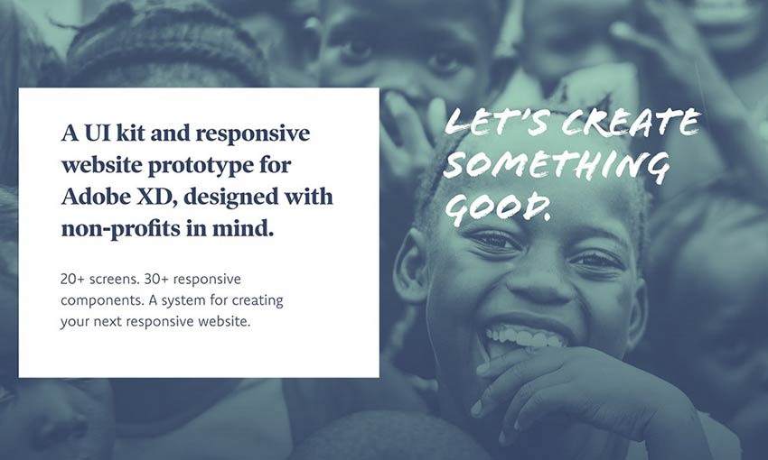
Designed for non-profits, this kit offers everything you need to build a website that looks beautiful and reaches further. Two colors and three fonts create a simple but memorable palette. The responsive website prototype comes with home, about, donation and various other pages relevant for a non-profit. 30+ components and 20+ screens will give you plenty to work with here.
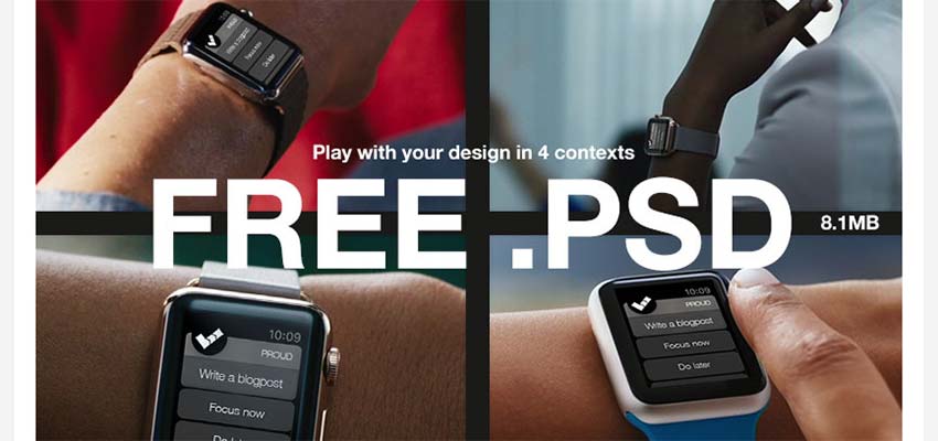
Smartwatch UI Kit
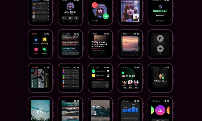
There are plenty of resources for website and app designers, but what about for a smartwatch? With 60 screens, 20 customizable components and 30 icons, this UI kit leaves little to be desired. Whatever kind of smartwatch app you’re making, there’s something to build on here, and plenty of room to add your own unique style.
Pawtastic UI Kit
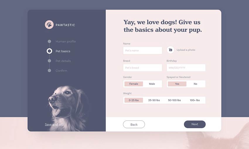
If you’re creating a website for pet services, look no further. Pawtastic comes with various super helpful components, including a well-crafted sign-up process and various customizable UI elements. The colors and typography look amazing here. And by downloading the free pack, you get 15 wireframes too! This is one that just can’t be passed up.
Fashion Influencer UI Kit
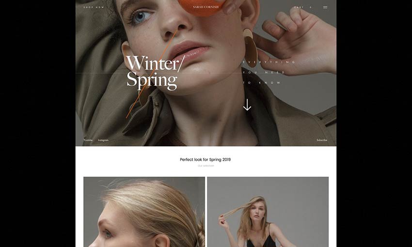
Fashion designer? You’ll adore this elegant UI kit. With 10+ pages to work off of and over 50 components, you won’t be running out of material any time soon. These designs are made with a careful, sophisticated style, perfect for a fashion portfolio or an online clothing store. For any project that’s trying to nail the fashionable look, the potential here is unlimited.
Dashboard UI Kit
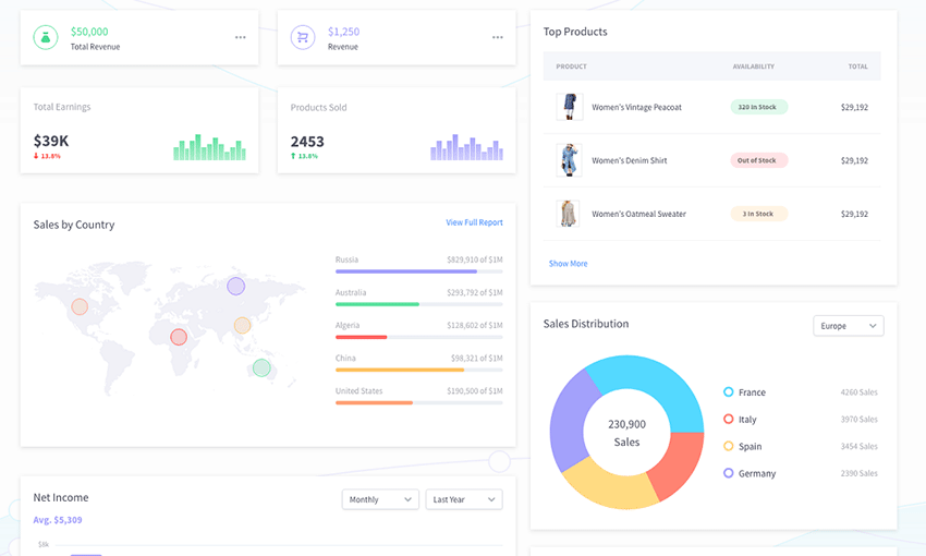
This one is just awesome! If you’re building a site with data visualization, Dashboard has exactly what you need. 15 customizable charts, 10 screens and 100+ UI components – a dizzying amount of resources for your project. The prototype is actually interactive as well, so customizing and even embedding it into a website is no problem. Show the world your designs as you work with this comprehensive UI resource.
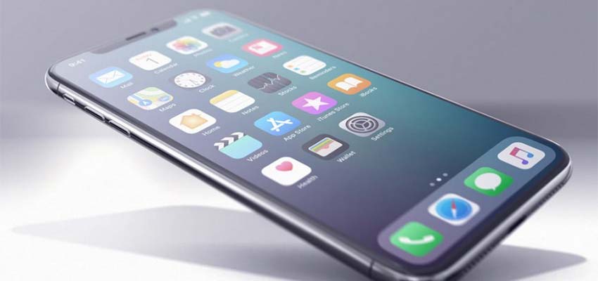
Navigo Transportation UI Kit
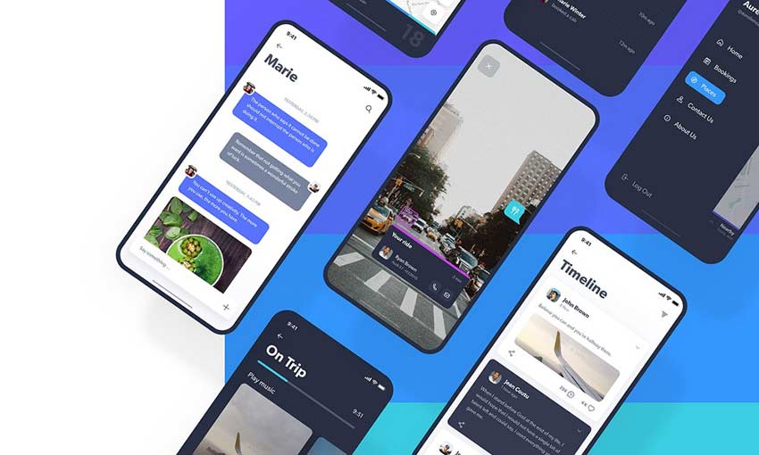
This unique UI kit is designed for transportation and GPS apps – specifically ones made for iOS and iPhone X. With 60+ assorted screens, spread across 6 categories, you’ll find plenty of content to keep you going. There’s even statistics and profile pages to really add some personality to your app.
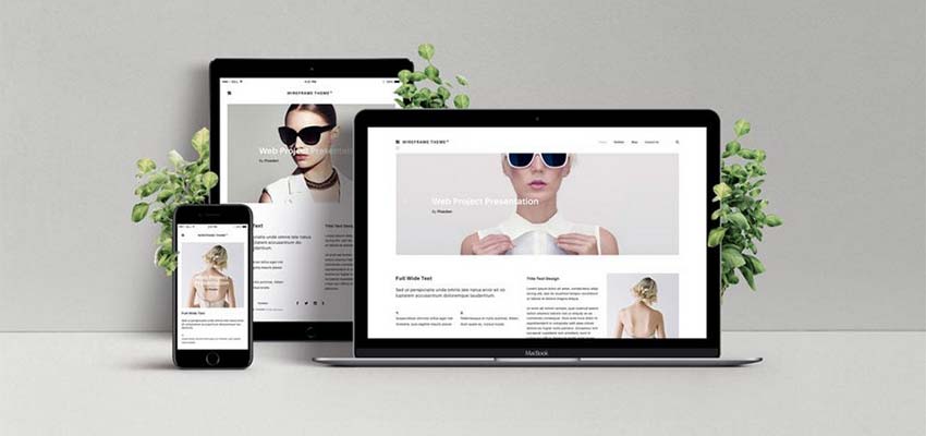
Easily Create Website Mockups
People who create and release UI kits for free are a godsend for web and UI/UX designers. Finding or creating assets and components eats up so much time. Using one of these kits, you can skip all of that and start drafting your new website right away. Try out one of these professionally made kits and get right to the action! No more scrambling to meet a deadline.