In the last two ducklings, I finished the extensive discussion on breakpoints and switched my focus to the watch area. In it, we have several amazing and lesser-known tools that let us build insight into our running application. Being able to tell at a glance if something works correctly is crucial for many applications.
This is very important for collections and arrays. We can have thousands or millions of elements within a collection. Debugging this is very difficult without some basic tools.
A cursor/pointer is a position indicator that helps the user enter text, numbers, or symbols. The default cursor is a symbol that is easily recognized by tons of people around the world. Without the cursor, user integration would not be as easy as it is now. Cursors have saved many people the trouble of memorizing keyboard shortcuts required to navigate a page.
Creative custom cursors are basically unique customized pointers. Throughout the years, the cursor has been modified to assume different shapes and characters. These customized pointers can boost a site’s interaction and traffic. Many websites have adopted custom cursors because they help them stand out and attract more customers.
Your Designer Toolbox Unlimited Downloads: 500,000+ Web Templates, Icon Sets, Themes & Design Assets
Benefits of Creative Custom Cursors
Though they’re not going to make a massive difference in how your website is received by visitors, custom cursors can make an impact, including:
Help maintain the theme of the website.
Can attract more customers.
Build website aesthetics.
Are easy to make.
How to Choose a Custom Cursor
Here are some factors to consider when looking for a custom cursor for your next website project.
Suitability
Getting a custom cursor that suits your website can offer great user interaction. If your site targets young users, having a quirky cursor can enhance engagement with your website. Whereas if your target market is older, having a custom cursor might not get you the same results.
Formal websites should use default cursors and stay away from custom ones. This helps to maintain the site’s formal tone.
Functionality
Some custom cursors don’t work well with older browsers. If a user opens a website using an old browser that doesn’t support custom cursors, the pointer will assume its default design.
This means features that work with the custom cursor will not be as effective when using the default cursor, which in turn affects user experience. This is something to heavily consider.
Speed
Your site’s loading speed is an important factor if you want to rank well on Google and attract more visitors. Minor site upgrades such as a custom cursor will not typically affect your site’s speed.
18 Examples of Creative Custom Cursors
And now, the part you’ve been waiting for: on to the list of creative and eye-catching custom cursors worthy of your consideration.
A unique custom cursor is a great way to make sure that users don’t — if you’ll pardon the pun — lose the point. Websites that use creative custom cursors that fit their aesthetic or theme create a more branded look and that is synonymous with increased traffic.
If you’re looking for the best custom cursor for your website, we hope this article will help to that end. Good luck to you!
As a developer, you probably already have a list of preferred browser extensions you use to help you customize your browsing experience and functionality.
Chrome extensions have been constantly growing and improving. This has in turn led to an increase in performance and the quality of work for web designers and developers.
Many developers use Chrome as their preferred browser because of its vast repository of extensions that will help save you time and increase your productivity.
In case you’re on the hunt for some new extensions, here’s a list of 10 helpful Chrome extensions that will help make work easier for you:
Your Web Designer Toolbox Unlimited Downloads: 500,000+ Web Templates, Icon Sets, Themes & Design Assets
1. Sizzy
Sizzy is a popular extension among web developers and web testers. With Sizzy, you get to test your website on multiple devices at once.
Preview URLs on different devices at the same time.
Preview changes simultaneously.
Filter devices.
Choose whether or not to display the keyboard on the different devices.
Switch between portrait and landscape modes.
Sizzy is an open source Google Chrome extension and can be accessed by everyone. It also adds an extra button to your toolbar which opens your current page in Sizzy when clicked.
2. WhatFont
WhatFont helps you find out the font used on a webpage by just hovering over it. This simple and easy-to-use extension has helped many web developers save time when it comes to identifying different fonts.
This extension can also help in identifying which service has been used for serving the font.
3. Clear Cache
Clear Cache helps you clear your cookies and global or local caches with just one click. With this Chrome extension, you don’t need to go through the tedious process of navigating to settings.
You can also configure what you want to clear on the options page including passwords, plugin data, file systems, cache, app caches, and much more.
4. Site Palette
This free Chrome extension is a must-have tool for web developers and designers. When browsing, you’ve definitely come across web pages with impressive color palettes and wondered how the designers pulled it together, I’m sure. Well, Site Palette helps you generate, extract, and share your favorite colors.
5. Image Downloader
Image Downloader makes downloading images from the web easy. With just one click, you can browse and download any image and filter by width, height, and many more.
By setting up a default download directory, you’ll make sure that everything runs smoothly and fast. Another feature of this Chrome extension is you can also customize the image display.
6. Checkbot
Checkbot is a powerful Google Chrome extension that checks page SEO, speed, security, broken links, and duplicate content of hundreds of pages in just one click. It identifies 50+ website errors based on Google’s best practices and recommends solutions.
Website performance is crucial in increasing conversions as most users prefer fast pages. This can also help with ranking as it boosts user experience.
This extension also picks up code errors in real-time, which saves developers the trouble of having to go back and check.
7. Highly Highlighter
With Highly Highlighter, you can highlight, save, and share anything from articles as you read. This helps with starting discussions on the important bits and works across multiple devices.
8. CSS Viewer
The CSS Viewer is a simple CSS property viewer originally made as a firefox add-on. It provides the basic CSS information you need with just one click.
For it to work properly, this extension needs to access your website data and history. However, it doesn’t store any of your information.
9. Web Developer
The Web Developer Chrome extension allows designers to check web pages for best practice designs, search engine optimization, usability, and coding.
Web Developer is a great tool that provides a lot of information on web design. It also adds various web developer tools to the toolbar.
With this extension you can check embedded javascripts and view your website on more than one device. It works well on Mac OS, Windows, and Linux.
10. Fonts Ninja
The Font Ninja Chrome extension is quite similar to WhatFont but with a much smaller interface. It helps identify fonts on a webpage and can be a great alternative to WhatFont.
Its algorithm analyzes fonts as well as CSS properties.
11. Window Resizer
Window Resizer is a useful Chrome tool that resizes your browser window to various screen resolutions. You can choose from a list of popular dimensions or custom set your own.
12. CSS-Shack
Last on our list here is CSS-Shack, which is another free Chrome extension that allows you to create designs and layers then export them into a CSS file.
Conclusion
There’s a plethora of Chrome extensions that are free and easy to use. However, this does not mean that you need to use them all. Be selective and you’ll get the most out of your use of extensions.
This list has narrowed down some of our top picks. To that end, we are pretty confident that you can get one or more that will help you boost user functionality and increase productivity.
Be sure to test out a number of extensions before settling on one. Good luck!
When browsing through websites, you’ve most likely come across three horizontal lines on the top right corner of the webpage. While not present on every site, these lines are commonly referred to as “hamburger menus” by UI designers.
What is a Hamburger Menu?
A hamburger menu is a navigation tool that opens up to a side menu and is used for both mobile apps and websites. The role of these navigation bars is to help you easily maneuver anywhere on a website in a user-friendly manner and without having to scroll up to hunt for navigation.
Hamburger menus were first introduced more than three decades ago by a man named Norm Cox. He made the burger icon for Xerox Star, which was the world’s first graphical user interface. The purpose of the triple bar icon was to let users know that the button contained a list of items. However, despite it being around for quite some time, it wasn’t widely used until 2009 and has gotten a lot of criticism over the years.
The UX Designer Toolbox
Unlimited Downloads: 500,000+ Wireframe & UX Templates, UI Kits & Design Assets
Starting at only $16.50 per month!
Pros and Cons of Hamburger Menus
Before we get into the examples, let’s first explore the pros and cons of using hamburger menus.
Pros
It provides quick secondary access: Users can quickly access desired pages without having to scroll through pages.
Recognized by many users worldwide: The sign is common and can be found everywhere from mobile games to web pages to apps.
Makes the webpage appear organized: The hamburger menu helps with maintaining focus on the important web features you’d like users to see. It also keeps the web page clean.
Cons
Lower engagement: When users can’t easily access a web page, they’re less likely to click on it.
Makes pages seem less important: Because all the important information is accessed on the first page it’s less likely for users to navigate through the menu.
Hard to reach: Hamburger menus can be hard to reach or press in some mobile designs.
Tips for Making a Good Hamburger Menu
Here are a few quick tips for ensuring your hamburger menu is identifiable and effective:
1. Use Animation
A hamburger menu without an animation that turns the three horizontal lines into another shape is rarely seen. Put it to good use.
2. Use a Custom Icon
It’s important that the menu remains recognizable to ensure a great user experience. Using a custom icon helps many users identify it.
3. Responsiveness
Mobile users prefer the vertical sliding or the horizontal navigation bar while computer users prefer a more detailed menu with tabs of content, rows, and vertical links. Designing your hamburger menus to be responsive will ensure users are presented with the ideal menu option regardless of the device they’re using.
10 Worthy Examples of Hamburger Menus
What follows are 10 high-quality options of hamburger menus currently available on Codepen to choose from. Why start from scratch when you don’t have to?
If hamburger menus aren’t speaking to you, there are some alternative options worth taking a look at.
1. Scrollable Navigation
This type of navigation tool is normally used for longer lists. Making the list scrollable allows users to easily move side-to-side. For example, it’s mostly used for news websites when users are expected to scroll through news categories, and also works well for online stores and music apps.
2. Tab Bar
Tab bars are considered to be the simplest navigation option with the main navigation options easily visible. For example, if you have an app that has a limited number of web pages/features then this is definitely the way to go.
Some things to consider with this navigation include:
The home page has to be in the first tab and the rest should follow according to the level of importance.
The tab bar allows no more than five navigation options.
It’s important for at least one of the options to be highlighted and active.
Use icons with labels unless for actions that are common and easily recognizable.
3. More Option Tab Bar
The ‘more’ option tab bar is most suitable if you have more than five top-level destinations.
The extra option can work well as a dropdown menu. To improve navigation you’ll need to correctly prioritize the options for users to have at least four to five on the screen at all times.
4. The Progressively Collapsing Menu
This type of menu fits on the whole screen and shows as much of the navigation as possible. Everything else is put under the “More” button. This provides a better user experience than the tab bar design.
5. Full Screen Navigation
The full screen navigation solution takes up the whole homepage for navigation purposes. Users then swipe to access additional menu options as they scroll up or down.
This type of navigation helps designers organize huge amounts of information without overwhelming the user.
Conclusion
When picking out a hamburger menu, make sure you pick one that’s most suitable for your website or app. Making navigation within an app seamless and user-friendly will encourage users to engage with it more than once and even attract new users. Just make sure you test the speed and efficiency before implementing. But then you should be good to set your visitors browsing. Good luck!
Want to give your users a great experience with your website? Create a unique design for your website with one of these great WordPress themes for your website. Only gambling is growing insanely in popularity these years. More and more countries are liberalizing their gambling laws, which is enabling users all over the world to […]
No matter what kind of website you have, a little bit of animation can go a long way to create visual interest and engage your visitors. From animated tab bars and CSS waves to creative text hovers, there are plenty of ways to spice up your website.
In this post, we’ll share 10 eye-catching CSS and JavaScript animations that you can use as an inspiration for incorporating animated effects in your next web design project.
Your Designer Toolbox Unlimited Downloads: 500,000+ Web Templates, Icon Sets, Themes & Design Assets
Here’s a simple and stylish tab bar that’s animated whenever a user clicks on a different icon. You can easily use this as a tab bar but you can also implement it in a menu to make your navigation more dynamic.
This animation relies on CSS alone so there’s no JavaScript code. It features a subtle and elegant animation that looks like ocean waves. This would work perfectly on a hotel or a travel website as well as on a website promoting wellness products or services.
Lately, everyone’s been buzzing about space travel and this animation would highlight that topic perfectly. It features a space globe along with another sphere resembling a meteor. If you have any type of futuristic website or if you’re working on a technology oriented project, this animation could come in handy.
Here’s a fun animation that once again relies on pure CSS. If you decide to add it to your website, your footer will have a fun and playful gooey look. This animation would add a dose of interest to any creative website or website that’s not serving a corporate audience.
Here’s a true work of art when it comes to what’s possible with a little bit of CSS and JavaScript. As you scroll down, the scene changes entirely from morning to night. If you need a creative background for a timelapse, this animation is a must-have.
At first glance, all you see is white background with black letters. But, when you scroll text and photos come into view and bring the entire thing to life. This animation would be a creative way to display any type of portfolio. Designers, photographers, and artists should definitely check this one out.
Toggles are pretty ubiquitous nowadays. But that doesn’t mean they have to be boring. With a bit of creativity, you can add simple animations and make them more fun. You’ll find a nice collection of various toggle animations, including a beer pong and a Kobe Bryant tribute.
CSS has indeed come a long way since its inception. This realistic red switch that relies on pure CSS animation is the best proof of what’s possible when you master CSS.
This animation would work well for any type of Valentine’s Day promotional campaign or on any website that caters to couples. It features a blue and pink neon heart that truly looks like neon lights.
Here’s another animation that at first glance looks like nothing special. Instead of a solid color, the text uses a photo fill. Once you hover over the word, the text becomes fluid. It’s pretty creative and it would work well on any artists or designer’s website that wants to show off their skills.
The recent pandemic has forced many businesses to go online. This has created a boom for Shopify, a popular eCommerce platform that makes it easy to open up your online store.
With hundreds of beautiful themes and apps that enhance your shoppers’ experience, Shopify has everything you need to shift your operation online and create a digital storefront for your business.
But to get started, you’ll need a solid Shopify theme and that’s what this post is all about. We’ll cover the best free and premium Shopify themes for 2021 that will allow you to launch your store as quickly as possible.
Your Web Designer Toolbox
Unlimited Downloads: 500,000+ Web Templates, Icon Sets, Themes & Design Assets
Starting at only $16.50/month!
18 Best Free And Premium Shopify Themes
Below, you’ll find an overview of the 18 best Shopify themes along with their features.
The Helas theme has a clean and minimal design. It would work well for a fashion store and has a product-centered layout which makes it easy for your customers to see what you have to offer. Notable features include product carousels and labels, plenty of customization options, built-in customer reviews, wishlist support, and more.
The Vintage theme is a free Shopify theme that would work well with home and garden, entertainment or arts and crafts stores. The theme has a minimal design and includes features such as recommended products, stock counter, in store pickup availability indicator, and more. In addition to that, the theme is responsive and easy to use.
Here’s a versatile and responsive Shopify theme that can be used for any type of store. It features a minimal design and has a built-in mega menu. Notable features include automatic price changes, products’ quick view, powerful customization options, product labels, built-in product zoom, and more.
The Narrative is a free Shopify theme that would work well for stores selling only one or two products. The theme has a simple design and includes features such as hero video, customizable image blocks, quote slides, customizable navigation, wide layout, and more. On top of this, the theme looks stunning on both mobile and desktop devices.
If you have a store that sells hiking, camping, and trekking gear, the Hikez theme is a great choice. It has a stunning grid based layout which makes it easy to organize and display your products. The theme is fully responsive and comes with awesome features such as product carousel and product comparison, 5 types of mega menus, Ajax filters, multi-currency support, and more.
If you’re looking for a free theme that was designed with apparel stores in mind, the Brooklyn theme has you covered. This theme features a modern and elegant design and has plenty of customization options. You’ll also find all the necessary features for a powerful eCommerce store such as dynamic product grid, header slideshow, slideout cart, support for video on the homepage, and more.
The Daxone theme is a great choice for any type of store since it has a versatile and modern design. The theme is packed with features to help you sell more, including: various page layouts, prebuilt sections, plenty of customization options, popup cart, built-in newsletter form, product quick view, and more. The theme is also responsive and optimized for SEO.
As the name implies, the Simple theme has a clean and simple layout that makes it easy to showcase your products in a modern grid layout. The theme has a sidebar menu which offers easy navigation and you’ll also find features such as product image zoom, image animations, product recommendations, and customization options. The theme is also responsive.
The Ella theme is a premium multipurpose Shopify theme that works well with any type of store. The theme looks stunning on both desktop and mobile devices thanks to its responsive design. It has plenty of customization options and includes important eCommerce features such as dynamic product filters, pre-built page sections, quick shop, quick edit cart, recommended products, product bundles, and more.
The Supply theme is perfect for any store that has a large inventory. You can easily showcase products, feature best-sellers, and more. The theme is responsive, easy to customize, and comes with features such as collection filtering in the sidebar, product slideshow, featured collections, and more. In addition to that, the theme comes with two color schemes.
If you’re looking for a theme that gives you plenty of control over the design of your store, the Wookie theme is a great choice. Not only does it have plenty of customization options but it also offers a number of premade sections to make it easy to design and build your store. You’ll also find features such as numerous layout variations, mega menu, dynamic checkout buttons, product filters, and sticky add to cart button.
The Boundless theme has a minimal and lightweight design that puts your product photography front and center. The theme is easy to use and has a responsive design. It includes features such as slideshows with a fading effect, full width collection images, sticky navigation, homepage video, and more. The theme is also fully responsive and optimized for large images.
The Avone theme has been optimized to load fast. It has a versatile design that works well for any type of store. The theme also includes features such as powerful customization options, mega menu, wishlist support, product countdown, quick view, product filters, product recommendations, and more. The theme is responsive and has several demo layouts to choose from.
The Venture Shopify theme is another free theme designed with stores that have a large inventory in mind. The theme features a multi-column menu that makes it easy to browse your store. You’ll find features such as product filtering, product slideshow, single featured product, promotional banner, and more. The theme is also responsive, optimized to load fast, and has a clean design.
The August theme comes with 8 different demos and it’s a great choice for a fashion, apparel or swimwear store. The theme has a modern design and comes with features such as product style variations, multiple header and footer layouts, product filters, built-in product compare and wishlist, countdown timers, product labels, and more. On top of that, the theme is also responsive.
The Express theme was designed to get you online fast. It doesn’t have a lot of customization options but it makes up for it with its ease of use and quick setup. The theme has a modern design and comes with features such as quick buy, responsive design, slideout cart, featured collections, and more. This theme is a great choice for one page stores that have a small product catalog.
If you sell car parts, the Aero theme is a perfect fit. It has a modern and bold design that’s fully responsive. The theme has 10+ premade layouts and a mega menu that makes it easy to browse your store. Notable features include product slider module, Ajax add to cart, Ajax layered navigation, product quick view, and more.
As you can see, there is no shortage of amazing free and premium themes for Shopify. The only thing left to do now is to pick a theme that suits your style and get started with your Shopify store. Good luck! Be sure to check out our other Shopify articles while you’re at it.
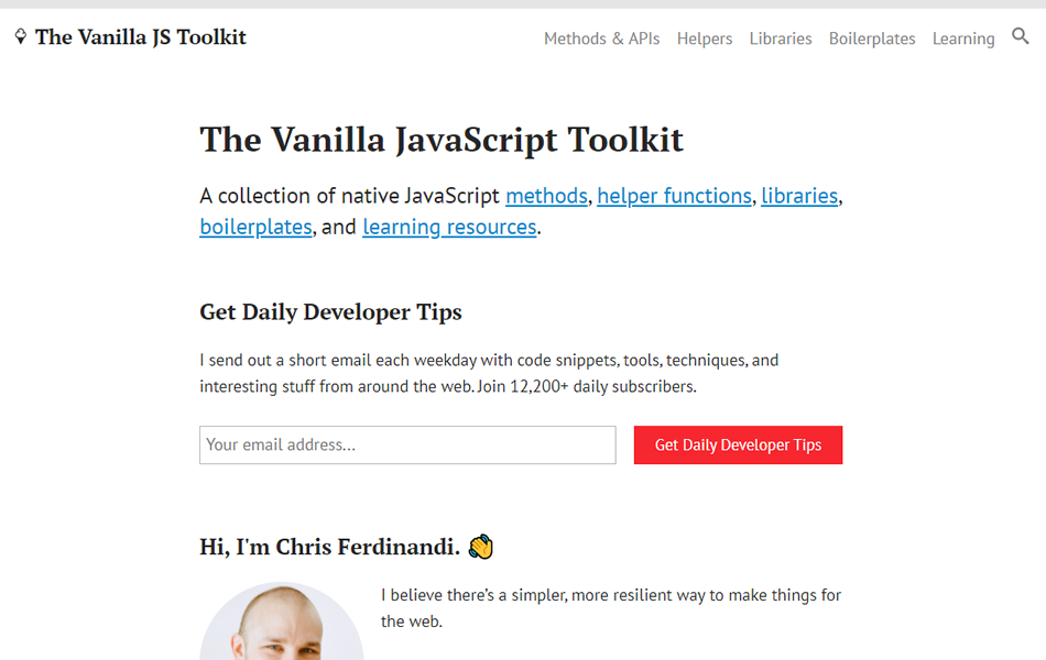
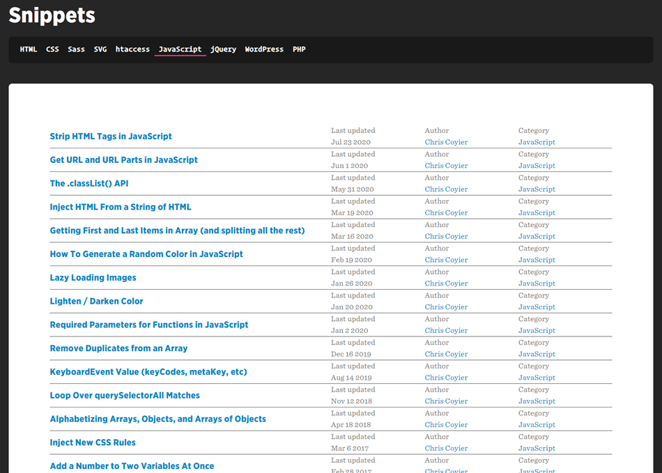
When it comes to writing JavaScript (or any other code, for that matter) you can save a lot of time by not trying to reinvent the wheel – or coding something that is common enough that it has already been written countless times. In these instances it is helpful to have a list of collections of commonly (or sometimes not so commonly) used scripts or snippets you can refer to or search through to find what you need to either get your code started or solve your whole problem.
That is why we’ve put together this list of collections of JavaScript snippets so you can bookmark and refer back to them whenever you are in need. Here are six useful resources for Javascript code snippets.
The UX Designer Toolbox
Unlimited Downloads: 500,000+ Wireframe & UX Templates, UI Kits & Design Assets
Starting at only $16.50 per month!
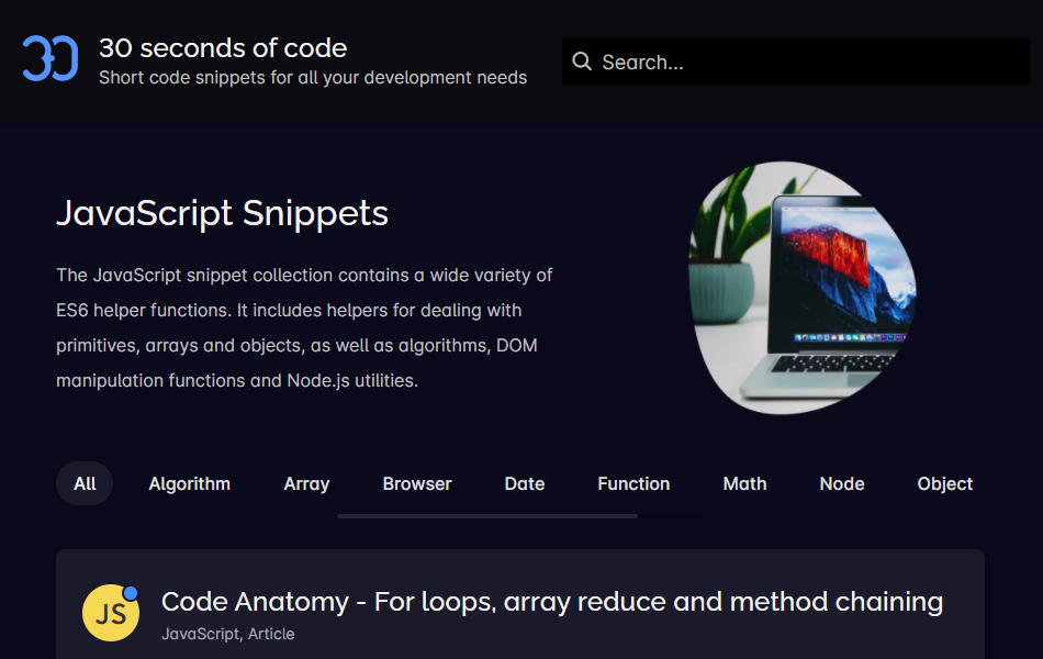
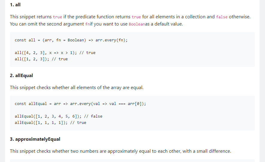
This JavaScript snippet collection contains a wide variety of ES6 helper functions. It includes helpers for dealing with primitives, arrays and objects, as well as algorithms, DOM manipulation functions and Node.js utilities.
Focusing on beginners, and a bit dated, but this list is still a worthwhile resource to keep in your back pocket.
We hope you find this list helpful in your future projects. Be sure to check out all of the other JavaScript resources we have here at 1stWebDesigner while you’re at it!
Building Dating Website is easy using WordPress Dating Themes & WordPress Dating Plugins. How to make WordPress Dating website without coding knowledge.
There are a few hidden treasures within Eclipse collections.
Eclipse Collections is an open-source Java Collections framework. In this blog, I am going to demonstrate five lesser-known features of the framework. I published a similar blog in last year's Java Advent Calendar. Please refer to the resources at the end of the blog for more information about the framework.
In today’s article we’ve compiled some impressive pure CSS drawings, animations, and other examples of what can be done with one of our favorite coding languages. Check out the various elements we’ve found on Codepen below, and be sure to check out our other collections of pure CSS code examples here on 1WD.
The Freelance Designer Toolbox
Unlimited Downloads: 500,000+ Web Templates, Icon Sets, Themes & Design Assets
All starting at only $16.50 per month
Do you use Bootstrap 4 in your projects? If so, you may be interested to see these examples of it in action that we’ve collected. From modals, sidebars, and thank you pages, to drag and drop, responsive menus, and buttons, we’ve gathered a few samples of code snippets to help you further how you build your next website. So have a look, play with them on CodePen, bookmark, and be sure to check out our other collections while you’re at it.
Your Web Designer Toolbox
Unlimited Downloads: 500,000+ Web Templates, Icon Sets, Themes & Design Assets
Starting at only $16.50/month!
Page loaders are often used on websites to give the user something to watch while the content is loading in the background, as well as signaling to the user that something is happening rather than just watching a blank screen while the page loads. Creative designers have come up with a multitude of ways to make page loaders entertaining, interesting, engaging, and even fun, so as not to bore the user. In this collection of pure CSS animated page loaders, we’ve gathered a variety of clever and unique examples for your inspiration. Perhaps you will be able to use some of them in your projects, or maybe they will inspire you to create your own unique spin on the genre.
Your Designer Toolbox Unlimited Downloads: 500,000+ Web Templates, Icon Sets, Themes & Design Assets
Parallax effects in web design have been around for a bit, and although some may say they are past their prime, we still find them in use all over the internet. In today’s post, we have compiled some pretty interesting examples of parallax effects from CodePen for you to view for inspiration, ideas, and to learn from. We hope you enjoy these examples!
Your Designer Toolbox Unlimited Downloads: 500,000+ Web Templates, Icon Sets, Themes & Design Assets
Setting all positions and parallax movements in CSS, this technique minimizes DOM manipulations to just one – on the `html` element – boosting overall performance, although certainly not better than using 3D transforms.
Whether or not you are a fan, parallax effects in web design don’t appear to be going anywhere soon. We hope these examples have given you some tips and inspiration for your own projects. Be sure to check out our other collections here on 1WD for other ideas!
Three.js is a cross-browser JavaScript library and API used to create and display animated 3D computer graphics in a web browser using WebGL. You can learn more about it here. In today’s post we are sharing some amazing examples of this library in action for your inspiration and learning. Let’s get to it!
Your Web Designer Toolbox Unlimited Downloads: 500,000+ Web Templates, Icon Sets, Themes & Design Assets
Whether you are already using Three.js in your projects, are in the process of learning how to use it, or have been inspired to start learning it now, these examples should help you with further inspiration or to get a glimpse of how it can be done. Be sure to check out our other collections for more inspiration and insight into web design and development!


