clip-path is one of those CSS properties we generally know is there but might not reach for often for whatever reason. It’s a little intimidating in the sense that it feels like math class because it requires working with geometric shapes, each with different values that draw certain shapes in certain ways.
We’re going to dive right into clip-path in this article, specifically looking at how we can use it to create pretty complex animations. I hope you’ll see just how awesome the property and it’s shape-shifting powers can be.
But first, let’s do a quick recap of what we’re working with.
Clip-path crash course
Just for a quick explanation as to what the clip-path is and what it provides, MDN describes it like this:
The
clip-pathCSS property creates a clipping region that sets what part of an element should be shown. Parts that are inside the region are shown, while those outside are hidden.
Consider the circle shape provided by clip-path. Once the circle is defined, the area inside it can be considered "positive" and the area outside it "negative." The positive space is rendered while the negative space is removed. Taking advantage of the fact that this relationship between positive and negative space can be animated provides for interesting transition effects… which is what we’re getting into in just a bit.
clip-path comes with four shapes out of the box, plus the ability to use a URL to provide a source to some other SVG <clipPath> element. I’ll let the CSS-Tricks almanac go into deeper detail, but here are examples of those first four shapes.
| Shape | Example | Result |
|---|---|---|
| Circle | clip-path: circle(25% at 25% 25%); |
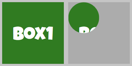 |
| Ellipse | clip-path: ellipse(25% 50% at 25% 50%); |
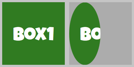 |
| Inset | clip-path: inset(10% 20% 30% 40% round 25%); |
 |
| Polygon | clip-path: polygon(50% 25%, 75% 75%, 25% 75%); |
 |
Combining clippings with CSS transitions
Animating clip-path can be as simple as changing the property values from one shape to another using CSS transitions, triggered either by changing classes in JavaScript or an interactive change in state, like :hover:
.box {
  clip-path: circle(75%);
  transition: clip-path 1s;
}

.box:hover {
  clip-path: circle(25%);
}
See the Pen
clip-path with transition by Geoff Graham (@geoffgraham)
on CodePen.
We can also use CSS animations:
@keyframes circle {
  0% { clip-path: circle(75%); }
  100% { clip-path: circle(25%); }
}
See the Pen
clip-path with CSS animation by Geoff Graham (@geoffgraham)
on CodePen.
Some things to consider when animating clip-path:
- It only affects what is rendered and does not change the box size of the element as relating to elements around it. For example, a floated box with text flowing around it will still take up the same amount of space even with a very small percentage
clip-pathapplied to it. - Any CSS properties that extend beyond the box size of the element may be clipped. For example, an
insetof 0% for all four sides that clips at the edges of the element will remove abox-shadowand require a negative percentage to see thebox-shadow. Although, that could lead to interesting effects in of itself!
OK, let’s get into some light animation to kick things off.
Comparing the simple shapes
I’ve put together a demo where you can see each shape in action, along with a little explanation describing what’s happening.
See the Pen
Animating Clip-Path: Simple Shapes by Travis Almand (@talmand)
on CodePen.
The demo makes use of Vue for the functionality, but the CSS is easily transferred to any other type of project.
We can break those out a little more to get a handle on the values for each shape and how changing them affects the movement
Circle
clip-path: circle(<length|percentage> at <position>);Circle accepts two properties that can be animated:
- Shape radius: can be a length or percentage
- Position: can be a length or percentage along the
xandyaxis
.circle-enter-active { animation: 1s circle reverse; }
.circle-leave-active { animation: 1s circle; }

@keyframes circle {
  0% { clip-path: circle(75%); }
  100% { clip-path: circle(0%); }
}
The circle shape is resized in the leave transition from an initial 75% radius (just enough to allow the element to appear fully) down to 0%. Since no position is set, the circle defaults to the center of the element both vertically and horizontally. The enter transition plays the animation in reverse by means of the "reverse" keyword in the animation property.
Ellipse
clip-path: ellipse(<length|percentage>{2} at <position>);Ellipse accepts three properties that can be animated:
- Shape radius: can be a length or percentage on the horizontal axis
- Shape radius: can be a length or percentage on the vertical axis
- Position: can be a length or percentage along the
xandyaxis
.ellipse-enter-active { animation: 1s ellipse reverse; }
.ellipse-leave-active { animation: 1s ellipse; }

@keyframes ellipse {
  0% { clip-path: ellipse(80% 80%); }
  100% { clip-path: ellipse(0% 20%); }
}
The ellipse shape is resized in the leave transition from an initial 80% by 80%, which makes it a circular shape larger than the box, down to 0% by 20%. Since no position is set, the ellipse defaults to the center of the box both vertically and horizontally. The enter transition plays the animation in reverse by means of the "reverse" keyword in the animation property.
The effect is a shrinking circle that changes to a shrinking ellipse taller than wide wiping away the first element. Then the elements switch with the second element appearing inside the growing ellipse.
Inset
clip-path: inset(<length|percentage>{1,4} round <border-radius>{1,4});The inset shape has up to five properties that can be animated. The first four represent each edge of the shape and behave similar to margins or padding. The first property is required while the next three are optional depending on the desired shape.
- Length/Percentage: can represent all four sides, top/bottom sides, or top side
- Length/Percentage: can represent left/right sides or right side
- Length/Percentage: represents the bottom side
- Length/Percentage: represents the left side
- Border radius: requires the "round" keyword before the value
One thing to keep in mind is that the values used are reversed from typical CSS usage. Defining an edge with zero means that nothing has changed, the shape is pushed outward to the element’s side. As the number is increased, say to 10%, the edge of the shape is pushed inward away from the element’s side.
.inset-enter-active { animation: 1s inset reverse; }
.inset-leave-active { animation: 1s inset; }

@keyframes inset {
  0% { clip-path: inset(0% round 0%); }
  100% { clip-path: inset(50% round 50%); }
}
The inset shape is resized in the leave transition from a full-sized square down to a circle because of the rounded corners changing from 0% to 50%. Without the round value, it would appear as a shrinking square. The enter transition plays the animation in reverse by means of the "reverse" keyword in the animation property.
The effect is a shrinking square that shifts to a shrinking circle wiping away the first element. After the elements switch the second element appears within the growing circle that shifts to a growing square.
Polygon
clip-path: polygon(<length|percentage>);The polygon shape is a somewhat special case in terms of the properties it can animate. Each property represents vertices of the shape and at least three is required. The number of vertices beyond the required three is only limited by the requirements of the desired shape. For each keyframe of an animation, or the two steps in a transition, the number of vertices must always match for a smooth animation. A change in the number of vertices can be animated, but will cause a popping in or out effect at each keyframe.

.polygon-enter-active { animation: 1s polygon reverse; }
.polygon-leave-active { animation: 1s polygon; }

@keyframes polygon {
  0% { clip-path: polygon(0 0, 50% 0, 100% 0, 100% 50%, 100% 100%, 50% 100%, 0 100%, 0 50%); }
  100% { clip-path:  polygon(50% 50%, 50% 25%, 50% 50%, 75% 50%, 50% 50%, 50% 75%, 50% 50%, 25% 50%); }
}
The eight vertices in the polygon shape make a square with a vertex in the four corners and the midpoint of all four sides. On the leave transition, the shape’s corners animate inwards to the center while the side’s midpoints animate inward halfway to the center. The enter transition plays the animation in reverse by means of the "reverse" keyword in the animation property.
The effect is a square that collapses inward down to a plus shape that wipes away the element. The elements then switch with the second element appears in a growing plus shape that expands into a square.
Let’s get into some simple movements
OK, we’re going to dial things up a bit now that we’ve gotten past the basics. This demo shows various ways to have movement in a clip-path animation. The circle and ellipse shapes provide an easy way to animate movement through the position of the shape. The inset and polygon shapes can be animated in a way to give the appearance of position-based movement.
See the Pen
Animating Clip-Path: Simple Movements by Travis Almand (@talmand)
on CodePen.
Let’s break those out just like we did before.
Slide Down

The slide down transition consists of two different animations using the inset shape. The first, which is the leave animation, animates the top value of the inset shape from 0% to 100% providing the appearance of the entire square sliding downward out of view. The second, which is the enter animation, has the bottom value at 100% and then animates it down towards 0% providing the appearance of the entire square sliding downward into view.
.down-enter-active { animation: 1s down-enter; }
.down-leave-active { animation: 1s down-leave; }

@keyframes down-enter {
  0% { clip-path: inset(0 0 100% 0); }
  100% { clip-path: inset(0); }
}

@keyframes down-leave {
  0% { clip-path: inset(0); }
  100% { clip-path: inset(100% 0 0 0); }
}
As you can see, the number of sides being defined in the inset path do not need to match. When the shape needs to be the full square, a single zero is all that is required. It can then animate to the new state even when the number of defined sides increases to four.
Box-Wipe

The box-wipe transition consists of two animations, again using the inset shape. The first, which is the leave animation, animates the entire square down to a half-size squared positioned on the element’s left side. The smaller square then slides to the right out of view. The second, which is the enter animation, animates a similar half-size square into view from the left over to the element’s right side. Then it expands outward to reveal the entire element.
.box-wipe-enter-active { animation: 1s box-wipe-enter; }
.box-wipe-leave-active { animation: 1s box-wipe-leave; }

@keyframes box-wipe-enter {
  0% { clip-path: inset(25% 100% 25% -50%); }
  50% { clip-path: inset(25% 0% 25% 50%); }
  100% { clip-path: inset(0); }
}

@keyframes box-wipe-leave {
  0% { clip-path: inset(0); }
  50% { clip-path: inset(25% 50% 25% 0%); }
  100% { clip-path: inset(25% -50% 25% 100%); }
}
When the full element is shown, the inset is at zero. The 50% keyframes define a half-size square that is placed on either the left or right. There are two values representing the left and right edges are swapped. Then the square is then moved to the opposite side. As one side is pushed to 100%, the other must go to -50% to maintain the shape. If it were to animate to zero instead of -50%, then the square would shrink as it animated across instead of moving out of view.
Rotate

The rotate transition is one animation with five keyframes using the polygon shape. The initial keyframe defines the polygon with four vertices that shows the entire element. Then, the next keyframe changes the x and y coordinates of each vertex to be moved inward and near the next vertex in a clockwise fashion. After all four vertices have been transitioned, it appears the square has shrunk and rotated a quarter turn. The following keyframes do the same until the square is collapsed down to the center of the element. The leave transition plays the animation normally while the enter transition plays the animation in reverse.
.rotate-enter-active { animation: 1s rotate reverse; }
.rotate-leave-active { animation: 1s rotate; }

@keyframes rotate {
  0% { clip-path: polygon(0% 0%, 100% 0%, 100% 100%, 0% 100%); }
  25% { clip-path: polygon(87.5% 12.5%, 87.5% 87.5%, 12.5% 87.5%, 12.5% 12.5%); }
  50% { clip-path: polygon(75% 75%, 25% 75%, 25% 25%, 75% 25%); }
  75% { clip-path: polygon(37.5% 62.5%, 37.5% 37.5%, 62.5% 37.5%, 62.5% 62.5%); }
  100% { clip-path: polygon(50% 50%, 50% 50%, 50% 50%, 50% 50%); }
}
Polygons can be animated into any other position once its vertices have been set, as long as each keyframe has the same number of vertices. This can make many interesting effects with careful planning.
Spotlight

The spotlight transition is one animation with five keyframes using the circle shape. The initial keyframe defines a full-size circle positioned at the center to show the entire element. The next keyframe shrinks the circle down to twenty percent. Each following keyframe animates the position values of the circle to move it to different points on the element until it moves out of view to the left. The leave transition plays the animation normally while the enter transition plays the animation in reverse.
.spotlight-enter-active { animation: 2s spotlight reverse; }
.spotlight-leave-active { animation: 2s spotlight; }

@keyframes spotlight {
  0% { clip-path: circle(100% at 50% 50%); }
  25% { clip-path: circle(20% at 50% 50%); }
  50% { clip-path: circle(20% at 12% 84%); }
  75% { clip-path: circle(20% at 93% 51%); }
  100% { clip-path: circle(20% at -30% 20%); }
}
This may be a complex-looking animation at first, but turns out it only requires simple changes in each keyframe.
More adventurous stuff
Like the shapes and simple movements examples, I’ve made a demo that contains more complex animations. We’ll break these down individually as well.
See the Pen
Animating Clip-Path: Complex Shapes by Travis Almand (@talmand)
on CodePen.
All of these examples make heavy use of the polygon shape. They take advantage of features like stacking vertices to make elements appear "welded" and repositioning vertices around for movement.
Check out Ana Tudor’s "Cutting out the inner part of an element using clip-path" article for a more in-depth example that uses the polygon shape to create complex shapes.
Chevron
The chevron transition is made of two animations, each with three keyframes. The leave transition starts out as a full square with six vertices; there are the four corners but there are an additional two vertices on the left and right sides. The second keyframe animates three of the vertices into place to change the square into a chevron. The third keyframe then moves the vertices out of view to the right. After the elements switch, the enter transition starts with the same chevron shape but it is out of view on the left. The second keyframe moves the chevron into view and then the third keyframe restores the full square.
.chevron-enter-active { animation: 1s chevron-enter; }
.chevron-leave-active { animation: 1s chevron-leave; }

@keyframes chevron-enter {
  0% { clip-path: polygon(-25% 0%, 0% 50%, -25% 100%, -100% 100%, -75% 50%, -100% 0%); }
  75% { clip-path: polygon(75% 0%, 100% 50%, 75% 100%, 0% 100%, 25% 50%, 0% 0%); }
  100% { clip-path: polygon(100% 0%, 100% 50%, 100% 100%, 0% 100%, 0% 50%, 0% 0%); }
}

@keyframes chevron-leave {
  0% { clip-path: polygon(100% 0%, 100% 50%, 100% 100%, 0% 100%, 0% 50%, 0% 0%); }
  25% { clip-path: polygon(75% 0%, 100% 50%, 75% 100%, 0% 100%, 25% 50%, 0% 0%); }
  100% { clip-path: polygon(175% 0%, 200% 50%, 175% 100%, 100% 100%, 125% 50%, 100% 0%) }
}
Spiral

The spiral transition is a strong example of a complicated series of vertices in the polygon shape. The polygon is created to define a shape that spirals inward clockwise from the upper-left of the element. Since the vertices create lines that stack on top of each other, it all appears as a single square. Over the eight keyframes of the animation, vertices are moved to be on top of neighboring vertices. This makes the shape appear to unwind counter-clockwise to the upper-left, wiping away the element during the leave transition. The enter transition replays the animation in reverse.
.spiral-enter-active { animation: 1s spiral reverse; }
.spiral-leave-active { animation: 1s spiral; }

@keyframes spiral {
  0% { clip-path: polygon(0% 0%, 100% 0%, 100% 100%, 0% 100%, 0% 25%, 75% 25%, 75% 75%, 25% 75%, 25% 50%, 50% 50%, 25% 50%, 25% 75%, 75% 75%, 75% 25%, 0% 25%); }
  14.25% { clip-path: polygon(0% 0%, 100% 0%, 100% 100%, 0% 100%, 0% 25%, 75% 25%, 75% 75%, 50% 75%, 50% 50%, 50% 50%, 25% 50%, 25% 75%, 75% 75%, 75% 25%, 0% 25%); }
  28.5% { clip-path: polygon(0% 0%, 100% 0%, 100% 100%, 0% 100%, 0% 25%, 75% 25%, 75% 50%, 50% 50%, 50% 50%, 50% 50%, 25% 50%, 25% 75%, 75% 75%, 75% 25%, 0% 25%); }
  42.75% { clip-path: polygon(0% 0%, 100% 0%, 100% 100%, 0% 100%, 0% 25%, 25% 25%, 25% 50%, 25% 50%, 25% 50%, 25% 50%, 25% 50%, 25% 75%, 75% 75%, 75% 25%, 0% 25%); }
  57% { clip-path: polygon(0% 0%, 100% 0%, 100% 100%, 0% 100%, 0% 75%, 25% 75%, 25% 75%, 25% 75%, 25% 75%, 25% 75%, 25% 75%, 25% 75%, 75% 75%, 75% 25%, 0% 25%); }
  71.25% { clip-path: polygon(0% 0%, 100% 0%, 100% 100%, 75% 100%, 75% 75%, 75% 75%, 75% 75%, 75% 75%, 75% 75%, 75% 75%, 75% 75%, 75% 75%, 75% 75%, 75% 25%, 0% 25%); }
  85.5% { clip-path: polygon(0% 0%, 100% 0%, 100% 25%, 75% 25%, 75% 25%, 75% 25%, 75% 25%, 75% 25%, 75% 25%, 75% 25%, 75% 25%, 75% 25%, 75% 25%, 75% 25%, 0% 25%); }
  100% {clip-path: polygon(0% 0%, 0% 0%, 0% 0%, 0% 0%, 0% 0%, 0% 0%, 0% 0%, 0% 0%, 0% 25%, 0% 25%, 0% 25%, 0% 25%, 0% 25%, 0% 25%, 0% 25%); }
}
Slots

The slots transition is made of a series of vertices arranged in a pattern of vertical slots with vertices stacked on top of each other for a complete square. The general idea is that the shape starts in the upper-left and the next vertex is 14% to the right. Next vertex is in the exact same spot. Then the one after that is another 14% to the right, and so on until the upper-right corner is reached. This creates a series of "sections" along the top of the shape that are aligned horizontally. The second keyframe then animates every even section downward to the bottom of the element. This gives the appearance of vertical slots wiping away their parts of the element. The third keyframe then moves the remaining sections at the top to the bottom. Overall, the leave transition wipes away half the element in vertical slots and then the other half. The enter transition reverses the animation.
.slots-enter-active { animation: 1s slots reverse; }
.slots-leave-active { animation: 1s slots; }

@keyframes slots {
  0% {
    clip-path: polygon(0% 0%, 14% 0%, 14% 0%, 28% 0%, 28% 0%, 42% 0%, 42% 0%, 56% 0%, 56% 0%, 70% 0%, 70% 0%, 84% 0%, 84% 0%, 100% 0, 100% 100%, 0% 100%);
  }
  50% {
    clip-path: polygon(0% 0%, 14% 0%, 14% 100%, 28% 100%, 28% 0%, 42% 0%, 42% 100%, 56% 100%, 56% 0%, 70% 0%, 70% 100%, 84% 100%, 84% 0%, 100% 0, 100% 100%, 0% 100%);
  }
  100% {
    clip-path: polygon(0% 100%, 14% 100%, 14% 100%, 28% 100%, 28% 100%, 42% 100%, 42% 100%, 56% 100%, 56% 100%, 70% 100%, 70% 100%, 84% 100%, 84% 100%, 100% 100%, 100% 100%, 0% 100%);
  }
}
Shutters

The shutters transition is very similar to the slots transition above. Instead of sections along the top, it creates vertical sections that are placed in line with each other to create the entire square. Starting with the upper-left the second vertex is positioned at the top and 20% to the right. The next vertex is placed in the same place horizontally but is at the bottom of the element. The next vertex after that is in the same spot with the next one back at the top on top of the vertex from two steps ago. This is repeated several times across the element until the right side is reached. If the lines of the shape were visible, then it would appear as a series of vertical sections lined up horizontally across the element. During the animation the left side of each section is moved over to be on top of the right side. This creates a wiping effect that looks like vertical shutters of a window. The enter transition plays the animation in reverse.
.shutters-enter-active { animation: 1s shutters reverse; }
.shutters-leave-active { animation: 1s shutters; }

@keyframes shutters {
  0% {
    clip-path: polygon(0% 0%, 20% 0%, 20% 100%, 20% 100%, 20% 0%, 40% 0%, 40% 100%, 40% 100%, 40% 0%, 60% 0%, 60% 100%, 60% 100%, 60% 0%, 80% 0%, 80% 100%, 80% 100%, 80% 0%, 100% 0%, 100% 100%, 0% 100%);
  }
  100% {
    clip-path: polygon(20% 0%, 20% 0%, 20% 100%, 40% 100%, 40% 0%, 40% 0%, 40% 100%, 60% 100%, 60% 0%, 60% 0%, 60% 100%, 80% 100%, 80% 0%, 80% 0%, 80% 100%, 100% 100%, 100% 0%, 100% 0%, 100% 100%, 20% 100%);
  }
}
Star

The star transition takes advantage of how clip-path renders positive and negative space when the lines defining the shape overlap and cross each other. The shape starts as a square with eight vertices; one in each corner and one on each side. There are only three keyframes but there’s a large amount of movement in each one. The leave transition starts with the square and then moves each vertex on a side to the opposite side. Therefore, the top vertex goes to the bottom, the bottom vertex goes to the top, and the vertices on the left and right do the same swap. This creates criss-crossing lines that form a star shape in the positive space. The final keyframe then moves the vertices in each corner to the center of the shape which makes the star collapse in on itself wiping the element away. The enter transition plays the same in reverse.
.star-enter-active { animation: 1s star reverse; }
.star-leave-active { animation: 1s star; }

@keyframes star {
  0% {
    clip-path: polygon(0% 0%, 50% 0%, 100% 0%, 100% 50%, 100% 100%, 50% 100%, 0% 100%, 0% 50%);
  }
  50% {
    clip-path: polygon(0% 0%, 50% 100%, 100% 0%, 0% 50%, 100% 100%, 50% 0%, 0% 100%, 100% 50%);
  }
  100% {
    clip-path: polygon(50% 50%, 50% 100%, 50% 50%, 0% 50%, 50% 50%, 50% 0%, 50% 50%, 100% 50%);
  }
}
Path shapes
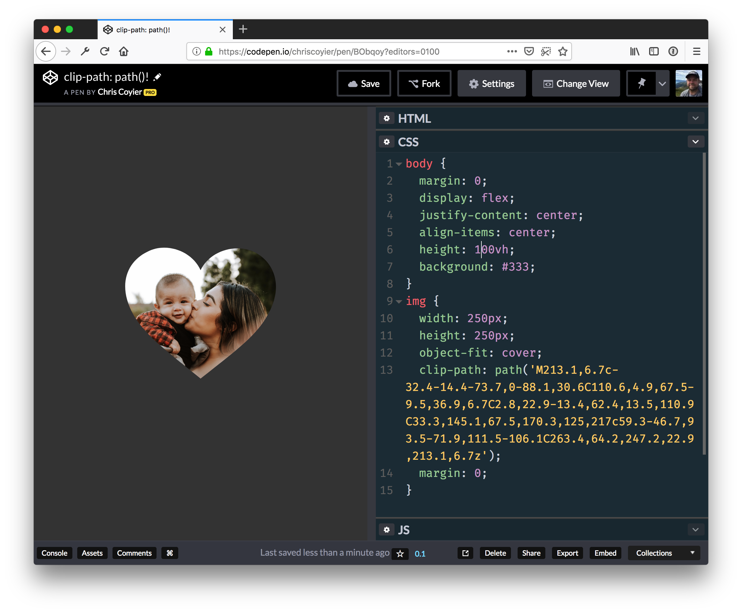
OK, so we’ve looked at a lot of examples of animations using clip-path shape functions. One function we haven’t spent time with is path. It’s perhaps the most flexible of the bunch because we can draw custom, or even multiple, shapes with it. Chris has written and even spoken on it before.
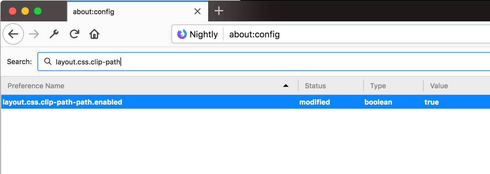
So, while I created demo for this set of examples as well, note that clip-path paths are experimental technology. As of this writing, it’s only available in Firefox 63 or higher behind the layout.css.clip-path-path.enabled flag, which can be enabled in about:config.
See the Pen
Animating Clip-Path: Path Shapes by Travis Almand (@talmand)
on CodePen.
This demo shows several uses of paths that are animated for transitions. The paths are the same type of paths found in SVG and can be lifted from the path attribute to be used in the clip-path CSS property on an element. Each of the paths in the demo were actually taken from SVG I made by hand for each keyframe of the animations. Much like animating with the polygon shape, careful planning is required as the number of vertices in the path cannot change but only manipulated.
An advantage to using paths is that it can consist of multiple shapes within the path, each animated separately to have fine-tune control over the positive and negative space. Another interesting aspect is that the path supports Bézier curves. Creating the vertices is similar to the polygon shape, but polygon doesn’t support Bézier curves. A bonus of this feature is that even the curves can be animated.
That said, a disadvantage is that a path has to be built specifically for the size of the element. That’s because there is no percentage-based placement, like we have with the other clip-path shapes . So, all the demos for this article have elements that are 200px square, and the paths in this specific demo are built for that size. Any other size or dimensions will lead to different outcomes.
Alright, enough talk. Let’s get to the examples because they’re pretty sweet.
Iris

The iris transition consists of four small shapes that form together to make a complete large shape that splits in an iris pattern, much like a sci-fi type door. Each shape has its vertices moved and slightly rotated in the direction away from the center to move off their respective side of the element. This is done with only two keyframes. The leave transition has the shapes move out of view while the enter transition reverses the effect. The path is formatted in a way to make each shape in the path obvious. Each line that starts with "M" is a new shape in the path.
.iris-enter-active { animation: 1s iris reverse; }
.iris-leave-active { animation: 1s iris; }

@keyframes iris {
  0% {
    clip-path: path('
      M103.13 100C103 32.96 135.29 -0.37 200 0L0 0C0.35 66.42 34.73 99.75 103.13 100Z
      M199.35 200C199.83 133.21 167.75 99.88 103.13 100C102.94 165.93 68.72 199.26 0.46 200L199.35 200Z
      M103.13 100C167.46 99.75 199.54 133.09 199.35 200L200 0C135.15 -0.86 102.86 32.47 103.13 100Z
      M0 200C68.63 200 103 166.67 103.13 100C34.36 100.12 -0.02 66.79 0 0L0 200Z
    ');
  }
  100% {
    clip-path: path('
      M60.85 2.56C108.17 -44.93 154.57 -45.66 200.06 0.35L58.64 -141.07C11.93 -93.85 12.67 -45.97 60.85 2.56Z
      M139.87 340.05C187.44 293.16 188.33 246.91 142.54 201.29C95.79 247.78 48.02 247.15 -0.77 199.41L139.87 340.05Z
      M201.68 61.75C247.35 107.07 246.46 153.32 199.01 200.5L340.89 59.54C295.65 13.07 249.25 13.81 201.68 61.75Z
      M-140.61 141.25C-92.08 189.78 -44.21 190.51 3.02 143.46C-45.69 94.92 -46.43 47.05 0.81 -0.17L-140.61 141.25Z
    ');
  }
}
Melt

The melt transition consists of two different animations for both entering and leaving. In the leave transition, the path is a square but the top side is made up of several Bézier curves. At first, these curves are made to be completely flat and then are animated downward to stop beyond the bottom of the shape. As these curves move downward, they are animated in different ways so that each curve adjusts differently than the others. This gives the appearance of the element melting out of view below the bottom.
The enter transition does much the same, except that the curves are on the bottom of the square. The curves start at the top and are completely flat. Then they are animated downward with the same curve adjustments. This gives the appearance of the second element melting into view to the bottom.
.melt-enter-active { animation: 2s melt-enter; }
.melt-leave-active { animation: 2s melt-leave; }

@keyframes melt-enter {
  0% {
    clip-path: path('M0 -0.12C8.33 -8.46 16.67 -12.62 25 -12.62C37.5 -12.62 35.91 0.15 50 -0.12C64.09 -0.4 62.5 -34.5 75 -34.5C87.5 -34.5 87.17 -4.45 100 -0.12C112.83 4.2 112.71 -17.95 125 -18.28C137.29 -18.62 137.76 1.54 150.48 -0.12C163.19 -1.79 162.16 -25.12 174.54 -25.12C182.79 -25.12 191.28 -16.79 200 -0.12L200 -34.37L0 -34.37L0 -0.12Z');
  }
  100% {
    clip-path: path('M0 199.88C8.33 270.71 16.67 306.13 25 306.13C37.5 306.13 35.91 231.4 50 231.13C64.09 230.85 62.5 284.25 75 284.25C87.5 284.25 87.17 208.05 100 212.38C112.83 216.7 112.71 300.8 125 300.47C137.29 300.13 137.76 239.04 150.48 237.38C163.19 235.71 162.16 293.63 174.54 293.63C182.79 293.63 191.28 262.38 200 199.88L200 0.13L0 0.13L0 199.88Z');
  }
}

@keyframes melt-leave {
  0% {
    clip-path: path('M0 0C8.33 -8.33 16.67 -12.5 25 -12.5C37.5 -12.5 36.57 -0.27 50 0C63.43 0.27 62.5 -34.37 75 -34.37C87.5 -34.37 87.5 -4.01 100 0C112.5 4.01 112.38 -18.34 125 -18.34C137.62 -18.34 138.09 1.66 150.48 0C162.86 -1.66 162.16 -25 174.54 -25C182.79 -25 191.28 -16.67 200 0L200 200L0 200L0 0Z');
  }
  100% {
    clip-path: path('M0 200C8.33 270.83 16.67 306.25 25 306.25C37.5 306.25 36.57 230.98 50 231.25C63.43 231.52 62.5 284.38 75 284.38C87.5 284.38 87.5 208.49 100 212.5C112.5 216.51 112.38 300.41 125 300.41C137.62 300.41 138.09 239.16 150.48 237.5C162.86 235.84 162.16 293.75 174.54 293.75C182.79 293.75 191.28 262.5 200 200L200 200L0 200L0 200Z');
  }
}
Door

The door transition is similar to the iris transition we looked at first — it’s a "door" effect with shapes that move independently of each other. The path is made up of four shapes: two are half-circles located at the top and bottom while the other two split the left over positive space. This shows that, not only can each shape in the path animate separately from each other, they can also be completely different shapes.
In the leave transition, each shape moves away from the center out of view on its own side. The top half-circle moves upward leaving a hole behind and the bottom half-circle does the same. The left and right sides then slide away in a separate keyframe. Then the enter transition simply reverses the animation.
.door-enter-active { animation: 1s door reverse; }
.door-leave-active { animation: 1s door; }

@keyframes door {
  0% {
    clip-path: path('
      M0 0C16.03 0.05 32.7 0.05 50 0C50.05 27.36 74.37 50.01 100 50C99.96 89.53 100.08 136.71 100 150C70.48 149.9 50.24 175.5 50 200C31.56 199.95 14.89 199.95 0 200L0 0Z
      M200 0C183.46 -0.08 166.79 -0.08 150 0C149.95 21.45 133.25 49.82 100 50C100.04 89.53 99.92 136.71 100 150C130.29 150.29 149.95 175.69 150 200C167.94 199.7 184.6 199.7 200 200L200 0Z
      M100 50C130.83 49.81 149.67 24.31 150 0C127.86 0.07 66.69 0.07 50 0C50.26 23.17 69.36 49.81 100 50Z
      M100 150C130.83 150.19 149.67 175.69 150 200C127.86 199.93 66.69 199.93 50 200C50.26 176.83 69.36 150.19 100 150Z
    ');
  }
  50% {
    clip-path: path('
      M0 0C16.03 0.05 32.7 0.05 50 0C50.05 27.36 74.37 50.01 100 50C99.96 89.53 100.08 136.71 100 150C70.48 149.9 50.24 175.5 50 200C31.56 199.95 14.89 199.95 0 200L0 0Z
      M200 0C183.46 -0.08 166.79 -0.08 150 0C149.95 21.45 133.25 49.82 100 50C100.04 89.53 99.92 136.71 100 150C130.29 150.29 149.95 175.69 150 200C167.94 199.7 184.6 199.7 200 200L200 0Z
      M100 -6.25C130.83 -6.44 149.67 -31.94 150 -56.25C127.86 -56.18 66.69 -56.18 50 -56.25C50.26 -33.08 69.36 -6.44 100 -6.25Z
      M100 206.25C130.83 206.44 149.67 231.94 150 256.25C127.86 256.18 66.69 256.18 50 256.25C50.26 233.08 69.36 206.44 100 206.25Z
    ');
  }
  100% {
    clip-path: path('
      M-106.25 0C-90.22 0.05 -73.55 0.05 -56.25 0C-56.2 27.36 -31.88 50.01 -6.25 50C-6.29 89.53 -6.17 136.71 -6.25 150C-35.77 149.9 -56.01 175.5 -56.25 200C-74.69 199.95 -91.36 199.95 -106.25 200L-106.25 0Z
      M306.25 0C289.71 -0.08 273.04 -0.08 256.25 0C256.2 21.45 239.5 49.82 206.25 50C206.29 89.53 206.17 136.71 206.25 150C236.54 150.29 256.2 175.69 256.25 200C274.19 199.7 290.85 199.7 306.25 200L306.25 0Z
      M100 -6.25C130.83 -6.44 149.67 -31.94 150 -56.25C127.86 -56.18 66.69 -56.18 50 -56.25C50.26 -33.08 69.36 -6.44 100 -6.25Z
      M100 206.25C130.83 206.44 149.67 231.94 150 256.25C127.86 256.18 66.69 256.18 50 256.25C50.26 233.08 69.36 206.44 100 206.25Z
    ');
  }
}
X-Plus

This transition is different than most of the demos for this article. That’s because other demos show animating the "positive" space of the clip-path for transitions. It turns out that animating the "negative" space can be difficult with the traditional clip-path shapes. It can be done with the polygon shape but requires careful placement of vertices to create the negative space and animate them as necessary. This demo takes advantage of having two shapes in the path; there’s one shape that’s a huge square surrounding the space of the element and another shape in the center of this square. The center shape (in this case an x or +) excludes or "carves" out negative space in the outside shape. Then the center shape’s vertices are animated so that only the negative space is being animated.
The leave animation starts with the center shape as a tiny "x" that grows in size until the element is wiped from view. The enter animation the center shape is a "+" that is already larger than the element and shrinks down to nothing.
.x-plus-enter-active { animation: 1s x-plus-enter; }
.x-plus-leave-active { animation: 1s x-plus-leave; }

@keyframes x-plus-enter {
  0% {
    clip-path: path('M-400 600L-400 -400L600 -400L600 600L-400 600ZM0.01 -0.02L-200 -0.02L-200 199.98L0.01 199.98L0.01 400L200.01 400L200.01 199.98L400 199.98L400 -0.02L200.01 -0.02L200.01 -200L0.01 -200L0.01 -0.02Z');
  }
  100% {
    clip-path: path('M-400 600L-400 -400L600 -400L600 600L-400 600ZM98.33 98.33L95 98.33L95 101.67L98.33 101.67L98.33 105L101.67 105L101.67 101.67L105 101.67L105 98.33L101.67 98.33L101.67 95L98.33 95L98.33 98.33Z');
  }
}

@keyframes x-plus-leave {
  0% {
    clip-path: path('M-400 600L-400 -400L600 -400L600 600L-400 600ZM96.79 95L95 96.79L98.2 100L95 103.2L96.79 105L100 101.79L103.2 105L105 103.2L101.79 100L105 96.79L103.2 95L100 98.2L96.79 95Z');
  }
  100% {
    clip-path: path('M-400 600L-400 -400L600 -400L600 600L-400 600ZM-92.31 -200L-200 -92.31L-7.69 100L-200 292.31L-92.31 400L100 207.69L292.31 400L400 292.31L207.69 100L400 -92.31L292.31 -200L100 -7.69L-92.31 -200Z');
  }
}
Drops

The drops transition takes advantage of the ability to have multiple shapes in the same path. The path has ten circles placed strategically inside the area of the element. They start out as tiny and unseen, then are animated to a larger size over time. There are ten keyframes in the animation and each keyframe resizes a circle while maintaining the state of any previously resized circle. This gives the appearance of circles popping in or out of view one after the other during the animation.
The leave transition has the circles being shrunken out of view one at a time and the negative space grows to wipe out the element. The enter transition plays the animation in reverse so that the circles enlarge and the positive space grows to reveal the new element.
The CSS used for the drops transition is rather large, so take a look at the CSS section of the CodePen demo starting with the .drops-enter-active selector.
Numbers

This transition is similar to the x-plus transition above — it uses a negative shape for the animation inside a larger positive shape. In this demo, the animated shape changes through the numbers 1, 2, and 3 until the element is wiped away or revealed. The numeric shapes were created by manipulating the vertices of each number into the shape of the next number. So, each number shape has the same number of vertices and curves that animate correctly from one to the next.
The leave transition starts with the shape in the center but is made to be unseen. It then animates into the shape of the first number. The next keyframe animates to the next number and so no, then plays in reverse.
The CSS used for this is ginormous just like the last one, so take a look at the CSS section of the CodePen demo starting with the .numbers-enter-active selector.
Hopefully this article has given you a good idea of how clip-path can be used to create flexible and powerful animations that can be both straightforward and complex. Animations can add a nice touch to a design and even help provide context when switching from one state to another. At the same time, remember to be mindful of those who may prefer to limit the amount of animation or movement, for example, by setting reduced motion preferences.
The post Animating with Clip-Path appeared first on CSS-Tricks.